Transcripts
1. Introduction: Light enables you to not
only see the object, but also identify the form of each object will allow light. Each object looks like a
two-dimensional shape. The elements of Art I used by artists to create a layer
Art in various media. The most common seven
elements of Art include line, shape, form, space,
texture, value, and color. You might wonder why
light is not on the list. Indeed, light is an
essential part of form. And very, how can a three
dimensional object be catched? Anger? Two-dimensional,
flat piece of paper is all of our how we catch light and
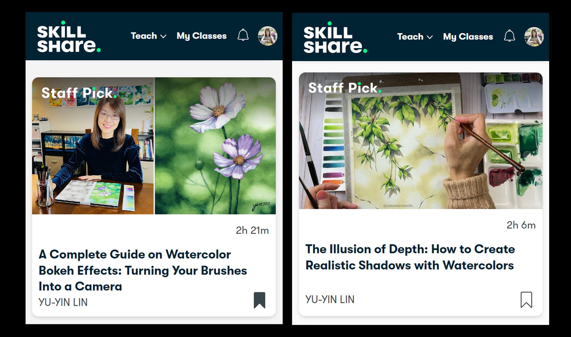
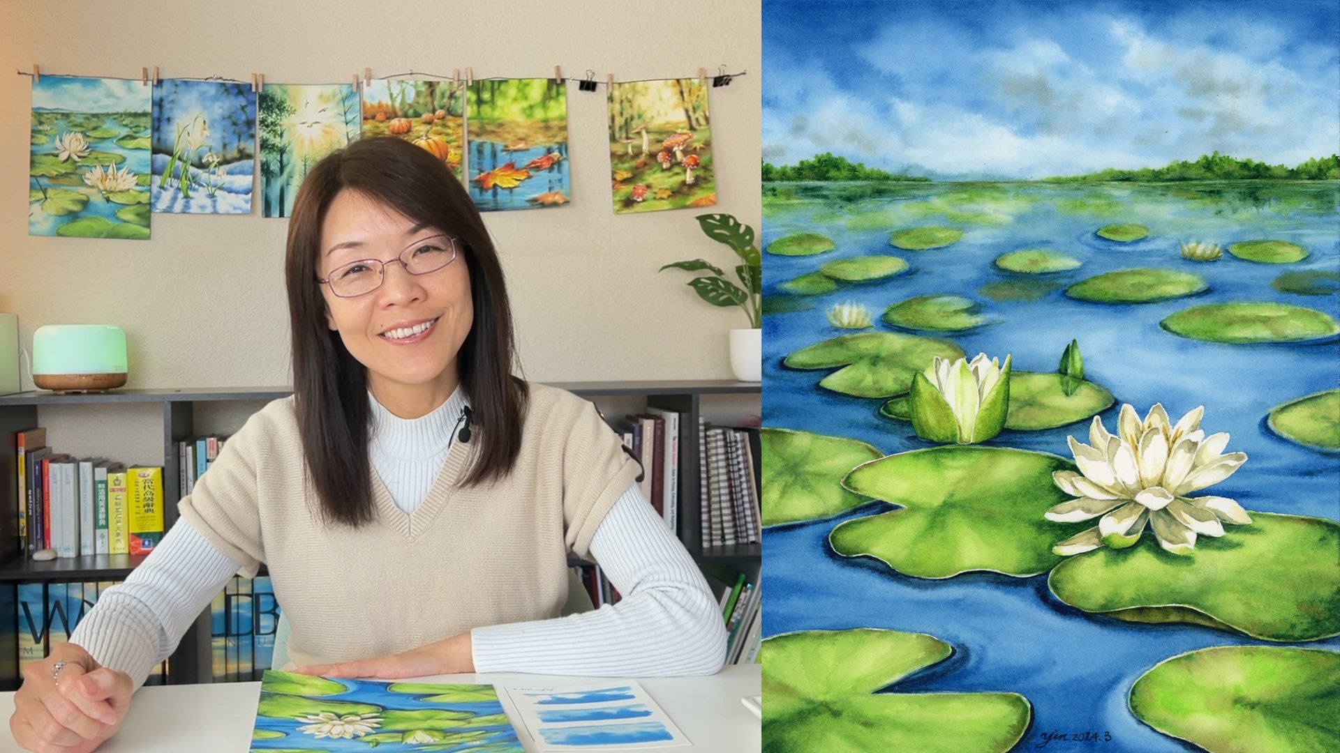
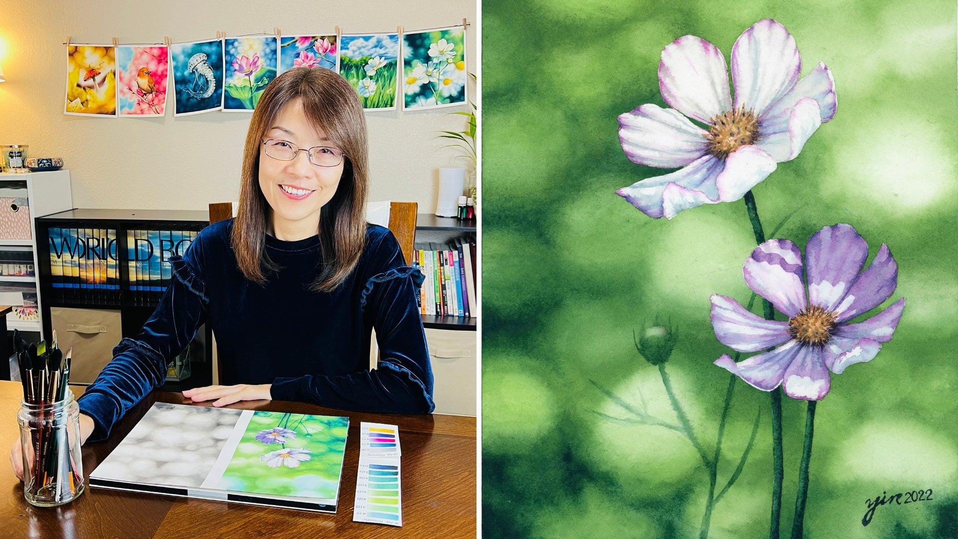
shadows in our artwork. Hello everyone. My name is usually a designer, an artist, and our educator. I have shared my painting, our work in different platforms, including Instagram,
Facebook, and YouTube. I also have published two
classes on Skillshare. The first one, a Complete Guide to Watercolor Bokeh
Effect Background. Second one, The
Illusion of Depth. How to Create Realistic
Shadows with Watercolor. Less class is my third
fundamental classes, which is how to enhance your watercolor painting by
Creating Light in Your Art. In this class, you will be running the importance
of light in Art. How light affects colors than relationship between
light and shadows, the various directions of Light. And also three projects. First one, Painting
with Back Lighting. Second one Painting
with Top Lighting, certain one Painting
with Side Lighting. And also my final Thoughts. After this class, you
will be able to apply these knowledge and skill to not only watercolor painting, but also other Art media. I cannot wait to share
all my lessons with you and look forward to
seeing you all in my class.
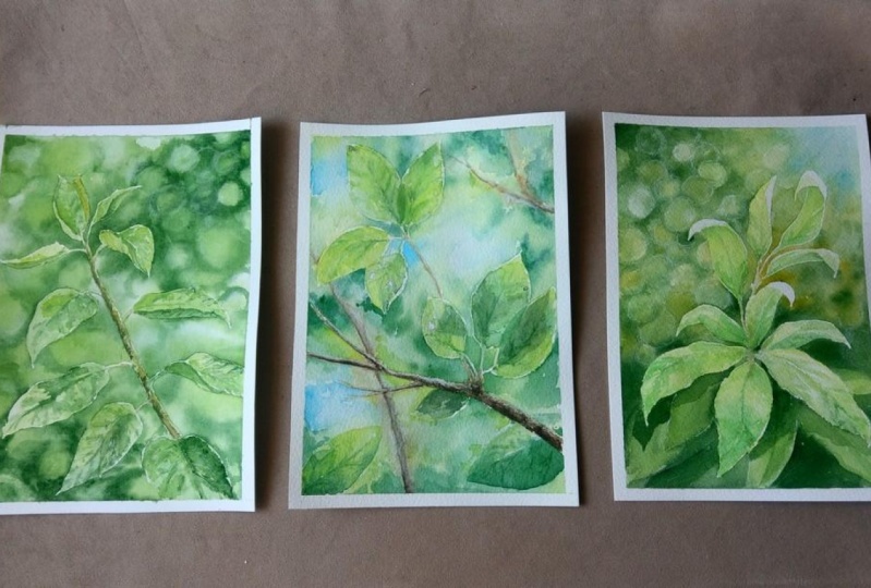
2. Class Project: Painting light in
your watercolor can create a composition. Good lighting doesn't
mean how intense Las, but how its direction and effect on the elements
of your artwork. On the other hand, we can enhance your watercolor
painting by creating light and affecting the
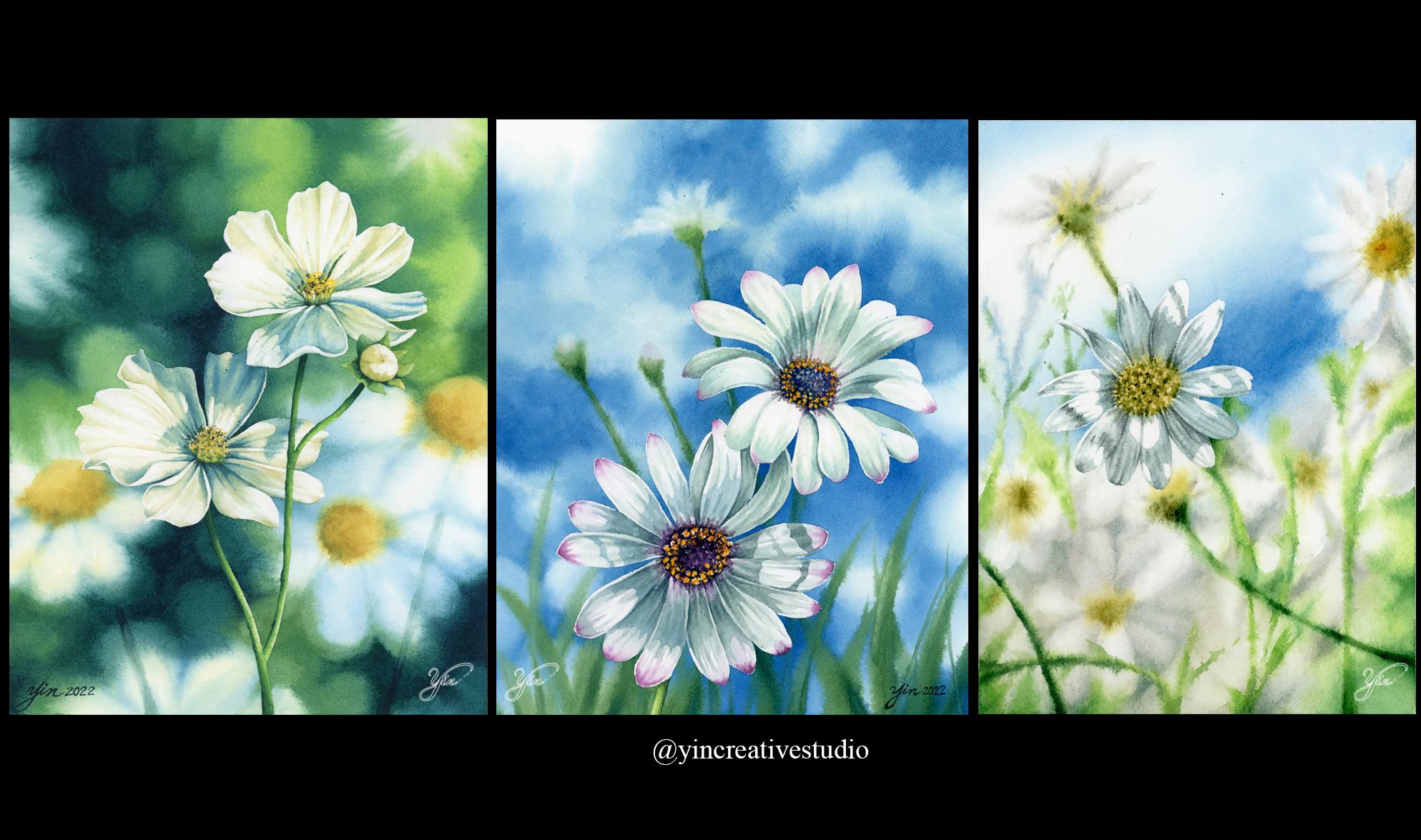
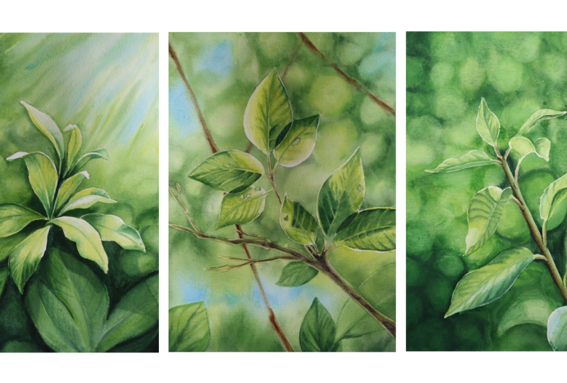
perception of the viewers. Here are some of my
paintings as a symbol. The first Painting is with
strong lighting from the top, you can see the shadow
on the second flowers. Cma, is it a second Painting? The lightings also from the top, although shadows from
different flower above it, seamless in the last one, even though you don't
see other flower. But based on a shadow, you can see where
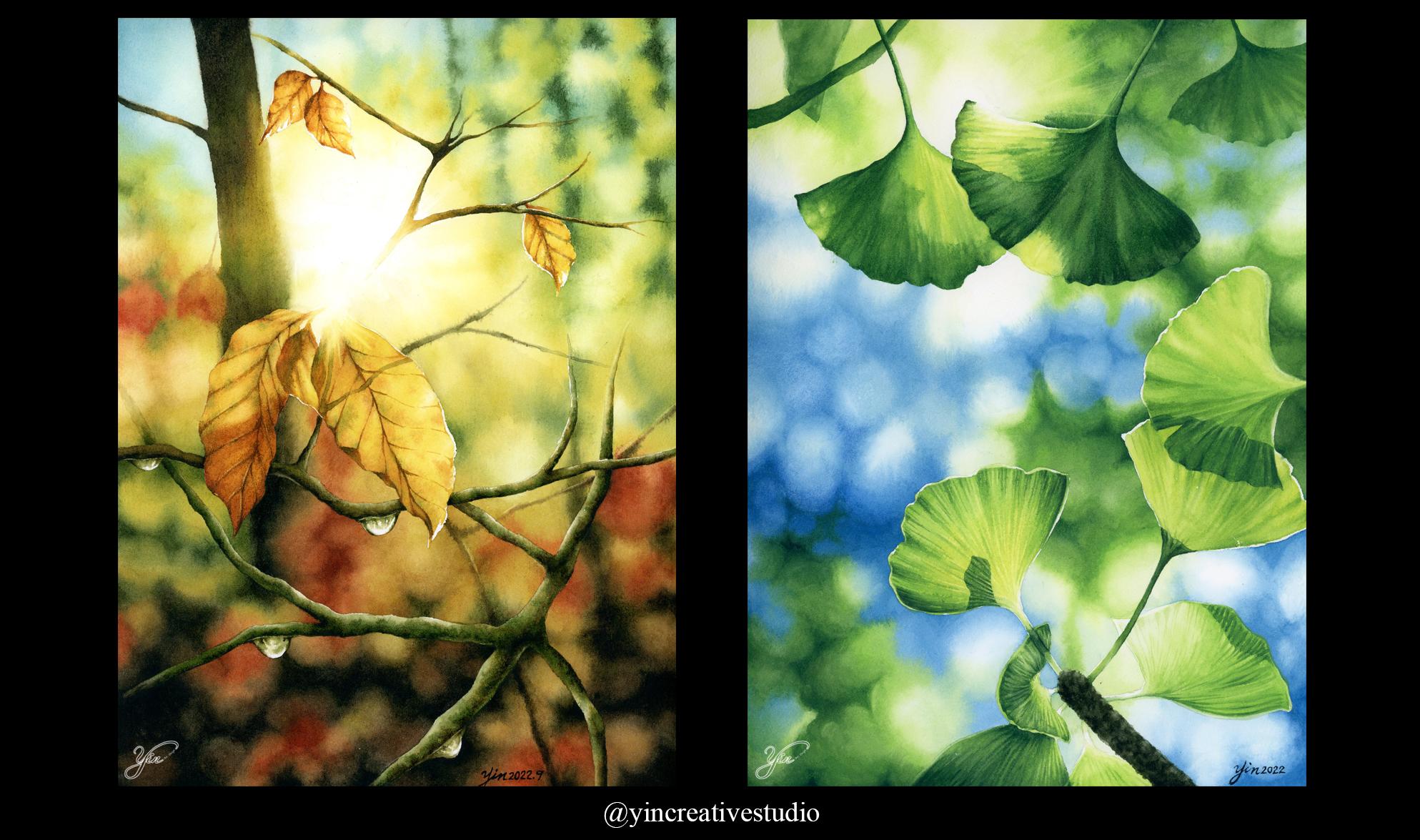
is light in front. The next Painting, I
adopt dramatic back lighting so you can see the edges of wildflowers
are growing. The last group, I
have very soft, subtle Lightin from
the back to crayola EMSA fear from either sunset
or in the early morning. In this class, you
will be running the basic knowledge
of light in Art, including the
importance of light, how light affects colors, the relationship between
light and shadows, and the various
iterations of Light. Furthermore, you will
create three paintings of leaves with three different
directions of Light. I will show you how to catch light from
different directions. The how light affects each
element to create layer forms. Also, you will be
learning how to create sun rays and watercolor
bokeh effect background. To add depth of your painting. In each project, you will be running my whole
painting process, including how I sketch, how I modify the reference, applying masking
fluid, painting, watercolor, bokeh
effect, background, and how to create leaves
in a realistic style. This class is for everyone who wants to row how to
paint light in Art or enhance your
watercolor painting by Creating Light
in your artwork. You can find all the
reference color chart, Sketches, final paintings. And a less of our
surprise that we need for this class under
Resources section. If we, you are ready. Let's get started.
3. The Importance of Light: Humans side is based on light. No light, no site. Light, on the other hand, is an essential part of our because it determines
not only shape and form, but also value and the colors. Painting can easily
look flat layers, not any form of Light
involved in the compensation. Light in our cannot
only able you to see, but also create the
illusion of depth. For example, in this painting, I, in order to show
the illusion of space, created different layers
of Background and really pop the main
subject in the foreground. That's why painting
light can build a sense of perspective and depth in Art. Furthermore, painting light
in Art can create a certain, in fact a motion. Let me show you
some famous artists paintings a year. Wonder why. The first painting I'm
going to show you is dense at the moron dela
delayed by Renoir. Renoir use loose brush strokes, MVB colors to express the line shown you
through leaves on people. This painting was
reoccupied Wisner, representation of light
and its effect on objects. You can tell when the time was. People were happy
during that time. The second painting
I'm going to show you is called Girl with the Red Hat. Girl with the red hat is
one of your Hannah's, Vermeer's small. These are work. The most remarkable
characteristic of this painting is not only
is exquisite use of color, but also is dramatic
effects created by light. This painting has a soft look, but psychological expression
due to light greens, we spry why specs of the tip of her nose
and her lips only. The last example that I want to mention is The Night
Watch by Rembrandt, who is one of my
favorite artist. They spending caused
lots of conversation due to large scale
of this artwork. The large group of portrays, its action picture and the
strong contrast, light, less light effects have a land viewers to certain
phases in this painting. The might use in
this painting has successfully created the story. Artists have a pride light in there are to create
dramatic m's are fears that continually invokes the viewers emotion
years after ears. Last. Why painting light
in Art is essential. Now we have around why light
is so important in Art. Let's move to the math lesson. How light affects colors
4. How Light Affects Colors: Relationship between
light and color. It just like the one between Light in the humans,
this ability, Light is a lot only
source of colors for all objects will are light
layers and no color. Color is created by light. We can say colors because the human eye campaigns
and light receptors, lacquer or SAP, visible light. The visible light spectrum
ranges from about 382, 780 nm, including red, orange, yellow, green,
blue, and valid. When light hits an object, some light is absorbed by an object and the
sunlight is refracting. We, as humans seen a refracting light
up chairs appear to be different colors based
on what colors lay, reframing the way and objet, Azores and refresh light can determine the
color of an object. We see also the
value and intensity are affected by amount of
light to in lower light, colors appear darker
and less intense. On the other hand, when layer is a lot of Light, communist appear more
vibrant and saturated. In Art, we talk about warm
colors and the cool colors. Red, orange, and yellow are warm colors that can bring
the emotions of energy, womb, comfort,
passion, happiness, and optimism to humans. While green, blue,
and welded are cool colors that can involve
our feelings of colonies, sadness, and in different. When the correct colors are
used in Art and paintings, they can be powerful to
invoke the viewers emotions. A painter can refresh his or her own emotions or even produce a
feedings in others. After running, how
light affects colors? Let's move to the next lesson. The relationship between
Light and Shadows
5. The Relationship between Light and Shadows: What is the relationship
between light and shadows? We can simply a spray. A shadow is an absence of light. When light is blocked by a
non-transparent objects, Lin, a shadow is formed. In Realistic compensation. Layer is a light, layer is a shadow. Light always travels
in a straight line. When the light hits an object. Shadows always form on the
opposite side of light. Also, depending on
different directions of light is coming from. And the intensity of the light source Shadows a
form in a variety of shapes. And the intensity. For example, when I press the light right above the print, you can barely see the
shadows on the table. However, once I move the
light around to 45 degrees, you can see how the
shadows changes. Not only the shape, but also the intensity. Also, when I'm more than
light farther from the print, you can see the edge of
a Shadows is a softer. In Realistic compensation layer two kinds of light
are surrounding us, including refracting
light and highlight. Refreshing Light refers to learn light that bounces
off of objects. And highlight refers to
the source of Light. In this class, I'm going
to focus on light. If you like to read
more about shadows, you can head to
my analogy class, that Illusion of Depth. How to Create Realistic
Shadows with watercolor. Where you can read more
about different kinds of shadows and how to create
Lin in your painting. Now, let's move to the next lesson where
we can real how to create different answer fears by applying different
directions of light. In our appendix
6. Directions of Light: As we all know, Leaves impossible to have
only one single light source. In real life. Objects are affected by
different light sources, including refracting light
and the green light, which is highlight layer, are essentially five
different directions of light in clothing. From phi top Back,
button light here. As artists, you can decide
which it directions of light, light you want to adopt
in your painting in order to create a certain
kind of EMSA affairs. Before deciding
which it directions of light that we
are going to adopt. Lesser more about the effects of each direction from Lighting can evenly illuminate
your subject, but tends to flatten your subject due to
the lack of Shadows showing to create a sense of form and the illusion of space. For example, in
the lab Painting, surgeries, praise a candle right in front of
the girl's face. Let's why her face
has less contrast and the details compared to
other parts of MS Painting. Side Lighting is the most common lighter
rushing used in Art. The side Lighting can be more expressive due to highlights on one side of your subject and shadows on the
opposite side. Also. The side Lighting
can bring out textures, dimensions, and the
depth of your subject, which you can enhance your two-dimensional painting to be more three dimensional, look is spatially in
Realistic composition. Let me show you two paintings. Love first example is
lighthouse at two lights. By add War Harper. He created a
three-dimensional look on not only the lighthouse, but also the surround
this between the front grass area and sky. Another great example is
self portrait by Rembrandt. He had Creating
the most dramatic is brushing in his
poetry's by using side Lighting from 45
degrees and taking light and dark two is streams. That's why Rembrandt
lighting has been marked as one of the important
lightings in photography. Top Lighting can create a
dramatic feeling due to the strong contrast been a shadows will cover
most of your subjects, might lose the details. The same as button Lighting. However, leads to
Lighting directions can create an intensive fear
for your paintings. Here are some examples
for top Lighting. The left Painting is a self
Poetry by Gustave Courbet, which emphasize his face and the right hand because
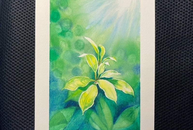
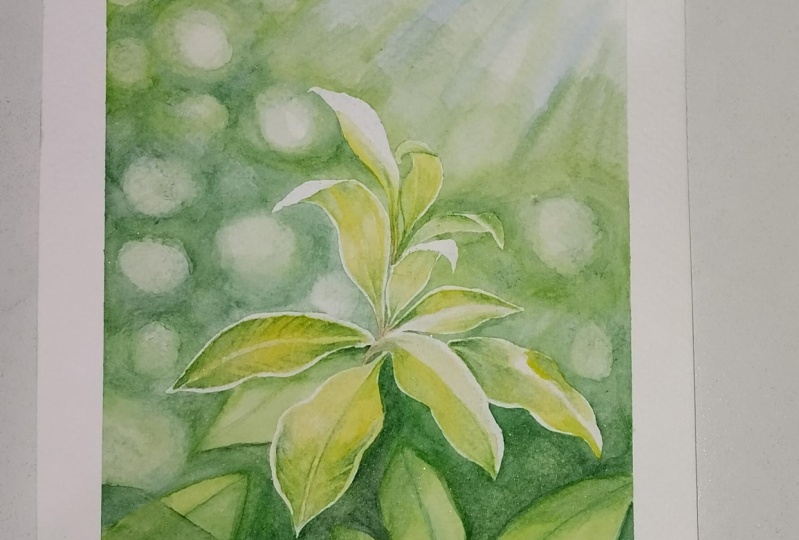
he was a shell list. The right Painting
is faith by myself, which emphasize the Lotus
lad keeps is faith and the grow towards the light
for button under Lighting. Here are two
examples by article. He use button Lightin from the stage to lead a
viewers to the singer. And the tensors. Back Lighting occurs when the light source is coming
from behind your subject, which you can create a nice rain light
around your subject, brightening up the
edges of your subject and pop your subject up
out of the background. The contrast and dynamic
range are very high. Just like the left painting, lady with a parasol by Monet. On the other hand, I can also create a
softer M severe by using sunset light
behind trees and leaves. Just like the painting
on the right-hand side, the new beginning by myself. In this class, we
are going to create three projects by applying three major directions of Light, including top Lighting, side
Lighting, and back Lighting. When we finish,
you can press them side-by-side to see the different m's of
fears among them. If you are ready. Let's get our our surprise.
7. Art Supplies: In this class, I'm
going to use arches, Cold Press, hundred and
40 pounds, 100% Cotton. And size is nine by 12 ". I divide the night by 12
" paper into two pieces. The extra space here
is for colored chars. This way is easier
for you to see which colors that I
use for each project. Here are the colors law. We're going to use
a full this class. First is yellow, lemon yellow, which is right here. And then a second one
is a one-to-one, 123. But sometimes I will miss
one-to-one, the 123 here. So that's how I've put the
chart like a color here. So the, you know, in the
after 123 is once 39, ended unless one is 143,
which is right here. As a, like a here, also mix 139 plus 143. So also put a color here in the fallen SY is
the 100 right here. And also here is a one-to-five, so same as earlier. I'm going to miss
these two colors. I have color here in the
FMR1 is a one-to-five. And 91, which is
really dark brown. So sometimes also
mix them together. Right here In the last is
the BU that you will see. I add here layer. So usually I will miss all
the colors altogether. So here's my color
palette. You will see. So once I have all
the colors ready, before I paint, I usually
have all my colors here. So you will be easier in the first term when
you start painting. So that's the colors that we're going to use for this class. First, I use molar
to when the paper. So you will see me every time
before I start painting. I will use less Brush
to wet my paper. Another thing is, you'll see me use a Quill says is
six quite often, not just well of paper, but also smooth edges and
sometimes small area. I can add the water
on my paper by using Quill says six. That's one. And the second set is all
about lifting colors. So when we do the summary or
maybe do some highlights, you will see me how to use them. So by the time we go
to different projects, you will see me use
different nodes, either flat or the angular
brushes to the colors. For the next group is
full of Background. So I'm going to create sound watercolor bouquet effect by using those for Brushes. And you may see each Brush
has different colors. That's the way I paint. I usually to have all the colors 3D in one, in each Brush. So for example, list, while I use a for light green, this one for brew lives through and listen
for darker green, and this one follow
139 plus 143. So I like to have
each brushes ready. So once I use neither color, I can just grab a brush
quick so you don't have to remix or maybe the column I look different
for the next step. That's why I have all a
Brushes for the big one. And then for the next
group is a fall, a beef. All the details. So same here. I have quite a few Brushes here. So same here you can
see each color, each, each Brush has different colors
from light green, middle, like a miss 121 plus
123 leaves when the One-two-three in list one is
kinda just for the lemon, lemon yellow and less. Why is a void? Yellow as well? But it's the fall
of smaller area. And therefore the
earth tone, Lego 100. And Lisa, smallest one for
always kind of mega BPS, one by the small area. You can listen to,
add more details. So I will make a list on the screen of each
size of brushes. But if we, you don't have
so many Brushes, no worry, just use it or why you have and how you can make
it work better. So that's all the brushes we're going to use in this class. For this class, we
will need some items. Is SAP, Paper, Brushes, ceramic Palette for Colors, also different kinds
of Paints right here. We also need a pencil. I usually use a 2H to sketch. Regular Eraser, a jar
or bottle for water. Smolder, ceramic Palette. For masking fluid. You can use different kinds
of brands. So it's up to you. Also the liquid Soap, also for masking for
the Residue Eraser. We use it to remove
masking fluid. And last one is all
towel or rag or paper towel or up to you see
how you feel comfortable. So let's all are surprised
that we need for this class
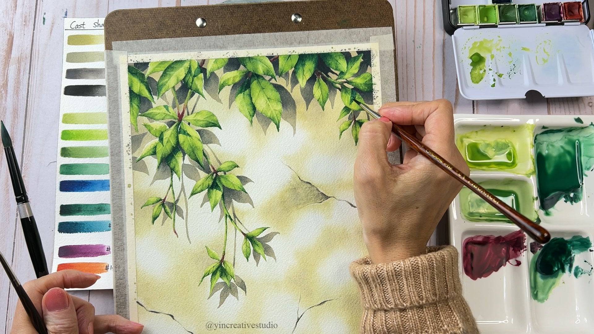
8. Top Lighting 1- Modifying the references: In less project, we
are going to ping a group of Leaves
with Top Lighting. Here. Is that a
picture that I took? However, I don't want
to pan them directly. Let me show you usually how
I modify the reference. I bring the image to Photoshop. Then I use Leso to select that group of
Leaves, Light I want. Copy, move to another
group, adjust the position. Then. A chess, the size. You can resize it,
make you smaller. Now, it looks good. So I'm going to crop it. That's it. A new reference lab I'm going to use
for this project?
9. Top Lighting 2- Sketching and Applying masking fluid: Let's sketch. You can sketch along with me or you can pause it
here in the printing all the file lap I post
under Resources section. You can trace them,
That's no problem. But if you want, you can grab your pencil
and sketch with me. First. Let's simply mark
each Leaves position. Though we're here, sketch
more details together. Let's add the two more
leaves in the back. Now I think the sketch is done. Let's move to next
step, Masking fruit. Follow this step.
We will need water, liquid Soap masking through small Palette and the two
sizes of synthetic brushes. First, way your brush, the into the Soap, then the price,
food to your paper. Once you down, let's get ready to paint the background
in the next lesson.
10. Top Lighting 3- Painting the sunrays: Let's pen the sunrays. First. Less, well, a paper. You can apply water
to your paper, two or three layers, just made sure the
paper is wet enough. Let's use a blue number 90 and the green number 121 to
create a some rate effect. For less if fat, you have to move fast. So use another brush, which is aqueous six, to bring at trial water
to carry the blue and green together to
create a some rate effect. After green and blue
brand together, well, washing your
Quill size is six. To bring more water bagging, less time is lifting colors
to create a summary. Now the sunrays, Los good, Let's move to next lesson to create watercolor
bokeh effect. Baker
11. Top Lighting 4- Painting bokeh effect background: Now let's sun rain looks good. Let's continue to do
all other background. If you find are low, paper is dry out. You can add more
water on the paper. For the background, I like to create watercolor bokeh effect. I'll use a green 120
where as the first color, move your brush in circular
way to create that effect. Certain area, I would like to add more blue to balance out. The background is a
little bit abstract, is based on my knowledge and understanding
about lighting. So it just, I created a watercolor bokeh effect
to create depth of space. You don't have to tolerate, follow my or you
don't have to worry about it doesn't
match the reference. Let's continue use
green one-to-one to create a first
layer of bokeh effect. Then use green number 123
to add some dark areas. Now use number 121 again
to mix both colors. Bader. I usually have a
one Brush for one color. So when you need any color, you can just grab a
brush and the user, you don't have to wash and
the remix or MSR, the colors. Now let's add a little
bit darker, green, which is number 139, process number 123, to
emphasize certain areas. Again, I use it a
Brush you with color one-to-one to miss Los color, kind of brendan
patriot together. If you see some areas
nap smooth enough, you can always use
a Quill size six, brush with clean water to mix the edge to make
them more smooth. Also, when you have a too
much colors on the Brush, you can wash clean the color. Otherwise, you might carry the darker green to
the lighter areas, which is now while we want. When we start a new area, I always add more
water to the paper. And they also made sure when the water touch the
previous pigment, tried to do it gently so
you don't want to lay low water mark or
lifting any colors. Follow up bottom
part of background. I mainly will use a
one-two-three 139 and even add some darker brew 143 to
make Lahore area darker. However, I use color 121 to emphasize is some highlight
alpha leaf in the back. Now we use greenways
brew wine 43 to really push back
the background to have a second or third layer. Again, let's use coil sides. Six boys clean water to
smooth out the edge. Sometimes you can use
the color left on the brush to do some
subtle details. Now the background
is almost done. Let's move to the
next method to add the some details on the
leaves in the bottom
12. Top Lightin 5- Adding some details to the leaves in the bottom: Now let's go back to
Brush always color one-to-one to emphasize the highlights in
look-back group. Use color 123 to add a cast
shadows on the button Leaves. Use a color once 39
and the one-fortieth three to create the negative
space. In the bottom. Adding cast a shadow. Bottom leaf can really create
the illusion of space. So I cannot use 139 to add a more cast shadows,
uncertain Leaves. Although the button Leaves
are non-human subjects, we still can add some
subtle details on it. For example, the
texture and Shadows. Let's add some shadows and the Megabit contrast
in this area. First, let's use a 123 to
create a base of shadow. They use a little bit, 139 to add a darker on the edge. Finally, use 143 with 139 to really add a dark is
par. For the background. This area looks flat, so I'm going to add the cast shadow on it to
make them more interested. We use color 123 as the
base of cast a shadow. Then we use 13092 mega some
cast shadow to be darker. This area can be darker, so let's add a darker
cast a shadow on it. Now the background looks good, but I do see some
area I want to fix. First, use the brush you
with clean water, gently. Apply on top of that area. Now would pick a color which is a darker one to apply
in the wet area. Use a Quill size six brush with clean water to smooth the edge. If you would like to read
more about less tips, you can go to my first-class, a Complete Guide to Watercolor Bokeh Effect
in less than 12. Now I'm going to use
Fred brushes size ten, and the anchor of Brush Size quarter to
create more sunrays effect. Wake your brush and
the leaf colors in one area until
you are satisfied. Before mu2 next session, make sure your brush doesn't
carry too much color, but either wash it or squeezes
the air trial water out. Useless angular brush to create
high contrast highlights. Now we just finished
in the background. Let's pin the men leaf
in the next lesson.
13. Top Lighting 6- Painting the Main Leaves: Let's remove masking
fruit before Painting. Use a dry brush to clean the paper and make sure you
get rid own a masking fluid. Let's pan the first leaf. When the paper inside the
leaf don't touch the edge. Then use lemon yellow
to create a base. Laying. Use one-to-one with some yellow to
create a darker par. Less keen mind. The lighting is from the top, sola highlight. It's really strong. Let's use a one-to-one with a little bit one-two-three
to add a lot darkest part. Now let's repeat the same
steps for the second leaf. Let's use a color
while hundred to create a combination
between leaf and this. Then. Now let's leave some colors to create a
mirror IP and the highlight. There's a continue
painting more Leaves. Now use a color
one-to-one process, one-two-three to add
a look darker part. That's repeated. Same steps. Water first, use a
yellow to create base. Sometimes you can add
a color one country to make a connection
while the papers to them. Having old Colors ready
is really helpful. Now let's turn to lift
color to create a rape. This time, I don't
use yellow to create base by use one-to-one
to do the base. Now use color 123 to emphasize is a button
that dark is part. Always a kidney mile. We're on the highlights. This time I'm going to
add a light blue as the highlight area that
refreshing the sky. Use the one-to-one
plus 123 to create a texture like a midrib
and the vein of Leaves. Man use flat brush to lift colors to create
the highlight. Now use the One-two-three
to add the darker part Now let's use a color 100 to
add the darker part under the the symptoms are using lifting technique can
make a highlight more nature. Now use a one-to-one project
123 to create a shadow using color. Once 39 plus 14032 really added a dark
is PPAR alpha cast shadow. Now use a color
one-to-one process, one-two-three to create a mirror IP and the sun bend texture. Use a color once, 309143 to really emphasize
the dark is part of the leaf. Now let's pan the last leaf. The last leaf has stronger
cast shadow on here. That is a from the leaves above. Creating cast shadow
is another way. Light you can show the viewer where is the direction of Light. Use a color one-to-one process, one-two-three to query
the meat rape and went. And then you can use darker color like a
wants 39 plus 14032, emphasizing the darkest part. Now let's add some cast shadow. Now let's do the final review. Some background I feel
is not dark enough. That's why I'm going to
add the more darker green, like a 139 plus 14032. Really appreciate the background back and the pop all
the Main Leaves. You can review yours if with a contrast between from leaf
and the background is good, you don't have to do it. So this is optional. Now I think the
painting looks good. Let's say your name. We just finish the
Painting with Top Lighting
14. Back Lighting 1- Sketching and Applying masking fluid: In this project, we're going to paint leaves with Back Lighting. Here are some reference
from my own pictures. One with the summary. Another one will allow, you can choose either
way as your reference. Let's sketch. Based on the reference, you can divide your
paper into half and the pull-up Branches
around one search area, make him more like
a 45-degree angle. You can sketch along with me or you can download of sketch light appose under Resources
sachet prior to this lesson. Now we just finished his
Sketching the main subject. Let's add some back Branches. Try to avoid parallel line lines so we can make a list
painting more interesting. Also, we can add some holes on the leaves to make
him more realistic. Before applying masking fluid, I want to leave some of my pencil marks by tapping
my eraser on certain areas, especially the edges of Leaves, I intentionally
make my sketch it darker so you can see
beta from the screen. The reason I'm doing
this is a to avoid unwanted pencil marks
in our highlight areas. However, when you
remove masking through, the pencil mark could be
slightly lift as well. That's why in this
step is optional. Using a clean dry brush
to swipe your paper instead of a your fingers to avoid the grease
from your fingers. Now is all ready. Let's move to masking fluid. Here we will need water. Masking fluid. Amy hands, Soap, small ceramic Palette in two sizes
of synthetic brushes. Now let's get some hints. Soap in your pelvic
will be masking fluid. And now that's the
way Your Brushes dig your brush into hints
Soap through early NS, That's dip into masking fluid. So from here we can start cover the main leaf,
the bigger area, and a small area like
more pointy area, we will use a smaller brush
to cover. Let's do it. You finish the brush, remember to wash it right
away to avoid clocking. Now let's see, use
a smaller brushes size one to fill
in the tiny areas. Once you down, let's get ready to paint a background
in the next lesson.
15. Back Lighting 2- Painting Bokeh Effect Background: Follow Background, I'm going
to have a 1234566 Colors. Ready? The first one
is just light blue, which is the number 90. We're going to add a sum in the sky, making more different. And we have a one-to-one
which is a yellowish green. And second one is 123 for why leaf can the
more olive green. And the fourth one is an added some vine
leaf, one-two-three, Adding some 179 kelp to
make him more greenish, but also add a some earth
tone kinda more brownish to make a tonal more close to the
silica, the One-two-three. And then we'll adult
is why I use 143, add a little B1 Thursday night to make a kind
of bluish green. And finally we have a some
kind of branches in the back. So that's why I use a little be 91 pair at the sum United, which is 105 at the
Branches color. Let's, let's start with
adding water on your paper, two or three layers. Then we can start
with color 121. Sunlight brew. Use a Quill size six to mix them together and
create a soft edges. Remember to move your
brush in a circular way. This way you can really
miss color better together and the creator
Buchanan effect. In this lesson, I'm going to focus on the leaf, the lighting. So for the bokeh effect, I'm going just quickly
go through with you. If you want to dip into
and know all the tips, you can go back to
my first-class, a Complete Guide to
Watercolor Bokeh Effect. For more details. Let's continue another session. Are usually well a paper when
I ready to paint a session. So you have more control
about the water in this area. I'm going to start with
light yellow, lemon yellow, and the other
sunlight brew since the last light shining
through that whole area. So I'm going to
make them lighter. Lemma going to use a color 121 to make a
certain area darker. Then add a color one-two-three
to create a darker area. Then you can either use a
Quill size is six with water, or use in a previous
brush with color one-to-one to mix
the edge better. The best time to
add the Branches in the back is when the
paper's still damp. So we're going to use color
100 process a little bit one Oh fie to create
the back branch. Also use Quill size
sick with water to make the edges
smooth insertion area, you can make them fade away. The central area you can
always go back into, make it darker when the
papers do kind of thing. Now there's another branch
in the back Stem area. Alpha branch can make it
darker by using column 105, adult lives will be 91. Now let's add a the darkest par with the color once
39 and the 143 Sarah area, like I said earlier, if not dark enough, you can always go back in, add a more colors. But before you do that, measure a paper is still them. If not, use it. A Quill size is six
with clean water, just gently apply
water on the top. Now let's continue
painting the left side of the background by following
the same step a prior water, use light green and add the darker green, four
different layers. Adding the BEQ branch
when the papers do them certain area, I'm going to add the lemon
yellow to reflect sunlight. Let's continue painting the
last part of background. In this area. I'm going to add the
sun by brew as well. Sam here is the best time to add the back branch when
the paper's still wet. Now use once 309143 to add the darkest area
in the background. Now we've just been painful
can't effect background. Go to math methods to paint
the leaf in the Middle Ground
16. Back Lighting 3- Painting leaves in the Middle Ground: Let's add some back leaf down. The pattern is optional. You can add or not. It just for me, I feel
Potter is kind of empathy. I would like to add a middle
ground for this painting. Let's begin with the leaf
in the right bottom corner. This time you don't
have to worry about the edge because it's
the Middle Ground. So we're not going to
emphasize too much about the highlight of that
leaf in the back. Some of that I might use the lifting technique
to create a highlight. Now let's pan the Secondly. Use the lifting technique
to query the highlight. Now we're just finishing
the second leaf. Let's continue for certain one. Using lifting
technique to create a highlight and Adam more
details on the back Leaves. For the last leaf, I'm going to do very
subtle details. Even like a highlight. I'm going to do just
really soft wake. Just finish the vagrant up back Lighting less than
Mu2, less lesson
17. Back Lighting 4- Painting the 1st group of Leaves: Before removing masking fluid, Let's check the background
is completely dry. Now it's time to remove masking fluid by using Residue Eraser. Laying, use a dry brush to clean your paper
before painting. Now let's get our Colors ready. He said one-to-one, 123, I'm going to miss 121 plus 123 to make Sir
color for the leaf. Let's apply water
inside the leaf first. They use a yellow lemon
to create a base. Then use one-to-one to create
a dimension of the leaf. Tried to lin the edge of
the leaf to be Brink, which is white because Laszlo
highlight areas of a leaf. Now use in a color 21 plus
123 to define a leaf, such as the midrib and the vein lane, use color 123 to create
a cast shadow area. Now let's repeat a sense
steps for different Leaves. Now let's use in
lifting technique to create highlights including
ME rape and the by. Now use color 121 plus
123 to add more details. When the paper is damp enough, you can always use a
Quill sizes six with water to smooth out the edges. Just keep this in my landlord
Lighting is a farmer back. So we have to refer to
where light is coming from. You can also have a
reference Rennes to you. So you can remind yourself which area or which
part is lighter. Now we use in lifting technique
to create more details. The lighting is from the bag, so full and leave behind. They were reframe their cast a shadow on a leaf
right in front. So some of them might
look like a transparent. I'm going to add the
same cast shadow for the overlapping area. In order to mega leaves
look more realistic, we can create a hole
naturally on the Leaves. In order to make the
leaf and more realistic, we can add a more cast
a shadow on the leaf. Now we use the color 123 to really make a big
contrast on the leaf. Now let's use the color
once 39 plus 14032 Cree, overlapping par, which is
cast shadow on the leaf. Let's continue
painting our leaves. After painting the field leaves, as long as you familiar
with the steps, it will be so easy
for you to paint a leaf for the
following project. Plus, if you have all the
colors are ready, just like me, it will be so easy to start
with a yellow one-to-one, One-to-one t1 plus
123, and then 123. So just take the older and have all the colors
right next to you. It just like a routine, you will be faster. They drown. Creating highlight by
using lifting technique. Now we just finished painting
the first group of Leaves. Let's move to next
lesson to pin the rest
18. Back Lighting 5- Painting the 2nd Group of Leaves: Let's continue painting the
second Group of Leaves. Some edges of Leaves, My be disappeared due to the strong sunlight
from the back. Towards the end, I'm going
to show you how to create sun ray light can really emphasize in the
sunlight from the back. Now, I'm going to use color
100 to add a little bit on edge of the 0. So I'm going to use
it a same color to add on the edge of
law WHO Alma leaves. Now let's continue. Use one-two-three to
create a big contrast, which is a cast shadow on leaf. Now let's use a one
Saturday night plus 143 to add the darkest part. Nang use lifting
technique to create a mirror IP and the vein
to add more details. Lastly, repeat the same
steps for the next leaf. Sin here, I'm going
to use a color 100 to add on the edge of leak. Now let's use a one-two-three
to add the cast shadow. Once you add a dark is par, which is the 139 plus 143, you really create a
three-dimensional look. Less leaf laying. Use a color 100 to
handle the edge Alpha. Who that really make
the leaf look real. Now let's pan the last
leaf of less Painting. Use color one, green to
add an edge of the leaf. This leaf has big contrast. One side is darker, analysis side is brighter. So Adam is kinda leave
in your painting can make less painting
look more interesting. Don't forget to add
other overlapping part. That's the way to show
light is a front, the back. So the cast shadow
on another leaf. Now use a little
thing technique to create the highlight
of the mirror it. The last thing we can add
to the leaves is the ACH, some edges not so bright, so we can bring sunlight
green to tone it down. Now we just finished painting
a second Group of Leaves. Let's go to next lesson
to paint the Branches
19. Back Lighting 6- Painting the Branches: I think now we finish
all the leaves. Now, let's pan the
patio and the stain. Let's add a color in the
middle of patio in the state. Because of the light
from the back, both sides of edge
gonna be shiny, bright. So you can only see the
middle part of the color. So let's do it. For this part, I use a
color one, oh, 5101. And the darkest part, I add the 91 in here. Now let's pan the stain. Here. I'm going to add some green
179 into the brownish color. And the sum of eigenvalues,
one-two-three. Also remember, only paying
the middle part of stain. Both edges should be shiny you
through from the Back Bay. The best effect of stains
texture is adding colors when the paper is wet enough to naturally branding
older colors together. Now let's use Kaltura once 39, Press 143 to add a
lot donkeys part. Now let's add some stick
outside the stent. So making more interesting. Now let's use a flat sides of
one to smooth out the edge between the brightness
par in the dark bar. So you can smooth out the
edge by lifting colors. We can either lifting colors, randomness to stick,
to make highlight. Now the Branches are done. Let's move to next lesson to create some sunrays
from the back
20. Back Lighting 7- Creating the Sunrays: Now is the exciting
part to create some rate effect. We will need. Quill says six for water, one flat brush and the
one angular Brush. First, use in a Quill
says six with water to gently brush on the area
you want on leaf Colors. Then use it angular Brush to nave color in
the stray light. Just make sure sun ray is
continue going straight. Sometimes you might have
to do it repeatedly. Do a few times until the carver lifted the also until effect
that you are happy with. Always lift from the lightest
part to the darker part. Also clean your brush almost
IQ time after lifting. Now is done. That's a sign your name
on your final painting. We just finished your painting. Back Lighting. Let's
move to the next lesson.
21. Side Lighting 1- Sketching and Applying masking fluid: In less project, we are going
to paint side Lighting. Here are two pictures I took. I cannot combine the
left top par with the right button leaf
to make my own layer. Let's sketch. You can download a file Alpha my sketch under
Resources section. It will be easier
you have a with you. So you can know
why Android also, you can trace my sketch, which is totally fine. So you can choose which
one works better for you. When I sketch a line to
mark each Leaves position. Just want to measure
overall if they look good. Once everything looks good, I will start doing the details. Now I just finished a
Main Leaves sketch. However, I would like to make a layout little bit
more interesting. That's why I add another leaf, Ryan from a stain to break the lie all the
way through the bottom. Also, I going to add a while
to leaves in the back. Before applying masking fluid, I like to leave some
pencil marks to avoid unwanted darker light
when we finished painting. After we'd done, I like
to clean my paper by using a clean dry brush
instead of my fingers. Now it's time to
apply masking fluid. So the same steps. First, where Europe Brush. Second, dip the brush
into hints Soap. Dip your brush into masking through and you can start
to cover the leaves. We can start with
the bigger brush. First. We can use a smaller brush to
cover the tiny areas. Now it's down. Let's move to this lesson
for painting the background
22. Side Lighting 2- Painting Bokeh Effect Background: Less pen the background. First. Let's well a paper, you can apply water to the
paper two or three layers. First, less use of color one-to-one to query
the lightest area. Then add the 123 to
create a darker areas. Once you've done 123, user brush with color
one-to-one to smooth the edges. Remember to move your
brush in circular way. As you can see when
the paper is still wet is really good
to create a pattern. Now let's see, use the color 123 to cover more darker
area. On the right side. You see the edge for the
pigment is almost dry out. Use an approach to add more
water to avoid a watermark. After applying more water, Let's continue use in
color One-two-three. And now let's use the
color one-to-one to create a lighter areas instead of
using mater to add more water, you can also use Quill sizes six to add the water in
the small areas. Now, let's add the
darkest part by using cover 139 plus 143. When the paper is still damp, let's use a Quill size is six to live colors in certain areas. This way you can create more
layers of the background. Also, you can use
the same brush to smooth the darker colors edges, bring all those same colors to the lighter area to
create some layers. But just remember, you can do this when the
paper is still damp. Now let's use color 143, a little bit 139 to
create a darkest area. Then we can use the color
123 to smooth out the edge. Then use Quill sizes six with clean water to smooth
the edge more. Some areas are not smooth. So I decided to use it a
Brushes with color 121 to smooth things out
and then also carry the same color to the left side to
continue the background. Same here, I'm going to use
Quill sizes six with water only to leave some colors
to create a lighter areas. After colors are dry, I notice the dark is
area not dark enough. So I'm going to add more
14032 push, really back in. Less time. Instead of
reusing water only, I'm going to add a
little bit green. Since the edges are
a little bit darker. The tip of Brush, it is always toward
darkness covered. So sun area or certain
angles I cannot reach. So sometimes I do
turn the paper. If we you see certain areas not dark enough or not
smooth enough, you can always go back in
to fix or add more layers. Let's continue the
rest of the baker. He for you see some
watermark on your paper? Don't panic. The
Beta Wheeler we can cover it is by
adding darker color. So you will not see. Let's continue use of color
123 to cover this area. As I mentioned earlier, I'm going to add a one or
two leaves in the back. So now's the time going to add another leaf by using
color one-to-one. Continue use color 123 to
make color darker background. Now, add 139 to make it even darker to
create more layers. When the color is still damp, last leaf, some colors to
create the highlights. Now let's add some dark areas to create the notion of space. Hello is the leaf in the back. We still can create
a time mentioned by lifting some colors to
create a highlight. If the area is dry, how can we add more
colors on here? Let's apply water gently
on that area first, then add the darkest
color to it. Finally, smooth edge. Now let's finish the
last part of background. First, let's use a color one-to-one to create
another leaf in the back. Then we use a color 123
to cover the whole area. You can either use in a previous lighter color
to smooth the edges or a, you can use Quill sizes
six with water only. Now use a commoner 139 plus 143 to create the darkest area. This area looks flat. That's why I'm going to add
another darker color to make a layers that we have a
Complete the background. However, I do see some
areas that I want to fix. The steps of a fixing areas. First, apply water to that area. Second, upright,
darker color to it. Smooth the edges. These steps are optional. If you happy with
your background, you don't have to do it. Here. I'm going to add
a little bit blue to make the colors
more interesting. We just finished the bankrupt. Let's pan the leaf
inland. Next lesson
23. Side Lighting 3- Painting the Main Leaves: Let's remove masking through
by using a Residue Eraser. Use a dry brush to
clean your paper. Just make sure you get rid
of all a masking fluid. Now, let's paint. First step. Use a query
size six brush with water. And when the inside of the
leaf on the hour tell you why. Nest use yellow for
the lighter areas. Since the paper's still wet, let's use 100 Earths color
to commit to the stain. They use color one-to-one to create a darker
area of Leaves. Based on the reference, you will notice the edge
of each leaf is lighter. That's why when I, when a paper, I try not to touch
edge only inside. So this way we can create
the effect of the leaf. Sometimes you can bring yellow back to brand both
colors better. Now let's miss one-to-one
and the one-two-three. Now let's create midrib of
leaf by lifting some colors. Now we just finished
the first leaf. That's the repeat SM
staff or other leaves. After finishing
each leaf alive to paint the connection
between leaf and stem. I think when the paper wet, the color can brand
together very well. When you paint a leaf, always a killer lighting
direction in mind. Because the Creating loads a
darker area and the shadow can really show the viewer where is lot duration of Light. Use one-two-three to create
a dark is part of the leaf. Let's continue to
pay more leaves. Once you get familiar
with all the steps, painting leaf is not difficult. It's pretty easy for me, is kinda like a meditation. First, well, inside of the leaf. Second, use the either yellow or call the one-to-one to
create a base of Leaves. Third, use a darker color, either 123 or one-to-one plus 123 to create the
darker area of Leaves. Force lifting color
to create a midrib. And then in this painting, keeping in mind the lighting
is from right top direction. So the darker areas
should be on the left. Using size one small brush
you to add a darker, the darkest green to push
the leaf to look back. Also adding some darker green by on the vein to make the
leaf look more realistic. Creating light and
shadows on your object, on the 2D paper can really make them look like a three
dimensional object. Surgeon, darker area. I will use very small
brush like a size one with color 123 to
really emphasize, to make him more three
that I mentioned. When you try to live colors. To summation earlier on not
too much water on your brush, because too much water, you might mix all
the colors together. So it's kinda like almost
dry but not fully dry, is the best time to leave. Pending the first base is very essential because
you are going to defy where is the lightest part and know where the
shadow will be. The reason I pick a certain Leaves is
because in the shadow, the cast shadow on the leaf. I can really make the
painting more interesting. And also you can
really show a viewer where is the duration of Light. Now, use the lifting technique to create a highlight
of a mirror IP. Now let's use a smaller brush. You always darker color, which is the 139 plus 143. To really emphasize
the darkest part. Let's paint a small
details of a leaf. The corner of Leaves
is affording back. So adding those
details and really make a your painting
more interesting. In this leaf, I'm going
to add some blue, light blue to refresh the sky. Toddler. Son an IV can
be more interesting. List leaf has not
only is self shadow, but also the cast shadow from
the staying on the right. So that's a really good
way to show the viewer when the duration
of light is front. The details of leaf. You can use it a size one. Brush ways to color one-to-one, either 21 on 123 depends
on the base color. In this leaf. I'm
also going to add the sunlight brew on
the highlight area, 15, certain area to
create a highlight. Then we add a color 123 to
add the details of Leaves. And then one Saturday night, 143 to add a, the
torque is part. Now let's pan the last leaf. I also add a blue on this
knee to emphasize that I highlighted area really
reflect the color of sky. Since the late leaf
is in the button. That's why I use
more darker greens, such as one-two-three,
once 39, and even 143. To really emphasize the cast
shadow, Frank. Other leaves. Now use it a small brushes size one to emphasize
the darkest part. Using lifting technique to create a highlight of a
mirror IP in the vein. Now we just finished
painting the Main Leaves. Let's move to the math
fashion to pin the Stem
24. Side Lighting 4- Painting the Stem: Now we have gone all the leaves. Let's move to
Painting the stain. Here. I'm going to
have a three colors. One yellow, 11, t2
plus one-two-three. Another one is one country
add a sound one, Oh fie. The lighting is from
the right side. So just make sure Cuba
highlight on the edge of rice I and the atom the darkest
part on the left edge. Once you paint on
Lighting area correctly, the viewer can really see where the direction
of Light, It's the best way to bring all
the colors together well, is adding more water where you've seen an area
to try just add more. So you will see the color 3D
nature a bringing together, which is in a beautiful part. Ola Leaves the stain or down, now only has one more thing
left. I want to show you. Remember we leave the edge
of leaves to be white. Sheila highlight area, buy
food locally and closely. Leanna, the same color
or same brightness. That's why I'm going
to make some offering darker to push him back. Now let's assign urinating
on the European. Now, we just finished painting
leaves with Side Lighting
25. Final Thoughts: Congratulations, you have
Complete this class. This class is longer
than my other classes. It's impossible to teach
painting light in our width. Just one project. I've been thinking what the best way would be to not
only give you the concept, but also apply to your painting. Last, why I decided to create three projects with a
threat directions of light, but similar subjects,
which is Leaves. Let's way, you can visualize the different m's are
fears among land. Or at the same time. When you put them side-by-side, you can see each duration
of Light crease, different effects
and the M severe. So as all depends on
what can invest or M severe you want to
express in your Art. That's where you can decide
which it erosion you want to use and what kind Effect and
M severe that you want to, the viewer to see. Press go to discussion section
to start our conversation. Share your paintings
or ask any questions. Also, you can go to
the review session to share what you have around follow this class is the layer, anything you will
allow me to cover in the next class, or any comments. Our be so happy
to hear from you. I also can be reached at in Creative Studio on both
YouTube and Facebook. As a former, HE, the account in Creative Studio
still cannot be reached. But I have a new account
which is at, in Creative Art. So you can reach me
overlayer again. Thank you so much for
joining this class. I hope I will see Olsen
in my next class. Happy painting
 YU-YIN LIN, Artist/ Teacher