Transcripts
1. Introduction: When we draw water ladies
and leaves with lights only, we create layer shapes. When we add colors, value, form, and texture to lane, we put layer three
dimensional forms on a paper. If we add a background with
appropriate perspective, the illusion of space
and the realism appears. Hello, everyone.
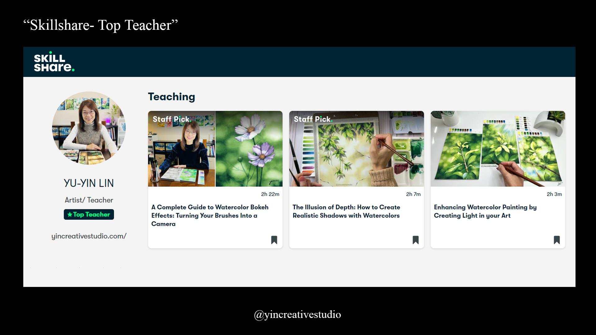
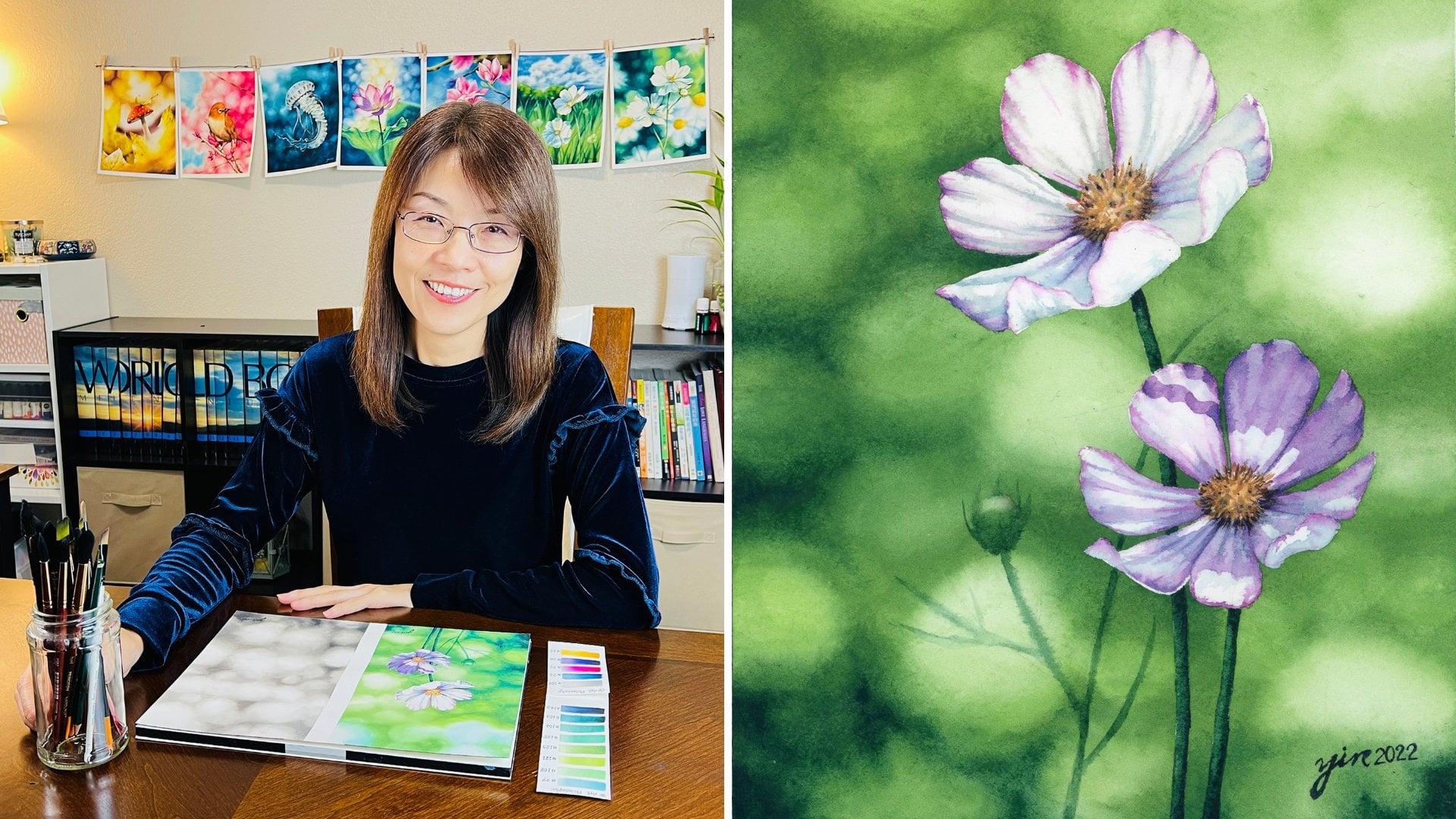
My name is in Lin, who is an artist, educator, and a designer. Some of you might have known me from other skill share classes. I'm a top teacher of Skillshare, who has published
three classes so far. My watercolor painting
have received both regional and
international awards. I have a team up with different companies to
design art classes, including Actu Studio, with the bundle lab
and R philosophy. Also, I have been releasing
my painting process, tutorial and sharing
my life experience on my YouTube channel
at Creative Studio. Another way that
you can come with me is to find me on Integrin at In Creative Art and Facebook
at In Creative Studio. My classes are not
only to teach you how to paint subjects
in a realistic style, but also provide you some
knowledge as foundation. It doesn't matter
if you are self taught or experienced artists. You will be able to learn
about theory, art history, and our knowledge that I
learn from my art schools, including a bachelor degree in fine art and a master's
degree in education. Last class is my fourth
class on skill share. After teaching how to create
boket effect byground, cast shadows, and
different light effects, I realize running
perspective in art is also an important element to enhance
your realistic artwork. That's why I've
designed class for you. In this class, you
will be able to run the complete guide
on perspective in art, including what is perspective? What is the elements
of perspective? Let's run about different
types of perspective. Why perspective in
art is so important. How do sketch with a
one point perspective? What kind of art surprise
we need for this class. How to create
evocion of space in your painting by creating
aerial perspective bro. How much water like you
need IGs question so often, I'm going to show you how to measure how much water
your brush should hold. How to paint the
frogness of clouds, how to paint realistic
water lily leaves. How to paint white water leads, including making the
correct colors for white flowers and cooperating with shadows and light in fact. Perspective really helps the
artists make a life artwork by creating the illusion of realism on a two
dimensional surface. At least class, you
can not only have the basic knowledge of
perspective in art, but also create the deeper depth to your paintings. You already. Let's get started
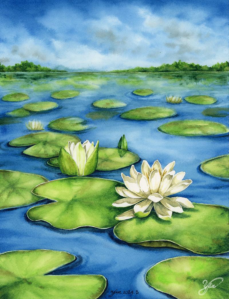
2. Class Project: In this class, you
will be creating a watercolor painting
of a water ledipo with appropriate
perspective to bring a three dimensional thing
on a two dimensional paper. I will guide you each
step of my painting and provide you the basic
knowledge of perspective, including what is perspective, the elements of perspective, different types of perspective, and why perspective
is important in art. R surprise. What kind
of R surprise that we need for this project.
How to sketch? I have a prepare grid for you. When we do sketch, we will use this que to make a one point perspective sketch. How much water you need
when we pan the bground and how to create the
frognes of clouds. How to correct the colors
for white water lilies. How to paint water lily and
leaves in a realistic style. Finally, final touch by adding a cast shadow on both
water lily and leaves. Okay. You can find class materials in the
projects and resource section, including the final artwork, color chart, the gree
that we use for sketch, my sketch, the small
cloud project practice, and the reference that
we use for this class. After this class, you
will be able to have the foundation of perspective in mind and apply it
to your paintings. By applying the appropriate
perspective to your art, you will bring realism to it. Are you ready? Let's get started
3. Perspective in Art: Here are two simplified
illustrations of water ponds. Can you tell the
difference between n, which illustration does show the illusion of space to you? The right illustration shows no depth in it due to the
same size of each leave. As for the left illustration, Aloe is a drawing on a
two dimensional paper. It represents the three
dimensional space on this drawing to the size of leaves that gradually decreased
in the distance? Why is that? It's all
about perspective. What is perspective. Perspective is a way of creating
illusion of depth space, and realistic presentation on
a two dimensional surface, such as paper and canvas. In other words, perspective
in R is the representation of three dimensional objects in space in two dimensional work. Why is perspective important in art especially realistic art. Perspective is very helpful for representation objects and space on a two dimensional
medium like a paper. It's such an important
element when it comes to realistic art style. Here is the brief
history of perspective. I can help you understand how perspective
influence our art. In the early 1400s,
Filippo Boneski, the Italian architect,
demonstrated perspective principles in
his building drawings. That has been considered as the first person who
invented linear perspective. Leki found out that
pero lines appear to converge at a single
point in the distance. Objects appear smaller as they
recede into the distance. He did an experiment
by using mirrors to sketch Florence Bapterry
to perspective perfection. In 14 35 Renaissance artist, Leon Batista Elbert published this theory in his
book on painting that Brunski's one
vanish point system is still being used nowadays. Let me show you some examples
so you can understand more how perspective has
inference art from time to time. First example. Egyptian
painting 4,500 years ago. The Egyptian art was
unique because they drew everything with two
dimensional perspective. Everything including
humans, cats, and pottery, what all painted
sideways without depth. Asian artists try to convey complete information on the
scene in a single view point. The second example I'm going to show you is called virgin and the child surrounded by Orators
the end of 11th century. In this painting, you
can easily sparse some misrepresentations
of perspective, especially the chair
in the middle. It's not until the 1420s, the artists fully adopt the concept of
perspective to layer art. The example I'm going to
show you is triplet of Madonna and the child
with je in 14 83. It's the time where
more and more artists started applying
perspective in layer. You can obviously notice the
perspective of the chair, the tiles on the floor, and even the by ground
outside of the building. The last example I'm going
to show you is called Paris three running day by
Gota Kaibag in 18 77. In this painting, you
can clearly see Kaba applied a two point perspective to paint the buildings
in the background. Plus, due two is a
symmetrical composition. L painting is considered
Kaba masterpiece. Having perspective in mind when you compose your paintings, it will help you
create realistic art. Now, let me show you the
simple illustration, explain perspective
in our word and also ran about the
elements of perspective. Perspective has five
important elements. The first element is
the horizon line. The horizon line
usually refers to the boundary between the
sky and the lane water, which you can refer to
the viewer's label. If you make the
horizon line higher, the viewers can focus on the image below
the horizon line. Just like this painting where I set the horizon
line way up there, so viewers can see
the birth first. On the other hand, if you place the
horizon line lower, the vers seem to
pay attention more on subjects above
the horizon line. Here's an example
of my painting. I intentionally guide
the veers to follow the leaves from the
air to the grow. The second element
is the vanish point. When you walk along this path, you know that both
sides are parallel. However, when you
look at this picture, all parallel lines appear to
converge at the same end. That is called the vanish point. The third element
is ground plan. Ground Plane refers to the
space below the horizon line. Where we are going to
paint water lady pop. The fourth element
is orthogonal lines. Orthogonal lines usually refer to the imaginary
lines the artists use to accurately create illusion of realistic
space in their artwork. Orthologon lines are usually invisible in the final artwork. In this class, I'm going
to show you how we are going to use orthologal
lines to sketch. The last element is
converging lines. Convergent lines refer to lines appearing to me at
the vanish points. They are very helpful
when it comes to drawing roles and buildings. After learning the basic
elements of perspective. Let's learn about different
types of perspective. One is linear perspective, and the other is
aerial perspective, near perspective represents
space by showing the scale of an object diminishes as the distance
from the viewer increase. In other words,
objects are farther away from the viewer
appear smoother, the lows that are nearby. There are three different types of linear perspective based on how many vanish points
adopting one artwork, including 1.2 point and
three point perspectives. Area perspective usually
refers to how artists express colors and the collty of objects due to how light
affects in real life. In my second class, the illusion of depth, how to create realistic
shadows with watercolor. I have already introduced aerial perspective in my lesson. If you want to learn more about this concept and how
I with my painting, you can head to my second
skill share class. In this class, I'm
going to apply both area perspective
and linear perspective, especially one point perspective to create water
lily pu painting. I will guide you
step by step from how to sketch to how to paint a realistic water
lily p After learning the importance of applying
perspective to realistic art. Let's get our art surprise
ready and see how we can apply perspective to our
composition for today's project.
4. Art Supplies: Now, let's talk about our surprise that everything
we need for this class. First of all, let's
start with pencil. I use two edge pencil to sketch, and also just regular eraser. You can use it for sketch. For the paper, I
choose the arches. Last time we choose A by ten for this project is
co press 300 GSM, which is 140 pounds 100% cotton. We're going to use this
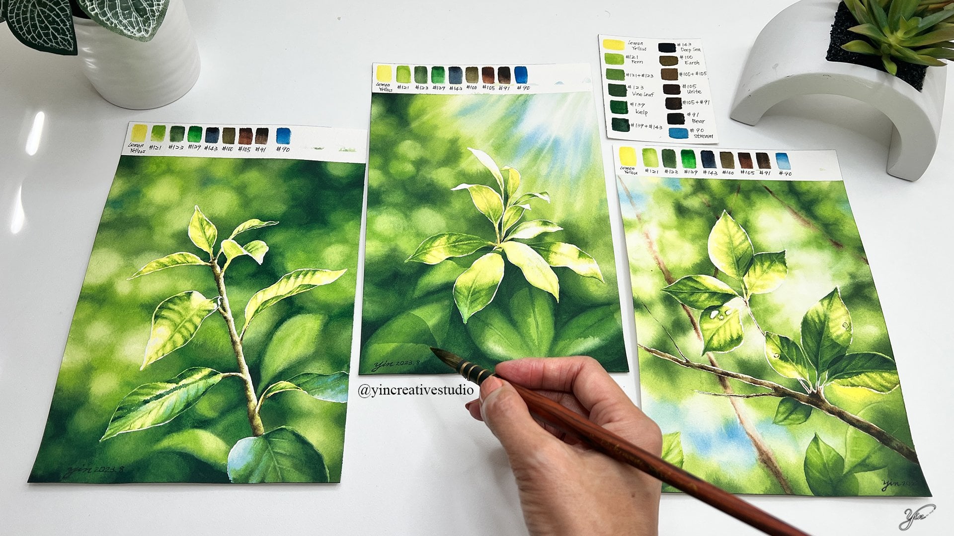
paper for today's project. Then we talk about colors. Here, I have a three
brands to choose from. I use R philosophy, I use Daniel me and
Weezer and the Newton. You can find this color chart
under resource section. If you don't have exact
brand with me, it's fine. As long as you have
a similar colors, you can apply to this
project. Let's see here. For the R philosophy, which is the product I have
been using for so many years. I still like they have so many different colors
you can choose from. For here, I use 90 stream, which is for the lighter sky. Then I use 1404 for the
darker area of sky and water. Then we have one, two, Then we have a 102, which co pond light gray. Then we have a 93, which is gray stone. I think other brands
also have the same name. Again, if not the
same brand name names might be different,
which is totally fine. As long as you
have two shades of gray gray for the yellow, the lightest one I
use 101, which is. And then we have a
Erst name Earth, like a brown greenish color. Then we have just brown, which is Brune Uber
from Daniel Smith. For the lighter green, I use of philosophy 1202, which they called Spanish moss. As for different
shades of green, I also use the dano smes. This one is really bright, so I don't use it a lot. You'll see how I
apply to the leaves. Then I have a sap green. This one I really like
I like the colors. Then the darkest one,
I use the domes. Just like a darker green. That's all the colors we going
to use for this project. After picking up
colors that I need, I like to place in the
same ceramic palette. Then I will make swatches on the paper with later brains
and names next to them. This way I can always
stop and come back to my painting later without losing track of
color information. By the way, while painting, I realized that I need darker blue and added
indigal from our philosophy, which I did not include
in the very beginning. Now let's move to
other supplies. First of all, just basic. We have a palate, which I like ceramic one, very easy to clean and
sturdy and I really like it. Sometimes I have one, two
or even three next to me depends on how many
colors I'm going to mix, and then the basic rock, maybe just paper towel, so it depends on how
you feel like it. Then we have a very
important set here, which is mescin flu, residual eraser, which I
used to remove mascin flu. Liquid soap, any
brand you don't have to use this brain as
long as the liquid soap, you can use it for mescin flu. And then I pull these
two brushes out because when I apply
mascin flu to the paper, I don't use very good brushes. I just feel like just in case. Of course, if you clean wash your brushes after
using mascin flu, it should be fine plus using the tip I'm going to
show you should be fine. But just in case I just
use synthetic very You know, reasonable price
brushes just in case. But I choose a small one, so you can always
go to the details. Plus today's project is smaller, so we can use a smaller
brush to go to the detail, which the size here is zero, another one here cannot
even see the size, but I believe it's size two. For this, medium is
called synthetic Oscar, which you can have it, you can use it or not. It's just like
extra thing for you to stain drying time
of your water color. I usually use it
for the b ground. For the small
details, maybe not. But for the by ground for sure, I will use a field
drop in the water. Okay. And finally, just brushes. I have a lot of brushes
for this project. I'm going to talk
about one by one. Here is the modular. That's the big one I use to
apply water to the paper. Every time when I do
the big area painting, I always use model
to apply water, wh it can really
hold a lot of water. It's really helpful.
For the b ground, I use quill size six. You will see me use
this brush a lot. Maybe the b ground, the middle ground or
even a small details. Main subject, I
always use it a lot. You will see how I applied it. And for the b ground, I
also use the oval shape, which is 1.5 size. You also have a wrong brush, which is size ten. In the smaller area, I use here. Another one. I use
wrong brush says 1086, just for the small area. You will see me
use those brushes mainly for the bay
ground, for the sky, for the water, or even
like a bigger area, be leaves in the front ground. You will see me how to use it. Okay. Then when we go
to the smaller details, like a smaller leaves or
the main water leaves. I use very small
wrong size eight. I have a different set One
set for the background, another set for main subject. This way, I don't
mess up colors. Also, you don't have to wash your brush in the
middle of painting. I think it is very good for
me to have the mindset. This set for background, and we have different
brushes. For the lead. Then when we go
to those details, like a smaller pedal, smaller corner, you can see
me use a smaller and smaller. I would say those brushes
I use main water lead. That would be wrong size eight. This one is a qui size, I believe is two, and this one is
wrong size eight. Okay. Wrong size six, wrong size four and
wrong size two. If you don't have so many
different brushes, that's okay. Just use what you have
as long as you have really wrong pointed brushes for the details,
that'll be great. Another brushes I'm going to mention here is the flat one. Here I have a two flat brush. This one is I've been
using it for so long, cannot really figure
out the size, but it's smaller brush, and this one is even
smaller less flat size two. When I use the flat size, I either using for
lifting color, like a create a highlight, or when I go to
the small detail, like a corner of pedal leave, or maybe a small area
on the lifting colors, that's two brushes I go to. It's three sets. Min set for bay ground, the middle set, for the details, and the list two flat
brushes for lifting color and create
a small details. Finally, I forgot to mention. We need a jar. Any kind of jar or
buckle you have at home, we can use it for water. I that's all our surprise that we need for this project. Okay.
5. Sketch Part- 1: Now, let's sketch. Here, we will need the
co press A by ten paper. Okay. Also, we will
need a two edge pencil, which I usually use two
edge to sketch and eraser. Any kind of eraser
you have, be great. Before we sketch, I'm
going to give you a tip. Some of you might feel overwhem
when you start to sketch. You don't know where to
put your main subject, and you don't want to change your main subject
location after all. Here I prepare the guideline. Which I use simply just
use a protecting sheet, whatever you can find at home. I can divide the paper
into four section, one, two, three, four. Sorry about the
refreshing on the paper. We have one, two, three, four. The mandy I will put my
horizontal line here. You will divide the paper to be a sky area in the
water lead palm area. Once you have a section set up, I usually put my main
painting subject between two, two, and three around this area. Maybe a little bit two or four. The main subject is not right on your face when you
look at the painting. You still have some
space to breathe in. Let me show you some of my
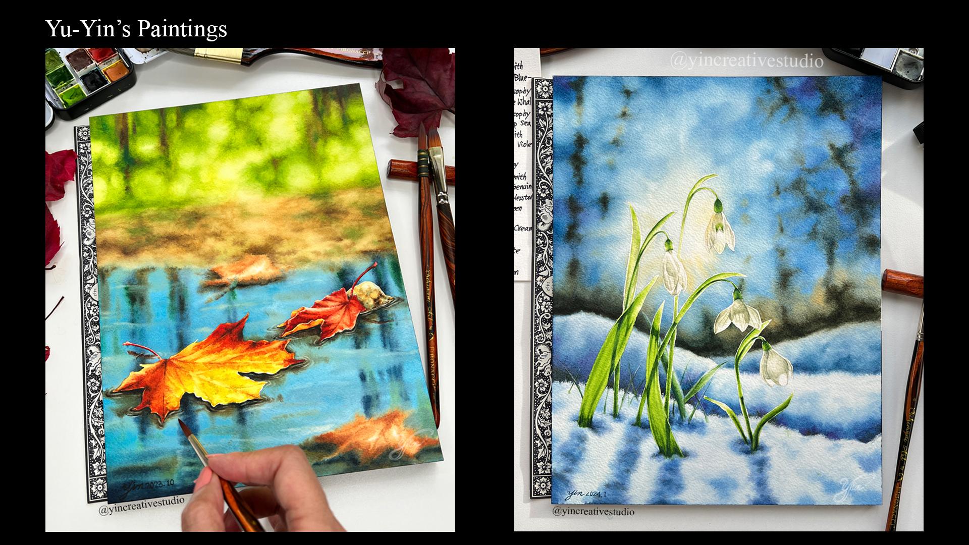
outer painting as example. First one, let me
show you painting. If I put my guideline
on it, Okay. You will see the
main leaf is 3-4. You will see this way. I still have a top area as
bground like the woods, so we can really push your
background to be further. For the viewer see
this painting, you will see the space for
them to breathe and they can keep going in to the end.
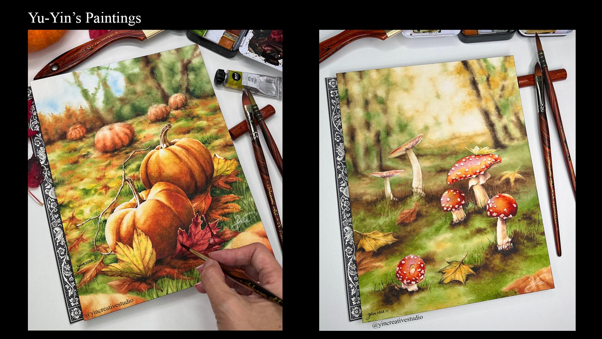
That's the first one. Then the second one, let me show you my
mushroom painting. Same here, I use the bground to create the perspective in art. Same thing once I put my
guideline on it, you will see. My main mushroom is
in the number two, three sections, I add one
here in the very last one. Same here for people
look at this painting, you mainly focus on
this group of mushroom. But you have a space
for them to go around, they will go all the
way in towards the end. That's a good
composition. One more. Okay. This pumpkin. Same thing you're putting on. You will see the main pumpkin
also in the section two, three, four in this area. That's just a simple tip for
you when you do your layout. I think that's the
way you can really cooperate perspective
in your painting. Not create the main subject, but also cooperate with the environment into
your composition. For today's water project, I'm going to show you
how to use guideline. To sketch and how to apply
perspective in this painting. Let's move to the next lesson. Let's go. Okay.
6. Sketch Part- 2: Okay, we'll put our guideline
on and I'm going to draw the horizontal line here for the sky and the back
water leading part. So I to mark a line here, we're going to do
the horizontal line. For this part, if you feel okay, you can just Another
way you can do it. If you really want to
do really precise, you can use the looter. You don't have to be exactly the same as long as when you see
visually is horizontal line. That's a live create
here is going to be the sky and some mountain
shut will be here, and here is all
about water lead p. Later on, we can also
use the sky line to see where we're going to put the main water lead. Okay. So I'm going to
put it right here, another one around here. Okay. When you sketch water lily, in the beginning, you
can draw a square. If we look at the reference from outside of the water ley, you can create a
rectangle shape. And then another water lily, I'm going to put it right here. Since one is not fully broom, so I'm going to do a half broom one to make a two
water lily different. L one can be a little bit
square shape right here. And then later you can add
some water leady leaves. Just remember, don't fill in the whole pound with
water leady leaves. You want to see some
sky refreshing, so you can get some space, so the viewer can go all
the way to the back. You can make a mark yourself, here is the two main water ley. Maybe one leave right here. Maybe one leaf here. Then you can make
some space here, make another one here
right in the front, or maybe you can do
another one here. We can just roughly to mention where the water
lily leave going to go. Since the water lily
are going to be white. The bground is better have a darker color to
make a contrast. I'm going to make a leaf here. So we can see the
water going here, here, and then here we
can become the bgro Okay. So now we can roughly mark where the main water lilies will be and the sun water lily
leave and the sky. So that's our first rough draft. Now we're going to
go in the details. Okay.
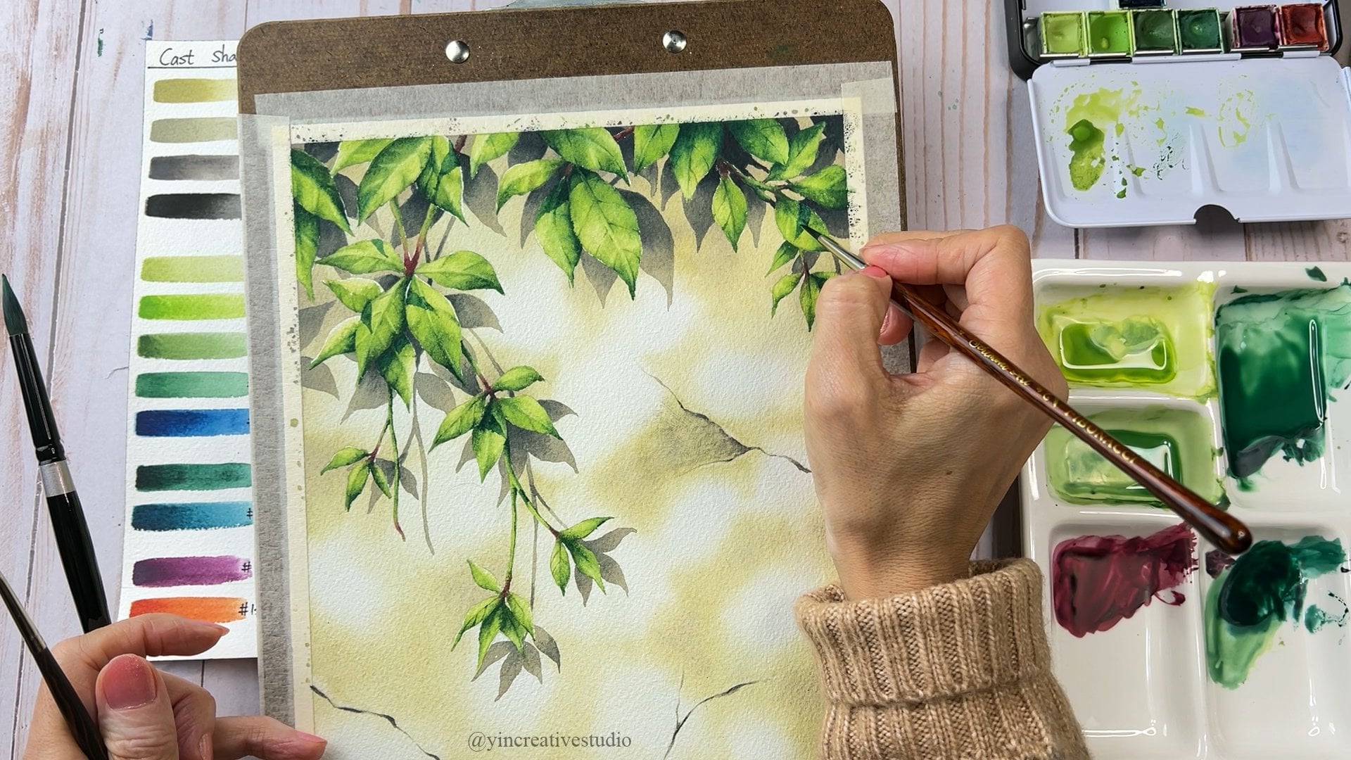
7. Sketch Part- 3: Before we add more
details of our sketch, there's one thing I would
like to mention here is about the perspective
in this painting. So I use the same
guideline, but this time, I add the perspective.
Guide line here. So as I say, we have a horizontal line here, we will have a vanishing
point right here. This one, I'm going to
just make it simple, we're going to put it
almost like a middle, so you can see the line here. That's how all your
object will go in due to the perspective from
where we view this painting. When you sketch all
the water lead leaves, make sure you don't
draw in like a circle low when you take the bur
view leave from the bur view. They are wrong, like
a circle shape. But once you move
your angle from the bur view to a lower
angle like this one. If you keep moving from your
view from the horizontal, keep going lower lower. Actually, the shapes of
a leaf are changing. It's from round
to be oval shape. From here, this skylight
is actually helping you to add the details of a leaf and try not to draw the same wrong
shape for each one. Also, the front leaf that
you see should be bigger. When you move towards the end, the leaf should be
smaller and smaller. The shape can be from fat
oval to be really narrow the rot and changes the shape
due to the perspective. If you take a look at
the painting from here, you'll see the front one
is bigger and the wider, go all the way to the back. I can push it to be narrow. But the size you can
see gradually changing, this one is more obvious
you can see the front. You can see almost like a
foot shape you can see, and the one is much bigger and go all the way to the back, one is narrow narrow, all the way you can
see the size you can compare the front one
in the middle one, all the way to the back,
they are smoother. Those size is changing. It's all about perspective. I can really help your
painting to be more realistic. During the sketch, I might
fast forward some part of it. If you feel like you will take more time to sketch, no worry, just pause here and take
your time to do your sketch. Let's sketch the main water
lady right here first. You can follow me step by step, or you can go to the
resource section. I will attach my final
sketch overlay. Let's do it. M. I usually start from
the center area, so you can know where the main
water would be from here, you build each pedal. You don't have to include airy
pedal from the reference, but you can just grab
the one you like. Here, I'm not going to add all the pedal in
this water lily. Mainly, I still cooperate
with perspective here. Here's the vanish point. When you add a leaf,
they will look most. I like a lease pedal because
towards the end is folding. So we can make each pedal
a little bit different. That's why I add a one here. Now we just finish sketching the first
water led right here. That's the main focus. And right here instead of
drawing another blooming water, I actually want to add the one half bloom
right over here. Also, when you put the
second water ledy, try to avoid n on the
same horizontal line. I can make your layout
more interesting. This one is right here. We are not going to draw
the second water ledy here. We're going to move
up a little bit, so it will lend right here. This water led half one
third on the water. I'm going to do
something like here. And also make sure this water lily is a little bit farther
from the first one. The size should be a
little bit smaller. Can do right over here. Here is going to be water. If you want, you can add
another third one right here, which is a fully close one to make it more
interesting if you want. We will see once we
finish the second water lily sketch and let's see
how the layout looks like. Let's start doing this one. That will be our
second water lead. Now it looks good. Let's add some water leady leaf
to complete the sketch. Another thing to
keep in mind when you paint water led leaf, they have not just
a wrong shape, they do have opening
on each leaf. You can add details.
That'll be great. I try not to use my
finger to wipe lose as thing because I don't want my grease from the finger
stay on the paper. Okay. Let's continue and keep the perspective in your mind
when you do all the sketch. Now we have a basic
layout right here. But I feel like we can add a bit more details to make
the leave more interesting. That's why I'm thinking
for the edge here, we can make some areas going up. When we leave can make more interesting
details right here. We a little bit more here? Okay. So that'll be it and we'll also here a little
bit folding up. Then we can read some
line we don't want. It's more interesting
these two leaves and some details on it. But here it seems to open. I will add another
leaf right here. So we can break the
whole water area here. Okay. I think that's pretty good. But also right here, I feel like this space. We can actually add another one is the water really almost
going out the water, so we can just paint the tip part add
something over here. Okay. So it's up to you if you want, you can add it I now,
you don't have to. We might just add
something here for now to see how we feel once
we start painting. Adding that will be good. Now just get read
unnecessary outline here, you can see the sketch better. Okay. Another way to check your
perspective is correct or not is put your
sketch vertically, and just look at n
from the distance. And this way you
can really see if the front leaves are bigger
than the one in the back. That's another way you can
check your perspective. If you're happy
with your sketch, let's move to the next session, how to apply masking fruit
on your main subject.
8. Masking Fluid : Now, let's apply mascin
flu to our main subject. This area, the two water
lilies and the two leaves. So for this part, we will need some surprise. Of course, the mascine
flu that's what we need. And we need a small pallet. Any pallet, you have a home, you can use it and a little
bit of water to bh to wash your brush
right after we use it and also the liquid soap. You can have any liquid
soap you have at home. You can we use it. We squeeze some of liquid soap, and then we can pull some masking
fruit in as you can see some grow forming here. I can just use the
back of my brush. The brush is not
really good one, just a really cheap ones, so you don't have
to use your fancy. Brush for this part. Everything about mascin flu, if you want to know more about how to use
it, when to use it. All the tips I have including
name in my first class, which is in lesson six. If you would like to learn
more about mascin flu, you can head to my first class. Now let's some of the
mescin flu in the middle. After we have to
clean up right away. Next time when you
open is not clock. Now we have everything here. Usually I start with
the smaller brush. I can make sure I cover all
the edge of the main subject. First your brush? Then you your brush
into liquid soap. Okay. And now you just
need to dip into the mexican fruit to
your main subject. When Masan flu dry and
when you remove it, it will leave some
color pencil mark. So you don't have to worry about all the sketch
going to be too dark like the pencil
mark going to be too dark for the white water. Because after we
remove mescin flu. Some of the pencil mark is
going to be lift as well. Usually start in the
center and go all the way out to cover the corners. Now you can just take your time. Especially if your first
time to use masking flu. Just take your time to
cover the whole thing, including a pencil outline. Now, we just cover the
main subjects here. So before you wash your brushes, let's double check if you
cover all the details, small point angle here. I think we miss it. And you can add on it. Since it's white water lady, so I want to keep the
white from the paper. So make sure I cover
on the corner. After you check planes and make sure the whole area is covered, you have to wash the
brush right away. The mesan flu is not going
to clock on your brush. Okay. Once you wash
it right away, get rid of the extra grow and your brush is ready
for next time for us. Now we just need to wait. We had to wait until
the masking flu is completed dry before
painting the bag.
9. Clouds Practice: Before we start painting, let's do a experiment. The most often question
that I got is about, how do you know how much
water you should apply to your painting before we wet or water color
bouquet effects. That's why right now, I'm going to show
you the way you can really how much water you
should apply to your paper. Let's do it. Here is
another tif for you. In order to extend
the drying time, I add a few drops of
synthetic scar in my water. I also did an experiment
of this medium, and based on the result, it did help me extend the
driving time a little bit. As you can see a water on
the paper a few times. If from the screen, you can see two
different surface. This one is fully
covered by water. This one, you can see the
texture of the paper. Looks like a totally covered. Now let's apply light brew
and darker brew for the sky. Let me move closer. You can see the
edge of the water. They branding in
naturally like here. That's the way it's
perfect for the cloud. When you still, we add the
darker blue in certain area. So you can see the dark blue bring in the light
blue naturally. Sometimes you can move your
paper little b angle or vertical for the color
branding naturally done here. Okay. If you feel like
here is too harsh. Use cual size six
with water only. Make sure when you squeeze
of water coming out. Let's write among,
you can help to bring those softness of the clothes. Then the paper wet. That is perfect timing. You add some grayish color. A little bit blish like
a darker area here. Looking at the sum
of thing here. Same here, same brush. You can softer the edge and create the flffinss
of the clouds. Now let me move
the paper closer. You can see the edge. Fluffinsss out and set a free of clouds also add
some darker area shadow. That's a good way
to paint clouds. Let's write amount of water. At home, you can test
out brush water on your paper and put the color
in and see how it goes. Let me show you another way
that means not enough water. If you just apply water
a little bit here, maybe just a little bit on it. In the base on the surface. I hope you can really see. Right now, you cannot really tell the difference
between these two area. Almost look the same. Compare with this
section is different from how we apply
water on that section. Now let's try it. Let's
do the light blue. I think is very obvious and
you can see there's not enough water for the
colors to blending in. Okay. Another way you can do is a quiz six with a
little bit water. But when you do this, make
sure you do it in time. You still can save your clothes, but see now you create the water mark right
here, right over here. When paper is not wet enough, you either add more water on it, but a risky part is you
might create a water mark. Now we add a darker
pour on the top. Since there is not enough water, you can see the cloud
is chunky here. It's different from
the first one we did. That will make a difference. When you have enough water, the frogfss of
clouds can be done quickly and naturally
really good overlay. But when you don't
have enough water, you might struggle with
adding more colors, you might the water mark, or you still can
save your painting. But it's really by chance
if you add enough water. This clos still works. But you just have to do it quick enough to add the
water into your paper. I hope this small
experiment can give you the idea how much
water you had to put in. When you apply water
to your paper, just double check the
texture of your surface. You can see the two
difference between dry and wet, that's
the right one. That's a small tip for you
before we start painting.
10. Painting Sky: After the small experiment. Now let's paint the sky. First, let's wear the paper. You can apply water on
your paper feel layers. Now you can see the top part, the top section is
fully covered by water, so you can see the refraction. The bottom part is
dry, so no refraction. Here, we are going
to use two blues. First one is string, which is a lighter blue
for the first layer. Then we're going to use bluf as the second layer
for the darker part. By the way, before you do that, you should have all
your colors ready, that is really helpful. When you find out the paper
is almost dry now wet enough, you can always use another
brush with clean water, just a little bit water
to smooth out the edge to make sure you still keep
the roughness of clouds. Now let's apply the second blue which is a blue thing
for the darker area. Now, I use a string
light blue to brand blue thing better
instead of using water. Now I can use water to
smooth out the rough edge. Just make sure they
branding well together. Since painting sky
is time consuming. Once you start painting,
don't overthink, just let the color goes
and just follow the flow. Since clouds don't
have specific shapes, so don't worry too much. Now let's create a
darker parts of clouds by using green stone
with blue fin. Then again, let's
use a clean brush with water to smooth
out the edges. When you find out your brush
it carries too much paints, make sure to wash and
squeeze out the extra water. You can keep repeating the same steps until you
like the final results. Now the sky looks good, but I would like to make
a curtain area darker. Also, same as brew
are curt area, I would like to add more brew. But when you do this, make show your paper still d enough
for you to do that, otherwise, you
don't want to lead the water marks or rough edges. Now the sky almost, let me show you another
tip how to create the lightest par of clouds
by using paper towel. Okay. You just use the tip of paper towel to leave colors so that area
will be lighter, so you can keep doing until you satisfy the final results. Make sure when you do
this when the paper, so easier for you to do it
and to avoid the rough edges. Now we just finish painting sky. Let's move to lesson.
11. Aerial Perspective Background: Now, the sky is down. Let's move to the farther mountain or wood
bushes that area. Before we started, I would like to soften the
horizontal line. Since harsh like here. I'm going to use the o
six with water only, and we just gently apply
water to this area. You have enough water
but not too much to reactivate the
paint we did before. Now use any small flat brush, also no color, just water. You can use a circular way, move your brush in a circular where you can see
the hard edge or gun and fall into branding in the water
area, which is perfect. A small step. If you
don't have this area, you don't have to do this part. Now this area, we
apply some water for the further trees
with mountain area. Now we're ready to paint. First, let's wear the paper, not too much water. Then, we use color stream blue to C the sky and water because later on we are going to
do the reflection. If you can make it
land smooth now, you can make the
transition naturally. Now I'm going to create the
farther mountain with trees. Instead of just out the shape of mountain
and fill in green. Instead, I'm going to use each straw to create
the mountain shapes, so you can really see the
trees coming in one by one. It looks more like lifelike. It takes longer, but
the result is better. In the meantime, you can
bring some green Sap green to the water since it's
going to be the reflection. Now let's use Earth light
brown to add some darker area. Since the paper is still dam, so you can see the
earth light brown actually breeding
into the water area, which is perfect part
of the reflection. Don't worry about it now. Finally, let's use due to add the parts can be between
trees and the button. If you see any strong contrast, you can always use the sap green to balance like a smooth, towards the end, you
have some green left. You can always bring them to the water area as a refresher. Now we just finish the mountains
for the right hand side. Now let's work on the silhouette of even farther mountain. Here we are going to
use a little blue. You can test out on
different paper. As long as it's darker
n the sky gray, don't use too much, so it will be too dark. Then we can use a little
bit green to to it down to bring the connection
with the mountains. For this mountain, I only the very simple shape
without any details. I only add a little
bit darker blue to add some shadow
like a darker area. Now let's move to the
left side of mountains. We will use the S green as the first layer create the
trees and mountain shape. Then we're going to add Earth, which is light brown
at some details. Finally, let's use green
to add the darkest parts. Now we just finish painting
the father mountains. Let's move to the next lesson.
12. Painting Pond- Section 1: Now, let's paint water lead pan. I'm going to paint
section by section. I only apply water to the
top section right now. Let's use the P number
90 color string, which is the light blue to
apply to the water area. Then I use Sap green to apply to leaves Since water
is pretty wet, so you can see two colors branding in together
pretty well. Next, I use J digan to create a reflection of trees mountains from the back. Same thing. I use each straw to create the shape of the
mountains shape, so you can see the
more realistic. Also, always have a quite six with water only to
blending in some areas. Since the paper is, so you can see the
refresh nature. If you take a look I
intentionally to leave the small stream between
background woods and water, you can see the whole area
leave it like unpainted. That's the nature thing. When you take a look at picture, you will see a
stream line overlay. When you create real paintings, adding details is
really helpful. Now all colors bring
well together. Let's create some ripples. Let's use the freed
brush to leave colors. Here I use fed brush size two. If the smaller area, you can use size zero. Again, when we leave colors, we need to get rid of the pins
from the brush regularly. You see I have a paper
towel in another pan, so I can always wipe
out the extra pins. Now the ripple looks good. Let's add some darker refreshing in the water by using co gen. The first section looks less continue for the second
section by applying water. Section let's create leaves
first by using sap green, and then we add some earth
to create layer forms. Since the lease leaves are in
the back away in the back, so we don't have to worry
about too much details as long as we give
them the basic forms. Then we apply string which
is light blue around leaves. Since the first section is dry, so you can see some
area is rough. That's why I use quill size, six with a little bit of water, not too much, just
smooth out the edge. If you do it in time, you will
not leave the water mark. Let's add one more leaf right here by using green and Earth. Now it's time to add
the darker brew, which is AP number 1404 brew thing for the darker area
under or around the lips. Again, some area
seems dry already. So going to use the quill six with water to
smooth out the edge. Let's use the blue fin to
emphasize certain areas, especially the area
right around the leaves. Now let's create some
ripples by using flat brush number
two to leave colors. If you see some area like you still want to add
more dark blue, but paper, it's kind of dry, apply slightly water to the surface and add blue to
emphasize the darker areas. Since the paper is dam, so it's a perfect time to create some ripples by lifting colors. The pon looks good, but I want to add even darker
shadows under the leaves. I'm using blue f
plus green stone, which is a darker shade of
gray to emphasize a bit more. Now, let's continue painting
the next section of pop. First, apply water to this area. Net, let's use a string, which is light blue
for the water areas. The best time to add a dark bro, which is broofing is when
the paper is still dam. You can use either st
which is light blue or water to b two colors
together better. Also, let the good
time you can create ripples and the water movement. I'm going to create some leaves underwater by using C
earth as first layer, then I add some Jigeni to add the darker area
to create a form. Since the layer underwater so you don't really need
too much details, but you can make the
painting more interesting. Now, I found out this area is not well enough
for me to continue. Instead of applying
more water to it now, I prefer dry thoroughly, and then we can apply water to the whole area again
in the next section. The reason I'm doing it is to avoid the water mark
which we don't want.
13. Painting Pond- Section 2: Now, the paper is dry. Let's repeat the same steps. First, let's apply
water to the area. Then we use Spanish moss as the first layer to
create leaves form. Next, let's use the Sep green
to add the darker areas. We can use Spanish moss, light green to bring two
colors beta together. Add some color earth. Then we use digano to
add the darkest areas, which is the edge around
water and the leaves. I use que often. I use it with water to either smooth the edge or
bring together better. Now, I want to make the
edge around leaf darker by using color
broofing with Bird er. The leaves look good. Let's create some lighter areas of the leave by lifting colors. I use the flat brush size too. Now let's use the blue fin to add the darker areas
around the leaves. Let's use with Bert oper we
use earlier for some areas. You can take a look at the whole thing to
see which leaf pedal. You feel like a leaf
should be darker. La shadow should
be more obvious. Is it a good time
you take a look and add some darker color
for certain areas? I'm going to paint leaf, but I notice some blue
breed into the leaf area. That's why I'm going to use a brush to leave
some colors out. After applying stream
blue to this area. I found out is too much water. You can see the paint
just breeding everywhere. I'm going to pass here. Instead, I'm going to paint Spanish moss for the leaf first. Net, let's use green to
add some dark areas. You can always use Spanish
moss to bring colors together. Then we add Earth. Now, let's repeat the
same steps for leave. Sap Green first mix with
Spanish moss and at Earth. Now it's time to
paint the water area. We just put a little bit
water in the y area, and then we use string, which is light blue for
the first layer as base. Let's use the Sap green
for this corner of leaf. Then we use digan to add the
dark area around the leaf. Finally, let's use
blue fin to add the shadow on the water and the ripple and make
a so water movement. Then we can use string to
smooth the colors out. Then we use the color level miss before with JD genial and the blue fin to add
the darkest around the leaf ripples and
some water movement. Finally, the paper still wet is a perfect timing to leave colder to create
the lighter area. Sometimes you feel like the
color is not dark enough or you want to add some
details. You can do it now. Then I use Earth and Sep
green to add some area. Finally, I emphasize
certain area with Jen for the darkest area. Same quiet six
smooths out the edge. Now, let's repeat the same
steps to pain this leaf. Spanish moss first,
then Sap green. Finally, use Earth
to define the leaf. Now let's use diGen for the darkest area and also
define some details, including the reflection of the bro water lily on the leaf. Now let's paint this
small water area. First, use string
as first layer, then we use the brofin
to add some darker area. Finally, let's use di with bof then add some bird and gray
stone for the darkest area. Now, let's leave to
create the highlight. Finally, let's use the J d j to do the final touch
on curton area. Now this sections, let's paint the Nullar
section next to it. First, apply water. As you can see for leap, the previous blue
debris into this area. That's why I'm going
to leave color to get rid of this blue first. Then we use the same steps. Use Spanish moss as
first layer add Earth, and then add Sap green
to define the leaf. Use Spanish moss to
miss colors together. Now let's use string as
first layer for water area. Then use blue fin to define the darker areas including shadow ripples and
the water movement. For the darker area of leaf, I'm going to use diganal with bird per to define
the darker areas. Then you can use Spanish
moss to mix them together. Just repeat the same step until you satisfied with the leaf. For the darkest area, let's add the indigal to it. Finally, let's use flat brush
zero to either leaf colors to create a highlight
or you can make the white outline darker by
using the colors next to it. Now this area looks good, let's move to the next session.
14. Painting Pond- Section 3: Now, let's paint the last
section of water lead pan. After finished
painting, I found out this section wasn't recorded
due to the low battery. Actually, the battery was out. I did not realize. So that's why I'm
going to demonstrate this section on another paper. First, let's apply water
to only the water areas. Then we use color string, which is light blue as the first layer to
create the base. Then we use color broofing
to add the darker areas. For all the water
ripples and movement, you can either use the reference I save
in resource section. If the edge is to
rough or too sharp, use previous color which is
string to smoothing out. When you are ready, let's use indigo for the darkest part, which is the edge around
leaves and some ripples, then we can create all the
water movement from here. Same thing, if the indigo
color is too sharp, let's use previous color, which is blue fin to smooth out. Finally, if anything anywhere
is not smooth enough, use quill size six with water, just a little bit water to
make the water more smooth. Now let's complete the leaf enough finish in the
previous section. First, apply water to it. Second, let's some extra blue on the leaf by using
flat brush size two. Then we apply Spanish
moss as base. Then we use sap green
to add some shadow, especially the area under
another leaf and some texture. Then we use previous
Spanish moss to bring both colors well. Then use color earth to
define a leaf better. Same here, let's
use Spanish moss to bring Earth into
previous color better. Finally, let's use gene with a little bit
integral to emphasize the darkest area
under another leaf and some edges center
and under leaf. Then we can use
quiet six with water and a little bit to
smooth the rough edge. Now the leaf looks good. Let's do some final touch by
using digan with integral to emphasize certain
darkest area in the center and the edge
under another leaf. Then it's time to
create the high light, which is a lighter area by using flat brush two
two leaf colors. You can repeat this step until you satisfy with
the lighter areas. Also, we can also create a white outline in certain
areas by lifting colors. Now, let's paint the
leaf right in the front. First, apply water. Then we use color Spanish
moss to create a base. This time, I'm going to add a thorough yellow green
to make it brighter, since it's right in the front. Then we add Sap green
to define the leaf. Then we add ears. When we use Spanish moss to bring two colors
better together, we can also use this time to define more texture of the leaf or define
the leaf better. Finally, we use Jen to
add the darkest area. Then I feel like we can go
back to use the Sap green to emphasize the center
area to make it darker. Then we use quiz six with a little bit water to
smooth the whole leave. When you paint the leaves, please feel free to
add different colors. For example, you feel like you need to use more step green, or right now, I feel I
need to add more earth. Just feel free,
you don't have to follow exactly about my steps. But here, just give you the basic idea how
to paint a leaf. Then let's create some
lighter area including the white outline around
the leaf by lifting colors. Here, the same I use flare
brush size number two. Finally, let's use the color integral to emphasize
the darkest area, which is between
leaf and the water. It's time to paint the last
leaf of session, same step. First, apply water, second, use Spanish moss to
create the base. Here we add yellow green to
bring the brands to leave. Then we use green to
add a darker area. Then use Earth to
define the leave more. Then we use the digan with a little bit indigo for the darker area in the
center around the edge. Then we can use water to smooth
out all the colors well. Like I say when you see colors
don't bring well together, you can either use water
or use the lighter green which I use Spanish moss to
bring them well together. After that, you can use digan, go back to add some darker area. Finally, let's use integral to emphasize the darkest area, which is between
water and leave. The last step we're
going to do is use Spanish moss to make some
white outline darker, so not too purple. You can take a look and go
around to see certain area, especially the white outline right next to the darker areas. You can make too
white or bright. Now the whole p looks good. We just finish water p.
Now we can move to next.
15. Painting Water Lilies in the Background: Now, let's paint water lilies in the background,
which is bury. You might notice when
I paint the pan, I intentionally leave
these three areas white because that's where
water lilies will be. However, as you can see, white spots don't look
like water lily forms. That's why I'm going to
use flat brush to leave colors in order to
recreate water lily forms. When you leave colors, you might have to clean
your brush pretty often. Once you create one pedal, for the next pedal, you might need to wash or get rid of some colors
on your brush. You just repeat the same action. In order, you can
see each pedal, or the form is created. After recreating the form of water led let's
get colors ready. Here I'm going to use M stay first to define
water led petals. Then for the button,
the darker part, I'm going to use Earth
to add the darker areas. The first layer los good, that's the earth for
the darker areas. Since the water lids
are in the back, you don't have to worry
about too much details, as long as you can define the pedals or the darker
areas, then you'll be fine. Let me move my color palette
to the left hand side. This way, you can see which
color I'm going to use. Now I'm going to use Earth
as we mentioned earlier, to create the darker areas. For the bottom of water
leaning let's add some sap green to
emphasize a little bit. You don't have to use a lot, just a little bit. The last step, we
can add some shadow below water lily between
water lily and the water. I'm going to use broofing to
emphasize the darkest area. For this part, you don't have to wear the paper,
but you still can, but just remember if you
do use slightly water, just a little bit, don't
reactivate the previous pigment. Then you add broofing then
you can smooth the edge. If not dark enough, you can always add
more broofing. Now, I think we just finish the first water
lily in the back. Let's repeat the same steps
for another water lily. First, let's create water
lily form by lifting colors. For the smaller area, you can switch two flat
brush s one or zero, if you have any to
create a small petals. Then you can use a stay yellow to define
what lily petals. Use Earth yellow brown each
color to add darker areas. Sometimes you can add
some sap green to to Now, let's use bro fin to
add shadows under water. Now we just finish the second water led
in the bay ground. If you want to add more
for the further areas, you so it's up to you.
16. Painting Unblooming Water Lily: Now let's paint on
bloom water lead, that is halfway
out of the water. Same here, let's recreate the form of this water
led by lifting colors. Then let's use Spanish moss, which is a light green to
define water lily petals. Based on the reference, you can see the left side
of water lily is darker. So going to use thorough yellow green to
create the darker area. Then a little bit
earth to touch. Now I use se green for the
darkest area on the left side. Finally, I add a little
in genuine for the edge. To bring all the colors
together in this area, I use either Earth
color or Spanish moss. It depends on how your
painting looks like, either color is fine. Or you can just use
a flat brush size two with clean water to
smooth out the edge. If you look of s reference, you will see the reflection
of water lead on leave. Let's add details. M. This water lily looks good. Let's add a shadow
below this water lily. Also, it's a time you can take a look around
the surroundings. The water and the
water lily leaps. It's also the good time. Right now we can add the darker shadows
right on the edge. We can do this at a time. For part, I use wet
on dry technique. I apply colors to the surface by using qui size six brush
with a little bit, clean water to
smooth out the edge. Don't use too much water, so you will not reactivate the pigment that dry out before. Just gradually smooth out, you will see the edge
are still very smooth. Now, let's do the
final review and add more dark shadow under water leaves by using
wet on dry technique. While doing final review, I found out I forgot this corner this piece of leave
da paint earlier. Let's complete corner. First, I use Sap green
to add the darker area, then add Earth to touch
ttleb and finally use Jen with a B integral to emphasize the darkest
g. In the meantime, I also add some integral to create the darkest
shadow in the water. Now, let's remove mask to paint the main water
dies and leaves in the son.
17. Removing Masking Fluid: Now it's time to
remove maskin flu. Before we do that, please
double triple check if maskin flu and the previous
paints are completely dry. Now I'm going to use a residue eraser to
remove maskin flu. You might see some people
use different materials, but for my experience, I like residue eraser because it doesn't destroy your
paper or damage anything, so I prefer to use it. Might need to remove
some grows on the goal because it's going to accumulate a lot on your eraser. You can either rotate
your eraser or you just keep cleaning
the extra grow off. It's always satisfied for me to see when I can peel the
whole piece of grow off. I don't know what
you think. I just like the whole piece peeling. Please carefully check
some small corner like a tip of water leave or petals. Sometimes some small thing
going to stuck there. If you don't clean it
up when you paint over, that area going to be
hard to put the pins on. Finally, you can use a clean dry brush to swipe
all the grooves out. Same reason I don't
use my finger. I don't want to leave any grease off my finger on the paper. Now we are ready. Let's move to next lesson.
18. Painting Main Leaves - Part 1: Now, let's pin water leaves. First, let's use
Qu size six brush to apply water on the leaf area. Second, let's use Spanish
moss to define the leaf. Where is the darker?
Where is the lighter. Net, let's use co Earth to add more details like
add value of the leaf. You can always use the
previous color which is Spanish moss to
smooth out the edge. Then let's use the
green to add areas. When the paper step in, you can see all colors bring
in together very well. But if you found out
still some hard edges, you can use the Spanish moss, the previous color to make
the edge more smooth. Finally, let's use J, which is darkest green to
emphasize darkest areas. Right now, I just use a quiz
six brush with water and a little bit Spanish moss
to do the final touch, smooth our old edge. Now the whole leaf looks gray. However, some area
should be darker. That's why I use the di
again to emphasize area. Also certain area like here, I'm going to use Earth to
emphasize a little bit. Now let's create the lighter
areas by lifting colors. Sometimes you can repeat this step until you reach
the effects like you want. When we look at this reference, you will see white water
leads reflection on the leaf. So going to create effect
by lifting colors. Now I'm going to
use flat brush size two to make lose white
outline less obvious by using thorough yellow
green or just carry the colors nearby to make
this area not too white. Some areas, we can
add light yellow, which is not to Tony. Finally, the water
area under the. We use the and India
to do the first layer. Then we use integral to
emphasize the darkest areas. I always use qui size six with a little bit
water to smooth out. Let's do the same thing for another area
right next to it. Now I think the
first leafs grey. Let's move to a next
lesson for another leaf.
19. Painting Main Leaves- Part 2: Now, let's paint a
second man leaf. First, apply water
to your paper. Then we're going to
use Spanish mass as the first layer to
define the value of leaf. Let's use color earth to
add some darker areas. Now add sap green to
the darker areas. In step of water, I use Spanish moss to bring
all colors together. Here, I use Sap green and digan to create a cat
shadow on the leave Also, I use the
same color to touch some darker areas and create
the texture of the leave. Then I use quill
size six brush with a bit Spanish moss and yellow green to smooth
out the whole thing. Now I use color to
the darker areas. Let's use the di genu to
emphasize certain areas. As you can see the
papers do them the colors brand
in well together. Let's add co earth to make it
coherent with another leaf. Now I use dig to add the
darkest areas of the ca shadow, specially the areas
right under water lily. M. I use freed brush size
two with color den with a B indigo we use earlier to fix the white outline
under water lily, which is not so bright. Then we use yellow green to
make some white out as well. Now it's time to
create a high light. However, the paper seems dry, so I'm going to apply a
little bit water on the area, I'm going to leave colors. Remember, not too much
water just a little bit. The leaf looks good now, let's paint the folding part, which is the back of the leaf. For a part, we are going
to use two colors. First is Sap green with Earth. Second color is with
indigo and the bird. Then we use more integral
to add the darkest areas. The lighter area of
the back of leaf is actually right on the edge
between water and the leaf. I'm going to use the flat
brush size two to leaf colors. Let's use the
intcal to emphasize the darkest area between
water and the leaf. Let's use thorough yellow green to cover some white outlines, so they are not too bright. For the outline underwater, I'm going to use the sap
green to really push it back. We just finish leaves. Let's move to lesson.
20. Painting Main Water Lilies - Part 1: The first lady we are going to paint is partially blooming. The first pedal we're going to paint is the
back of the pedal. Let's use the Spanish
moss as the first layer, which is really light green. Then we use fellow yellow green with Earth as a second color. Then we use the green as a third color to
define the darker area. Okay. Finally, let's use di genuine green with a little bit integral to define
the darkest edge. Now, let's repeat the same steps for the second
pedal on the left. First Spanish moss. Then fellow yellow
green with Earth. Now use green. I'm going to add some
earth color on this petal, so it can be coherent with
other leaves around it. Finally, J gene with indigo. When we down all the colors, let's use lifting technique to create some highlight
of this pedal. I'm using flat brush size two. Based on the reference, the darker area is
on the right side, so I'm going to apply Spanish moss on the right
side to define this pedal. After first layer, let's
add a second layer by using color ma stay with thorough yellow green
to add some dark area. Now, let's repeat the same
steps for the rest of petals. I did not apply too much
water for these small areas, but I always have a que
size six brush with water, not too much water to brand second and the first
color well together. Finally, let's add the
darkest part for this water. We are going to use light gray, which is a poner with little bit yellow
as the first layer. Painting why water
lily is tricky. Because of the colors. If you use too dark, you will make a why
water lily look dirty. We prefer from light
to start with. If not dark enough, you can always add more layer. You can test it out
on another paper. Just make sure the color is
not too dark, but just right. Now, let's add the sun burned
oper for the darker layer. Now the water lily looks great. One more detail. Let's add some shadow on the
surface of water. Now we just the water ley. Let's move to the next lesson and pain the second water lily.
21. Painting Main Water Lilies- Part 2: When we take a look
at the reference, as you can see, no airy petal of water lead
is the same layer. Some of lane are lighter, some of n are darker due
to the lighting direction. For that case, we are going
to use the light yellow to do the first layer to
define petals are darker. Let's use this yellow. Just really light light yellow, so we can define which
ones are darker. We start from the middle. Those petals, they are darker. I'm going to apply light
yellow to the serton area. We add some of for
this petal as well. As for the middle polygon, we can use the darkest
yellow to add the details. For this three in
the back is darker. We can add some of
them on this one two. D is right here, add some right here, this one is on the back. I'm going to add a
little b right here. Same as one behind a cast shadow from the pedal on top of
it and one is right here. Add yellow here as well. For the bottom one
that one's really dark and this is
this area as well. Bottom one fly dark. And this one as well. I only button here. Okay. So as you can see some petal at the dark yellow
to remind yourself which area and then for this button one toward
the central one, we will add darker shadow later. Now, let's add a second
layer to water petals. Here, we are going
to use two colors. The first one, let's
use light gray, which is AP 102 ponder. Add a little b to AP number
hundred, which is Earth. We use this color
earlier already. You add some light
gray ponder to Earth. And you always can testing out on extra paper to see is
too dark or too light. I too dark add some water until you are happy
with this color. Another color we're going
to use is dark brown, which is Daniel
Smith, burnt Uber. You can add a little bit as dark color to emphasize
the darkest par. Again, having colors
ready is very helpful. When the paper is dam, you can add two colors, so they can bring in
naturally together. Anytime if you see the edge
is harsh and smooth enough, you can always use quiz
six brush with water only. Bit water to smooth
out the edge. Now we're going to use
two colors to define water lady petal moors based on the reference.
Let's do that. The lighting is
straight from above. That's why we do see a lot of cast shadow falling
on the bottom petals. That's why we add
dark color on petals. In order to show the dark is
part of the bottom pedal, I'm going to add a dark B, which is brew film number
1404 to this pedal. I also add a dark on the
pedal net to it because both of the receive the
most of cast shadow on me. For this petal, instead of burn, I use being to add the dark and thing as
the one next to it. A. While painting is good
to always go back to the reference to see if you make some petals
too dark or not. You can always start
from lighter later. If not, you still have
a chance to make it. But if we make it too
dark in the beginning, it's hard for you to
make the lighter. For the tip of these pedal, I want to make it really light subtle yellow to to it down. It's not just flat white area. Also, for these two pedals
next to it, it's folding. The back of pedal have
some green showing, so I'm going to add a green
to make it different. That's the reason when
I look for reference, I want something small detail,
some interesting details. Now we have a finished
water lily pedals, et pin statement in
the next lesson.
22. Painting Water Lily Stamen+ Final Touch: For this part, we
will need two colors. The first one is mast,
which is yellow. Second color is Earth with
burnt uber as darker color. It's also a good time to use these colors to define
the edge of petals. If you see something rough, not clean enough, this is
the time you can fix them. Now, let's use Earth with bird uber to create
darker areas. After statement, let's review the whole water led
to see certain area. We need to emphasize
some ca shadows. I mix ponder with indigal a little bit dark green we use before for the darkest areas. For those details, I
usually use brush size one. Or you can use flat size two, so you can really go in the small area,
especially those corners. Now, everything looks gray. However, I'm going to show you one detail that most people
might not pay attention to. If you look at all my petal, I intentionally
not pain the edge. I have some space between
the edge and my dark areas. The reason I'm doing that
is you look at the petal, they do have a
thickness around it. Right now is the time
you have to go over to see whole edge area. Not all of them are
light enough or dark enough to match the
shadows of lighter areas. That's the time I
use my flare brush. Just use a little light yellow to tiny down
some white edges. You can see one side to down, they look more like
a realistic pedal. You can also use
flare brush side two, to smooth some edge,
some rough edges. Everything looks good right now. However, the darkest part of this area is the space between
water and the water lady. That's why I'm going
in by using indigo to really emphasize
this darkest area. Some final touch. After that, I think we just finish
the main water ladies.
23. Final Thought: After linear perspective was
discovered and defined by Bnleki I allowed R to have a depth and to
be seen more realistic. Nowadays, we seem naturally to see the way of our
surroundings with perspective, including creating
art, especially for Landscay paintings
and architecture. I'm so grateful that you are
taking this class with me. My goal here on
skill share is to not only teach you
project by project, but also provide
you the foundation of R to go a longer way. That's why my class is
different from others. You can always learn about not only my techniques and tips, but also some R knowledge. You can find class materials in the projects and
resource section, including the final
artwork, color chart, the green that we use
for sketch, my sketch, the small Cloud
project practice, and the reference that
we use for this class. I hope you enjoy this class. You can always communicate
with me on skill share, including me a common, a review, starting
a conversation, discussion, or asking
me any questions. I will try to get back to
you as soon as I see it. Also, you can connect
with me on YouTube, at In Creative Studio, Integra at In Creative Art and Facebook at In
Creative Studio. By the way, I always enjoy
seeing your paintings. Please share your
artwork with us. We can always run
from each other. Again, thank you
so much for taking this class until next
class, have P painting.
 YU-YIN LIN, Artist/ Teacher