Transcripts
1. Introduction: Hi, welcome to my studio. My name is Nadia, and today we're going
to be looking at how to paint a watercolor portrait
based on a photograph. I'm a professional artist
mainly working in painting, and I'm based in Berlin. I studied fine arts at four
different universities. In New Zealand, Spain
Italy and Chile. And I was exposed to a lot of different techniques
and ways of creating art through the various systems of teaching and each university. Then I finally got
my master's degree in Fine Arts in 2014. And since then I've
been working as a freelance artist,
exhibiting internationally. Even though I've
painted for years, it was usually in oil, so I really struggled to
get a grasp on watercolor, probably mainly because
part of its beauty is leaving the paint
to do its own thing, sometimes, just
giving up control. And then after taking
a few workshops, something just clicked and
Ive been loving watercolor, ever since. I am now convinced that with practiced and
a relaxed attitude, anyone can master this
wonderful technique. So I've done my best to make this course as
comprehensive as possible. To include creatives
of all levels, whether you're just
starting out or you´re a practiced drawer or painter. In this course, you
are going to create an expressive portrait in watercolor based
on a photograph. I'm going to take you through
the materials that we'll need and how to
choose your image. I will then show you some
basic facial structures. And then we'll look
at two different ways to transfer your
image to your paper, either by grid or by tracing. I will talk to you
about the colors we will use and how to mix them. And we will look at some
basic watercolor techniques. We will also be using graphite pencil as a
complimentary tool. We'll see how to start
painting by applying the first layers
and then go on to focus on the various
elements of the face. We will also be painting
the contours of the face, the hair, and the clothes. At the end, we will add the
finishing touches and I'll also give you a
few tips regarding preservation of the
work and framing. If you follow these steps, you will have the knowledge
to create a portrait in watercolor that's rich
in contrast and expressive. To take this course, among other things, you
will need paper, paint brushes, watercolors, graphite pencils and a palette. This course is for all
types of creatives and anyone who feels attracted to the wonderful world
of watercolor. Essentially, I am hoping to provide the tools
for all levels of creators so that
it's accessible for absolutely everybody who wants to develop their
watercolor skills. So I hope you'll
enjoy this class and I'm really looking forward
to seeing your projects. If you'd like to see
more of what I do, you can check out my
website at www.nadiavaleska.com or my Instagram at nadia__valeska I also have another class
here on Skillshare, which is lino cut portrait in black and
white for all levels. So make sure to check
that out as well.
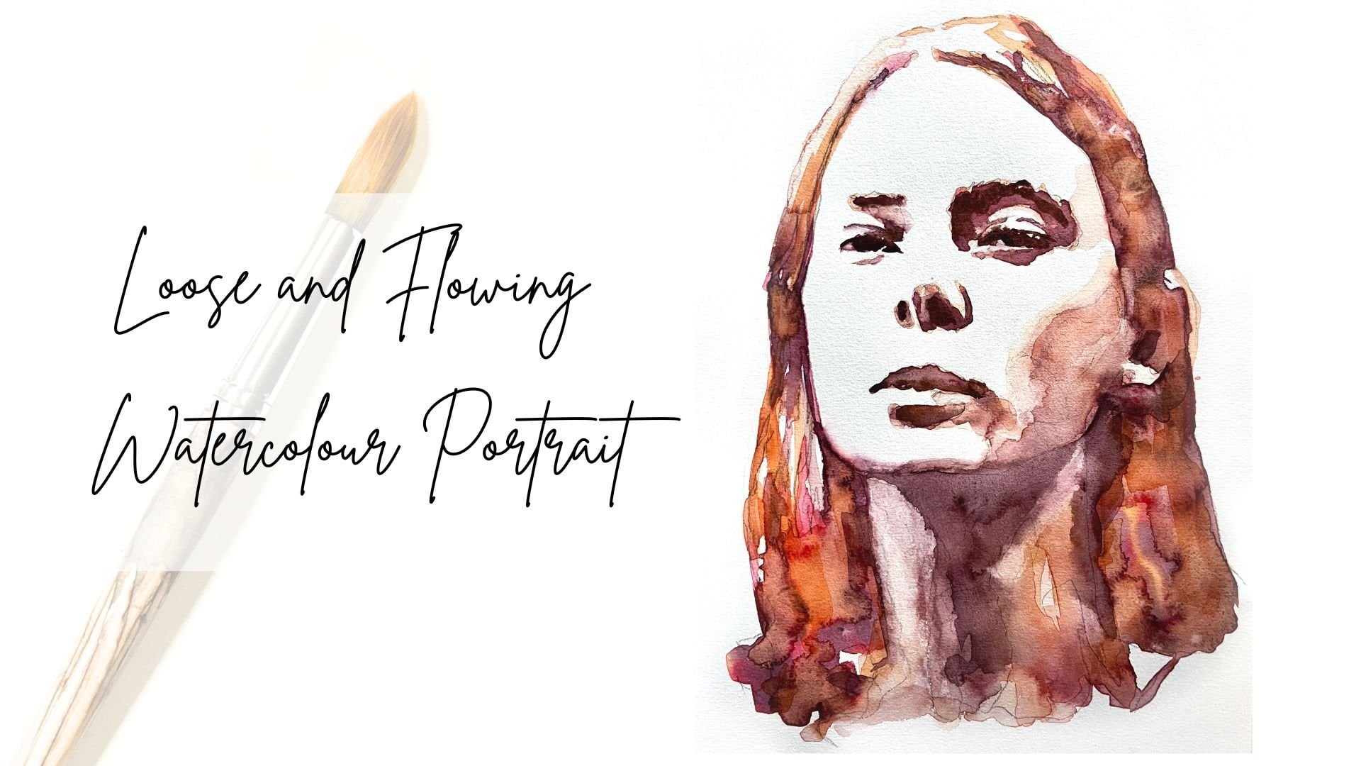
2. Project: In this lesson, I'm going to
be telling you a little more in detail about what we're going to be doing in this course. We'll be making a
watercolor portrait using a photograph as
a reference for this, we're going to learn how to transfer our photo to our paper. And we will start working with a limited color palette from which will mix all
of our colors. We will also be using
graphite pencil as a tool to help us get expression and
contrast and a painting. But we want it to stay
in the background. As first and foremost, we want the watercolor to
be the protagonist. We´re also not aiming for a
hyper-realistic portrait, but rather an expressive
one where again, it's about the watercolor and its possibilities more than getting the painting
to look a 100 % Like your photo. I will be
showing you how to structure the face by working in layers to give an
impression of volume. I will also give you
a quick overview of the basic facial
structures to better understand the
planes of the face and why shadows fall where they do. We'll also be working on how to paint the
hair and clothes. You're encouraged to practice
how to control the paint. Although with
watercolor, there's always a certain
element of chance, which with practice can work
wonders for your pieces. As with everything,
the more you practice, the better you get and I invite you to complete
various portraits as a means of practice until you've produced one with
which you're satisfied. Maybe you're already really happy with the first
work you make. That's great. But if
you're not, don't despair. I have found in my own work that the best things happen when I don't try for a good result, but rather see each work in
progress as my next step to getting as good as
I want at what I do. In any case, I would love to
see the works that you're making as you go along to
see how you're progressing. And it would be wonderful
if you could upload those to share your
journey with me. So in short, the final project of this class is to produce at least one watercolor
portrait based on a photograph with
which you're happy. And hopefully you will also upload your progress
as you go along. In the next lesson,
I will be showing you which materials
we're going to be using. Stay tuned.
3. Materials & Finding Image: In this lesson,
we're going to look at the materials that
we're going to use. And I've made you a list
here which I'll also upload. So basically the materials which will need will be watercolors, watercolor paper, a palette, masking tape, paint brushes, a wooden board, graphite
pencils and eraser, paper towels and jars for water and also optionally
some protective spray. Now for the watercolors, I prefer to use tubes, but you can also get
pans and there's also liquid or in powder form. But just have a play around
and see what suits you best. The quality also differs depending on the brand
that you're using. So I suggest you just go ahead and buy a few
and just try it out. So I'm working with these Winsor and Newton
Cotman watercolor tubes and I found them really good. But again, it's a thing of experimenting and just
seeing what feels good to you. In terms of watercolor paper, really important is
that it's 300 GSM. So that's important because
this paper is especially made to be able to absorb the water that
we're gonna be using while we're painting without
warping too much, so it won't ruin our painting. I'm using the brand from
my local Fine Arts Shop. It doesn't need to be
the most expensive paper, but you also don't want to be
getting bad quality because this will really affect your
experience of painting. You need to know that
different papers will absorb the
water differently. So it's important for you to find one that suits your needs. So again, I just
suggest trying out a few different
papers and seeing what you like and
what suits you. Some good go-to brands
include Canson and Arches, for example. There's a couple of
different things you need to keep in mind about the paper. Number one being it comes
in different grains. You have satin finish, you have fine grain and
you have rough grain. I'm working with
fine-grain because I like the feel of the
watercolor paper, but I don't want it
to be too rough. And satin finish is
to smooth for me, it's almost like normal paper. The second thing you
need to keep in mind is that the paper has a front
side and the back side. The front side is granier,
or more textured, and the backside is
usually a little smoother. In theory, you could
paint on both, but the backside of the paper
absorbs very little water. So we want to be using the
front side at all times. Okay, so now let's
talk about brushes. Typically we use
round brushes for watercolor because they
hold the water better. So I suggest you get three
or four different sizes. One small, one midsized one and one large one. So I've got a size three, a size ten, and the size 16. If you want, you can also get a very small one
like size is one. And maybe another midsize
one like a size six, that's up to you, but I would suggest at least
three if not four. If you can't find these
exact sizes, don't worry. I suggest getting
one fine brush, one or two medium brushes
and one large brush. I just want to
mention again here, you also don't want to get
the very cheapest ones. Often those packs that you
get for very little money, they start losing the bristles really soon and that's really, really annoying when
you're painting. You can use synthetic brushes
or animal hair brushes. As long as they're good quality, it's really a matter
of preference. Some people prefer to use the synthetic ones because
they are more animal friendly. It's really up to you. Taking care of your brushes properly is also
really important. You want to keep
them flat and with the bristles as
straight as possible. Don't ever put
them bristles down into your glass of water
because once the tip is bent, it's pretty much useless. Next, let's talk about
our mixing palettes. This is where we mix our colors. It should look
something like this. And the most important
thing is that it has these little mixing compartments
because the paint is really liquid and
that's really hard to contain on a flat surface. We don't want it to mix
with the colors that we're trying to
mix on our palette. Then we will also need
graphite pencils. So we will need a
4H age or 6H. And this is to make
very faint lines, for example, for our sketch, because we want to erase the
grid lines at some point. We'll be using the HB and 2B pencil
for some details. What will also need on hand
will be kitchen roll or tissue paper to absorb extra water from our
brush or paper. We'll also need
masking tape to tape our paper to a surface,
preferably a wooden board. We do this because then
the paper warps less. We will need the ruler to transfer
our photographs to our paper. Also, we will need an eraser. And I have this
putty eraser that I really like because it doesn't smudge the pencil as much, but it's also quite
good just to have a regular eraser on hand. Last but not least. Let's not forget
about the water. So I suggest having two
containers for water. One is for cleaning
your dirty brushes with, and the other one is for freshwater when you want to hydrate your pigments
and make new colors. Now we're going to
be looking at how to find the photographic
reference for your painting and
what I usually look for on the reference
photos that I use. I particularly like
to use Unsplash. This is available on the
browser or as an app on your phone. When you're looking
for a portrait, put photographic portrait or portrait photography in
the search box because this way you get a much
more specific type of image which will suit
our needs better. There are a few factors that add difficulty to painting an image. And if we're just starting out, we might want to avoid
these factors when we're looking for
our reference image. So let's just have a
look at a few examples. So one thing would be hair
or objects over the face. Also, glasses. Glasses are difficult
because it's quite difficult to
get the shape right. And also sometimes they have these reflections or
they hide the eyes. Also sunglasses, they're going
to hide the eyes entirely and I find the
eyes are really important factor to our portrait. Also unnatural,
artificial lighting. Closed eyes and hands. Hands of very
difficult to paint. As much as I love black
and white images, we're going to want to avoid those for now because
we're going to have to imagine the skin tones and that's going to add a
difficulty as well. Open mouths, open mouth
smiles with teeth. Teeth are very hard to paint. We want to avoid also photographs with
these blurred areas. We want it to be clearly
defined and we'd also liked the entire head to be
in the image, if possible. Now let's have a
look at some images that I find would be suitable to begin with. We have some clear,
front facing or mainly front facing images with a
good light shadow balance, tonal variety,
quiet backgrounds. If you're tending
towards the profile, it's best of both sides of
the face are still visible. So if you have a torso in your image and you
need to crop it, remember to maintain the
ratio of the painting, so, if you're making a 30 by 40 centimeter painting, you need to crop your image to the ratio of three by four, for example. The image needs to have a high
enough resolution so that you can still clearly see the features and the
tones of the face. If you have an image
that contains elements like jewelry or hands,
that we can omit, because they don't cover important
elements of the face, then that's also fine. I hope that's made it clear
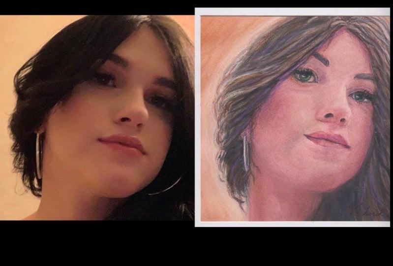
what we're looking for. I've gone ahead and chosen this image here for
its simplicity. Front facing, very clear, we have a good light
shadow balance. The background is
very quiet and I'm actually going to not
paint that at all. I'm also always really drawn to a strong gaze and I
find that in this photo, this gaze that she has
is very compelling. I also really like the colors. I love the dramatic
shadows here, the reds and the tonal
varieties in the shadows. And also there are no difficult
elements in this face. There's no glasses,
There's no jewelry, there's no teeth,
there's no hands. So yeah, I think I will use
this image to begin painting. I invite you now to go
and look for your image. And I hope you
find one which you feel like you're really
excited to paint. And I suggest making a selection of
different images first. And then out of those images, choosing the first image
that you're going to paint. When you find your image, I will see you in the next
lesson where we will take a look at some basic
watercolor techniques. I'll see you there.
4. Basic Facial Structures: In this lesson, I'm
going to give you a quick overview of basic
facial structures and proportions of the
head to help us later with understanding where
the shadows usually go. Even if they're not, they're pronounced on
your reference photo. What I'm going to
show you probably won't be all that new to you, but I find it important
just to cover quickly. Knowing these basic
proportions will help you, even if you know how to draw, just to double-check that
everything is in its place, just in case we miscalculate
an element of the face. So we start with a
circle and we just add the length of a half of the
circle to the bottom there. You can mark the mid point of the face vertically
as well if you like. We can connect the space, so the chin to the circle and then we have the
shape of the head. So if we find the
middle vertically, that is where the eyes will be. And then we go on
to find the middle between the eyes and the bottom, so the chin, to see
where the nose will be. The eyes and the
top of the head to see where the hairline will be. Next, we're just going
to put in the brow ridge here, to give us some guidance. And then we're going to
divide the space into five more or less equal parts to see exactly
where the eyes go. The general rule is that there's one eye between the eyes. We already know with the
nose sits vertically, but we also want to
know how broad it is. Usually the bottom of the nose goes from
one tier to another. You just draw in the
wings of the nose there. And then we also want to
know where our mouth is. So that's halfway between
the nose and the chin. We have the bottom lip, the bottom of the bottom lip. And the corners of the mouth are usually around the
middle of the eye. So we can just go ahead
and draw that in there. We're just going to
put in the ear here. So the ear goes from
about the height of the eye down to the
bottom of the nose. Just going to put
in the eyebrows. Start making the
shape of the nose, the bridge of the nose there. So the nose is usually a little bit circular at the bottom. Then we'll just put
in the chin. Let's just have a look at
the volumes of the face. So we have this bone
structure here. So there's a small inclination, which means when we look
frontally at the face, this will always be in shadow. So we have the eye cavities and the eyes under
the brow ridge, so they're always in shadow. We have these cheek bones. We have the chin and under the, under the bottom lip and above the chin is always going
to be in shadow as well. And between the nose and the mouth and on the
sides of the nose, then we have our
neck muscles and the neck and the forehead. We'll just put some
hair on them there. Okay. So the eyeball is
around the base here and that is
covered by the eyelid. Now for male jaw, it's usually more square and the female jaws
tend to be rounder. So that's the basic structure of a frontal view of the face. The nose and the lips are
fairly simple to draw. The lips can be
constructed by using two small spheres and each lip and then constructing
the lines around them. And the nose has two
wings and the base, which is also kind of circular. So you just connect
those really. Let me just quickly
show you how to avoid the common mistake
when drawing the eye, which is drawing the
complete iris and pupil, we'll just start
with the eyeball. Then we'll put the
iris and pupil. And then we have to
imagine that it's covered by an eyelid. So it's really very
seldom that you see the iris and pupil
in their entirety. Usually only with
expressions is fear or disbelief when the
eyes are completely open. So don't make the
mistake of drawing a round circle for the
iris and the pupil. Make sure you have some
of it covered by the eyelid. Now let's take a
look at the profile. We start again with a circle. So again we find the center. We add half the sphere at the
bottom, just like before. Just gonna make a basic
skull shape to begin with. Now let's find the center
to put in the eyes, again in the middle. And I'm just going to see
where the nose will end. Okay. And halfway between
eyes and chin. And the nose will protrude
somewhat from the face. Now we'll see with the bottom of the bottom lip
ends just to mark that. And then the chin protrudes. Let's put in the eye and
the wing of the nose again, by the tear duct around
about, and the corner of the mouth is around about
the center of the eye. Let's remember that bone
structure and the skull here, which kind of goes backwards. Right. Let's put on the hairline again, that's about halfway
between the eyes and the top of the head. Again, the eye cavity here. We'll shade in the side
of the nose as well. Don't forget the cheekbones
and around the chin. Remember that these measurements
are only indications and very generic and they'll
vary from face to face. So make sure you really look at your reference photo and
observe what's going on there. It's just really good to know these basic structures because they might help you
out if for example, you feel like your
face looks a little bit off and then you
can double-check, is the eye in the right places, the nose in the right place, are the spaces correct, et cetera. Now that we've got
an overview over the basic facial structures, Let's move on in the
next lesson to transfer our image onto our
paper. Stay tuned.
5. Transferring your image: In this lesson, we're
going to be looking at how to transfer our
image to our paper. And don't worry, if you don't
have any drawing skills, you won't need them
for these techniques that I'm about to show you. So first of all, I'm
going to show you how to transfer the image using a grid. Later we'll be looking
at how to use tracing to transfer your image
to your paper. You can use a light
table for this or a window or any
other light source. Of course, if you like to draw, you can just go ahead and draw your image
onto your paper. So you'll notice
that I've printed my reference image twice. That is because on
one we'll be drawing our grid and the other one
we'll be using for painting. Okay, So let's start on that grid on our
reference photos. So for this, I'm going to make marks one centimeter apart, vertically and
horizontally so that my whole photo reference will be covered with
one centimeter squares. And later we'll transfer
this grid onto our paper. Now on your reference photo, it's fine to use an HB or 2B pencil for your grid
so that you can see it. But once we get onto our paper, you will need to be
using your 4H or 6H pencil so that we can really easily
erase it afterwards. Make sure you're starting
at the same side, top and bottom and left and right, so that you match up the line. Now that we've done
the vertical lines, Let's do the horizontal ones. You want to choose
how large to make your squares depending on how large your
painting is gonna be. So if you're making
a larger painting, your squares can also be larger because the amount of
information that you're going to have in each
squared isn't going to be as much as if you're
painting smaller. Once we have our grid, we want to start
putting letters at the top and numbers down the side
so that we can see where, for example, the eye starts. It gives us a reference and
it makes it easier for us not to have to count squares
across and down every time. My image is slightly
smaller than my paper. So I need to first measure out the exact size of the photo, which in this case is 20 by 29. So now we start marking
one centimeter by one centimeter on our paper
like we did on a photograph. And this way we are transferring
our grid to our paper. Now just a little note, don't press too hard here. We don't want to
have indentations on the paper because
the watercolor will register this and we
really don't want that. Also remember to
put the numbers and the letters at the top
and bottom and sides. Let's start with where the eye on
the right starts. I find this is a
really good place to start because immediately you can see the face
emerging and that keeps me motivated
to keep going. For me the eye starts at M12. So we just make a mark at M12. And then we see where
the eye ends, same thing. So we look at our grid, make a mark where it ends. Then we just go ahead and
connect the two points, the beginning of the eye
and the end of the eye. And we can see the curvature here at the top and
the bottom of the eye. So you can really
see how the grid is helping us put our
drawing onto the paper. See where the eyelid goes at the top, seeing that I
made a mistake there. So I'm just going to
erase that, draw in the corner of the
eye then already. And just get the eyelid to come across. Remember not to press too hard. When we're drawing the
iris and the pupil, remember what we talked about? In the basic structures of the face, that they are barely
ever completely seen. So don't draw it
completely round. Now we're just going
to put the eyebrow up the top there, if you
need some guidance, then check the grid
and your photograph, check your grid on your paper. Just going to mark
here where the nose comes down, just slightly, and also the darker spaces
under the eyes. So what we're doing here is really making
ourselves a roadmap for later, to know where exactly the darker
areas are going to go, when we start to paint, we're just giving ourselves
some indications. So the more information
you have, the better. So we're also going
to be reserving this light line at the
bottom of the eye there. So that's gonna be the
white of the paper. We don't want to be
painting over there. So let's mark that
in there as well. So now onto the second eye, Let's see where that stops. Measure it out and see
on the grid, on our reference image and then
on the grid on your paper. We'll just mark the corner of the eye and the outer
corner of the eye. So for the second eye, we'll
just be repeating the steps that we took
for the first eye. From one corner of the
eye to the other, top, bottom, if we make mistakes, we can just erase them. If we need extra detail, we can make an extra little
square within our square. Then we'll just put in
the iris and the pupil, the corner of the eye, the eye lid, the eyebrow. This eye, you've
got quite a large shadow under the eyebrow, so we really want to mark that. So now that I'm
done with the eyes, I'm just going to do
exactly the same thing for the rest of the face. Looking at the grids, see where the reference points are
and then connect them. So just keep going until you've got the rest of
your face on your paper. You'll notice that there's
some important shadows, the sides of the
face, the cheekbones. You definitely want
to mark them in. So once we've
finished our sketch, we need to erase the grid and be careful not to erase your
drawing while you're at it. I've gone over my
sketch lightly with an HB pencil so that I
won't erase my drawing. And also you'll be able to
see it clearly on the screen. Important things
to remember, we will not really be using white paint. The white we'll have
in our painting will be the white of the paper. So there are some areas
you want to reserve. For example, the highlights
in the eyes, the tear duct, some areas which are
protruding from the face like the the cheekbones
are the tip of the nose, the highlight on the
lips, things like that. We're just going to go ahead
and erase our grid now. And now that we've done that, we're going to tape our paper onto wooden board or whatever
support we've chosen. If you find the grid method
too difficult or too tedious, you can also use a light
table or a window, or any other source of light to trace your image to your paper. So you want to fix your reference image without the grid to your light source. And then you place your
watercolor paper over the top. Remember, we're only using the top side of the
paper right now. And then you just start tracing. And same thing again, just with the
6H or 4H pencil. So for your roadmap, you'll want
to outline the areas with the most shadows are, the most vibrant colors or
details you want to reserve. We'll want to be doing this
in a dark environment. So you can see how
I've made outlines for myself to remind myself
where to paint later. Okay, so now that we have
finished our sketch, we're going to start looking at how to mix our colors
in the next lesson. So I'll see you there.
6. Basic Watercolour Techniques: In this lesson, we're going to look at some basics
of watercolor, which I suggest you
practice at home. I also recommend these to
loosen up your hand and relax and to get familiarized
with the paints, the brush, and the technique. I'm going to put all
the colors we'll be using for our project
onto my palette now. It doesn't really matter which order you put
your colors in. The colors from my portrait
are Yellow Ochre, Burnt Sienna, Cadmium Red, Crimson Red, Ultramarine Blue, Prussian
Blue, and Ivory Black. Depending on the
image you've chosen, you may also want
to get Burnt Umber. I will upload the list in the
resources for the course. We will also have a
tube of white on hand, but this is only for the
highlights in the eyes, should we not be able to
reserve the white of the paper. Otherwise, the white of the painting will be the
white of the paper. If your paint dries, the pigments can always be
reactivated with water. So don't worry if you put
too much on your palette. It's important that you
practice a bit with watercolors before
starting a portrait, so you have an idea of
how to use the pigments. Remember that we
want to start with the simplest thing
and work our way up. And once we start working
with our sketch, it's more complicated to just focus on how the paint works. Okay, so let's try a few things. I'm going to use my size ten brush and I'll start
with the cadmium red. I just wet my brush and hydrate the color and bring it over to the mixing
area of my palette. We always want to be
working in calm movements. Bring a brushstroke from
start to finish and not make little staccato
marks on the paper, because then we lose
control of the paint. Remember that watercolor is translucent and we
don't want to use it like more opaque paints by applying it without
enough water. If we do, we won't be able
to build up our layers. Now how much water you should
use is a practice thing. Your paint should be translucent. So I've made this
brushstroke here and I can, for example, soften
the edge like this. Up until now we've been applying the watercolor to dry paper, but you can also apply
it to wet paper. And the visual
effect is quite cool but you've got less
control over your paint. So as you can see, just wet the paper
and then you just dab the pigment in there
and it starts to expand. Let's just try again to
smooth out the edge here. As you can see, if you
add too much water, the paint will expand
into the wet area. You can always add pigment
or inject pigment, and to areas where your paint is still wet, to make
it more intense. I'm just going to
smooth out the edges of the circular
brushstroke here. As I said, with calm movements, taking the brushstroke
from start to finish. Let me show you how to
erase a brushstroke. If you make a mistake
while it's still wet, you just quickly get
your tissue paper and dab it on your brushstroke. It won't always erase
a 100 per cent and some color may still
be visible on the paper. So keep that in mind. And if it were the case, think about how you can incorporate this
into your painting. Notice how I'm laying
my brush on top of my water container and not
leaving it stand bristles down. As I already
mentioned, you should never leave your
brush standing in water as the tip gets bent and
then your brush is useless. Now let's try layering
the blue over the red, makes sure the red is completely
dry before you start. This is because otherwise
the paint may mix, or you will get irregular
white marks where you inadvertently remove the
bottom layer of paint. Remember that all layers
should be translucent. Let's try with the blue. Again, taking your color from your palette
to the mixing area, we'll make a start and leave some pigment to
observe how it dries. I'm going to take
some yellow ochre to practice some more layering. It's a little too translucent, so I'm just going to inject
a little more pigment here. Now we'll just quickly
take a look at the strokes to the left here. See how where I left the
extra pigment and the stroke, how it's dried Let's continue the exercise with
the burnt sienna. Again, taking the
color from the mixing palette and
applying it to the paper in a
calm, circular motion. When you clean your brush, use the dirty water first, dry your brush a little
and then you can use the clean water to
hydrate your next color. I want to see what
happens if I use too much pigment for my purposes and want to make it
more translucent. So I'm just going to take
my brush and remove some, in between dab your brush on your tissue paper to remove
excess water or pigment. We want to try layering
with our crimson red, but as you can see, our
ochre stroke is still wet. So we can either dry it with a hairdryer or wait
until it's dry. And see what happens when we try to correct a stroke after it's already
started drying. There are these
little white marks, where I've passed my brush over it. Maybe while we wait for
our brushstrokes to dry, we can practice with
different brushes. I take the number
three and just see how that feels
different to the ten. We can just take the
number ten to compare. Then maybe with the large
brush, in my case number 16. Okay, the ochre
seems to be dry now. Let's see how we can lay
the crimson red over there. As you can see, the yellow
ochre brushstroke is very faint and the crimson is quite charged with pigment, in this case, you won't see much of
the underlying color. So that's something we
need to keep in mind. So let's try, for example, layering some ultramarine
blue over the crimson here. Again, I've used
too much pigment, so I'm going to
remove some so that we´ll be able to see the
red shining through. So as you will notice, the pigment will
appear different on the paper when it's dry,
than when it's wet. And this is part of what makes watercolor so hard to control, because you won't know
exactly what it's going to look like once it's dry,
while you're working. This is why practice is so important because
after a while you can kind of estimate
the dry result and it means you don't
overwork your paint. You can maneuver it a little, but you don't want to be going over it too much
when it's wet as then you can get irregular
areas or ruin your paper. One more thing I want to
show you is how different the colors appear depending on how we apply them to the paper. We will start by painting
a yellow ochre square. And while that's drying, we'll paint another one next to it, and we'll just go ahead and
add some ultramarine blue. And thirdly, let's mix a color using the ultramarine blue
and the yellow ochre, in one of them
mixing compartments, and we'll just paint a little square next to the other two. We're going to keep practicing while those are drying, we're going to try the same
exercise with the crimson, red and ultramarine blue. And then as we're waiting
for those to dry, how about we go ahead
and just take a look at what happens when we apply the darker color first and then apply the lighter
color over the top. So in this case, if we apply the ultramarine blue first and then the
crimson over the top. And remember if you use too much pigment,
it's not a problem. You can just remove it
by using your brush. Okay, so now that
our squares are dry, Let's try applying
the ultramarine blue to the first two squares and the crimson red to
the last square there. As you can see, how you
apply your paint to your paper will make a difference
in what they look like. Okay, so I suggest
you have a play around with these techniques of watercolor to see
how the pigment behaves when you apply
it to your paper. When it's dry, when it's wet. How you can remove the pigment, how you can inject pigment, how you can smooth its edges. All those things that
we've just looked at. And once you're
comfortable with that, let's go on to the next lesson and start looking at how we're
going to mix our colors. I'll see you there.
7. Colours: In this lesson,
let's see how to mix the colors I'm going to be
using during this class. I'll be mixing seven
tones for my portrait. And then later on my palette, I might add a little hint of other colors for more shades, but these seven colors will be the seven staple tones that I always
want to have mixed on my palette. I've
also gone ahead and made a few more mixes just in case the colors I'll be
using for my portrait is not suitable for the
image that you've chosen. So it's really a
matter of looking at your image and choosing your staple tones for
your color palette. You'll also find these in the resources part
of the lesson. So the first color I'm going
to mix is skin tone 1. For this, I'm going
to start with some yellow ochre and
some crimson red. We hydrate the color
and bring it to its own little mixing
compartment of a palette. And let's make quite a bit because we'll be using it a lot. Let's add some red to make a kind of orange and test
it on the test sheet next to our palette. This is a great tool will
want to use, because often the colors look different on our palette than on the paper. This color that I've
made is to orange for me and it won't work
well for skin color. Let's delve into a little
color theory, for this, let's take a quick look
at the color wheel, which I'm sure
you've seen before. We have the primary
colors, red, yellow, and blue, which we can use to mix almost every other color. Mixing red and yellow,
we get orange, yellow and blue make green
and blue and red make purple. I'm sure this is not new to you, but you might not
know that you can use the opposite color to tone down any color
that you're using. So for our orange, we mix in a little bit of
the ultramarine blue. If we are using, for
example, yellow, we would do the same thing by mixing them a little bit of purple. So as I said, we'll be using blue to tone down the orange color
and we'll be careful to mix in little by little
so as to not overpower it. If it turns out too dark, just add more ochre
and red and make sure you remember that
watercolor is translucent. So don't forget to use water. Once we're happy with that. Let's go on to Skintone 2. This is the same
combination of colors, but we add more red and more
blue to make it darker. So the skin tone that
we're currently making, Skin tone 2, is used in our portrait to
emphasize details. Now when we're happy with that, we'll go on to make
the next color, which will be a coffee brown. And for this we will use the burnt sienna and
the ivory black. Same steps as before,
wet the Sienna, bring it over into its separate
mixing compartment, then add the ivory black and we'll also be using quite
a lot of this. So go ahead and
make a fair amount. Try it on your test paper. For our blue black or Payne's gray will be using
Prussian blue and black. This color is for the eyes
and other dark tones and will not be using black alone to darken on
our portraits. For some contrast,
we're going to make a green tone with ochre
and Prussian blue. So using greenish skin tones next to the reddish skin
tones that we've mixed, we're really bringing
out the colors. If at first your mixed colors don't turn out exactly how you'd like, don't worry, it just
takes a little practice. Let's also make a
purple for shadows. We'll use our crimson, red and ultramarine blue. And we can also mix
some burnt sienna or some of the coffee brown
that we've already mixed. But we won't be using
our Prussian blue or our cadmium red because there´s too
much yellow in those colors. So the last color we're going to mix is the skin tone three, which has the same
combination is skin tone 1 and 2, except we're going to substitute our crimson for our cadmium. I find this is a really good way to bring a little bit of variety in there because often the crimson is just a
little bit too pink. So these are the colors
that I'm going to be using for my chosen photograph. If you find that they're not suitable for the photograph
that you've chosen. Make sure you take a look at the other mixes that I've
put together for you, which I mentioned at
the start and also uploaded to the resources area. It really depends on
your reference photo. So I suggest always having about seven or eight
tones to start with. Once you've mixed your colors, Let's go onto the next
lesson and start painting.
8. First Stages: In this lesson, we're
going to start painting. Before we start, I just
quickly want to show you how I have my
workspace setup. So I have my palette
down here to the right. I have my paint
brushes and pencils. Next to my board. I have my board
with my work on it right in the middle
of my workspace. I also have my reference
photo on the left hand side, which you won't be
able to see, but I'll always be referring to that too. Then I have my paints, the tubes of paint in a
little box at the top, I have my tissue paper for
absorbing water from my brush, or also from my paper. I have my test strip of
paper under my palette. I have the white tube of paint for the
highlights of the eyes. And I have my two
containers of water, one for cleaning my brush and one for wetting
the pigment. And then I also have an eraser. Okay, so now let's get
started with painting. We will start by working on the first two layers
of our portrait. And I will be using
my size ten brush. I recommend you see
what size feels comfortable for you depending on the size of your work really. So I will start by
wetting my paintbrush and going over to the skin tone one which
we mixed earlier. Make sure this is a translucent
wash. We want to be setting up very faintly with a lot more
water than pigment. As I said earlier, if you charge your paint with too
much pigment later, it's harder to lay
more colors on top. So try it on your test paper and make sure it's very light. We will start out with
this wash to mark the contours of the eyes,
the nose, and the mouth. And then we'll go
on to the contours of the face, the
neck, and the ears. This kind of light wash will disappear later under
the layers of paint. But it's a great
way to start off and not be afraid
of the white paper. So I'm just going to
start on the right eye with the wash, with
a very light wash. And you can see I've got my reference photo
to the left just to see where the shadows are and
where it's good to paint. We're not going to
cover the entire face with paint right now. We're literally just going
to mark the contours. Be careful not to paint
over lines that we want to reserve the white of the
paper like for example, the bottom of the eye, there's a white line. We want to make sure we
don't paint over that. Also the highlights of the eye, we don't want to paint
over it and also the corner of the
eye on the inside. If you feel like your
wash is too dark, you can always remove
a bit of pigment with your brush like we
practiced in the exercises. Now we're just going to
mark the eyebrows here as well to give them a bit
of a background color. Now, onto the nose, we will map the nose
wing and the ridge of the nose where we
can observe color. As you notice, the left side has more shadow than the right. So we'll just make
that a little more dramatic so I will know
to darken this later. We're just painting
the shaded parts or parts we find
important right now. Continuing with the mouth, it's not so important to stay within the drawing
lines right now. You'll have to pay attention
to this later though. Make sure the wash is
still really light and maybe spare some of the highlights
on the lips as well. Okay, so let's move on to the
contours of the face now. You may need a larger
brush for this. I'm quite happy using
my size ten brush. So just outline the face and also start painting and where
the big shadows are like, for example, she's got very defined shadows under the cheekbones also in
the temples up here. And while you're painting, just remember what we said
about the brushstrokes from beginning to end
and smooth and calm. So as I said before, the aim of this first layer is not to cover everything
in the layer of paint, but rather just to highlight the areas that are important
so that we know where to darken later when our paint
is a little more intense. And if you happen to use a little too much
pigment at this stage, it's not to worry, you can always lift
it up again with your paintbrush or a
clean tissue paper. As I mentioned earlier, how much you leave the brushstroke
on the paper and how much you soften that
is completely up to you. I tend to soften the brushstrokes more at
the beginning and then get a little bit looser as
the layers start forming. So now that we've
finished our first layer, we need to let it dry before we can move on to the second layer. So you've got two options. Option one is waiting for it
to dry it, or option two, you could use a hairdryer
to quickly dry it off and I'm going to go for option two and just do that quickly. So you just want to be
moving the hairdryer around a little bit and not
just keep it on one spot. So before we go on, we just need to make sure
that it's really dry. And you can either do that
by carefully touching your paint or you can see if it's still shiny
and if it still shiny, It's not dry, but mine is dry. So I'm going to continue and I'm going to use a smaller
brush for this. My number three, we are going to be doing
the details of eyes, nose, and mouth next, and we're going to be
using our skin tone 2 I just want to quickly
remind you to always have a clean handkerchief or paper towel on hand, if you make a mistake, that's
really important. Now, I'm just going to start
with the right eyelid here, just with my small
paintbrush and the skin tone to just gonna
be putting pigment on here, wetting my brush and then
smoothing out the brush stroke. We don't want to be
going to intense yet, but we do want to start
building our layers. If you notice that your
wash is too faint, you can add a little pigment. And if you notice
that your washes a little bit too intense, you can either add
more water or erase the extra pigment from your paper if you notice it
once you've got it on your paper, but also remember that we
have our test strip to see what the pigment looks like on paper before we apply
it to our drawing. We just continue intensifying the shadows that we've
marked with our first layer. Don't modify your watercolor
brushstrokes too much. They might disappear
or you might get some really irregular
white marks on the page. So just apply it. Move it a little, let it dry. So just observe what
I'm doing here. Applying the paint and then if I feel like I've overstepped, I just take it away with my
brush like we practiced. Now. I'm just going to move
on to the nose now. And I'm going to start with
the side that's more shaded. Remember the brushstrokes. And I am just going to smooth my brushstroke
out a little bit. We're going to go over
towards the base of the nose. The nostrils. There's
a large shadow under the nostril on the
left side of my paper here. And she's got quite a marked
nose down the bottom there. Once we're happy with the nose, we're just going
to mark the shadow underneath the mouth here. We're going to leave the actual mouth for a little bit later, but we can mark the shadow under the mouth and the
corners of the mouth. So next we're just
going to move on to darken the
contours of the face. We really wanted
to start bringing in a little bit of contrast here so that we can start
seeing how the face has volume, but we don't want
to overdo it with too much pigment or
too dark colors. So little by little we
just work up our layers. Okay, So I just realized
I haven't actually done my second layer on the
bottom of the eyelid, of the left eye here. So I'm just going to
go quickly to do this. And then I'm going to change
the size of my brush to do the rest of the contours
to my size ten brush. So we want to stop being
a little more careful about not going
over our lines now. So if we make a mistake, we'll just wet it
with a paintbrush and then dab it with
a paper towel. Remember that it's up to
you whether you smoothen out the brush strokes or
leave them as they are. You just see how you feel. Maybe you can have a little
bit of variety there. Just try a few things out. Remember to work a little on the forehead but
don't overdo it. So now we've finished the
second layer of our portrait, don't worry if your brushstrokes aren't all that
clean at this point, we're going to keep
adding layers, so a lot of them
will just disappear. They just really
important to give us an idea of how
to continue now. And in the next
lesson we're going to start looking more in
depth at the eyes. So let's start.
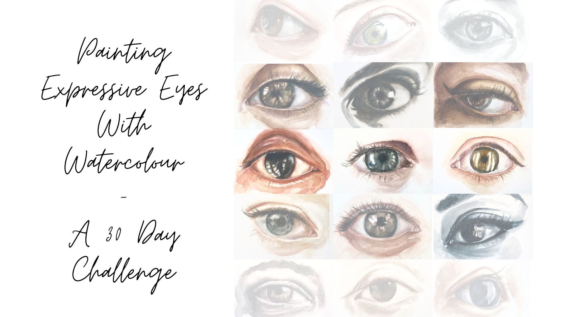
9. Painting the Eyes: This lesson we're going to
look at how to paint the eyes. They are the key element to your portrait and the
character of the rest of the face is somewhat
determined by them, so they are really important. I'll be using my smaller
number three brush as we'll be getting
into the details. We´ll be starting
with skin tone 2 as before, putting it
into the mixing area of my palette and
adding a little bit of coffee brown that we
mixed earlier with, just going to intensify around
the eyes with this color. Just also want to make sure that our first layer is
completely dry. It's important to
remember that we're not painting a realistic portrait, but rather an expressive one. The photo is there to give us a guide and the base
from where the start, but we can use our
artistic license to use our watercolor in an expressive
way, as we see fit. You can also omit things that you don't want
on your painting. I decided, for example, to not paint the
background color and just leave it white. While we wait for this to dry, we will just start
on the other one. Same color, same method. Now for the shadow
under the eye, I like to use the purple shadow. We're just going to continue
to intensify around here, around the top of the eye. Just like we did before, building up our layers. Defining some details, the
eyelash line for example, or the top of the eye lids, also the bottom eyelid. Just get into the details there with your small brush. Once we're done with
that, we're going to start painting the iris. For this, we're going
to use our blue black, or Payne's gray. You can paint over the pupil, but if you can, make
sure you leave the highlights of the eye reserved as the
white of the paper. Will be continuing to build up our layers going from
lighter to darker colors. And we will be going
over the pupil with lead pencil once
the pupil is dry. And later on with our
watercolor, again, you can choose if you
want to wait for it to dry or use a hairdryer, but it must be completely
dry before you start working on the pupil
with your graphite. Otherwise, you'll
ruin your paper. Before you apply your
color to your paper. Remember that we are putting
it on the test sheet first to see what the color looks like when we
get it onto paper. So I've decided
that I don't want the iris to be just one
color, one uniform color. So I'm taking away some
of the pigment and some areas to make it
a little more varied. So just like we practiced, when the paint is still wet, you can take some pigment away by just dabbing
your paintbrush on there and continually drying it with your
clean paper towel. So once that's completely dry, we will use a 2B pencil
to go over the pupil. And also the eyelash lines. Don't press too hard. We don't want to be making
indents on the paper. We can also darken the
outsides of the iris. Just don't overdo
it with a graphite. We still want this to be
a watercolor painting. See, we can make very
small pencilstrokes here. To shade a little.
Press lightly. If you've found you've used too much graphite,
don't worry about it. You can just go
ahead and erase it. Now that we've got
our pupils ready, we're going to start on those eyelash lines starting with the left here,
just lightly. And the outside of
the iris as well. The corner of the eye, shade a little under the eyelid
up the top there. It's always darker
under the eyelid. Right, now the other eye. So when we've got facial
elements that come in pairs like the
eyes, for example, we always want to
be working them at the same time because if we do one completely and
then the other, they are just going to look really
different to each other. Alright, now we'll
just emphasize a few details up the top here, the crease and the eyelid. Alright, so now let's move on to intensifying those areas we've just worked on with the pencil, with our blue black paint. Okay, so we're going to
be going over the pupil, the iris, and the eyelash lines. Starting with the pupil. Remember that we won't be
using our blue black on skin tones, but it's really
useful for these details. So as before, I don't want the iris to just
be one uniform color. So I'm just making a
few different marks here so that it has a
bit of tonal variety. I feel like that makes it
come a little bit more alive. So observe how usually there's a little red and
the corner of the eye. Well, actually in both
corners of the eye. So we're gonna be
using our skin2 to just put a wash in
this corner of the eye. The white of the eyes
never really, really white, it's always a little, either
a little reddish or a little bluish. So, for the
corners of the eye, we're going to be using Skin2. And for the whites of the eye, we're going to make
a very faint wash of our blue black
or Payne's gray, but make sure it's very faint. Otherwise it'll be too dark. So yep. Also in this
corner of the eye, we're also just going to put
a little bit of reddish skin2 on these areas here at the top of the eyeball
and at the bottom. I'm just going to intensify that a little bit and then I'm going to move over to the other eye
and do the same over there. Now I'm going to start
with my light wash of my black blue to paint
the whites of the eyes. Just faintly, see
how faint it is. We don't want to make it very overpowering because
then we have these weird dark eyes,
we just want it to not be the whitest
whites of the paper. Okay, So I'm gonna
start intensifying a little more this area of the
eyelid with purple shadow. You can also use skin2, add a little purple shadow
or just skin 2. This is kind of, from now on we're going to
be working intuitively. I'm also going to be using the purple shadow for the
shadow under the eye. Remember that we're
building up layers here, so I'm not using the
coffee brown yet. So we're just going
to start with our purple or skin 2 to intensify
these areas. Okay. Remember that little
white line that we've reserved at the
bottom of the eye. If we start putting a
wash over the eyeball, it will really
start to come out. Right? So I'm going to
use our coffee brown to start intensifying
the eyelash line. At the top and the bottom. Remember to work in pairs. So I would just intensifying
here and you can start using your colors a
little more intuitively. If it's no good, you can always erase it by dabbing your clean
paper towel on it. Right? So intensifying this area
also with the coffee brown. Just putting a few
details in there, see how the eyes are
starting to stand out. You can also intensify the shadow of the eyelid with a little bit
of coffee brown. Careful not to go over the top. Now, I'm really
loving the shadow on the left side here by the eye. So I'm just going to intensify that by taking
a little Skin 2. And let's add some cadmium red to it because I really
like that red tone. So I'm just gonna go
ahead and intensify that. So as I said, your
use of color is intuitive once you
get a little bit more experienced and practice. So you can also
use, for example, the skin 1 and add a little bit more cadmium
or a little bit more crimson or a little
bit more ochre depending on what your
photos telling you. Just experiment a
little bit with this. So after making sure that
my layer is completely dry, I just want to darken
these corners of the eyes. So again, working in pairs. Also want to darken a
little bit the pupil. Just want the eyes to
really start standing out. I find that once the eyes really start to
come out of the paper, the painting becomes alive and it makes it a lot
more fun to paint. Just going to start
on the eyebrows. Now, I'm probably going to be painting wet on wet for these. So we're just going to
put some water into the area that we've
outlined as the eyebrows. And then we're gonna get a
coffee brown and just dab it. And then, you'll see how the paint starts to
expand a little bit. There's gonna be a bit of
an organic feel to this. Later we'll add some details. If you have too much water, just use your brush to absorb
some of that excess water. Just a little reminder. You can choose if you
want to smooth out the brushstrokes or
leave them as they are. Remember that if
you make a mistake or a drip of watercolor, water drops onto your
page, don't worry, you can just erase it by
using a clean paper towel. I realize that there's a lot of information in these classes. So if you feel the need, just go ahead and watch them again until you
feel comfortable. So I'm just going to intensify the eyes again a little bit with my thin brush and my blue black. If you're not seeing a lot of different colors in
your photos just yet, don't worry, it's a
training the eye thing. After practicing for a while, you'll start to see tones
and shades that will really help your paintings
have some more variety. If you didn't manage
to save the white of your papers for the
highlights in the eyes. You can now go ahead and grab your white watercolor and
just without diluting it, apply it thickly like little specks in the
eyes as the highlights. Now, this is not the
final stage of the eyes. We will leave them
here for now though, and revisit them again later. But first, let's go ahead with the rest of the
features of the face. In the next lesson, let's have a look at how to paint the nose, mouth, and ears. See you there!
10. Painting the Nose and Mouth: In this lesson, let's keep going with painting the
features of the face. Starting with the nose. We're going to use our 2B
pencil again in the nostrils. And maybe also use some light pencil strokes to do some shading around
the base of the nose, also on wing of the nose. And after that, we will
go back to watercolor. Remember to work lightly
with your pencil. We do not want to
press too hard, so we get indentations
on the paper. We don't want to go over the top with the graphite pencil. It's just a tool, but it's still going to be a
watercolor painting. And remember, if you're
using too much graphite, you can always erase
it with your eraser. Back to watercolour. And I'm going to start
off with skin tone 2. We can also use purple shadow to start adding darker
areas around the nose. But at this stage,
the purple shadow is really the darkest, we're
going to go. Later, we can start adding
coffee brown, but remember that we are building up our layers
little by little. Remember that watercolor is
supposed to be translucent. So if you're using
too much pigment, you can even move it around or just absorb it
with your paintbrush. I'm actually going to start
using my number three brush first for the details,
for these outlines. Just going to mark
the shadow here underneath the nose
and the nostrils. So as you can see by
building up our layers, we're really starting to
add volume to our face. So now I'm just going to
change to my number ten brush, continuing with the
skin tone 2 to work on the bridge
of the nose and the shadow over the left
side of my paper here. I'm going to smooth out the
brush strokes a little bit. Also in some parts, I will leave them as they are to give
a bit of a contrast. See, I've used a little too
much pigment there. We really want to make
a difference between the more shaded side
and the lighter side. Now, once that's dry, we're going to start working
on the nostrils with the coffee brown and
our fine paintbrush. Again. Notice how one part of this nostril is
a little bit red. So I'm just going
to go ahead and grab my skin tone 2
with a little bit of cadmium red and just make that corner there
a little bit redder. Continuing now with
the purple shadow. Just go over what we've just done before and
see where we need to darken or intensify the
shadows. The details. Gonna go a little
bit more reddish for the shadow under
the nose here. So we'll just keep working on this layer until
we're satisfied. And remember that we will
come back to this also later. Okay, so for this moment, I'm satisfied with this. I've worked on the
bridge of the nose, on the base of the
nose and the nostrils. Okay, so now we're going
to move on to the mouth. We want to make a more
red tone for the lips. So I'm gonna be working with skin tone 1 and
adding some red. In my case, I'm going to
be adding cadmium red, but just take a look at what
tone fits your painting. We're going to be painting
one lip at a time. Otherwise, it just looks
like one big blob. Don't forget to reserve the
highlights here as well, in my case there
on the bottom lip. So once that layer
is completely dry, we want to darken the area
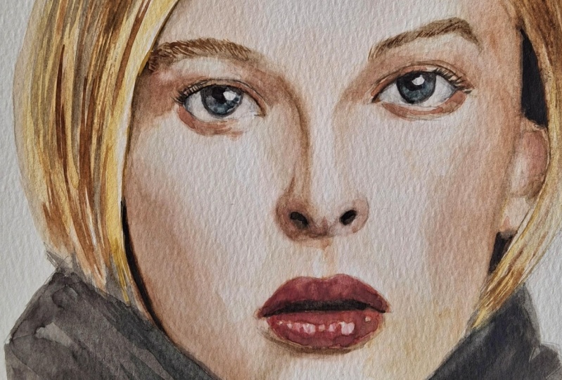
between the parted lips. And we're going to be using our coffee brown color for this. If you want, you can add some pigment into the
corners of the mouth. That's always a little darker and the corners of the mouth. Wait for that to dry. And then we can give
the lips another layer. Maybe you want to use some purple shadow mix with your lip color for
the darker areas. But make sure you
watch out around the area with the
coffee brown mix, if you reactivate it with water, it will mix with your lip color. And you want to avoid that. We're still going to reserve the highlights.
We'll just keep adding color. So once we feel like
this layer is saturated, we can let it dry and then go over it again
with another layer. I've chosen to go very red, mixed my skin 1 with a lot of cadmium red. Because in my
reference image she is wearing
very red lipstick. And I really enjoyed
that kind of dramatic effect that it has. Now I'm just going to
darken a little bit with our purple shadow. So just in the areas that I
find are a little darker, I'm just going to apply that. Now. I'm also going to smooth out
my brushstrokes quite a lot. Then again, we have
to let that layer dry and then we can rework
the dark area in between the lips and then also just put a little
more darkness onto our lips. So layer by layer, we're just going to be
intensifying these colors here. Remember you can inject more pigment and areas when
the paint is still wet. And also remember that between each layer you need to
let your painting dry. Now I'm just going to be
using a little bit of blue black here in the
parted area of the lips. This is just to give
it some more contrast. Notice how I've reserved the
highlights on the lips, but I wasn't quite
happy with that. So I'm just going to go
ahead and smooth those out a little bit
and then go back over it and add
some more detail. Just going to remove
a little pigment and then reapply a little pigment. So, let's leave
it there for now and we can always come
back to it later. And now in the next
lesson we're going to look at how to paint the
contours of the face.
11. Painting the Contours of the Face: In this lesson, I'm
going to show you how to paint the
contours of the face. But first of all, I can see my palette
is extremely dirty, so we're just gonna go
ahead and clean it. Now for the contours
of the face, we're going to be a
little bit liberal with colors and use them
quite intuitively. So for example, we'll be using the green ochre color
that we mixed up earlier. And this will really
give an intensity of richness and variety to our
skin tones and to our face. I mentioned this before, but I don't like to use one color to cover
the entire portrait. So we're just going
to be selecting some areas to apply
this color to, because that way it really
does give us the variety. And it helps us to build up
layers in terms of volume. Don't forget to paint the
forehead a little bit, paint underneath the hairline which leaves a little bit
of a shadow as well. So, remembering that the layer has to be dry before you
start on the next layer, I'm going to start applying a layer of my skin tone 3, which is the one with the cadmium red instead
of the crimson red. Just going to intensify here where a face stops and the ear starts, also putting down a
layer of my skin tone 3. And then I'm gonna
go across and apply a little bit of shadow
between the eyes. Remember that there is
a concave area there. So we just wanted just a little bit with
a very light wash now we're just going to take a smaller brush and take a little bit of our
purple shadow and just intensify the shadows around the jaw and where the ear is. Again, we're going to let
that dry and then we're just gonna go over the face with a little bit of
skin tone 2 with cadmium instead of crimson, red. I'm just telling you
what colors I'm using, but you can really just be very creative with this and
mix your own colors. You can also try working wet
on wet and the cheek area. And then smoothing
out the edges like we practiced, it gives a little
bit of a smoother look. So, remembering again that before
we start a new layer, we always have to make sure
the previous one is dry. I'm going to paint the
shadow under the lip. And for that, I am using skin 2 with a little
bit of our coffee brown. So yeah, essentially
I'm just working up my layers, intensifying shadows, injecting more color into areas where I feel
like it's necessary, like here on the cheek, I really enjoy that reddish kind of shadow that she
has going on there. So basically we're just
going to be doing that. Building up layers,
injecting pigment, intensifying shadows, heightening colors,
things like this. I'm still going to soften the shadows here on the cheek so that
it's not too intense. Now I'm going to go and work on the forehead and the
shadow of the hairline. So yeah, just keep
working with your colors, intensifying,
deepening, darkening. It's really a process. Remember also that between each layer it's
going to take a litte time to dry unless you're
drying with a hairdryer, but just remember to dry each layer before you
start on the next one. Now I'm just going
to come over to the ear here and the
hairline and just intensify that shadow again
with some coffee brown. I find that at
this stage you can already appreciate why it's not such a good idea to cover the entire face with
just one uniform color. Like, you can already appreciate a lot of tonal differences. Now we're going to intensify the shadow over this side of the face
from the hairline. So I'm just going
to go over here and go over the ear with some skin tone 2 and just
keep building up that, darkening there as well. We're just going to intensify this shadow here under the
cheekbone just a little bit. Alright, so for now we're
going to leave it here. You will see that as soon as we add details
like the hair and the clothes, the whole contrast is going to look
differently again. So we will probably come back to deepen some shadows and
exaggerate some colors. But for now, let's leave
it there and let's go to the next lesson in which I'll be showing you
how to paint the hair.
12. Painting the Hair: In this lesson, I'm going to show you how to paint the hair. So we're going to
start with the HB pencil. And we're just going to
divide the hair up into sections because we
don't want to be working on the hair is only one section because then it will just
look like a helmet. So try and find some sections that you can
see on your reference photo. It doesn't have to be a 100%
the same as your photo. So just kinda also use your artistic license
here a little bit. So this technique with working
with the pencil beforehand actually is appropriate for working with all
different hair colors. So once we've divided up into different
sections, we want to, with a very sharp HB pencil, sketch, strands of hair
within the sections. It's not going to
look realistic, but we do want it
to look organic. You press a little harder at
first and then you let it go so that it fades out. So at the beginning
of the hair where it's attached to the head and at the end of the hair
where it finishes, always going to be a
little bit darker. You can see here if you
want to press harder with your HB pencil or if you want
to be using a 2B pencil. Just don't press too hard. So this is not easy and maybe you just need to warm up
your hand a little bit. If you wanted to do
a few exercises on a different piece of
paper, feel free. So you can see what
I'm doing here. Pressing harder as I stopped at the bottom or at the
top and then let it go so that the line becomes fainter and fainter
and thinner and thinner. That gives us a feeling of
volume and light and shadow. Just remember that you
can also always erase it. Okay, so before we
start painting, I'm just gonna go ahead and
shade this area here by the jaw line a little bit because I wanted to have
a little more contrast. Now in my reference image
we have blonde hair. So I've gone ahead
and mix some ochre, some yellow ochre
with my coffee brown. And I'm just going to
start painting the hair by the sections that
I've divided it up into, we're going to paint this back
section here and I´ve added a little more coffee brown to it because it's
a little darker. And the next section
we're going to work on is not going to be directly
adjacent to this one. So we're going to choose
a section of hair that's not directly next to the
one that we just painted. That in the end it
doesn't look like just one helmet or one blob. So there's this kind of sense of the variety and
differentiation in the hair. For the lighter areas, I'm going to use more
ochre and that's going to be a little bit more of a
light wash to begin with. Remember if you use
too much pigment, you can always remove it with your paintbrush, in this way. We're just gonna go ahead and
cover section by section, making sure that the area that we're working
next to this dry. You can smooth out
your brushstrokes. You can leave them a
little bit looser. See what colors
work best for you. So now that I've done my
first layer in watercolor, I'm just going to go over
section by section again. I'm going to put a little
bit of texture in there, but also darken
the darker areas. Put a little bit of
contrast and build up my layers as we have done for the rest of the
painting as well. Remember that even
though we want to generate contrast here, we're still working
with watercolors, so we want to be using
translucent layers. And remember that every
time we begin a new layer, the one beneath has to be dry. So making sure this layer
is dry, my third layer, I'm going to take
my yellow ochre with a little bit
of coffee brown. And I'm going to take
my number 16 brush and just put one layer of this mixture over the
entire hair to unify it. So as I said, just
make sure that the layer beforehand is dry. And once that's done
before we continue, we need to make sure
this layer is also dry. That might take a
little bit longer depending on how much
water we've used. Then we go on to
deepen the shadows and create a little bit
more texture on the hair. I'm working here
on this part which is the darkest. Yeah. So exactly like we've
been doing all along, we're just building up our
layers and I'm just working with my number ten brush
for these larger areas. Just building up the shadows and the contrast and the colors. Also adding some
different shades. I've put a little bit of my
cadmium red into my mix here. Remember if you make a
mistake, it's not a big deal. You can just dab it away
with your clean paper towel. Don't forget about the
shadows on the skin. I'm just going to add a few
finer lines here to get the sensation of hair. You can use a finer
brush for this as well. So as I said, the head tends to be
a little darker down the bottom and at the
very top of the roots. And another pointer at
the back of the hair, you usually have a slightly
darker section as well. For the very fine details here, I'm just going to
use my fine brush. Just a little, little bit more darkness here to really
make it stand out. Some of these very dark areas, you can use the coffee brown or a little bit of blue black. But we're not gonna be
using just black to darken. So once you get into it, sometimes it's just
really hard to stop because you can always be adding more detail
or more colors, more texture, more depth. We're going to leave
it here in a minute. But I do hope you can see
how by building up layers, we've really made
the image start to really come out of the paper. So I'm just going
to leave it here. Now, remember that we can always come back to this once
we've done the clothes, most probably the contrast
will be different again. So in the next lesson, I'm going to show you how
I'm going to do the clothes. Stay tuned.
13. Painting the Clothes: In this lesson,
I'm going to show you how I will
paint the clothes. So first I'm going to
start off with really outlining my jaw line so
that I don't paint over it. And I'm just gonna do
that with my HB pencil. Not pressing too hard, but just so it's clear for me where I have to start
painting the clothes. So, seeing as the portrait has turned out quite neat and defined, I have smoothed out a
lot of my brushstrokes, I really want the clothes
to be about the watercolor, about the brushstrokes,
undefined and really contrasting
the face in this way. Really leaving the paint a little bit to do its own thing. On my reference image, I see that she's
wearing some sort of black top with some detail, but I'll just go ahead and
use my artistic license here. I find that when everything in the painting is very defined, it loses some of its spark
and becomes a bit boring. I'm going to use blue black
and I'm going to grab my number 16 brush and
just start outlining here. So you wanna be working quite fast because once
the paint dries, you'll be able to see
different brushstrokes layered on top of each other. I really want is just
an area of paint, undefined, flowing paint. If this is something that you
would like to achieve as well, you can also work wet
on wet technique. I've opted for wet on dry, wet on dry paper, but
down the bottom here, I'm just going to
let it flow out with a bit of water and at the top I'm just going to inject
some more pigment to make it more dramatic
around the neck line. I'm just going to
put in a couple of details here at the sides. So now once I've got my
first layer of the clothes, I'm just going to
get blue black with my little brush and just start defining a little bit more
detail areas with blue black. So just darkening, going
around the neck line, making sure it's clean. Maybe also going into
the hair a little bit, just darkening a little bit,
intensifying the shadows. One important thing
to keep in mind, if your layer of clothes
is not dry yet, you need to make sure
you don't touch it. And if you think
that's impossible go ahead and dry it
with a hairdryer. If you've used a lot of
water on your first layer, you will need to
wait a little bit to start drying because
otherwise your paint is going to spread everywhere. So I'm just using
this time while I'm waiting for my
clothes to dry, to put a few details
on here. Just a few touches of color. For your second layer of clothes, you want to make sure that your first layer is completely dry and then you just get
your large brush, in my case, the number 16, and apply a second layer. I've chosen to add more Prussian blue to my color for
the second layer. And again, you want
to be working quite fast so that we don't get
the layers of brushstrokes. Now if you've used a
lot of water again, you need to wait a
little while before you can start drying your painting, but otherwise you can just start drying it
with your hairdryer. I think we're just gonna
leave it there for now. You will have noticed that
the contrast and the face is different now that we have the contrast of the
hair and the clothes. So in the next lesson, we're going to work
on intensifying certain elements of the face again. We'll just be putting the finishing
touches on our painting. So I hope to see you there.
14. Retouching: So now we've painted the face, the hair, and the clothes. And usually you'll find that your painting is still missing a little contrast or drama,
especially in the face.
15. 15. Final Tips and Steps: In this lesson, I'm
just going to give you some final tips about
your finished work. Firstly, we need to remove
it from our wooden board. We want to do this very carefully as not to
damage your paper. Having said that, this
area which is covered by the masking tape
now will be covered by our past Passepartout in
the frame later.. So it's not the end
of the world if her paper here is
a little rough after removing the masking tape, we just don't want to rip it. So we're going to do
this by carefully lifting up the tape and rolling it from the inside
outwards like this, not lifting up from
the bottom to top. Once you've finished your work, you may want to consider protecting it with
a protective spray. I recommend using one which has UV protection like this one
from Schminke for example. Many artists choose to go to a professional framer and
to get their works framed. And you will need to choose a fitting frame and passepartout. The passepartout to or
mat board should always be acid free so that it doesn't
turn yellow over time. Essentially the passepartout separates your work
from the glass and hereby protects it from humidity
and temperature changes. Before you frame your work, remember to sign it. If you prefer to frame the
work yourself, stay tuned. I'll be launching a
workshop on this soon. So there are many, many
different types of frames and you will need to choose
one which suits your work. I've chosen a white frame with an off-white passepartout
because I like it when the work
hangs on the wall and it's not disturbed
by a loud frame. So now we've covered all the
contents of this course. I hope you've enjoyed it and that it's been
useful to you. Painting a watercolor painting
takes time and practice. As I told you, I used to really
struggle with watercolor. So I think the more
hours of practice you put into developing
your watercolor skills, the better your
work is gonna get. I've tried to make this course as comprehensive as possible, so that it's packed
with information. So if you feel the need to
just go ahead and watch the lessons again as
many times as you want. So if you haven't
started already, I invite you to start working, and working
on your final project. And I suggest you
approach it with a relaxed attitude and experiment a little
with the watercolor. Don't despair if at first it doesn't do what
you want it to. In my own work, I usually work on two or three
paintings at the time. It really, really relaxes me
and takes the pressure out of having to make one painting that's gonna be really good. So play around with the colors, the brushes get
accustomed to use tools, loosen up the hands
a little bit, and remember to have fun.
If you make a mistake, don't worry! You can go back. Once you've made some headway, I would love it if you
could upload your work into the project section so that
we can see your progress. If you have any questions, please put them in the
comments section and I will try and get back to
you as soon as possible. Now have fun with this
wonderful technique and let me know how you go.