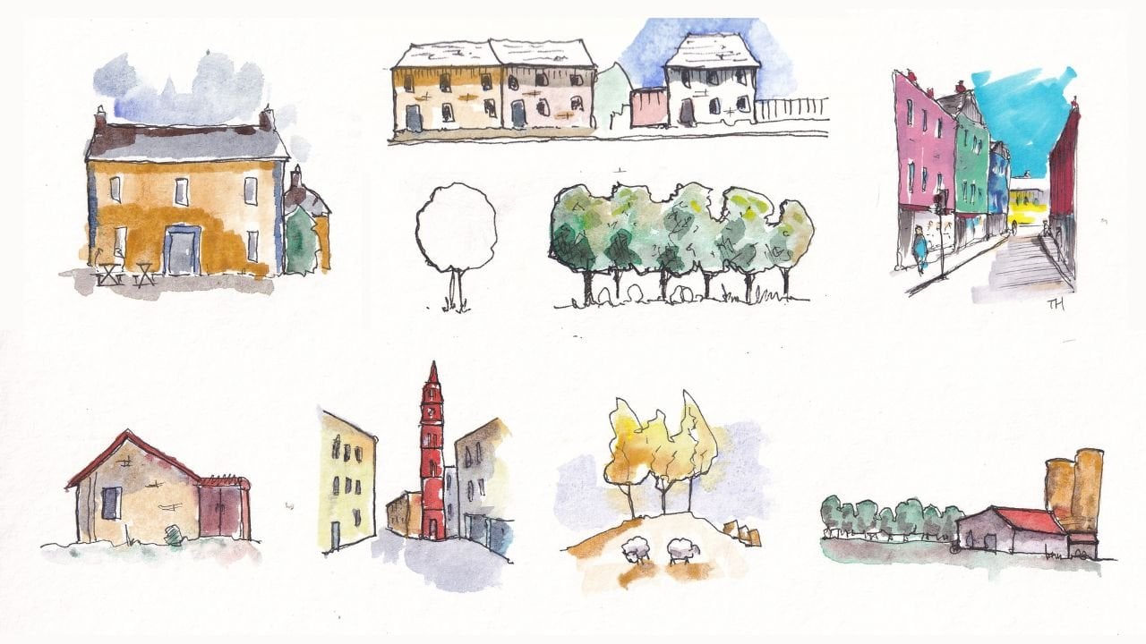
Transcripts
1. Introduction: Sketching with normal fountain
pen ink soluble document, and the kind of ink
which you can get everywhere is so simple, so approachable,
and so much fun. That is like the world's
best kept secret. Despite its simplicity,
it's full of variation, full of possibility,
and we can create such dynamic and
interesting scenes in just a few minutes. But I just don't know why
more people don't do it. Now, this sounds
like you're kind of fun and expressive
sketching technique. You're in the right place. My name is Toby. I'm known as Toby opens catch on Instagram and YouTube
here on Skillshare, and also on my website. In this class, I'm going to show you the best kept secret, the secret to
sketching with normal, cheap, soluble found in panic. We're going to use
just three things. Bit of water, pen with normal Lincoln and of
course some paper. With that and with
three simple steps, will be able to
produce a fascinating, loose, expressive
bit of sketching. Before we start the final
project with those three steps, I'll also give you the
fundamentals, the basics to you. Warm you up and give
you all the confidence you need to launch
into your project, will talk about simplification, what it means and how to achieve it with
these simple tools, we'll talk about tone and value, why it's so important in our sketches and how
understanding this can really elevate our simple
sketching to a work of art. And of course, we'll look at
how we apply final touches. There's real touches of magic, of randomness in a variety
which bring a sketch to life. Finally, I'll show you
my three-step process. It takes less than 10 min even with me talking and
narrating and explaining everything going on in next to no time will have produced a
beautiful sketch together. And that's exactly what I'd
love to do with you today. If you'd like to join in, then please do please create
your own sketch and share it by clicking on the Create
Project button below the video. Now, I hope all of that
has warmed you up, got you excited and got your inspirational creative
juices flowing. And if so, let's go
straight ahead and start looking at this
fascinating sketching technique.
2. Supplies - Just 3 things: Now the supplies you really
don't need very much. And I'm going to show you
exactly what I've got, but also talk you
through them options. But remember, you only
need three things. So what I love about this
technique is you need almost nothing and you don't
even need a fountain pen. All you need is soluble ink, which is in lots of standard
everyday drawing pens. But I will talk you through
what am I using and why. Well, I've got my
watercolor sketch book. Now this is a mole
skin sketchbook is half letter or A5 inside. And you can see it's got a lovely watercolor
paper texture. Doesn't have to be
watercolor paper. I like the texture that gives even when I'm just
using ink and no water. But also we are going to use some water in this technique. So having that watercolor paper does just let those colors that emerged from the ink
flow a little bit better. So that's my sketch book. But if you have just
a normal sketchbook, these techniques
will still work. You'll get slightly
different textures, but they'll still work. So no need to buy a specific watercolor
sketch book if you don't want,
already have one. Next, the pen. I've got my Lamy Safari
range of pens here. I got to where the fun new
one with a medium nib, any fountain pen will do, and any water-soluble fountain
pen ink will do as well. Most fountain pen inks
are water-soluble. I've got a range, so in here I've just got the
normal Lemmy ink cartridge. In this one, I've got this
Waterman absolute brown, which is one of
my favorite exit, comes rather nasty in red when we add water, which
is beautiful. In this, I've got this red. It's kind of a purply red, but it's a lovely color, a subtle red ink, but I could easily
have had blue. I've got pink and green somewhere behind
me on my shelves. But most ink is water-soluble. It's harder to find water,
proofing them water-soluble. So don't stress about it, but just any water-soluble pen will do amazingly
for this technique. And lastly, that brings
us onto the water. I guess I'm gonna be using this. It's a water brush and you can see it's got a little
water reservoir inside and a very
cheap nylon nib. That's great. It means it's easy to
buy a couple of pounds. You can track it in a bag. You'd have three or 4.1 in
each bank always full of water and your ovaries
always ready for sketching. Alternatively, just get
a big pot of water like I normally paint with
and any old brush. And that's it. That is everything you will need to basically three things, a surface, a pen, and something to apply
some water to it.
3. What is simplification?: Hi everyone. Thank you very much for
joining me and welcome to the first sort of sketching
lesson of this class. What we're going to look at
here is actually really key. It's really important
not just for this time, but for basically all up. And that is what is
simplification like? What does simplification
actually mean? More to the point when we're
thinking about this style. How can we put that
into practice? So a nice quick but
hands-on lesson. Well, I'm sure you're getting a lot more understanding
confidence about what simplification
means, of course, that translate
directly into step one of the final project,
which is simplification. So urban sketching is all about simplifying and getting
things down quickly. So in this lesson, I just
want to talk to you about a couple of methods or
mechanisms for simplification. Because simplification
is essentially the first step in our three-step process
that we'll be doing later. So what is simplification? What does simplification mean? Well, it means taking an
object or a scene and translating it with the
fewest lines possible or with the simplest
representation possible. So as an example, we could take our scene
that we have here. We could do it as a silhouette. So if we just work from
one side to the other, we could draw this chimney come down and then the
edge of the building. And then that comes
down to all we're doing is we're finding
the outline of the scene. When you think about this
classic prints that you can get of the city lines like New
York, London, anywhere else. You recognize them
from that simple, simple outline,
even though there's obviously so much more
complexity there. So we know that people can sell enormous numbers
of these prints of recognizable places
and make them really recognizable with
dramatic simplification. So why is that not
okay for us to do? And I'll tell you
it is okay for us to do. So. There we go. We have our scene and I don't
know how long that took. I've been filming for just
about a minute and a half. It's probably took
30/42 to make. And we can then build on that. In this version, we
could just create our own sort of
little horizon line, pulling that ink down. And suddenly we've taken
the idea of simplification, applied it to our own scene. We've got something really quite interesting already
and you could imagine building on this even more when perhaps colors or
something like that. So why don't we think of how we can do with
our simple ink process? Why don't I take one of my
different colors of ink? I do the silhouette
of the bottom. So we could come along
from the bottom of these buildings and maybe
even incorporate these cars. So why not do the
silhouette of the cause? And I'm gonna get
things a bit wrong and things are gonna go
loose because you can see the page is still wet. That's fine. Fine by me, at least, it doesn't
have to be fine for you. But this is why creativity so much fun because everyone's going to have a
different opinion. We can also include
this, this person. Why not just put this
person in there? Then bring it down
and we end up with a silhouette which
is joining together. Why don't we just join that
up with the colors as well. So now we've got
this kind of joined up image with two tones of ink. We can see it's
particularly effective where these inks are meeting. So why didn't we
just encourage that? I think that's pretty
cool image already. I think that's a really
interesting image. If we wanted, we could keep
building and building, but we started with something
super, super simple. And that's all I
want to show you in this really short lesson is that simplification
is not just fine. It's necessary,
it's interesting. It makes you make decisions, which is you being an artist.
4. Value and tone: Now step two of the final
project is all about value. And so we need to just
cover what that means. And again, this is a
nice hands-on lesson. We will look at what value is. We'll look at a value
scale and we'll look at why we care about value. And to give you the bottom line upfront and the sort
of short summary, the value gives you shape, it gives you shadow, it makes things come in life. Without value. We also didn't have light. We don't have brightness. I'm sketching, so hope I
haven't given it all away. But let's go into this lesson and just do a little
bit of practice and understanding about
what value means and how we can get
it using this style. Now, in step two of
our final project, we're gonna be talking
about when I say it's tone or value. And these terms aren't the
same but they overlap. What they basically means if
value is going from light, which you could say is
a value of zero, e.g. up to dark, which if
we made a short scale, could be something
as simple as a full. So what we end up with our
value scale is we have 101234. And in traditional pen, you might produce that
value by hatching. So we go for one, for zero, we've got
white page for one week, just go one way for two, we go two ways for three,
getting the pattern. Now I imagine you go three ways for week four
ways and you could keep, you can fill this up, you could change the densities. And in theory, there's an
infinite number of values between black is black
and whitest white. That's what value means. Tone is the intensity
of a color. But we can tone something down by taking in color
and adding black. So you end up with a darker, more and more moody color. You can turn something
up by taking it and adding white so you
end up with a paler color. In this way, tone also overlaps. E.g. if we, if we take this line and
we just drag it down, and we do the same here. We do the same here. And again, you probably
getting the idea. As we go up and up, we're getting a higher value. Also, deeper tone them, darker tone, there's more white mixing with
our pigment here. Unless white or relatively
more pigment here. So when we use these
words, sometimes, suddenly I know that I
use them interchangeably, which is wrong, but they are
linked and they do overlap. A really simple exercise
to try and you should just have a go at this
with a few different pens, is to craft really, really simple scenes and see how you can move
the ink around, create different values
to create shape. Because of the value is what creates shadows and shadows or what show us that
we've got a 3D object. E.g. if we take a tree and suddenly we decided to just
give it a little bit of some internal
markings just like this, just suggesting
these little bundles of leaves that you get. But if we then
activate that ink, we can give each of
those bundles or shadow. And suddenly, hopefully
you'll agree that she, this tree takes on a whole, whole lot more shape. There's another thing as
well that value does. So we've got this rally, which is giving us
a lightened shadow, which is giving the shape. But it also provides
literally light. It makes things like the only way that white
looks bright if it's, if it's surrounded by dark. So we might have e.g. a. Lump. If we just draw a silly little
lumps, would like that, might take on a Pixar
lamp, might have. My Pixar lamp is much more wobbly than the
real pixel in them. We want the idea of light
emerging for you there. But how can we do that? Well, this area will
start to appear much lighter if elsewhere is dark. So suddenly, if we just apply a little bit
of value in a few places, we can get the idea that maybe we even want to do a
little bit more down here. We've got this dark table. And hopefully you can
agree that even in this 20 s sketch, that now there is
like a merging, whereas before it was
just a white paper, but now there's this stream of light that is
lighting up the area. You could keep going as well. And this is where the
experimentation comes in. You can layer up your ink so
we could go, you know what, it's not light enough
yet, which means there's not enough contrasting dark. So we'll come in and apply some contrasting
dark above and below. What is our stream of light? And we can leave that there
if you want the texture or we could come in and soften it
and move that ink around. Unlike say, a week, making this area lighter and
lighter and lighter. There's another
little technique, but it's worth knowing
about when we're thinking about tone and value. Because you see here,
when I've added in my, my ink, I'm left
with some lines. Sometimes maybe you think
I know I'm ink sketching, but I don't want some lines. Now you can literally
come in with your brush and take some ink. So look if I do that, I
get some really dark ink. So now I could come
in and I could again, just darken this area up. And I can't promise you
won't damage your pen, but I can only tell you that I hope I didn't do a huge amount, but I do this quite a
lot and I just gentle, very soft with my brush. I have never, ever damaged
append doing this. But it is something
people asked me. So I'd say like, I wouldn't do it
with 100 pound pen if I owned on which,
which I don't. But for me it's a lovely
technique and it's worth experimenting with and
having a bit of fun with. And more and more darkness
here, look, again, this is now getting lighter
and lighter and lighter. We can even add a tiny bit at the back of this
light bulb just to show the direction of the
light coming out of it. So there you go. There's just my
little techniques, my little sort of
waffles all about value. So remember it starts
with the idea of a value scale and
value in total link, which are why these words
often get intermingled. Value creates shadows, which creates 3D objects
and creates light. So you can't have a
light image without having some dark to contrast. Now, I hope that prepares you, sets you up for our final project where we'll
be doing this very quickly. We don't see, we've
got one more lesson to go, of course before that. And then I'm very excited to sketch along with you
for our final project.
5. Extra touches, experimental ideas: Now the final step in
our final project is going to be all about
adding finishing touches. The finishing touches is kind of leaving it a little bit open. But what I want to show
you in this lesson, in this class before we
jump into a final project is the range of possibilities
that you might think about. Things to get you inspired, to get you motivated. So let's have a look at a little play and
I'll sketch book without pen and see what we
can come up with together. So final lesson now, what I want to talk to you about is just what we're
gonna be calling in final project step three,
the finishing touches. The finishing touches I'm
just going to apply to our really simple silhouette
that we did here. It's just a couple of
fundamental techniques that you might want
to try to add. A little bit of something
extra at the end. So if we take 101 thing that
you can do is little flicks. So just by flicking a
brush and suddenly look, we have this empty sky. But now this guy has a
feeling that is with us, that it's in, sort of
in the sketch with us. It's not just blank and it's also the
element of randomness, which is really
interesting, really fun. Idea number one for
finishing touches as applying these lovely
little areas of randomness. Idea number two is just
finding a few extra details. Now in our final
project would have done a little bit more detailed
sketch than this. But equally, we might
want to think about two ways that we add some
extra details in six e.g. we might want to find a window. Now we might find that window
just without pen and just do a neat line where everything
else is going to open, moved, and washed around. So you might want to
just come in and find a couple of bold lines. Something else we might want to do is find those lines but keep them really soft and
keep them really gentle. So we might say on this side, we might actually apply some water and then
repeat the process. So suddenly we're
going to add think, but it's gonna be soft, it's going to move, It's going
to flow around the page. And we end up with
something very different. So there's two ways
of applying linework, applying different
textures of line with the same tools and
nothing else has changed. Now the other thing
that we might want to do is when
we've done this, we've got this single
layer of value. We can change that
lower value in a couple of ways. We might
have done it before. But if we find we want
something much, much darker. Remember, when we were
discussing value over here, we layered in lab what we can do the same in our
actual sketch. So let's say we want the back
of this image much darker. What we can do, we can just
go over some of our lines. If we make that line
really nice and bold. Maybe you want to
go up this church even can put the pen away. Then with this new bold
line, we can layer. So suddenly we can
bring down extra Toni, do you see how instantly
we're making things darker? We could smooth
that shadow over. But now we've got this dark
area to our sketch as well. So there's just a
few little ideas, little things to think about
and to experiment with. How can we inject some
randomness into our sketch? How can we apply different
linework in our final stage, which doesn't overwhelm
the previous linework. How can we ramp up those
levels of tone? Don't forget. Also, you could add tone through the fountain pen technique as a palette that we did before. So perhaps you just want to do real darkness in these windows. You could do that as well. There's a few other things
that we will try in our, in our lesson like
cooling and lots of water is something that we'll do in our actual sketch as well. But for now, have a go with
these very simple techniques on a very simple scene. I'll see you in
the final project.
6. The Final Project Explained: So the final project, the final project is
going to be all about creating a really lovely, loose, interesting,
tonal, shadowy sketch. And we're just going to do
that with our three items, or pen and paper and a brush. And with that, we'll
do it really quickly creates some really
funky, lovely sketches. I'm going to show you the
full three-step process. So step one simplification
step to adding value. And step three is Hugh fun finishing touches to really just bring everything together. What would be amazing is when you've done your
project or projects, and I'd welcome people doing multiple sketches here
to share your sketch. And you can share your sketch
by clicking here under the video and then pressing
on Create Project. What I make sure
to do is come back to any project that people do, post and leave a comment
or a discussion or give them feedback so that
we can have a bit of an interactive
experience together. And that I think is what makes sketching and sketching on
Skillshare really great. With all of that. I guess it's time
to start sketching.
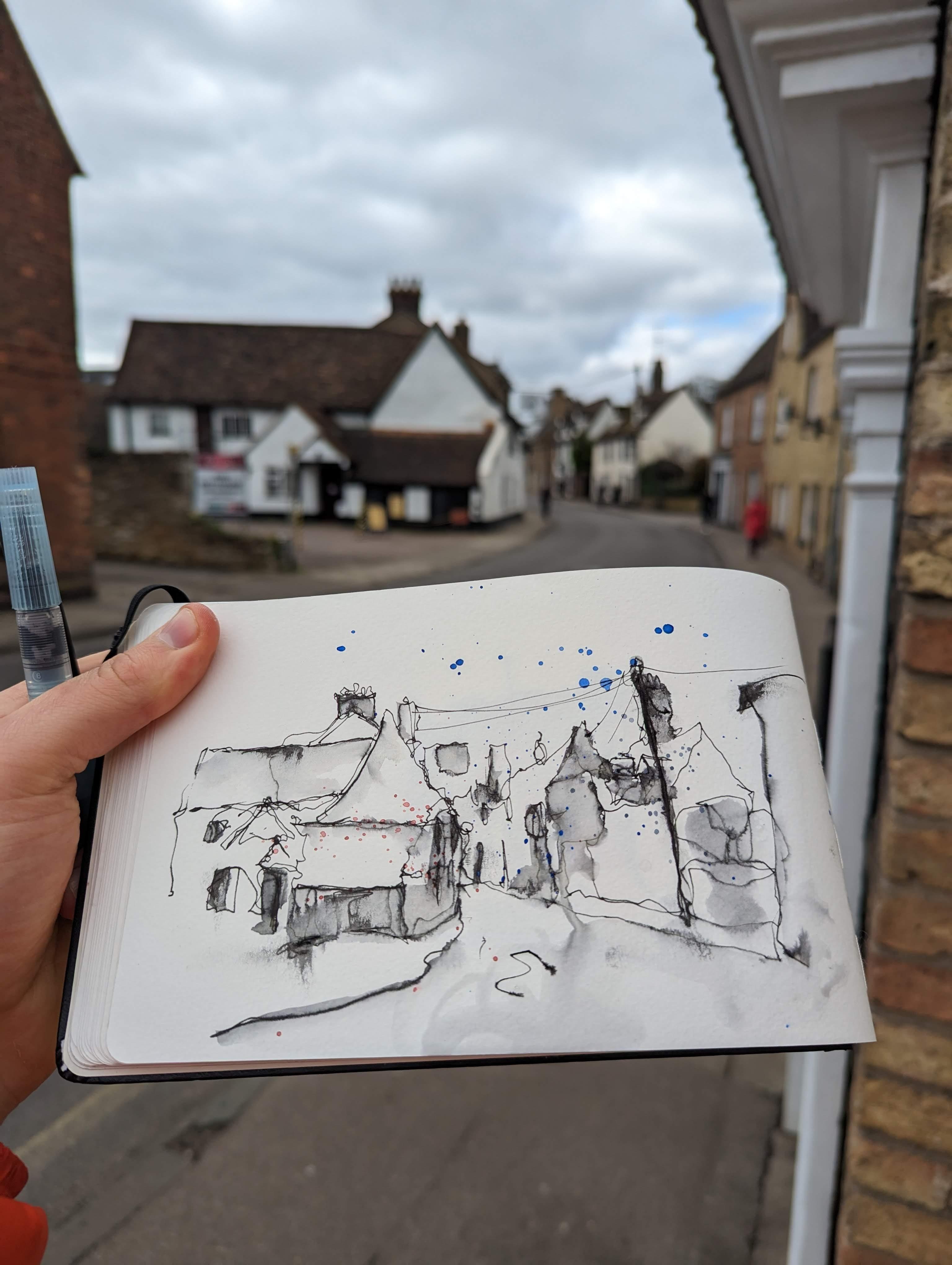
7. Step One - Simplify: Now step one, you
should be really warmed up for this with our
little warm-up lessons. And we've already talked about exactly what
simplification means. Don't forget to grab
the reference photo. And from there I will
be demonstrating step one of our sketching process,
which is simplification. So hello everyone. This is the final project
and this is step one. What is step one? Step one is simplification. So we're going to simplify
in a couple of ways. We showed the silhouette
method in our warm-up, and I often talk
about shapes as well. So let's just dive straight
into our sketch with our same pendulum is far a medium nib with
Lemmy black ink in it. And we'll, we'll apply our silhouette and we'll
look at shapes as well. Now this is going
to be quick and loose because the fund that fascination with this technique is that you can go out
with these three things. Pen, water, brush,
and sketchbook. Stand around and get a
whole scene sketched. Make it fascinating,
make it fun, make it interesting
in less than 10 min. So even with my waffle, I doubt we'll spend very
much longer than 10 min creating my final scene. It may take you a
little longer just because you're not as
confident with it. Before long, U2 will be sketching things
in that timeframe. As long as you're happy being
loose and letting go of the need for perfection if you're able to do that
and if you want to do that, of course, because not
everyone wants to do that. Not everyone wants a
really loose sketch. Anyway, let's just start going to start up here
on the left again. And we'll go left to right and
we'll grab our silhouette. The nature of grabbing
the silhouette means it's already loose because
it's hard to measure. It's very hard actually
to measure and get us through it. Absolutely right? What it does do is it sets up
our perspective very nicely because by coming along
and silhouette like this, you'll find you aren't
getting the angles, that sort of flow of
the scene, right? And you're not actually
having to think about perspective because you're
only drawing a line and you're just
looking at where does this line move to how,
how angled at it? And that is perspective. It's the angle of
our scene really. Before we've done. So we come all the way across
and it took no time at all. We've got to
approximately right. Good enough. Now notice
I've not done all of these foreground lampposts and there's a good reason for that. We're going to
leave them to step three because you want those
lines crisp and clear. And that comes back to us
talking about how can we add finishing line workers
finishing details. So I'm leaving the lamppost and the telephone wires and
we'll come back to those. But we're going to do now
is think about shapes. So actually I'm going
to come in and bring in one more building to the
left and we can come down and look at
what shape that is. It's like a rhomboid
and then it's got a rectangle in-between. So now what we can
do is we can come along or whole silhouette. We can make the
shapes underneath it. So here we've got a square, we've got a circle. And we've got this little while. Just a line, really, isn't it? So you don't have to call
everything is shaped. Sometimes they're just a line. Then we can come along
and we know we're gonna be making this parallelogram. But we can also find
the little shapes. So we've got the
tools to Windows. Another window here,
another window here. These are all rectangles going back, got
little rectangles. Before we finish off
our grander shape. As you get back, it
gets harder and harder to find the definite shapes. But it becomes less important to find
the definite shapes. Instead, we can just
find the kind of forming little tiny
rectangles and slivers. And everyone in front here. There's kind of, I know what this church
looks like unfortunately. So I end up imagining
I can see things. There's actually a couple of
windows here coming down, but to me in this image it
looks more like a circle. So I'm going to just
draw the circle. That's enough detail, enough shape for that
part of our scene. Now you can see, look what's
happened, What's happened, I've gone terribly wrong. My bottom lines actually come
up too much isn't than it. So we can do a couple
of things about that. Now because we've done a really loose silhouette line sketch. Well, either we can
just ignore it. We couldn't correct it and we can correct it
in a couple of ways. We can either raise this side, we can lower this side. Now, for the sake of argument, I'm just going to raise
this side and go, you know, I got that,
got it wrong here. I brought this up too high. A lot of problems.
So what we'll do, we'll just do our silhouette. We're just gonna go
over our old cinema. Recognize we got it
wrong before long, just by a little change. Now, float and work together. And it didn't take a
huge amount of stress. It was just a little I
noted I got that wrong. So that's let's just correct it. And as long as you're happy
to just a loose style, you will to note these
things, not let them worry. You can know it
doesn't look I mean, it's it's certainly
not perfect at it, but it doesn't look
wrong in the same way. I'm just going to introduce
you've got this sort of pavement line and that will help reinforce some of the
flow of this scene, kind of reinforces this
perspective going in. And that's it. That is
the end of step one. So that's pop-up pen away for a moment and
get a water brush out. And we'll start at
step two in a second.
8. Step Two - Add Value: Step two now, so step two
is creating that value, that shadow, and having
a bit of fun with it. This is a very quick
step and we again, we've already talked
through the kind of things that we might
be looking to do. So let's just jump into it. So in step two, we
just compute using our brush and just might
want to check it's clean. I like to just clean it off at the back of my
book, To be honest. I just use a page somewhere
at the back and then I don't have to carry on tissues
or anything like that. And with this, we're
always using the same ink. Oh, even if we're using
two or three things, it's still all of these kind
of ink like murky tones and cleaning it off on the
page works fine for me. What we can do, we can
find those values. So a top tip for this, for this, for finding values
and your theme is squint. And if you squint,
suddenly everything which is dark will
become darker, everything is light or
suddenly pop out a lot more. So suddenly we can find
there's just basically a heap of darkness which is meeting all
the way back here, but there's some
elements of light. So the top of this church is like then there's less
darkness going on here. And then there's darkness at
the bottom of these houses. There's also talking to for
free this pavement and I mentioned some fun we'll be
having with pooling water. So what I'm going to do
with my little water brush, drop some water down here
so we can end up there. We go. Nice puddle and we can just
pull the ink into that, give it a swirl, get that curb involve. And now what we'll get some natural movement of all
that ink naturally flow. Just like with watercolors, it's going to create textures
that we can't on our own, we can't actually create. So we're going to end up
with something uncontrolled, uncontrollable, but
fascinating because of that. Now you'll notice, as I was
doing my tone over here, I was taking a little care
not to not to color and e.g. the windows just
leaving them a bright white leaves us flexible. Losers variation that
leaves us the ability to just have something more interesting in that they are in fact dark on if
you look at them, not too dark, but it's okay to flip things
on their head if we're doing it on purpose and we're aware that we're
making decisions. And making decisions. That's exactly what
art is all about. And that's it.
That is, step two, we have activated
or ink might have waffles an awful
lot and it's still taken us a little over 2 min. Having activated that,
we're going to have this fascinating scene
which we're gonna be able to come back to
you in step three, where we will be
adding final linework, changing the values
a little bit in places, adding some randomness.
9. Step Three - Finishing Touches: Step three, finishing touches. And this is where it gets
fun because we're not just doing something we
kinda planned ahead to do. No, we are responding to
what's happened on the page, as well as thinking about a reference or the
scene in front of us. Really fun, really interesting, and loads of possibilities here. Let's jump in and let's say
you have a little c together. What kind of things we
might want to do here. So we're back for step three. In step three is
kinda, like I said, having little final
touches and this is where anything goes. We get to just play around, discover what happened and decide from what's happened
and what's in our image. We're in front of us,
what we want to do that. So we're gonna be using both
our pen on a water brush. We'll start with our pen
and just take a moment to look around and see the
shapes that have happened, the movement, the flow. I've still got a little
bit of water here. So I know that if I go in there, I'm going to get
different textures to elsewhere where
it's nice and dry. Mostly I wanted to dry
because I can add water, but sometimes I want to be
able to have crisp lines. Now the first thing I do, I'm noting that a little
bit of my center, it's been lost, a lot of, lost a little bit of my structure. I'm going to start by
finding the ketone, the key parts of the
silhouette back. And we can also add
extra details at this point if we want, say, e.g. the top of this little
chimney might have a little bit of fun
if we just added in. Now also notice as I'm
going around that this is a very dark area
in the reference. I'm going to load up
the page with ink. We can do the same around some of these windows frames
and then perhaps just come into the bottom of the buildings a little
bit at the same time. I'm going back notice I've lost a little bit
of the roof shape. Perhaps I never really had them. Perhaps you're
always a bit messy, but it's a chance for you
just to find them now we'll reintroduce them or add a little bit more character. And by doing this, by adding
all these extra lines, we're also sort of hatching and introducing a lot
more tone and value. The touchy done pretty well. But again, on this side, on the right, it's a bit darker. You can see the page
source a little bit wet still, but that's fine. It just means things are flowing and loose and when I'm
putting my ink down, it's already spreading out. Obviously, we don't
want the page to wet, but a little bit of dampness
is absolutely fine. That I'm going to
work my way up to the other part of the
image, the other side. And just get it feeling
a bit more symmetrical, bit more balanced fund
this extra details, There's a couple of dual signs. E.g. maybe we just want
to add a couple of these windows and just
keep moving around. I left out this this wool. I'm not sure why I felt
they leave out the wall. Then also this lovely tree, we could do the tree just
really simple little lines. These are lines can
suggest branches. And if we leave this try we end up with this really
fine texture, which is another variation on very different to
the rest of them. Loose and flowing texture
we've got elsewhere. These pavements have
definitely been lost and they're quite important
for their perspective. So we add them in and then
we can also just come back and create some randomness, some texture in the middle, you can see how that
water is really impacted, how the pens float,
but that's fine. That's part of the randomness. We can come back and
I've got my brush pen. And we do the same thing
we did before really, we are reactivating
some of that ink, being a little bit
more careful now. But look how we talked
about all these dark areas. Look how much extra dark we can now get with
a second layer. This is like that layering
you doing in watercolor, but it's the same ink
we can layer up or ink all of these little
shadows, little places. We can just start introducing
slight variations. Not just one flat layer,
but slight variations. Really fun to get some splashes
and we could do that just splashing off the top of our and are found to
be nice and gentle. But by doing that, it just adds randomness,
it adds variety. It, it fills the page. It removes some of that
total blank space. And it makes a negative space in the building stand
up so much more. Now, we could finish there. We could finish there.
But there's always, if you want, always a few
extra touches we can make. And this is where we can start adding those
things like the tree, where we want fine lines. You want something
a bit different and we don't want that loosens
wishy washy texture. I'm talking of course. I'm talking about
the telephone poles and talking about the signs. I'm talking about the lampposts. I'm still gonna
make them wobbly. So he saved my lovely little wobbly lamppost
here on the left. It's still going to keep
it wobbly like that. But I'm going to have
them being a dry, fun and more crisp structure than what the looseness
before at it. In a key part of this
is the telephone was, I always suggest practicing
your telephone wants to sweeping your pen from
one side to the other. Doing a little practice. So that when you
actually do online, you can be confident
that you're going to get about right. And just be nice and loose. It doesn't matter if they're
not totally continuous, doesn't matter if they
break up a little bit. And also, we don't
want them too hard. We don't want to use straight. These are flowing loose lines. So just keep practicing and we can just add a few of these. And again, it's one of these
things. Don't add too many. At some point. We need to stop and
think and hold back. You can feel hopefully how by adding in these
lines on one side, we kinda twisting the vision with balancing out a lot
of this negative space. That's the joy of
these flowing lines that they sort of
balance things out. But perhaps I've gone too far, perhaps is too much pulling. So let's try adding one
more detail on the left. A little, a little
a telephone book, telephone, TV, Henry Hill. And then of course,
don't forget to sign. Signing is really important. It's where you are being proud, being happy, showing off what you've done them and
how good you are. And even who's not perfect, you're still brilliant
for just doing something, being creative and putting
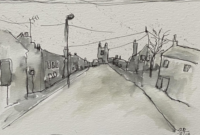
yourself out there. This scene is from New
York, it's Mary street. I'm actually in the distance. You can see some Mary's
Church, so that's, that's the church that
we are focusing on. There's actually a
cheat incident to announce all the
churches equals married. So you always notes and Mary's. Now with that, that is
my main final project. Done really quick,
less than 8 min to do this final step
and less than 50, maybe 60 min to do
the whole thing. This is exactly the kind
of thing that you can do. Anytime with such
small equipment. Just walking around,
standing around. Really simple process,
three easy steps. Only need three
bits for equipment. So just go out, have fun. Try if you're wanting
to create this at home, or even get out on your
local street and do a little sketch book
and create outside. Thank you very much.
10. Bonus Projects - Speed Sketching: So this is the final, final lesson where we
are going to be doing two more bonus projects and
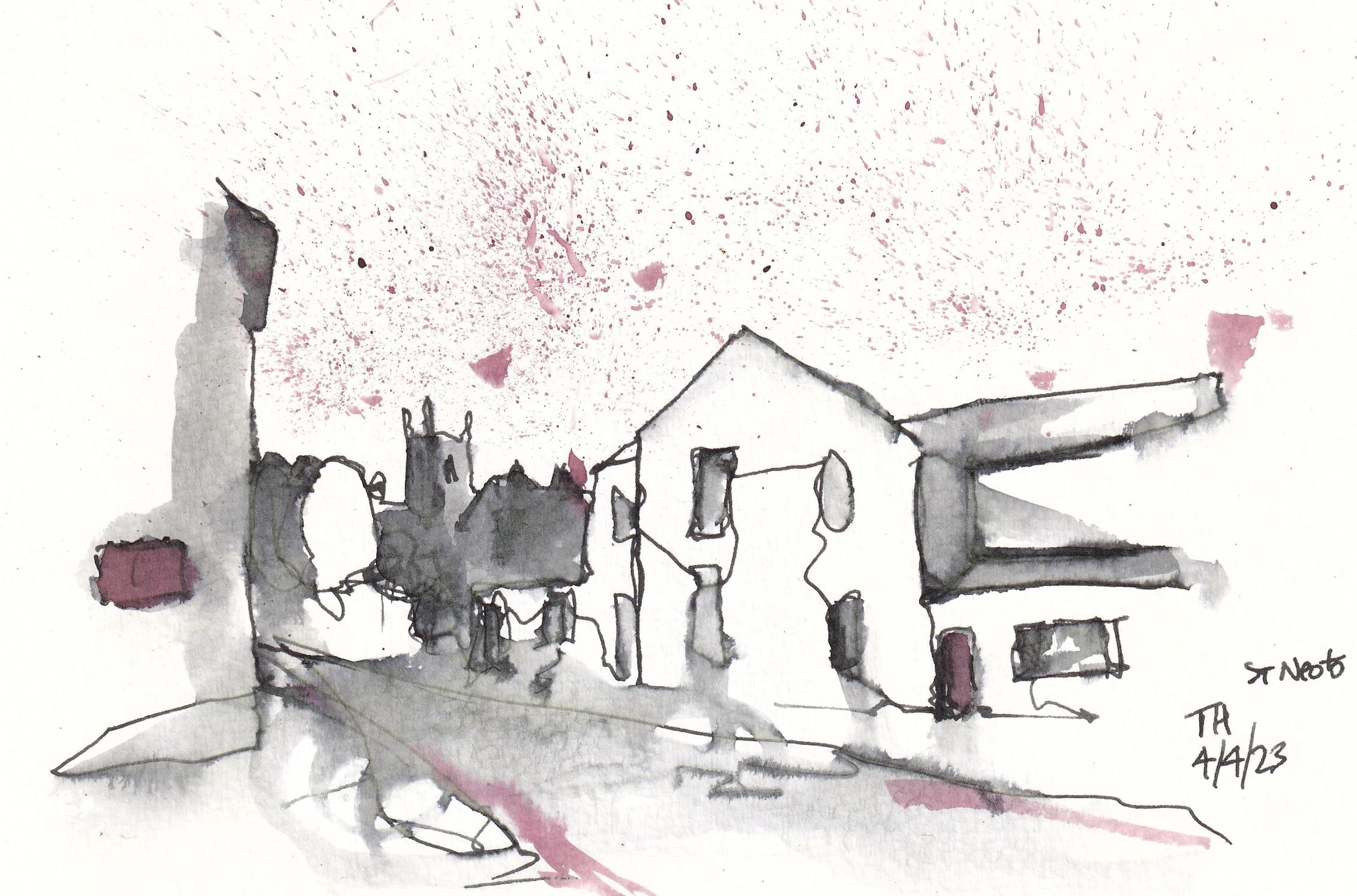
using the same processes. This time, I'm using my Lamy Safari pen with
some brown ink and not absolute brown ink we mentioned in the first
supplies lesson. Now notice that in this first step we're doing the same thing we
are simplifying. I haven't drawn a whole
horizon out this time. I've drawn a little
bit of a horizon that I'm building the
shapes in under it. And also building the amount
of ink on the page ready to load the page up
with ink later with our brush when we can
create our value. And now I can come along and
I can produce the next bit of this silhouette before adding the shapes
in under there. So we don't have to do the
steps we outlined before strictly in exactly one
order. We can play with them. We can supply in different ways. When it comes to adding in the left-hand side
of the street, we can just measure across so we can measure
against objects. We've already got to
get the right height, the right sort of
bottom and top. So we can see the edge
of this building. These come level
with that chimney. And then just by doing
that simple little step, we can easily get our simplified
sketch approximately right, approximately
in proportion. I'm looking really
interesting already. And that is it, as
simple as that. That's step one of simplification of our
final project done. Now remember, when we come
to value, this is step two. We talked about hatching before. There's no reason we can't use hatching or a little
bit of extra line work. To start off our step two, we didn't have to go
straight in with the pen. We can load the page up with more ink ready to be
activated by our brush. And look what
happens when we use this lovely brush
on this lovely egg. We get this kind of
nutty, warm brown color. Now we can already see there's a whole heap of fun we can
have not just with one ink, but with carrying around
a second pattern, or even just having a different ink cartridge
that we play with occasionally with a normal pen by using this different tone. So this is a dark value, but because it's kind
of a different tone we can play and have
a really interesting, a different field or image. But it's exactly
the same technique. We're doing exactly
the same thing because we're squinting, finding the shadows,
funding the dark areas. I'm a full lung would
still just as quick. We can now come in and we can find extra details,
find extra darkness. We can re, evaluate, refund or shapes, even adding some new shapes and
some new lines. But again, I hope
you're seeing that this is exactly the same process
to actually same thing. Now we said in the
final touches, anything goes, isn't it? So why not use our finger? Why not use a bit of
wet and ability of our finger smudge and
move things around. Of course, signing our
image because our signature is us being proud to
show off, are up. Now on to our final,
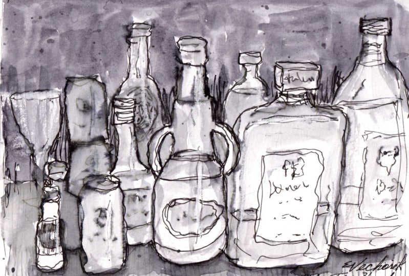
final project. And this is easy. Another, another pen. So this is a, another allow me sorry, this time with red ink by combi. And we're doing something
completely different yet we are actually sketching my
drinks cabinet because why not? Because why only use
these techniques outside? Why not use them inside? Why not find a
little still life? It didn't have to
pay drinks cabinet. I chose drinks
cabinet because look, we can apply the
same techniques. We've got this silhouette
line that we can produce the tops of the bottles
and we can come down the bottom and do
the same thing. We then got all these shapes, shapes on shapes and shapes. The shape of the bottle,
the shape of the cap, the shape of the label, and all of these things
just gradually bit by bit, we can build up to produce every interesting sketch when we have a look at our scene. So it's obviously
incredibly complex, much like we have in
our urban sketches. There's a huge amount going on, So simplification is
absolutely necessary. As is value. Value describes the
relationships between things that describes the
liquid in the bottom, it describes the shadows, the shape it shows
these are 3D, not 2D. Again, you see we can use some
really simple hatching to effectively load our
page with ink before we come to applying our water is a really important concept in still lives is just to
apply that horizon line, that line which shows the floor and the wall meeting that
prevents things floating off. It prevents the idea that these
things are floating away. Again, our step-2 begins while it began with the
hatching, really didn't it? But it moves on with a
little application of water. And then we can move
around the ink, we can move around all that
hatching little by little. We can also look here the
idea of that negative space. Remember we're creating light. Well, we can create
reflections on the bottles by putting
the ink onto the wall, making the wall darker
than the bottles. And then suddenly the bottles are light and shiny
and reflecting. Before coming back for
our final touches. Final touches maybe this
time it's important to get the feel of
all the writing on the labels as well as
recapturing those shapes and solidifying some of
the important marks. This time maybe
we're trying to make more of a focal point so we can focus on of online work on one
side of the image, leaving a lot of the other
side of the image, as it is, as a really loose, light,
slightly tonal sketch. And they splashes, I can never
get enough the splashes, but again, they add, it's almost like hatching with
lots of points. Add a background of value in a random
and interesting way. So again, this
splashes are pointing us towards light
and bright bottles. And finally, that sign, let's write what we
were doing where we were and be proud of
what we have produced.
11. Thank you and next steps: So everyone, thank you so much for joining me and
it's been a pleasure. And I hope that
you've really enjoyed this process and enjoy
the little learning. Short and quick, but very expressive and varied
catching style. If you haven't
enjoyed the class, please do leave a review. You can do that by clicking
underneath the video, going to reviews and just
simply great review. You can leave a rating and
write a comment if you'd like. It really means the world
to read these things. And I do value the
feedback as well, and I try and act on any
feedback that people give me. I'd also love you to
leave me a project. So again, you can go
underneath the video onto the projects tab and just
click Create Project. Share something with us
all and just show us what you've learned and
leave a comment if you like, about the biggest learning point or the biggest challenge. If you'd like to
join me elsewhere, you can find me on
YouTube and on Instagram, and also on sketches
loose TopCoder, UK where I host all
sorts of other videos, tutorials and this and that, and just would love to
connect with you everywhere. So with that and
without further ado, thank you so much
for joining me here. Do share your
project, do go out, enjoy your sketching process, and of course do
come along and join me in the next Skillshare class.
 Toby Haseler, Urban Sketcher, Continuous Lines