Transcripts
1. Introduction: Hi there. A UN urban sketcher. He wants to know more
about perspective. Perhaps the very idea of
perspective fills you with fair. It makes it feel
like it's gonna be so much hard work you really want is a simple way
that you can use perspective, make it your friend, and make it really
enhance your sketches. Well, in this class, we're gonna be doing just that. We're gonna be looking at
one-point perspective. That is where you have a
single vanishing point. And we're gonna be using those
principles of perspective, the structural lines, the vanishing point,
the horizon line. And we're going to
be making them easy. And we're going to be
making them work for us. My name is Toby, known as Toby
urban sketch on Instagram, YouTube, and of
course on Skillshare. My style of art is
loose, expressive. I use ink lines most often
with my fountain pen to capture a scene in a sort
of semi accurate way. I sketch quickly. I
sketch for myself. I want to enjoy the
moment and I want to have a record of the
different things I've enjoyed, the different places I've been. Perspective for me make
sketches really interesting. Having one or two
points of perspective especially really
gives an extra, an interesting sort
of flow and feel to my seems to my
sketches in this class, but I want to do is
give you the benefit of my trial and error, benefit of my experience, and show you my ways of
thinking about perspective. We'll be focusing on a
one-point perspective scene. And we'll look at ideas
like Linear Perspective. Talking about all
those things are vanishing point in
the horizon line, the structural lines.
What do they mean? But more importantly,
how can we use them? How can we easily adapt
them for our scene? But also think about
atmospheric perspective, the bidder perspective
that we often forget. If you don't know much
about that, don't worry. There's a specific lesson
about that within this class. When we've looked at all
these different things, we're going to take
it into action, will have a final project, which we'll start by looking at a reference photo
and dissecting it. Finding those perspective lines. Finding by the
perspective doesn't work. But we can make it work for us. Finding ways to break up that perspective to make
our sketch feel free, you feel fun, enjoyable. We'll look at not just how pen lines and pencil
lines add 12 perspective, but also how colors and shadows
really enhance the image. And we'll do all of this
step-by-step through a series of guided
sketching lessons. By the end, I hope that you'll have gained a huge
amount of confidence and understanding of the
basic principles of perspective and
just how to use them, how to take them out and
start sketching today, tomorrow and just introducing perspective into your sketching. Be amazing if you
enjoyed the class, please do. Leave me a review. And if you've done
a class project, pop it up in the class
gallery. I'll leave a comment. And it's amazing to
connect like that equally, if you'd like to share your
image outside of Skillshare, defund the on my socials. Toby, urban sketch. Fundamentally, most
importantly though, I hope you enjoy the class
and happy sketching.
2. Theory - Linear Perspective: So the first lesson we got, we're gonna be looking
at the principles of perspective and in particular,
one-point perspective. And I know this can
feel sort of scary, but there's just a few things
we need to know about, and it becomes much simpler. These things are the horizon
line vanishing points and those construction lines
are lines of perspective. So let's have a
look at the theory. And then we can
work out how we can put that into practice. So what is perspective? Perspective literally means I'm the techniques and skills
we use to get a 3D scene, a 3D object, onto a 2D page. So the most simple idea is, how do we draw a cube
while we were a cube by giving it lines
of perspective. So here we can see a
cube has straight edges. It's all 90 degrees, but these corners are not 90 degrees and that's because we have given IT perspective. So if we were to follow
these lines all the way, we'd find they meet. These lines also
will meet no meat on a horizontal line which
joins up these two points. And now we have our sort of construction or sketch
of perspective. But what are all these lines? What are all these
bits and pieces? Well, we're going to talk
about that just now. So if we go back to square one, when we're thinking
about perspective, we can first draw
a straight line, a straight horizontal line. We call that line
the horizon line. So I'm just going to
scribble that horizon line. And that is at eye level. So there's our eyes. And what that means is in any scene is
everybody's eye level. Doesn't matter how
far away people are. Their heads will
always be around about on that level,
really small person. But there are only small because they're in
the background. Really big person
will be at the front. We've got the horizon line. We can always draw that. Next. We want to build
up the perspective. Well, this box is in two-point perspective
because there are two vanishing points and vanishing points there where these lines meet and even
vanish into the distance. Now in our sketch, we're thinking about
one-point perspective. One-point perspective. Perspective can mean two things. So what it can mean
is that there is a single vanishing point over here or on the other
side, of course. And then all of our lines of perspective will
come out from there. And then if we were to
draw a street scene, let's say we'd be
able to build up our street just by building
those vertical lines in. And then there'll be another
line which was the roofs. And the roof would look
something like this. And there'll be some chimneys,
chimneys going along. And of course there'll
be some windows and all these windows,
all these doors, all these little extra bits, they're still following
these lines of perspective. She might go to pop a
door in and tall would be just above the horizon line. Because it's got to be a
little bit bigger than people, hasn't, it's got to
be a bit taller than the person for
someone to get in it. Then as we build that forwards, if we draw a line going
over the top of our door, we know that we can
build our doors in as well so we can get
bigger and bigger doors, bigger and bigger windows. So all of these windows
will also be joined up at the bottom by another
lineup perspective. So that's what one-point
perspective means. It's a single line there, a single point, vanishing
point, everything coming up. It can mean we're looking
along a street like this, or just to show
you very quickly, the other thing it
can mean is we've got a vanishing
point in the middle. So if we draw our
horizon line here, then we can draw all of our construction lines
coming out like this. Now what we're doing, instead of looking down
one side of history, we're looking straight down an alleyway or
something like that. So now we've got
houses which will be coming towards us like this. And then maybe this is the ruse. We've got doors. All the people. Again, all the
people are just at that vanishing point level
or the horizon line level. We've got another set
of houses along here. What you can do if you
want to get really good at drawing sketches
like this, like this. You can pop into vanishing
points or one or two, toy your horizon line and you can start constructing boxes. You can put a line
there and then just start constructing boxes and getting the boxes to be exactly right and working
out when you need to tweak undecided boxes
and things like that. That's not me. That's
not what I enjoy doing. What I enjoy doing is
learning by practicing. So that's what we're
going to do is, well, we're going to go
straight into a scene. We're going to be drawing a
one-point perspective scene. And it's going to be
like this one here. We're going to be practicing and looking at how
all the details, all the bits and pieces in our scene fit the
structural lines.
3. Theory - Atmospheric Perspective: Now we often think about perspective as
linear perspective. So when everyone
says prospective, normally that we met all those lines, the
vanishing point. So things we've just
been talking about. But there's another
aspect of perspective, atmospheric perspective,
and that's all about intensity and line weight. So let's have a look at
that in practice again, because that's going
to be important when it comes to
our final project. I always like doing the
same example for this, and it's a very simple example. If we draw a simple still-life, some fruit on a table. And we draw them all
together like this. And clearly summer
in front some of the hind couple of apples or
banana, maybe some grapes. So we know that things must
be in front or behind. But it's not clear
exactly which. And that's because
we've not dealt with atmospheric perspective. So just to exaggerate it, I'm going to go to my brush pen and show you what happens if we think about atmospheric
perspective. Atmospheric perspective
is the idea that outlines and colors are bolder. The closer we can say, if this apple is
in the foreground, then simply by making
its outline bold, it will come forward. Perhaps this benign is actually
in front of this apple. So just making this
banana a little bolder, been hottest boulders at
Apple in the foreground. Suddenly this banana
is in front of that. Certainly if we add a bit
more shape and hatching, we'll see that this banana is definitely in front of this. But then these grapes are there right the
way in the front. So these are the boldest
least dense objects. Now, by simple trick of using
different tones of line, different thicknesses,
weights of lines. We've moved things forward. And the same applies to colors. So if we were to
do the same thing, a nice red apple, a nice sort of orangey
yellow banana. Neither just very loose
shapes of course, but hopefully enough
to understand than a loose green apple
on the side as well. So it's not really clear again, which shape is in the front. But if we do the same process, so if we work in
reverse this time, so if I make up banana folder, just really getting
that boldness to be stronger than that Apple. Little bit of shadow
under the bottom as well. But then we get to the apple. And that's really intense,
that's really bold. And again, we can
enhance that even more with a little bit of shadow. But then we get to the grapes. They're almost black. So intense that purpley black. We can draw their little roots. We can draw the double tops. Simply by increasing
the intensity of color. We've affected
atmospheric perspective. We've made it clear what's
in front and what's behind. When we're doing perspective.
Don't just think about all those nice
lines as structures. Also think about the
colors and the weight of the line to make sure that the perspective is
in the right order.
4. The Class Project: For the class project,
we're going to be producing a one-point perspective
urban sketch. I've popped a reference up
in the class resources. You can of course use this. I'd love you to use that. Or I'd also love you to
use your own scene. Sit somewhere looking down a street with
one-point perspective. A photo which you
really want to sketch, or perhaps a photo of your local streets,
something like that. Just make sure it's
got that one point of perspective to either looking along a street which
disappears off to one side, or looking down a street which disappears off
into the distance. We're going to start
by drawing our sort of scaffolding lines
of structural lines with our horizon line. When we've got
those, we can build our ink lines around them. And we can work out how we can break up the perspective
and make it more interesting than just a one-point perspective
structural sketch. Next, we'll add some color so the color will enhance
their perspective. Break up the
perspective a bit more, and just give our sketch
some life, some fun. We'll build up the
color and a couple of layers before adding
this final ink touches. I'm gonna do this all
with you side-by-side through this step-by-step
guided lessons. So without further ado, let's get started with the class looking at
perspective and then looking at how we can build perspective into
our urban sketches.
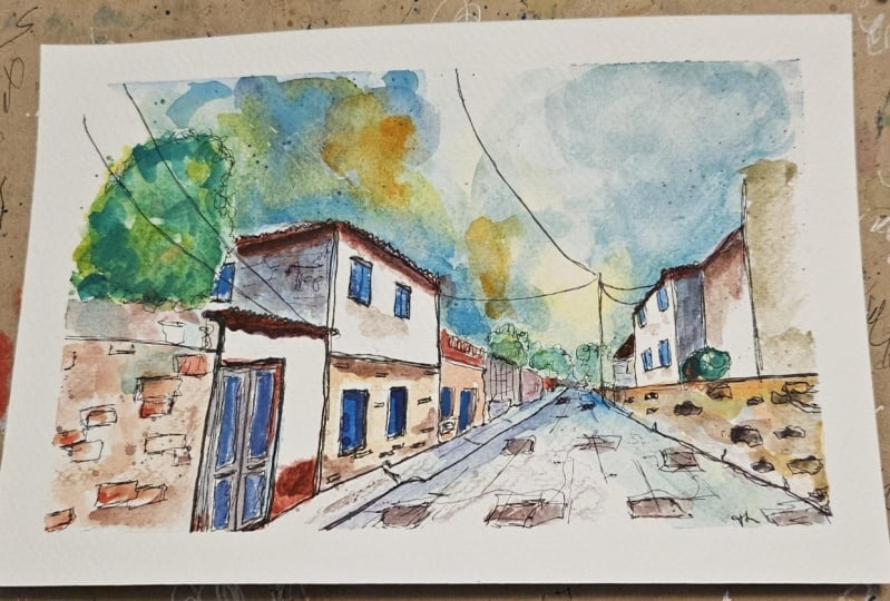
5. Analysing Our Scene: So now I'm going to show you my reference photo that I'm
using for my class project. I'll show it to you on my iPad. And we can then draw in
the lines of perspective. And we can talk about a
couple of things here. One is the perspective and the lines of perspective of the vanishing point
that we can find. But to is those bits
which don't fit. And we'll talk about
why they don't fit. Why that's important, why actually it benefits
us and makes us seem more interesting having those
bits which don't really fit our rules of perspective. So here is our scene and we're going to be
sketching it on paper, but this is on my iPad. So we can have a look
at the perspective. And you can see
that mostly this is a one-point perspective scene. So let's find the
construction lines and find our vanishing point. So we've got our scene now. Now what we want to do is find
our lines of perspective. And to do that, all we do is we look for lines in the image. So we've got the bottom of our building and
that will be able to form a nice line
going this way. We've got underneath the edge here that will form another
nice straight line. We can put that. Then we'll have another one
which comes down like this. And again, we can
put that there. You can already see
that we've found an approximate vanishing point. And all these lines are
leading towards it. And you'll find underneath
the window will line up. You'll find above the
window will line up. And we could keep finding
more and more of these lines. We can take it to the
other side as well. So if we draw out, we'll find that this line approximately fits our
lines of perspective. Will find that this one also approximately fits our
line of perspective. Now what you find is nothing
is perfect and the reason is things aren't perfect because they're on different planes. So as they move back, you see this wall is
in front of this wall. The lines will shift
very slightly. And because they're
slightly curved, so here it doesn't
fit perfectly. And that's because
there's a slight curve or the plane of the
line is different. But it's a very
good approximation. And this is simplifying
perspective. We're taking
perspective and just getting the one vanishing point. In reality. There's more
than that going on. Just going to add
in our horizon line for reference as well. I'm just going to get
more through the middle. Then we can start looking
at other things which don't quite fit our perspective
and we can work out why. So we've got this
building here and obviously this line
and the window, they're not fitting our
line of perspective at all. And the reason is
that f facing us. So all of these buildings are on approximately the
same plane going this way. This building is facing us, so it's got no perspective. We've simplified this into a
one-point perspective scene, which means anything
that actually facing us will have no perspective
lines at all. If we look really carefully
as well, we will see. So with one-point perspective are vertical lines
should all be vertical. So if we were drawing a box, we should be able to just draw down vertical line to
be completely vertical. But if you ever look, you'll see this line
isn't vertical. So if we draw it out, it's much closer to the
edge here than it is here. And the reason is, the
world is complicated. So when we look at something, there's always more
perspective than the one point that he
put in the three-point. What we've actually got
somewhere way up there, probably a few
meters off my page. We've got a vanishing
point where all of these vertical lines
control it in here as well. You see this one sloped as well. So all these vertical lines
are meeting up there. But we're drawing in
one-point perspective with simplifying things, which is what our writers
as an artist, alright, is to simplify things
and make our sketch understandable and make
our sketch fewer pool and to display the world
as we want to display it. So what we're going
to focus on in our sketch is this
vanishing point. Are vertical, lines
are gonna be vertical. We're going to have these
no point perspective areas which can be interesting. We're going to have
these fun looping areas, these areas of green which are
not really straight lines. So we're going to
make them that kind of area of the image
which just doesn't care. And similarly, you've got all these lovely telephone wires which connect up the image. There is perspective to
them, but they loop. So they're not following the same lines of perspective
as the rest of the image. If we just take our background, we can see that's the sort of construction that
we're aiming for. So you have that kind of
simple idea in your mind. I'll pop it back
on and we can make the background
come back to life. Hello, we're going to do,
we're going to simplify it. We're going to find
our perspective, we're going to find
our vertical lines. And then we're going to break
up these vertical lines with these lovely looping areas. So let's move to our paper and we'll start
sketching for real.
6. Step One - The Framework: So we've been through
everything in theory, we've had a look
at our reference. Now, let's get to our
first sketch through this. This first lesson is the longest of my
class project lessons. And that's because
what we're gonna do, we're gonna draw out
our grid that we can work from when
a torque gradually, gradually about how we
build these key areas. There's key lines and get our sketch started
on the right foot. So here's my bit of A4 paper. And I'm going to
start by sketching out Today's key
construction elements. So first we want our horizon line through
the middle of our image. Then we just want to decide on a vanishing point and just think about your rules of composition. And remember we want our focal point to be
on one of those lines, or third eye in a pop of
vanishing point off to one side. And we can manipulate our
image so that that fits. Then, instead of doing a ruler for the rest of
the vanishing point, the rest of the
construction lines, I'm just gonna do them
free hand because the rest of the sketch
can be freehand. We want things to
feel loose from the beginning and just have a
think about your reference. We've got a, a wall
going like this. Then we got a very steeply
angled roof coming up here. And we've got a few other
things like Windows, it will fill in the gaps with some other
lines to guide us. Then we've got the
bottom of the wall which is coming down,
something like that. Then on the other side we've got the we got to sort of answer. We've got a pavement first, so let me let me get the
bottom of the building. Then we got the bottom
of the windows. It's getting that line in. And then we've got the
top of the windows just above the horizon line. Of course, they're only just
above because their level with a door and the door is at about a few inches
above her head level. Now we just got a few
other tops of buildings. So let's just try
for another couple of construction lines in there. So now we've got this kind of
grid that we can work from. You didn't have
to draw this, and I normally wouldn't draw this, but this will
hopefully just display the thinking process that I'm going through automatically what I normally just sketch. So with that in mind, let's start doing our sketch. I've got my Lamy
Safari fountain pen. Just gonna get my phone nearby is today What I've
got my reference on. And we're going to start by finding some of those
vertical lines. These vertical lines are
how we rule together. This kind of image that
we've constructed. So if we just start popping in little vertical
lines and join them up. So this is the top of that roof. And then it's got a basically a horizontal line
to the next roof, which then comes up like this. And then between them
we've got vertical line coming down and
another vertical line. And then we've got some of
these loops. I told her. I said greenery,
but the greenery, the lovely work breaking up this very architectural
feeling area. We can do it with loops, we can do it with
the leaf-like shapes or however you'd like
sketching your greenery. That just breaks up
this otherwise quite strict feel of drawing. And then we can move down. So we've got now
the bottom of this, at the top of this wall, which is just above
the horizon line. And it kind of comes
down in steps and then comes all the
way out towards us. And at the bottom we've
also got sort of a bit of a mucky edge and we kind
of texture leaders, a few bits and pieces going on. Now, in this building, we've got windows so we
can put the bottom of those windows along our
construction lines. We do the same here. I love doing little
continuous line and feel and joining up things. And so that's why I've got extra lines here,
but you don't have to. You could just make
it neat and perfect and just get these feel on
the construction lines. It's going to start
adding in just a few of these details as well. Got this little guttering or rain pipe or
something coming around. So let's, let's find
that another n. Then we can come across
and we can start building up the other
side of our image. So what have we
got in a distance? We've got this building which comes forward
and then there's a fence which comes
all the way out. And then we got the
bottom of both of those. And all I'm doing is
I'm working outwards. I'm working with
my reference image coming out towards me. And we can change
things as well. Because I've moved the focal
point off to one side, the vanishing points
off to one side. I'm going to have to expand
some of these buildings, but because I've got
these construction lines, it can be very easy to expand
it and keeps some accuracy. You may make noise. I will cut this bit out. Then we can do the balcony. And we can grab
this edge that we studied quite extensively
in the last lesson. Then we can come down and
we can start finding these. Got a big window, haven't we? We've got a doorway as well. And they all meet at
these bottom edges. So at this point we can probably just bring this
bottom edge along. We find it's got a
little slight patent. It comes up. It doesn't fit this
line of perspective perfectly because it
comes up towards us. We've got the same
thing here with this pavement along this line, but then it cuts in a slightly different lines still towards that
vanishing point. Now, we can just manipulate our image using those construction
lines as our basis, but not as our strict rule. Let's get the next building. And so I'm actually
going to extend it a bit higher than this
construction line. So I'm going to bring
it is actually if we look in the reference is about the same height
as this building. So that's what we've done. Then we can bring that out. Again. We're just expanding
it a little bit, just like we're simplifying
the perspective. It's absolutely alright to
simplify other areas as well. Now, this line here, you notice I've slowed it down. So I'm adding in a second
vanishing point over here. If you want to totally simplified to one
point perspective, keep that line horizontal. And that will again, it will simplify things that
will provide a slightly warped but interesting warped in this world is
not a bad thing. I've walked view perspective, but warping perspective
is interesting. It's an artistic choice, which is what separates our
art from being a video. A video. Sometimes when I'm talking,
I'm not sure what I'm saying. What I mean is separate
art from being a photo because we change
it, we make changes. We simplify. So don't
be afraid to simplify, to change, to manipulate. And then we're almost there so we can get the top
of this wall. Then. You see how Rus gradually, gradually we're building up rather unimpressive
zooming outfield. This whole image is
rather interesting. And we can just pop this
little crumpled edge here. And then we can find some of these other looping structures, these trees which just break up all that rigid
perspective fail. Come along that day. We got a little window in
the background. Let's just start finding
now some of these details. Then we've got these
other windows and all of these things are fitting our construction
lines of perspective. And there's really
nothing clever. That's all we're doing is just because you've
got those lines in, we can use them
and we can really simply make everything fit
the same sort of worldview. Notice how my lines are
a bit wonky and wobbly. That's how I love sketching. I notice how despite them
being wonky wobble able, despite everything
being so the freehand. It still, at least for
me, you can disagree, but for me, it still works. So don't worry about
being perfect. Certainly don't worry if your construction
lines are a bit off. Don't worry if you have
to change perspective or change the size of the building or whatever you
have to do or want to do. Just try and experiment. And worst-case, it won't look
exactly how you wanted it. A little tip here when
every detail that we do, every little detail has to
fit the lines of perspective. So even though these bits here, these two handles, There's
a little vent under here. All of this, everything fits
those lines of perspective. And we can find these
list all little shapes. Now in the distance, it's
very complicated, isn't it? It's very small.
Everything's close together. So how do we accurately
sketch that? Well, we still don't have to. What we can do is we can
just put some noise there. Few vertical lines, few loops, and as things vanish,
we can't see them. And that's why it's so complex. That's why it's so hard to draw. So we don't have to see
them in our sketch. We can compress things. We can just make this suggestion
of the amount of detail. That is, they're like, I can't count these trees.
I'm not going to try. I'm going to just add a
few of our trees using similar sort of loopy but
leaf shapes elements. Then we've got
this lovely house, which he talked about
in the last lesson, which breaks up
that perspective. And then you go, that is the
first part of the sketch. Them where we have focused on all those details and
narrow them down. What we're gonna do in the
next session is just pay a little bit more attention
to a few fine bits of, of our pen work like bricks
and things like that to see how we can add a tiny bit more interest to our sketch.
7. Step Two - Details in our Lines: Having got the main sketch down, it's time to add a bit more interest and
add these little details. But there's little details
still fit perspective. So we still need to think, even with every little brick, a little bit about perspective. This might sound
like a headache, but I promise it's not. And I also promise
that as you practice, this kind of thing
becomes automatic. I also promised that it's not important if it's not perfect. And rarely are my sketches
anywhere near perfect. So don't worry about it, but just bear in mind
and have a think. And I'll show you now how I
approached this sort of area. So we've got our
broad structure here. Let's add a few more
interesting details. So I'm talking about things like this and paste things which
are breaking the mold, then not sat on our
construction lines. And then they come with
things like these wires, which again, they do
have perspective, but they're not in
the same plane. They're not sitting
in the same way. But do you see how just the simple touches and
all I'm doing, I've got my scaffold here. And then I'm applying a nice gentle loop and you
can practice it off the page or you
can practice over the page. Then just go for it. A gentle loop. And we've got a couple coming
in the edge here as well. So we can add those in. Just these lovely
little shapes which breakup otherwise
quite a rigid sketch. We also got lots of
little details, haven't. We've got all of these
bricks going on, so we can start adding in a few. And I would say less is more, especially at the
start, less is more. But the key is to remember
your lines of perspective. So all of these bricks, all the horizontal lines, will be flowing Along
the same horizontals, which is add a few
bricks here and there. And we can find maybe little
details we missed before. And we can just keep those bricks going along
these lines of perspective. So as they come further down, the vertical is still
vertical with the horizontal is sloping
more and more. And it's the same with little touches like in these windows, all these slaps will
gradually slope. Well, that's like more
and more of the top, less and less at the bottom. And we can add those in. Another point to note is these bricks were all
the same size, right? But as we get further away, so we add in a few
bricks over here, they get smaller and smaller. So that's another
part of perspective. Perspective is, isn't
just the angle of things, it's also their
overall dimensions. And as we get further away, we know they get smaller
and smaller to our eye. There in fact, obviously
the same size, but I think getting smaller. We can just gradually adding
these lovely little details. There we go. Just working
in these gradual details, sticking with those lines of perspective means that we can build up all of this
interesting or image. Keeping accurate, keeping
it fearing correct. But also learning to break those lines up with
looping structures, with other things which
don't fit the mold, which just provide another
point of interest. Things on the road are also going to fit
our land's perspective. So as, as these bricks come closer to us, they get bigger. We can very easily
just sketch in it will constructions feeling
lines all going towards the vanishing
point back there. Then we can use those scaffold
to building our bricks, remembering as they
get further back, that they get
smaller and smaller. And that is all we need to do. So now we have got our sketch. We've followed the
rules of perspective, we've built it up very nicely, and we're ready to move
on to the next stage. The next stage is another
point of perspective. This time we're gonna
be thinking about atmospheric perspective.
8. Step Three - Atmospheric Perspective: Now the last little
bit of pen work, and this time we're
thinking about that atmospheric perspective. We've been thinking about
linear the whole time. Now, let's just have
a quick think about how we can change the
atmospheric perspective a bit with our pen before
we move on to the color's perspective or
one-point perspective sketch. It's very almost finished. We're going to add some
colors, but before that, we're going to think about
atmospheric perspective. So in all of this we've
been thinking about linear perspective of
vanishing 0.0 horizon line, all these construction lines. Atmospheric perspective
is the idea that as things get further
away, they get fainter. Outlines get fainter,
colors get fainter. So it's an important thing to
consider with our pen work, particularly the weight of
line or the density of line. So as we get closer, we want online
work to be bolder. And what we can do now, we can go around some of our key lines and
just do the harder, firmer, more pressed line. We could find more detail. So more of these textures and these details are adding
to that line density. All of this adds to the
atmospheric perspective, bringing things forward. Even little windows can have that increased
density because these are windows which
should be standing out compared to the
windows in the background. So we just go around. It doesn't take long and
you can actually do this after your colors as well
if you want it or instead. Which is the way I most
often it's most often idea, I loose light sketch
and at the end, I come back and I add a few more heavy lines to reaffirm some of
that perspective. But this isn't equally valid way of doing it is just a
different order, nothing else. Then as we go further back, we do less and less for weighting of the
line until we get into the distance where we just keep our standard loose
and gentle lines. Coming forward here we can
bring out more texture again. I'm make things bolder. And before you know, it is a very short little segment of the lesson could
before you know it, you sort of got
this wonderful bit of atmospheric perspective that fits with your
linear perspective and make things very clear
what we're dealing with. A vanishing point
somewhere back here, everything here that
is very distant. Going to move on now to the color stage
and the color will have a think about how
we use it loosely, but perhaps in ways which still
enhances our perspective.
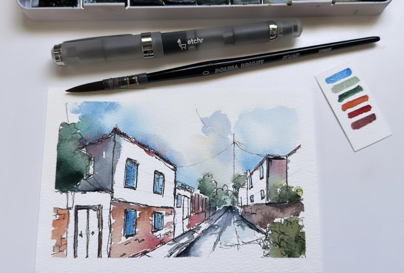
9. Step Four - The First Watercolours: Finally, that first
layer of colors coming. So color still has perspective. So we can still use our colors to enhance our perspective, to just enhance those
structural lines. Or we'll look at things like shadows and
how those shadows just show different planes
and different areas. So even though we've
moved on to the colors, we can still bear in
mind that perspective. We can still bear
in mind our sketch. As we move forward. It is time to add our colors. Now I'm going to be
using to start with my little medium-sized
Chinese brush, my standard set of watercolors. I've got big hub of water
off to the side as well as a little I've got my normal sort of
towel off to the side. We're gonna be
thinking about how colors can be used to enhance the perspective and
just generally make our image lovely
and interesting. So I'm going to start
with a really loose sky, because what we can see is this guy's got
lovely bit of texture. Some blues and yellows. So just put some
water in first and then touching some
of that lovely blue. There's two things
to think about with perspective even in the sky. One is that atmospheric
perspective, as things go further
back, we'll get fainter. And that is true for
this guy as well. Also the sky, the clouds and things will be following
lines of perspective. They'll have the same
vanishing point. So that means that the shapes, so where we have
shapes in the sky, the shapes will be bigger at the front. So we
can even do that. We can make loops and we can make them smaller
as they go back. And that's just a
nice expressive way of suggesting that kind
of feel to the sky. Now I liked just touching
in little bits of pigment. I like moving around and
keeping my sky really loose. Also by outlining the edge of our buildings and creating this sort of heavier dose
of pigment at these edges. We are enhancing those
construction lines. We're enhancing
that construction all feel and
everything flowing in. So those are two ways of thinking about the
sky with perspective. Then we can keep things flowing. So with a nice seem like there's a one-point
perspective scene. It can be nice to have things connected and that's
how I like sketching. So I'm going to drop in
some green on top of my blue here and that's
going to flow into the sky. But then we can, if we
look back there we go. Lots of shadowing. Blue is a lovely basis
for a shallow so we can use some of that same
sky blue, the cobalt blue. And that can then
flow towards us as a shadow coming out of
these, this vanishing point. So now we've got this
lovely connected sky, this flow towards us. We can find another couple of places to keep that
connection going. So we've got this tree here. Let's get that same green. So this is a cascade green. I'm just dropping into
the into the tree here. And then we can just go back. Do you see as the colors dry, even if they try only
for a few minutes, we lose some of these
shapes so we can go back, we can re-introduce
bit of shape. We can drop a few more
bits of yellow in. Just the yellow for me is simulating sunlight
that's breaking through. You can also drop water in
which will create this kind of negative cauliflower or
push away some of the blue. And we can get these shapes
just progressively enhancing. Then already Let's think about our atmospheric perspective and get these colors
in the foreground, this foreground tree to be much bolder than
the ones back here. Now, we're on to some other aspects of our
perspective and our buildings. So another aspect
where all these, all these walls are sort
of, why aren't they? And we got quite light whites going on in most of the street, but we've got other
definite shadows going to stick
with the same blue to start our shadows off. If we just gently block in
these areas which are shadow. And again, don't worry
about colors running. We'll have another layer of watercolor after this
where we can fix and if we want to fix or we can manipulate some
of these colors, but just by blocking in these these areas which are
not part of the perspective. And what I mean by that is these are the ones
which are flat, they're facing if they
have no perspective, by blocking those in and
giving them a shadow, including the edges of windows
and the edges of doors. We can just extend
that shadow a bit, but by blocking all of those n, we're highlighting
them as different. So now we have all of our
instructional elements jumping out at us, being really bold, being
really interesting. And we can. Again, just go back to
our trees and go back to our sky and find a few bits just because
it's dried a bit more now, we can find a few more bits to just enhance and keep
that variation going. Then what is next? What is next in this first
layer of color as well, we can start now thinking
about actual color. We can think about how we create the feel of these
different elements, these different
elements of brickwork. So we've got the white walls, but then we've also got the lovely bricks
that we've drawn in. So those bricks, I'm going to use just
a gentle warm color. So I've got a bit of
quinacridone, sienna. And I'm going to do a
really loose little wash of that on these
warm brick walls. And you can see because I wasn't thinking I've popped
it on the wrong wall, but that is okay because
look what happens. Let's extend it to here. Then because it's
nice and watery, I'll be able to go
in clean dry brush and remove most of that color. It doesn't matter if
it's not all removed. We got rid of most
of that color. So we're back to
all my square one. Mistakes happen to everyone, especially if you're not fully concentrating or
you're in the flow, it's easy to make
little mistakes. The trick is to know how to correct them and to know that
it doesn't really matter, that it's not important. If a few bits go a
little bit awry. Let's then do the same here. Just a gentle wash
of that color, keeping a little bit of blank
space on the page as well. And then we've got some
other nice little touches of other warm colors. And we got the red
which is up here. I've got the red
that's down here. A little bit of it
going on here as well. What we can do is we can just stop making this reef,
have a bit of interests. So I'm gonna make
it, I think it's got a little red hint,
read hints, right? So I'm going to give
it a red undertone and there's a deep
shadow there as well, which we're going to
add in a bit later. This tree here has
got some red flowers, so I'm going to add that red and then pop a bit of green on top. And then coming forwards, this wall is a bit
shadowed, bit warm, so little bit of a warm brown followed by nice little
wash of our blue. Now we've got this scene
all linking together, all being quite interesting. And the colors are flowing down this
lines of perspective. They're enhancing those
lines of perspective. They're showing the
different planes. And they really enhancing the simple sketch
that we did as well. Just a few little
touches here and there, just to create a little
bit more variation. And then what we can do,
we can let this first wash of color dry and then
we can come back. And what we'll be doing next is providing a little
bit more shape, a little bit more structure to our colors with some
more intense colors, more or fit colors
and a smaller brush.
10. Step Five - Bolder Colours/Shadows: So what we've got now is
already Listen lovely, sketch, some beautiful
colors flowing over it. And now we can take
it up a notch with some darker, more
intense colors. We can really provide that killer kick where
it really comes to life. So let's have a look
and have a good, have fun using a smaller brush. Darker colors, more
intense colors, and see what happens. So you can see the page is now mostly dry and it's
time to come in, add a little bit
more specific color and a specific structure
with our color. I've got my size six brush now, little round brush
with a good tip. What we're gonna do, we're
gonna find some shapes, more structure in this image. It's going to start at the
back and work forward. And that will mean that our
atmospheric perspective works out very nicely. So I've got my same green, I've mixed it with a
little bit of blue. And that's gonna
give us a nice deep, sort of slightly muddy green. What we can do is
we can use that to give these trees in the back. They will touch of shadow. You see just by doing that and maybe providing a
few little lines. We've given that idea of a shape to the
trees at the back. As you come forward, you can do the same with
the other trees. And this time
remember, we're making a tone more intense so that it comes forward and even more so as we come forward here, not just more intend
to put the color tends to be more saturated. And it may or may not appear that way in the reference
or in real life. We can still manipulate
it so the color is more saturated as we come forward because it's our
sketch after all. That would mean that we are
showing the viewer are few. We're showing them what
is really going on. When we look at this image. There we go, got more saturated colors as
we come forward. I'm just going to
soften and move a bit around until I like
the feel of that. And I can add a few
splashes as well. Just to fill in this
negative space here. Well, not so much fill it in, but to give it some things
so it's not just blank. Then what's next as
we move forward, we've got these these
wolves back here. I'm just going to take
a little shadow color. I'm going to take
some moon glow. I'm going to start
finding some of these shadows and
applying it there. And we've got the same
shadow underneath, haven't we say, we can
bring that shadow forward? And we can find that
shadow actually, again, to enhance our linear
perspective because it's going to be shadowed
under the whole of this curb. And just ringing that shadow, all the different places. We find that the doors, the windows, underneath
the windows like this. And just moving around until
we're satisfied that our first touches the shadow,
we're doing the right thing. Let's start adding
a bit more bright color in places as well. So we've got this
lovely blue in our sky. I'm going to use that
same blue for some of these windows and doors. And the windows and
doors are much, much less bold blue in reality. But it's nice to use a set of color which flows
through the image. So because this
blue is in the sky, having it popped in these windows and the same
color of the shutters. I think just join things up, make things feel more together and no one is going
to know or remember that, that she wasn't quite that blew. It was a bit of a different way. They just know that the
shutters are a nice bold blue. So we can go round,
we can add that in. We can take a slightly
different routes. If I take some indigo,
I can drop that in, in a few places and just
create that variation. And I can use that deeper blue to enhance
some of those shadows, those edges that remember we have applied a very loose
shadow to you at the beginning. Same here. Then we can come all the
way forward to this one. And you'll notice that my
colors are all run together. And that's again, how
I like sketching. I like the abstract
feel that brings I like the way I'm influencing. We're not totally controlling my image and I like
working really fast. So that's why I do these things. But if you want to sketch more, controlled by all means, the same techniques apply. I can take a bit more of my red. I'm mixing it with a bit
of blue and green in my palette to create
a deeper red. This time, I'm going to find those nice red edges again
with this. And that. Roof that we've decided
is definitely red. And just grabbing
some of that shape. The same down here where we've
got this lovely red edge. Or we can just layer over
the top of it and we can perhaps even just add a little bit more where
it's run into the frame, I think is really interesting. So I'm going to go with it, add a bit more, make it
my sort of my indecision. Then going to come back
bit of that moon glow, a nice shadow color again. And find some more
of these shadows, including under the roof. So while this is still wet, we just apply that
shadow color underneath. It will become a
nice soft mix of shadow and red roof color. Do the same here and we
can actually start to enhance these other shadows
we already added in. We could do the same
on this wall as well. We can enhance his whole will, make it more shadowed, more bold and more. Pulling out these different
areas of perspective. Got one window that we
can see I've missed, so let's find our blue. I'm pop that in there. And I'm just going
to add a little more shaped this one as well, but giving it a wash. And actually I liked that
so much that I'm going to go and do that too few of these background
windows as well. Now what is left
to do is certainly a little bit more work
on our brick quick. So I'm going to take my
Quinacridone sienna, that nice warm brown. I'm mixing it with
the moon glow. Now we can pull out a
few individual bricks. We can also pull out
just general shadows. We can create loose
washes in places. We could do some splashes. So if I take We're water, I can splash into these walls and even bring that splashed
down onto the pavement. Could do the same here
perhaps here we want to just slightly different times. We can take different
amounts of yellows and reds and wash them into that wall. We can still come back and
drop a few brick marks on it. Can you find things you forgot? So here's, I forgot about
this building again, I've thought about it with
the sketch we've got about it with with my colors. So we can now go back and
we can bring them out. We can see it's got
a nice red roofs, so let's get that
roof color as well. And a few little
spatially is just again, to highlight these decisions. We've made these
little red touches. We're making them
around by playing some loose flashes and things. I'm gonna do the same
with our shadow color. And I'm going to just bring some of these areas into shadow, which presently on I'm just moving around
applying little bits of texture to our wolves. I've got this frame
here which we can bring out as a
shadowed area as well, which kinda just encloses
the whole scene. And then onto our pavement, we can do the same thing
with some small bricks. More shadows. There we go. So that is my second
layer of color done. One more little to go on this, which is the final
touches of pen. To make it again, just seeing and bring out that atmospheric perspective
a little bit more.
11. Step Six - Finishing Touches: We're onto the final stage. So all we're gonna do now, take our pen and just
enhance a few little areas. These are the finishing
touches which really takes something lovely and
loose and give it that tiny bit of
extra structure. Still thinking
about perspective, but that tiny bit of
extra structure to make our sketch into a
finished sketch. So we are back again
and pretty much dry. So certainly touch dry
almost everywhere. That means we can come back with our Pen and what we'll
find if we just add a few more touches is
adding this pen onto paper. We've had watercolor on, means a pen comes up bolder. So when we are thinking about perspective, remembering
atmospheric perspective, we know we're going
to have to be a bit careful with those
finishing touches because everything that we apply
the pen tool is going to feel like it's leaping forward. It's going to have a much stronger lisa
atmospheric perspective, which is fine as long
as we think about it. In fact, we can use it to our benefit as long
as we think about it. So just go round,
nice and gently. Adding in these more
structural touch it. When we are on the
really distant objects, we have to be really gentle when we're on
more important objects. One to want to stand out, well, it's great because
suddenly these lines that automatically much bolder. We can bring out
textures on their roof. And they'll be just
naturally much bolder. Again, just as we come closer, we want these lines to
be bolder and bolder. And we go, and
just really we can go a bit more with these
textural marks as well. Same on the ground. And just the little marks
all just enhance that. Both the atmospheric and
the linear perspective. There we go. Not too much more. Just kidding. I think even couple more
touches on this door. So we've got that
lovely shape with all this layering of blue. So let's just bring it
out a bit more with pens. And then before I go too far, before I do that
touch, I regret. I'm going to leave it there. So that is my little sketch, my one-point perspective sketch, but we're not just thought
about that one point. We've also thought about the
atmospheric perspective. So time for me to unveil
it and say thank you. In the final lesson, the thank-you and summary
of what we've learned.
12. Thank You and Summary: It's time now to do the
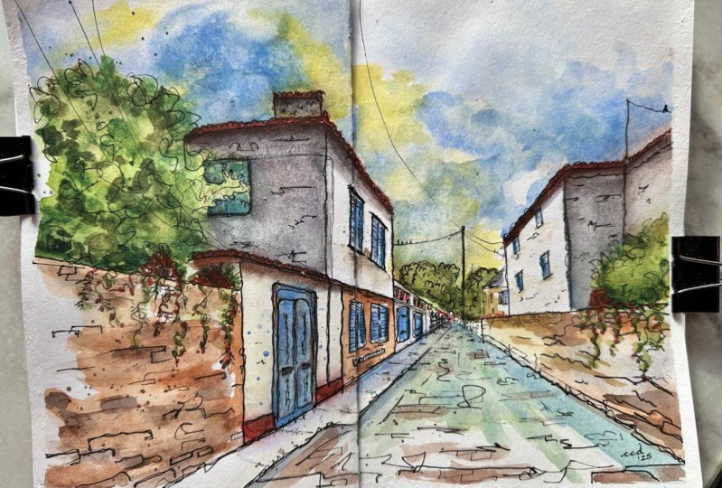
unveiling. And here we go. Let's take off the tape and
see what we're left with. And of course, we
are left with this, which is really fun. I rather like it actually, it's got a lovely
atmosphere to it. And a lot of the
atmosphere comes from this sort of disappearing feel, this big bold side with it disappearing off
into the background. I hope that you're as happy
with yours is I am with mine. Won't be amazing is
if, if you're happy, if you have time to leave a class project to upload
your, your sketch, perhaps some of you photos from your sketches
he went along as well, just to share and I'll
provide you some feedback, some questions, a couple
of discussion points. If you have the time, if you enjoyed the class
would be amazing. If you could leave a
review, it means the world. It helps me understand
how to improve, and it also helps this class
spread and shares the word. Most importantly, I
hope you enjoyed it. Please do connect with me on my socials app to
be urban sketch. I'm happy sketching.
 Toby Haseler, Urban Sketcher, Continuous Lines