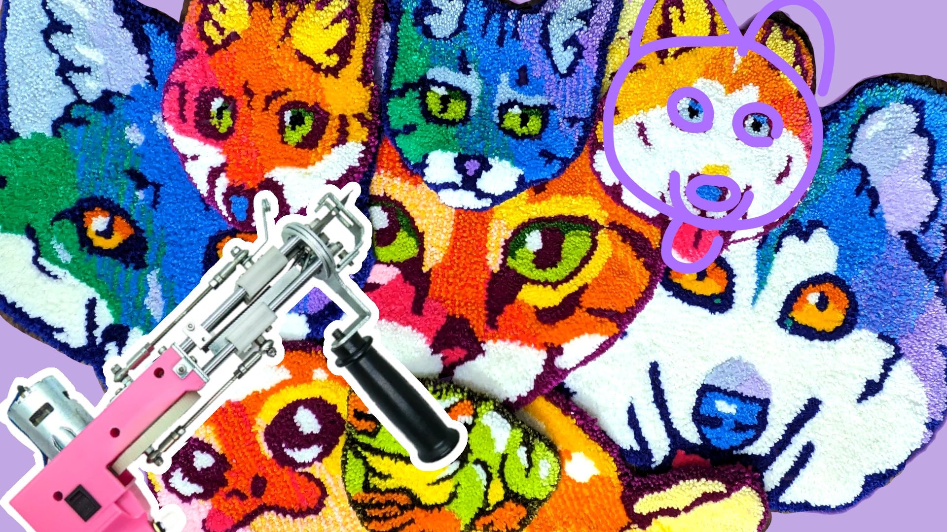
Transcripts
1. Welcome!: Are you new to rug tufting?
And want to learn how to create rugs that are
completely unique to yourself? Or maybe you've been tufting for a while and you've been using
other people's designs, but you want to learn
how to use your own and this is a class for you. Hi there, I'm Charlie.
I'm the artist behind squid tarts art. I'm an Atlantic Canada based textile and watercolor artist specializing in
animal portraits. In this class, I'll walk you
through the process of using any digital program
that supports layers to create a tufting map. We'll look both at creating a value map for a
black and white image, as well as a color map
for a colored image. I'll then walk you through
the entire process. I used to create a
rug from start to finish using one of these maps. By the end of the class, you should have a
good idea on how to transform any photograph
into a beautiful rug. So please join me
for this class, level up your rock tufting game and I can't wait to
see what you create.
2. Your Project: You're pressing for this class, we need to create a rug
tifting map from a photograph. To do this, you'll
need a photo that you want to transform into a rug. And any kind of software that
has layering functionality. In my example I'm
using procreate, but there are plenty of free
apps and software available. I'll have a few linked
down in the description. If you'd like
feedback on your map before actually
creating your rug, then please feel free
to submit that into the project section or if you want to start off taking your rug all the way
to the finish line, I'd love to see what you create. Please be sure to share it
down in the project section. Of course, if you
have any questions, please be sure to leave them
in the comment section.
3. Building a Map from a Reference - Black and White: The first step to designing
your rug map is selecting a good reference photo and then importing it into
your software choice. I'm using procreate
for this class, but there are plenty of
free software options. The only thing you need is software that supports
using layers. I've linked to two
freeware options, Rita and Gimp, down in
the class description, but there are plenty
of options out there. When selecting a black and
white reference photo, it's important to really
focus on the values you want. A photo that shows
really strong values. Looking at this dog
photo, you can see there are a really strong
light coming from the upper right and that casts a really strong shadow
on the bottom left. These strong highlights
and shadows are what we're going to be using to
create our rug map. Once we've imported our image, I'm going to create a new layer and this will be
my palette layer. So this is where I'm
putting swatches of the final colors in order
to create my palette'm. Going to start by selecting
the lightest highlight. This is the area that is the absolute brightest on
the image for this dog, it's practically white,
a little bit darker. I'm going to select that
color from the photo, and I'm going to add that
to our palette layer. I'm then going to see what is the second stage of highlight. So it's a little bit darker than the absolute
brightest highlight, but still brighter than the mid tone or average
color of the dog. I'm going to select that color and add that to our palette. I'm going to follow
this trend of choosing the most
extreme values, just because it makes it easier to approach the mid value. With this in mind,
I'm now going to select the darkest shadow color. I'm going to use the
Dropper tool to pick that from my photo and add
that to our palette layer. In the next layer, I'll
pick the middle shadow. It's still darker
than the mid tone, but it's less dark than the darkest shadow
that we just picked. The final step is to
pick the midtone. For this photo, there's
quite a lot of shadow, there are quite a few options you can try for the midtone. You might need to try
a few different colors before deciding which
one should be your base. I'm going to add a layer
for each of my colors. For my middlest color, which is the first
color we selected, I'm going to trace
out the entire image, and then I'm going
to hide that layer. After getting the overall shape trace out with my midtone, I'm essentially looking for
the lowest hanging fruit. I'm going after the area that stands out the most
to me in this image. What stands out the most is those really bright highlights. So those are the whitest
whites on my top lowest layer. I'm going to select that color from our palette, the
very bright white. And I'm going to
trace over all of those areas that look
super white this dog. Once I have those areas all
traced out and filled in, I'm going to turn that layer off and go to the
layer beneath it. And then I'm going to choose the second layer of highlights. This is the slightly
darker highlights. I'm going to trace
around any area that feels like it's in
highlight and fill that in. Once that layer is
done, I'll turn it off and I'll move
on to the shadows. In this case, I'm starting with the largest shadow shapes. It's the lighter shadow
that we selected earlier. I'm just going to
trace over any area that looks like it's
darker than the mid tone, it looks like it's
in any shadow. The final step for our
color palette is to use that very dark color and trace out the
very darkest areas. This is where you can add a
nice little bit of detail to your image around the nostrils and just to highlight the eyes. Essentially, you want this
color anywhere where you want a dark shape to really
stand out and come forward. The final step before
we move on to refining the map is just adding
the eyes for eyes. I find it's easiest
to have tones, a lighter tone and
a darker tone, and then just use white
for the high light. Just like before,
we're tracing out the lightest area and then the darkest area before adding the
high light on top. Once I've traced out
all these layers, I'm going to turn them on. The way these layers
should be arranged should be your middlet
tone at the bottom, followed by your lightest dark. And then above it is
your darkest dark. Above that is your
darkest light above, that is your lightest light. When you look at
it, you should be able to see all of those values. And looking at this final map, this is where you need to
assess whether you need to add some extra details or even add an extra layer of
color on this dog. I've decided that the shadow
area needs a bit of work, so I'm adding an
extra shadow layer just to give me one more value. I'm also going in and
refining a few of the shapes just to make the image a little
bit more interesting. Remember that your rug
is a piece of art. While accuracy is important, it's not as important
as aesthetic. So just make sure that
you don't have any areas that look too boring
or too same, Same. Then as a very last step, can look at my rug's overall
design and I'm going to see if I need to
change the outline of it. For this dog, I feel like it has quite a strong outline, so
I'm very happy with that.
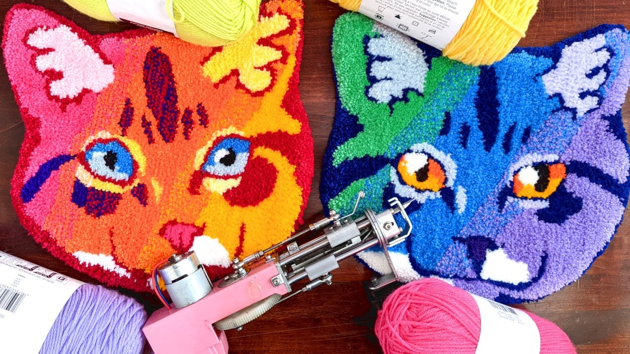
4. Building a Map from a Reference - Colour: The first design
we covered, pretty easy to see because it's
a black and white image. It's very basic. What
about a colored image? Let's look at this
brown tabby cat and we'll break it down. The primary difference between a black and white photo and a colored photo is
that instead of looking for the shadow
shapes and the light shapes, you're looking instead for
the main color shapes. So let's take a quick look
at this tabby and try to identify the approximate
number of colors in the fur. I can see there's
this light tan area. There's a midtone orange
here on the nose, a very light white on the mouth. Of course, the very
dark black stripes, this mid biji tone, and then this ticked
area on the cheeks. I've identified six colors. I'm going to go ahead and add
six layers to this image. Your reference photo may have more or fewer
colors depending on the complexity of the
colors of the subject. Now that I've identified
these colors, I'm going to go ahead
and color pick them, just like we did in
the first lesson. The photo is on the
bottom layer and on the very top layer is
going to be my palette. And I'm starting
from the lightest and working my way
towards the darkest. When I'm selecting colors, I'm aiming to get
something that is representative of the overall
colors within that area. So be careful not to pick the lightest yellow or
the darkest yellow. If you're going for that midtone yellow for this cheek area, you can see that there's
some ticking in the fur. And that's just where the fur is made of several
different colors. In this case, I'm
going to try to pick a color that's between the
darkest and the lightest, and that's representative
of the overall color. This area is made up of a
light brown and a dark black, but it feels pretty
dark overall. So I'm going to go with this
darker brown color that'll give the impression of the color without actually
giving the true color. You might be able to
find a specialty yarn that has that ticked color. But it's good to have a back up with my colors picked out. I'm going to go ahead
and trace out my base. I'm using this mid tan tone. Once the base is traced out, I'm going to hide that
layer and then I'm going to move on to this
orangey color. I'm just looking for any area in the cat that looks like it has this orange color tracing around it and filling it in. Not worried too
much right now if it overlaps other areas, we're going to put
the stripes on the very top to
make sure that they show through so you don't have to be super clean with this. Next we're going to go down to these ticked
markings, and again, we're just going to fill
in any area that looks like it's this ticked
brownish color. This can be a little
tricky with how the brown is overlapping the
other colors and fades off. It's okay to try out a few different shapes and
see what you like best. After looking at
the ticked shape, I decided that I
actually wanted to add a bit more orange near the
top of the cat's head. I'm just going to go back
to that layer, add that in, and then close that
layer off again, and go on to the next color. The next color here is
this light cream color. I use this anywhere
where there's a light color that is
not explicitly white. Next we're moving up to
the pure white areas, and that's just the
chin on this kitty cat. I'm not worried too much
about the shadows because I'd have to add an extra
shadow color for that. And I want to keep this
at the six color mark, but if you want to
add more detail, then absolutely. Go ahead. I'm also going to use
this white to add a little bit of fur
texture here in the ear. And finally I'm going to add the pure black
of the stripes. Adding this last,
because I want it to lay on top of all
the other layers. The very last step is of
course, the eye color. Just like with the
black and white dog, I like to choose two
colors for the eyes, black for the pupils,
and a white highlight. But you can add as many
colors as you like. Once you finish filling out all your colors and turn back
on all your color layers, you may decide that you need
to move some of the layers around or maybe remove or
change elements of a layer. For example, the
brown of the mouth here is completely lost
underneath the white. So I'm just going to select
and cut that area and then paste onto a new layer and move that above
the white layer. Now when I turn on
all my color layers, I can still see the mouth
detail looking at the piece. Now I feel like I need one more color just
to distinguish around the ears and maybe add a little bit more contrast to this reddish orange
around the eyes. I'm going to select the reddish orange and
make a new color for it. I'm also going to make
sure to give this a new layer on top of all
the layers except for black. Remember, this isn't
an exact science. You're going to want
to push and pull a little bit, change
some colors here, change some shapes there
just to come up with something that you find
aesthetically pleasing.
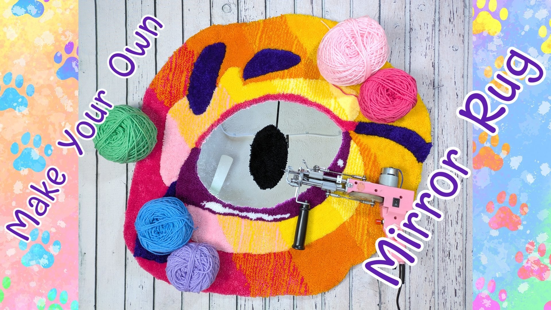
5. Choosing Your Yarn: Now that you have a
color or value map of the piece that
you're going to make, it's time to choose your yarn. There are a few things to remember when
selecting your yarn. And the first is that
the yarn is going to tuft out to be a darker color
than it actually appears. Unless you've made
swatches of the yarn, it's going to be
difficult to make an exact match to the color
that you're looking for. It's best to select
yarns based on their relative relationship
between each other. So for example, when I'm choosing the
oranges for this cat, I'm going to choose a lighter
orange and a darker orange. They're not necessarily
the exact oranges that I've chosen from my color map or that show up on the photo. They're pretty close and it's the relationship between the
two that's most important. There were a few
times while making this rug that I actually ran out of certain colors and I had
to go out and buy new yarn. If you find yourself
in this situation, be careful that you're getting
the same batch number. Yarns that were dyed
in different batches tend to be slightly
different colors. This is really
accentuated on a rug. You can minimize the impact
of this color difference on your rug by tufting
in different sections. If you have enough of a certain color only to do
half of the next section, you might just wait until
you get a new scheme of yarn and tuft out
that new section.
6. Transferring Your Sketch: The first step of making the rug is to stretch
your backing cloth. Just try to make sure
that your lines are straight both on the
vertical and horizontal. As you tft your cloth will get a bit looser and you'll have to tighten it up to make sure that the gun follows it cleanly. Once you have your
backing cloth stretch, it's time to transfer the lines. I'm using a photo
projector for this, but there are several
different methods you can use. You can also print out the lines and tack them to the back of your backing cloth and just
trace them through it. Or you can even free hand the design if you're quite arty. Before you trace
out your design, it's important to remember
that if direction matters, so if the subject is not
perfectly symmetrical, you want to flip
the canvas so that way the front of the rug shows the correct orientation and then it's just a matter of
tracing over your lines.
7. Tufting Tips: Some basic tfting
advice is that you really want to outline the shapes before
you fill them in. That allows you to get a nice, clean edge and to really
control the final shape. Remember that there's
a speed knob at the bottom of the handle
of your gun that you can slow down or speed up your gun if you need to
go around sharp corners. You can also tap the trigger
to slow down your gun. If you want to make a
curve, you want to leave a little bit of a gap
between the lines and the fill in that way
your lines stay nice and clean and your colors
don't bleed into each other. That gap, in general should be about one to two stitches wide. It's also best to
always try to tuft in the same direction to keep
the pile direction the same. Think about when you walk
across a freshly vacuumed rug, how you can leave footprints? Because you've changed the pile. That's how your rug will look if you tuft in
different directions.
8. Gluing Your Rug: Gluing. A rug is really important
to make sure that it has structural integrity and to ensure that the yarn
stays in place. For this rug, I'm
just using PVA glue. The advantage of PVA glue
is that it's very safe. I recommend this for any rug that is going to be around
children or animals. However, it's also
the least durable. It's best for a wall
hanging pieces. When I apply the glue, I just use my hand because PVA glue, as I said, is very safe. But if you're using something
like carpet adhesive, you want to make sure that
you're well protected. Make sure that you're applying
the glue quite liberally. Make sure that you're bring the glue past the
edge of the yarn, onto the excess backing fabric. That's going to give
the backing fabric a little bit more durability. And it's going to make creating the waterfall edge at
the end much easier.
9. Backing Your Rug: There are many different
ways to back a rug. In this example, I'll be
using a waterfall edge, and that's just where you fold
down the edge of the rug, some of the yarn
comes onto the back. To do this, I'm going to cut approximately 1 "
around the entire rug, and then I'm going to make
some parallel relief cuts. How far apart you
make the relief cuts is based on your rug design. If there's a curve, you're going to want more of those cuts. For a straight line, you can
get away with many fewer. Once I have all my
relief cuts in place, I'm going to take
some hot glue and I'm going apply it
around the edges. And I'm just going
to pull the rug, just a few strands of yarn, curl down the back. I'm going to go all the
way around the rug, folding down this excess fabric and gluing it to the back. Then once that's done,
I'm going to take my final backing fabric
or finishing cloth. In this case I'm using
felt and I'm going to glue this down in order to
get a nice clean edge. I'm going to take the hot
glue gun and I'm going to put it just where the yarn lays
across the tufting fabric, the backing fabric down
on top of that glue. Then I'm going to use a
little bit of pressure to push the glue out
towards the yarn. This is going to make sure
that the base of the yarn sticks a little bit to
the finishing cloth. I'm going to do that all along
the outer edge of the rug, making a little pocket. Periodically I'm going to reach inside that pocket and apply some more hot glue along
the base of the rug. And I'm just going
to pat that down so it stays nice and sturdy. Even though this is a
wall hanging piece, the felt on the back shouldn't be taking
too much pressure. So I'm not super worried about having it very
solidly glued down. But having a bit of
extra glue really does help give it
some extra fidelity. The final step for backing
a rug is to trim away the excess backing cloth because I'm sure the glue gets right
to the edge of the yarn. It should be a
pretty easy process. What I like to do is take a sharp pair of sewing
shears and pull the excess backing
fabric perpendicular to the back of the
rugs, just straight up. Then I lay the scissors down, running parallel with
the back of the rug. And just trim off
all that excess. Try to use the tension
between the rug and the backing fabric
to guide your scissors. Not only does backing
help your piece feel more finished and
look more professional, but it also increases
its durability.
10. Trimming Your Rug: The final step for finishing up your rug is the
trimming and clean up. For doing the
trimming on this rug, I'll be using a sheep shear
with a plexiglass guide, but you can also use just regular animal shears
or even just scissors. This first pass is just to clean up the pile and try to get
it as even as possible. You notice that certain
colors of yarn tend to create more flyaway bits that
need to be trimmed back, while others tend to come in a bit thicker and
bushier and need to be trimmed back to feel a little bit more level
with the rest of the rug. Once your pile height
is fairly even, deven out the edges
of the pile height. I like to take my
scissors and just go around and trim the very edge to be quite short and sharp. And I take my
scissors and around that edge back towards
the front of the rug. This just creates a nice clean look all the
way across the rug. And gives you a rug that really nice shape that you've already
designed into it. The very last step is
completely optional, but you can also do a
little bit of carving to help create very distinct lines. I like to do this around eyes, especially to help them
really come forward and pop. I'm just doing this with my
scissors and I'm just putting the scissors between the eye
color and the fur color. And trimming on a
bit of an angle. I'm cutting the fur color on
my first pass, going back, tilting my scissors the
opposite direction, and cutting just the eye color. On the next pass, that's going
to create a little bit of a V shape between the eye
color and the fur color. And it's going to make
sure that the line between those two colors
is nice and sharp. This clean up step is what makes your rugs look
really professional. So be sure to take as long as you need to get the rug as clean and polished as you like.
With that, you're done.
11. Wrapping Up: Congratulations to the end. I hope you've learned how
easy it can be to create complex rugs from photographs and that you're
feeling confident for tackling your next project. In this class, we went over
two different examples of how to take, photograph, and transform
it into a rug tufting map. I also walked you through
my entire process and how I created
a brown tabby cat. If you need more information on the physical aspect
of creating the run, please check out my beginner
rug tufting course. I'll have it linked down in
the video description here. Now that you've watched
through the whole class, be sure to practice these
skills to make sure they stick. If you don't have software
that allows layers, I've linked some free options
in the video description, so be sure to pop down there
and grab one of those. And whether you practice
making a simple map or you go all out and make an entire rug based
on the tutorial. Please share in the
project section below. I'm really excited to
see you guys create. Thanks very much and
have an awesome day.
 Charlie Proulx, Watercolour and Textile Artist