Transcripts
1. Welcome!: You're new to watercolor and one learn basic techniques or you're an experienced
watercolor artist and want to find something fun
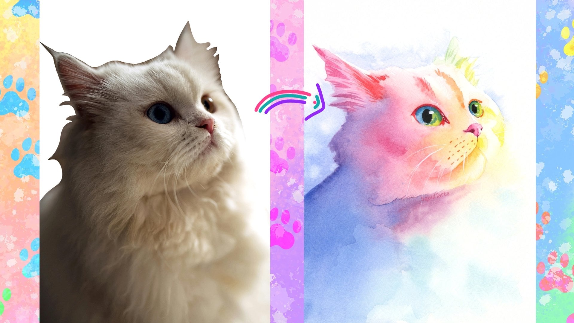
to spice up your work. This class is something for you. Hi, Aar. My name is Charlie. I'm a watercolor and textile
artist from Atlanta, Canada. I specialize in rainbow
colored animal portraits using both watercolor
and rug tufting. In today's class, we're
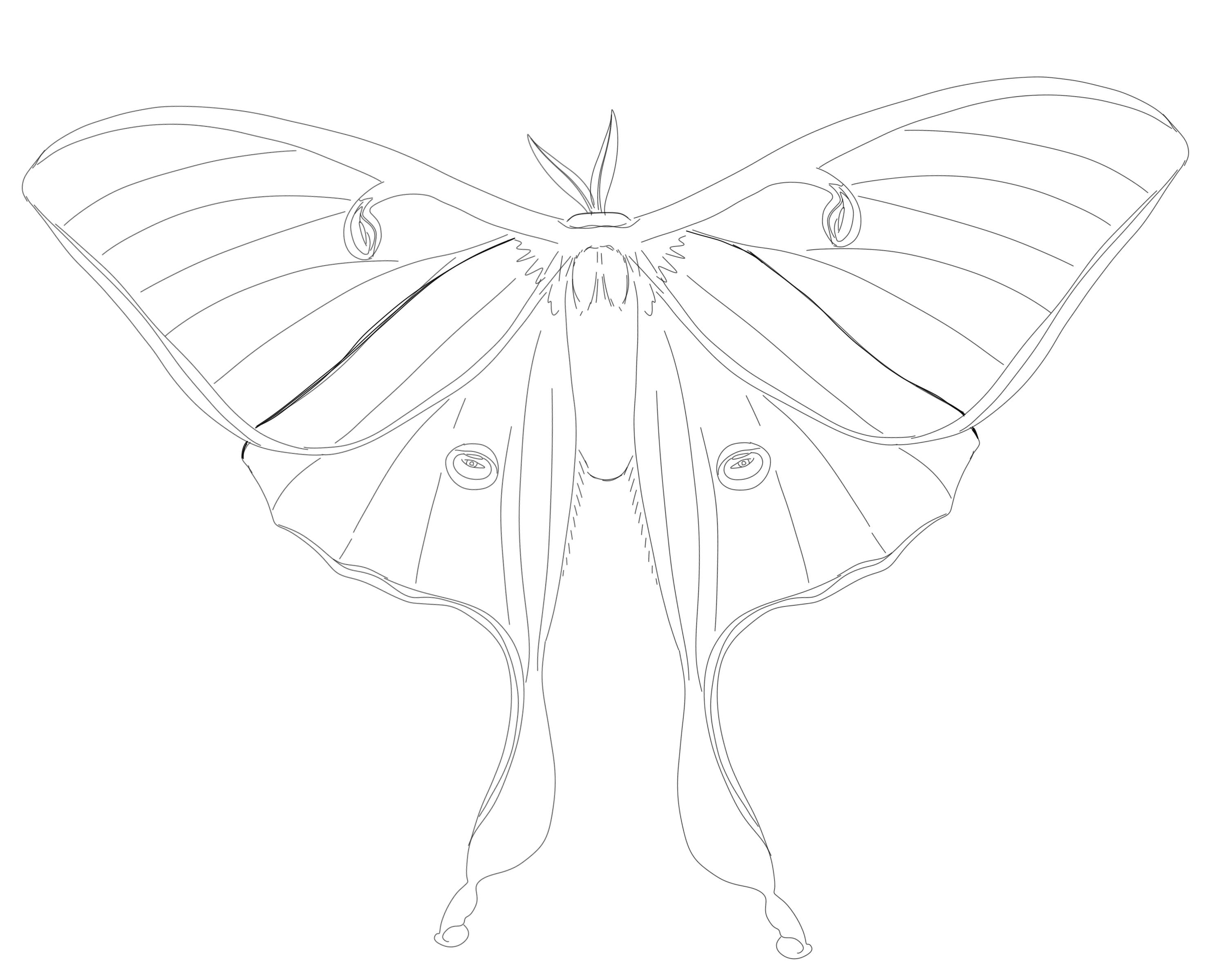
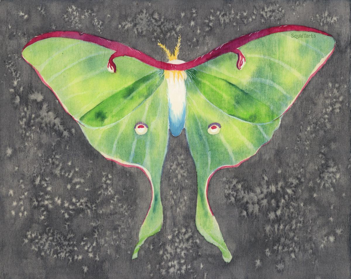
going to be painting this una moth on wood panel. We'll start by
comparing different media you can use to treat your wood that will change the way the watercolor
behaves on it. I'll then walk you
through the proper way to prepare your wood using watercolor ground
and then we'll go step by step through
painting this moth. We'll be using all the
classic watercolor skills, including wet on wet, wet on
dry, glazing and lifting. Also go through some more
advanced techniques like using masting fluid,
salt, and guash. This Moth project is very
beginner friendly and the information you
use here can be used for much more complex
projects down the road. Thank you for joining me today and I hope you
enjoyed the class.
2. Your Project: The project for this class is to paint lunumoth on wood panel. To do this, we're going over
preparing the panel using watercolor ground and
it'll be covering a variety of beginner
friendly painting techniques. Even if you're an
advanced painter, I recommend starting with this project just so you can get an idea of how the watercolor behaves on the
watercolor ground. Once you finish your
painting, please be sure to share your work down
in the project section. I'd love to see what you create.
3. Materials: For supplies, you're gonna need some sort of
painting surface. I'm using a wooden
panel. You're gonna need your watercolor ground. I'm using Daniel
Smith transparent, but any sort of watercolor
ground should be just fine. You might also want
some masking fluid. You'll need some sort of
sanding paper or sanding block, preferably a fairly fine
grain. This one is 220. Of course, you're going
to need your watercolors, a variety of brushes, and maybe a pencil to sketch onto your canvas or to
transfer the sketch over. I'll also be using
some white guash, but this is entirely elective. If you don't have
any opaque white, feel free to just leave
the canvas blank there. Mm hmm.
4. Comparing Surface Treatments: Before we begin our comparison,
I have to treat the wood. I'll be dviding this
piece of wood into four sections in the upper left. It's gonna be the
raw untreated wood. In the upper right, I'm
going to be treating with two layers of gesso
in the bottom left. I'll be treating
it with two layers of transparent watercolor
ground by Schminke. And in the bottom right, I'll be treating
it with two layers of white watercolor
ground by Daniel Smith. I'll be sanding between
each layer of treatment, and I'll be applying them
in perpendicular motion. So first, I'll go
left and right, and then I'll go up and down. All of these swatches were
created in the same way. I initially laid down a clean
and wash of water and then added one stripe of palo blue. I allowed the paint to
distribute down the water, however it would
travel naturally. The swatch on the right
was painted on dry wood, and it was painted
in two layers. First layer was put down
and allowed to dry, and the second layer
was painted over top. These were allowed to
dry naturally to show how much lifting you might
get during glazing layers. And finally, were those
two swatches overlap? I've scribbed out a line using a scrubber brush so you can
see how easily colors lift. I remember that this is
a highly staining color. At the raw wood, you can
see that the color actually traveled quite nicely
following the water gradient. But you can also
see that the water followed the ridges
in the wood as well. So it's made staying
inside the lines of the water extremely
difficult if not impossible. You can see a similar
sort of feathering on the edges of the swatches that were painted on the
drywood as well. Looking at where
these two overlap, you can see that there's
a very harsh edge there, which shows that once the color is down, it's not going to lift. And this is reinforced when you look at the area
that's been scrubbed up as I was able to get very little paint off
there whatsoever. You put watercolor
onto raw wood, it's very likely to stay there. Moving over to the gesso,
you can see that the swatch over the water has
distributed quite nicely. There's quite a nice flow there, and it's actually stayed inside the water line quite nicely. So you don't get
the same feathering that you do on the raw wood. Where you do run
into a problem is looking at these swatches
on the dry wood. You see the wood is
very patchy and uneven. Despite the patchiness, you can see that once
the paint dries, it actually does tend to stay
quite nicely for glazing, and it actually
does lift up quite nicely using a scrubber
brush as well. Down to the transparent
ground by Schminke. You can see when the paint
was added to the water, it actually did not
move very much at all, and this is something
I find with the Schminke watercolor
ground in general, is that the paint really does not want to move
on it very much, which can make it difficult
to get a flat even layer. Moving over to our dry side, you can see that the first
dry layer stayed very nicely, and has quite clean edges. And then when it
was glazed on top, those edges were
completely lost. You can see that when I
used the scrubber brush, I was able to get back almost
to the clean wood again, which is extremely impressive given that this is a
highly staining color. Moving on to the white watercolor
ground by Daniel Smith. You see that this actually
behaved the most like you would expect a
watercolor on paper. When added to the
water, the paint distributes into
a nice gradient, not as nice as you
would see on a good quality cotton watercolor paper, but certainly better
than the other media. And when we look at
the dry swatches, you see the first watch has quite distinct edges
and no feathering. So that shows that
the watercolor is not following the
grain of the wood. It's really staying
in place nicely. And then when we
glazed over top of it, we did lose a little
bit of the edges, but you can distinctly see where the first layer and
the second layer meet. So I'd say that's about
the same performance you'd expect to see
on watercolor paper. Maybe a little bit more lifting
than on watercolor paper. And when I used the
scrubber brush, you can see I was not able to get completely back to white, but we were able to lift
quite a lot of that paint. And I'd say that watercolor
ground in general is much easier to lift on
than watercolor paper.
5. Before You Paint: Before we go applying
the watercolor ground, I want to make sure
that we sand out any rough edges on the board. In addition to the
edges, I like to just go over the face
once really quickly, just to make sure that
it's nice and smooth. This doesn't have to
be perfectly smooth. You just want to make
sure that there are no splinters on the surface. I'm using a clean piece of paper towel to remove
some of the dust. I prefer paper towel over
anything reusable just because it's less likely to have dust particles
on it already. I'll be using Daniel Smith
transparent watercolor ground, and I'll be doing two coats. So first, I'm going to go
entirely horizontally, and then the second coat,
I'll go vertically. If you find your ground
is a little bit thick, you can add a
little bit of water to it to thin it out a bit. Would you want to be a bit
liberal when applying this? Because you're
trying to get down into the grooves of the wood? If the watercolor ground is covering every area of the wood, if you have deeper gouges in the wood that
are not filled in, then the paint
will follow those. If you have a darker wood, the Daniel Smith
watercolor ground may not be as transparent because it is a
little bit thicker. Which case I
recommend going with the Schminke for the first coat, and then you can use
the Daniel Smith on top if you don't like the
finish of the shrink. First coat is on, I'm going
to go through and try to pick out any little hairs that might have gotten in there. And then once I'm
happy with that, I'm going to let it
sit and air dry. You don't want to
use a hair dryer or a heat gun on this to speed up the process because it could cause cracking or
warping of the wood. So just wait for it
to dry naturally, then we'll send it down and
we'll put on our second coat. Once that first layer of
watercolor ground has dried, we'll go on and add
the second layer. Remember to try to make it perpendicular to
the first layer. So if you went up and
down the first layer, go side to side on
the second layer. Once your second
layer has dried, you can either leave it as it
is to have a little bit of tooth or you can smooth it out with some fine
grained sand paper. Once you're happy with
the finish of your wood, we can move on to
transferring the sketch. So we need to transfer the
sketch onto the wooden panel. And, of course, you can't
use a light box for this. So instead, we're going to
be using transfer paper. If you don't have
transfer paper, you can just take your
sketch, scribble on the back. And then it has the
exact same effect. So the first thing I'm
gonna do is I'm going to line up my sketch the way I
want it on the wood board. And then I'm going to
take some masking tape. Can also use washi
tape for this. I'm just going to fold down the edges and tape
that right on. And then it's just a matter
of slipping the carbon paper underneath and tracing as much or as little of
your sketch as you need. I'm going to be
pressing pretty gently because I don't want
to score the wood. Once you're happy
with the result, you can just peel off your sketch, and that's
all you need to do. Next, we're going to move on to applying some masking fluid
to some of these markings. The parts that I
want to mask out are these red areas on
the top of the wings, these markings, and
these eyespots. I'm also going to have the
pink down here masked out. Some tips for masking. Use a small brush. I'm using a side
zero liner brush. I have a little container
here of dish soap. I'm going to dip my brush into the dish soap all
the way up to the feral and that's just going to ensure that my brush
doesn't get ruined. I'm using some Daniel
Smith masking fluid. I'm just going to apply
that nice and liberally. With something on the edge here, you just want to make sure that the inner edge looks good. This is gonna come off at
the end of the painting. So if the outer edge
looks rough, no big deal. It's not going to appear
in the final piece. Once you're happy with your
masking fluid placement, I'm just gonna wait
for that to dry, and then we can get
on to painting.
6. The First Layer - Wet-on-Wet: First starting
painting the green of the wings, using wet on wet. And this is where the
masking fluid really helps, so we don't have to paint
around those small details. Using a fairly large brush. This is a size 12 round brush. And I'm going to
start by pre wetting the wings on the left side. If you're left
handed, you probably want to start on the right side. Just so you're not dipping
your hand into the wet paint. It's perfectly normal for the water to pool up
on top of the wood, so don't worry too
much about that. Just pre wetting
this whole area. You can see quite a
lot of dust came out of my brush. Not too
worried about that. We can dust that off the
painting when it's dry. Just making sure that I
have really good coverage. Paint naturally does not want to move very much on the wood. So having a lot of extra
water really helps with that. More than you would
use on paper. You actually do want it to
be puddling a little bit. I come here using three
different colors. A variety of greens, teals and cool blues. I'm gonna start with this palo green light shade as my base because I want this to
be quite vivaceous. And without mixing that, I'd come in here with a bit
of more of a teal color. I'm just going to let that mix. I'll come in here with a bit
of a palo blue green shade. Just add some extra interest. Down my reference photos
while I'm doing this. You can see that in
most of the moths. You get a little bit of gradient towards the edge of the
wings where it gets a little bit lighter before breaking off into
the pink color. So I'm gonna try to leave
that a little bit lighter. And that's it for
the first layer. I clean my brush, and I'm
going to go on and do the exact same thing
to the opposite wing. So I'm laying down quite a
nice wash of clean water here. I want that to be very wet right up to the
edge of the wings. Went over a little
bit, so I'm just gonna dad that up
in the paper tel. Painting on wood
is very forgiving. So if you accidentally
paint outside the lines, it's not a big deal. You can just go back
and dab that up. I horse comes to
worst, you can always sand down that part
when you're done. Again, I'm coming in here
with my bright green, just dabbing that all over and coming in here with my teal. Leaving a bit of gap near
the edge of the wings there, and then dabbing in
some palm blue here. And once you have your
first layer down, you can just wait
for that to dry. You can see the first wing
has all smoothed out. Got a nice gradient going here. Just go wait for this to dry and then we'll come back
for the second layer.
7. The Second Layer - Glazing: Once the first layer of the
wings is completely dried, we're gonna come in
with a second layer, and on the dried paper, we're gonna apply
the second layer gently to where the
wings would overlap. Do you want to be pretty
gentle with this? Try not to scrub with your brush because that's going to cause
the underlayers to lift. We were talking about the difference between
paper and wood. Even staining colors on the
wood would lift quite easily. I think the wings are going
to overlap about here. I'm going to go
ahead and drop in a little bit of this
teal color, as well. Just flick that onto
the body a little bit. Just go to add a little bit of extra teal along the
edge of the wing, just to really emphasize that
that is the edge of a wing, and that's where
they're overlapping. Smooth that out with a little
bit of a bright green. Then I come over and do
the opposite side as well. Because these are analis colors, I'm not worrying too much
about the color underneath, and also because these
are transparent. The color underneath is still going to look nice and vibrant. Just want to make sure that we show the two
dimensionality and the transparency of the wings by adding this layer of color. Again going to come in
here with some of my teal. Just go to emphasize there's
a bit of an edge here. Yeah I'm going to smooth that out with the green. Here we go. And while we're at it. I'm going to come
down here and add some shadows to
these bottom wings. So these moths have a bit
of a crimp in their wings. They tend to curl a
little bit at the bottom. I'm just going to
go ahead and add some little strippy stripes to indicate where
there's curling. Now, some moths don't
really have this very dramatically, so
you might leave it off. It's completely up to you. I apply that dry and
anywhere I want a soft edge, I'm just going to come back with a slightly dampened brush and smooth that out of it. And same here. I'm going to add a bit of a crimp
to the wing here, a little bit of
shadow and interest. And again, coming back with a clean damp brush and just buffing that
out a little bit. Just be very gentle. Just letting the edge of
the brush touch the wood. Made me want to make
that a little darker. Most of the dimension
this piece is going to come from when we add
the veins in the wings. So I'm not too too
worried about shadows. And when you're happy
with how that looks, you can wait for that to dry. And then we're gonna peel
up the masking fluid.
8. The Details - Wet-on-Dry: The second layer of color
all nice and dried. We're gonna come up
and were gonna peel the masking fluid so that we can paint the red and
pink areas on the wings. Are gonna be using a
tissue paper for this. You do not want to use your
bare hands in the wood because you will
get friction burns. And with that all cleaned
up, ready to add the pinks. I'm gonna start with the
medium size brush here. This is a size
eight round brush. Same one that we were using for coloring in the wings before. And I'm using some pinks
and purples for this. I'm going to start wet on dry. I'm painting directly
on to the dry wood here and just tracing around the
outside of the wing here. Switch over to some
purple, add some interest. Remember that the
pink is quite dark. You want to use a fairly
high concentration of it. It's a little strip going
across the neck of the moth. I'm just switching
back and forth between pink and purple to add
some visual interest. Back here and add these
markings and be cautious in your reference photo as part
of the marking is yellow, part is pink and part is white. We want to leave the white
and yellow areas clear. For the yellow, we're
just going to be using the natural wood grain up. I was a little bit light
with my first wash, so I'm going to go
immediately in with the second wash and add some
more color on this side. It's going to help it blend
into the markings nicely. One of the nice
things about wood is that you can add as
many layers as you'd like. You don't have to worry
about it warping. Stuff becomes too saturated, the pigment will just lift up. You won't be able
to add more layers because the layers
underneath will be lifting. That can happen with any
thick application of. Okay, so I've added
two layers of paint to the top of
the wings there. And now we're gonna go down and do the sides of the wings. I just wants to fade out a bit. He has to reach the
bottom of the wing. These eye spots in the center. The references that I'm using, there's not very much red, but we're going to add just
a little bit of pink there. The great thing
about moths is that no two moths are exactly alike. So no one is going to
notice if you don't follow your reference photo perfectly or if you just
embellish a little bit. And for these blacks
and these eyespots, I'm actually just going to
use a little bit of purple. Can also use blue. The same blue you use in the
wings would be really nice. I prefer to have
maximum contrast. So I can use a little
bit of purple here. Just to contrast with the
blue and green and have a little bit of harmony
with the purple that we've already added
to the red area. One last detail is
I'm going to really accentuate the orangeness
of moss antennae. Again, I'm just taking my brush
and using a little bit of orange to trace the
gills in the antennae. Using the tip of my brush
and a flicking motion. You can also use
a liner brush or a size zero round brush if you need a little
bit more control. Next step we're going
to be moving on to is using gouache to
accentuate the whites.
9. The Lights - Using Gouache and Lifting: With most of the watercolor
painting out of the way, we're going to move
on to using guash. It's one of the most fun
parts of painting on wood because the opacity of the guash looks just completely different than the watercolor and creates a nice
visual contrast. So I have just a dab
of white guash here. You can always use a titanium
white watercolor paint, and I'm using a size
four round brush. Just getting a bit of
guash on my brush. And I'm going to use to
color in the head here. Then I'm going to use
it here on the body, carefully painting
around some of these tufts of hair that I
see on my reference photo. There are some of
these yellow tufts. I just want to accentuate
their yellowness by painting the
white around them. The wood that I'm
using is quite light, so it might take a few layers to really get the
guash on there. I'm also going to
add a few hairs here just with the
tip of my brush, along the side of
the moth's wing. My reference photo shows that
this moth is quite hairy. I'm just going to add
a few of those hairs. Same with down along
the side of the wing. It's a bit of a white stripe. To make sure that
I include that. Then along the underside
of the wing here. And the underside of
this swing as well. You can add a little bit
of white here next to this pink marking because it looks quite pale on
my reference photo. But if you prefer to
keep the wood color, you can absolutely
leave it like that. As I mentioned before,
all these moths have slightly
different patterns, so it gives you quite
a bit of leeway in how you'd like
to color your moth. Then we're going to go
on to the eyespots. This eye spot has very
strong white in the center. Now, we're just going to
do a few little details. So I'm adding just a
little shadows here with the same yellow that I
used for the antennae. I'm going to use
just a little bit of the blue that we used in the wings for down here
on the body of the moth. I'm just going to go
over the white area with a little bit of blue just
to give it a shadow. I'm going to blend that out
with a bit of clean water. Don't want it to blend
perfectly because you want to create a
bit of a fur texture. So just flicking my brush up
into the body of the moth. You can also add the
veins in the wings using your opaque
white in this step, but I'm going to lift
them out with a brush. Our next step is
lifting out the bains. So I mentioned before
that it's really easy to lift watercolor on wood. We're going to
practice that by using a small brush to lift out
the veins on these wings. I'm using a size
zero round brush. This is actually the
exact same brush that I use for applying
the masking fluid, and I'm just going to
dampen it in some water, blot off a little bit of the
excess water on my brush. Then I'm going to just trace
the line I want to lift. I do that a few times, and then I'm going to dab it up. Because I'm using a small brush, I'm not really scrubbing. I might take a few tries. It'll go faster if you
used a non staining paint. But I of course used
staining colors, so it's going to
take a little bit longer and a little bit
more scrubbing on my part. Felt this to be a little
bit easier and you don't mind your lines being
a little bit thicker. You can also use a specifically
made scrubber brush. This one is by Roll
and Langnickel. I'll have a link
in the description for it so you can
find it easily. Brush is a little bit firmer. So you can use it to
really scrub up the wood. You see this creates
a subtle effect, which is exactly
what I'm going for. But if you want your veins
to be more standoutish, you can go ahead and
paint them on using white wash or a white
watercolor paint. Applying the veins, make
sure that you're paying close attention to
your reference photo. You don't have to copy the
veins exactly, and in fact, it's easier and better if you don't you want to
make sure that you're following the
approximate pattern to ensure that your
moth is believable. Once I'm happy with the lifting, I'm actually going to go
back with a little bit of white guash,
it's very dilute. I'm just going to reinforce
some of those lines, not all of them, just
a few here and there. And again, that's just to
add some visual interest. Again, you can also
skip this step. Find that lifting works
better on darker colors. These ones turn out very nicely. But the one on this
swing, where it's mostly the yellow can be a
little bit difficult to see. Reinforcing that
with a bit of guash can really help
clean it up a bit. Well, I have the white out. Going to go through and add a few more little flicks
of hair here and there. You don't have to
stick with just what you see on the reference photo. You can add any little
embellishments you'd like. Just adding a little fur
to the end of these wings, just because I think
it would be cute. Adding a bit more fuzz
to these wings here and maybe going to go up here and add just a little
bit of a fur texture. Just a little bit of
a hatching marks, add a little bit of
visual interest. With that, your
moth is complete. You can choose now
to call it finished or we can go through
and add a background. I'm going to add a plain
black background on this. I'll show you that.
In the next lesson.
10. The Background - Using Salt: Now that our moth is complete, I'm going to add a little
bit of a background. For this, I'm going
to use a black. In this case, I'm
using Daniel Smith neutral tint and I want it to be quite watery because I'm just going to essentially
stain the wood, mixing up quite a good amount to my palette of just watery paint. This is entirely elective. You can choose not to do this. Our goal here just
to add some contrast between the light
moth and the wood. You can use a smaller brush
for going around the body. It makes you feel comfortable. Great thing about the wood
resisting the watercolor is that it's very easy to clean
up any hard edges you get. So you can really take your time painting around your mouth. You don't have to worry
about getting any t lines or hard edges because those
can buff out very easily. Well, this side is still wet and add just a
sprinkling of salt. I like to use neutral tint
in my backgrounds just to really emphasize the
color of the animal. A little bit of my white
gouache is lifting. That's not a problem. We can come back and add that again after the
background is in. If you go over the mouth while you're painting
in the background, you can easily just mop that up. I come here to add some salt. Well, this is wet. The color I'm using here is a
non granulating color. But if you use a
granulating color, you'll see a lot
more separation with the salt for most
colors, at least. You're using quite
a watery wash here because you really want the texture of the
wood to come through. There's not a ton of texture on this particular wooden board, but if your wood has
a lot of texture, it'll look really stunning. I come here with a smaller brush or painting around the mos Tena. We'll add some salt up here. I'm just double
checking my edges. We're gonna wait
for that to dry, and then this project
will be complete. If you'd like, once it's dry, you can also come back and add more guash details either around the edges of the wings or in the background or whatever
strikes your fancy.
11. Wrapping Up: Congratulations. You
made it to the end. Thank you so much for watching. I, you have a better
understanding and a little bit more
confidence about how to use watercolor on wood and what makes this
medium so special. In this class, we
discussed how to prepare the wood surface using
watercolor ground, as well as some basic
techniques and how those might vary on wood versus
watercolor paper. Hopefully, by now,
you've painted your own little mop or
created your own design. Whatever you've created
using this technique, please be sure to share it
down in the project section. I'd really love to
see what you create. If you'd like to try out a
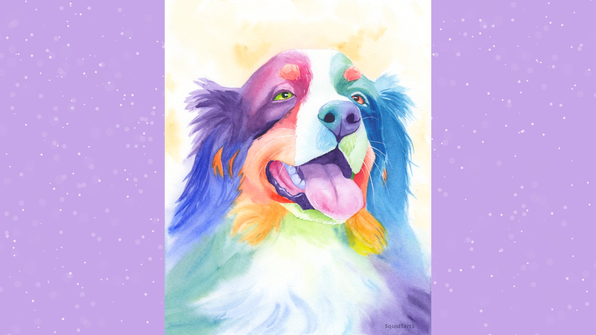
more challenging subject, but with still light guidance, then please be sure to check out any of my other
watercolor courses. All of my rainbow
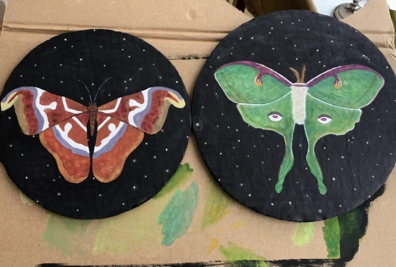
animal paintings can also be painted on wood, and it gives them a very
unique glow in person. Remember, if you
have any questions, please put them down in
the description section. Thank you very much for joining me and have a wonderful day.
 Charlie Proulx, Watercolour and Textile Artist