Transcripts
1. Welcome!: Traditional painting
techniques rely on mimicking the form right down
to color and value. What do you do if you can't or don't want to use those
traditional colors? In today's class,
I'll show you how absolutely easy that can be while painting a white subject. White subjects are traditionally seen as a more difficult
subject to paint. But I have two methods
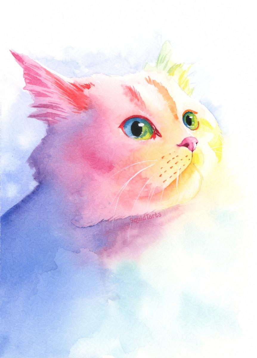
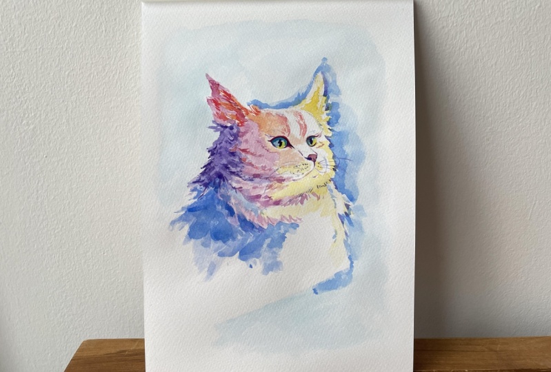
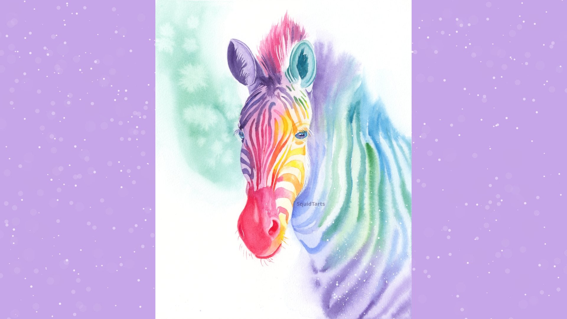
here that are very, very easy and beginner friendly. Hi there. I'm Charlie. I'm a watercolor and textile
artist from Atlantic Canada. I specialize in rainbow colored animal portraits
and in chase class from recovering painting
white animals in a fantasy rainbow color scheme. We'll put a special
focus on maintaining luminosity and simplifying
shadow shapes. Project for this class
will be painting in an ethereal wet on wet style, which is perfect for anyone
who just wants to play around with some paint or is ready to level up their
watercolor scales. By the end of this
class, you should be able to take any portrait of a white animal and convert it into a beautiful
Rrainbow portrait. Thanks so much for
joining my class, and I hope to see
you at the end.
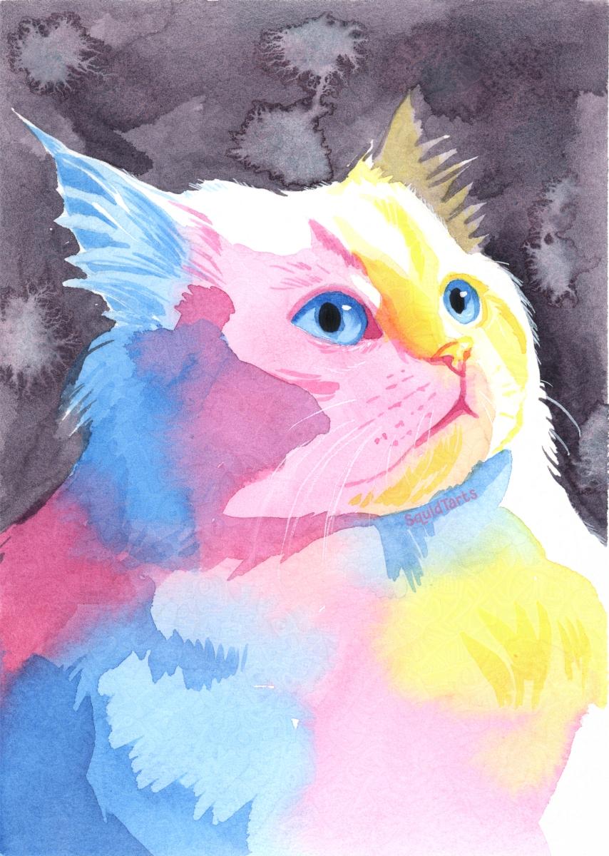
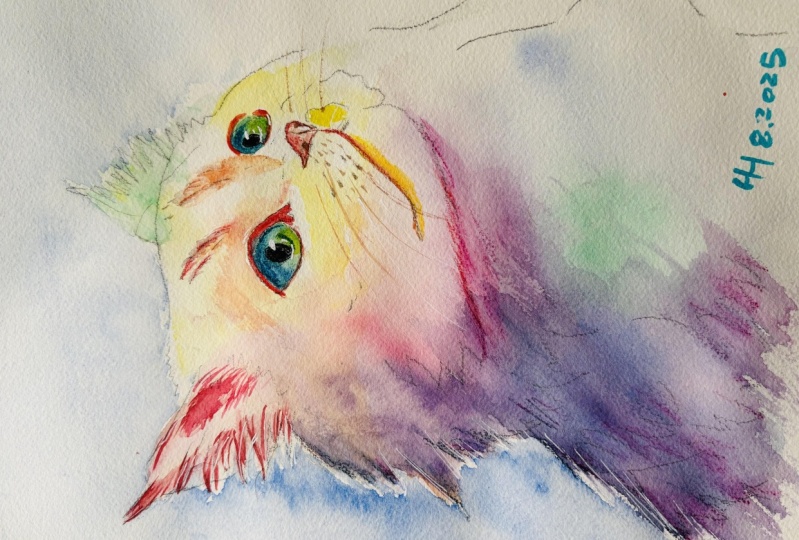
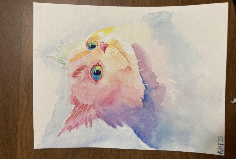
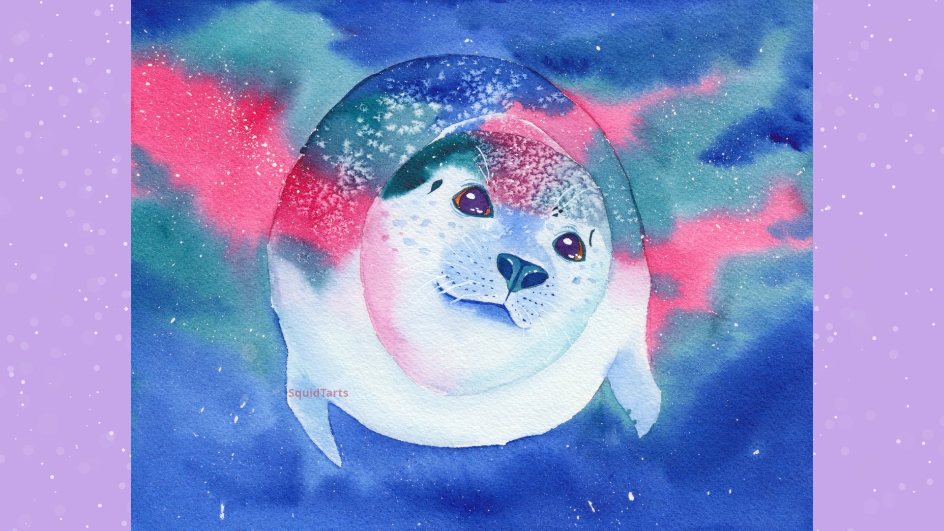
2. Your Project: The project for this
class is to paint a rainbow portrait
of a white animal. In this class, I'll
be using watercolor and using primarily
the wet on wet method. However, the skills
that we cover in this class can carry
over to any medium. By the end of this
class, you should have the skills to paint a
rainbow portrait of a white animal while maintaining luminosity and introducing a lot of vivid, beautiful colors. Once you've finished
your portrait, regardless of the
medium or subject, I'd really love to see it. Please share it down
the project section and ask if you'd
like a critique.
3. Materials: And the materials you're
going to need for this project are a good
quality watercolor paper. When you're looking for
a watercolor paper, you want to make sure
that it's 100% cotton. Watercolor paper comes in cold pressed and
also hot pressed, and Cal press just has
more of a texture to it, whereas hot press is a
much smoother paper. I'll be using a hot press
paper for this demonstration, but a cold press paper
is much easier for beginners because it allows the paint to lay
down more smoothly. He also need brushes
in a variety of sizes. For my paintings today, we'll be using a size
12 round brush size eight round brush. And a size zero liner brush. But any paint brushes that you have that you're comfortable
with will be perfect. You also need a
variety of paints. I'm using Daniel Smith paints. I'm using Quacker rose, Palo blue, and Qpalon yellow. But any cool red, cool blue, and cool yellow will work if you're using
my exact color comp, but you're also welcome to use absolutely any
colors you like. The final thing you'll need
is a good reference photo. When you're looking
for a reference photo, you want to find one that has really strong contrast when you convert the image
to black and white. So you want an image that has a good variety of dark tones, and also the brightest white highlights
that you can find. Usually, these images will be of animals that are
out in the sun, but there are some
really good photos of indoor animals as well. It's really just the contrast
that you're looking for. You also either want
some art software, which I've linked a few freeware programs down in
the description, or you want to be
able to print out your reference photo so you can test your colors
before painting.
4. Creating a Value Map: The first step that I
find really helps with a light color painting
or any painting really is to figure out where you want the areas
of highlight and shadow. The first step of the painting is to find a reference photo. Once you have a reference photo, it's time to do a value study. The way I like to do this, I'll take my reference photo and put it into digital software
that supports layers. Any software that supports
layers is fine for this, and I'll have a few free options
down in the description. I'm going to convert the
image to black and white, and then I'm going to add
three blank layers above that. On the topmost layer, I'm going to select pure white, and I'm going to fill in any
area that is the lightest. That's going to be
our highlight layer. I want this layer to include anything that isn't in shadow. Take your time going through and selecting
the highlight areas. It's usually best to connect these areas to create
some nice simple shapes. Once I have a basic
shape outlined and go ahead and fill that in. These shapes are not immutable. You may decide later on
that you want to change up the shapes to help with the
readability of your image. Once I have the absolute
lightest lights done, I'm going to go a
layer below that, and I'm going to pick a
light or mid tone gray here. I'm going to use this for all the shadow areas
that are not super dark. Because this is under
the lightest area, we can just go ahead and outline
the entire lighter area. Once you get that shape,
I'm just going to fill that in and on
the bottom shape, I'm going to fill it
in with a darker gray. This will be my
darkest shadow area. What I want to do is I want to refine these shapes
a little bit, see that I've completely
covered over the nose and eyes, and I want to make
sure that I have those areas as darker areas. I'm going to turn
off the dark layer, turn off the light layer and decrease the opacity
of the mid tone layer. Now I'm going to go in
here with an eraser. Any area that I want to
be darker than midtone, I'm going to go ahead
and erase that. There are some ridges in the fur up here all
around the eye. I want to be quite a bit darker. By reducing the opacity, we're able to see the
underlying photo. We can see like, that's
a very dark area. I want to make sure
I get that in there. Getting the whisker details. It's not really necessary, but it does give you a good idea of how your portrait
is going to end up. Keep in mind that the
objective of this part of the exercise is to build an
attractive shadow layer. You really want to simplify your shapes as much as possible. Only include the shapes that are going to benefit
your piece overall. Just adding a little bit
of fur texture in here. To remind myself that
I do want to add a little bit of fur texture
when we get to the chest. And I'm going to connect
that with the shadow here. By connecting the
shadow shapes together, you're making the final
piece more harmonious. So with that done, I'm going
to return that min point to opacity and turn back
on the light and dark. There's some areas down here. That didn't get covered
with the dark layer, so I'm just going to circle
those and fill those in. There we go. And now we
have a basic value map. So you have your lightest light, which is your white,
your mint tones, which will be your
first layer of color, which is your light gray,
and then your darkest tones, which will be an
additional layer of color. Which is your dark
gray. If your subject does not look
readable on this map, then your final piece is also not going
to read very well. So make sure you spend
some time on this, and really also keep
in mind that you want the highest levels of contrast
to be around the eyes. So even though there's no very bright highlight around the cat's right
eye, for example, I might still add some white
there just to draw the eye, and it helps to add
that to your map, but it's not necessary if you
think you can remember it.
5. Selecting Your Colours: After we have a value
map established, we're going to
create a color map. Again, I'm going to
do this digitally. We can also do this
by printing out your photo reference and coloring directly
over top of it. The first thing I'm going
to do is I'm going to go up here and add a new layer, and then I'm going to convert
this layer to color mode. And that's just going to ensure
that whatever color I put down is going to match
the tone underneath it. If I put a blue, for example, over a dark area on the cat, it's going to come out
to be a dark blue. I put it over a light
area on the cat, it's going to come out
to be a light blue. This allows us to
focus on the color that worrying so much
about the value. It's important to keep in
mind that warmer colors like yellow and red tend to feel lighter than cooler
colors like blue and purple. If you have a very light area, it makes sense to use a color like yellow there
instead of blue. Conversely, if you have a
dark area around the ear, it makes sense to use a darker color like purple
instead of yellow or orange. Just because yellow and
orange are not going to get very dark value. I want to somewhat limit
the colors that I'm using. I going to use a CMY palette
just like a printer. So I'm going to have
some blue and magenta, and yellow as my colors. I'm just going to apply
these anywhere right now. And to see what I
think feels right. Of course, I'm
going to be saving the yellow for the
lightest areas of the fur. So here on the chest
and around the ears. When we apply these colors
with the watercolor paint, they're going to bleed
into each other a bit and we'll create a wide
variety of colors. So where the blue and pink meat, there's going to be
some more purple, and where the blue
and yellow meat, there'll be green, and were the pink and yellow
meat, they'll be orange. This particular mockup,
I have the yellow for the very brightest areas with blue for the darkest areas and pink for most
of the midtones. I think I'm quite
happy with that. But let's try a different one. Again, I'm going to
add a new layer, I'm going to turn off
the previous layer, and come up here
and select color. This is now a color layer. What if I use more
colors this time? I'm going to start with a
purple and say that I want these so these very dark
shadows to be purple. I might fade those down
into blue down here. Maybe fade that blue out
into a s lighter area with a cyan or even a bit
of teal out here. I'm just going to follow that gradient up towards
the face of the cat. Some yellow, green up here. Switch that up to yellow around the side
of the face here. That yellow will move into a nice orange color, the
main part of the face, and then bring that into red and a bit of pink here to connect
the red and the purple. And for the eyes. Maybe a
nice green for the eyes. Is because red and green
are complimentary colors. It's going to stand
out nicely on the cat's right eye and let
the left eye fade in a bit. Maybe pink for the nose because
it's an analogous color. Do that orange and contrast
nicely with that yellow. Maybe I'll try another one. Again, we're going
to make a new layer, turn it into a color layer. Then maybe this time, I want to do something
completely different. And I will make the side
of cat's face blue. Going for a very
cool palette here. Blue, maybe teal back over here, bring that back into blue here, purple in the shadows maybe. Maybe bring that down into a little bit of
pink at the bottom, just because I really like pink. Then we'll reflect that
pink up here in the eyes. Maybe we'll add a little bit of orange in the eyes
as well because orange and blue are complimentary colors.'s a little bit
of purple for the nose. Great thing about these color
comps is that you can keep playing with them until you find something
that you really like. So it's a very low risk way of figuring out what
you like before you actually start painting. Something to keep in mind is if you are doing
these digitally, your final piece is going to
look quite a bit different. It's going to look a
lot less saturated. I'm going to have
lower contrast. That's just because
digital colors are much brighter than
traditional painting colors. And of course, as part of
your color comp testing, you also want to test any background elements
that you're going to add. So if you want to have
a dark background, for example, this is the
time to test that out. Make sure that you like it.
Once you've done a few of these color comps and you've figured out what
colors you like best, you can move on to painting.
6. First Layer: When tracing out the sketch, make sure you're leaving
the areas that you want to be completely
white blank. That's to allow your cat to
fade into the background. Now we're going to go through
and we're going to pre wet any area that we don't want
to be completely white. Just using clean water
on a clean brush here. And carefully painting around the details like the eyes that we want to be
a different color. We're doing this because
pre wetting the area will allow the paint colors to flow into each
other more easily. Using this wet wet technique, we're also painting over the areas that we want to
remain completely white. This will allow the paint
to flow into those areas just a little bit and
create a nice soft edge, which will help the cat
feel very soft and fluffy. When you're out of your
water, you want the paper to be nice and shiny with wetness, but you don't want any puddles. Just because the
puddles will cause the paint to stick to one area. Going in here with
a mid light tone. This is our lighter gray area. You want this area
to still be fairly light because that'll help create a feeling of
luminosity in the shadows. W help your cat feel more white. I'm going in adding
colors according to my color composition
that we created earlier, and your colors may be
different depending on what you decided to use. If I paint over an area
that I want to be white, I'm just going to go
back in and dab that up. Here I've dried off my brush. That's just a little bit damp
and I'm just lifting off the color these areas that
I want to remain lighter. I can also use a paper towel to really clean up those edges. I'm just going to continue
adding those shadow shapes. If you add your paint to an area where the water
has begun to dry, you can use a damp brush to draw out that paint and create
a nice soft edge there. Going back in and
wetting the body. Then coming back up here in the face with some
of this purple, it's going to come
down into the body. We've wet the body and
head separately just to ensure that the body didn't
dry before we reached it. Again, I'm just filling
in those areas where there's shadow and trying to avoid the areas
there is white. You want to leave
a little bit of a buffer between
your white area and your shadow area
because your paint is going to flow out into
it because of the water. To create a bit of
a fluffy fur effect here on the bottom of the cat. I'm using loose brush strokes just to da down that blue paint. I'm going back up here
to the ear and wetting that and adding some
green and yellow green. Again, I'm being
careful to avoid any highlights that I
want to keep in there. Once that layer has
completely dried, we can move on to
the second layer.
7. Second Layer: This is the darker area here, you can see it's quite
soft in the photo. Where are we trying to mimic that with a wet met technique? Se I'm adding quite a bit
darker for the darker shadows. Again, that's because we
want the midtone to be closer to white than it
is to the shadow color, just to help create the feeling
of whiteness in the cat. Using the edge of my brush
here and painting on dry paper to create some fur
texture here in the ears. I use a smaller brush for this if it makes you
feel more comfortable. I'm just dipping into
different colors according to my color
map underneath. I'm trying to match the colors with the current colors
that I've already put down. Here for this red. I wanted to blend out the
base a little bit. So I'm going back in
with my damp brush without any paint on it, and just using that to blend
out some of this paint. You can see that the red
still has definitive edges, but now we've added a little
bit of a color gradient. Now, I'm paying attention to this big shape
here on the cheek, and I'm filling that
in with clean water. I'm making sure that I go
into the lighter areas. That way we have a
nice soft transition. Going back in here and
dabbing in some paint. The I want this to
be fairly dark. It is going to dry
lighter, especially because the water that
we've already put down. It's going to dilute
it quite a bit. Paying attention to the
shape here on the cheek. Begin just trying
to keep the colors correct with my color cop. You see here, I'm
getting a little bit of an edge from where the water
is touching the dry paper. And if we leave that, it's going to be visible on
the final piece. There's going to
come back here with a clean damp brush
and wet that out. And that's going to help
push that edge out. Let's sop it from
being so harsh. D. Coming back up here into the face
to get those ridges. You see how the paint is sharper and more detailed
where I've not put water. And it gets softer where
I put the water down. That's a good way to add
different types of edges. And here in the orange,
I've just gone a little bit too far into the light area.
I'm using a paper towel. I just add that back. I'm just continuing down here into the body and adding
some of this blue. Let me see again, I'm trying
to keep my brush strokes, pretty light to
help them fade in. Coming back up here to the ear. I'm again using a
flicking motion with some clean
water on my brush. Just to soften this edge here
and help create a bit of a soft transition between the ear and the
shadow of the face.
8. Details: Once that's all dry, I'm
going to go in here with some more concentrated paint
and add in the details. It's difficult to see on camera, but I'm adding a
darker yellow here. Because I'm painting
on dry paper, these strokes are going
to have a sharp edge, which is going to help draw
attention to the face, due to the contrast
in the edges. Again, I'm going back to my
reference photo frequently to see which shapes
I need to reinforce. Adding a nice
little shadow under the mouth here to help give this cat a nice
sassy little smile. I'm just going back here with a damp brush with
just water on it. Tps off in the edges
of this orange chair. And then continuing on that cat's smile down here
with a little bit of pink. And again, I'm using
clean water on my brush. Just to dampen the
underside of the smile. I'm trying to keep a hard edge
here underneath the chin. And that's going to help
the body fade out into the background and create a soft feeling of the cat's fur, while also creating depth
around the cat's face. I'm just using the edge
of my brush here to flick some paint up into the face to create a bit more of
a fur texture there. Again, I'm going here over
the back of the body, just adding a bit more paint
to darken that up a bit. Oh. And then coming back in here into the face to really
emphasize that cheek bone. It's quite prominent on
the reference photo, so I want to make
sure that I'm adding that in nice and dark here. In place have added a
little too much paint, and just go dab that off. Watercolor is really forgiving. As long as just pick up
the paint before it dries. I feel like there's a bit too much contrast
here in the ear. So I'm just going to go
ahead and the entire ear. Let me go over with
a lighter value of the colors and just paint
that straight over top. And that's going to help
decrease the contrast there. Next, we're looking at some of these sharper details here. So I'm painting again on dry paper and using the
tip of my brush with a bit of a flicking motion to darken up some of
these shadow areas. Going back in here to
this eyebrow ridge, and then over to this other ear to add some shadow as well. Don't want too much
detail in this ear on the back because I
want it to fade away. If you add too much detail, too much contrast, it's
going to look too busy. And looking at the
overall piece, I feel like this
particular shadow shape has gotten lost
here on the face. I'm going to add a bit of color and darken that
up a little bit. I put down some
color on dry paper, and I'm just smoothing that
out with a clean damp brush. And again, on dry paper, I'm just adding these
little whisker dots. Again, I'm checking the
reference to make sure that I'm placing these at approximately
the right location. If you place the whiskers oddly, then it's extremely
noticeable because every animal has
very individual way of holding their whiskers. And again, I'm just
going in here to apply this paint to dry paper around the muzzle and smooth that
out with a clean damp brush. Next to come in here and do
some of the final details. Right now, we're doing
the skin around the eyes. I'm doing this
again on dry paper. I want that high level of contrast around the eyes to
draw the viewers attention. And same with his
other eye over here. I'm moving on to the nose. Painting over the entire
nose with a mid tone value. Again, this is
still on dry paper because I want this
to have sharp edge, don't want the nose
getting lost in the face. I'm coming back here
with my clean brush, and I've wiped it
off on a towel, so it's a bit dry, and I'm just picking out
those highlights. Anywhere that's not in shadow, I'm going to pick that
up with my brush here. I'm coming back in here to add a bit more shadow
around the eye. A quick trick for these
light warm colors. Says warm colors don't
tend to get very dark. You can make them look a little
bit darker without losing saturation by adding an
analogous cold color. For this one, I've added
pink over top of the red, and that's because pink has
a little bit of blue in it. I'll make it look a
little bit darker. Once that's dry, coming in here with the base
color for the eyes. Again, I'm painting
this on dry paper, but you can paint it on
wet paper if you prefer. I'm just adding some
blue to the top and fading that down to a bit of yellow at
the bottom here. You can see that
creates a beautiful green gradient in
the center there. And then I'm laying down a thicker application of the
blue around the edges here. Because this paint is still wet, it's going to feather out really nicely and create a soft
shadow around the eye. I'm doing the same on
the opposite side. Just a little bit of blue. And then I'm going
to blend that out to a little bit of yellow. Well, that's still a
higher concentration of blue here at the top to
create a bit of a shadow. You see that creates a really beautiful luminous green color. Going back here to darken
up the cat's nostrils. I'm just using pink for that. Maybe with a little
bit of purple added, just to help it look
a little bit darker. And then I'm switching to
my size zero round brush. I think I'm using neutral
tint here on the eyes, to had a nice dark pupil. You can use a larger or
smaller brush for this, depending on whatever makes
you most comfortable. You don't have to use
a neutral tint or any particular color
for the eyes here. I just find that having
that little dash of black in with the color really
helps the eyes stand out. I I'm getting the
shape of the eyes right can be a
little bit tricky, so tend to take my time and really work on
the edges there, make sure they look correct.
9. The Background: Now we're going to go
in, and we're going to add a minimalist
background to this. I'm just going to
add some water down here and I'm going to make sure that I'm not
painting into the cat. And then I'm just going to add a little bit of this blue color. This is going to look a
little bit lighter once it's dried and it has been
diluted in that water. Painting up to the
edge of the cat here. I'm not worried about the
color looking too even. Just want to add a
little bit of color in the background to keep it from looking a little
bit too light. Mostly use the
edge of the shadow to define the shape
of the cat's head. Sing my brush here to
flick a little bit of that paint into
the cat's head to create a bit of a
fur texture there. It's absolutely okay to get your background color
onto your foreground. Just make sure that
you faded out nicely. So I'm using a bit
of a paper towel here just to fade that edge. And I'm just dropping
a little bit of water into that background to add
a little bit of texture. So that water is
going to bloom out and create a bit of
texture on the cat. Adding a bit of color just around the outside of
the face of the cat here. You see how it instantly pushes the cat forward
towards the viewer. Really defines the edge
of the face there.
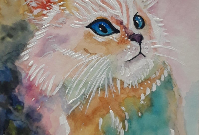
10. Opaque White: Once that's all dry, I got
to come in here with some opaque white and add
some highlights. First thing to do is add
some highlights to the eye. And you can see
that immediately, makes the cat look more lively. And then can come through
and put highlights anywhere that I think could
use a little special touch. On the nose, flicks of whiskers, flicks of fur over the muzzle. Just anywhere I feel could use a little bit
more of a highlight. Especially want to keep
these touches to the face because they're going
to look sharply contrasted against the color, and you want all the
sharp contrast to be in the face to draw the
viewer's eye there. I I I adding a few little flicks here at the edge
of the highlight. I just helps create an extra fluffy
appearance for the cat. Coming in here and adding
extra detail around the eyes. They're not there in
the reference photo, but having that
extra detail will help draw viewer's
eye to this area. Once you're done with these
final little details, you take a step back and
see if you're happy. If so, your cat is complete. No.
11. Wrapping Up: Congratulations. You managed
to the end of the class. But now you should
hopefully have all the skills you need to paint a beautiful rainbow colored white animal and maintain lots of luminosity
in your portraits. In this class, we
discussed selecting a good reference photo to get beautiful tones in your work. We discussed breaking
down that photo into tonal values to make it very easy to control your values
in your final piece. We discussed ways to create
color maps so they can test out your colors before applying them to your painting, and we discussed a variety
of watercolor techniques. I'd love to see how
you apply these skills to your own portraits. Please be sure to share
anything that you create from this class down
in the project description. Doesn't have to be
a watercolor piece, it doesn't have to
be a white cat. I just really love to see
what you're all creating. And please also let me know if you would like any
critique of your work. Thank you so so
much for watching my class and have
an amazing day.
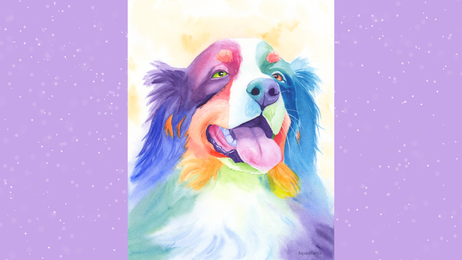
 Charlie Proulx, Watercolour and Textile Artist