Transcripts
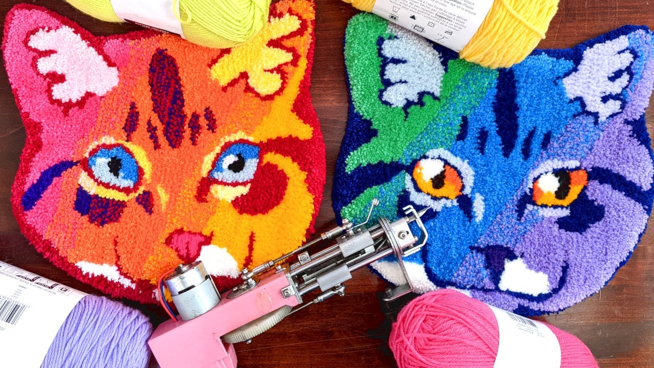
1. Welcome: Are you new to rug tufting? Or maybe you've been tufting for a while using other
people's designs. But you really want to get
into designing your own rugs. If so, this is a class for you. Hi there, I'm Charlie and I'm the creator behind
Sco Tarts Art. I'm an Atlantic Canada based textile and watercolor artist specializing in rainbow
animal portraits. In this class, I'm
going to walk you through how I designed and created this seal rug based on some very
key reference photos. We're going to
discuss a little bit about the elements of design, including shape and color. And we're going to discuss
breaking down complex shapes into simple shapes that
are much easier to tuft. At the end of this
class, you'll have a better understanding
on how to use shapes and color to convey
your desired emotion. Also take you step
by step through the rug creation process in case you need a
quick refresher. Thank you very much for joining me and I hope you
enjoy the class.
2. Your Project: Your project for this class
is going to be to design your very own rug based
on photo references. First step is to collect
some photo references there. Take these photographs and break them down into simple shapes. And that'll allow you to
tough the rug more easily, as well as convey
emotion more strongly. Finally, you'll select
some colors to compliment your rug design and the emotion that you're trying to create. Once you have your
finished design, I'd love to see it
all tufted out. But if you want feedback
just on your design, then feel free to add
that to the projects and specify that you'd
like some feedback and I'd be happy to
provide that for you. Please share whatever you
create in the project section. I'm really excited to
see what you guys make.
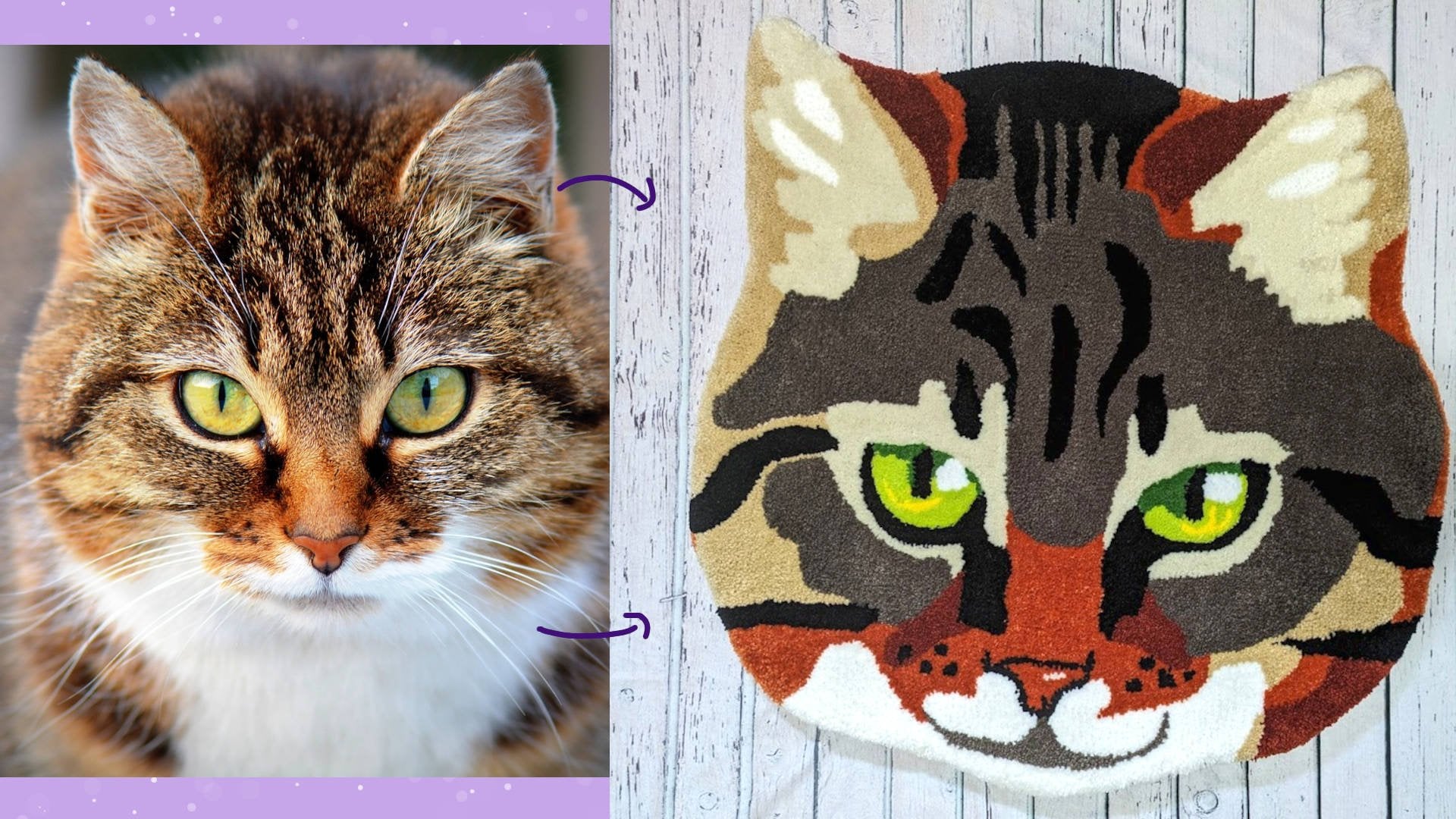
3. Design Shapes From a Reference: The first part of
making your design is finding some good
reference photos. There are a few websites that
I'd like to use for these. There's Pixabay.com
there's Pexels, P.com and then there's
also Wikimedia Commons. An important
consideration in using a reference photo is who
owns the copyrights. These websites that I've listed, I'll have some
copyright free photos that you can use when I'm
looking for a reference photo. Mostly looking for some
shapes that I find appealing and also
some nice patterns that I might want to include
in my finished piece. So for example, if I'm
making a tiger rug, then I want to look
for a photo of a tiger that shows where the
stripes are really clearly. Once you have some reference
photos put together, your next consideration
should be on what sort of feeling you want to create
with your rug design. Do you want it to look elegant? Do you want to look
cute and friendly? Do you want to be a
little bit edgy and cool depending on what
feeling you're going for? You'll need to use different
sort of shape language. If you want to create
a very friendly shape, then using C's or circles
really helps with that. If you're looking to
create an elegant design, you want to use a lot of
shapes and a lot of curves. If you want something
that's maybe threatening or a
little bit edgy, then you want to use sharper
shapes like triangles. An example of a
really well designed, friendly character is Kirby. You can see that not only is Kirby's body made of a circle, but also his arms and his legs
are also made of circles. Even when he transforms
into a geometric shape, you can see that those
circle curving forms are carried through
to all the corners and all the overall shape. Disney is really great at creating elegant
female characters. This is Jasmine from Ladin. Not only does he or she have
S curves in her clothing, like in her legs here
and in her hair, but also the poses
that she often takes are just exaggerated
S curves as well. Finally, here's an example
of a threatening character. This is a coup
from Samurai Jack. And you can see
that his torso is essentially just two
triangles stuck together. Even if you look
closely at his face, you can see that
there are a lot of sharp shapes from where his
neck connects to his body, where his horns
connect to his head, and even his teeth and eyes are very sharp and threatening. Those are just a few
shapes to take into consideration when
designing your rug. The level of detail
is also going to come into play relation to how realistic or what emotion
your rug is going to convey. In general, the more
detail you have, the more realistic
something is going to look. Also, the more detail is, the more opportunity for
something to look threatening. If you want something to
look friendly or elegant, then in general, you want
a lower level of detail. Usually very, very cute
designs are extremely simple. When I'm using my
reference photos, I want to look at
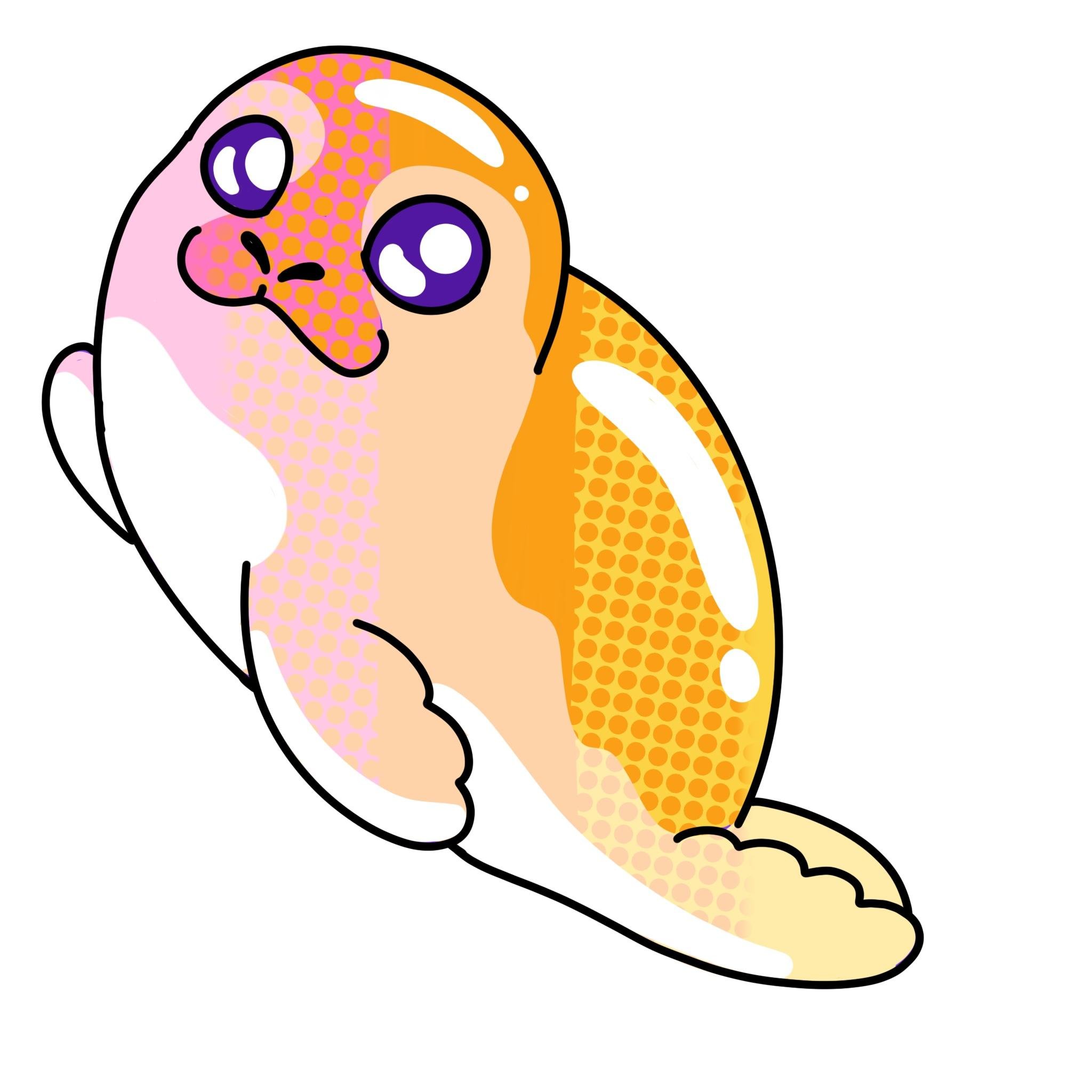
the overall shape of the subject for this seal. I can see that
there are a lot of ovals and squished ovals. And then I'm also looking at the details that really
define the animal. In the seals case, the
face is really important. So I'm looking at where the eyes and mouth sit and how they
relate to each other. In my own design, I want
to be very friendly. So I'm going to go for
a very simple shape. I'm going to take the
oval shape of the seal, and I'm going to
simplify that into just a curve on the top
and a curve on the bottom. And that's it, it's going
to be an little sphere. And then I'm giving another
half sphere for the head. And then I'm just adding some simple shapes for the flippers, using my reference photos to
get the placement correct. I'm just adding in
very simple ovals for the eyes and a very
simple little smiling mouth. Once I have a
sketch that I like, I'm just going to
go over it with a pen tool to make sure that the lines are nice and clean and they're
easy to transfer. Then I'm going to go
through and I'm going to decide where I want
the pattern to be. I like the pattern on the
bottom right seal photo. That's the one I'm
going to use where there's a gradient from the back of the seal down to the belly
where it gets darker. I'm just going to
define those areas in my sketch with a dark, a medium torso area and
then a white belly.
4. Colour: The colors you choose
to your design are another element
that can really help reinforce the feeling that you're trying to get
across with your rug. In general, really
bright colors are going to be friendly and pastels, and neutral colors tend to
be more elegant, more muted, or darker colors,
especially when paired with a high contrast color,
tend to be more threatening. And of course, this isn't
a hard and fast rule. It's great to play
around with your colors and see whatever appeals to you. In this piece I'm
creating today, I'm going to be using
bright, rainbow colors. Because I want to create a very friendly and engaging feel. I'm creating an ingredient.
I like to break my design down into five areas. The middle area to
be my primary color. Let's say I'm using
oranges example. I'm going to have my middle
section be a pure orange. And then on either
side it's going to be two orange, half yellow, and then two orange half P. Then I'm going to
have a pure pink on the pink orange side
and then a pure yellow on the
yellow orange side. You can break this up into
as many steps as you like depending on how many steps
there are in your gradient. Don't forget to add any special little details like highlights in the eyes or on the back of the seal to make it
seem extra shiny. Once you've added those details, make sure that you're
going back and you're adding them to your
line art layers. So that way you have
that on your template when you go to create your rug. I also like to be sure to mark
out where I'm going to be transitioning my colors
just to make sure that I get those transition
areas nice and even.
5. Transferring Your Sketch: Today I'm using a projector. I'm just projecting
the digital file onto my backing fabric. If you have a design that
needs to go one way, make sure that you flip it so
that way you're reading it backwards as you're
tufting it is that way it reads correctly
on the front side. You can also transfer
the design by printing it out and
taping it up together and then pinning it to the backside of your cloth and then just tracing
the lines through. I have an example
of how to do this. In my introduction to a tufting, I find it best to use
two different colors when I'm transferring my lines. So I'll use a Sharpie for any area that I need to be
a dark line, work color. And then I'll use
a different color, usually a red or green, to indicate any markings. I also use the same color
and a dash line to indicate where I'm going to be breaking
up my color gradients. When in doubt, it's better to
add more detail than less, and you can always just ignore the bits that
you don't need.
6. Tufting: I'm just going to
give a quick reminder of some tufting tips, but if you want a more in
depth discussion on how to begin tufting and some
best tufting practices, then definitely be sure
to check out my class on introduction to rug tufting. First thing I do want to
have a design is I tuft out the outline for this.
Take as long as you need. If you need to go
slower around curves, then tap the trigger on the gun to have it going a
little bit slower. Makes it a lot easier
to go around the turns. Make sure that you're turning the handle of the gun
that's holding the trigger. The other hand with
the front handle, is just there for support. Carefully go around the
outline of your rug. I usually like to do about
two or three layers for the outline just
to make sure that there's plenty of
room along the edge. Your design is not being
cut off or lost anywhere. Once the outline
is done and you're ready to start blocking colors, it's best to tuft around the
area of the color first. So you're basically outlining
that block and then fill it in with rows going
all the same direction. The reason why you want
your rows tall got the same direction
is because you want the pile tall got
the same direction. Think about when you
walk across a carpet, how that pushes the pile
in a separate direction and leave like a
ghost of your foot. That's essentially what
it will look like if you tuft your carpet going in a bunch of
different directions. You'll get that ghosting effect a bunch of
different angles. When you're tufting the
edges of your color blocks, you want to make sure that
you're leaving a little bit of a space between
each color block. And also the outline usual say about one to two
stitches width thick is good enough and that
just prevents the yarn from relapping too much on the front and making it look a bit messy. It's also best practice tuft
with two strands of yarn. This makes it really easy to do gradients for a mixed gradient. For example, if I'm going
to mix yellow and orange, I want a mix in the center that is both yellow and orange. I'll just have one
yaron that's yellow, one yarn that's orange, and tuft those both
at the same time. For example, what I'm
doing here is I'm going from a purple gradient
to a blue gradient. First I'm using two strands of purple yarn for
this first section, and then in the
next color block, I'm using one strand of purple
and one strand of blue. And the color block after that, I'll be using two
strands of blue. And that'll give me
that gradient from purple to purple, blue to blue.
7. Glue and Backing: Blowing up your rug is really
important for longevity. If you'd like a more
in depth discussion of a bunch of different ways
to glue up your rug, again, check out my introductory
rug tufting class, but for today I'm
using an iron glue, I'm using heat and bond. And how this works
basically is you remove your rug from the
rug tufting frame glued, put it on an ironing board, and then put the glue
side down and just iron it on using a iron set to dry. Should be no steam
involved in this. There are a few
advantages to this. One is that you don't have to wait overnight for
your glute to dry. Two is that it doesn't
produce any fumes. I wouldn't necessarily recommend this for a rug that's
going on the ground. You want something that's a
little bit stronger for that. But for a wall hanging
piece, this works just fine. Once I have all
the adhesive down, I'm going to trim out my rug. I'm using felt for
my backing again, there are a lot of different
ways to back a rug. And if you'd like more in
depth discussion on this, you can check out my
introductory rug tfting class. But for this I'm just
using a raw edge. I've gone around as
close to the yarn as I can and cut off the
excess backing fabric. And then I'm just
applying the backing directly onto the glue
that's on the rug. To reactivate the glue,
I'm using a heat gun, so that way it doesn't
have to touch the glue. Then I'm just pressing
the backing on firmly. Once the backing
has been adhered to the heat glue, I
wait for it to cool, then I trim the backing,
leaving a little bit of an edge between the glue
and where I'm cutting, so there's a little bit
of excess fabric just to reinforce that edge and
add some extra stability. I'm using a hot glue gun
to go around and glue down that little bit of excess fabric to the
yarn around the edge. That's just going to add a
little bit of extra fidelity.
8. Cleaning and Trimming: The final step here
rug is the trimming. The first thing I like
to do is even the pile, I like to use an
electric razor for this, but you can also
use just scissors. If you're using an
electric shaver. You can also purchase
a shaver guard that'll make sure that your pile guard
turns out even at the end. But for small rugs like this, I prefer to just do it by hand when I'm shaving
down the rug pile. I like to work in color sections because I find that
different colors of yarn by the same manufacturer
in the same line, different densities that can make it a little bit tricky to get the pressure
right if you're going over a bunch of different
areas at the same time. The purpose of shaving
over the entire face of the rug is just to get the
pile nice and even you want to trim down any bits
that were cut a little bit too long or any parts of the rug that are just
thicker than others. We want to get it
all nice and level once the rug is all nice and level to go back
and trim the edges. First thing I do want,
I'm trimming the edges. I flip the rug over to its back and shorten all the edges. This is going to allow
me to follow the contour and really emphasize the contour
of the shape of the rug. Once the very edge is finished, then I'm going to flip it
over to the front side. I create a curve around
where I've just cut. Initially, it was a boxy cut and I feel that stands
out quite a lot. So I'm just going to
use my scissors and gently create a bit of a
curve with a few cuts, shortening the pile from the edge towards the
face of the rug. The cleaning up of
your rug is what gives it a really
professional look. So be sure to take your
time on this step and clean up any bits that
look a little bit rough. And with that, your
rug is complete.
9. Wrapping Up: Congratulations,
reach to the end. But now, I hope you have
a better understanding of how to break down
complex subjects from a photo reference into simple
shapes and how to select what shapes will convey
the emotion that you're trying to
capture with your rugs. In this class, we
discussed breaking down complex subjects into simple shapes and selecting the appropriate shape for the emotion that you're
trying to convey. We also discussed the use
of color to complement your shape selection and reinforce the emotion that
you're trying to create. We went over some
basic tufting skills, including how to
get a clean line and how to gradiate
between colors. And I showed you my
entire creation process, from sketching out the
initial design, to tufting, gluing, backing, and
cleaning up the final rug. Thank you for watching. I
hope you enjoyed the class. Please be sure to
leave any comments in the comment section
and share anything. You're great in the
project section. I'm really excited to
see what you guys think of the class and what
you guys create. Thanks very much and
have a great day.
 Charlie Proulx, Watercolour and Textile Artist