Transcripts
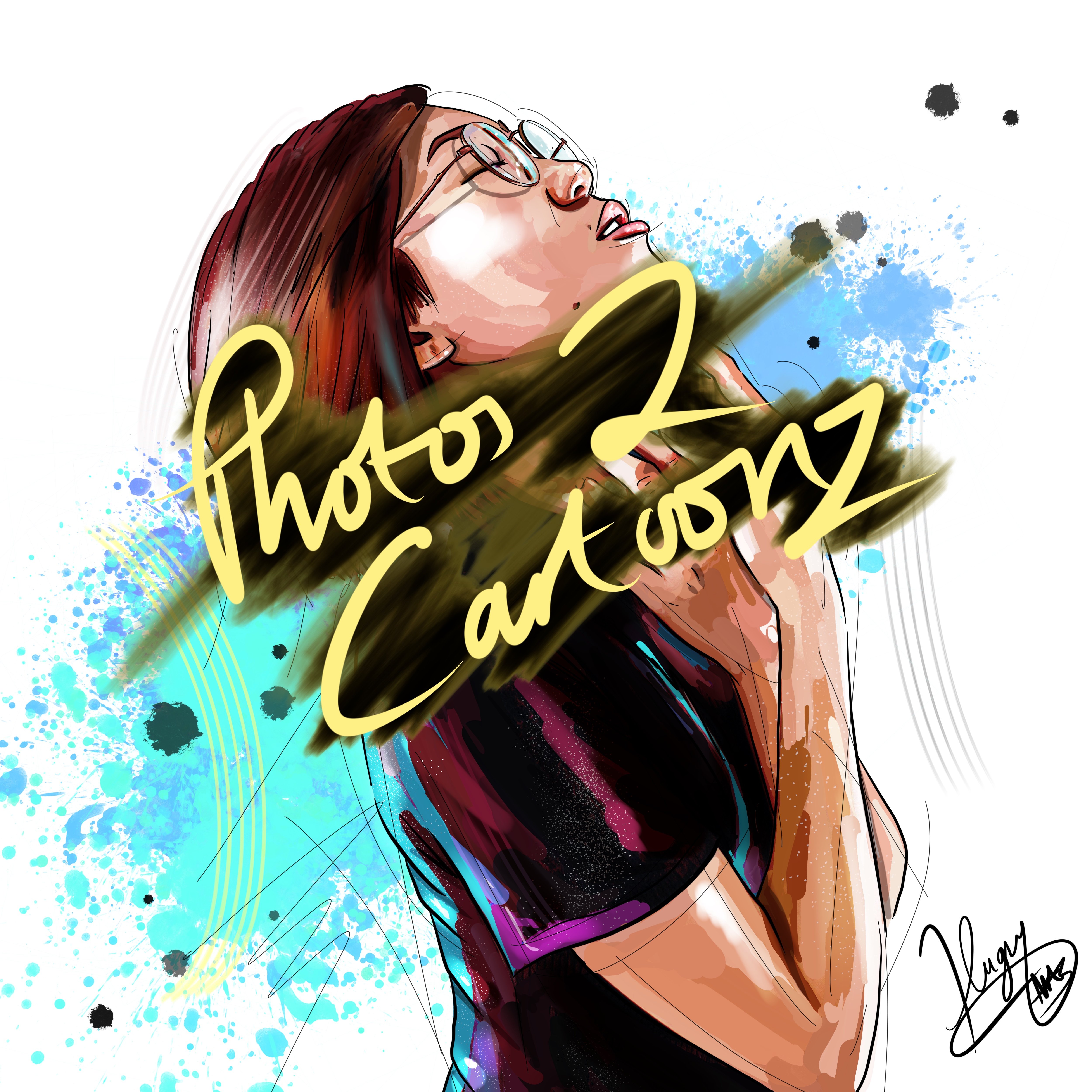
1. Introduction : Hello everyone hugs yachts here, back with another tutorial. So if you remember, I once did a tutorial called
photos to pet portraits. So this is going to be a
follow-up to that one. It's for almost a
pet portraits tool. And we're looking along the same lines as
what we did before, only with some extra tips and tricks which I've picked up
along the way since then. And I'm adding more of an RT, RT style to things as well. So in this tutorial
is broken down into 1010 minute, small
bite-sized chunks. We're going to get straight
in these don't take forever. As you know, if you've
seen the first one, if you haven't seen the
first one, by the way, I recommend giving that a go. For this one, I'll be
following on mostly from that. But i'm, I'm gonna be teaching you these new little
tricks and tips that I do, which include using
the curve tool, liquefy tool selection. Tool. Layers are going to be using maybe a multiply
layer and an overlay layer. And now there's a
few little things which we didn't do previously, which will give us a
much better result. If you look closely. It gives a nice polished,
polished finished. So, see you in part
one. Let's get started.
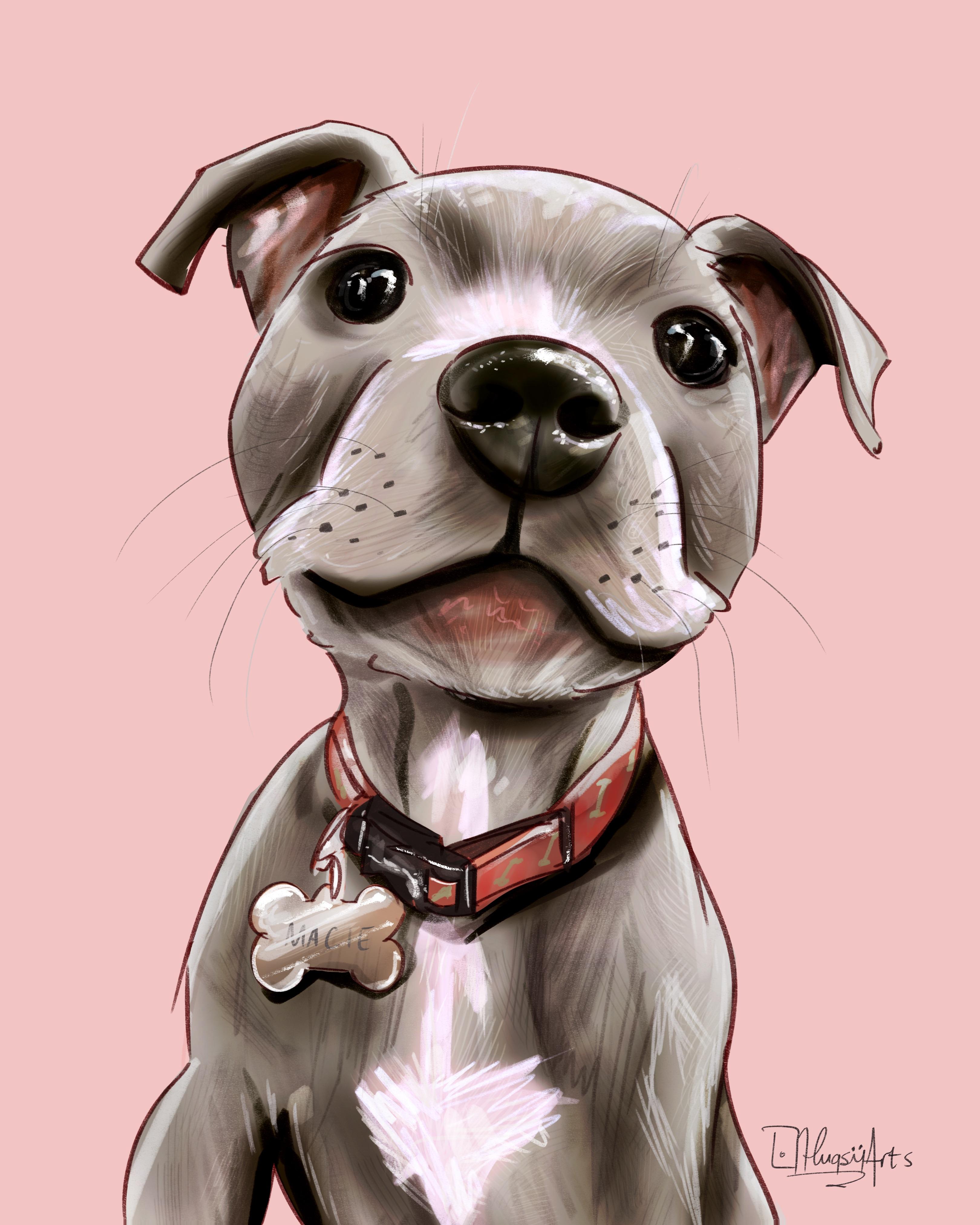
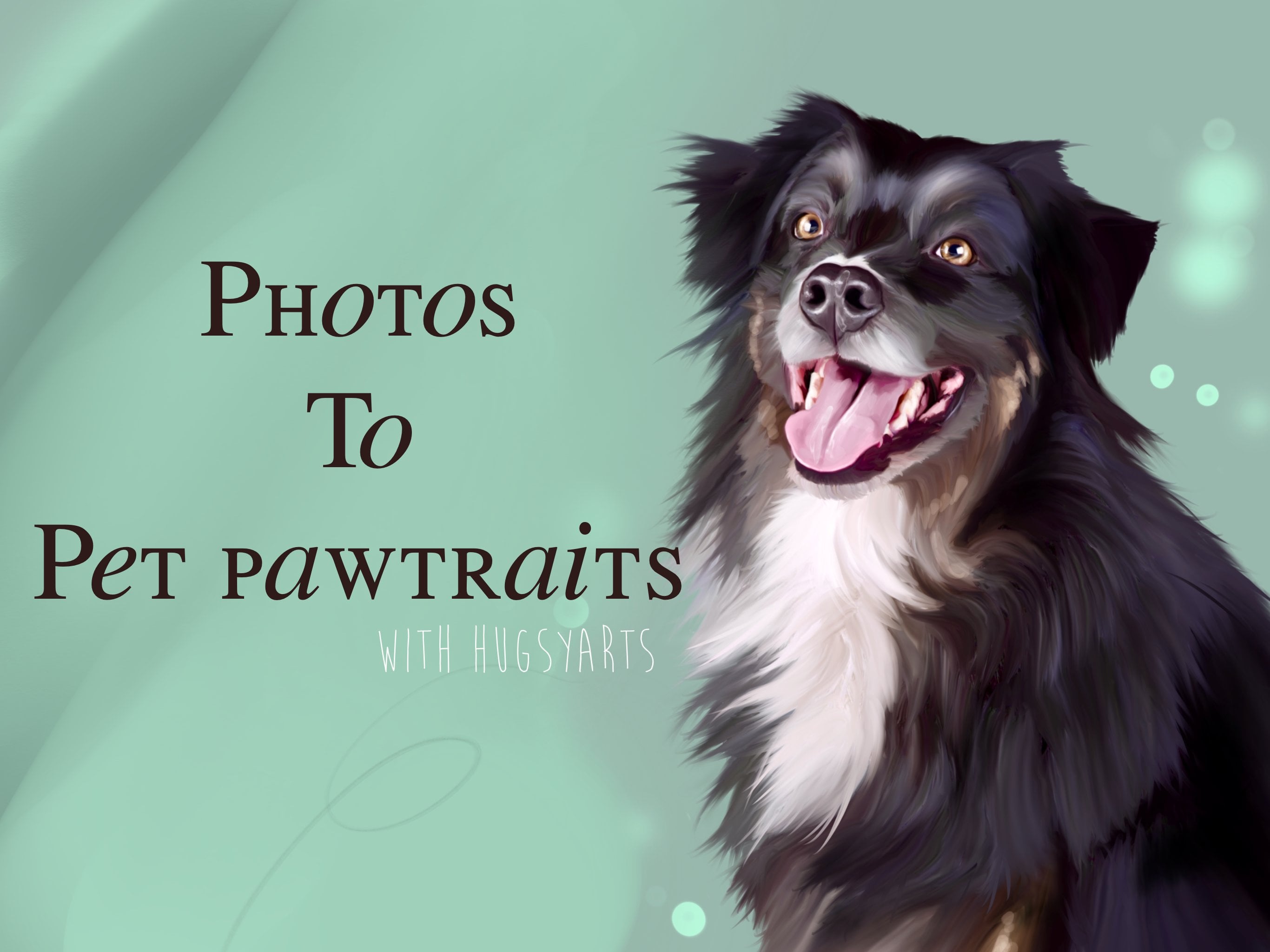
2. Preparation, learning the selection tool: Okay guys, Welcome
to part one of my photos to Pet Portraits tool. So this is the recent
one I've just done, literally did this this morning. So you can see the reference
was the photo used, and this is the final
image I come up with. Now as you can see,
upon closer inspection, to the naked eye, there is no evidence that this is actually a
manipulated photograph. None whatsoever.
None whatsoever. There's too much going on. Stylish. And more importantly, it's really simple,
really simple to use. So this is the method I'm
going to be teaching you. One of the most important
new parts to this is using the selection tool to get edges. More importantly and features. Select the eyes, the nose. They're going to be on their own layer and
merge them all. Now actually, I've merged
them all together, but you will be selecting them. There'll be working
on their own layer, the edge of the blanket. It's gonna be on its own layer. So we don't get all muddy, muddy colors and muddled up. And you'll see as we move on, let's quickly open up a canvas
and choose a dog to draw. I was tempted to actually do this one again because
he was quite tricky. I imagine pugs with if folds and small hairs pose a few
problems for people. Let's give this guy and go. I've never drawn this
guy or this guy before. So CAI, we do things. So obviously the first
thing I do is I open the photo onto my canvas. First and foremost, place
it where you want it. Get your selection tool, and cut around the bits of the
photo that you don't want. Don't want that blue background. I'm only interested in the
actual animal for this, for this exact portrait. Ignoring the whiskers. And to be honest, at this stage, I'll be ignoring all details for the next several minutes. Invert clear layer. Okay, so there we go. Now, one thing I
wanna do is just grab a duplicate of
that and turn it off so that we've always got a copy spare of our
cutout picture. So the next thing
I wanna do is work out my important features. So my important features
are going to be the nose, the eyes, and the towel, maybe a bit of that shin around there where we're going
to need the nice edge. So these are the areas that
are gonna be, you know, the I is gonna be drawn to
grab your selection tool. Highlight some
important features. Going right around the eye. They're getting all around
the edge of the i2, not just the eyeball. Right around like so
right around the nose. Maybe even grab
that bit in there. Around the nose, like so. And as I just said, I think I want to grab
this chin on its own. We can get that top bit
going straight over. I think I'm going to grab
this bit because it's gonna be it's gonna be going
over they were towel. I got that there now highlighted
and open up the layer. I want to erase everything
except what I've highlighted. So let's go back to that. And is it going to let me it's not going to
let me know. Okay? Layer's empty. Let's
try that then. Invert. Not exactly sure if it worked or not to be
fair. So have a look. It didn't. Didn't. Okay. That's good. We live in Loon,
we live in learn. Let's, let's do the safe,
they're safe technique. Back to the eye. It's a good start for
this tutorial, isn't it? The I the C the care I'm taking you don't
need to be too careful. We'll be the master
of the detail when we come to put in our own spin
on things towards the end. Okay, so let's just
get that chin again. Like so. Save and load than
the bottom and press Plus, we've now saved that selection. Hit Invert, and save that too. Okay, that didn't
actually function there. All right, so we've
now got everything but they were selected nose
and mouth and thing. We've also got just our eyes, nose and mouth selected. So go and everything,
but what's going on? Well, unit, I think my finger I just had a tip top and
my fingers are too cold. Clearly. There's
our important parts to this, to this portrait. This is what we feel. It's gonna be an important part. When I bought them on backup, duplicate arrow button
12 in the bottom off. Another important part, of course it's gonna be this towel. So let's go ahead and get the edge of that toe
all the way up there. The face. You'll see
why I'm doing it. When I come to
actually blend in it. It just gives us
a nice hard edge with a blended into much. We don't want it to become all muddy with the colors
and the blues and stuff. Okay, so our towel,
it'll be next. Go right there.
Select our towel, everything but the
towel has got to go. Again, my fingers
are not working. Clear layer. There we go. So there
is our important parts which we've selected. And of course we've still got
everything on the bottom. So let's duplicate
that bottom one again, and it will always
keep one of the
3. Smudging away the photo to create smooth painterly feel: We'll always keep one
of these just down the button for spare,
switch it off. Let's make a start.
So I start on it. We're meeting part that dog. And I've provided some bus
brushes, of course, for this, which I will be titled
PIP2 Pet Portraits two. And we're gonna be
using clumpy for tool, is gonna be our main
go-to blending brush. And it's going to
be on 87% opacity. We're gonna, we're
gonna vary the size. But I'm starting off with, I'm going to start off with 27. I get stuck in gecko
and start smudging. I've got besides a little bit, I'm, I'm 41 now. Totally forget about details. Just focus more on colors. If it's white, try not to
mix too much blacks into it. Obviously, our main
priority year is keeping the colors and
eliminating the photo, that horrible photo layer and not even sure what
you call it, like no use. We want to get shot so that
even under close inspection, our pet portraits
look genuine and look cool and look really, really fancy without looking
like an edited photo. We're underneath the
moment because we've got a bit of that chin
already on their luck. See, so let's turn that off a minute and see what we're doing. And we're not taking
too much care here. Because as we've already got this covered on the layer above. All right, let's
go a bit bigger. And I start dragging
some of that white and pinks around like so. Totally ignoring details. This is quite important
at this stage. This is why I haven't actually
opened up the Canvas yet. Oh, picture. We're not even at that stage. I've done that for a reason. I don't want to be
bogged down by details. All we're doing is just smudging out this photograph first. Before we put our spin on it. Get around. They're going
to be a couple of the nose. Now. Don't worry too much about this area because as you know, will be going in a
bit more detailed on this main feature. When we start on
our layer above. But just give it a
little once-over. Like so it's not going to hurt. But don't worry too much about getting all that
photo phones out because if you look,
it's gonna be covered. More importantly, just make sure you
do blend where you haven't got on the
layer above C. So probably an
idea to keep it on actually get some
of this in here. Again, don't worry about the
eyes where we can't go over there because it's
on a layer above. So just try and get those little different
change in tones. The subtle grays and blacks. Try and keep them. The one
thing you do when you're doing this technique
is that you are washing away as well. So saturate, nice saturated bright colors,
you're going to wash away. With this particular brush. This is a wet brush. It dilutes and it washes away. But it is the best brush that I can come
up with for this. But don't worry, because I've
got a master plan to get all our vibrancy back in just
a few clicks of a button. And I'll show you
later. We won't be all washed away
for goods will be more vibrant than it
was in the beginning. Okay, It's looking good. Minimal, minimal fuss is
just get a bit of this year in forgetting about
the whiskers. Whenever own whiskers
towards the end. I just want to get
rid of the furs. And as you can see, we're not going over there because it's on our towel layer
which is above C. So we're just stick to that. When you're doing these, always try to do that. Underneath. Flats even makes
sense The underneath first. So for an example, if I was doing this
part of the towel, which we'll do now
actually do the black part first and the
overlapping part second, rather than starting on this bit and then having
to come back with. The underside. It's just, I just find it saves
you a lot of other, especially when
you're doing this, of course doesn't just work for Patsy, works for everything. But when you are doing
different things, buildings, cars, people, jewelry on
people, clothing on people. Go out and decide
done like that. We're just going to try and
keep some of these blues. Nice and smooth side. I'm just going to
shut up a minute and go ahead and show
you how to do it. Just want to quickly
say it's a bit of an underside here where
we got this crease. So I'll be doing the
underside first. Excuse the humming. Something I always seem to,
when I'm drawing, I just seem to go into
a meditative state. Suppose we're all going
to have a little quirks. A lot of people may frame
their nose upon this methods. Maybe, who knows? Let's assume they weren't actually because you're creating some pretty fantastic results with minimal fuss,
minimal skills. It's good. We can make money out of this. I show you that. If you notice here I'm washing away this bit and it's kind of showing through what's
underneath because we already have the towel
on the layer underneath. You see, it's kind of washing away and show
him what's underneath. Don't worry about that. Don't even worry about
what's underneath this little undecided first, we're going to go
right up to that year. Dtt, nice and dark down there. All right. So if you look, you
can see it's kind of looks a bit off
at the moment, but what we'll do is now
we've finished that towel. We'll go back in on
our original layer and we'll tidy up those edges, will give it all a good
blend back in Luxor. We are. Otherwise, you run the risk
of looking a bit messy. If anything, I'm bringing it back. I'm bringing it back in. I just want to say I don't know if this is
going to turn out. This is I haven't
drawn this before. It's completely new to me. This picture, right? That's TO all done. And as our main part of
our body and face done. We of course now need to start looking at
the detailed bits. So let's get on it. Let's get on it same brush, same method. But maybe take a
little bit more care, especially around the edges. Keeping colors, colors in
place as much as you can. You can see where the chin salt goes back into that white first. So I'll be doing the same. Yeah, nice. Knows I always start
with the darkest bit first and then I just work, work out from the darkest bits. Again. Forget about details or the little speckles
and things like that. This is gonna be what
our two-sided comes in. We want to do is just find
the shape. The colors. For now. Try and soften off those edges which have had their hard cuts. So because of our
selection tool, we just want to soften up, soften them up a
little tiny bit. And as you can see,
I don't know if a schedule earlier when I
said that detailed parts. I think too wet. As you can see, just just the same as what we've already
been doing really. Maybe just a brush size down for the really detailed bits, the fiddly bits like the eyes, which are gonna be, they're gonna be worth that
extra bit of time. It's the main focal point. People will instantly
look there first. This is not the
be-all and end-all of our detailed process would be put in an RT spin on things as
well towards the end. So this is just sort of the
first coat, if you will. Just the first coat.
Just to get us going. I want to keep those shotguns because I want to
know where they are. When it comes to
adding my own shines. Like that. Nice, it's nice. And now all I want to do is
just soften around the edges. One thing I want to say is when you're doing
particularly dark pets, be careful because they were all our screens work on
different brightnesses. And if you have
different settings, if you're in broad daylight, things can be harder to see. Be careful because
the dark parts of pictures will show you out. They'll show you out. You might miss some. So just make sure you're going over them appropriately because they will hold onto all that fors
is quite easy to miss. And then you can post it online or give it
to the customer. And they're like, Yeah,
what's that all about? It looks like a
photograph. But here, bringing this blue straight down beyond the bit we've
already got cut. I have a little look at that. I'll have a little
look at that now, when we go reference out. Firstly, we wanted
a sharp edge to me, so keep an eye on it. Right? So we're
at the stage now. We have gone around and smoothed
off all our photograph, given another one
solver and check for any silly Blair and arrows. But that's looking pretty smooth now if we just take a look at our original graph and we've smoothed them out
and we've got this. We've lost a lot
of definition and saturation and values as well because we've
watched him away. So it'd be bringing them back. One thing I've just noticed
is that I don't like that. Let's actually photograph.
So that's got to go. Okay, so now it's
time for the fun bit. This is where we put
our stamp on it. And I'll see you
in the next part, where we'll be using
our artistic skills to turn this into a nice
look at portraits.
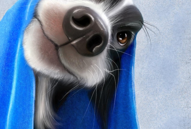
4. Drawing in texture, hair and detail: Welcome back to part two guys. So for this part, we're gonna be using all of our IT skills to make it
look a bit more acceptable. So first I want to open
the Canvas and bring up a reference of your
photograph of your pets. Like so just for purely for what it is
reference purposes, you can see all that
lovely white wispy for underneath the chin. He's got a lot of textures
going on around us. Snow loads a little
white hairs in there. This is where we
just go a bit mad. We're gonna go on a layer above. We're going to just
let ourselves go. And you will see that
it always works out. It always works out. So grab a brush.
I like this one. Probably my favorite brush that I'm gifting to
base hair brush. Grabbed the local color, which is sort of a dark gray, go a bit lighter,
so it stands out. And now we start having fun. This is the bit. This is the bit that sets
it apart from being a photograph and turns it more into being a
fun piece of art. I'm just adding texture
everywhere they want to. All those little tiny bits there. Let's have a go at that. This is gonna be the fun bit
for you because this is, this is where you put your
IoT spin under things. Even your own style. Whatever your style,
maybe it has cartoony. You might want to
go bolder and more brassy with your strokes. Mine is more of a painterly. Look, I suppose
you could say. So. I will be staying fairly
soft with what I'm doing. Varying this brush
sizes all along. The best bits are still to come with how the curves tool works. You'll be blown away by that. Look at all. We'll get this back.
Supersaturated and fun. Some lightness. I'm pressing really lightly, by the way, literally just glazing. Glazing in texture. You can have too much texture. Let's get this local color
and go a bit darker. Same. There were instantly
starting to pick up textures. And it's not even
an issue as it yet. Let's grab another brush. Let's use our hairy, rough texture. Amazing brush. This will, from a distance
gives you instant recognition. Is really, really nice. It just works well for
my style personally. And then below that. Nice, happy with that. I'm happy with that. Let's get a bit, just a tiny
bit of texture here as well. Always take notice of the parts where the
light meets dark. They are going to be your
parts to exploit when it comes to adding your
ATI, spin on things. The more texture with
a scruffy hatches it. Brilliant, brilliant brush
just purely for texture. And your style. Alright, let's go to the layer below and I start working
on this towel now, I just need to add a
bit of texture to that. So I'm gonna go to
my sketching brush, which is actually more of a
texture brush, I suppose. Grabbed the local
color. Nice and big. And I'm just going to
start I'm just going to start it too dark
for that part in it. Just going to start
commissioning some texture. As you can see, it sets it off, sets it right off. That green bit, get there. We'll run them. Random thing that is
layered is that even on whatever gone now, I'm going to add some more of this still on the
sketching brush. And I'm going to add
some more of it. Just lightly glazing purely for texture services has
got a bit of that pig. It's like an off pink. And that's just data around there. Like so. I'm not going to worry
too much about that. I'd be grabbing that with
my overlay layer in a bit. We could go a little bit light. But as you can see, it's a
very nice texture brushes. This one is just a
sketching pencil, which, which I've converted. I converted it into
purely a texture brush. Okay, so he's looking
a bit more lively now. He's got some bumps and swishes and bits
and bobs going on. It's a bit easier
to look at now. We want to get some dots. Maybe use a better
stippled brush. Again. It's all about texture
artists, nothing else. We're not being detailed. I might try and taught in
a few bits and bobs there. We need to work a
bit on my nose. So let's do that. Scrubbed the lightest color and go a little bit
lighter than that. Too much too big. Too big still. Okay. Nice, nice, nice. Let's get some clumpy for. It also works
fantastic as a brush. This is Columbia for one of my favorite
brushes of all time. Okay, I'm happy with that. So we're looking at this now. And we can go ahead and
just bang in some details. Layer above. All those whiskers are
gonna be fun to do. So pick your correct opacity and size down in an opacity
and just have fun. One there. When they're fun. Whenever you see them. Bigger there for these big wins. Whenever you see
them, draw them. And this is going to also just pop in hairs
all over the place. Yeah. Because it will
set your work off. Got some dark ones
coming out from the top of the Luxor. Nice. Now he's looking he's
looking pretty cool. But he's still looks
like the photograph. We'll sort that out. The bubble. You could put the bubble
and if you wanted to, you could just cut it out. I'm going to leave it for now. This is more about the pets. So highlight all of your layers you have so far except the bottom one
which was just a backup, liquefy unless workout
while we can play with k. So we can, we can
play with the eyes. Maybe we can make is
I'll use a bit bigger. I've missed a layer
off there overnight. While they missed off. Okay. All right. Of course, we're backup
one is now at the top, right back to liquefy and less enlarge is by stretching
his head up. Like so. Yeah. Nice. Pull this out a bit short
and give them a bit more. A bit more form. We can play with this a bit. We can give them a bit of a
smile if we want to. Like so. Hoops, then I'll fit a
bit of a smile there. You can make his nose bigger, smaller, whatever you want. Just pulling carefully and
try not to use it too small. This thing because it pulls
a funny angle when you do it too small. So there we go. Doggy, looks just like the
targeted on the photograph, but now he's got a little
bit more character and he's a little bit
more fun his knee. But that looks so much brighter. So in the next part, I'm going to show you how
we get our colors back.
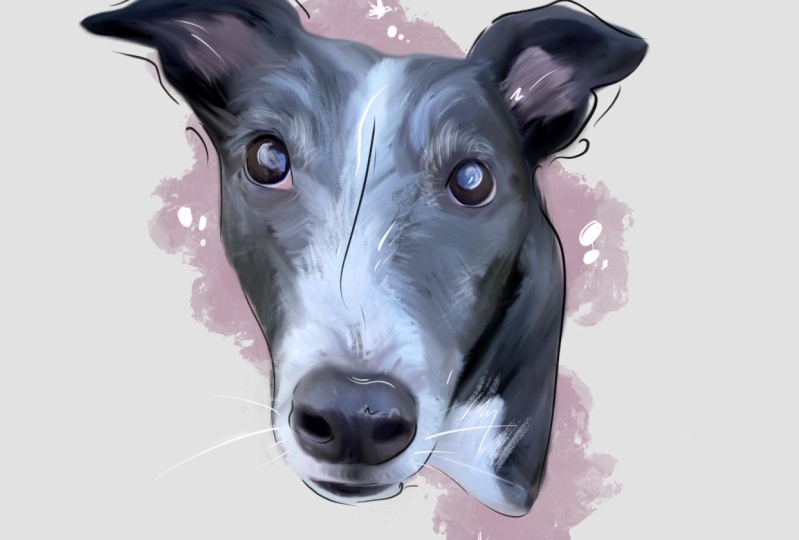
5. Bringing the depth and colours to life using curves and hsb: Welcome back guys. So for this part, we've washed
away a lot of the color, the values and the
saturation and the ETC, want to bring that back. So let's start doing that. First. Let's bring it
back on the towel. Curves gamma. And if we move this top
one directly to the left, we're going to be picking
up all the highlights. So I like to just go a little bit to pick up some
of those highlights. If we move it to
this bottom left, one to the right, we're gonna be bringing out all the shades. So I like to pop it out like so. Okay. That's gonna give us
our snap and value back, which we washed away when we did our blend in and rendering. Same again with each layer
gamma on the actual dog Now, bit to the left to pop
some of that white back. Bit to the right. Not too
much because it's a dark dog. But to give us some of
that depth and value back, highlighted important
areas, of course, same thing, bit to the left. This bit bring some
lightness and a bit to the right to bring
some depth, not too much. The next thing we want to do
is on each of them layers that we just did that is to
bring our saturation back. Take it up to 60 wherever
it sits right with you. I like to go usually
in the sixties. Otherwise, you will
find, if you think, oh, that looks too much,
you look back at it. Still looks a bit
washed out. Okay. So now our dog has got
life and color again. You see? And he is
starting to look like at work other than a washed out, boring old football, which
to be honest pets portraits. One was the birth
of this method, but this is more now
going up a level. It's got, we'll go
into another level. We're turning it into art. Okay? That is other things
I like to do. And one of them is this. I like to add an overlay layer. I like to take it to black. And I like to add texture. I like to add texture and
depth to certain parts. Again, more color popping. Literally what it's for. So that's that. And then take it
to white and just pop out some, some lighter bits. Again, this is adding more texture and depth
to our piece again. Back to black. I'm
going to do a bit around the tops of the, you know, the eyes there. Now I'm doing this with the
sketching brush again because it's just instant,
instant texture. And it looks the part. So some lightness around there
and likeness in the eye. With me. We've added a lot. They're just from that issue. If I try and show you there, that's without the overlay,
and that's with it. It just gives it a
little extra pop. More artistic style. What else do we need to do on an open up a new layer
normal again. And I'm going to take it down to a very dark color, almost black. I'm gonna be using my sketch
in two to three pencil. And this is where I add
my RT spin on things too. I'm going to be
outlining if I was drawing all my main features
or around the eyes, around the iris is
wearing the pupils. I'm adding contrast.
Sweet Chevette, just to give it a
little something else. I'm not being too careful
because that's my style, but you can do you can be
careful if you wanted to. I'm going to bring
this off a bit better. I'm just trying to add my
my take on proceedings. This is also what
makes people go, Wow. You did that. Let's get around sheer fact. What I'm gonna do is on
the very bottom layer, don't know if it's gonna work. They actually
covered under there. I'm going to go around and
accentuate this mouth. Like so. Because I'm gonna go
back over it then. Because this is also an awesome pencil for adding texture, texture, a little wild
hairs and stuff as well. So we can do it like so. Lost out on the okay. So any wild little hairs, you need extra whiskers, whatever that this
is going to give us our extra little arty and for
that we need around here. Really separate that from the Blank little bit
of white around, make sure we get that
popping over there Like so. Yeah. This bet. That's going a bit of
that blue running. Nice and neat thing that likes against the blacks
are gonna be your friend. We've added some little
units to hit them. We also, as you think it's too much like so just give
it a little smudge. And then you'll keep
that contrast still. Also highlights. Let's go straight to white. And you can pick
whatever brush you want. A shoe is my scum. Because it's quite a heavy, heavy brush to say the least. Go easy with this one. There you go. We have created a pet
portrait only this time. It looks better
than our last ones. If you wanted to,
you could add more. Background wise. I've
been keeping mind fairly loose and like this, but I do like to add some
with a clumpy for brush. Some paint splotches. Just literally splurge. Splurge and paint
here and there. Just I didn't bits and bobs. Everything you add to this is your own touch, your own thing. If you don't not his style. Take one more look at it
and you're happy with it. You can always then merge all your normal
layers together. Down, down, down, down,
down, down, down. If you wanted, then you
could go and give it another clumpy food smudge, check-in for any anything that you're not quite
perfectly happy with. Everything will smudge as one. Once you have this all
selected together. You can use this to to your
benefit if you want to. If it suits your style. Okay guys, and take one
more look at curves. Does it need a bit
more to the left? Does it need a bit
more to the right? Not really. It's looking pretty good. That's it guys. That concludes my
tutorial Of Pet Portraits to you can sign it with the customers name of the animal then
wherever you like, they love it when you
just do it yourself rather than type
it in fancy texts, which all looks a
bit to digital. You know, just grab
it. Grab a pen. I like to use this one actually, my sketching two to three. Just can't think of a name. Just go with the flow. See, obviously sign your work. Because others are climate. And I said Folks, photos to Pet Portraits, to thanks for watching. Any questions. Ask me and my group on Facebook, which is called Procreate,
learn, and share. And yeah, I'll see you
all soon. Thank you.
 HugsyArts, Aspire to inspire