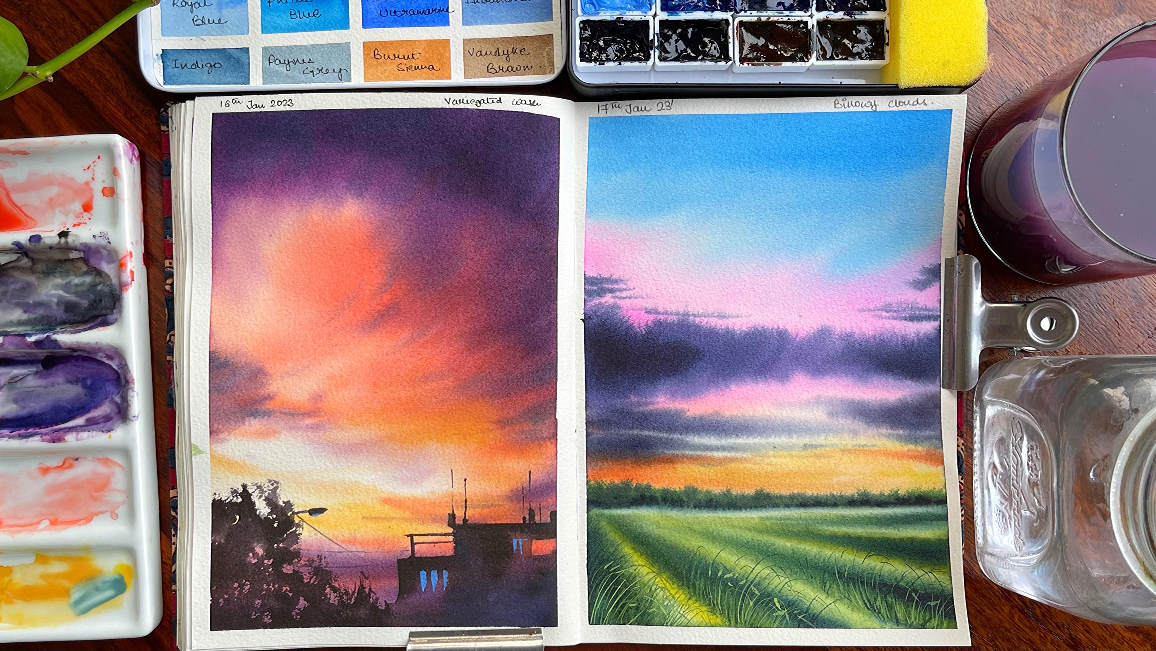
Transcripts
1. Introduction: Urine and statisticians
Cai, can make up a day. It has the most beautiful in
the orange cow in itself. So due date, we are going to share all the
secrets of painting. These beautiful skylights. Hi guys, I am an artist and strapped
on mumbles cache each of cattle are five
muscles where we not only my sketch
from Congress, weak base, but also their
courses, workshops, etc. Each of these courses are
available for lifetimes. So if you want to explore it, please go ahead and check out
my channel, www.google.com. This class, you are
normally going to explore two different
types of skies and girls. But we are going to go in depth in terms of what are the kind of palettes that you can choose. Whether it be an annual
August bolide or split complementary palette
or a harmonious valid. Each of these Ballard has a following exercise which
you can go ahead and paint, as well as understand
how to use each one of them to the best
of the possibility. You can understand these folks
like large brush strokes, then the electron
cloud brush strokes, as well as how to make smaller brush strokes
so that each and every kind of a
brushstroke and come to your usage for you and
your future paintings. Small yet important
details have been gobbled, like painting your son. Then I four different ways. I have been painting my son either be wet on
wet and wet on dry, wet on wet technique, as well as painting your
grasses with only using water. Finally, I need to get
all these projects are real time and you can
paint along with me. Anyone of you can join this class irrespective
of your level as there is good
amount of planning for Campari level of artist. So join me now hand, let's think these
majestic skies.
2. Materials : Let's discuss
everything you need for the whole physics sizes. The first is the cameras. So I would be using
variety of colors, just going through
all the sheets which I have the Talmud, orally, Indian yellow, Naples, yellow deep cellular
orange quinacridone, coral, cadmium red copper, and also for our campus
valid greenish yellow, olive green for a spring, royal blue teal, new
French ultramarine, involuntary, indigo,
a spray on sienna. And when I keep
them individually, every painting that
you would be the wing has a list of Carlos
that I would be using. Let's just go to all the brushes that I would be using for
completing the painting. The fascia is my appetite,
DaVinci or brush. It is three by zero. And I have been using this brush for many of my other
paintings. Cool. Just wanted to keep you
guys updated as well. Wonderful brush to have
Casanova size zero, brush. Size four, round
the Vinci brush. And this is his photos brush. Hello, with it. I do have a wash brush
for doing all my sizes though many of the exercises are done only with one single brush, like this one, which is that
in C, gasoline oil brush. The sketch book, of course, is made out of Carnegie five
GSM, hundred percent cotton. Paper. Size is
nine into 12 inch. So I would be practically
using carpet, which is majorly alone, A5 size. I have a color palette. Of course I've used
this palette for my other binding site
would need a palette like this or any
other palette that is available with using tissues. Now these are actually
gotten to shoes and I can watch this
and again use it. Just being a bit
more environment for having two jars of water for my washing of brushes as well as
one for first supply. I do have a pencil and eraser, as well as I'm
keeping a result of any extra Revit miles
from the paper. So you need from the
materials perspective, let's move on to
the next lesson.
3. Color Selection Various Palettes: If you practice painting
or if you are an artist, whether the
watercolors or quash, or mediums like oils, etc. It's important to
spending some time on your color wheel
because that could really help you do is to
any of your paintings. This particular part where we are going to not only
discuss the color wheel, but how to pick
up the colors for your clouds or any other
painting that you are doing. I have selected for
CDO three colors, which is my Indian yellow,
ultramarine hundred. I would be just creating
a simple color wheel. Now, this simple color we
have already done many times can we are not going
to focus on this much. It's just for your
knowledge that you can have any three primary colors and create as many secondary
and tertiary color. But to capture the mood, focus, tension of a painting, it's important to understand
the color harmony and how a color harmony practically defines a good or
a bad painting. Many of you have asked me
how I select my colors. And this is where
I'm going to tell you the various ways in
which I select my colors. We would be working with
the same colors that we are showing over here in
our next set of practices. So let's start focusing
on the first part, which is my analog is palate
and analagous colors. On the palette,
whatever you seen has primary color,
like a yellow. I have taken the colors
that are adjacent to it, which is majorly my orange. Or you can even take colors
that is closer to orange. That is your Compose
Opera or red value. Whatever color is closer to the primary sheet that you have, you can take that and start making this
analog is column B. This is so important
and it comes so handy when you make any
kind of sunrise painting. You will see that I will
be using this kind of Coca-Cola will format first
type one practice exercise. Though, we are also going to add violet because it is
a multiple color. But in case you want to only go head with a limited
palette exercises, this can be one which you
can select on your own. For the first week. I would say it helps you to achieve a wide range of colors. Whereas when you go ahead
with the analogous palette, it's not helping you to actually take care of a wide
range of columns or drum. The different shades
that you can achieve, it really helps you to capture the mood which is majorly warm. In this case, the red or
the yellow was that you use practically really sets the tone or the mood
of the painting, which is warm in nature and
hence any sunrise or sunset. These can be the colors
which you can choose Stroke. Though there are
other colors which are even harmonious score, which split
complementary palette that we're going to discuss now, let's go ahead with our
split complementary palette. This is something that I really want to
actually tell you. I have used this kind of a pilot very often
in my paintings. I'm going ahead
with yellow, red, and one thing, you can go
ahead with yellow and blue. This would really help you to create much more
interesting paintings. I split complimentary
is basically concept as logos with
one basic addition, I would say it begins with the color scheme of
your yellow and red. But adding some blue to practically complement
unbalanced of anything. By doing this, you
are not only creating an interest for the people
who are watching you paint, you are even going
ahead and doing a color harmony in a way that all these colors are
connecting to each other. This is the type of practice exercise gloves
that we are going to print. Hello. There could be some
directional clouds that we are going to add. The third type is the
harmonious palette. Though harmonious palette is the power of choosing
good colors. Good colors means three
are close to each other in the color palette. I am choosing blue, various shades of blue. That is my bright blue. Or you can see a royal blue, jello blue and Payne's gray. Payne's gray, which
I have chosen, has lot of blue pigment in it. Hence, you can see that they are basically
from the same family. This is another painting
which is type three. Now what practice exercise? After these practice exercises, we are going to move on to the final painting where
all the learning school, this color wheel, and
our practice exercise, which helps us to bring two different kinds
of clouds and skies.
4. Analogous Palette Practice Exercise: I did all to detail
you a lot in detail about the color wheel,
analogous palette. But let's understand how to
use it on our real painting. The first is on sites where we are going to
use our primary color. The only primary color
which is yellow. And we would be working with the colors in and around
the primary color. That is majorly
your warm shades. I'm going to use Sennelier, orange as well as
opera hand purple. Since this is our
multi-color blending. That's why I have gone
ahead and add in my poeple. Otherwise, I would have only gone with my
orange and operon. These practically, as I
have told you earlier, helps to set the mood
of the painting. The mood of the painting
is warm and it is Sunrise that is
happening right now. Therefore, the colors
towards the bottom, lighter in value, while towards the top it
is darker in value. Going ahead with cochlear blend. But before I had my colors, I did pre-vet my
people. Pre-web thing. Your paper actually
helps you have a smooth blend in case you are going ahead with all wet on dry. I am not denying to fact that you will not
get a smooth blend. But with a wet on wet technique, it becomes really easy
to cover the space and color seamlessly blend into
each other, less hassle. So that's one of the reasons that I
always like to go ahead with my wet on wet technique
for covering larger areas. Whatever colors you see on the people is practically
the first layer. And this is really light. If you are one of the
persons who loves to have very soothing as well as like
low value on your paper. I would ask you to go
ahead with this shade. But I am one of the
persons who loves to have a lot of vibrancy
to the painting. Therefore, I am going ahead with some more darker shades of my yellow, orange opera orals. You can also take Compose Opera would ever Carlo is
available on your palette. In case you do not have
any of these columns, please go ahead
with your crimson that is kind of similar to what you really
want to achieve. You can see an uneven blend. We need to blend it with some clear water as well as some yellow in and
around though. Sum, the sum that you
observe over here is practically very
soft in its approach. Now how to keep her
son really soft? Here we are painting in
and around the whitespace. Dough. The white is all the wet on wet, hence, the palace. We'll move into the places where you have tried
to keep it wet. What I usually do
in these cases, I would go ahead, take a clean, damp brush and pick up the extra colors wherever
it is necessary. This is one of the most
handy and easy techniques which you can use for
all your paintings. The second one that is another go-to technique
for many of the hottest is to use your tissue to pick up colors from the
particular place where you do not want any of
the pigments to be applied. Orals, you want culprit
of lighter value, go ahead and pick it up with
the help of your tissue. Though the tissue might
give some hard edges, has a really picks up the clear water which
is there on the people, or it makes it less
damped compared to what we want for
the soft term sheet. Hence, I would always
ask you to go ahead with this particular way of cap
line the colors on your paper. I'm going with a
repetitive process of just adding and blending
the colors simply, whether it is from the bottom, towards the top or from the
top towards the bottom. One thing which we need to always keep in
mind when we start with our painting is going
with the lightest value first. Another aspect which I
have always have solved, if you start with
the lightest value and then continue with
the darkest value, usually the colors do not flow even from your brush
to the lighter value. What happens is even if we take off all the hits
droppings from your brush, there is a tendency
that we have of very, very light mix still left
in our brush that can really get into
the lightest value which we always do not want. I am turning my board of
it towards the bottom. What I usually do is place
any object towards the top, below the board exactly. And then you can easily see the colors flowing
towards the bottom. It is gravity and
gravity does it stop? That's how I go
about the painting. Adding a few points like
all the colors that we have used and how there is a multiple layer blending
that we have done over here. These are a few
notes which you can always keep for
yourself that can even help you whenever
you have done any kind of studies on you need to reference
back on your paintings. I usually love to
do these exercises on my sketch book,
but just that, I thought I put it on a paper that would
be easier for all of us to have a look at it and
it is easy to review them. Let's go ahead to the next one. The next one is even a
bit more interesting as it is split
complementary palette. And you can also say it is a split analog is kind
of a pilot where we are adding the blue
color along with yellow, as well as the
orange or the red, whichever you want to choose. Irrespective of
that, like we have a warm as well as a cool family, both of them blending together
to give oh, perfect mix. As well as it becomes
way more interesting. I must say you will
yourself also, but once you start painting in those second
practice exercise. So once done, let
the paper dry off completely and move on
to the next exercise, which is exercise two.
5. Split Complimentary Palette Practice Exercise : Split complementary
palette is one of my favorite go-to palettes. Here, basically we mix
three kinds of sheets. One is from the warm
site, that is the yellow, something that is
closer to the yellow, either it be an orange or a red. And then you can go ahead
with the color like blue. It creates very
interesting fx tan. Let's try that out right now. Pretty wet your paper and then just load your brush with
some amount of yellow. The extra yellow that you
did load on your brush, take it off on the tissue, and just start with in this
round count or strokes. This is a very simple stroke and I'm leaving some
areas for my son. The colors will
automatically flow in between so you do
not need to worry. You can actually leave
a larger space of white because the yellow will make
it look much more smaller. Going ahead with
cause simple stroke from left to right
and from right to left by applying some pressure, adding some orange orals. You can also go ahead with red. Both orange and red are
close to each other and I would prefer the warmer
sheets to be used orals, you can also only go head
with yellow and orange. I would leave that
option up to you. Once you have added this part, go ahead with some blue
towards the top area. The blue is basically
my end on three, I have been using this blue very often in many of my
other paintings. If you would have gone
ahead and check that out, you can understand
how beautifully I have applied this shade in other paintings to
the special aspect of this sheet with oranges. It plants very beautifully
with each other, leaving no gaps and there is no muddy effect that you
usually get out of this. Once you are working
with this color, make sure that you
blend it evenly. And every time you blend, the colors need to mix in a
way that it looks very even, even in a way that they
just blend into each other without giving any
lines or any other effect, which leaves those harsh lines. Going ahead with
some more orange. And you can see that
I am now going from the bottom towards the top
as I want a smooth blend. Blending Hayes Hall. Very difficult
exercise to be frank. But once you master it, all your paintings is going
to have an amazing outcome. Going with some more orange. And this practically
takes a while, so just be around
and practice it. Go ahead and add some
more yellow towards the bottom where I want to keep it wet for a longer
period of time as I'm going to add some
blue into the yellow. You have already
seen while I was working with the split
complementary palette, the yellow was also mixing with the blue to create some
greens and pattering we would be using
towards the bottom of the paper where we are
going to add some foliage. The foliage will be
really abstract and it is just too far away from us, so it's not clearly
seen and I'm not going to add a lot of foliage Intuit as this is more to do with the practice
exercise of using the split complimentary palette in the split
complementary palette. And other thing that I
want to teach you is how to add the
directional Cloud. The directional Cloud is a
very, very important concept. And it's all about just applying some pressure on your brush
and moving your brush from there right towards the
left as the direction of the clauses from the
top right corner towards the left part. Makes sure that this
movement is not even, not even in a way that in
few of the parts you will apply more pressure or there would be more clouds
that you observe. Whereas in few of the other parts you
can have less pressure and you will have lesser number
of clouds along with it. While you go towards the bottom, the clouds will become
way more Teller. From the blue family. I'm again using Payne's gray because my Payne's
gray has lot more pigment blue compared to any black pigment
that usually appears. My Payne's gray is from
Magellan mission and goal. You can try any other kind of pastry or darker value of
blue for these clouds. I have been using
Payne's gray and in downstream blue very often. And I feel these
two colors really hard for great flavor
to my painting. You continue adding the lines while you go towards the bottom. But we are right now only pulling the planes kind
of technique where we are not picking up
the colors directly from the palate anymore. We're going ahead and pulling the paints
which are already existing on the people from
the right towards the left. Now, this method I use very often in many of my other
flu preventing stroke. As well as this method
comes really handy when you want to actually
blend your colors evenly. I always pick the cough the
extra colors on the tissue. And then only I go ahead and
add these kinds of lines. As we are towards
the bottom area, I am going a bit
more slow and adding the more lighter
values compared to what I did when I
was towards the top. This is one of the areas
where I do keep in mind that not to go overboard and just go with those split complementary
palette in a way that it produces clouds which are lighter and values compared to the ones that are
there on the top, going with some blues so that
you can get a bit of green. This is a very nice and
beautiful tenth of green. I'm going with my damp brush to create these lightest clouds. I use this technique
very often in many of my other paintings to ask
the people, is semi damp. And when you are
picking up the colors, it really gives
you a shade which is lightest value of
yellow or orange, but yet produces CloudStack. Look more organic and
nice from the white side. Okay, Let's have a
look at the painting. And here what we have learned is all about
directional Clouds, split complementary
palette, and how many limited colors you can choose
for completing a painting. Let's move on to the
next one where we are going to work only with
the harmonious colors. I am a true lover of blue
for my watercolor clouds. So I will be picking
up Carlos from the blue side of the
watercolor sheets. Meet you in the next
lesson and just understand the power
of harmonious palette.
6. Harmonious Palette Practice Exercise : Harmonious watercolor
palette is one of my go-to palettes for
many of my clouds. Whenever I want to paint
any clear skies score, I want to paint cumulus clouds, water laden, cloudy scenes. I think this is one of the palettes that I
always refer back to. If you are also someone who
was in love with clouds, then this is one of the important
aspects that you can always go ahead and explore
for you plug studies. I'm applying a wash of water. Once I have applied
it on the paper, I will make sure that
there are no particles. This is something that I have, even one, the audio, but I want to be very specific. Every time we go ahead
and rewrite our paper, they should not be any puddles only applies machine
should be seen. Going ahead with my
bright blue orals, you can also call
it as royal blue. I really loved the
color blue because it just so pretty and beautiful
that I love this color so, so much adding some amount of my three loop blue
into it so that I get a darker shade and the
blue becomes more interesting. I love to create
colors on the palette. If I am working with
something that is in a very, very limited space, you're hardly there is any
blending, etc, and wall. Hence, I would go ahead and meet the color
on the palette. Orals. We might create
many sheets which we do not want for
this painting. Going ahead with some more
darker sheets from the right and then coming
towards the bottom. Do make sure that once you have first applied
the likelihood value, then only go ahead
with the taco button. What happens is that sometimes we get overboard
with a darker value. Water columns, there is no
way that we can get that. That's one of the reasons it's great to always
go ahead with the lightest value and then add any darker value of your
choice if required. While I go towards the bottom, I am just using my brush and
finishing it off towards the bottom with the color that
is available on my brush. Now, I am going ahead
and adding some Payne's gray and orange to
get hard taco value. This is majorly to show that
part of the cloud which is dark or the shadows which are darker compared to what we have already added for our sky. This is called real, real light color that I've
gone ahead and added. Do try this color on your people since I
had the tissue and I can really observe
what's going on with the color of the shade
on the tissue itself. You can make or alter
the values again. Now, we can mix a
bit more orange into it to water the
value of it and add these darker shade or
the shadows compete more darker compared
to what we have already added for
the clouds part. I will go towards the
bottom as well as pain, some smaller and thinner lines. This you can always do by
using the tip of your brush. Use the tip of your brush for
the smaller cloud and apply some pressure on your brush when you want to make bigger clumps. I have been using this
gas in your brush from the open sea for many
of my Cloud sessions. And this comes very handy if you ever get a chance to
get a handle on it. I think this is one
of my own paper brushes that you can try out, though I will not say that you have to go
ahead and purchase it, but it would be a goodbye for you in case you
are looking forward to purchasing something like a
mop brush, washing my brush, and then just write a
bit about what we would like this particular
exercise to be used in, like a cumulus cloud or a
clear sky has told you. And then what are the
sheets that we have taken? Let's remove the tape and have a final look
at the painting.
7. How to use your Brush: Applying your
brushstrokes precisely is very important
for everything. I'm going ahead with
a more pressure from the Vinci size C2
and using it in a slanting weights so
that I can actually occupy greater area
compared to its type. Only use the tip of my brush. Right now I am just waiting a few water
or other spaces so that I can show
you this method. Again, innovator
with, this is one of the most important traits, whatever you can say
for Big 0 painting, where you might be struggling
a bit to occupy space. And other important
trick that you can hold the supplies
going wet on wet, wet on wet really helps you to occupy larger space very
quickly as the carlos to flow into each other
as well as you can get an outcome which is quick, easy, and it keeps your
paper wet even for a longer period of time
compared to wet on dry, which can even create marks
which are like hard edges. This will come really handy
in our final painting. I know that brush
using your brush in a slanting way or in a street tree using
the tip of your brush. How to use your
brushes are very, very important aspect that
should be explored and that you guys should also
explore when you are working with any of
your clouds painting. If you can please
your brush where only one single brushes and afforded complete
loves painting, we could be working through
that for our next exercise. I'm going to only keep
down my people on the right hand side to show you the same larger brushstrokes, I would suggest you
to use some idiom, one where you can just go ahead and use your brush
top clamping manner. Then on the second area, you wet your people and apply the same motion of
the brushstroke. Let's explore the
directional clouds. This is something that I have been preaching
for many years now. It's simple and easy part
when you're starting out, it looks a bit more
tough compared to other kinds of clouds
and skies had to print. I just thought to
tell you that this is a combination of smaller
as well as larger stroke. The largest flux is
towards the top. And while you go
towards the bottom, you have to use the tip of
your brush for the smallest, triumphantly using
this on dry paper, if I use it on a wet people, which we are going to explore
on the right-hand side, you will understand
how these colors, usually if you're on a
wet paper right now, it's important to just understand how he
looked through it. Smaller brushstrokes. Now when you are doing
smaller brush strokes, this is one of the ways
in which chi will make my first project with smaller brushstrokes that is not covering an entire space. We will again repeat this aspect just the way
you also, right now. Hang while I go
towards the right, I will make these small, small lines with
the tip of my brush has the tip is really
nice that you also. Once this is done, we will go ahead with our final painting
on the right side. This final painting is all about exploring our Clouds
hybrid pre wet my paper and I would be using all these techniques
that we have. Right now. We are starting with those smallest
brush strokes that you also towards the bottom. I'm using my Naples
yellow and then I'm going ahead and put my Indian yellow. I'm using some
amount of Orleans, but this only really moves very quickly
into other spaces. And hence, I just thought to a wanted for this part
of the painting, going ahead with some orange
and yellow TO both of these in yellow as well as all really not the same plant
that is any year. But as I always say that I like colors which
are moving less. Alright, now compared to what usually you use for a landscape painting when
we're doing, we go paintings. I think I would
need to Carlos that move more compared to if I'm
doing a smaller painting, I would need the color
that moves less. This is 17 into 17 cm space where I am
painting right now. It's a square area. You can also go ahead and
select something like this. It's more of a rough painting
that we are going to do just to understand how
our brushstrokes work. If you see, I'm going
ahead with some direction. We will work with the
directional clouds. What should we did understand? First, we are going ahead with a lighter values
and as we progress, we will go ahead
and make a taco. This is something that I always
have been asking you for, telling you to use your
lighter values initially. And then as you progress through your
watercolor paintings, switch to the attacker values. As there is less opportunity
in watercolors to come back. This is a repetitive hydration, which I have been doing for many of my other paintings too. And hence, I think I would be again and again
telling this hint, any of the watercolors sessions that you take from me because This is something that
has to be inverted in our mind when we work with these shades or colors of water. Going ahead with
some of our blues. This is a non-trained
Luther I have use. You can also go ahead with
Copart too or any other blue. This is practically
to just understand how we are covering
a larger spaces. You will always
see that I'm using my brush ***** lumping manner rather than
applying a load ratio. Whenever I'm picking
up my colors. That's the time when
I am practically applying a lot more pressure compared to whenever
I'm painting my sky. This guy is very
simple, soft, nice. But we are going to make some color of Enron
three in blue, as well as civilian orange to create comics that
looks more like purple, you can also add a bit
of Payne's gray into it and then check
it on your tissue. Now, I love to check my
colors on the tissue, but it's always great
to also try it on the people and then
understand it. That's the shade
which you want it to actually use
for this painting. I was really not very sure
of the shade of the color, as this is more of experimental. And I just wanted to
show you how I use my brushstroke
rather than carlos, et cetera, which we are
actually working to do. Again, every time when I'm
working with this top part, I use a lot larger space while we are going towards
the bottom, you will see, I would use Musqueam, the tip of my brush for
walking through the clouds, clouds, and have always
fascinated me a lot. And highs. Li tags. This is one of the most magical and
beautiful space that has so many possibilities and so
many options which you can explore as you work through towards the
bottom of the painting, we will be working with the same kind of approach that
we took for our detection of cloud's going with the tip of our brush and then using it for the bottom part with
smaller clouds over its smaller parts of the skies with which
we want the shadows. The darker values. Currently that you observe me heading towards the torque is majorly the shadow part of the behavior of
these little clouds, which we did have volume. My people remains wet
for a longer period of time as I do not use my pan, even if I were walking in
the hot or humid conditions. If you want to know
how much space, I would really ask
you to go ahead and switch off your plan. Use an AC input required, but please do not
walk under your font. You could like you pay for trial three more quickly than
what it should be. Going with. A lighter
value of my orange, more of orange and less
often entree into it. You can see how beautiful
brown that if yours, it's more orange or brown. The tip of my brush, again, for these clouds compared to
what we did, What's the top? Just absorb the brush movement. That's the most important
aspect over here. If you want to paint
along with me, I would be more than happy
to see this project. If you are not even
painting along with me, it would be great too, so, so that you can use it for the final two
projects which are there. This is simply a practice
exercise that you can all hear me worried or
may not choose to wait. For my understanding. It's always good to go ahead
with every painting that you see that really helps you to build upon your
muscle memory. What happens is that your hand is not trained or is not well enough trained
initially to apply the colors in the way
you are absorbing. It takes a while for each
one of us to train ourselves to apply the colors
exactly how we wanted to. Hence, the movie
paint the vector is on understanding
competitors or outcome. Usually are clouds. Painting takes about ten to
15 min because our paper, it means that only for that
particular period of time, if you want trying to walk through any of the
Clouds painting, my only request would be to
actually whoa, stop timer. Approach where you suck about ten to 15 min
for your timeline. What has your timeline
for the clouds painting? I can tell you if you can do the painting within that time. This is a tightly wound it. Otherwise you will
get harder edges and the clouds will also not be as soft as you
would like it to be. Going ahead with
or in yellow and then just blending it with the darkest value of the green that you also
towards the bottom. This is something that
I have always loved, this blending technique, it
really comes very handy. This part of our painting is
not about painting skies. It's just about blending
the colors into the background so that we can
get something really nice, soft to our eyes. Why do you continue watching
me doing this part? I would request you to go ahead and practice these clouds, whether it be larger clouds, whether it be smaller clouds. I would ask you to use
the tip of your brush for the smaller clouds
pan the top part, or use the slanting method
by which you can apply more pressure on the brush for the larger part of
the club, only one. Rush is ten. Now, that is one more pressures and
Nakoda, clouds painting. I have actually many brushes
for clouds painting, which I have been
using very often. But having said that, I think it's important
to just have one brush so that you can use it for all the projects
that we want to paint. In case you would like
to know the list of the columns which I have
used for this painting. This is mean surely yellow, orange or you can
also have poor on it. As well as use some blue, blue candy of your choice. For me, it is in N32, which I have used throughout
the painting almost done. I have used some orange with it to create the taco
value of the clouds. That so all from the Cloud
area for our bottom path, we have used yellow as well as a darker value of green
for creating the fields. On top of the fields. I think I would just go ahead and allow it
to rest right now because I have Guan be moved further than I should
have for my fields area. Let it rest and then there
will be a small hilltop. Pi would be adding from the top right hand corner to
the bottom left-hand corner. It would allow me to even had a bit of interest
into the painting. And I think Pinterest is
something that I now like to do a lot better than what
I understood already. Going with omics off our
orange as well as end on 3M glue or any other color that's existing on your palette. This something that I
have all these load, whatever is your
left out colors, you can use it for
these smaller sizes, which you want to paint for. Cloud spot, going with
really dark value right now, but it is now a lock
with the extra water, which I have had some more of our darker values and then blending it with
our blending brush. Finally, some work,
role blending learning. And it takes a long time
to blend your colors, to set or to get, I would say the
exact outcome which you might have taught you can shoot in a painting
hydrides to change the vans even for a smaller
space to a great extent. It helps me to have a better
understanding as well as it creates the soft edge or the soft feeling
of the painting, which I wanted for this part
with the people is semi wet, or you can say it's in thumping. That's one of the reasons
I can go ahead and add this darker value of
green for the bushes, which is actually allowing
me to show how far off land area or the bottom part of the hill Patton
angle and have fun.
8. Painting the Sun - 4 different ways: Many of us want to paint sun and they'd have been
different approaches. I do have previous
approaches out of which I feel the top four are the ones where I perhaps keep the white
of the people intact. Absolutely. For painting my son, I'm going ahead with some of my Indian yellow hand in and around a particular
species of white. That is a soft approach
we're painting my son. This is usually very, very often used technique
for any kind of sunrise, sunset, soft, foggy mornings. This approach can
be used very often, and I have used previously in many of my other classes too. You can also use it for your various paintings that you are to win even in
your future projects, you will see how I use this. Okay, going ahead with
some of my cleanup of this particular area and
then adding some colors. See Carlos is not what we're
focusing on as of right now. The approach that I'm taking is to just preserve the
white of the paper. I'm showing you when
there is excess water on the paper and the columns start flowing
towards the bottom. I still see that. You can go ahead
and just clear out some of the space where it is white by pouring
in a bit of water and then clearing it out
with some of your tissue. Still, you need to actually
go ahead and again rewet it this way so that the approach
of the sun remains soft, beautiful as well as enchanting. It really helps to
show the light, but still has a subtle
approach to exit. Let's go ahead and paint
this case wet on dry method. I'm going with an
entire color space. What Hello I'm doing is going with the
blending technique. It is the analogous palette
that I have told you earlier, which we are going to use, in this case, posters or yellow, then it would be our polo
going ahead with some compost, so per hour opera and then
finally some of our purple. The important aspect here
is to use your tissue rather than actually
keeping any space empty. What we are going ahead with hazard approaches and just clean out or space with your tissue and make
it absolutely white. Exactly the way you
solve over here. Not the way we did
our last approach, where we went ahead and just
preserve a particular space. So if you are even
going ahead with an approach where you have quality potato particular space, you still can come back
to it by using a tissue. The next is again wet on dry. But here we are preserving
an entire species. Hence we are painting
in an around the sun rather than going
inside it anyway. Can now be half played a lot
with water as well as pains, even in the area where we
need to paint the sun. But in this particular case, we keep it as us. We are just going
in and around it. What happens is this case is sometimes there can be a
pencil mark which is left and you can't reset
once you have applied your watercolor over it. So it becomes a bit tough
at that point in time. Hence, this approach,
I would say, is not highly
preferred in my view. I prefer mostly
the next approach, which is masking how
particular area. With that, what happens is there is no soften the pencil mark. You will just go ahead remove the masking tape and that's it. I'm not going ahead with
any of my masking fluid or any of my white
gouache acrylics, etc, for painting the sun. I hope you are enjoying
the last method now it is again the analogous
palette in a simple way. We are going over it, making it in various sheets. And Carlos, once you have
added all these sheets, lead people dry off completely. And once it is dry, remove the tip at an angle. You can also, though particular space
did come out very well. Another part of this
painting is re-wetting. The wedding is a technique
where you go head and the wet a particular space
of your painting. It is practically going
with your shade or machine. You can see clear shade. I'm going to see clear
water until your machine is practically a very light
wash of water that you apply. Once you have applied that part, go ahead and start applying these kinds of clouds over it. You can observe
that the painting will remain as soft as possible. The colors will blend, as well as the bottom
colors are not going to get mixed up with each other and give any kind
of party effects. What happens when we are doing
multiple things together? If we have applied of base layer and we want to go
over it with another color. Sometimes both of these mixes up and it gives us
a muddy effect. This is a complete way in which you can avoid
any kind of muddy. So I guess this is helpful for all of us who are facing
any kind of challenges. Removing the tape and then
having a family look at it. I usually just put
a beautiful pens removing that part and then you can go ahead
and just erase it. Okay. Let's name it
fosters or wet on wet. And it is again, the wetting technique
that we did in this case. This is wet on dry along with
the tissue that we used. Nothing but absolute wet on dry, leaving a white
space for your son. The last and one of my own favorites is
masking a particular area. I hope you enjoyed all
these four ways and I will meet you in the next lesson where we will
discuss techniques.
9. Vibrant Sky Colors: Understand all the
sheets that we are going to use
for the painting. The Foster's or royal
blue and the sustainable. Both of them will be
used together to make a combination that we are going to use for the
top part of the scarf. Then next is Oprah,
Naples yellow. Horribly, though there
is a combination of Naples yellow and Arlene
that we're going to use. But it's not that we are using it really in
an intense form. In a few areas we're
going to use that. This is a major and
important point. You have to make a
non-trained blue as well as sending your orange to
get a column like this, which we are going to use for the top of this current law. With that, you can also add
a bit of your Payne's gray. That Payne's gray
is really going to help you to get a darker value, which you need for
the Cloud area. Greenish, yellow, olive green. And this is your forest screen. Either you can go ahead with forestry or create a green
like this for your painting. I will exactly tell you
how to get or achieve, or green like this one. Greenish yellow plus olive green plus burnt
sienna will give you a color that's
more on the side. If you add a bit of
infantry and glue on it, you will get a color that is
more like a sap green shade. And this can be very well
used in your grasses area. This part is basically
a quick guide to understand how I have
prepared all the colors. I know you have already
understood from the column mixing how each
of these colors are derived. But here is a real-time
example of the same.
10. Vibrant Sky Part 1: You guys have already seen the colors that we are going
to use for this painting, as well as the kind
of color combination which you can get for the sky
as well as for the grounds, is something that
you should always try out before going ahead
with the final painting. There are only two
paintings in this case, we are going to do
the easier one first. And then going with
the second one has there is a bit of a rewetting
technique in that case, which needs some kind
of previous experience. And this cloud is
particularly great for it. I'm working on a 185 GSM
paper, as you all know. And right now I have taken
some amount of opera. I'm going over this
part of my clouds. This is absolutely
the middle part of the Cloud and I have
already mixed the color, which is majorly my bright blue, as well as Taylor blue for
the top part of the sky. Here Comes domain. And the most important
aspect where we start giving a bit of a
direction to our clouds. Though, this is not an entire directional kind
of sky that we're painting. The left one is more of that which we are going
to paint next. This is a quick warm-up, I would say for the sky, I would like you guys to
paint in the next part. Going ahead with the top part, right now, this
an A5 size paper. So the whole painting would
be pretty quick, easy. And you can really completed in a very
short span of time, navigated Walsh's similar to the one that you are
doing right now, are absorbing on the paper. But a gated wash is all about
applying different values, as well as having various
shades onto your paper. You can either have a whole
kind of aggregated wash. That is what most of us do, which is covering
the entire paper. But in the clouds case, I always like to keep some whitespaces or really
light spaces that you observe. This is not that last pair. You are going to actually
master the clouds, but it is a quick on-the-go kind of a class
where you will really enjoy painting two
different kinds of clouds in a very easy and
simple man or any beginner, or if you are an intermediate or an
advanced level artist, the soft clouds are going
to take your heart away. And it really took mine. I hope you love to paint these, starting with some more
of the darker values. Now, this taco value I
have already told is a mixed off your non-3GPP glue. You can have some
amount of orange in it, as well as you have to
go ahead and add Payne's gray in case there is a
darker value requirement. You have already gone through
all this during the colors. So I have explained that
pretty much in detail, but over here, it might
appear a bit different. If we go with a
bigger size brush, what happens is that your
colors are not concentrated and they become a bit more blur compared to what
you absorb right? Now, when you go from the right or from the
left or right part is majorly a bit lesser in terms of the
clouds concentration. Whereas in the left side that has more of clouds
concentration. As we go towards the bottom, the clouds will become
thinner and lighter. And some of the ear, I'm going to leave in the
yellow and orange spot. In case you have this kind of situation where you have
already applied the colors, you are unable to go back. Just go ahead. Take a wet or damp brush can take off the extra
color that you observe. Going with some of my orange. Now, this orange is my favorite. It's the Sennelier orange. And it gives that beautiful
color and looked to the sky. You can even mix this orange
with obit of your operand. That law really is
very, very pretty. I do try that color in case you are doing
it on the paper. Before you go hand and
hand it to your clouds. I always say this guy clouds. Everything is all experimental. But while you do
this experiment, make sure that you don't go
wrong and he read-write. Going with a darker
value of green. What I did is I took
some olive green, mixed it in the
blue that I already had on the right side. And then going ahead with
some more darker value, using my Payne's Gray orals, you can even created with a dark brown whatever
way you like. It can be done. I just take off all the extra. Carlos, all the extra
pigment from my brush and take it off on the left
side napkin that I have. This applaud napkin
which I'm using. It is basically reusable. That really helps me to
use it again and again. And it really helps me to
even reduce the paper usage. So that weighs, I am keeping it all bit more
environmentally-friendly. Blend the color with the
help of four damp brush. Once you have added
this damp brush, go head and start adding
greenish yellow color. This greenish yellow color
is seriously super amazing. Once you apply it
towards the bottom, you can understand the
yellowish green just starts glowing and it just gives
that factor to your fields, which is very much required
when you are planning to make more of something
which is spontaneous. Okay, Let's start
making the fields. I'm going with the
lightest value, which is my greenish, yellow or yellow, greenish whatever you have on the
palette, light green. I mean, you can also make
this Colorado together, take some lemon yellow and mix it with the
green that you have, you will get some color that is similar to the one
that you observe. Of course it might
not be exactly the same and that's
perfectly okay. You always do not need to
have a similar kind of shade. Something that is a
bit closer is great. Now going ahead with the
darker value of my green, this is majorly on mics
off my olive green, the blue that I
had on the palate, as well as the orange look in a bit Bitcoin
or E. So overall, I just I'm just using anything
that I had on the ballot, but I have already explained
to you that you can get this kind of green
using, First of all, three shades of green, which is majorly your
greenish yellow, olive green, some amount of brown to get that darker value of green
folder if you want to have a bit more dark part and let go ahead with an entree
in blue and then add it. This part of the fields
is very spontaneous. What we are trying to
achieve is to have an invisible point that is in to the background of the fields. And then they are all merge into one single point on the papal. I have done this pretty much in many of my
other classes too. You can go ahead and check out my other classes
where this concept of perspective is given in
much more in detail. So that becomes very easy
for you to follow along, clearing out of the edges
wherever it is required. And then we will go ahead and add a bit of light
green over here. As I just feel that there
is a lot more green than what it should
have been enjoyed. Yeah, that's, that's what it is. And let's continue
painting this ketamine are so fantastic throughout
this part, I would say.
11. Vibrant Sky Part 2: In continuation to our part one, we are going to do very simple things is
to lift off the colors. Lifting off as a very,
very important technique, which I did show you during
their techniques section. And we will do multiple
kinds of lifting techniques. And this one is that
you are doing right now with the help of your brush. That is majorly a flat brush, I have mixed some more
amount of blue and adding it as use
absorb on the ground. Continue doing
this. But overall, now when you observe, you can see that the colors
have faded a bit compared to when we were going ahead and adding it on
the Cloud section. This is what always happens
for a wet on wet technique. If you think that this is the
exact color which unique, you might have to go one shade darker than what you
currently observe on the people that were really made sure that you are getting a similar color on the paper. Going with some more
cleanup or lifting up of the colors and just below
the bushes that you also, I will do a very nice and
beautiful process over here. My paper is not having
so much of water on it. Which means that I can go ahead
with some clean water and make these kinds of grasses on the darker values
that we have applied. What happens in these cases, you will get beautiful marks on the darker part of the
values of the colors. Even know if you
have darker values, those parts will appear lighter and they will appeal
like grasses. I have done this in pretty much many of my other paintings. And this is a very
beautiful and secret method of working through any kind
of process that you want. You can frankly walk toward on any other paintings
to where you have wild grasses or you want
to add some kind of crowns. This comes in very handy. On the left side. What small problem
happened does that we had a drop falling on
the just the left side, because of which it
has become, again, a lot more wet than
we expected it to and going with some darker
value adding on that. But in the meantime, we can work on the right side. This is having the
correct amount of water, which is majorly about very light sheen is
seen on the paper. It is semi wet kind
of a situation as you have seen on though, techniques are in the
technique section where we did go ahead and try this out. And now you again of
Soviet over here. This is the second
way of lifting off your colors using plain water. So the whole concept of
watercolors, frankly, revolves around how well you can partner with the medium
that has watercolor itself. And water plays the
major role in it. Whether you say, you are
going to lift off the colors, whether you are using that
color to make any kind of particular row
gradient or washes. Everything starts with water and pretty much ends with water. Let's have a closer
look at it. Now again. You can see that I'm going ahead and making some
more darker lines. Now. This is practically pushing those same four
colors that I had. Taking those same darker
value of green and adding some more grasses
in the similar direction. The way we have
painted our Rome. Grassland over here. That is, so there are rules of crosses that though is there. And hence, you have to paint the grasses
and the similar way. This usually gives
direction has well, as it gives more detail to the grassland that
you want to paint do we could have
easily leftward at the stage that you did earlier. But I really wanted you
guys to try this out. It's a bit of an
advanced technique, not exactly a really
advanced one. But yes, it helps
you to go through this whole thing of watercolor in a bit more depth and
understanding, process. It, it really requires
bit more majority, I would say, yeah, let's sell. To continue working through it. I ever worked through it on the other two or three
directional or grasses that we have and the roles of basically clauses that we have. Once that part is done, we will actually make
some amount of quash with our greenish yellow that we
have used for this grassland. Then go ahead and add
it on these grasses. In the similar way we are adding darker value. We will do that. Once our paper is
completely dry, orals the colors
will move into each other that we really want. Time to add a bit more opaque
color to your grassland. Again, this is a step which
you may do or you may not do. I would leave that
decision up to you. But overall, this
step will really help you to get that
detail outline or that detail understanding of the whole process and those details on the
ground really look nice. That's the only reason I have
gone ahead and added this to detail a little bit more and not only concentrate
on the Cloud, but the grassland really adds a lot of flavor
to our painting. And as per the rule of thirds, you already know that
if you have a Cloud, you should concentrate on that, on the major part, which is majorly two-third
of our painting, is covered with the Cloud. Rest of the part is
not so important. Hence V are either do grassland or we are going ahead
constructing some buildings, any kind of street
that you want. This is part which you will always understand better in case you know the
rule of thirds. I have outlined it in my
all your classes too, so go ahead and check them out. I think that way it would
be easier for you to understand how you should
place your subjects. Placement of the subject is most important in any kind of
a painting that you do, whether it be watercolor, whether it be paced tools, whether it be acrylics or oils, anything that you really want. I think placement of the subject really plays
a major role in it. Going back to the painting, I'm making these
small, small strokes. Just show that, yes, there is some kind of
a field and it has either some flowers
or some fruits or whatsoever the top
area is like that. I guess it's more of an
imagination over here. It's not that something which I did think or which I did see. But it looks great when we
do it or apply it on paper. This is it guys. Let's just peel off the tape and have a look at the painting. Embrace you all cells. The next painting is going
to be even more interesting.
12. The First Light Colors: Let us just discuss
all the final colors which we need for
completing the painting. Again, we are going ahead
with some warm sheets. That is your yellow. This is Indian
yellow, which I have, you can see exactly a replica on the left side where I have named all the colors
which I'm using. The next one is Naples
yellow deep from Sennelier. The third color that
I'm going to use is Sennelier orange from
again the brand Sennelier. The fourth color is
quinacridone coral. This is one of the most used
colors I can save from. Though watercolor,
florals palette, as well as I use it very often for even many of my
sunset paintings. Along with it, I am
going ahead and adding some amount of my Compose Opera. This is a color which is very close to the shape
that is red violet. Along with it, we will
use some bright violet. And the last one, I would say is in
non-trained blue. This is very often I have been using for many of my paintings. But there are some more
shapes that is good to have, which is majorly my Payne's
gray and burnt sienna. This has been my palette
for quite some time. I use it for florals, I use it for sunsets, I use it for Sunrise, landscape, or any kind of other paintings
like birds, animals, etc. In case you are planning to
create a palette of your own. Something similar to
what I have can be really helpful even in your
own watercolor journey. Let's have a look at all
the color combinations which we can leak from
these sheets that we have. The first is our
Naples yellow deep, and then assess any year orange, it would give me a color that is really light and downs
of the orange, which I get. Next one is my Compose Opera. And compose violet,
I will get Carlo, which is lighter than violet, but in-between caboose
violet and your Campos. I'm mixing my orange and some amount of
inventory in blue to get a color which is conquered
and in-between the Warren, just Alaska in lawn three, this is majorly used
for a lot of clouds. Are you good for the water
area where I want to depict the trees as
well as the billings.
13. The First Light Part 1: Whatever we have learnt
and now we will be using all of it for
completing the painting. Let's suppose pretty wet paper. And once you have added
water to your people, make sure that you
start adding some of these yellow small,
small strokes. Now these strokes are towards the bottom
area as you observe. And we are going ahead with all very small
brush of size four. You can also use any brush
coffee or Joyce bark method of smaller size because that would help nucleate
or smaller lines. Switching off to my mop brush and I am having some orange
in my brush right now, I'm loading if you have already also Cao Pi Ping
typically spaces. When we were discussing
about the brushstrokes in our previous exercises, we will be using the similar approach
for this painting to going ahead with some more
orange and just adding it. Also cooler semicircle. For Mano. Of course it's legal
to fully semicircle is kind of the semicircle. So cool that we are using
adding some more compost. Compost is a color which is
pretty close to red-violet. All this is happening
pretty fast. Let me tell you. When you are trying
to paint your sky stop people would remain
wet for four to 5 min, all maximums six to 7 min depending on where or
how you are using it. If you are using another plan, it's going to stay even less wet for a longer
period of time. If you are going ahead
and using an AAC, it can stay wet for a
longer period of time. Though I'm using
only one, in fact, GSM hundred percent
cotton paper. So you can see that I have
to walk very fast as the paper's pretty thin to absorb
the water very quickly. Going with my darkest
value right now. And this is the problem though. I'm using the palette
which is more like analog, this palette, all the colors are close to each other
poeple of courses. In addition, as I always say, it's from the darkest
value and I'm using the range that is
yellow, orange, or red. You can use if you want
Oren's, your compost corpora, and some amount of
corporate to create this whole sunrise or
sunset kind of an effect. For me, the sunrise
and sunset is really, really special as I have been a fan of it for many
long years now. From the time I've
started painting, I can only remember
sunrise, sunset, which I have been
painting for so long. Applying the purple
towards the top and just taking it
towards the bottom. So this is how I allow the colors to
move into each other, but you can truly
absorb fat that is really less water
on my paper now, if I keep painting over it and
I will get the hard edges. So there is a
regretting technique which pie will tell
you over here, which comes very handy for everyone who has been
painting clouds. One aspect of it
is to let it dry completely and then go
head and worked all night. Wash of water at the
colors haven't added. And then finally, have the
same thing ready for yourself. Another approach is to
partially with how place, which is quiet right now. Then going ahead with few of your brushstrokes
over there, Hi would explain this hub bit more in detail as we progress. Blending is a very
important technique. I have been focusing on
this for a long time. If you see over here when
there is no smooth blend, I tried to go head
and have for heft behind more colors so that
the blend looks very smooth. The mean, No, Carlos, that also changes called lot with your case, my
quinacridone coral. I have told you about
the colors like orange, red part there is a beautiful
quinacridone coral, which I usually use for many of my floral paintings that I did use for the cloud over here. And it is fantastic. I would say. I have never seen such a
beautiful painting which is so close to what I have seen in photographs and in real time. So this particular paint, I would suggest to each
one of you who was into florals or who is into
watercolor class. This can come really
handy in case you want to switch from orange
or from red to blue. Quinacridone, gold. Okay, some more colors
or taco value as you see that darker value as one of the important aspects
of the painting. You can get more interests
where you create value. So when you use different
values of column, if you are not using
different values of color and in case you are not adding their direction
to your clouds. What happens is that you
will create less interests for the viewer or for the spectator who is
watching your painting. In case you can actually create a lot of values
within the same painting. Just watering our bird of water in your brush along with the pigment
that you have taken. I think it is magical
and it will create all the reference that in
with the darkest value. And going towards the bottom, I'm using my size four
brush as you can put solve. This part is also getting
completely dried. So trying to blend a bit
with my blending brush, as you can observe, I would say, this is one of the
parts where I want to add a bit more color
and it's almost dry, so you will get a few hard
edges which you can of course blend with the blending
brush to create soft edges. Do I have told you
this primarily even audio that if you
are working on wet paper, you will get soft edges. But if you are working
on a dry paper, you will get hard edges. And there is a very, very soft line or very, very soft definition of the difference
between both of them. What happens is
we wet the paper, but if it dries very quickly, you will get really less chance to add all these clouds and the beautiful smaller details
that you want to create in terms of production or in terms of smaller
lines, mono readings. All of those can get messed up. Whereas if you work really
quick between this, there are more chances of going ahead and
capturing all of it. Let us just understand a bit how far rewetting
technique which is coming next. For me, I'm going to
ahead and rewetting with my quinacridone coral that
I have already shown you. And I am just blending it with some more clear water in the whitespace that happened. Again, an important,
important trick that I can tell you for painting
clouds of warping thing. Any kind of Skies. Try to leave some white spaces. This whitespace, you know, can create so much of
impact in your painting. If you leave the
whitespaces that is already available
on the paper, you can see how much your
painting is calibrated in terms of the level at
which you have been printing and in terms of
where you are painting now. So this is an important
aspect which I'm good. You can cautiously,
but in your mind, when you are working
with watercolors. And we have done this in the harmonious pallet when
we read flying up clouds. In case you do not try it out, I would highly recommend
you to go back and try and had painting with
you will cool at them. This painting has that
would really help you to build up the grounds for
this particular painting. Okay, Let's have a closer look
at how I apply my paints. Has you did have code approach, but let's see how it looks
like when you see it closely. I am applying the
colors and then blending it with my flat brush. This is quite an
advanced technique and I will not say that. You will get it just at school. It takes awhile to get this. And in few of the places, I would even go ahead
and remove my columns. You can also observe that
the value of the bubble, which I have added is
changing a lot extent. Sometimes it's become lighter and sometimes it's
becoming darker. Though. You can always
remove a bit of a color from the watercolor paper or the
people that you are using. If it is watercolor, then it allows you to pick up the color to a great extent. But there are a few things which are happening
or staining this. And then they would leave their own stains on
the watercolor paper. And that would not be very
pleasant exercise to do. Finally, I guess it's
time to work a bit, even on the bottom, where you can add a bit
more darker clouds. The darker clouds is not
only in only purple color, you have to add a bit
of indigo and trained for getting the
darkest cloud you do. It all depends on the kind
of value that you are using. If your violet has
anything to do with it. I think it is good to go. If it doesn't have much
of doing it, of course, then you have to add a
bit of blue and use it. Something that I
have noticed over time is it all depends
on the pigments that you color has rather than depending on what you're
using for your painting.
14. The First Light Part 2: We are completely done with our clouds now and
you need to let it rest and dry off completely
for a good period of time. Once that is done, go ahead and then start applying this dry brush
technique on the people. This dry brush technique we did already discussed in
the techniques or brushing movement or section
I would say with majorly, we did understand how
to use your brush, but still for people who
might have just skipped it, I will repeat them. Pick up your paints
on your brush, and then take it off all the
extra pins on the tissue, start applying it in this a slanting weight
onto the values to an extent because some of it would be taco and
some of it will be lighter. I'm using simple
brush movements for this part of the
spaces in between. I am leaving empty as Taiwan, some cannula that
is two-pronged the bottom to be sure
clearly over here. Now, whatever I do, it's kind of pretty random in
terms of the brushstrokes. Believe me, this point in time means rarity of
my painting is what? The only thing that I keep in mind while I paint
the bottom area or near the horizon line is just to keep my
sky more intact, work only in the
lower one-third part of the people and rest. Leave it as okay, so over here, we need
to add a street life. And whenever we have to add
any of those kind of things, I always say that go ahead
and make a rough sketch. Because as a big nor we don't have so much of
confidence just to go with a brush and pad has
many strokes as we want. Therefore, it's always nice to first made to offline and then Google with
the final painting. Finally, yes, there are not worn lines that we need
to now add for our house. It's so simple process, I would ask you to solve this. Let me just painted and then go over it with
your own brains. Has this part, you
might not be in a great position to also my pencil strokes has this already has an
underlying column and it's not white anymore. So there are chances
of missing out of bed on few of the areas
at this stage, but I don't want you guys to
spoil any of your painting. You have majorly done humungous amount of work that
was needed for the clouds. Do all of this
painting usually takes about eight to 10 min for the clouds part,
frankly speaking, and although difficult part of adding the details
near the horizon, no. Ten, not make or break
the thing that I really do want you guys
to be safe in this spot. And let's just see. I'm going with my darker shade of blue that is a non-3GPP blue. And then having it slowly, this part, I would be going
ahead altering the values. Sometimes I'm picking up my darkest value and
somewhere I'm using my water. Now, this alteration of
the values will come up. But over time I can tell you, I initially did not decide that I would be
altering the values, but I love to do it at every point in time you will
see altering the values. So this guy altering the
values or the bottom area. In case you are not
well-versed with the values, I would highly
recommend you to go ahead and check out
my molecule class, where we have a lot more in detail on the value small airplane things
because paintings, various different kinds
of shapes and colors. I think that's one of those very pretty classes
and easier classes, which can teach you
a lot in terms of how to work with various
values of one single color. And then of course it can be used in multiple column Mike. Only small trick. While I change the value was
one sidewalk with a brush. Then I worked with clear water. Then again, I worked with brush. Easily these colors
blend into each other, which is majorly the water part, the color, pigment part, and theme of the spaces. And it creates a nice
effect that you can also try has a tip in many of the paintings and
I'm pretty sure about it, you will get some
amazing results. I'm going over though, pencil mark, which
I did apply audio. And then using my tip
of the brush to add these railings for the
top part of the house. It's pretty imaginary,
believe me, there is no connection to
the reality for this one. It's more like what I
thought when I mentioned. And then I'm coming
up with this. Finally, adding some more
lines here and there. And once I have
added these lines, you will see that there is one or two small
loose lines here and there to create more debt. All you can say create
more interesting. That's really, really simple. That's how I see it always. Adding one more shade, an area for the building part, joining it with the bottom part. I think it's not yeah. Now it's absolutely
straight As I was a bit on what streets. So I made it straight. Small. Learning that I got from this particular
painting for myself is that if you try to paint one painting
three or four times, they might not be similar. I tried this four times. The first time it
came out, so well, the second third time, it did not come out
exactly the way I wanted. You will see it on
the left-hand side how the blending was not proper. And you can see brush marks. So on the left
side of the paper. Hence, I had to go ahead. And again, this painting as an office or has all
art enthusiasts, there will be times
where you will not be happy or where you want to
try it again and again. I would always ask you to be
patient with watercolors. Watercolors is a
medium that is very rarely spontaneous,
accidental, magical. But having said all of
it, it's dangerous. And getting the same result
becomes a bit tough. But All I can say is this is one of the most
beautiful medium that I've interacted with ever. Picking up some of
my royal blue or else you can also see the
bright blue that I always say, yes, one of my favorites, I love to add it as a
detail of my painting. Small aspect do not go with the colors
that are transparent, go with colors that is opaque. You can also mix a bit of
blue in your white and then had these spindles remove
the tape at an angle. And now you're painting.
15. Conclusion: Hi, I would like you guys to try this photo which is taken from Unsplash and even upload it in the
resources section. As I am a true
believer that tell you start painting on
your own from photos, you will not be in a position to actually have
all the learning. If you have like anything
about this class, do give a feedback that really helps me to improve upon
all my future classes. As well as it's a great
source of motivation. I'm waiting for each one of
your constructive feedback. Along with it, do
post your projects in the project gallery
so that I can give my own valuable
feedback to you that can really help you to ace to any of your future paintings. Can't wait to see you in the
next class. Bye for now.
 Dhritikana Nath, Watercolor Artist and Instructor