Transcripts
1. Introduction: Hello and welcome to this
intermediate level watercolors. Today, we will be
painting a European beat. This class is such
that it can be completed in a single
hour long second. I see many species of
beetles somewhere, right from my
European visitor as one species I am yet been to
visitors who are in India. So fingers crossed,
I see one this year. The colors of this
be TO make him a very visually
striking subject. However, depicting
Go striking colors while maintaining a fresh looking painting
is a challenge. A challenge I will teach
you how to package. We will use a combination of quick brush strokes
and patiently daily. Even maintain harmony between all the colors of
our lovely beater. As always, we will loose, playful but confident
press books. We will focus on large shapes
and how to connect them. Not be bogged down by
perfection in minority. Even embrace happy
accidents that take place along v and find joy, find fun in the unpredictability that the medium of
watercolor affords us. I'm Anita. I have a professional
background in practicing and teaching service design and
industrial design. I also have average loud for
the outdoors and wildlife, stretching as far back as I can remember what watercolor is. Relatively recent,
the passion of mine. And it's a passion that I now want to see how far I can push. This class is the first
step in that direction. It's a journey I am hoping
you will join me on. You can follow along my trials and tribulations on Instagram. I'm also looking
forward to publishing a few shorter length
videos on YouTube. I'm fairly active on my social media handles and
would be happy to connect.
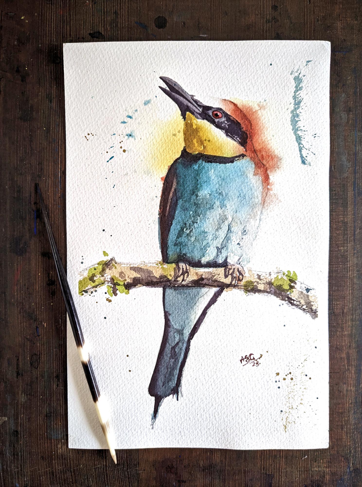
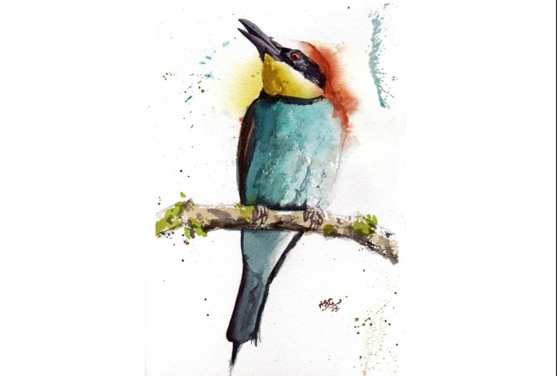
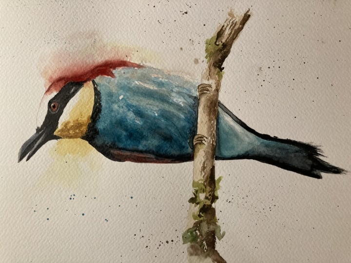
2. Approach and Materials: This right here is the painting that we will be creating
in the next 50 min. Before that, there's a couple of things I wanted
to talk about. Firstly, the drawing
for this beta. This class is more
about the painting and I will be jumping directly
to the painting part. That said, a line
drawing template is available in the resources
section for this class. You can download it, maybe cut it out and use it to transfer the lines onto
your watercolor paper. I also encourage you to draw
it through observation. The reference image for the
beater is also available in the resources section that I'm using is a Saunders
Waterford rough paper, 100% cotton. This is around A4 size. I would encourage you to use a slightly larger
size than this. I am restricted to
this size because my camera struggles
to capture a paper of a larger size in
portrait format. We'll need some solid
surface to mount your paper on and some tape to
do the mounting. Also, it would be nice to have some form of support structure to elevate your drawing board every once in a while so
that your washes fluid out. For mixing your colors. You might like
something like this. This is a simple
plastic palette. This is a broken piece of
my regular folding palate. And before you ask him, No, this is not paint I
have managed to damage. It is nice having some paper tissue around in case you have any spills
and need to wipe off. You will need some
containers for your water. I like having two around, one for washing my brushes and one with a little
bit of clean water. Always nice having a
little spritz what it does to keep
your washes active. And lastly, simple eraser. I like using a kneaded eraser. You can use anything
you're comfortable with. And open CID, who put down
your line work on the paper. Next, let us take a look at the brushes that we're gonna
be using in this class. Starting from big to small. First is this one. It's a number two sized
mop brush, goat hair. This one is a size eight. It's a mix between synthetic
and natural fibers. This is a size six. It's a synthetic sable
limitation brush. This brush, I think
is a size three. I'm not quite sure. It's a synthetic brush. And this is a small size zero synthetic brush
for very small details, such as the eye of a bird. This brush is a size ten brush. I use it on one
occasion in the class, but I don't actually
think that it is needed, so I am going to
leave it on the side. And lastly, let me show you through the colors
I've used for this class. First stop is or Aeolian. By White Nights. It is a cool by yellow. This is pyrrole red by Shin Han, fairly neutral red color. Burnt sienna by White Nights. It's my brown for the painting. The next two colors that look fairly similar but have
different properties. This is a color coiled
up by White Nights. It is a tailor blue, somewhere in-between, a
green shade and a red shade. This is the similarly named
cobalt blue by White Nights. It is a cerulean which
granulocytes a little bit. Also it's a little more
opaque compared to the blue, which is very, very transparent. I also have two colors. Sure. This one is a viridian
green by Sennelier. I use it in the class, but on reflection, I am not quite sure that it
is actually needed. For the time being.
I'm going to leave it here at the side. Second color is lamp black. This one to use in the class. On one occasion, I use it
to paint the beat as I. Apart from that, it isn't
absolutely necessary. So I leave that on
the side as well. Now onto the painting.
3. First Pass (part1): Okay, then let us begin
with our first layer. If you've seen my other classes, you'll know that I like
to start off earlier by mixing the colors
that I will be using. However, unlike the other
classes, this time around, I will be seeing what preparing mixes of
different consistency, different amounts of water. The BWI painting is a very
brightly colored book. There is temptation to use paint straight from the tube
in its brightest bulb. But if you've noticed
anything you need to it. There is very few
creatures which have clean or pure
colors in them. And keeping that in mind, I want to double down all my colors just a little
bit as I begin with my mixes. That's exactly what I'm
doing with my yellow. I don't want it to be upright straight from
the tube yellow. So I'm mixing it Amy quantities
of both red and blue, just to take the
edge off slightly. The puddle on the left is the
coffee consistency, pardon? While the one on the right is a very diluted
consistency, Pardon? The next color I need to mix
is the reddish brown color at the back of the bead does hate colors and mixing my red, but I need this mix to
be a little bit thicker. I'm going to apply it on wet people will die
out as type buses. So this mix will be, you can call it
milk consistency. Notice how I take my
time at this stage. There is absolutely
no need to hurry. So pascal, take our time until we're confident and happy with
what are mixed looks like. Also helps to test the color out on rough sheet of paper
if you're not sure. The third color I'm mixing is the turquoise for the
chest of the bead. Now I could easily have opted for or turquoise
straight from the tube. But instead I have
chosen to mix or turquoise colors
I'm using for this. I might be reading green, my cobalt blue, and a
small touch of my yellow. This school, I would like
to mix into consistencies. That color in the funny spot on the palate is my cobalt blue. I'm now adding water to
one side of the mixing well to ensure that part of
the mix is much more dilute. Hello mixing has done, and we're ready to get
started with the painting. And as always, no matter
how many paintings are, laying the brush for
the first time on a white paper is something
I always find it. Dbdt. I'm starting my process
with that Peggy dilute yellow mix
that I created. I'm laying it down in the neck and the back of
the head of the bird. Areas where war more darker
colors will soon join. Notice how I'm not sticking
to the line and the spreading the wash beyond the,
beyond the bird. This is because I want some
of the colors and flew out. I'm quickly going to come
in with a smaller brush and smoothing the edge between the eye marking
and the neck area. I don't want a very hard edge. The next edge, the print to that red
brown color that I mixed. I want to leave
this in the back of the bird's head in
one single stroke. And of course the stroke
won't be perfect. As I'm done with the stroke, I will come back in and fix any irregularities that
might have accorded. Having any pain or
fatigue consistency would help you as some of that color is going to flow into the wet yellow wash that
we laid down earlier, ensuring that this section
dries a lot later. We can't have it
drying too light. Hence the tick mixtures. As I did earlier, I'm coming in with
my size six brush and softening that
edge on the forehead. Next I'll be working on the burst chin area
under the peak. The ignition Nero for very
dilute wash. it's too big, so I can just drop in a
slightly darker yellow that and watch it flew out into the wash. Just to introduce
a little more pigment. Actor darkest point in the neck. Again softening that edge. So making sure that there is that light section
between the eye marking it as can be seen
in the reference image. Periodically I will use
my spirit sporting, keep my wash active. Next I will be working
on the beaters chest. We'll start by
adding clean water. That bottom edge, which
hopefully is still wet. And then slowly
introduce Friedman. I'm going to pause this video to point out I have just made, I can't even call it an
error because 99 out of 100 times this wouldn't
have gone to. Notice the water on the
bird's left shoulder. Back slowly creeps into the
red brown area and it leads to a rather unfortunate looking
cauliflower eventually. Okay, let's just get back into it step-by-step and now introduce the turquoise into
that water I've placed. I'm using my number to
quote, help mop brush. Notice how deliberate
my strokes. I'm trying to cover that
area with a small number of workers cooks while leaving some dry brush markings on
the buds left-hand side. I'll now introduce
some stronger color to the top of his chest area. As you can notice in the
reference image as well, that is the area where
the turquoise is darker. And as we move down
towards his belly, it slowly gets not only
lighter but also download. My deal. I didn't need it. I'm mixing it a little
bit of burnt sienna to the dilute part of my mix. And I'm going to add that to the bird's belly
to dial it down. I'm gonna do so using splashes so as to add a little interesting
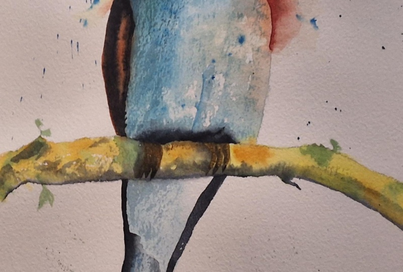
texture to that area. Next, I'll be tackling the
right wing of the book. The thing is also that
reddish brown color. In the reference image. That area is under shadow. You don't quite see the color. That shadow will come
there in the next year. As with the back of the head, I want to lay down this
red brown paint in one group and come back and fix any inconsistencies that may have been there. I'm also now going to try and fix the head brown
area, and the neck. If you have gotten your consistency for
that color, correct? On the first first application, I don't think you
need to do this. I've broken this
lesson into two parts. Abide by the lesson
length guideline. But I would advise you to not stop here and immediately
continue with the next lesson. We'll do not want
the paint to dry. You want to connect
the wet washes you have all the way
to the bird state.
4. First Pass (part2): Continuing from
where we left off, I am first going to change some of the
mixes in my palette. I need to mix in
something for the branch. The belly is still
wet and I want to connect the branch
that embedding. So I'm first going to mix in
a little bit of burnt sienna and my audio and yellow to get
some kind of golden color. When I'm satisfied with that, I am going to further
neutralize that color by adding my cobalt blue. I think the mix can
be described as somewhere between EN
coffee consistency. Closer to coffee. The mix is looking fine. I'll apply it to the branch using confident
and quick strokes. Making sure that I have
a broken brushstroke. And some of the white of
the paper showing through indicate the textured
nature of the wood bark. Next we can move into the
tail section of our bill. Section is a duller
looking turquoise color that we already mixed. I am connecting it
to the branch wider display and simply laying
it into the tail region as fairly flat wash. Just being mindful of that one section that
is catching the light. I want to leave
that paper white, but the soften the
edge a little bit. I'm taking some random paint and placing it at the
speed of the bead. I'm doing this just so I don't
want the feet to be byte. At the same time. I don't want
it to be too dark either. Inside, I'm lifting some
of the paint backup. I don't want any attention
to go to the Betas feet. I'm turning my attention
back to the branch. I want to add some of the most enlightened
that we can see. Fingers crossed the
branch is still big because I want
that paint to fuzzing. My green is a mix of yellow and tiny patches
of both the blues to be as random as possible
with my application here. And with that
satisfactorily done, we can move our attention
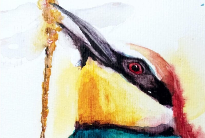
back to the bird's face. For the beak and the
marking across his eye. We will need a darker color. For this, I am going
to use a mix of my halo blue and my
five-year-old rate, which will give me a neutralized
poeple looking color. I'm going to use this mix,
add coffee consistency. Maybe a bit lighter
than that as well. We just need to keep
it simple here. Apply a flat layer of that dark color over all
the areas that need it. Well this however, move back to my small size synthetic brush
for the way of the beak. If you want to add
the beer in the bead, does Monk, now is
the time to do that. In some of my practice
pieces, I did add it, but in this final piece I opted not to, just
to keep it simple. The face is one of the few
points in the painting where we need to be tight
with our brush strokes. We need to be accurate and
make sure that we sculpt that. I'm marking very carefully
and deliberately because that is the section which adds so much character to
this particular board. That is the section where the viewer's attention
goes through first. Now we're going to
lift out a tiny bit of paint from the top
part of his beak to indicate some light in that area. Little
bit of a highlight. We're pretty much done with
our first pass of pain. At this stage, you
can either choose to immediately continue
with the next bus. You can also take a small break, maybe make yourself
a cup of tea. Depending on how comfortable you feel and how experienced. Painter UI, both options are. What options are on the team. Not fidgeting too
much at this stage? Fix any small errors
that may have occurred. I for one, want to lift some more paint from
the birds feet. Now apart from that one
error in the neck area, which I can only fix
at the very end. I'm quite happy with how my first pass of
paint is looking. And I'm ready to move
on to my second pass.
5. Second Pass (part1): We're now moving to
our second pass. This time we will start right
from the top of the bowl, right from his beak
and mask area. The pain that might
still be a little moist, but that is perfectly okay. The color I'm mixing
into this region is the same as I did
for the previous year. It is a mix of red
and yellow, blue. If you need it to
go a little darker, you could add a touch of black. As in the previous layer. We want to keep this section
of the bird simpler type. I'm just adding in dogs as I see them in the
reference photo. Now walking on the
bottom half of his beak. I'm also softening
the edge as we move upward towards
his mountain. To pulling out some
discussed that the birds have feathers. The underside of
his open mouth is also visibly a darker section. So that's what I'm
working on now. You've just started this year. There is no paint that needs to be worked on before it dries. There is no hurry. So it's
okay to relax. Take your time. The thing that deserves our
attention at this point is how those dark sections
are connected to each other. Don't want to have one
isolated dark patch. We want all of them to
be linked in some way. So that is what I am
doing at this point. And slowly building
up those connections. 100 day. I have now moved
slightly larger brush, this is my 656 synthetic. Have done this so that I can also have a little bit of
a flourish with the DOD. Have some rough
untidy looking at. It's untidy in the sense
that they are broken, flattish leg that they did. Now that I've covered
most of the dark section, I'll give it another look. See if I need to make any
changes in your adjustments. And then one to
the next section. Alone with my attention to the shadow area on the
right-hand side of the board. Large connected shadow running
from the under part of the beak gene of the bird all
the way down to his speed. If you would like to, you can mark out to this
section with a pencil. It might help you define that area better
before you start applying. Changed up my color mix. I'm using yellow with a
touch of burnt sienna. As I've done a few
times in this bird, I quickly apply my
paint in one scoop, fix any infections, and
then smoothing the edge of the board where
his chin aims and his torso begins is
the darkest visibly. That's where I'm just going
to add a touch of dark. I have added some of
that dark purply mix. Yellow. May have gone a little too
green, but that's okay. So I'm just going to drop
that color in into the wet, wash and smooth the
edge like last time. My yellow shadow is still wet. I am going to go ahead and
connect it to the turquoise, the shadow on the
torso of the book. First, I'm just going to rewet the slightly dried turquoise
on my palette or TD. I am going to be applying
this over the shadow area, demarcating it as
per my pencil line. This is just a glaze. It's not very strong color yet. After I'm done demarcating
that shadow area, I'm going to scuff up
some of the edges. The coffee cup
gives the illusion, gives the texture of feathers. And could do this, I'm using my number six rough
synthetic brush. I of course need to make
that shadow area stronger. And to do so, I am going to introduce
a darker shade who that turquoise is dark is a mix between Kylo
blue and burnt sienna. And now adding it to
my turquoise mixed and introducing it
to that glaze that I am going to start
introducing the dark from the shoulder area where the chin connects
to the shoulder, because that is the darkest
part of the shadow, as you can see in the reference. Mix, can now be called milk consistency scheme,
low-fat milk consistency. So the turquoise shadow, I'm now going to connect it to the shadow right at the
underside of the belly feathers. Feathers are forming a shadow
as they touch the branch. At this point, I'm
not very happy at how the edge of that
shadow section is. I'm going to go in and scuff
it up a little bit more. Fix some of the edges, extend them where they
need to be extended. Add more texture. The chest of the bird. Now introduce
further dark shadow between belly
feathers and branch. I have used my use
my purply dark, the one fit the red and shadow from those belly feathers
can slowly be connected. Shadows are being
cast on the branch. If you notice carefully,
these shadows are being cast by the boys of our beater. And also some of the most that
is growing on the branch. We don't need to be very
precise in this section. Definitely don't
need to be precise, as in some versions I have
painted of this book, I have been more
precise and in some, I have been less. And in all honesty, I think I prefer the
less precise once. Next, while the core
shadow is still wet, I want to give it more strength in that area right
under the chin. Hu Bu. So I'm going to drop
in some stronger paint at the top of this wet wash
and let it float down. Please do not stop
painting here. I would advise you
to jump directly to the next lesson while
your paint is still big.
6. Second Pass (part2): I will now continue with
adding shadows on the branch. I'm going to use these
shadows to better define them was that we added on the
branch in the previous layer. Color I'm using isn't
anything particular, it is just me picking up random colors which already
there on my palette. I just need some sort of dark. That's about it. The stoma is well, I want to preserve some level of dry brush
texture on that branch. Indicated the buck. And to do that, I'm applying strokes with the
side of my brush, keeping in mind the circular
form of the branch. Now turning my
attention to the shadow cast by the right
wing of the beat. Turquoise wash is still
moist, very moist. I waited for it to
reach the stage so that the dark that have now League one does not bleed too much. Again, I am applying
the dark with a single stroke and then fixing any irregularities
after that. As I already have the
dark on my brush, I'm going to move my
attention to that, my kingdom on his neck. I want to connect it to
the dark of the week. It would have been best to apply this mocking using the
side of the brush. I may not have been as successful in doing so
as I would have liked, but that is what I would
advise you to try. More or less done with the part of the word
above the branch. Now, I need to turn my attention
back to this p.stance. For this, I am mixing some more of the money
turquoise color, which is mix of the cohort, is your ability in
the book sienna, in comparison to the head. I don't want the tail to attract
all that much attention. I am going to apply a
simple flat wash to begin, just as we did in
the previous layer. Only this time, I want
some of the lighter wash to show especially new
or the patch of light, the patch which will
provide in the first year. This time as well, I will soften the edge around
the bright patch. Next, I need to pay
the entire curve of the field and some of them being that is
showing the branch. For this, I will use my dark mix at a
thicker consistency. I'm going to drop
that dark paint into the wet wash and
living bleeding. But if like me, you're painting on a rather dry, it may not be all that much. If that is the case, you assisted flow a little more. The brushes I'm
using at this point, or my smallest
synthetic brushes, say six, say support. When spreading the dark on
the bottom of the tail. Be sure to leave a little bit of a bright patch on the left. Now trying to establish the division between the
lower abdomen and the teeth. I'm looking to add a dark shadow at the bottom of the branch. I put my paper edit it
takes hoping some of it would bleed into the
vet turquoise wash. But that did not happen so much. So I was looking to
find a way to connect that dark into the
bottom part of the bird. So how I thought I
would do that is by connecting that dark the
left wing of the book, bring that down from the branch. Now almost at the finish
line without painting. This stage, I'm just going
to take a moment to see the things which need slight
adjustments like tweaking. Think I want to add
some dry brush texture on the under part of the deal. I felt the shadow there
would use a little more. I don't think you would
need to take the step. And I think I would
say that a work, most of the things I will
do in this lesson for me, I'm very sure at this stage or painting looks a lot
different from mine. So each of these steps don't have to take them judge your
own piece for how it looks, and then decide what you want to change and what
you're satisfied with. First, I'm lifting some paint from the left side of the tail. Want there to be a little
more indication of light? I do this by using a
stiff synthetic brush, dipping it in a slight
amount of water, running it over the paint, and then lifting that paint using some tissue
paper in my lab tech. Extract on my attention
to his right, we seem to be two layers of
overlapping feathers there. And I just want to highlight the gap between those two years. That too I do by lifting some people seem process to
leave the parent as the tip. I'll do it a little
easier this time because the pink
is a little dab. This lesson is that all that
is left is the beat as I.
7. Eye: The beetle species have seen the all have
bright red eyes. This is one instance
where you could use a red straight
from the tube. However, in this instance I decided to mute it
just a little bit. I'm adding a tiny bit of that
dirty turquoise to my red. Just to take the edge off. I will apply this as a simple
flat clear in the eye area. Take your time, good. There's no hurry. Just a
simple flat application of B. If like me, some of your read ends up where
you don't want it to be. You can mop it up with
your paper towel. Next, I want to lift
out a little bit of a highlight on the
top part of his eye. I'm very closely following the reference in which I
am trying to replicate or create the impression of
what I see that the sky reflects in the top
part of the eye and that is what I'm
trying to indicate here. Red paint is still moist. To lift some of it.
I will be using the same procedure I did
in the previous two types. I will be coming in with my small stiff synthetic brush and agitating some of the teeth. This time I don't
need the tissue paper to lift the weight of I think the bristles
will be sufficient. Now I'm just going to
let that area dry off. Painting the eye is a
rather stop-start process. May not notice the
stop-start nature because I have cut
out a few bits, but it is okay to
take your time. You will need layers to dry before you can
apply the next one's. Speaking of the next one, I'm mixing in pure lamp black. I'm first going to use my black goo better
define the eye. I'm just following along
the reference image. Next with the same color. I'm going to paint in
the black of his eye. After you're done with
this, let it dry. This is when we will be
using our whitewash. If you don't have
any white gel pen or opaque white watercolor
will work perfectly fine. It's just one door that to add the highlights from the sun. And done that bring the
whole thing to life. My B2 is complete. I have heard from a few
of my students that they enjoy watching me remove
the tape from my painting. So that's what I'm gonna do. Thank you for joining. I hope you learned something new today. Please do leave any feedback you may have in the form
of a review for this class that will allow me to make the
next one even better.
8. Conclusion: I hope you had a fantastic time painting your lovely Peter. The first bus. Do you allow your colors to flow freely into the wet wash? It is best to let the
paint do their own thing. However, do remember to
keep an eye on them. Don't want them to form a
cauliflower like blue make minded combination of colors, the new Jews to paint the
dark markings of your bead. I prefer to mix my dad's rather than use
a dark state from. I think that this helps me maintain a sense of
harmony and liveliness. It might be. Were you able to complete
the beater in one city? Was there any part in the class that you found
difficult to follow along? If so, please do leave a comment in the
discussion section. I'm always here to help. I'm really looking
forward to see all your fantastic paintings in the project
section down below. Do leave a review for this class so that I can make the
next one even better. Don't forget, you can follow me. And also on Instagram. So you know, when
the next one drops. See you soon.
 Aniruddha Gupte, Urban Sketcher & Wildlife Artist