Transcripts
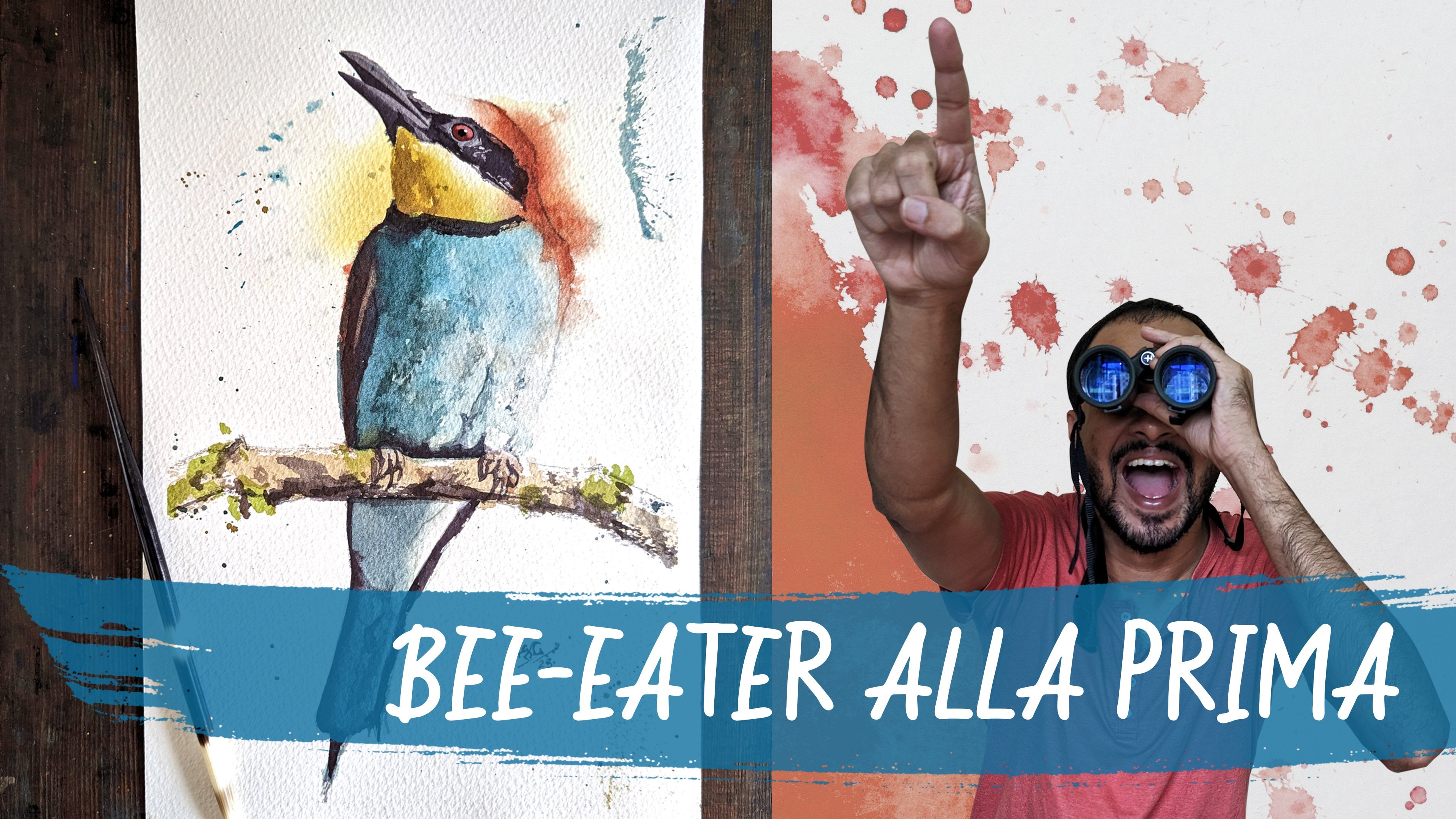
1. Introduction: Hello and welcome. In this intermediate
watercolor class, I'm going to introduce
you to my neighbor, the group, and how to paint
them with confidence. To grow as a bird that most of us see or know
near daily basis. However, when was
the last instance took the time to absorb
vitamin in great detail. Common bird that is almost black minute they initially appear as a
very important subject. But the very fact that it is
monotonous gives us a lot of scope for experimentation with Deloitte and
abstraction or fall. In nature, not opinions of
brewing entirely black. So we will be tackling
our subject too. Big brushes. The brush
strokes, daring. Be looking at the larger
shapes that bring the world together and not be bogged
down by small details. All debate even in the happy accidents that
take place and find joy, find fun in unpredictability. That is the hallmark
of the medium report. I'm unable to tell. I have a professional
background with practicing and teaching service design and
industrial design. I also have an average love for the outdoors and
wildlife searching. As far back as I can remember, watercolors, a relatively
recent passion of mine. And it's a fashion that I now want to see how far I can push. This class is the first
step in that direction. It's a journey I am hoping
you will join me on. You can follow along my trials and tribulations on Instagram. I'm also looking
forward to publishing a few shorter length
the news on YouTube. I'm fairly active on my
social media handles. And we'll be happy to connect.
2. Materials: Hello, hello, and
welcome to what will hopefully be the first of
many Skillshare classes. I have on my table right now, the colorful grow that we
will be painting together. I hope you're as excited
about this as I am. We're really looking forward
to pay take him again. So before we get started
with the actual painting, I would like to run you through the materials that
I will be using. The paper I will be
using is this one. It is Bao Han, cold press paper with
slight bit of texture. I will be using a
slightly smaller size, a quarter sheet,
approximately n by 14 ". You might also like
having a little bit of masking tape to hold
the paper down. I'm going to be
mounting my paper on the drawing board right here. I like to have a free
surface, unattached surface. Because quite often
during my paintings, I pick up this board, move it around, and let the pigments flow
into one another. You might also like having
somewhat of a support too. Prop your drawing board
up against so that the paint can flow down words. I'm gonna be using a limited collection of
six different panels, six commonly available colors. Payne's gray, ultramarine blue, viridian green, ocher, yellow, burnt sienna. And it says quinacridone
violet rules most brands is called
quinacridone rose. So this row is color. That's all the colors
you will need. Moving on towards about brushes. I have six brushes here. I may not use all of them. I'm starting with this
number for mop brush. It's synthetic brushes,
squirrel imitation. This one here is a number two. Brush. Next is number
eight, round brush. It's a mix of synthetic
and natural fibers. This one's a number six
around or synthetic fibers. I don't quite know
what size this is. It's a synthetic fiber brush. Mike close to a
size two or three. And this is a super tiny size zero brush
synthetic fibers, which I will use at the very
end to give small details. So these are our brushes. Apart from this, you
will need a palette, any old palette, we'll
do perfectly fine. We need containers of water. I like having two of these, one to wash my brushes and one with a little
bit of clean water. Apart from this, you will need perhaps need spray bottle to
spray down your painting. Should the wash me getting
dry before you wanted to? It's always nice
to have a bunch of paper towels to wipe off any
spill that you might have. My daughter like to have
a cloth rags close by. And of course for the drawing
you will need a pencil. Any old pencil is fine. And an eraser, I like
using a kneaded eraser, but you can use
whatever you want. I think that just about concludes the
materials that we need. Let's move on to the
next class then.
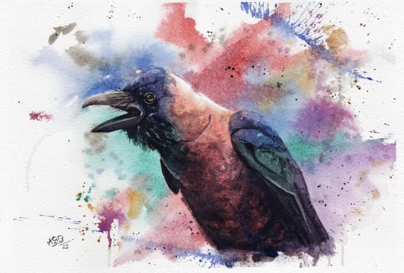
3. Roadmap: This lesson is about how we are going to approach
our reference image. So right now I've opened
up a window Photoshop. And in it you can see
this handsome group who is going to be our
subject for the painting. We are about to look at him, look at all the details which have been captured
in this photograph. This so many
variations of color. There is so much finer
details in his feathers. There are variations in texture. There is glossy texture,
there is reflections. There's just so much happening. And looking at him,
you might be thinking, Hey, that is quite
difficult to paint. And I would agree with you. I don't think a good painting. Maybe now. Maybe now he's a little easier
now that I've taken away the background. How about now? I've taken away his color. I've taken away one
level of detail. Does that make him easier? How about now? What I've done now is
I've simplified him into three main tunes are three main values that being
light, midtone, and dark. We will be using these three
values to build our crew In measured and strategic
matters in measured steps. Now going to take a closer look at each of the three layers. The three layers which will
comprise the three steps. As we approach this painting. We are in a different
Photoshop file now. But we still have a
handsome grow with us. First thing I'm gonna
do is I'm gonna give him abstract splash in the background and
take him off our screen. What you can see
right now will be the first layer of our painting. See how abstract it is. All we need to do is
splashed paint loosely. And three, there are two things you need to
keep in mind, however. One, we need to leave out those two white highlights
that we can see on the screen. One on top of the beak and
the other on top of the neck. And secondly, we also
need to be mindful of where we apply warm colors and where
we apply cool colors. The next layer in our
process is the mid-tones. This I find to be the
most crucial layer, at least in my process. You will notice how the midtones are one large connected shape. And it helps to view
them as a shape rather than the
anatomy of a board. We have to paint this layer rapidly and we have
to make sure that we connect the shape in one wash even when we are
using different colors. And then we move on to our docs. You can afford slowing
down at this phase. In this particular image, the darks are connected
as one shape. But more often than not, you can get away even if
you don't connect the dots. After applying the ducks. This is when you're painting
truly comes to life. In the preceding lessons, I will be referring
to these steps or layers as the road-map
to our painting. Before you move on
to the next lesson, I would suggest
that you check out the resource page
for this class. There. You will find four files
that you can download. The first one is the
original reference image for this group photograph which
I downloaded from unsplash. The second is a line
drawing for the group. You can use that as
a template to trace and skip the drawing stage and move directly
to the painting. The third will be this roadmap image that
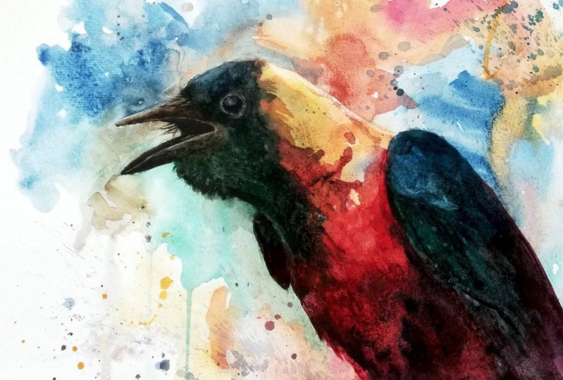
we just talked through. And the fourth file is my finished painting
from this class.
4. Big Splashy Wash!: Are you ready? Next? Begin then. I like getting started by mixing the colors I'm going
to need for the painting. The first one here is red, which I am using
a combination of. The loop, doesn't look quite right yet. But absolutely more yellow. Dad's Beca. I'm adding water to the
mix. In the first layer. You don't want your colors
to be concentrated. It's good to start with a lot of pigment
and a lot of water. Next one I'm going
to go for is green. This is more or less straight
green from the queue. The viridian, which I
showed you earlier. The only change I
need to make to it is diluted with water. Third color I'll be using
is the ultramarine blue. As with the green, I
need to dilute it. I also need a book for
which I'm going to mix the ultramarine with the
queen rose on my palate. I think I'm ready to
start painting now. So the next step is writing
down the entire group. You might have
noticed that an image has popped up on the
right-hand side, top right-hand side
of your screen. As I explained in
the previous class. While wetting down the crew, we need to leave out a
couple of highlights. The first one on
the top of the beak and the second one on
top of the Krosnick. I have also chosen who not wet down the crew's i in
this particular layer. As for the rest of the bird, as I'm wetting him down, I have a much more
carefree attitude. I'm not sticking to the lines. I'm letting the water
spread beyond the crew. Am working with my
paper flat on my table, which means that the water will spread evenly in all directions. I would suggest that you use
the image on the top right as a reference for where
to place the water. Be careful when
you're walking around those two bright highlights. As for everywhere else,
just let the water flow. I forgot to mention when
I was starting off, I'm using my big number
for size mop brush. This will probably be the only time I will use
this particular brush. So mop brush, because
of its shape, holds a lot of water. And since it's such
a large brush, it's allowing the use of some very boiled and
playful brush strokes. If you want to check. If the water is evenly
spread across crew, it sometimes helps to move
your head up and down. Brian, notice the
glare of the people. By painting it. I can see it clearly
on my paper, but I'm not entirely sure how can you be able to see it
on your computer screens? Again, going in with
a smaller brush and making sure that my
highlights are to my liking. I need to reiterate
over and over again that maintaining these white highlights
is super-important. In case you have gotten
some water on your fight. Areas or areas which should
be decided to leave white. Like me, you can go in
with some paper tissue, paper towel, and dry that area. Again. I think I'm now ready to start
laying in my colors. No matter how many
paintings I do. Laying down the first
stroke of calories. Always intimidating prospect. If you're confident
about how you relate down the water in
the earlier phase, there is no need to
feel apprehension or hesitation when
laying down European. Let the water do the work, let the paint flow. All you need to do is drop in the paint at the
appropriate spot. I just warmed up the top part of the cruise neck using
some of my yellow. And amount of yellow. Please don't be like me. Please remember to squeeze. Gender is quantity of paint
when you're starting off. It'd be honest, this
isn't my regular palette. I usually use a palette
slightly larger than this. As I was saying that I
moved on to the next color, the blue on my palette. Notice how I don't
stick the line. Notice how I'm encouraging the paint to flow
beyond the light. To be honest, I'm not happy with how much the red fluid into
the head area of the group. But then again, in this
style of painting, it doesn't matter all that much. The local color doesn't
matter that much. It's the value that
is more important. I'm now going to
move on to my green. You might be wondering how I
am selecting these colors. E2 for a crew that gives to visually
it looks entirely black. If you look at the
reference image closely, will absorb that those
colors are present. What I am doing is exaggerating. Look closely under the neck. Don't you see agreed. At the back of the bird.
I can see your pop. Can you at this point in the layer, you don't actually need to follow along with
what I am doing. All you have to do is stick to the roadmap that we agreed upon at the
beginning of the class. This is your chance
to be GEF three to be boiled with your strokes. If you have followed
along the process so far, it's very difficult to mess
it up from here onwards. Difficult, but not impossible. So people, but to exercise
a bit of caution, do what feels good. You do what fields, Correct? If you're feeling courageous, you can use some colors that you can observe in the
bird that I be healthy. What I'm gonna do now might feel a little counter-intuitive. I'm again going to warm up the neck of the
Crowell a little bit counter-intuitive because
as per the reference, that's a lighter
part of the bird. However, this cilia is the only chance if
you're going to get to work that section. So it's important
to get it correct As you will not get a chance
to add another layer there. Another thing that I'm
trying to do right now is smoothing the edge between the warm neck and
the pure white highlight. I don't want a harsh transition from the white, the yellow. I want it to be
gradual and smooth. For the beak, I have decided
to go with brown tape color. That's a mix of burnt
sienna and Payne's gray. Not much to see at this point. I'm just going by my gut
feeling adding splashes. You're in there. As with the neck, I want the transition of the brown tone beak and the highlight at the top of the beak
to be a smooth one. Sometimes you don't get
it in the first shot. You need to run your brush
over that line a few times. It's just random
splashes at this point. I'm just doing what
feels good to me. As should you think the video
skipped a few frames there. I'm sorry about that. I'm gonna do something
rather cool now, this is a trick I learned from urban sketch
of random mine. I'm going to orient my drawing
board vertically so that the pink flowers and leaves behind the
prickles and droplets. I really enjoyed this effect. You don't need to do it. If it's not your cup of tea, you think that is
something you might enjoy. And if it's a risk
that you want to take, by all means, go
ahead and do it. It's fun. It's a lot of fun. I'm still following along the roadmap that we
agreed on initially. I'm increasing the contrast of the highlights and the back their loans at points
where they meet. As per the roadmap, we're not going to do another
layer on the background. So if you feel that you want
to add strength to anybody, now's the time to do it. To be honest, I should stop, but now it's very easy
to get carried away in this layer and to fidget and
grew more than required. If you think that you are at a good point, you should stop. I'm going to proceed and do
a couple of crazy splashes. I enjoyed them a lot and people who view my
paintings enjoyed it a lot. So I just can't not do it. This layer is done. Just need to wait
for it to dry and then proceed to the next layer.
5. Creating Definition: I hope you're ready for Lear to. This layer will be all
about the mid tones. As a reference, could look back at the layer two image from the roadmap we
discussed earlier. As with the previous layer, I'm going to start
this one off as well. The mixing the colors
I'll be needing. Currently mixing
my new drilling, which is mixed with the
ultramarine and the burnt sienna. Initial part of this
lesson has a lot of me mixing my pig breeds. If you find that uninteresting, or if you're super confident
in your own mixes, feel free to skip ahead to around the mid number
four mark in this lesson. Swipe. Proceed with the
adding the neutral I just mixed into the colors which are used in
the previous wash, the red and the green. I'm going to proceed
to reorganize the colors on my
palette a little bit. I'm going to change the blue at the bottom of the palette. And then I'm going to mix. And I require some
deep blue as well. The deep blue will be similar
to the nutrient mixture, a mix of ultramarine
and burnt sienna. And to make it darker
and maintain the blue. The blue because it
is blue after all. I might go ahead and
add Payne's gray to. For this layer, your mixes can be slightly thicker
than the first layer. However, it is
advisable to stick with the formula of
pigment and water. Another good practice is to take your time When you are
mixing your names. As you haven't started
the layer yet, there is no hurry. So feel free to play
with your pigments. Do you feel that you have with the right formulation
for your mics? So now I'm done with the mixing
and I can start my layer. Since my mixes are ready, I can apply my paint in a very
fast manner and make sure that the entire
bird is covered in one single wash without it
drying out at any point. I'm starting with the beak. It's a duller version of the color we used in
the previous layer. Right now I'm simply putting
down my paint and softening the edges who maintain the smooth transition be
managed in the previous layer. As I've mentioned a few times, in this style of painting, it is the bone that matters more than the color you choose. So as I move into the
forehead of the bird, I will be changing color to the blue as per
the previous layer. And your feel free to let the
edges of the colors touch. Feel free to let the different colors
flow into one another. That's not going to hamper
your painting in any way. As you apply a pin, it's okay to have a few
gaps in your brushstrokes. Actually lanes the impression of their being
feathers and texture. Now softening some of the
edges of the blue just to maintain variety of edges. And bringing the blue
lower into the face. And I'm going to proceed the proceed with the face by connecting the blue face faders. Do the brown peak leg, the two colors touch, let them flow into one another. You want to have those seamless
wet in wet transitions. Also notice that I'm
now working on a team. I have placed my board
or analytic inbox. This is who allow the paint to flow from top to bottom and to maintain a wet edge at the bottom of the wash
so it's easier to connect. Connect to the next, kind of speaking of next color. I'm starting with my grid. My crew has a very scruffy neck. All his spiders neck feathers
sticking out as he goes. You don't have to be exact when representing
those feathers. But make sure you give a
hint of the feather texture that you might have noticed that our roadmap image has popped up on the top right. Now it has another
value of green. Careful attention to that
mid value in our roadmap, which you see how it
is all connected. That's what we need to do now. That's how we need to
follow the roadmap. The only difference being our
version has to be colorful. Have now proceeded
towards my grade. Just as with the
blue and the ground, I have connected the
red to the three. I'm going to proceed to carry the swash down to the
belly of the group. Again, leaving a few
strategic gaps here and there and softening
of few random edges. I'm now working on the belly. And the belly is
a rounded shape. So I'm going to make
sure that my strokes match the sheep of the belly. I'm going to proceed
to my blue. Now. Notice how I make the connection between the blue and the red onto the green. Now. And onwards towards the Pope. As I've been painting quickly, my wash is great. And a wet washes and active Bush swam taking
advantage of that, going in with a smaller brush and pulling out some
more nick fetus. The edge on the Red Belly, being the lowermost,
was still wet. And I can easily pull it down. I want to see if I can get
a few trickling droplets. Could have been better. So now, as per our roadmap, we're done with the mid-tones. We have marked them out
as what we had planned. As the paint is still. We can proceed through
adding a few darker colors. The wet wash will ensure
that they don't leave a sharp edge and this smoothly transition into the colors
that we have already laid out. In all honesty, if you are satisfied with where you are to your own painting at this
stage, you can stop. I should have stopped
at this point. But I proceeded to add a few
more strokes here and there. I like using the
side of the brush, give the extra, extra
to indicate feathers. I'm also going to proceed
to adding a few strokes to indicate the overlapping
feathers of the wing. These may look harsh
when I lay them down. But as the washes rate, they will melt into
the rest of the beam. And with that, we're
done with our secondly or you can wait for it to dry. But if you feel
adventure is true, can proceed with the next phase. Even if you're painting
is slightly wet.
6. Beak: In this short lesson, we'll be painting the
peak of colorful crew. So now we are at that
point in our painting, we will mostly be
using darker tones. This is where your
dark Payne's gray or will come most in handy. I'm starting with the inner
part of the cruise mouth. You can simply block
in that entire area, the entire inner part of the
mouth as one dark shape. It's best to think
of these as shapes and not as part of the anatomy. Makes it much
easier to paint it. With my crew. I am trying to be
a bit more fancy. What I want ideally is for though part of his mouth and
your stroke to be darker. And I wondered darkness
to kind of paper out as as I approach the
loyalty of his bill. As I didn't have any layers
underneath the part, part I'm painting right now. I am having to give
it more strength. Use pickup pin just
to make sure that I can achieve the level
of dark that is required by the inner part of
his mouth is to wait. I'm going to try and pull
out some of his whiskers. If you notice the part on top of this grows
beaker, any crow's beak, you will see these
hair-like protrusions and having them in your
painting lenses are cruel. Lot of character. I'm going to add a touch of black people. This beat. My beak has
lost its finishing, and I'm hoping this will
help bring it back. You may not need to do the same. I'm now going to move on to
the lower part of his bill. His chin. I'll first put down or dark layer and then put
down the darkest, dark. Again at the tip of his beard. The lower tip of has
been on a long make sure that you leave a small gap between the inner part of his
mouth and the lower bill? I wasn't very successful
in doing that in micro. I'd probably have to
get that brighter gap by lifting some pain. A little more definition. And we're almost
done with the bill. I'm going to wait for the
paint to dry and then try and lift out the highlight on
the beak that I missed. If you have managed to maintain this highlight in your group, I think you can move
on to the next class.
7. The Darks & The Details: All right, We're now at the
final stage of our painting. This is where things
start to get too slow. This is where things
get methodical. In the first layer, there's a burst of energy and VS splashing paints all around. Now you're in the final stretch. It is more about adding strategic kids of doubt and bringing the whole
painting together. The color I just is
predominantly Payne's gray, little bit of ultramarine. And whatever was left over on
my palette from previously, it's the best piece of advice I can offer
you at this stage is to keep one eye on our roadmap. Check where you are in
accordance to that roadmap. After two layers,
there is bound to be a difference between
my painting in yours. You can observe me as I
paint my third layer. But you don't have to follow along with each and
everything I do. All you need to do is make decisions based on how
your painting looks. At this point. I'm adding more strokes to the
top of his beak, trying to create an
impression of his viscous. I'm now going to move
back to my green, add a little more volume
and depth to his neck. I'm using my small brush and
I think I'm going to use the side of my brush to give
the impression of feathers. Unlike the previous layer, you don't always have to connect
all your ducks together. However, in this particular
reference image, it does seem that all
the ducks are connected. And since that is
how the subject is, let's just go ahead and do it. As per the roadmap, I have now moved to my rate and I will
be connecting it to the lines on his neck and
the dark parts in his belly. In this particular instance. I have already gone fairly dark in the belly and in the
dark regions of the group. I may even have overdone it slightly in the previous layer. With that in mind, I am going to leave my wash. Little bit too
weak, a little bit. However, in your painting, it might be different. You may not have gone
as dark as I am, while you may have
even gone even darker. So pick a color coding
and lay of paint down. According to how
dark you need to do. Good reference point.
For guiding stars, who has to speak
is our roadmap in which reaches at the top
left-hand side of your screen. Pink, I need a little
more dark paint. Think I need to squeeze
it out of my view. I like working with
the paint fresh from the bean, does tend
to be selective. Some like working from
being tried in the palette. Some like working from
freshly squeezed. I'm not bu selective, but I do enjoy fresh
paint a bit more. Although it is best
practice to squeeze out all the paint you will
need before you start. Something I've not done
in this particular case. One should always try to keep maintaining a
variety of edges. With that in mind,
you can see me softening an occasional edge. At this point, I like to
think of my painting, my wet wash, as a more
readable piece of leaf. When my wash is so died, I tend to feel that my
errors are less Buddhism, which makes me feel Boyd, Boyd enough to add blogs
of being traded debt. And then morning mold it into
the shape I want it to be. I'm about to take
a little riskier and introduce some
blue to his belly. Just to add a little
variety in the color. I also just notice that
might be Buddhist and flat. I did not put it at an
angle. I'll do it now. Better late than
never. Right now I'm trying to better define
the shadow of the wing. The shadow that separates the wing from the
belly of the bird. I can see that it's looking
harsh at the moment. But don't worry, I
will be connecting that wash into the lower
parts of the vein. I want my Vinny to be relatively
lighter than the belly. I'm literally tentative with regards to how
dark I want to go. So what I'm doing at
the moment is I'm just putting in very dilute paint and a lot of water in the pink section that I want
to connect to the vet wash. I will proceed to add more
paint and darken the wing. Only where I needed
only in sections. I'm adding that
third division lines that you see on the
reference image. The division between the
various layers of his feathers. Softening the edge
a little further. Make sure you're
using a small brush with a good that is gonna give
you the best result here. And since the washes, the pain that you're
laying on now will gradually melt into
the rest of the wash. Mixing some darker paint and plopping it down
where I needed. Hopefully hopefully it will flow and not look so
harsh. Fingers crossed. I don't want that shadow
line to be so isolated. I want to try and connect
it to the rest of the washer little bit and add a few more shadow lines as I can see them on the photographs. Cmu's district before as well. I am a dry brushing, a little bit of feather
texture on the bird showed us just a teeny bit more strengthen
that division line that I don't mind if the
very lower part of the wing merges
with the bell. Again, I go back to
the point I keep making about a variety
of edges and darks. Visibility into Docs is
also one type of age. You need to add some
strain on that. Fed from the thing on the
far side of the world. Again, keep looking at
your individual painting. Take a look at the
roadmap image. If you think you're at
a point where you are satisfied, feel free to stop. I don't think the whiskers
on my grew strong enough. They think they can be more
distinct and distinguished. So I'm going back in
there and seeing if I can add a few more strokes. Sometimes when you are putting
down lines or no backwash, they might melt into the wash
more than you expect it. In such cases. It helps to go back,
check on them. And if that has happened, if that is the case, add a little bit of string. This layer is more or less done. I'm just fidgeting
around at this point, which isn't advisor. But so what I'd advise
you is it's best to stop. And then we can move
on to the next class. Complete his eye and finish
off our lovely colorful crew. Hi.
8. Finishing Touches: Usually I would finish my eye before starting the
finishing touches today, have opted to go the other way. I would suggest you
watch this lesson from start to finish before making any changes
to your painting. Many of the things
I'm about to do may not be applicable
to your pain. And if that is the case, you can skip forward to
the final lesson where I think the first thing I've started off with is the bright streak on
the peak of the group. The brush I'm using
for the lifting is not a brush I would
use for painting. I don't like this brush. It is a cheap brush with
the synthetic bristles. Works well when lifting because the synthetic bristles
agitate the paint gouache. I come in with a little
bit of water on my brush, scrape the pain where
I wish to remove it, and then wipe it up with the tissue which I'm
holding in my left hand. I'm lifting a few
highlights nearest Nick, hoping to replicate
replicate the effect of light falling and
sparkling of his neck petals. Now indicating the tiny bit
of reflected light which separates the stray feathers of the fire wing and the body. Another bit that you could
consider rectifying is the end point of the
group across its belly. As we've been working at
a tail for many sections, the beam might have flown
down more than we would like. So it might help
to better define the end point of the group so as not to make him
look to elongated. Also notice how I
use my fingers. Smudge the paint.
Don't be afraid to use your fingers are
directly touch your painting. It is a good way to smudge
pain and smudge edges. I'm now going to add some highlights to
his whiskers as well. Notice how I am vaping my marks of cross
his dark open mouth. If you feel that
you've gone too dark, anywhere else in your painting, you can go and do well, actually lifting
on those sections. What this will do
is also help expose the colored pigment
under the duck. Who add even
stronger highlights. You may opt to use an opaque
white gouache at this point. I'm quite happy with my
finishing touches at the moment. And I'm ready to move on to the eye and complete
this colorful beauty. I hope you are ready to.
9. Eye: The eye is a very crucial part of our painting. Get it right. And this abstract form of splashes and values will
suddenly have life. I'm going to try
and keep it simple. When I paint my eye. I am not going to try and replicate what we can see
in the reference image. Instead, I am just going
to paint a very basic I, which I know works
fine for most birds. My color mix for the I is
basically a dark shape. I am mixing together
my Payne's gray, my Quinacridone Rose,
and my burnt sienna. I am going to start by applying a flat layer of
the color I just mixed. I'm going to leave a couple
of white spots on the top of the eye who indicate reflections of fire
off light source. If you're painting is
all for smaller sites and you are unable to leave
those white spots in VI. You have the option of using an opaque white gouache who
get them back later on. I'm using my small size brush. It's approximately a size three and has a
synthetic bristles. I'm going to follow that up by coming in with my
super tiny brush and laying a little bit of Payne's gray at the
bottom part of the eye. Hoping that this paint will flow into the rest of the eye
with a smooth transition. And add to that. I also decided to use a
hairdryer to quickly dry. The queen died laid out. And now I will again come
in with my tiny brush. And you lift a little bit of paint from the
bottom of the eye. Lifting out this tiny
softer highlight gains to make the eye up.
You're skeptical. So now we're done
with the eyeball. But we still need to do a tiny bit of lifting
around the eye. If you've observed any
of the birds around you, and if you've observed the
area around their eye, they usually have a tiny
patch of exposed skin, like a circumference
of exposed skin. And since the skin is exposed, it tends to catch light and be brighter than
the feathers around it. And that is what I'm trying to replicate with this lifting. There is no hurry at this stage. There is no paint drying on us. You can take your time
with the lifting. You can see which brush is
giving you a better result. As mentioned earlier, a brush
with synthetic prostitutes or height of receipts
makes it easier to read. A reason we chose to use
the ultramarine blue is that I drew Marine is a pigment which is
slightly easier to lift. And thus concludes our
spectacular, colorful. I'm quite happy with my result. And I hope you are
with yours as well. Thank you for joining
me all the way up to the end of my very first. Let us conclude by recapping the steps
we took to get here. And also what we learned
along the way, Shelby.
10. Conclusion: So you have fun painting
your lovely colorful group. What was your first layer lake? Was it funnels flashing
colors left and right. Like me, I hope you
were able to stop in time and we're
tempted to do it. What about Leo number two, were you able to
connect all the colors of dawn in finding wet wash? As mentioned, using
a large brush and being as fast as possible. What about the details
of the beak and the eye? Have you experienced the rush when the entire painting
came together with the tabs? I'm really looking
forward to see all your down in the
project section. I'll be here to provide
you any feedback you need to make your
piece. Special one. Thank you for joining
me in this class. Don't forget that you can
follow me. On Instagram. You are in the loop when
my next class prompts.
 Aniruddha Gupte, Urban Sketcher & Wildlife Artist