Transcripts
1. Introduction: Hello and welcome to this
beginner level water. If you enjoy my
style of painting. But I found my other classes too challenging to
get started on. This class is just for you. Together. We're going to be painting the simple landscape from
the Himalayan Mountains. In this class, we
will look at how to plan and execute a painting. From start to finish. We will break down the scene in such a way that it can be
painted increase simple leaves. This is a method I use
for most of my feet. Be they animals, landscapes, or plein air, urban sketches. Before we begin, it
will be best if you download the files present in the resources
section for this class. You will find printable versions of the steps that I mentioned. Pictorial list of all
the materials I have. As always, we will use plentiful but
confident brush books. We will focus on large
ships and hope we connected not be bogged down by perfection in Minority aids. We will embrace happy
accidents that take place along the
way and find joy, find fun in the unpredictability that the medium of
watercolor affords us. I'm Anirudh tell. I have a professional
background in both practicing and teaching
service design and industry. I also have an average loud for the outdoors and wildlife, stretching as far back as I can. Watercolor is a relatively
recent passion of mine. And it's a passion that I now want to see how far I can push. This class is the first
step in that direction. It's a journey I am hoping
you will join me on. You can follow along my trials and tribulations on Instagram. I'm also looking
forward to publishing a few shorter length
videos on YouTube. I'm fairly active on my
social media handles. And we'll be happy to connect.
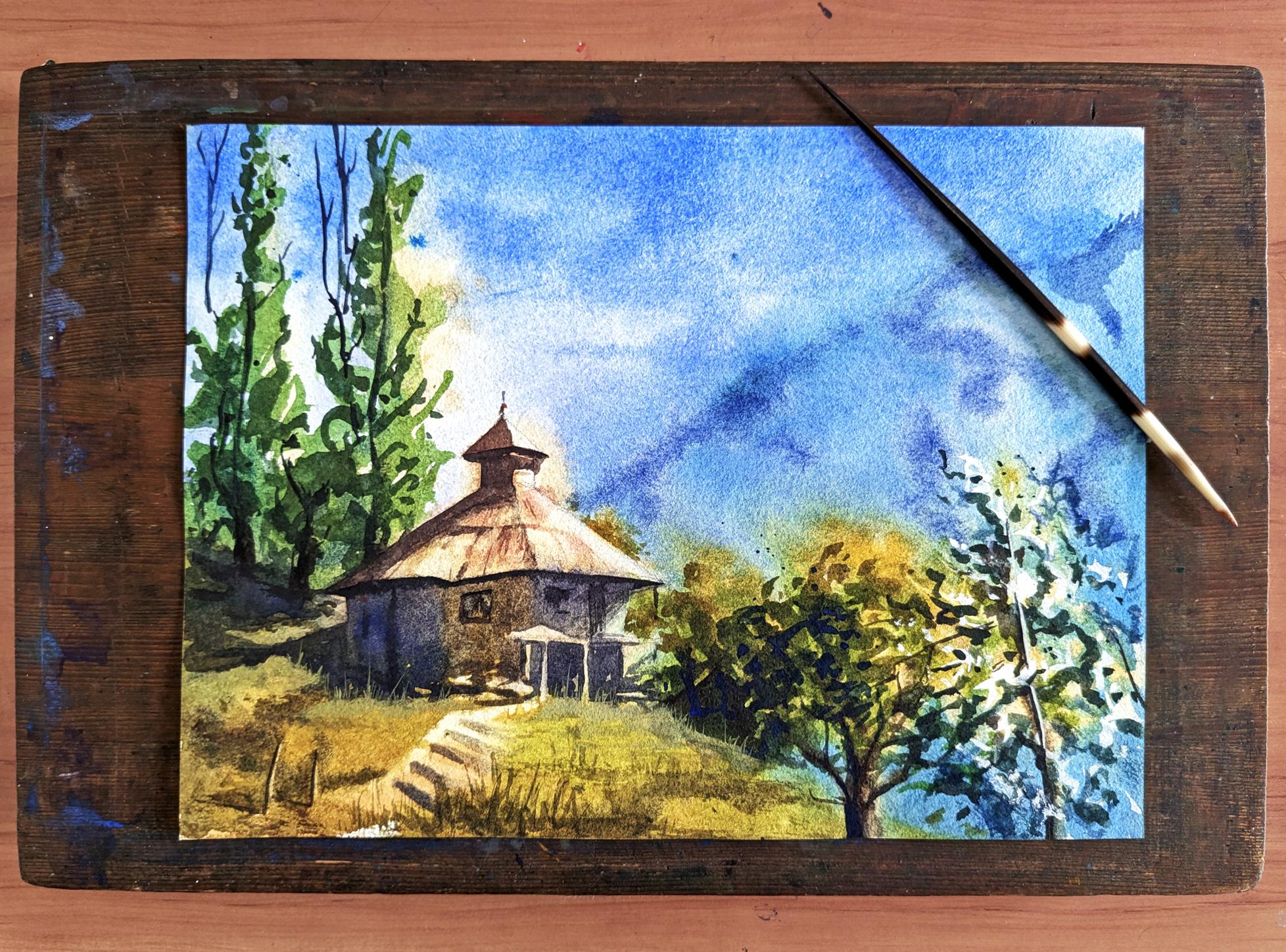
2. Drawing and Approach: Alright, let's get
started with our drawing. I have my paper on my
wooden drawing board. This time around. I'm
not going to mount it down using tape. And you will see
why as we progress. I'm printout of the photograph that we're gonna
be referring to. Might have already
noticed that the ratio of this photograph doesn't match exactly with the
ratio of my paper. And I'm sure it'll be the
same with your paper as well. So you need to adjust
the composition, kind of fit onto this and enhance it a little bit as
we're doing it as well. When I look at my
reference image, the first thing I'm looking
for is the vanishing point, the horizon line, or
the line of sight, which I think is in this
particular photograph. I can tell that
because I can see a little bit of the
bottom part of the roof. Perspective lines of the
roof move downwards. So this is where the
horizon line would be. Next, is finding the right
size and place for this house. On my for that, I am going to say that
this point is halfway on my horizontal line
across the paper and this point is halfway
on the vertical lane. It's not exactly, but that's what I mean by I'm going to change
the composition. I think I'm going to bring
the house up a little bit. Now, one thing a lot of
students are worried about is all this detail
in the vegetation. What I would advise you is in the line work in
the drawing phase, just block in this area. Don't worry about every
single leaf and stem. Just need to demarcate the area where the
trees are going to be. And as we move on
with our layers, those trees will appear
plus the process. Okay, Then let's get
on with the drawing. As a speedup video of me drawing
the scene onto my paper. This video is probably sped up about 15 times the actual speed. To it. I just wanted to
give you an idea of how I measure my paper. As I am introducing elements
from the photograph and placing them within
the composition. I also want to show you how much I move the paper as a drop. Just give you a vibe of
my overall approach. And also give you a glimpse of the errors
I make along the way. As I build the sea now, I keep checking for the relationship between
different objects. The relationship
between the size of four different elements
in my composition. Say e.g. how the top of the house matches
the top of the tree. On the right-hand side, the one swing in the police. Should be a scan
of my line drawing in the resources
section of this class. You can download it. Should you find it useful for drawing your own
version of the scene? We are now almost
ready to get started with our paints off-camera. I've just sharpened up
my sketch a little bit. So the painting
process will be broken down into three steps. The first of which is painting
in the color of the light. As you can see in
the photograph, there is bright
afternoon sunlight falling on the
foreground elements. And as we move backwards, the image gets cooler
and cooler all the way up to the blue sky. So in our first step, we will be applying
this color of the light in the
background and the warm, yellowy sunlight
in the foreground. As that is done, there is no time
to take a break. We immediately have to
move on to the next step. Start while the
paper is still wet. This is where things
get interesting. This is a rather important step. Now as you can see,
there's a lot of detail which intimidates
students quite often. So to simplify it, this is what we will be
painting. In essence. This is the large
shape that we need to put down on our paper. We'll start sure. Along
the mountain ridge while the paper is wet so that the paint fuzzies into
the sky and move downwards. And then to the left. Along the way we will be
changing the color on our brush. We can't have it
gray, of course. It will be changing the
color on our brush, as we can see in the
photograph here. But note that the
particular colors that you pick do not matter as much
as the color temperature. One step that we're
going to do differently. One interesting step
this time around is that we're going to
vet both sides of our people before we get started so that we have enough
time to work wet in wet. This is particularly
important for me today, as you heard in Bombay, we are in the dry winter season.
3. Colour of the Light: Starting off with
the painting now. So for my warm color, I'm gonna be using ocher yellow and a little
bit of new gamboge. I'm gonna make sure that my mixture has a
lot of water in it. There's no need to
hurry At this point. Acre time till you
get your mics right. Sometimes helps having a
tiny piece of paper around. Test the color. Next I will be mixing and Mike, we'll color the volume which
I will be using for the sky. The cool blue I
have on my palette, I be using for the
sky is cobalt. Blue. Really do perfectly
fine as well. And I'm thinking I'll
add a little bit of ultramarine just to make
it a little bit more. Not too cool. I like preparing these before I
actually start with a layer. This allows me to work faster, which is a huge advantage
when working wet in wet. For this particular painting, I have decided to try a little bit of a
different approach. I'm going to wet down the
back and front of the paper. Unfortunately, I had to cut out a little bit of the
vetting process. The rapid back-and-forth
movement of my hand was not being captured
very well by my camera. When you wet down both
sides of the paper, it prevents the paper
from warping when you apply very wet
layer of paint. Since both sides or both sides, they just say the tension
on both sides is equal, which prevents the word
ping from happening. The tools I'm using
to wet down my paper, a spray bottle, and
natural sponge, a little water on the surface, and then take a little
additional water in my sponge and make sure it is evenly spread across
the face of the people. Or the sponge does is evenly
distributes the water, lifts whatever there's
too much and adds water, meaning that the paper will dry. I even think there will always
be equal amount of water. I'm going to start off my
layer using my big flat brush. So I'll start right at
the very top of my sheep. As I'm working on a sheet
that is already fixed, I am aware that the
paper will dry a lot lighter than what
it appears right now. That is something
you need to keep in mind when working on the wet paper and it's
going to dry a lot lighter. So make sure with goo to go
in with paint a little bit darker than what you want
the final result to be. So as we move towards
the horizon line, I want to make the color
a little bit toward more. For that, I am adding
liquid of lavender to the mix window being
purplish color, which is slightly
opaque in nature. I don't think I've gotten the consistency of that
lavender quite right. Should have had more water. The reason I opt
for the lavender is because the part
lower down is yellow. And as you know, blue and yellow gives greed. And in some places where
there is vegetation, for sure I want
there to be green. But in some places I want
to maintain that yet. And lavender, purple,
it doesn't turn green, it just neutralizes the yellow. Neutralize the yellow
has an added advantage. It can be further, further blended into more
and more striking yellow. As we move down on the
people towards things which are closer to the
viewers line-of-sight. One thing to keep in
mind when working on landscaping is that things further away from the
viewer tend to appear. Why things closer to the
viewer into a pure water mode. There are, of course,
exceptions to this rule. But more often than not, that is the case in
Netscape paintings. And as per the rule, I am changing my form mixture. First I increased the amount of warm yellow, the new gamboge. And then I'm making it
a little more golden by adding in some burnt
sienna hint of orange. As I've mentioned a
few times already. Don't do, don't need to stick
to these exact same colors. Just follow the principles
that I'm mentioning. Who will get a good result. Another principle is that things closer to you appear dark coat. And this guy at the very
top is there to indicate that the sky was hit by
this guy on the horizon? Is this guy for
this, that'll be, it adds depth to your painting when you darken the
very top of this game. A major part of this
washes now done. I am just adding strength
to sports sweat. I think it is needed and correcting any
mistakes that I've made. Again, take a look at your piece and make decisions accordingly. Don't need to follow each
and everything I'm doing. What I'm doing right now
as I'm lifting some of the beam right off the
wet wash, the sportswear. I'm lifting the paint. Areas that will remain light till the very
end of the painting, areas that are catching light. The way you lift paint
is you go in with an almost dry brush and
just wipe the paint off. As your wash will
be, still be wet. It is rather easy to do. This lesson is done, but don't stop now, you need to work the next layer while
the wash is still wet.
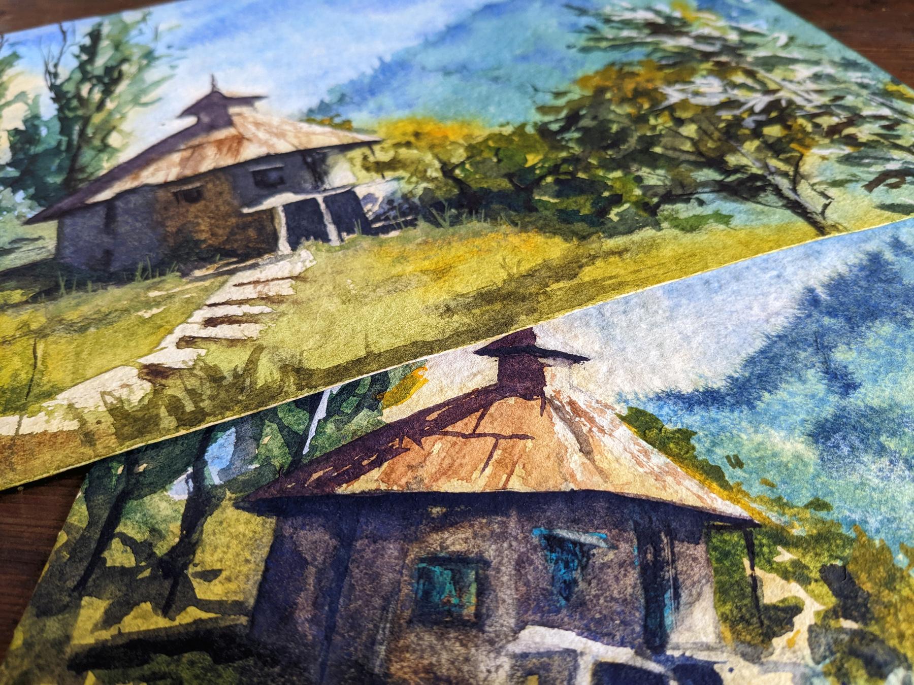
4. Big, Connected Shape: The first thing I want
to tackle in this lesson is that in the fire background. The reason I am
painting this while the previous Washington is because I want it to
fall into the sky. I want there to be
a very soft edge. The hill is covered
in vegetation. I need a greenish
color for the Hill, but I don't need it
to be too bright. I am mixing in my pillow with a little
bit of burnt sienna, WHO get the rather neutralized green I
need for this backdrop. While you want to start, while the paper is still wet. It does bear keeping in mind that you don't want
your paper to be wet. Otherwise, as you
put your paint down, it will just flow out of control as **** as is what is
happening right here. So paper's drying is
a very subjective, like there's so many variables, so many factors that affect it. The humidity and
the heat of value, which will obviously be
affected by the season. So there's no hard and fast
rules about when to start. You would just have who judge
your own sheet of paper. And this judgment only comes through practice
and experience. Also notice that I'm
now working at it. I have that tin can at the top of my
board, my drawing board. This ensures that the
paint I'm putting down flows downwards
more than upwards. For this, particularly, as can be observed in our roadmap, we need to connect the
trees, the background. It's just one large shape with
different colors of goods. So that's exactly
what I'm doing now. The right of three seems to be catching a
little bit of sunlight. And I'm painting
that in as yellow. Yellow and green gives you
green. It doesn't matter. It's just about getting
those temperatures where you need cool and
form that you need for the first time, I'm
adding a little bit of sap green to that
yellow mixture. I'm placing the paint with the simple tabs of my
number two, brush. The page is still wet and that
paint will face and blade. As time goes by. Going to think of the things that we're
building right now as trees or grass or mountains. Just think of it as
one large shape. One shape with a few
different colors. Going to one of my
browns and just adding a little bit of a
indication of the tree trunk. Now I'm changing the point where my support goes and putting it to the right
of my drawing board. Because I now want the paint
to flow from right to left. I'm connecting goes through
the grass on the hill. How to need to connect the
vegetation to the house. Now, mix the color I
need for the house. It seems to be a
very dull color. Patch of yellow in the house. The bluey color. I would like to use a mix of ultramarine blue and a
little bit of burnt sienna. For the yellow bit, I would
go in with my yellow ocher and maybe tiny touch of new gamboge yellow,
but that will be later. Now I'm mixing blue color. And I can instantly see
that I've gone too dark. This was a mix that
in all honesty, I should have mixed before
I started the liver that would have made sure that I was faster than applying. Alas, I didn't do that. Look at the roadmap
image on the top-left. Make sure you leave out those bright support
structures for the platform. Ensuring that those
light areas remain light is giving your painting life. There is a possibility of
getting those lights back with the white goulash or
any opaque color. But that tends to
diminish the charm. It's best to use light to pick colors
as less as possible. I'm now mixing in that yellow
I mentioned previously. Again, don't hesitate to touch the edge of the last color. We don't want sharp edges. You want those colors to
flow into one another. Also, notice I keep
going to my little spot. Spraying your wash
every now and then, especially if you need to take a short break and
mix some more paid, ensures that the wash is wet
and wet wash is active bush. It ensures that you
don't get sharp edges. As for the roadmap, I've left a few
lighter patches at the bottom left-hand
side of the house. Light patches. It doesn't matter. What is that light thing that you don't need
to speak what it is. We just need to
indicate that there is something they're
catching the light. In case you have not
been able to leave out those white patches. You can go in with
some tissue paper and lift some of the paint as I I'm now painting
in the left side, left end of the house. And I will connect it to the grass that and
then I'll move the wash into the roof and
those will be decrease long. Keeping in mind that I'm not painting a house
or grass or trees, I'm just painting in a sheep. I'm now mixing in my color for the grass at the very end of
the hill and also the trees. I'm not mixing in a
very specific color. I'm just using all the colors which I've already
on my palette. And getting a green
which is not too bright, not too warm, or
somewhere in between. As per the roadmap, I am connecting the grass. The staircase leading
up to the house. It's the same value,
just a different color. And since I'm working in vet
school will merge together. You can use just a new
mix on your belly. Need to mix a specific
shape is Bruce whatever is there
on the palette. Again, splicing both my palette. Keeping the wash active. I'm now mixing the color I
will be using for my roof. The specific bean that you
use doesn't really matter. Just needs to be a
brownish, reddish color. For me. It's burnt sienna, little
bit of pyrrole red, I think. And adding that dirty neutral is already there in my palette just to take the edge off a bit. You could also try
using the side of the brush and its texture. My paper actually is to wait
for me to be doing this. And I only realized that
after I after I tried it, I probably will give it another try a little bit later
than the paper is dry. I have changed the position
of my support again. I need the paint to flow
from bottom to top. This time around we need to get my mixes ready fast. Keep the wash active.
By this point, the sky in the background
is rather dry. And that's okay. Very soft edges
because these trees are fairly close to
the US point of view. With foliage like this. Lot of students struggle
because they tried to paint in every single,
every single detail. That's not what you
should be, right. An easier approach,
especially for painting. News, is who hold the brush at the very tip and simply
blocking the ship. General shape, which
somewhat resembles or use the brush strokes to
give the field of foliage. This paper of mine has stayed awake for a surprising
amount of time. And I'm going to take
advantage of this and add some variation in the
mountain in the backdrop. I'm going to use my mixture
which is already there on my palette to add a
little bit further depth, create the impression of ridges. In that instance. You could also try to make the edge of the mountain appear to have tiny plain trees. It worked for me in
my practice piece, but in this piece I didn't
get it quite right. At this point. I will Lear is
more or less done. Have all our major
elements in place. We followed the roadmap and down the large
ship on our paper. While the wash is still wet. We can take advantage of
that and add a little bit of places where we want
to go slightly darker, but I don't want a sharp edge. Additive variation in
those trees at the back. Add a little bit of variation in the grass
on the foreground. Now, I know will dry lighter. Just adding some
finishing touches. Said this, but look
at your own piece. Each and everything I'm
doing at this point. I'm going to try and
scratch out a few leaves, a few random stems, which are catching the light. I'm also thinking that
I scratch out something that looks like a fence
somewhere in the foreground. This layer is done. You need to wait for
your paper to dry completely before moving
on to the next lesson. So now is the perfect
time to take a break. But apps make yourself
a cup of tea or coffee and come back refreshed.
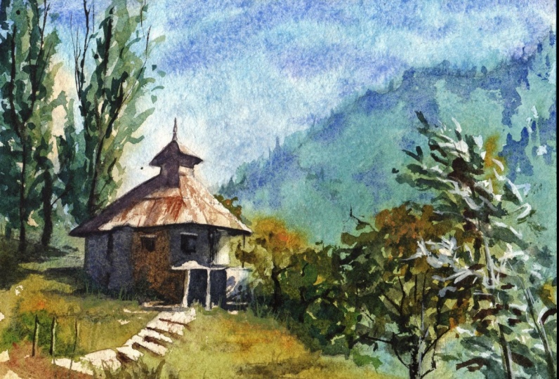
5. Midway Check-In: I hope you've been able to follow along with
our process so far. My paint is all dry. And I am quite satisfied with how my painting
is looking at the moment. Having painted the same scene, three times, earnings is the
third time I'm painting it. Each time at this phase, the result looks a
little bit different and it is rather pointless comparing it to the
previous result. So with that train of thought, my advice to you is your
result at this point, we'll definitely be looking
different from mine. And there is no point
making a comparison. Do we need to take the next steps in accordance to where you are in the process. And that is bound to be
different from where I am. That being said, in this
particular instance. I could have gone a little darker here is
what I'm thinking. And maybe I went too
dark with the sky. Foreground has turned out fine. I guess. Maybe couple of tiny changes need to be made here
a little bit lifting. I'm not too sure. Maybe some texture as well. Vegetation seems fine. You put a bomb or
vegetation down her would have been nicer. Content. Now, next I think I'll be adding those by the leaves that are catching bits of light. I do that using whitewash. And since I have this sheet to the sprint
out in my hand right now, I will proceed with
explaining what this is. We're done with the lights
were done with the mid-tones. Now we will move
on to the darks. What is interesting
in this scene is that the darks are connected as well. However, if we attempt
to paint them in one go, as we did the midtones, it might be a little
bit difficult. So I'm going to break
it into two parts. I'm going to do the
darks on the left first and then the
darks and the right. Even within the darks, there are two values. I mean, there's the dark and then there's
the darkest dark. So with that in mind,
let us proceed. I already have a little bit of whitewash squeezed
out on my palate. The bottom right of your screen. I am going to use it rather, take not want to add
too much water to it. You can call it a
cream consistency. As you apply it on your paper, applied in clumps and patterns. Some of those white
patches can be isolated. But trying a few
of them together. Think of it as giving the
three form and definition. Keep in mind that
you're not trying to paint in every single leaf. What you want to do is
create the illusion of form around that
skinny tree trunk. Who apply my paint, I'm using my number
six round brush. I'm just letting the brush dance on the successful people. Then you are done
with this tool. Remember to wipe off oil, the white quash of your palate. You don't want it to get in your other mixes because
it will make them opaque.
6. Darks and Details: Part 1: I'm going to start
like I sometimes do by mixing all the colors that I will be needing
for this layer. The first one is my most, most used, three,
most used nutrient. It is a mix of burnt sienna
and ultramarine blue. This one will be on the house, some parts of the house, and also mixed
into other colors. The next dark I will be mixing is the dark shadow
needed for the roof? It could be a slightly
reddish color. I'm going to mix in red
with some Tito blue. Maybe add a little bit of burnt sienna if I feel the need. There isn't any hurry at this stage as we
haven't started yet. And there is nothing to connect. Grouping rapidly drying on us. So it's okay to take your
time and get these mixes that I it might also be advisable to have a
little piece of paper, scrap piece of
paper next to you, test some of these mixes. If you are not very short, by just observing
them on your palate. The next one I need is deep green for the dark
of those tall trees. And might even use some of it
for the grass, some darks. And the graphs for this have mixing the same colors that I mixed for the
background monk, little bit of glue and
some burnt sienna. So notice how I don't
clean my palette. I make use of any of the
leftover colors which are there. The last one is the deep yellow for the
yellow bit of the house. I think this is gonna
be ocher yellow and I muddy it using everything
else I have with the panic. I'm gonna be working
on a slight tilt because it is easier
to capture on camera. You don't have to do it if
you don't think it is needed. Though I've been
painting for a while. I still get nervous. I slid out myself at times. That's what's happening here. I'm making sure I know
where the lines are, where I want to add my paint. Brush stroke is also
a very tentative. But I'll get up to speed soon. Always comes down to getting
into the flow of things. As in the last layer. Make sure there isn't a bit of randomness and a
lot of energy to low brush strokes that will make the
vegetation convincing. Leave out a few bright bits
in your reputation as well. It gives the impression
that there are speckles of light falling on
some of the smaller leaps. Indicates known state. The brush I'm using
at the moment is my number eight round brush. After the rapid speed of
the first few layers, working better and better,
things slow down considerably. When adding the ducks. You can take your time. You can be meticulous here. It's okay. If you do not connect
the wash wet in bed. At the same time, be mindful that you don't overwork any section
of the painting. There's always the
temptation to do that in this dark stage. I'm now connecting
the vet green paint at the bottom part of the tree to the dark
red shadowing the roof. This is the reason
why I pre-mixed oil, the dark shades I
would if I had to stop and mix the roof shadow now, the greening the three
would have dried and would have been
harder to connect. Using such connections isn't the only way to
paint in watercolor. Numerous approaches available. This just happens to be my favorite one and the
one I will share with you. If at any point along the
process you feel lost or you don't know where the next
bit of dark should go. Look at the road map
image on the top left. Image, as I've
mentioned earlier, is available in the
resources section. You can download it and print it for your reference.
As you're painting. The three trunks have, right? I'm not too happy about that. Nonetheless, they need to be connected to the
shadow on the ground. And I will just go
ahead and do that. Instead of having a bunch of smaller shadows scattered
across the ground. I mentioned that they'll
have one big connected one. Now, moving to the left
hand side of the house, connected to the shadow
while it's still wet. As with the last layer, don't think of these elements as a house or the
ground, or three. Think of them as shapes. Look how the dark in the wall is connected to the
dark on the ground. Painting that shape. See in the roadmap image. Change the color on your brush. But make sure that that
shape is connected one. As I'd mentioned earlier, I'm just going to muddy
that yellow COVID. Pretty much everything
that instead of by reiterating the point again, the color is, the
specific colors don't matter as much as the value. Temperature of the Gulf. So now when we add these ducks, that is where those white
bricks that we left out in the bottom of the house now is when they
will start football. Now always when we
start to notice them. Apologies for my head
popping into the frame. Sometimes I forget
that vocabulary. I need to paint these
smaller sections. I have a habit of sticking my head very
close to the paper. Make sure to leave that bright patch of light on the right-hand
side of the house. It's going to add a
little bit of strength to the shadow on the ground, the Washington break and it will face in all the other sections. There's also been a bit of
a protrusion on the wall. The left-hand side wall just indicated the
slightly darker line. Also, right. And that is where the least amount of
light will penetrate, so little bit of darkness there. Add more depth to the house. And if the wash is still wet, the edge of the dark line will slowly melt into the
rest of the wash. Usually I wouldn't
clean my palette like that in the middle of what happened this time
around is that the mixture there
just got to muddy. When I'm painting, you
can constantly see me looking upwards East.
I might do that. I'm either looking at the photograph on
my computer screen or I am looking at
the roadmap image, paste it on my wall. The same one that you have on the top left of your screen. As per that, I'm going to add
the darks at the bottom of that platform area
and then connect those darks with the
shadows of the leaf falling on the wall at the
extreme right of the house. If I had chosen to paint
at a faster speed, I would have connected
those shadows of the leaves right into
the trees on the right. But this time around, that is the point where I am
going to stop this lesson. And I'm going to add some finishing touches on
the left of the painting. The next thing I want to turn
my attention to is adding a few dry brush strokes on
the grass. On the left. I want the grass in the
extreme foreground. Tiny bit darker. And I want to try and
connect that dark part to the shadow that I've
already laid down. The color mix I'm
using is my bomb, new gamboge, yellow, and
a little bit of brown. Also leftovers on my bed. At this point. Whether I decide to
consciously use them or not, leftovers of my palette to get into every single dark mix. Next, I'm going to
add some of the top. This ducks, my wash
isn't exactly vague, but it's still moist. And then we'll try and
take advantage of that by laying a little
bit of darker pigment on the underside of that top triangular. This
could have been done. In all honesty. I think I'm paying
attention to right now is scuffing up
some of the edges. So I picked this up from lesson by a famous painter
named Alan Bullock. What he mentioned is that the elements in the
painting, their identity, all that you really need
to pay attention is the H. And in this case, I am scuffing up that edge to give the impression of
the green being grass. Simply by having a rough edge. That illusion should appear. At this stage in the painting, it helps to take a look at your nice and cannot do each and
every step that I'm doing. I myself am questioning my
decision-making slightly. I don't think that dark that I'm laying on
right now is truly needed. One edition that I do
want to make is add a few more vertical branches
to those toiletries, as can be seen in photographs. Do this, I am going to use my number for rigger
brush for the first time. Regardless of brush
with a slim head and long thin bristles, it is ideal for doing it. Long, squiggly lines, such as branches or wires in our
landscape paintings. I honestly should be
using more of this brush. I don't use it enough. If you are uncomfortable or not used to using a
rigor to make such strokes, you can practice them
on a rough sheet of paper before putting it
down on your painting. As with the leaves earlier, try to be as random as possible. With those vertical branches. Am approaching the
danger zone of over-working that extreme
left part of the building. So I really need to stop that. When I addition I need to make is the window is on the house. And I'm going to use the side of my brush to quickly
put those in. And as soon as I've
made that mark there, I will do a straight dark. I was expecting the wash to be slightly moist but it was not. Let's see if I can fix it. If I can't fix it with the brush, I will lift some of the
paint off with a tissue. When those done.
And now the door, same technique,
side of the brush. Just add a little bit of
water on the dark bits and lift. Good enough. So this lesson is done. In the next lesson, we will do the darks on the right-hand side
of our painting.
7. Darks and Details: Part 2: We're almost at the finish
line that we intake now. I'm currently mixing in the darks for the
foreground trees. First one is a new gamboge and leftovers on my palette
to make it dark and muddy. Second color I've added
there is the sap green. And I'm now adding brown to it. Take the edge off
and make it darker. I'll be needing a
third dark as well. Somebody I can use as my
darkest dark in some cases, which will be a cooler green for which I am using my teal blue. And again, palate leftovers. Just morning up that yellow
a little bit further. I'm going to start by
adding a little bit of depth on the leaves
right in that roof area, right next to the house. Starting with a warm color host. Relatively warm color too. I am softening
some of the edges. Now moving to a slightly
darker color as I move the base of
the plant there. The dark base of
the plant will also help define the
grass on the ground. Again, it's always nice to keep softening some of the edges. I fear that I don't do enough of that in this
painting is when, especially in this section. Even though we are working
with the darks now, the tree is going to need
to be defined and separate. We can connect some parts of the leaves of the
tree further away. And the three flows by B3 and playful
with your strokes. Try keeping your arm
as loose as possible. Everyone's leaves
look different. Don't need to follow along
exactly the way I'm doing it. They don't even need to look similar or even close
to the photograph. They just need to
convey the information, visual information that this is a stroke is a little broader than
I would have liked. Oh well, adding some branches to give more definition
to that group. Maybe a lift. Some
of the paint off. Don't be afraid to use your fingers to smudge
some of the pain. The more you do it, the more
comfortable you will get with the smudging
with your fingers. When I feel that the mix on my palette isn't
going dark enough. That is what are the few
times that I will take. In blue my Blackwell
on the palate. That's what I've
just done now to add some indication
of three trucks. Also going to add a little
bit of blue in that area. Even though you can't visually see any blue in the photograph, a nice ultramarine will add
a bit of fun in that area. I've found this tree on
the right to be relatively harder to paint as compared to the other trees in the scene. A couple of lessons ago, we added white patches to indicate leaves in the wind
catching some sunlight. Now what we need to do is
add some dark pigment under those white patches to indicate the shadow
side of those leaves. Some of those dark
patches can be isolated. Most of them, it helps
if you connect them. To connect them in
one continuous shape. It gives you a little bit of definition, a
little bit of foam. As you gradually
add more leaves, the tree will slowly
start taking four. And once that's done, you can move back
to your good and quickly added that long
skinny trunk of the tree. It doesn't have to be
one continuous stroke. You can do it in few
strokes who show that some part of the trunk is being hidden or
covered by the leaps. The leaves as well. I think I'm slightly
guilty of overworking. So my advice to you is
in your own painting, sculpture, a little
earlier than I have got. As I had mentioned earlier, I'm just going to
add some ultramarine to those three trucks. I lose dark system, bedtime, want to pull some of
that paint to dry, brushing some texture to
the foreground grass. Again, I'm paying attention to the edges to indicate a rough, uneven, wild mountain
grass. There. There's a tiny bit of
vegetation sticking out from the right-hand
side of the roof. And by adding legit
strength to that area, we will also be able to better define the edge of the roof. So that is what I am
going to do right now. One last thing I want
to do before the end is mix some white quash with the warm
yellow green switch already there on my palette. I'm going to use
this school paint in a little bit of
grass, strands of grass. And I'm gonna do this at a very particular points
in the painting M1 to do this against some of the
shadows that we laid down. So the white gouache, what it does is it
makes the paint opaque. So now we have
opaque, pale yellow, which can be used to overlap
with the shadow areas and create the impression of random strands of
grass sticking out there. The way I'm going
to go about this is first put down some paint. I'm using my number six
brush and then go in with my record and pull
out some strands of grass. And after that, I'll probably
go back to my number six and soften the edge at the
bottom of that opaque patch. I'm going to repeat
the same process. This time I'm going to add some strands under
that platform. Maybe a few sprains in the dark section of vegetation to the right of the
platform as well. And with those
finishing touches, we're almost, almost at
the end of our being. I hope you have
enjoyed this class. I hope you've learned something about the planning of painting. Thank you so very
much for joining me and I hope I can see you again for the
next class as well.
8. Conclusion: I hope you've had a lovely time maintain your
Himalayan Mountains. How did it feel to paint the color of the light
onto the wet paper? And you will remember to use
pink that was dark enough, but not as dark as
the print I did. Can you have fun painting in
the pink connected shape? Not having to worry about individually, objects
and meetings. If you're being dried before you could connect to
one color to the next. May I suggest tilting your board to a greater
angle the next day? Or spread saying you're
painting a little more on, that will ensure
that your wash is. How did you finally are able to maintain some level
of color in your darks? This bring your
painting to life. I'm really looking
forward to see all your fantastic paintings in the project
section down below. I'll be here for any
feedback that you may need at any stage
along the process. Do leave a review for this class so that I can make the
next one even better. Don't forget, you can follow me. And also on Instagram. So you know, when
the next one drops. See you soon.
 Aniruddha Gupte, Urban Sketcher & Wildlife Artist