Transcripts
1. Introduction: Hello and welcome. This class is best suited for students who
are familiar with basic watercolor
techniques and now want to learn how to use those
techniques in combination. Together. You're going
to be painting or duration Mac by now, I absolutely love these books and can spend hours watching
them get up to Michigan. Sadly, in my current
place of residence, I don't get to see them anymore. I wouldn't bird has
fairly simple colors. Black and white,
with some bright electric blue streaks Moving. And in this class, we will learn how to
represent black and white without being
in our color choices. Even learn how to capture that electric broom
nature of his videos. We will learn how to create
a sense of atmosphere. Even use playful and
confident brushstrokes. We will focus on large sheets
and how to connect them. Not get bogged down by
perfection in minor. As always, you will embrace the happy accidents that
take place along the way. And find joy, find fun, unpredictability that the
medium of watercolor. I'm unable to tell. I have a professional
background in practicing and teaching service design and
industrial design. I also have an average loud for the outdoors and wildlife, stretching as far back as I can. Watercolor is relatively
recent passion of mine. And it's a passion that I now want to see how far I can push. This class is the first
step in that direction. It's a journey I am hoping
you will join me on. You can follow along my trials and tribulations on Instagram. I'm also looking
forward to publishing a few shorter length
videos on YouTube. I'm fairly active on my
social media handles. And we'll be happy to connect.
2. Materials: Let me take you
through the materials that you will need
for this class. Starting with the paper. I'm using, cold press
paper by Bao Han. The size I will be using is
ten by 14. Quarter sheet. Would require something like a solid surface to
mount your paper on. I like using this
wooden drawing board I've had for a very long time. For the mounting, you will
need some kind of tape. I use this simple masking
tape for mixing your colors. You might like
something like this. This is a simple
plastic palette. This is a broken piece of
my regular folding palate. And before you ask him, No, this is not paint I
have managed to damage. It is nice having some paper tissue around in case you have any spills
and need to wipe up. You will need some
containers for your water. I like having two around, one for washing my brushes and one with a little
bit of clean water. Always nice having a
little spritz what it does to keep
your washes active. And lastly, a simple eraser. I like using a kneaded eraser. You can use anything
you're comfortable with. And Benson, who put down
your line work on the paper. You will also need
a little support to occasionally prop up
your drawing board at, and I am using simply tin box
that I have lying around. Next, let us take a look at
the brushes we will need. Your other ones I will be using. You can use anything similar or actually anything
you're comfortable with. Starting from the biggest one. This is a size thing,
round synthetic brush. Next is a round
size eight brush. It's a mix between synthetic
and natural fibers. Third one is a size six round
brush, synthetic fibers. This one is another round brush. I'm assuming this is
a size number three, although I'm not entirely sure. The last one is a size
zero round brush, synthetic fibers. On two occasions in the class, I have used brushes
that I've seen here. However, I can assure you that five brushes
similar to these, is all you will
need for the class. Let's take a look
at the colors we will be using in this class. Don't have to be very particular about your color choices. Any colors already
in your collections similar to these will
work perfectly fine. I often mix and match the
brands and the colors I use. But still at any given time I own a very small
number of tubes. In this class, I will
be using a new gamboge, which is a warm yellow, orange transparent
pyrrole, orange, red. This color called a X4, which is quite similar
to tailor blue, green shade, cobalt, turquoise. And Payne's gray.
3. Drawing and Approach: Before we get started
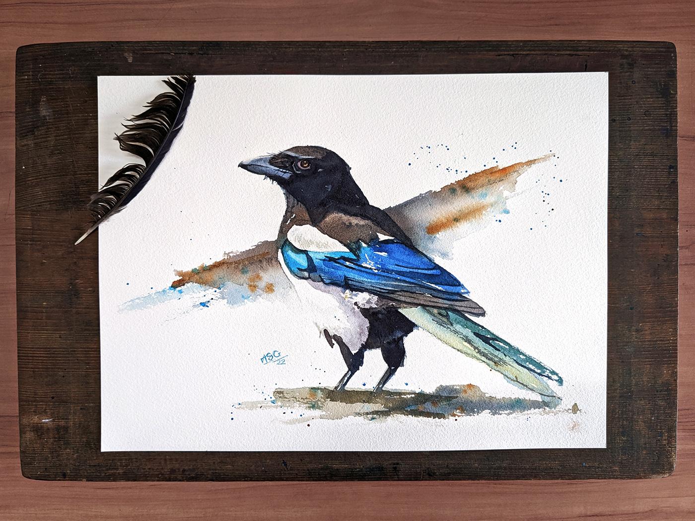
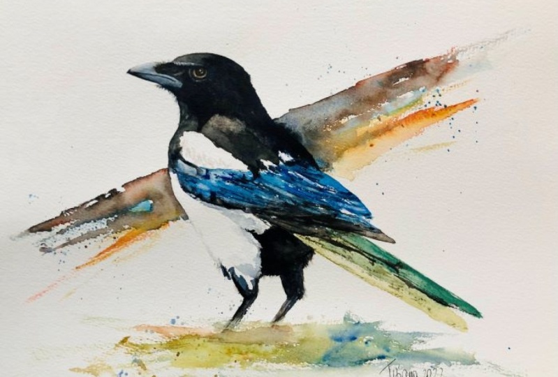
with painting part, I wanted to show you the colors swatch out on a piece of paper. This is the reference image
that we will be using. The turquoise and the blue
there uses rather obvious, it's with the vein. As for the red and the orange, I'm going to use these
two to neutralize the two blues for the
hair and the rear. I won't actually be using
much of this Payne's gray. I will actually be using these colors could
neutralize these two and then bias them warm
and cool as we required. The yellow is mostly
for the tail. I want it to be more greenish than it is
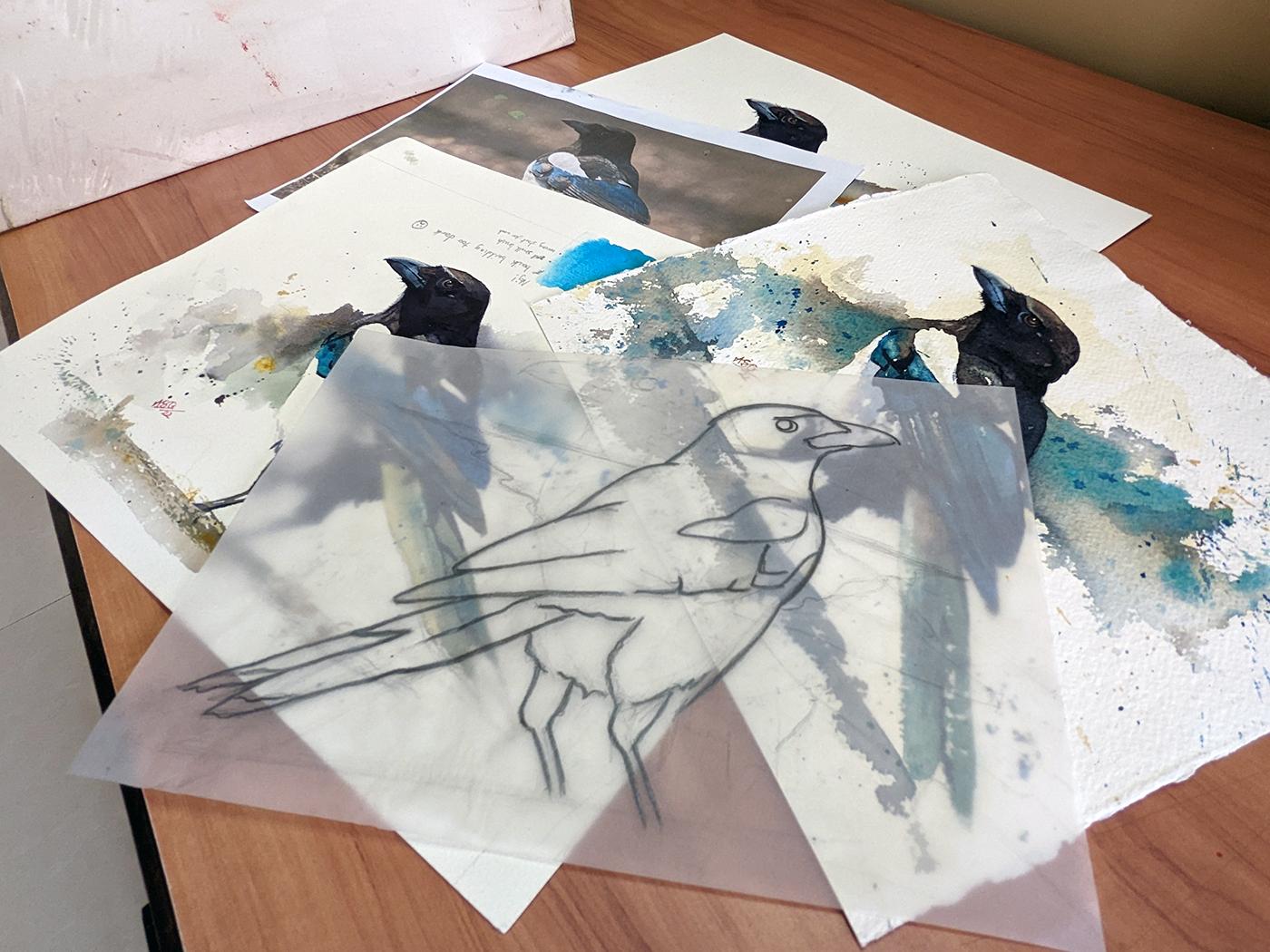
in the photograph. As far as drawing out
your bird on the paper, there are two ways you
can choose to do it. There is a line
drawing template for this magpie in the
Resources folder. For this class. You can download it, use it as a cut out
and draw around it. If you choose to do
that to make sure all your points are sharp. You don't need to do
your lines as dark as mine there just so that you
can see them on camera. You can also add the
division line in the beak and these bits of white feathers that
are sticking out. I would actually encourage you to draw it out
through observation. And if you go down that route, the important thing
to keep in mind are the angles of the board. So this is one. The second is the tail, code is the head. And then how the head
fits onto the body.
4. Underpainting: Let's start off with a
little bit of underpainting. Under painting is pretty
much slippery painting in the color of the light. I'm selective above where I want to paint in this
color of the light. And I'm making my
decisions based on fictions in the
painting that I do not want to touch again
in the next year. Next time I'm going to mix my own color for this painting. The blue I'm using is a rather
greenish blue and the red I'm using leans more to the
side of orange and yellow. So those two neutralize
each other to give me a purple color. As I did with the yellow, I'm going to be
introducing a lot of water to this mix as well. In the underpainting layer, it is super important
that we keep our mixes and I'm going to add a little bit of that
nutrient to my yellow, just the angel fertility but couldn't give me
have added too much. Okay, I'm happy with my mix now. I am ready to apply it on paper. I'm using number ten
brush at the moment. One rapid stroke, I'm just
going to lay down that yellow. Then. Any irregularities
in the stroke? Now I'm just going to
add clean water and let the paint flow up
and walking on it. So it's not going to
move up all that much. Yellow and purple are
opposites on the color wheel. Just as I neutralize the yellow with a little
bit of purple. Now wouldn't utilize the purple with a little bit of yellow. Taking the edge off again. I'm going to use that
color in the under part of the big shadow there, as you can see in the
references, very late shadow. As I move backward, I am going to connect
to that shadow to the end of the map. By this shadow. I'm hoping will give the Mac
by an illusion of volume. The clear water. I'm softening some of the edges. I want variety of edges. I want to have a little bit of a random texture just to
show or create using that. There are those that he has, these three white
feathers right on the edge of that black
and white marking. I want to try and preserve that. This particular magpie. As the paper is white, this dipole does look kind of harsh when you first
put it down on your paper. What half-baked in the process. It doesn't dry lighter. I'm trying to maintain a few sharp edges
where the shadow aims. But in all honesty, I might be time to be ready
to cute may not be decided. Next day what we
lay down or dilute, wash. in the magpies and face. For this area, which
is covered by shadow, I want to use color. I'm again mixing in
my blue and red, but there is a lot more
as compared to last time. I might also add a tiny
bit of Payne's gray. And of course I'm
diluting it with water. In my last class, I heard a public complains at my head kept popping
into the frame tool. This time I'm going above and beyond to avoid that happening. That's why I've moved my palate, kept it in my hand and
they pick the spot grid. I can see the week
but you can see me. So just lay the screen
mixture in flat. All you need to worry
about is the edges. After you're done laying in the color, picker, clean brush, dip it in water, wipe some of that water of
the brush over the edges. In the week you
want to be careful that the antibiotic is
not covered in color. You want to leave a sliver of white on the top of the beak. Using a size six
brush, by the way. Even though I'm fussing
around with the edges. In all honesty, I
don't need to water all that much because there is another layer coming
on top of this. If the transition is
reasonably smooth between more or less disappear once the next layer comes in. More or less done
with the audibility. Now, onto the big
connected wash.
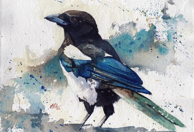
5. Big, Connected Wash: In this layer, we're going
to connect the parts of the map phi that
we can observe to be as a midtone immediate value. In this reference image, most of the Board
of Governors to fall under that category. So in this swash, even though we're using
different colors, you will be connecting almost
the entire board together. Of course, he will be
giving out the white bits. So I'm now mixing
the color I will be using for the head and the area. My mix is comprised
of three colors. A large part of
the transfer into blue and the transparent orange, and a small touch of
the thyroid rate. I want versions of
this new green color, one for all the parts
the light is hitting, and a slightly cooler version as well with
a little bit more. For the area that is under shed. I'm ready to start
laying in my painting. Now. I'm going to go in with a bigger brush
size number ten. I'm going to start at
the top of his head. You might have noticed my
drawing board has been propped up against that inbox. They're working at it. And as I apply my paint, it finished flowed outwards. There's no need to
do anything fancy. You just connect the tip of the brush and drop
and laying the paint. It's okay if it is black. Gone to my sprints Martin, because I just remembered
that I wanted this some of the paint to bleed out from the chest of the
word and the back. So now I'm going in
with clean water and applying it to the spot where I want those
bleeds to happen. I use the spray so that the wash would remain a game to it later. Now come in with
my neutral color, the one with more blue in it. I was hoping to get some
broken brushstrokes, but the brush I'm
using has very soft. So that doesn't seem
to be happening. But I would encourage you to try to use the
side of the brush, especially if you have
a synthetic brush and see if you can get some
broken brushstrokes. The lines you see to the
market, the background. I only use them for
this video lesson. They aren't entirely necessary. When putting in your bag ground. Beef, flee, we boiled. Have some kind of plan when you are
starting off your liver, but also have the
courage to improvise. As I move into the
shoulder of the board, I'm again using the warm
one grade two, and I have the same warm tone. I'm going to move into
the chest of the bird. And as the vet paint hits know what tired
which I laid down, it will slowly start
meeting from the outside. I have placed the water
on the outside so that the paint flows down along the belly of the world and creates contrast between the
white and the background. I am introducing
some dynamic color, orange in this case, who the background
splashes back down, bleed. It's better to earn
on the side of caution when doing these
kinds of backgrounds. I already seen that we
have gone a bit too far. So I'm using my
spirit so to keep the wash basin so that
now I'm going to move into my blue and I'm going to use the wet edge at the bottom of that
nutrient brown color and connect that to
the blue feathers. I'm predominantly
going to use colors, my blue and my turquoise blue. I don't need to mix them or
turn them down in any way. I can use them as they are
straight from the tube. Because I want these blue areas to be bright and draw attention. I want to be a little adventurous
with my brush strokes. Now. I'm standing up, holding the brush at its very end and making quick
movements in a V-shape. Getting in those
layers of his big I just want to sharpen
up with some of those quick loose strokes
than in the blue paint. And then I will move back to my warm, neutral brown color. I'm purposely leaving
a few white gaps in the wing area just to indicate highlights and create a
little bit of a tourist. Done with the vignette. You want to do a few splashes in the wet
bleed background area. Going in with my
cobalt turquoise. What turquoise is a heavy color. Once you splash pigment in
the synapse when you put it and also pushes
out the polarity. As I'm looking at. The paint
keeps flowing downwards. In the background area. This means that it's creating an edge at the
bottom of the wash. I'm just going in with some clean water and try to soften that
edge a little further. I'm now going to
move the wash into the rear end of the pipe. Even though it is
a fairly dry day, the Washington Irving was still wet and I was able to
connect it without testing. You're wanting painting
absorbed how wet your washes, you don't want it to dry. If that happens, you will not be able to connect it seamlessly. For the real part of his room, I would prefer the
learning drill again, as that part is under shadow. I am not going to be very
detailed with his legs. I'm just going to do a quick
scope and putting ground. I usually avoid painting
feet on my books. In my experience. Not only are they difficult
to get accurately, but if you happen
to do a bad job, they speak out and draw all
kinds of unwanted attention. There's nothing to be gained
and a lot to be lost, and that's not a risk. That's what again, I enjoy DT. Just to accentuate the feeling of sunlight falling
on the board. I have added a bit
of a dark under the daily just to create some kind of illusion of a shadow as can be absorbed
in the references, which is at this point I'm just passing about
with the background. I would advise you
not to be the same. It's best to stop. This lesson is done. We will now be
painting in the field. Although I have put it
as a different lesson, it can very easily be attached to this big
wash that we have going.
6. Tail: Onto the tail now, when the rest of the wash
is still slightly damp, that is the best time
to put in the tail. The tail, I want
slightly greenish color. Make this color. I'm mixing my blue halo blue, and yellow. I'd be tackling it
very similar to how I did in the underpainting. Same big number ten brush. But a stronger color
this time around. The brush at the very tip. Standing is a good idea. Practice the stroke
in the air a few times and quickly put
it down on paper. Fix any imperfections that
you may have in this troop. And after you have done that, lane, some clean water and
let the paint flow down. Depending on how
the paint fluids we can come back
to this section. I'm again looking at the
head area of the book. There's a slight
highlight above his eye. It looks almost like an eyebrow. I want to lift some
paint off in that area. So I'm using a size six brush
with the rough brushes. I'm coming in with a damp brush and scraping
the paint where I needed. After the brush does its thing. I'm coming in with
some pigeon rule, which I'm holding
in my left hand. You can repeat the process
a few times until you are satisfied with the amount of paint you have
been able to lift. Also note that lifting becomes harder if you're using
low-quality paper. The painting, the deal has slowing down more than
I would have liked. I'm coming in with
the same brush there and lifting some
of the paint off. It's much easier to live
when the wash is still wet. Next, I'm going to go into
the ring one more time. If the paint is damp, that is actually beneficial as it can mean that you don't get edges that are a very sharp. I'm using my big brush again. And I don't want to be
too delicate details. I just want the buildings to
have a sense of direction, whichever hoping who achieved
to these boyd hits of pain. When doing this step, it's best to look at
your own painting and make a judgement
accordingly. Now be looking at
his shoulder again. In the reference image you can see there's a few spectrum of light which are visible or
reflecting off the shoulder. And I'm going to
try and replicate that by lifting some of the
paint in the x-direction. I'm doing the lifting the same way I did with the eyebrows. After the lifting is done, you can let all the
paint on the paper dry. If you want to take a break, this is the best time to go. Make yourself a cup
of tea or coffee and come back to the
painting little bit later.
7. Midway Check-In: Off-screen, I made
one tiny change. As I can see in the
reference image. I lifted a little paint from
his feathers right here. Now at what many artists coil the ugly stage
of the painting where there isn't all that
much contrast and you're not sure whether you're gonna be
able to pull it off or not. You're not sure what the end result is
going to look like. All I can say is
trust the process. Now we will be adding our darks. And once the ducts
come into place, the bird will slowly
come to life. The darks, I'm talking about. The beak, the shadow
falling on his head. The shadow is on the feathers. The rear end of the crew and maybe a few touches
in the tail as wind. This is when we will be adding our Payne's gray to
the neutral mix.
8. Beak: Come back. While the paint to be applied in the previous
layers is now dry. We will start this phase by
first tackling the beak, adding more depth
and detail to it. The color I'm gonna be using
is very similar to what I used when I painted the
beak in the first year. Yeah. Halo glue, little bit of Payne's gray and a very tiny touch
of thyroid rate. I would approach to the
beak will also be rather similar to what we did
in the under painting. We will start by laying down
nice and transparent wash. I'm using the number six brush. And I will only be
covering the bottom part, bottom half of the
week to begin with. Once that is covered, I will wash my brush off. You can also use a smaller
brush if you are comfortable, and then use it to feed
out the edges as we approach the top
part of the beak and leave a sliver of white
right at the very top. I am sticking to the reference image as far
as the weakest consult. The gap between the
top and lower half is built right next pool
right under his eye. That area is slightly lighter. So I lifting the paint
from their adult. About that. As you can observe in the
reference image, the tip of his bill and the lower part of his big
R, little bit darker. So for that, I'm using
little more Payne's gray and coming in with some
darker paint to apply it. The Washington wet and it
will transition in may, slow knee into the paint
already laid down on the paper. At this stage, you can also
add a little strength. The division line between the top and bottom,
top of the building. We will of course be
coming back to it later and defining each foot. The bill for my magpies. I know to fidget and we can
move on to the shadows first, starting off with the
one covering his head.
9. Darks and Details : Part 1: We're now starting
with our darks. The color I'm mixing is very similar to what
we used for the beak. It is halo blue, little bit of Payne's gray
and he bit of pirate rate. It is discolored and slight variations to this color
that we will be using. From now, almost at
the end of the lease. We're almost the end of the
day, to be quite honest. So I'm gonna start with
the section around the I. For some reason I'm
very tentative. As I project. Perhaps is the camera, perhaps it's making me nervous. Oh well, I will get up
to speed very soon. Kilo blue ensures that the
wash is nice and transparent. Start with It's okay, just laying down
relatively flat wash in this section that is
covered by the shadow. I'm trying to vary
my brush strokes to use the side of the brushes. I had started with
my size eight brush. I've now moved back
to my size six. Soften some of the edges
around the top of the beak, as well as softening the edges. I'm also adding a few sharp box to indicate those bristle
like feathers in that area that before starting
off this head shadow, we could have marked it out with the pencil
on the board as well. After putting the liver, after putting the dark
paint, the pencil mark, especially if done
with a soft pencil, something like a six-week,
would disappear. Just as I did about the beak, I am now smoothening the
shadow on top of the head. The paint mixture I'm
using can be described as perhaps milk consistency. This part towards the back
of the neck by the Florida, which is at the far side. It appears a little bit later
in the reference image. And that is why I chose to go with slightly more
diluted mixture of peak. It's finished shadow,
it's still very dumb, but a little more diluted
than the rest of that area. At this point, I'm
not entirely happy with how this layer of
paint has been laid out. It appears a little bit patchy. Fortunately, the
wash is still baked. And as the scene was, as long as the washes wet, it's kinda like and
I'm not coming in with a little water paint trying
to even out that gosh. I'm also trying to vary the
edges of the shadow and it will hide a few random fed
the work smoothly an edge. You added that the part about the bill is
still bothering me. I'm still not happy with how that transition
has turned out. So I'm taking a stab at
that section as well. Extending the doc
selecting for those, trying to get a
better transition. Let's try some Phaedo marks right in the end of
the eyebrow section. For pulling out his
eyebrows, eyelashes. I moved to my very small
number zero brush. While I'm at it, I might as
well pull a few strands of beard and mustache
across his beak. These markings, even
though they're small, they lend a lot of characters. So make it a point
to add it to yours. So now that most of my head shadow has been
placed on the board, I want to introduce
a little variation within the shadow itself. If you notice the
reference image, there are some parts of the
shadow which I got good. Let's call them
adopt this ducks. I am now going to
introduce those with the wash while
the wash is still wet. And for this, I'm using more or less pure
Payne's gray paint I'm using can be described
as a cream consistency. Quite take, but it will
melt out into the wet wash. Swam. Now looking to connect
this large shadow, the shadow areas in the titles. And I found a patch right under that white bit of
petals sticking out. There's a shadow at the day. We taken connect
to the shadow and the hate and then continue that connection into the rest of the feathers
shadows. The shadows. I've moved back down to using a smaller number
three sized brush. The level of detail
in the wing feathers. Intricacy can be intimidating
when you're just starting. What I would say is you
don't need to copy this feathered details exactly
from the reference image. What you need to do
is move this factor, notice the structure,
and use those lines, those lines that you're
making with a thin brush to create the
impression or create the illusion of what you think of them
as computer lights. I don't have much to
say at this point. The strokes that I'm putting
down aren't predetermined. It's impossibly too. Plan and know. The next stroke should put. Each group. Kind of tells me the next
one wants to be slake. I have the feeling that I'm
solving a jigsaw puzzle. I don't know what that
making sense or not, but I just wanted to share
that feeling with you, as well as observing
what I'm doing. Also observe your own Back Bay. I'm sure by this point, it will be looking
fairly different from your painting,
will tell you. The next contour
line needs to be adding that shadow, which the spray feather disgusting
all the rest of the week. Why it's doing that.
I'm also keeping in mind how I can connect that shadow to the rest of the docs that
I've just laid on. After the rush of energy in
the first couple of years, this is when things become
a little bit methodically. There isn't any need to rush it. This point. Even if your paint
dries and you're not able to connect
those attacks by them, but it's still okay. It isn't all that
visible at the end. As well as adding darks
noise layers in the week. You can also consider gifting
out some of the paint. I can see highlights the next section in
the reference image. And if I wish to replicate that, I would be lifting out
streaks in that loop. I'm now adding the shadow on the underside
of the back phase V. This shadow is important. Take your time with the knee. Be smooth in an age like
I'm doing right now. But to adding an
attribute of fluff, that batch of messy
white feathers did. Coming back to the
shadow under the week. After moving from the
mid tones to the ducts. The ducts are what we use to
separate out parts in RPT. And that is exactly what
this shadow is doing. It's separating
the beam protein. And I'm trying to lead
on lead on the tail in such a way that it appears like a shadow and not as a light. I don't want too much detail in the layers of PNP applied. There were spontaneous and quick and the dark
will be loaded as absorbed in the
reference image. I'm just putting in simple lines to indicate a little
bit of shadow and overlap between
the tail feathers. Maybe that wasn't quite
necessary where they felt the need for a little bit of extra little bit of dry brush. Go next lesson is a
continuation of this one. There we will be
adding the darks.
10. Darks and Details : Part 2: Moving forward from where we
left off in the last lesson, I am now going to complete
the reorder of the map. I'm trying to see
if I can connect the shadow of the
being dark in video. Once you're trying to isolate that bright white
patch of messy faders. I indented to use
a combination of both warm and cool colors
and is a teachable moment. Just as I started with the real, I realized that I was
out of a dark dark mix. Don't be like me. Please make sure to mix enough paint before you
start on the leeward. There were no harmful
consequences this time around. But mistake leg this has in my past experience
who ruined be excavated. In this section, I'm trying
to use a combination of variation in color and variation in darkness to
create the impression of the Sioux move into the beard glossy part
of the ProSlate. Since this area is glossy, it has a lot of bright
patches of light reflected. I need to maintain
those white picked. So keeping most of
the white intact, I'm just pulling of dark line
at the back end of his leg. If you feel you've gone
too dark at any for it or want to add for
the other variation. You can always lift some of
the paint up before the race, making sure that
lying is to break. After which I'll come
in with a little bit of warm color and smoosh
it into the ground. If you plan on doing this
week with your stroke. This also means
that you get nice, especially if you're
using a rough paper. Using similar books,
books on the leg as well. Again, the rough nature of
the people that I will get. Broken brush stroke and mix
of white showing through. Finally, I'm this scuffing
up some of the edges to give the impression of
uneven, untidy feathers. As I mentioned earlier, I wanted to make the line between the top and bottom part of the beak there
it is congruent. I'm going to go ahead
and do that. Now. It's best not to make it to one. It's nice to have a
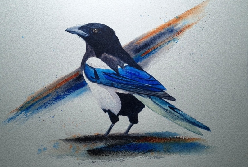
few gaps in that lane. Our docs and done. All we have left to do is the I and a few finishing touches. And then our magpie is complete.
11. Eye and Finishing Touches: Great job making it so
far into the video. I hope you've enjoyed
what you've seen so far. Almost at the finish line now. Just a few more finishing
touches for both. Start with, I am doing a
little bit of lifting. First, I want to lift a
little bit of color to indicate ring
around the magpies. I am doing the lifting the same way I
have done this class. Coming in with a damp brush, agitating some of the paint, and then lifting up the
paint using paper towels. In my other hat is a tiny light mark at
the back of his eyes. I want to get that in. Next, I'm going to turn
my attention back to the big where the layers
of his wing overlap. You can see speak soft, light. And I want to indicate those by lifting out a few streaks. In this lesson, it would help if you pay attention to
in your painting. You don't need to follow along
with every single thing. Blue. Maybe on Mac Pi does
not need to streaks. Maybe you've gone pool
light in the beginning. If that is the case, you can quite easily
add another glaze of Taylor blue to
indicate some overlaps. I'm working in now. We're easily do with
adequate kit of Taylor. Next, I want to turn
my attention to that bright white pat on
the shoulder of the math. But I want to add a little bit, tiny bit of feather texture that I'm using a brush which I didn't mentioned
at the beginning. It's a very tiny
flat brush displayed within damaged
because it's so old. It actually creates
a rather bad Reshma. But I need that random is in
this particular instance. The color I'm using is
also just leftover, warm leftover on my palette. I am putting in a lot of water, making it be
consistency and just clean it on the white patch and then softening it
with another brush. I think I'm done with
my finishing touches. You might need more or you may not need all these
touches, which I put in. That decision is yours. Now, we will move on to the eye. First. I'm just going to put
in that pinkish color which can be observed
around this eyeball. I'm using my pyrrole red and I'm just going to
muddy it a little bit. I'm gonna be using my
smaller brushes to do this. I'm just going to
lean the color flat. After you're done laying
in that pink color, give it a minute to dry. In the meantime,
you can go ahead and mix the color you
need for the eye. The eyeball appears to be somewhat of a
brownish color to me. I am using my transparent orange and a little
bit of Payne's gray, and also some leftovers
on my palette. I'm going to use
my smaller brushes and I'm going to lay it flat. I am going to leave out a
small.in this eyeball section, this is to indicate a highlight for a glimmer in
the bank by side. In case you're painting
it in a smaller site, or you are unable to do so. You can always get
that highlight that by using some
white gouache. After the layer is dry. You will need to be quick, grab some tick Payne's gray, and quickly lay it along the circumference of
the brown eyeball. Provided the layer of the
eyeball is still wet, this dark paint will slowly March into the eyeball and
create a sense of them. Once you've done this, give it a few minutes to dry. The next thing we're gonna do is I'll highlight at the
bottom of the eye, but you have to do lifting. You cannot come in
with opaque color later because you want
to have soft edges. In most of my paintings, I always lift out this little highlighted
the bottom of the eye and it gives the using of
the eyeball being spherical. And I like that very much. And with those touches, our painting is now complete. Thank you so very
much for joining me. I look forward to seeing you
in the next one as well.
12. Conclusion: I hope you had a lovely time painting your wonderful book. How did the electric blue
feathers of the wing? Are you able to keep your hanger and your
strokes confident? Did you manage to
collect all the colors of the magpie in
the big red wash. This step is never easy. The temperature and the
humidity of the room during play a large part in how much time
you have available. Were you able to lift
the highlights on your magpie and give
him greater definition? Provided you're using
good quality paper and still had a hard
time doing this. You may consider using
different colors. Some colors are easier
to use than others. And this inflammation is
present on the color. I'm really, really
looking forward to see all your
fantastic paintings. In the project section. I'll be used for any
feedback that you may need. Any stage along the process. Please do leave a review for this class so that I can make
the next one even better. Don't forget, you can follow me. And also on Instagram. So you know, when
the next one drops. See you soon.
 Aniruddha Gupte, Urban Sketcher & Wildlife Artist