Transcripts
1. Introduction: Hello and welcome to this intermediate level
watercolor class. Today, we are going to be
painting a horned for me. Now, this class is a little more challenging than my
previous classes. So if you are new to watercolor, I would strongly suggest
you check those out. Comedians are such
quirky looking animals and they're
independently moving. I is the projectile tongue and the color
changing superpowers. See my first chameleon
in the violin is a childhood memory that
I will cherish forever. And I would like to
believe that we all have a child-like fascination for
such a magical creature. The colors of a
comedian makes him such a striking visual subject. However, depicting those
colors while maintaining a fresh looking painting
is a challenge. A challenge I will teach
you how to overcome. We will learn to
surrender control. Let the paint flow as it wants. Let it freely mix on
the wet paper surface. As the paint begins to setting, we will slowly and
gently begin to add definition and bring
our convenient to life. As always, we will use plentiful but confident
brushstrokes. We will focus on large ships
and how to connect it. Not be bogged down by
perfection in minor details. We will embrace happy
accidents that take place along the
way and find joy, find fun in the unpredictability that the medium of
watercolor affords us. I'm Anita until I have a
professional background in both practicing and teaching service design
and industrial design. I also have an average loud for the outdoors and wildlife, stretching as far back as I can remember what watercolor is, a relatively recent
passion of mine. And it's a passion
that I now want to see how far I can push. This class is the
first step diabetic. It's a journey I am hoping
you will join me on. You can follow along my trials and tribulations on Instagram. I'm also looking
forward to publishing a few shorter length
videos on YouTube. I'm fairly active on my social media handles and
would be happy to connect.
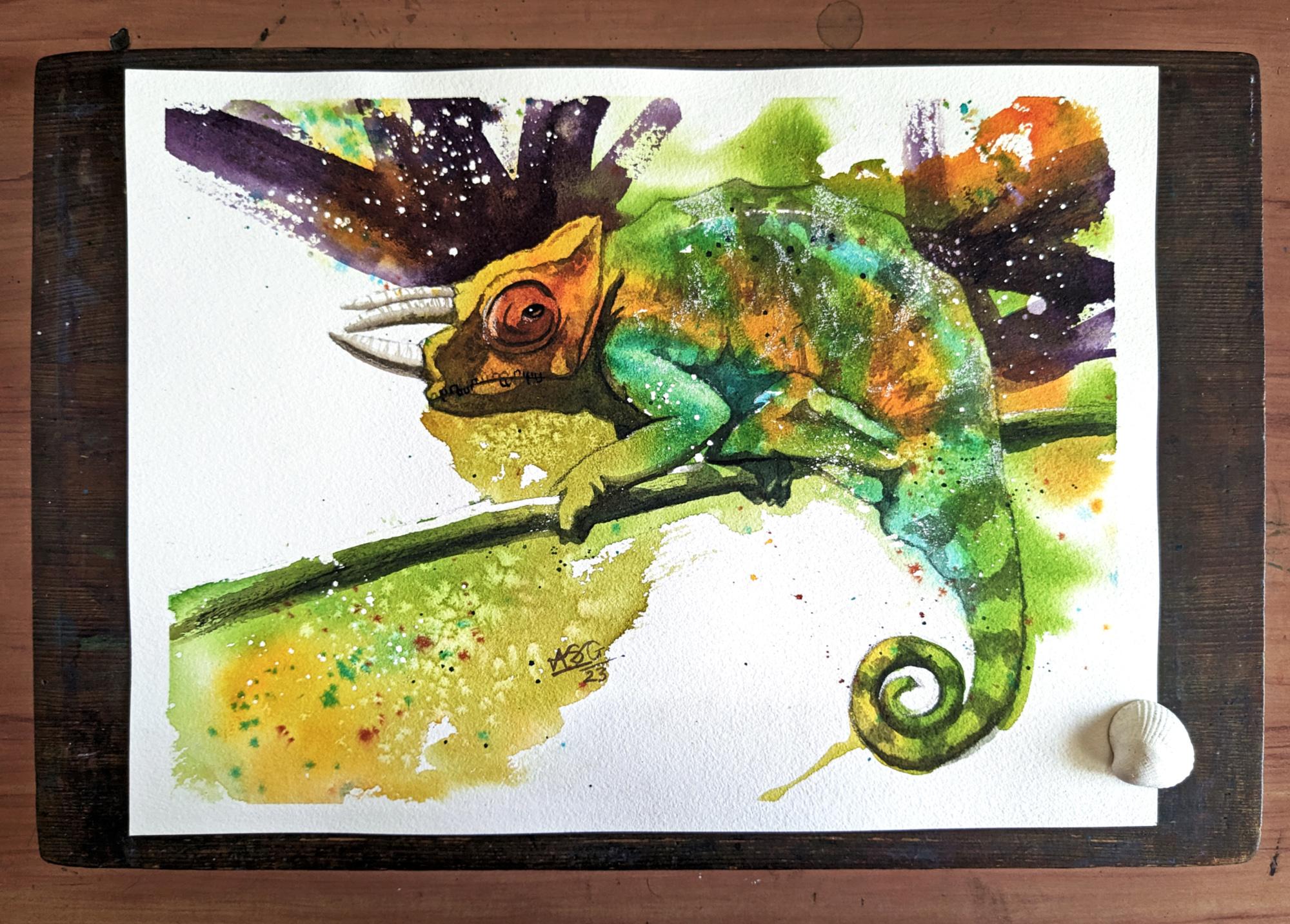
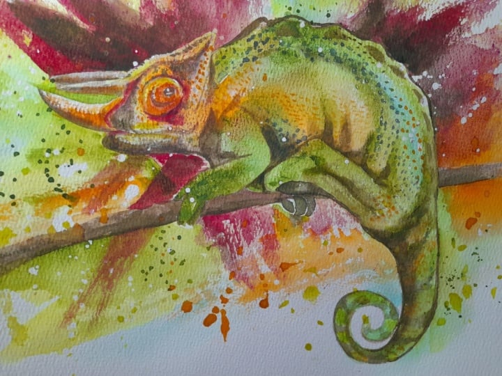
2. Approach and Materials: This right here is the
chameleon that we will be painting in the next 1 h.
In all it's kind of blurry. Before we begin,
there's a couple of things that I
wanted to mention. This class is all about
the painting bit. So I don't go that
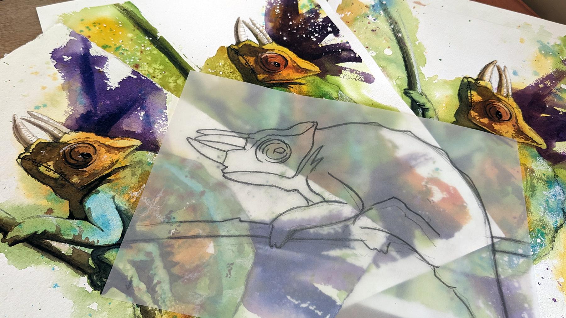
deeply into the drawing. To help you with the drawing. I have provided you this
line drawing template. It is available in the resources
section for this class. You can download
it, print it out, use it as a cutout
template to place on your watercolor paper and then put down the
lines that you need. You can also choose to draw
it from direct observation. The reference photograph that
I used for this painting, one I downloaded from Pixabay is also available
in the resources for them. The paper I'm using is a
bow home cold press paper. It is 15 " by 11 " in size. I will be mounting it on the
solid wood in drawing board. It's nice to have a surface that is separate from your table. Because in the class, occasionally I will be lifting the drawing board off and
moving it around a little bit. For the mounting I use, this is simply masking tape. I also keep this small
aluminum box handy. I use it to occasionally prop
up my drawing board like this so that I can draw
the flow of my washes. Other materials you will
need is as follows. Pencil and eraser
for your linework. Containers for your water. I like having two around, one, a little bit of clean water and one for washing my brushes. Palette for mixing color. This is a broken piece from
a regular folding valid. And before you ask no, this is not paint. I have managed to
damage the surface. Spritz bottle to keep
your washes active. And cotton rag or some paper tissue in case you have any
spills and need to mop up. Now, Let's take a look at the brushes that we will
be using for this class. Starting with the largest. This is a size four, goat hair mop brush. This is a size ten
synthetic head round brush. Although it says ten, I think it's closer to a twelv. This is a three-quarter
inch synthetic flat brush. I use it at the end of the painting to put
in the background. This is a size
eight round brush. It is a mix between synthetic
and natural fibers. This is a size six round brush. It's all synthetic fibers. This is a size
whatever assuming is a size three brush
round synthetic fibers. Apart from these, I do use a couple of other
brushes in the glass, but I can assure you that six brushes similar to these is oil that you
will actually need. Now we'll look at the colors
that we need for this class. New gamboge,
transparent firewall, orange, quinacridone,
violet rose, cobalt, turquoise, sap green, and lamp black. Any colors in your
collection similar to these savings will
work perfectly fine. This class. You don't have to have
these colors in particular. And lastly, a look at
some optional items. These will not have a big impact on the final
results of your painting. This is masking fluid. This is a damaged brush I use to apply masking fluid and
also sprinkle it around. I also use this toothbrush to sprinkle some masking fluid. This is white gouache. And this is a white
glass cutter. Spencer.
3. Masking Fluid: You're going to
start up painting with the use of
some masking fluid. This step is optional. If you don't have masking fluid or if you don't
like masking fluid, I would advise you to skip
forward to the next lesson. I'm using an old
toothbrush school splatter some masking
fluid on my paper. The reason I'm doing this is
because I like the type of droplets are toothbrush gives you droplets that are
both large and small. I don't think that's the best way to put
out masking fluid. I don't use it all that often swim a little clumsy
with my application. What I'm doing is I'm dipping my brush to the masking fluid and then bringing
the brush over to the paper and tapping it
so that the droplets fall. I want those droplets to be in spots that will be covered
by paint later on. As you can see, you can
also use your tongue to get more variety in the types
of droplets and spatter. Brush dip In your masking fluid. Make sure to wash it off, rinse the masking fluid off
immediately after using. Otherwise, it will become a
speaking mess as it brace. I'm now using cheap round brush for applying for
the masking fluid. I change brushes hoping that there will be a little
more variety in the splatter. As I mentioned, this is
a super cheap brush, so I do not really care
if it gets damaged. In the reference image, you can observe that the top of the branch is catching
an adjuvant of sunlight. I want to preserve the
light of that area. Hence, I am masking it
with the masking fluid. Masking fluid needs a
few minutes to dry off. If you want to make
the process faster, you can run a hairdryer. If for the droplets
of masking fluid have landed on a spot that you
do not want them to be in? You can take them off, wipe them off with the eraser
as soon as they are dry. Once this masking fluid is dry, we can start with our
first layer of paint.
4. Big, Splashy Wash: Are you ready? Let
us begin then. As we often do here, I'm going to start by
preparing my puddles of color. First stop is my warm
new gamboge yellow. I'm going to use it without mixing it with any other color. However, I do need to
adjust its consistency. And I do that by
adding more water. I wanted this mixed
to be around milk. Next up is sap green. No mixing your either. I am just going to add
water and putting it up. Milk consistency again. The third party is off
for cobalt, turquoise. This one is a little bit of
a tricky pigment to hand it as it lifts easily and is
granulating in nature. This party will be somewhere in-between milk and
coffee consistency. Next, I am going
to strategically vector down parts of
my pencil sketch. This is very similar to the
approach for the class. However, this time around, I'm being more strategic
in the areas that I bet. I am going to wet down the
comedians head entirely. And I'm going to wet down
large sections beyond the lines of the community while leaving his body mostly dry. I'm choosing the parts where considering where I want the paint to flow once I
introduce it on the people for his being, I think
I'm going to stay within the lines because they want to preserve that interesting shape, that interesting
silhouette of his speed. I've introduced a
lot of water to my paper and as you can see, it's begun to buckle in parts. If you want to avoid
this completely, you can stretch your paper. I usually don't do
that in this instance, have just skipped it
down to my dry-bulb. Have left most part
of his horns and dry. However, I want some paint to flow in the bottom
area of his horn, the part covered by shadow. I move my drawing board around to make sure the water
is spread evenly. Small spirits from
my spritz bottle and we are ready to
introduce the pain. I will start with the yellow, as that is the lightest value
of the three colors I have. I'm going to use the yellow
to cover the comedians head. And I'm also going to go beyond
the sketch lines so as to make sure that the color flows into the water that
I've laid down earlier. For this part, I have three brushes ready,
one for each color. I don't wash the
brush after use. Acre different brush
for the next color. Be bold and playful with
your brush strokes here. This is a Chan School began. Let the paint flow. Only thing to be mindful of
is make sure enough of it is flowing in those wet areas
that you have laid down. As I laid my turquoise down, I can see the yellow and the green are very
quickly flowing into it. That's just the nature of
the turquoise speak boot, something that you
need to be mindful of. I am introducing green to the
bottom part of that branch. The comedian is up
and connecting it to the paint already laid down in the face
and the chin area. Don't forget to
introduce more paint to the tip of that
branch because we want a nice flowy section on
the bottom left of the page. It's best to work
with at this stage. Don't want the paint to dry on you before you can connect
it to the next segment. In spite of what
I just said last, could have actually waited
for a few more seconds before connecting that yellow and green and the turquoise. I don't like how much it has
flown into the turquoise. Oh, well, that is watercolor. You do not have any
control over it. And it's quite often
very difficult to predict how it will behave. Have to embrace the
chaos sometimes. Making sure I stay within
the lines for this section. Now want to add a little
bit more turquoise. See if I can salvage
the situation. No, I don't think
that's helping. Probably would be best if I just provide some of the
color that lifted off. Next, I am changing that yellow, making it warmer by adding
a bit of orange to it. In the reference image
I can see the feces. You have been more
orange than yellow. So I'm going to introduce
it there and also dropping in some of
those yellow patches. I'm just going with the flow. I'm just doing
what fields right? There isn't a premeditated
approach to this. The painting itself
is telling me where I should add when next. My advice to you
would be listening to your own painting
rather than follow every single step that I'd feel free to try
something different. I am now going to come
back with a clean, damp brush and lift some pigment from the top of his
food and his elbow. You can see in the
reference image that part is catching
some of the satellite. I'm trying to lift
something from his bag, create a greater sense of form. But I don't think it is quite working the way I
thought it would. I'm taking a minute to
stand up, step away, one step away from
the painting and make sure that everything is
who my satisfaction. The wash is still wet. And if I need to
change anything now is the time I have just lifted up my board
and I'm moving it around, letting the paint flow
a little bit more. Hopefully giving me edges
that are even softer. I have decided that there's a couple of additions and if you bake ecto coexistent bugging me. But the more I fidget with it, the more high risk
ruining it entirely. I also want to add
some red around his eyes as they can observe
in the reference image. To do so, I am going to mix
of color, Losing my orange, my Quin Rose, and some blue. While the wash is still wet, I am going to introduce
it to the eye area. And maybe you are to
splash some of it. Jordan there in the backwash. I'm not happy with
how hard the edges have began to appear in the
bottom left of the people. I'm going to come in
with my big brush and some water and soften
some of those agents. Just run my brush along there. A couple of other optional
things you could do now is if we add soy, who some of the wet wash to give you some nice
interesting texture. Some more lifting is also possibly could lift a little bit of the red from the
front part of the eye. I am with the lift for the
highlight from his legacy. And with that, we are
done with this layer. We need to wait for the paint to dry before we can move
to the next layer. So if you plan on
taking a break, now is the best time. But apps make yourself
a cup of tea and then come back and start
with the next layer.
5. Horns and Head: From your own forward, we will mostly be working
with darker tones. The slight exception
to that are the horns. As we have left them. People, like in our host, clear color I'm mixing for the horns is I don't
know how to describe it. I think I just described
it as dirty brown kinda. I have added some ivory
black to the red, which was already on my palette. And also a little bit of orange. And now I am diluting it
further by adding water, bringing it down to something
off would be consistency. I need a darker, stronger version of the
same color as well. For the core shadow. Swam mixing another thicker
part of the same color. This time at milk consistency. I will start with the
tea consistency color. Applying it to the bottom
part of the whole. I am using my number six brush. Again, come in with my brush clean this time to
soften that edge. Now I'm going to use
my number two brush WHO be market or fewer
ridges on that one. Give it the fusion
of being circular. Now move to the Holland top. Again, starting with
the key consistency. Even connecting some of those images and
softening the edge. Then adding ridges
there as well. Next time dipping into the
thick consistency button and adding a shadow to the point
that you began the process? Yeah. I waited until it
was at the point of dry. So it spreads just
the right amount. I now repeat the process. The third on. Again,
starting with the tea consistency,
softening the edge. Then coming in with the
smaller brush to add the ridges. Best to be quick. Finally dipping
into the thick of pain and adding the core shadow. Some of the horned shadow
falls on the chameleons fees. Just a little bag. I want to extend that a little bit so that I can connect it to
the main shadow. As I progress. We will now turn
our attention to the shadows on our
chameleons face. Before I started painting, I had marked those
shadow areas in pencil. Now it's quite possible
that after laying down the first wash. You may have
lost those pencil markings. If that is the case, I would advise you to strengthen them before we start
adding the shadows. I am going to tackle the
shadows in what I can only describe as a little bit
of an intuitive approach. It may seem complicated
on first viewing. But trust me, it is fairly easy. On my palette. I am creating
a mix of blue and orange, opposite colors on
the color wheel. However, I'm not mixing
those two consistent. The bottom of that
palate to the oranges, more probability to
bind on the top, the blue is more prominent. I'm using my spits, bought it, further dilute that
mixture to somewhere between milk and
coffee consistency. Take your time with the mixing. Getting the consistency and
value of this mixed correct, is more than half
the battle won. Now when applying the shadows, I will be dipping into
a different mixing them each time I come back
to reload my palette. This will ensure that my
shadow is colorful and paid. You get it. As I begin with my shadows, you can see that I'm
constantly looking up. I am looking at my
reference image. There's no need to
be in a great rush. Relax, slow down. Carefully sculpt in
that shadow shape, as you can see in
your reference image. And as you have marked
with your pencil, I have lost some of
my pencil lines. That's why I being
extra cautious here. Currently I have my board
maybe around 15 degree angle. Even though there isn't a rush. I do want to connect
it connect to the fish shadow as
a single backwash. Working at a tilt
means that I know which edges will dry first
and which will remain active. The bottom ones will
remain active longer. Knowing this novel only enables me to accurately judge drying time as
I connect the shape. It also allows me to occasionally
come in with a clean, damp brush and soften an edge or I am working with
the combination of my smaller sized brushes, my number six, number three, and number eight round brushes. If you want to buy yourself. Additionally, you can
use the spirit spot. We put a big split this week. Keep the wash active
what Nikki way longer. Gently and want to work that
wash into the neck creases. Changing the color
every step of the week. Okay. Time for a
random chameleon fact. Did you know the
community and that your painting is called a
three horned chameleons. Jackson's chameleon. It is native to Eastern. Africa. However, since it's a very popular
escaped animals have formed the colonies in quite a few different
parts of the world. The shadow on his neck will
better define his left for. What I'm doing now
is essentially negatively painting around that. Now is the ideal time to add
the crease of the mouth. I'd also add some of those
skills along his mouth. The lens so much character
to this convenient. Tinker v Des sculpting
a sheep slowly, gently. There isn't a need to add
in every single skill. Just enough to indicate that there are skills
around his lips. I'm now at the risk of working. Next section. It's
going fine so far. But each time a comeback to it. There is an element of risk. And now move that darker area. The small shadow
cast by those dots on his on his head, color, whatever you want
to describe it, that is gently doubling my brush, creating a stippling pattern and connecting it to the
rest of that shadow area. There is a small shadow on the back of his neck
cost by his color. Don't forget that one. Don't miss that because it
adds definition to the head. It's a lizard as rough skin. So feel free to use your fingers to smudge
some of the pain.
6. Belly and Branch: Now we can tackle the belly, the shadowy areas of the body, the same way we did the
shadows on the face. I will continue
using the same data, but the mixture of blue and orange have also dipped my brush in a little bit of
turquoise this time around. It's slowly and gradually. That shadow on his belly, shadow on his leg and the
shadow on his left foreleg. I'm now coming in with an almost dry brush and scuffing up some of
the edges of the shadow. If you notice the
reference image, there are flaps of
skin folding there. And I want to create that impression with
these dry brush strokes. All the time. Be mindful that
your wash remains active. Washington means more because you need to connect
it all together. Violet is still
vague. Once again, I'm working with my
paper at a slight to ensure that the bottom edge D
is active for a bit longer. I am now connecting
the shadow on his left foreleg to the stem
Nick, he is standing on. It's just one large sheet. We can negatively paint around his fingers to give
them better definition. As I move the shadow
from his Ford leg leg, I will connect that shadow. The doors of his
left leg is wet. Occasionally I'm coming
in with a clean, damp brush to smooth in
an edge, you are in bed. I know all this might appear
as hard. It can work. But do remember to relax, enjoy the process.
Have fun with it. I keep repeating this, not just for you, but also for myself. Even though I have painted this convenient multiple
times though, when I turn the camera on, it gives me a little
bit of anxiety. I have no continued the
shadow from his toes onto the folds in the muscles
of his left leg. All through this section, I have been using
a combination of my number three and
number six round brushes. I now want to add some dry brush marks or
his left leg is back. I can see those flaps
are folds of skin there. Now connect that dark section of the muscle foil to what
appears to be his bottom. Before the rest of that
wash entirely dry. I thought of introducing a
little bit of darker paint, some sections that need it. This was a
spur-of-the-moment decision and I hope I don't
regret it later on. I'm also trying to dry brush
some texture on the branch. Going back to his bottom, I will further
extent that shadow to better define his belly here. And I'm going to use
that active edge, add some stripes on to speak. Who create those stripes? I'm not using any
color in particular. I'm just picking up the
leftovers on my palate. I'm going to pick up some
more leftover paint, dry brush it onto the
body of the community. Not only will this add
texture to his skin, but hopefully also create
a sense of his body. We're almost at the
end of this lesson. I just need to add a few final touches to bring it up to a
satisfactory level. I just noticed that
I still need to add the shadow part of the branch on the right
side of my paper. Once this shadow goes him, not only does it
define the branch, but it also better defines the silhouette of the
chameleon as well. Each of these steps slowly, the chameleon is coming to life. The first time I saw
a real chameleon, it was actually in the wild. I must have been ten
or 12 years old at the time and was taking a school trip to
the local National Park. The guide who was
accompanying us, found in Indian
chameleon in one of the low-hanging
branches. He caught it. And I was the lucky boy to get a chance to
hold it with my hands. In my excitement, I dropped the work of
Illiad or to the ground. And in an instinct, he changed from
green to black and began his senior to me with
aggression, the medications. I want to have another go at the contour lines
of his ellipse. This time, I am also
going to indicate the parts which are covered by the shadow make them when
it is stronger and darker. I also just noticed that I forgot to add the
shadows to the loop. Silverstein. Oh, well, we can just do that
in the next lesson.
7. Bold Background: Let us now begin
with the background. The objective of
adding a background to better define the
silhouette of our chameleon. And also to dictate how the viewer's eye travels
through the painting. In this instance, I've already decided where I want to
paste the background. However, quite often, I am very spontaneous with these
tables Decisions. So you can feel
free to improvise. I'm going to make the
background contrast with all the yellow. Get this popup. I'm mixing my wind rose and my azure blue. I have mixed burdens of this. One is a peak. Somewhere between
milk and cream. Consistency. By the
second is fairly died. I would call it E consistency. It'd be painting
this background with the flag three-quarter
inch brush. Right now I'm coming in with
a damp brush and marking the area against the pencil may actually be the extent
to which the purple flows. I want a fair bit of it will
flow against black, white, or giving me a nice contrast between the white and dark book does have now come in with some consistency
showed on my brush. Quickly putting down
directional brushstrokes. That's looking just about fine. So now I want to add variety
even within those strokes. To do that, I have my brush in the stronger cream mixture and again applying it
to the same giddy. The earliest strokes are still ensuring I will get
the smooth edges. For a little more variety. I'm coming in with the
almost clean brush and softening one of
the harder edges. For a thinner stroke you can
use the edge of the brushes will keep it simple. Try not to fidget too much. Spot as soon as you feeling
that the result is, is working the way
you want it to. So as repeat the same
process around this back. No. I give this a reality. It's smaller than the
one in the frack. Be consistency first, then
can even consistency. And the smooth NH2. All right. So now I turn my attention
to steal one more time. I'm just following what I
see in the reference image. There seems to be a dark
ridge running along his back into a fee that if I further define that the silhouette of the company
and will be more distinct as we did with the
space and his belly. It would be nice if we can connect the shadowy
bits on his team. Has once in good shape. You know that chameleons
have a pretty insane and can easily
use it as extra limb. Get a grip on
branches and stamps. I apologize for the
deteriorating light quality. It's almost sunset. You're now I haven't been very good with my
time management today. To make sure I can keep the shadowy parts and
they feel connected. I think I'm going to
go with his stripes. One more type is when I have decided to do a few more dry brush
marks over his body. Just to add more of a
feeling of volume there. If you ask me how I'm making
decisions at this stage, I will not be able to answer. Most of these are
unconscious decision that it's the painting which speaks to me and
I answer with my gosh. So if you don't feel
that your community needs this, don't do it. Next, I want to add
further strain. Who some of the kidneys
is around his eye. For this, I'm just going to use the dark pigment quality
there on my belly. Maybe add a hint of
ivory black boots. Slowly and gently just follow along with
your pencil lines. If your pencil lines have
been lost in the previous, wash them down again
and then put the paint. There is no hurry at this point. There is no paint drying on us. There is no wash that needs to be connected
or kept the length. I'm using my number three
synthetic brush at the moment. Fin, at the end of a painting, adding such hits of
paint on a dry surface, I find that this type
of synthetic brush is a lot more efficient than
our natural hair brush. I find it very difficult to find a good stopping point when it comes to these
finishing touches. I can go on forever. So now I want to make a
conscious decision to stop and then paint the eye.
8. Eye: It does not paint the eye
and complete the painting. For the eye. I'm going to use ivory black without mixing it
straight from the tube. I'm using my number three
synthetic brush again. I have a little
paint on my brush and I am simply blocking
in that section. Make sure to use a small space, brush and get that
shape accurate. Could even exaggerate those
flaps of skin across the eye. Once that is done, give a few seconds
for the Bean who said you can go from wet to them. Now, come in with the moist, clean brush and lift out a highlight on the bottom
right part of his eye. Just the way I am boot. The only essential step now is to add a little specks of white to his eyes to
indicate a highlight. All the other steps I'm
going to demonstrate now. Optionally, the need to define his left hind
leg a little further. And I'm going to do that by
lifting a small amount of P. I do this the same way
I did for the eye boy, I come in with a
clean, moist brush, dampen the area I want to live, and then press or dry
tissue or export who lived. So next I'm gonna come in and have a play with
the white colored pencil. And using the pencil to exaggerate some of the highlights
on the comedians piece. First. Next I will exaggerate the
highlight on his legs. Now I am adding some stripes
on to the chameleon, hoping to build
further definition and volume to his body. Brick work a lot better
on my practice piece. But I'm not very happy how it is looking on
this particular intermediate. Think it's best I stopped
before I ruined it completely. Hello, I'm using
my kneaded eraser to rub the masking fluid. I drove on the paper before
I started the first wash. This will expose the
people white and give you an idea of the effect the
masking fluid has given us. I've sped up this clip
to save us some time. I can't erase that
fast in real life. Next, I'm going to
use white gouache to add that link in
the chameleon xy. Now, I could easily have put a small dot of masking fluid
before I start the painting, but I forgot to do so. Are there alternatives to get this green gel pen or even
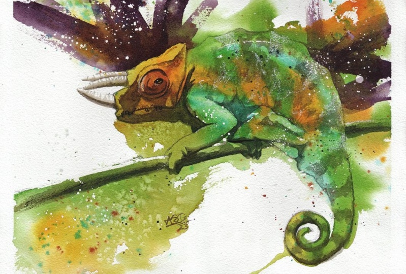
white opaque watercolor? Alpha literal signature and the moving of the masking tape. And our quirky colorful
chameleon is complete. Thank you for painting
with me here today. I am grateful to
you for making it all the way to the
end of this class.
9. Conclusion: I hope you had a fantastic time painting your color picker. Was it fun letting go? Observing how the paint flows and it mixes on
a wet paper surface. What combination of
colors did you use? It's always best to let
the paint do its thing, but also keep an
eye on it just in case you are able to patiently paint in the shadows being cast
on your complete. Able to keep those shadows
colorful and fresh. In situations like these. Planning is far more
important than speed. How many of those special
effects options where you can? You try the masking fluid and
you try the colored pencil. These are all fun
additions to any painting. However, it's easy to get
carried away when using them. So it's best to earn on
the side of caution. I'm really looking
forward to see all your fantastic paintings in the project
section down below. Please do leave a review for this class so that I can make
the next one even better. Don't forget, you can follow me. And also on Instagram. So you know, when the next
one drops. See you soon.
 Aniruddha Gupte, Urban Sketcher & Wildlife Artist