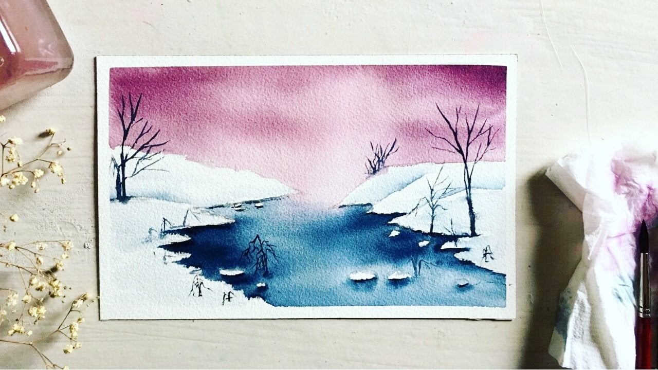
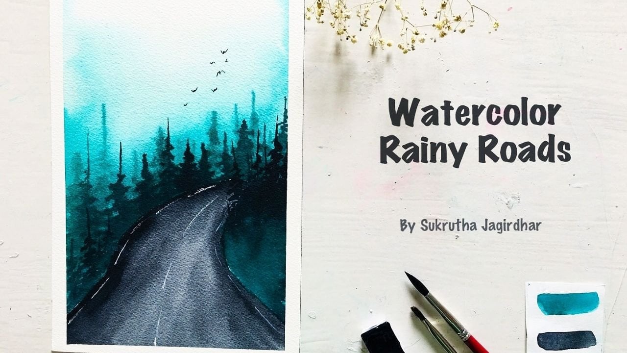
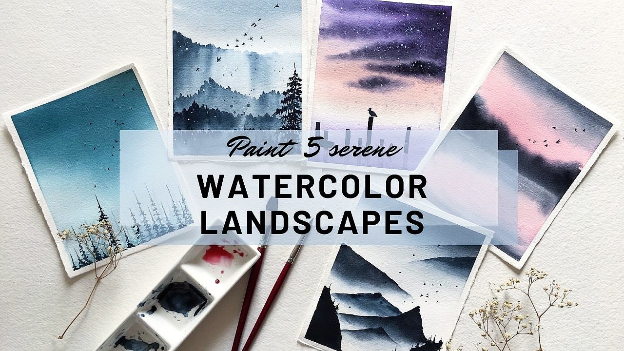
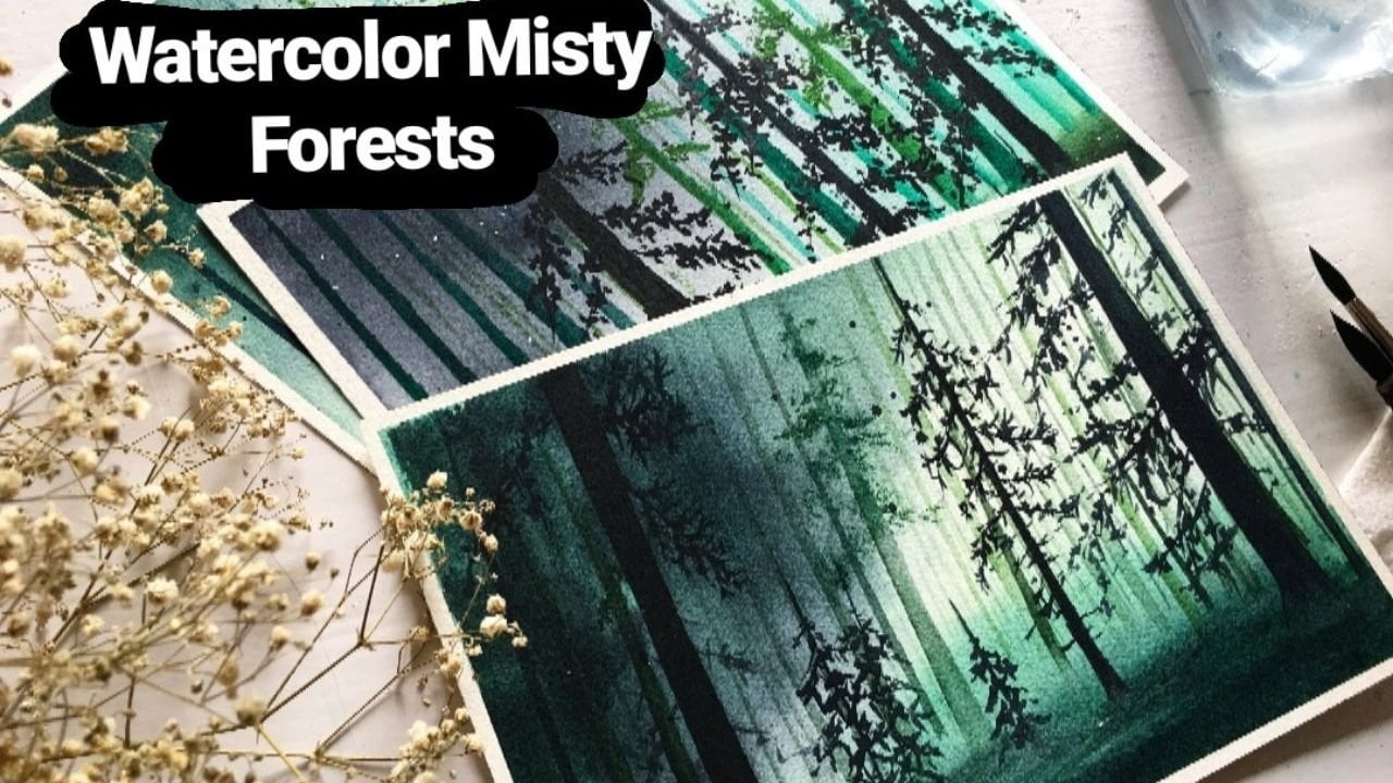
Transcripts
1. Introduction: The oceans are the heart of our planet. Well, who won't love to be in a company of sea that is so blue and those little white waves come crashing at your feet? Don't you just love the soft sand throughout the beach? Well, we may or may not be able to go to a beach right now, but we can certainly paint a few. Come join me and we're going to have a lot of fun painting a lot of different oceanscapes today. Of course, I'm going to walk you through the techniques, wet on wet and wet on dry, before we start with landscapes. Hello, this is Sukrutha, watercolor artist and teacher. This class is perfectly beginner-friendly, so are you ready to paint three beautiful tropical oceanscape? If the answer is yes, then I'll see you in the next video where we're going to discuss the art supplies that we're going to need.
2. Art Supplies: Coming to the art supplies, let's first discuss the papers. I'm using my favorite watercolor paper that is Fabriano 300 GSM, and 100 percent cotton, and it's cold-pressed. I buy these papers in rolls and I cut them up in the sizes that I want. Today, I cut those rolls up in squares. If you don't have Fabriano, that's okay, you can use any papers that you have and make sure they are 100 percent cotton because we're going to have to blend a lot here, oceans, beaches, and water. Hundred percent cotton paper makes blending easier. Now, coming to the brushes and it's an easy one. I am using only three brushes today. It's bistro hake brush, and I will use this brush only for wetting the paper. That is the first step. Because this mop brush that I have here, silver black velvet, it's quite smaller in size; I should have brought a bigger size. For the first step that is blending an entire paper, or even half of it, I'll be using this hake brush. Now, the silver black velvet number 14 brush, I'm going to be using this brush a lot to paint oceans, beaches, and mountains, and whatnot. Now, I have this small number 6, silver black velvet brush. It has a very sharp point. I'm going to be using this for detailing work, and for painting small things, and for splattering, of course. You don't have to use the hake brush if your mop brush is bigger. You only need these two brushes for all the three landscapes. Now, coming to the most important aspect of art supplies, that is paint. All of the paint here are from White Nights. It's very important to have the right shade when painting the oceans and beaches. Hence, I thought I would make swatches of all the colors that I'm using. You guys will get an idea on what colors you're going to be using if you don't have these particular colors. I'm going to get started with the heliocoelin bright blue. It's from White Nights. If you don't have this color, you can use ultramarine blue are Prussian blue. Coming to the next color is turquoise blue from White Nights. As you can see, the turquoise blue is actually more like a green color from White Nights, so what I did is I have mixed both bright blue as well as turquoise blue to paint the ocean. I'm going to show the shade right now by mixing these two colors. There you have it, the rich blue ocean color, which is perfect to paint the tropical oceans. If you guys already have this shade, you can directly use it, or else you can mix any blue, ultramarine or Prussian blue with turquoise green to get that blue ocean shade that I'm going to be using today. Now, coming to the next important shade raw sienna. Now, you have to be very particular when painting the beaches, you have to be very particular about the shades. If you don't have raw sienna, you can use a Naples yellow or gamboge yellow mixed with very little of white paint. I have used brown color, caput mortuum to add a little bit of depth to the beach as you can see in the landscape. I'm going to be bringing you that particular shade right here. If you don't have caput mortuum, you can use any brown shade that you have. If you don't have any brown shade, you can use burnt sienna, which is a very common color. For the beaches I have used raw sienna and caput mortuum. For the last shade, it's payne's gray. I have payne's gray on my other palette, I'm going to be using just that. If you don't have payne's gray, you can use ivory black. As you can see, I have used payne's gray to paint mountains and rocks. There is only one color left that is white to paint the waves. For this, I'm using Chinese white watercolor instead of whitewash. Now, these are all the colors that we're going to be needing to paint all three landscapes. I would suggest to keep all of these colors on your palette before you get started. I forgot to mention that white watercolor is from a brand called Camel. If you don't have it, you can use any brand of the color. Of course, it's not necessary to have the same brands as I'm using right here. You can use any brand of the colors, but make sure the shades match. Now, a few extra things: water jar, tissues, and palette. That's all the art supplies that you'll need.
3. Techniques: Let's go over the techniques. The first technique is wet-on-wet. As you can see in all these three landscapes, the oceans, the beaches, and the right waves are also shamelessly blended together without losing their colors, and it only happens when you go for a wet on wet technique and as you can see, the same thing is happening in this landscape as well. All three colors perfectly blended together. I'm going to show you the exact steps that I follow to get that perfect blending of all three colors. Let me quickly draw a box. Now let's get started by wetting the paper, and now remember, the paper doesn't have to be soaking wet. Even if it is quite damp, the colors will blend perfectly together. Let me first take the bright blue color, followed by a raw sienna, and then I'm going to add light color in the middle. To blend all these colors together, you need tissue paper. Mold excess water present on the brush using the tissue, and then slowly blend all the three colors together using the damp brush. I'm going to add a little bit of blue color because it was looking rather dull and you don't have to, this is just a demonstration. Now, blend using the damp brush until you feel right, until you feel that all three colors have blended perfectly and that there is nothing more else to do, and of course, you have to do all of these blending and adding the extra colors while your paper is still wet, when you sense the paper is drying, that's when you have to stop. As you can see that blue patch color. Now I think I have to stop because the paper is drying and as you can see the blending is perfect and I feel very happy with it. This is a very brief demonstration of wet-on-wet technique and you definitely need 100 percent cotton paper for this. That's it for wet-on-wet. Now let's move on to the next technique wet on dry. Wet-on-dry is used to paint the mountains and the rocks. I'm going to draw a box and I will show you how I paint wet on dry. We are going to be painting the mountains and rocks on wet-on-dry. We first need some background so we can paint the mountains and rocks on it. Briefly, I'm going to paint some beach scene. This is not at all correct. I'm not even using any technique to paint it. Just some rough sketch. Now, I'm going to have to keep this one for drying, and after it's dried, we can paint the mountains. I'm going to keep this one drying and I will come back in a few minutes. You guys might be wondering, what is a wet and what is dry here? I'm going to explain in a bit. We can see the paper is completely dried. Now I'm going to take a small brush and binds gray, and I'm going to dip my brush in the water and take the bind gray. As you can see, my brush is wet and the paper is dry. It's wet on dry. Wet on dry technique is one of the most important techniques in watercolor, right along with wet-on-wet because this is when you add detailed structures to your painting. I'm going to show you what happens if we add mountains or rocks while the paper is still wet. I'm going to quickly make a small sketch of a blue ocean. If we try to add the mountains while it is still wet. You can see you cannot make any detailed structures. Wet on dry is as important as wet-on-wet and to paint not just this ocean scapes, to bind any of the landscapes, you need to learn wet on wet and wet on dry, both techniques and these two are the only techniques that we're going to be using to bind these ocean scapes. I hope you enjoyed watching these two techniques that I have showed you and let's quickly move on to the class projects.
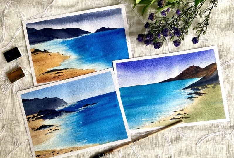
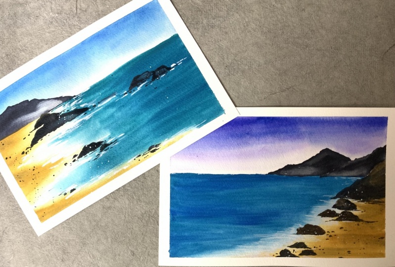
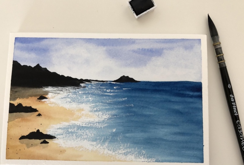
4. Class Project - 1 - Pristine: Let's get started with the first class project. Since it's the first project, let's go for a simple and easy landscape. I will start with a simple sketch, but you guys don't sketch until I finish my sketching because I'm going to be making a lot of changes, so at the end, you can pause the screen or take a screenshot and finish your sketching. This is a very simple and easy landscape with just water and a few mountains and rocks and of course, the beach. I'm not following any reference picture for this one, so it's just me imagining things and sketching them. When you don't follow your reference picture, it's going to be difficult for you to point out the horizons. That's what's happening here. I actually put out the wrong place for the horizon. I'm going to be changing it up. That's why I told you guys do not sketch until the very end. I think we had in the clear, this is the final sketch. You can now pause the screen and complete your sketching. I hope you are done with the sketching. Yeah. Let's get started with the first step, that is wetting the paper with clean water, and I'm using my Hake brush. It's from Brustro. As you can see, I have only wet the paper till the horizon line because I just wanted to finish it off with the sky area. To paint the sky, I'm using blue mixed with just a little bit of purple, so I just wanted to do that stormy effect for the sky. Remember we're not painting with the purple color, we are mixing it with the blue. Even you mix those two colors, it's gonna look something like this. There is a little water drop on my paper, I'm just going to adjust it. Now I'm going to keep this for drying, and I'll come back once it's dried. Now let's move on to painting the water, and for that, I'm going to be mixing bright blue color with dark ice blue. This dark ice blue is more like a green color, so that's why I'm mixing blue. As you guys see, I'm not wetting the paper first here, I'm just going directly with my paint, and this is wet-on-dry technique. With a very wet brush, drag the paint down to create the ocean. It's okay if you paint all the rocks, they are going to be in darker color later, so it doesn't matter. Now I'm going to take a little bit of blue on my brush, and I'm going to add a few brush strokes in the ocean. Having different shades of the color gives perspective and depth. Now I'm going to add a little bit of water on the right side of the paper, and I'm going to get started on painting the beach, and for that, I'm using raw sienna color. Like I said, adding a lot of shades gives perspective and depth. I'm mixing a little bit of blue with raw sienna, and I got this greenish sienna color, and I'm just going to blend it with the rest of the beach. I'm blending it until I feel satisfied. I think I'm good. I'm going to keep this for drying, and we'll come back once it's dried. I'm using burnt sienna and raw sienna, and finally, pines gray to paint these mountains right now. Again, plainly add pines gray, it doesn't make much of a difference, I thought it does but at the end, it did not, so if you are comfortable, you can directly add pines gray without all these colors. Slowly continue painting all of the mountains with the same color and do not let the edge of the mountain spread into the water. Just end it at the horizon line. I don't know why I'm using raw sienna here because when I look at the end of the landscape, it did not really make any difference. I should have just used pines gray, but if you like using all these colors, you can go for it, or else like I said before, please directly add pines gray. Now we have moved on to painting the mountain that is on the beach instead of far away, like in the background. Now let's add those tiny rocks. I think these rocks are the main attraction for this landscape. It's time to add the waves, so I'm going to use white color, Chinese white and [inaudible] gouache, and I'm going to take a generous amount of it on my brush and I'm going to get started. Guys, can you see my brush is not soaking wet, it's somewhere not damp and dry. Taking a lot of paint on it, and just do you know, moving my hand in a horizontal way is really great technique to paint those waves that are coming crashing down into the beach. Once again add these waves until you feel satisfied, until you see the whole picture. But please remember, it's also very easy to get carried away and paint a lot of white which is totally unnecessary. Think of what I just said, applies to me too, so I'm going to stop it right here and call it the end. One more step, I just splatter some paint, the white paint on the rocks. Now I think I'm really done. Let's quickly move on to the next landscape. I hope you liked painting this one with me. Thank you for watching.
5. Class Project - 2 - Untainted: Now let's get started with our second class project. I'm going to get started with sketching. Like I said before, please wait until I finish my sketching because I'm going to be making a lot of changes. I'm going to go with the horizon line. Later, I'm going to be adding those big mountains in the background. Later, I'm going to get started on sketching the small rocks. I am actually referring picture I found on this website called Unsplash for this landscape. Picture, I'm using for references right here on the right side. But even if I follow a picture, I always add my own imagination, be it in the form of colors, or the placement of things. But I guess I'm making an exception for this class project because at the end, this painting really look like the reference picture. These two rocks right here will be in the middle of the ocean water, and the rocks that I'm painting now are on the beach. Like I said, I'm following my reference picture for the sketching also. The interesting part here is to find out where the white color should be. I'm just drawing a dot as well, and I'm going to write w, as in white, to remember by while painting. Hope you guys paused the screen before and taken down the sketching. Now let's get started with painting the sky. I'm only writing the paper till the horizon line so I can paint the sky. We're just going to paint the sky with clear and bright blue color. You know, when the sky is blue, it means that it is a sunny day, and when it is dark, it's going to rain. Obviously, you know that, I don't know why I am telling. Once you are done with the sky, it's time to keep this for drying. I'm going to come back once the sky area is completely dried up. Now that it's dried, let's move on to painting the ocean. For that, I'm going to be using bright blue color and a mix of dark ice blue, like we have done in class project one. Start from the horizon line, and you can absolutely paint over those rocks in the middle because they are going to be in binds gray color later. Keep in mind that white space in the middle in between the water and the beach. Do not print anything, just leave it as it is, the white, I mean. Very quickly, clean your brush and take off all the water from it using the tissue paper and slowly blend that blue color. If your paper is completely dried up and it's going to leave those stains, so what you can do is take another coat of paint and just paint over it. It's one of the few techniques that actually works. Then proceed with blending. Now, I'm using a small brush. Am I? I don't think so. Don't change the brush. With the same brush, I'm taking the white paint and I'm just going to be adding it in the space where we have left w mark, and continue adding the white to that whole space. Now, I'm going to use a raw sienna and proceed with painting the beach. Again, do not paint over the white color. We need to save that white color as it is. I'm going to take a little bit of Caput mortuum or any brown color. If you don't have caput mortuum and slowly paint over that raw sienna. Do not completely cover the beach area with caput. Just take a little amount paint on random places so that different shades gives the perspective on unduct, like I've mentioned before. We are almost done and there is this blue that is there in the middle of the paper as you can see. I have to correct it. If you did not get this bloom, you can ignore the next step. I'm just taking my brush and slowly going over to paint once again and whenever I get blooms, I use this technique. Now, it's time to keep this for drying. We'll come back once it's dried. Now, we have to take pines gray and get started with painting those mountains and rocks. I have used a lot of unnecessary colors to paint these mountains in class project one and for this class project, we are going to be using only pines gray. It's quite easy to paint these mountains with pines gray because the ocean part, the beach part, and the white color is all quite dried up very nicely. If they are in any case wet the pines gray that we are using now will bleed into these colors and it's going to ruin all of the landscape. Please wait until the previous layers are dried to add the next layer in watercolor. Now, I'm painting those rocks in the middle of the ocean using the same color, pines gray. Now, paint the ones that are on the beach. Going to just add small rocks here and there on the beach. The small things really gives a lot of perspective to a landscape. The small rocks over here at the bottom as well. Now, it's time to highlight some of that white color again. I'm taking my small number 6, syrup black velvet brush and I'm going to just attempt to paint a few waves. My brush is not soaking wet it's dry with a lot of paint on it. It's almost like a dry brush technique and just take that white color and paint those horizontal lines, which we are going to look like waves. Coming to my favorite part add a border to all those rocks using the white color. It shows that the waves are crashing into those rocks. The time of painting with the white, all of the rocks were dried up except this big one. As you can see, the white color is just spreading into the rock. I'll show you at the end how beautiful it looks. I'm going to splatter some of the leftover paint on my brush and do not go overboard with this splattering here. Like I said, the white color that was spreading into the red rock is looking so realistic and I did not do anything. It just happened on its own. I think it's magic of watercolors. I hope you enjoyed painting this landscape with me. Let's move on to the next class project. Thank you so much for watching.
6. Class Project - 3 - Raw: Let's get on with the class project 3. Once again, I'm starting with the sketching first. That starts with the horizon line. You guys do not sketch until I finish mine. Like the previous class project, this one is also inspired from a photograph that I found on the same site called Unsplash. I'm going to be adding the picture right here on my right side. I have [inaudible] one thing, if I'm painting from a picture, the horizon line looks perfectly good. If I'm painting from imagination, I always mess up with it. What I usually do is I take sketching from one picture and colors from the other. Sometimes I'm adding my own elements to it, like an extra rock or something like that. I'm not saying that taking a reference picture is completely wrong. It's just adding your own elements brings a lot of fun and learning. You can see in the picture there is a white color in between beach beach and blue ocean. I'm going to mark it, so I won't paint over it with any color. I'm almost done with the sketching. You can now pause the screen and complete yours. With my Silver Black Velvet brush number 14, I'm going to be wetting the paper with clean water. As you can see, I'm wetting only the sky area. I'm going to mix the bright blue with a little bit of pines gray because I want the sky to look stormy. Because the previous class projects were all bright and shiny. Now we're going to keep this for drying and we'll come back once the sky area is completely dried up. Just like in previous class project, I'm mixing bright blue with turquoise color. Mixing these two colors gives such a bright and rich ocean color. Without any delay, I'm going to fill up the entire ocean. Not literally with this color. Make sure to leave that white space alone and do not paint the blue color in it. I'm going to quickly wash my brush and remove the excess water on it by dabbing tissue and make those hard edges into soft ones. It's very natural to see those blooms in the middle. By taking the extra paint on your brush quickly correct them just like I'm doing right here. When that's done, clean your brush and take white color and start adding the white in between the beach and the ocean. Since that blue color is still wet, you can see how beautifully the white color is spreading into it. As you can see the blooms are happening. Just take your brush and correct it very smoothly. Do not go for hard strokes. I'm going to take raw sienna and I'm going to get started with painting the beach. Spread the raw sienna color on the entire of the beach, following the sketch we have previously made. Now we're going to add a little depth to it. I am taking the brown color, caput mortuum and I'm going to just add a few strokes of it at the bottom part of the beach as well as in the middle. This is done in wet-on-wet because the raw sienna is wet and the paint, caput mortuum is also wet. These colors will beautifully blend together. Now let's take the white color and slowly add a few rough waves. You don't have to be very detailed with it. Just a few brushstrokes in horizontal direction. My paper is almost dried, but if yours is wet, please keep this for drying before we move on to the next step. Using a small number 6 brush and with pines gray, I'm going to get started with painting the mountains. Now remember, my paper is completely dry right now. Feel up the entire mountain area using pines gray. To the next two little mountain right now. Now to the one that's on the bottom. We're going to add a few extra rocks on the beach. Like I said, I will always be making these small changes to the reference pictures. Going to cover the ocean area with the tissue and I'm going to splatter some black paint over it, I mean the pines gray. Now, I'm going to take white color and just add a few rough waves. Some of the white paint at the edge of the rocks and a lot of white paint on the beach area. As you can see, I am adding the waves, a detailed waves here on the beach using the white paint. I'm going to take a little bit of pines gray and add the small shadows under the waves. Trust me, the waves look very realistic when you do this. A few small corrections on the beach and we are done. Of all three class projects, this one is definitely my favorite. It's very simple and very realistic. I hope you enjoyed painting this with me as well. Thank you for watching.
7. Oceanscapes Sunset Theme & Colors Needed: Guys, welcome to another session on painting ocean scapes. Today's theme is sunset. I hope you enjoyed previous theme that is tropical beaches. I hope you have practiced the techniques as well, because in today's session, we're going to be using the same techniques, wet on wet, and wet on dry. Before we get started with painting these three landscape, let's first see the colors that we're going to be needing. For all these three landscapes the base colors are all same. I'm going to swatch out a few colors. Make sure you use the same shade. You don't have to use the same brand, but the shade should be similar. Most important colors of the sunset are yellow, orange, and pink. The pink that I am using here is going to turn rose. Yellow is lemon yellow. Orange is, the color is actually called a sennelier orange. The blue color is called bright blue from the brand White knight. I'm going to list out all the shades and a brand in a bit. Final dark color is Payne's gray. Now let me write the names and the brand of these colors. But I have to mention something here. In one of the landscapes, you can see the shade purple. It's because I have mixed the pink color with the blue color, the quin rose with bright blue as you can see, and it gave me the purple color. There is another shade. It's peachy color. It's because I have mixed yellow, pink, and orange. Have all those colors on your palette. Before you get started with your three landscapes. Did you do get them? Perfect. Now without wasting any time, let's start with our class projects.
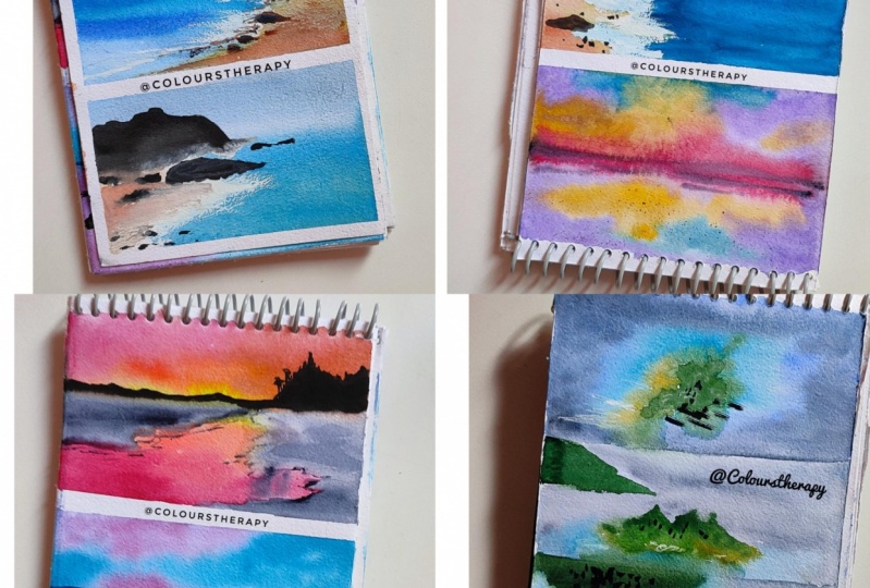
8. Class Project - 4 - Blurry Sunrays: We're ready to paint this beautiful sunset ocean scape. Then let's start by sketching the horizon line first. It's not much sketching here, except for this line, so it'll be easy. Using my hake brush, I will first wet the paper with clean water. I'm going to explain the colors I take as I go. Here, I'm mixing orange with yellow and a little bit of pink to get dark peachy color. Above the horizon line is the subject, and below it is the reflection, so whatever you paint above the line should be painted below as well, and in the same manner. Now, just like before, I'm going to be mixing yellow, pink, and orange, but this time the colors will be more to the yellowish side, that is I'm using more yellow, as you can see here. Now let me use bright blue color, and same goes below as well. I'm mixing blue with pink, and I'll get this purple color. I'm going to continue to paint the sky as well as the reflection using that color. This is one of the reasons why I usually go for monochrome; because there are so many colors. That is [inaudible], I guess. Take off all the water from your brush, dip it in your tissue paper, and blend all the colors together. This is the technique that I have taught in techniques video, Wet-on-wet. If you haven't seen that video, please go see it so you can learn how to blend wet-on-wet. Now I am mixing pink with blue, and I got this dark purple color. It's probably because I have Payne's gray on the palette, and I'm getting started with the clouds. I have to tell you guys my paper is still wet. If your paper gets dried up, you can't really paint these clouds. You can re-wet again if you are confident with re-wetting technique. If not, then please use 100 percent cotton paper when going for wet-on-wet, and also work faster. I'm painting the cloud both on the top as well as the bottom of the paper, and it's because above is the subject and below is the reflection, and obviously, they should be looking similar. As you can see, I'm only using one color here to paint the clouds; indigo, sorry, Payne's gray mixed with pink as well as blue. I'm almost done with the heavy clouds, I'm just going to add a few lines above and below the horizon line. The orange in the middle is looking very dull, orange and pink mixture, the peach color. I'm going to add one more layer of it, but you don't have to if yours is all right. Now once I add the beige color, I'm going to keep this for drying, and I'll come back once it's dried. After its dried, I have never seen anything so weird. You can see how blurry it looks. I really thought my camera did not focus. I have tried to focus my camera on it a couple of times. You can see my trials. I had to edit out a lot of footage here because I have tried for a good five minutes to focus my camera, and it took me a lot of time to realize it's just how it looks. Then so, with my number 6 silver black velvet brush and Payne's gray, let's get started with painting the ocean. Painting ocean is really one of the most easiest ways in this landscape. It's just painting a few lines using a good brush and Payne's gray color. You can just simply paint a few lines, or else, you can take a damp brush and blend out dark edges. I'll continue to paint the lines using that same small brush. As you can see, I'm not blending out these lines yet. I'm going to blend them all together once. I'm going to show you how it's done. But first, let's get this lines part over with. Now I'm going to take my damp brush and I'm going to blend very lightly and softly over these lines. As you can see, I'm not using hard brush strokes. We're going to add one more line using the small brush. Now let's blend using the damp brush once again. Now since the brush is damp, you can see the water lines forming. In the next step, I'm going to just re-wet the reflections area, the beach area, I mean. The beach area is wet, so I'm going to take my small brush and Payne's gray. I'm going to put just a dot of paint over it. Since paper is wet, the paint will obviously spread. I'm going to use tissue paper to cover the above sky and beach area, and I'm going to splatter some of the paint here on the beach. Let's add some details to the beach using the small brush and Payne's gray. Last time, we have blended these lines using a damp brush. This time there is no blending, and only add edges, so it shows the water is moving in waves. This point it's all about following your intuition. Do what's right for you and stop. The most difficult part in watercolor painting is to learn when to stop. So keep in mind that you're not overdoing those waves. There you go. I hope you like this simple, beginner-friendly sunset ocean scape. I'm going to see you in the next class project. Thank you for watching.
9. Class Project - 5 - Beach Mirror: Let's see what the second class project is about. It is a bit different, not difficult, different from the class project one. We're going to use the reflections here. As always, this class project will also get started with the horizon line and the light sketching. Like I've said before, do not sketch until I finish mine. This project will have the mountain and the beach, and the reflections right over here on my left, and probably a few bushes and a few trees up on that mountain. If you want to see the process of sketching, you can keep on watching this video. If you want to directly sketch, you can skip all of this process of sketching, and you can move on to the next bit where you can take the screenshot and complete your sketching. Sketching the last bits here, that is those few trees on the mountain. I'm done with the sketching. Now, pause the screen and complete yours. Now, you know the next step, wetting the paper with clean water. I'm using my hake brush. Colors are going to be very easy in this landscape. We're going to use only three colors; yellow, orange, and pink. In watercolor, we're going to always start with the light to dark. The light color is yellow, followed by orange. Whatever you paint in the sky, paint the same thing below, because that is the reflection. Also, I'm leaving that white space on my left that will be in a light color. It's the faraway beach. The water is only reflecting here in the middle. Thought I was going to use pink, but it got mixed up with the previous color that was already on my palette, but you can use a pink here, like I'm using right now. I just took a fresh batch of paint. Now, using a damp brush, like we have discussed in wet-on-wet techniques video, blend all of these colors together, especially in the sky area before the paper gets dried. Using Payne's gray, I'm going to get started with the reflections. That's right. We're going to first have to deal with the reflections before the subject here because the reflections will be in wet on wet. Now, without taking any color, with the paint that was already dripping from that sky area, let's just blend that empty beach space. Like I said, do not use any more color, just blend with what you have. Make sure the beach that we are painting right now should not be darker than the reflection or the sky. Adjustments to the reflection, and I'm going to keep this for drying, and I'll come back once it's dried. Now, I'm going to take Payne's gray, my paper is completely dried, by the way, using Payne's gray, I'm going to get started with the mountain area first, mountain and the trees. Remember that horizon line that we first drew, now with the same paint, add very small mountain-like structures on that horizon line. Make sure it's very small. Then not taking any more of extra paint on the brush, drag whatever the paint that is already dripping from the mountain and spread it across the beach area. Just make sure it's not white, it's somewhere around grayish color. Now, I'm going to just draw a few small random lines. They might look insignificant, but these small things add a lot of character to a painting at the end. The drop of water that fell on the middle of the paper, I'm going to remove it using the tissue. I'm going to continue with adding those random lines to the beach. The only thing that is remaining is that empty beach area. I'm going to use very, very light Payne's gray. Please do not take darker shade, just take the one that matches with the beach that is on the right side. Now, with a small brush, number 6 silver black velvet, I'm going to slowly build up the beach area using the small random lines, just like we have done in previous class project. You can already see a sunset beachscape is forming here. The perspective is forming, I mean. The last final step, let's add a few dark lines of Payne's gray. We are done with the sunset beachscape with reflections. I hope you enjoyed painting this with me. Let's move on to the next one.
10. Class Project - 6 - Before The Night: Start with the third class project of the day. Now, we're going for something that is a late sunset. When the sky is in a darker shade of blue with a little bit of sunset colors still lurking around. I'm done with the horizon line and there's not going to be much of sketching here, just that one line. I'm going to get started with wetting the paper with clean water, and I'm using my hockey brush. Rules in this landscape are even simpler than the previous class project. Only two colors, pink and bright blue. Let's get started with painting the sky, as well as the reflection below. I want this to look a little bit cloudy, so I'm going to be leaving the white space in the middle. Whatever the shapes or forms that you paint in the sky area, make sure to paint the similar lines and forms in the reflection area as well. White spaces are still looking harder. We're going to blend them later to give them soft edges. Now let's take our second color, pink. This is actually quinacridone rose. Where the blue gets mixed with the pink, it gives purple color and that's okay. I'm going to add the pink to the rest of the paper, and I'll do the same in the reflection area as well. My brush is damp now, so I'm going to blend these two colors together. By the end of it, you might not see a lot of white, but you can still catch a hint. There is no pink in the middle, so I'm going to add a little bit of it. My paper is wet, so that's why I'm able to do all of these things. Let's add another layer of blue up and below the horizon line. The ground is all set. I'm going to keep this for drying, and I will come back once it's completely dried. I'm only using blue color with a bit of pine's gray because it should be a little bit darker, the ocean. I'm going to follow the same steps I have mentioned in class project 1 in sunset theme. I'm going to draw a few lines, and I'm going to blend them using a damp brush. Continue the same step of adding the lines and then blending them later with a damp brush. This landscape is quite different from the previous two because we are going to be adding the rocks at the edge of the beach and they're going to be the highlight because they look so good. Since the brush will be damp you have to wet read rest of the beach whenever you use a damp brush or else it's going to leave the stains, so I'm going to be doing just that. Let's add one more line of the waves using pine's gray and a small brush. Now the paper is still wet, so I'm going to add a few pine's gray drops. Since it is wet, the paper, the paint will just flow and spread. I have decided to add a lot of rocks, and it's better to splatter instead of adding them manually. Now, add a few details to that wave right here because the paper just spread across, and it did not add many details because the paper was wet. A few more details, just like we have done in the previous two class projects. Adding details to the waves after the paper is dried. You can already see the perspective is forming for this oceanscape. Let's add a few large rocks. Like I said, this is the highlight of this landscape. Blend the edges of these rocks using a damp brush. This is what I usually do, but it's not compulsory that you have to do it as well. It's just one of my habit, but I have to say following that step, softening the edges of the rock really gives a great look and a very realistic look to the beach. Again, let's not get carried away and stop it right here because it's important to know when to stop when you're painting. In the coming session, I will be taking up a different theme in the oceans. Thank you for joining me and I will see you on 30th of this month.
11. Oceanscapes In Drone View & Colors Needed: Guys, welcome back. In today's session, we're going to Bain notion scapes with drone views. As always, there's going to be three landscapes in today's session as well. But before we get started with the class projects, we are going to see the colors and the color palette that we're going to be needing. First color is Sap green. Second color is bright blue. But you can use ultramarine blue, our cobalt blue, and instead of bright blue color. And now the next color is trocar is blue. And this is indigo. I kind of got my hip ballot mixed up with a lot of colors. So it's looking slightly greenish. So I'm going to be using the fresh paint now. And this is indigo and the raw sienna. Now this green and Russia and are used for land on the beach. Remaining three colors are used to paint the water. All of these colors are from the brand called White Knight, except it's from Sennelier. But it doesn't matter which brand you are painting. Your paints are from. Make sure you get the shapes right. And of course, I'm going to be using light watercolor instead of whitewash. Or white watercolor is from a brand called camel. And that is it for the color palette. Now, I'm very excited to start with the glass projects, and I hope we are ado. Let's jump into next video.
12. Class Project - 7 - Up From The Clouds: Let's start with our first class project. As always, I'm going to first go with sketching. And you guys, please wait until I finish mine and then you can sketch the US. All of these three class projects are exclusively wet on wet. Only the island that I'm sketching right now is going to be done on wet-on-dry. And same goes for the next two class projects, only island and one mountain. If you haven't seen the techniques video in one of my previous videos, please go watch it. It's the same as the one I have taught there. In that techniques video, we have learned wet-on-wet by blending beach water and the white whales. And same goes here. We're going to have to blend the island, the beach, I mean, which will be in raw sienna color and takeaways blue and ocean blue. As you can see here. There is a double line for the island. Uh, the, the one in the triangle shape is the island and the area around it will be in raw sienna color that is outlining the island. You can call it a beach. And now I'm done with sketching. Please pause the screen too sketchy us. All colors on my palette. Sap green, tacos, blue, bright blue, and indigo. And I did forget today grass Yana and white color, which I'm going to add right now. I'm already swatch the color palette before. We're just in case. I just wanted to show you the colors lie on my palate. Once again, that all the colors have assembled on my palette. I'm going to get started with wetting the paper with clean water. And I'm using my silver back with ID number 14 brush. As you can see, I'm not wetting the area of the sketch. I'm only reading around it. Once that's done, I'm going to make a chocolate is color with white color and just a little bit of bright blue. And I'm going to get started with painting the area around the island. Here. The water will be very light and takeaways color around the island. And then as the area moves towards the edge of the paper, the water will become dark color, which is when we will use indigo color. You can see the final picture on my right for reference. Now make sure to make the heart and just into soft edges by blending them with a damp brush. We're going to have to slowly add in the darker shades of the color, just like we have seen the final picture. So I'm going to take indigo with bright blue and I'm going to add the color around the corners of the paper. All this is wet-on-wet technique on your paper has to be wet the whole time. So you can see there is a lot of blending going on between different colors. The taco is blue has to get mixed up with that bright blue and indigo color. And later, we're going to add a raw sienna. I've near that island. And all of this has to be blended well. And that only happens when the paper is wet. Now I'm blending the outer layer, the dark color with indigo color using my damp brush. Damp brush is when you remove the excess water from your brush and it's not dark enough. So I'm adding one more layer of indigo. Here. There is no dyed blue, just dark indigo color. And remove the excess water from your brush. Using the tissue paper and slowly blender indigo with the rest of the paper. Now as you can see, there is a hard line that is formed in the middle. So I'm going to remove it using the damp brush technique. You can observe how easy it is. To manipulate your painting. If you practice the techniques Malinowski, wet-on-wet and wet-on-dry techniques. Now if you want, you can stop it right here. But since my paper is still wet and I have no control over when to stop, I'm going to add one more layer of taka is color and a lot of hard edges that are found here. Now I'm going to soften them up using my damp brush. Let's add raw sienna while the paper is still wet. Now in the raw sienna, just a talker is color. It gives a bit of green color and try to avoid forming green color and just paint along with raw sienna. Wherever the green has formed. Our goal is to show only tacos and raw sienna. I'm going to take green color, sap green. And I'm going to add the island area with it. Just dab your brush over it with a lot of sap green. And mixing different values of sap green. I have just added only sap green. Now I have mixed sap green with blue color to get the dark shade. And it generally shows the light and shadow part an island. Now I'm going to keep this for drying and we'll come back and add the shadows after it's dried. Let's try it. I'm going to take the lighter shade of gray. I'm going to get started adding the shadows. Now your paper has to be really tried. If you are attempting the shadows or else it'll just a blended with the background darker color and glue in your painting. I'm not using any specific a technique to paint the shadows. I'm just randomly adding the horizontal lines. Helps if your brush is not soaking wet, it should be somewhere around damp and dry. So you can add these lines properly. I'm going to stop talking for a few seconds and let you guys see the process of how I'm adding the shadows. But this is when your landscape should start looking as realistic as a picture. Before I end the class, I'm going to just take my small number six brush and I'm going to take light color and add a few. Thank you so much for watching. I hope you had fun painting our first class project from draw new series. And let's quickly move on to the next class project.
13. Class Project - 8 - Mountains In The Ocean: I'm going to get started with sketching for class project to previous class projectory have been dead and I land. And in this class project we are going to paint mountains. As on this, please wait until I have finished my sketching. And later, you can both the screen and finish up your sketching. The beach back here at the mountain is not working out for me. So I'm going to come back to it later. And now I'm going to paint another mountain just on the left corner of the baby. I'm going to walk on the beach park after foster mountain. As you can see, the perspective is just not right. So I'm going to correct it had to draw a straight line instead of going diagonal. And the perspective is not correct. You can also screen now to complete your sketching. Leaving the entire sketched area, I'm going to read the rest of the paper. I'm using the same colors that we have sketched before. And I'm going to use my smaller brush for reading the baby. Let's get started with Docker is color mixed with a light color to that that light green color color. A lot of times deny. Okay, now I'm going to paint the light dark eyes around the mountains and almost the entire surface. Let's slowly darken the color. And I'm going to take bright blue mixed with the indigo. And now let's add this dark color around the edges of the paper. Now, I think it's still looking very light. So I'm going to directly add indigo. And again, around the edges of the people. The rest of the paper in all the corners, leaving the mountains. You can see how smartly color is gliding onto the paper. Because the paper is wet. And I'm using a 100 percent cotton paper as well. When you guys using a 100 percent cotton paper, really makes a lot of difference. And lift a little bit of color under the mountain to expose that talk in front of the mountain. And it's the beach area. Made a lot of blending here. Just few brushstrokes are enough. Gonad, the sienna, just a hint of it under that second mountain as well. Now, I'm going to keep this drying and I'm going to come back and paint those mountains. Kids dried up now. And I'm going to take sap green. And I'm going to paint those mountains just like I have done in the previous class project die land part. Now let's slowly and very softly soften those hard edges of the mountains using a damp brush. Let's finish off painting that second mountain, Sap green. I'm going to darken the edges of the mountain using Payne's gray color. A few details. So I'm using finds great for this. I want this to look like a range of mountains instead of just one. So I'm trying to add a few details that suits to it. Few rocks at the foot of this mountain. Let's lightly soften the edges of this mountain ranges. Yeah, then I hope you enjoyed painting this mountain, David. Yes. In the middle of the ocean. And I'm gonna see you guys in the next class project.
14. Class Project - 9 - Far Off Island: Let's paint the third and last class project. Sketching for this class project is the easiest one. It's just three lines. Sketches for the land. And the other is where the beach. And the third line is for the darker blue water. It's reversed the board. Now I'm going to get started by wetting the paper with clean water and do not read the sketched area. We're going to first use quickly by bright blue and indigo mature. As you can see more than bright blue, there is indigo here. And that's okay. Going to use my damp brush. And I'm going to blend these two colors together with the same damp brush to soften the edges of the talk I Scala. Now I'm going to take raw sienna and I'm going to the beach part. Painting this landscape reminds me of making a cake, building up layer after layer with cream and cake. It's just a nice experience. I'm going to paint the raw sienna with the restaurant island. It's okay, we're going to cover it up with green. But first, we're going to have to darken the color. And they just say I'm going to use indigo. My paper is still wet by the way. And very carefully, blending all these three colors together, but making sure to keep their original colors intact without printing them away. Now takes up green and paint the island. Painting the trees in a drone view. So hold your brush in a perpendicular manner and put large dots on the paper. It helps you feel hold your brush in a perpendicular minor, like I said before. But just paint with only one color, change the shape of the color. And now I'm mixing sap green with a bit of indigo to get a darker shade. Let's take a bit of light shade of indigo. And I'm going to paint the shadows. Now the beach area that are painted industry and is quite dry it up so I can be able to paint the shadows. But if the US is still wet, you have to wait for a few minutes. The shadows in this class project. Not as sharp as the class project one. I'm going to just use a dark color like indigo paint, little bit limited in the beach area and it will not show it. I shadows and like I said, I'm not going very detailed. Shadow look for this particular glands project. A little bit of dark color in the tree area as well, just because it is there and my brush. And now I'm going to give this for drying. And that'll come back once it's completely dried. Now I'm going to add a few trees in the beach area as well. Just a few. I'm going to take the mixture of sap green with indigo and darken the top part of Thailand with it. This is wet-on-dry technique is to not paint details at the end of the landscape. I hope you enjoyed painting ocean scapes with me with all the three teams. And I'm gonna see you in the next video. Thank you for watching.
15. Thank You: Finally, finished with our ocean scapes and bigness guide. We have learned a lot of ocean scapes with a lot of different things. The first session was about tropical ocean scapes. The second session was about sunsets in the ocean. And the third was about drone wheels of three beautiful ocean scales. I hope you guys enjoyed painting this with me as much as I did. And see you in my next class. Thank you for watching.
 Sukrutha Jagirdhar, Watercolor Artist I Creative Entrepreneur