Transcripts
1. Introduction: Hello friends, learn the Art of 3D painting From
Beginner to pro. Here, 3D painting is an attractive and
Creative Art that illustrates reality with
new colorful dimensions. This Art will take
you to a new world of creativity and imagination. Why there's a style of painting? Because you can create very attractive and
realistic paintings by using depth giving
techniques to images. In this course,
you will be taught six designs from
simple to Advanced. I will be with you from
the first step until the moment that your
creative work is ready, you'll easily learned at
different stages of drawing to finally achieve a
wonderful result in creating a 3D painting. So don't miss this
opportunity by any means. Join us and step into the fascinating world
of 3D pencil painting. The award of creativity and
Art is waiting for you.
2. Tools: Hello everyone, Good
evening and welcome to a new chapter and new
season of painting with me. This isn't we're going to
work on 3D painting together. We want to see how
to do the tricks, how to do the basics. Before we start, I'm
going to tell you about the tools that we require
during this course. Because we are about to
work with some paint, because we are going to have
some paintings with colors. So you should have
some colored pencils. It doesn't matter. You can use whatever brand that you like. We need a normal pencil
that can be HB or B2. We can use an eraser and normal eraser and
entered eraser. We need a fader. And a very useful
tool that we need for the tricks of the 3D paintings
is actually a cutter. So with these tools
and equipments, we are going to create beautiful
and amazing 3D paintings
3. Basics of 3D Perspective: Hello everyone, Welcome to a new course of painting
and sketching with me. Alright. In this part, we are going to
learn 3D sketches. And of course, I'm
going to teach you the tricks of 3D
paintings first. So all the first thing
that I should tell you is that so many of the 3D paintings are actually made by the
correct perspective that it is making them 3D. So you should just have a very summarized
background of perspective. Perspective is
actually something that can help you to make your sketches and
paintings 3D or even 2D with the help
of a watcher point. Does it mean if I
want to explain it to actually practice? I'd like to say, for example, imagine that you are by to see the watchers point
is actually the point in the middle and
the line which is actually in the middle
and in-between the sea and this guy which is
actually in front of your eye and the you
that are looking at it. It will be actually
the water and that line would be
the water line. So this is a point
and this is a line. This is my horizontal line, my horizon horizontal line, which is actually the line
between this guy and the C. And this is me,
just by the sea. And actually into continuous of my eye would be my
horizontal line. Now, if I have something
exactly right in front of VI, I can only see one side of it, the side that is in
front of my eye. Now, if this surface, if this thing comes to the right of my eye, how it's looked. In this way. I can
see two sides of it. See from each
corner of my shape, I'm going to my point here, one line and I come
inside, go toward inside. And one point and another
line would be here. This is actually a cubed now. Just moved it right now because I see more
than one side of it. Now it's a cube. Alright? This is my rectangle cube that only two sides of it
are visible for me. I see the front
side and the side. The left side actually. Now, if I bring this to the
left of my work, again, I say exactly on this
horizontal line, but on the left, again from each corner, I move toward the point. Connect them. Then I'll
create a line over here. I go toward inside. And from here again, I go toward insights. So this is my rectangle cube. So this is my rectangle cube. That in this in this
shape also again, I see two sides of my work. The front side and this side. So if this cube comes
actually above our eye, for example here, how it's seen. Again from each corner, I move toward the
point like this I place a line over here. I go up again. I find my points, and I connect them altogether
to make my shape. Okay? Now, my cube look like this. But the size that I can
see are only these two. It means the front side
and the bottom side. Okay. I just bring this
side up and the right. Well, in this case, I see three sides this time. So basically my shape is
going to become a 3D shape. So from here, I go to
the point like this. I connect the dots together
to make the shape hold. Okay. Okay. So it would look like this. I can see this front side, this side over here, and this bottom side. I've got this side surface from surface and bottom surface. And for these practices
of 3D painting, it's really good and helpful if you know about
the Perspective. So many of these designs
and sketches and paintings, our dependent on the
fact that you know, how you should put
your shapes into perspective and how to
make them into 2D or 3D. It is really important. Again, like the right side. I've got three
surfaces over here. Now, what happens if this shape, this cube comes below my eye? How it's seen? Let's see. For example, I put it over here, just place the rectangle here. Then from each corner, I drag them to my main point. To my viewpoint,
the viewers point. It would look just
like that. Okay. Again, in this case, I can see, so on his in front, Of course, this one. The top side can also be seen. This top surface. And this side surface
is visible for us. If I put it below here, exactly below my viewpoint, is exactly the opposite
of upper cube. So again, I drag the lines to my viewpoint and I
create another cube. I can only see two sites
and two surfaces here, one on top and one in front. And on this side part, it would be exactly the
opposite of my left part. So from each corner, again, I go to my viewpoint. And then exactly like
the previous parts, I create my cube. And again, in this case, I can see three surfaces. The top part, the side part, and the front surface. Okay. Now, let me tell you something else to it
gave you this tutorial because Many times we see
some designs and buildings like a building which is actually coming
out of the paper, or for example, a
hole in our paper. The point in these kinds
of paintings and designs. For example, if I want to
consider it as a building, if I want to take photos of
this model of this building, will be only seen
from this angle. I mean, it actually will be
seen 3D only from this angle. If I just want to get a
photo from this picture, from the design from below, from right to left. It cannot be seen 3D. If you want to make the
shapes in a 3D shape, you should actually take the, take your photo or look at
them from the point of view that you first considered
your Perspective. In extra steps, I'm going to
tell you how to create them
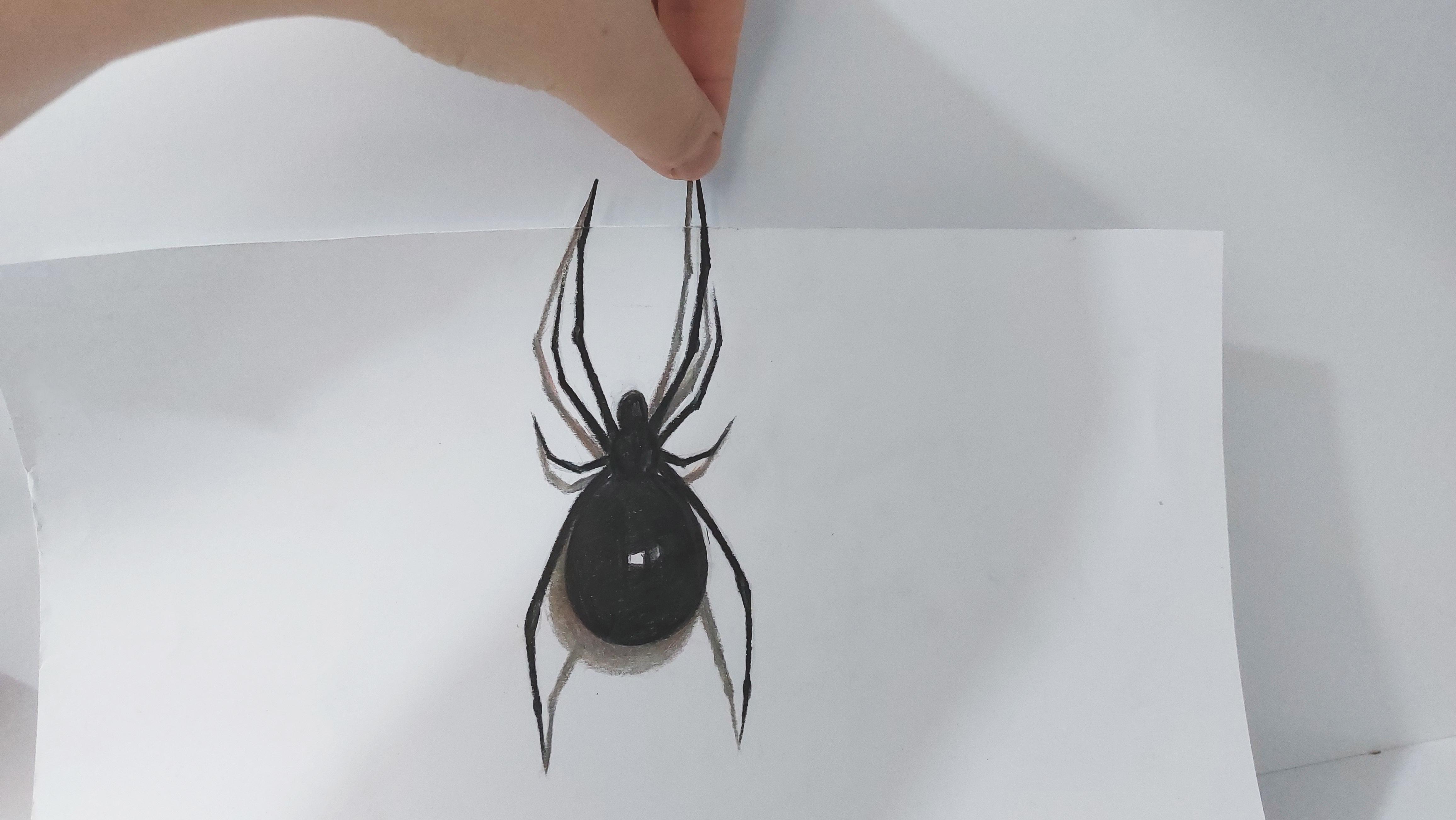
4. Primary Sketch of Spider and Start Coloring: Hello again and we'll come to the first episode of
3D painting with me. Okay? In this episode
we're going to create a very beautiful Sketch on painting together and
it's also very easy. We want to actually
create a Spider which is coming out of the paper
or to pay per frame. So first we should start
with the main edit. So if your paper is a3 or a4, you should fold a
part of your paper. Like this. Very strange. You fold your paper, a part of your paper. Thank this. Then
you open the fold. You put it on this way, and then you can start
creating your main edit. So I'm going to create a
part of my Spider over here and a part of it
on the upper part. So you should use your
normal Pencil or B2 Pencil and you can actually start working on the main
attitude of your work. As I said before,
I want to create a part of my Spider over here. It has kind of a circular shape. Then on this top part, it has a smaller
circle like this. And looking like that. Again, another smaller
one on top of it. From this part of my Spider. I'm going to shape
this area as an oval. And then I erase the extra
lines around my work. And one this area to
be more or wall now. Alright, like that. Can clearly see and try to make the main entered
of your work very clean. Shouldn't be dirty or messy. Now let's create the legs. One of them is over here. Going down like
this. Here we go. The other leg comes
exactly from here. So it's exactly on the
other side of the body. And it starts in the
same place and ends in the same place as
our previous leg. Okay. Now I want to work on the
hands and feet over here, the legs and arms. So I'll create it like that. The first and the main
entered of this work is very, very easy to primary
at it is very easy. And if you just pay attention
to the movement of my hand, you can easily do it yourself. As you can see, the
arms are very long, going all the way up. And also from here. Again, I'm going to
continue this arm all the way up. Alright. I should consider two more lines for my Spiderman
arms in these parts. And now the primary and the main answer
that via work is done. Just as easy as
you've just seen. Okay, Now we're going to
do to Coloring together. I'm going to start
with my black color. And I want to start applying
the darkness of my work. I'm going to use my
black colored pencil. And I'm going to drag
it over these areas. And I apply the exact darkness
that I wanted my work, which is actually
pretty strong as well. This is the middle part of my Spider and into
Central of its body. It, it's got kind of a shine. So I placed a shine. And now slowly I am starting to darken or via spider's
body, making it black. Okay? Now as you can see, I am Coloring my Spider very, very dark with a strong
darkness with my black Pencil. And then I'll continue this
Coloring up to the top, except this area that I've
actually chosen for its shine on the bank. Okay? In these areas that the parts of the body are connected
to each other, the amount of darkness
will be definitely much more to Coloring is
very, very easy, so you don't actually need any special ETC to
color this thing. You don't need any
special skills. It's just a simple Coloring. I'm going to get my dark gray. I need a dark gray. And then when you've got that, you start moving in Coloring
on the parts which you still have some white
parts of the paper below. From these parts. Just like that. Do it. And then I'm going to use a
very dark red for this area. So 40 side areas were
all around the edges. I'm going to use this dark
red or very dark red. Then I'll do the same thing
for this upper body part. The smaller one. As much cleaner design
as you get a new color, it cleaner as much as you can. The 3D shape of your work would actually show itself
much more better. So when you're doing
the designing, the sketching of your 3D
shape or your Coloring it. Do not rush it at
all as much as you actually place attention on it. And as much as you
spend time on it, the result would be
much more better. All the same thing
for this back areas. Then I want to work on
the legs, on its legs. Now, I'm going to create
the legs like that. As you can see, I'm Coloring, but basically I'm just following the line
and making it darker. So very slowly as I come down, I am making the shape
of the leg thinner. As you can see, it's
getting thinner and more narrow
as it comes down. That's anatomy. I'll do the same thing
for this side of the leg, or better say for the
leg on this side. Then again, I'll come down. And as I'm coming
down from here down, I tried to make the legs thinner You should do it very precisely
with a lot of caution. As you can see,
I'm just creating the legs of why
Spider delicately. Alright. Now I want to work
on this part. This arm. I go up and again, as I move on, I move on toward the
end of the line. Make it thinner so I can delicately applying
this part as well. In general, when you're moving
to the end of the line, you should make
your lines thinner. K. Now, this part
is done as well. And just like that, I'm going to create this
upper arms as well. Basically, I don't actually know that the things
that I'm creating right now are counted as the
spiders, arms or legs. No idea. It doesn't matter that much. So should just do
it, whatever it is. I think this upper
two are the arms and two ones which on the bottom are the
legs? Well, I don't know. I'm not so much familiar with the wild world,
especially insects. But anyways, I'm
going to continue. I said arm. So maybe arms. As I move on to the
end of the arm, make it thinner
and more delicate. Now, I also have to create the last two
arms of my Spider. You should be very precise
and careful about these arms. Because when we want to
make this shape into a 3D, these arms actually play
a very important role. I'll do the same thing for
the other side as well. And as usual. So I come over here, I just make a bump,
a prominent shape. Then again I go up again, another bump over here, and then I'll continue
until the end of it. Okay? Now, as you can see, I'm doing this work very
precise and very organized. Now I'm going to use my gray
color and I want to create the shadows of the legs
and arms of our Spider. So first of all, I want to create the
shadow of this area. The shadow of the body, which looks like this actually. So just remember when you are doing the shadows
and the shavings, you should just Color. So cohesively. You should be very
careful in this area because if it gets a
little darker or lighter, it doesn't look so it doesn't look like a shadow
or shading anymore. So be very precise about
this area and don't rush it. Also, the shadow of
the leg will come from here to the leg itself. Now, in this area that the leg is actually connecting
to its own shadow, the amount of this shadow
would be darker and more. Also on this lower area, this part is darker because it's actually
meeting the body. And for this side, I'll do the same thing. I apply. The shadow from here. I'll come toward the leg itself. And then in the end, just match them together. Just like this. So here we go. I'm going to continue
for a while. And my dear friends, if you want to see the
rest of the video, you can actually follow
us in the next episode.
5. Continuing Coloring and 3D cutting: Hello again to all
of my dear friends. Welcome to the continuous
of this tutorial with me. Well, we were working on
the shadow parts together. As you can see like that. Then for each part, I'm going to create a shadow and I'm going to
consider a shade for it. We need to have a
shadow for each part. It's very important. And sometimes I see some students just
make some mistakes. The point is that sometimes
they actually apply the shadows on the lower
part and some parts, just by mistake, they apply the shadows on top
of their work. This contrast, this,
I'll pause it doing with actually make your work
get out of its 3D shape. So the direction and the placement of the shadows
are very, very important. From here I should come up. And then just like that, I will work on this part of the shadow for the long
arms of my Spider. And from here, I will
work on this arm. So I'll continue
it this way. Okay? Now, even up to here, if you want to
consider your work, we've almost got the
3D shape of our work. Now. We're just going to
work on some tricks to continue our work. Okay? As you can see over here, the shadow is on this side. So over here again, I mean, on the left side, I just drag and guide the
shadow toward this area. And I'll continue it until
the top part of my work. So it would look like this. Again, I emphasize on
the fact that you should not change the correct placement and the correct direction
of the shadows. It's very important. And they should be symmetrical. You know, even right now, because we've applied
the shadows correctly. We've got kind of a
3D shape to our work. Now with your light brown from overhear from this lower part, I'm going to combine this color a little bit into my gray color. This is a light brown and
I'm using it so little. I don't want to use it too much. I just wanted to get out of
that completely gray color. And then I'm going to use even a darker brown,
one shade darker. So for these parts. And then I'm going to use
my white colored pencil. And I'm going to drag
this white color on all the shadow parts that
I've already created because I want my shadows
to be more cohesive. I don't want them to be a
stains or something like that. I want the shadows to
become smooth and cohesive. So I'm just dragging this white color over
the shadow parts. As you can see. I'm just
continuing this way from all these parts going
to do the same. And I'll just repeat
this work for each part of the
shadows I've created. Like that. Alright. Now I'm going to use my white color
for these areas as well. I'm just going to
use it a little as some stains over here just because I wanted to
be a little bit shinier. Now I want to work
on the last move. This is actually
the best move that actually makes my
work to look like 3D. So first of all, I'm going to cut this area
very slowly with my cutter. I mean, this folded
line, this folded part. I'm going to cut it Very slowly and very
carefully with my cutter. Just like that, as you can see. Okay. You should do this
with a lot of cautious. Then I'm going to do
the same thing for this other side. Alright? Now, I'm going to cut
around my spiders arms. I'm going to do these
cuts very clean, very carefully and very clean. I tried to cut around
my spiders arms. Hint, if you're not
careful like I am, you might just cut
the tip of the arm. I cut the tip of
the arm by mistake. Later. I'm going to tell
you how you can fix it if something like that
happens in your work. So easily like that. Also from here, I just cut
my work all around the arms. Do not tear apart your
paper forcefully. Be sure that the part
that you want to separate is caught by a cutter. Because if you just
want to take them apart forcefully or
tear them apart, it can actually tear your work apart and can ruin your work. So be very careful about that. Then for this part. For this middle part. Again, I'm going
to use my cutter and very clean and
very carefully. I will separate this
area from my work. Okay. Now, as you've got the main
parts of the paper out, you can actually work
on some details. If there are any
small parts left, you can use your cutter
to get them out. As you can see, there
is a white area over here between the
arm and its shadow. I can do two things here. I can either cut it out
with my cotter very delicately or I can actually color it and I can make it the Color of this area match the background of
my photographing. First, I'm going to
use my black color, going to work on
the arms over here. And then for these parts, I'm going to color them again. I can color this
white area to match my background's color where I want to do the photographing. So right now I want to
cut this middle area, but you can color
it as I told you. But I'm going to go
with option number one. And I'm actually using my
cutter to delicately and very, very carefully take out this
white area in the middle. I can show that my
Spider is coming out of its frame. Alright. I will also want to darken
this shadow a bit more. I want to make it darker. And just like that, my work is in a 3D shape. See, it's like it's
coming out of this frame. Just remember to fill all the
white parts on your work, especially on the address which we've actually cut the paper. So use your colors
to cover them. When I put it like that. As you can see, it's
like, you know, it's in a 3D shape and you can photograph it
or you can use it. Anyway, you like, this is
our first 3D painting. It just so simple. I hope you've enjoyed it a
lot and see you next tutorial
6. Primary Sketch of Hand and Start Coloring: Hello again. Welcome
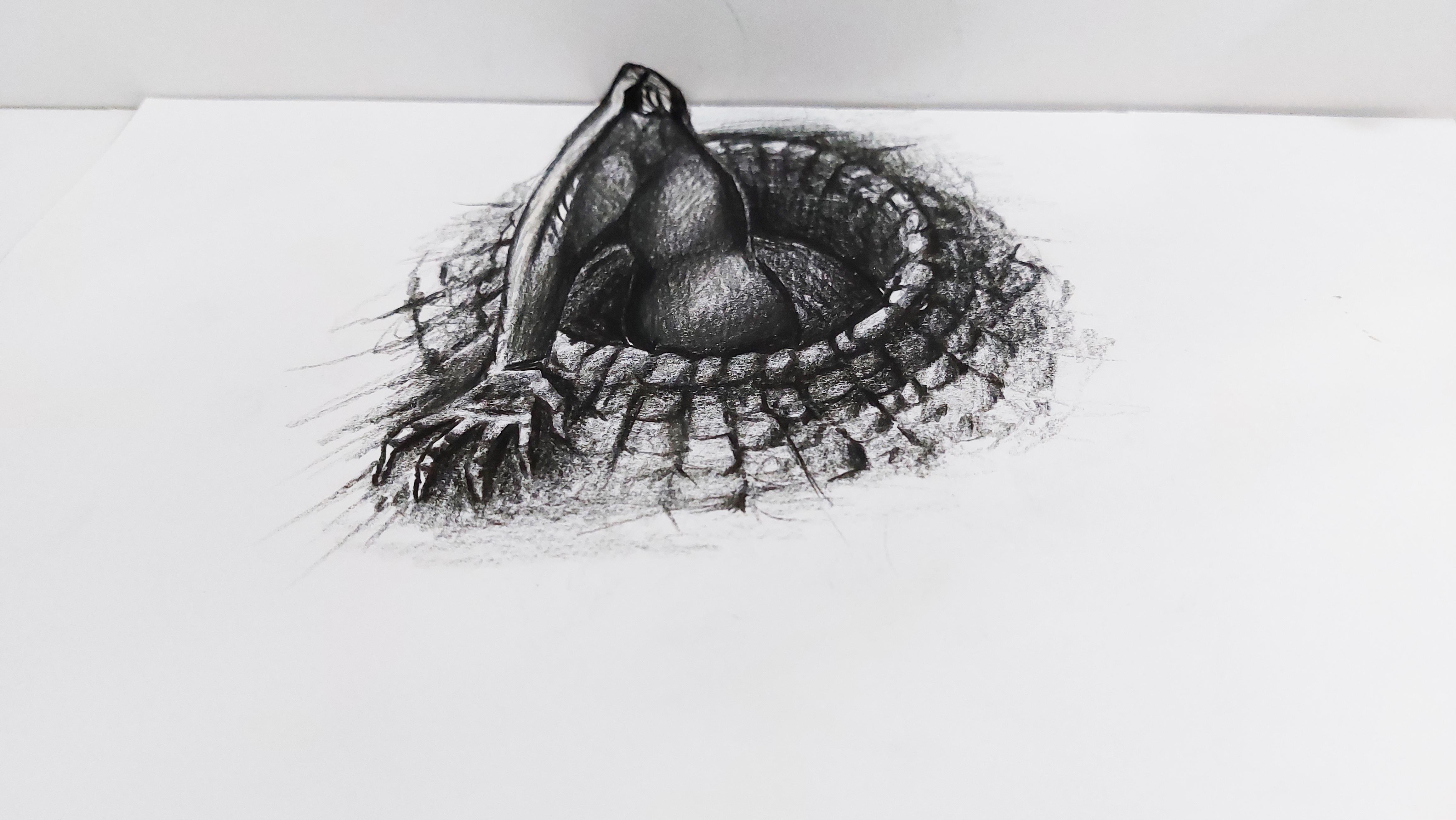
to a new episode of 3D painting with me. Okay. This part, we're going
to work on a hint together. We want to show a
hand coming out of the paper, reaching out. My paper is an A3 size, but you can also work it on A4, so it doesn't matter. But what paper that
you're working on, you should consider
half of your paper. So after you've considered
half of your paper vertically, just right here, start creating the design and Sketch
that I'm doing right here. So over here, I create a circle
with your normal pencil, with your HB pencil. And you do it exactly the same place as I'm doing it right now. Based on the size of your
own paper, of course, considered a half, and then
draw it right over there. So I'm going to create and draw the shape of the hand coming
out of the paper. As you can see right now, just doing the primary
Sketch, the primary draw. I come all the way up. And over here,
this is the elbow. So this should be the arm. And as you can see, I'm actually creating
a scary arm. So it can look more rough and it would
be more attractive. It's like a scary arm coming out over the
frame to get you. So alright. Now I want to pay more
attention to the details. Details of the arm
are very important. And this area is the body. We should show a
part of the body. Not all of it, but a part can be shown and then even
erase the extra lines. So my main and primary Sketch
will actually show itself. And it would be cleaner
as much as you make your primary draw and
primary Sketch cleaner. Your work would be easier. Just like that. I would also work on this
area around the arm. Okay, so I want to
design this aria, a bit of a stone shape. I want to create some
stone texture over here and you can
actually draw them, Sketch them like this
completely randomly. Just like when I'm doing. In some parts, they can
be bigger or smaller. Sometimes they would be doubled. So very easily you can actually apply this attitude of the arm. And I'm going to complain it
all around up to this area. Then I'm going to work on
the Hand and the fingers. This is the Hand and
that's the thumb. From here, I have to
create the fingers. So I'm going to create them. The first finger,
the second one. The third one, and
the fourth one. That will be my thumb. Actually now my thumb. But anyways, now I'm going to consider
my fingers more completely, going to create them
more completely. As I told you before, I'm going to create
it a bit as scary. So that's the reason of
this odd shape here. And then in this area, I'm gonna do the same. So just as easily as that, we've created the fingers. Okay. Now for the surroundings
of this well Or this whole,
which is over here. From the bottom
of each is stone. I'm going to create a
line and drag it down to show that this is
kind of a whale or hole that this arm is
reaching out of it. As you can see, I am turning the direction of
my lines based on the direction of the stones and circular shape of the whale. Well, in the upper part, I'm actually doing it less. I create less lines. But over here I've created more. I would also create some stones over here on
this side of the arm. Because I wanted to
show it's the circle. It has a dimension. Alright. Now let's work on this
inner parts of the, well, again, I'm changing
the direction of the lines. That's very important to
show that this is a circle. And then I start with my black colored pencil to apply the shades
in the shadows. Basically, I'm going to color this thing with my
black colored pencil. Okay. I start from this side, this edge of my arm. And very delicately,
very finely, I start shading and I move on. Remember, to keep the tip of your pencil completely sharp. This is very important
so that you can actually work on the
details better and more. So it comes right
up, up to here. Then from here, I start applying this strong
darkness for my work. So especially on these edges, I have very strong darkness because I want to show that
this muscle on the arm, it's actually the bicep. I want to show that
it's prominent. Therefore, I'm trying to color the edges and
the surroundings darker and keep the center of it a bit lighter so I
can show its prominence. We'd having a
lighter shade on it. That's why I'm going to dark on the address
and the signs. So very slowly and
very carefully. I do my Coloring. My work would actually look 3D. You see something that in 3D painting is actually going
to make your work look 3D. Is if you, if you can apply the volume of
your work perfectly. If your work doesn't
have any volume, Of course, it won't
look 3D at all. It will look like it
has any dimensions, so it shouldn't be flat. You should make a volume
with your shadings, with your shadows,
your Coloring. This is very important
in 3D paintings. As you can see, basically, I'm creating a volume for my bias of and my arm over here. On the prominent parts, I will have less darkness. And on the sides and the
edges, they would be more. I'll do the same
thing I repeated for this part of
the arm as well. So just like that, I'm gonna do it Then I create this shape for
this inner part of the arm, the part that the elbow is bent, this area would
definitely be darker. And as I said before, wherever you've got
the lighter areas, it means that that
area is prominent, so pay attention
to that as well. Now I come up and I want to show the structure of this area
that includes a bone. Therefore, I apply it part by part and I'll make it
shine, make it light. So I can show that
this area is prominent and is actually a part
of a bonus structure. Just like that. I come all the way down here. Okay. I would also work on this area, very softly, very mellow. And then again, right from here, I bring the darkness
into my work, a very, very strong darkness. So just like that,
as you can see, I'm applying the dark areas
and making them lighter. As I move on to the
more prominent parts, that is very important to know which parts are more prominent
and which parts aren't. The parts which are more
prominent be lighter in shades, and the parts which aren't. Of course they should be darker. So I'm also going to apply this part by part
shape of this area. The way that I'm doing it. From here, I bring the
darkness slowly outward and you will fade it
slowly and smoothly. Just like that. I would also want to
work on this area. The same way. The fingers. K, Here we go. Scary fingers. Alright. So that's it.
7. Continue Hand Coloring: Okay, so from the lower
part of each finger, from the bottom of each finger, I create a shadow. So as you can see, I'm spreading the
darkness on the part, on the background or the surface which the
hand is covering. So just like that, I shade the lower part
from the outside. I just guide the shadows
and the right direction. I also apply some on an organized or random shadows for this part of the
hand above the fingers. And just like that
as you can see, I've a spread in a
shadow just below the fingers and above them. Then I would also make the
fingers into several parts. And here we go. Yes, that's it. I'm almost done with the
shadowing the fingers. But I still need some more
shade in between the fingers. We need more darkness. So don't forget that. I want to work on the will. See exactly as I
did for the arms. I start very dark on the
edges and the signs of I, of R. Well, and like that, I move toward the center
and make it more complete. As you can see, it got a
bit lighter toward the arm. I'll do the same thing for
all the parts of the will. It means that even
this inner parts are actually included
in the same way. Alright. So now I move up and
I fade this darkness. The direction of your fading
is also very important. Don't forget of ADA it. Now I want to work
on the well itself. Same. First of all, I
wanted to work on these stones on the
edge of the well, making them more visible and
actually completing them. And then I want to
come down a little from this circular shape
that I've already created. This will actually make
your work more realistic. That just get it out of that. It's circle shape. You can do it in a circle shape. There is no problem with that, but if you make it into an oval, it makes it more realistic. It looks better. Of course. Just like that from these parts, I'll do the same thing. I create these stones. And I continue this thing. Right over here. Now is start creating a design
actually like that. I wanted to draw this. And from this back part, just from above the stones, I start applying a darker shade. Basically it's a shadow. Anyway. I'm going to fade them upward. Basically. Again. I'm going to fake
them toward outside. See, it's darker
near the stones. And as I go out, they just become lighter. Some parts are also
darker as well. So I start from the sides, from the address of the stones and I will make them darker. When I move out, I make my shadings a bit lighter because I
wanted to emphasize on the stones and the dark
shadow right beneath them. I have to control The percentage of my shades. With my dark color Pencil,
black colored pencil, I apply a shade and
I move it downwards. All the way down. Then I apply a general shade
over all the stones. Also over here
inside of the will. Should be shaded like this, very generally and very lightly. But then I actually make these lines coming toward
inside of the well. So I can make it more 3D. Well, of course we should
get more darkness from the most inner part of the well toward the walls of the well. I apply a very dark
shade over here. As I move toward the
walls of the will, to the sides, I
actually fade them. Then I would also create some shapes for the
stones in this area. Just like that. Okay. I also consider a shade and
shadow for these stones. So I can have that volume and
that dimension in my work. Alright, here we go. Just like that. Hi, come down over here. And I also make some shadows and shades for
the stones of this area. From below each part. I create a line and
I drag it outside. It already kinda looks 3D, or better say it
got some dimension. Okay. Now for each part, I
consider Morrisons. I can make them double, make them big or small. In anyways, I'm going to draw
more stones on this area. And I want to look
in a bit random. Now from below each stone, I'm going to apply
a shape like this. So I can keep the volume
of my work like that. You see when you
want to actually create the volume and dimension. The most important
thing in your work is to play with the
shadings and shadows. That's the most important thing. If you learn how to do that. You won't have any problem in
any kind of 3D paintings or volume paintings because
you know how to create a volume or a dimension
with shading, with different shading,
you can actually pass the other courses, the
sketching courses. So you can actually be a
master in this point, shading. So continue the same way
for the rest of my well, and I'll get the
volume for each part. We're gonna continue
next episode
8. Shading of Hand and 3D Cutting: Hello again. Welcome to the last episode
of this tutorial with me. We're going to complete this painting and we are
going to continue the stones. As we move up. The stones will actually look a smaller based on the
Perspective rules. So the stones which are
in front are bigger. And then we go further. We go toward up, the stones would look smaller. Just like that. Alright. So here we go. Then I'm going to work on
the shadows of my fingers, making them more fade. Then for the middle of the hand, for the center of the hand, I'll consider a shade like this. Okay? So from here, I bring the absolute darkness
upwards so I can show that This part is inside of
the well and it has a depth. So here we go. Okay. As you can see, we are going to darken
these parts a bit more because they are further and just as easy as that. Okay. Now, I'm going to work
with my gray color. And with my gray color. I'm going to make my
shadings more faded, that it can actually make
my work more natural. So I'm going to make it
more natural with fading the shapes. Here we go. Just like that. And just as easy as that, I'll have my painting,
my 3D painting. Now I get my white
colored pencil and I actually apply
it on the white areas. And that's it. Okay. Now, for this painting, I'm going to create the
fold over the elbow area. Just remember that
in this painting, you should not actually
fold the elbow area. You should actually
fold the sides of it. You shouldn't create too much of a fold on the elbow itself. So for all the areas next to it, but not the elbow itself. So I am fold my paper
and then with my cutter, I start cutting it. So I will use my cutter
on the sides of my elbow, cutting the extra paper out. As you can see, of course. Just like that. And from here, I also take it out. Then I use my cutter and I
move it all around my elbow. Be very careful in this
area not to cut your elbow. Should just go around
it. Very smooth. Just like that. I got the elbows out. Then I use my black
pencil to get the extra whiteness in the surroundings of
my cut on the edges. And that's it. So if I
put it in this angle, you can see the 3D shape. Now I'm going to tell you
how it's going to look 3D. See if I actually place my camera over here upfront of actually
above the painting, as I bring it down
a bit sideways. And I'll turn my camera
into different ways. So you can see the 3D
shape of this painting. We can say it
completely right now. In this angle you can clearly see the 3D
shape of the work. It's like it's coming out. It's all about the right angle. You can do there photographing
in the same way, in the same angle to get the
3D shape of your painting. I hope you've enjoyed
this painting, this tutorial, and I'll
see you next episode.
9. Basic Sketch and The Beginning of Glass and Fish Coloring: Hello everyone, Good
evening and welcome to a new episode of a sketching
and 3D painting with me. Okay. In this episode we're
going to create an amazing, an exceptional 3D
painting altogether. The sketch that I've
considered for this episode is actually a glass
with a liquid in it. And it would be in 3D in a
way that the Glass is coming out of the paper and you can actually place your hand
inside of the Glass. Okay, just like the
previous samples, if your paper is in a3
or a4 doesn't matter. You just consider
half of your paper, half of your framework. And then you start working
in the center of your paper, in the middle of your paper, I want to sketch a Glass. So as you are looking at
the Glass in this angle, I should make it longer
and more stretched. Because when I want
to actually look at my work in a different
angle to make it 3D. It will actually comes
into a normal size. Because I'm looking at my
paper on this side like this, it would be sideways like that. And based on the
Perspective rules, when you look at something from this side, will become shorter. Therefore, I have to a
Sketch my primary Glass. I should Sketch it taller
and more stretched. So in this angle,
I'll make it taller than when I turn my
paper, make it sideways. It would look normal size. So I'll consider this area. The opening of my Glass. Your sketch should be
very clean and organized. Shouldn't be messy. Not at all. Okay, This is the
opening of my Glass. And then I'm going to create the body
of the Glass itself. That Of course, I'm going to sketch this Glass longer and
taller as I said before. All right. So I come a little bit lower. I come a bit more down. It should look like this. The bottom of the
Glass should look like this flat line. And then I should also create another curved line in here just to separate this area from inside
of the Glass itself. Because we should show that
our Glass has a thickness and this area is the liquid
inside of our Glass. So in this area, I'm going to work more so I can show the liquid
inside of the Glass. Okay? Imagine that if your
finger wants to go inside of this Glass,
well, exactly. As the size of your own finger, the thickness of your finger. This would be the
placement of your finger. You should actually place it on your painting, on your Sketch. So I'll consider the
finger over here. Create a finger over here. And then from this area, I'm going to create a reflection of the top
part of the finger. The last part of the finger. These are some reflections
and I'll tell you later, I'll tell you about
it more completely. This is the bottom
of the Glass. Again. I have to create a circular
shape over here as well. Because again, I say we have to Have dimension. I also wanted to create a
beautiful fish over here. Looking like that. Alright, I'm sketching my Fish. That's all about it. And just has beautiful
and cute as this one. So here's our Fish. Now we want to start working on the paint and the shades
actually of this work. First I want to
start with my Fish. I'm going to color my Fish because I want to
create a goldfish. Therefore, I need my orange
color and my red color. So I should start with my
red color and I'm going to work on the darkest
parts of the Fish. You should just lighten the primary Sketch of
your work a little. Therefore, when you
are Coloring it, you can actually make
it look more natural. And the black color doesn't get involved in other colors
that you're using. So I'm going to
use my red color. And from this top part of
the fish, from its fin, I'm coming down making dark
red and making it darker. As you can see. Here we go. Then from the fins, I start creating a
shade, bringing it down. And just like that, again, I'm creating some shadings, making them lighter comparing
to the edges, Of course. Now continue. As you can see, I'm going darker
on the sides and edges and a bit lighter while I come toward the center of the Fish because
it's a bit chubby. So we should show that some parts of it
there are more prominent. In some parts, are actually
the edges of its body. Again, with the shadings, we are going to give
it some volume. It doesn't matter if you're
doing the shading with a black colored pencil or other colored
pencils like this one. The rules stay the same. With the correct shading, you get the correct volume. Then I can work on
its fin and its tail. It's a per fin. And now I move on
to my orange color. As you know, goldfish
is orange basically. So from with my orange color, I come from the red
colors toward the center. So as you can see, when I start on the edges, on the red colors, I have high Hand pressure, but as I move on
toward the center, I'm decreasing my hand pressure. I start from the dark reds, coming all the way toward the center, making them lighter. And by blending these
colors altogether, I'm actually working on
the volume of my Fish. So here we go.
Getting it together. As you can see, it's
coming together better and more as I
continue my work on it. Okay. Now, I guess my yellow colored pencil
and said goldfish, Of course it's going to
have some yellow in it. And as I did before, I come from the darker parts
toward the liner parts. So on the edges
and then the size, they would be darker. In the center, it
would be lighter. I cover all of my Fish with it. Very smooth and very nicely. As you can see, the colors are all
coming together. So so it, my black color. I should also work on its eyes, making them look better. I would add some
a strong darkness over here if they're needed. And doing all of it
with my black pencil. Can you see how
beautiful it gone? Now? I'm going to use my red color
and I'm going to create some scales for this
part of my work. I'm going to shade just beneath them with my dark red color. After creating the scales.
10. Continue Coloring Of Glass and Fish: Okay, again, I consider
a darkness for overhear. And you can actually
created with your very dark red color. And it would look like this. Okay, so our Fish
is done right now. And now I'm going to use a bit of the color
that I've used for my fish so I can show
the reflection of the fish inside of my
Glass and in the liquid. Okay, I'm going to
erase this area. Actually I'm making my primary
Sketch wider altogether, so I'm going to
use my red color. I'm going to apply it over here. And as I move on, I fade it more so I can
get the reflection, right. Also, I need a bit of
reflection over here as well. It's a liquid, it's
Glass. Definitely. It's going to have some
reflection of the colors, even not the whole shape. Okay. I move on
to my gray color. So I'm going to pick
up my gray color. Let me just find it. Sorry. Taking a little long. I know. Okay. I've got it. And now I'm going
to use this color. And I'm going to use
it on the sides and the walls of my Glass
toward outside. I'm going to shade it
towards the outside. So first of all, I'm going to color the
bottom of my glass, making it more clean. As you can see, I'm
using the gray color on the bottom and I'm
shading toward this side. Again, I emphasize
that the direction of the shades are as important
as their placement. And there are mount. Some parts near the Glass should be darker and as I move on, we will get lighter. But the parts which are near my Glass or on this edge should be definitely
darker. All-in-all. It's not that dark as we used to do in our previous episodes, but it's still dark. Okay. So here we go. I apply the shades
wherever they're needed. I'm going to use it
even a bit more, making my darker spots darker. And as I move outside,
making them lighter. My shade should be in
the shape of my Glass. The shadow of the
Glass is over here, so my shading should
look like a Glass. As I move up. It should get lighter, as I said before. Do not lose the shape, do not lose the direction
and the placement. I also make all the
shading is over here more cohesive like that. And from the bottom of my work, I start shading again. So here I go. Come up. Alright. Now, I use a bit of this same shade on this side of
my glass as well. But on this side
it should be very, very light comparing to the other side of
my Glass because this is actually kind of a side that the light
is coming from. So as you can see,
I'm creating very, very light shades just to
show that there is a shade here just to separate the Glass from the
white background of it. But again, I insist
do not overdo it. Keep it light and Cupid minimal. So just like that. And I kinda make it faded. See, even now that I've
turned to paper, you can See that 3D shape. It knows completely. Now, for the bottom of my Glass, again, I should add
some more shades. I should bring the darkness
over here and make it more. Of course. And then in-between these parts, again, I'm going to apply the dark shades of the
bottom of my glass. I am applying them over here. So here it is. Okay. Now for inside
of our Glass, I'm going to use my
light, dark blue. As you can see. I'm using my dark blue, but I'm creating very, very light shades here. I can just apply
some kind of color. Just a trace of color
is enough for here, as you can see, light
chains don't overdo it. And just like that, I'm going to work on
all of these parts. Again, I say Do not
overdo any part. Just a trace of color
is enough here. If you make it too much, it won't look natural and
it will look beautiful. Keep it simple and minimal. Okay, Here we go. Okay. Now I want to move
on to the next parts. This top area under
reflection of it, which comes to the front
part of our Glass, should be as the Color
of the background of videography or
my photographing. My background is
this green color. Therefore, I should
get the exact color of my background to my work on the top of the Glass
and the reflection of it, of course, in the liquid. First of all, because I
want to create this green. I'm going to use my black
color and I'm going to shade it very lightly here. You can even do it on a black background so
you would not go through all the trouble of making the painting as the same
color as your background. Because this takes
a bit more time. But if you want to
make it simpler, you can use a black background so you won't go through
all this trouble. But if you want to work
through it a bit more, you can do what I'm
doing over here. And let me tell you this. As much as you blend
the colors together, it helps you in your skills,
definitely improves them. So don't be afraid of it. Practice makes perfect in it. Now I'm going to use my dark green over here and I
Start Coloring here. I can match the color of this area to the Color
of my background. All right. I'm actually applying the exact same of my cardboard, sorry, exact same color of my
cardboard in this area. Now, for continuous
of our tutorial, we're going to next episode. Follow us
11. Finishing the Coloring Of the Glass and Fish and 3D Cutting: Hello again, Welcome to the rest of this
tutorial with me. Alright. We're going to
continue our work on the Glass. Was actually Coloring this area with the same color as
my background color. First I used some
of my black color and then I'm applying
some green over it. I'm going to continue my work. I come down and over here. I'll faded a little. As you can see, it gets faded. Over here. Our colors should not
look flat at all. That's why we are
using contrast, darker and lighter shades
next to each other to create a volume and also flat shape. I'm going to use the
same green color on this upper parts
a little as well. On the edges of the opening, the mouth of my Glass. Then again, I apply some black color over here
just a little, not too much. Very lightly with a very, very low Hand pressure, I applied to darkness here. And I fade it in the middle. And if you're a member, I said you should put
your finger over here. So be careful. You should not actually
Color this area. It's the placement
of the finger. So you should Color around it. Alright. I apply the darkness of here with my black color. But as you can see, I'm
doing it very lightly. Again, I said it's better not
to color your placement of your finger because
when you want to do your photography or videography, you would know where you should place your finger exactly. But you can color it like
I'm doing right now. I recommend you not Color it because you're
going to start it J1, forget the placement
of your finger, but you can do it like I did. So then again, I'm going to
use my green color over it. As you can see, I'm going
darker on the sides. And as I move toward the center, I am applying lighter shades. It's the same for
here on this area. So from the size of the
finger toward outside, again, you should apply
a bit more shading. The dark parts are on the edges, all around the edges on
the size of the Glass or right next to the fingers. The sides of your finger. Here we go. Then I use my gray color over all of my shadings in order to
fade them all together. And actually blending
them with this action. Okay, Here we go. Just like that. From the sides. I'm going to apply some Small shades in my work
from the edges of my Glass. I'll do the same thing. So I'm going to work
all around my Glass very vividly and I just
create some shades around it like that
as a reflection. And from here I apply a
very strong darkness. And I'll do the same thing for the other side of the Glass. I wanted to look symmetrical, so I'll do it for both sides. In this area. I apply very light shade
and then I'm going to use my orange color over here. Why? Because the reflection of my Fish should also
come up to here. The Beginning of my liquid. I'm actually going to New try neutralize it with
my gray color a bit, not to leave it to orange. Then I'm going to
sketch some lines, like water lines,
the lines that you can see on any kind of
liquid, mostly water. So I am sketching these lines over here
to show the texture. And it's the same over here. Even right now when
you look at it, you can get a feeling of 3D. Let's just start
working on the finger. See, I actually want to apply a hole over here so I can place my
finger inside of it. But from debt hold down, the rest of my parts should be colored as the same
color of my finger. Obviously depends
on your skin tone. I'm gonna do with mine. Again, I say that curved line, I'm going to cut a hole, put my finger, place my
finger inside of it. So the rest of it should be
as the Color of my finger. Now with my skin color, I'll start from the sides
and I create a shade. I bring it down. You don't have to work on the skin tone very
professionally. Just to get a shade is enough. A good shan't. Okay. Now I'm going to use EBITDA
of my dark brown for the sides and then a bit of gray for this area. Or better say these areas. Okay. No sketching of our
Gus is done up to now. Now you want to do the tricks of making it into a 3D shape. So again, I'm going to fold
my work from right here. I just get it right here. Again, as you can see, I'm mostly folding the
sides of my glasses, not the class itself. I don't want any
lines on my Glass. And then I use my cutter
to cut these parts. I do them very carefully
and delicately. Of course. I'm going to separate the sides. I'll do the same thing
for this other side. Do not rush through it at all. Then you want to cut your work. So from all around my
Glass, very carefully, I'm going to cut the extra paper out because it's in the shape of a circle and
it's very delicate issued. Use your cutter very carefully. Not to cut any part
of your main work. So be careful about it. Varies. Similarly, I want to detach
it from here, like this. Okay, I got it out now. Alright, now, I said, as I said before, I would also have to
cut this curved line, which is the placement
of my finger. I have to cut a hole like that. And then I take it out. This would be the
placement where I can put my finger in it, see. If it's too small
for your finger. Of course, you should
make it bigger. No worries. Like this. See, now I can clearly
put my finger in it. Now. I want to tell you how
you can photograph it or how you can record
a video from this model. Okay. See this finger goes inside
of my work like that. And this is the angle where
you should take your photos. See. Now I've got a model, a standing here and she's putting her finger
inside of the Glass. And as you can see, when I turn my camera, you can get the 3D feeling. You see this is the correct angle for
getting the 3D shape. Just as easy as that. We could have created a 3D painting with actual
human contexts in it. I hope you've enjoyed it and
see you in next tutorial.
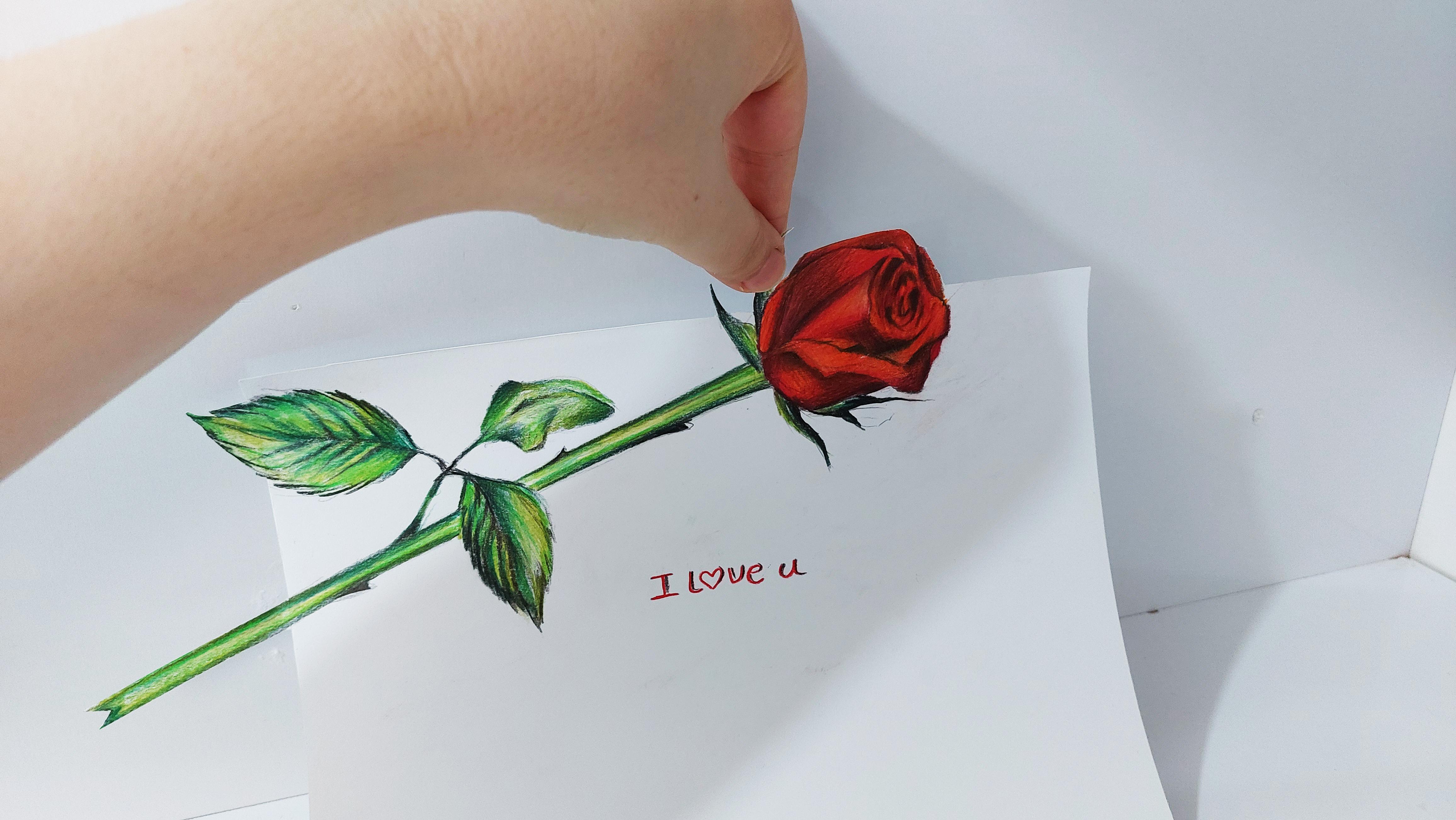
12. Basic Sketch and The Beginning of Flower Coloring: Hello again, Welcome to another episode of
3D painting with me. In this episode
we're going to work on a very beautiful Sketch. I'm actually going to
create a beautiful rose, a beautiful flower alike. It's coming out of
the paper, of course. First I'm going to
tell you how to do the primary Sketch of
this beautiful flower. Again, as I told you before, consider half of your paper, whatever size you
have a3, a3, or a4. Then you've considered
the half of your paper. For example. Because my paper is too big, I want to consider
this area for my work. From this fold, from
this folder line, you should start
creating your Flower. Okay? I want my
Flower to come over here and continues all
the way down there. So this would be the big, the end of my flowers, a stem. I place the stem of
my flower over here. And now I want to sketch
the flower itself. You see from all these
parts on can start my work. I start from here. I come up, I'll come
back again from here. And as you can see, I'm not
creating straight lines. There are a bit wavy. It's a flower. Here. I actually create
the general shape of the bond, the rose bud. This is a rose
flower, I can, I say, if I haven't mentioned
before, From here, I come and I create the shape
of the rows right here. So now very slowly, I will create the
rest of my rows. M actually sketching a
beautiful rose over here. You can Sketch any kind
of Flower that you like. It's not necessary that
it would be arose. You can create a sunflower, a lily. Anything you like. My favorite flower is Rose,
especially and Waitrose. So I've decided to
create arrows for you. From here, I come down
toward the end of this stem. And also very slowly, I would like to add some
thorns on my Flower. Okay. Because as you know, you can see thorns on the
stems of rows Flowers. Now I'm going to also
create a leaf over here. Because it's early about
The Flower or the stem. We also need leaves. So from here, I come down
to complete the leaves, and this is my third
leaf actually. Looking like this. Again, I come a bit more down and I add another
thorn over here. Okay? Now, this is the main answered and the
primary Sketch of my work. Now I want to Start
Coloring it and shading it. Of course. First of all, use your black colored pencil for applying the depth and a
strong darkness in your work. So I'm going to start from here. The inner parts of
my rows Flower. These parts are the darkest. So I'm going to Spread the darkness
to its surroundings. As you can see,
I've applied it in one place and now
I'm spreading it. Its surroundings,
fading my shapes. You don't want any stains here. Now, if you're creating a
rose flower the same as me, and if you're actually doing
the same Sketch as me, you should do to shadings
exactly the same as me. But if you're trying
another Flower, you should do based on your own. Of course, you should have
already learned this stuff. As you can see,
I'm just applying the Shane's wherever
I need them. And just like that, I also shade this bottom parts of the petals,
making them darker. And just around the petals. I mean, all around, all the edges of my
petals should be darker. Just do it very smooth. So it would still look natural. We don't want to make
it too cartoony. Okay. And just like that, I will continue my work. In this area. We have the rows bond
itself and I'm going to shade it again as usual, darker around the edges
and lighter in the center. Because we want to
show that centers are prominent and we have a volume, so there should be a
contrast of shades. I would also shade this central parts.
Right in the middle. I'm covering all of
the petals one-by-one to create and get to
**** Flower correctly. I also come from these sides. Shading them. I get my red color. And then I start from the dark parts with a
very high Hand pressure. And I try to fade them a
little toward the center. So I'm going to
use my red color. I'm going to start
from the dark, very dark parts of my shades. And from there with a very high Hand pressure,
I Start Coloring. As I move toward the center, I decrease the Hand pressure
and I make my shades, my red shades, lighter. I'll do the same
thing for this side. See, now the black is not
showing too much anymore because I've covered it with my red and it's actually
turned into dark red. Just the way I wanted it. So like that. And of course, I'll do the
same for this last petal. Of course, the inner
part of each pedal, which shows the depth of it, would be done more dark. It would be darker because
it's inside and it has a depth in order to
show that we have to create darker shades. But as you can see,
for example over here, because we have a
prominent part, we're gonna make it lighter. So I'm gonna do the
whole thing like that. The same way. Very beautifully
and very slowly. I apply each one of these shadings in
their own placements. So I applied the
darkness like that. And then very simply, I move on to my orange color because it shouldn't
be only read. I want to create a combination
of colors to make it look more natural and more cohesive. So I'm going to use
my orange color. And these parts, especially on the lighter areas of our pedals. That's very important as that. I'm also going to
color these areas. Wherever I have light shades, I'm going to use
my orange color. So basically I'm covering it
hole with my orange color. This way, all of the colors look more cohesive
and at the same time, I kept my contrast same. I would not leave any
white texture in my work. Now, I'm going to use my
dark red and I'm even adding more darkness
into my work. As shades. Of course. Looking like this. Looks better now. Wherever I have a
twist in the petals, I definitely have
more darker colors. And the darkness
is obviously more. K. Again, I move on
to my red color. And I add more
contrast to my work. I make it more red. Then I move on to
my black color. And I emphasize some of the
darkness and I've already made emphasize on them, and I fight them into the rest of the colors
at the same time. Here we go
13. Continue Coloring Flowers: Now I want to work on
this Samza of my work. Again, I start with
my black color and I apply some strong darkness for these parts of the stem. These are, these are actually
the top part of the stem. Looks like petals,
but they are green. So they can be
counted as leaves, very small leaves
right on the top of the stem and below
the flower itself. So I would also work on the stem itself. I just drag a line down, straight, not messy
and very clean. I use my black color
in order to create it and maybe even
work on some thorns. Not too much. Just a tad
is enough. Here we go. And I'll do the same thing as I go down and continue my
stem to the end of it. Alright? And as you can see, I am actually fading my lines. Which shapes we shouldn't have any specific lines in our work. Every line you have, you should fade them
with your shadings. That's the important
part actually. Okay. So here we go. Just like that. I would also apply the
darkness of the leaves. They definitely have
some darkness to. So here we go. I make this part
even more complete. And wherever I feel
like there's a depth, I will apply strong
darkness on it. Because the only way
to show it depth in a painting is to
apply the darkness. And if you've got some messy
parts or dirty parts on your work by dragging
your hand on your paper and making your
paper black or messy. Be sure to erase it right away. Do not let it go. Just like that.
I'm going to apply the darkness to my leaf. And as I do, you can see it's coming to life. K. And of course, the upper leaf is going
to be done the same way. Okay? Now I want to get another color
for Coloring these areas. And first of all, I'm going
to start with my dark green. So I use my dark green. Over here. I apply the
color from the sides. As you can see, I'm starting
on the edges as usual because the edges are darker and as I move
toward that center, they would get lighter. I would also have to Color
even over the black parts. So I am actually applying
this color over my black, so it would not look black
because they are leaves. They should be green. Okay, Here we go. I'll just continue till the end. Then with the same color. I'm also going to
work on my leaves. I apply the dark green
and I fade it in my work. And also I'll do the
same on this leaf. I'll go from the dark parts to the light parts are going
to continue in next episode
14. Completing the Color of The Flower and 3D Cutting: Okay, Now we are going to continue the rest of
this tutorial together. So as you remember, I was just starting to apply my color from the
darkest part of my work. And I was bringing them to the light and finding
them at the same time. And of course with
my green color. I'll do the same thing
for this other leaf. I shouldn't just
live this one out. So especially from these parts, I'm going to apply my green color in this way. Okay? Now, for my third color, I'm going to use
a lighter green. As you can see my hand. I'm going to use it on the parts which have
been uncolored. So you should actually add
this color to your work, again from the sides
toward the center. Because when you apply layers of color on
top of each other, even if you don't want
to take a darker, so we should be darker
on the edges and sides and as we move on to the center, it
should get lighter. So that's why I say each
color you want to add, it's better to add it first on the sides and then
in the center. Then I mean size, I mean,
Of course the edges, the dark edges that
we have in our work. Okay? I will have higher Hand pressure in the surroundings and edges. As I move toward the
center, I decrease it. Okay. Now, I want to get the
lightest green that I have. This is my lightest screen. Then you should cover all
of your stem and leaves. With this light color. Just leave the
center of your stem lighter than all other
parts like this. But anyway, with
this light color, you should cover the whole area. You can go all
over your painting once was actually helps
for blending the colors. And of course, making
it look better. It makes your work
look more cohesive. I'll do the same for the leaves. And of course, I'll do the same thing for
this outer leaf. Okay? Now, you should get
your white color and you should
drag it over here, the center of your stem, and also on your leaves. Just to make your work
completely cohesive. Here we go. I can also use a bit of my white color over here on the
petals of my rows. So I can give it a nice volume and I use
a bit of it for here. Furness area. Okay. I want to use some tricks
to make it more 3D. As I told you in the
beginning of our work, we should have folded
our paper like that. And now again, as you can see, I'm folding the sides
of my flower so hard. I create this line. And of course with my cutter, I'm going to separate the
upper part of the paper. Again, I insist you should do this work very, very carefully. Because sometimes it happens, even if it happened for me
before that, then I was Cutting my shape. My color just slipped from my hand and got into my work and it ruined
the whole thing. So don't rush it. Just take your time
with it and very slowly use your cutter on this line to
separate it, Of course. Okay. Now I should separate this area, the leaves below the flower, because they are so delicate, I should even spend more
time on it and make it, you know, better. I'll come over here
doing this one as well. Next is the flower itself. I'm going to cut all around it, all around the edges. Okay, I'm going to continue this cut all the way down here. Just be very careful
not to rip your work apart very carefully and slowly. Make sure you can
attach it easily. Say it's a bit of stuck here. So I'm going to
take it away with by Qatar again and with by
hand again very slowly. Okay, this should do the trick. I'll try again. And yes, Here we go. Here it is. Now I want to do
another fold from this side. This time. I want to take a bit of the
leaf out of my framework. And of course, a
part of my stem, the ending part of my stem, I want to take them out
of the frame as well. So again, very slowly
and very straight. Try to cut this area. If you can not do
these cuts straight, you should definitely
do them with a ruler that can help you. So try to make the cuts straight and carefully because this area is also very delicate. As you can see, we have
some fine lines here. And of course, last but
not least, the leaf. Again, I say, when you
cut it with your cutter, don't just rip the paper. All of a sudden from
the other side, you see sometimes some
parts may be stuck. So you should just try to
detach them and take them away very slowly with a
lot of Kushan like this. Alright, so dressed
as easy as that, we've got our Flower. Arrows are beautiful. 3d rose flower.
Again, very, very. You feel like there's a wide part still on
the edges of your work. We're used to be the cut paper. You can color it with
your colored pencils. And I can even write
something nice here. For example, I can
write, I love you. It should fit the
painting, shouldn't it? So here it is. Now let's take a photograph
of it or record a video
15. 3D Photography of Flowers: Okay, Now, if you want to do to photographing
or videography, you put your painting
in this angle. And then with moving
your camera up and down, you can get the right
angle for its 3D shape. See. I can even fold this area a bit. And this is my work. This is my 3D painting
in this angle. You see here it
is. So beautiful. I hope you've
enjoyed this one to and follow us for
more tutorials.
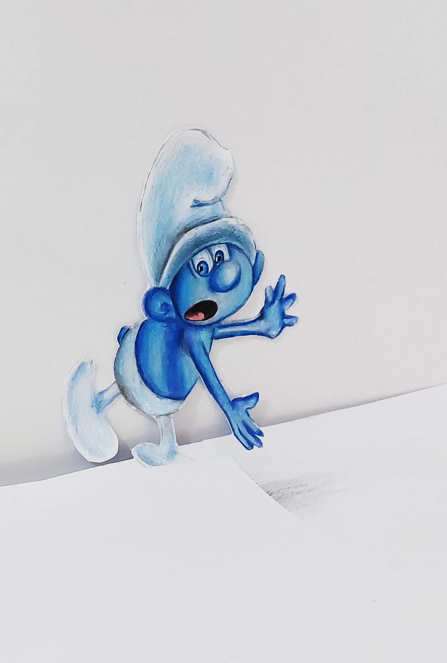
16. Basic Sketch and The Beginning of Smurf Character Coloring: Hello again and welcome
to a new episode. I'll 3D painting with me. Okay. This time we're going
to create a very, very cute character, which I know is one of your favorites. It's The Smurf I want to
create a 3D. Is Smurf? A little Q to Smurf. As usual, you should consider the half of the paper
you're working on. And then you should start creating the primary Sketch of your Smurf with your pencil. You can do it the same
way I'm doing it. They're so cute
little creatures. Okay? So I'm going to
create an oval first. It's actually chubby oval. It's a fat oval, as you can see. And then from here, I'll try to create its hat. In this area, I have
the Smurfs ear. As you've seen in the cartoons. The ears of the Smurfs are big, almost bag consider
comparing to their hats. I create two on both
sides of the head. Then I erase the extra lines
of my work with my eraser. And from here, I move up to
create the rest of its head. Actually one of the
iconic features of Smurfs are there hats. From here I come down, I create the shape of the head. I also create a circular
and cute nose for him. Then I create the
mouth for my Smurf. Okay. Then I start the
two eyes from here. It has certain color eyes. Okay. Then I erase all the
extra lines of my work going like this. Okay. Am just as easy as that. I've got my is Smurf head. So easy. Now I want to create
my Smurf spotty. So from over here, I'll consider a
circle in this shape. Okay, then from here, I come down and I also come down from
this side as well. All right. This would be my Smurfs clothes. They also have very
funny clothes. So I'm gonna get them right. One arm is actually coming
out this way, stretching. And of course, don't
forget about the fingers. I'm going to create the
fingers in this way. This is one of my
Smurfs, arms and hands. And the other one will be
placed here a bit of distance. First, I'll erase
the extra lines so my work would be cleaner. And then in this area I add three fingers over here
to complete the second arm. Again, I erase the extra
lines wherever I've got them. Just to make my
primary Sketch clean. I bring the mouth
a bit more down. For example. I place it
over here in this shape. And now it's face is
definitely Smurf. Goddess Smurf here. The only thing left is the leg. I'm going to create
the legs for him. First, I come down. Now. It's foot. Actually looks like a bean. Foot, looks exactly like a beam. I'm going to create
this second leg with a bit of distance. Again, I come from here. Then again I create
another bean over here. I should also add
a very small team. It's back. Now, I erase all the
extra lines of my work. I clean my primary Sketch because I want to
Start Coloring. Are going to Start
Coloring and making it into a 3D painting. Okay. I'm gonna start with my dark
blue for Coloring my Smurf. Then first of all, I'm going to Start Coloring
from this sides and edges of my Smurfs hit very
carefully and very slowly. I'm applying this dark blue
on the edges of the head, or better say
address of the face. You should do it. So your work would
actually look clean, the outcome would look clean. Very slowly. I tried to drag this color and faded toward the
center of the face. I do not overdo it and
I do not make it dark. It is dark and around the edges. And as I move on
toward the center, I decrease my hand pressure
in order to get it lighter and spread it
throughout the face. I also determine
the eyes with it. I mean, I'll go around
the eyes with my dark blue and I'll sit
around the nose. Okay. Then I just apply light shade
toward it's okay. Then I continue adding the
darkness wherever I need them. And the edges of the
face around the eyes, the nose, and
wherever it's needed. You can actually use
any other kind of sketches that you like
other than Smurf. Or you can actually Sketch any kind of cartoon
character that you like. Okay? So whatever character you're
going to create and Sketch, just remember to do this shadings as clean
as I'm doing care. And that's why that's important. I should also darken this
lower part of the nose. And as I move toward
the tip of the knows, I actually decrease the darkness because the tip of the
nose is very prominent. So it should be lighter. I'll do the same thing for
the darkness of these areas. And just like that. Here we go. Then I move on to
the other parts. For example. For his ear. Again, I apply the darkness on the ear around the
edges on the lines And from inner part of its ear, again, I apply some darkness. So I come to its
body and I'll do the same for antibody. Okay. So from these parts, again, I bring the darkness of
this arm to my work. Also. I'll do the same thing from below the head without the face. These parts should be
dark hair of course. So I'm going to work on
this area and the arm. I'll start applying some
darkness and my work, for example, on the Hand, this is one of the fingers, another one over here. Just like that. Then for this area, again, I imply some darker
spots, some lighter shades. And again, for over here, I create all of these shades
with these contrasts. This is actually what can give your painting a
volume and a depth. So I should also apply the darkness for
here below the arm. Just the way as you can see it. Okay. Now I move on to the other arm. So just from this darkness that I've already
applied over here, I started my work again and
I drag it towards the arm. Can actually use it for dinner. So I can show that it's
all attached there. And of course, because that's a very darkest spot and it can help me to get my shapes better. Again, I'm going to use some
darkness for the fingers, apply some darkness
on the fingers. And then little by little, I'll faded in the
prominent parts. Wherever that is more prominent, I'm going to shaded lighter and fade actually my dark colors. So just like that, also, we need this side
of the arm as well. And I am applying my darkness exactly as I
did in the previous parts. Fade the darkness completely
17. Continue Coloring Of Smurf Coloring: Now I'm going to use a blue which is one degree lighter
than the previous one. This kind of a sea blue. And I'm going to use
it on these parts. And if you pay attention, I'm using a circulatory
Hand movement. And I am dragging my colors from the dark parts toward the lighter shades and
the prominent parts. So here it is. Just as easy as you can see. Then again from these
parts below the nose, I add another shade like this. Then I'll do the same
thing for the ear, also for these
parts of it. Okay. It's looking pretty good. So from the side parts, again, just like the previous parts, I'm going to use
my lighter color. I'm going to start
from the dark parts and bringing it to
the lighter areas. This actually blends
the colors together, making it more faded, more smooth, and more natural. The belly and the front part
of the body is also done. So here we go. For this Hand. I'll do the same thing. No problems there. So just like that, I'll get even a lighter blue. And again, I come on the lightest areas and I'm dragging my Colored
Pencil over there. So basically, I've used a
three degrees of blue color. I used three shades of blue, a dark one, I mean D11, and a light one that I'm using now for Coloring
this whole Smurf. This lighter one should be
applied on the lightest areas. And then for my last touch, I'm going to use my
white colored pencil. And of course, as you know, I'm going to drag it all
over my work in order to make this areas, these light areas cohesive, looking like they are
all the same color. So very slowly. We just blend the colors and
fade them into one another. With our white color. It also gives it a smooth look. As much as you feel the textures of your
cardboard or paper more. This blending and also creating the volume will actually
show more in your work. They would look better to
try to feel the texture of your paper or cardboard
as much as you can. This can affect your whole work. So wherever I have a
darkness or even a light, I'm going to cover it
with my white color. Okay? Now, I'm going
to choose a very, very, very light blue. Just let me find it here. It's going to take some
time finding the blue here. Sorry, I meant a
very, very dark blue. I start applying this color on the parts which have
very strong darkness. I apply this color in order to create a great contrast and Create a depth and volume
that I want in my work. So I choose a very dark blue, this blue that I'm holding. And then I apply it
on the darkest parts of my work to get degrade depth. Simultaneously. I work on some parts with my white and I'm just covering
some parts with my dark blue, especially on the arms
and around the fingers. These are some dark spots. Okay. So just like that, very slowly with a lot of
patients, I'm doing it. I don't want just a splash. My dark call her lover. I can. And I should be
very careful not to create any stains because in this step we're actually
fading the colors. I'm getting the
shapes correctly. So here we go. Going all around the
fingers as well. So step-by-step and slowly I add this darkness
into my work is C. Then I've applied
this very dark color. How much I've got
volume in my work, how much more I've got
volume in my work. It already had some, but then I added
this dark color. It just popped out. It's like double the volume. Got it more and show it more. So I'm going to use it on
the face and ears as well, especially around
the eyes and nose. Of course over here
below the head. It's the same thing because
it's very, very dark. Very closed up area. This part of the
ear should be done to I have this darkness. Okay. As you can seem like that. Then I'll use the same color and the same process
for its ear. Because we should show
the depth in ER as well. I don't want to make the
whole thing and the 3D shape, but leave the ears flat. It's not going to work. I'm going to try and work on it more until I get the
volume that I want from it. So again, I'm going to
work on some darker spots, or better say, very
strong dark shades on the arms and on the body. And as you can see, I am fading all of these
shadings little by little to their surroundings
because I don't want any border with my colors. I don't want any
specific lines or any color borders in my work. That's why I'm fading
whatever color that I apply. Forget about the little team. Color it to. Then again, I switch to my
light blue colored pencil. If I find it here. So again, I get my light blue. I am using it on detail
a bit on the ear. Just a touch over some parts
to make it even blend more antibiotic or Of
course, alright. Now get your black
colored pencil. Sharpen it completely. And then use it to
create the mouth sheets. Create a Smurfs mouth with
your black colored pencil. I'm even going to
color inside of it a little except its tongue. You should feel the rest of this mouth with
your black color. Then you get your red color and you feel inside
of the tongue. And they complete the
tongue and mouth. I'm also going to use
my black color on some very darkest spots in order to get a dark shan't
wherever I need them. It's only on some parts, not everywhere as you can see. The parts which are really dark. Here we go. Now, the last, but not least, of course, are the eyes. For the eyes, I'm just
going to apply two dots. And then from the sides, I'm going to use my blue
color to go around it. So I use my dark blue to create around the eyes and
I'll do it also very fate. And then you use your light blue on them to fade them better. Just like that. And just the shade
for inside of its I, a very, very light shade. Just a trace of color is enough. Shouldn't be blue. Now I'm going to create the hat and the bottom
part of my Smurf. So first of all, you
should use your dark blue. And then very slowly and very
mellow and very lightly, you should shade these areas. Do not rush at all. Just take your time, would it? Take it as slow. So your shading will be
cohesive and in one color, you don't want to create
any sudden stains. Keep your hand pressure low and do some shadings on the hat. Continue the same way. For the continuous
of this tutorial. Be with me next episode
18. Complete Coloring Of The Smurf Character: Okay, welcome to the rest
of this tutorial with me. I was working with my dark blue and applying
these dark colors. No, of course, from these
parts from the back of the hat that we have some
wrinkles on the hat, I would actually increase
the darkness just like that. So from the bottom, just like that, I add more darkness to
the wrinkled areas. And for this part of the hat, Of course, I consider
this darkness. Yeah. Okay. I'm done. For now. I should also bring some more darkness from
the edges of the hat. I'll do it. Okay. Now I'm going to use
my lighter blue. And I'll fade this
color toward the edges. Then I'll use my
white colored pencil. And I will cover the whole hat. So I'm going over all the
darkness that I've already applied to fade them. And I'll go through
the other parts to blend the colors together. Just as you can see. This way. Then I also drag it
once on the face. The same on these parts as well. So I'm gonna do it. Okay? So I'm gonna do the blending
from the top of my work. So all of my colors
are actually makes to each other and faint into
each other completely. I don't want any specific
lines or stains of colors. Now I'm going to use my gray color and I'm going
to work on these parts, making them even
more faded. Okay. Or this area, again, I'm going to use my
black colored pencil to darken this part even more. So cute. Looking so cute. And of course these
parts should be darker. So I'm going to use my
black colored pencil to get the correct shades
that I need from here. And again with my
white colored pencil, I create a faded
shape for this area. And I'll drag it
up to these parts very slowly and lightly. And then I'm going to do this same process and repeat
the same procedure which I've done for they had for the pants for the bottom
part of my Smurf. Depends on legs and feet. I'm going to repeat exact same procedure
as I did for the hat. So I'm going to
apply some darkness I would apply some black
color in this area. And then I'm going to use my white colored pencil to
create it's faded color. Okay. Then I'm going to use
some color for the feed. But before that,
I should lighten my primary Sketch with my eraser because I didn't want
my colors to get messy. Okay. And in the bottom parts
of the shoes or the feet, the shadings are darker
and as they come up they would be lighter
until we get to the ankle. The ankle is also a bit darker comparing
to the rest of the leg. And I'll do the same thing for the other leg
and the other foot. The bottom part of the shoe or the foot is
definitely darker. And as I move on, it
will get lighter. I can even use a bit of my
black color for this area. And of course, fading it
in with my white color. The best thing for fading is
the white colored pencil. Okay? So I'm going to take
the lighter blue. And I cover these areas a bit. Then I use my eraser and I can add more light
to these parts. And of course, I can erase all around my work to
make it cleaner. I don't want it to
be missy or have any extra colors are
anything around my work. Alright. So I'm going to create a very, very light shadow over here. Just, you know, below the foot. Under the foot. So with that in mind, I'm going to expand it a bit more because it cannot be
just a circle and that's it. I'm going to spend
expand this shadow. So it would look like that. This is the shadow of my Smurf. This wide area. It looks like he's
kinda falling. Probably falling
out of our paper. Okay, Here we go. Coloring it nice. And I use my finger
to fade it a little. As you can save and I
drag my finger on it, it will get faded. Okay?
19. 3D Cutting of Smurf Character: And now I should've
start cutting my work so I can make it into a 3D. So I only want this part of
my Smurf to be on my paper. The rest of it
should be cut out. So I am going to fold my paper from here and cut it from here. Because I want the most of
its body out of my paper. I just only want this
part on the paper. I'm going to start
with my cutter and cut my Smurf
out of this paper. I'll do it very carefully,
very, very carefully. I'll do the same
thing from this side. And then I have to cut out
my Smurf from my paper. So I should use my
cutter and go all around my Smurf to cut
it out the paper. You should be very careful because this is going
to be very delicate. It's kind of a complex Sketch. It has so many details. So try not to lose any of them. In your cutting process. You can just spend
some more time on it. Okay. Here we go. Okay. The bottom part is almost out. Okay. Now, I separate
this part as well, and then I come to the bottom
of its pants and do this. Continuing all the
way through here. You should rotate your paper
in order to CO2 your work in different directions because you have to move your hand easily. It's a very delicate work, so it's better if you can move your hand easier and easily. So you can get up all
the parts that you need. K then it goes here. And of course, this middle area. Be very careful not to tear
any part of your work. This should also
be cut, gets out. And The same thing is
going to happen here. I'm going to cut around the arm in the Hand. Okay. So part by part, you should separate these papers and you should cut
your Smurf out. Working on the hand. They even need more cautious. Small parts are
harder to work with And this area is also
separated and cut out. Okay. This part of the body. And my Smurf Hand again, inheritance. We are almost done. Again. I insist
that you'd be very careful around the fingers. See, you should press your
hand beneath your cardboard, or better say, on
the cardboard so you can actually cut this part out. Okay, I just make a cut over here like this. Then again, I bring my cutter. Actually I take it from below
the paper or cardboard. And I cut the smaller parts. Then I'm going to cut
its face out. The face. And of course after
that, the hat. As you can see, I am rotating my paper because it's
easier to work this way. I want to get all the details and I don't want to lose any. Just like that. I go around the hat as well until I get to
this part, the ear. So I go around the ear. And the last part, the back. Again I say, do not just
suddenly after Cutting, you shouldn't just suddenly take the paper away because
some parts might be stuck. I get my Kotter beneath my paper and very slowly from
below, from beneath. I start cutting out my
sketch, my painting. See for example, this
part gotta stuck. It wasn't cut. Okay? And I think we are done. Maybe if it's of this area, again, here we go. And that's it. Now as you can see, we've separated our
Smurf from our paper. We basic big cut it
out of the paper. Let me just make this
right now it's done. Okay, Good. And get this area to the
round shape of the hat. So we gotta down. Now, I'm going to tell you how you can photograph it or
record a video on it.
20. 3D Photography of Smurf Character: Okay, Now after you've
cut out your work, it should stay up like this. So you can take a photograph or you can record
a video from it.
21. Basic Sketch and The Beginning of Spiderman Character Coloring: Hello again and welcome
to a new episode of 3D painting with me. Okay. This time we're going to do
the one last tutorial of this course and we are going
to create a Spiderman. So this time we're going to
create a 3D is Spiderman. You can choose any other
Sketch that you want, but I've decided
Sketch of Spiderman. So I will darken to
backup via picture. So if a sketching the work is too complex for you or
it's too hard for you to do. You can use this way that
I'm showing you right now. I'm just doing it
for saving time. I will darken the
back of my work. Then I will place it on my paper that I want
to do to work on. I addressed it. Then I start going all
around the lines of my picture in order to copy
the sketch on my paper. With this way. So easily your picture will
be copied on the paper. This is good for the times
that you want to save time. Or as I said before, this would be good for the times where it's complex for you. I'm working on the legs. So I'm going all around my work, going on all lines. Also the arm and the Hand, eyes. And we've already
worked on the body. I even go over the
design of its close. I can also go over the shadow of our Spiderman because
we need this to, you know, I also go
all around the shadow. Okay. Just like that, I'll copy my work and
I start sketching. And I actually Start
Coloring the primary Sketch. First of all, as you know, and as you can see, I'm starting with my red color. I installed from these parts. Below my Spiderman. Spiderman is Nick. Sorry. In these parts, I work
with a strong darkness. Okay? So in this way, I apply my red color
where it's needed. Of course. Here we go. And do you can do this exactly as I'm
Coloring this model. Okay? Just like that. So very slowly come from the
sides toward the center. I come over here
and I'll continue. See. Okay, I'm only applying the
background color right now. And as you can see, I am not doing any
shadings knows yet First, I'm just doing a background color
for all of my work. Sorry. Then later I
will apply some are shadings in order to get the
volumes and the other stuff. So just as this I'll continue. So I will actually made
all the red parts red. I mean, wherever I had
red color in my work, I applied red color in here. I should also complete
this arm as well. Okay. I don't want to make
their head read yet. Because first, I want to do this shadings over here and then move on
to the next part. So I want to start from here. I bring the darkness
into my work from below the head with
my black color. Again, I say for now, I keep the head on Colored
because if I make that R2, it would be really hard to apply the shading where
they need to be. Okay, now, from this side part, I'm going to do the same thing. Here we go. Up to these parts. I will do all of them. All the dark shadings
will be applied here. So with my black color, I apply the darkness on
his stomach very slowly. And it's a lot of patients, I apply the darkness in their own placement. C. I can also work on
this part of the arm. Okay. So here we go. I'm bringing the shades into my work and is
stars look better. I should also have
some dark colors, some black colors
on the edges of the arm around the
lines and the fingers. Of course. Just like that, I'm going to use my red color and
I want to go over these parts that I've
already colored black because I want my work
to look more faded. Just like that. And
just as easy as that. Okay. Then I would also have to
work on my Spider man's head. Now I can start it because
I've already shaded below it. So I would know where is the
head is placed or his neck. Now, I'll Start
Coloring the head. Keep in mind you should
notes Color over his eyes. They should just
stay on Colored. Okay. Here we go. And then again with my
black colored pencil, I will try to add the darkness for this area. Okay. I go around its head with my black color and
also around his eyes. And then I faded toward inside
because as I said before, I don't need any specific lines, so I have to fade any
line that I create, especially if they're with my black color because
they can be so visible. Then also from here. I'm going to shade
this area so I can show that the lower part of his arm on his shoulder
is more prominent. Then again, I guess
my red color and I want to work on this part more. Okay?
22. Continue Coloring of Spiderman Coloring: Now I move to my blue color. And I'm going to apply
my blue color over here. Just like that. They will be colored
in this way. And it will be the same from
these parts, these areas. So I applied my blue color
in the parse that I needed. Then I get my darker blue. And with that, I start
shading in Start obviously from the
sides and the edges of the arm and hand toward
the inner parts. And it would look like this. As nice, as beautiful
as this one. Then again, I guess my black colored pencil and I darken this area completely. And also this area. Do the same for here too. Then I work around the arms and I apply the color over
here a bit more. Then I want to work on the
bottom of my Spiderman, the lower body part. So as I did before for
the upper body part, I start with my red color
and I start with his legs. Okay. So I just use a lot of Hand pressure in Coloring this area
because I want to feel all the textures of my
cardboard and my paper. And as much as you can feel the texture of your
paper or cardboard, it can actually make
your work look better. Every aspect possible. For example, you can even choose a Sketch or a photo in which Spiderman is flipping or
jumping over some building. This kind of characters
can be really interesting while we bring
them to 3D paintings. Okay, then I moved
to my blue color. And with my blue color, I'm going to color
all the leg parts. I go up. And from here. Okay. Again, just generally, I'll create a background color. This time with my blue, with a very high
Hand pressure. C. Just feeling all the parts and all the textures of the
cardboard or paper. No worries. Okay. Then I should get the volume of my work
with my darker blue, so don't worry about it. As I said before, it's
just a background color just to feel the textures
of the cardboard or paper. Now I get my darker
blue and again, I Start Coloring especially around the edges and
making them darker. Alright. Now I'm basically
applying my darker blue around the edges
wherever I need to to create the volume that
I want from my picture. Okay. I will also work on the knees. Comes all the way up to here. As you can see while I'm
adding these dark blue lines, it is giving my
work more volume. It's giving get depth
in some places, making some other
parts look more prominent is getting it
out of that flat shape. Even right now, you
can clearly see the difference between
the upper body part and the lower body part. Because I've already
done the shades for the upper body part. Okay. I should also do
the same thing over here. Here we go. Okay. Now, I should use my
black colored pencil. And I should just bring some of the darkness into my work
with my black color. As always. Just as easy as that. I'm going to start from here. I am dragging the darkness
into the lower body part. In this area, K. We're going to continue this tutorial
in next episode.
23. Complete Coloring Of The Spiderman Character: Hello again and welcome to the continuous of our tutorial. Alright. I was applying
the darkness of the work with my black
color, as you can see. And actually I'm applying the darkness the way I see
them in my model picture. Putting them in
the right places. Here we go. Wherever I see them, I should apply them. Just as easy as that. You just need to pay a bit
more attention and go for it. So I applied and needed
darkness went my black color. There ever. They shouldn't be. Then I'll do the same thing for the links. All the way down to
the feet and toes. Okay. So here we are, darkening all these
parts and I'll continue because Of course I should do the same
thing for the other leg, especially around the ankle. Well, we should have darkness
on both sides of the body. And this bottom
part of the foot, of course, would be the darkest. I'm going to use my
white pen this time. And I'm going to apply some
white spots in my work. Some of them as you
can see on the arm, Hand, some of them
are on the body. So they use of my white pen. I am creating this white
or better say light spots. They look like some
kind of a shine or for showing the more
prominent parts. This is a good trick
to get them all. So very carefully. I drag them up here. Here we go. It would
look like this. First you should drag your white pen on
your hand like that. You should just drag
it on your hand. So it would get warmed
up and it doesn't get too little or too
much of the white color, the white ink on your work. Just the amount that
you want. Okay. I can also apply it
over here on the head. Alright, it's needed
for the mask basically. And that is how it's done. I'm gonna do the same
thing for the arm, the shoulder, the arm, and all the way to the wrist, and even the Hand. Okay. For all these parts, again, I should
use my white pen. Of course, in these parts, it's not too visible. For the legs, the red
parts of the leg and feet. And doing the same thing on
this other side of the body. On this other leg. Of course. You don't wanna do just
half the painting. We should do it all the way. Alright. We're almost finished. This area Okay. I also apply some lines on the shoulder, right over here. And now I'm gonna do the exact opposite. Here we go. Just as you can see, I'm doing it. Now. Take your black Pencil,
black colored pencil, and then from inside
of these parts, one-by-one, from behind,
the white areas. Apply your shades. With your black pencils. You should apply some
shades right next to the white lines that
we've just created. In this way, your
Spiderman Sketch will actually show
itself pretty well. It will pop out and it
will get Ville volume K. Do the same thing for
this area as well. One-by-one. I'm doing them. If you can see. Here we go. Then I move on to the
center of the body, or better say to the
middle of the chest. This area is very dark, so I am Coloring get with a high Hand pressure
with my black pencil. Just Coloring get
dark as you can see. And then I would also do the same thing on
the legs and foot. So from the address from
the sides, I'll go darker. All around the edges
would be dark. And then I applied
the rest of my shades and I tried to fade them as
I move toward the center. I don't want just
sustains of color. Of course, whatever color
we add, we should fade it. Okay. So do the same thing for the head area and consider
this darkness for it. Just does this. Okay? The darkness of here
goes a bit more up. Also, again in the
middle of the chest. I'm kinda creating
The Spiderman logo. I put it in middle
of his chest place. It's always been. Now I'm going to create the shadow
of my Spiderman. I'm going to use my gray color. And is start from here because it's connected
to this foot clearly. So I'm going to color my
Spiderman shadow with it. With this gray color. In this way. This is the
head area and the hand. Okay? Then I Start Coloring, Of course, with my gray color. I'm going to color
the whole area. I'm just going to do it very slowly and with a
lot of patients. But again, I say
because it's a shadow, I'm going to color all of it
with my gray colored pencil. Just going to cover
the whole area, the whole shadow area. Leaving that spot
not Colored right here in the middle because
there isn't a shadow here. So I carefully
just go around it. And then very slowly eye
color all the shadow gray. So here we go. And it's done. And then I get a lighter gray. And I go over all
the parts that I've just colored because I
want to fade all of them. See. Then I go all over it one more time with
my lighter color. It fades. All of the darker lines. Makes it look better. Just like that. And that's it.
24. 3D Cutting and Photography Of Spiderman: That alone, king
Spiderman and just caught the Spiderman and out and making it into a
3D is Spiderman. I'm going to fold
my paper from over here because we want
this area to be outside. So I strongly full the parts
which are not inside of my painting so I can cut
them easier with Lai cutter. I've asked one is by them
and let me first good. Spiderman itself. And then I can cut the rest of the paper
easier, of course. So I'm using my cutter and
going all around my Spiderman. Just as this see very slowly. Because you don't
want to just get into your main painting. I'll go around his head. Again. I say it would be easier
for you if you can rotate your paper because your
hand can move more freely. And the Cutting phase, the Cutting stage would
be easier for you if you can rotate your paper
the way I'm doing now. And it actually reduces the
risk of mistakes for you. So continue downward. And as you can see very easily, I caught that part out. I should also
separate the head and from this flight of the head and can easily
go down to the other arm. Here. Right from here. I'm going to separate it. There. Also some very, very delicate parts over here
because they're small parts. But I'm going to very carefully separate
these two bearer, say, cut them out. Right? Then this area between the
legs again from this side. Just have to be sure. And I'd be careful not to
cut the leg by accidents. And the last part would be here. I mean, the last delicate
part, Of course. I get this part out as well. Cut it out. I cut this area out to the part just around
the knee and tyrannous. Now I just have to cause the main parts so I can separated from the
rest of the paper. So from here I cut it. And as you can see,
it's coming off. The extra paper is coming off. So I cut out my Spiderman
from my paper that bad. Then I use my dark colors in order to go all around
the edges of my work. If I see they are still white because we don't want to leave any white parts
in our painting. And also, I use my Kotter
again to cut out these parts, these small parts from
between the fingers. And then of course, I
use my orange color to go around it and cover
all the white parts. Notice. Okay. It goes like that is Spiderman. And then I fold the
Spiderman a little up, aren't they put it like this? And now let's go to see how we can photograph and
let's see that's too bad. Okay. Now, if I move my phone
and I'm based this angle, and you can see a Spiderman is actually spending
out of the paper. So I can take photographs of him and this angle
to make it 3D. I hope you've enjoyed this
tutorial as much as you, and I'll see you in next courses and next tutorials
with the naked
 Amelie Braun, Artist & Cartoonist