Transcripts
1. Intro to Christmas Bauble in Procreate by Delores Naskrent: Hi guys and welcome. My name is Dolores Nascrint
and I'm coming to you from sunny Manitoba, Canada. As you can see, my
grass is still green. There's still
leaves on my trees. What I've been working on
lately is my Christmas stuff. What I wanted to do was to get you started on this project now so that you can have all of that in place right
when you need it. Even if you're just going to be printing it and sending
it to your family, you definitely want to have this done a little bit in advance. Now, this project isn't going
to teach you too much new. Everything that I'm
showing you here in procreate is a skill that I've taught you in
one class or another. I just want to inspire you to create something fun and easy. I'm including a bunch
of free brushes. That way you can dig
into the project without having to
create any of your own. Once you see what
I've done here, you can definitely go ahead and start creating a
bunch of brushes for yourself as the years
go by using procreate, I've developed so many brushes and when I'm producing
a project like this, I'm so glad that I did all the brush sets that I have
definitely come in handy. Some of them sit there for
months without being used. But there are certain ones that I go back to
again and again. Now if you're watching
this class on skill share and you
don't follow me yet, hit that link with my
name and it'll take you to my profile page
where you can follow me. That profile page is a great way to find all of the
other classes I do. I have so many
procreate projects for any time of the year. Also, if you follow me, you'll get all of the discussion
posts that I send out. I'm also going to suggest
that you get on over to my website there and add your
name to my mailing list. That mailing list is where
I send my newsletter from, and you're more
likely to get links about the brush sets
and things that I post. I have lots of artists
resources and believe me, there are a ton of free ones there. You want to check it out? Are you ready to dig
into this project? It's not the first
one that I've done. Believe me, I've
got a few to show you here and I'm
going to get you inspired with a bunch of other examples.
Let's get into it.
2. Lesson 1 Examples, Inspiration and Overview: Hi guys, welcome to lesson One. Like I said, I'm
going to get you started by taking a look at some inspiration and some
examples. Let's get started. Don't you just love Christmas? It's one of my favorite
times of the year for lots of different
reasons, I guess. I mean, it's obviously a
really wonderful family time and we tend to gather as
a family more than once. There's different
combinations of my family that we gather. And we gather sometimes
in the big city where my husband's family is or here where my whole family is
like my children and my mom, of course, my sisters
are all far away. But there's often times
where one of them will come or one of my nieces
and nephews will join us. So many different combinations. And I always get
excited for Christmas. And since I've been involved
with art licensing, I start Christmas in the summer, so I'm designing patterns for Christmas and art for Christmas. Very early on, I have
found that Christmas is one of the most lucrative
times of year to design for. My last set of licensing that I did for
Christmas was last year, and I did a whole class on the creation of a
Christmas flag. And in the end, it
actually turned out to be a really big project because
they created mailbox covers, they created
beautiful floor mat, they created smaller flags. There was a whole
collection of items that I ended up being able to
collect dividends on. Eventually, each of those
things has paid off, and I was so glad that
I had gotten that job. The project that I want
to do with you guys today is a Christmas decoration. I've got some imagery
that I've saved, my Christmas boards
actually are all together in this Christmas ideas
section of my Pinterest site. Let's just go into the Christmas decorations
category here. And there are some
beautiful references here, Some really fun and great
projects that you could create. You could definitely find
a lot of inspiration and so many different styles
like something like this. This will be kind
of fun to do if we base our project on this. All the different bubbles, all the different
shapes of the bubbles. I would almost say this
is our retro style. Lots of little
retro elements that are added in here that
make it kind of fun. I love that when you click on something
here in Pinterest, you're definitely given a ton of other examples
that you can look at. And like I said, the styles
are so very different. So if you can infuse your
own style into your artwork, maybe your own color schemes, you can create some
really cool pieces. I loved this one because it's obviously done
with cut paper. And what a brilliant
idea can you imagine? This would be a look that you could actually
achieve digitally. So that could be
an idea for you. There are some that
are very vectory. Something like this
could easily be done in affinity designer if that
was your weapon of choice. I love that some of these could work as a
combined vector and raster document
like this one here is a selection of
different baubles, different shapes
and I think that a lot of this detail could
have been added with the pixel persona in
affinity designer or the whole thing
could have been done in procreate with
some brush stamps. The stamps to create
these bauble shapes. In fact, that's
why I've developed my Christmas set that I'm going to be selling
at some point this year. I haven't got it done yet, so I'm really hoping
that I'll be able to. Here's another example of a really sort of a
painterly style. Lots of really cute
little additions of leaves and branches and flowers you could probably
get use out of all of those little flowers that you've either created or
you've purchased. Again, this one has another
sort of a retro feel to it. I love this one for its texture, so that's something
that might be interesting to incorporate
in our designs. And really all the different color schemes, these
really excite me. There's definitely your traditional Christmas
color combinations, the green and red, but so many other colors
being introduced here. This is your traditional
red and green Christmas, but with all the
different tones, the desaturated pinks
in the background, the really saturated reds
and saturated greens, and then textures added. This could be a really good
inspiration piece right here. I think that everyone could
create an artwork based on the instruction I'm
giving today and have it turn out absolutely,
completely different. What I would love to do is develop a set of greeting cards. And you know me, I've got
so many pokers in the fire that I may not get time to do all of
these things that I want. But look at how easily you could adapt something like this
for a greeting card. Really, you could use
the same bauble shapes and just decorate them
slightly different. And probably be able to create ten cards quite quickly
and quite easily, just applying different
color schemes, perhaps different
holiday messages. This reminds me a lot of the
lettering that we did in the lettering project that
we did a few weeks back. So keep that in mind, you could probably take a day to just produce a bunch
of the phrases, do the lettering, and
create the phrases, and then be ready with those phrases when you have
a bunch of babbles done. Personally, I would also take those bubbles and save
them out as PNG files. And then those PNG files could be applied to multiple projects. Why not use the same bubbles
and add little characters, or add additional flowers, or just change their coloration or change their arrangement? I think that this is going
to be a really fun project and I'm wanting to start
it early on for you so that you can get some of these ideas started well in advance of the
holiday season. Like I said, most of the time I'm designing Christmas
in the summer. I'm thinking that if you
set your mind to it, you could produce a
bunch of cards and at least get them uploaded
onto a site like car dial. Look at how gorgeous this one is with just one single bauble, One word added, and then some beautiful
greenery around the side. It's just like a
black hole here. We could just keep
going forever and ever honestly looking at this and I'd love to see each of you try the
different techniques, try some really solid flowers
with no painterly effects. And then actually do a few that have textures and
painterly details added. When you take a look
at one like this, what I like about this one
as you're looking at it, is how much of that
bauble really stands out. It's like the most
prominent piece there, and that's because the
color is super saturated. Nice and dark, and
then everything else in the background
is desaturated. Don't get me started about
foil, foil, and glitter. I think absolutely
work for Christmas. But actually show
you some examples of my own pieces right away
so that you can see. And I'm going to break down
the documents so you can get lots and lots of ideas
as you look at mine. So without further ado, let's get into the lessons. I'll see you in lesson two.
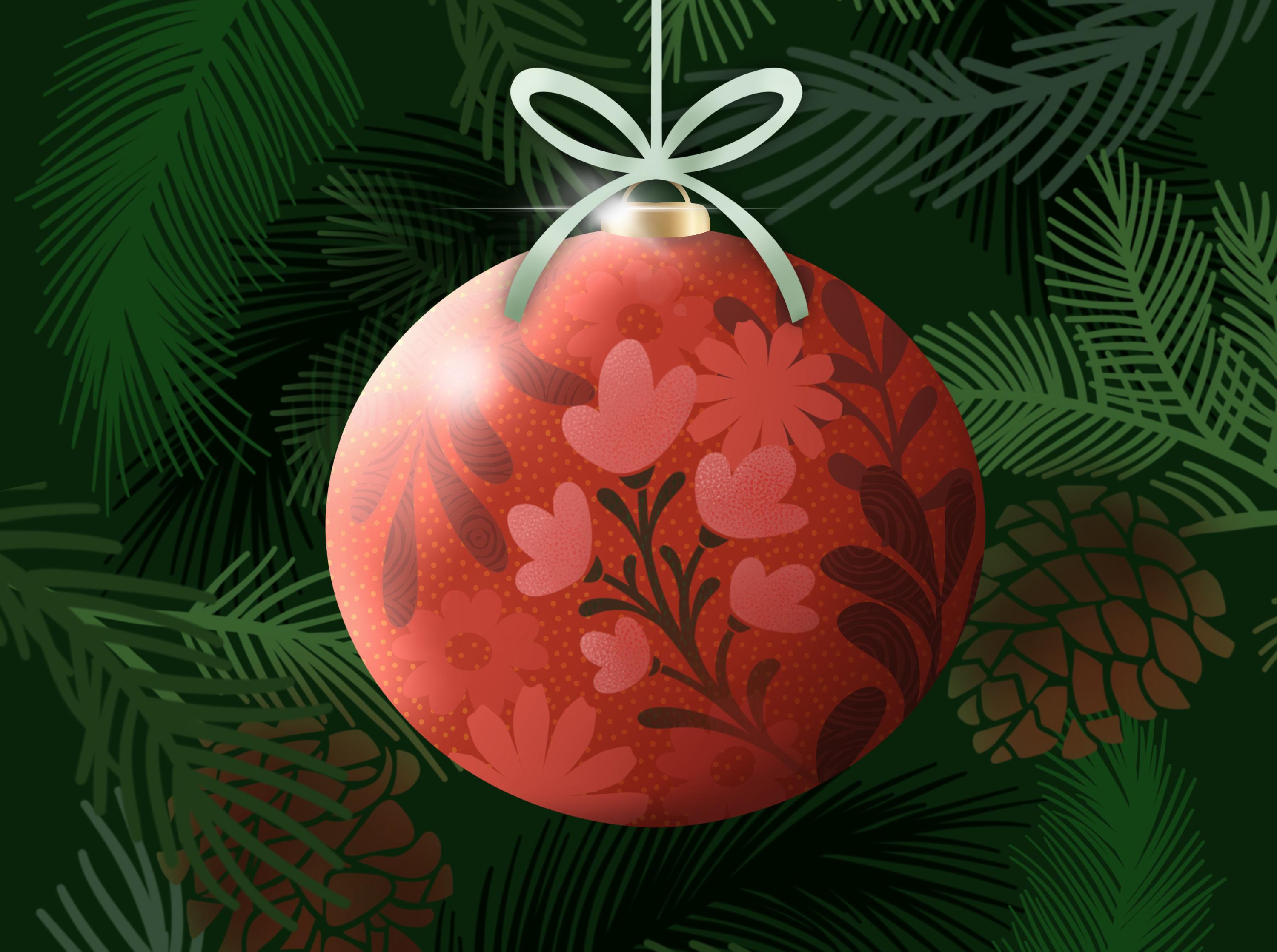
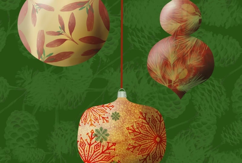
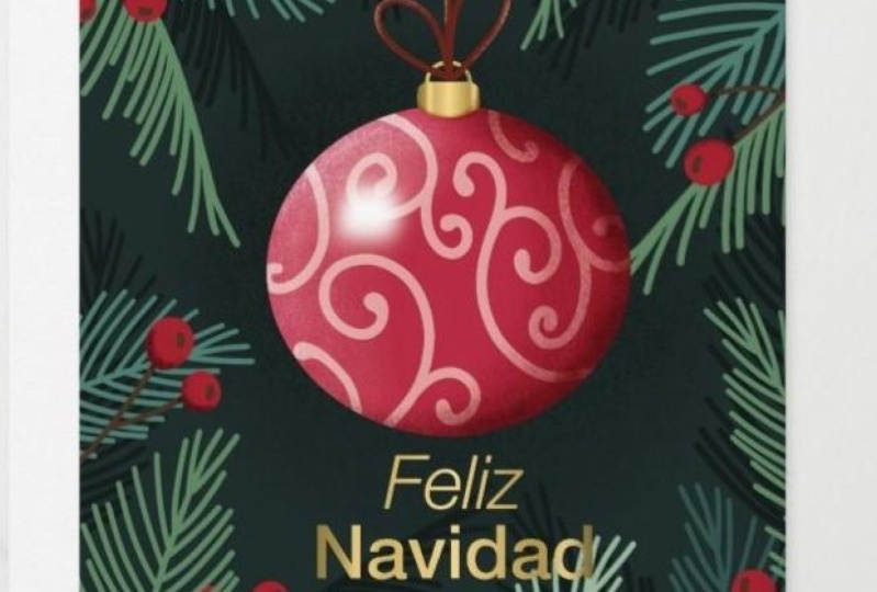
3. Lesson 2 Document Set Up and Included Brushes: Hey guys, welcome to
lesson two. Lesson two. Here we're going to get started
with some of the brushes. I'm going to show
you how to set up your document. Let's get to it. I'm going to show
you a couple of the different Christmas
bauble artworks that I've created in
the last few weeks. This is probably the project
that we're going to do. These are very simple. I haven't added a lot of
additional elements here. I might show you also this one to show you how
I would add elements. This one here, I
really liked because of the highlights and
shadows that I added, I thought that made it look
really nice and shiny. And the background textures, I'm not really quite sure
which one will end up with. You'll probably end up with
lots of ideas that you can go back and apply
in your own way. One I was just working on, I don't know if I would
consider this one finished, but this one, I added some glitter to it and
I thought that was fun. I think any of these could be adapted to be greeting cards. I actually went through
and set this one up. I'll probably end up making
this one into a card somehow. I just haven't got
to that point yet. This one is fun too. I did add a little bit
of glitter in the end and just a little bit of shine, That addition of some
greenery in the background, I thought really set it off. Just like I showed you
in that first lesson, there was that one bubble that was really standing out
against the background. I used the same
principles, Basically, kept the foreground bright
and fully saturated, and then I really darkened it, desaturated the background so that you would really
get that contrast. The addition of shadows, of course, makes it
also lift off the page. Again, there's highlights
that I painted on here before even putting these
bits of sparkle on there. These are all different
things that we can do when we're
producing this project. That's what I mean
about it being almost like limitless with
a bunch of stamps, go through and create tons and tons of different artworks. I think I am going to do this
one square because then I can adapt the artwork for either horizontal
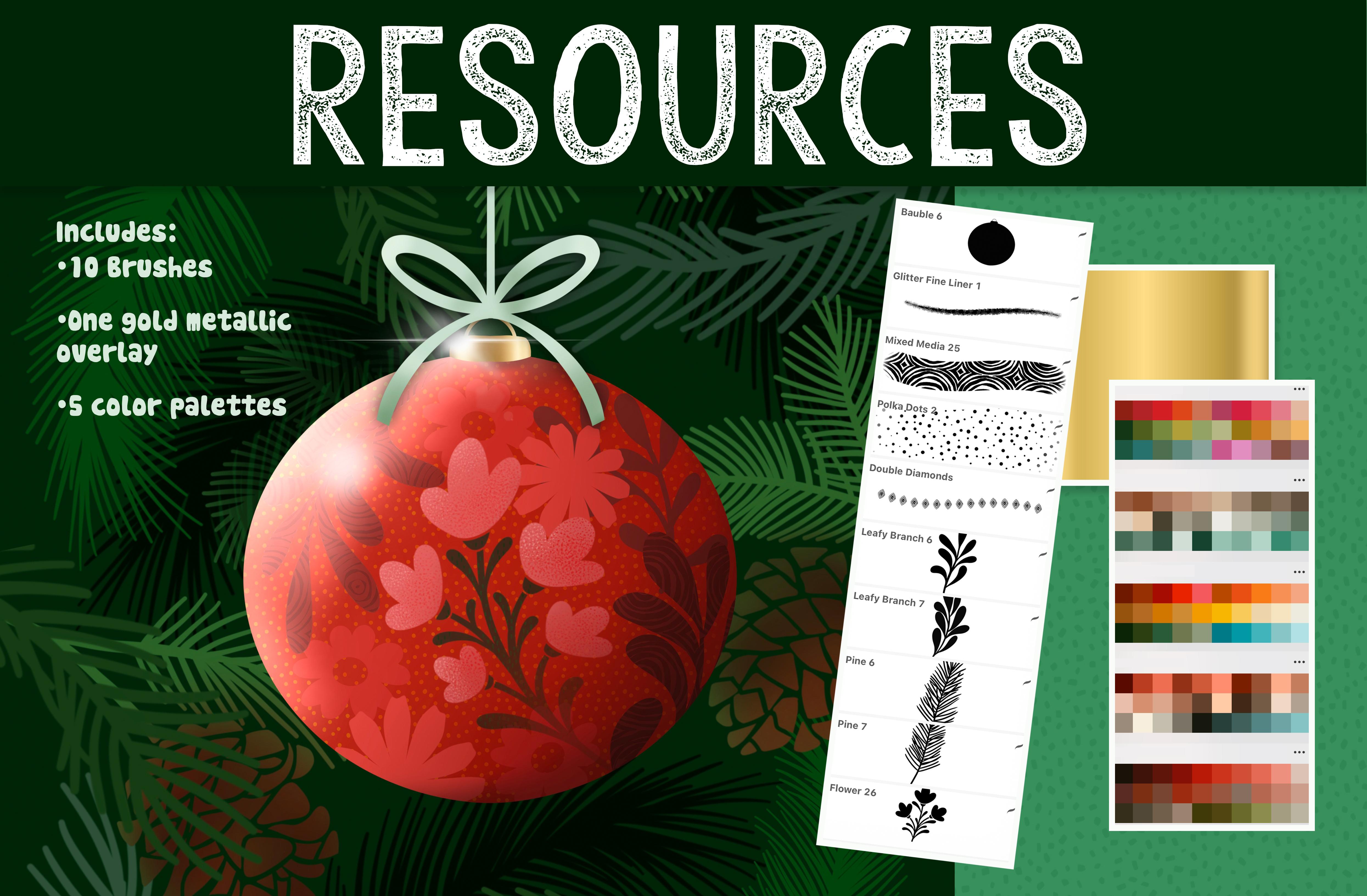
or vertical layout. I've been developing
a brush set, so I've got a ton of assets here that I will be putting into this brush set
that I'm creating. As you can see, it's
pretty extensive. I will give you a
couple of these to play with so that you have everything you need to actually get started
in the class. But you'll see here lots
of different shapes. The addition of little wires to hold them as if
they were hanging. I'm going to be adding
more shapes to this. Lots of little ribbons
in different styles. Some thin, some thicker. Some of the leafy
branches that I had in the Christmas card set, that Christmas joy, I think
was the name of the class, I added those different
motifs in here. Some leaves, spruce branches, some acorns here, and
a few snowflakes. This isn't complete yet, but I just want to show
you all the different ones that are included
here in your set. You'll probably get this
one of these bubbles. And let's just start by
creating our first bubble. When you get the brush, even at the largest
size, it isn't that big. If you want to make
it bigger than that, you would have to go into your properties here
and enlarge it. I've just got it so that it shows as the whole bubble there. If you wanted a really big
one, that's what you would do. I'm going to go back and
change that before I forget. I like it a little
bit smaller there so that you can see
the whole bubble when you're looking
at the brush set. The steps for this are
going to be quite basic. Everything that you
draw, you're going to add as a clipping mask. And you're going to
use that literally for positioning
everything that's going to be on the bauble. If you wanted to work
with pre existing stamps, you could definitely do that. And I'll show you an
example of doing that. You could take something like
this, change your color, add a new layer stamp, and then take that layer and create a clipping
mask with it. If you're going to be
creating multiple, then you're definitely
going to want to organize these into groups. I would select them both and make a group
and that could be your first bubble
if you plan to do more if you wanted to
continue in this vein, then I would just
keep adding layers. If you go back to the bauble
and you add the layer, be added as a clipping mask. Because it's between that one and the other clipping mask, you could change your color, slightly stamp your motif here, and then decide whether
the positioning is good. Do you want to flip
it? Do you want to flip it horizontally? I personally like it when rounded items are put
on a rounded base, something like this, I would definitely go in and do
some distortion with it. You can hit the distortion
or you can hit the warp. The warp is a good one
because you can actually use it to curve your motif. That is a wonderful way to start getting the feel of
dimension on your bauble. I think I would go back to this one and do the same thing. I've got Warp already
selected there. I can warp it. And you can
see that with the warp. If you just look at
the lines of the warp, you can see that
they're curving in the same direction as
the actual bauble. That's a really handy method to judge whether or not you're
getting the shape correct. At this point, I
want you to really stop and think about
the color scheme. I've got lots of different palettes that
could work for this. I could stick to a
monochromatic palette, like I could choose any of
the colors that are here. Rather than choosing
these contrasting colors, I've also got plenty
of palettes to choose. So I would choose one that might be conducive to this, a design. I personally think for
this one I want to stick to a
monochromatic palette. Let me go back to that red one. I think I might stick
to something like this. I like the reds and pinks
and greens together. I'm going to make this
my default palette. Go back to my disc here, I'm going to clear what was there from my previous project. Now I want to make sure
that everything that I put on my bauble is from
this color scheme. Now it's actually not too bad. It looks like for the most part, what I've got going on here is what I've got in
the color palette. If I wanted to change it, I could easily select it and make an adjustment to
the hue and saturation. So I could go into hue
and saturation here, but one of the methods
I've been using a lot more of lately is
this color fill. For selecting and filling, because it allows me to do a lot more experimenting
with the color, I'm going to change this color to be a
little bit more neutral. When I hit select here, you're going to see
that it immediately fills with whatever
I've got going on here. It's filled with
that color I chose. But I feel like it's
strobing a little bit here. I can make adjustments to it by just dragging around
in the color circle. I can also completely change it by grabbing something else
here within my palette. I like this. I love
the intuitiveness of it and being able to make
those adjustments on the fly. I think I'm actually going
to go to more of a reddish. And I am also going to go and do the same thing
with this one here. Now if I hit Select, because I have this option
already selected here, that's exactly what
it's going to do. It's going to pick that color. And you can see that it's filling with whatever
I've got going on here. Now if you're really particular, you are going to see that
there's a little bit of a haze of that
previous color there. What I do for something like that if it's really
bothering me, which honestly it really isn't. But if it was, I would select,
I would go to feather. I would move this up just tiny bit like 1% You
can't see it there, but it's now filled it a
little bit more so that less of that little haze of
color was showing there. I'll do a little bit bigger
here so you can see here. I would select it's going
to fill with this color. Eventually, I'm on that layer, make sure
I'm on the right one. On the right one, okay. I'm
going to go to this one. I'm going to hit
Select. It fills it with that darker color. I'm going to go to
feather, I'm going to go just 1% and you can see that it has taken out a little bit more of that haze. You can try 2% if it's
not enough for you, but I think 1% actually
got rid it for me. Let's continue
adding motifs here. At this point, you can continue with the
motifs that I'm giving you. It's not going to
be that many or you can go to one of
your bigger sets. I like using these
folksy flowers for lots of my projects. I'm going to add a couple more. I'm going to put them
on separate layers so that I can make changes,
something like that. I could make a
bigger one and then maybe have it off
to the side again. Because I've added
it above the bauble, but below one of the other
clipping mask layers, it automatically creates
a clipping mask with it. I think I'm going to add
it separately though. Again, with these, I'm
going to go in and do that. Warping. Get a curvy feel to it. Again, warping, I'm just
warping it slightly. But it's just giving
a little bit of a suggestion of some
curve to my motifs. If I want to move it
around, I change it to uniform and then I
could move it around. Basically, that's the
process I go through for adding motifs with brush
stamps that I already have. I'll do a little
bit more on this one off camera and
then I'm going to show you how I go about adding some of that dimension,
highlight and shadow. All right, I'll see you
in the next lesson.
4. Lesson 3 Texture and Metallics Experiments: There. Welcome to lesson three. In lesson three here,
I'm going to be showing you the use
of clipping masks. I want to add texture and
detail to some of my motifs. I'm also going to be showing you how to add a little
bit of metallics. Let's get to it. All right, I've added a couple
of other motifs here. I really wanted to
experiment with texture. This is something that
I would have to do completely differently if I was adding texture to my motifs. I want to show you how
I go about doing that. Let's say we want to add
texture to this motif. Here. Right now it's
a clipping mask. I can't add texture
to it because when I, whatever it is I'm
doing is a texture, it's just going to clip
to the ball, right? This is the bauble and that's
what it's going to clip to. I'll show you like
if I add a layer here and I've got a
texture selected, I'm not adding it to
that individual branch, I'm actually adding it
to the whole circle. This is how I would do it. That motif I would pull out and I would turn the clipping
mask option off. Now you can see it's not
being clipped there anymore. I would add a layer and
then I would do my texture. I'm going to sample the color of that motif and I'm
going to add this one, which is the one I
added over here. And I'm going to go a
little tiny bit lighter so that it shows up so you
can see what's happening. Obviously, it is not clipping. What we want to do here is
then clip it to this one here. Now you can see that
the texture has been added specifically
to that motif. The problem is it's
not clipped, right? What we want to do here is
we want to merge it down. Now, it's completely clipped to that leaf and it's stuck to it. There's no adjusting
it at this point. It has to stay that way. So you've got to be sure
that that's what you want. And then now we can clip
it back to the circle. Again, I would go through and do that with each of my motifs. You could also add texture
to the entire ball. That's something that we
could take a look at doing. Let me just find cool
texture to add to it. This is where you
could really go crazy and be really individual with it because you could add any of the textures
that you do have. Let's try this one
with the dots, but you could, of course, definitely use
something like this. Music notes, or you could a mixed media background.
Let's try a couple. Just for the fun of it, I'm
going to add a layer directly above the bubble because we're clipping it to
that whole bubble. I'm going to sample that color, that brighter, red
in the background. I'm going to go a little
bit lighter and I'm going to just apply the
texture and boom, the texture immediately changes. The appearance of it. Lighter or darker could make a
huge difference too. You could also experiment
by changing blending modes. The size of the pattern
could make a big difference. You could have enlarged the grain of your
pattern before starting. Like on your brush,
you could go right into the brush and
make the grain bigger. I'm going to clear that layer and let's try it with
a really dark color. Right now, I still have
that blending mode on, so I'm going to change
it to something else. Idea, definitely don't have to go with it, but it's an idea. I'm going to clear this one
off and I think I'm going to stick to just graphic textures. I really like this
dotted pattern here. Again, I'm going to
sample that color. I have the same red and
I'm going to go just a tiny bit brighter and add
texture to the whole thing. Now, right now, there's
that blending mode on it, multiply, I'm going to go
back to normal and there is that texture applied. I think that's adorable.
We could definitely tone it down by
reducing the opacity. But that's again,
another way that you could go in and make
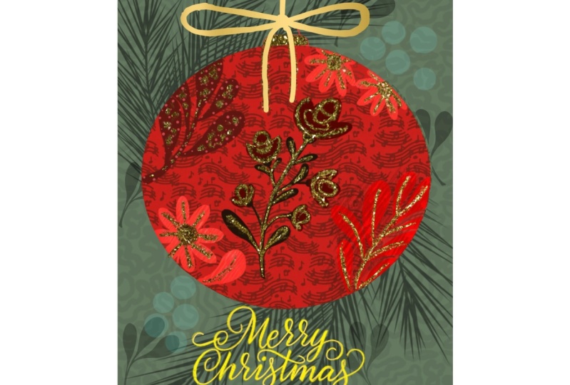
changes to your motifs. Now in this lesson, I also wanted to start adding a little bit
of detail to this. I'm thinking how fun it would be to have glitter on the top, just even a metallic
finish to make this part look like a little metal cap that normally is on
something like this. I'm going to draw that in. I'm going to keep it
completely separate from this. I'm going to add, I
still want to stay in that group because that's
our entire bubble. One of the things
you can do here, just to make it easier, I could go into the canvas
settings drawing guide, edit the drawing guide
and put symmetry on. I can move this, let's
just move this now. It's centered here, I think. Pretty darn close.
I'm going to go in and grab my paper
pen, pressure brush. It doesn't matter what
color you draw it in, because you're going
to apply the glitter. But as you're drawing, you're going to see that it
is doing the reflection. Now, right now it's clipping. I thought I had, I was doing
it on the wrong layer. This is the layer
I created for it. With this layer, I want to make sure that I put on
drawing assist. Then as I draw this, you'll see that it's drawing both sides for
me, which is great. You can decide
whether you want that to go straight across or if you want to put
a slight curve to it and then just
simply fill it. Now we've got the placeholder for our little metallic piece. I think I'm going to
square it up a bit more. Rotate your canvas
if you need to. And I'm just going to take
that little extra bit that I had there off and I'm going to straighten
that up a little bit. I don't mind that the wire for now stays in the red color. You can decide if you wanted to end up having
that as metallic. You could add it at this point. Go a little bit bigger so that you actually cover the original. Remember you can
always go back and set off of the original
if it's not quite right. So maybe that's
just what we'll do. Instead of the tapered
pin pressure brush, I'm going to use
my pasta because it doesn't change in
thickness as I draw it. And that draws the perfect ring. Obviously, my buble
was not quite center. I could use this as a guide to make it
perfectly centered. I'm getting off in the weeds
here, so I'm going to stop. But you could
easily also just go in and erase that
part of the bauble. If you're going to be using
this as the final wire here, what I would do is import either glitter or
a metallic finish. I've always got some handy, so I'm going to go
to my actions here. Add insertifile. I'll give you this file. It's in my procreate assets. Got a whole folder of different types of
glitter and foil. I'll give you at least
one of these you've probably received
from me in the past. This one I think
would be perfect. I'm going to import
it and it looks super cool on that ball doesn't. I'm going to make
it nice and small. I could have been if I had
been selected on this layer, then it would have inserted
it directly above it. I had been working
on that bauble. It was inserted right
above the bubble. But here now I can just
do clipping mask and I've got the foil applied
beautifully there. I love it, but I did really think that was
cool, that metal in there. And I'm wondering if
we insert it again. If we do take it down into this, if we could possibly coz that to be foil
looking but red foil, I'm going to go into
hue and saturation. This is just an experiment. Folks don't know if
it's going to work. I mean, all of these
colors look so great, but let's try to
keep it in the red. I don't know if
it's going to work, but it does look cool. Sometimes it sees experiments that end up giving us
ideas that we never, ever would have
dreamed of again. This is one of those
things where you could go through with blending modes. I'm sure we could have
accomplished this with gradients. And maybe that's what
we should do is just go back and create a
gradient at some point. But I'm sorry, I had to
go on that tangent just to see this would look and
I think it's really pretty. So all of these little things
are sometimes discoveries. Just because you took
the time to experiment, you could do something like
this and pull it over so that you've got the
highlight on one side and you've got the darkness
on the other side. We're going to try to accomplish
that with airbrushing, but I just had to follow through with that
just to check it out. Now, I'm going to take it off. In the next lesson, let's take a look at how to add
some dimension here.
5. Lesson 4 Dimension, Shadows and Highlights: Hey guys, welcome
to lesson four. We've added a lot already and it's really starting
to come together. But until we add
some dimension here, it's not going to look
like a Christmas bauble. I'm going to be
showing you how to add highlights and
shadows to really make it look rounded and
dimensional. Let's get to it. From that little
experiment that I did, I know that adding dimension to this is going to
make a huge difference. Let's add the overall
highlights and shadows to this. That's going to make it
look really dimensional. Now these I'm also going
to do as a clipping mask. It's going to be a clipping mask added to the circle here. Now I'm pretty sure
that we're going to need to add it to the very
top of everything here, which is going to mean
we're also going to have to do a blending mode
because we want it to show on all of the different components
of our design here. My favorite tool to use
for this is soft airbrush. I've pulled my procreate air
brushes actually up here, closer to the top of
my brush library, which goes on and on and on. I do use the airbrush
quite a bit. I've brought it to the top here. The soft airbrush is my favorite of all
of the air brushes. What I want to do here is
I want to dark areas here. I want to do some
light areas here. You can, and you're going to
probably want to experiment, but you can decide on what actual color
you're going to use. I'm thinking I'm going
to try the red first. A dark, dark red looks
like a deep maroon here. And see how that looks. Now, my hair brush
is way too small. What we want to do is
go quite large with it. Now this is telling me it's at about 21% of whatever
the setting I have here. In properties, I've
got the maximum right to the top and the minimum
pretty close to the bottom. And I've gone about
halfway up here on my brush size indicator, I just like I'm almost
working out here in this area and then I'm working
towards the middle there. I'm off to the side
here at first. And then working
towards the middle. And I think we're
going to need to do the highlights on a
completely separate layer. I could just go
right into it now, switch to white and
do the highlight, but I'm thinking we're
going to have to use blend modes anyway,
at this point. Oh my goodness, I just
painted on a layer there. I could have sworn I had made
one. Okay, let's do this. Again, clipping mask and again starting on the
outside here but going into the middle of it a little bit more but keeping it really light in the middle but quite dense at the
bottom, I think. Now with the blending modes, it's going to do what I want, which is to take that color and blend it with all of
the layers beneath it. We're probably going to be using one of these
top four here. Linear burn color, burn,
darken or multiply. Real toss up. What do you think? Like what darken does is
it keeps that red color, but it, to me, doesn't seem like it's got enough contrast. Multiply is pretty
good for the contrast. Color burn really
intensifies the colors that are there and
I think that makes those a little bit too dark. And same with linear burn, I'm pretty sure multiply
is my choice for here. Don't forget, of
course, that you can lighten up a little bit
by using the opacity. Remember we went with
the maroon color, So we can always go back and add a deeper shade
right at the edge. Maybe go a little bit
smaller and go quite black along that outside
edge. Hard to say. I think that you want to keep that fairly diffused because
if you have it too tight, it makes it look like
it's a flat surface, drops off really
quickly with a circle. You definitely want it to be as though it's really gradual. That shadow is really gradual. Now I want to also add
and make a clipping mask. I've added a layer,
made a clipping mask, and this time I'm
going to go to white. I'm going to do almost the
same thing on this side. I'm starting off on
the outside here. You can see that I'm building up a little bit of
high light there, going to go maybe a
little bit smaller. Again, you can see
it's not blending even though we're getting
the effect that we want, where we've got that light side, it's blocking out
what's underneath it. In this case, we got to
experiment with methods of having it blend and still give us that
high light effect. I have no idea where we're
going to land on this, but I think it might be
either screen overlay or add. Those are my three guesses. A ooh, that's quite nice. Overlay, That's
really pretty too. It's a tough call, but it depends how dramatic you want that
lighting to be. I actually Like that. I think
that's super dramatic. I think here I'm going to go with an even bigger airbrush and just curl that a little bit
more around the bottom two. Yeah, I'm like, in this
I think that's giving it super dramatic lighting and overall we're really getting
that feeling of dimension. I think that I need to
add a little bit more and a little bit smaller so that I go a little bit more
around the circle. And I think I have to do that
with the shadow as well. Just my observations here
are telling me that I need to still have it going a little bit dark
down here at the bottom, I'm going to go quite diffused. Just adding a little bit more, very gingerly so that it pulls it just around
a little bit. I think the same
thing goes up here. There would likely be, if
there was a light over here, there would be a shadow
around this thing here. Keep experimenting with
your brush size and create that shadow that you're looking for. I hope
you're impressed. I hope you're happy with
what you're producing, because I think it
looks really cool. I still have work
to do, obviously, on these motifs in here, but I'm pretty happy so far
with how this dimensioning is helping to really create a much more
interesting motif. At this point, we can definitely start thinking about
the background. You can do the background in
a bunch of different ways. Of course, you can go right into the background color
here and make changes. I personally prefer to add a
layer, let me just add it. I'm going to do this, add a layer, then move my
group above that layer. Now the reason I do like to do this rather than using
the background color, is that I like to have a
background layer if I export. This depends on where in
what way you're exporting, but sometimes when you do
the background as a color, you don't get that
in the export here. I am going to just guess, fill the layer with
whatever color. It doesn't matter
too much because we can do that method of
selecting again where we have the color fill select here and then you can go and
do some experimenting here, I'm all for the drama. I don't know about
you, but I love the drama of these dark colors. But sometimes it's fun to take a look at some of the
other colors as well. Go into a different
category completely, and just see how
that could work. That's not even bad,
like a really dark gold. Or at this point, now that you're selected, you can just move
around the ring here, ooh, that Navy is gorgeous. And just, you know,
decide on how you want your artwork
to look. I love this. I mean, I could definitely
stick with a dark green. And I mean, I'm thrilled with
how this is turning out and I'm thinking ahead to the possibility of using
this as a greeting card. I know that my artwork
is 10 " by 10, ", So if I were to want to create
a greeting card with this, I know that I could take all of this and reduce it in size, and I could do it here, or
I could do it in Photoshop. I like having it this in layers, exporting it as a PSD document, taking it into Photoshop, and then using the type
design tools in Photoshop. It's a lot more flexible. I love you procreate. But when it comes to type, I find it's a lot easier
to work in Photoshop. Also, I like being
able to create my artwork square like
this with my artwork, my motifs, my main image, flexible that I can move
it and make it smaller without degrading the quality and it's better in Photoshop. I can then export this
to POD as a square, but with my image really
small in the middle. And it allows me to
put it on all kinds of different items for POD site
like Zazzle for example. You want your vertical artwork, but you also want to
have long artwork. Landscape to do things like
coffee mugs and things. Having a lot of
color here around the outside is super ideal if you're going to
be working with POD sites. At this point we're ready to start adding some of
those finishing details. I want to add my
ribbon of course. Then some of that stuff
in the background like I showed you with
this artwork here, so I'm not sure what
we're going to do. This is going to
be a surprise for me as much as it is for you. And yeah, let's meet in that next lesson where we're going to add some
of those details.
6. Lesson 5 Background Motifs and Layering: Hey guys, welcome
to lesson five. We're going to do
a lot of layering and I'm going to be showing you how to make your assets
go a little bit further. Let's get to it. All
right, off camera there. I added a little bit of detail
to that particular flower. I think that worked out okay. Now I want to add some texture into my background texture and interest, I guess you'd say. So I'm going to go into my Christmas brush set
that I'm creating, and I'm going to grab,
I'm going to use probably a variety of these
different pine branches. I'm going to sample
the green there, and I'm going to go a
little bit lighter. And let's see how big
the brush is right now. It's a clipping
mask. I'm going to go down to the background, add a layer. Let's just see. Oh yes, that's delicious. Absolutely delicious. I'm going to add that in
a couple of spots where I can possibly flip it
horizontal, vertical. It takes, I think I cut
that one off a little bit, but I can use my tapered
pent and pressure brush to erase it into a shape
again, which is cool. Because it gives it a variety, It doesn't look like those
are absolutely identical. Add another layer, let's
grab a different shape, and let's go with
a different color. I'm going to go maybe a tiny bit more into the teal
just a little bit. Just these colors here. Make sure my brush is that
it's pretty much full size. I think this is one where I
would have to go in and make it bigger here so that
I could enlarge it. I think I would even go actually darker for this one
and a little bit bigger. That's maybe a little bit too dark because you can't
even see it actually. You know what? Let's leave it. I'm going to do it that color. It's on its own layer.
Now let's check out some blend modes and see if we can find something that
looks really cool. Something about that,
that or lighten. That was divide, which is
one that I rarely use. But the good thing
about that is you could do something
like this, right? You could just work
on the opacity. While we've got that one, let's duplicate it
to use elsewhere. There's no blending mode on it. Now, I think the
other one that looked pretty good was
screen screen works. Again, this is one
where we could do that selecting of the layer, it's going to fill with
whatever color we've got here. And we could try
changing in the color. In this way, what
I'm trying to do is build up a few of
these that I can then have in the background at different levels of opacity. Now, these two are
quite different. They are a much busier, feathery, more like
a Scotch pine. You might prefer to not have
two different types in here. You can definitely think about that as you're
composing it. I'm even going to try adding one of these
in here, new layer, putting that in be in one of these colors
as big as I can, maybe I'll stamp it in
the middle so that I can get it as large as I possibly can with
the settings I have, and then I can move it around. Now, with this one, of course, we're
going to probably end up wanting to do something
with that pine cone, and I have two
different ones here. I'm going to add
another layer again, as large as I can, make sure
that it's on its own layer. I'll go into the
properties, enlarge it, I'll stamp it in the
middle here so that I can then take and
move it around. And think about the size of the bauble size
of the pine cone. I've seen some really
large pine cones. But look how quickly we're
filling out this layout. I love this. This is the part that is always the
most interesting to me. I'm going to try this one
again on its own layer. Again, I'll do a
really dark color, make it as big as I can. Go into the properties and enlarge it there,
stamp in the middle. And then I can move
this one around again. Duplicate like probably before moving it and having it crop, I should duplicate it. And then I've got the
full branch that I can position elsewhere on my
document. You get the idea. This is how I would go about
filling out my design. And with this, you
can definitely experiment with different
degrees of opacity. Now, with these that
have the pine cone, I would add a clipping mask. And then you could
use almost any brush that you like to change
the color of that. I think I might just
do it really subtly. I think I'll go back to using
that soft airbrush and I don't really want to leave this color category like
what I've got going on here. I'm going to pick
the brownest one that I have here and then just see how that
would look to just add a tiny bit of a
hint of brown to it. Because again,
this one separate, this is again something
that you have to judge as you're putting
something like this together. Do you want to stay in this color category or do you want to introduce another color? I think it's okay. We can add this brown. You can go in dark because I'm keeping it really
desaturated and quite dark. I don't think it
competes too much with the foreground items here. Let's do that on
this one as well. This one I'm going
to go in with. Airbrush and just kind
of add a hint of brown. Make sure it's a clipping mask and go a little bit browny. I don't know, Readier I guess is the term
I should be using. It's still super subtle. And I think you could
add a few more of these other boughs or
branches and have them in. I don't want this
as a clipping mask. I'm going to unclip it.
Oh, I see what happened. I put it in between re clip that but have this one in front. So it's subtly neutralizing
that a little bit more. It's at this point just
you going through and making these judgment calls
as you compose your document. Definitely take advantage
of the fact that you can duplicate, flip, rotate, and experiment with
the different degrees of lightness or
darkness on a layer. For this one, I would
definitely go in and darken it. So you could do it by selecting it and filling
it with a darker color. And you could also go into hue saturation, and brightness. And then just really take the brightness down and
look how pretty that looks, again, establishing even more depth as
you're going along. We could duplicate this one, change the order if you need to. You see that one
now above this one, because it would be even
further into the background. I would move it in behind. I think at this point I'm going to stop doing
this part of it. And let's add the
little cute ribbon that we have in the kit. I'm going to Christmas kit, I will give you one of these. I think I'm going to go
for a slightly bolder one. I do have a really subtle, really thin string here, but I want to go for something
a little bit bolder. I'm going to go right
to the very top of my layer stack here
and add a layer. Now, what color
would you do this? I'm thinking that maybe I'll go for a lightish green stamp. It quite large,
but in the middle. And then just position
it right where it meets the very top of that
little ring that's there. If you had to add
anything in addition, if that string
wasn't long enough, you could do that by just selecting the area
with a rectangle. I would do it on a separate
layer if I wasn't quite sure. Because, see, I didn't
perfectly lined it up, add a layer and then fill it. And that gives you the option to change the size
of it and whatnot, position it where you need to. It's not quite matching there, but I'm going to
pinch those together. And what I would do here, if I was using this one, I'm obviously going to
be moving mine up. But I would add a
clipping mask to it. And then I would take
that large airbrush, should be in my recent here, and I would go with a
slightly darker green anyhow, and just darken the
top of the bow. In this case, I am moving
the whole thing off anyhow. But can you notice
that if I really, really enlarge it, maybe you could find that spot
there it is, right there. You can also select
something like that. Let's take the color fill off. Use the free hand selection, Select the area and you could slightly blur it to have it
blend a little bit better. Then you may have to actually
trim off some of the edges. There are so many different
ways you could fix this. The other way would be to, before I'm going to go
right back to this, I'm going to turn
off that guide. See, now you've got this
if you wanted to fill it. See, the problem is I had added a bit of a gradient there, but what you could do
is just select this and fill it and it would correct that little booboo that
was there, all that work. Just to then take
it off the page. But I just wanted to show, I want you to always have all the information
that you need when you're putting together
a project like this. We've just scratched
the surface. When you think back of all of those other examples that
we looked at on Pinterest, I have just basically given you one idea that combined a bunch
of these different ones. But if you go through here, I'm sure that there are
techniques here that you could easily duplicate
in your own way. All right. I'm glad that
we got that one done. I will talk to you
in the next lesson.
7. Lesson 6 Uses for Motif Optional Photoshop and POD: Hey guys, welcome to Lesson six. I thought I'd do
something a little bit different here
in lesson six. It's completely optional. You definitely don't
have to do it. I'm going to be switching to Photoshop just to
give you a look at some of the things that you can do with this artwork
now that it's complete. If you prefer to use your ipad and you use affinity photo, you can definitely finish
the project there. This is just to
give you the ideas and I want to show you exactly how I set up my documents to
make them really flexible. Once I get to the POD
site, let's get to it. I'll be showing you
my complete process when I go into Photoshop. But just know that you can
absolutely complete all of this in either procreate
or affinity photo. This is just my
workflow for doing an artwork that I'm going to
use on multiple products. Really, the biggest change that you'll see here is that I've taken and put
everything that I want, The most important stuff
in the middle here. I'm leaving a lot of space
all around the outside. I want you to imagine this, a portrait style layout. So if this was going
to be a greeting card, it would probably be
shaped kind of like that, show you with my cropping tools. So it would be more of this
sort of a shape, right? If it was going to be
on a coffee mug though, I would probably need
more like this kind of a shape rather than creating a bunch of
different artworks. I just undo that cropping because I don't
actually want to crop it. I just leave it like this
and I put it in the center. And in fact, this might
still be too big for doing things like a wraparound mug or something like that. So in a case like
that, I might have to still come back and do
some customer artwork. But I'm going to show you
the steps that I take to put this on
Zazzle in this case. Now this is just a really quick Reader's Digest
condensed version. I will do a full class by the time you go
through this class. I may have already done that. But let's just say there is another class
that's going to be available for the whole process of uploading to POD sites. So in this case,
what I want to do is to export a document, either J Peg or PNG, whatever the POD site
requirements are. And of course you can see
all of the layers as I created them in procreate
Over here on this side, what I'll do here is
do a save as command. So under file to file save, you can do this, like I said, in procreate I'm
going to export it as a J peg because that's
what zazzle requires. And I'm saving it
actually, right now, just into my folder
for this class. You can see I've already added a number to it here
though, 18 46, because that's the
next artwork number in my organization system. So I've got it saved where
I'm going to be using it. I'm planning on doing a
bunch of different things, a bunch of coordinate patterns and things to go with this. This would be an artwork that I could also use for a pillow, let's say on spoonflower
or on society six. What I try to do is create
the most versatile artwork. So I'm not going
back and forth and always having to
edit my artwork. I know that's now saved
and I can shoot over to Safari here on Safari, I've opened up Zazzle. And now I'm not going
to be explaining the whole Zazzle process of setting up your
store and whatnot. I'm just showing you in my store creating
a greeting card. My artwork is saved here
in my saved designs. But I'd like to start
here where I can create specifically
on the product that I'm looking at for today. So I've hit this create, I've gone to view all, and then I've come
all the way to the holiday cards or to
the cards in general. I think this category
was greeting cards. And there are so many options, so you could go through and
design for more than one. If for now you're just
producing a card for yourself, for Christmas or whatever
your purpose is, You can go through
these and the one that I'm going to be doing is
a five by seven card. Now this flat note card
is just a single layer. It doesn't have a fold in it, and you can just keep on
going. It's almost endless. You can even have
a trifold card. Like I said, so
many options here. There is a method to upload
your artwork and have it apply to a whole bunch of
different products at once. That's something again, I will
explain in another class. I've actually got a
shortcut or a bookmark for the exact card that I like to use. It's this one here. You'll see it pop up into
the image area here. You're going to see that it
is currently showing it as a horizontal layout down
here, you can change that. I'll change it to
a vertical layout. What you want to do whether you are going to be listing
this on the marketplace. Ordering it for yourself. You're going to go to
customize this design. The set up pops up like this. You're going to go to my files because at this point you
would have uploaded your file. If you haven't, what
you'll do is you'll go to layers and you want to go
to the front of the card. And then you're going
to go to elements, you're going to go to my files, and you're going to
upload your image. I have saved that
in my horse folder for this class. Let me go back. I think I didn't
save it properly. I want to make it
a Jpeg for Zazzle. Just so that I'm very clear, my computer had crashed, which is why I've got
this word recovered here. Here it is, right here. So I did have it and I'm
going to upload it now. It's going to pop it in at the width of the graphic
that you created. We know that we have
created this in such a way that we can
enlarge it to fill the card, and that's it. That's
all I have to do. If I needed to
change the position, I could definitely do that. There are guides, there's all kinds of different
options here for doing things like removing
white from the image, making the object permanent. I do this so that customers can't change the
front of the card. I do allow editing on
the inside of the card. You can do things like scale it just by a little
bit at a time. Now, right now, I'm just using the plus and minus
keys on their own, but if I hold down my
option key on my keyboard, you can see that it doesn't increase in quite as
large of an increment. You can see I've got a
really nice preview here, and actually this is a
beautiful little mock up. You can actually download these. And again, in that long
version of this class, I'm going to be
explaining all that and I'm going to be
explaining what you can do to finish the
card if you want to add your logo or add
a personal message. I'm just going to
hit Done. I get this really nice little mock up and I've often done a
screenshot here. Command shift four to save this screenshot so
that I can use it in, let's say Instagram
posts or whatever, you can go through and
look at your whole card. We didn't customize the
inside or the back, but that other class will be
definitely explaining that. And believe it or not, there are additional mock ups here with different kind
of background. This one for Christmas, but there's different
backgrounds there for you. So at this point we're left
with this set of parameters. We can continue to edit, so we could go back to the
editing by hitting this. We could add it to
the card if all we want to do is buy this card, or we can choose to sell it. So this is where I
would choose sell it. Now it's alerting me that I
have left some things undone. So at this point also, we would flesh out the rest of the information
about the card. We would describe the item. So I would put something
like Christmas bubble, winter foliage, words that somebody might
use to search for the card. You don't have to
add the word card at the end because that's
automatically added. Then you can categorize it for people to find the
correct season. Here would probably be the
one that I would choose. Holiday and seasonal cards, I would write a really
good description. This is one of the things
that you may choose to get help from chat GPT to do. I find that I can do like a very basic description
based on the words I would use to describe
this and then I can ask GPT to reword it and
improve the writing. Again, these are just a review of who your card
is intended for. So if you don't put anything, you're really limiting the way
people can find your card. So you definitely want
to go through and make sure that you go
to all the steps of describing what occasion it would be for who the
recipient would be. Something like, this is a very generic kind of a card that you
could send to anybody. So you want to make sure
that it's good for anybody. If you had a Mother's Day card, then you specifically
want to say, Mothers, you could have
your own store category. Here, I have a bunch
of departments in my store and I have everything separated into collections. Again, that's something
you can choose here. Add as many tags as you possibly can to describe your card. Anything colors are
very important, the imagery, the phrase, maybe that you're
using on the card. This is definitely suitable for everyone as far as the content. So general is what
you'd put here. Royalty information is
something that you can choose. I think the maximum is 25, but you could choose to
go just 10% on a card and that will be adjusted here in the royalty you'll make. I usually leave mine at 20, and if I can I even go to 25, it makes a difference
to your bottom line. Obviously, here
you're going to make $1.09 every time
you sell a card. This is a new feature
that Zazzle has now where it can be an instant
download for the client. This is another way that
you can make money. I definitely leave this. And what I like about it is how high the royalty
percentage is. You make a good $2 more as a digital download than
you do on a printed card, understandably because
obviously they would have to pay for the manufacture of
the card and ship it out to the customer
and all that jazz. It's definitely a
really great addition to the Zaza website. Then of course, you have to
check this off saying you haven't copied this
artwork from anybody else, you're not stealing
from another artist. And then you hit Post It. I'm going to wait and
I'm going to definitely go through and fill all
of this other stuff out. I couldn't even post
it at this point because I don't have
these filled in. So that's just a quick
breakdown of how to post. And this is just on the
zazzle marketplace. Every marketplace has something
a little bit different. I'm going to be trying to
cover more and more of this. Again, this is definitely an optional thing for you to do. But imagine how fun it
would be for you to create a card for this year and
make enough for your family, just maybe ten people and
ship it out and Yeah. Get some feedback
on your artwork. All right, that's it. And I guess I will meet
you in the wrap up.
8. Lesson 7 Closing Thoughts, Mock Ups and Wrap Up for Skillshare: Hey there, Welcome
to the wrap up. I thought it might be a really
interesting exercise for you to take your artwork and
create that POD artwork. I'm going to show you here how my artwork looks at all the different products
from the POD sites. I definitely like
doing my artwork in this way with a large field of background so that
it's flexible enough to on differently shaped items. Doing a layout in this
way definitely allows me to switch from landscape
to portrait quite easily. Now that you've
created this piece, I would suggest that you use
it for Christmas presents. Why not definitely use it for your Christmas
card this year? Add some personalization,
a little bit of text. If you've made more
than one artwork, why not upload them
to car dial or another greeting card
site where you can start making a little bit
of passive income from it? I know it doesn't seem
like much at first. You set up these POD sites and
you've got a few artworks, and you're only selling
a little bit at a time. But the more and
more you add to it, the more and more you sell. Being an active seller helps you to be more visible
in the marketplace. I don't know what I'd do
without that passive income coming in from all the different POD sites that I sell on. I really encourage you to also take a look at all the
other offerings I have. There's projects
that you can adapt to so many different
times of the year. Thanks so much for hanging
out with me today. I know it's a nice day and
I want to get outside, but I really wanted to get
ahead on my Christmas stuff. Take care, and I'll
see you next time.
9. Lesson 7 Closing Thoughts, Mock Ups and Wrap Up for Skillshare: Hey there, Welcome
to the wrap up. I thought it might be a really
interesting exercise for you to take your artwork and
create that POD artwork. I'm going to show you here how my artwork looks at all the different products
from the POD sites. I definitely like
doing my artwork in this way with a large field of background so that
it's flexible enough to on differently shaped items. Doing a layout in this
way definitely allows me to switch from landscape
to portrait quite easily. Now that you've
created this piece, I would suggest that you use
it for Christmas presents. Why not definitely use it for your Christmas
card this year? Add some personalization,
a little bit of text. If you've made more
than one artwork, why not upload them
to car dial or another greeting card
site where you can start making a little bit
of passive income from it? I know it doesn't seem
like much at first. You set up these POD sites and
you've got a few artworks, and you're only selling
a little bit at a time. But the more and
more you add to it, the more and more you sell. Being an active seller helps you to be more visible
in the marketplace. I don't know what I'd do
without that passive income coming in from all the different POD sites that I sell on. I really encourage you to also take a look at all the
other offerings I have. There's projects
that you can adapt to so many different
times of the year. Thanks so much for hanging
out with me today. I know it's a nice day and
I want to get outside, but I really wanted to get
ahead on my Christmas stuff. Take care, and I'll
see you next time.
 Delores Naskrent, Creative Explorer