Transcripts
1. Intro to Authentic Stitched Felt Applique Children's Book Page: Hey guys and welcome. My name is Dolores
nascar and I'm coming to you from sunny,
Manitoba, Canada. Well, usually sunny today we're apparently having a
torrential downpour, but better than snow. One thing about rain is you
don't have to shovel it. The class of reading it today is a really fun and
whimsical bird project. We're going to be creating
these birds to look alike. They're stitched,
felt, applicator. I'm providing you with all of the brushes that you're
going to need for this. I've got a bunch of stitch
brushes that I've created. So I've got a running stitch, I've got a blanket stitch
up our satin stitch and textures like the felt that we need and some data
for the background. And all of these are provided
for you for today's lesson. It looks really simple, but we all know that in order to make something
look really realistic, we need to have some depth. The depth will create using highlights and shadows
because as you know, felt is a very thick fabric. And when used for
uppercase like this or for whimsical little gifts. A lot of times it's given a little bit of stuffing
to give the dimension. So we're gonna be
creating highlights and shadows to emphasize that. And also the stitching requires some shading techniques in order to get it to look
like it's real, that it pulls and
Tucker is the fabric, as you see on any
real application. Sounds a little complicated, but don't worry, I'm taking you through this step-by-step. It should be pretty manageable, especially with the
brushes provided. I'm going to start
by showing you the inspiration I had
for this project. And I'm going to break
down my own document so that you can see all
the steps that I took. It ends up being tons
and tons of layers, but it's not really simply. So you'll have clipping masks to create a lot of those effects
that I was talking about, like the shadow and
the highlights. Now if you haven't
done so already, I'm going to suggest
that you hit that follow button up there. That way you'll be
informed if any of my classes as I release them, also, you'll get any of
the posts that I send out. But I would also like to invite you to check out my website. Add your name to
the mailing list there because there's gonna be all kinds of different stuff
coming from my website. That's where I have artists
resources and that's where I always put
my free resources. If your name is on that
list that you're sure to hear about everything that
I've put there as well. At the end of class, we'll review everything
and talk about next steps. Are you ready to get started? Let's get into it.
2. Lesson 1 Inspiration and Document Set Up: Hi guys, welcome to lesson one. Course. We're gonna look at
inspiration in this lesson. By the end of the lesson, I also want to lay down the background, which is gonna be a datum. Let's get started. I thought I'd start this lesson showing you a little bit of my inspiration. So there's a lot of really
cute felt applicant art. I didn't realize what
an art form it was until I started looking for
some reference for this. This is a really cute one. And that reminds me quite a bit of what we're going
to be doing today. And I love this one. So we're gonna be
creating a bird. And I'm gonna do it based on
an artwork that I've found. So we're going to be not only emulating the artwork
and a stitch work, we're also gonna be working a lot on highlights and shadows. So we've been doing that a
lot in my classes lately, and I just wanted to
reinforce it even more. So some of these artworks
are great inspiration. You don't need to do the
bird like I'm doing. You could definitely pick
something unique to you. So maybe when you are ready
to start this project, take a look at some
inspiration like this and decide on what started. We'll look that you want. I think once you do a
couple of these here, kind of be surprised at how realistic you could
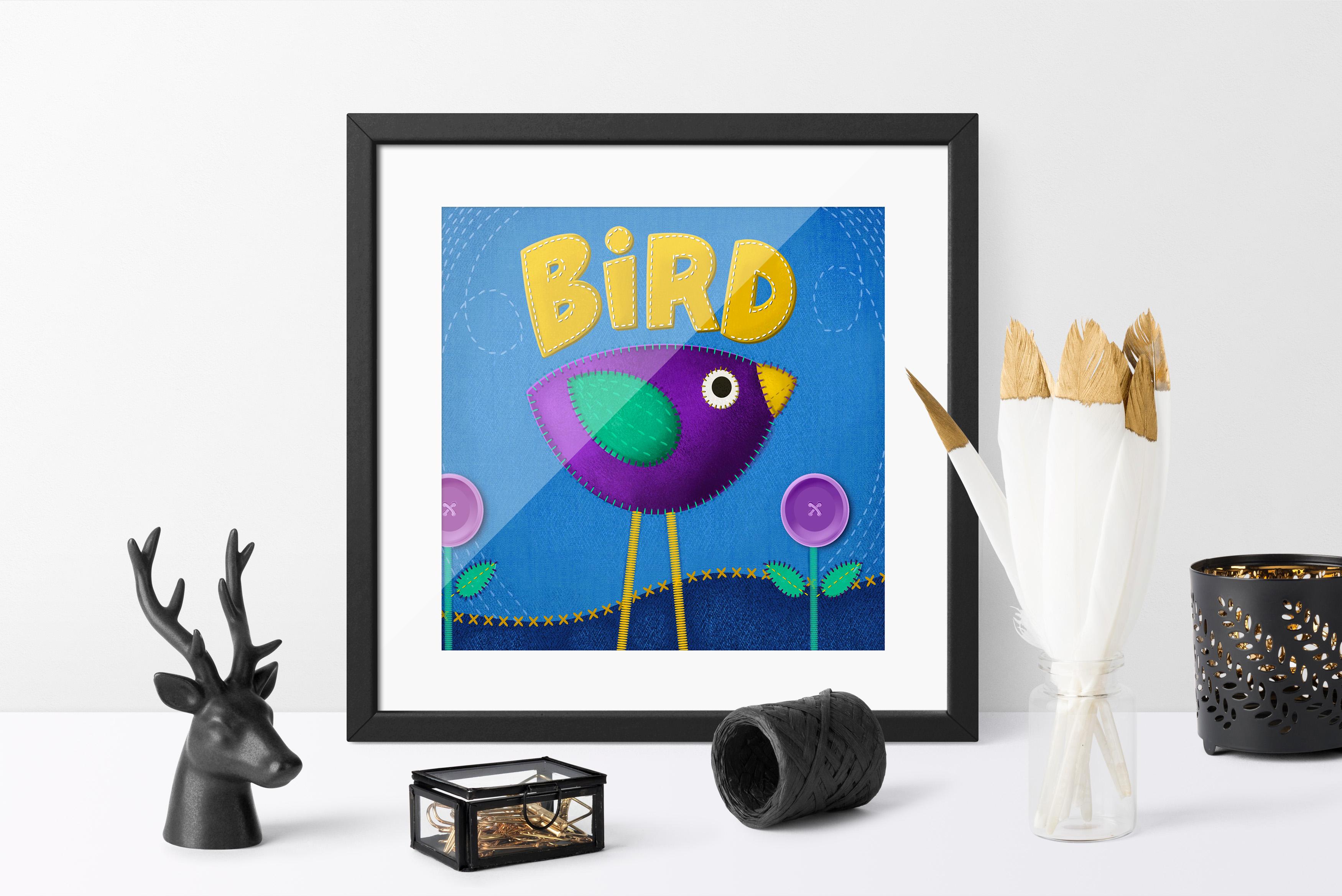
make them luck. Like I said in the first lesson, I was inspired by a children's book that I
was reading to my grandson. And it had the
whole alphabet and an animal or I think
it was all animals. Yeah, animals or birds are reptiles for each
letter of the alphabet. So that's why I decided to use that as my
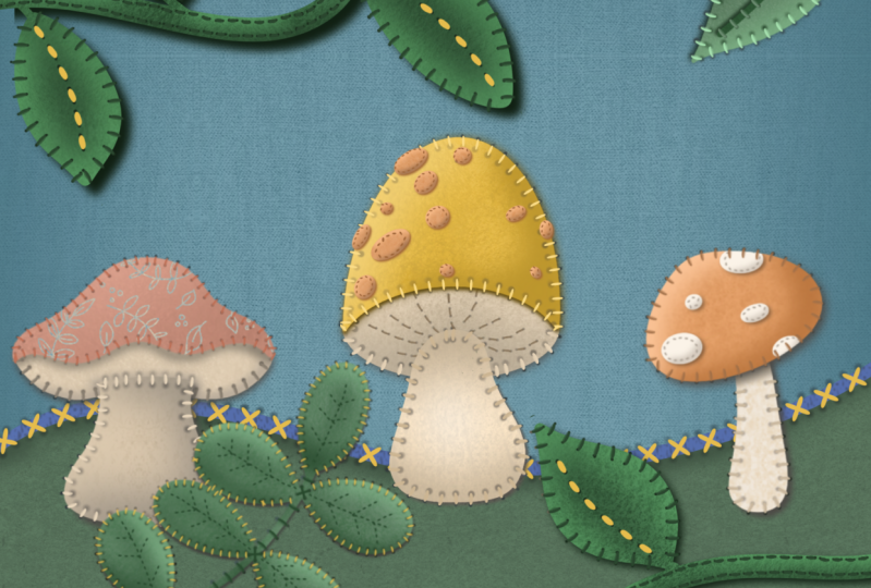
inspiration for this. So you can see that
I've created a ton of dimension here and lots
and lots of texture, texture that I'm mainly
using on the feature items, the bird and the
lettering and I guess the leaves here on
the little flowers. These are all
textured with felt. I've created this brush set
that you'll be getting. I may add more to it by
the time you get it, but I've got really
nice woven textures. I've got a denim,
this is the felt. Then there's a big
texturize user for denim. Again, this is just a
different texture of denim. You can see the
two of them here. So these are the two
alternating textures. And then I've even done
one in leather because I've seen some leather
work done like this. Then I've created a
bunch of stitches. So we've got a cross stitch. I've got a blanket stitch that goes around the edges here. I've got a nice running stitch. So that would be one of these. I felt like a short
one and a long one. And then I've also
created a brush for these little shadows that you see wherever there's a whole. And I made the
brushes identically. The, I think it was
this one and this one, I use the same base brush and the art was basically
positioned exactly the same. So this little fuzzy thing, and for the most part it
sometimes matches like when you do a whole string of them that it'll match the
stitching there. And sometimes you have to make an adjustment like I was
able to get about halfway here and then I had to pick
up and start again to get them lined up and I'll be showing you all of that as well. And like all of the most recent projects
that we've worked on, I've really worked at creating highlights and shadows to really give it dimension. Oh, yeah, I wanted to
show you the picture that I had used if I leave
it in the document. No, I didn't leave
it in the document, so I'll import it again here. So I just went to, and this
is what you'll do if you have the photos saved for inspiration on your
camera roll I just went to Add and then insert a photo. And this is the one that
I use for inspiration. You'll recognize it right away. Let me move it up here. Where did where did
I just plunk it? Oh, you know what? I think I'm
at my maximum layers here. Let me just delete this.
So believe it or not, I had 73 layers because it has the warning I get when I get the get too high
of a number here. So let's try that again. Insert a photo and
this time it came in perfectly a real accurate. You can see how I've taken
a lot of the information from the photo to
produce the arch, keeping in mind that this
is somebody's art form. And so I would never be using this for any sort of
commercial purpose. I would be creating
my own characters, but I wanted to work really closely with
the photographs so that I could illustrate for you all the shadows
and highlights. This one is really good
for showing dark areas, highlights and that
sort of thing. So that's why I wanted to
use this one as a reference. So surprisingly I
did hit 73 layers. I shouldn't say surprisingly
it because I hit, I hit the maximum
layers so many times. But you'll see why when you look at each individual element, there are lots of layers here. So if I was to break this down, let me just turn off and
then turn on every layer. So this is what ends up
being the drop shadow. So it is just a duplicate of the original lettering and then filled with a really dark color. Then this ends up being the
highlight that shows on the one side to make it look like the lettering has
some thickness to it. So if you see it now, you see the darkness
on this side and the lightness on that side, which is what gives it
that look of depth. For this, you could
definitely sample that color. And when you've got the
mall showing like this, you could go in and
let's just grab, I'm a mono line marker. You could go in
and just make sure that these that's
still pretty big. Let me make this smaller. You could go in
and do this which makes it look like
it's beside of this fabric rather than
looking like it is an independent shadow or an independent
highlight or whatever. So that's what I
go around and do. You can see how
forgiving this is two. This is a type of style that obviously if
this was cut by hand, there would be some roughness. There would be some wobbly
started lines here and there. So it's not really, if
you're a perfectionist, you could of course, make it absolutely perfect
and sharp and clean. But I think it looks
more realistic when it's created in such a way that it could have
been cut by hand. So that texture I just added is what makes
it look like felt. And we've got a shadow which actually came
after the stitching. So I did this stitching
and then I put on the shadow to make it look a
little bit more dimensional. That's basically
what we're gonna be doing in this class today. And I guess in the
next lesson we'll get started right away
in drawing the shapes. Most of the shapes I did
with that mono line marker, they're very, very
simple shapes. I'm going to go into an
absolutely new document. I'll do that usual
12 by eight size. And of course the first
thing we're gonna do is lay down a little bit of
texture in the background. I decided to do sort
of a blue jean kind of looking woven
fabric for that. So I picked out of
a dark denim color. Then I made a new layer, went to my brushes here and chose one of
the denim textures. Now you could go lighter, you could go darker. Basically, what you
want to do is have that texture showing
quite nicely. You see here how
realistic it looks. And I did have a couple of little flaws there in the
brush, but you know what, once I was done,
my whole layout, it really wasn't noticeable. I think I might lighten that
color just a little bit. So I'm gonna just do it
with human saturation from bright. I don't know. Maybe they don't
want to brighten it. I'll just suck teeny, tiny bit darker than 50%. That makes a difference for
52% or whatever it was. And I'm going to make this into a clipping mask and just experiment a little bit
with these blending modes. Okay, so something
like Linear Burn gives a very nice
look to the texture. It does make it quite
a bit darker though. So you might want to try these other ones and
see which one you like. I think that linear
burn actually does the best sort of blends. So I think maybe I'll just
lighten it like this. And remember, you can
always go into curves and also lighten that,
increase the contrast. So something like
that would work. We can adjust this color later. We're going to start working on our layout in the next lesson. And there will start piecing together what will end up
being our application. I'll see you in the next lesson.
3. Lesson 2 Creating the Basic Shapes : Hi guys, welcome to lesson two. Unless until here I want to
draw all the basic shapes. Then we're gonna add some of that highlight and shadow
that I talked about. The steps are very repetitive
so you'll be able to easily add the highlights and shadows to all of your shapes. Let's get to it. Alright, so we're
ready to start, started blocking in
our basic shapes. I think I will bring in
my inspiration again. So I'm going to insert
that photo again. I don't know if you
noticed, but I slightly changed that background
to be just a tiny bit more cozy and I kinda
darken the outside edge. That's completely optional,
of course for you. But now I'm ready to start
blocking in those shapes. I think the first shape
I'll start out with is the big sort of body shape. And then we'll go from there. So what I did, of course, was just to use my
basic mono line marker. I set that quite small. It's still thick because
I had just resized. And if you recall, I will go back and
reduce it additionally so that I can make
it thinner line. That's that's a little bit
too thin for you to see. But I think for this bird, I'm going to try a
different color scheme. I think this is more
like the one I just did. So I will work with these
colors I think this time. So I'm going to pick a nice
purple I can the sample, the color right from
my photo there. So I just haven't said
it's a single tap, but you might have the
holding tap, whatever it is, you can sample the
color and now I have it here so I
can draw my shape. I'm going to keep all of these
shapes on separate layers. So this first shape, let me go bigger
so you can see it. I'll go lighter as well. Your shape has a
crescent or curved line, kind of shallow
and then a really deeply, a deep crescent. If there's such a thing and
make sure that your shape is closed because what
you're gonna do is now fill it with that color. And I've got my first shape. Not quite the same
purple because I lightened it, but that's okay. I'm gonna work with this
lighter color because I think on this dark background
it's gonna look better. I know I'm going
to probably end up lightning that as well. So that's my first layer, that's the bird and
I have accidentally done it on this layer, but
it doesn't really matter. I'm going to create a new
layer though for the wings. Now this I could also unclip. It had accidentally
become clipped to that background and
I don't need it to be. So now I will draw the wing and I'll probably again
sample that color. I'm gonna go a little
bit lighter and almost like a teardrop
shape this time. Now you can't really
do a teardrop. You can't draw it and
have it correct for you. So, you know, in many
shapes you can just hold at the end and it'll
create a shape for you. But this one doesn't,
it doesn't create the exact like it turns it into an ellipse
which I don't want. So what I could do if
I wanted to make it perfectly accurate
would be to quickly throw on my drawing guide, go in and alter it through
the assisted drawing and makes sure that it
is vertical reflection. I can bring that over if
I would like it done. And then this way I can draw a perfect teardrop
shape again at this point because it's
only doing the half, you can use your
holding technique, hold at the end and it'll
straighten it up for you. You can feel it. I've got that purple line there. Let me just clear
my layer first. Oops, try it one more time and I probably overthinking
it like really the shape could
have been a little bit wobbly and it wouldn't
have been a problem. So I'm going to turn
off that drawing guide and I think I might lighten, neutralize that
color a little bit. So I'm pulling away from the edge here and I'm
going just a little bit into the sorted grayer color
and I like that better. And of course then I
can just position that. And then, you know, the drill, draw a new layer, grab whatever color
it is that you need for this one,
this is the eye. Again, we can hold, edit the shape and make a
circle, fill the circle. We could just duplicate this one and make it
smaller, fill it with black. And we've got the
inside part of the eye. My proportions are a bit
different, but that's okay. That's the eye. Okay, so our next layer
is going to be our beak. Again, you can sample the color. I might do it. Yellow this time. It's a good contrast to
what we've got here. I am kind of thinking
about this in terms of a kid's
book illustration. If that's not what you're after, then maybe these bold colors aren't exactly
what you want, but that's kinda what
I'm going for right now. So I'll continue with
this color scheme. Feel free to use any color
scheme you want for this. I've got all my basic layers that I need here for the legs. I'm going to do a satin stitch. So that's really simple. I've got that one brush created. There it is there. So it doesn't look much
like a stitch here. But what it does is one of
those really tight kind of stitch lines that you would
see on the edges of stuff. And for that, For mine, I just did really
two straight lines basically going right
across that open area. Now I want to point out
something about this brush. Now you've probably noticed that when I started drawing it, well, of course now it's
not gonna do it, but Started to draw it. That first line. Can you see that
it's kinda crooked. But if you do hold it, not only can you get
a straight line, but you can also stretch
it out or tighten it up based on how much
stitching you actually want. So I'm going to do it like
that and I'm bringing it off the page because
I'm just too lazy to figure out something
for feed at the moment. That layer I'm going
to bring down. Oh, and you see
what I did there? I combined the stitching
on the legs with the beak. So I'm gonna redo
that because I do want this to be on its own
layer and I might as well, while I'm at it
moved down to below the body so that I can tuck
it in behind like that. These are really a
whimsical birds. You can do so much to
make them different. You don't have to
follow this at all. The main reason I want to keep
this here is to use it as a reference for when
we're doing the shadow around the stitching
and whatnot. So I also saw a little correction
I needed to make here. I've got I'm going to move
this to a hard airbrush, nice and small, and then I'm
just going to erase that. So we're good to go with
all of our shapes here. And I'm going to show you basic shadowing technique
of the entire shape first. So let's isolate the body here. I'm gonna take it off of
the layer with the birds. So three fingers swipe down and this time
I'll do cut and paste. It puts it right in
the exact position, but now it's on its own layer. What I want to do is
duplicate this twice. I'm going to grab all of these
and put them into a group. And you're going to want
to be doing this this time and even going through and naming all of these layers because there are
a lot of layers, like I said, at the end of the production
of the last one, I had 73 layers, though it sounds ominous, but it's really not
that hard to deal with. So what I want to do here is fill this one
with a dark color. Probably I'll sample
the purple and I'll probably go to almost black
and fill the shape block. You can see here
that it's filled. And then with this one I
want to do a light purple. So again, I'll sample
the color and I want to do a really light
version and you feel it. And now we can just move these. You can use the tapping
method to move these and I'm gonna do it
so that the light is coming in from here. So that's gonna make this area darker on all of my shapes. So you see this is
light in the top left. And now we're gonna take
this dark and we're going to move it down and over. So we've got the
light on this side, the dark on this side. And what I want to do is
add the felt texture. So I'm going to add
another layer here. And this one, I'm going to
make it a clipping mask. I'm going to grab the felt, which is this one here. And I sample the color there, and I'm going to go
quite a lot darker. I mean, relatively speaking. Okay, so we've got
the color samples. I'm going kinda
like this bar over. It might not be right, but
we can also change it. You want to have the opacity set to full on this side here. And you can make your
brush nice and big. And there you see, it's that easy to just make
it look like felt fabric. I actually created
the pattern swatch for that From a
picture of real felt. So I'm gonna do the same
thing with this layer here. So I'm going to add a layer, make it into a clipping mask. I'm going to go lighter and
apply the texture to it. You can build up the
texture because this is a buildup brush
that I've made. So think about how
light do you want it? And it's not like
super light is just there so that it looks like
as a bit of a thickness. And let's do this one
here and a layer, make it a clipping mask. And let's sample
a darker purple. And the darker purple
was quite a bit lighter than the purple
that filled that shape. But I think that works perfectly for making it look like
there's some thickness. If you feel it's too much, just move your
shadow back a little bit using that tapping method. I really liked that
method because you can move in such
small increments. So I think that really
helps to make it look like there's some
thickness to that. It reminds me of those cut
paper projects we were doing. That one's done. Let's move on to the wing. So again, I'm going to
duplicate it twice. I'm gonna grab all of these, put them into a group,
rename my group. Then I'm going to go through
and start filling these, this one's going to be lighter, so I'm going to
sample the color. I'm gonna go a bit lighter. And you can't see it because
it's kind of hidden there. But now I think we can
shift those a little bit. So I'm kind of
going up and over. And then now we're going
to add the clipping mask, get the felt, texturize, and add our texture. Now you wouldn't have to
necessarily go back and put a texture on all of your
shadows and highlights. You can decide whether it's showing enough
to make it worth it. With this one, perhaps you don't just adding a
little bit of texture to it. It's so hard to see it. So I'm not sure that I would go on some of these really
small areas and do it. That's basically how you go and sort of prepare your layers. I'm going to do the eye and the beak off-camera to
save a bit of time. But I'll meet you in the
next lesson and we're gonna start talking
about the stitching. All right, I'll see you there.
4. Lesson 3 Adding in the Initial Stitching: Hi guys, welcome
to lesson three. Less than three
here I want to show you how to use that blanket stitch to stitch down all of these different parts
to our application. We're also going to be
doing a little bit of work with our
highlights and shadows. Let's get started. All right, We're ready to start adding some of our stitching. So I'm gonna walk you
through doing that for the first time on the
main body of the bird. I've got upload blankets, stitches here that I've created and that's the ones I'm
gonna be using for this. I'm just going to grab
that blanket stitch to. You can go up a little
bit bigger if you want. Now, the one thing
you want to know is that if you change the
direction of your Canvas, sometimes it can
affect the stitching. So I don't change
the angle too much. And what I'm gonna do is just do each of these lines separate. And one of the things
I want you to know is that sometimes when you go to, I'm gonna do a
contrasting color here, actually do a lighter green. Sometimes when you go to start, you're gonna get that first one being kind of crooked like that. Just know that if you pull, you can actually get
it straight again. The other thing is when I start, I tried to start with a
really light touch so you can often get it quite
straight if you just don't though too
fast at the beginning. So give that a shot and do
your best to follow the line. Once you get to the end, you
can hold and you'll be able to get your line really smooth. Now, I've got this as a
clipping mask right now, because I've done it
on their own layer to add a layer I'm
going to add to. Having it on its own
layer will give me a lot more of a chance
to make adjustments. And you see there
how I was able to hold and get those lines
to straighten out. And it's not the end of the
world if they're not perfect, this one has a little
bit more space. This one's kind of crooked. You can make
adjustments of course, or you can just afford it again. Sometimes it takes a
little bit of practice. Now you see what happened there. It turned completely. So when I get to the end here, I'm going to hold it'll
straighten out and then I can bring it back into
position quite nicely. So that one turned
out all right, I'm going to do this one next. Same idea. You don't always have to hold it if
you get it close, It's probably easier
to not do it this way, but it's up to you
when you first finish or when you just finish, you can go to edit the
shape and you do have a little bit more control with these little anchor points. So you can move it
around this one, that one stitch
there to just turns. So I'm going to select
it and just rotate it. You can try to do this
thing in one swoop, but I did find that it was difficult to get around
these sharp corners. So I just did it like this. Now, it is a little bit
transparent. That brush. I'll show you real quick here. I've created a built-in
highlight on it. There is a little bit of
transparency with the brush. You may want to
duplicate that layer. You'll see as soon as I duplicate
it that it brightens it up quite a bit and there's
still a bit of a shadow on it. So I think that looks good. I'm going to merge those two
together, so emerge it down. You can see that that has really made it look quite
authentic already. What I want to point out here is all these little
shadows that are created and that happens just
by tightening the thread. This may have been stuffed a little bit and
the thread being tightened creates
a bit of a divot. I've created another brush here which I call the
stitch whole shadow, for lack of a better,
more descriptive term. And this one is also
going to add a new layer. This one is also a running line. You can keep going with it. I found that it
was really hard to get it to line right up, even though I created them
using the same basic brush, what you'd have to do is go in here, take a look at the Stroke, Stroke Path and look
at that percentage and then go in and
The same here. So it's definitely
just the size. The brush size is what affects whether that hole is spaced more or less and it is truly impossible to get it
perfect every time. So I have just resigned
myself to the fact that it is just easier to drop in
each individual debits. So I'm going to sample
the purple color and I'm gonna go darker
or tad bigger. And now it's nice soft brush. So it's quite forgiving
as far as positioning, but I just go through and individually drop in
that little shadow. So it seems like it
would be tedious, but it doesn't take that long. Doesn't that make the
biggest difference now having that
little shadow there. Now I'm kind of thinking
that this distance for my shadow is a
little bit much so I'm going to actually
reposition that. So select the shape
and then just do your little tapping if you ever
need to adjust yours at all. What we're gonna do next, I do need to go through and
do all of these shapes. But what I want to do
next is just showing you some general shadowing that's going to help it look
really dimensional. So you can see on
these that there's quite a shadow that's built
up within the stitch line. I'm going to add another layer. I'm going to grab while I have that darker color there.
So that's perfect. And I'm going to grab the
texturize your brush again, go smaller, a little bit
bigger than that today. So I've got it here at 6%. I want to make this
into a clipping mask. And because it's
on its own layer, we're going to be able
to make some adjustments to the opacity of
it in a second. So right now I'm just
going through and putting it everywhere
just to get a look at it. And I liked that. Now, I do notice that
over here on this side, we've actually got quite
a bit of a highlight. So let's sample that purple
and this time go in later and add a little bit of highlight
here on this end of it. That'll blend better with that highlight that we
do already have there. So I think I could go
around and do that here. I'm still leaving
some of the darkness there so that it looks
like the line was pulled and I'm always
trying to keep it darker on this side
just like this is here. I actually want to get a nice big brush and
then just drop in some darker sort of shadow area here and then
moving into this area. So right around the edge, I can build that up and go
a little bit darker again. So I'm building these up slowly. I don't really
want to overdo it, but adding that is what's
going to give that shape, that sort of stuff to shape. Let's go try a bit
lighter and I'm gonna make this on a
new layer just in case. And that was a bit too late. Make sure that this is a
clipping mask as well. And you can see
how that's really starting to give that
feeling of contour. I want to lighten up
that other one though. So I'm gonna go here and
just reduce the opacity. So it's not too stark. And I think I still
need some light here, so I'm gonna go even lighter, maybe slightly smaller brush, go to the light layer and
just sort of kind of tapping, I guess you'd say, but
getting just a little bit more of a highlight in
there and blending it off. So I'm gonna go with more
layers of it here and then less as I get closer to this side because that helps
it to blend in more. So I think that's really
added a lot of depth here. What I'll do it
off camera is add all the stitching to
these other shapes. So it's gonna be the
exact same process. I'll go into whatever
group it is, add a layer actually on top
so that I can have it notch, be a clipping mask, pick a color for the stitching. So maybe in this case
I would pick purple and try both of those blankets, stitches I have there because they are a little bit different. This one has more
of a highlight. So it's a little
bit more obvious. Sure, that color
is white, right? I'll go darker. You
see how it's got its own built-in shadow here, I'll show you what
happens when you try to go around a corner. So it's a little bit
harder to control. I mean, it works, but
you almost have to start turning well ahead. And I think it's just too
hard to get it perfect, so I just prefer to
do it like this. Of course, you can
experiment with changing the direction
of your canvas. And then you can
always go in and you see how there is a
highlight and shadow there. I would duplicate
it if it looks too transparent and then merge
those two layers together, you can always go
in with hue and saturation and brightness
to saturate it, get it more colorful
or lighter or darker. And then if you need to change the direction of the stitching for some reason like this one. Just grab it and move
it into position. And you want to do
this before you start adding all of
those little divots. And on my bird here I might
go in and possibly get rid of that last stitch there
that's on this line here. So you can do
something like that. You can grab the whole beaker, you see how it's all
in one group and that's one of the reasons
I do it that way. You can also grab and move each of the
individual body parts. So we're well on our way now. I'm going to do the stitching on the I and the wing
before I come back. And then we're gonna
start doing, of course, the shadowing and highlights on the wing to make it
look really dimensional. Alright. I will see you in
the next lesson.
5. Lesson 4 Adding Lettering to the Layout 1: Hi guys, Welcome. Plus and four. We didn't add the lettering
in the last lesson, so we're gonna do
that in this lesson. We're going to also add some
of the stitching to it. Let's get to it. All right, time is
marching along here. So I want to work on some of the other elements that I had
in my overall illustration. So let's revisit
that just to take a look and you can get an idea. I've got lettering that looks
like it's been cut out of felt and then phone and that has a
different stitch on it. And then I've got these little, I guess you'd call them flowers that I created with a button. I have created a
button brush for you. It works great for
like it's already got all the shadow and
everything built-in on it. So if you take a look
at it here and we'll go into the shape and there it is. That's exactly what
it looks like. It's even got the shadowing
call it highlights. It is a very quick and easy
way to make the flowers. Then I've added
another layer here in the background for my
just some interests, I guess you'd say that's another that other denim texture there. And then the lettering
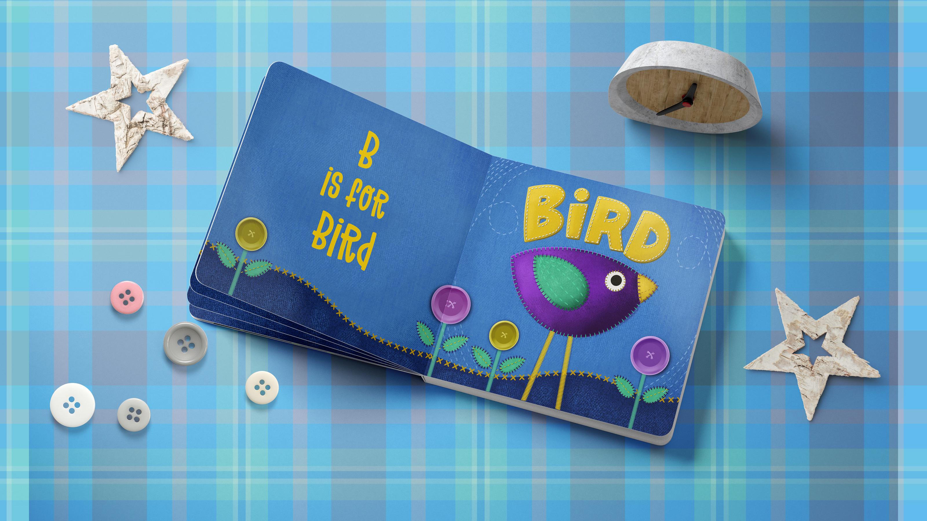
on the side here. I really didn't put that until the very end because I've
got a mock-up that is, for a board book that opens up. I have to make some
slight alterations to my artwork because I need
basically two squares. So I'm not sure I might end up doing lettering like
this on this side, but once I show you once you'll know how to
go about doing that, the other stitch that I've
got here is a cross stitch. So that'll be kind
of fun to you. So let's get right at it. At any point now to
if you feel like the photograph is kind of
in the way you can hide it. We can always go back and take a look at it if we need it. I could've brought that
in as a reference, so it could be here so that you have it as a side reference. Instead, I just had
it nice and big. I just found that that
was easier for me to take a look at and get some of the
details of the shadowing. Let's make a new layer
here at the top. And I'm going to use
my monoline brush, which is that Posca paint
marker that I use ever so much. It's just I've appended
here into my reasons because these are the ones
I use like almost daily. So it's just a
monoline brush and then my tapered pen
pressure brush that gives me thick and thin lines and then the pencil
for sketching. Those are things I just use. This one here
actually I can unpin, I hadn't panned here
from the last class, so I can just get rid of that. And then of course, all the most recent
brushes show up here. Okay, so for the lettering, I've got a new layer. I'm gonna do it in yellow or even choose a slightly
brighter yellow. And I just went for it. I created each of
the letters by just basically drawing nice thick, what will end up being
a nice thick shape? You could use this layer
to cancel it in first, and that might not
be a bad idea. So let's pencil it in with a white or something,
so it's contrasting. We want the lettering to
be really nice and thick because imagine this
being cut out of fabric. You're not gonna be wanting
to do really fine lettering. So if you wanted to sketch it in this first, when
you get to the B, to the r, you want to make that top area quite a bit
larger than it is on the B. Just to make it kind of funky. You can always go in and darken or race lines just so that
they'll show up better. So this is what I often do. I'll do the sort of really quick and rough sketch
and then I'll go in and do some erasing and adjusting till I get it looking
the way I want. Something like this, you can even make adjustments
to things like the spacing by just selecting and moving
things in closer. Remember, this is supposed to
look kind of rough English. I've got and see how I've
got my lines on all of these sort of almost like
a one-point perspective. They're all kind of
coming into the center. You can do that if you want to. You don't need to. But the way I wanted it to look, and I've got my lettering
roughed in pretty good here. So now let's do the final copy. So I'm gonna make a
new layer because I'm gonna get rid of that
one in a second. And I want my brush again and my yellow
color slightly brighter. And I'm gonna make my
brush a little bit bigger. So you can see I can reduce
the opacity of this one. And then when I'm drawing it, you're gonna be able to
see a little bit better. So I'm gonna go to
my Posca marker. You can always be
correcting a little bit now as you're creating. Drink too much
coffee this morning. Definitely a little bit shaky. One of the things you can
do if you are a little bit shaky is going to
your stabilization here and increase your motion
filtering and stability. Not be too careful with the
corners here because I can pull back and do
them with an eraser. That's one shape
that I can do with the stabilization
kind of curve thing. I don't even know
what that's called, but it works great
for things like this. Okay, so I've got my letters, let me just get rid of
that outline and then I can go in and just do
some slight repairs here. The eraser is still
on the hard airbrush, so that works okay for me. Or I could put it back on that
Posca pen marker as well. I just find it's faster to do it this way and then fix it up. And again, you can also do straight or curved
lines with your eraser. You probably know that already, but I'm not going to bother because I want this to be okay. I think that's good
for me for now. And we're gonna follow
the exact same steps as we did before. We're going to
duplicate it twice. On the middle one,
we're going to fill it. Let's do this selection
this way just quicker. And we're going to fill it with a lighter version that could be the highlight on the outside. So it's way we're
going to fill it quickly by using
the layer commands. Let's do a darker one
and select, Fill. And these, you
remember what to do. We're just going to move
them over a little bit. I'm using the tapping method. Which one is that? Now I want to add
the texture to the, to each of the layers as well. So we can do it this way
by just adding a texture, making each a clipping mask can select everything to do
with the lettering and put it in a group and rename
the group to be lettering. Let's start with the top one. So I'm going to grab
the texturizing color. I think it's gonna be too dark, so let's go in and
it's a clipping mask. So it's going to clip
it quite nicely there. If you feel that it's too dark, go in with a little bit lighter, but you do want that
texture to show. So be mindful of that
as you're doing it, you can go in and do that
on each of the layers. They barely show. So it's not that critical, but just kind of giving
it a shot anyway. So this is a good
way to maybe do a little bit of work
with your shading and stuff and then
don't forget on that middle layer
that light earlier. To go in, sample the color, use your monoline brush
and just fill in. So I want to sample that color. So I'm gonna hide these two for a second sample and
then turn them back on. And then I can just
kind of brush that in. So I'm basically connecting from that corner to this
corner on all of them. It looks like that that belongs to the side of the fabric. So it's kind of a little
bit of a perspective there. And you can do the same
thing with your base layer. We'll sample that
color and go in. And just if there are
areas that stick out like that that you blend blend them in just so that they look
like they're connected. Now that one's not quite
matching up to simply because we did some light
and dark areas there. So I'm gonna be a little bit
more careful with this one. So it's more of a corner
like that and you know what, it probably wouldn't
even show there. So and I don't know, You could also just shave it back a little bit
with an eraser, whatever you think looks right. It always boils down to
your judgment on that. So we've got our lettering. I'm glad I've put it
in a separate folder because that lets me do things like adjust
the size or positioning, angle, that sort of thing. And now we can add
our stitching. So we're still going
to work in this group. I'm going to add another layer. And this time I want to
do that running stitch. I'm going to try
this longer stitch. There are two
different sizes there just to give you some variety. And I think I'm going
to is one in white. Let's see. Yeah,
that's pretty good. Make sure that you're
on a separate layer and then go in and
in your stitching. Now you're going to find
that these stitches are a little bit easier
to turn a corner width, but I still prefer to do it separately because of things
like that that happens. So I'll just quickly go through
and add that everywhere. Remember that trick
of holding down your stylist to help you straighten out some
of those stitches. And the stitches maybe a bit big because you
can see the angle. They're kind of weird
on a couple of them, but you know that
you can go in here and just adjust them
if you need to. Maybe that's smaller. Stitch
would've looked better here, but I wanted to work
kind of larger just so that it's all obvious when
you're watching this lesson. Remember you can always put in individual stitches if you
need to just by tapping. That worked. I'm happy with that. But I think of course
I'm still going to add shading and whatnot to that. So I will do that off camera and come back and just explain it to you or will be here forever. In the next lesson, we're
going to do the flowers. We just have run out of
time on this lesson, so I'll meet you
in the next one.
6. Lesson 5 Flowers, Leaves and Stems: Hi guys, welcome to lesson five. Unless than five here I want to add a landmass at the bottom. And also we're going
to start adding some of our other
decorative elements. I've got a button brush that I have here in the set for you. And I'm gonna show you some
special considerations for it. Let's get into it. I was gonna do this while
off camera just to be fast. But I think that it is a
good skill to learn here. This is just an alternative
for creating the shadows. So I'm gonna duplicate,
it'll stitch them. That's on the lettering. The duplicate. The
one that's below is the one that I'm going to
use to make the shadows. So I'm going to select
and then I'm going to fill and I'll just
choose black for now or really dark yellow. Go back here and
I'm gonna fill now that white stitching is a
little bit transparent, so I'm gonna duplicate it
and that can be merged down, that blocks it out a
little bit better. The bottom layer
here you can see has a darker color on it. So what I'm gonna do for this
one is used the blurred. I'm going to the
adjustments menu, the Gaussian blur, and I'm just going to blur it slightly. So I'm at about 5%, 4 or 5% there. I don't want to get too big. Maybe I'll just do it at 3%. It's there, it's a
little bit light. So you could duplicate it to
darken it up a little bit. But I think that
works quite well for doing the shadow
in this case. Now you could still go in with
that stitch whole shadow. And if you're looking for something really
therapeutic to do, you could go through, and actually let's go
with a dark yellow. You could go in and
make little divots. You'd have to probably end up lightening them up or
using the blurred, we can go a little bit smaller. I'm using that shaded
side as my color. And you could go through and
do this everywhere as well. That would be quite
time-consuming. But if you really wanted
it to look realistic, you could definitely do that. Decide which side needs it. Maybe you only one
side would need it. But you can see that definitely makes that stitching
look deeper. So that's one I'll do off
camera just so that I don't keep you here
watching as I paint dots. Now I want to also add
kind of a landmass, I guess he'd say at the bottom
before I do my flowers. So for that, I just grabbed
the Posca marker and I'm going to sample that blue so that I can go a
little bit darker than it. And then just kind of do a
curvy line at the bottom here. No specific way you
have to do this. And I just thought it's
something I'm gonna add it down here at the
bottom instead. I'm thinking one thing I want
to do first is just changed my canvas to be instead
of eight by 12, I wanted to do it
14 inches here. That way I will have two squares that I can
use on my mockups. So this really has
nothing to do with you, But it's more for the purposes of my
finishing at the end. So I'm going to hit Done here. Oops, can't do it. You see that I hit
my maximum layer, so I'll have to deal
with that later. Alright, so I've got
my new layer here. I'm going to fill it
with that darker color. I'm adding a layer. Now. It's still allowed me to make layers here because I
haven't enlarged it. Therefore, I still have, I think the 73 layers that I was supposed to have
on this new layer. Now I want to add that
other denim texture. I'm using this kinda bolder one and I'm going to darker
I think on this one, I want to make sure this
is a clipping mask. And that worked really nicely to put that sort of
a denim texture. And you can go over it
more than once if you want to make it a little
bit more prominent. And then I'm going to
add a layer above. I'm going to actually
put those legs into that layer,
the third layer, I'm gonna drag it in above
that texture just so that I can unclip it and not disturb any of the
other clipping masks, then I can actually grab all of these and group them
to be in a background. So this one I would
rename background. And this extra layer that I've added is for putting
that cross stitch on there. So I'm gonna grab
the thicker one. I like it better. I'm gonna
sample that yellow color. And then it's really a
matter of kind of centering over both shapes so that you get what looks like
stitching joining the two. So I'm kind of running my
trying to run my life. An awkward angle here, but I'm trying to run my line. I'm gonna go a little bit
bigger than trying to run it. That the point of my stylist is right on that connecting line. And you can see
here I haven't done the greatest Jaws Dragon One
more time for good measure. So there's my stitch line. Again, that's one that you
could add shading to you, that's completely up to you. And then the last thing
I want to do here is add some little flowers. So I'm gonna use my button and a couple of the colors that
are in my layout already. So I've got a new layer here. I'm going to stop that button. A little bit smaller. If you want to make it a
little bit less transparent, you can duplicate it and run those two
together if you want. And I'm not loving
the color here, so I'm going to merge
those two together and then go into my hue
and saturation here. Move that a little bit. I think I'll do kind
of a purply one. I'm going to go to the
deeper purple color. You can pretty much
stamp anywhere, put it on its own layer. Now I think what I
could do here is to put a white
background on that. So I'm going to duplicate it, go to the bottom one, select it, and then fill it, and then filling it with white. Let's see how that looks. Nope, that's not what
I'm looking for either. So I want to that
other method again, we'll delete this one. Automatic selection. I've got it at about 11% of a threshold of their
Select Inverse, didn't get the whole area. But I think I can still fill
and then see how that looks. That could be
another alternative. So a different way
to do it so that it looks a little bit better
than that one there. So you could also
fill it with whatever the color is that
you want that button to be if you wanted,
didn't want white. So you could go to more of a pink color and I
think it looks better. So I'm gonna go back and
do that with the green which I see is added
onto my stitch layer. So I'm going to just do a
freehand selection here, cut and paste In layer,
I'll duplicate it. I'll go to the bottom one, select it, then, fill it with. You could go into a
different color. Let's try. Yellow doesn't seem to
work too well either, but I do like this purple one. So let's just eliminate this greenery for
that segue there. But I mean, this is how it
works for a lot of times, like you're just solving
problems as you go along. So I'm going to group
those two together so they're within the
background group. But then I can
duplicate and have my second button
there for flower. And I could merge
these two together. And then I could try altering the color here
to see if it would work. So yeah, that works
a little bit better with that white or
light background. So we could do yellowy
button like that. Okay, and now I need to
add the stems to them. So maybe what I'll do is put all the flowers into a group
within the background. Then I'll add a layer
which I'll put beneath. And let's use that
satin stitch again. I think I had it pretty wide experiment here a little bit, and that's a pretty
good thickness. So I'm gonna grab that yellow
again because I think it's nice to keep the color
palette fairly limited. You could do it
yellow or you could choose to do it in one
of the other colors. So let's try the green here and I'm going to use the wing, believe it or not, as my two leaves on each
of these plants. So I'm going to
duplicate the wing, bring it down here phi is it it to be adequate for the flower? And then I'm going to read the rename this one because
we're getting to that point where we've got so many
layers that it would be a real pain in the butt
to try to figure out, I'm gonna drag that
down into the flowers. You can use the distort
function here if you wanted to just reshape it, maybe make it a little
bit slimmer and then duplicate, flip horizontal. Oops. I accidentally grab both. Yes, I did. Grab just one of
them and flip it horizontal and you've got
the two leaves there, then you could take these
leaves, group them, and duplicate the group, which you can then
bring over here. We've got the leaves
for our little flowers. And now of course, you know, all that's left to do is
add the stitching on that. So I'm gonna use
the same kind of stitching as I did around here. You can experiment
and see whether the smaller stitch might
work better in this case, make sure you add a new layer above and then go ahead and
start adding your stitching. So I'll come back to you in
the next lesson with my, all these extra
elements all stitched. Then we're really just
at the point where we're gonna be adding some
other finishing touches. All right, so I will meet
you in that last lesson. See you there.
7. Lesson 6 Brushmaking Details and the Mockup: Hi guys, welcome to lesson six. We've got a few details to iron out here in the last lesson. All right. Let's get to it. I wanted to show you the
results of my toils. So you can see here that I have reduced the size
of my documents, so I did that so that
I could also create a blank page that I'll use on my mockup and I'll be showing
you that in a second. Things that I hadn't finished
that where I left you last was the stitching along
the edges of that flower. And you can see I just ran a single stitch along the
center of both of those. And you can see that same
technique that I used for the earlier examples of how
to create a bit of a shadow. And of course, I've gone
through and done a few of those dots to make it look like there's a little
bit of an indentation there. And for the fun of it,
I just thought I'd add some sort of planes
stitching as if it's been sewn right onto that denim before the
applicant was done, or it could have
been done after, but it gives this a little
bit of extra interests. I also went through and
finish the eye and added that stitching around the B and of course that
line in there, I added some stitching
on the wing. And so overall, I think it
looks pretty authentic, pretty realistic, if you recall. This is our little examples. I've gotten their
kind of cutoff now, but you can see
that we basically accomplished what we wanted
to at the beginning. I'm going to delete that now. But our goal was to
create what looked like a really
realistic application. And I think that we've
accomplished that. So I can't wait to see your creatures or flowers or whatever it is
that you create. Hopefully you'll have
fun using the brushes. And I just quickly want to
show you that if you wanted to go in and make any
changes to the stitches, it's really easy for you to
just duplicate the brush. Then you can go in here and adjust all kinds
of different things. You could adjust the spacing
of that blanket stitch. You could go into the
properties and make it quite a bit larger and I'll show you the resulting stitch. So let's just do a test. Well, let's just make a new
layer on top of everything. And now that's the new
stitch that I created. So that's just by altering the spacing on what I had there. The other thing you
could do is you could go in and substitute, draw your own shape
that's a little bit taller or a
little bit fatter or whatever it is that
you want to have and then paste it in and create
your own brush. So that I had done that on a ten by ten
document like this. This isn't the document, but it'll work just fine. Let me just delete this. I've added a new
layer to delete. Choose any brush that
you're comfortable using. You could make a nice,
nice, chubby shape. I didn't even use my
Draw Assist to do this. Just free handing it to fill
the background with white. Now you can see that
it's filled with white. You could copy this code
into that brush set again, duplicate whichever stitch it is that you're
trying to work with. So let's duplicate this one. This is a running stitch, go into the brain here, hit Edit, Import and paste. And now you're going to have a nice thick version
of his stitch. Okay, so that's how
easy it would be to create various stitches that you would need for your project. All right, So once I had
completed my layout here, what I did is I
export it as a JPEG. I. First of all, I exported
this one and then I turned it off and
exported this one separate. So now let's hop
onto Photoshop and I'm going to show you how I went through and finish
that onto my mock-up. Alright. Okay, So here's my
cute little bird page of my children's book. So you can see here
that I have both sides, but I had created in Procreate. And the way a mock-up
usually works, I've been buying mockups
a lot from Create see, and they're great because
they will do a smart objects. So here in the layers panel, you would click on the
layer that you were wanting to pick your art onto and
you would just paste it in. So I had it in my
folder for this class. I simply pasted it in. Once I save it, then it showed up here. That's basically all there
is to these mockups. I added one of my own backgrounds and
a bunch of these little view Hickey's that I had
from other mock-up sets. But I'm gonna show you just real quick just by doing a cover. So this is one of the mock-ups
that came in this section. This one is just the cover, so this should be really quick. Here it is in the layers panel. I just need to
double-click on it here and then I need
to have my artwork. I'm going to open it up. And here it is in my
downloads folder. So I saved it as
a JPEG and I just used AirDrop to
transfer it over here. Now it up here, I'm gonna select all and copy and paste it in just a
little bit too small. So I'm going to use
a shortcut that I have to have it fit. I'm going to hit Save. Once it's finished saving, it'll update on the smart
object just like that. So there it is, my
finished little book ready to showed up
publishers or whoever it is. I'm trying to present it to
now as far as the background, the shadows are
all there already. So what I'm gonna
do is I'm gonna go into this layer
that's called color. So I guess you could go into this layer and change it to
anything that you wanted. You could find suitable color. You could sample a color from within and
maybe go a little bit darker or a little
bit more neutral. But if I wanted to do
actually is add a pattern. So I'm just gonna go here into my layer adjustments
or adjustment layer. I'm gonna grab pattern here. These are patterns that I
have saved here in Photoshop. So I've got a few
random folders, things that I've
been saving here. I don't have a lot
here because I recently redid my Photoshop. So a lot of those were I
just didn't reopen them or didn't re-import them so
we could grab something. Let's just grab that same plaid and that's a pattern
that I already have. You could make adjustments to
the size if you wanted to. So you go half size. It's not the best
color for this job. So I'm going to
also add a hue and saturation adjustment layer in order to clip it to the pattern, I'm just going to option
click on the line in between. And then now I can just slide this hue slider until I
find something suitable, desaturated and maybe
lighten it a little bit. And you can see it's being
affected by the shadows, the scene shadows that are already built into
this document. So basically that's it. You've gone through the
entire process and I can't wait to see the projects that you
guys come up with. This stage, this mock-up
could be done in Procreate. I've done it before, but it doesn't use the in
smart objects here like this. So you're kind of
having to cut and shape your artwork to match and it doesn't
necessarily work. So my advice to you is to use
a program like Photoshop, whatever you have,
that's equivalent. I have, of course,
Creative Clouds. So I've got all the software on both my computer and my iPad. So I could do this in
Photoshop on the iPad as well. But the other thing you
could do, of course, is also draw your own mockup. Make it look like a book
by adding a bunch of shadows around the outside edge. You could do that with
your Gaussian blur. You can do that
right in Procreate. Good luck. I can't wait to see
your projects posted here.
8. Lesson 7 Conclusion, Mockups and Next Steps: Guys, welcome to the ramp up. Was this a fun project for you? I really enjoyed it and I find that even though
there's a lot of repetition when you're doing the shadowing and the stitching and all that kind of stuff. It's very therapeutic. You can sit and do this
while watching TV. And next thing you know, you've got a really
dimensional finished piece. Now that you have the
technique down pat, you can use this to
do all kinds of art. And like I mentioned
at the beginning, I have a children's book
that I read to my grandson. And it's got the
entire alphabet. So from a to z,
different animals, different reptiles or whatever. And of course, it says for
him to learn the alphabet, this is a very viable
illustration technique. I'm sure you could produce some really fun art to
sell on POD sites as well. This could be beautiful for
a kid's room, for example. Here's a couple of
mock-ups that I did. I had to do a little bit of
adjustment on my artworks. I hadn't done it in
the right proportion, but I think it turned
out pretty cute. I've done a couple of
them here so that I can show them to you on wall art. And here's some fabric
pieces as well. If you enjoyed the class and
you like my teaching style, then I would suggest that you hit that follow button up there. That way you're informed of
any of my classes as I post them and any of the other
information I send out here. Now remember to
also add your name to the mailing list
on my website. The website is
where I post all of my free assets like
the brush sets. And they don't necessarily
all go with classes. So if your name is on the list, you'll get informed about the new products as soon as
I add them to my website. If you're interested,
you can also check me out on sites like societies six, art of where in Canada
and Sawzall.com, which is where I have
my biggest shop. I also have tons of artists resources on
my Pinterest sites. So the first one is the
loris art Dolores das grin. I've made a board there for reference that would be
suitable for this project. You want to check that out. The other side is called
teacher Dolores gas grid. Between the two sides, there's tons of artists
resources there that you can checkout
and lots of inspiration. I guess that's it for today. I can't think of anything
else to add here. Thanks so much for
hanging out again. I really enjoy it and I
really loved the fact that you are there
watching my classes. And I feel like when I'm
describing what to do, I'm talking straight to you. So thanks again for being
here and bye for now.
 Delores Naskrent, Creative Explorer