Transcripts
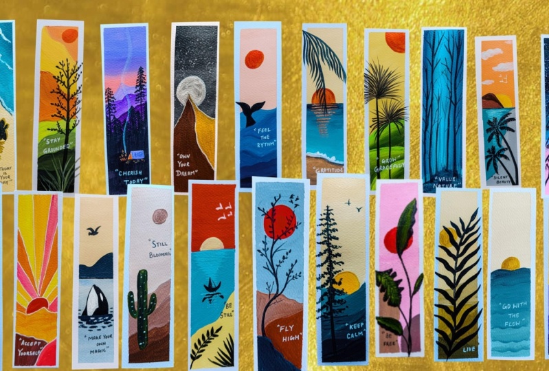
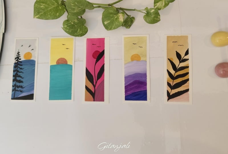
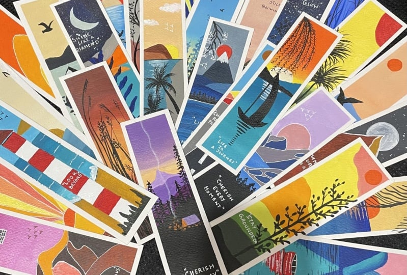
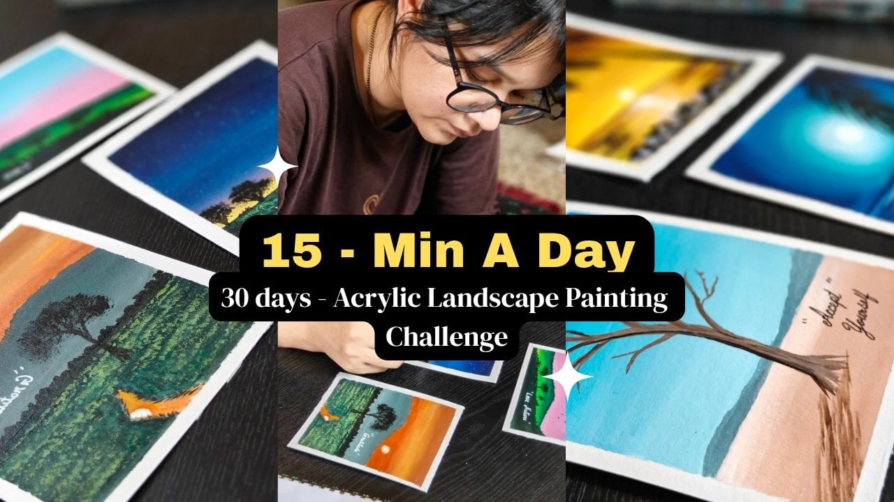
1. Intro: A bookmark may seem
small and simple, but it holds a quiet
kind of magic. It's special because
it marks not just a page but a moment where
you left off in the story, a thought that intrigued you or a feeling that
stayed with you. So in many ways, a bookmark is a companion. Hello, friends. My
name is Mohan Senna, and I'm an acrylic and Gash artist and also a
camel art ambassador. So this class is
specially designed for bookmarks with
beautiful quotes in it. So it will be a 30 days class with a landscape
painting in Boho style. So anyone can try it out
even the bigners So come and paint along with me this beautiful and bright
vibrant bookmarks. And
2. Materials Required: So let's discuss
about the materials which will be required. So the first one is the paper. Now, this is the 200 GSM paper, which I'm using here, and it is seven into 2 " paper. And it's a very thick paper
as it is 300 GSM paper. And it has almost 24 set
which I will be using. Apart from that, we will be using masking tape to
put the tape around. And then comes the
pencil for drawing. You can use any pencil,
technical pencil, anything. Then comes the colors. I will be using acrylic colors, mostly camel and
Windsor and Newton. Apart from that, the brushes, there will be three brushes which we will be
needing the flat, the round, and the rigor brush. This is the round brush, and this is the flat brush. No bigger size flat brush, normal flat brush will work. And the tissue or the cloth
for wiping your the pen, the black pen and the white pen, white gelpin, the palette knife. And apart from that, we
will be needing palette and the jar for keeping
water. So this is it. So let's start with these
beautiful bookmarks. I'm really excited to share this tutorial with
you guys because this is very simple and
easy to do it. Anyone can try it out with a beautiful code on
it. So let's start with it. Uh
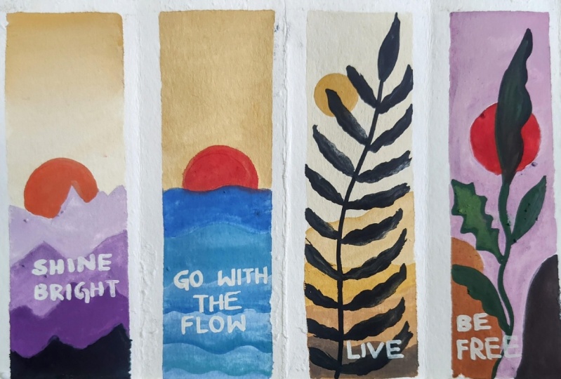
3. Shine Bright: Come back. So let's start
with our first bookmark. So let's first put the
masking tape all around. This is the masking
tape which I'm using. So try to put half on the
base and half on the page. First, put it on the base
so that extra gum comes out and then start putting
it on the bookmark page. So just half on the page
and half on the base. So like that, we have
to put all over. So be careful that it should
be in a straight line. Then only it will
look nice and neat. If you're not able to
put in straight line, try to put the line first and
then put the masking tape. So very simple and easy
way of putting it. First, put it on the base
so that extra gums remove, and then you can
put it on the page. Half on the page and
half on the base. I will be putting
on all four sides. Now, this is not compulsory. You can also leave it
and you can directly do on the entire bookmark.
It's your choice. So this is all I have
done, the taping. Now I'll just do a little bit
of drawing of the mountains because these are
landscape paintings which is done in Boho style. So it's very simple. It's
not very complicated. Anyone can try it out. So first I'm just trying to draw the
overlapping mountains. So at least four
mountains I have drawn. So one sun I will be adding, that is a half sun I will be adding on the top of mountains. So this is my smaller masking
tape which I'm using. You can use compass
also for drawing it. It's your choice, how
you want to draw it. Scrubbing the extra lines
so that when we will paint, the lines will not be visible. Make sure that from
all the sides, it is properly taped. Now, let's start
with the coloring. These are the colors
which are there, white, violet,
orange and yellow. I will be using my flat brush
for painting the top first. So let's take the yellow color. You can use any yellow,
whichever yellow you want, the lemon yellow or the
cadmium yellow, any yellow. So I'm just mixing
first a little bit of orange into this. So it's very light color, very pastel shade color. So first, I'm just trying
to cover the above part. You have to do with
very light color, so it should not be very dark. Applying it on the top. You can see how
light my color is. Adding more white to it. Try to use very creamy color, not make it very thin color because we
are using acrylics. So try not to make it very thin. So I've also covered
that sun also. Then on top of that, we will be doing the painting
once the color dries. Now, I have done
it on a bookmark. You can do it on any sheet, any size sheet. It's up to you. I'm doing it on a bookmark, and also I will write
one quote on this. So first, I've just
painted the above part. Now, a little bit corn is left, so I'm just putting
the same color there. Now, with my round brush, I'll start from below. So first, I will take
just violet color and start painting the
bottom line which is there. A very simple and easy painting. If you are a beginner and
you haven't tried acrylics, it's very easy, and
you have to just follow each and every step and
you will be able to do it. Just try, remember that
only water should be on your brush and directly
take the color and fill it. Don't mix too much
water in your color. Water should only be
there on your brush. So slowly, slowly, I'm
just adding white. So as I will go above, more and more white,
I will start adding. Just be careful with the
shape which is above, first outline it, and then
you can fill the colors. You can use your
round brush also. You can use your flat brush
also for filling this. It all depends upon your choice, how you want to do it. Which brush is
comfortable for you. You can see I've
just filled it with this nice dark purple color with a little bit of
white added to it. Now, as I'll go above, I will add more white to it. I'll just make the color
lighter and lighter. Like, I have made four layers. You can add four to
five layers also. It not only is that you have
to add only four layers, you can add many more
layers like four to five. Roly slowly, I'm just
filling the colors. Now in the top layer, I will add more white and very little
amount of this violet color. So now you can see
the transition from the dark to light color. This type of painting really helps us to understand the color tonal values also. If you are not satisfied with one you can apply the
second coat also. But if you are satisfied
with one, it's fine. Now I will start
adding the top part, giving a little
shape, proper shape, round shape to the lower part. So it's up to you how many
layers you want to apply. Now the second code you
can apply, it's up to you. So if you see any brush marks, you can definitely
apply second code. I would recommend to apply second code because
sometimes second code makes the color more bright and more neat and with less brush marks. So that's why I'm
applying the second code. Little bit color
variations will be there, but it's fine because
you're applying second code on the entire thing,
it doesn't matter. Slowly, slowly,
I'm just applying the coat with my same brush. And now let's start
with the above part. So that is the sun,
which I will be doing. I think the top one is fine, so I'll not apply second core. So a little bit of this
red color also I have added and little bit mix of this yellow and
little orange. So I want a little orangy,
dark orange color. That's why I've
taken red over here. So first, make the outline with circle and then start
filling the color. So if you have dark orange
color, you don't need red. But if you don't have
dark orange color, try to add little red to that yellow and orange mix so that a different color
value will come up. Very simple and easy to paint. Just try to make it
as neat as possible. The more neat the
painting will be, the more beautiful it will look. We are almost done
with the painting. Now I will write one at over there in the
darker part with my white gelpin So some of the colors, there are gap, so
I'm just filling it with this light color. So once your base has dried, then only write the coat. Otherwise, wait for
the base to dry. Once it has dried, then
we can write it down. So let's first
take out the tape. Now my whole painting has dried, so I'll just take
out the tape slowly. So now let's write
a small coat on top of it with my gelpin. This is a white gelpin
which I'm using. So on each and every bookmark, there will be one code depending upon the landscape
painting which I am doing. So let's meet in
our next lesson.
4. Go With The Flow: Welcome back. So let's start
with another bookmark. So again, I have just taped
down the entire thing. And first, we'll draw a little rough sketch and
then we'll start painting it. So this is go with the
flow as the names suggest. It's like a water which is flowing and you should
flow along with it. It's like that, the message. So that's why I'm drawing here first the
waves, which is there, and then we'll create one sun, very simple painting
and very easy to do it. Anyone can do this
type of painting. I'm just creating some
nice curvy lines. After that, I'll create
small sun on top of it, half of it, and then we'll
start with the painting. So for doing the sky, I will be using yellow
ochre and white color. So two colors I will be using. So this is yellow ochre. If you don't have yellow ochre, you can use chrome yellow also. And this is white color, that is titanium white, which I'm using here. So I will try to
make this yellow ochre colour very light color. It's a very light color. So maximum, it is white
and very little amount of yellow ochre I
will add to it. So you can see how much
quantity I'm taking very little amount of
this yellow color and mixing a lot of
white to it so that the background sky becomes
very light pastel shade color. So now with my flat brush, I will just start painting it. You can use your flat brush. You can use your round brush. Whichever brush you
are comfortable with, you can use it, and you can
just paint the entire thing. Try to use thick colour when you are blocking the entire sky. Very simple and easy to
paint these bookmarks, and these are very beautiful. So mostly we will be doing here the landscape
in Boho style. So this is one of them. If you're not satisfied
with one coat, you can apply second at
after the first coat dries. Now, once you are done
with the background, now we will be doing the we can do the sun and
then we can do the water. It's up to you whatever
you want to do. Now, the color
which I'm using for water is the hallow
blue here I'm using, but you can use any blue
whichever blue you have. So using my round brush, I will create a transition
from dark to light color. So like this, the
transition will go. So first time using
the dark color, that is the dark bluish color. Then as we will go down, we will use lighter and lighter and lighter,
so it will be like that. So first, try to use the
darkest blue which you have, and as you go down, try to make the color from
dark to light, the transition. Then only that effect will come. You can use your
round brush also. You can use your
flat brush also. It depends upon
your convenience, what brush you want to use. You can go line by line also, and you can just
directly paint it also. It's totally your choice, how you want to
paint your painting. You can see as I am going down, I'm making the color more light. So this is the exact
transition which we want from dark to light color. A If you're still not sure what to mix,
how to mix the color, mix quite a large amount of color with the first
take dark color, then on that dark color mix totally white color
a little bit, and then again, mix more white, then again, mix more white like this you can do or you can divide the color into parts
and then also you can mix. It's totally your wish how
you want to mix the colors. You can also don't create the shape and just try to
mix it first the colors, and then you can create the
lines that also you can do. So here you can see, I'm
just making the color a little more dark. Using directly that
tallow blue and making this upper
color more darker. And without creating any lines, just go down and down and down using more white and white. So like this, you
have to move down. So when you will
do this process, you will come to know
how to mix the colors, how much to mix the colors, and how to create a nice
transition from dark to light. So You can see how nicely the transitions are
coming from dark to light. So that's what we want here. If you feel that the color
is coming a little same, just try to mix it and just
make it a little more dark. Till then you are satisfied, just try to mix the colors.
This also you can do. No need to create the lines
like this and just try to first create the transition
from dark to light. So slowly, slowly,
as I'm going down, I'm making the color more light. Now, once you're done with
this whole transition thing, then you can add the lines
with the dark color. Try to add the lines
with the dark color. Simply dark color.
Take the dark color and simply try to
create some wavy lines. My color is still wet behind. I'm just adding on top of it. And these lines, I will
try to blend also with these light colors so that
the lines are not very sharp. I'm just trying to blend these
colors on the upper part. Similarly, you have to
do for all of them. Just try to blend the lines a little bit. Don't
make it very sharp. Just try to blend the
upper part of the line. I'm able to blend because my
colors are still wet behind. That's why I'm able
to bend the top part. Once you have done
all these blending, now you can create the sun on top of it with just this
yellow aqua colour. Using the same round brush
size four or size two, and just colour the whole above round circle and see that
your blue colour has dried. Otherwise, it will mix with blue and it will turn
out to be green. This is it. This is
what we have done it. Now, here, once the
space has dried, then only write the at. Simple at with your gelpin, white gelpinO even you can use your brush also to write it. It's totally your choice
how you want to write it. Simple quote I am writing here. You can see how
beautiful this color is looking the hallow
blue especially, and just slowly
take out the tape. So if you don't want
to put the tape, you can color it on the
entire bookmark also. It's totally your choice. I love putting bookmarks. That's why I put the bookmarks. You can see here the color
has little spread up. So what I will do it, I
will just take white colour and just cover that area which
has not come up properly. So this is it. Go with the flow. So you should always
go with the flow. So this is it, the
whole bookmark thing. I'm sure you will
also enjoy doing these bookmarks and we'll
meet in our next class.
5. Live: Welcome back. So let's start
with another bookmark with the quotation as v. So just
adding some mountains, some overlapping mountains, and then we'll start
with the painting. Very simple sketch,
not much to do. So you can see I've created four overlapping
mountains and one sun. Now, let's start
with the painting. So the colors which, again, we'll be needing here
is yellow ochre, white. And black. So these three colors we will be needing for
our complete painting. We don't need much colors. So first, we will be
doing the background. So let's first mix the colors. Now, again, a very
light color we need very light yellowish color. Again, if you don't
have this yellow color, you can use any color, any yellow color of your choice and try to make it a
little pastel shade. So just trying to fill this
whole sky color first. Very simple and easy painting, it is. Very relaxing. Just move your brush in one direction and try
to fill the color. You can see water is only
on my brush. That's it. And I'm just directly
taking thick colour, and I'm just putting
one layer of this whole light color
on this background. M Now, once you are done
with the above part, let's start with the mountains. So these are
overlapping mountains. So we'll start with dark color. And as we will go above, it will be slowly, the color will fade.
So it's like that. So let's mix first
this yellow ochre and black and make it like
a burned umber color. So very dark color it is. So just filling it up
the lowest mountain, I'm just filling it
with very dark color. And as we will go above, this color will becomes lighter. So just filling this
with dark brown color. See, when you are
using yellow ocher, you don't need a separate brown. You can just mix this color
and you can make brown color because this yellow ocher is already a little
brownish in color. Now, you can see I've added
more of yellow ocher in this, and I'm just filling
the above mountain. Now, again, I will make
the color a little more light by
adding white to it. And just filling this
area with my round brush, you can use your flat brush
also for filling it up. It depends what brush you
are comfortable with. Very simple and easy painting. I'm sure you will
enjoy doing this. Whenever you feel stressed, you don't have time and you
want to paint something, you can just pick one of the bookmarks and
just try it out. You will feel good. Because
when we do coloring and we use colors by just moving the brush and the
colors and mixing the colors, our mood automatically changes. So now we will add the leaves. But first, we will
remove the tape and then only we
will add the leaves. So before that, let's
paint this sun, which is there with
just yellow aqua color. Simply using my round brush
and filling this circle. Try to do it as
neat as possible. And now I will just
remove my tape, and then we'll start
painting the leaves. So I want these leaves to
be on the white part also. That's why I'm just removing it. So once we have
removed the tape, now I will start making the
leaves with just black color. First, I will create the line. Make the color a little
thin when you are making any lines or any
detailing things. Don't use very thick colour. And when you make the
color a little fluid, it will be easy for you to
move and flow your brush. Otherwise, it will be very
difficult for you to paint. So try to make the
color, little fluid, and that's just grab
this black color and start making the leaves. The leaves are very simple. You just have to press
and release the brush. Use your round brush of
size four or six and just press it and
then release it. If you're using from outside, then make it a little thin and as you go down,
it should be thick. The pattern is like that. So as we are going down, the leaf size will
also increase. And these are like wavy leaves, not very straight leaves, something like a wave,
you have to move the leaves like S type. These leaves look very beautiful when you
will do it completely. You can see I'm also doing it
on the white part as well. So take your time and enjoy the process of
creating these leaves. You can create
different leaves also. It depends upon you how
you want to create it. You can also create
two small leaves. I will look good. So it all
depends upon your creativity, how you want to decorate it, how you want to decorate
your landscape. O So you can see how beautiful
these leaves are looking when we
have put them on. We are almost done
with this painting. We'll just put the quotation
and we are done with it. The quote which we
will put here is live. Just live your life to
your fullest. Just live. That's it. So I hope you enjoyed this. See you in our next class.
6. Be Free: Welcome back. So let's start
with our new bookmark. Be free. So let's
first draw the rocks. These are rocks which are there, some small rocks
and some big rocks. And simple painting,
not very difficult. It's a very simple painting
and one sun in the center. So very simple drawing, just a circle the center. You can draw with
free hand also, and you can draw it
with your compass. Now, let's see what colors
we will be needing for painting this whole bookmark. The colors which we will
need here is white, sap green, black, magenta,
and lemon yellow. So let's start first
with the background. So taking my flat brush and just magenta
and more of white. So very little
amount of magenta, and maximum color is white here. So we have to make a
pastel shade background. So just mixing it with white and just apply it and
see what color is there. It's a bit dark, so I'll
add more white to it. And just with a simple coat with horizontal brush strokes, I will just fill
this entire section with a light magenta color. If you have pink color, that color also, you can use it. Simple strokes,
horizontal strokes. Try to fill the corners
properly so that the bookmarks, when you take out
the masking tape, it comes out nicely. So try to cover the
corner edges nicely. Very simple painting. You can do it within 15 minutes, and you can just gift it
to your any book lover, whoever you want to gift it to. I think handmade paintings are the best gift you can
give to your loved ones. And especially the book lovers. Let's now paint the below part, the below two rocks
which are there. So the first color
which we will be using, we'll mix and make
the colors here. Let's see what first we'll mix. The first color
which I'm taking is the magenta color
and lemon yellow. You can see it is a little
orange color mixing white and little bit of black I will mix to make it a
little brownish color. You can see how you can
make a nice brownish color. So this way, you
can just mix and make any color, whichever
color you want. So it's like a raw umber
color, which you can see here. Once this rock is done, the other one, I will make
it a little lighter colour. Lighter means more yellow and a little bit more white,
I will add to that. So it will turn out to be
a little lighter color. Just filling it with
my round brush. So in this whole painting, I will not be using
so many brushes. Two to three brushes
we will be using for this complete
30 days challenge. That is the bookmark challenge. Just try to paint it evenly. Once we have done with
painting of this, again, I will mix color. That is the magenta and lemon yellow to
make it orange color. So just making this a nice
coat and just wash off your brush and grab the colors
and just try to mix it up. You can see a nice orange
color has come up. So just painting the upper
sun with a nice orange color. So try to do it as
neat as possible. Now, after doing this, I will remove the
tape and then we'll start making the leaves of the banana, you can say. So just removing the
tape very slowly. So actually be free is
with the banana leaves, how they move with the wind. So it's like that you
just have to move freely. Just be free. Just make yourself free from all the obstacles. And, So that's why I've
kept the coat like this. So first, I'm drawing
the line from the bottom, taking black color. And with black color only, I will be drawing the leaves. The simple lines from
starting from the bottom, and slowly I will be creating the leaves also with
black color only. So I will try to take the leaf outside the white portion also. First, I will give the
shape with my black color. If you're not comfortable
directly using black color, you can first draw with pencil, and then you can do
the black color. It's totally your choice
how you want to paint it. First, I'm making tea leaves. I will make three to four
leaves because it is a very thin bookmark.
It's not very thick. So that's why we cannot
make too many leaves here. So just adding one more, which is wide open. Once I've drawn it, I'll just
fill it with black colour. Try using milky color so
that you can easily fill all the gaps. So two more. I will add one small, and one on the top, which is going towards the sun. Try using your round rush
only for doing this. Just try to make it as
simple as possible. So if you don't want to
make that second leaf, you can make all
the leaves same, but make it of different sizes, some big, some small, like that. So one more smaller one, which I will add over here. And once I'm done
with the leaves, we'll create some
little details with our sap green and
lemon yellow color. So just a highlight on
top of all these leaves. So just taking first the sap green colour and
a mix of lemon yellow, just to make a little
lighter colour. And I will just try to give a little highlight on the
curvy part which is there. Do these detailing when
your black color has dried. Otherwise, this color will
mix with black color, and it will turn into black. So wait for the
background to dry and then use this layer. A simple one. You can add a little bit more
of white if you want, sorry, not white,
yellow if you want. Adding here in the center. So just taking a little
bit of lemon yellow and just sap green mix and
giving this a shape. Similarly, I will do
for other ones also. For this one, I will
do on both the sides. Just the textures I'm giving just to give a
little highlight and a little more beauty
to the leaves. Once you have done
this highlight, we'll just do the quotations and we're almost done
with this bookmark. You can see how quickly you
can do just one bookmark. So yes, these are
very easy and you can quickly paint these bookmarks easily with just a few colors. Just adding a little
bit highlight or with this lemon yellow color. And now I will add the
coat which is there, just making a little
more bright with yellow. Now, let's add code with. Either you can write above
or below. It's your choice. I will write below.
Taking my black pen. This is black technical
pen which I'm using, and I'll just write it. I think below, I will write. Just be free. That's it. I hope you will enjoy
doing this painting and see you in our next class.
7. Keep Calm: Welcome back. So
let's start with our new bookmark. Keep calm. So let's start first
with the sketching. Simple sketch. Overlapping
mountains first I will draw. So like this, I have
just drawn, I think, six overlapping mountains,
and then on top of it, sun. Tree, I will directly will
be creating with colors. So these are the colors, cadmium yellow, turquoise,
black and white. So let's start with the first color that
is Tallow turquoise. Taking white and mixing
a little bit of white in this turquoise color and a little bit of black because
I want a little dark color. So first, we'll start
with dark color, and as we will go up, the colors will become light. You can use any color,
whichever color you want. If you don't have
this turquoise color, you can use any blue colour, teal color, purple color, whichever color you
like, you can use it. Same process. So I'm just taking out all the
colors from my palette, and then I'll start
from the last one. So from the lower,
we'll go to upper. So first, I'm starting
with the dark color. And then as I will go up, I will start adding more
and more white to it. So taking my round brush, I'm just first doing
the lower part. You can see how
dark this color is. Very simple and easy to paint. You just have to change
the colors accordingly, just by adding white. So in this way, you
will learn how to make the transition from
dark to light also. Now, as I'm moving up, I'll just add a little
bit more of white into this color
which I have mixed, and slowly we will move upward. Oh Try not to mix your colors with the brushes because the brushes get damaged if you mix
the colors with brushes. Try to mix it with your
palette only palette knife. So just adding one
more layer of color. Now, again, I will mix a
little more white into this. You can see now the colors
are becoming more light. So one by one, I will be filling
each of these mountains. So so again, we will be
adding white colour. So this is the
easiest way to add actually white colour
on the same color, you keep on adding and
adding and adding, and a nice transition from
dark to light will be created. So you can see water
is only there on my brush and I'm just
taking nice thick color Now, as I'm moving upward, again, I have added white. So you can see how beautiful the transition is coming
from dark to light. So, likewise, you
can use any color, whichever color is
your favourite. You can use that and you
can make this transition. Now, once this is done, we'll first paint the background and then we'll paint the sun. So for painting this,
we will be using cadmium yellow and more white. So cadmium yellow will
be very less amount, and more amount will be white because I want a
little lighter color. So you can see how
light my color is. So similar color you can use. If you have naples yellow, you can directly
use naples yellow. Naples yellow is also
similar to this color. So just applying it
with my flat brush, taking thick color and
blocking this background. So you can see
I've just block in the entire thing. Be careful. Try not to disturb these
lines which are there. Do it very carefully. The more the neat painting will be the more beautiful
your bookmark will look. So I've almost filled
the entire thing. Little bit is left because we'll cover that sun, so
I've left that part. So I'll just take my round
brush and my cadmium yellow, and I'll fill this
up this entire area. Very nicely and very neatly
try to do this circular part. You can see I've
just done this part. After that, I will
just remove the tape, and then we will be
creating the pine tree. Try to do it very
carefully, very neatly. Then only that effect will come.
8. Keep Calm Final Details: Welcome back. So let's
start with the tree part. So just making the
color a little dark, mixing black and
this thalo turquoise and just creating first the line using my rigor brush. If you're not comfortable
creating the line directly. First, you can create
it with pencil, and then you can draw the line. So after drawing this line, we'll start creating small, small leaves as this
is a pine tree. So as these will go down, the size of these leaves
will start increasing. So I've just zoomed
a little so that you can see the textures
which I'm creating. These are just random
dots and lines, which I'm trying to create it and trying to
give a shape to it. As we go in the
outward direction, these dots and lines
decreases so that the thing becomes
pointed like a leaf. I'm also filling the
area which is in between those spaces that
are between these leaves. So very small
textures are these. Just have to create
random dots and lines, and you'll create a perfect
tree texture, as you can see. Try to use your rigor brush or liner brush for
doing such details. It gives a very realistic
look to the pine tree. So once we are done with this, we are finally done
with this painting, we have to create some few
leaves and we are done. So the reason behind keeping the name as keep calm because as these trees keep calm in
winters and same in summers. So like these trees, we should also keep calm
in extreme situations. So that's why I kept this
name for this bookmark. So you can add some
birds also on top of it. Very simple birds. It's totally your choice. You want to add or you
want to just leave it like this because this is
also looking very beautiful. You can leave the
bird part also. But if you want to add it, you can So let's write the coat with our white gelpin I am writing in the dark place, so that's why I'm using
your white gelpin. Simple codes, and then we
can just remove the tape. You can see how beautiful
this painting is looking, this bookmark.
Very easy to make. Within 15 minutes, you
can make such bookmarks. Also, you can extend these
lines to the white part also. So the leaves which are there, you can just extend them to this white part
so that it will give a little more different
look to the bookmark. So just extending it more
towards the white line as well. So I hope you guys are enjoying
this bookmark challenge, which we are doing here. So let's meet in our next class.
9. Fly High: Hello, friends. Welcome back. So let's start with
another bookmark painting. So I've just taped down
with the masking tape. These are the colors, white, red, Bern sienna,
and Pain's gray. So let's start first
with a little drawing, and then we'll start
with the painting. Simple overlapping mountains
first time creating. And a nice sun picks and I
will create with my compass. You can directly
create this circle. No need to use compass also. You can directly create
the circle like this. Just make a small circle
with the compass. So all these things you
can directly also do. You can do with your compass, or you can take any circular
thing and try to draw a small circle on top of it
because on these small area, drawing with compass is little difficult because we don't
want a very big sun. We want a smaller size. So now we'll start
with the painting, just removing extra
lines which are there. Now, let's start with
painting using paints gray, little bit of white mix. First, I will do the background, that is the sky,
very light color. So starting from the top, I will add a little bit
more of this white, and starting from the top, I'll just try to color
each and everything. Eaving the sun, I'm just
trying to block in everything. If you don't have pains gray, you can use gray color also. Just add a little
bit of blue in that. So just covering the
background first. If you will use thick
colour in one coat only, everything will be
done perfectly. You don't have to
use second coat. So water is only there
on my brush. That's it. So once we have done with
the background painting, we'll start with the lower end of the mountain with
just a dark color. Little mix of this
color which is left. So it's completely dark. Using my round rush, I'm just trying to block
in this last one first. Very simple and easy painting. You just have to
block in the shapes. Anyone can do it, and it's done within
day 15 minutes. So just give a nice smooth
touch to the boundary. And then after that, we'll
be painting the upper part, which is with different color. That is the brown color
which we have taken. That is the burnt sienna. So I'll mix a little bit
of white and burn sienna together and a little
bit of red also. And I'll try to just
apply on this part. Just taking lots of burn Sienna, mixing white and a
little bit of red, and just covering
the upper part. Try to block in very nicely and neatly because the more neat
your painting will look, the more beautiful it will look. Uh So I've just applied on the above. Now I will just be adding
another color on top, which is the lighter color
of the same version, but I'll add more white to it. So same color. I've just add a little white to this
and a little bit of pains gray and just
applying it on the top. So we are done almost with these three
overlapping mountains. Now we'll start doing the
sun with normal red colour. Any color you can take
any warm colour, red, orange or scarlet lake, crimson, any color, whichever color you feel
like you can take it. Just mixing a little bit
of white to this and just covering it
the upper circle. Very simple and easy to paint. Try to do it very neatly when you are
doing the circular part. If suppose if colors comes out, just try to make
a circle a little bigger so that the
shape is proper. So once this is done, we'll create the trees.
10. Fly High Final Details: Come back. So let's start
creating the tree line using the same color that is Pain's gray and by
using my rigor brush. I will start creating the lines. I will not create
a very thick tree. It's just a thin tree
which is just blowing with the wind and all the leaves are just blowing with the wind. That's why I have named
this bookmark as fly high. So also, I'll be creating
some birds over here. So thinking that in mind, that's why I kept this
bookmark as name as fly high. So everything has meaning. So yes, so just making
the lines a little thick. So just making the
lines a little more thicker and a little more branches and sub
brranches I will be adding. Now, whenever you are
adding these lines, just try to make sure that
your color has to be fluid. It should not be thick color. Otherwise, you will not be
able to create thin lines. So try to make your
color a little thin, then only your lines
will be also thin. So that's why try not to use thick colors when you are
creating such fine lines. Just adding some of
the branches and sub branches and few leaves
also, I will add to it. Just adding some leaves. You can add these leaves
with your round brush also. That will be easy
for you because these round brush has nice
round tip on the top. With this brush,
you can easily add some nice round leaves. Simply adding few of
them here and there. Just enjoy this process of
drawing leaves, drawing trees. It gives a very soothing effect, and within 15 minutes, you'll be able to complete
this and die of painting. So small small birds
also you can add. But it's not compulsory. You can leave it
like this. But if you will add, it will be good. So you can add some small
small birds on the top. Small small size birds, since my painting
is also very small. So let me zoom in
a little so that you can see it clearly
what I'm drawing because these are
very small and tiny birds which I'm drawing
on top of this bookmark. Very small and tiny
birds are these. So do it very carefully. You can also do it with your technical pen if you're not comfortable doing
with your brush. It's completely fine. Very small and tiny little
birds which are flying high. So only three birds I will
add, not more than that. After that, I will just
be adding the coats. So three to four birds
is more than enough. Now let's add the coat also a little bit more branches
and shapes you can add. If you want you can
add more birds. It's your choice, how many
birds you want to add. Or you can just leave it like
this just making the tree. That's completely your choice. So now just adding a little
bit more of these lines, just making a little thick
and a little more lines, thin lines here and there. Now, let's add the coat
with my white gel pen. You can also write in
this black part also, but I'm writing in the center. So just simple codes fly
high with a quotation. So yes, double ates
and we are done. Let's take out the tape
and see how it looks. So let's meet in our next class.
11. Be Still: Welcome back. So
let's start with our new bookmark, B still. So first, we will just draw a little sketching and then we'll start
with the painting. This painting will be completed, like within 13 minutes. So let's start. Just
simple outlines I'm doing. And then I will just
start coloring it. I just simple sunset
and the pathway, that's it you have to draw. The boat, I will be
drawing directly. So let's start with the painting first, these are the colors. The first color is black, tallow blue, orange,
white, and naples yellow. So these are all colors
we will be using. So let's start
with our painting. I will be using flat brrush. So first I'm taking
naples yellow directly, and I'm just applying
it to the foreground. Now, if you don't
have naples yellow, you can use cadmium yellow and just mix a
little white to it. A similar type of
color will come up. So just applying it in
the foreground first, simple yellow,
taking thick color. Water is just on my brush
and I'm just painting it in a nice one direction. So once we are done
with this painting, then we will be
doing the background and the middle ground. Let's just wash it off my brush, and we'll take the second color. Thoroughly wash it
off your brush. Now let's start with
the orange color. I will be using simply orange
color and I will just apply it on the above background. I haven't mixed any color. I'm directly using
cadmium orange over here. You can see how
bright this color is. Try to do it in one direction. And with very light pressure, you have to fill in the colors. Once we are done
with this, we'll wait for the background to dry. Then only we will add
the sun and the birds. So let's do the middle part, which is the thalo blue
with a mix of white to it. So just mixing a little amount of thalo blue to this white. So whenever you mix any colors, take the lighter color first and mix with
the darker color. So this is the rule. So I'm using here round brush because I want to make a line over the foreground as well
as the background. It should be a nice neat line. So that's why I have used here my round brush and try to
fill it in one direction. After you can fill it with
your flat brush also, but I have taken round brush and I'm just trying
to fill it up. You can definitely switch to the flat brush if you
are just blocking in. Now, if you don't
have tallow blue, you can use any blue,
whichever blue you have. If it is dark, just
mix a little bit of white and try to
fill in the colors. Mm sure you do the above area, which is the orange part
carefully because there is a line in between the
orange and the blue. If your orange is wet,
it will mix with blue, and it will turn out to be a nice grayish color
which we don't want. So now you can see I've
left a little bit of white space there
because first I will color this whole sun with mix
of naples yellow and white. Tick color you have to use. Only when your
background has dried, don't use it on wet one. Otherwise, this color
will turn into orange. So once your
background has dried, then only apply this color. Try to do it as
neatly as possible. The more neat you will do, the more beautiful it will look. So once we are done
with the above part, now we can do the
lines in pillow, just covering it carefully
with my round brush. Okay. So now let's start with
the boat which is there. You can also add some birds above with the white
color or black color. Whichever color you feel
like you can just add it. I thought of adding white color. So I'm just adding a simple
V shape normal birds, very simple, which we used
to learn in our childhood. So yes, now let's
do a little bit of shadow effect of this sun. So I'm just making the
color a little light, and I will just add
a little bit of shadow effect to the area
which is just below the sun. Just simple lines because
since this is a boho painting, we don't have to do
a very detailed one. So now we will be adding some more lines
with my flat brush. This will give a more
nice finish to the lines. Once we have created
these lines, now we will add the boat
which is very small boat, it is not of very big size. Simple boats, it's
not very complicated, you just have to take
your round brush of size two or four and just try to create a nice
curvy shave like a U and just make it a
little thick with a nice little thick and with a nice triangle
shape on the top. If you are facing difficulty
doing it directly, then first draw with
your pencil and then you can color
it with black color. Just a simple sketch
and also a shadow, which is same, similar. Whatever you have created above, you have to create just below. Very simple and
easy sketch it is. You can directly do it
with your same color also, and if you have difficulty, then you can obviously
draw and then paint it. So just creating the reflections
just below this board. Try to make it with
similar shape, little bit of up
and down is fine, but try to give
it a little shape of the board which is above
because it is a mirror image. Do it very carefully and neatly. You can see a
similar shape I have given to the below boat also. I will add some
reflections also of the water with my same flat
brush just on top of it. Make sure that your color
has dried, this black color. Then only put this lines. Otherwise, that black
color will mix with this light color and it will turn out to
be a grayish color. Just adding small small lines
to give a watery effect, the reflection effect to it. Making the lines more
crisp and clear. Now let's add some leaves below, with my round brush only. You can take any
size two, four, one, any size brush and try to
create some nice leaves below. Just with the tip of your brush, you can easily
create these leaves. You can see these leaves are mostly in the
upward direction. Now, this is completely option. You can leave it empty
also. It's your choice. If you want to leave it empty, you can leave it
empty also without any leaves or any grasses. So more grasses on the sides. So just adding some few crosses. And then after that, we'll write the quotations where the
area which is left in between the yellow So taking my black technical pen, I will be writing the name, the quotation over
the yellowish area. As the names suggest B still, so boat that's why I have
resembled here the boat. So be still be calm
and be gentle. So like a board, you should be still calm and gentle
and keep flowing. So let's see, take out the masking tape
and see how it looks. So this is the whole
bookmark complete painting. I hope you enjoyed this. If you are painting this out, do tag me on my Instagram. That is Mohni Art Gallery. I will love to see it, and
we'll meet in our next class.
12. Still Blooming: Welcome back. So
let's start with our new bookmark that
is still blooming. Let's first draw some sand
areas which are there. So we are drawing
some sand dunes, just normal wavy lines, three to four lines
we will draw, and then our sun and then
we'll start with painting. So characters we will
draw directly by using the colors and just
a little small sun on top of it, and that's it. And then we'll start
with the painting. So let's take first color, which is the red color. 50% red and 50% born Sienna, we will mix together and we'll make a nice reddish brown color. That put the colors we
will be using together. So I'll just mix these two
colors with my palette knife. Nicely just mix both
the colors together. And after that, we will
be using white color, sap green color, and black also. So let's first take white color because we have to make
the color a little light. And it should be a light
color it should not be a dark color when we are doing
the background specially. So we'll make just a
pastel shade of it. I'm just taking sap green also, so that we will do
it simultaneously. So first, we will use the color which is the normal
dark color which is there. The reddish brown color. And I'm just painting the first one, which
is the below one. And as we will move above, we'll start adding
more white to it. So this is how it goes. These are all sand dunes, which I'm showing with
different brownish, reddish, brownish color. So as I will go above, I will just start adding
more white to it. So I've given the name still
blooming because instead of these such harsh weather that characters
still blooms there. That's why I given
have suggested that name to this bookmark
that it is still blooming. So, likewise, in our
lifestyle, also, there are many times
which is very tough, but still some people are a very happy face
always smiling. So this is what it is. Nature teaches us a lot. So just adding the layers. As we go above, we'll start adding more
and more white to it. So as you can see, Very simple and easy
painting, it is. Anyone who is a beginner
can easily follow all these steps and can easily make these
beautiful bookmarks. Very easy, very simple. And very relaxing it is. You just need your 23 brushes that is round brush, flat brush, and the liner brush, and you can make such
beautiful bookmarks. The last one I'm adding
with more light color, and then we'll start
adding the sky. The sky will be the lightest
color of this color. So you'll see how it is. Now I'm using my flat brush and mixing more amount of white, and I will start
applying from the top. Make sure that all
these masking tape is taped down nicely, otherwise, those crisp
line will not come up. So just adding more
white to it to make it to the lightest color
which is there. It's like a buff tan
color, you can say. So any color you can make
just by mixing the colors. If you don't have brown, you can just make orange
and add some black. You can make easily
that brown color. I have just applied the
first layer of the sky. I think I have used a thick color so I don't
need to do it again. So if you're using thick color, you don't need to
do the layering or blocking of colors again. Now, after doing this, I will start painting the sun, but you have to wait
for the base to dry. Once the base has dried, then you can add the sun which
is on the top of the sky. Simply just to remove
the brush marks, just doing one more layer. Now, once this is done, I will then take the colors, blending, just putting
one more layer to give a nice smooth touch
to the background. Now we will start
adding the sun. My base has dried. Now I will just take this dark
color which is there. That is the mix of the
colors which are there, and I'm just applying
coloring that circle very properly so that it
is round and very neat. So now I will start
adding the cactus part. So for the cactus, again, I'm using my round
brush, sap green color. And first, I will
create the shape, and then I will color
the whole thing. So first, I'm just
taking my brush. Water is just on
my brush and I'm just first creating
the shape of it. So in round brush, there is one technique that the more you will press your brush, the more thick the
lines will be. So first, I'm just creating a nice thick vertical line with a nice semicircle on the top and just filling
it with the colors. Now, you can see my sap green
is a little translucent. So I'll just add a little
bit of white to make it more opaque color because I don't
want a translucent color. So just adding little white can make your color
a opaque color. Adding a little more
darker color to the sides, just to give a little
highlight to it. So more cactus roots
which are there. The stems which are coming
out, this is not a root. This is the stem, small, small stems which
are coming out. So just very simple
and very easy to make. Two. So this is one plant which grows in these areas which are
mostly the desert area. It holds a lot of water inside, so I'm just making a little big. I don't want it
to be very small, so I'm just extending the
line a little bit above. You can see I've just extended
it a little more above. Now we will add some details
also to this little bit of the little bit
details, not too much. I've just taken black
color over here and with mixing
black and sap green, I will just make one area a
little bit more dark so that it will give a little more
effect to this plant. Also, I will add some more details to this
whole plant structure, adding a little more darker
color to one side only. Now, I'm just using
my gelpen that is the white gelpen to
write the quotation. You can write it on the top with black or you can
write it below also with white color.
It's your choice. I think black will
suit more over here. So I will just start writing with black color because
white is not visible. With white technical pen, I'm writing the ads
still blooming. Now, let's give a little
more details to this. This has dried up
and now just small, small white dots I will
add onto this area. I think I'll use the round brush because with round brush, it is more easy to create small, small round dots, thick colour and small small
round dots here and there. Oh. So you can see just small dots
I have just added. You can add one more
characters if you want, or you can leave it like this. Let's remove the tape
and see how it looks. Now, you can see the little
color has come up there, so I will fix it just
taking my same color, and I will just try to fix
this up with my round brush. You can fix anything, any mistakes over here when
you are using acrylic. So let's meet in our next class.
13. Make Your Own Magic: Friends, welcome back. So let's start with
a new bookmark. Make your own magic. So I'm just drawing
the center line, the horizon line, and above, there will be
overlapping mountain, or you can create a simple
mountain just in a U shape. And after that, we'll draw the dolphin whose
face is upward. So very simple sketch. Not much. So just drawing
the nice U shape, something like X shape size and some fins dividing the
line in the center, and there is a fin which
is on both the sides. So the name which I have given
here, make your own magic. So like the dolphin
creates their own magic in water and creates
the magical beauty inside the whole ocean. Same way, people can also do
and create their own magic. So nature teach us so many
things in so many ways. So just thinking this in mind, I created the at this
make your own magic. A small bird which
is flying above. And that Dolphin
is looking at it and just enjoying and making its own beauty above
the water surface. So just a small sketch, and then we'll start
with the painting. So let's start
with the painting. So the colors which we will be needing here are
just four colors. That is cobalt blue, yellow ochre, black and white. So let's start from the top. So from for the top, I will be using yellow
ochre and white, so it will be more of white
and less of yellow ochre. You can mix it directly
with your brush or you can also use your
palette knife for mixing. So I'm just currently mixing
it with my own brush. That is flat brush, and I will apply just same
color on the top. If you don't have yellow ocher, you can use the cadmium yellow also for this whole
thing or naples yellow, any color you can use. So just blocking the above part. U Now we will be
painting the lower part. The lower part is more
lighter in color. And in the same color, I'm
just adding little blue, and I'm starting to
fill this whole thing. Just adding a layer of
very light, bluish, grayish color and just
mixing more of this yellow and blue and just applying it and moving the brush in the
downward direction. So try to add the brush
strokes in one direction only. Then you will get a very smooth
finish of the background. So once we have done
with the background, there's a little bit of
pencil line which is visible still below this color. So we can easily paint it. So let's first start
painting the mountain, and then we'll gradually
move to the dolphin. So just adding a black
and little white to this blue and making it a
light grayish, bluish color. So it is a dark color, and I'm just using
my round brush and trying to fill this
entire area which is there. So just filling it very carefully without disturbing
the horizon line. The more you will paint such
type of painting neatly, the more beautiful
it will look and try to use thick colour
so that in one go only, you are done with the painting because these are
very small paintings. Now, once you are
done with this, let's now paint the
dolphin which is there, adding black and making
the color a little thin. And using my liner brush, I will try to first fill in the colors which are
black in colour, the body of the dolphin. Whenever you are drawing
or coloring anything, first try to outline it, and then you can
fill in the colors easily so that your colors
will not come outside. So first try to
outline it everything. And then with your
same liner brush or rigor brush, you
can just fill it up. Since this is a very small area, that's why I have taken my
rigor brush to fill this up. You can use your round brush
also of size zero or one. So try to do it as
neatly as possible. Just making the line below. And then the fins, also, we will try to color it. So so then comes
the white color. So before white color, let's add the water part first, and then we can
color the white one. So being same color, which is the mountain
color, very dark color, and just applying some nice water ripples which
are coming there. That dolphin is creating
magical ripples around its whole body. That is the magic which
the dolphin is creating. So once we are done
with those ripples, then our black color
has already dried. Now we can apply white
colour in the body part, which is the below
part of the dolphin. Let's add the bid same color. Again, all these
small things try to do with your rigor brush
because these are very small, small shapes which we
need to be done properly. That's why try to do it
with your rigor brush. So let me zoom in a little so that you can see it properly. So you can see how the lines are coming very neat and
crisp line to create it. Always try to use your
liner or size zero or rigger brush because
this will help you to create a nice
and neat painting. Now, let's paint the part which is the body
part of the dolphin, the below part, which is there. So just adding white
color on that part. Also, some white is there
on the black part also. Everything I'm doing
with my rigor brush. Now, this is the whole
painting which is done. So now we will write
some quotes below. That is, make your own magic. This code I'm writing with
my black technical pen, simple lines with a quotation. So this is it. You can see how beautiful this painting is
looking after it is done. Very simple and
very easy to do it. Anyone can try it out. And if you are trying
out this painting, do tag me on Instagram that
is Moheni Art Gallery. I will love to reshare that. So now let's take out the
tape and see how it looks. So now we will meet in our
next bookmark painting. So I hope you are
enjoying this series.
14. Slow Down: Welcome back. So let's
start with a new bookmark. So these are the colors, white, naples yellow, black,
and hallow blue. So these colors we will be
using and a flat brush. Let's start first with
the background painting. We'll not be using any
drawing or anything. We'll directly draw
with the colors. So I'm just making the
color a little light, and then we'll
start from the top. So as you can see,
I'm trying to make a u pattern to this
background painting. That's why I'm painting
it in a shape. So just trying to
paint it in a U shape, and as we go down, we'll start adding
the yellow one. So I'm just making
the color a little light and just
blending the colors. And as we will go down, we'll start adding
the yellow part. So here you can use
the round brush also, but I feel that flat brush will give more neat finish
to the background. That's why I'm using
the flat brush. So once the coating is done, then we'll start
creating the trees. So I'm just painting it, and then as I go down, I'll start adding
the yellow colour. So you can see I'm
making a little lighter, moving it in the upper direction so that there are less
brush marks there, a little more darker on the top and trying
to blend the colors. So like this, we have
to move the brush. Now we'll take white
and naples yellow mix, and we'll start with below, and we'll start adding and
blending the colors with this. Blue color. Now, you can see
my blue has already dried. That's why that line is coming. So now, again, I will take blue color and start blending
it with this yellow. When you mix naples yellow
and this tallow blue, it gives a very nice
greenish touch to it. I not turns permanently green, but it gives a very nice, beautiful color which
comes out to be. You can see the color
which is coming out. Very beautiful color comes out. So just trying to blend it
with very light pressure, very light and you have
to blend the colors. After blending is done, we'll fill the below part
with the yellow colo itself. Now with our rigor brush, we'll start creating the trees. So the trees the
background trees will be a little lighter. So mixing yellow to this blue, and we'll create
nice tree structure, big, big trees at
the bottom part. So you can see some are
small, some are big. So random sizes of trees,
we'll start adding So very beautiful way
of creating pine trees, which I like to paint the most, this type of pine tree. As the quotation
says, slow down. Slow down means you have to just enjoy the process of everything, whether you are painting, whether you are doing anything. Don't move fast in it. Just enjoy the process, slow down and watch
how it is going. So you should not
run in a rat race. You just enjoy the process and just see how the
brushes are moving, how you are painting it, how your life is going,
slow down a bit. Oh similarly, nature also does
same thing. It slows down. Sometimes you must have
seen that at a point, the trees stops there and it
slows down and it breathes. So this is a time
when it is fully grown and it has slowed down, and it is just relaxing. So you can see the
light color trees I'm creating at the back. And as we will move forward, we'll create the darker trees. Same type of trees I will be creating on all the four trees. Now, here the area
is very small, so you cannot add too
many trees over here. So I think four is
more than enough. So just enjoy the process, feel the flow of the
colors on the brushes, how the brush is moving, and just enjoy the process
of creating a new bookmark. Each and every bookmark
has its own uniqueness, has its own beauty. So you can just pick any one
of them whichever you like, and you can start painting. Most of them are completed
within 15 minutes. So even if you have 15
to 30 minutes time, you can just paint one bookmark. No need to paint all of them. Just paint one of them, whichever you like,
and it's done. Now, taking black color
and mixing a little water. Whenever we are creating
any lines or any details, try to use thin color. Just mixing a little water
in this and creating some nice trees on top
of the lighter one. I have drawn four lines, and on top of that, I will
start creating the trees. Very simple and easy to create. You just have to
create with dots. Dots and lines, simple textures. Let me zoom it so that
you can see it clearly. So these are just
simple lines and dots which I'm
creating over here. Similarly, I will be creating
for other trees as well. Try to use the black color
on top of this lighter one. So here you can see
I've just added four of them because the
space is very less. So yes, we can add just four
of them, and that's it. Very simple, easy and
beautiful painting, it is. So just enjoy it. Do it slowly, take your time and enjoy the process
of the details. So once we are done with
all of these four trees, we'll start adding some
birds on top of it. And on small, like a U shape
moon also, I will add there. So with just using
your same brush, or you can use your technical pen also
for creating the birds. If you face any difficulty creating the birds
directly with your brush, you can use your
technical pen as well. Very small tiny birds. I'm just creating on top of it. So I'll just zoom it in so that you can see the details of the bird properly because these are very small
and tiny birds, which I'm creating over here. Just created three of them, but you can create
four to five birds. It's completely your choice, how you want to do it. If you face any difficulty
doing with your rigor brush, you can definitely use
your technical pen, or you can use your
liner brush of size zero to create these
small and tiny birds. These are very small
and tiny in shape. But these cute little birds
add beauty to this painting. So try to do it very carefully. So just three birds, I will add a small moon, which is there on the side. So just enjoy the process and do it very carefully
when you are doing this. And just taking a
little white color, making it a little very less white color you have to
take and just a very thin. It's a half semicircle shape you have to create very thin it is taking a little bit more of white and making
it a little more visible. We are done with this. I'll
start adding the codes, which is slow down with
my black technical pen, and then we are done with it. This moon shape you can also create with your white
gelpin if you want. Normal slow down with
black technical pen. And this is it, and then we'll just take out this
tape and see how it looks. So this is complete, so we will meet in
our next class.
15. Accept Yourself: Welcome back. So let's
start with a new bookmark. So first, we will be
doing the sketching, and then we'll start
with the painting. Simple sketching,
starting from below, and some nice landscapes, and then the sunset. So the main part here is sunset. And the coat which will be
here is the accept Yourself. A simple sunset drawing with
the rays going outward. So the main focus here is
the sun which is there with the nice rainbow warm colors
which it is spreading. So how the sun accept
itself like that also we should also accept
ourself. So it's like that. Simple lines, I'm
just drawing it out, and then we'll start
with the coloring. Very simple sketch. You can draw these lines
directly with scale also, or you can draw simply
with your free hand. It's your choice. Now, let's
start with the painting. So the first color which
we will be using here is the Indian yellow. The second color will be red. You can use any red, naples red, scarlet lake red, any red, cadmium red, whichever red
you have, you can use that. And the third color is the lemon yellow. So lemon yellow after
that, black and white. So these are colors we will
be needing for the painting. So I've just taken out all the colors and we'll just
start with the painting. So using my round brush, I will be doing first
the lower part, taking red colour and a
little bit of yellow, Indian yellow and white mix, and starting from
the bottom part, I'll just fill in this
whole area which is there. It's a nice, pinkish, yellowish color with tint
of white added to it. After that, we'll
do the next part, which is the adjacent
landscape which is there, making the color a
little dark by using black color in this little
brownish color it will come. So you can easily mix and make brown just by adding
all these colors. So simple brownish color, or if you have directly
burned sienna, you can use directly
that color also. But I feel when you
mix the colors, you learn more how
to mix the colors and make the combinations. So this part we will be
doing with this dark color. Now, the above part,
I will be taking this lemon yellow and
Indian yellow and just mixing together
both the yellows and filling the upper part. Whenever you are
filling the colors, try to make first the outline
and then fill the colors. That will be easy for
you to fill the colors. Take thick colors so that
in one go, it's done. Otherwise, you have to
repeat another code. So try to take thick colors and do the blocking of these things. Try to make it as
neat as possible. The more neat you will make, the more beautiful it will look. We will paint the
sun which is there. I'm just adding a
little bit of red and this Indian yellow together
with lemon yellow mix, making it a dark orange color and painting this
above round shape. Covering this whole
circular part. So you can see how
we can make orange also just by mixing the
red and yellow color. You can see how bright
orange it has come up. So now we will be
painting the above part. So we will be using two to three colors
in the above portion. So let's begin with that. So the first color, we'll do one by one the colors like alternate
colors we will be using. So total, there are four
colors which we will be using. So the first color
I'm just making it with white and
little pink color. I'll start from the first part, and leaving the three parts,
I will do the fourth one. So like that, I
will start painting the whole rays which are there. You can see I have
left the three gaps, and the fourth one
I'm painting it. Again, I will leave
the three gaps, and the fourth one,
I will paint it. So like that, I have done
this whole painting. So the first color
which I have mixed, I will first block
in the entire thing, and then we'll move
to the next part. As you can see, all
the three of them, I have just colored it. And I think the bottom one also, I will do it because
after three, the bottom one is also left out. So like that, I'm leaving the three parts and
the fourth part, I'm painting it with
this light pink color.
16. Accept Yourself Final Details: Welcome back. So
let's start further. So the three of
them I have done. So let's mix another color, which is the light
yellowish color. So that's what I'm making here. So if you don't have this
Indian yellow color, you can use cadmium
orange color also. So it's like a more of towards or cadmium
yellow also you can use. It is somewhat like
that type of color. And just covering one
by one, all of them. So like that, after pink, I'm using this yellow color. So every adjacent color, which is the pink
adjacent to it, I'm just adding this
light yellow color. So now comes the third one. After that, we'll do the
third color which is there. The third color is the
yellow and white mix, lemon yellow, which
I'm using here. So this is a different
yellow, you can see. So just a lemon yellow
and white colour. So both the yellows
are different. Indian yellow and lemon yellow, both are different yellows. So adjacent to Indian yellow, I'm using lemon yellow and
white mix and filling it up. Likewise, you can also divide your sections and you
can paint it with different variations
of warm color. Now I'm using this red and both the yellows
mixed together. This will create another
form of orange color. You will see here. Very nice bright orange
color it will create. So this is the fourth color
which I'm using here. So you can see a
nice orange color has been created over here. So there are total four
colors which are there, which I have divided into. Now, all these
paintings I have just done with this brush
only this round brush. It's a very good brush, and all these paintings you can do just with one brush
also, the round brush. This round brush is of size
six, which I'm using here. So you can see I've just
blocked everything. And after drying, I will start
outlining it with white. But first, you have to wait
for the background to dry. Then only you can use that white gel and you can
do the outlining part. So I'll start from
the bottom outlining. So I will outline each and everything with my white gelpin. If you don't have white gelpin, you can use white color and just outline it with
your liner brush. That also you can do Simple outlining each and every part of these drawings
which we have made. So just outline it carefully. Make sure that your
background color has dried. Otherwise, it will not work. So your background should dry then only outline it
with your gelpin. Once we are done
with the outlining, we will start with
the quotations, which will be written below. So you can do this outlining
with free hand also. You can do this outlining
with the scale also. It's totally up to you how
you want to outline it. You can also create
these wavy lines. It is a straight
line. You can create some wavy lines on top of
it to create the rays. It's totally how you want to paint your style of painting. So I'm just giving a little idea that this also you can do. Mm. You can see I have just outlined it with my gelpen each and every line. And after that, I will start writing the
code which is there. With the same gelpin, I'll start writing the code in the darkest section
which is there. Simple codes. You
can write this code or you can write something else. It's totally your choice. I thought of writing
this by seeing the sun. So you can write anything, whichever coat you
like, you can write it. And this is. This is
the complete painting. Let's take out the tape
and see how it looks. You can see how beautiful
this painting is looking. Let's meet in our next class. M
17. Glow: Welcome back. So let's start
with our new painting. So these are the
colors which are here. So the first color which we will be using is the Prussian blue, black, white, and
fluorescent pink. So let's start with
the painting first. Here, we will not be
drawing anything. We'll directly paint. So first color which I'm using
here is the Prussian blue. So a little bit of black
and Prussian blue mix. With my flat brush, I'll start from the top. So starting from the top
and as we'll go down, it will be more towards
the pinkish side. So as we will go down, we'll just add Prussian
blue and we'll try to blend this color
with the dark color. So as you can see, the area is very small, so try to do it very neatly, especially at the edges so that this proper border comes out. It's just trying to
fill all the areas, especially the corner areas. Now, as we are going down, I'll add more of white
mix to this blue. And just trying to
blend both the colors. So you have to remember that whenever you are
blending two colors, both the color has to be wet. Otherwise, it will not blend. So again, I'm washing off my brush because the dark color has been there on my brush. So taking again the
lighter color and putting it aside and trying
to blend with the darker one. Like this, we'll go all
over to the down part. So just taking more of this blue because this
blue has dried up. So just adding this blue and trying to blend with
the lighter color, washing off my brush,
removing extra water, and then we'll try to
blend the colors more. Just with a damp brush, I'm just painting and
blending the colors. So now taking pink color, mixing it with this white and just putting
it a little bit, taking a little bit of blue
also because my blue has dried and just blending this colour with this
lighter blue colour. So here we have to
mostly focus on the blending part because we are making a
dark, glowing sky. So maximum portion
is the dark portion. Adding more pink to it. And as I will go down, it will be more and more pink. So this pink color, I'm trying to blend with
this blue colour. So when you blend this blue
colour with pink color, automatically, some of the
colors turns out to be violet. So just try to blend
it as much as you can. So try to use thick
colors because if you will use thin
colors, it will not blend. And if you will
use thick colors, the colors will not dry very fast and it
will blend easily. Now just with damp brush, I'm just trying to blend
this pink with blue. Now it adds some lighter effect, which are the sparkling effect
to this whole background. So with my same brush, that is the flat brush
I will wet my brush, make the color a little fluid, and I will start
spraying the colors on top of this whole background. So a little light violety
color which I'm making and just spraying it with my
finger using my flat brush. So you can see how nicely the stars are coming up when
you sprinkle it like this. So once done this much, now we'll start
creating the trees. So we have to wait for this background to dry
before drawing anything. Once this background has dried, then we can add the trees part. So for the tree part, I will be using a mix of blue
and black mix. So more is black, less of blue, mixing it and with
my rigor brush, I will start creating the lines first and then we'll
create the tree textures. So starting from the top, slanting lines are these. And as it is going down, it is becoming more
and more bigger lines. So like this on both the
sides, I'll try to create. So you can see I'm just
creating the lines. So once done, we'll
create some more stems, some more branches
to these lines. Adding few branches and making
the line a little thicker. You can use your rigor brush or your size zero round brush, any brush you can use to create these branches and try to make the color a little fluid when you are creating such lines. Don't use thick colour. Try to use thin colour. So I've kept the name
of this bookmark as glow as stars glow in the dark. That's why I have kept this name of this
bookmark as glow. I've just created the
branches and sub branches. Now we will create some leaves. For the leaf texture, I will be using, again, my flat brush, a
completely dry brush, and using my dry brush, I will take some of
the darker color, and with the side of the brush, I'll create the textures. Very little color
you have to take. Don't take too much color. Otherwise, it will
create a patchy effect. So take very less amount
of color on your brush and just with the
side of the brush, you have to create the textures. So slowly, slowly one by one, I'm adding these textures. Here you can use your fan brush also for creating textures. But here I have
used the flat brush only for creating such
textures of the trees. So wherever I have
created three branches, there only I'm adding
these textures. So try to take very
less amount of color when you are creating
such type of texture. Don't take too much color. Very little little amount
of color you have to take. Now you can see entirely I
have done the texture part. Now we'll start
writing the coat. I will mostly write the
coat in the section, which is the dark section
with my white gelpin. So let's first make it dry and then only try
to write it down. Now, just writing in the darkest
part which is there with my white gelpin just
a big this is it. Let's take out the tape
and see how it looks. You can use any color of
your choice you want. So we will now meet in our
next bookmark session. So this is the
complete bookmark.
18. Silent Beauty: Come back. So let's start
with another bookmark. So this bookmark
is silent beauty. So first, let's
draw some sketches, and then we will start
with the painting. First, I'm drawing the
center line with scale. Then with some wavy lines, which is starting
from the corner, and it is ending towards the
other side of the bookmark. So this is the and some
overlapping mountains, very small overlapping mountains
are these and the sun. So there's much drawing
we will be doing. After that, we'll start
with the painting. So let's talk about
the colors which we will be needing
for the painting. So the colors which
we will be needing is the white Indian yellow, red, cobalt blue and black. So let's start top first. So for the top, we will be
using a kind of orange shade. So first, I will be
taking white color, and with my flat brush only, I will be doing taking
enough of white, then this Indian yellow. So Indian yellow is a
bit of orange in color, so as you can see here, and a little bit of red to make it a little
bit more orange. So if you have orange color, you can directly
use orange color. It's your choice, how you
want to use your colors. You can use different
background color as well. So this is what I have taken. So I'm just covering it
fully with my thick color. If you will use thick color, the color will not bleed
inside the masking tape, and in one coat only, it will give a nice finish. So just covering the
upper part first. You can see I'm slowly
covering the part, leaving behind the
sun and the mountain. So very slowly try to
cover each and every part. So the upper background is done. Now we will start
doing the lower part. So for the lower part,
I'm taking white and a little bit of
black mixed to it. So making a grayish color and a little bit of so you can see, I'm just using this
pathway and just covering this pathway which is
there beside the beach, covering it with nice
light gray color. Now, this one you can also
do with your round brush. It is totally your choice which
brush you want to use it. You can use your
round brush also. You can use your
flat brush also. So now let's start painting the other part, taking, again, a little bit more of white and making a little more
lighter colour, a little more light
grayish color. Just filling it with a
little lighter gray color. Try to do it as
neat as possible. So now let's start
with the water part. This part we will be doing. So taking first color, which is the cobalt blue, mixing it with white, and also a little bit more
of white I will take, and I'll start filling
it with this colour. This is a blue color
which I have taken here. So now I will switch the brush
to the round brush because it will be easy for do these wavy lines with
this round brush, and it's really very difficult to do it with the flat brush. So I've switched to the
round brush of size six. So just first outlining the parts and then
we'll fill the colors. Very simple and easy
painting, it is. It's not much because it
is in a little boho style, so we don't have to do
too much details in this. Just filling the colors and So just filling it with
blue and white mix. So now taking my red colour, mixing this with a little bit of black and making it
a little dark color. So I'll just fill the
upper part first. So the upper mountain, it's quite dark in color
mixing this with the colors. And the lower one, I will
just add a little bit of white to it to make it
a little lighter color. So try to do it very slowly, very neatly so that it looks like proper,
neat and beautiful. The more neat it will be the
more beautiful it will look. All these paintings,
anyone can try it out. Just pick one of them and just try out any bookmark
whichever you like. So it's just all the bookmarks
are separate bookmarks, so you can try anyone
and you can gift it to your love bus who
loves reading books. They will love it,
especially these bookmarks. So just covering
the lower mountain, now we will do the
so now we'll start doing taking black and just outlining it
with my liner brush. So you can see how simple
and beautiful it is looking, but try to do it very neatly. Now again, I'm adding this yellow and very
little amount of white and just painting
this sun which is there. Oh You can paint the sun with orange color also. I totally depends upon you which color you
want to choose. All these paintings I am
doing with 23 brushes, that is flat brush, then rigor brush,
then round brush. So apart from that, I'm
not using any of them. So as the name suggests, it is a silent beauty
of the nature, just watch it and enjoy it and just feel
the nature wipes. Now, let's make some clouds. Just taking this white
color and making it a little liquid form and just
giving a shape of the clouds. I won't be giving
any details to it. Just normal circular clouds are these two to three clouds
I will be creating. Just try to move your brush in a circular motion and
just try to fill it up. Very simple and easy
clouds are these. Not much details in this. After that, with the same color, I will also be adding birds. Using my rigor brush, three to four birds
we will be adding. Okay, now let's take black and make it a
little liquid form. So but before making the trees, we have to first
make the highlight which is there on
the water part. So taking this blue and
white little white mix, so it is a light color. So just using my brush, just giving a little
round shape to it. And now I will use my
flat brush over here. Either you can use your
flat brush or you can use this round brush
to create the details. First, I will give other lines
with the flat brush only. So just filling it up and making this a little green color. So you can see the color
which has changed. So I'm not liking that
total blue color. So I've just mixed a
little bit of yellow to it to make it like a greenish,
like a teal color. So I'm just filling out up with this same color. So it's up to you. If you want to leave it
blue, you can leave it blue, but I thought I just want a
little greenish touch to it. So I've just added
a little bit of yellow in this blue mix, and I'm just filling it
with my round brush.
19. Silent Beauty Final Details: Welcome back. So now let's
start with the trees. So using my same brush, I will just make the
colors a little lighter. And I'll just make this
part little more light in color because I
think it is quite dark. So just making this
a little light. After that, we'll start
making the trees. So before making the trees, we'll first make
again, the reflection. So for the reflection, I will be using my flat brush, just taking this same
color and mixing a little white and just adding some
lines going towards down. So bigger lines on the top, and as it goes down, it becomes smaller in size. So very simple and
easy to do it. Anyone can try it out if they follow each and
every step of mine. Now taking my rigor brush and making the color
a little fluid, I'll start making the trees. You can make the trees upward. As you can make it downward, but I think I'll
make it downward. So from starting from the
sea point towards the end, so I will be making two
palm trees, as you can see. So two palm trees, making it a little
thick at the bottom, and just making the leaves. Simple trees as we do in the
normal palm tree painting. So first I'm creating the lines, and then I will start
creating the leaves in this. So there will be two trees, one big and one small. Now, to add the lines, I'm using my round brush
because with this, this will be more helpful. You can use the rigor brush
also for creating this, but I thought of using
this round brush. Adding the leaves to
the entire section. So my first tree is done. Now I will add the second one. Second one is a little
smaller in size. So just adding the smaller one. Same process as we did
for the first one. After drawing this tree part, we will be writing the codes. So very simple and easy
bookmarks are these. If you are trying these out, you can share your project work. You can also tag me on my Instagram that is
Mohni Art Gallery. I will love to reshare them. So just adding some lines So my painting is now complete. We just have to write the codes. And after the codes, I'll
just take out the tape. Just with my technical pen, I'm writing the codes. So my painting is complete. Now let's take out the
tape and see how it looks. So I hope you liked it and
see you in the next class.
20. Value Nature: Welcome back. So let's start
with another bookmark. So here we will be
needing three colors. That is the white,
blue and black. So blue is winsor blue. So first, we'll paint
vertical directions. So this time we are painting
it in vertical directions. So I will be using a
smaller size flat brush for painting this because as the size of this
bookmark is very small, so try to take a smaller
size flat brush. And first I'm taking white color and putting it in the center. Taking a thick white color. So when you take
any thick color, the color doesn't dry very fast. So take thick white color and start putting in the center. Then I'm mixing a little
bit of this blue to this white and just putting to the
sides of the white color. Just a straight line. This is actually a
vertical blending which we are doing here. Just wetting my brush, taking the color, and then trying to blend this color
with this blue color. As you can see, I'm
just trying to blend this color with this blue color. Slowly, slowly, I will
start blending the colors, leaving a little area below. Rest of the areas, I will be blending in a
vertical direction only. And as we will go to the sites, the colors will become dark. So it's like mid is the lightest and the
sides are the darkest. So like a misty forest, I'm trying to create
this background. So as you can see, I'm just
trying to blend the colors, wash off your brush,
remove excess of color. And with just the lighter color, take very little amount
of lighter color and try to blend
the darker color. So this is how we have to do the blending on both the sides. One side, you can
see I have done. The other side also,
we'll do the same thing. So this painting is
basically related to nature, everything related to nature,
the forest, everything. We should always value
our nature first. Nature gives us everything. That's why I thought of
painting this as a bookmark. So we should always
value nature and what it gives instead of
destroying them. So nowadays, you must
have seen a lot of tree cutting and the
deforestation is happening. So this bookmark is
related to that. So if we want a healthy
environment, a healthy weather, a healthy us, then I think we should value
the nature first. So it's just the painting
through which I'm trying to depict So just making
a misty forest. Center it's very light color, and the sides are quite dark. This is how we have to blend it. Now, the blending is, again, if both the colors are wet, then only you will
be able to blend it. So try to use a thin flat brush, then only you will
be able to do it. Don't use very big
size flat brush. Otherwise, these color
variations will not happen. So try to use a flat brush
but of a smaller size. And again, you can see I've
applied the darker color, taking the lighter color, I'm just trying to
blend this color. So this is how this
blending is being done. After blending this, I will also create the pathway below, and then the trees which
are somewhere far, the far trees will
be a little blurry, and the one which are closer, it will be a little dark. So like that, I will try to create the whole nature effect. So just painted the
entire background. Do the painting
till you feel that the whole background has
been blended nicely. Now I'm using the
lighter color and just putting this
shape of, like, a triangle shape to the
bottom part of the bookmark. With my same brush I'm
using and I'm blocking this shape and how it is blending towards the lighter
path. So this is like that. Now I'm using the darker color. That is the blue color, and
I'm just applying it below. Mix of little bit black is also there. So just filling it up. Just filling the whole
pathway over there, and then we'll draw
some trees also. Now the blending and
the background is done, the foreground is also done. Now let's add some trees which are first
the lighter tree. First, I will make
a light blue color, and then I will
start first creating some light tree backgrounds
with very light blue colour. That is the mid color
which is there. The color should be darker than the background color
which you have put in. So just adding simple lines, some short, some tall
lines in between. Very light color are these. Don't try to create
a very dark color. Otherwise, it will not
look like a misty forest. So that's why I'm
trying to create very light lines and
very light colors. So just creating
the light effect, these trees are very far away. That's why they are in
very light in color. So now we will add a little darker ones with
a mix of black and blue. So adding black and blue and just trying to create
some darker trees. These are very simple trees, just some straight lines. Some are tall lines,
some are short lines. So like this, I'm just
trying to create it. And then we'll create
the branches and sub brranches and then we
are done with this painting. Now, for all of these, I'm using my rigor brush
for creating the lines. You can use your
rigor brush also. You can use your round
brush also of size 01 to create all these branches and
sub brranches of the trees. I'll not create the lines, the dark trees in the center. In the center, I will remain
keep the light trees only, only onto the sides
of the pathway, I will create the darker trees. So you can see I've kept
the center as blank, and the rest to the sides, I've created the trees. Very simple and easy and
beautiful painting it is. Once it is complete, it
looks absolutely amazing. You can use any color, any color, whichever
color you want. I have used here, blue
color you can use here, the combination of
green and yellow also. You can use the combination
of purple and pink also. A combination you can use to create these
types of bookmarks, these looks very beautiful
and very vibrant. Any color you can use, even the paints gray or Christian blue or
ultramarine blue, any color you can use to create such type of
bookmark painting. Even if you can create multiple colors of
these bookmarks and you can give to
your loved ones. So just adding a few more trees and branches and here and there, just adding some very thin
branches, some thick branches. So here and there, I'm
just trying to add it up. I will not create
the leaves in this. I'll just create the tree and the tree branches. So that's it. Very simple and easy to paint. It's just the
background which makes it the painting look more
vibrant and effective. Now I will just add a
little bit of details to the pathway to create
a more misty effect. With the light blue color, I will just add some of the dots and textures over this area, the light texture area
just to the sides. And then with my white gelpin
I will write the coat. So once this whole
background has dried, then only write the coat. Don't write it on the wet one. Otherwise, it will
not look good. So adding a little bit
more of lighter trees and lighter grasses below just to give a little more misty look just giving final
touch to the painting, and then we are done with it. And So you can see how beautiful it is looking. Let's write the quote here. If you are trying this bookmark, then you can also tag
me on my Instagram. That is Mohni Art Gallery. I will love to share
it on my story. And very easy and very
beautiful bookmarks are these. You can try any of them. And this is it.
Just we'll take out the tape and we'll
see how it looks. I'm sure you will enjoy doing this bookmark
painting as I did, and we will meet in our
next bookmark class. So just removing the tape and
you can see how it looks.
21. Grow Gracefully: Welcome back. So let's start with another bookmark painting. So this bookmark is, again portrait shape,
again, vertical. Let's draw a few lines, and then we are done with it. I'm just drawing the foreground and one half circle on
the top, and that's it. That also you're not
required to draw. You can do it directly
if you are able to. And let's talk about
the colors now. The colors which we are
using here is orange. Naples yellow, lemon green, sap green, and black. So these are the colors
which we will be using. Now, let's start from
the first half circle which is there below
the land area. So first, I'm using
the light color. Now, if you don't have
lemon green color, you can make this
color easily just by mixing yellow and blue. Mix more amount of yellow
and less amount of blue. And if you have normal green, you can just add a little
bit more yellow to that. This will yellow and a
little bit white as well. And this will create a
nice greenish color. Now, you can see how
I'm doing my blending. First, I'm putting
the darker color, there's dark green color, which is the sap green
color which I'm using here. So it's a very dark color
which you can see over here. So using my same round brush, I'm just trying to
put this color first and then just blending
it with the lighter one. So again, I will take
the lighter color and I'll try to
blend this color. Nicely. So this is how you
have to blend the colors. Similarly, I will be
doing the other one also. The other two also
in the same way. First, I will apply
the lighter color and then I will move towards
the darker color. So try to do as good blending
as possible because here we are using two color blending and the lower part
is quite dark. So once you are
satisfied with blending, then it's perfectly fine. So again, taking thick color. So when you will
take thick colors, the colors will
not dry very far. So try to take thick
colors so that you can easily blend the colors while you are adding
the darker one as well. So first, I've applied
the lighter color. Now I'm again adding
the darker color. So slowly, slowly, I will be blending both the
colors together. Same thing I will be doing
for the third one as well. So a little lighter,
I think below one is. So I will just try to make the
shape as neat as possible. So you can see I've just added the darker one, and then, again, I will blend the color because I felt that that color
is a little light. Always push the lighter color
towards the darker color, then the blending will
take place very smoothly. Similarly, we will be
doing the lower part also. For this bookmark, I have kept the name as grow gracefully, like the trees or the plants
or the smaller plants also, how they grow so gracefully, so nicely without thinking
that they are thin, they are short, they are tall. So, likewise, we also should grow in our personal
life gracefully, not thinking that, okay, I am dark complexion. I am white complexion. I'm short in height. I'm tall. I'm not good in studies, so we should always
grow gracefully. So there are so many things we can learn from nature itself. Each and every thing in nature teaches us some
or the other thing. So that's why I kept this
at in this bookmark. Here you can see a thin plant or a tree which is
growing so gracefully, even there's a harsh
sun on top of it. So likewise, we should also grow gracefully irrespective
of any situations. Now taking my flat brush and naples yellow and just
filling the above part. Now, if you don't have
naples yellow, again, you can mix yellow and
white to get this color. Try to take thick color
so that in one go, the blocking is done perfectly. Now once this whole
blocking is done, we'll just add one
sun on the top, which is half visible. But for drawing
the sun, you have to wait for the
background to dry. Once my background has dried, I will just add the
sun on the top. Using my round brush
just half circle. Very easy and simple
painting is this. Anyone can try it out. And within 15
minutes, it is done. So once you are done with
the blocking and everything, now we will take out the tape, and then we will
draw the branches. So just a smooth, nice round shape I'm just
trying to create. Now we will be
drawing the trees. You can see these trees are
also on the white part. So let's first give
the lines first, and then we will
remove the tape. Using my rigor brush, I'm just creating a single line. And one shorter
line is also there. Just adding small small lines and in different
different directions. So first, I will
remove the tape, and then I will draw the
lines on the other side. Otherwise, it will be difficult for me to do it afterwards. So just removing the tape
from both the sides. So first, I'm doing this side, and I will also do it on
the other side as well. Very simple lines in
all the directions. Now creating the smaller one. Smaller one is a little
shorter in size. Just removing the
tape, and again, same process I will repeat
for the smaller one as well. I haven't removed the upper
tapes because otherwise, this bookmark will move and
I will not be able to paint. So I've kept that tape fixed. After drawing, then I
will remove that tape. I Try to use thin colour for
creating all these lines, not to use thick colors, otherwise, you'll not be
able to make these lines. Now we will add the
coat which is there. The coat, you can write it with black color also or white color, depending upon your choice. I will be writing with white
gelpinGrow gracefully. Even some of the letters
will come on the stems, which is perfectly fine because
we are using white color. Very simple quotes. And if you're trying
this painting out, do share me or tag
me on my Instagram. That is Mohni Art Gallery. Very easy paintings are these. You can easily draw or paint it just by
watching this video. Just follow my steps and
you can easily paint these beautiful bookmarks and you can gift it to
your loved ones. After that, we will remove the upper tapes, and that's it. Just removing the upper tape so that you can
see how it looks. So let's meet in our next class.
22. Gratitude: Welcome back. So
let's start with a new bookmark painting. So I've just put a
tape in between, and I'm just drawing first the base and then just the sun. Rest, we will just draw
and paint directly. So these are the colors
which I have taken out. So you can see this black, orange, blue, white and yellow. Blue is hallow blue over
here, which I'm using. So the first color
which I will use is the cadmium yellow, which is there and mixing it with white for doing the base. So I've just taken
out the colors first. Mixing a little bit of yellow in this to make a very
light color yellow. You can directly use
naples yellow over here also for painting
the background. Try taking thick colors
so that in one coat, the background coating is done. Again, I'm using my flat
brush for painting this. Just painting this
whole upper background. After that, once
my base has dried, then I will add the sun part, the sun painting, and then
I will remove the tape. So if you live in a humid area, the colors dry very fast, like my color has already dried. So just taking my
round brush and a little bit of yellow and
orange mix together, mixing a little more of yellow to make the color a
little more opaque. When you mix two colors, the colors become quite opaque, especially when you mix yellow with something else colors. So just painting it, blocking this whole half
circle which is there. And then after that, I
will remove the tape. So once I've done this painting, I will just remove the tape
which I have put between. So this tape actually gives a perfect straight
line, as you can see. So now I will start
doing the water part, which is using
first Tallow blue, thalo blue first, and
then as I will go down, I will start adding more
and more white to it. So the first top base is the total just
Tallow blue color. So try to make it as
neat as possible, the line, especially the
horizon line which is there. Now, once I have
added this color, then I will use the mix of
blue and little bit of white. And as I will go down, it will be more lighter color. So this is how I am
going to paint it. So mixing little white and just painting it and also
blending both the colors. So I have kept this bookmark
quotation as the gratitude. So we should Always thank for what nature gives us. We should always feel blessed
that what nature gives us, we should also give
nature back in some form. So that's why I have kept this painting the code
name as gratitude. So just covering it, making it a little more
dark, the upper part. So very simple and
easy to paint. Just you have to follow
the instructions which I am giving and
you can easily paint it. If you don't have how blue, you can use any blue
whichever blue you have, and you can just paint
this with blue colour. After that, we will be
doing the foreground and then some waves,
some reflections. Now for doing the foreground, I'm mixing black and orange
and a little bit of white. So when you mix
black and orange, it gives a nice brown color. You can directly use
brown color also. That is also perfectly fine. But since I already
have orange color, so I just thought of making orange and black mix to
create a nice brown color. So you can see how nice
brown color has come up. So you don't need
each and every color. You can just mix and make different different types of colors just by
mixing the colors. So just adding here the
brown color, as you can see. After that, there are some
sea waves which are coming. Then some upper shadow area
of the sun is also there. So first, let's create the shadow part which
is there on the above. Simple straight lines
taking thick color. And with the tip of the brush, I'm adding these details. The lines are bigger on the top, and as it is going down, it is becoming small. So it's like a cone shape
which is being formed. Now we will create some
waves which are there. So let's create
some waves first. Taking a little mix of so here my color has
come up a little bit. That's why I'm just adding
that light color over here. And then taking
thick white colour, I will just add some
nice wavy textures over the foreground
area which is there. You have to add thick
colors over here. Don't mix any water when
you're adding these textures. After that, I will
just add outline with a nice brown color, an outline. So this is it. So this
is the whole painting. And after that, we'll
draw the trees. These are not full
trees, actually. These are palm trees which are
actually just few of them, not the complete palm tree, the leaves are visible. So like that, we
will be painting. So first, let me
take out the tape. Oh. And after that, I'll start
creating the leaves. As you can see, there are
only two leaves visible. You can create two, three,
as much as you want. Taking my rigor brush and mixing it with black, little blue. So I don't want this tree to
be completely black colour. So that's why I'm
mixing a little white, little blue and black as So with my rigor brush, making the color a little thin, starting from the white part, I will start creating
the leaves till down. So these are very
big, big leaves textures which I will
be creating over here. It's very simple
and easy to make. You just have to be careful that the color has to
be a little fluid, then only that movement of
the brush will take place. Otherwise, that movement of
brush will not take place. So make sure that your
color is fluid and you are using a nice rigor
brush of size zero. Here I'm just
creating two leaves. We almost done with
this painting, and we'll just write the
coat and this is it. So very simple and
easy one it is. Anyone can try it out. So the whole painting is done, we have to write the coat with my gelpin with my white elpin, I'll start writing the coat
below to the foreground area. If you are trying
out this painting, do tag me on my Instagram. That is Moheni Art Gallery. I will love to share it. So we will meet in
our next class.
23. Feel The Rythm: Come back. So let's start
with a new bookmark painting. So here is first, we will be doing the sketch, and then we'll start
with the painting. So feel the rhythm is the quotation over here
which we will be writing. So first, I'm creating just the sea waves
which are there, just some wavy lines. So five to six wavy lines, I will be drawing just a half of the bookmark and
then sun on the top, and also the fish tail is there. So just the tail
is reflecting and this fish is actually enjoying
the rhythm of the waves. That's why I have given the
name the feel the rhythm. So actually, the wave
is feeling the rhythm, how the waves are moving. So, likewise, we should also
feel the rhythm in our life. That how the life moves up and down like the waves of the sea. So just drawing a rough sketch, and then we'll start
with painting. So we have mostly drawn
the entire sketch. Now we will start
with the painting. So let's first discuss about the colors which we
will be needing. So it will go out the tail, so we'll do it later. So let's discuss
about the colors. The colors which we will
be using here is black, white, orange, Windsor
blue, and Prussian blue. So these are the colors
which we will be using so let's start from
the top using my flat brush. I'm making this orange and white mix a very light orangy color. So taking more white
and very less amount of orange in this and
just mixing it together. Very light pastel shade
color I'm trying to create. And then all the
above background, I will be covering
with this color only. Try to use thick
color so that in one go only the
background is done. You don't have to
put the second goat. Water is only there on
my brush, that's it. So you can see I'm just taking the thick color and I'm just applying on top of
this whole sky part. Even if some colors
go inside the tail, it's perfectly fine because
we have to do it with black, so that will be covered. So now we will be doing the
sun and the waves first. Taking my round
brush of size six, taking Windsor blue, and directly first using
this as color, directly the Windsor blue color. You can also mix a little bit of this Prussian blue as well. So as we will go above, there will be a transition
from dark to light color. So like this, we will
be moving upward, mixing a little bit
of Prussian blue in this to make a
different version of blue. So you can see how
different the color is. You can just use one
blue also if you want. No need to use both the blues. You can just use one
blue and make it from the transition
from dark to light. But I thought of changing
the colors a little bit. So I have used both the colors and
mixing both the colors to make a different
version of blue itself. So as I'm going above, I'm just trying to make the colors a
little bit more light. Each and every wave, there should be a
difference between them. As you can see the waves which
I have put here and here, they look quite similar. So try to make the lower one a little darker so that there will be a little difference
between those two colors. So I'm just fixing
it up a little bit. So just taking the colors
and I'm just applying it over here to make a little darker
version of this color. Now let's move on upward, taking a little bit
of black mix in this windsor blue
and just making this area a little bit more
darker because I feel that this area is quite light because the lower part should
be quite dark in color. Now, again, mixing a little
white and moving upward. Likewise, we have to move the colors and make the
transition from dark to light. Similarly, we will
be moving upward. As we move upward, the colors will become lighter and lighter. So like this, you
can use any blue, whichever blue you
have, you can use it. You can use Windsor blue, you can use Kobal blue, you can use Prussian blue. You can use
ultramarine, any blue, whichever blue you feel like
you can use it over here. So as we are moving upward, you can see the colors are
becoming lighter and lighter. Once we are done with
all these filling, we will wait for the
background to dry and then we will draw
the tail of the fish. So now my background has dried. Now we can add the
sun on the top, taking orange color and just creating a nice
circle on the top. See how vibrant this
cadmium orange is. Now taking my rigor brush, making this black
color a little thin. And I'm just trying to
first outline the sketch, and then I will
fill it with black. Or the tail which is on the other side, it is more towards
the white part also. We will do that
later, but first, I'm just doing the part
which is the other side. So for doing the other side, we have to remove the tape, and then only we can do the
other side of the tail. Just removing the tape first. So now we can draw the other
side of the tail as well, and then we can just paint it. Use your rigor brush or liner
brush for just sketching it so that it is neat and clean. Once we are done with the tale, we'll just fill the
color, and that's it. The whole painting is done. So you can see it's very
sweet and within 12 minutes, you can just complete
this painting, and it's very beautiful. You can gift it to
your loved ones who love reading books. They actually love bookmarks, so you can gift them. And if you are trying this
project, this painting, you can tag me on my Instagram
that is Mohii Art Gallery. Now, we're done with the
filling of the colors. Now we'll just
write the quotation that is feel the rhythm. So using my gelpen I'm
just writing it out. So finally done, now we will
meet in the next class.
24. Own Your Dream: Welcome back. So
let's start with the new bookmark.
Own your dreams. This is the main quotation
which I've kept here, creating a single mountain
with two different shades, one dark shade and
one light shade. One at the shadow area and
one in the bright night sky. Just creating a round circle, and let's start with the
upper part of the painting. So the colors which we will
be using here is white, red, yellow ochre, and black. So these are the colors
which we will be using. Let's start from the top. Using my flat brush. I've just wet my flat brush, taking black color, mixing a
little bit of white in this. Not too much white, very
little amount because I want the transition to be from dark to light and not too much light also
because it is a night sky. So just first applying the
dark color on the top. And as I will go down, the colors will be more lighter. Simultaneously, I will try
to blend the colors as well. So slowly, I'm just filling the colors and I'm trying to
blend the colors as well. So just filling out this
whole entire thing, it's okay if the colors
go inside the moon, also, it's perfectly fine. We will fix that. Once the background has dried, we can overdo with
the white color. So just first, I am focusing on the
blending of the colors. I want a transition to be
from dark to light color. So that's why I'm just trying to blend the colors as well. So once my background is done, I'll start painting the
mountain, which is below. One is at the shadow side and one is towards
the bright side. That's why I've kept two colors. So just filling out
these spaces first. Now, just filling it
up the corners also so that the shape comes properly
when we remove the tape. After that, I will mix the colors and we'll
create a nice, dark, brownish color with red, black, and this yellow ochre. So first taking a
little bit of white, mixing this white with black. And first, I'm just
spraying up the entire, creating a nice starry effect. Whenever you are doing
this spray thing, try to make the color a little fluid and then only
try to spray it up. You can see I fully sprayed the entire thing above
creating small tiny stars. This is a very simple and
easy way to create stars. After that, we can create the we can colour this
whole part with red, mixing red and white,
little yellow, and then little black to make
a nice brown color shade. It creates a very nice and
beautiful brown color shades, if you will see here. You can directly use
brown color as well. It's totally up to you. You want to mix it up or you want to directly use the color. So I'm just making a
little darker brown, mixing a little more
black into this, and then I'll just
fill in the color on one side of the mountain. So just with my round brush, I'm just first
outlining the shape, and then I will just fill the
color with this same color. Try to use thick colour
so that in one go, the entire filling is done. So just enjoy the process
of filling off the colors. Now, other side, I will be
using simply yellow ochre. No color mixing, nothing, yellow ocher on the other
side of the mountain. So I've kept the quotation
over here, own your dreams, and dreams means you own your dreams and shine like
these beautiful stars. That's why I've created this
quote and own your dream, whether you want to
be in the darker side or you want to be in
the brighter side. It's your choice because
you have to own it. So that's why I've kept this name of the bookmark
as own your dream. So just coloring the other
side of the mountain. Very simple and
very easy to paint. This whole bookmark is. You can choose any
bookmark whichever you want and just take
it and start painting. Each and every
bookmark is unique. You will see more classes. I have tried to kept these
bookmarks as simple as possible so that each and
every person can try it out, even the big nurs who
have never tried it out. Now I have just colored
this entire thing. Now I'm just coloring the whole moon which is there on the backside
first making the circle, and then I will fill it
with white thick color. Try to use thick colour of white because the background
itself is very dark. Do it very carefully
leaving the mountain top You can also add little
textures of gray in this whole moon part because the moon is never
very totally white. It has a grayish
texture in this. I'm just adding a little bit of grayish texture in this moon. Now taking my liner brush
or you can say rigor brush, and I'm just outlining the whole mountain
with white color. Make your color thin when you are doing this
outlining part. This is it. The whole painting is done. We just have to write the
quotation, and that's it. So just adding one
more layer of white so that it becomes a little
more bright and shiny. So this is the whole
thing which is there, adding some white
here and there. I'll also add a little
bit of gray also in this. Um, So is it. We'll just write the codes and we are done
with this painting. You can see within 12
minutes it's complete. So try it out. And if
you're trying it out, do tag me on my Instagram. That is Mohini Art Gallery. So using my gelpin I'm
just writing it out. And let's remove the tape
and see how it looks. I suppose some colors come
outside your borderline, take just a little bit of white color or you can
use your white gelpin just to remove those dots and
things which have come out. This is a way you can just solve your problem.
And this is it. See you in the
next class. Mm hm.
25. Cherish Today: Welcome back. Let's start
with a new bookmark. So in this bookmark, first, we will do the little outlining. As you can see, it's a
tent, which is below. We will draw each
and everything, and then we'll start
with the painting. So first, the lower
area is the area, which is the area
of the foreground. I'm just creating a
zigzag line over there. After that small
mountains on top of it, there are two
overlapping mountains which I will be
creating over here. As you can see, and
then the trees. After that, the whole sky. So one more I will just create so you can
see there is one, two, and three
overlapping mountains, and above is the sky. Tree we will directly
draw with the colors. So these are the colors
we will be needing. First color is violet, red, white, black,
and lemon yellow. So let's start with
the painting first. So we'll start from the
top using my flat brush. It's a violet color which I'm
using here as you can see. Just mixing white
and violet first, making it a very light color. I don't want a very
dark color to be there. So just creating a nice
light, violety color. And we'll start
first from the top. And as we will go down, the colors will change to mostly pinkish or
orange, you can say. So here, the red which I'm
using is the crimson red. You can use any red, whichever red you have,
you can use that. So I've just covered half of it with this violet pastel
shade of violet, you can say it's after that, I will mix white and
this red color together. So taking red, white, and mixing both the colors, making again a pastel shade, a little bit of yellow to it, very light color of the
orange pinkish shade I have created over here
and trying to cover the area which is
above the mountain. And after that, I'll try
to blend both the colors. Washing off my brush, taking again a little
bit more of colors, making it and trying to blend
both the colors together. Now you can see my color
which is above has dried. So I'm again taking
that color and just mixing it with the color
which is the lighter color. So this is how we
do the mixing part. So again, taking the
violet color first. Because here also
mixing is not done. So I'm just trying to
blend both the colors together so that there is
no sharp lines in between. So this is it, the background. Then we will move towards the
mountains which are there. So the mountain which are at the backside will be
of lighter colors, and the more it will come towards the foreground,
it will be dark. Here, the quotation which I have written here is cherished today. That means enjoy today. Don't worry about the
future or the past, enjoy the moment
where you are in. So this is the quotation of this bookmark
which I have kept. So first I'm doing the
background mountain, which is a very
light violet color. Using my round brush, I'm just
trying to blocken this up. Very simple and easy
painting, it is. It looks very complicated,
but it is not. It is very simple. If you will follow each and
every step, you will get it. Now, the mountain, which is the second one is
little more darker, so I'm making it
more dark color. So making the above color
a little more darker. So in this less of white I have used Using my round brush, I'm just trying to
blocken this up. You can see two mountains
are already done. Now comes the third one, which will be more darker
than the other two. For the low mountain, I have taken quite a lot of
this violet color. I'm not mixing any of
these white and this. I'm just taking
this violet color, and I'm trying to cover this up. So all the three
mountains are done. Now we will do the one which is below that is
completely dark color. Mixing black in
this violet color and just covering
the below part. I haven't drawn any of the
hut or the tent over here. We will directly do it once
I will do this blocking. Here, also, with my flat brush, I'm just trying to cover it
this whole whole thing up.
26. Cherish Today Final Details: Welcome back. So let's
start with the trees first. So with my rigor brush, I'm just making the
color a little thin and just making a color a little fluid so that we
can easily draw the trees, adding a little
more black to this. And these here, which we
have made a zigzag shape. The only we will add the
trees, simple trees, making simple lines
in a diagonal shape, some big, some small trees. Let me zoom in so that
you can see it clearly. So simple trees I'm drawing over here, not much complicated. Simple pine trees are these, big, some small trees
I have made over here, and simple diagonal
lines I'm just trying to draw over here because
it is a bookmark, we don't have so much
space that we can do so much of things over here. So I'm just adding very
close close these trees. So five to six trees I have
just made in very close area, some big, some small,
different sizes. So after making the trees, we will do the lower part also. But first, we will do the
bigger trees as well. There are bigger trees
which are there. Just adding little more colors, dark colors in the below area so that the lines
are not visible. Now we will create some
more bigger trees, which you can see on the sides, and I'm not keeping it in the center because I have
to create that smoke area. So that's why I'm doing it
on the sides, the trees one. So bigger trees, one is big and one is
little smaller size. Now, this pine tree, I will
draw it in a different way. It's just a little bit of dots and textures
I'm adding over here to create some
nice tree texture. So on both the sides, I will try to add
these textures. Creating some area which is the mountain area and they're
enjoying the camping thing. That's why I've kept the name
here, the cherish today. So another three
on the other side. For the sides, I've
drawn the trees. Now I'm making a light
violety color for making this tint which is there below. So very light color
I'm just trying to make first and creating a shape of the Hut type shape it is first creating a triangle and then
the rectangle lines. Just filling it with
the same color. And the color which
is the triangle part, I will fill it with
the orange color. Small size tint it is.
It's not very big. Taking this red colour
and little white mix, and there's already a
little yellow in that, so orange colored it is. So I just putting it inside, you can see all these
detailings I'm using. Same brush, that is
the rigor brush, adding more yellow to this, to make it more bright and
a little bit more red, I'm adding to this to
make it more vibrant and orange and creating
the line below. Now taking again the same
color and just creating some nice stick area which is there because this whole area there's a
fire which is burning there. So I'm just creating
the lines and then some smoke
which is coming out, some fire which is coming out, little bit dots over there, little bit fires,
which is coming, which is a little
bit of lights below. And then the smoke
which is coming out, we'll create with
just white color. Using my round brush,
making the color very thin, adding a little bit of violet
also with my round brush, I will create a
nice smoky texture going from down to above. Try to make the
color transparent. Don't use thick color. Otherwise, this smoky
effect will not come up. You can see how
thin my color is. This is called as
a glazing thing, which you can see the background
of the color as well. This is the glazing effect
which I'm creating over here. So this is the
complete painting. I really enjoyed
doing this painting. I hope you will
also enjoy it, too. And if you're trying it out, do share me or tag
me on my Instagram. That is Mohini Art Gallery. Now I will write the
quotes below with my white gelpin All
these bookmarks are very different and
unique in their own way, and every bookmark has a
small quotation in it. So I hope you will enjoy
doing these small bookmarks. And within 15 minutes
and 20 minutes, you can color all
these bookmarks. You can take any one of your choice and you can
just start painting it. So now let's remove the
tape and see how it looks. So this is the
complete painting. I hope you will also enjoy it and see you in
the next class.
27. Stay Grounded: Welcome back. So let's start
with another bookmark. So first, we'll draw a rough
sketch of the foreground, and then we'll start
with the painting. So just simple
foreground landscape. I'm just adding one
on top of the other. Also, the background
will be also in layers. So that's what here
I'm thinking about. So the background will
be of three colors. So now let's discuss about the colors which we
will be using here. So the colors which we will be using here is the lemon yellow, black, lemon green, sap
green, orange and white. So these are the
colors. So let's start first with the foreground, starting with my round
brush, the lower part. So the lower part which
I'm using here will be the mix of lemon
green and black mix. So two colors, I'm
just mixing together, and I'm just filling
up the below section. So the first layer is done. Now we will start doing
the second layer. The second layer will be
just sap green color. So in the second layer,
I will be adding this lemon green and sap green mix, and the second layer,
I'm just adding it. So I'm adding a little
bit of lemon green to this sap green because the
color is a little translucent. So when I mix some colors, especially the
lighter value colors, the colors become
a little opaque. So that's why I'm
mixing that color. So now comes the above part, which is the simple sap green. And more of yellow and
lemon yellow also. So as we will move up, the colors of green will change, starting from the darker
color to the lighter color. So you can see it's a
different shade of green. So now I will be adding
a little more lighter green by taking this
lemon green colour. Just adding a thick coat of it. So just adding a nice coat and a smooth finish
to the painting. Now taking lemon yellow
and lemon green mix and a little bit of white
and adding the above layer. So these are the colors from darker transition
to lighter one. Then comes the upper part, which is the sky part. So this one I will
make a little bit more darker because I feel
it is a little light. So I'm mixing sap green a
little bit to this green, and then I will just
apply this color over here because you can see there's a drastic change between both the colors, so
I don't want that. So I'm just making it
a little darker color. Applying a thick
coat of this color. And this is it, the foreground. Then comes the sky, which is again of three colors, as you can see, Now, I've kept this bookmark
quotation as stay grounded. So first, doing the upper part, taking this orange and white
mix and applying on top. And then as we will go down, we will add more
variations of warm colors. So the topic here is
stay grounded means, the more you become, the more you get onto the
positions high and high, you should always be grounded. You should always feel
the gratitude and be thankful for it
like the tree does. So now this is the little
more darker orange color. So mixing a little bit of lemon yellow and just
filling this up. Now, the center one, I will
keep it lemon yellow only. Mixing a little bit of white
and just filling it up. Our background part
is almost done. Now we will create the
trees and the sun, which is there and
some of the grasses. First create the sun, which is with orange color. Bright orange color
you can see over here. After that, we will
be removing the tape, and then we will draw the tree, which you can see
the tree branches are also on the white part. So let's first draw
the main tree trunk with simple black and
sap green mix color. So using my rig brush and
making the color a little thin, I'm just first trying to make
a straight vertical line. Simple tree it is very simple. So more sub brranches
going towards the upside. So all are directed
upward, as you can see. Creating some more sub branches and adding some leaves
with the same brush. That is the rigor brush. I will remove the tape from one side because you
can see the grasses and the tree branches and the sub branches are also
there on the white part. So I've just taken out the
tape only from one side, and let's create some more branches
on the other side also. Now, some leaves with my
round brush with round brush, it is a little easy to
create leaves rather than using the rigor brush. Very simple and easy
way to make trees. So after that, we'll add
some grasses below as well. The grasses will be mostly
lighter green color because the background is dark. You can see I've just
added the leaves here. Now I'm just creating
with my rigor brush some nice grasses, big grasses. So this is the whole painting. We'll just write the
quotation and this is done. So whenever you're
writing any quotations, make sure that your
background is dry then only start writing
with your gelpin. So this is my white
gelpin which I'm using here and just writing
the quotation. This is the entire painting. I hope you enjoyed doing this. And if you're trying it out
to tag me on my Instagram, that is Mohii Art Gallery. And we'll just take out the
tape and see how it looks. So this is it. So see
you in the next class.
28. Today Is Your Day: Come back. So let's start
with another bookmark. So today is your day,
the bookmark coat. So first, we will just draw
a rough sketch of the sea, which is on the upper side, and these are small newborn
turtle babies which are moving towards the
sea for the first time. So this is the whole image
which we will be drawing. Very simple sketch it is. Just we have to draw some
of the turtles which are moving towards the ocean. Simple shapes and circular
and the oval shapes. I will be drawing three turtles. If you have space, you can
draw three to four of them. You can see the second
one I'm just putting his legs which are in the front so that it
looks like it is walking. So here I only have
space for three, so I will be just
drawing three of them. Now, let's discuss about the colors which
we will be kding. So the first color
is Tallow blue, white, yellow ochre, and black. So these are the colors
which we will be ing. Using my flat brush, I'll start first the ocean. So taking water on my brush, and first color
which I will take is the Tallow blue a mix of white. Starting from the corner, I'm just using
thalo blue color as I will move towards
the ocean shore, it will be more of
a lighter color. So like that, I will be moving. So a little bit of
white I'm adding to this thalo blue and just
covering this area, and slowly I will
be moving towards the shore with a
more lighter color, making this color a little
bit more dark and also blending this color
with my lighter color. So slowly, slowly, I'm just
making the colors more light and light just by
mixing white in this. Do it carefully and
also blend the colors. Blending should
always take place in between the dark and the
light color which is there. As you can see, I've blended the dark and the light color. I'm adding a little
more white towards the shore so as to make the color a
little bit more light. You can see I've just
blended the colors properly. After that, I will just paint the lower part with yellow
ochre and white mix. You can use same brush or you can use the
round brush also. It's totally up to you which
brush you want to use. There's no compulsion with it. So I'm just covering it with simple yellow ochre
and white mixed color. Even if you're using
this lighter color, you can see the pencil
marks below because these colors are
light colour and a little bit of
translucent color. So you can see the pencil
marks which are below, so it will be easy for us
to paint these all turtles. Now I will use my round brush because these are
little curvy lines, so I will use my round brush
and block in this part. Now, you can see we have
blocked both the parts. Now I will create some
nice ocean waves which are at the shore and some are
below with just white color. Taking just thick white color, and I'm adding a little bit of thick lines, some wavy lines. So whenever you are
creating these textures, try to use thick colors. So I will highlight this line with this black and blue mix. A little bit outline
I will give to the outer edge of this s. A little bit more lines below. Also, I will add some of the sea waves which are coming from far with the same brush. The whole background
which we have done? Now we will be
doing the turtles.
29. Today Is Your Day Final Details: Welcome back. So let's start with painting of these turtles, which just black color. I'm using here my liner
brush, and first, I will outline these turtles, and then I will fill
the colors with black. So it's good if you outline it because when you will
outline all these things, the colors will not come out and the shape will
come properly. So just outlining it first. Try to use your rigor brush or the round brush of
size zero for doing all these small turtles because
these are very small in size and try not to use
bigger size brushes. When you are doing this, use thick color so that you can
paint it properly in one go. Now I'm outlining all these
four legs which are there. Same way, we have to do all the two other
turtles as well. Enjoy the process of
filling the color and do it very carefully because the
background color is very light. If any mistake of black will be there,
it will be visible. So try to do it very carefully when you are
painting this with black. I've kept the name of this bookmark that is today
is your day because they are just newborn and
they are just moving towards the sea and
starting a new life. So that's why I have created this quotation as
today is your day. So you can see in this
one leg is going up, one leg is going down. So like this, it looks
like that they are walking. So one more to go? So now we're almost done with the filling of this black color. Now I will take yellow
ochre and black mix, and I will try to outline the outer area of
this small turtle. This is actually the shadow which I'm trying to
create with this color. So try to outline it
from the outside. Use thin colour when
you are outlining it. Don't use thick
colour so that it looks like a shadow
which is being formed. Oh So similarly, I will outline the other
two turtles as well. And we create some of the area, which is the area like the
pathway it's following, some imprints which are
there of this turtle. So that I'm creating on the back side
with the same color. Similarly, I will be doing
for the other two as well. This painting looks very
beautiful and it's very easy. Anyone can try it out, and you just have to follow
each and every step, and you will be able to do it. Even bigners can try it out. Very bigner friendly. These all bookmarks are
I'm not keeping it much complicated so that each and every one of
you can try it out. And if you are trying
out these paintings, these bookmarks do tag
me on my Instagram. That is Mohini Art Gallery. So we are almost done
with this painting, and we'll just write
the quotation below, and then we'll take out the
tape and see how it looks. Now, the quotation which I will write here is with black pen. So taking my black
technical pen, and I'll just write
the quotation. So this is it, and we will just remove the tape
and see how it looks. So this is the
complete painting, and thank you for watching. We'll meet in the next class.
30. Choose Right Path: Welcome back. So let's
start with a new bookmark. So let's first do the sketching and then we'll start
with the painting. So this is a painting about
choosing the right path. So accordingly, we will
be drawing the bookmark. Very simple and
basic drawing it is just a pathway and some
mountains behind and the sun. Mountains I have created
in a wavy texture. Very simple sketching these are. We just we'll do the sketching
and let's talk about the colors which we will be needing for
doing this painting. The colors are black, turquoise, Tallow, lemon
yellow, red and white. These are the colors
which we will be needing. Using flat brrush,
let's start with first color that is
the thalo turquoise, and mixing this with white, making it a nice,
bluish, greenish color. If you don't have Taloturquois, you can use any color like
Tallow blue or cobalt blue, and just mix a little
bit of yellow in that. This color will be formed. Or you can directly use simply cobalt blue also.
No need to mix it. It all depends upon how you
want to paint your bookmark. So just mixing a little
more of this color, and I'll fill this
whole background first. So after filling
this background, we will be doing the
pathway which is there. So now we will be
doing the pathway. I'm just repeating
the second quote of it because I felt this
color is little thin. So I'm just repeating the
second quarter of it. I have removed that sun drawing because this color
was not very thick, so I have done second
quarter of it. And let's do the
pathway which is there, taking same colour, mixing a little bit of this
red and little black. So when you will mix
all these colors, a different color will be
formed as you can see. So just making a
different color, which is a grayish touch to it. And I'll just first
fill the path which is on both the sides,
some grayish color. So both the sides
which are the parts, I'm just coloring it
with my round brush. You can use here
flat brush also. I totally depends
upon your comfort, which brush you want to use. The middle part will be more
blackish grayish color, which I will make a
little more darker. You see, I've just
mixed black and white in this and
a little bit more black because I want the
middle roadways to be a little darker compared
to the side pathways, using my flat brush
and trying to first make the outline and
then I will fill the colors. See how dark the color is. Do as neatly as possible because here the
painting is very simple. It all depends upon how
neat you are painting this. Filling the center part. To that we will be
doing the mountains.
31. Choose Right Path Final Details: Welcome back. So
let's start further. So first, we will be painting
the Back Mountain with my round brush using
this lemon yellow, just filling it with
lemon yellow colour. Try to do it very carefully and make sure that your
background has dried. Try using a smaller round brush and try to fill it up because
the size of this mark, you can see, it's very
small almost 2 ". So you have to be very careful when you
are painting this. Now I'm making a nice
color of orange. So just mixing both the colors
that is yellow and red, the two primary colors and
making a secondary color, just making orange the mountain
which is the second one. And the last one will
be a little darker one. After doing the second one, we will be doing
the last mountain with a very dark color. So we'll mix red and black and
we'll make a certain dark, brownish color to it. Just filling the last one
with a more darker color, making it a little more darker and filling the last mountain. Now, let's do one more at
on the sides because I feel that color is a
little lighter in shade. So I'm just making
it a little more darker by mixing all the colors, and you can see how gray
colour is being formed here. A different type of gray it is. So when you mix
all these colors, a different type of gray comes. Adding one more
coat of it to make the painting look more smooth. I have kept the name of this bookmark as
choose right path. Like we should when
we are traveling, we should choose the right path. It's simply with
life also that we should choose the correct
part, not the shortcuts. Otherwise, we'll end
up missing our life. So it's related to
something like that. So just filling that up. Also, if you want, you
can add one more coat in the center part because
when you add two coats, the color become a
little opaque and if the finish of the
painting looks much better. Now, let's do the sun, which is in orange in color. In this, we'll make a
light orange color and we'll try to paint the
sun which is there above. When you are using
on top of blue, try to add at least two coats of it so that the color becomes thick and opaque and that
orange color is more visible. Now the thing, the nice leaves which I
will be adding over here, the palm leaves which are not full tree is just
the leaves are visible. So those leaves also, I will
be adding with white color. And these pathways with gelpin, I will just create
a straight line. You can also do it
with your white color, or you can do it directly
with the gelpin if you have. Just outlining these
mountains first. Remember, whenever you are
outlining with gelpin, make sure that the base
of the color has dried. Now, this white outline makes
the painting more vibrant. Also outlining these pathways. All these outlines
you can also do with the white color and
using your rigor brush. It's totally up to you
how you want to do it. So I thought of doing with this, and there are the white marks
which are in the center. That's what I'm trying
to create here. Some thick lines which
are rectangle lines. These are very small,
small details which make the entire painting
look more beautiful. Very simple and easy to
follow. Anyone can do it. Even the beginners
who have never tried out their acrylic paints. They can also do such
type of painting. Drawing the line at the horizon. Now we'll take the round brush, and I'll just make
one more coat on this sun which is there just to make it
a little more glowing. Now, taking my rigor brush, I will make some leaves
which are on the top. Now, whenever you are making
thin lines or anything, try to make the colors
little fluid so that it is more easy to do it and
you can create thin lines. If you will use thick colors, you'll not be able to
create thin lines. Very thin lines and wavy lines
of the leaves are these. Just enjoy the process
of doing this. Every day within like ten to 20 minutes you can
complete these paintings. Just take one of your
favorite bookmarks or your favorite ates
and try to paint it. And it's very easy and
very bigna friendly. Anyone can try it out. We are almost done with this painting, the
quotation is there. So you have to decide where
you want to write it. I will write it in
the gray area which is there with my white gelpin. So just writing the quotes, choose your right path
or choose right path. Anything you can write it out. After that, I will
just take out the tape and we'll see how
the painting looks. So anyone can try it out. And if you are trying it to share me or tag me
on my Instagram, that is Moheni Art Gallery. So just removing
the masking tape. So this is the complete
painting we will meet in our next class. Thank
you for watching.
32. Life Is A Journey: Hello, friends. Welcome back. So let's start with
another bookmark. So this bookmark is
about life is a journey. So first, let's draw a sketch. You can also use
the masking tape in between instead
of drawing the line. This will create a
nice crisp line. So just keeping
it in the center. After that, rest of the
things we will directly draw. So there are two mountains, overlapping mountains
which you can see, and there is a sun, which is just joining
that mountain. And after that, there
is a boat below, which is also overlapping
the mountains. So boat we can draw either after the painting or we can just draw a little rough
sketch if you want. So because when we will
fill the coloring, it might be the chance that the pencil
marks will be gone. So you can draw it. But let's see, simple
drawing it is of the boat. So rest of the lines
we can draw directly. So let's start first
with the painting, and let's discuss about the colors which we
will be needing here. So the first color is black, orange, lemon yellow, white, prussian blue, and teal. So these are the
colors which we will be needing for doing
this painting. It's a very vibrant and lively
painting, as you can see. So first, I'm using orange
with my flat brush. Water is already
there on my brush, so I'm directly
grabbing the colors, and I'm just applying first
this thick, permanent orange. So if you will use thick colour, in one go only this
painting will be done. So try to use thick
colour when you are blocking the
background, especially. So just taking thick
colour of orange. And after that, I will add little yellow and
mix it with orange. This will make this orange
a little lighter orange. And as I will go down, I'll make it more yellowish. So I'll just wash off my brush, and then I'll grab this
lemon yellow color. And first, I will do the bottom, and then slowly I will blend
it with my orange color. So I want that
yellow to be there. I don't want it to
turn into orange. That's why I'm pushing the yellow color towards
the orange side. Try to blend it nicely
so that there are no sharp lines in between
orange and yellow. After blending, we will
now do the lower part, which is the mountain part, and then after that, we
will create the sun. Currently, my focus is on the blending part because the more you will
blend the colors, the more it will look nicer. Sometimes with just
damp brush, also, you can just blend the whole
thing if your color is wet. I'm taking my round
brush and mixing a little yellow and more
amount of white and creating the sun which is
there around half circle, which is on the top
of the mountain. So I'm just filling
a thick colour. So very simple painting it is. It is not at all complicated. You just have to follow
each and every step, whatever I'm doing,
and it will be done. It's very big nerve friendly. Anyone can try it out. So just try to fill
in the colors nicely. Take thick colors when
you are blocking in. Now we will do the lower part, which is the mountain part. So behind mountain will be light and the front
mountain will be dark. So I'm just taking Prussian blue and a little bit of black mix, and I'll do the first, the mountain, which
is in the front one. So this is the darker one. Just filling it with
the same round brush. Now, let's do the
lighter mountain, mixing this Prussian blue, black and white mix, and you'll get a
nice light color You can see the two
mountains are done. Now we will just remove the tape and then we'll start
painting the lower part. If you're using thick colour, then you can remove the tape, even the paint is wet. Now let's do the water
part which is there, mixing this teal, then little
white and blue and black. So I'm just making
the color a little more bluish, light bluish color. So the top will be this color, which is a mix of all
the three colors. Just making a nice
thick coat on this. After that, as we will go down, it will be more
towards the teal side. Just taking teal
color and trying to blend it with this
dark blue color. So you can see how nicely this teal color is
blending with this color. As we are going down, we'll add more and more teal. You can see how
bright and beautiful this whole water part is looking because
of the steel color. If you don't have teal
color, you can use, like cobal blue and mix a
little bit of yellow in that, you will get a
nice steel colour. Also, a little bit of white because it is a
little lighter color. So just adding a nice coat of this little bit of wavy lines also we
will add in between. So once we are done with the proper blocking of the colors, I will just wash off
my brush and take this nice blue color which
we have mixed earlier, and we'll start creating
some nice lines, some nice waves which
are there, very light. Now my color is already wet. I'm applying it on the wet, so it is mixing with
this teal also. That's why the colors
are very light. Trying to add a
little bit more of the lighter color and trying
to blend this darker one. Wound y clines.
33. Life Is A Journey Final Details: Welcome back. So
let's start further, taking white color and a
little bit of yellow and making the line just below
the sun, which is there. This is the reflection of
the sun which is falling. After creating this,
we will then create the boat, which is there. So taking just black color, and I'll just first
take my round brush, and I can see a little
bit of line in there. So even if you
cannot see the line, you can draw it with pencil. But remember, you
cannot rub anything when you are doing
it with pencil. Either you do with the
watercolor pencils or chalk pencils you can use for drawing it on the
acrylic paint surface. So I'm just creating
a small boat which is there and with a
nice curvy boat. Just creating a nice curve
with my round brush. To that a straight line. Now, whenever you are
creating any straight line, you can use the
masking tape also. If you're not comfortable directly doing with
your free hand, you can use your masking tape, put a straight line there, and then put the line above. So that will create a
nice straight line. Or if you are okay with it, you can use your rigor
brush and directly create the straight line
with your free hand. It's totally your choice, how you want to create it. Just create a nice
little bit thick line. It's not very thin. And then the flaps which
are there on the board. So just creating
the lines first, and then I will just fill
in it with black colour. Make sure that the lines which are the yellowish lines below, the boat, you have
to do it first. Otherwise, you'll not be able to do it once you are
done with this boat, because half of the areas will be covered with that boat only. Just filling this with
thick coat of black. You can use a smaller size brush of size zero round brush or the rigor brush to
just paint this out because any mistakes if
you do, this is a dark color. You cannot cover it up. You have to redo the
background again. Now let's add a little reflections
which are there below. These are just lines
which I will create. I'm just creating a nice
straight line below. Try to take thin color when
you are creating any lines. Don't use thick colors. H. Just simple lines are these. So we are done with
this board part. Now we will do the tree part. So first, we'll
create the lines. Again, whenever you are
creating any lines, try to make your
color very fluid and then only try to create
the nice thin lines. So I will be
creating many lines, some of them are overlapping. So as the coat suggest,
life is a journey. Here I have shown the boat that is sailing and it's
like a journey, which is someone is onto it. So similarly, our life
is also like a journey. So we should enjoy
each and every moment. So now I've just
made it upside down, and then I will
create the leaves. This will help me to draw the leaves in a downward
direction in a very easy way. So again, using the same brush, liner brush, and creating
small small leaves, as you can see, eaves you can also create with your round brush of
size zero oh one. Just creating very small, small leaves which are
very close to each other. Because we have to make it like filled with
small small leaves. That's why I'm
creating one by one. It's a little time
consuming process, but the effect is
very beautiful. So just enjoy the
process of doing this. Don't do it in a hurry. Take your time and
relax and then do it. You can see one by one, I'm just filling these stems. Once we are done with this, we are done with the painting. We just have to write the codes. Always make sure
whenever you are creating any lines, any texture, make your color a little
fluid and then do it for better result. Now I will rotate it, and then you can
see these leaves are in downward direction. The easiest way to
create the leaves, just rotate it upside down
and then create the leaves. Now, we'll just write the quote, which is life is a journey with my white gelpin So I hope you enjoyed doing this and watching this
beautiful bookmark. So try it out and you can
tag me on my Instagram. That is Mohini Art Gallery. I will love to share it. So this is it. I'm
just taking out the tape and you'll
see how it looks. So this is the whole painting. I hope you enjoyed doing
this and watching this, and thank you for
joining my class, and we'll meet in
the next class.
34. Life Is Like A Mountain: Welcome back. Let's start
with a new bookmark. The bookmark which
we will be painting is life is like a mountain. This is the quotation which
I have put over here. Let's first draw the structure. First, the line, which is a
little below then the center. And straight line.
After that, two, three overlapping
mountains, we will create the valleys
which you can see. These are some small
trees which are there. After that, there are
overlapping three valleys, or you can say mountains, and there is one big
mountain on the top. Just some overlapping mountains
and one bigger one behind the mountain is the sun and some trees we will
create later on, but just the lines
we can create it. Very rough sketch I'm drawing. After that, we'll do
directly with colors. The waves and
everything we will be doing directly with
the colors itself. Now comes the line, which is
the tree line on the top. So this is it. This is
the complete drawing. Now let's start with the colors which we will be needing
for this complete painting. Simple branches I am just
adding out and this is it. The colors which we will be
using here are the colors. First color is the
turquoise halo which you can see on
the first upper side, that is the turquoishalo. Then which I will be mixing it with little
amount of black and white, and I'm making a nice
bluish and greenish color. If you don't have this
turquoise hallow, you can directly use an eco bolt blue and add some
amount of green to it. This will create a nice bluish green texture
and a little bit white also you can add
because here also we are adding some amount of
white as I'm going down, I'm making the color more
lighter and lighter. This is how I'm going to
do this entire water area. Simple brush moving in horizontal direction and just blocking it with this color. I haven't made much difference in the colors, as you can see. Now I'm adding some lines
which will be there. Taking, again, a mix of white, black, and the turquoise, making the color a little more darker and a little
more lighter. You can add one more coat of it if you want, or
you can leave it. If you feel that there
are lots of brush marks, then you can definitely add one more coat of it to
make it more smooth. Now, you can see I've
added two codes. Now I'm just making the
lines of the waves. Just I'm creating
first simple lines and then I will make it
a little more darker. Just adding some
more wavy lines. Now using my rigor brush, just making the
color a little more darker with this rigor brush, I will try to create
some more lines. Just adding a little
bit of red also to it. So this is a kind of color which is more towards the bluish, reddish, like grayish side. So just filling it with this color using my rigor brush because it's a very small area. If I'll use a bigger size brush, there are chances that colors will come out of the
line, which I don't want. So that's why I'm doing it
very carefully and also making the color a little
lighter and trying to blend it. Now I'm using my smaller
size round brush to blend these two
colors together. So as you can see,
the top part is dark and the lower
part is little light. It's fine if the colors are going inside that tree part also because we will be using darker color so we can
overlap that thing. Now let's do the upper
one, which is more light. I'll make a little
more lighter in color. Again, the top one, it will
be a little more darker. Two are dark and the mid one is light so that you can see the three overlapping mountains. Now these three overlapping
mountains are done. Now let's do the mountain part, making it a little more dark because the mountain
is the darkest, so we want a very dark color. But before doing this mountain, we should first, I think, do the background because
when we do the background, the colors might go inside
the background as well. So we'll wait for the mountain. First, we'll do the
background and then we'll go for the mountains. Let's again take first
black color and let's do the trees which are
on the horizon line. Very simple up and down
exact lines are these? I haven't created much details in this because this is
a type of Bobo style, so you don't have to create
too much details in this. Now, let's do the sky part. The sky part you
can see a grayish, very light grayish color
which I'm trying to create. I'm just mixing a
little white in this, and I'm just covering
the upper part. Try to make the color
as light as possible. The value you can see,
it's very light color. So try to make it as
light as possible. Even if the colors go inside
the mountain, it's fine. Just try not to take the
color inside that sun part because it will entirely
change the color if that goes inside it because we have to use
a warm color there. Just covering the
sky part with very light grayish,
greenish bluish color. Now, let's paint the mountain. So just taking more of this thalo turquoise
as it has finished. So again, taking this black
and thalo turquoise mix a little bit of white and
doing this bigger mountain. So So the upper mountain
is the darkest, so don't try to add too
much white in that. After that, we will do that
sun part which is there. There is also a white snow
area which is on the top. Now, taking red and
a little bit of yellow color, making it a nice, rich orangy colour, very
dark orange color or like a tomato colour and just
covering that above circle. Do it very carefully when
you're doing this because there's a white part of the
mountain as well there.
35. Life Is Like A Mountain Final Details: Welcome back. Let's start
with the painting further. Just making this
orange red color a little more just a
little bit more smooth, just by adding a few lines and colors here and there
where it is missing. After that, we will be doing the part which
is the white part, you can see in the center. This we will be covering
with just thick white color. Just taking my rigor brush
and taking thick white color, I'm just trying to
cover this part, making the shape also proper and covering this with white color. Now, let's add the tree
line which is there, the branches which are
coming from above, small branches
which are there and some more sub branches and small small white flowers
we will be adding in this. So just some small branches, and after that, we will be creating some
nice white flowers. I will be using your gelpin, but before using the gelpin
let's do the first this part, the lower part which is left, the water part, adding a
little bit more waves with dark color using my round brush and just creating
some nice wavy lines. Also adding some more of the thicker lines
as you can see. Now, adding the line, which is the horizon line
with white color. Also some flowers
which are on the top, just round circles and
some dots in a dot form. Simple small, small
dots and adding. After that, some birds also
you can show on the sides. Just taking again
this black color and making some more small small
leaves here and there. Now let's take again the
same color which was the background color
of the sea and let's start adding more waves to it because we need a
little bit more waves and little thicker waves. First, adding a little
more lighter color. You can see I'm just
filling the color inside this and I will then
blend it with the dark color. This is how we
actually do the waves. We have to do simultaneously
first the dark color, then light color, and
then we can blend it. Or you can leave it like this because this is the bo painting. Just adding some of the lines. It's a bit confusing
and a tricky thing. If you're not able to do it, you can just leave it and just
make some wavy lines with different colors of blue
that also you can do. You can see now I'm
adding the lighter color. Again, just taking
the dark color and just overlapping with this. Since my lighter color is wet, so it is easy for me to blend
with this lighter color. You can see now the effect is coming out. Now this is done. I'll create some
birds on the top and then we are done with it
and just write the codes. Here the quote is, life
is like a mountain, doesn't mean that
it is a burden. It means there are lots of ups and downs when we
go into the height. Sometimes we go down,
then again, we go up, it's like that life is always sometimes up
and sometimes down. We should enjoy each
and every moment of it. Writing here the quotation and we'll just take out the
tape and we are done with it. If you're enjoying this series to share your project works, you can tag me on my Instagram that is Moheni Art Gallery. I would love to reshare it. Let's take out the
tape and see how it look we will meet
in our next class.
36. Stand Still: Welcome back. So let's
start with a new bookmark. So it's a very simple
yet beautiful bookmark, which has a coat
that is stand still. So let's first draw
some curvy lines, which is the foreground
and the background. And the mid center is the tree. You can create any tree,
whichever tree you want. Here I have created pine tree. So some wavy lines
for the foreground. There are three lines and some lines curvy lines
for the background. So like this, I have
divided the section. So first, we'll start with
this much drawing is needed. Let's talk about the colors now. The colors here we will
be using is the yellow, red, white, turquoise,
hallow and black. So yellow is lemon yellow. So let's start with
the paintings, taking the black color first, just covering the black
color for the below part. Now, this time, I am mostly using the round
brush for filling the colors and creating a nice curvy lines because when you are doing
it with round brush, it gives a nice
round shape to it. In this entire painting, I'm mostly using two
to three brushes. If you have seen my
bookmark painting. Only I'm using like
two or three brushes. Apart from that, some
gelpins, that's it. So just covering
the above part now, taking this hallow turquoise and just covering
the above part. So the first
foreground is black, then turquoishlow, then there will be a mix of white to it. Try to do it as neatly as possible because it's a
very simple painting. It's only required
is the neatness. Now adding this white color to this taloturquoise and
painting the above one. Try to make it a
little more light. And when you are
covering this part, do it very slowly and patiently. A so you can see how nice the
curves have come. Now, let's do the background. Taking lemon yellow. Wash off your brush nicely. Otherwise, this lemon
yellow will turn into green by mixing this
with tallow turquoise. So taking lemon yellow and a little bit of
white and little bit of red and making a light
lemon orange color. So let's start
with the painting. Okay, let's do first to top because the lower
part is a little wet. So first, I'm doing
the upper part, which is more orangy
like a tomato color. So just adding more red to it and covering first
the above part. Use thick colour. If you
will use thick colour, I think in one go, your
painting will be complete. But if you will
use a thin colour, you have to do at least
one more quote on this. Now you can see I've
kept the name of this painting as stand still. So the tree is standing still irrespective of whatever
is the atmosphere, whether it is raining,
whether it is hot, whether it is humid. Like that, we should learn
from the trees to stand still, even in any difficulties. So there are so many things we can learn from nature itself. So try to observe the
nature and see how they are behaving and how they are standing still in such
extreme condition. So just making the
little orange, little more lighter towards
the yellowish side. So I've added a little
more yellow to this. Just covering the
middle part first. After that comes the last part which has more yellow in that. A so you can see when you will use thick
colors only in one coat, the painting looks perfect. So basically, our
background painting is done, few parts are left. That is the tree and some birds, and then we are done
with this painting. So you can see this whole
background is done.
37. Stand Still Final Details: Welcome back. So let's
start with the tree now. Here we will be using
our rigor brush, making the color a little fluid, and I'll start making
the tree directly. Just try to make the color
a little fluid and use your smaller size brush size zero or size one to
create this tree, and don't forget to make
this color very thin. It should not be thick color. Otherwise, you will not be
able to create the trees. I'm just first outlining
all these areas, the foreground part with
my black color first, and then I will create
the tree directly. Now, let's start
creating the tree. Now, the tree which
I will create, it will be mostly
in the center part, which is the yellow orange
area which is there. So just creating the textures. Small small textures I'm adding. Let me zoom in a little so that you can see
it more clearly. So you can see how the
textures are being formed. So very small small
textures are these. So try to make it as
a small as possible, random textures I'm creating
and as I am going down, I'm just making it look
more like a conical shape. You can see as I'm going down, it is becoming
bigger and bigger. So this is how we have
to create the trees. Just one tree I'm adding here. And then comes the birds, which are on the top, very
simple birds like a section. So just like a V, I have
just drawn a simple bird. I haven't created
any complicated one. So this is the entire painting. I'll just outline these above
part also with white color. And I'll write on the black part that at
that is stand still. This is my gelpin
which I have written. Also with my gelpin,
I will just outline the above background area also. So this completes our painting. So we'll just take out the
tape and see how it looks. So very simple and easy to make. Anyone can try it out. If you're trying
this painting out, do tag me or you can share your project work and
tag me on my Instagram. That is Mohii Art Gallery. Now, here you can see, I did some colors came out when
I was removing the tape. Soave just used the
same color and I'm just coloring the same color, and I'm just fixing it. So this is how you
can fix your things. So whenever you are
taking the tape out, do it very slowly
because these are papers and try to take
it out at an angle, and very slowly, you
have to take it out. So this is the
complete painting, so we'll meet in the next class.
38. Never Quit: Friends, welcome back. So let's start with a new bookmark. So this time, it is the
coat that is never quit. So let's first start
with the drawing, creating a horizontal
line in the center, and there are a few overlapping
mountains on the top. There are a different
type of mountains. You can see it's more
of a curvy shape. So just two to three overlapping mountains
we will create. Then there is a
boat and the sun. So simple drawing,
not much to do. Then the boat, which
will be below, and also the reflection. This is the reflection
of the mountain, and there will be reflection
of the boat as well. So once we are done
with the drawing, then we will discuss
about the colors. So this is the reflection of
the boat which I'm creating. Now, let's talk about the colors which we will be using here. The first color is
the thalo turquoise, red, black and white. So these four colors we will be using for this entire painting. So first, starting
with the background. So taking lots of
white and mixing a little bit of red to
make it a pinkish color. So very light pinkish color. And I'm just trying to
cover this whole up area, which is the background
sky with a thick color. Here I'm using my
round brush only. You can use your flat
brush also if you want. Covering the above sky. Now once we are
done with the sky, then comes the lower part, which is the mountain. So the mountain first I'm
taking this turquoise hallow and mixing it with
little amount of white. First doing the back
mountain which is there, first outlining it, and then I will slowly
fill the colors. Just making the color
a little more light. And slowly, slowly,
I'm just covering it, taking just white color
and putting below. And then I will blend
both the colors. Wash off your brush,
remove excess of water, and just with your damp brush, you can just blend
these two colors together in a
vertical direction. It's a very simple way
of doing blending. So now we will do
the other mountains. There also blending
is required for the second layer of
mountain which is there. So first applying the dark color Then after that, we will blend this with
the lighter color. So I'm just taking white and
I'm trying to blend it with this dark color because already that color is
there on my brush, so it can easily mix with that color and
make a lighter colour. Now with just damp brush, I'm just trying to blend it, taking a little bit more of this dark colour and
slowly try to blend it. Similarly, the blending, I will be doing the
other side as well. So till then you are
satisfied with the blending, try to blend it because this is half dark color and
half of light color. And this both should blend means the line which is
dividing the two color, it should be a blurry line. I should not be a sharp line. So just taking the lighter color and blending it with
the darker one. Now, once this blending is done, we will do the mountain which is at the horizon.
This is a dark color. We don't need any blending
in that taking little bit of black and mixing it with the tallo turquoise and
just covering this one, which is on the sides. In this no blending is required. Just create the horizon line and just block in the colors. So you can see how beautiful and glowing these
mountains are looking. Now let's do the part
which is the side part. The side part is actually dark
in color, as you can see. So I'm just taking
the same color and just painting it with
the darker color. So both the sides,
it is dark color. And the center part is more little lighter than the
one which is on the sides. I'm just mixing
white and covering this entire area, which
is the water part. I'm not colouring the board, so that part I have left. Also leaving that reflections. I'm just covering it carefully. Mostly it is the same color and a little bit darker below. Or you can just put
the same color. So you can see the
blocking is done. Now we will create some
details in the water part. Mm.
39. Never Quit Final Details: Welcome back. So
let's start further. So now we will be doing a
little bit of detailings first. Let's take first red color and make a bright sun on the top. Just adding a nice red, bright color on the top. I'm using my same
round brush over here, just making it proper round shape and
filling thick color. So try to make it
perfect round shape so that it looks more
neat and beautiful. Okay, so now we will
do the boat part. The boat which we will be
doing is with my rigger brush. So I'm just taking first
red color, and first, I will just outline the boat, and then I will fill this
red color over there. So try to do it very carefully. Use your smallest
size brush here, that's why I'm using your
rigger brush so that there are less chances of colors
coming out of the line. So do it very
carefully when you are blocking this up because
it's a very small boat. Oh and use thick color so that in one go, you can just do the
blocking of the boot. Now taking this black color with a mix of red and just
doing the upper part, just filling this upper part. Also, I will do the lower part, and we'll do some
shadow part also. You can see the shadow part
is mostly red in color. So let's first just put the
proper shape of the boat. Now I'm taking my flat
brush and creating these textures using my dry
brush and thick colour. With the tip of my brush, I'm just filling color, the red color over
the shadow area. Also, I will be adding
some whites in between. Just use the tip of
the brush and you are good to go with
this shadow part. It's very easy when
you use flat brush. Now we will be taking
this turquoise color and we'll create
some more shadow effect on the above part, which is the shadow
of the mountain, creating some lines on the
sides of the shadow part. So you can see. So the coat which I have written over here is never quit, like the boat, even if in the stormy
season or something, the boat, the people
who are traveling in this boat never quit
and they fight. So like that, also in life, we should never quit ourself. Even if we fail, we should always keep
on doing and doing. Similarly, I'm just
adding some of the lines below
with my same brush, that is the flat brush. Just to show the
ripples of water. And let's draw some lines on the boat as well
with my rigor brush, making the color a little thin, and I'll just draw some lines
below the shadow as well, and on the boat also. So these white lines enhance
the beauty of this boat. So we're almost done
with this painting. We just have to write the
coat and we are good to go. Just writing with my gelpin so this is the complete
bookmark painting. Let's take out the tape
and see how it looks. I hope you also enjoyed
doing this like me. So if you're doing it, do
tag me on my Instagram. That is Moheni Art Gallery. See you in the next class.
40. Shine Like A Diamond: Hello, friends. Welcome back. So let's start with
another bookmark. We'll draw a little
rough sketch, and then we'll start
with the painting. So I've just taped
down the entire sheet. Now, let's start
with the drawing. So simple drawing
it is some lines. Now, this is the foreground
which I'm adding over here. Then above, there
are three mountains. So two is overlapping and
one is separate mountain. So like that, I have
created the mountain. So the overlapping mountains and above this are the
overlapping mountains. There is a little path which has the water area as well
in between the mountain. And these two are the overlapping mountains and the moon which is on the top. It is the half moon. So I will be using this
round or masking tape to create the nice
half circle moon. You can use any
round shaped thing and you can create it like this. Just making it a little pointed. Now we are almost done
with the drawing. Now let's talk about the colors. First color is
Windsor blue, black, yellow walker, teal,
white and red. So first, we'll start
with the top part, which is the sky part. So as the sky is very dark, so I'm just adding windsor
blue and little black mix, and I will just cover the above
area with my round brush. Because this is a night sky, so I want the sky
to be very dark. That's why I've created a
very dark bluish color. If you don't have windsor blue, you can use Christian
blue also for creating a dark
background of the sky. Just filling it with
my round brush. Leaving that moon, just
doing it carefully. We almost done
with the sky part. Now we will add some
sprinkles also on the top part with my flat brush. And because we have
to do it earlier, then only we'll start painting
the rest of the things. Otherwise, the colors and everything will
fall on that part. So first, let's take
a very light color of the you can see this is the water part which I'm adding here
with teal color. So just taking the teal color directly and just adding
some more colors in this making the upper part a little bit more darker and
just filling the colors. As we will go down, it
will be a little lighter. So I've just covered it with
one coat as you can see. You can use here,
your flat brush, round brush, any brush, whichever brush you
want, you can use it over here for filling it. Also a little bit area
of water is above so that also I'm filling
it with teal color. Now, let's fill the below part, adding a little bit of yellow ocher to this
color to make it green. So I'm not separately
using any green. I just mixed the colours
and made green with it, and I'm directly using
this mix of colours. Very nice green
colour is formed. And here also, I will add a little lighter green
by adding white, and I'll blend both
the colors together. So now we will do
the mountain part. Let's do the mountain
part also taking first white color and a
little bit of black mix. And it's basically a
very light color it is, so I don't want it
to be very dark, so it is like a grayish color. So doing it very carefully. Now, once we are done with the above one, we will
do the next two. The next two is a bit of more
the red and orange side. But first, let's
add the stars here, just taking the white
colour, making it very thin, and I will just sprinkle
some stars on the top before painting the other one because the colors will fall on them. So just adding sprinkling
some dots on top of it. Thin down the color
and then you do it. Don't use thick
colour. Others wise, thick patches will be created. So try to thin
down the color and then create these sprinkles. Now we will do the rest of the two mountains
which are left.
41. Shine Like A Diamond Final Details: Welcome back. So
let's start with the rest of the mountains. So the second one, I'm just doing it
with red colour. Simple red color blocking, thick blocking you have to do. Now the last mountain,
which is left, we will just mix some
of the colors and make some brown color
using yellow ochre, orange, and you can see how
the color has been formed. It is like a brownish color
which is being formed when you mix this yellow
ochre and red color together. Just try to do it
carefully so that it is not going outside
the boundary line. So we're almost done
with de blocking the part which is
the above part, it is left, and we
are done with it. Now, let's do the part which
is there on the above, adding some more
this red colour. You can always do second layer
of blocking if you want. Now, just adding some white
to this part, the moon part. You can see the quotation of this is like shine
like a diamond, like how the moon shines like a diamond in between
so many stars. So we should learn
something from the moon, even if it is dark, even there are so
many stars that one moon is catching
attention of all of us. So there are so many things
to learn with nature itself, you can see, adding thick
color of white on this spot. Now we are done with
the above part. Now we will create some leaves which are there you can see, little bit of area if
you missed it out. If the shape has not
come up properly, you can just fix it with this color of the background
color which you have used. Now, let's take the mix of blue and black
and make a color a little fluid when
you are creating any tree line or any leaves. Just adding a nice line
from top to bottom. You can see I'm not taking the
leaves on the darker part. I'm only keeping the leaves where there are bright sections. So try to keep it on
those areas only. So just add taking my, again, the round brush
and just creating some nice leaves with
one stroke like we did, I think in our first or
second bookmark painting, which we did, it is similar to this, but
a little different. So just adding some nice leafy textures
on both the sides, All the leaves are in a diagonal position and moving it in the
upward direction. If you're not comfortable
doing it directly, then you can just draw the
leaves and then paint it. Both the ways you can do, you just draw it and then
first then fill the colors. It's totally up to you
how you want to fill it. So just enjoy the process. So we have almost done
so many bookmarks. You can try any
bookmark, anyone, whichever you feel like that is any quotation which you feel
like it's good for you. Just draw it. Within
like 15 to 20 minutes, you can draw one bookmark. It's that simple. Even the bigners who have
never tried painting, they can try it out these
beautiful bookmarks. I'm sure they will enjoy it. So just adding few more leaves
and then the quotations, and then we are done
with this painting. So if you're trying
this painting out, do tag me on my Instagram. That is Mohini Art Gallery. I will love to reshare. So just adding one
more last leaf and we are done
with the painting. So now let's add the quotation. So you can see I've already
taken out the masking tape. I will just write the quotation
and we are done with it. So I'm writing the quotation
on the black part. So we're almost done
with this painting, and we'll meet in
our next class.
42. Time Is Precious: Welcome back. So let's
start with a new painting. So this is a desert
pattern thing, which we will be creating
some sand dunes and some balloons on the top
of it, some air balloons. So I'm just drawing
a simple sketch. So just making some
desert patterns. So three to four
overlapping sand dunes I'm trying to create over here. And also, there will be a one
big air balloon on the top. For that, I will use
a circular thing. I can use my masking tape, which is a smaller size, and I'll put it on the top, and I'll create the
half circle first. This will create a nice
round circular top, and then I'll just
extend it like a conical shape and
we'll join the line. Very simple and easy to sketch. Also, there are some more lines within this circular balloon. Also one basket sort of thing, which is below joining with a thread. So as we will be
using light colors, so these lines will be visible. That's why I'm drawing
it with pencil. Now we are done
with the drawing. Now let's discuss about the colors which
we will be using. So the colors are yellow aqua, burgundy, orange,
white and black. So these are the colors
we will be using. So I'm just taking
my round brush and we'll start
from the top first. So let's mix some white
and Burgundi colour to make the background color. So just taking this color
and making it very light. I don't want a very
dark color to be. So very light, pinkish color. These Burgundy colors are
mostly violety pinkish colors. If you don't have this color, you can directly use any pink
color, whichever you have. So try to make it very light. It should not be
very dark color. See now when I'm
applying this color, my background lines
are also visible. So it will be easy for me to draw and paint the
whole balloon. So just as I'm going down, I'm making the colors a
little bit more lighter. Trying to fill the
background part first. When you will take thick colors, you don't have to do
two, three codes. So try to take thick colors
and do it in one go. So just making a nice
smooth of color, it should not have brush marks. Again, mixing a little bit
more of this color and just trying to do one more coat. When you do two coats, the brush marks are removed, and the colors which
you have filled, it looks more neat. So just I'm adding two
coats of the background, and then we'll do the sand
dunes which are below. So by the time we'll
do the sand dunes, the upper part will dry. So just taking burgundy, mixing it with the yellow acre
and a little bit of black. This color will turn into
a nice burnt sienna. It's very dark brownish
color which has come up. So I'm just coloring one side of the sand dune
with this dark color. So you can see I
will be coloring alternatively this dark color on all the sand dunes
which are there. Do it very carefully
with your round brush. When you will use
your round brush, it will be easy for you
to fill the colors. Filling the darker part first. So one more to go and we're
done with the darker part.
43. Time Is Precious Details: Welcome back. So
let's start with the other parts of
the sand dunes. So we will be using different colours of
warm colors, actually. So just mixing this
orange and white together and a little
bit of burgundy also, and I'll start
filling the colors. So I'll start from
the top making this a nice orange
shade. You can see. It's a very orange shade. So just filling the
upper part first. Now, here I have kept the
coat as time is precious, so we should enjoy each
and every moment of our time because this
time never comes back, so that's why time
is very important. So now we will be doing the second sand dune
which is there. So you can see it's a
bit darker in color. So I'm just mixing a
little bit more of this yellow ochre and making
it a different browny shade. Just adding a little more
of burgundy and white mix, it will be a little
different color than the one which I have
used on the above part. So just filling it
with this color. So different different varieties of values of warm colors we will be creating,
as you can see. All these four colors of the
sand dunes are different. Then only it will
look beautiful as we are creating a bow
painting of landscape. So just adding more
of this black and Burgundian this to make a
little bit more darker color, but not darker than the one which we have used
in the first one. It should be less
darker than that. So I'm just making it
more browny color, different from the color which we have used
in the first one. So I'm just adding
more of white to create a difference
between both the colors. So you can see there is a difference between
both the colors. So just filling it carefully, thick color so that in one
coat it is done properly. And the last one
we will be doing, it's a complete brownie color. So just adding orange, yellow ocher and white and a
little bit of Burgundi also, and just filling the lower one. It's more of the brownish color. So now we are done with
all these four sand dunes. Then we'll start
painting the upper part, which is the balloon
part, which is there. So we're almost done with this. The lining we will do once
the color has dried up. Now the upper part
has already dried, so now we can do the
painting of that balloon. Just doing the outline first because outline
here is important. After that, I will start
filling the color. Outline I'm just doing with this nice, dark, Burgundi color. With the same color. I'm just trying to fill it
up both the sides, the dark color
which we have made. So So it's just
Burgundian black mix, just filling that with
a very dark color. Then the second color
is the yellow and the mid color is more
of orange color. So second color which
I will be filling is the orange color which
is in the center. The rest are mostly yellow
ochre with a mix of white. So these are the colors which I have used for
the balloon part. Try to fill it as
neatly as possible. If you want, you can add
second at also to it, but try to fill it as neat and the lines should not
go outside the boundary. Otherwise, it will
not look good. Just making the outside color
a little bit more darker. Now we will be doing
the lower part, first making the line
with the darker color and just the lower basket shape, which is a rectangle shape. Just filling it with a
nice dark burgundy color.
44. Time Is Precious Final Details: Welcome back. So let's
now outline this first. Just using my white gelpin, I'll just outline everything. You can outline this with your white color also
using your rigor brush. But outlining with gelpin
is the more easier process. So just outlining this
with my white gelpin Now taking my round brush, I'll just mix some burgundy and this orange and little
bit of white colour. Just filling the area, which is in the second
part a little bit, because that was
not filled nicely. After that, we'll just write the coats and we'll also
outline the upper part as well. Outlining makes the painting
look more beautiful. You can outline this
with black also, but I felt like outlining with white will look more beautiful. Outlining the inside part with my rigor brush because
these colors are still wet. And if I will outline with my gelpin this will
not work properly. So I'm just outlining
with my rigor brush. Now, once this outline is done, I will also create
some details below. With my same rigor
brush just outlining this box and creating
some nice vertical lines. Now, the last part
which is left is the quotation and some boards
also we will be creating. Just filling the
colors nicely so that this whole
balloon looks neat. Little little things makes
the painting more beautiful. So just adding some
birds and quotations, and then we are done
with this painting. Let's take a gelpin and
write the at first. The coats which I will
be writing here in the darker section that
is time is precious. Also, I will be
adding some birds on the top with my brush itself. Taking rigor brush,
taking black colour, making this color
a little fluid, and just adding few
birds on the top. Very simple and easy birds, which we used to learn
in our childhood. So this is it. And let's take out the
tape and see how it looks. So I hope you guys are
enjoying this bookmark series. Anyone can do any bookmark, whichever bookmark you
like, you can do it. And you can tag me
on my Instagram. That is Moheni Art Gallery. I would love to reshare it. So this is it. We'll
meet in the next class.
45. Look Beyond: Hello, friends. Welcome back. So let's start with
a new bookmark. So let's do a little drawing. So you can see there
is a background, the sky, the sea, and the ground in between,
there is a lighthouse. So simply drawing some lines, and in between, there is a lighthouse which we
will be using scale. So it's not a straight line, a little bit of a diagonal
line you can create, like a slanting line, like a steep from top and a little bit
thick at the bottom. So not too much thick,
but little thick. After that, we'll start
with the painting. There are not much
of drawing here, the lighthouse and
some grasses below, and we are done
with this drawing. Also, in this quotation
is the Look beyond. So you can see I have written the
quotation in the red part. Few of the drawings, you can add the grasses
also below directly, or you can draw the lines. It's totally up to you. So I'm just drawing the
lines in between also. You can see there are
lines in between. So some grasses,
some zigzag lines. Also, some lines which divides the white
and the red part. Very simple and
easy drawing it is. Now, let's talk
about the colors. So the colors which we will
be using is hallow blue, yellow ochre, red,
white and black. So these are the
colors which we will be using here for
the entire painting. So let's start from the top. So for the top, I'm using my round brush and
this white first. You can see it's a light color. So whenever you mix
any light color, take first white and then take some little amount of color
and then try to mix it. Then you'll get a
perfect light color. So I'm just painting the above part with
my thalo blue color. You can use any blue,
whichever blue you have, you can use it and you can
just paint the background. So here you can see I'm
using my round brush, not the flat brush, but yes, you can use
your flat brush. Since the area is very small, that's why I'm using this round brush so that
I can do these small, small areas carefully without
making any mistake and without taking the color
inside that lighthouse, do it very carefully. Once we are done
with the background, we will do the s and
then the foreground. Try to do this as neat
as possible because everything in simple painting
requires is the neatness. So the more neat
your painting is, the more beautiful it looks. So you can see I have
done the above sky. Now we will be doing
the lower part, which is the area, which is the Sea and little bit area which is
left on the side, I'm using my rigor
brush to do it. And inside also the tower house, there is a gap which
is in blue in color. So try to use the smallest
brush to fill these gaps. Don't use the bigger size brush. Otherwise, color might go
inside this tower house. So be careful when
you are doing this. Now, let's start
with the below part, which is the mid
part, the C part. So the C part which is there, you can see it's a
dark color on the top. I'm just making a line
a little below so that it's more of the sky area. Now, let's do the
C, which is there, mixing a little black into this tallow blue and making
the above part a little dark. Try to first make
the line and then start filling the color
from dark to light. So you can see how
dark my color is. And as I will go down, I will just take a mix of hallow blue and a
little bit of white. And as I will be moving down, it will be more and more white. So like this, I will keep on doing the coloring
of the sea part. So try to blend it simultaneously when you
are filling the colors. You see I have not mixed
any water in this. The water is only on my brush. That much amount of water is required when you are
doing acrylic painting. So don't use too much water
when you are doing this. You can do this type
of painting with acrylic colors,
with gauge colors, with poster colors,
any colors you want, you can use it and
you can paint it. It is a very good
practice to paint every day because these
are very small bookmarks, and if you are a beginner, I think this exercise is must
that you paint every day. This will give you
a habit also and your muscular exercise also
for holding the brush, how to move the brush in
a smaller part because painting in a
smaller area is more difficult than painting
in a bigger area. So you can see I'm trying to blend also simultaneously
the colors. So blend it, then only that C part will look more beautiful. Once I've done one side, I will do the other side
of the sea as well. So you just have to keep
in mind the three colors. The first color is mix of
black and Tallow blue, then thalo blue, then
thalo blue white, a little bit more
white and more white. This is how the color should go from dark to
light transition. Just try to be careful so
that the color should not go inside this tower house. Even if a little bit of colors goes inside this tower house, it's fine because
when we will be doing this painting of red and
white, this will be gone. But yes, if some dark
colors go inside this, you have to do at least
thicker coat on this so that the other
color is not visible. So you can see I'm
just filling it. So do it very slowly and blend the colors with your
same round brush. You can see I'm
blending the colors. Colors will only blend
if your color is wet. Otherwise, it will not blend. So make sure that
your color is wet. Then only those
colors will blend. We will be doing the lower part, just mixing a little white into this yellow ocher and filling it with this nice
yellow ocher color. So we're almost done
with the blocking of everything now will be doing the blocking of the
tower house and the grasses and little
bit of detailings It's okay if the color has gone inside these grasses because
these are dark grasses, so it will be it is
completely fine. So just adding some nice, ocean textures with
thick white colour. Don't mix any water in this. Take thick white colour and
then only add these textures. Don't mix any water when you're adding these
thick textures. Also some thick
textures above, also, I will add a little bit to give a water effect or
a ripple effect.
46. Look Beyond Final Details: Welcome back. So
let's start further. So just taking first red color and applying it on the top. So this will be an
alternate part. So one part red, then another white,
then red and white. So alternate, we
will be doing it. So here you can see I have used my rigor brush for
painting this because it's a very small bookmark and
it's not very big in size. That's why I'm using the zero
brush for painting this. You can use your round
brush also size one or zero for doing this whole thing because the area is very small, so try to use a
smaller brush and give first the outline of
the edge and then fill the colors so that
the color should not go out because if you
want a neat painting, so try using a
smaller size brush. Now, as the quotations suggest that look
beyond like we use this lighthouse to look beyond the horizon where the ship is coming or enemies are coming. So something like this we
use for this tower house. So like this, we should also use our mind to look beyond
our imaginations. We should try anything
which is beyond our limit. We should not stop
somewhere that, Okay, we are not able to do
this, so we'll not do this. So just you have to think
beyond and try to achieve your goal as much as possible. So something like this,
I thought in mind. So I kept this quotation
in this painting. So every painting has a meaning. I've tried to connect that bookmark painting with the
quotation as much as I can. So just filling all these blocks with red color,
simple red color, you can use any red color, whichever red color you have, cadmium red or scarlet
lake, any red, whichever you red you have, you can use vermilion, any red. So just enjoy the process
and fill it one by one. So first fill the red
and then fill the white. You can leave it
blank also like this, but I thought of filling it with white also so that
it looks uniform. The more you practice
such paintings, the more you will get hands on, and more muscular exercise
of your finger will happen, and more you will get used to using your brush if
you are a beginner. So that's why I have created this class so that you
can just try it out. These are maximum 30
minutes painting, and you can do it in
30 minutes time or so. And if you will follow each
and every step of mine, so you will be able to do it exactly the
same what I'm doing. So just try to
follow the process. If you're not good at acrylics, if you're not able to
do acrylic painting, just follow the process
what I'm doing. And I think you will
be able to paint these bookmarks and you can
gift it to your loved ones. You can just laminate these bookmarks and then
you can just gift it. All the bookmarks are
unique in their own ways. And if you're trying
these bookmarks, please do tag me on my Instagram that is
Moni Art Gallery. I would love to reshare it. Just enjoy the process. Now I'm just filling
white color in this. Now, this is a time when
some colors have gone inside this tower house, you can just fix it
with the same colours. I have almost completed coloring
the entire tower house. Now I will do the next part. Either you can outline it or
you can do the upper part. It's totally your choice, how you want to do it, or you want to
follow one by one, same steps which I am
doing. That is also fine. So here you can see I've
mixed red and black, and I'm just doing
the above part. M So again, you can see I'm doing
with my rigor brush. So every time you have to use your rigor brush for
doing such small things. So don't use bigger brush. Otherwise, there will be chances that some
colors will go out, and again, you have
to fix those things. So do it very carefully
when you are doing it. The best practice is to outline it first and then
fill the colors. So you can see we're almost
done with the blocking of this lighthouse or tower
house, you can say. And then we will be doing
the outlining also, and the grasses which are below, we will be doing with
some dark color. When you mix this
yellow ochre and black, it turns out to be a
nice greenish color. It's a dark green color
which I'm using here. So try to mix yellow ochre, a little bit blue and black mix, and you will see the colors have become a little greenish. So just coloring the grasses. So adding some more smaller
waves with my rigor brush. Also outlining the edge of the ocean wave with
my black color. Make the color thin when
you are outlining it. Whenever you are
doing any outline, try to make your
color very thin. Otherwise, there will
be a very thick line of will be created. So just adding some nice birds, small birds on the top, like a V shape. Also outlining this lighthouse. You can outline this
with your pen also. If you're not comfortable
outlining it with your liner brush
or rigger brush, you can outline it with
your technical pen also. So just trying to fix some
of the areas which are left out or some colors
have gone inside it. So that's why I
was telling try to make your painting
as neat as possible. Now I'm making the rays
with a very thin color. You have to make a color
thin by adding water and just try to make
the rays on the top. So you can see I'm just mixing
white and yellow ochre, making the color very thin, and just filling it
with my flat brush. Try not to use
very thick colour. These are the actually rays, which are light splashes, flash, which is coming out. So I'm trying to create that
since it is a boho painting, so I'm not giving much
of details in this, a line showing that the
light is focusing somewhere. So now I will write the coat. The coat will be in
the red section. So I think this is the best place to write
the coat with white color. You can write in the white
part also with black color. It's your choice where
you want to write. Simply look beyond. This is it. Now let's take out the tape and see how it looks. So this is it. We will now
meet in our next class.
47. Stay Beautiful: Hello, friends. Welcome back. So let's start with
our bookmark painting. So this is you can see in
a circular or oval shape. I'm starting from the center, creating some five oval shapes, starting from the center. Just take a proc
center and start creating some nice oval shapes. This you can directly
do with color also, but it will be easy for you to do when you draw these ovals. Very simple and easy painting. Like, as the quotation
says, stay beautiful. Sunsets are always beautiful. You don't have to
explain anything. So these are the colors
which we will be using here. So the first color is the white color which we
will start from the center. So just filling it with white. Then comes the
lemon yellow color. So just lemon yellow, you have to do it in
the second circle. Since this is a boho style, so we don't have to blend
it too much the colors. It's okay if the colors are visible like
a separate color. But if we are doing as
an acrylic painting, we will blend this whole thing. So just filling the colors. This blending, you can see
in my Bigner lesson class, which I have taught. It is a complete Bigner lesson acrylic painting for
bigness, complete bigness. You can see this type
of painting in there, which has a blending techniques
as well in that case. So here I'm not blending it. I'm just filling the circles. Now I'm mixing this
lemon yellow and orange together to
make a nice, light, orangy yellowish color and just covering the third circle. So everywhere you have
to use the same brush, that is the round brush. You don't have to add
water to your colors. Water is already
there on the brush. Dip your brush in water and directly just grab the
colors and start painting. You can see I have added
the third layer as well. So we will be adding
fourth, fifth and sixth. So total, there are six
circles altogether. So slowly, slowly, I'm just
filling the color nicely. I just want it to be
in an oval shape. So that's what I'm
trying to do over here. Again, now we will use
directly the yellow. You can see yellow, it's
not properly circular. So I'm just giving it a little shape to this
yellow part first. It's okay if little bit colors
go inside this orangy part because it will
blend and will turn into that orange color only. It's fine. Just try to give
a nice circular shape to it. Then only it will look a
little more beautiful. So just try to make
it more circular. Now I'm adding orange color. This is cardium orange,
which I'm using here. It looks like red,
but it is not red. It is cadmium orange,
which I'm using here. It's quite bright orange, as you can see over here. So just adding this camium
orange in the fourth layer. The easiest way is to just first make the circle and then
just fill the color. The easiest way is to
make a nice oval shape. So try to do it
carefully and as neat as possible because in
these types of painting, the neatness matters how neat you are making
your painting. Here, you can use the
oval shape brush. You can use the
round brush also. You can use the
Filbert shape brush. That is the oval shape, which has a nice
curve on the top. That brush also you can
use in your painting. Any brush you can use, it's totally your choice with which brush you
are comfortable with. So I'm finishing it. Now I'm taking red color
and putting it on the top. So as you can see the names suggest that is stay beautiful. Whenever we see any sunset or even if we see every day
the sunset or the sunrise, it is always beautiful. So all these natural
things teaches us so many things to be
stay beautiful in whatever condition you are
in beautiful from inside. It means that should be
beautiful from inside that even if anything
changes or anything, you should always
feel the gratitude and thanks the universe
for who you are. Thinking this in mind, I thought of creating
this sunset painting. You can see a glowing sunset which is there only
as the sun is there, I haven't created any background because there's not too
much space over here. I'm just creating the sun and
the background effect which comes and some nice tall
grasses which are there. Just adding this red color. Now in this red, I will
mix a little bit of black and I will add on the top. So it's not totally black. It's a mix of little bit
of black and more of red. So don't turn it to
totally black color. Now comes the lower one, which is a little more
darker than the upper one. So first, I will just try
to fix the upper one first, and then we can do
the lower part. Lower part is more darker
from below because here is the foreground where we have to create the tall grasses. And I've tried to keep each and every
painting very simple and easy so that even
if you are a beginner, you can easily paint it because these are
very small paintings, not only that you have to do
it on the bookmark itself, you can do it on the poloid or A five size paper or
A six size paper. Any paper, you can paint it and it very easy to paint and
very easy to draw also. You can see I'm just adding one more coat to
make it a little more thicker because I can see some pencil
lines over there, which I don't want
to be visible. So I'm just hiding it with
a thick color of yellow. Try to keep it as neat
and as clean as possible. The more your painting
will be neat, the more beautiful it will look. Just making this whole
circular thing more circular, it should not look
like a crooked shape. It should be nice,
oval shape properly. Adding one more coat to all of these and fixing
the shapes also. Okay, now, just taking this orange color and just applying more
orange color to it. Try to fix the
colours wherever it's possible because this will only make your painting
look more beautiful. You can see how I'm fixing this and making it more
oval in shape. I just want all these
shapes to be more oval. After this, we will be
doing the darker color, that is the red and
the upper dark color, which is a mix of black and red. So just enjoy the process and do the whole painting
background painting as beautiful as you can. Here, the brush number which I'm using is the four number. You can use four number brush. You can use six number brush. Any size of brush you can use, it's totally your choice. So we almost done with
the background thing. Now we will be
creating the grasses, making this again this
whole yellow part, little more round.
48. Stay Beautiful Final Details: Welcome back. So let's create the tall grasses
which are there. So first, I will be
just adding with my flat brush some dark area, taking the color
and just creating some nice pushy area
below and taking a little bit of orange and
a little bit of red color and creating more
of these textures. Try to use a damp brush. Don't use very watery brush. Remove excess of water just by removing it with your cloth
and then use the brush. You can use the vertical brush
strokes, as you can see, I'm putting it from down to up and using it at an
angle, the brush. And using the tip of the brush, now I will create the grasses
with the round brush also. Once I've created
the whole base, I will be taking the rigor
brush and just making some nice maroonish
color mixing black and red and creating some
nice lines below first. Then a little bit
smaller lines then as I'll go creating the
bigger lines as well. So it's a mix of
both smaller lines as well as the bigger lines. Add some lighter first and then some darker
version first. It will look like that
these rays are falling on these grasses and it is
turning into the orange shape. That's why I'm not using
directly the black color. Just create some
nice tall grasses. With your liner brush. Try to make the color fluid when you're creating
these lines. Don't use thick color. Otherwise, thick lines
will be generated. Try to use thin color
and create nice lines, big lines, small lines
in different directions. When you add these lines
in different directions, it adds more beauty
to the painting. It's not like how I am
adding you have to add same. You can add your lines
in your own ways. It's not compulsory that where I am creating the only
you have to create. It's your choice, how you
want to add your lines. I'm just giving you an idea. So you can see just
adding few more lines. So just making it a
little bit more longer. So just making
little taller lines, some criss cross lines, some lines are
overlapping one another. It's totally fine if one line is overlapping the other line. It's totally fine. Now adding some more lines to these
bigger tall grasses. I will just add these hairs only to the taller grasses,
not the smaller ones. And always try to
use thin colour. Then only this will
look more beautiful. Otherwise, thick patchy
lines will be created. So make your paint
a little thin by adding water and
then use the colour. So this is actually our
30th bookmark painting. So, yes, it was a long journey from bookmark
one to bookmark 30. I thought I will not
be able to do it, but yes, we did it. So almost 30 bookmarks,
and guess what? There is two more
bookmark coming up. That is the bonus lesson, bonus lesson one, and
bonus lesson two. So two more bookmarks coming up. So yes, this is not the
last bookmark painting, two more bookmark painting
I will be sharing. So if you're trying
out these bookmarks to tag me on my Instagram, that is Mohii Art Gallery. I will love to reshare it. So you can see almost
the grasses I have done. Now I will just write the
quotes when my base has dried. I'm just adding a
little more black parts below because I want
it to be very dark. And just adding a little
more of the grasses below. Also, you can add some of
the lighter colors also. So I will write the coat first, make sure that the
base has dried. Don't use it on the wet paper. After it has dried,
then only you can write the coat on top of it with your gelpin so here, the quotation is Stay Beautiful. So this is it just removing the tape and see how it looks. This is the complete painting. I hope you enjoyed
this whole series. Is you in the bonus class.
49. Bonus Lesson Cherish Every Moment: Welcome back. So let's
start with a new bookmark. So just doing a little sketch. This is the second last bookmark which we are doing
and one more to go. So let's start first
with the drawing, and then we'll start
the painting thing. Simple sketch it is
with some mountains, some valleys and some trees. So these are the sketches. Very simple sketch
you have to do. It's not very complicated. Only the main thing is there's mountain in between
the water part also. So it's not only in
the horizon line, but also below the horizon line. After drawing this, we'll
be doing the coloring part. So just simple drawing. Circle you can draw with
any own thing also, or directly, you can draw the circular thing
with your pencil. Now, let's discuss
about the colors. The colors are the we will
use the background first. So the colors first
we will be using is this violet color. This is a light violet color and mixing a little
more white to it. It is already light color, but I want more
lighter than that. So if you don't
have violet color, you can use any purple color and just make it as
light as possible, like a pastel shade. So just mixing this light
violet color with white, and I will try to cover this whole background
with my flat brush. So the first color is this use thick color so that in one go only that whole
blocking is done. So you can see I've done the entire blocking,
just the mountains. I love little bit colors. I've gone inside that
circle, also, but it's fine. When we'll be doing it, it
will be covered the mistakes, whichever color has gone inside, the boundary of that circle. So now let's take our
round brush, and again, taking this violet and a
little bit of red mix. Very little amount of red. I want to make it
a pinkish color. But when you add this
red into this violet, it becomes like a
pinkish, purpolish color. So this is something
different color. You can say. You can also say it is like
a peach color it is. So something like that. And I'm just making a circle.
Take thick color. Don't mix too much water. And just water is there only
on my brush. That's it. That much amount of
water I'm using here. And I'm just filling it the upper part of that is
the moon, which is there. Idly, the moon is not
pink, but in this case, I have made it pink
because this is something creative
which we are doing. So yes, you can do
it with any color. It's it's just the representation
of a moon or a sun, anything anything you can say. So for this, I have kept
the quotation as cherish every moment that you should cherish each and every
moment which comes to you, whether you're go traveling, you are seeing some
scenery or you're going to something or you are just sitting and drinking
tea and watching TV, so enjoy each and every moment. The more you will enjoy, the more you will feel
good from inside. So yes, nature teaches
us so many things. I'm just mixing this blue color, which is the thalo
blue I'm using here and a little bit of red. So when you mix
these two colors, it will become a light, darkish violety color, not
totally violet, you can say, but it is a reddish violet color with which I'm covering
this one part, and one part will
be the dark color. So like this, I will
alternately fill the colors. So just use your round
brush and fill it slowly. All these mountains are of same similar color,
just little variations. So you can see one part I have done with
this light color. So all of them, whichever
mountains are there first, I will do this light color, and then we can proceed
with the darker color. Just try to do it as
neat as possible. You can see it is alternate. One side, it is blank. Then again, I put other side. So it's like you have to
do it alternate ways. So just mixing more
of blue and black and a little bit of red also just to make it a
very dark color. So this dark color I will be
applying on the other side. So these are very small, small patches which are there, which I'm representing
in a form of Boho style. So we are not doing so much
details in the mountains. We are just filling the colors, and the dark colors also
we are filling in between. So just making the darker part, and then we will do the
area which is below. So you can see how simple it is. Within 15 to 20 minutes, you can paint all
of these paintings. Choose whatever coat
you want to choose or whatever painting you want to
do, and just start with it. You will feel good.
If you are fresher, if you are a beginner, I think this is the class which I think you
should try out. You will really feel good after creating this because
I have taught step by step from drawing to painting
to writing the coats, everything I have
done from scratch. But in this case, try to
do it as neat as possible. Now, the lower part, I'm
just covering it with black, which is the tree part. Can see I've just covered
it with whole black. O.
50. Bonus Lesson Cherish Every Moment Final Details: Welcome back. So let's
start with the water part. Again, using my round brush, white and Tallow blue. You can use any blue
ultramarine blue or cobald blue if you don't have Tallow blue. Tallow blue is a little
more like a sea color. That's why I'm using
here, this blue. It's very vibrant blue actually. That's why I'm trying to use this blue in this
painting because it will look beautiful and very
cool in this warm painting. So that's why I've
used this color. Filling this part neatly. Now, you can see we are almost done with our background
and everything blocking. We just need a little
bit of details of the trees and the
outlining with white, and then we are done
with this painting. Try to take thick color when you're filling
all these colors. Now we will be just doing the outlining of the whole
circle, the mountains. Each and everything I
will outline with white. So here I'm using the white
pen gelpin I'm using. So you can use either pen
or you can directly use your liner brush and draw the lines with the
same acrylic color. It's totally your choice. But when you will
do with this gelpin it is a little bit easy, but make sure that
your base color has dried. It should not be wet. Once this whole thing has dried, then only apply this gelpin. So you can see I'm outlining
each and every part, also creating some birds. So each and every
part of the mountain, I have outlined over here. Now I'm just making some trees
which are the pine trees. I'm showing the above part of the tree and the rest are
in the darker section. Very simple tree
textures, I'm putting, not very complicated, you
have to create lines in a diagonal shape and
little curvy. That's it. Very simple and easy way to do. If you want in any other way, which I have taught in
my previous classes that also you can use. There are lots of pine
trees which are there here. That's what I'm
trying to show in this small bookmark painting. Once we are done with this,
we can write the codes and we can outline this
mountain, which one is left. Outlining the last mountain. I. Also, I will add a little white and
black mix and just adding some more dark grayish coat in this just to look a
little more different. After that, once this has dried, then only I will
write the quotation. I'll wait for the
background to dry and then I'll start
writing the quotation. You can see this painting
is almost complete, taking white colour and
outlining the horizon line. Now my foreground
has almost dried. Now I can write the quotation over there
with my white gelpin. Simply cherish every moment. So if you're trying
out this bookmark, please share or tag
me on my Instagram. That is Mohni Art Gallery. I will love to reshare it. So there are so many bookmarks. Anyone you can try it out. So this is it. This is a whole painting
which we have done. I'll just remove the tape
and let's see how it looks. You can do the painting on
complete bookmark also, complete Earth page, but
I like that white border. That's why I've kept bookmark. This is the complete painting. See you in the last class.
51. Bonus Lesson Two - Miracle Happens: Welcome back. So let's start
with our new bookmark. So just a little bit of drawing and then we'll do the coloring. So this is actually
the northern lights, which I have done in A Boho
style, so you can see here. And the quotation of this
will be Miracle happens. This is like a
miracle only that you can see different
lights on the sky, different green, purple,
pink lights in the sky. So these are all miracle
which happens in nature. So just adding first the
mountains and then the lines. So this will be our last
painting of this whole session, which includes
almost 32 bookmarks. So this is the last bonus
lesson which I will be doing. These are very simple paintings, just drawing the lines, and then we just have
to block in the colors. So anyone can do it. Even big nurs can do
it like perfectly. Now, once I'm done
with the drawing, we'll talk about the
colors which we will be needing for this
entire painting. So let's talk about the colors. So the colors which we will
be needing here is the black, white, lemon yellow,
and Prussian blue. So let's first start
with the above part. So I'm taking my round
brush over here. You can take round
brush of size four or six and just taking white color. Sorry, just taking this
yellow and blue mix. When you mix Prussian
blue and lemon yellow, very little amount
of Prussian blue, then it turns out to
be a nice light lemon, you can say lemon green color. So that's what I want.
I'm just coloring, just mixing this up
with this color. And after that, like, alternately I'll be filling this color inside these
lines which are there. So you can see how
bright this color is. So try to use lemon
yellow only over here. No other yellow because lemon
yellows are quite bright, you can say, and just a
little bit of prussian blue. Very little amount. You
don't have to add too much. Otherwise, the entire color will become dark green,
which we don't want. We want a lighter
color of green. So more towards yellowish side. Just adding alternate
rows, you can see. Here, you can use
your flat brush also, but if you're using flat brush, then use a smaller size flat
brush, not a bigger size. Take thick amount of
color and just fill in these nice curvy
shapes, as you can see. Water is already
there on my brush, so no need to add any
water in your color, directly use the color
and start filling it. Now you can see I have
done the lighter color. Now we will be doing
the darker one. So for the darker one, I'm using this Prussian blue and a
little bit of black mix, and I will start
filling it in the ones which are not colored. Fully slowly, I will fill one
by one the entire blocks. So you can see this painting is very simple and very easy, and the outcome is very
beautiful, as you can see here. So that's why I was telling that anyone can try this painting. Anyone, even if the beginner who has never tried any painting, just take your colours and
start painting the bookmarks. It's the best way to practice your brush techniques
and everything. As you can see, the
quotation which I have put in here is
that miracle happens. So as in nature, these are miracles
which where you can see these beautiful lights, these green light,
this purple light, pink light in the sky. Similarly, in life,
also, miracle happens. Sometimes we are not expecting
that and it happens. So yes, it's completely true. You just have to
believe in yourself, and everything is possible. So yes, so nature teaches us so many things in different
ways, as you can see. So that's why this last painting is this Northern Lights because I really like seeing the
pictures of Northern lights, even though I have not seen
it like with my own eyes, but yes, I have seen pictures. So just filling these
colors one by one. So I hope you enjoyed this
complete series of bookmark. And you can gift
these bookmarks to your friends, neighbors,
family members, anyone who really
like reading books, and they will love to see this
handmade bookmark by you. So just filling the colors. Try to take thick colors
so that in one go, you can just fill in
the entire thing. You don't have to
repeat it again. Finally, we are done
with the blocking. Now we will add some stars using white and this
Prussian blue mix. I'm just spraying it above. So with this, it's
really difficult. So I'll take the flat brush, wet my flat brush,
and then again, take the colors which is here, taking more of
white mixing here. So it should be a little fluid. So just mixing a little
bit of this lemon green also and just spraying
it with my finger. Very small, small
dots will be there. So just adding a little
more water to this, and again, I will spray it.
52. Miracle Happens Final Details: Welcome back. So let's start
further. So the mountains. So the mountains here we
will be using the colors, which is this Prussian blue and a little bit of this yellow
and green mix and white. And you can see the
color which is formed. It is like a teal color. So just mixing it and a little bit of black to
make a little darker one. And first, I'm adding the
darker color which is there. So you can see how
you can mix and make different different
varieties of color. It is like a turquoise color, you can say or a teal color. So it's something
like that in between. Any sort of color you can
just make by mixing it. So you don't need
each and every color. You just have to mix
and make the colors. So first I'm doing the darker one and then I will
do the lighter one. Lighter one is
nothing but a little more white should
be added to that. Now, once we are
done with one side, we'll do the other side. The spraying thing,
you have to do it first before painting
the mountain. Otherwise, when
you will spray it, some dots drops might
come on these mountains. So that's why spraying
of these stars, you have to do it before. So you can see, I'm just
adding now the lighter color. Very simple and easy way to paint these mountains
in boho style. So You can see I've just
done the mountains. I will also add small
pine trees below, not very big, small,
small pine trees. But first, let's outline
it with my rigor brush. Make your color a little thin, white color and then outline it. Don't use thick
colour. Otherwise, you will end up creating
thick lines. You can also outline these
things with your gelpin, but you have to wait for
your background to dry. Then only use your gelpin. Outlining with white makes this mountain look more
beautiful and vibrant. So we will also outline
the upper part, which is the sky part with
the same white color. Just simple outline. These outlinings you can
also leave if you want. It is not necessary
that you have to outline each and
everything with white. You can leave the upper part. It's totally your choice
and your creativity, how you want to
create your bookmark. Little bit here, the
color has come up, this blue color, so
I'm just fixing it. Now, once we have
done the outline, just the tree part is there, and then we are done
with this painting. So now let's add the
trees which are there. These are pine trees and very small small pine trees
I will be creating below, as you can see,
taking my round brush of size to just creating first
the lines straight lines, And then I will
slowly start creating the tree textures which are
there with my rigor brush. So slanting lines
on both the side. Try not to leave much of
gap in between the trees. Otherwise, it will
look very odd. So try to fill
each and every gap which is there with
these tree textures. So you can see how closely I'm just adding
these tree textures. Let me zoom in a little so
that you can see it clearly. So this is how we
have to create it very close to each
other, as you can see. You can see where less
gap is there in between, some of them don't
have gaps also. So that's why I've
created some tall, some short different types
of sizes of pine tree. So this is the entire painting. I'm just filling the
gaps which are there and below with black color. So we're almost done
with this painting, we'll just write the quotation
and we are done with it. So I hope you enjoy
these whole series of bookmarks which
we have completed. So this is our last bonus class. And I would love to see
your project works. You can also tag me on my Instagram that is
Mohii Art Gallery. So we will soon be meeting
in our next exciting class. So this was the last bookmark. So do share your
reviews as well. I would love to see your
feedback, your project works. So simply writing the quotation, and we'll take out the masking
tape and see how it looks. So just taking out
the masking tape, and this is the entire painting. So I hope you enjoyed this, and we will now meet in
our next exciting class, which will soon be coming up. Thank you so much for
all your support.
 Mohini Sinha, Acrylic and Gouache Artist- Nature Lover