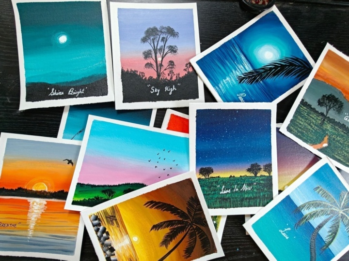
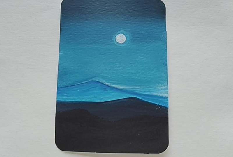
Transcripts
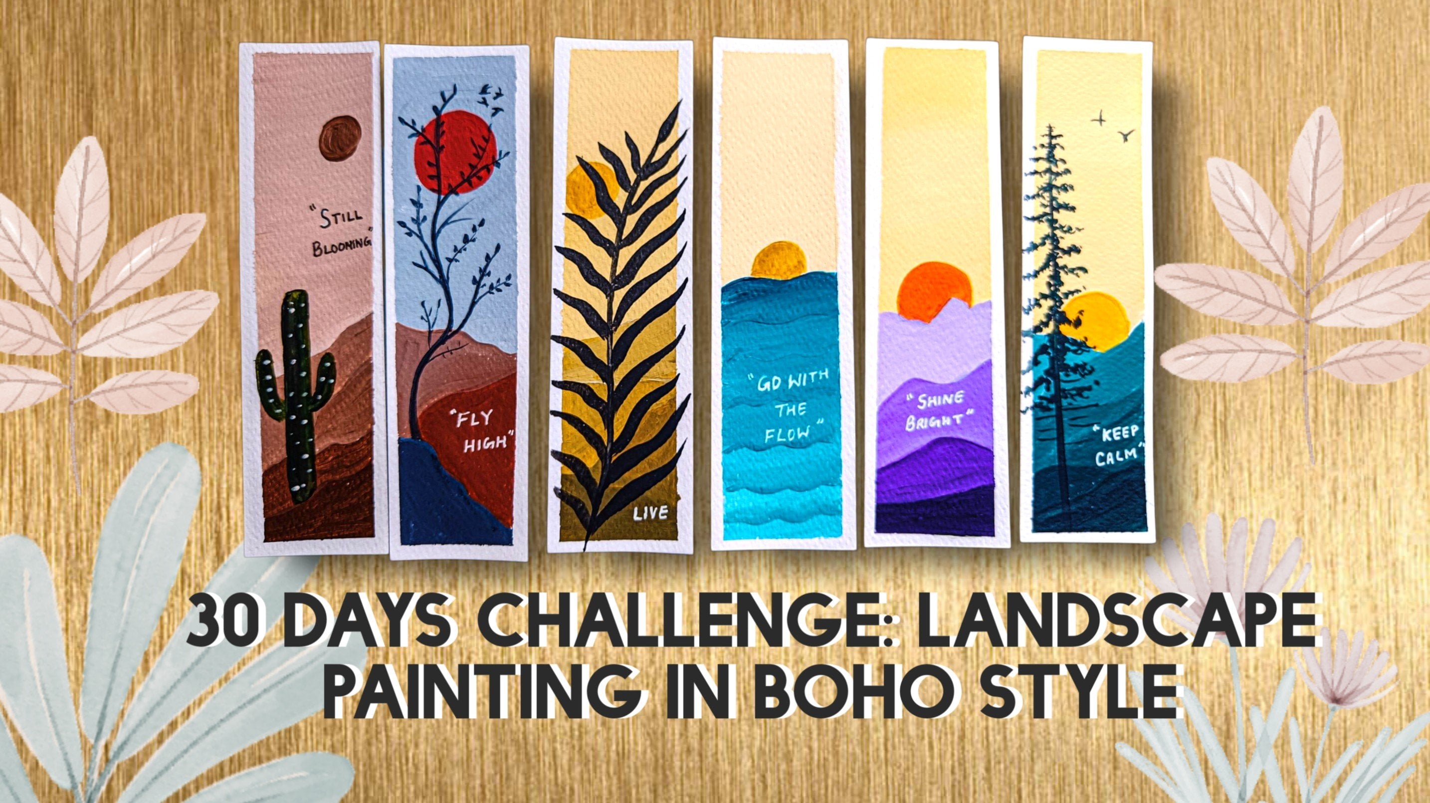
1. Intro: Want to build a consistent art habit
without feeling overwhelmed. This class is designed
just for you. In today's busy hour, finding hours to sit and
create can feel impossible. Between work, family, and
daily responsibilities, creativity often
takes a backseat. But what if you only
need 15 minutes a day? This class is designed, especially for those who love art but struggle
to find time. No longas no pressure, small, consistent step that helps you to reconnect with
your creativity. Because even on
your busiest days, you deserve a little time to
create something beautiful. Hello, friends. My name is
Mohiisna and I'm from India. And most of you know me as Mohani Art Gallery from
my Instagram account. I mostly do nature
related painting, mostly related to nature. So this whole class will be
related to nature painting. So in this 30 day acrylic
landscape painting challenge, we will create beautiful
bigner friendly landscapes in just 15 minutes a day. From serene sunset and misty mountain to peaceful
lake and cozy winter scene, every project is quick, relaxing and easy to follow. This class is perfect for
absolute bigners as well as anyone looking to reconnect their creativity in a
simple, manageable way. By the end of the challenge, you will not only have
30 mini paintings, but also a strong
daily art routine.
2. Materials Required: Welcome back. So let's
discuss about the materials. So the first thing which we
will be needing is the paper. So this is the 300
GSM paper cold Brest, which I'm using here, it's a very thick paper, and it's of five into 4 ", which is a very
small size paper, uh and you can say A
five or A six size. So that mid size, this is
the palette glass palette, which I will be using
for all my paintings. And the brand which I will
be using for acrylics is the mostly camel brand
and Windsor Newton brand, and one more brand that
is the Monte Marte brand. So these brands I will be
using for my acrylic painting. Apart from that, let's
talk about the brushes. So these are all flat brushes which were blocking
the background, small size flat brush. Then comes the um, liner brush or rigger brush, then the different different
sizes of the round brushes, as you can see over here, the fan brush, which is
a Bristol fan brush, and this is the Filbert brush, which we will be using size two. So these are the
brushes which we will be using for
the entire painting. So, um, we will be discussing about the colors
in all the paintings. Then this is the pencil
for drawing, of course, then the pen, that is
the technical pen, black technical pen,
then white gel pen for writing the coats. Then comes the masking tape, which we will be using
for taping the paper. Then comes the Scale, of course, for drawing, and then the water, at least two jars of water, then the tissue paper, or you can take cloth for
cleaning the brushes. So all these materials
we will be needing, and one more thing we
will be needing is the palette for
mixing the colors. So let's start with it with a beautiful
collection of painting.
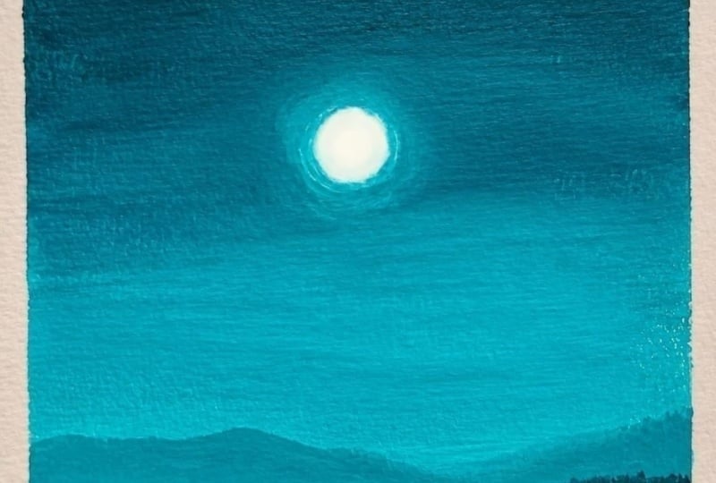
3. Shine Bright Part one: Welcome back. So we'll start with our painting
that is shine bright. So this is the painting
which we will be doing. So let's first discuss about the colors which
we will be using. So this is a very small size, you can see, not very big. And let's first discuss
about the colors. So the first color
is deep turquoise. Now, if you don't
have turquoise, you can take any blue color. Whichever blue color is your
favorite, you can take that, and you can just
mix a little bit of black to make it a dark color. So the first color is
a little bit darker, and as we will go down, it will be more lighter. So this is a normal
turquoise color. Then the third color is a
little bit more lighter. So I'm just adding white
and turquoise to it, and this is the third color. Similarly, for the
mountains also, we will be using the
colors like this. So this is whole background. So now let's talk
about the mountains. So for the mountains,
the first color is the lighter color. Then as it goes down, it will become more darker
and darker and darker. So like that, we will
move the mountain part. So these are all
overlapping mountains. So similar color than
the second color, which will be a little
bit more darker. So like that, we will
proceed with this. There are only three
colors we will be using. That is the deep turquoise,
white and black. If you don't have turquoise, you can use any blue color, hallow blue or serlem
blue or cobalt blue, whichever is your favorite
blue color, you can use it. So now let's start with
this beautiful painting. So first, I have just
taken the 300 GSM paper, which is five is to 4 ", and I will just put the
masking tape all around. Why we put masking tape
is for two reasons. First reason is that your
paper will not move. And the second reason is that you'll get a nice
border out of it. So half tape on the paper, half tape on your base, whatever base you are using. So like this, I will be putting the masking
tape all around. So just enjoy the
process of making and do one by one the painting because every day I will
be uploading one painting. So this is the first one
which is of day one. So 30 days challenge it is. So 30 paintings we will be
doing in this entire course. So I have taken a fresh color, as you can see, turquoise,
white and black. So let's start first
with the top part, and then gradually
we'll go down. Taking my flat brush
loaded with water and just taking the color directly without
adding any water, I'll just apply a little bit
of black to it just to make a little bit darker and we'll
start from the top part. Just moving the brush in
to and fro direction. If you feel your brush
is becoming dry, again, add water to your brush, take the color and then again, start with the top part. So it will be like the
dark to light transition. So this is a color
which I have made, as you can see, very dark color. So gradually as we
will move down, we'll make more lighter
color and then more lighter. So it's like that from
dark to light transition. So I'm just adding
first, the darker color. Now, whenever you are
blending the colors, make sure that both the colors are wet and take thick color. Otherwise, your colors
will dry very fast. If you'll take thick color, colors will not dry very fast. So try doing it slowly, first blend the colors
and then move downward. So every time first you
have to blend the colors, always push the lighter colors
towards the darker color. Try not pushing the darker color towards the lighter color. Otherwise, all the
colors will become same. So slowly, slowly,
you can see I'm just adding more and more white, and I'm just blending
also the colors, and I'm applying it all over. If you feel that in one coat that perfect finish
has not come up, you can always apply
the second coat. So below will be the mountains, so I have just
painted half of it. Rest we will do
for the mountains. So just again, mixing
the darker color, my base has completely dried. I'm applying the second
coat to it so that my color becomes more
fine and more finished. So now you can see in the second coat the
brush marks are going. So that's why it is important to apply at least two
coats on this. And if you feel that the darker portion is less and the lighter
portion is more, you can just adjust accordingly. So like how I am doing. So I'm just applying
the colors and blending with the darker colors. So just taking again the
lighter color and again, blending with the darker color. So this is how we have
to blend the colors. It is just with one
simple color and just the neutral color that is black and white,
which I have used. And this painting you
can do with any color, either blue or black
just black and white, any color, whichever
color you feel like.
4. Shine Bright Part Two: Now I'll start creating
the mountains. So it's a very simple
and easy painting, and I'm sure you will be able
to paint it very easily. So I have started with a very
simple and easy painting, and all the paintings will
be done within 15 minutes, and you will enjoy also. And if you have less time,
you do it one by one because every day I will
be uploading one painting. So if you will practice each
and every painting, and, like, every day, I'm sure your painting
techniques will improve. So just taking the color
which is a little darker, and again, I will apply
just one more coat. I feel that there is a line
in between the above part, so I'm just applying
the third coat onto it. So it's not important
to add third coat. But if you feel
that your blending has not become perfect, then please go for the
third coat as well. And always try to
take thick colors, and water should only
be there on your brush. Make sure that when you
are blending the colors, both the color has to be wet, then only your
colors will blend. I've just washed off my brush, and with just damp brush, I'm just trying to
blend these two colors, putting my brush in
between the two colors and I'm just trying
to blend the colors. This is also a technique how
you can blend the colors. Now let's start creating a little bit more
lighter version of it, and then we'll start
creating the mountains. So once our background
blocking is done, we will now create
the mountains, starting with the lighter color. And then as we will move down, it will become darker. So why I'm using
here lighter color, as you have seen when you
go to the hill stations, the back mountains will
remain very light in color, and as you will come
closer to the mountains, it will become more darker. So that's what I have
tried doing over here. So as I'm going down, I'm making the color
a little bit more darker and giving some
shapes to the mountain. So here you can see I
haven't drawn anything. I'm just directly doing
with the colors and creating some nice mountains. So I'm just pushing it down. It's okay if there
are brush marks in the mountains because we don't
want a very smooth finish. So this is the second color. Now, the third one is a
mix of black and blue. So a little darker color
than the second color. Starting from the
corner and going simply to the down part and covering this entire
portion and just pushing it down and filling
this entire area. The last one, I will make
it just with just black, so it will be the darkest one. Overlapping one another. You can see there
are four mountains which are overlapping
one another, which just three colors
you can make this. Very simple and very beautiful. It looks when it is done in a similar way with any
color you can use. So just apply it, and then we'll create
in the center the moon. So in the center part, I
will be creating the moon. So just wet your finger
and take the white color, very thin color,
and just make it thin as much thin as possible and just apply it in the center. This will create a nice shadow behind light the aura light, which you say, behind,
very thin color. And then in the middle, I will be adding a
thick color of white. So just a thick color
with my rigor brush, or you can use your round brush, also, smaller size round brush. So just making a small
circle in the center. Try to make it in a circle and So very simple and easy to make. Try it out, and I'm sure you will love it if you're
trying it for the first time acrylic painting. So this is it. So every painting
has a quotation. So for this painting also, we'll have one quotation. So just making the sides of this circle a little
more blurry just by adding water around it
with my round brush. Now this is optional. If
you don't want to do, you can leave it, add a circle. But if you can try it out, please do try it out just to create another shadow
effect around. We're almost done
with the painting, the quotation is left
and we are done. So let's take out the tape
and see how it looks. So you can see a nice border which has been created
when we use the tape. And when you are painting, your paper is also not moving. So this is the advantage
of using masking tape, but this is completely optional. If you don't want to use
it, you can leave it. And we'll write
the quotation with our white gelpin
in the black area. It's also optional. You can write the quotation or you can leave it just
like the painting. So it's totally up to you. Just simple two
letter quotes that is shine bright in cursive writing, or you can write in a
simple alphabet form also. So this painting is done, so we'll meet in
our next painting.
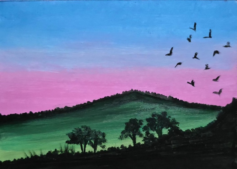
5. Fly High Part one: Welcome back. So
let's start with our next painting
that is fly high. So let's discuss about the colors which we
will be needing. So the first color which
will be in the background, you can see is orange. So it's a cadmium orange, which I'm using here. Then then comes the cadmium
yellow, then lemon yellow. You can see I'm just taking out a little
bit of cadmium yellow. So this is cadmium yellow. Then comes lemon yellow. You can use chrome yellow also. And for the greenish parts, these are all the
background part. Now for the grasses, I'm using here viridian
and black mix. So very dark greenish
it will create. And for the light
greenish color, I'll just add yellow to it. That is lemon yellow, creating a light
yellowish color. So yellowish green, as you can
see, to create more light, you will add more yellow to it to create more lighter color. So these are the basic colors
which we will be needing, all these colors, which we will be using for the painting. So let's start with this
beautiful warm painting. So these are the all whitish
in color, just the dots. So let's start with
our paintings. So I've just put down the tape, all the colors are ready. So we'll move in a
half circle manner, the brush, and lower part
will be the grass area. So here we don't have
to draw anything, we'll directly be
doing the coloring. So let's take our flat
brush loaded with water. And the first color
is cadmium orange. So I'm just taking a
thick amount of color, and we'll start from the top. So just moving the brush
in half circle manner. Try to take thick color because thick color will
not dry very fast. You will get time to
blend the colors, especially when you
are doing blending, take thick amount of colors. So the first color
is cadmium yellow, which I have done one third. Then comes the um
cadmium yellow. First one was cadmium
orange, then cadmium yellow. I'm just trying to
blend this color. My cadmium yellow is a
little bit transparent. So you can see there is a line between the orange and yellow. So I'm just trying to blend the line in between
the two colors. Again, I will take
cadmium yellow, and I will apply it
in the lower part. I have washed off my brush properly so that there is
no orange left in that. Otherwise, my whole
cadmium yellow will turn into cadmium orange. So I'm just pushing
the lighter color towards the darker color, that is the orange color. Now, again, I will apply
this lemon yellow, which is a very
bright yellow color, trying to again blend with this camium yellow and just blending in a
half circle manner. So again, taking lemon
yellow and putting it down Just covering
the lower part with this lemon yellow, a little bit white, also, I will add below to this lemon yellow so that it
will become more lighter. So it is all warm colors from orange to light yellowish color. After that, once it dries, we'll apply one
more coat over it, and then we'll start
creating the grasses. So wait for the
first coat to dry and then apply the second coat. So my background has dried now. So again, with the same
brush loaded with water, I will apply the second coat, starting from the top and repeating it in the same manner. This time, you can correct
the color corrections, also. If you want more orange and less yellow, that
also you can do. I totally up to you how you want to color the
whole background. So I'm just filling
this orange color, thick amount of orange color, and then I will use this
lemon yellow, sorry, the cadmium yellow,
and I'll try to blend this color
with this orange. After washing my brush, again, I will take this
camium yellow and try to blend this color
with orange color. So whenever you
apply second coat, it becomes more neat and more
clear, as you can see now. The whole background
becomes more neat and there are
less brush marks also. So this is the time when you
can correct your mistakes. If you have done any mistakes, you can cover it up and
you can correct it. So just applying the second coat and once this second
coat will dry, then we will add the details. Very easy and simple painting. Anyone can try it out if they follow each and every
process of mine. All these paintings are
done in within 15 minutes, so you don't need too much time. So yes, but it depends
upon your speed also, how much speed you have. So I'm just mixing black and this viridian green and just applying it in the
vertical direction. Now, my brush is damp brush. That is the fan brush, and it is a bristol fan
brush, which I'm using here. It is not a synthetic one. So just making the brush damp and then I'm using
this color that is Vidian green and black mix and creating a nice
grasses in one go. So this is a very good brush for creating some nice and beautiful
grasses in just one go. So just adding more
and more grasses in different directions. So if you don't have this brush, you can also use
your flat brush. But again, when you're
using flat brush, use damp flat brush and use the sides of your brush
to create the grasses.
6. Fly High Part Two: So now let's give a little bit more
details to the grasses. So one coat of black and
this green I have done. Now I'm taking my rigor brush to create some long grasses by just using this
viridiant green. So first layer was
the darker color, then less darker color, and then it will be more
lesser lighter color. So I'll add more yellow to it. So currently, I'm
just using green and creating some long grasses
in different directions. Whenever you are
creating grasses, make your colors thin, then only those lines
will become thin. If you are using thicker color, there are chances the lines
will also become thick. So if you want thin lines, make your color a little fluid and then try to
create the lines. Now, I've just
added lemon yellow and creating more
and more grasses. So this way, you will practice the brush strokes also and
how to create thin lines. So very easy way of doing it. You can try first on the rough sheet and
then try it on this. That is your choice that how
much you are practicing in. There is also one
class that I have here that is for completely
bigner friendly, that is for absolute BGNurs where I have taught everything from color wheel to the
scratch to the paintings, how to blend the colors, how to make the
colors, everything. I will share it in
the description box. You can check it out. So now we'll draw the sun in between. So taking my round brush and
taking a thin yellow color, I'll just make a nice
round circle over here. So just make your color
a little thin with water and then add
this circular thing. So just adding water to my
color and making it as thin as possible so that
my background is also visible and the upper
part is also visible. So this is called as
a glazing effect, which I'm doing here. So now I will add
a thick coat of white and yellow
mix on top of it. Just a small circle in between. So very simple and
easy to paint. Anyone can do it. So try it out, and I'm sure you will
love this painting, too. It's a very bright, warm,
and beautiful painting. So also, I will add
some of the flowers, white flowers just with dots. I will not do anything. I'll
just create some small, simple dots here and there with my smaller size round brush. Here and there to the lines, creating some small size
round shaped flowers, filling the entire grass
with these dot shapes. So this is it for this painting. And now we will write the coat and we are done
with this painting. So you can add as many
dots as much you want. So just add it and just
enjoy the process. Also taking some orange and just outlining it to the
sides of this sun. So that's it. So a little bit more white. I'm just adding to
make it more brighter. Now, this painting
is almost done, we have to write the codes
and just take out the tape, and we are done
with this painting. Also, you can add some of
the birds if you want here. Little small birds on the top. If you want, you can add it. So just I'm adding
small size birds with my small size round brush, just like a shape. So you can add as
many as you want. So this is it. So let's
take out the tape. Try to take out the
tape at an angle so that the paper
should not tear off. Very slowly take it out. So this is it, and we'll
just write the code. So here you can see there is a little color
which has come out. You can just add a little bit
of white to cover that up. So everything you can
correct here in acrylics, there's nothing which you
cannot redo or re correct it. H so this is done. So let's write the codes. Since this is a
light background, so you can write
with white also, you can write with black also, but I will prefer writing
it with black micron pen. So just writing it fly high. You can write any codes,
whatever codes you want. So this is the entire painting. Try it out and see you
in the next class. It
7. Breathe In Part one: Welcome back. Let's start with a new painting that
is breathe in. Here is the painting
which I will be using. The first color,
which I will be using here is Burgundi then
as we will go down, it will create a transition
from dark to light. More and more white we'll
start adding as we will move down and we'll print the
colors simultaneously. Apart from this,
the darker color, which is the tree part, we will be using one with
this Burgundi color and the second color will be
mix of black and Burgundi. These two colors we will be
using for the tree part. Let's start with our painting. I have taken a fresh
palette with the colors. As you can see over here, there are three colors
which we will be using the Burgundy
and white and black. The first, we'll start
with burgundy using my flat brush and
loaded with water. I'll start from top moving
in a half circle form. And as we will go down, the colors will become
more lighter and lighter. It's a very nice color. If you don't have this color, you can use AlazarinGrimson, or you can use the maroon color, whichever color is your
favorite you can use. There's no color
barrier over here. Any color, whichever color, either you can use
blue also for this, any color, whichever color
is your favorite you can use to paint this
beautiful landscape. As I'm going down, I'm adding more and
more white to it. Again, I will move down
and I'll just take again, the white color and I'll
try to blend this color. Already, there is this
Burgundy on my brush. I'm just taking white and
washing off my brush, removing excess of water, and then I'll start
blending the colors. I'll not push the lighter
color more towards the upside. I'll just push the
color below so that the entire brush
marks are vanished. Again, taking white and blending with this
light pinkish color. We have done one coat, and you can see there are
a lot of brush marks. It is recommended to do
at least two coats of it. Once the first coat will dry, then we will add
the second coat. Wait for the first coat to dry before adding
the second coat. Once the first coat
has dried, then again, same pattern wheel adding, same color, again, starting
with the darker color. Similar color with less
brush marks, as you can see. Now it is a very smooth painting which is coming up
without any brush marks. Try to do it with
very light pressure. Don't press your brush too much. Do it with very light
and gentle pressure and try to apply it in
a half circle manner. Then as I'm going down, I'm adding more and
more lighter color to it and I'm also
blending the colors. Just with your damp brush also, you can blend the colors very nicely with
very light pressure. As you can see, there is
already pink color on my brush, so I'll just add more white to it to make
it more lighter. And simultaneously
with my damp brush, I will try to blend
the colors as well. Whenever you are doing blending, don't press your brush too much, do it with very light
and gentle pressure. Now we have almost
done the background, now we will add the back
trees and the front trees.
8. Breathe In Part Two: Welcome back. Let's
start further. Now we will start
adding the back trees. Using my smaller
size round brush, just taking this burgundy
color and just drawing a line. Whenever you are
drawing the lines, make the color a little thin, then only your lines
will be proper. Try to make the color thin. Now I'm changed my brush
to rigor brush and made the color thin and I'm
drawing some small big lines. The behind tree lines should be longer than the one which
are with the darker color. Try to make it a little tall than the ones which are
with the darker color. These are all the behind
trees which are there, which are light in color. Just with my rigor brush
creating random shapes and lines making some
nice pine tree patterns, just random shapes and
creating nice pine trees. This pine tree actually
looks a little bit more realistic than the one
than the other one. Just adding some
nice tree textures, holding my brush at 45 degree angle and
the color is fluid. Whenever you are creating
any textures or any lines, try to make your color fluid and then only
create these lines. Same process I will be
doing for the other trees. If you will practice
these many pine trees, and I'm sure you will slowly and gradually
know how to create it. The first step may be
a little difficult, but as you will move to more
and more pine tree creation, it will become more
and more easy. Everything comes with practice. That's why I have
created this class for you so that you can practice
it as much as you can. I have kept all the paintings
quite simple so that you can be easy for you to follow it and you
can do it easily. These are just random textures which I'm applying
as you can see, just in a pattern of
horizontal pattern, making it a little longer. Using fluid color, try to
create these textures, starting from small and
as it is going down, it is becoming
bigger and bigger. This type of painting you
can do with any color, you can do with Tallow blue, you can do with
ultramarine blue, you can do with serelim blue, you can do with brown color, any color, whichever color is your favorite and
you want to do it, you can do this painting. So just adding the
nice three textures, one more is left, and then
we'll add the darker one. Once we are done
with the back trees, then we'll start with
the front trees. Most of you have
seen that whenever we see the back trees,
it is a little blurry. That's why I've created
this with a lighter color and the front trees
with a darker color. Now I will start making
the front trees. Just adding the lines in
between the two trees. Some are small, some are tall, different different
heights I have kept, but not bigger than the
one which is behind. Now here are also similar
steps, similar process. The more and more you do these repetitive process
of making trees, the more you will get it. The more you will develop
patients disciplines. Whenever we do all these
repetitive process, it teaches us a lot
of patients level. You can see there
are so many trees which we are creating. This burgundy is a
very beautiful color. I really like this color. So similar process and same steps and just trying to create some nice
tree textures. All these exercises are
just practice exercise. The more you will practice
all these types of painting, the more you will
get the hands on and the more your
speed will increase. I have done this in 15 minutes, maybe you can do it
in half an hour, everyone has their own speed. The speed depends upon
how much you are doing, yes, the speed may matter. But yes, try it out and it is a very simple and easy painting. And if you are trying
this painting, do tag me on Instagram. That is Mohni Art Gallery, I will reshare it to my story. Now we have almost
done the tree part. Now we'll start adding the
center moon which is there. Just wetting my finger
and taking a thin color of white and applying
it in the center, moving my finger in circles, and then I will add a thick
white in the center part. Same thing which I did in my previous painting,
same thing. I am doing it here also. Similar process. You can see how bright it looks when you add that background
glazing effect. Now let's write the coats just making the sides a
little bit more smooth. Now this painting is complete. Now, let's add some small
small birds here and there, just like a V shape. This is it. Now we'll write the codes and then
our painting is done. I will write the code in the
center that is breathe in. First, I decided
to just breathe, but then I decided
to write breathe in because of these trees. Let's take out the tape first. I I added afterwards, first, it was just breathe
and then I realize that I have added
the same quotation in another painting as well, so I'm doing it breathe in. But you can just write
breathe also if you want. This is breathe in
as the quotation. See you in the next class.
9. Be Still Part One: Welcome back. So let's start
with our new painting. So B still is the coat, which I have kept
for this painting. So let's first discuss
about the colors. Here, we will only be using three colors that
is tallow blue, which I have mixed it with black and a little bit of white. So this is the
first color which I will be using for my
background painting. Then comes the second color
which is simply Tallow blue. Then the third color is a mix
of white and Tallow blue. So this will be the
whole background painting color of my painting. And apart from that,
so this is a color. We are using three
colors that is Tallow blue, black and white. So let's begin with our painting of beautiful
monochrome painting, you can say because we
are using one color. So let's start with our
painting with a few drawings, and then we are done
with the painting. So I'll just draw
the center line, and that's it we have to
do for this painting. We don't have to draw much, just the center line. Make sure that the
tape is nicely taped down so that your
border comes nicely. So just a center line and then I'll just apply the colors. Here, I will put the small moon which will be there
in the center. So I'm just taking out
all the colors now. That is hallow blue,
white and black. So these three colors we will
be using for our painting. So let's start from
the top first, mixing this black and thalo blue together to create
a nice dark color. So if your color is a
little bit transparent, you can add a little bit
white to it just to make your color a little
bit more opaque. But if your thalo blue is
quite opaque, then no need. So just applying this, you can see my color is
a little transparent. So I'm just adding, again, this darker color with a
mix of blue and white. And I'm just applying
this nice, light, bluish color and trying to
blend with the darker color. So whenever you are
doing any blending, don't push the color
completely above. Otherwise, everything will
turn out to be light color. So again, I'm mixing it with more lighter color and
just applying it below. So since it is a first coat, don't worry about the blending. If it is not happening, little bit of blending is fine, but if still it's not proper, then in the second
coat, try to fix it up. And make sure that
both the colors are wet when you are blending. So again, I'm taking
that darker color and just applying it
on the top again. So a little bit below,
I'm pushing it. So since my lighter
color is wet, so it is easily blending
with that color. So whenever we paint
any reflection, reflection is always the
opposite of your sky color. So the dark color will be below and the lighter
color will be above. So like this, we will form the background of
this still water. So I'm just mixing again that same color that is dark
colour than light and light, and then I will apply
it accordingly. Just mixing a nice
proportion of color. When you mix the colors, it is a little easy
for you to paint. You don't have to mix
it with your brush, and it is advisable to mix with your palette rather
than mixing with your brush because
brush will get damaged if you will mix
it with your brush. So try to mix it
with your palette. Now, again, taking a
little bit more of this hallow blue because
everything is about blue. So lots of blue will be required here when you
are doing this painting. I will start first
from the darker color, that is the lower
portion, which is dark. And as I will go above, it will become more
lighter and lighter. So from dark to light
transition from bottom to up. So same colors I'm using and the same background
which I have used above, the similar color I
will be using below. Just adding a little
more lighter color in the horizon line just to make sure that it is
visible that line, the lighter than
the above color. And trying to blend the lighter color with
the darker color. Always try to push the lighter color towards
the darker color, not too much, but especially that line which is in
between the two colors. So we have done the background. We'll do one more coat on this once my
background has dried. At least try to do two
coats of your background blocking for the smooth
finish of your background. And this time you
can correct it also.
10. Be Still Part Two: Welcome back. So
let's start further. So I've just mixed
the same color. So a little bit my color
has again finished, I'll just take a
little bit more. And just making again that darker color and
trying to blend the color. So always try to add at least two coats on
your background blocking. So this is the second
coat which I'm applying and I'm
applying thick color, and I'm trying to blend with
the lighter color also. Wash off your brush if there are too much color on your brush, and then with your damp brush, you can just blend the color. Don't push the light
color completely above. Otherwise, everything will
turn out to be lighter color. Just the line which joins the dark and light color,
you have to blend that. So now, again, taking the lighter color and blending
with the above color. Wash off your brush,
remove excess of water with a damp brush, try to blend the lines in
between the two colors. So this is how you can blend acrylics very smoothly
and perfectly. Now we have done the upper part. We'll do the lower part
also one more coat, similar as we have
done the upper part. So taking again, few
colors because there are lots of blues which are
required in this painting. So whenever you will
mix the colors, exact color will not be formed. So it's okay if a little bit of color difference is there, that is perfectly fine because every time you will
mix the colors, you will never get
the exact color. So just blending the
lighter with the darker. So the reason of
using thick color is that thick color will not dry very fast and you will get a longer time to
blend the colors. That's why in acrylic, we use thick colors for doing
the background blending. So now just adding
the lighter color and trying to blend
with the next color. So we are almost done
with the blending now, and now we will add
some details to it. So just enjoy the process of
blending and with any color, you can use your
blending technique. It's not like you have
to choose same color. You can use any color, whichever color you feel like. So just adding the center
line a little darker than the colors
which are adjacent. So just adding a center
line with my flat brush. So now we will add the details. Very simple details
are there, the moon, the reflection, and
these long grasses. Very simple and
easy painting here. The main focus is on
the blending part and a little bit of details of the grasses and the reflection. So I have tried to make it as simple as possible
so that each and everyone can understand
and try it out and now we will add the reflection with
our same flat brush. But this time, I will use
a smaller size flat brush, adding a thick color on the tip. This is a damp brush which
I'm using and a thick color, and I'm just adding some white
lines across this water. It's just below the moon. So as it will go down, it will become smaller
and smaller and smaller, it will be a V shape. And So very easy technique to add reflection
of the moon or sun. So now we will add the lines, making the color thin and
using my rigor brush. Make it fluid thin by adding water and
then add the lines. So when you will
make the color thin, you can easily float your brushes and make
some nice thin lines. Just adding a little bit
of blue to it and just making it thin and drawing
some nice big grasses. And if you're trying
out this painting, do share your project
work and you can also tag me on Instagram that
is Mohini Art Gallery. So you can see how beautiful the lines have come up
when you make it thin. If you will use thick lines, thick paint, it will
create thick lines. Some very small, small
lines moving downward. These are very big
grasses which you mostly see near the lake
or near the river. So this is it with the painting. We'll just write the
quotation and this is done. So I'm just removing the tape
and let's see how it looks. Try to remove the
tape at an angle so that your page
should not tear off. Now we will add
the quotation with the white gelpin because my
background is quite dark. You can write it anywhere
or you can leave this painting like this
that is totally up to you. So try out this beautiful
vibrant cool painting, which I have used
cool colors and just the neutral color
that is white and black, and I'm sure you will love it. Anyone can try it out. It's very easy and simple, and I'm sure you will
be able to follow this. See you in the next class.
11. Accept Yourself Part One: Welcome back. So
let's start with another painting that
is except yourself. So let's start first with the colors, what
we will be using. The first color is Tallow blue, which we will be using. And as we will go down, we'll add more white to it. So from dark to light, transition will be there. So similar like this. And then we will do the
foreground with the colors, that is the burnt sienna. So this is the sky
which we will be doing. Then the foreground
with burnt sienna, making into very light
color and more light. Something like that we will
be using for the foreground. And now comes the mountains. So mountains, we will
add this blue color, then a little bit black
and a little bit white. So something like the grayish, bluish color, which we will
be using for the mountains. Similar to this. So these
are the colors which we will be needing for our
beautiful painting, which is a scene of a desert. So let's start with it. So you can see I have
done a little bit of drawing of the
mountains and the line. The line is just below. It's not in the center. It's just below the center. Very small area I have
kept for the sand area. So first, we'll start from
the top, that is the sky. My brush is loaded with
water and just mixing the color and making it a little lighter and starting
from the top. It's a very beautiful blue
color that is hallow blue. And you can see how
bright this color is. This color is used
for many paintings, especially the ocean painting. So this is very beautiful
and very cool color, as you can see, I
really like this color. But if you don't
have this color, you can use any blue, serium blue, cobalt
blue, ultramarine blue. Whichever blue you
have, you can use that. So just mixing and
blending the colors, and as we will go down, it will become more
lighter and lighter. So since this is a first code, don't worry about the blending. Now, this blending I've just
done with the damp brush. Sometimes we just need the
brush to blend the colors. Every time we don't need
colors to blending it. So just applying it and just wash off your brush and
then blend the colors. That will be a perfect
blend if you will see. So I will just wash off my brush and then I'll
try to blend that area. Make sure that your brush
is damp, it is not wet. So just filling the colors
with more lighter color. Now, you can see
in the first coat there are lots of brush marks. So that's why it is
important to apply at least two coats onto it
so that it becomes nice, bright, and clean
and neat background. Now we will do the
lower part also. So for the lower part, just
bunsiena and white mix. So you can see first
the color is light, and as it goes down,
it becomes dark. So like that, we have
to make the blending. So first, I'm just applying this lighter color everywhere. And slowly we will make the
colors a little bit more dark because I feel this is the
first coat which we have done. So it's a lighter above
and a little darker below. So just making the colors a
little more darker and just applying burn Sienna
and trying to blend with the lighter color. Once the background has dried, then you can apply
the second coat. Wait for the background to dry and then apply
the second coat. Now my background has dried, so now I will start
applying the second coat. Since it is very hot over here, so my colors are
drying very fast. So if it is not at your place, then you have to wait
a little bit longer. So I'm just applying,
again, the same color, and this time I'm taking the blending part
more seriously and slowly I'm just blending the color to make the
background more smooth. Now, you can see
the smoothness of the color of the second coat. So just try to make it
as smooth as possible. Do it slowly. When you
are blending the colors, don't press your brush too much. Do it with a very light hand, with a very light pressure. And as we will go down, the colors will
become more lighter. So very bright and
beautiful colors. So once we are done with the background and
the foreground, then we'll start with
the mountains and the tree part because this tree is the center
part which is visible. So whenever you will
see that painting, the center of attraction
is the tree that is there. So yes. So we have
done the background. We'll do the foreground
also once more.
12. Accept Yourself Part Two: Welcome back. So
let's start further. Now we'll start doing
the mountains here. So making the color
like a grayish, bluish color, and I'll
just cover this area. These are very thin mountains. I haven't made it very thick. It's very thin and since they
are at a very far distance, that's why they are
looking very small. Blocking that part. Here I'm using my round brush of
smaller size to fill this up. And now we will start
doing the below part, that is the foreground
part, which is there. So I will first take the color that is born
sienna and black mix, and then I'll start
making the line first with a nice grayish,
blackish brownish color. So whenever you are
making any lines, try to make the colors a little fluid and then start
creating the lines. So first, I'm just making a simple straight line,
a little bit curvy, and then I will make
the branches and sub brranches So just a nice us the branches here we will add. There is no leaves in this
tree, just the branches. Just adding more and
more taller branches. So whenever you are drawing
any lines or any details, make your color
fluid and then draw the lines and use
your rigor brush. First draw a single line, and then later on, you can thicken the lines. So it's a very light,
brownish color with a mix of little bit of black to
it, as you can see here. So now I'm making the lines
a little bit more thicker. So try to do it very
slowly and one by one. If you're not able
to draw it directly, draw with your pencil line or pencil color or chalk pencils
or watercolor pencils, and then you can outline it. Because when you will
draw with pencil, it will not be able to
will be able to rub it. So it's better to draw with any chalk pencil or
watercolor pencils. So first, I'm drawing
the main branches, then the sub branches. So first I'm drawing one side, then I'll draw the other side. Take your time and draw
it slowly one by one. Very beautiful single tree
which has survived in this desert like the tree that has survived
and accepted itself, so we have to also
accept ourselves. So just making a
color a little bit darker without mixing any white, that is black and brown mix and just outlining
the edge first. And then slowly I will
start blending the colors of this black with the brownish
and white mixed color. So just taking again the darker color and
giving some details to it, some lines, some small, small lines, making the tree branches more bright and more visible just by adding
the darker color. So first, I've added
the lighter color, then on one side, I'm just
adding the darker color. So there will be a mix
of dark and light color. So make one side a little
darker so that it looks like that one side the sun is falling and the other
side is the darker area. So just adding more
and more darker lines. Adding some smaller
branches and sub brranches. So we're almost done
with the tree part. We will not add any
leaves over here. So just the tree and
the tree branches. That's it. And the reflection,
which is on one side. So now we are done with this. Now we will add the
reflection part. So the reflections again
on one side of it. So taking my smaller
size flat brush and making the color
a little fluid, mixing this brown and a little bit of black
and then applying a little white also
to it and just adding some nice reflections
to this side. So this is it with
the drawing part and with the coloring and rest, we'll just write the
ates and this is done. Very simple yet beautiful
painting, it is. Try it out and do tag
me on my Instagram. That is Mohini Art Gallery. I will love to
reshare on my story. So just write except yourself with your technical
pen, and that's it. Your painting is done. I like writing codes,
and it's up to you. It's completely optional if
you want to write it or not. But for every painting,
I have one quotation. So just let's remove the
tape and see how it looks. So try to remove the
tape at an angle. So this is the complete painting and to try it out by yourself. And you can see how the nice border is created
when you put the masking tape. So this is it. So see you
in the next painting.
13. Sky High Part One: Welcome back. Let's start with another painting
that is sky high. Let's first add the colors
which we will be using here. The first color which I'm
using is the violet color, which is the second
color is a mix of cadmium yellow and
red and white mix. It's morely towards the pinkish orangy
color, which it is. So something like this type of color which I'm using here. So violet cadmium yellow. You can use any red, whichever red you have
Alazarin crimson, any red, whichever red
and black and white. So these are the colors which we will be using for our painting, and the painting which we
will be doing is this. You can see the background
with two colors. And so these are the two
colors which we will be using and rest are with
black and white. So this is a simple, beautiful painting
which we will be doing. So let's start
with our painting. So I have taken all the colors
as you can see over here. So, just have taped down
the entire thing nicely. And without drawing much, I'll just draw the below
part and that's it. And rest we will be doing
directly by using the color. So try to draw very light
pencil lines, not very dark. Otherwise, that pencil, charcoal or graphite may
come into your painting. So if you don't
have violet color, you can also use
ultramarine blue. That is also a
little violet color. And here we have to
make pastel shades, so more will be white color. So try to make it a very pastel shade color
because in pastel shade, more color is white and
the other color is yes. So just making all the colors and then I'll start
with the painting. So again, I'm taking this red and a mix of cadmium yellow, very little amount and white. So just mixing it and seeing how the color
has been formed. So I feel that this
color is a little bit dark and a little
bit more pinkish. So I'm just adding a
little more of yellow because I want a
pinkish, orangy color. It should not be
totally pinkish color. So something like that. So just making a
little lighter and a little more yellow
adding to it. So something this type of color, which I'm looking at it. So just starting with
the background with first the cool color and then the warm color,
I will be mixing. So I'm just taking my brush, wet brush, applying thick
amount of color on the top. And as we will go down, we'll start blending the colors. So mixing a little bit more of this color because I
feel it is very less. So I'm just mixing again this
color and just making it more thick and so if
you add thick colors, you can easily blend the colors. That's why thick
color is important. And if you feel that your
brush is getting dry, again, dip your brush in water
and then take the color. Once I have applied this color, as I will move down, I will add more and
more pinkish to it. So this is how we have to move. So I'm just making it a
little lighter and again, applying the color
and just blending it with the darker
pastel shade color. So just blending the colors
with very soft hand. Don't press your brush. Otherwise, there
will be brush marks. Try to do it with
very light hand. Again, taking a little bit more of white into it, and again, adding the more lighter
version of this violety color. So try to blend the lighter
color with the darker color. Then we'll take this
nice pinkish color. And first, I will apply
it in the lower section. And just one line. And with white, I'll try
to blend this color. So if you feel that it
has a lot of white in it, just wash off your brush and
just with your damp brush, try to blend the colors. So again, I will take that
purplish color and I'll try to blend it with
the pinkish color. So this is how we have
to do the blending. Now, still, you can
see there is a line. So again, we have to
apply that color. Then only that
blending will be done. So just moving the brush and moving it in the
above upward direction. And you can see now the
blending has happened because my background
color was wet. So every time you are
blending the colors, make sure that both
the colors are wet, then only you will be
able to blend the colors. So again, taking the color a
little bit more orange side and just trying to blend the
color with the bluish color. So this is how we have to do the blending and whenever you feel there is
a lot of color, just wash off your brush, and again, just with
your damp brush, you can blend the colors. So again, I will
wash off my brush, and just with my damp brush, I'll just try to blend the two colors which
are joining each other. Now, you can see how the
blending has been done. So whenever you are doing blending to with a
very light pressure, don't press your brush too much. Again, I will apply the
second coat on this. So whenever you do any painting, at least apply two codes of the background color to make a smooth finish of the color. So making it more smooth. Now, you can see the
difference when we have applied the first coat and
this is the second code. It has become more smooth
and more nice and neat. So that's what we want
for our background to be. So just applying in
a similar manner and trying to blend the colors. Now, once our blending is done, we will do the lower part, which is mostly
blackish in color. So just above part is more
like light pastel shade. Rest of it is mostly
done with black color. The more and more
you will practice, the more and more
you will get it. That's what this class is about, just for practicing
it every day.
14. Sky High Part Two: Welcome back. So
let's start further. So now we have done
the background. Now we will do the lower part. Just taking my round brush and some nice milky
color, black color. I'm just applying it
in the pillow section. First I'm applying
it to the edges, and then I will just fill the entire section
with black color. Try to use thick color so that in one go, you can fill it. If you feel that the color
is a little transparent, you can add the second coat
also to this black color. This is it with
the black portion. Now we will add some small, small trees and
details around it, and especially the center
tree which is there that also we'll draw
directly by using our brush. So whenever you are drawing
the lines or anything, make sure that your color
is fluid, not thick. So just filling it in
again because some of the areas are a little
transparent in color. Now I'm taking my rigor brush, making the color a little thin, and I'll start drawing the lines and also
some tree textures here and there below. Just small, small tree textures, I'm just adding just
with my rigor brush, or you can use size
zero round brush also. Very small small
textures here and there, just lines and some dots. I'm adding just to look
like that there are some trees which are
there in this back area. Very small small
textures, as you can see. So some of the big trees also
I will add to the sides, adding by adding some
tree trunk and all. So a little bit bigger
trees on the side part. Just adding some
branches and tree line. A little bit, very small, small textures of tree
in a half circle manner. Very small small
textures that some of the trees which
are very far or back, that they are
looking very small. Now we will start
adding the center tree. Just make your color fluid and then start adding
the center one. So first, make the main line. It's okay if you're
making thin line, you can make it
thick afterwards. But first, make the line
thin and then correct it, and then start
reshaping the line. So if you're not comfortable
drawing directly with color, you can draw with your
watercolor pencils or chalk pencils, and then you can
paint it directly. So try not to use
pencil line because we will not be able to
rub the pencil line. So just trying to draw the sub branches and some stems coming out here
from here and there, I will leave the
central part because there I will add the sun. Some branches here and there. It's not a very thick tree, very thin tree, it is. So once we have added the lines, now I will add with my
filbert brush the textures. Now here I'm using a damp brush, and the texture is just
applying on the tip and just dabbing it
the tip of my brush. Since the tip is
like a half circle, so you'll be able to create a nice half circle
texture onto it. Try to make it a
half circle shape so that it will give a
nice look to your tree. Very easy way of creating
the tree textures. And try to use
smaller size brush that is of size one or
two, not bigger than that. Now I will just add the
center part of it with a small circle around mixing this cadmium yellow and white. A little more brighter just by adding a little
bit more white to it. So if you want to
make it more shiny, you can add a little bit
more white to the center. So this is it for
this entire painting, you can add birds flying, anything you can add,
it's totally up to you. So this is the painting
which is complete. Now we will add the coats, which I will add in
the black section. So with my white gelpin. So I like writing code. So you can skip this part if you don't want
to write codes and you just want the painting
that is totally up to you. So just writing
the codes and then we'll take out the masking tape. So this is it. So beautiful painting. And if you're trying it out, do tag me on my Instagram. That is Mohini Art Gallery. So see you in the next class.
15. Breathe Part One: Welcome back. So
let's start with our new painting
that is breathe. So this is a very warm
painting in which I have used the colors as pains
gray and a mix of white, very light color. It is. If you don't have pains gray, you can use black and white mix, then cadmium yellow,
cadmium orange and white. So all these colors we will be using for the
background painting and um another color that is a very dark black
color and white color. So all these colors
we will be using. So let's start
with our painting. So this is the page
which I have kept it and just drawing
the center line first, and then we'll start
with the painting. So first, little bit of drawing is needed
here, not too much, just the center line
and a little bit of the bushes or the background
mountains which are there. So this is the drawing
and rest we will do directly by using the colors. And here will be the sun, which is half in a half circle. So let's start
with our painting. So taking my flat brush
loaded with water, we'll start first with the darker color that
is the orange color. So either you can start below from below or you
can start from top. It's totally up to you
wherever you want to start. So I'll start with orange first, mixing taking a lot of orange here and just
adding it below first. And then as I will go up, it will become more lighter
by adding the cadmium yellow, and simultaneously, I
will blend the colors. So mixing orange and yellow and trying to blend the colors. So as I'll go above, I will take more of the cadmium yellow and
will blend the colors. So most of the
time, you will see cadmium yellow as very light. So now taking pains gray and the white color and just
applying it from above. And then gradually I'll go down and then I will
blend the colors. You can see I have left a gap in between yellow and
the gray color. So here is the point
where I'll start blending the colors
with more white, added to this gray and trying to blend the color very gently. Now, already my yellow color
has dried a little bit, but still it is a little bit, so you can easily blend that
color. You can see that. So again, we will do
the lower part also. So lower part also, same colors, but since this is a water, so the reflection will be just
opposite to the above sky. So again, taking similar color, and we'll start from the lower
part using the gray color. That is the pains
gray and white mix. And as I will go above, I will add more yellow and then orange because this is the
reflection of the sky. So whenever you
are adding yellow, try to blend this yellow with
the pains gray color first. So try to blend the colors
first and then move above. So again, I have taken
that pains gray, and I'm just trying to blend this color with
the yellow color. As you can see, pain's gray
is much lighter than yellow. So you can take Pain's
gray and blend the color. Now I'm mixing
yellow and orange, and then I will blend
with this yellow. So whenever you are blending, take the lighter color
and blend the colors. So again, I will take yellow
and I'll try to blend the colors where the yellow
and the orange meet. So this is how the
first coat is done. Now my upper background has
dried. So this is done. So now we will start doing
the above part again. So same color I will
be using again, and again, one more coat I
will apply to the background. Now, every time you
will mix the colors, there will be a difference between the colors a little bit. So don't worry about that. It is perfectly fine. Just try to blend the colors
when you are moving it. Now, this is the time when
you can fix the colors. You can make the blending more powerful and
more like neat. So just taking more of this orange and yellow mix and trying to blend
the colors again.
16. Breathe Part Two: Welcome back. So
let's start further. I can see there is
a line in between, so I'll just fix that
line and then again, I will start with the painting. Again, I'm mixing that color. Now I'm doing the
third coat over here, so it's completely fine. If you're not fulfilled, if you think that
it is not proper, then you can go ahead
with the third at also. So you can see I've applied till the line below where
I could see the line, and I'm just mixing white and yellow and trying to
blend the color first, and then I will move downward. So for smooth finish, you have to give time to your blending until
unless it is, like, nice and fully
blended and very neat. Then only the background
will look like, like, very neat and bright.
Like a smooth finish. Like, the colors are
going from dark to light. It should look like that. So that's what I'm
trying to do over here just by
blending the colors. So blending will only take
place if your colors are wet. If it is dry, you will not be able
to blend the colors. So that you have
to keep in mind, both the color has to be wet, then only you will blend it. Now we'll do the lower part. So we have just done one
coat for the lower part. We are doing the second coat. So similar colors and, again, a little smooth
blend of the colors. Taking yellow and white mix and trying to blend
the colors first. So just making it more
smooth and perfect blend. Now I'm adding yellow, and then again, I'm
blending the colors. So again, I will take orange and blend again with
the similar colors. So this is how we have to blend the colors and do it slowly, take your time and try
to blend the colors. Once your blending is done and once your background has dried, then we will do the detailings. So if you live in
a very hot area, the background will
dry immediately. But if you live in, like, humid area or, like, it is a cold place, then
it will take time to dry. So wait for it to dry. Once it has dried, then
we'll add the details. So taking my rigor brush, and first, we'll start
with the part below, creating some lines, some darker lines than
the lines with the color, similar color, but
a little darker. So just adding some
lines here and there. So I'll not make this
whole background, the foreground very messy, just adding some
lines here and there, and that's it. We'll be doing. I don't want to
complicate this painting, so I've just added some lines and some orange lines
also I'll add in between. So very simple and easy
lines you can draw. You can also use your
round brush for drawing the lines if you're not comfortable with
your rigor brush. So try to make your color
fluid and then draw the lines. Now, once we have
drawn the lines, we will be adding
some more details. So the lines which are joining the middle part and
the lower part, that area, I will make
it a little lighter. Just adding the lines so try to make this color a little bit darker than
your background color. Then only that color
will be visible. Now we will take the white color and a mix of yellow and white. And I'll just try to
create a nice half sun, which is a sunset time,
and the sun is setting, so half of it is visible,
so something like that. So it's just making
it and just trying to smudge the harder
area with water. So making it more half circle, so making it a thin color because there is
water on my brush, so you can easily make your color thin when
the color is wet. Just making the color thin, and then I will just apply a thick white color
in the center. So since my background
is already wet, so when you will add white, a little bit of yellow
will mix and it will turn into a little
yellowish color. That is okay. That
is perfectly fine. So now we will also add
the reflections below. But first, we will add the
lines which are there, the middle ground where there is lots of bushes
and trees which are behind by just adding
with my round brush, just giving him some
textures here and there and just creating
a straight line, and I will just fill it
with this black color. So just making the color
filled with black, the center, I will try to make
it a little bit more like orange just by
adding orange color. So that's why I have
left that area. So just taking a little
bit of orange and then doing this part with
a little orangey mix, black and orange mix. So this is the area where
the sunlight is there. That's why I made that
area a little orange. So likewise, I'll cover
this entire area. Now we will add the line
which is in the center. So just making a nice center
line with my round brush, taking white and a little
yellowish color and making a nice thick line in there
that is the horizon line. And then I'll just add
the reflections below. So just adding some
reflections below of the sun. So using my flat brush like completely dry brush
and adding some textures, just dabbing my brush and
creating some nice textures. So this will create a very
nice reflection of the sun. You can also add a
little bit of yellow in between and a little bit
of white also in between, just to make it more glowing. So in between, I have
added yellow in the sides. I have added a little
bit more white. So just adding some more
layers of this yellow. And then we will just
add one bird on the top, and then we are done with it. Just adding some more white in the center with my rigor brush, some thick colors of white because the more white you
will add thicker colours, the more bright and
vibrant it will look. So now taking my technical pen, I'll just add one bird, which is flying, a small bird. Now, this is
completely optional. You can leave that
or you can make it. If you feel that
this is perfect, you don't want to add
bird, it's totally fine. If you want to add more
birds, that is also fine. So it's your painting. You
can do it in your own way. A very simple small bird, which I'm adding here, you can add it or you can leave it. It's totally up to
you because it is your painting, you
have to decide it. So this is it. And just we will
add the quotation, and this is done. So why I have kept the coat as breathe because that bird is just enjoying the fresh
breath which is there. That's why I've kept this name
as breathe. So this is it. And if you're trying it out, do tag me on my Instagram. That is Mohini Art Gallery. I would love to reshare it. And this is it. Just let's take out the
tape and see how it looks. So this is done, and we will
meet in our next painting.
17. Love Nature Part One: Hello, all. Welcome back to our new painting
that is love nature. This is the painting
which we will be doing. Let's first discuss
about the colors. The first color is pale blue
or you can say light blue. And if you don't
have light blue, you can use any blue color and add white to it to make
it a light bluish color. It would be good if you take the thalo blue and
mix it with white. Then the third color
is the pinkish, little bit pinkish
and purplish color because when blue will
react with this pink color, then it will turn
into a pinkish color in which I have used red. Or lazarin you can use. Then comes a mix of
viridian, black and yellow. Then as we will go down, it will become more lighter just by adding
radian and yellow, and then more light,
it will be just by adding yellow and mixing
it with the green color. This is the pattern
which we will be using for our painting. Let's start with our painting. Of course, black we will
be using for detailings. These all colors we will be
needing for our painting. Let's start with our painting. So now in this painting, you can see I put the page
in a landscape shape. It's not like vertical, it's in a landscape
shape. So it is. So just a little bit of
drawing is required, and then we are done
with the drawing. Just the below part,
I will draw and rest we will be
filling by the color. So there are two mountains. One is below and the
other one is above. These are all green mountains. So just drawing it, and this is it, and then we'll do directly
with the colors. So let's discuss about
the colors again. The one is alzarin
crimson, blue, white, lemon yellow,
and viridian. So these are all colors
we will be needing. Apart from this, one
more color is there, that is black color. So these are colors we will
be needing for our painting. So let's start first
with the background. Again, using my flat
brush loaded with water, I'll start with a
light bluish color. So again, if you don't
have light blue color, you can make it just
by mixing white to it. So first, this color, that is a bluish color. And then as we will go down, I will make it a little bit
more lighter and then we'll make the pinkish color and try to blend with
this blue color. So as you are moving down, simultaneously blend
the colors as well. So with my damp brush, I'm trying to blend
this lighter color with the darker color. Now taking lazarin crimson
and little bit of white. I'm just making it a very
pinkish color and just applying it from the
edge of the mountain. And as we go above, this color will mix with
the blue color and it will turn out to be a little
violety pinkish color. So this is how we have
to paint the background. So again, I'm taking
this nice pinkish color. And you can see there's a gap
in between the two colors. I'll just take a
little bit of blue and with this pinkish color, again, I will add
the color because both the color has to be wet when you are
blending the colors. So again, taking a little
bit white and blue, making a little eye
lighter blue color and then blending it
with the pink color. So just blending it in now you can see there is a line in between the
blue and the light blue. So that just with
your damp brush, try to blend the colors. The more you will blend it, the more it will look neat. So this is how we have
to blend the colors.
18. Love Nature Part Two: Welcome back. Let's
start further. Now we have done the background. We will do one more coat of it. But first, let's do the
lower part which is there. Just taking this radiant color first and applying it above, just using my round brush, keeping my brush at 45
degree angle and giving a little textures on the top and just filling it
with this radiant color. Now mixing this with a
yellow that is lemon yellow. Now you can see the
color has dried. That's why that line is coming. Again, I'm applying this
color and taking again this light color and trying to blend it
with the darker color. When the color dries, you will not be able
to blend the colors. You have to keep in mind that
both the color has to be wet then only you will be
able to blend the colors. That's why every time
take thick colours. This is how you have to
blend the area which is the hill area or you
can see the land area. Now we'll start with
the lower part, making it a little darker
on the above part. I think it is a little light. Mixing it with a little black, I'm just making the above part
a little darker and again, blending it with
the lighter color. Taking yellow and
blending the color. Sometimes you don't
need the colors because already green color is
there on your brush, so you just need
your lighter color to blend the whole colors. Now the lower part is mostly the darker
color which is there, taking a nice dark color of green and black mix
and just giving some edge to the area
which is the line. A little more from above, we can start and just giving
a little edge with my brush, and then I will completely
fill with this color. I don't want that
edge to be smooth. That's why I'm adding
these textures, moving it in just
dabbing it with the brush and then just filling
it with the darker color. So if you take thick colour in one coat, it is
perfectly fine. You don't have to repeat
it again and again. So one coat if you have
done, it's perfectly fine. You can see how
beautiful that land is looking when you're
using viridian color. If you don't have
viridian color, you can use any green
whichever you have. Now my background has dried. I'll apply one more coat on this because I'm not happy
with the background. Adding again the second coat. Just adding more white and blending the color with
the light blue color. Just blending it now this is the time when
we can fix our issues. I was not liking
that white part, so I wanted to make
it more smooth. I'm just taking a
lighter color again, thick lighter color
and then taking again this red and making
it a little bit more lighter and
then trying to blend this color with the light
bluish color which is there. Just pushing this pink
towards the blue so that it turns into a little bit
more of violety color. M now you can see this blending, it is more perfect
than the previous one. Whenever you are not
happy with your blending, you can always redo
your blending work. Because once the colors
dry, nothing will happen. You can always redo it. Now I will create
small small trees which are there below. Some of the above
little little edges I'm just trying to create. All over very small small edges with a mix of black and green. This is little small trees
which I will create, which is on the lower pathway. Again, with a darker color. Now taking my Filbert brush completely damp brush and first creating a half circle
shape in some areas. Then I will create the tree lines that is the
tree branches and tree trunk. So very easy way of creating the tree textures by
using the filbert brush. Try to use smaller
size filbert brush, not very big size, and then some lines tree lines, and this is it that
small trees are ready. And you can add some
branches here and there. This is the whole painting. Little bit more tree lines, we will add some
smaller, some big trees. Now, with your
rigor brush, also, you can create this
half circle type of shape and then add
very small trees. Here and there, some bushes and just some bushes and grasses here and there.
I'm just adding. And little small small details, and this is just to make your painting look
more beautiful. These are the smaller
trees which I have added. Now there are birds which
are flying on the top. So here we will add some birds. I'm just using my technical pen, black technical pen
for adding the birds. You can add with your
acrylic colors also, but I feel that this is more easy than doing it with
the acrylic colors. Just making a V shape and creating some birds
moving here and there. This is it with the painting and now we
will write the ats and then we'll take out the
masking tape and it is done. For the coats, I'm writing
in the darker section with my white gelpin that
is love nature. We should all love
nature because nature is so beautiful and
it gives a lot to us. Love nature, and that's it. And then we'll take out the masking tape and
see how it looks. Try to take out the
masking tape at an angle. If you're trying this painting, do tag me on my Instagram, that is Mohini Art Gallery. I would love to reshare your artwork and this
is a nice, beautiful, vibrant painting with
a subtle look to it, see you in the next class.
19. Peace Part One: Welcome back. So
let's start with our new painting that is peace. So this is the painting
which we will be doing. So let's first discuss
about the colors. So the first color is
the quite a dark color. You can use Prussian
blue or windsor blue. A blue you can use, then this is the light blue. Then comes the teal color. The third color is suralum
blue and white and black. So these are colors we will
be using for our painting. So we will be moving
the brush in circles. So let's start with it.
So this is the painting. So I have just made a center
line, as you can see. We don't have to do much
of the drawing over here, just the center
line, and these are the colors as we have discussed. So all these colors we will
be using for our painting. Make sure that all the
corners are nicely sticked. And let's start
with the painting. So you can use bigger
size round brush or flat brush for doing the circular movement
of this painting. But I will be using
here same flat brush. So I'll start from the center, and then I will move in
the outward direction. So in this process, I will be using two brushes. One is the round brush, and one is the flat brush. So first, I'm making
a nice circle in the center with white color. Then comes the light blue color. If you don't have light blue, you can just mix white and blue. Serlim blue, and you
can make this blue. Then comes the third color, which is the teal color. It's a very nice vibrant
color, as you can see. So I'm just blending the colors a little
bit with my brush. Then comes the third color. So whenever we are
mixing the colors, try to mix it in a circular motion using
the side of your brush. Always push the lighter color
towards the darker color. So now I am using
this teal color. And again, we will do the
blending in a similar manner. So just applying a nice thick
circle of this teal color. And then washing off my brush
and then moving in circles, since my light blue
and teal is wet, so you can easily
move the circles. Every time I am
washing off my brush. So again, I'm taking
white and moving the brush in circles
and moving outward. This is also one of
the way of blending. Now comes third color which we will be using
is the serleum blue. And for this time,
I will be using my flat brush because
the area is quite big. So that's why I'm using here
the flat brush and taking a thick color of
serleium blue and applying it in a
circular manner. After that, the color is
a little more darker. So by just mixing
this darker blue, that is Priscian blue, or you can take windsor blue and just apply it in the corners. So just applying the darker
colors and Currently, I haven't blended
the darker ones. It is still like that. I have just applied the color. Now I will start with more
of the blending process. So I'm just blending
the two colors. That is the darker color
and the blue color. I haven't blended
the central part. So just making the sides
a little bit more darker. So now I will take the smaller size flat
brush and I will start the blending process using the teal color and
the serleum blue. Moving the teal color towards
the serleum blue because every time we move the lighter color towards
the darker color. So I'm just blending the
serleum blue and the teal, then a little bit more
of this bluish color. So just taking the damp
brush and trying to blend the colors which
are in the outer section, again, taking a little bit of teal and just moving
the brush in circle. So this is how we have
to do the blending. Sometimes we only need a damp
brush to blend the colors. So once we are done
with this blending, then we will do the lower
part, which is there. So when you use a light
blue or a teal color, that glow comes
out automatically because those are very
bright and beautiful colors. So now I'm just
painting the sides with my Prussian blue first
with darker color, and then as we will
go in between, it will be a lighter color. Making the central line with my flat brush and just applying a nice thick coat
on both the sides, and then I will
use the blue color for the central part and blending it with
the darker color. Again, I will take
the lighter color and put it in the sides and
then in the central part, I will be using the teal color. So this is how we have to do
the blending of the colors. Again, I'm taking the
darker color and I'm trying to blend with
the lighter color. Just move your brush in to and fro motion and you will be
able to blend the colors. So this is it for
the blending part.
20. Peace Part Two: Let's start further. So we have done one coat
of the blending. Let's do the second coat so that more finished
look comes up. So again, I'm adding a nice
white color, then light blue. I haven't washed off my
brush, as you have seen. I've just taken the
light color directly. Then comes the teal color. Try to use thick colors so that these colors will
not dry very fast. If you will use thin colors, the colors will
dry very fast and you will not be able
to blend the colors. So now I'm just washing
off my brush, and again, I'm moving the brush in a circular motion and
trying to blend the colors. So again, I'm taking a little
bit more of this white, putting it in the center, and just moving the brush in a circular manner using the
sides of the round brush, try to use the brush with a side portion instead of
using the tip of your brush. So now I will apply this serleum
blue with my flat brush, and just you can see how thick my color is when
I'm applying it. So try to use a thicker color, not very thin color so that
your drying time increases. When you will use thicker color, the drying time
automatically increases, and you will be able
to blend the colors. So just blending the serum
blue with the darker blue. Also, you can see
there is a line in between the teal
and the blue color. So that also we will blend with the shorter flat brush that
is small size flat brush. So just taking this teal and
just blending the colors. I will wash off my brush, and also I'll take
the damp brush to blend the colors more nicely. Because when you use damp brush, you can easily blend the
colors more perfectly. Because already we have lots of thick colours on our paper, so just we need the
brush for blending. Now, once the blending is done, we'll start doing
the lower details. Making the center line. So now, again, taking the darker color on the
tip of my flat brush, and I will create
some ripple details. Just moving the
brush into and from motion and creating
some nice lines. D. In both the sides, I will be adding
these darker details. Then in the center,
I will just merge these colors with
the lighter ones. That is the serlum blue. I'm adding serum
blue also so that these colors starting
to merge with textures. Sometimes we do merge the
colors with textures like this. So now adding teal and white mix and just
adding it in the center. Again, taking just
the teal color and adding more and more lines, just moving the brush in
the to and fro position. Now, just adding this
white in the center. So this is how you can
make the water so easily. You can see how beautiful it is looking just glowing
in the dark. Very beautiful and easy way
of creating these textures. Try it out, and I'm sure
you will be able to do it. Now, the main part is the
tree which is coming, just the one leaf
which is coming, just adding a little bit of
white in this center part. Just the white color. That's it. Now we will start creating
this palm leaves, which is just one
leaf which is there. So I will be using
my rigor brush. You can use your round brush, any brush you can use, but use a smaller size
brush of size zero or one, making a long line and creating some nice
leaves, bigger leaves. Whenever you are
making any lines, try to make the color
a little fluid so that the colors can flow and
the lines are easily made. Try not to use thick colors when you are making the lines. So like this, also, we will
paint the other side as well. Oh. So we are almost done with this painting. And if you're trying it out, do tag me on my Instagram. That is Mohini Art Gallery. I will love to reshare
it on my story. And we have done this painting. I'll just write the ate and we'll take out the tape and
we'll see how it looks. So a little bit of
space was left there, so I've just covered it so that my shape does not get hampered. So just removing the
tape very slowly. So this is the best
part of the painting. When you remove the
tape and you see your painting, it look magical. I hope you also agree with this. This is the whole painting. So we'll just write the coat and we are done
with this painting. Because of this
peaceful surrounding, I have given this a name piece. So see you in the next painting.
21. Glow Part one: Welcome back. So
let's start with another painting that is glow. So as the name is glow, the painting is
also very glowing. So in this painting, we will be using different
different colors, that is the warm colors, mostly. So the first color
is burn Sienna, which is with a mix of
little bit of black. So it's a dark, brownish color. And then comes
little bit of white, also, we add just to make
the color more opaque. Then comes the orange
with a mix of Bnciana. It will give a little orangy
touch to the brown color. Then comes the orange
and yellow ochre for the lower part. And as we go down, we'll mix this lemon
yellow and little bit of yellow ocher together, and then more of lemon yellow. As we will move down. So these are colors
we will be using and rest of the details
with black color and some gray color
and the mix of white and black color for
the stone, for the rocks. So let's start
with our painting. So this is the painting. So I've just taped
down the entire thing, and then the colors which I have taken all the colors as
you can see over here. So now let's start first
with the background. Here, we don't have
to draw anything. We will be directly doing with color and moving the
brush in circles. So first, I'm taking
the burnt sienna, that is the color and just moving the brush in
a circular motion. So I've just added a
little white to it, just to make it a little more
thicker and opaque color, and just moving it in
a half circle manner. And then as I'll go down, I will start adding
a little bit of the orange to this brown color and just try to blend the color. Again, little down
just by adding again, more orange color and
just blending the color. So this is how we have to move. Now, already orange
is there on my brush, I'll just take yellow ochre and I'll just try to blend it
with the orange color. So as I will move downward, I'll mix this lemon yellow with this yellow ochre
and try to blend again with the darker color. So as we will go down, the colors will become
more lighter and lighter. So this is how we have to do the entire process
of the background. Whenever you are doing
background painting, always take thick colour because thick colour will
not dry very fast. Now I'm just taking
nice lemon yellow color and just blending the colors
with the above color. So here you can see
there is a line. So I'll just again take yellow ocher and just put
it over there. And again, I'll try to blend
with the lemon yellow color. So this is how we
will do the blending. And again, I'm
taking lemon yellow, and I'll just fill it
till the lower part. So this one coating is done, we'll apply second coat now
once the first coat dries. This time, I will make the brown a little bit more darker. So just taking, again, this brown color with
mixing little bit of black into it and just adding a nice dark
color on the top, very dark brownish color, and then just the mix
of brown and orange and just trying to
blend the colors again with the darker color. Similarly, as we go down, the colors will become
more lighter and lighter. So this is how we will be
doing the entire background. Sometimes with just tamp brush, you can just blend the
colors every time you don't need the colors if you're
using thick colors. So just taking orange and trying to blend the colors a little bit more taking yellow ochre and just pushing the yellow ochre again towards the darker color. So just blending it and making the colors move from dark
to light transition. So once we will do
the background, and then we'll start
doing the details. Similar colors I'm
using like I have used for the earlier part
for the first coat. We are just repeating
the process so that the color becomes thick
and more uniform. So just adding a nice thick
coat of this warm color, and then we'll start
with the details. Just blending it till
you are satisfied.
22. Glow Part Two: Welcome back. So
let's start further. So now we have done
the background. Now we have to divide it
into the middle ground, which is the water part. So I'm just taking this brown
color and I'll just draw a line with my flat
brush, a simple line. You can use your liner brush
also for drawing the lines. Now mostly to the sides, I will add the darker colors. So you have to move your
brush in a to and fro motion in putting your brush at 45 degree angle
and just move it. Try to make your color a little fluid and then move your brush. Then it will be easy for
you to move the brushes. So try to do it very gently. Don't press it too much. And whenever you are doing
the to and fro motion, now just applying it into and from motion just to create
a nice water effect. Now I'm just adding
this orange color in the center part just to
make and blend the colors. Now, I'll just take this
brown and black mix and just apply it in the corner part because
I want the corners to be more darker
than the middle part. So now let's add the
center part with the sun where the sun is there and the
reflection is there. So just taking white
and lemon yellow color and creating some nice textures, you're also moving the
brush into and fro motion, adding the white and lemon yellow mix and just moving the brush in
to and fro motion. Now, just dabbing the
brush and creating the reflection of the
sun in the center. So I will add more
and more white to the center part so that it
becomes more and more vibrant. But first, I will
add the center sun, the circle which is there
mixing first the yellow, just making a yellow circle, and then in the center
the white, small circle. Just thick white color in
the center. So this is it. Also, I'll add some lines in the reflection part just to
make it look more glowing. Now we will do the details of the tree and the
rock which is there. So let's add the tree line
first with my rigor brush. So just taking black colour, fluid black color and just
drawing a nice line first, and then I will start
adding the thicker lines. So first draw a single line and then make it a little thicker, and then you can just
fill in the colors. So this is a very
simple and easy way of creating palm tree. So first I'm creating the tree
trunk with my rigor brush, and then I'll create the leaves. So whenever you are
doing any detailing, use your rigor brush or liner brush or size
zero round brush. Now, very big leaves, I'm just creating almost half of the line of the trunk it is. So try to make it big. Don't make it very small. You can see how big it is. It is covering the
entire area of my page. So try to make it big, and then we'll add the
details of the leaves. Very beautiful and realistic tree it looks when you
will do like this. And then taking my round
brush and black colour, fluid black color,
just moving it in a diagonal and creating
the leafy texture. So each and every leaf has the direction in
different directions, as you can see, some in
both the side leaves, has just one side leaf. So you just have to
imagine the tree and decide where you have
to add the leafy texture. The more and more you will practice such type of painting, the more you will get the idea. The best practice of
trying the trees is take any photo or just watch
the tree and then draw it. That also you can do it. Just search for the tree
in Google or something and then try it out with
just watching that picture. So you'll get more
idea out of it. And when you go out, see
the tree, what color it is, how the leaves are moving, then you will get more idea that how you have to
create the leaves. So just adding a
few more leaves. Just these are lines which are in different
different directions, but try to make bigger lines. Keep less gap in
between the two leaves. Don't give too much
gap in between. Now the trees are also done. Now we will create the
rocks which is below. For using this, I will
be using my flat brush, small size, half, I will add white and half
I will add black. And this way, I'll
just blend the colors, and then I will make the rocks. So this will create
a two layer pattern, as you can see when you use
in different different sides. So one side I'm adding white, one side I'm adding black, and then I'm just creating these nice square shapes
in different directions. Very easy to create. And I'm sure you will
also love this pattern. So you can see how beautiful
it is looking like a rock. Try to make it in different
different directions. Then only that
look will come up. Don't keep it in one direction. In some of them, you can
just add black also and just create in between some black
rocks also. That's it. And this is just
done the rock part. So now we will add the
coat which is there, that is the glow. So I will be adding
in this water part. With my black color, you can use your white
color also for adding any technical pen you can use or gel pen
for writing it out. Or you can leave it like this
without writing any coats. That is totally your choice. So let's take out this
tape and see how it looks. So this is it. We'll meet
in the next class now.
23. Live Part One: Hello all. Welcome
back to our new class. So this is live. This is the painting which
we will be doing. Let's discuss about the colors
which we will be using. The first color is
the teal color. The second color
is windsor blue. Then comes the third color, which is serleium
blue and white, black, and lemon yellow. All these colors we will
be using for our painting. So all these color we will
be using for a painting. So for the background,
we will be using, you can see serelm
blue and white, then the windsor blue, then the teal color. So like that, we will
start doing the coloring. So I've just taken
out all the colors as you can see over here. So let's first create
a horizontal line. So this line I'm just making a little below from the center. So let's talk about
the colors first. So the first color
is windsor blue, then the teal color, then serum blue, white, black, and lemon yellow. If you don't have Windsor blue, you can take the
Prussian blue also. So just make sure that every corner is
taped down properly. So I have just wet my brush and just loading
the first color, which is serum blue on the top. And as I will go down, I will make this color
more lighter and lighter. So this is the best
color for the sky. If you want a very bluish sky, seralium blue is the color for making your sky really blue and So this is actually the
natural color of the sky. So as I'm going down, I'm making the colors a little
more lighter and lighter. So from dark to light
transition we have to create. So as I'm going down, I'm increasing the
white proportion, and blue proportion is less. So just blending the colors, and this is it. And then we will
do the lower part. So for the lower
part, the first color which I will use is
the Windsor blue. So starting from the top, Windsor blue is a
little darker color. But if you don't
have Windsor blue, then you can use
Tritianblue also. So just adding
this thicker color with a mix of serleum
blue on the top. And as I will go down, I will start adding
the serleum blue. And as I'll go down further, I will start adding
the teal color. So just taking the
teal color and trying to blend with
this serleum blue. Whenever we mix any color, try to push the
lighter color towards the darker color and
just blending it. And as I will go further down, I will just take
another serleum blue and just blend with the colors. So this is the whole background and the foreground painting. And one more coat we will be doing after this
first coat dries up. So whenever you do
two coats of it, you will see the
difference at how beautiful it comes up when
you add the second coat. The finishing and everything
comes up very well. So again, I'm adding
these radium blue, and then as I'm going down, I'm adding more and
more white to it. This time, try to
fix the brush marks. And whenever you
are doing blending, do it with a very
light pressure. Sometimes with only damp brush, you can blend the colors. So you can see with the
second coat the blending has become so neat and proper. So same way we will be
doing the lower part also. So just adding the
second coat of it. Mixing the darker blue
and the urllum blue. And first I'm making the line, and then I'm just filling it in a vertical position,
the darker color. And then as I will go down, I will add serium blue and try to blend with
this darker color. And as we are moving down, again, I'm mixing with teal. So this is how we have to blend the colors
for the water part. The steel is a very
beautiful and vibrant color. So if you don't have teal, you can just mix
blue and little bit of yellow to make
this steel color. Also add a little
bit of white to it.
24. Live Part Two: Welcome back. So
let's start further. So now we have done
the background. Now we will start doing
the little bit of clouds which are at the
lower part of the skies, taking my flat brush
and just adding. Now, this brush is a damp brush. It is not a wet brush. So try to take a little little colors
of white and just try to smudge the white color
across the horizontal pattern, small small clouds
here and there. I'm just adding. I will not add too many
clouds over here. So whenever you are
creating clouds, take very little color. So now again, I'm taking the mix of the colors that is just
creating small small clouds. That's it. And after that, we'll start creating the
tree, which is the main part. So I'll not do anything
in this water. It is a still ocean
which I have made. So now we will make just
dark grayish color, and we'll make the tree trunk, which is like S shape. So first I'm just making a line, and then I will just make
it a little thicker. So if you're not sure that the lines will
be perfect or not, you can use your
chalk pencils or any other watercolor pencils
to create these lines. Just adding a little
bit of white to one side and just blending
it with the darker color. So now we will add the lines. Now, this time, I will switch to my rigor brush and then
I'll create the lines. Whenever you are
using rigor brush, make your color a little fluid and then use to make the lines. Otherwise, the lines
will be very crooked. So try to make it
like a fluid color. So you can see this has become
because my brush was dry. I've just mixed a
little bit water, and then I'm creating the lines. Very big lines are these. I want this whole up area to be covered with all
these tree leaves. I will also add the
lines that tree lines, making the color a little thin, just moving in the
downward direction. So whenever we are making
any details in these trees, we always add first
the darker color, then the lighter color, then
the more lighter color. So this is how we do in our tree painting or
any other painting. So I'm just adding the leaves. Bigger lines, try to add bigger
lines, not smaller lines. So in each and every leaf, the direction changes
as you can see. So just enjoy making
the palm tree. It is a very beautiful tree and make sure that when
you're making the palm tree, it is like a round shape. So everywhere I'm not
making both the sides. Only in the upward area, I will make the leaves
in both the sides. Since all the leaves are
in the downward direction, so I have just made it in the downward
direction, the leaves. But the upper leaves,
I have made it in both directions as you can see. Now, once this color dries, we will add now the
lighter colors by mixing this lemon
yellow and blue mix. So Cirillium blue will get a nice greenish color,
as you can see, we'll get a nice
greenish color and just applying it in some
areas of black. I'm not covering the
entire black area. I'm just adding few areas
with this greenish color. So trees leaves does not
have only one color. They are a mix of colors. They are light
colours, dark colors, some yellowish color,
some brownish color. So that makes the tree look
more beautiful and more real. So I'm just adding more
yellow and white and trying to add more
lighter color leaves. Just adding here and there, I'm not filling it entirely. So you can see how
beautiful it looks when you add the varieties
of colors of green. Now I will take white
and yellow mix, and I will add the
lines which are there. So the lines which are at
the joining are thick, and as it goes out,
it becomes thin. So try to make the
color a little fluid and then draw these lines. All these detailings
will be done with the rigor brush or liner brush. So once we have added the lines, if you feel that
some of the areas, the color has
become transparent, you can redo that part. Now, just taking
white and black mix, I'm just adding some lines
in these tree trunk. Just small, small lines. So this is it. I'll not do
much of the whole painting. So this is the entire tree
line and the tree setup. I'm just adding one single
line on the other side, and just let's remove the
tape and see how it looks. Very simple and easy painting with a nice beautiful
background. And then we'll write the code, and this is done. To try it out and enjoy this beautiful beach painting and just writing the coat
with the white gelpin. So this is it. So let's
meet in our new class.
25. Hold On Part One: Welcome back. So let's
start with a new painting. So the first let's discuss this is a painting
which we will be doing. So let's first discuss
about the colors. So the first color which
we will be using is the Windsor blue and a mix of this burgundy and little bit of black mix. So
this is the color. So a little bit more darker. And then, as it will go down, it will become more burgundy
and then some more whitish, pinkish color, and then
some yellowish color. So this is how we have to do the background and
rest all the details, we will be doing it
with the colors. So this is how we have
to do the background, and this is the black
color which we will be using for our painting. So let's start
with our painting. So first, let's make
a small sketch, and then we'll start
with the painting. So a little line, which is not in the center but little below
from the center. So first, I've just
taken the colors, which you can see, there are four colors which I have taken. So just I'm drawing the
nice mountain section, and below also, I will
draw the same thing. We'll start with the above
part and then we'll go below. So let's start
with our painting. So I'm just taking
first color that is the Windsor blue and burgundy mix. So a little bit of black also we will be kneading over here. So I've just taken some black. So mix of black, windsor blue, and burgundy. So very dark color. So a little bit of white just to make the color more opaque. And then there's burgundy color. If you don't have
burgundy color, you can use Alazarin crimson. So I've just mixed all the
colors and made it quite. You can see dark color. So this time, I will be
painting in a half circle, as you can see,
like a half circle. So just covering the above part. And as I'll go down, I'll just take
Burgundy and I'll try to blend this with
the above color. So just trying to blend the
colors with the above color, and I'm pushing burgundy color and just adding
more of the white, and again, mixing the color
and pushing it above. You can see I haven't
washed off my brush. I'm directly taking that color so that it becomes
a little purplish, and you can easily
cover that area. Now I will wash off my brush and again take this
burgundy color separately with a mix of
this lemon yellow and white. And then, again, I will start putting the colors and
blending the color again. So just blending the color and moving this light color upward. So you can see there is a line. You just have to
wash off your brush, remove excess of water, and then you can blend
the above part also. So first, I'll do
the lower part. It's a mix of this, burgundy and yellow mix. So more of white. I'm just adding below, and I'm just trying
to blend this color with this pinkish
color which is there. So if your pink color
has dried, again, you have to apply the colors because whenever we
blend the colors, both the color has to be wet, then only you will be
able to blend the colors. So just taking more of yellow and applying
it below because I want that area to
be more yellowish. Now, similar color we will
be using for the lower part, but in the opposite direction because this is the
reflection of water, water reflection is always
opposite to the sky. So the lighter color
will come first and darker color
will come below. So we will be adding
similar color below like we have used above, mixing the color
and making it and then blending it with
a similar color. So whenever you mix the colors, always push the lighter color
towards the darker color, not the darker color
towards the lighter. You can see whenever I'm
blending the colors, I'm always pushing
the lighter ones towards the darker one. Now, the above part with yellow. So you can cover the
entire part with yellow instead of
leaving that area.
26. Hold On Part Two: Welcome back. So let's start
further with our painting. So again, I'm just mixing the colors, similar
colors, black, blue, and burgundy
and the white color. So just making a color a little darker and just applying
it now you can see, whenever you will mix any color, there will be color changes. So don't worry about that. It is okay if a little bit
of color change is there. So this color you
can see it is more towards the bluish side. So I've just taken a
little bit of burgundy and I'm just mixing,
blending that color. Now I'll just wash off my brush, take a separate burgundy color, and I'll just try to blend this color with
the upper color. So as I will push this
burgundy towards above, it will automatically
turn the color to little, the purplish shade. You can see purplish,
pinkish shade. Now again, I'm mixing
the similar color, and again, I'm starting to
put this color on the top. In this painting, I want
the maximum portion to be darkish in color and rest
to be a little lightish. So I'm just mixing
again this burgundy and lemon yellow and white mix and just placing this lighter color. And then I will blend again
with the burgundy color. So just applying this burgundy
and trying to blend with the above color and
just blending it. And then again, I'm washing
off my brush, and again, I will take the color that is the yellow color which is
there that is lemon yellow, and again, I will
apply it below. So make sure there is not
any color on your brush. Otherwise, there are chances that yellow will
turn into green. So wash off your brush
again and then again take a fresh yellowish color and then apply it in
the downward direction. Just mixing a little bit
of white in this and just applying it and just blending it with the above pinkish color. Try not to push it more
towards the bluish side. It should be towards
the pinkish side only. So again, blending it
with the burgundy color. So if we will push this yellow
towards the bluish side, it will turn into greenish, which we don't want. So that's why I have used this burgundy and I'm
trying to blend the colors. And once I will do the
above blending, again, I will wash off my
brush, and again, I will blend the lower
part with my damp brush. So this is how we have
to blend the colors. Now my above portion is done. Now I will start
doing the lower part. Similar colors like we
did for the above one. So just adding again
first the darker color. Little bit up and down of
the colors doesn't matter because every brand has
different color variations. So it is perfectly fine if there is a little bit of
changes in colors. And if you don't have
this burgundy color, you can always use
Alzarin crimson. So just adding again this
yellow color And again, I will blend with
this burgundy color. Same thing I'm doing. I'm just pushing it towards first blue. Then I will push this yellow
towards the pinkish color. So this is it with
the background. Now we will add the details of the the color was not
there was some dark color. That's why that
mark has come up. So again, I'm just taking
yellow and white mix, and I'm just trying to blend
the colors first again. Make sure that your brush
is clean when you're using at a lighter
side of the color. Now again, I'll take white
and so instead of white, let's start first
the middle part. So taking black
and this blue mix, I will just add the center
mountain which is there with black color using my round brush and just making a center line, and I'll just fill it
with this darker color. So try to use a milky
color so that in one go, you fill the colors, you don't have to repeat
it again and again. Now we will do the reflection
below, which is there. I will use my dry fan brush. I'll just use the
tip of my brush and just pull this
black color downward. So this is a
completely dry brush. Don't use wet brush. Otherwise, this effect
will not come up. We want a dry brush effect, so I'm just pulling it
in a downward direction, using the edge of my brush. So this is it for
the reflection part. Now I will add just
small lines of the water lines of the
ripple lines of this. But first, we will
add the center part with the white
color where I will add the center part with white color just
using my flat brush. Now already my black
has not dried. So when white is
mixing with black, it is turning into a
light grayish color. So that is okay, which we want it to be a little
grayish not totally white. So now I will take
my rigor brush, make the colors thin, the white color, and
I'll start adding some ripples on the
reflection side. You can see how
beautiful it is looking. The colors very vibrant and a mix of dark and the
light, warm color. The effect comes up
very beautifully. So very small sun, which I'm adding
with white color, and some reflections
in the water part. So I'll just add the
outline with yellow. Also, I will add some
reflection below the sun, which is there with my round
brush in a very small area, taking thick white and
adding some lines. So this is it. I
will just remove the tape and write the
quote, and this is done. So if you're trying
out this painting, do tag me on my Instagram. That is Moheni Art Gallery. I will love to
reshare your artwork. And I'm sure you are also loving this whole
series like I am. So the more you will practice, the more you will get
it. It's like that. So just writing the quote with my white gelpin That is hold on. So this is it, and we will
meet in our next class.
27. Live In Now Part One: Welcome back. So
let's start with our new painting
that is live in now. So this is a painting
which we will be doing. So let's discuss about
the colors first. So the first color
which I will be using is the mix of black
and Windsor blue. So it is a very dark blue. If you don't have windsor blue, you can use trician blue also. It is a similar color to that. Then again, the windsor blue. And as we move down, it will become a little
lighter mixing white to it. So these three blues we
will be using first. And then comes the
violety color mixing this blue and Alazarin
crimson and white mix, just to make a little bit of the purplish color and blending
the blue with that color. Then comes the pink
color mixing white and lazarin together to get a nice pink color and
then lemon yellow. So these colors we will be
using for the background. Then comes the lower part
that is a foreground. We will be using first
black and yellow mix to cover the entire background. Then we will add the
details of green by mixing blue and lemon yellow to get a nice
greenish color, first, starting with the
darker green and then with a little lighter green just by
adding lemon yellow to it. So this is how we will
be doing the painting, and these are the colors
which we will be using. So black for creating
the details. So these are the colors
which we will be using for doing the
entire painting. So let's start with a painting. So I've just drawn a line a
little bit below the center, and then we'll start with
the painting process. I have kept the background
a little bit more wider than the foreground,
as you can see. So let's start first
with the above color. Using my flat brush
loaded with water, I will mix this black with this windsor blue and
we'll start from above. So since it is a night
scene, so actually, the scene is just before the
night when the sun has set, and there is still
that yellow line which is there and the
darkness has started. So this is the scene in between the evening
and the night. So just try to make it a
little darker, the background. And then as we will go down, a very thin line is that yellowish and purplish
and pinkish line. So I'm just moving down and making my colors a
little more lighter, but I'm keeping it
in a darker manner. I'm not making it very light. So just adding the colors and
blending it simultaneously. Now I will start adding
the purplish color. That is by mixing this
Azarin blue and white mix, a nice purplish color. So it's like a lavender
color, you can say. It's not properly purplish, but more like a lavender color. Then again, I'll take
blue colour and I will try to blend this color
with this purple color. So once we have done
with the blending, then again, I will
move downward. I will start adding
the pinkish color. So sometimes blending is also
done with the damp brush. So I have done the blending. Now I will take the pinkish
color little below, and I'll start adding
this pink color with the edge of my brush because
this space is very less. So I'm just using the
edge of my brush to paint this and just mixing
this blend of colors that is the pink and
yellow together just to make a nice yellowish,
pinkish look. And blending it
with my damp brush. So when your colors are wet, you can easily blend the colors. But for blending your colors, you need thick colors. So every time whenever
you are blending, always try to take thick colors. Now, once my
background has dried, I will add one more coat to
it so that it becomes a nice, perfect finish of colors. So again, mixing the
same color and trying to block in it with the
same dark color. So it's good to add two
coats of the colors. And if you feel that in one code only it has come up properly. No need to add two coats, but two coats actually give a nice finish to
your background. Just adding the colors and
blending it simultaneously. Make sure when you're
adding the second coat, the first coat has
dried completely. Try not to add when
your first coat is wet. So just blending
the colors nicely. I will not put the colors here because I feel it
is perfectly fine. So now I will do the lower
part mixing this yellow lemon yellow and black to make
it a dark greenish color. And I will just cover this
entire part with this color. So I've just made the edge, and then I'm just filling
it in a vertical manner. So we're almost done
with the blocking. Now we will do the detailing of the grasses and small small trees
which are there. But before that, we have to
first add the stars above.
28. Live In Now Part Two: Welcome back. So
let's start further. So now we have done
the whole blocking. Now let's add the details. So I'm just wetting my brush, a very fluid color with white
and a little bit of blue, and I'll just sprinkle
all over on top with my flat brush just making it very fluid so that
I can sprinkle it. And just with my finger, I'll try to sprinkle
it all over this area. You can use your
flat brush also. You can use your
fan brush also for sprinkling the stars like this, so you have to fill it all over. And if some of the colors goes inside this black
part, don't worry. You can just readjust it by
using again, the same color. So you can see some of the spots which have come up
on this black part. I will just cover it with the same black and
this yellowish color. So just covering it
again with this color. Now we will start
creating the stars here. So I'm just making this area more yellowish because I want this part to become like more glowing and
yellowish in color. So just adding
more yellow to it. Now we will add some grasses
and then some small trees. So I'm using here my fan brush
that is Bristol fan brush. I is completely
dry and just using some nice greenish color and
applying it over the area, using the tip of my brush. Try to use a damp or dry brush
and create these textures. Try not to press your brush, do it with very gentle hand, and just use the
tip of your brush, hold your brush at
75 degree angle, and then try creating this. You will see how nicely and beautifully these
grasses will come up. And I'm just pulling
it little bit down to make a little longer grasses. The very easy method of
creating such grasses. And now I will use my rigor brush after this for creating some nice
tree textures and tree lines. So just taking my, um, rig up brush and making a color a little fluid because I have to make a longer grasses now. So I will just make the colors a little lighter than
the one which I have used here and just making
some nice long grasses below. I've just added a little
bit more of yellow to make the grasses a
little bit more lighter, and I'm just trying to
make some longer grasses. So just adding little
little details makes your painting
look more beautiful. So very small small grasses
as I'm going above. So this is it with the grasses. Whenever you are
drawing any grasses, make sure that your
color is fluid. And again, with my fan brush, I'm adding these lighter colors
on the top because there are very small small
grasses on the top part. So just adding it and filling it with the tip of my brush. Now, once we have done
with the grasses, now we will add certain tree
textures and tree details. So now taking my
filbert brush here, I will start adding the
tree textures first. Now using a damp
filbert brush, not wet, it should be damp brush, and I'll just try to create some half circle
shapes on the top. So just taking again
a little bit more of this black and just trying to create a nice half
circle, as you can see. So trees of different
different sizes, some small, some big. Some are just half visible. So like that, you can
create the tree textures, and then with the rigor brush, I will be creating the tree
trunk and the tree branches. Just taking my rigor brush and trying to create
the tree lines. Whenever you're creating small, small trees, this is the
best way to create it. Very easy and simple way to create with your
filbert brush. If you don't have filbert brush, you can use your
round brush also for creating this half circle. So these are some
of the trees which are at a very far distance. We can add some of the
bushes also on the top. So I'll just add small small
bushes and more branches, and just small small textures,
I'm adding on the top. Little little bushy areas
here, very small textures. So this is it with the painting. So I hope you enjoy
doing this painting. And if you have tried
this painting out, do tag me on my Instagram. That is Mohii Art Gallery. I will love to reshare
it on my story. Now I'm just writing the
codes with my white gelpin. So you can leave this
part or you can add it. It's totally up to you. So I like writing codes, so I'm writing it
on my painting. So this is it. And we'll just take out a
tape and see how it looks. Whenever you are
taking out the tape, try to take it out at an angle so that the paper
should not come out. A very beautiful and
bright painting, it is. And do try it out, and we will meet
in the next class.
29. Gratitude Part One: Welcome back. So
let's start with another painting
that is gratitude. So these are the colors which we will be using
for this painting. We will discuss one by
one here the colors. Here, there is no mixing
is required much, so we will directly do it
over here, the coloring. Let's first draw a sketch, and then we will start
with the coloring process. So I'm just drawing the line, which is a little
below from the center. So just a nice line. So my sky is more than
the, um, foreground. So these are some of the backside distance
tree which are there. Then there is a mountain, which is like a smoky mountain which is there in the backside, and then some trees we will be adding and some shadow
effect of the sky also, I will be showing
over this area, which is the foreground area. So this is the drawing
which is required, and rest we will be doing
directly by using colors. So these are the colors we will be using white yellow ocher, burn sienna, cad yellow, orange, black, and viridian. So let's start first with the yellow ochre and
little bit of white mix. Again, using my flat
brush loaded with water. Also, I've mixed burn sienna a little bit to change the
color to little orange. After that, I will be
using this more of this burn sienna and yellow ocher mix and apply
another coat on top of it. Then comes the cadmium yellow, which I will be
taking with white, and I'll just try to blend
it with the upper colour. So here you can see, I haven't mixed here the
cadmium yellow with white. I have directly
applied white on this. So this also you can do
if your color is wet. Then comes the orange, burn sienna and white mix and applying it in the
lower portion, which touches the
backside mountain. Taking more of this
color and just covering this entire part and also
blending it with the yellow. It's a very beautiful
and warm sky, as you can see, and a
very beautiful painting. Here, we learn so many color mixing
parts, as you can see. We can mix and make
so many colors. So whenever you are doing it, try to mix and make the colors. It will be more helpful for you to learn
the color mixing. Now I will do the backside
again by color mixing. So I have just taken black, white, and in this color, I will just add a
little bit of viridian, and you will see a
nice color which will come of very
dark greenish color. It's not totally
greenish because viridian is more towards
the bluish side. So that's why the color has
a different value to it. If you don't have
this type of green, you can use sap green
also for doing this. So just adding first, the top layer, And then
as I will go down, I will make the color
more lighter and lighter. So you can see I'm just
adding more white to it, and I'm just applying
it in the lower part. And then again, I will blend this color with
the darker color. So this will create
a nice smoky effect in the backside mountain. So again, I'm mixing the color. So whenever you will mix the colors every time the
color value will change. So don't worry about
that little bit of color change, doesn't matter. So now, again, I'm just taking the white color
a little bit more, the lighter color,
and just trying to blend the color with
the darker color. So it's a very beautiful
and lovely color, as you can see over
here. Very different. Sometimes you have to blend
just with the damp brush, and you can see how
nicely it has blended up. So now the middle
part which is there, it is with black color, which we will be doing
directly with black. So again, taking my round brush and filling this center
part, which is there. You can mix a
little bit of green also just to make it a
little more greenish, but try to take it
a very dark color because the lower part
is also green in color. So just applying
first the textures, and then I will just fill
it with the darker color. Using my rigor brush, just making a nice line and then filling it with the color. So instead of taking
the rigor brush, you can use a smaller
size round brush, and this will be easy for you to fill the colors because
with rigor brush, it will take a very long
time to fill the colors. Now, we have done the upper part a little bit more
of blending I will do for the sky because we have done just the one at of it. So a little bit of
color fixing here we can do just by mixing
the colors again. So again, taking the same color, a little darker version of that. So here I've added more
of this burnt sienna and then this cadmium
yellow and white mix and just trying to blend the
color with the darker color. Then again, the orange color which is there
at the bottom part. So just for trying to blend
the colors with damp brush. Then taking this
orange brownish color and just putting it in the lower part and mixing
it with the yellow color. So you can see when you apply two coats of this whole
background blending, the blending becomes more
vibrant and more neat. Little bit of clouds I
will add here and there.
30. Gratitude Part Two: Welcome back. So
let's start further. Now we will add
the details below, that is the foreground. Using black and viridian mix, so I'll start
applying the color. The color should be lighter than the color which you
have used on the above. Try to make it lighter and just filling it with
this nice dark color. So here also I'm
using my round brush. You can use your flat
brush also for filling it. A brush you can use for
filling the foreground. Leaving the center part, which, and rest of the areas, I will just be
filling it with this nice, dark, greenish color. So once we have
covered this area, we'll start creating
the details. So taking my fan
brush and this car yellow and mix of green and
a little bit of white also. So just making it
a nice greenish, yellowish color and just adding some textures
with my dry brush. This is a dry pistol fan
brush which I'm using. And just using the
tip of my brush, I'm adding some nice
grassy textures. So don't press your
brush too much and don't load too much
color on your brush. Take a small, small
amount of color and just try to dab the tip
of your brush, and you'll see how beautiful
that grass details comes up. So we will be adding
one more layer to it. But first, let's add some details which is
in the center part. So just applying the colors similar colors which
we have used above. So just taking a
nice yellow ochre and little bit of brownish mix. And then as I'm going down, I will make it a little
more orangy and yellowish. So same colors I'm using
what I have used above. So this is actually
a water which has a reflection
of the above part. So now, again, I will just add the more orange textures over here because
this is the area where the sun will be there. So I'm making this
area a little bit more orange just by picking up
the orange and applying at the horizon of the horizon
line of the mountain. Now taking this nice thick
white color and applying it in a side with a
circular manner, and then washing off my brush. Taking again this car yellow and applying
it to the sides just to make a little bit more
shadowy effect to this sun. After that, I will also
add the sun over below, which will be the reflection
of the sun above. Just half of it, I
will show not fully, the reflection which
is coming on this part of the area where the water is. So you can see how
beautiful it is looking when you will
add these details. Some small small textures to the sides of this
area, I'm just adding. Just some nice dark textures. Again, I will take my
fan brush, and again, the same color and just apply to the area which is near
to this water part, applying some
textures over here. Now taking my rigor
brush and adding some more lines here of the small small lines
just to show that this is a reflection of the grasses
which are coming here. All these things
add a little bit of beauty to your
painting. That's it. So this is the
entire painting and one more tree is
left, which is there. So I'll just take
black color and first, I will make the tree
branches and the tree trunk, and then I will add the tree. So nice branches. And then on the top, I'll just add the tree textures. So just added the branches
and sub branches, and then with my filbert brush, the damp filbert brush, just taking the
black and little bit of green colour and
just applying it on the top and creating a half
circle kind of texture. So very easy way of
creating the trees. And if you're trying
out this painting, do tag me on my Instagram. That is Mohini Art Gallery. I will love to reshare it. And this is the entire painting. I hope you enjoyed it. I'm just writing the ate
and we are done with it. So very beautiful and with a mix of warm and the cool colors. So I hope you also enjoyed doing this
painting like I did, and we will meet
in our next class.
31. Stay Humble Part one: Welcome back to a new
painting that is stay humble. So it's a very glowing painting, as you can see, with
lots of warm colors. So let's talk about
the colors first. The first color is black
and cadmium orange mix, which give a nice
burnt sienna color. Then the second orange, and then we will start blending
with the cadmium yellow, and then more lighter yellow. So this is how we have
to blend the colors. Similarly, for the
below part, also, we will be using similar colors, and rest is with black. So let's start
with our painting. So a little bit of
drawing is needed. Rest we will be
doing with colors. So just the foreground
drawing, that's it. And rest we will draw
directly by using the colors. So I'll just add the
reflection part, which will be there below. Rest, the trees we
will draw directly, or you can draw a little bit of lines and the tree
line, that's it. And rest, we can just do the tree textures directly
using the colors. So these are the colors which
we will be using white, cadmium yellow, cadmium
orange and black. So I'm here using
my Philbert brush. So first, I'm just mixing
black and orange together. So it will be a kind
of burn sienna color, which I will be
adding to the sides. A little bit white, also, I will mix just to make the
color a little more opaque. So just moving my
brush in circles, So I will do in parts. First, I have done this part, and then I will blend the colors and then I'll do the other part. So now I have washed
off my brush and taking now this yellowish color, which is cadmium yellow, and I'm just rotating
my brush in circles. Just filling the entire thing, which is in the center with
cadmium yellow and white mix, just to make the center
part look more glowing. Again, taking this orange
and this black mix, and I'm trying to cover this entire side
portion which is there. Again, taking the
orange color and again, mixing a little bit of black, little bit of white, and
doing the other sides. Try to take thick colour so that when you
do the blending, the colours are still wet. So just rotate it,
rotate it and try to blend the colors with
the lighter colors. Sometimes you can also use damp brush to blend the colors. Always blend and push the lighter color towards
the darker color. So you can see I'm pushing the yellowish color
towards the darker color, not the darker color
towards the yellowish. So now, again, I'm taking the lighter color which
is white and yellow mix, and I'm just pushing it
towards the darker portion. So try to rotate your
brush in circles and try to fill it
the entire portion. This is also one
of the technique of doing the background portion. Now we will add here some more
colors to the foreground. Similar colors we will be
using for the foreground also. So let's start with
our flat brush. So I'm just taking orange
and black mix first. Little bit more of
orange should be there. It should be orange,
brownish color. So just adding first orange, black mixed color on the top and giving
a nice edge to it. As I will go below, it will become more shiny
in the center and again, darker at the bottom. So like that, I want
the colors to be. So you can see I've just
taken orange and I'm trying to blend with the darker color. Take thick colors so that you can easily
blending it because it is very hot in summers and
the colors dry very fast. So try to take thick colors. Tick colors will
not dry very fast. I've just switched my brush to the round brush and I'm just
blending it with this color. Just making it the
lower portion a little bit more darker
and just applying it this nice orangy color and blending it with
the darker color. So I want the middle
portion to be more lighter. So that's why I'm using orange to blend with this darker color. Take thick color and you can
easily blend the colors.
32. Stay Humble Part two: Welcome back. So
let's start further. So we have done one
coat of the background. Now I will add another coat. I'll just make the colors
more brighter just by adding this orange and black
and very little amount of white to it. I want the sides colors to
be more brighter and darker. Then mixing it with orange, then the cadmium yellow. So you can see slowly,
slowly I'm moving towards the other side so that my
colors don't dry very fast. So again, just yellow, and then in the mid
section, yellow and white. Again, moving the brush in circles and taking
again the same color, similar color, and just rotating it in circles and
blending the colors. Again, mixing the darker color and just applying to the sides and then blending it with the orange and
cadmium yellow color. So this is how we have
to blend the colors. Again, taking white and yellow and just covering
the middle section. Sometimes just with tamp
brush or the lighter color, you can blend the colors. Don't try to push the darker
color towards the center. Otherwise, everything will
turn out to be same colour. Now, one at of my
background has been done. So now we will be adding some highlights over the
area which is there. So just a yellow color and
just blending that color. So again, taking a little
bit of yellow and just highlighting the horizon line which is there with
yellow colour. Then we will add some
reflections and the tree part. So for adding the reflections, I will be using my flat brush and the darker color which is there that is black
and orange mix a little bit more darker
than the background color, and just applying a nice line, which is dark line, which is moving
like a V section. So just covering this
area and make it more straight. So this is it. Now we will add the tree
part which is there. So just adding one
more coat to this so that this color
become more darker. So now we will start doing the tree details
using my rigor brush. Make your color fluid and
then add the tree details. First, just making the shape and then applying colors to it. There are some branches which will be going
here and there. So this area, I will
just make it more orange because there I will
add one sun over there. Also adding some branches
to both the sides. So just adding some nice lines, some broken branches
which are there, some newborn branches
which are coming. So like that, we can
just add the branches. And then after that, with our Filbert brush, we'll add the tree textures. Whenever you are
creating any tree line, make sure that you use fluid
color, not thick colour. So just adding some
branches and sub branches. Now I will add the
tree textures, mixing a little bit of black and yellow and just adding some
nice tree texture above. So already there is
some orange also. I've added a little
bit of yellow also. The color will
change a little bit. So you can see I'll
not fill it totally. I'm just adding here and there and just filling
the outer surface, just making it a
little round in shape. Just adding some textures
and the tree part is done. After that, we will
add the moon the sun, which is there, which is
very close to the tree. So first adding
cadmium yellow circle. Then taking white and
adding a nice circle to it, white and a little
bit of yellow mix. And that's just highlighting the taking more white because
this has to be glowing. So you can see how
beautiful this painting is looking when it is done
with all warm colors. You can also try it out
and try this painting out, and I'm sure you will love
this painting like I did. Little bit of orange
highlight I will add over here because I
want this area to be a little bit glowing
that the sun rays falling over there and this
area is becoming more orange. Us some orange highlight. So this is almost done. We'll just write the ates and we are done
with this painting. So you can see how
beautiful and glowing this painting is looking
very warm colors, which I have used here. So just removing the tape, and once the background dries, I will just write the quotes. And if you are trying it out, do share me and tag
me on my Instagram. That is Mohini Art Gallery. I will love to reshare
it on my story. And if you have any doubts, any questions, you
can always ask me. So just writing it
with my white elpin So this is it, and we will
meet in our next class.
33. Stay Strong Part One: Welcome back. So
let's start with a new painting that
is stray strong. So this is the color
which we will be using. So let's discuss about
the colors first. So the first color
is cobalt blue, which is this blue. Then mixing it with white
and a little bit more white. So as we will go down, it will be from dark
to light transition. Then comes the foreground
mixing yellow and green mix. Then directly green. This is a permanent green, then a mix of black and green together to create
a night transition, again, from light to dark. So now we will painting
the mountains, which are grayish blue color
and one more mountain, which will be a little
bit yellow added to that. So these are the back mountains
and one which is front, a little bit of yellow. I will add to that. So these are the colors which
we will be using. So let's start
with our painting. So a simple drawing we will be doing first drawing
the center line. Just a few drawings,
some mountains, and then we are done. So overlapping mountains. And then the colors, these are the colors, the cobalt blue, titanium white, lemon yellow, black, and permanent green. So these all are colors
which we will be using. So let's start
with our painting. So first, I will
take cobalt blue and we'll start from the top. So this is the above part is
dark and as it will go down, it will become more
lighter and lighter. So this is how we have to move the sky from dark to light. If you don't have cobalt blue, you can use any blue. You can use serlem blue also. So just taking white and
I'm just trying to blend this color with the
darker blue color. So once the blending
is done, again, I'll take more white and
apply to the lower part. It will create more
lighter version of blue because already blue
is there on my brush. Now we will do the foreground. So first is the light color. Taking a little bit more of white and just
covering this portion. So now taking the color which is the light yellowish green color. So more yellow and less green. So applying it on the top. And as we will go down, it will become
darker and darker. So first, I have mixed
this yellow and green, then I will use green and
then green and black. So this is how we will
be doing the foreground. So once we have done the
foreground, and again, we'll start with the background, our background has dried now. So now we can add one more
coat to the background. So this is it for
the foreground, making it a little more
smoother blend of colors. So you can see, again, I'm taking the
lightest green colour and just blending it
with the darker color. Now, by the time I have
done the lower part, the upper part has dried. Now, again, I will add
one more coat to this. Now, this time, I
will mainly focus on the blending and there should not be any
brush marks in there. So just adding first,
the darker color, that is the blue colour. Then I will mix a little
bit more white to this and try to blend this color
with the darker color. Sometimes we only need
brush to blend the colors. We don't need any
colors to blend it. Now taking more white and
adding to the lower part. And then again, blending the
colors with the damp brush. So you can see how
vibrant these colors are looking with a mix
of blue and green.
34. Stay Strong Part Two: Welcome back. So
let's start further. Now we have done two
coats of the background. So now I will be
adding some clouds. So just taking before
doing the clouds, let's add first the mountains. I'm using the grayish blue color for the back mountains
which are there. So first outlining it and I'm just filling it
with the same color. So both the side mountains, I will be using the same color. And for the center mountain, I will be adding a little bit of black and white
and little amount of yellow to change the
colors a little bit. And the center one, I will be making it
a little lighter and more like a greenish,
like olive color. So just adding this color
to the front mountain. So you can see, it's a very different and
very beautiful color, like grayish blue type. So now we will be doing the
grass part, which is there. So taking my fan brush and dry an brush and just
taking on the tip the yellow color and applying
it first on the top. So as we will move down, it will be more greenish. So just taking a mix of
green and yellow and adding this greenish color
to this middle part. And just green, I will be
adding to the lower part. So this is how we have
to make the grasses. And as I am going down, I'm making the lines
a little bit bigger. Now, this brush is
completely dry, so try not to wet this brush, otherwise, this effect
will not come up. So always use dry brush whenever you are
creating textures. So just adding some nice lines. So these are the grasses which we will be doing
it with fan brush. Then comes the
bigger grasses and some sky which we will
be adding on the top. So just taking my
rigor brush and mixing black and green
together and making and yellow also and making
some nice long grasses. So whenever you are
making grasses, make your color a little fluid, then only your brush will
make some nice thin lines. Try not to use very thick
color, use milky color, and just move your brush in the upward direction
and try to create some thin grasses in different
different directions. I have added white to this
color so that the color becomes more opaque
and more visible. Very simple yet
beautiful painting it is with a combination
of the cool colors. Very relaxing painting, it is. So just adding some
nice long grasses. Also, I will add some
small grasses on the top. So the more and more you will practice such type of paintings, the more you will get command on your brush and the
brush strokes. So that's why I have made
these classes for you guys, so that you can practice it
and you can do it every day. So if you have done
this 30 days course, I'm sure you will be able
to paint any landscape. So just adding some smaller,
some bigger grasses. So now taking this yellow and adding some more
lighter colour grasses. So this is it with the grasses. Now we will add
some mount sorry, not mountains, the clouds
which are left on the top. Also, first, I will
add a little bit of more textures on the top, just to make that yellowish
part more vibrant. So this is actually a
field which has lots of yellow flowers and
grasses which are there. So now we will add the lines of the mountains,
very thin colour, try to make it very thin
colour, like bluish, dark bluish color,
and try to draw a very thin line as
thin as possible. Make your color fluid and
then try to draw the lines. And now we will add the
clouds with my flat brush. Again, here also, I will use dry brush and just
smudging it with the edge. Very easy way of creating
some nice fine clouds, smudge it, and you'll be able
to create some nice clouds. Every time whenever you
are creating clouds, use dry brush, not wet brush. It is not damp brush, it is completely dry brush. So very beautiful effect it creates when you are
creating in such a way. So now, once we are
done with the clouds, I'm not adding too
much of clouds. Just in the lower part, I will
add the clouds, not above. After that, this
painting is done, and we will just write the coats and this
painting is done. So I hope you enjoyed
doing this painting like I did because I really
liked the whole outcome. So here the coats stay strong, like the grasses, stay strong. So if you're trying
out this painting, do tag me on Mohini Art Gallery. I will love to reshare
your work on my story. And let's take out the
tape and see how it looks. So this is it, so we will
meet in our next class.
35. Be A Giver Part One: Welcome back. So
let's start with a new painting
that is B a giver. So this is the painting
which we will be doing. So let's talk about
the colors first. So the first color which we
will be using is Sirium blue. So the top part is serum blue. Then comes the
light bluish color. Then comes the pinkish color
which is in the between, that is with Alazarin
crimson and white mix. So this will generate
a nice pinkish color. Then comes the cadmium yellow, and then the lemon yellow. So all these colors we will be using for the
background painting. So this is all which we will be using for the
background painting. Lastly, the orange color. Then comes the part which is in the side portion,
the side portion. So we will mix with blue
that is ilium blue, white, and a little
bit of lazarin mix. And this is the color which
we will get a little bit of more white to it to make
it a more lighter color. So this color we will be
using for the mountain. So let's, do this painting, and let's start with it. These are the colors,
white, black, serlem blue, alzarin crimson, orange, and cadmium yellow. So I've just stuck my
paper with masking tape. So I will create a line which
is one third of the paper, and I put the paper in
the landscape shape. It is not like a portrait shape. On both the sides, there are mountain which are landing
in the center part. Similarly, I will be drawing the reflection of
the mountain below. So that's it this
much is the drawing and then we'll start
with the colors. So I've taken fresh colors
as you can see over here. So first, we will start
with the serleum blue, and with a thick amount
of color on my brush, my brush is already
loaded with water. So I've just taken a thick
amount of serleium blue, and I'm starting from the top. A little more of serelium blue. Try to take thick colors so that when you
blend the colors, the color will not
dry very fast. So I've just taken
white since blue is there on my brush so
I've just taken white, and I'm trying to blend
this with the darker blue. Now, washing off my brush
and taking this Alizarin and white mix to make it
a nice pinkish color. So just adding in the center and blending it
with white color. So making it more light
just by adding white and trying to blending it
with the bluish color. So just taking a little bit
more of blue on my brush and trying to blend this color
with the pinkish color. Then comes just applying
again a little more blue, just to make the blend look
more blended and neat. Then I will take
the cadmium yellow, applying below just
the cadmium yellow, and we blend this cadmium
yellow with this pink color, then the orange color below. So for blending, you can
use the smaller size brush, or you can use the same
size brush for blending. Even if some colors go inside the mountain part,
doesn't matter. When we'll apply another layer
of color, it will be gone. So just we have covered
this entire portion. Now I've just switched
to a smaller brush, and I'm just covering this
part with more of this orange. Thick amount of orange,
and then again, I will take the cadmium yellow and a little bit of white to make
this color a little opaque and blending
this color with orange. So just blending it
with the yellow color. So now we'll start
with the white part, that is the pinkish
part which is there, which I will blend
with this yellow. So this is how we have to
blend one by one, each part. Blending will only happen
if both the colors are wet. Now we will start
with the lower part, which we will again blend with the similar color
which we have used above. Since water is the
reflection of sky, so first, we'll
start with orange. So first orange color. Then blending it with yellow. And as we will move down, it will be more of
pinkish and then bluish. So same color I'm using
what I have used above. And now taking Sirium blue and just blending it
with this pinkish color. So you can see how this
color has just taking a little bit more of
white and trying to blend with this warm color.
36. Be A Giver Part Two: Welcome back. So
let's start further. So now we will be doing the
mountains which are there. So taking this blue white and a little bit of pinkish
color which is below. So I'm just mixing
all the colors together and just covering
the above portion first. So using my round brush, I'm just trying to cover
it the above portion. It is more like a purplish, bluish texture which I
have made over here. So both the mountains, the reflection as well
as the above mountain, I'm just covering
it with this color. So try to use thick
color so that in one go, you are able to cover
the entire part. Now here, you can also use
flat brush for covering it. But since the curves are there, so I thought of using the round brush instead
of using the flat brush. So one side we
have already done. Now we will do the other
side of the mountain. So using the same color, I'm just covering
the other side. So here in this painting, you can see we are
using a mix of both warm and cool colors. So how we use warm and cool
colors together here we can see so you can see the
sky has both the colors, the warm colors, as well
as the cool colors. This happens mostly at
the time of sunset or sunrise when that
orange color comes up. So whenever we mix the colors, there will be a little bit
of variations in the colors. So here you can see a little
bit of variations are there. So it's perfect, it's okay. It's perfectly fine if
there are a little bit of variations. Don't
worry about that. Once we will do the
textures in the water, that will be gone, but a little bit of
difference is fine, but try not to make
too much difference. So we have done the mountains, we have done the background. Now we'll start
with the details. So just taking my rigor
brush and black color, making it a little fluid. I'll just make
little bit of blue also I've just added to this black and just adding
the center line first. So whenever you are
drawing the lines, try to make it fluid,
then draw the lines. Now we will start doing
the little bit of details. So I've just removed excess
color from my brush, and with the side of my brush, I will be using thick colours and creating some
nice dry textures. All these textures you can also add with your round brush also. Try to use less water on
your brush and dry colors, then only these
textures will come up. Don't take too much
color on your brush. Otherwise, there will
be thick patches. So try to take your brush and remove excess of color
and then try it out. You can try first on a
rough paper and then try it on your painting. So you can see I'm just
using the sides of my brush. I'm not using the
tip of my brush. Now, here I'm just creating some details by using
the tip of my brush, but I'm creating these textures using the sides of my brush. Very simple and easy way of creating the
mountain textures. Now taking my flat brush, I'll just mix some of the bluish color and
just create some lines, which will show that there are some water ripples which are there because every
shadow is not perfect. They have some lines and
textures which are there. That's what I'm trying
to create here also. Taking that black and bluish mix and again creating some lines. Moving the brush in
to and fro direction. Less water is there on my brush. My brush is almost damp brush and very little little
color I'm taking, and I'm trying to
create this pattern. Moving the brush in the
to and fro direction. I'm not pressing the brush. I'm just using the
tip of my brush. So you can see how beautiful the reflection has come up when you use your flat brush and
just the tip of your brush. So flat brush is not only
used for the blocking, but also creating such
beautiful textures. Now I'm just taking orange and adding a little bit
in the center part. Again, taking the blue
color and adding below. So now, again, taking
my rigor brush, taking blue and black mix, and just creating some nice
thin lines of the mountains. Oh try to make your color thin and then
try to draw the lines. Very thin color and
very thin lines. Just use the tip of your
brush to draw the lines. So we are mostly done with
this painting in the center. I will add one sun
and that's it. First, I'm adding this
cadmium yellow with a nice circle and then the thick white
color in the center. I will also add the
reflection of the sun below. Again, taking cadmium yellow and just applying it to the sides of this white color and
then taking again, the white color and adding
some reflections below. So this is it. Our painting
is complete and just we'll write the coat and take out the masking tape, and
we are done with it. Very beautiful and
vibrant painting, it is. Do try it out. The most satisfying part
is removing the tape. So this is the whole
painting and we'll just write the coat
and this is done. You can skip the coat if you don't want you want
just the painting. You can keep it like that.
So with my black gelpin, I'll just write the coat, be a giver, and that's it. So this is the entire
painting we will meet in our next class.
37. Keep Moving Part One: Welcome back. So
let's start with a new painting that
is keep moving. So this is the painting which we will be doing mostly
of warm colors. So the first color
is yellow ochre, then cadmium yellow,
then lemon yellow, and a little bit of white. So these are all colors
we will be using for the background and
also the foreground. And rest of the
details we will be doing with black and white. So these are colors
we will be using. Then for the detailing, something like this type of color which we will be making, and then some lighter
colors we will be using. So let's start with this
beautiful painting. So here not much
drawing is there, just the center line, and rest of the things we
will be doing with colors. So these are the colors,
black, lemon yellow, cadmium yellow, yellow
ochre, and white. So let's start with
our painting first. Here you can see
the painting will be done in a half
semicircle form. So like this, we will be
doing this entire painting. So let's take our flat brush. The first color is yellow ochre, which I will be using. And you can see I'm painting
it like a half circle. Till the end, I'm just making
it like a half circle. Then I will be using
the cadmium yellow, and I will blend this
with yellow ochre. All these are similar colors, so blending will be easy
for all these colors. So just blending this
color with yellow ochre. Then comes the lemon yellow. So try to do till the end. Then comes a little bit more
of this cadmium yellow, and then the lemon yellow. So just mixing and blending this lemon yellow with
this cadmium yellow. And as we will go down, it will become more
yellowish, whitish yellow. So this is how we have to paint the background, that is the sky. And now we will be doing
the lower portion. So this is how we have
to blend the colors. For this sky, you can see how beautiful that
blend has come up. So now let's do the below part with our first yellow ochre, putting the sides
with yellow ochre. Similar colors I'm
using yellow ochre, then the cadmium yellow, then lemon yellow, and I
will be blending the colors. Now camium yellow, which I'm blending it
with yellow ochre, and then the lemon yellow. So this is how the
whole water part will be similar colors
but in different pattern. Just drawing the centerline with yellow ochre and just
blending the colors. So you can see how beautiful
the color has been blended, both the sky, as well
as the lower part. So just taking one more coat
of this color on the top. So always try to add at
least two coats of it. Sometimes in one coat also, the finish comes up properly, but it's good to do two coats. So just adding some more
of the same colour, similar color, and trying
to blend the colors. So we're almost done with
the background blocking. Now we will add the
details after this. You can see how
beautiful and vibrant this whole sky is looking when
we add that lemon yellow. So now just the center line
with the yellow ocher.
38. Keep Moving Part Two: Hello, friends. Welcome back. So let's start further. So now I have done the background and the
foreground blocking. Now I will be creating the
details with a mix of black, yellow ochre and white. So it will be more
of yellow ocher, like a dark brownish color. And we'll start first
with the textures, using the tip of my brush. Try not to hold too much
of water on your brush, and just using the
tip of your brush, I will create some
textures first onto the sides and
then in the center. So just adding the textures
all over in random manner. Very easy way of creating
the water textures. So do it one by one, use the tip of your brush. Don't press the brush. Do it with a very light
pressure and try to do it very close to each other so that they are not so much
of gap in between. And little bit of gap, you can keep it in the center, but at least to the sides, try to make it more dense. So just adding these
textures all over. So you can see how this
texture is looking when I have just filled it
with this entire thing. So small, small textures. I'm just trying to add
in the gaps which are there just to show that there are some blend of
light and dark colors. And now in the center, there is a sun which is setting. So first, I will
create the reflection, and then I will make the sun. So just using the tip of your
brush and the white color, and I'm just adding
in the center this white texture,
thick white texture. Try not to add any water. Just use the tip of your brush and try to add these textures. Try to add more textures in
the center and to the sides, little bit of yellowish texture. So this is it with
the water part. So there is a small
boat which is there in the water so that we
will be creating. But first, we'll create the
sun which is on the top. So first, I'm taking
lemon yellow, and I'm just applying a nice
half circle sort of base. And then on the inside part, I will be adding this nice
white color sun half circle. So I'm not making full circle. So this is it, just
the half circle. And then, again,
taking this cadmium yellow and applying it
around the border of this circle just to make it
more vibrant and more popping out and just trying to blend and smudge this cadmium yellow
to this lemon yellow. So this is it for the sun part. Now there is a small boat and also the one leaf which
is coming from the top. So first, we will be
doing the boat part, and then we will
do the other part. But first, I'm just drawing
the center line with my white color using flat brush. So just adding a nice thin
line with my flat brush. Then again, taking
the round brush and I will draw the boat
which is there. Very small boat. I'm just trying to draw it
directly by using the color, using the slanting lines and the horizontal lines and
some curvy lines on the top. So try to draw very
small size boat, not very big and just a little bit of
reflection of black below. So this is it for the boat part. So now we will add the
leaves which are there. So for the leaves
also, we will be adding using black color only. So again, my middle
part has dried. I will just add more white
to this center, uh sun part. And I'll just try to smudge that white into this yellowish color. I don't want a very
sharp line to be there. So my white was still wet, so I could easily
smudge that color. So now I'm drawing the leaf, which is coming from the top. You can draw one leaf also. You can draw multiple
leaves also. That is totally up to you. So one line. And then this line, just one line I have drawn, and then the small small
lines on both the sides. Make sure that your color is fluid when you are
drawing the lines. And try to draw big, big lines, not small lines. So you can add one leaf also. You can add multiple
leaves also. That is totally up to you how you want to arrange
your painting. You can add some birds, also. Anything you can do it. So we are in the last
part of the painting, and we are almost done
with this painting. And if you're liking
this whole series, and if you're trying
any of these project, so do tag me and share on my Instagram that
is Mohini Art Gallery. I would love to reshare your
artwork in my story section. So this is it for the leaves. And now I will just
remove the tape, and we'll write the coat
and this painting is done. So let's remove the tape now. Just adding a few more leaves, especially to the
tip of this leaf. So let's take out the tape
now and see how it looks. So you can see when
the tape comes out, it looks something different,
something very beautiful. That's why that poder
is very important. So every time I do my painting, I definitely use
these masking tapes. So now I will just
write the coat. You can write the coat
with black color also. You can write the coat
with white color also. So I will write in this
water part with white color. So just taking my white
gelpin and writing the coat. So this is it with the painting, and we will meet
in the next class.
39. Giver Part One: Welcome back. So let's
start with a new painting. So this name I have
given a giver, like the tree gives us so much. So like that, also,
we should be a giver. So first color is serum blue, which we will be using
as a background. Then comes for the blocking
of the foreground. This is burn Sienna with a
mix of little bit of black. Then comes the grasses
which are there, the yellow ochre and
burn sienna mix. Then comes the cadmium yellow and little bit of
naples yellow mix. Then again, naples yellow, and light color
of naples yellow. So also we will be using the
lemon yellow, in this case, for creating the tree textures and so nice greenish colors. So all these colors we will
be using for our paintings. So lots of warm colors
here we are using. So let's start with this
beautiful painting. So firstly, I have just taken my paper in
a landscape shape. So these are the colors
which we will be using. So, um, all these colors
here I have just taken out. So let's start first with the drawing from
the center point, and I'm just creating, like, a mountain shape foreground, and rest we will be
doing just by colors. So first, let's paint
the background, and then we'll start
with the detailing. So I'm just taking my
flat brush loaded with water and just painting the background with
just one color. That is serleium blue. So just covering
the entire portion with this serleium blue. So try to give a nice at to it. So on coating is done, we'll wait for the first coat to dry and then we'll add
one more coat to this. So that little bit
of brush marks which are there gets removed. Then we'll start with the base, which is the foreground using
burn sienna and black mix. A little darker color we want. So just I'm using a very dark color of brownish
color, as you can see. First, I'm creating the edges, and then I will fill the entire portion with
the same brush. It's okay if there are
brush marks or something. We have to create detail, so we need a little
bit of textures also. So that is perfectly fine. So you can see I'm just blocking it completely with
this dark color. So now we will again add one
more coat to the background. So my background
has almost dried, so now we can add one more
coat to this background, and then we'll start with
the grass detailing. So I've just taken a
little bit more of color, and I'm just adding a thick
layer of this blue color. So it should be like a perfect finish of the
background very smooth. And then we will start creating the details
of the grasses. So first, we'll start with the darker color and
then more lighter, more lighter and more lighter. So like this, we will be moving our textures using
our fan brush. So let's take our
fan brush, again, a dry brush or a damp
brush you can take. I've just mixed this brown and this yellow ocher together and just creating
some nice details. So just using the tip of my brush and creating
these textures. As I'm going down, I'm dragging
this a little bit more, adding more of this yellow ochre and just creating more
textures on top of it, little bit of cadmium
yellow and naples yellow, also, I will add to make the color a little
bit more lighter. So just repeating the
same process and covering this area with the
second layer of color. So the more and more
layers you will add, the more realistic
your grass will look. And as I will go down, I will make the layers a
little bit more longer. So now I will use
much lighter color that is more of naples yellow and a little bit of cadmium yellow mix and a little
bit of lemon yellow also. So again, I'll start adding more and more
textures across it, leaving some of the
darker areas also. So just taking again my colors and little bit
of white also in this, adding the colors and trying to create some nice textures. So this is how we create
the grass details, adding layers of
textures on top of it, leaving some of the dark
portions also in between. So, the more and more you
will add these textures, the more realistic your
grasses will look. So you can see how beautiful these grasses are looking when I've added so many textures.
40. Giver Part Two: Welcome back. So
let's start further. Now we will start creating
the tree part which is there. So using my black and little
bit of lemon yellow mix, I'm using my filbert
brush and completely damp brush and just creating
some nice half circle. Very simple way of creating
some nice tree textures, creating some nice,
half circle shape. After that, I will be
using green color with a mix of blue and
this lemon yellow, and again, I will add some
more textures on this. Again, some more lighter
textures by adding just a little bit of naples
yellow and a little bit of white adding little bit of textures of lighter
color just on the top, just to show that there are so many varieties of
greens are there. Very simple and easy
way of creating this beautiful tree which
is loaded with leaves. Now we will create
the branches and the tree trunk using
my liner brush, taking white and black mix and a little bit
of burnt sienna. And I'll start creating
some nice tree textures. So it is a grayish, brownish color which I'm
trying to make over here, and then I'll create
some nice tree trunk. So thick tree part with little bit of branches
going here and there. Just adding some branches. Just adding some lines of
darker lines in between, making these branches look a little bit more darker
so that they are visible. Giving a little shape to this, adding some more darker
textures and branches and smaller branches
and some textures in the main tree trunk. Little bit of branches
in between the trees. So that's it for
the tree detailing. I will not be making
it more detailed. So just a little bit of tree detailing and a little bit
more longer grasses, also, I will try to create a little
bit of tree textures on top of it just to show
that there are some tiny leaves
which are coming out. Taking the lighter colour
with a mix of blue and yellow and creating some more greenish
texture on the top. Now taking the thin color of lighter yellowish color
and trying to draw some longer grass
lines at the bottom. Just adding some nice, longer grasses at the bottom by mixing all these warm colors. As I'm going above, I'm making it
smaller and smaller. So here, my main focus
is the longer grasses and very yellowish grasses which I have created over here. So lots of detailing
of the grasses and the trees is the
main focus here. So lots of yellow grasses with a mix of some darker
grasses also I have made, some black and brownish
grasses also I added in the between so that
it looks more natural. So this is the painting
which is almost done. We'll just write the coat
and then it is done. I'll write the coat in this
grass part only because I won't want to do it
in the blue part. Let's just take out the tape till the time it will dry out, and then we can write the
coat with our white gelpin. This is it for the painting, we'll just write the coats
and we are done with it. Adding some more tree textures on the top, that
lighter textures. Mm. So this is it. Let's write the coat and then we
are done with this. Using my white gelpin, I'm just writing the coat. This is the complete painting and we will meet
in the next class.
41. Admire Part One: Hello, friends. Welcome back. Let's start with a new
painting that is Admire. So this is the painting
which we will be doing with the grayish, yellowish
color background. Black, pains gray, naples
yellow, and white. These are all colors
we will be using. So I'm just taking Pains
gray and white mix. If you don't have Pains gray, you can use white and black and little bit
of blue you can add. So this is the color
background which we will be using as it goes
down, it becomes light. Then comes the naples yellow and a little
bit of white mix, and then doing the
background with this. And as I'm going down, it is
more of the naples yellow. So this is the
background which we will be using and rest of the things we will just be doing with black and naples
yellow mixed color. Sorry, black and pains
gray mixed color. So let's start with a painting. So these are the colors
which we have taken Black, pains gray, naps
yellow and white. So let's start with first
a little bit of sketch. Not much of the
sketch is needed. Just the foreground,
and that's it. Rest we will be directly
doing with colors. So first, we'll paint the
background with my flat brush. It's loaded with water, taking white and a little bit of pains gray mix because I want very light grayish
color, not very dark. So if you don't
have paints gray, you can obviously use
black and white color. That will also work. So just adding the paints gray
on the top first. And as I will go down, I will lighten the color more. So as I will go down, I will make the color a little lighter than
the top color, and then I will blend
this color with the naples yellow and white mix. So just blending the color. And then the third
color which I will be using is naples
yellow and white mix. So first, I'm doing
naples yellow, and as I will go above, I will just mix that light gray and the light naples
yellow together. So just taking white colour and naples yellow mix and trying to blend both the
colors together. Now you can see my color
has dried a little bit. So again, I'm taking
the lighter color and just blending it with
the lighter naples yellow. So this is how we have
to blend the colors. So naples yellow and
the paints gray or the grayish color will never turn your color into
greenish color. So that is the benefit
of using naples yellow. So just trying to blend
it more the colors. If you're okay with one
coat, you can leave it, but if you're not
okay with one coat, you can definitely go ahead
with the second coat. So I would suggest every time whenever you are doing
background painting, try to do at least
two codes of it. So now I'm applying the second
coat in the background. Same colors and just
mixing the color and applying it
starting from the top. Little bit of color
variations will obviously be there because
whenever we mix any color, there is always a
color difference. We cannot get exactly
the same color which it was earlier. So don't worry about that. It's perfectly fine if the colors are a little
bit up and down. It's just that we learn how
to mix and blend the colors. Our focus is to do it every day and practice
it every day. The more you will practice it, the more you blending
and the color mixing and the detailing
will be finer and finer. The main purpose of this
whole class is just to make you practice it every
day and make a routine. So now I have done
with the background. Now I will do the
foreground with simple black color
using my round brush. Little bit of pains
gray you can mix or you can directly
use just black color. So first, adding the edges, and then I will fill the colors. Simple black color, thick black, and pains gray mix color
to the below part.
42. Admire Part Two: Welcome back. So
let's start further. So now we will add some
clouds on the top. So here I'm using my filbert
brush and a little bit of grayish and yellowish mix
and just adding some nice. So instead of using
my Filbert brush, I will be using the flat brush, small size flat brush, which will be helpful for me to create some nice, small clouds. Using a damp brush, or a dry brush also you can use. Just take a little bit of
color on your brush and just spread it in a
horizontal manner. Just smudge the colors
and spread it across. And very small small clouds, which are like
horizontal clouds are these are there on these area. I will not make too many clouds, but small small clouds
here and there, especially in the center part. So try to use dry brush for
creating all these textures. And if your brush is
making it very dry, then you can use a damp brush
also for creating this. But try to use very less
color, as you can see, I'm taking very less
amount of color and just smudging the color
in a horizontal manner. Adding some of the clouds in
the yellowish part as well. So that's it with
the clouds and let's start creating some
trees and some grasses. So for creating the grasses, I will be using my
fan brush, and again, a damp brush, taking
black color and just creating some nice
textures on the top first. And little bit of
textures I will add on the bigger
bigger grasses, which we can do it later. And first, I will draw the tree, which is the main tree
which is in the center. Either you can mix both the
colors or you can just use your black color to create
a nice tree structure. So there's one big
tree which is there. So first drawing the line, that is the center line and then creating some
nice branches here. Just most of the branches are in the upward direction as
you can see in the image. So small small branches first, and as I'm going down, I'm making these branches
a little bigger in size. Just adding some branches, some bigger branches,
some smaller branches with sub branches. So like this, I
will just be adding the branches which are all
in the upward direction. So this is also a type of pine tree which is
found in the mountains. So just adding small, small grasses also
and some textures on this area just to show that
there are some small trees or some small bushy
textures which are there across this
whole foreground line. So whenever you are
creating all these things, try to use a very thin color, make your color thin, and then create all these
textures and tree lines. Try not to use thick color. So now with my Filbert brush, I will just take a mix of
both the darker colors. And just on the tip of my brush, I'll just take the
colors and I'll start creating some
nice tree textures. So like a half circle
kind of thing. On each and every branches, I will be creating
these textures. Again, a dry brush method. Try not to use wet brush, use damp brush or dry brush for creating
all these textures. Very easy and quick
way of creating some beautiful
tree textures with filbert brush and use smaller size filbert
brush of size one or two. Adding some textures
in the center as well. Now again, taking
my rigor brush and creating some more
branches here and there. So we are almost done
with this painting, the birds are left
and the coat is left, and then we are done
with this painting. Very simple and easy
to create these trees. So the more you will
add the details, the more it will look realistic. So you can add a little
bit of textures with your liner brush
also on the top. These are some random
textures dots, which I'm just creating
on top of these. So these small birds I will be creating with
my technical pen, but you can also create these small birds with
your liner brush. But with technical pen, it is easy for you to create
much smaller size birds. Now, I'll just write the coat and we are done
with this painting. Do try it out and do
tag me on my Instagram. I will love to reshare them
on my Instagram story. That is Mohii Art Gallery. So this is it. I'll just remove the tape
and let's see how it looks. So this is the
complete painting. So let's meet in our next class.
43. Go On Part One: Welcome back. So
let's start with a new painting that is go on. So this is the painting
which we will be doing. So let's first talk
about the colors. So first color is, you can see it is a grayish, which is pains gray and white makes a very
light grayish color. If you don't have Pains gray,
you can use black also. So very light
grayish color it is. Then is the naples yellow, which is the second color
with mix of white again. All pastel shaded
colors are these. So just blending this
with Pains gray. And as we will go down, it is mostly pinkish. So here I have used hot
pink and mix of white. You can use any pink
whichever pink you have available that
pink you can use. If you don't have pink,
you can use red also. And the last color is hallow
blue with a mix of white. So very light shade colors
are these like pastel shades. So this is how we have
to do the background. So these are the
colors which we will be using for our
background painting. So the first color
is naples yellow, white, hot pink, Tallow
blue, and paints gray. So let's start
with the painting. So first, here we don't
have to draw anything. We'll directly do the
background blocking. So a little bit of
line you can just draw or simply you can
draw with colors also. It's totally your choice. So first, we'll start mixing the colors that the
colors here you can see. So the first color is
naples yellow, white, hot pink, thalo blue,
and pains gray. So all these colors we will be using for our
background painting. So let's start first
with Panes gray and a very little amount
of Pains gray and lots of white because we
want light grayish color. So we'll start from the top
and so this is the painting, as you can see the reference. So first, with gray, then yellow, then
pink, then blue. So like that, we will move
the blending process. So now I'm taking naples
yellow with a mix of white and trying to blend this
with the paints gray color. Whenever you are doing blending, always push the lighter color
towards the darker color. So here I am pushing yellow
towards the grayish color. But still, you can
see there is a line which we will fix when
we'll do the second code. So just taking again the
pink color and just trying to put it and blend with
this naples yellow color. So very light
pinkish color it is. And then comes the bluish color
which we will apply next. So very little amount
of blue and mix of this hot pink and white and just applying it in the
horizon line to the horizon line
and just filling this below part with
the bluish color. So again, just blending it with the hot pink color so that
there are no lines there. Now I will use the tallow blue with a mix of white and
I'll cover the below part. So you can see even if you
will not draw the lines, you can just cover
the whole area and then you can go ahead
with drawing the lines. Because here the horizon line which we have to make
is a little blurry. I should not be very thick
lines and visible lines. That's what here
our main motive is. So once my background will dry, I will again apply
the second coat. So again, mixing my color and just applying
the second coat. Similar colors I'm using
here and just blocking the entire background as
well as the foreground. Try to blend the
colors nicely this time so that it becomes
a little more uniform. Just trying to blend the colors. And now I'm using a mix
of pink and blue and white and just blending it
with the pinkish color. Just taking my damp brush and
trying to blend the colors. Again, I'm taking the
cobalt blue, sorry, Tallow blue and just blending
it with the lighter color. So this is it with the blending.
44. Go On Part Two: Welcome back. So
let's start further. So now we have done the
background details. Now I will add the line
which we have made earlier. So just near to
this purplish line, and then I'll start adding the details with the
edge of my brush. So a little darker color
than your base color, it should be not too much dark, just a little bit
darker than your base, and I'm just using
the edge of my brush, that is the flat brush and
creating these details. So this will create a nice
beautiful water ripples. This is a still water, so it will create a
very nice ripple effect of the waters. So just the tip of your brush and you just have to tab it
and create these textures. So as I will move down, I will make this color
a little more darker. So just taking more of this blue and just adding it below. So this is how we have to add
the textures of the water. Now I want the line which is in the center to be
a little blurry, which I will be doing that. So I'll take again my flat brush and pink color with a mix of little bit of
blue and just taking little brush and just applying here the brush movement since
my color is a little wet, so this will easily be blended
and it will become like a little bit smudgy like a
foggy effect it will create. So just again, taking the darker color with a mix
of this paints gray and blue and adding some
more darker details in the bottom part. So just adding some
darker details. So some nice dark details. As I'm going up, I'm taking
more of blue because I want it to be more towards the bluish area as
we are going above, and I'm making it a
little more blurry, leaving some spaces and just
having these textures less. So now here we will
be creating a nice, small boat which is there, very small tiny boat
which is there. There will be two boats
which I will be creating. So wait for your
background to dry and then we'll start
adding that boat. So I will take my rigor brush, and we'll start creating some
nice small boat over there, just taking white and
this hot pink color. And first, I will
create the base. Try to use the smallest
brush which you have. You can also use your
round brush for creating this very small size boat. It is very simple. Try not to add too much details in the
boat part because these are very small boat and it's better not to add
too much details. The other details
we can add with our technical pen or with a
much smaller brush than this. So one more boat I'll
just add creating the base first and then
the above flag on the top. So try to take milky color and your base should have dried. It should not be wet.
Otherwise, that color will mix and make
some different color. So now I will just
wait for this to dry. Then I can add the textures into this
with my technical pen. I've just taken my
technical pen and I'm just creating the line which
is there, the boat line. You can use your brush also
for creating these things, but it is so small that
it's better to use your technical pen
than the brushes. So just creating the
outline of the above cloth which is there and
also doing the same for smaller the other one. Now, sometimes when
you will be drawing, if it is wet, the colors
might come onto your nib. So take care of that
that when it dries, then only use this
technical pen. You can see I've just added a little bit shadow
below with black, and I've just outlined the area. Just making the vertical line and some nice outline
to this smaller boat. So this is it we have to do
for the board, nothing much. I'm not doing any
detailing over here. I don't want to make
it complicated. So just this painting
is almost done. You can add birds also
on the top if you want, or you can just
leave it like this. And we will just write the
coats and this is done. So just adding a little bit of white to give a little
more proper shape to it. W so this is it. So let's write the coat and then we can take
out the masking tape. So using my white gelpin, you have just written the coat. You can also draw
these boards with your gelpin also if you're not comfortable with your brush. So this is it, and now we will
meet in the next class. U
45. Empathy Part One: Welcome back. So
let's start with another painting
that is empathy. So let's start first
with the colors. This is Pains gray, then mix of Pains
gray and white mix. Then a little more lighter color which we will be making
for the background. And as we will go down, it will become more
lighter and lighter. Similarly, we will be using
for the foreground also. So we will start
with few drawings, just the foreground
and rest we will be doing by the colors only. So just two half circles, just the foreground. That's it. And we'll start with the colors. So let's start first
with the color. That is the background color, Pains gray, white and black. So first, I will do the
background. That is Pains gray. If you don't have Pains gray, you can use black and white, black and white,
or a little bit of blue also you can
add if you want. So any color you can
use in this painting. So just making it a
light grayish color. Water is only there on
my brush. That's it. Colors are thick so that
when you add thick colors, the colors will
not dry very fast. So just adding the
thick coat of colors. First, the darker, and as
we will go down and down, the colors will
become more lighter. And the lighter color I'm just trying to blend with
the darker color. Again, taking more lighter
color and trying to blend this color with the second
lighter color which is there, which we have used,
the mid color which we have used, and again, just taking white
and applying to the layer which is
the foreground. So we will be adding
two layers of color. So one layer is done, and now we will do
the lower part. Here, also, we'll
start from dark and go towards the
lighter color, each and every part of this
half circle which is there. So just taking my
smaller size brush and just mixing again this
paints gray and white mix. Try to keep the color
with lighter grayish, not very dark grayish
color because this is the painting of the snow. So try to make it a little lighter like black and
white snow, you can say. So try to make the
colors a little lighter, not very dark when you
are making the snow part. So just first the dark gray, then the lighter one. And as I will go down, it'll become more
lighter and lighter. So similarly, I will be doing other side also of the mountain. This is actually not a mountain. It is a valley kind of
thing, which is there. Similarly, I will do
the other side also. So we have blended
the background. We have blended the foreground. So we have used in both the sections the blending
technique as you can see. Just adding some more
darker layers on the top, because I feel that the lighter ones are
more and darker ones are less So once we are done with the lower part, just adding a little bit
more blend to the colors. So now we will be adding, again, the second coat to it
using a bigger flat brush. So similar colors, little bit of variations will be there, but it doesn't matter. So whenever we mix any color, little bit of variations
will always be there. So don't worry about that. It is perfectly fine. So just mixing
lighter and lighter, and as we will go down, it will become more lighter. You can see in the second coat the finish of the background, it will be more accurate
and more clean. So once we are done with
the background part, then we'll start with
the tree detailing.
46. Empathy Part Two: Welcome back. So
let's start further. Now we have done the background. We have done the foreground. Now comes the part
of the tree line. So I'm just taking this color, which is paints gray and
a little mix of white. And first, I will draw the
line of this foreground. So I'm not using
black over here. You can use here darker gray if you want if you
don't have paints gray. Now I will add some lines of
the backside of the tree, which I will be using
with this color only, the lighter grayish color. So this grayish tree
will appear as if these are the behind trees which
are very far and very blurry. So this will give a nice
blurry effect to the trees. Adding some pine trees
with some random textures, just moving with my rigor brush. As you can see, just
random textures are these. There are no shapes. But as I will go down, I will increase the sizes, just giving a nice
tree texture to it. So as you can see, I have
added three, four lines. So 34 trees I will be adding in a bunch so that it
will look like they are all trees which are in the backside of the areas and making it a very
light in color. So these are some
random textures which I'm applying just dots and lines and giving it a
shape in a downward direction. Similarly, I will be doing for the rest of the tree lines. So just enjoy the
process and try to draw the trees one by one. Even if one tree is
touching each other, it's perfectly fine.
Don't worry about that. So whenever we do such type
of repetitive painting, sometimes we get bored
and we do it very fast. But this is a time when you can make your painting look good and you can make your
painting ruin your painting. So do it very slowly, carefully, have patience, and try
to do it one by one. So we already done with three
and one more we will do. Now, once we have done the
backside of the trees, now we will add the front. I'm just adding a little
black to this paints gray, and the front tree will be more darker than the back tree. And I will try to
make the front tree a little shorter
than the back tree so that the back trees
are also visible. Four to five lines I
have just created. And same process I will repeat which I have done
for the B tree. So just adding some
shapes of the leaves. These are just
random shapes which will create some
realistic type of tree. So one by one, I'm
adding the trees. So there are five trees,
so slowly, slowly, we'll be moving to
the trees one by one. Like, I have done two layers. You can create
three layers also, first lighter, then a little bit darker,
then more darker. So three layers also you
can add to the trees to give a more denser
look to the tree part. Anything you can do it, it's just your painting, your creativity, how
you arrange the trees. Oh now, once I have
done the tree part, now I will create
the reflections. For the reflection, I will
make a little grayish color. And with my smaller
size flatbush, I will just create
a nice section. It's like a V kind of
shape which is there. So some rays which are
falling from behind and giving a nice shadow
to this plane area. So this is it. Now we will add some nice snow
which is falling. So we will use splittering
technique that will we'll sprinkle some
colors on top of it. I will not use
totally white color. I'm just mixing it and
making it very fluid, the colors and making
it very light color. And I will apply
it on top of this. Just sprinkle it everywhere. Now, my color is little thick, so it is not sprinkling. I'll just make it a
little more fluid so that it will sprinkle more. So just taking a
little bit more of white and just sprinkling
it everywhere. You can also do this
sprinkling technique with your fan brush, and it gives a very
nice effect to it. That also I will show you. So once we are done
with the sprinkling, I will just remove the tape
and we'll see how it looks. So I feel that there
are less sprinkles, so I will add a little
more sprinkle to it. Even if I have removed the tape, I will use white colour
to sprinkle it all over. So white colour will not be
visible on the borderline. So you can use white colour
and use your fan brush. Just wet your fan brush, take liquid colour, and
just spray it everywhere. Now you can see how nicely it is getting sprinkled when
we use fan brush. So this is it. Once it will dry, you'll just write the
ate and this is done. So do try it out and
share your work. I would love to see it and share it on my Instagram
that is Mohini Art Gallery. So this is it. See you
in the next class.
47. Compassion Part One: Come back. So let's start with a new painting that
is compassion. So this is the painting
which we will be doing here. So let's talk about
the colors first. So the first color
is Alazarin crimson with a mix of black and white, so something like this grayish, rusty tone it will come, and then comes the lighter color where I have added
more white to it. And this is how we
will blend the colors. As we go down, we'll
start adding more white, and the rest of things
are with mostly this naples yellow and
mountains with black color. So let's start
with the painting. So these are the colors
which we will be using. So let's first
draw a little bit, and then we'll start
with the coloring part. So just the mountain
I'm drawing and rest we will directly do
by adding the colors. So this is the mountain, which is there, just one
mountain I'm just drawing. And above these other colors
that is Alazarin crimson, black, white, and naples yellow. So first, I will mix
the color and make some nice color which is like a purplish,
grayish texture. It is not purple, also, it's
a kind of different kind of grayish or reddish
color which is there. So mixing lots of white, very little amount of red, and very little amount of black
also, I will add to this. So something like this type
of color will be created. So the first color will
be a little darker, and as we will go down, the colors will become
more lighter and lighter. So again, taking white on a separate block and taking a
little bit more of red this time and then mixing it
with black because I want the colors this color to be little darker than
the second color. So this is the image which
we will be painting, so you can see how
dark the color is. So I will just apply
starting from the top, moving the brush
in half circles. And as I will go down, I will be applying
more white to it, more lighter color to it. So just blending it
with the lighter color, washing off my brush again. And again, I will take
the lighter color, and I'll try to blend
with the above color. Again, taking a little
bit more white to it and applying it to the
line which is there, which is the mountain
horizon line which is there and will blend
with the darker color. So this is how we have to
do the background blocking. Then comes the mountains
which are there. Yeah. So the mountain part is nothing just simple
mountain which I will be painting it mostly
with the darker color. So just taking, again, the round brush here, and I will be blocking
this whole mountain. So taking my round brush and
just mixing a little bit of black into this and just first covering this top
area which is there. Or instead of covering this, I'll just cover
this entire thing with the darker color first. And just block in
this entire thing with thick black color. Try to use thick color so
that in one go, it is done. So this is whole of the
background blocking. Now we'll start with the
detailing little bit. H.
48. Compassion Part Two: Welcome back. Let's
start further. Now we have done just one
coat of the background. Now we will be doing the second
coat so that it becomes a little more uniform
and more neat. I'm just taking the
same color again and I'm just putting
the colors first, a little bit of the colors. This time you can take
a little thin color if you have done just one coat. Second color, you can
take a little bit thin. Again, I'm just trying
to blend the colors. And as I will go down, I will make the colors a
little bit more lighter. Again, I'm mixing a
little bit more of this darker color because my
darker color has finished. Now, this time when
I'm mixing the colors, little bit of color
difference will always be there when you are
mixing it as you can see. Little bit will be there, but don't worry about that. When we will blend the colors, little bit up and
down is totally fine. So just adding the colors and blending it with
the lighter color. Just blending the
colors everywhere. So now we will be taking, again, the darker color a little
bit I will push this color down because I want the colors to be a little bit
more darker below. So I've just pulled that darker
color a little bit down. And just with my damp brush, I'm just blending the colors. So now, we'll start doing the
detailing of the mountains, and there is a moon
which is in the center, and there are lots
of birds which are flying. So it's like that. So let's first, start with
the mountain details. So here I'm using my rigor
brush and taking white first, mixing it with a little
bit of black and just first making a
little shape above, making it a little pointed
and giving it a nice shape. Then again, taking
a lighter color, and I'm just covering
this above part with this whole part which is there. And taking this black and giving a little more shape on the top, because the above shape
should be pointed, then only it will
look nice and neat. And I'm just giving the lines little bit shapes below also with
the lighter color and the darker color mix, just giving a little shape
to the above part that there's certain eyes
which is there on the top and rest are this black taking some white
also and just adding some textures with my
dry brush or damp brush. So this is it for the mountains, and a little bit
shape, I'll give to this side also
of the mountain. Try to take less less
color and dry brush. Don't use very wet brush. Damp brush will also work. Try to use, like, a damp brush. So just adding some
shapes and details, and then we are done with it. The mountain part,
and now we'll start creating the center
moon which is there. So my background
has totally dried. Now I will start
making the moon. I'm just making the
color a little thin and just making a circle
in the center for big circle and just applying the colors and also trying
to blend the edges, smudge the edges a little bit. I don't want the
edges to be very sharp So just pushing
this color outward, just making the edge a little
more softer and softer, like a glazing effect. Also with your damp brush, you can apply this shape, and slowly it will merge
with the background. So this is it.
Again, I will take a little thicker version of this naples yellow and
apply it in the center. So this is how we have
to make the moon slowly, slowly and just adding
little yellowish in this part also so that some rays are falling on top of it. Then I will apply in
the center that is the totally white
color which is there. With a mix of little
bit of naples yellow, I will add a thick color which
I will add in the center. Also adding some
grayish textures here. Try to add thick
colors in the center. Then only it will look
bright and beautiful. So grayish textures
also I will add, but just I'm making the edges a little bit more smudging type, like, more neat and more round. And more little blurry type. Again, taking more
white and just applying it on this whole part. Taking some grayish
color and applying to the middle area because moon is never very
white and yellowish. So just making the edge
more softer Again, taking my round brush and
this naples yellow and making again a little
circle around this moon. Then only that bright
glowing moon will come up. So now after doing this, we'll add the birds which
are there all around. There are lots of birds
which are going home, you can say when
it is a nighttime when it starts
turning into night, so all are going to their nest. So I'll make lots of
birds around this sun. Now, for making their birds, I will be using
my technical pen. You can use your
technical pen also. You can use your brush
also for creating. So in different
different directions, I'll create small small
birds, which are flying. Now, since my background has
not dried the center part, I will first leave
the center part and wait for it to dry. I'm just adding some birds
all around this moon. So you can see that I have added so many birds
here and there. Now to the center part, I will apply, um the
birds which are there. But first, I'll wait
for that to dry and I'll just write the coat
that is compassion. A So this is it and a little
bit of birds in the center, I will use my round
brush till it is wet, but I will use my round brush
to create some small birds. But when you are creating
with technical pen, wait for the center part to dry because the thick
colour takes time to dry. So that's why do it later
once the background dries. So just adding some
nice small birds which are flying
over the sun moon. So this is it. We are
done with this painting, and if you are trying it out, do tag me on my Instagram. That is Mohini Art Gallery. I will love to reshare
it on my story. And it's a very
beautiful painting with some beautiful color. Do try it out. And let's remove the tape and
see how it looks. So try to remove the
tape at an angle. So this is it, and we will
meet in the next class.
49. Bloom Part One: Welcome back. So
let's start with a new painting that is bloom. So the main color here
is violet and hot pink, which we will be using
for the background. So let's see what
colors we need. So violet with a mix of white. So I want a very
light color white. And as we will go down, we will add more white to it, so lighter color,
and then we will mix it with the hot
pink and white mix. So if you don't have hot pink, you can use your Alazarin
crimson and mix white to it. That color also you can
use for your pink color. So this is the background
color which we will be using. Then comes the grasses. The grasses I'm using here, lemon green and black mix. So mostly darker color, and on top of that, we will
be making some nice flowers. So let's start with the painting of this
beautiful scenery. So white, violet, pink, green and black. So let's start. I will be just drawing the
below line. That's it. And rest we will be doing
directly by using our brushes. So just a curvy
line at the bottom. So this is it for the drawing, and I'm kept my paper
in the landscape shape. These are the colors, white, violet, hot pink, lemon
green, and black. So let's start first with
the background blocking. So I'm using, again, my flat brush, which
is loaded with water, mixing this violet
and white mix, and I will start from the top, starting from a little
darker violet color. And as I will go down, it will be more of a
lighter violet color. So this is how we have to do the movement of the brushes
from dark to light. And then as we will go to
further more lighter color, so there will be the last
portion where I will be adding that hot pink
color with a mix of white. You can always do two
coats of it, but first, I'm just focusing on the
blocking of the colors. So just taking hot
pink and white mix and applying it below. And blending it with the
lighter violet color. So this violet is very beautiful violet
from Windsor and Newton. It is a Windsor violet
which I'm using here. So one coat we have done. Now we will do the second coat. My first coat has
completely dried. Now, same coat I will
be adding again. Now, this time you
can fix the colors. If you feel the colors
are very light, you can make it a little
dark and you can change the colors accordingly from
lighter to darker version. So you can see I'm just
filling the colors, thick colors, and I'm
also blending the colors. So same colors we will be using and then hot pink
with a white mix. So try to do the blending
with very gentle hand. Adding more hot pink below and blending it with
the purplish color. Now we will do the lower part, mixing green and black
together to make a dark color. You can directly use sap
green also if you want. But if you don't have sap green, try to mix green and black and then use it to make it
a dark greenish color. So you can see how
dark my green is. It's very dark greenish color. So just blocking this in
a vertical direction, it's okay if there
are brush marks that is perfectly fine. So we will be adding
textures on top of it, so these brush
marks will be gone. So this is it with the background and the
foreground blocking.
50. Bloom Part Two: Welcome back. So
let's start further. Now we will start
making the grasses using my lemon green
color, which is here. In this lemon green, I will just mix a
little bit of black, and it is a completely dry
fan brush which I'm using. And with the tip of the brush, I'll start creating
the textures, filling it in the random manner. So just dry brush and I'm adding these textures.
There is no pattern. I'm just trying to fill each and every area just
with the tip of my brush. So whenever you are creating
these grassy textures, try to make sure
that your brush is dry and use very
less less color. And don't press your brush, use the tip of your brush. So this is how we have to add the textures of the grasses. Now I will add a little bit of this purplish lavender color or textures to these grasses just to show that
there are small, small flowers which
are very far away. Leaving some green areas, I'm just adding these textures. Now, as we will go down, the size of the
flowers will increase. So now as we are going down, we will add little more
bigger size flowers. So using my round brush, I will just mix a little
bit of first green and just add wherever I want to create the
flowers just the bud. So it's a green and white mix. Oh smaller on the top,
bigger in the down part. So mixing white and violet mix a little bit
of this hot pink. So very light color it is and just making
small small flowers. Try to keep the color
a little milky, not very fluid, not very thin. It should be a
little thick color. And just adding small small
flowers in this area. Using the tip of my brush and creating four to five strokes. So try to use a round brrush
which has a fine tip. Then only you will be able
to create these flowers. And if you're not
confident enough to draw directly on this paper, first try it on a rough
sheet and then do it on this painting. So we have to exactly fill the entire portion
with these flowers. So as we are going down, I will make a little bigger flowers than the one which are above So like this, we have to simply fill the
entire thing with flowers. So you can see we have done the filling of the
flowers everywhere. Now we will add some leaves. So for adding the leaves, again, I will be
using same brush. But for drawing
the lines, first, I will make the color a little more lighter than the
background color which I have used and adding some
lines like grasses. So some lines filling
all this bottom part. Also with the same liner brush, I will add some leaves
here and there. Whenever I feel
space that is empty, I'm just adding these leaves here and there just
to make it filled. It's a very beautiful
and bright painting, and lots of flowers are there. That's why I have
kept the name bloom. Now, let's add in the center
the sun which is there. So I'll just take more
of this hot pink, and first, I will add the center with just
hot pink color. Just a small circle. And then on top of that, I will add thick white color. So this is how we have to
make the entire painting. So this painting is almost done. You can add birds, also. You can add trees also. It's your painting, so you can arrange it according
to your choice. But I will keep
it simple so that people can understand
and people can paint it. I won't make it
very complicated. So just adding more white
to this center part. So now let's take out the tape, and then we will write the coat. So you can see when
you remove the tape, it looks more
beautiful and bright. So now I will just write the coat with my
white color only. So first, I thought of
writing with black, but I don't want to
ruin the background. I will just write it over
here where the flour is. So there only, I will
write with white gelpin. Make sure that your background
has dried. So this is it. This is the complete painting. Do try it out and I
would love to see your artwork and just overdo the line so that
it is visible more. If you don't have elpin, you can write it with
acrylic colors also. Or you can just leave the codes. It's your choice. So this is it. See you in the next class.
51. Be Positive Part One: Welcome back. So
let's start with a new painting that
is B positive. So this is the painting
which we will be doing. So let's talk about
the colors first. Now, this color which
I have made here is with Windsor
blue and white mix. So it's like a
pastel shade color. Then Alzarin and
white mix, again, another pastel shade color
which we will blend together. So these two colors,
apart from that, there's Windsor blue and
black mix for the mountains, a little bit of
white also to that. And a little bit
more black we need because we want a
dark bluish color. Then as we go down, it will become more
darker and darker. So like that, we have
to make the mountains. And apart from that, there's
a yellow tin which is there, yellow glazing effect which
I have put over there, and that's it for the
complete painting. So let's start with this
beautiful painting. So first, I will just
draw a little mountains, and that's it for the drawing. And rest are the sky and
the birds which are flying. So some mountains, there are three mountains which
I will be drawing here. So one mountain overlapping other So that's it for the drawing and let's
do the coloring part. So these are the colors which
we will be using white, Alzarin crimson, black, Windsor
blue, and cadmium yellow. So let's start first with
the background painting, mixing this Windsor
blue and white mix. If you don't have windsor blue, you can use any blue
and add white to that. So you have to make
a pastel shade blue. That means white should be more and the blue
quantity should be less. So I've just mix a nice
pastel shade blue and also pastel shade pinkish
color which I will make. Very little amount of
AlazarinGrimson I have taken, as you can see, and this is a
light pinkish pastel color. So taking, again, my flat
brush loaded with water, I will start from the top. So most of the area
are bluish area, and very little part
is the pinkish area, as you can see in the picture. So mostly I will cover this
area with the bluish portion. So just taking thick amount of color and applying
in the background. And now we will apply
the pinkish color. So just taking the pink
color and applying it below. So I will just wash
off my brush again and then I'll start
picking my pink color. And again, I will
apply into this area and try to blend this color
with the bluish color. So you can see very
light color it is. So try to make it paste and
then try the background. So just blending the
colors with my brush. So now the one coat is done. I will be doing
another coat on it so that a perfect blend
of colors comes up. So again, I will be mixing
a little bit more of this pastel colors because you should have
enough quantity of pastel colors again and again, you cannot mix the colors
because every time you will mix it every time a different version of
blue will come up. So first coat I have done, second coat, again,
I'm mixing it. So try to mix a
little more amount so that the colors are
not finished in between. So just applying one more coat and you can see how
neatly that blend is coming when you're
applying the second coat. So till more than half, very little amount
I have left for the pinkish part and just
taking pink without washing my brush and just applying it at the point where the pink
and the blue will meet. Then again, I will wash off my brush and take
this pinkish color, and I'll try to blend with
this again, lighter color. So this is how we have
to do the blending part. Now comes the mountains. Let's start first with the first mountain
that is in the side. So for the side mountain, I will be using my
round brush over here. I will not be using
my flat brush because it is a round shape. So I'll just take blue
and a little bit of this lighter blue mix with a little bit of black
to get a nice pastel. It's not like pastel. It is more like a
bluish color thing, adding a little bit of
Azarin also to this, just to make it a little more
purplish and bluish color. So something like this
type of color will come, and I'll just apply it above. So try to take thick color
so that in one go only, you are able to do a nice
finish of this color. So I've just block
in this whole area, and I will give a little bit of edges on the top, as well. So this is it for the
first mountain. Oh
52. Be Positive Part Two: Welcome back. So
let's start further. Now we have done
the first mountain. Now we'll start doing
the second mountain. So I'm just adding
more blue and Azarin to it and a little
bit more white to it. And I'll just do the second
mountain, which is there. So just first adding the
thick layer of darker color. This color is a little darker than the one which
I have used on the top. So here I have added
less white to it. Now, as I will go down, I will make that color
a little more lighter. So here also, we have to do some blending using
the lighter color. So first, I'm just applying
the half with a darker color, and other half I will be
doing with lighter color. Also giving some textures
on the top with this brush. So some textures just
to show that there are some mountains or some grasses or some trees which
are there on top. And the below part
which is there, half of it, I will add
with the lighter color. So I've just taken this
lighter color which I used for the background, and I'm just applying this
nice thick, lighter color. And then I will just blend
these two colors together. Just washing off my brush, removing excess of water, and I will just try to blend
these two colors together. Now, this time, I will be using my small size flat
brush to blend this color because sometimes
blending is much more easier with flat brush
than the round brush. If the area is too small, it is very difficult to
blend with flat brush, but if area is a little bit big, you can do this blending
with flat brush. Now, the last part
which is there, that I will make it more
dark by just applying black to it and covering
the below portion. Again, I'm adding some edges, and then I'm just covering
this area with a darker color. It's not completely black, but it is somewhat
more darker blue. Try to use thick colour
to cover this up so that you cannot apply
the second coat. If you're using thick color, you don't have to apply the second coat on
these mountains. So I'll just applying some edges also just
making it more neat and So the mountains are done. Now I will add here the sun
which is there in the center. So first, I will
apply this nice, that is the color which
is cadmium yellow. I will make the color very thin. Like a glazing medium, I will use this color. So I'm just making
the color very thin, mixing a little bit
of Azarin also, not too much, but just
applying it in the center. So when we apply this color, the background color
is also visible and the upper color is also visible. This is called sometimes
the glazing effect. So I'm just making the
color a little bit more of the yellowish, like, light, yellowish color mixing
white and just applying it on the top of the mountain. So try to take thin colour. Try not to take thick colour
because we are applying here for the mountains
and just taking, again, that pinkish color
and just blending a little bit of the edges
with this pink color. So in order to make
it more interesting, I have just added this color. You can leave this section
also if you don't want, and you can just keep
blue and pink background. But if you can try this glazing
medium, then try it out. This is called as
a glazing effect where we see both the colours, the pillow color also and
the front color also. So you can see how many
times I'm repeating this process just to make
that area look more glowing. So I'm just using, again, this color
and making a circle. After that, in the center, I will apply a small, white and white circle. So just taking
thick white color, mixing a little bit
of yellow into it, and drawing a nice small
circle in the center. Again, taking some pinkish color and just applying
it to the sides. Just I'm avoiding
the sharp lines. I don't want any sharp
lines of yellow, so that's what I'm trying to
blend with this pink color. Just making the edge
look more neat. Now there are so many birds, as you can see on the top. So they are like a V section, the V shape it is,
how they are flying. So like that only I will try
to create some birds with my technical pen just in
different different directions. You must have seen in
sky sometimes that they are flying in,
like, these positions. So that's what I'm
trying to create over here, creating some points, and then I will draw the shapes in different
different angles. I haven't complicated
the bird shapes. It is very simple, like, how we write, how we used to draw in our
childhood, the birds. Similarly, I'm
drawing it here also. So this is almost done, and now we will just write the quotes and
we are done with it. So if you are trying
this painting, do share your project work
and tag me on Instagram. That is Moheni Art Gallery. I will love to reshare
them onto my story, and do try it out. It's a very beautiful pastel
shade landscape painting, and I'm sure you
will enjoy it, too. So just taking out
the masking tape, So this is the
complete painting, just writing the codes, and we are done with it. So see you in the next class.
53. Value Part One: Welcome back. So let's
start with a new painting. So let's discuss about
the colors first. So here, the first color
which we will be using as a background is this red, cadmium red and white mix. We need to make a
pastel shade color, so very light color, more of white and
less of the color. The second color will be the
lemon yellow and white mix. So two colors we
will be using for the sky and also the water part. Then comes the violet color with a mix of white also to it. So this color we will be
using for the mountains, and rest all are done
with black color. So these are colors
we will be using. So let's start
with the painting. So first, we will be doing a little bit of sketching
of the mountains, and then we'll start
with the painting. So first, I'm just
drawing the center line. This line is a little
bit above the center. So maybe we can make it more center line and little straight. This is the center line
which I have drawn. After that, I will be
drawing the mountains. I'm rubbing the extra
line which is there. Then comes the mountains. So two mountains I
will be drawing and the similar mountain I
will be drawing below. Just this much
drawing and between, there are the tree
line which is there. Similarly, below also.
So this is a drawing, so these are the
colors, white, red, lemon yellow, black,
and the violet. So let's first take white
and a little bit of red mix. You can use any red,
whichever red you have. This is the cadmium red
which I'm using here. But you can use any red, whichever red you have. So first outlining the
base of the mountain, and then I will start
filling the color. So you can see I've used a smaller size brush so that
I can easily cover the area. Depending upon the
size of the paper, you have to choose the brush. Now I will make a
light yellowish color, and I'll just put
the yellowish color above and blend it with
this pinkish color. Try not to push too much of pinkish towards
the yellow side. Otherwise, everything will
turn into a orange color. So just blending the colors and then same thing we will be
doing the lower part also just opposite to the sky
because sky is always a reflection and a mirror
image of the water. Water is actually the
mirror image of the sky. I just said opposite. So yes, similar color, but in the opposite manner. So first, we will be using
pink and then yellow. So first, at the bottom, I have started with yellow, and then I will use pink. A little bit more
of the white mix. So very pastel
color it should be. Then taking this pinkish color and putting it first to the edge of the mountains
and then filling it and blending it
with the yellow color. So this is it. So we have done the background and
the foreground blocking. Now we'll start
with the mountains. Just blending the color
with a damp brush. No
54. Value Part Two: Welcome back. Let's
start further. Now we will start
doing the mountains. Just taking windsor
violet and white mix and just making a color a little lighter and we'll start
first from the top. First, I'm just outlining it. I'm just making a little
darker this color. Outlining it first
with my round brush. And as I will go down, I will lighten up
the violet color. So just adding more
white and then applying the lighter
color below, and then I'll blend
both the colors. So now we were doing
in the background, now we are doing in the
mountains, the blending part. So filling up the
lighter color first, applying more lighter below, just adding white and trying to blend this with
the darker color. So if your darker
color has dried up, you can again apply it and then blend it with
the lighter color. So this is how we have
to do the blending. I'm just applying the
darker color again. And slowly, I will push this color towards
the lighter color. So once we are done
with one mountain, similarly, we will be doing
the other one as well. First outlining it
with the darker color. So you can see water is
only there on my brush. I haven't mixed any
water in my colors. So just the raw color and
water is there on my brush. That's it. Similarly, we will
be doing the lower part, just first outlining it, and then filling up with the lighter color
and then again, blending with the darker color. You can turn your
page upside down and then you can do the filling. It's totally your choice and how comfortable you are handling in the
opposite direction. It's a very simple and
yet beautiful painting with lots of pastel
color background, as you can see here. So I'm just trying to blend
the colors with my brush. Now for blending, you can
also use your flat brush. If you're not comfortable
with your round brush, you can use your flat
brush also for blending. Now in the center,
I will be adding the black path where their
small small trees are there. First I'm giving a little
shape of the trees, just by moving the brush
in vertical direction. And then I will fill
the colors with black. Just making the center line, which is the middle
horizon line. And just filling the entire
thing with black color. Similarly, I will do the
other side also just making some textures and then filling
up it with black color. And just filling it up with
an ice, milky black colour. So if there are
certain white caps, just try to fill it up nicely
with the black colour. Now, just taking my flat
brush and white color, and I will just create the center horizon
line which is there. Still, my black color is wet, so a little bit of
colors will mixed with this white and it will
create a nice grayish line. Just covering some
parts which are left. So now I will create some lines, water lines again,
my flat brush, making some lighter colors
and just moving the brush in to and fro direction and giving some lines of the water. So my purple is still wet, so a little bit of mix of this purple is also
there, as you can see. So just adding some lines in
the lighter section also. So we are mostly done
with the details, just the mountain shape. I will make it more accurate. So just taking my
lineup brush and little thin white
color and creating some lines in these black
parts which are there. So very thin lines are these. Oh So now I will give a little shape to these upper mountains
which are there, giving a little
smooth finish to it. Outlining and
shaping it properly. Again, taking the darker
color and giving it a pointed shape and also smudging this darker color to this lighter section also. So bigger trees to the sides. So all these small details make your painting look
more beautiful? So just the reflections as well. So this is it, and now
we will write the coat. Just removing the
tape at an angle, and then we'll write the coat and we are done
with the painting. Very simple and easy. Try it out and do share
your project works. Just writing it with my
black technical pen, see you in the next class. Oh
55. Step Up Part One: Welcome back. So let's start
with another painting. So this is a nice, beautiful painting with a mix of all cool colors, as
you can see here. So first color which
I will be using here is Windsor blue and white mix. So this will create a very nice, beautiful blue sky with little bits of clouds with
white we will be adding. Then comes the mountains which we will be
making with blue, black and white mix. So this is the mountain part, and then comes the
whole the grass part, which is the foreground, mixing with the lemon yellow and white and a little bit of
black mix for the first color. Then the second color
which is there is with a mix of black and more white. That is the last color which
you can see the last part. And then, again, another one, which is a mix of this
white and more lemon color, which is the third last one. So all these colors we will be mixing and we will be making, so playing with colors, viridian green, and again, the lighter green mix, we will be creating
another green. So there are so many
greens which we will be using here, as you can see. So variety of greens we will be creating in this painting. So all these different
different types of greens, which we will be
learning step by step when we will be
doing the painting. So let's start with
the painting first. So let's start first
with the drawing, and then we'll start
with the painting. So first, I will draw the line
which is in the center and then the mountains and
then all the land area, which is there with
different different parts that also we will draw. So first, I'm drawing
the mountain. Very simple and very short
mountains are these? They are not very
bigger in size. And then comes the land area, which are divided into
different different angles. So just drawing that and then we will start with
the coloring part. So this is how the land goes. Now, these are the colors
which we will be using black, winsor blue, viridian green, lemon green, lemon
yellow, and white. So all these colors we will
be using for our painting. So let's start first with
the background color. So using my brush fully
loaded with water and mixing this windsor blue and white mix and starting
from the top, you can see how
vibrant this blue is. I really love this windsor blue. You can use serelm blue also if you don't
have windsor blue, but this blue is amazing. I really like the color when
it white get added to it. So I'm just adding more and
more white as I'm going down and making a transition
from dark to light. So just blending the colors. Try to take thick colors
when you are blocking anything so that the colors
will not dry very very fast, and you can easily
blend the colors. Now, you can see how the
first blending is done. We will do at least one
more coat of the blending, and then just more
white I'm adding below. So just more white and trying to blend with
the above color. So if required, you
can add second code. If you feel that in the first code only it
has come up very well, then no need to do
the second code. Especially on paper. But yes, if you're doing it on canvas, you have to do at least
two to three coats. Now we will do the lower
part which is there. So first, we will
start with the color, which is the mix of
this lemon green and this more lemon yellow and a little bit of
black am adding to this. Just making a color
a little different. So this color, if you
don't have lemon green, you can use normal green and add yellow to that and
little white to that. You will get that green. So just adding it in
the above portion. So here I'm using my round brush because this will
help me to make some nice curvy shaves instead
of using the flat brush. So just filling it with this
nice light green colour, grayish green, you can
see, and little yellow, I'm taking it below and trying to blend with
the upper color. So this will create
a little transition from dark to light color. Then comes the second one
in which as you can see, it is a little darker one. So I'm just mixing this
viridian in this color only and just making
the second part, which is there a little darker, just adding a little more
black to the screen. And first, I will outline it, and then I'll start
filling the colors. Filling it with my round brush. So you can see the upper
part is a little darker, so I'm just making
the upper part a little bit more darker. And as it will go down, it will become more lighter. So again, here also the
transition from dark to light. So this is how we have
to make the background. So two we have done. There is three
more, which is left with different greens
we will be using. So I'm just taking the lighter
green and I'm just trying to blend this color
with the darker one.
56. Step Up Part Two: Welcome back. So
let's start further. So now we have done
the two parts of this. Now we'll be doing the
third one by using yellow and this light green
and white mix, and we'll cover this part. So it is mostly yellowish in
color, so yellowish green. So that color we
want to be here, like a green color, you can say. It's a more lemony color. So exact lemon color
is like this only. So just applying here
this light color. So this painting I chose
because I wanted to show you there are so many
grains which we can make. So here I have just used two greens and we are making
so many greens out of it. You can make so many greens out of just yellow and blue also. So only two colors if you use, you can make so many greens. Like here, I have
used the two greens, but instead of using two greens, try to use just blue and the lemon yellow and
the cadmium yellow. You'll get a different green. So this is the second
one which I'm doing. The second last one. So it's mixing the viridian and the second lighter
green which I have. So just applying it and you can see this is another type
of green which is there. So after that, the last one, which is the bottom
part of the for ground, there will be another
type of green which will be more
towards the grayish side. I'm just mixing black in this, more yellow in this,
and a little bit more black and more white. You'll get a nice
different type of green which is totally
different from all of them. It is a grayish green
color, you can see. All these are the land area. Now we will be doing
the details over here. The first, we will
do the mountains. So let's first add the
clouds with my flat brush. Now here, I have used just a damp brush for
creating the clouds. Try not to have any water. It should be a dry or a damp brush and take
very less less color on your brush to create all
these nice cloudy textures. So just smudging my colors and creating some
nice thin clouds. After that, I will
add the mountains, the colors which are
there in the mountains. So for this, I will be using blue and black and white mix. So a different color of blue
will come up, you can see. So even if you're using
Sirium blue or Kobal blue, try to mix this color and make a different version of blue. So just first outlining it, and then I will fill it
with the same color. So if you're using
thick color over here, and I think in one coat, it will be perfectly done. You don't have to
do the second got. So try to use thick
color, and in one go, you will be able to complete this process of
filling of the colors. So you can see how
different blues are both the sky
and the mountain. So now we will start doing a little more details to the mountains just by
giving more darker colors, just giving a
little shape to it, that there are some
darker areas which are the shadow areas
of the mountains. Just some lines and
textures. That's it. And then we will add
some more textures to the grasses using
my dry fan brush. So taking first yellow colour and putting it in
the lighter one, which is the lemon yellow color. So there I will just add
yellow textures over there. So just filling it with
nice yellowish texture, and then a mix of yellow
and green texture and a little bit of the darker
green and white mix, I will be adding on
to the upper one, which is the first one which
I have created just to make a very lighter
look of the color. Some lighter textures. Then I will add to
the second part, just adding more greener color to it and just few
textures here and there. Adding more white to this lighter color and adding
again the textures below. So same color I'm using. I'm just making it a
little lighter either by adding yellow or by
adding white to it. That's how we have to
make the texture part. So now it is looking like there are grasses which are there of different colors and different
areas up and down area. So like that, I have tried
to create this painting. Now, I'm just taking
black and green mix, and I'm just outlining this
part because I don't want the lighter colour to go
inside this darker part. It should be a clean edge. So this painting is almost done. We'll just write the coats and take out the masking tape
and we are done with it. And so let's first take out the masking tape
and see how it looks. So here we will be
writing coat with, again, our black technical pen. You can write with white
also in the darker section. Or you can leave the coat
if you don't want to write. You can leave the
painting like this. Writing on the lighter part
with my technical pen. So this is it. Do try it out, and I'm sure you will
love this painting, too. See you in the next class.
57. Stay Committed Part One: Welcome back. So let's
start with a new painting. So this is the painting
which we will be doing. So let's talk about the colors which we will be using here. So the first color is
Pains gray and white mix. So if you don't have Pains gray, you can use black also. And the second one
is the burgundy and little bit of
white mix into this. So again, if you
don't have burgundy, you can use AzarenGrimson. And this is cadmium
yellow and white mix to the cadmium yellow. So this is a background
which we will be using for the background as well as
the foreground same colors. And for the mountains, I will be using very
light pains gray color and the details directly
with the pains gray. So let's first start
with the drawing. So I'm just drawing first the center line and then
I'll draw the mountains. So this line is just
drawing some mountains. These are very small
size mountains. They're not very big. So try to make it small and just outlining the
mountains, and this is it. Now we'll start with the
background blocking first. So taking my again, flat brush loaded with water,
so these are the colors. So let's first mix the
pains gray and white mix. Just mixing the color and first, I will apply it on the top, moving the brush in circles. So this time you can see I'm
moving the brush in circles not in like straight
horizontal lines. So try to move the
brush in circles. This will create a
nice, cloudy effect. So then after washing my brush, I will take another color
that is the burgundy. So you can also use
your round brush if you're not comfortable
with the flat brush. So again, I will
just take the color, make the color a little lighter, and just moving the
brush in circles. So similarly, as I will go down, I will make the color
more lighter and lighter. So I don't want the
colors to be very dark. It should be very
light, grayish color. After that, to the
burgundy color. So I haven't washed
off my brush. There is gray on my brush, so just taking my burgundy
and just rotating my brush in circles and trying to
blend with the gray color. Sometimes you just
have to wash off your brush and just the brush, you can blend the colors. So damp brush, and you
can blend the colors. After that, there's
cadmium yellow. So this is cadmium yellow
deep, which I'm using. So very thick and
opaque color it is. So just first outlining the
mountains and then filling this whole thing with the
nice thick, yellowish color. And you can see there is a line in between
that burgundy and yellow. Again, I'm taking burgundy
color and applying it across the line. And again, I will try
to blend the colors. So just washing off
my brush, and again, I will take the yellow color, and I'll try to blend
this color with yellow. Just moving the brush in to and fro and
trying to blend it. So you can only blend
it if the color is wet. If the color has dried,
you cannot blend it. Now we will do the upper part. Again, I'm taking
that lighter color because my gray
color has dried up. So I'm just taking
this color and again, applying it on the
above portion and trying to blend it with
the burgundy color. So this is how you have to
move your brush every time. Every time whenever you
are blending the color, make sure that both
the colors are wet. Otherwise, it will not blend. You will not be able
to blend the colors. So just pushing the colors
and blending the colors. Again, taking this burgundy and just trying to
make it more darker. Again, taking this
mix of white and this cadmium yellow mix and trying to again repeat
the same process. Just blending it
with a damp brush. So in the first code, just focus on how the
colors are going. Then when you're applying
the second code, you can fix all of these things. Now here we will do the
blocking of the water, which is there, which is
a reflection of the sky. So first, I will add here the color that is
the cadmium yellow. There is a mix of little
bit of burgundy into it. Then again, Burgundi color in the center and then
the grayish color. So again, taking
yellow color and blending it with
this burgundy color. So I don't want any
sharp lines to be here. Now I will take the color, which is the paints
gray and white mix and just putting to one side and trying
to blend the colors. So this blending,
you can also use your flat brush for
filling these colors. If you're not comfortable
with round brush, you can definitely use your flat brush for
blending the colors. So I'm just pushing
this burgundy and this grayish mix together. Again, taking this
lighter yellowish color and pushing it
towards the burgundy. So this is how we
mix when we mix it in the horizontal direction.
58. Stay Committed Part Two: Welcome back. So
let's start further. So now we have done the one coat of background
and the foreground. Now, let's start again
with one more coat. So using my same round brush, I'll just mix the color and
start from the top again. Similar colors here this time, the little bit more
perfect blending. Here I'm looking for it. So I'm just first
filling the colors. And again, the Burgundy
color in the center. Now, if you don't have burgundy, you can use AlazarinGrimson. It is similar to that. So just applying this burgundy
and washing off my brush, removing excess of
water and just taking this so grayish color and trying to blend with
this burgundy color first. And again, washing off my brush, taking again, white and yellow, applying it below, and again, blending it with
the burgundy color. So this time, a little bit
more finish to the colors, you will see more finish look when you use two
layers of the colors. So just trying to blend it
carefully with my brush, just taking again yellow and fixing this color which
has come up here. So slowly, slowly,
I'm just building up the nice blend of colors. So now we will do
the middle part which is here, the mountains. So first, I will mix a very light grayish color, very light. So here, maximum amount is white and less
amount is the gray. So first, I will take white, and I'll just mix lots
of white in gray, and I'll make a very
light color of gray. So I'm just adding
it to the mountains, and first I'm just outlining it, and then I will
fill in this color. So again, I'm using here, my round brush only because these are
very small mountains. So try not to use
very big size brush. And if you will use milky color, then in one go only, you can fill in
the whole mountain and no need to repeat
the second goat. So just filling this
entire thing over here. So slowly, slowly, I'm
just filling it up. Now, once we are done
with the filling, we'll do the details also on top of it by using Pains gray. So just taking
again my same brush and pains gray and adding
some textures here and there. So try to use here the brush, dry brush, not wet brush. Then only you will be able to
create some nice textures. So I'm just smudging
this colour, taking very lstless color, and my brush is completely dry, and I'm just smudging it
across some of the parts, just applying the nice thick
color of this paints gray. Somewhere I'm using the tip, somewhere I'm using
the side of my brush. So like this, you have to create some textures on top
of the mountains. It's a of dry brush
technique where I'm smudging the darker
color on top of it. So that's what we
have to do over here. So just outlining and making
a line of the mountain, the horizon line, and then just taking some white and adding some white textures
also in between. So this is it for the mountains, and we'll now add just a white line below
this darker line. It's not completely white. It is like a grayish color. And now we will add some more textures on top of it because I feel it is
not very nicely blending. So I'm just adding more of
this grayish color on top, a light, very thin
colour, not very thick. So again, taking a thin
colour of this gray and just rotating my brush in circles
and applying it on the top. When you will do like this,
it will look like there are very cloudy atmosphere which
is there on the top sky. So now we will do
the water part. So for the water part, I
will be using my flat brush. So just mixing burgundy and
paints gray and just creating some lines just to
and fro just touching the tip of my brush and creating a nice lines of the water. So one side, I will make it dark and one side, I
will make it light. And just extending some of
the lines and few lines, I'm just applying
it this side also. And again, taking my paints gray and just applying a few lines over this side also.
The lighter ones. So I've just mixed
here a little bit of white and just
applying some lines, little bit on the top, just to show that there
are some reflections of the mountains. Then taking some
yellow and again, adding some more yellowish
lines to this side. So this is how we make
the blend the colors, blend the textures by
using simple lines. So this painting is almost done. We just have to create the
outline of the mountains, and then we are done
with this painting. So just using my liner
brush and making the color thin and drawing
some lines, very thin lines. So you can see these lines
are not very smooth. These are some crooked
lines you can see. Try to make the color
as thin as possible, then only you will be able
to create some fine lines. So a little bit of
textures I'm just adding here and there
with my liner brush also. And so this is it. We'll just write the
coats and remove the masking tape and we are
done with this painting. So this cloud is full of rain, so it's like a cloudy
weather which is there. And yes, the sunset and the cloudy weather both is
happening at the same time. So stay committed. This is the coat over here. So we'll remove the tape and you'll see how beautiful
this painting is looking. So this is it, and we will
meet in the next class.
59. Smile Part One: Welcome back. So let's
start a new painting. So here is the painting
which we will be doing. So let's first start about
talking about the colors. So the first color
is tallow blue, which I will be using. And as we will go down, we will add more white
to this to create a nice transition
from dark to light. Then comes the base, which is the base
of the grasses. So this will be a dark color, which is a mix of lemon
yellow and black. Then comes the nice green, lemon green color which
I will be using here, then lemon yellow, which I will be using with a mix of
this, again, lemon green. And also for the mountains, and for the darker part, we'll be using black color. So these are colors
we will be using. Then comes the mountains. For the mountains, again, we will be using a mix of
blue, black and white. So this is the color
of the mountain, and one is a little greenish, color in which I have
added lemon yellow. So all these colors
we will be using. So let's start first
with our painting, first with our drawing, and then we'll start
with the painting. So let's first create the line, that is the center line. And then we will create the center
pathway which is there. It's a so this is the
mountain which will be there, and there will be
a center pathway, which I will be creating. So I'm just creating
a line little below. And now I will create the
pathway which is in the center. So the land area which
is in the center, it's like a curved
shaped on the top. And below also, it
is a little curved. So something like this
will be the land part. And above will be the mountain. And below also, there
will be the land area. This is a reflection of the mountain which we will create, and below also will
be the land area, that is the foreground area. So this is it for the drawing, and there will be a mountain
which will be below as well. So there will be two mountains
which will be below, so like very small
mountains and this is it. So let's start first with
the background blocking. So I have already taken
out all the colors. So this is sallow blue, black, green, yellow,
thalo blue and white. So let's start first with
the Tallow blue color, and we'll mix a little
bit of white in this. And so it will be a
mostly darker color. But as we will go down, we will make the color
lighter and lighter. So when you mix a little bit
of white and hallow blue, it becomes a little
opaque because mostly Taloblue is a very
translucent type of color. So it's better to mix a
little bit of white into it. So I'm just blending the colors. And as I will go down, I will make it more lighter. So very simple background it is like we have done
in so many paintings. If you have practiced my
so many paintings, now, by the time you must have
known how to blend the colors. So blending is very
important in acrylic. In every part, we use blending. So practice more of
the blending part, and you will see your painting
will improve day by day. So this class is
basically for this how we can do the painting
in easy steps. So that's why I have explained each and every step in
each and every painting. So here, also, I'm just blending the colors from dark to light. So now we will be
doing the part, the water part, which is there. So you can see water is
always a reflection of sky. So first, I will add
the lighter color. Then I will add
the darker color. This is how we have to move in and we have to blend the lighter color with
the darker color. Again, just dark
color and again, trying to blend
the lighter color and the darker color together. So this is how we have to
move in the entire process. So this is the water part,
the sky part we have done. Now we will do the land part. So for the land part,
whenever we do any detailing, we always first use the darker color that is a mix
of black and lemon yellow. So we are just making
the color a little bit more of dark color, and just we will fill in
it with my flat brush. So just first creating
the edges and filling it in the
vertical shape. It is fine if brush
marks are there. We have to create details so all the brush
marks will be gone. So central part also, I will be filling it like that. So first creating the line and then I'll just fill it
with the same color. And a little bit more greenish, I'll keep just adding a more green color to it
and just filling it up. So this is how we have done
the filling of the colors. Now we will start
with the mountains.
60. Smile Part Two: Welcome back. So let's
start for the and now I will be using just black color
and a liquid black color. First, I'll be creating the shapes of the
trees which are there. So I'm just moving my
brush in vertical, giving a shape of a tree. So when you will move
the brush vertical, it will create some
edges which will look like there are
trees which are there. So I'm just adding some
big and small lines like this and filling it up. And the rest of the area, I will just fill it with black. Similarly, for the
reflections, also, I will be repeating
the similar thing. Just filling it nicely
with black colour. Now, doing the lower
part, same thing. I'm just creating
the lines first, and then I will fill
it with black color. So whenever you are doing
any lines or details, try to use fluid colour, not very thick color. Otherwise, you will not be
able to create the lines. And for the filling, you can use the milky color, and that's it. So try to do it slowly
one by one, each process. So you can first see it and then do it that also you can do. So just filling it up. So in this whole class, I have tried different different
landscapes so that you get an experience of different different types
of landscapes to paint. So try it out, and I'm sure you will enjoy all these
beautiful landscapes. So now I'm painting the mountain with a
grayish, bluish color. It's just the first mountain
and with my round brush. You can do it before
doing this tree part so that the lines will
not be disturbed. But if your lines are disturbed, you can redo that part. If you have done that black
part, you can redo that part. If your lines get
disturbed the black lines. And this is a little
greenish one. So this is it about the two
mountains which are behind and then a little bit of
filling I'm just doing. Then comes, again, the
bluish, blackish color. I'm just filling the color. Some of the colors
are not there, so I'm just filling it nicely. Now, if your lines have
got disturbed there, you can redo the lines there. Now I'm using my fan brush and just using the tip
of my fan brush and creating these textures using this nice greenish,
light, greenish color. If you don't have
this green color, you can make it by mixing this lemon yellow, blue and white. You'll get this type of color. So it should be more of yellow, less of blue, then only you will get a
light green colour. So I'm just applying this
texture all over to create a nice grass area. Any color you can use, but try to use a dry brush, not a wet brush, then only you will get this type of texture. Also adding some textures
on the top of the grass, taking the black color and
creating some textures. So we'll also create some
clouds on the top a little bit. It's just adding small, small textures of grass
and some black textures on top also just to make it
a little bit more real. Now, again, taking
this green colour and just little bit
of yellow mix and adding some more
textures to this area. Try not to press
the brush too much. Use just the tip of your
brush and the brush should be completely dry brush. So now we will be doing
a little details of the um the lines, the water lines which are
there, very thin lines. Try to make the color as
thin as possible and then create the lines using
your liner or rigor brush. So this is it for
the water part. You don't have to do too much. And then we will add
some clouds on the top. So for adding the clouds, I will be using my flat brush, again, a damp flat brush, not a dry but a damp brush and just smudging
my white colour, taking very little little
white color on the tip of my brush and just
smudging all around. This is how we create a very beautiful and realistic clouds. These are all small straight
clouds which are there, creating some of them at the
cloud at the mountain part. I will also add
some of the clouds on top of the mountain just to look that there are
some clouds which are on top of the
mountains also. So this is it of the painting, and we'll just write the coat and we are done
with this painting. So just removing
the tape slowly, and you can see how
beautiful this painting is looking like a
cool color painting. That's why when you
see such greenery and such blue color, automatically, the
smile will come. So that's why I've kept
smile as the coat of this painting. So this is it. We'll just write the coat and we are done
with this painting. So here you can see some
colors have come out, so I'm just hiding it with my white color that you
can do it in acrylic. And now we will just
write the coat. Just adding here also, a little bit of the colors, just to make the lines
crisp and clear. So all these details matter when you are
doing the painting. It's just adding the black
line over there also. So do try out this painting, and you can tag me
on my Instagram. That is Mohini Art Gallery. I will love to reshare
it on my story. You can skip the coat part. You can just do
the painting also. It's totally up to you how you want to
keep your painting. So just write some one word at, and this is done. See you in the next class.
61. Be Real Part One: Welcome back. Let's start
with a new painting. Let's first discuss about the colors which we will
be using in this painting. The first color is
cadmium orange. The second color is a
little bit of black mixed with this cadmium orange
and a little bit white. This is the second
color which I will be using and blending
with orange. Then the color with black and white makes a grayish color which will be the
mountain color. And rest of the
things we will be doing just with black colors. So these are colors we will
be using for the painting. So let's start first
with the sketching, and then we will
do the painting. So this color we will
be using for the sun, that is lemon yellow and
white mix. So this is it. So let's start first with the sketching and then we'll
start with the painting. So first, I will
draw the center line and then I'll draw one
mountain, which is there. And rest of the
things we will be adding directly by
using the colors. So this is a pathway
where the trees are, and there is a mountain behind these whole tree line area. Below also, there is one patch where the tree will be there. So we will be slowly doing the details once
we start coloring. So these are the colors which
we need that is orange, black, white, and lemon yellow. So let's start
with the painting. I'm using my fully
loaded water brush, flat brush and taking this orange color and directly applying
first on the top part. And as I will go down, I will make it more
of the brownish, or you can say, a mix of white
and little bit of black. It becomes like a
brownish type color, very light, brownish color, and applying it below and then blending it with
the orange color. So this is how we have to mix, try not to make it very dark. It should be a very
light orange color. So orange should
be more and white and black should be less. So we will blend both
the colors together. Again, I'm taking orange
and trying to blend this color with this
grayish orangy color. So it's okay if you want to push the orange towards this side, this will automatically turn into a light grayish,
orange color. So now we will start
doing the part, which is the upper part,
the mountain part. That is a kind of gray color, so mix of black
and lots of white. So it's a light grayish color
which I will be making. So just applying it above
using my round brush. So first, I will
do the outlining, and then I will just fill
it with this same color. So just filling it,
first outlining it, and then I will just fill this with a nice light grayish color. So there are lots of
different varieties of grays we are using here. So this is another type of gray. Above also, we have mixed and create a grayish orange color. So similarly here,
just white and black. So now we will do the part, which is the black part, where the three lines are there. So just mixing in the
same color more black and first creating the
lines in a vertical shape, and then I'll start filling
it with a similar color. It's a very simple and beautiful warm color painting
and very different. It's mostly full of orange, red, yellow, like
that type of color. Very soothing look it gives when the whole painting will be
finished. So you'll see. So just adding the tree line and then the middle
part which is there, that will be also black, but we'll do that later on because we have to do
the water part first. So for coloring the
water part, again, we will be using our flat brush, just taking one side orange and one side a little
grayish color. So like that, we will
be moving the colors, and we'll blend the
colors also like that. You must have seen in one of
our painting we have done same similar blending of water. So same thing we have
to do it here also. So I'm just making gray color. So one side, I'll keep
gray, not totally below, just above so that it looks
like there are the mountains due to which that water
has become grayish color. So I'm just making a line and just blending it with
this orange color. So again, I will wash
off my brush and take the orange color
and apply it below. Similarly, I will blend
these colors also together, and then we will create some ripples and lines
in the water part. So again, taking
the color which is little orangy grayish color and just adding some
lines to one side. First, we will add
lines to one side, and then we will add lines
to the other side also. So just moving the
brush in to and fro direction and just adding
the lines as you can see. So once the water part is done, then we will start creating the trees which are in
the center of water. In the middle of water, it is. It is not in any area. There's a land area
in the middle of water where we will be
creating the trees. So just mixing some colors and blending it with
the grayish color. So this is the whole blending. Now we will be doing a little
bit more of the textures, and then we will start
creating the trees.
62. Be Real Part Two: Welcome back. So
let's start further. So now we'll start creating the trees which are in
the center of the water, as you can see in the image. So first, I will take
plaque color using my round brush and make
it a little milky, and I'll just draw
the path which is in the middle of the water. So just a small path section and rest will be the trees
which will be above. So using my same brush, I will be drawing
the tree trunk and the textures of the leaves, I will be drawing with
my filbert brush. So just adding some textures. Now, use your damp brush or the dry brush for
creating these textures. You just have to use your
tip of your brush to create these textures and try
not to press it too much. Do it with a very gentle hand. And this is it for
the tree textures. We'll just add some more
branches on the tree part, and then we are done
with the tree part also. Also, we'll create some
reflections of the tree, and there will be a
sun also on top of it. But first, we will create
the reflection of the tree. So using my small
size flat brush, I will create some
reflections below, just moving the brush into and fro direction and
creating some lines. Just try to use a tip of your brush to
create these lines. Now I will create the
sun which is there on the top after
creating these textures. So now for the sun, I will use my round brush, and first, I will
just apply the color, which is the lemon
yellow and white mix, and I'll create a nice, small circle on just
top of the tree. Also taking more of white
and adding it in the center, creating a nice big circle. Now we'll create some
shadow effect of the sun, taking yellow and
creating onto the sides, just the light which is
there in the side part. So try to make it a little thin, use your brush and make just the damp brush and try to make this outer color
a little thinner. Now, again, taking white
color and creating some lines in this water part
to show the reflection of the sun So white and yellow I have taken white in the center,
yellow to the sides. So this is it with
the painting part, and now we will create the
create some birds on the top, which are flying together. Now for creating the birds, you can use your technical pen, also, you can use
your brush also. It's totally up to you
what you want to use. I think that technical pen
would work more better when we are creating very small birds
in different directions. So all these birds are
moving in a group, and also the code, I will be writing with the
black technical pen. So this is the whole painting. And if you're trying out, do share your project works, and you can also tag
me on Instagram. That is Mohini Art Gallery. I would love to reshare your project on my
Instagram story. So this is our last painting. So one more painting to
go as the bonus lesson.
63. Stay Wild Part One: Welcome back. Let's start
with our last painting. This is the painting
which we will be doing. So first, let's talk
about the colors. So the first color
is serleum blue, then serum blue and white mix. This will be our background. Then serum blue, white, and the lemon yellow
mix for the water part. This will create a
nice steel color. Then a little bit
more sirilm blue and the lighter color
and a mix of black. To create some nice snow
area which is there. Then comes the back tree line, which is there with using orange and black mix to
create a nice tree line. So this is a little
bit more dark. So like a dark
burned sienna color. So all these colors we will
be using for our painting. So let's first start
with the sketching. I have kept my page in a
portrait shape, as you can see. So now, first, I will draw the line which is in the center. A nice center line, and then I will draw the
middle ground which is there, giving a little shape to it. And also, I will add
above the below part, which is the foreground and also the above tree
line which is there. So the rest main birch tree, we will directly adding
by using the color. So this is the whole drawing
which we have to do, and rest we will be doing
directly by using the colors. So let's start
with our painting. So these are the colors which we will be using, as you can see. So first, I will take
serleum blue and white mix, and I will start from the top. If you don't have serleum blue, you can use cobalt blue also. So starting with a darker color, and we will end towards
the lighter transition. So this is how we have to move our colors from dark
to light transition. So just moving the
brush and trying to blend the darker color
and the lighter color. As we will go down, it will become more
lighter and lighter. So it's a very
beautiful painting with lots of cool
colors added here. So here you can see I'm
just taking white and making this area a
little more lighter. So if in one code, your blending is perfect, no need to repeat it in second code when you're
using it on a paper, but when you're using
it on a canvas, try to do at least
two codes of it. And try to use thick
colour and less water. Then only your blending will be fine and the colors
will not dry very fast. So keep all these things in mind when you are
doing your painting. So again, I'm taking this blue
with a mix of a little bit of yellow into this to
create a nice steel color, which we want for
the water part. So very beautiful color
it creates when you add a little bit of the
lemon yellow to it. So just covering
this water part. So here I will be using a similar color but a little
lighter on the top part. And just blending it
with the darker color. So now we will cover
the foreground and the middle ground
using my same brush, taking this seralm blue, black, and lots of white mix because
we want a very light, grayish, bluish color
to be filled over here. So just applying it
with my flat brush. So now we will use
a similar color on the top for ground the middle
ground which is there. So from the horizon
line to the below part, we have to cover with
this color only. So we have almost
done the blocking, only the upper part and
the reflection is left, which we will be doing with
the orange and black mix.
64. Stay Wild Part Two: Welcome back. So
let's start further. So now we have to do
the upper part in which I will be using this
orange and black mix. So I will be making a nice
brownish orange color, and I'll start first creating
the textures on the top, and then I'll start
filling the colors. So try to make it more
towards the orange side. Try not to make it very
dark, blackish color. So just applying
creating the shapes in vertical I'm just moving the brush in the
vertical motion, as you can see, and creating some pointed shapes so
that it will look like that there are trees
on the back side of the middle ground. So just adding some lines
very close to each other, and then I will just fill in the entire part which is left. So I've just created
the texture, and now I will just fill it with the entire part
with the same color. It can be a little
more darker than the upper part which
you have created. Now for filling, you
can use any brush, either the round brush
or the flat brush. Whichever brushes suits you, you can use those brushes. So some nice background
trees which are there. Now, once I have
done the back part, there is a reflection
of the same thing which is there in the water. So very few reflection
is there for that part. So that part also we
will be coloring with the same color which we
have used on the top. So again, taking the
similar color and just creating nice vertical textures first and then filling
it with the same color. So this is the actual reflection of the upper part
which is there, and it is only here the
reflection is visible. So now we will add some textures in the snow
part which is there, the above and the below
part, both the sides. First, we will add the textures. So taking this yellow
color and white color mix, I'll just add some textures
on this area as well. So here I have mixed
yellow because I want the color to be a
little more visible. That's why I mixed
a little bit of yellow to make it a
light orange color. Then I'll just take
white and blue mix and just applying
some textures on the area which is the snow area. Use completely dry fan brush and just with the
tip of your brush, you have to create
these textures. So textures here
and there randomly. I'm just trying to create. Also some on these
tree back trees also. So we'll also be adding
some black textures as well on the snow
area which is there. So small small textures
I will be adding, especially on the upper part
of the area which is there, some small small textures just to show that there
are some areas which are rocks or these areas are not
covered with the snow. Just small small
textures I'm adding. On the top also some small
textures with my rigor brush. And now we will create the main tree which
is in the center. But before that,
first, I will add some water ripples
with my again, rigor brush, and your white
color should be thin. Just create some thin
lines just to show that these are the water
part which is there. That's it for the waters, and then we will add two birch tree which is
there in the center. So for this, I will be using. So again, I'm just taking this nice thick white color with little bit of
yellow added to it. Very little amount. It
should not be visible. It's just a bit of the
yellow part and just trying to draw two lines both the
lines are very quite thick. So try to make it either with your round brush or
with your flat brush. Anything you can use either
round or flat brush. So just adding two trees, two tree trunk line first, a little thicker line. And on top of that, we will be creating textures with
this brown color. So now, once we have
added the lines, now we'll start
adding the textures with a mix of orange and black. So you can see there are
lots of textures in between. So just adding some small, small textures in this
whole tree trunk area. So instead I will use my fan brush to
create some textures. Let's see how it comes out. So this is very small space, so it's very difficult
to create with this. So we will be using our flat brush of smaller size to create
some nice textures. So just taking my flat brush and creating to the side corners of this tree so that it gives a little shape
also to the tree, and the textures are also
created very nicely, and the edge is
also not disturbed. That's why I have
used the flat brush. Try to use the smaller
size flat brush. Similarly, I will be doing the other part of the tree also. Very easy and simple way to create this birch
tree tree textures. Once we have done with
the texture part, I will just create some branches
and some stems which are coming out with my rigor brush. So making the color thin and
creating some nice lines, some nice tree lines. So I won't be creating too much. Otherwise, it will
become very complicated. So a little bit of branches here and there. I'm
just taking it out. This is our bonus painting, and I'm sure you will love
this too because it's a very beautiful painting with the two birch tree
in the center. So this is the main attraction, the birch tree, which is there. And do try it out and
share your project works. This is a class 30
days class challenge. So this is a 31 painting
which I'm doing here. So try it out and share
your project works, and you can try it
at your own time, at your own pace, creating some grasses with
the brownish color. Some more grasses with
a little darker color. So this is the painting, and we'll just write the
coat and this is done. So I hope you enjoyed this
whole series like I did, and to try out your painting. It is just like a
routine practice, and slowly, slowly, you will see improvement
in your painting. So this is the whole painting and just taking out the tape
and we are done with it. And thank you so much
for watching it.
 Mohini Sinha, Acrylic and Gouache Artist- Nature Lover