Transcripts
1. Introduction: I welcome you all to my new class on data
analytics using Minitab. In these series, we are going to talk about
control charts. As I promised you in my Telegram channel that
I will be launching the control chart
chapter in detail so that all the basic doubts that we have, we'll get clarified. So the focus of
this entire program is to understand what
is control charts, what the different types of
control charts that we have. Ventura use control charts. What our control limits, what is the central lying
in a control chart? Using control charts to detect common cause and special
cause variation. Using test for special
causes and control charts. What are the different types of tests which one to use when, what to be avoided? Everything will be
covered in this session. Who is this class for? This is an important
question which many participants
have that should I be attending this class
or it's not for me? So if you are a student
of Lean Six Sigma, Green Belt or Black
Belt or a yellow belt. Or you are one who wants
to understand statistics, process control, that is
about control charts. How can I monitor my
process statistically? You want to apply statistics, you want to understand
different graphical techniques, grab all you want to
understand one of the most important
Seven QC tool, which is control charts. You must take up
this program because it is good to clarify
all your doubts. Some of the key takeaways which you will have from this workshop is you will understand exactly
what is control charts. Venture I use it
water control limits. What's the difference between specification limit
and control limit? And how do I test
for special causes? What are the tests that are used for identifying common cause? And what are the different
types of mistakes people make when they are
working with control charts. All these topics will
be covered in detail. I'll be setting up a
separate workshop, which we'll be talking about. Practically doing all of it. I'll be uploading my
project data sheet. You will get lot of
projects to work on. Plus, if you have any queries
which are relating to your process where you're drawn control chart but you're
not getting an answer. You will free, feel free
to write to me or put your comments in the
discussion section and I'll help you out, right? So let's get started.
2. Class Project and how to upload it: We need to do a project whenever we are
learning something. And the best part
but Skillshare is that it encourages
teachers to create projects which the participants
and the students need to learn from the course,
apply the concepts. So I'm going to attach this Excel sheet
as a project plan. This has lot of data example that I'm
using during the course, like the cam shaft length data, umbrella data, injection
molding data's still lend. There are a lot of examples which are available over here, which will help you
understand the concept. Number one. Number two, you have
this data which can help you do your project
and complete it. Now some of you might be
new book Skillshare to help you understand how do I do a project and submit a project, I'm going to guide you. So first of all, you would
have a datasheet like this. This is the product datasheet which I'm going to
share with you. So for example, I am
taking my umbrella p data, write it directly, takes me to that place where
my data is saved. I copy this data to MiniTab
and do my exercise. I have my data. What type of data use case we will be covering
it in detail. I'm just trying to show you how do you upload your project. So I have created my control
charts and I go ahead and defective umbrellas
subgroup size. And I click on Okay, once I have my chart ready, what I need to do is I
just copy this graph. I can put it in paint. And I save this file. Now, let's come
back to Skillshare. In Skillshare, once you
complete the project, you have a section
below about review, discussion and project
and the sources. So click on Project
and Resources. And you can see a
green color button over here telling
create project. You need to click on
this Create project. It takes you to a
screen like this, where it's asking
you to the photo that you want to present
in your project. So I will upload a
photograph that I just created. It's uploading. Now I submitted
the project title. I have done the p-chart using umbrella dataset. You are free to use all the
dataset that I have uploaded all the projects because
this will give you confidence and I'm going to
share feedback with you. But if you have data relating to your own and you want
me to help you out, you can still upload it. I'm not going to ask
you for the data, but I'll help you in the
interpretation. I have. Read this. For defective data. If I have more content, I can go ahead and
add more content. If you want to
keep your projects private, you can click on it. But I'd say that we all learned by sharing
with each other. And then I come up
and I have published. Once you publish it, it might take few minutes or few minutes to few hours for
the project to be available. What happens is as a trainer, I get an alert over
here that somebody has created a new project and
I need to give a feedback. So I go here and
give a feedback, which will help me
understand what you have done and I can
share the feedback. So this will encourage you to ensure that you
complete your project. Now let us come
back to this chart. Yes. So if you have any questions, you are free to open up a discussion and say
start at one position, ask a question on the project. So I have a question.
You can ask. Can you help me with more
examples of B tilde? I'm just writing it down. So then if you have
any questions, I'm just giving a
hypothetical question. And I can go down and say, Post. When I pose this, it
is available and it is a duty of a teacher to
reply back to this. With this, your doubts
will get clarified. Whatever you're learning in
the class, you will apply. This class is not only going
to cover the practicals, but it will also want to clear all the concepts which
sometimes gets confusing. Right? So with this, let us continue
with our learning exercise.
3. How detailed is this course on Control Chart: Hello friends. I welcome you to this
class on control charts, which is a statistical
process control methodology. Most of us, when we're doing Six Sigma projects like greenbelt projects or Six
Sigma Black Belt project. We are using control charts. Some of the participants are, some of the people
in the office also use control charts
as a seven Q. C2. It is good that we all
know how to practice control chart or how to develop the control chart
using different tools. You have templates which
are available on a skew. Some people use MiniTab, some people use JMP. In this class. What
I'm going to cover is starting from the basics. Though you might be
aware of control charts. You might be aware of certain
concepts at a high level. I'm going to take you
step-by-step in this course, which is going to cover
what is control charts? What are control limits? What is a central line
in the control chart? How do I detect radiation? Examples of common cause and
special cause variation? How can I use brainstorming to investigate
into this problem? What type of difference? What are the different
types of tests that are available for us? What are the different
types of control charts depending upon the type of
data that you need to build. We're going to take up many
examples where we will try to understand the concepts
from the scratch. So we've are going
to learn how do I actually apply which
control chart will be used? Not only in theory, but also in terms of practical, where I will give you a
use case and ask you or guide you through the process of selecting the
correct control chart. Post, which I'll also be showing you how to build this
control chart using MiniTab and how we identify the special cause
variation within the process. Many examples over here, which makes it easy for
you to understand and apply it even though you are
from different industries. So first I will
explain the concept. What is the problem the
quality engineer is facing? What is the data
he is collecting? And based on the data, which is the right control chart that needs
to be picked up. So I hope you enjoy
learning through me, not only the practical of
creating the control chart, but also about the concepts
which are very important for us to ensure that we are able to clear our y-bar
during the presentation. The next important thing which I'm going to add is the project. So please watch that
in the next video.
4. What is Control Charts: So what is control charts? We have B as we
understand, right? It's a chart which helps you find if your
process is in control. Audio process is out of control. It helps you identify the presence of special
cause variation if it's existing
in your process. Whenever there is
special cause variation that's present in your process, your process is said
to be unstable, which means corrective action is necessary in your process. Control charts are used
as the seven QC tool. It is also used to in the control phase of your Green Belt and
Black Belt projects. And it's always good to
check is my process which I'm running today isn't in control or is
it out of control, or are their chances of
going out of control? We want to identify the
special causes variation, and we want to fix it. Control charts and
nothing but graphs that plot the process data
in time order sequence. You would have heard about the concept of time series plot. So yes, it is a time
series plot or run chart, but the additional element which gets added in control chart, easier central line, upper control limit and
lower control limit. And these did, these lines are drawn based on the data
that you have provided. The center line represents
the process mean. The control limits represents
the process variation. By default, the control limits
are drawn at a distance of approximately three
standard deviation above and below
the central line. So when I have a run chart, technically a time
ordered chart, but I have additional
elements which gives me more information like
the central line, my upper control limit, and lower control limit. It helps me to identify
ease my process audience, my process is not stable. The points that fall randomly within the control
limits indicate that your process is in control and exhibits only common
cause variation. So common cause variation could be anything which
is a random, right? So sometimes when I'm speaking, they might be a lag of 1 second. That could be because
of the common costs. But if I'm speaking and you're not able to hear me,
That's a special cause. Either my mic is not working or the my network
is not working. I have clicked on
the mute button. There will be a special cause
which needs investigation. And those can be identified when points fall outside
the control limit. Are they display a nod? I'm back then. Even if the process is inside
the container limit, but the pattern at non-random, they indicate that the
process is out of control. Special cause variation is
present in your process, which requires you
to take action. When do I use control charts? That's a common question
which people have, whether you are monitoring and ongoing process audio trying to obtain understanding
of your new process. Control charts is a
very helpful tool. You can use control charts
to demonstrate whether your process is stable and
consistent or what type. A stable process is
one that includes only common cause
variation and does not have any
out-of-control points. Verify that your process is stable before you perform
capability analysis. So you remember in the measure
phase of your project, you try to do a capability
analysis is how capabilities your process if you're doing a Six
Sigma project. Some pros, some
organizations also do a capability analysis on a regular basis to validate
if the process is stable. So you have to do this analysis only after you know that
your process is David. If a process is not stable, you should not be doing
a capability analysis or that report but you'll
get is not a valid report. Assess the effectiveness
of the process change. This is also one more scenario where you use control charts. When control charts, it is easy to compare the shifts
in the process mean, changes in the
process variation. Communicate the performance of your process during a
specific period of time. As I told you that
can pull charts are drawn in a time order sequence. What our control limits. We will cover this
in the next video.
5. What are control limits?: Let us understand what our control limits,
control limits are. Your control chart represents your process variation
which helps you. I indicate easier
process in control or is your process out-of-control
controlled remotes, limits and nothing
horizontal lines which are drawn above and
below the center line. That will help you to judge. Again, is my process
stable or not? That person control
limits are based on the random variation
in the process. By default, Minitab sets the control limits as three standard deviation above and below the central line. This is a simple example,
the control limits. So you might have
your process data which is being drawn in
time order sequence. That red line on the top, which is called as UCL, is your upper control limit. And the NCL is a
lower control limit. The green line is
your central line. We can see in this process
that I have two dots, which are two data points which are beyond the
upper control limit. It is indicating that the
process is out of control. So it means there is a
special cause variation and we need to investigate it. Let us understand the
difference between control limit and specification limit in the next chapter.
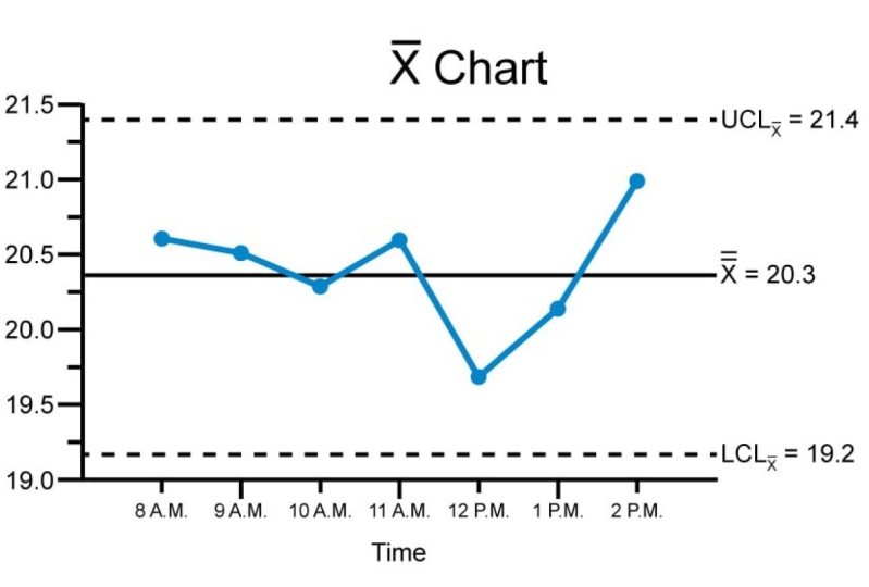
6. What are central line in control limits?: In this chapter we are
going to understand the important
terminologies like what is the central line and what
are the control limits? So what is a central
line in a control chart? The dental line in
your control chart represents the process average, not necessarily their
desired process. Tonight the specification
average given by the customer. It's what is actually happening and happening
in your process. The center line is a
horizontal reference line on a control chart that
is an average value. And it is based on the
quality characteristics used the central line to observe how the process performs when
compared to the average. If the process is in control, the points will vary randomly
around the central line. See this example. You
will, the green line, which you see on the screen, is your center line. It's talking about
the process average. Each data point could be
a subgroup of numbers. So subgroup, it could be a subgroup sample
of five elements, ten elements, and so on. And that average is
taken and the average of the whole data is
taken to derive at this green line, which
is your central line. In this example, the X-bar chart displays the length
of the manufacturing camshaft over the period of the central line
shows the process mean. And the subgroup means very
randomly around the process. So you see the dots are going up and down
around the green line. And this is happening
because of the presence of some common cause
variation in your process. Award of caution
whenever you're working. Do not get confused between the central line with the
target value of your process. The target value comes from your customer
specification, right? What is the desired outcome? That is the target line, but the actual outcome
is your central line. So both are different. Using control chart
to detect radiation. We will cover this
in the next chapter.
7. Detect Variations: Let's get started to
understand how can I use control charts to detect
variation in my process? Control charts are used to monitor two types of
process variation. As I told you in the
previous chapter, it talks about the
common cause variation and special cause radiation. What are common
cause variation and special cause variation might be a question that
you might have. And what special
cause variation looks like when you are working
on the control chart. How can I identify special cause variation
on my control chart? Using brainstorming
to investigate special cause variation
is a solution. If you identify special cause
variation and your chart, we're going to cover
all of it in detail. Do not over correct your process from
common cause variation. That's a common mistake
which people make. Because some rid of common
cause variation should be present in your process
because it's natural. So let's understand some degree of variation is naturally
in any process. If I start my training, I might be sitting
everyday in the morning at ten o'clock to start
recording my training. Some days I might be
present at tendon. Let's make a more
simple example. I order food on swaggy speakeasies that I will deliver the
food in 40 minutes. For an example, it might
deliver the food in 38 minutes. Next day, I ordered
the food from the same place and through 3D, but the order might get
delivered in 30 minutes. Third day, it might
get delivered in 32 minutes, 45 minutes. Whatever little bit of
variation that's there. And it is acceptable that is coming because of the
special cause variation. Common cause variation. The common cause variation is a natural process and unexpected variation
in the process. Special cause variation is an unexpected variation
in the process, which is because of some
unusual occurrences. It is important to
identify and try to eliminate special cause
variation in the process. So for example, I place
an order on squeaky. They said it will be
delivered in 40 minutes, but it's already two hours and they're not able
to deliver my order. I would definitely
get concerned. I would not even wait for two hours immediately
after 45-minute, I would call up and
say where is my order? And they say it's on the way. One hour later means
after 60 minutes, I again quite a bit is my order. And they said because
there is heavy rains, the driver is stuck
on the way and hence, the delay in the delivery.
8. Examples of common-cause and special-cause variation: Hello friends. Let us continue understanding what are the different causes of variation in our data analytics
for using control charts, we're using, we're trying to understand all the concepts
relating to control cells. One of the important
thing that we learn our different
causes of variation, which is causing the control
chart to move up and down. The causes can be something like a common cause variation or
a special cause variation. If you see the
Farmer on the right, the boundary farmer
on the right, he receives a bag of eggs, which are a box of x, which are a mix of
white and colored. When he gets into the root
cause of the problem, he realizes that all his eggs, hence our Lee mixed colored x, they are laying white
eggs and they are linked colored x, the power. So it's a common
cause variation. So he needs to investigate
and try to reduce, minimize. You can go, he cannot
eliminate material, try to minimize the
common cause variation. The powdery farmer on the left
also receives a box of x, which are a mix of
white and colored. When he investigates
into his powder farm, goes to the root
cause of the problem. He realized there is a one particular breed
of hens which are laying color x rest
of the hands and his poultry farm or
all Lane white eggs. It means there is an assignable
cause to this problem. And hence, he needs
to investigate what caused this hand
to lay the colored x. It could be at the
feed, had a problem, or the bird is from
a different place, or it's a mix, there would be some
assignable cause to it. And control charts help you identify the common
cause variation and special cause variation. Let's take some more examples of common cause and special
cause variation. So for example, if a baker
is making a loaf of bread, the temperature fluctuation
inside the old one slightly baby weigh
one centigrade up and down is acceptable
and that's due to a common cause variation of
the nature of the equipment. But suppose if the temperature
is dropped drastically, then it could be due to some assignable cause like the baker forgot to
close the window. Special causes help you identify the assignable cause which
needs to be focused. One more example is recording the customer
contact information. If there is an
experienced person, he might be making
very minimal errors. Whereas if it's a new person, there is a chance of him
making a lot of errors. So it means that he needs
to get trained and he needs to be taught some
tricks which can help him do this job
more efficiently. Let's take one more example to understand common cause and special cause variation in detecting mold
into plastic toys. So when the plastic toys
and made slight variation, the plastic toys is
acceptable because that's the nature of the
entire process. You are putting
the mold into the, sorry, the melted plastic into the mold and
it's coming up. But suppose that the quality
of the raw material is bad. The minute the toy is
coming out and I hold, it breaks out, it's very hard. It could be due to an assignable cause that
raw material is not of the quality that we
need and it affects the strength and the
consistency of the product. What are special
cause variation? And how does it look like when you are working
in the chat? A process is stable if it does not have any
special cause variation, common cause with
always exist, right? Control charts and run charts provide good illustration of process stability or instability is my brother Steven,
or it sounds table. We can use, but one of them, the process must
be stable before its capabilities assessed
or improve our initiated. If my process is not stable, picking up a Six Sigma
project is not acceptable, means it doesn't work out. If you'd look at
the control chart, which is over here, you will realize that this control chart has
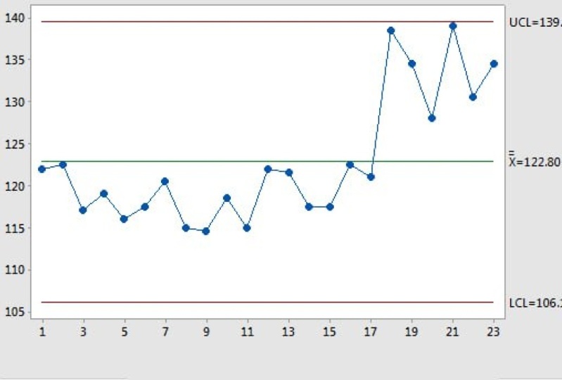
some random variation. And these variations are between the two control limits which are identified using the read line. All the dots are randomly fluctuating around
the green line, which is my central line. This clearly shows
it and it's not even violating any of my eight
rules of the control chart. I'll be talking in detail
about the different tests that we perform on control charts
in the following videos. If your control chart looks something like this
with lots of red dots and it says a 11155
and it sees 333. It means that the process is not stable and it has violated
the rule number one, rule number five, and
number three in this case. And statistics that the
process is not stable. There are some special
cause variations which needs to be investigated. If you have any questions or any doubts or clarifications, feel free to ask in the
discussion section below. Should you try to apply
the concepts outside and ensure you complete the
project and upload it. In the next video, we are going to
learn about using brainstorming to investigate
special cause variation.
9. Using Brainstorming To Investigate Special-cause Variations: We continue to understand the different causes of
variation in how should I investigate on the special
cause variations that we have identified during the,
in the control chart. So we can use brainstorming as a very good exercise to investigate the special
cause variation. A good starting point
in investigating special cause
variation is to gather several process
experts together, get the subject matter
experts over there. Using control charts increases
the process operators, the process engineers, and
the quality test us to brainstorm why a
particular sample. They're out of control. Because you know that when you're drawing the
control chart, It's in time order
sequence and you will have a sample ID which
will identify it. We can go and investigate what happened during
that instance. Depending upon your process, you may also include items
during the next meeting. When you're investigating
special cause variation, you should answer some
of these questions. With samples were
out-of-control. Which test for special
causes did the sample? What does each field test mean? And how do I what do I look for? We're on all the possible
reasons for the field test. The common method of
brainstorming is to ask questions about why a
particular failure occurred. To determine the root cause, you can use the 5-Why method. Keep asking the why, why, why, until you reach the root
cause of the problem. You should also use a
cause and effect diagram, or the fishbone diagram or the Ishikawa diagram
as you call it. To understand the
different types of different types of causes which is causing
special cause variation. Like whether it's men
material method, and so on. Remember, don't
over-current your process for common cause variation. But it's important to avoid
special cause variation. Try to eliminate
common cause variation must make matter worst. Consider a bread baking process, a slight drift and
the temperature that is caused by the organs and thermostat up part of the natural common cause
variation for the process. If you try to reduce this natural process variation by manually adjusting
the temperature, setting up and down, you will probably increase the variable t rather
than decreasing it. It is called as over correction. If you have any doubts or need clarification on
any of this topic, please feel free to ask in
the discussion section below. And as always, try to apply this concept and
complete your project. You can dig up some existing
control charts that you have and try to find out what is there is
a process table. Is there any special
cause variation? In the next video, we're
going to learn about which test for special causes
are included in Minitab.
10. Which tests for special causes are included in Minitab?: Hello friends. Let us understand which test for special causes are
included in MiniTab. When we're trying to understand the process stability
using control charts. Test number 11, more than three sigma from
the central line. This is the most common tests
which we always look for. This test identifies
the subgroup that have unusual when compared
to the other subgroups. These are universally
recognized as necessary for detecting
out-of-control situations. If a small drift in the
process out of interests, you should also do test number two to supplement test number one in order to create a control chart that has
a greatest sensitivity. Test number 29 points in a row on the same side
of the central line. This test shifts identifies the sift in the process
center or variation. If a small shift in the
process are of interest, you should use test too, along with test1
to understand what has caused this special cause
variation in your process. Because if the process
is on one side of the central line
continuously for nine bytes, the probability
for that point to go out of three Six Sigma. Three Sigma on one
side is very natural. And we can understand
the reason for it or investigate the reason
for it with more confidence. Test number 36 points in a row, all increasing or decreasing. This test detects the trend. This test looks
for long series of consecutive points that are consistently increasing
or decreasing value. As you can see in this example, if it's continuously
increasing for six points, this is also a probability
for it to go out of control. And it is already, the process is out of control and going on. It's
a special cause. Write something
happened in the process which made continuously for the variables or
the process to give samples which were consistently increasing or
decreasing in value. In this example, it is
increasing in value. Desk number 414 points in a
row alternating up and down. A test for detect
systematic variation. If you want the pattern of variation in the
process to be random. But a point that field test for might indicate that the
pattern of variation is this number by two
out of three points, more than two sigma or two standard deviation from the central line
on the same side. So as you can see, there are two examples of the
test number five. Over here. This test detects wall shifts
in the process very easily. Desk number 64 out
of five points, more than one standard deviation from the central line
on the same side. So if you see this example, we have four or five
ones which were on the same style and they will
more than one Sigma away. These desk number six detects small shift in the process
like the other tests decently. So number 715 points in a row within one sigma of the central line
on either side. Can you see that
in this example, these 15 points are very
close to the center line. It's as if they are entangling the central line
very efficiently. This detects a pattern
of variation that is sometimes mistaken as an
evidence of good control. This detects control, this test detects control limits
that are too wide. Because you would have
said this based on your old process control
limits that are too wide or often caused by
the stratified data, which occurs when the
systematic cause of radiation is present
in each subgroup. That's number 88 points in a row more than one Sigma
from the central line. On either side. This test is called
as a mixture pattern. It is in the mixer button. The points tend to fall away
from the center line instead of falling near the central line that we saw in the
previous test. If you have any queries relating to the different types of
tests that you just learn. Feel free to ask in the
discussion section below. Ensure that you try
to apply the concepts outside and ensure you complete the project
and upload it. Thank you.
11. Which tests should I use to detect specific patterns of special-cause variation?: Let us understand which
tests should I use to detect a specific pattern in
the special cause variation. We learned about different types of tests in the previous video, we should learn how, how can I use them
most appropriately? Apply certain tests based on your knowledge
about the process. Is it likely that the
process is moving the shift or is there a random variation
depending upon that, you will apply the test. If it is likely that your data might contain
a particular pattern, you will look for them
using the respective test. Adding more tests to
the jar is not correct. It will only increase the chance of finding
a false negative, false positive,
or a false signal that the process
is out of control. When in reality the process
is not out of control. When you increase
several test or when you use several
tests together, the chances of obtaining signal of lack of control increases. Let's understand how if, in case you're working
with variable data, you will be using
variable control charts. If you're not sure
which test to apply, by default, Minitab always
applies the rule number one, the test number one, that is, how many damped
the data point is outside the three
standard deviation. But apart from that, you
might try using test1, test2, and test seven. When you apply this based
on the control limits, if they are based from the data. After the control
limits are established, you must use the known
values for that limit. Then we don't need the
test number seven. Number 11 from control limits, detects a single
out-of-control point. That's to nine points
in a row on one side of the central line detects the possible shift
in the process. This seven too
many points around one standard deviation
of the central line. It detects whether the
control limits are too wide and Vida control limits are caused by stratified data, which occurs when you have a systematic source of
radiation within each subgroup. Let us understand if
you're working with attribute data of
defects and defectives. In this case, you are
not sure which test to use UGA free to use desk
number one and number two. Test number one is about 1
away from the control limit. This number two is
nine points and draw on one side of
the central line, detecting the possible shift. After the process
is established. You are control
limits are always drawn based on the values from the data that
you have supplied. We will be doing a lot
of practical exercises in the next lessons. So stay connected. And if you have any
doubts and questions, please feel free to write in the discussion section below, and ensure you try to apply
the concepts outside. Please ensure you do your
project and upload the project. Do write your review and share your thoughts
about how did you feel this class
when this number. In the next video, we're
going to learn about which test is applicable
in my control charts.
12. Which tests are available with my control chart?: Let us understand which test is applicable in my controller. That's number one to eight are available in most of the
variable control chart. Note that only test
one to four are available in R and S chart
and moving range chart, that's number one to four are available inaccurate
control charts. Which test is applicable
in my control chart? On time better control
Jan MiniTab only performs a test for points that go beyond
the control limits. That is your number one,
our test number one, that the seven test assumes
that the points are independent because
the plotted points are in time ordered, the weighted towards
combine the information of the previous subgroups and the points are not independent. If you have any queries, please feel free to ask in
the discussion section below. In the next video, we are
going to understand what are the different types
of data and how I've worked with them
in the control charts.
13. Types of data for control charts: In this video, we are going to understand the
different types of data that we have for
our control charts. What type of data do I have? This is the question
you want to answer. You, if your data is
about continuous, determines if you have
something like length times B, which is a continuous datatype
it from your process. Then you're going
to use continuous control charts like IMR chart, Our x-bar R-chart,
x-bar S chart. But if you have some
multivariate process, then you are going to use
multivariate controls. If your data is an attribute
like defects and defectives, we're going to use attribute
process control charts, which are like n chart, P chart, C chart. There are some charts
which are called as a very when process chart, which we will be
covering separately. So what type of data do I have? Control charts that
you use depends on whether you collect
the continuous data or attribute data. If you have multiple content, continuous variable, consider whether you
have multivariate data. Mike, continuous variables
are infinite numbers such as 84704 something, so you can endlessly
divide them. Attribute data have two
subtypes, binomial and Poisson. The values of an attribute
data are restricted to specific categories
are distinct values. For example, attribute data
could be like paths and feel. The number of defects
and a sample can also be an attribute data which is
fallen a Poisson distribution. Continuous measurement
usually provides more information than
that attribute data. Remember this? However, the attribute
datas are generally easier to collect because you
just have to accept, but it's defect or an effective and how many
defects if it's defective. Does the attribute data
is often collected when the continuous measurements
are difficult to obtain. Attribute data are often
subjective rating that are assigned by the operators
and quality control person. Because I feel it's
a defect I counted. If I don't feel
it's a different, I will not come to that
dependency is there? Let us understand the
control process data. Continuous data measures
the characteristics such as lend, weight,
temperature, etc. The data often includes
fractional or decimal values. For example, a food
manufacturing manufacturer wants to investigate
whether the weight of the cereal product is
consistent over time. To collect this data,
the quality analyst records the wheat from a
sample of the cereal boxes. If you have any questions, please feel free to ask in
the discussion section. And do ensure that you
complete your project and try to apply these concepts. Do write your review.
14. Use Case: Help the Quality Engineer: Let us continue our
understanding of control charts. Control charts are
also called as statistical process
control, SPC. We do this exercise during the control phase of
our Six Sigma project. Spc was developed by
Dr. Stewart in 1924. He said that you, as the concept goes, y is a function of x. We should not only
monitor the project, why, but we should also
monitor and control the vital fuels are the x's which are
contributing to that y. So by continuously monitoring the x and y together
using the control chart, it becomes easy for
the project owner and the process owner to monitor the performance and
keep it in control. They control processes
proactively. It's not. It can clearly identify what are natural causes and water
assignable causes. Natural causes are nothing but common cause and
assignable causes are nothing but special cause. It also helps you
to identify and prevent process from
this special causes. If you look at a control chart, this is just a sample. You will have upper
control limit and lower control limit, which are created approximately a three
standard deviation from the central line, which is usually
the process mean. And these three
numbers are getting calculated from the process
data which you have captured. Anything outside the upper
control limit are outside the inner lower control
limit are called as special cause variation
and their assignable cause. If you're seeing a variation
in your process which is entangling or going
around the central line. These are due to the
common cause variation. This is just a sample
representation. The reason he took three standard deviation from the central line is that if
you remember, in the bunker, 99.73 per cent of the data is getting covered within plus or minus three
standard deviation. So whatever variation
you are seeing that is 0.135 on left and
0.135 on the right. That is because of the
special cause variation. Now, again, what I
covered earlier, I'm just repeating
because this is very important and it's also
an interview question. What is the difference between control limit and specification? The control limit is
getting calculated from the data that book
control and the lower control. And it describes the water. What is this process
capable of achieving? Specification limits,
on the other hand, is given by the customer
and management. And they specify what is
the process requirement. It describes what
the process should achieve to be able
to continuously be called as a capable process and it is able to meet the
customer requirements. So again, control limits
from data specification, limits from the customer. Control limits help
you gets calculated and it helps you identify the common cause and
special cause variation. If you have data points
within control limit, but outside the
specification limit, it means that your
process is not capable. We will be looking at those
examples in the future. When we have this
control charts, do I have showed you that it's a plus or minus three
standard deviation. But those calculations depend upon the type of
data that you have. When you're doing control chart. We have variable data
and attribute data. Readable data is also
called as continuous data. Where you have decimal points like length, time, distance. These have can be
continuously divided. So if your subgroup sizes one, then we go for X IMR chart or individual
moving range chart. If your sample size
is between 29, you go for X-bar,
R-chart, or winter. But if our subgroup sample
is greater than ten, it is easier for us to calculate
the standard deviation because I have more number of
data points in each sample, then I will be drawing
an x-bar S chart. On the other hand, if I have an attribute data
or discrete data, the attribute data
can be of two types. Is it a defective data
or is it defects data? What are we monitoring? If it's defective data and
the sample size is constant, it could be any number, it
will be 1020304023 or 12. But that number, whatever
you're taking is constant. Then we go for NP Chart because the control limits are
getting calculated based on the formulas from
the underlying chalk. The variable sample. For defective data. Like for example, I want to calculate the number
of defectives. But today I did a production
of 100 units to more sturdy, I did a production of 95 units before that day was 96 units. So my sample size is
reading on a daily basis. I will be using the p chart. We will be seeing
examples of Peter, where you'll understand
that the control limits for a P chart and U
chart are zigzag. We will cover that.
Do not worry. We are going to have
lots of practice so that all these concepts become
very easy for you to record. Let's continue. So if I have defects data, It's the sample
size is constant, then I use c-chart. If the sample size is reliable, I go for Utah. The thing which I easily try to remember is if it's defective, so it's a piece, the whole
piece gets defective. That is why we have
P and NP Chart. Because it's constant, we go for NP and because it's
variable, it's a p-chart. The other is obviously
C. And because C is for constant seated and
other other one is Utah. So I tried to use this jingle to remember that which
are to be used. So if it's defective, it's P or NP depending upon
the sample size. If it's defect that is C and U. And between C and UC is what constant and Q is what variable? Let us take a use case. Though. There's a quality engineer
who is at an automotive part. He wants to he wants to monitor that how the length of the
cam shafts are getting done. He has three machines
which the company uses. They work 24 by seven in
three different shifts. So what the engineer does is
that he's taken a sample of five from each machine
during each shift, you would have easily
guessed because the sample length is
a continuous data. Sample size is five. It means that it is between 28 and I will be
going for X-bar R-chart. So let us understand how
are we going to do this. I have already shared with
you the datasheet, right? If you come to the main sheet, you have cam shaft length data. I just have to come
and click over here. It takes me to that part where the data is
present, right? I have given you a lot of data but you do not have to search. Just use the mean
sheet for surgery. I have machine 123
and sample IDs. So I'm just going to copy all this data and paste
it in my data sheet. So I'm going to
take all this data. I have my MiniTab handy. I'm going to paste
this data here. Then I'm going to click
on Stat control charts, variable with some group. And it is because I know it's a subgroup size of
less than eight. I'm going to go for X-bar
R-chart. Let the pop-up come. Yeah. So all the observations in the charter in
northern column, yes. Our observations of the
subgroup are on one. So I'm leaving it like this
and I'm going to select Machine 123 and subgroup
size is five, right? And I can also use the
subgroup ID because I can see I have 111115, right? I'm going to click on, Okay. I will want to really
do some mistakes for you to understand what
mistakes we need to avoid. Now, it is telling X-bar chart
from machine to machine. I click on Output To see all. It has created one
chart for each machine. So X-bar chart for machine one. And if you look at over here, you can find one red dot outside the upper and
lower control limit. So it's a special
cause variation. But in the range chart, everything is in control. Let's scroll down. Let's see, machine to machine to the process
appears to be in control, and the range also
appears to be in control. If I see the x bar in
jail for machine tree, again, I have two data points
which are out of control. Now one more thing
which you need to observe is the upper
control limit. Let me just zoom in a little. The upper control limit
for machine one is 6.64301 and lower is fine. 98. Let's go to machine two. It is six hundred and
five ninety eight. If I go to machine
three is 60298. So can you see that the upper control limit
is getting calculated separately because
the control limits come from the process data. And there is a variation, the control limit, because there is a variation
in the data. Despite the upper
control limit being 602, we have points which are going
beyond the control limits. Right? And same way, I would
request you to look at the control limits for the rain chart
between machine one. Machine two has a
range of 0 to seven, and machine, sorry, machinery
has ranged from 0 to seven. Machine two has a
range from 0 to two, and machine one has a
range from 0 to five. This gives you an idea that
reinforces the concept that your control limits are getting calculated
from the process data. I can do the same chart and
come to multiple graphs. And I can see the same, but I would say, okay, I can go to X-bar, R-chart, go to the test, and select the test
which are important. So if you remember, we said that you should
be testing for test1 and test2 to understand
it very well. So let's click on, Okay, let's click on Okay, and let's redo this chart. You can see that Minitab
is recalculated. If you see the X-bar
chart for machine one, it still the same one data point outside
the control limit. Now, if you're comparing this, you can see that because
I said same by it is very clearly showing that the process is very sharp and very narrow. And CMV four-inch
also it is very less. And machine three and
machine three R-chart. At the bottom you can
very clearly see it says the test reason for x-bar
chart in machine one, test one field 1, more than three standard
deviation from the central line. Test fail at point number eight. So you can go ahead and identify the subgroup of a where
the point number is eight, and then investigate what
happened on that day. We learned right? We need to do brainstorming to, to fix the special
cause variation. The test results for x-bar
chart for machine three, test 11 from three standard deviation
from the central line. This test has failed
at two places, Point number 2, number 14. So it becomes very
helpful for us to investigate what happened
on that particular date. We will continue with more
examples in the next video.
15. Use Case: Can-filling Process : Let us do our next exercise of helping the quality
engineer with the can wait. A quality engineer at
accounting company assesses whether the filling
process is in control. As you know, these
are aerated drinks. If they are more than required, it will cause a leakage
or the blast of the box. And if it is very less the
customer is dissatisfied. To check if the process
He's in control. The engineer collects
a subgroup of n gans to minimize the
within group variation. That is a can-do can variation
within each subgroup. The engineered
collects the data of the given subgroup in a
short period of time. Now, let us understand what
type of chart should I use? What is the process
we are taking the variable data
because I want to pick how much quantity
of liquid is filled up and what are
the subgroup size. It is ten. So I need to
use an x-bar S chart. Let's get onto our project file. On the main chain, you have
the data. Click on it. It will take you to the place
where the data is pleased. I'm going to copy this
data into Minitab. Now click on Stat
control charts. Readable data with
subgroup and x-bar S chart as my number of samples
in each subgroup is ten, it's more than eight. All the observations
are in one column. Yes, so I'm going to put as the subgroup size
or the subgroup ID. I'm going to mention it because
it's going to be 1 third, I'm just going to click
on x-bar s option for both test and I prefer to
do test number two as well. Click on Okay, click on okay. Now let me look at the output. So the output that we
got is the X-bar chart, where we can see that
the test has failed. On point number three, the range has not failed, but the X-bar chart has failed. So test1, 1 out of three, more than three standard
deviation from the central line. The test failed at
point number three. But asking the quality
engineer to go back to the data and see that
what happened when he, when when was this
data collected? And what happened
during this process, that the process
was out of control. And as you can see, the process is out of
control on the lower. To limit. It means less quantity
of liquid was felt. The quality engineer
now needs to bring strong that what happened
during that hour. And is it something that's
an assignable cause? And how can we avoid that
special cost from happening? Again? Let's take up the next
example in the next video.
16. Use Case:Injection Molding Process: Now let us help the other quality engineer
from a plastic company. If you can see this, it's a plastic molding process. A small animation
which is blue by VR, is shown over here. So you can see that the
plastic mold comes over here. It goes through the channel
where there is lot of heat. Hence the plastic gets melted. It gets into the
molding section where the food is kept and when
the product comes out, it's a nice toy which we
can sell in the market. So the use case is the
quality engineer for a plastic part company monitors and injection molding process. The machine has a dye that
creates £5 in one time and they engineer collects 20 subgroups of five-part each. They engineer
monitors both within subgroup variation and between group variation
at the same time. N between the batches. So as we're trying to monitor the plastic injection
molding process, we have a subgroup size of five and He's selecting 20
subgroup data points. So obviously, what's the data that we are going to look at? What type of chart do
we need to work with. My sample size is
less than eight, so I need to use
an X-bar R-chart. It's obviously the
variable data. Let's go to our control charts. I have my injection
molding data over here. I'm going to copy the data of the pods and the
subgroup into MiniTab. Now, this time I'm
going to show you this process using the
assistant feature in MiniTab. So when you click on Assistant, go to control charts. It's continuous data. Collected data in subgroup Yes. Is the subgroup less than eight? Yes. So I go for an
x-bar in charge. You can see how intuitive it is over here to work
with many tapped. My data is present in part. It's not a constant size, So I haven't seen the
column WhatsApp group ID is over here. How do I determine the control
limits and central line? I'm saying estimate it
from the data points. It has immediately identified that there are certain points where the data is missing
out on x-bar and R-chart. So I leave as it
is and click on. Okay. When I look at the output, my x-bar R-chart four
parts has been created. Is the process being is a process that we
are monitoring staple. It says, no, the
process is not saving. The process that we're
monitoring is not stable. The subgroups are out of
control in the X-bar chart. Keep in mind that you may see a 0.7% of out-of-control
subgroups by chance. But more than that is called as a special
cause variation. When we look at this chart, this time, we have a problem
in the X-bar R-chart. The previous subgroup was missing the point on the
upper control limit. And the next subgroup is missing the point below the
lower control limit. It is definitely required for the quality engineer to
investigate what happened during the point number 13 and the sample that was collected
during point number 14. We also find that the ring chart is also having
an out-of-control limit. Which means that the range, the sample that was collected
during the point number eight had a wide
variety of radiation. So was it an assignable
cause or is there a bias? When the other
data is collected? The engineer needs
to investigate it. Whenever we're doing
an X-bar R-chart, we look for certain patterns. Is there a global trend like the way you're
seeing over here? Do you see some
cyclical pattern? Currently in this data? I'm not seeing any global trend. I'm not seeing any
cyclical pattern. Is there a shift in the process? I can see that, yes. There is a slight so the point was down and then there is
a ship which is going up. Is there adrift, like it
was completely down and up. I don't see any drift over here. Is that an oscillation of data? Not at the moment. Can you see some
mixture patterns? I can see a little
bit over here. Can you see some
excessive out-of-control? I can see it both in
my x-bar and R-chart. So it says very clearly the X-bar chart has missed the control limit
on by number 1314. The R-chart went out of control during
point number eight, which makes it easy for
us to understand that. Why should we go and
investigate, right? You'd need not be
concerned about the precision of the
control chart limits because 70% or more data points are included in the calculation. Your data has passed
a correlation test. The correlation between
conjugative data points within each subgroup
is less than 0.02. It means that the randomness is there when the sample
was collected. But yes, we have found that the process
is out of control, which is requesting
the quality engineer to investigate into the matter. I hope you are enjoying the practical exercises
of the control chart. I would also request you
to practice all this from the data sheet and upload
it in the project section. If you have any questions, please feel free to ask
in the Q&A section. We will continue with one more
example in the next video.
17. Use Case Detergent pH data: Let us help the quality engineer from a detergent company. This is a use case where the quality engineer wants
to establish the pH data. The quality engineer
wants to map and monitor the manufacturer of the liquid detergent
and wants to assess whether the
process is in control. Engineer measures the pH or clarify conjugate two
batches of detergent. And because the data is
not collected in subgroup, you are required to
use the IMR chart. He's using 25
constitutive batches and ask what he's
measuring is the pH, which is a continuous data. We are going to
use an IMR chart. I'm going to show you one
more time our types of control charts because this will help you remember it for life. In control chart, the type of data we are measuring his pH, which is a variable datatype. Each batch he's selecting one sample value
and that's why we, n is equal to one. And hence we are going to
go with the IMR chart. Let us go to the project file. This is the project
data file that I have sent our uploaded in
the discourse section. Scroll down, you will find the detergent pH
data. Click on it. It will take you to the place
where the data is present. I'm now going to copy
this data into Minitab. I have coped. I have copied this
data into Minitab. I need to now build my IMR
chart. There are two ways. One, I can go to
stats, candle jogs, and then go to weird charts for individual and click on IMR. But this time let us
use the assistance. So I'm going to do assistant, click on control chart. Data type is continuous, is the subgroup data collected. Know I'm going to
use the IMR chart. The data volume is Beard. And I'm want to estimate the control limits and the
central line from the data. It is very clearly told
the point number three. There is a possible point
which is out-of-control. As a quality engineer, I never delete any data point because that's a point
for me to investigate. I just click on Okay and
come to see my output. Yes. The IMR chart for peace is
this process means table. It says, no, the process mean is not stable for 4% of time. The process may
not be stable for per cent of the data points are out-of-control in the eye chart. Keep in mind that 0.7% of
out-of-control is by chance, even if the process is stable. But now I have more
data which is out of control and this data point has missed on test number one, it might rain
moving range chart. My process is not
out of control. We look for certain
patterns whenever we are building our control
charts, like trends, cyclical shift, drifts,
oscillation mixture, and excessive points
out of control. In my current process, I can very clearly see that there is an
out-of-control point. I'm not seeing mixture
on oscillations, shifts and drift in my
current control chapter. The process variation is Steven, no point is out of
the control limit in the moving range chart, but there is 1 which is out of control in the individual
charter, the I check. If the data is not normal, you can see that this could
be a false alarm rate. So you have to also do
the normality test, which has been covered
in the other series. As a quality engineer, the advice I would give to
this engineer is to ensure that the quality gets monitor and investigate what happened during the point number eight. I hope you understood the
concept and you will be able to apply this in your own
project using your own data. Apart from that, I
would request you to practice using the dataset
that is given over here.
18. Use Case Steel bar length data: Let us move on to the next
use case in control charts. Here, let us help the quality
engineer who wants to determine whether the steel bar cutting process is in control. They engineer measures
the length of five steel bars,
some tents, ships. Can you guess what is the
datatype that we are using? And which type of control
chart should we be using for determining if
the process is in control? Can you help the
quality engineer? Can you type in the
Q&A section that what type of date control
charts should we be using? Thank you for being engaged. You are right. As the control chart
is available data, that is the length
of the state bar and my subgroup size
is between 2528, that is, my current
subgroup size is five. I will be going ahead
with the X-bar R-chart. Let us take the project file. I have my data project file, which I have already shared
with you in this project. So you should go and pick
up steel bar land data. Click on it. It will take you to the place
where the data is present. I'm going to copy this
data into Minitab. Yes, the data is
present in Minitab. I have copied the data
from my datasheet. Let us do the analysis. I click on Stat control charts, variable that subgroup
x-bar in charge. I have placed length in the data column and subgroup
ID in the subgroup size. I go to the x-bar
or option and go to the test section and ensure that the test number 12 are selected. You remember we learned this
during the earliest stage. Which test to use? When I click on Okay,
I click on Okay. Minitab is going to do the
analysis and get me out. If you see this, it has prepared
the X-bar chart for us. I can very clearly
see that there are no data points which are
going out of control. Whatever variation
we are seeing in the process is due to some
common cause variation, we need to continue to
monitor this process. As I can see that there
is a data point touching almost the upper control limit. I haven't request the
quality engineer to collect some more data to
be sure that the data processes in control. I would request you to
do the similar exercise, create your project and upload the project in
the project section. I'll be happy to review your project and give
you the feedback. And this will give me confidence that you are all enjoying what you're learning and you are also able to apply
what you're learning. Let us continue with another
example in the next class.
19. Use Case Unanswered calls data: Hello friends. I guess you are enjoying and learning a lot from
this control chart. Lessons. We have seen examples of x-bar, R-chart, X-bar chart,
and IMR chart. Till now, let's get into
the attribute type of data. Here we have an example
from the call center. The supervisor of a call
center wants to determine whether the call answering
process is in control. The supervisor records
a total number of incoming calls and the number of unanswered goals for 21 days. As you know, if we are the
customer and we're calling up bunny for a query and our
phone doesn't get answered. We feel frustrated. And then we don't want to go back to that company
to work again, to partner with them or buy
the products from them. Hence, Unanswered call is a major problem in the
contact center industry. And we have to help
the supervisor to understand how he can reduce it and whether currently is his process
in control or not? Because the type of data
is count of defectives, the entire goal is not answered, so it's not defect,
but it's defective. And do you can you control the number of incoming
calls on a daily basis? They are variable. Hence, we
need to use the character. Datatype is attribute because
it's the number of calls. And my data types sub
datatype is defective because I don't answer a
part of the colon, so right. Either answer the color, I do not answer the call. Each column is a piece. The total number
of calls received in a day is a variable number. Hence it will be a
variable sample size, and hence we need to
go with the p-chart. Let us go and see our
data in the Excel sheet. Does the product data file that I have already shared with you? Click on an answer. Calls. Data is present over here, and I can very clearly
see that on few days, I have one twenty three
fifty three calls to 65 calls to 58 calls, and so on. I have the number of calls
that are not answered. So I would go ahead and copy
this data into Minitab. I have copied the
data into Minitab. Now I need to perform the test. I can go ahead, click on Stat control charts. The datatype is attribute chart, and I already know
that I need to build a p-chart. I click on it. I see unanswered calls and the subgroup
size is total calls. I go to the P chart
option, go to the test, and I can determine which
all tests do I want to test. So I'm going to click on all the four tests to see if any of these desktop failure. I click on Okay,
I click on Okay, my data is produced. Let's view the output. We can see the p-chart
for amounts are called. And my data is very much
within the control limit. And it has not violated any of the four tests that we
perform on the p-chart. One interesting thing
which you might have observed is that the
lines are zigzag. The control limit is not the
straight line as the way you saw in the X-bar R-chart
or the IMR chart. Can you guess the reason why? You are right? Because my sample
size is wearing, my control limits are
also vary accordingly. And hence the p
chart would have is exactly the test is performed
and there is no radiation. The process is in control. The variation is due to
common cause variation. If you have done
the same exercise, I would request you
to copy this graph, save it, and upload it in the project section
of this course. I'll be happy to review
your project and we'll be happy to share my feedback. If you have other data
relating to defectives, you want me to review it. Please upload it as a project. You are not going
to violate any NDA because you're not going
to share the data. You're already going to
share the chart with me. Please ensure you
do not upload any of your company data
onto Skillshare. You'll just upload that
information where you need clarification without
revealing the name of the client or the company
from where you are uploading. Thank you. We will learn more
in the next session.
20. Use Case Defective Umbrella P chart: Let us do one more
example of the featured. In real life. Most of the time we are into manufacturing
and production. Even if we are in the
service industry, we consider the client is always monitoring as on
defects and defectives. And hence, I'm showing you more and more examples for the different attribute
type of control charts. So this is again, one more
place where the supervisor of an umbrella manufacturing unit wants to evaluate the
quality of production. As you know that it's a
monsoon season now in India, sale of umbrella is at its peak. So if the manufacturing setup does not produce
good-quality umbrella, they even not be
able to sell it. And the remaining umbrellas will stay back with them as a stock, which they will be only
able to be selling the next financial year
or the next month soon. So to avoid that, the supervisor wants to record the total number of umbrellas
that were produced are manufactured every
day and the number of defectives for 21
days in a series. Because 21 is a good number, we can go ahead with this. Again, I repeat as
we are checking for defective datas and the
sample size is reliable. I'm going for the pitcher. Let's go and copy the data from our data
sheet into Minitab, which I have already done. I go to the main sheet, I have umbrella data. Let me just scroll
up umbrella data. And I have copied this data
from here to the MiniTab. I go to assistant, I go to control chart, I go to the p-chart and C
number of defective columns. So it's defective umbrella that is constant subgroup size. Know the column of subgroup
size is total produce. I want to estimate it from
the data and I click on Okay. Easter defective umbrella be charged for defective umbrellas. Is the proportion of
defective items table? Yes, it is stable. The proportion of
defective items table, there is no subgroup, which
is why leaving the room. You would see when I'm doing the p-chart using the assistant, my control limits
are coming out as a straight line instead
of the zigzag line. That is one problem
with the p-chart. If I'm using an assistant, if I would have done
the same using stats, control charts, attribute
data, and p-chart. Taken the defective. And to reproduce what
are the p-chart option, go to the test and ensure that all the desk directive click
on Okay, click on okay. Now you can see
that it's showing the p-chart for umbrella
as a zigzag line. Right? Perfect. However, because the line
is very far off, it's okay. Even if it was a straight line because you are not
missing out on any point. Unless we saw what we
saw earlier where we had the call when we had
this type of zigzag lines. And hence here it
was very important for us to use the normal. We'll go into stats control
chart and doing it. Wonderful. I'm happy that you have
been practicing with me lots of case studies
on learning it a lot. If you have any questions, please feel free to write
in the question and answer section or the
discussion section below this. I'll be happy to answer
your queries and be happy to help you out with
any doubts that you have. Let us continue for other
examples in the next video.
21. Use Case Hospital Medical Records Defects data: Let us continue with the next example in
the control charts. This is an example of a use
case from the hospital. The hospital maintains the medical records
of the patient. As a quality engineer, there is a problem
that we're facing. The supervisor of
a small hospital wants to ensure that
the number of arrows in the hospital medical
records remain in control because it's dealing with the life of the patient. Supervisor records,
the total number of medical records that
were filled each day, and the number of
records that are incomplete or inaccurate
that is defective. So as you know that
the total number of records that we
spend each day is a variable number and we're talking about
a defective record. So can you guess what is the type of chart
we need to prepare? Yes, you are right. We need to prepare the p-chart. So because the data is related to the
counts of defectives, we're going to use the picture. Again to recap. Our data is attribute data, defective variable sample size. Hence, we are going to use beta. The reason I keep showing
you this again and again is to ensure that this
gets imprinted in your mind. Now let's go to
our project file. In the project file, you have to go and look for the data which is
about medical records. So it can you see it's
defective medical records. I will click on this
and it will take me to the place when the
defective record is there. I'm going to copy this data. And we can see very clearly
that the sample sizes wearing and the defectives
are also different. So these are the total number of records, these other defectives. I'm going to copy this in mind. Minitab. Yes, I
have the data here. As we are going to
use the P chart, I can go to stat control charts, attribute charts, and
select the p-chart. Total number of the
variable is defectives, and the subgroup size is the
total number of records. I would go to P chart and go to the test and ensure that all
the protests are active. I click on Okay,
I click on Open. The output has come out. Let's go to the output window and look for what has happened. We can see that there are
multiple places where the P chart has on
test number one. It is point number
810 thirty five, fifty six seventy five
eighty seven eighty nine. We need to go to our
data and look what happened on that day that we
have so many of the factors. The defectives are on the below the lower control
limit and as well as the upper control limit. Though, this is a
positive change that we have making
less defectives. But we need to
understand how can they be so careful and why can't we reinforce the same
pattern all the time so that our control
limits will change. You can also see that the data, the control limits
are highly zigzag because the available
data size is wearing. Each day my sample
size is wearing. And based on that, mice control
limits are highly zigzag. Okay, so now I hope you
understood what needs to be done. You need to investigate
into the matter. On the subject
matter experts go to the point number eight and investigate what
happened on that day. So I would come here and go to point number eight
and see that, Oh, out of 1700 records, 1778 records only 3D vectors. It's a positive thing. But why can't I repeat this behavior again and
again on the other this, if it was possible to have some good data on the
particular dates, I would want to reinforce and
repeat the good behavior. I hope you understand. I would request you to practice
creative project file. Save this project file as an image and ensure
that you upload it. In the project section. I have created a separate video which tells how can I
upload the project. I would be loving to review
your project and give you the feedback and share the experience that you have gotten by learning to my class. I will continue the
rest in the next video.
22. Use Case Defective light bulbs data: Let's take one more example
about defective data. Here we have the
light bulb data. Let us help the quality
engineer in this company. The quality engineer
assesses whether the process used to manufacture light
bulbs is in control or not. As you know, the bulk
can be either completely defective or it is it
puts on the light. It cannot be half defective. Hence, it's a defective data
and not differenced data. The engineer test
500 light bulbs each hour for 38 hour shift. As the sample size is constant, we are going to use
the defective data. For constant sample size. The Engineer records the number of bulbs that did not light. Hence, he's recording
the defective bulbs. As you understood. We are counting the number of defectives with the
constant sample size. We are going to
use the np chart. Let's take the recap of our
types of control charts. We're looking at attribute data, we're looking at defective data, and we're looking at a
constant sample size. Let us now look at the
dataset that we have. Look for this bulb
data. I'm just Yes. So defective light bulb data. I have two fields over this
group ID and defectives the number of light
bulbs that did not lie within the subgroup. The data is over here. I'm going to copy this
data into Minitab. The subgroup Id,
which you look see over here is an identifier, but the size of the
subgroup is saying 500. Let's go to MiniTab. And I have pasted
my data over here. As it is a constant sample size. For defective data, I'm
going to click on Stat. Control charts.
Attribute data, np dot. I'm selecting the vectors and
the subgroup size is 500. I go to NP Chart. Click on Test and ensure that all the four marks are ticked. Click on Okay. Click on Okay. Now let us
reflect on the control chart. We can see that at this point, the test number
three has failed. And at this point the test
number one has failed. So what is the test number 11, more than three standard
deviation from the central line. This test has failed
at point number 16. There's 36 points in a row, all increasing or decreasing. This has happened on
point number nine. If you see from point number 32, number nine, we have a
continuous decreasing trend. So we would want to investigate
what was happening during this six ships that the number of light bulbs which were effective, was
constantly reducing. Because it's a
positive behavior. And we want to reinforce
this positive behavior. If the data would have been completely shifted and
it will be between 02, our control limits
would have changed. Hence, as a quality engineer, you're not only looking at something which is outside
upper control limit, but you might also want to
reflect on the behavior of the data that can avoid
things going out of control. Good. So I hope you
understood this. If you have any questions, do not forget to ask your questions in the
discussion section below, I'll be happy to answer them. I will continue with the next
example in the next video. Till then, happy practicing
and happy learning.
23. Use Case Wallpaper defects data: Now we will move to
one more example. Here we will try to help the quality engineer in a wallpaper
manufacturing company. As you know, post COVID, most of the families
have decided to renovate the house because they were at home for
the last two years. And they realize that their
housemates redevelopment. So there's a lot of
demand for the wallpaper. And hence it's important for the quality engineer to manufacture good-quality
wallpapers. But one purpose, as you know, come with various designs. And Prince, he
wants to understand that he's the printing
process table or not. Three hour, the engineer
takes a sample of 100 feet of wallpaper and count the
number of printing defects, such like pattern
distortion and ink missing. As we are looking at the different data with
a constant sample size. Can you guess what type of control chart should
we be building? Your right? I need to build for the constant sample size
for different data. Again, I'll take you through
the types of control charts. So we're looking at attribute data defects and a
constant sample size. So we're going to
take up seizure. Let's go to our project file. Look for the wallpaper
defect data. I can find it over
here. I click on it. It takes me to the place where the wallpaper data is present. Here the sample ID is
only for identifying the id entity should counting
the number of defects, each sample is of
a 100 feet, right? I'm going to copy this
data into Minitab. I have done the same. You remember I need to
do with jot, correct? I click on Stat control charts, attribute charts, and C
for constant sample size. I'm going to measure
the defects. I'm going to go to C chart and ensure that all my
tests are selected. I click on Okay,
I click on Okay. Now let's look at the output. There is the output
of the c-chart. As the sample size is constant, my upper and lower control
limit are straight lines. I can see that the
test one has failed at two points by number
12 and boy number 13. If I do not want to count
at which point it is, I can look at the
reference which MiniTab also the test has failed
at point number 2, number 30, it investigates
a matter that why did so many defects
happen on these days? While there was so much of high printing errors that were encountered during
these two shifts. And again, due to what
it came back in control. So it should definitely be an assignable cause
which needs fixing. Good. If you have any questions, do not forget to ask your questions in the
discussion section below, I'll be happy to answer
all your queries and don't forget to complete your project and upload it in the
project section. I would invite you to do multiple projects so that you are confident of
what you are learning. And this gives me a
lot of confidence, even as a facilitator, that I have been helpful in your learning
journey. Thank you.
24. Use Case Defect Medication errors: Let us take one more example. As the pandemic just got over, it's important for
us to check if all the hospitals are
working under control. This is a quantity in Junior who is checking whether
the records in the medicines or the
medicines are being given at the correct rate
and other character. So the Director of the
quality for a group of hospital wants to *****
the medication error rate. Example of errors include delivering medications
at the wrong timing, delivering the wrong dosage, or delivering the wrong
medication altogether. The director records the
number of patients and the number of medication
error each week for 32 weeks. As you can understand, the number of patients
will be variable. And we are referring to the
defects data like wrong dose, age, wrong timing, drone
delivery of medication. We are going to use the Utah. Let me take you through the
types of control charts. It is the attribute data, it is the defect data
readable sample size. Hence, I'm going to
use to your chart. Let's go to our
project data file. Let's search for
medication error. It's heal arrows, the number of medication errors
that happened that week. Patients at the total number
of patients each week. Mentioned over here. So when I go over here, I can see how many errors
and how many patients they can very clearly see that the
patient's size is reading. I will copy this
data into Minitab. The data is in Minitab. Now, let's do the analysis. Click on Stat, click
on control charts, click on attribute
charts, click on Utah. Arrows are over here. The subgroup size
is the patient's. I go to the U chart, click on the test
and ensure that all the fence for
desktop selected. I click on, Okay,
I click on Okay. My output is present. Let's pull it up. Now. We can see that there are multiple points at which
the test one has filled. Based on the data, the upper control limit and the lower control limit
is being calculated. We can find that either there
are very less arrows are, there are very high error. So in, on both the sides, the three standard deviation
is getting this note. So if there are consistently, actually this has
a positive effect. If you are getting
less errors for the number of patients,
it's a positive effort. So as a quantity engineered, the dots at the bottom will be a point of investigation that how can we manage it so well? Whereas the doubt dots on the top beyond upper
control limits are the places of concern that why have we missed
and meet so many arrows? And did it cost us the
life of the patient? So as the quality person for
this group of hospitals, it's extremely critical
for you to investigate in this matter because the test has failed at multiple points. And do remember, control limits are not
specification limit. As per the specification limit, the group of hospitals
might have agreed that at 10% errors is acceptable or
7% errors is acceptable. So all the points beyond that will make your
process less capable. I have covered that
in the other video, which talks about
the hypothesis. Let's continue focusing only on control charts
in this chapter. Before I go further and getting you back
to my project file, you can see that there are multiple examples which
are given over here. I would invite you to practice them because this will give you confidence of continuing and
understanding the concepts. We have covered multiple
examples till now. Let me take you right. We saw that medication
error example. We saw the wallpaper example. We saw the defective
light bulb example. We saw that umbrella example. We saw the hospital
medical record example. We saw the contact
center example. We saw the detergent
p-hat example. We saw the length of steel bar. We saw the injection molding. So what does it mean? I have already taken you through multiple examples in
each of the chart that I would invite you to
practice all of it because this will give you confidence of how
do we investigate. The motto is my
process in control. What investigation
do I need to do? With that? I will stop over
here and I'm looking forward to your queries in
the discussion section. And your project completed, uploaded in the project section. Happy learning and
continue to grow. Thank you. See you
in the next lesson.
25. Thank you Note for my students: I thank you very
much for completing this series on control charts. You would have practiced all the examples that I
showed you in this lesson. You will have also factors
that using the data that I have already shared
with you, you should have, you should also try to practice control charts using
your own data, which will give you a
different confidence level. I dressed, you
have learned a lot and hope your concepts
are also very clear. Please follow me on Skillshare. This is my profile and I will keep uploading new
videos as we go forward. For those who are interested in doing some
corporate training. I do hi interactive
corporate training where I do programs. I have workbooks which is specially designed
for my participants. Depending upon the company
where they're working. You can see that how everybody is engaged
in this photograph. These are just a glimpse of some of the trainings
that I have done. I have done many virtual
programs during the pandemic, which accounts to more than
thousand hours of training. These are just snippets
from some of them. For those who would like
to stay in touch with me. You can connect with
me on LinkedIn. I have a Telegram channel which is called as
six underscore. Six, number six underscore sick. Well, you can connect with
me over there as well. My e-mail ID is also
displayed on the screen. If you have any queries, please feel free to contact me. If you have any questions. Do not forget to use the
discussion section given below. I'm looking forward to
your learning process and I hope I can be of help
in your learning journey. Thank you so much.
 Dimple Sanghvi, AI Consultant, Lean Six Sigma Master Black Belt