Transcrições
1. Apresentação do curso: Olá. Sou Daniella Melon, artista e autora. Obrigado por se juntar a mim na aula de hoje sobre o uso de marcas simples ou traços para criar
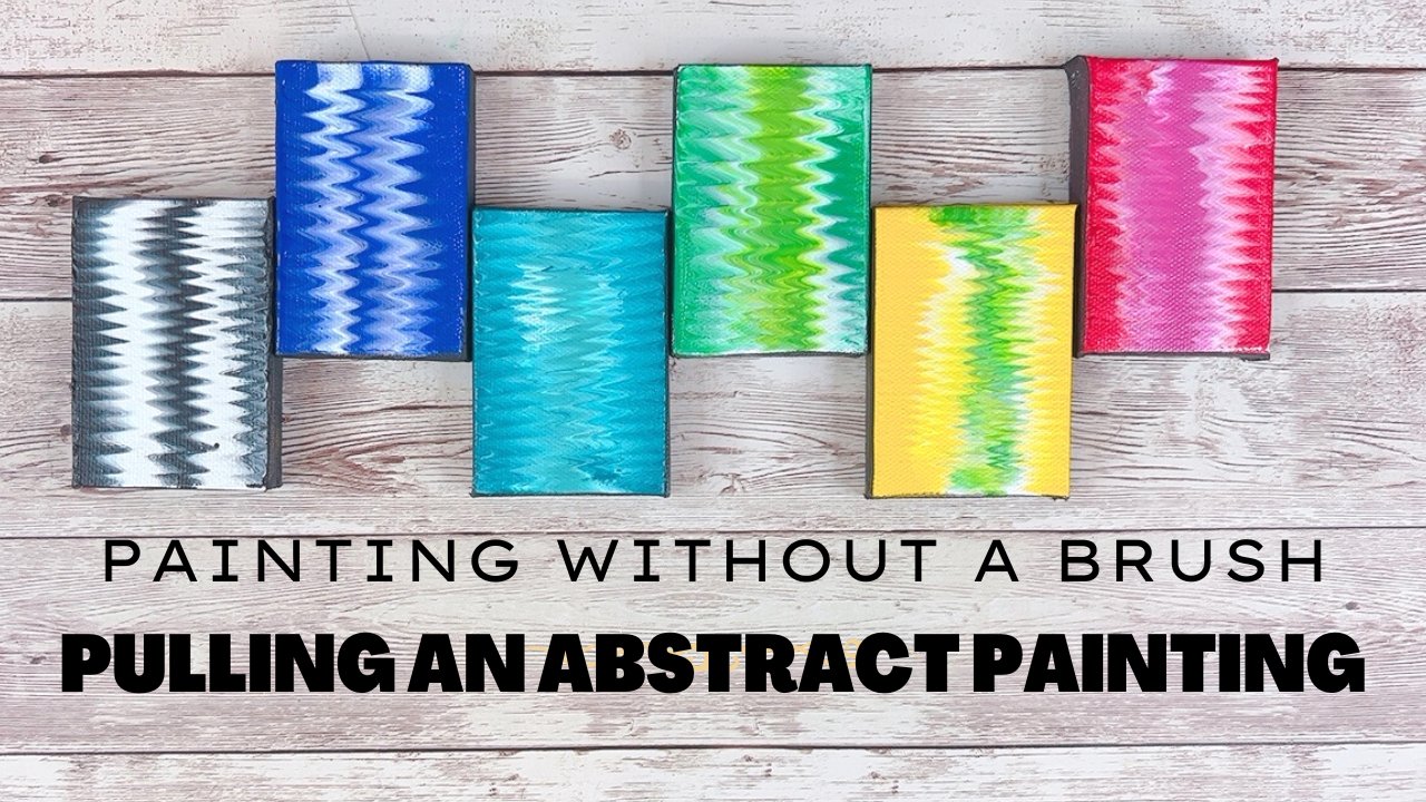
arte abstrata . Marca de classe de hoje fazendo arte abstrata prompt Número um usa minhas ondas na
técnica de linha de costa para ajudá-lo a imaginar as várias camadas usadas na criação de uma
obra abstrata de sucesso . A aula de hoje usa um simples prompt de quatro etapas para criar camadas atraentes no trabalho artístico. Você pode usar qualquer mídia que preferir, como aquarela ou tintas acrílicas, ou até mesmo mídia combinada, como usar colagem e marcadores. A lição de hoje é demonstrar o uso de aquarelas e marcadores, mas pode ser usada para a maioria dos meios de comunicação. Eu encorajo você a usar o que você tem em mãos e um processo terrível para sua própria
voz artística . Vamos começar com uma breve visão geral dos quatro elementos da criação de Mark e,
em seguida, discutir um processo de camadas. A partir daí, usaremos vários suprimentos para criar uma peça. Esta aula é a primeira de uma série de aulas de criação de marcas, e eu espero que você goste. Agora vamos começar
2. 2 materiais do curso: para a turma de hoje. Nós apenas os três folhetos da Classe 1 são apenas o básico de fazer marcas, e vamos rever isso em um capítulo muito rapidamente, apenas explicando quais são as marcas que vamos usar e como criar nosso próprio repertório deles e descobrir aqueles que são pessoais para nós que nos interessam. A 2ª 1 está explicando nosso processo hoje, e vamos fazer as ondas em um modelo litoral para criar nossas imagens. E isso explica com mais detalhes, e vamos repassar tudo isso na aula. E, por último, a última esmola é apenas uma marca pronta. E este é o desafio específico para a aula de hoje para que você possa criar seu próprio projeto . Você também precisa de alguns outros suprimentos. Então, agora, para suprimentos de arte, como podemos fazer nossa pintura real bem, usar qualquer material de arte que você gosta, quando você está confortável e sinta-se livre para cruzar mídia. Então, na aula de hoje eu vou usar aquarela e depois um pouco de tinta acrílica, talvez até alguns marcadores, e aqui eu tenho apenas marcadores de aquarela, marcadores permanentes e marcadores de tinta acrílica que eu encontrar com os marcadores de tinta acrílica. Eu realmente tendem a usar apenas branco ou preto, mas qualquer cor vai fazer o que você gosta. Só não precisa ser um grande investimento. Eu tenho meus marcadores permanentes padrão, e então eu tenho uma variedade de tintas acrílicas. Eu tenho minhas dores de artesanato, que são muito mais baratas, mas são muito fluidas. E então eu tenho meus mais como artistas, pinturas de
qualidade ou pinturas profissionais. Tenho pincéis. Eu tenho uma velha escova de dentes que eu uso para misturar salpicos controlados por massa. Eu tenho um pincel pequeno, apenas detalhando aqui e, em seguida, um marcador permanente. Isso não vai sangrar, e acontece que é do Sharpie. Você também pode usar estênceis se quiser, e você pode usar seu pincel. Ou você pode usar apenas um pequeno bloco para usá-los. Para qualquer uma dessas mídias na aula, eu vou usar um pedaço de papel aquarela oito por 10, mas você poderia usar tela para placa fixa. Seja qual for o seu trabalho de mídia, sinta-se livre para usar isso no próximo capítulo, vamos passar por cima de criar e nos familiarizar com nossas marcas básicas
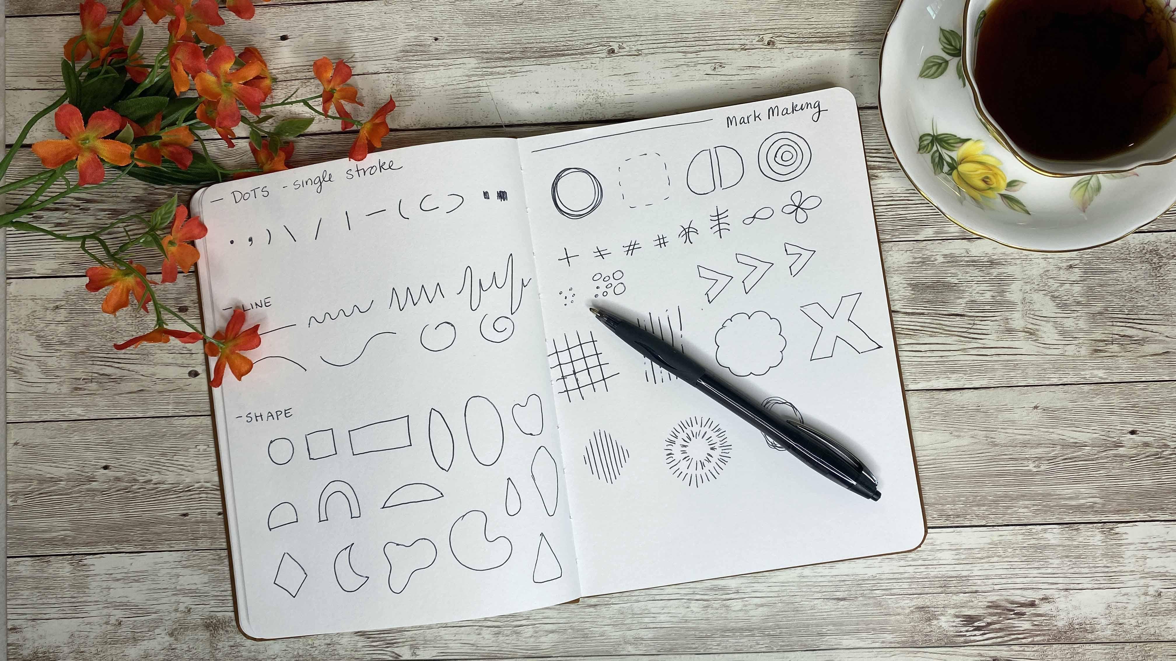
3. 3 fazendo marcas: para fazer as minhas marcas. Eu gosto de ter um pedaço de papel ou até mesmo um caderno de esboços cheio de páginas de apenas marcas. E não há nada que seja realmente elaborado. São mais como traços. E todos esses traços podem ser motivo expressivo ou apenas acidentes vasculares cerebrais. Então, com Mark fazendo, a premissa é, tudo começa cada criação que você desenha. gravação de tinta começa com um único ponto OK, então temos apenas o ponto e, a partir daí, um ponto pode ser um único traçado ou ele se qualifica como um único traço, então isso pode ser um traço. Pode ser uma vírgula. Pode ser uma linha mais grossa. Pode ser uma forma de lágrima, mas é apenas uma única marca. Vá em qualquer ângulo que quiser. Então, esses são os pontos que considero, apesar de sabermos que eles englobam mais algumas coisas. É só um derrame. A próxima coisa é os pontos virando linhas de reboque, e assim linha é apenas pegar um cão e alongá-lo. Então, obviamente, todos nós reconhecemos uma linha, mas também pode ser diferente. Coisas como esta, as coisas qualificam suas falas também. E como você pode ver com apenas as três linhas aqui nós meio que criamos diferentes humores. Este é fluído e macio tipo de feminino. Talvez descrevê-lo como este é cheio de ansiedade e casualidade. Então, essas maneiras diferentes de transformar um ponto em uma linha e há fazenda ou
ambos . A próxima coisa que fazemos é quando completamos o alinhamento, fazemos uma forma. Então, para uma forma enfraquecida, obviamente fazer um círculo. Podemos fazer um quadrado, um diamante, lágrima, qualquer coisa assim que possamos fazer, , como um chevron, podemos até fazer uma forma orgânica. Qualquer coisa que se conecta e fecha torna-se uma forma. Finalmente, começamos com o ponto Nós transformamos em uma linha, ele pode se tornar uma forma se quisermos. E então, se repetirmos
isso, ele se torna um padrão para que possamos combiná-los ou simplesmente fazê-los singularmente. Então, se temos um monte de círculos como este, agora
temos um padrão porque ele se replica três vezes. Fizemos um padrão. Podemos combinar formas, então temos um círculo um ponto em um círculo, e mais uma vez temos um padrão. Mas como artistas, poderíamos tomar algumas liberdades com isso e assim podemos transformar algo que não qualifica o padrão matemático em um padrão visual. E com isso quero dizer, se eu quiser apenas fazer um monte de círculos, todos os tamanhos diferentes, eles têm algo em comum. São todas circulares e sólidas. Isso se torna um padrão quasi. Podemos fazer isso pela forma também. Então, se eu quiser fazer um padrão preenchido como eu chamo,
isso não significa que é opaco. Significa que estou tomando uma forma e criando-a de outras formas. Então, se eu tenho um círculo e eu quero criá-lo fora de linhas, eu apenas desenhá-lo para este caminho. E assim o aqui eu tenho uma forma circular feita de linhas, e eu me refiro a isso como uma forma preenchida. Outra maneira de criar uma variação em nosso padrão é combinar nossos pontos ou nossos traços para
que possamos ter um sinal de mais. Podemos ter uma marca de haxixe , tack ,
biqueira como quiser chamar. Podemos fazer uma tomada sobre o infinito ou eles não são iguais a dois. E então estas são todas variações. Se você quiser, você pode criar um diário com apenas suas variações e seus pontos, suas linhas em suas formas. E assim você pode voltar para ele e se referir a ele. Se você está em um ponto onde você não pode pensar no que Dio, às vezes é bom criar essas formas e decidir Bem, eu vou preenchê-lo, então eu vou pegar meu círculo e nós já fizemos isso aqui com linhas. Nós fizemos isso aqui com várias formas, vários tamanhos e escalas do círculo, e então podemos ter um círculo que preenchemos. Existem também outras variedades. Poderíamos pegar o círculo e repetir. Assim, podemos pegar o círculo e sobrepô-lo. E aqui temos coisas adicionais criadas a partir do nosso ponto original e do nosso traço original. E então estes são os conceitos básicos da criação de marcas, e há muitas maneiras de você ir com isso e expressar ainda mais. Mas isso é o básico, e vamos começar com isso hoje. Eu encorajo você a vir para cima com algumas formas, traços ,
pontos, padrões que você gosta e manter um registro dele. Em algum lugar no próximo capítulo, vamos rever o processo de hoje
4. 4 ondas em uma técnica de linha curta: para o processo de hoje, vamos seguir a visão de pensar sobre ondas em uma costa e o que vemos as todas as camadas diferentes que vemos de lá. E depois vamos relacionar isto com o nosso processo de criação de marcas. Então, quando olhamos para uma costa porque há tantas camadas diferentes, a água é transparente e você pode ter alguns pontos de destaque do sol que você não
pode ver através. Você pode ter algumas sombras que você não está familiarizado com, o que é o que está no fundo. Você pode ver um pouco de areia seca, alguma areia molhada, alguma pedra, talvez uma criatura marinha enterrada. E é isso que estamos tentando capturar com nossa marca fazendo pintura abstrata. Então eu só vou usar marcadores hoje só porque eles secam rápido só para te dar um
show rápido . E então entraremos em nosso processo usando aquarelas. Então o que eu gosto de fazer é pensar nisso em termos de camadas, e eu gosto de começar na camada inferior. E então eu quero começar a camada inferior, e a camada inferior é a forma, a forma grande. Então, se eu criar isso e eu mostrar que vai ser. Minha camada inferior fará quatro camadas aqui, e este é apenas um esboço áspero. Penso no que está no fundo, que vejo mais longe de mim. E assim seria o chão de areia. E como eu disse, podemos ver algumas pedras parcialmente enterradas, algumas conchas, a areia, talvez algumas ondulações das ondas que fizeram com que a areia criasse formas diferentes. Então eu vou apenas criar isso aqui, e eu vou apenas usar algumas cores. Eu não estou preenchendo minha página, embora eu possa se eu quiser, e eu tenho alguma sobreposição. Ok, a próxima camada, que quando criarmos a nossa pintura vai realmente colocar na nossa primeira camada é onde
vamos ter mais alguns padrões e formas que se sobrepõem e vão para cima da nossa primeira camada. Então aqui eu posso ver um nangk PS ou um baú de tesouro enterrado, e então eu vou colocar isso na minha peça. A próxima camada é onde eu quero começar a comprimir e fazer minhas camadas minhas formas. Minha imagem é menor em uma escala muito menor, um pouco mais pensada para eles. Então aqui eu sei que nessas duas camadas se eu fosse combiná-las, eu terei essas formas e então eu terei alguma área branca. Então, para combiná-los, vou tomar uma forma e construir em cima dela. E assim, fazendo isso, eu poderia fazer uma forma aberta ou uma forma parcialmente preenchida. Então aqui é onde eu poderia combinar o meu círculo e colocar o meu círculo preenchido em cima. Ou posso fazer uma hashtag como marcas aqui e ali. E então, finalmente, a camada superior vai querer mais perto de mim é onde eu vou colocar o meu melhor trabalho de detalhe. Eu poderia fazer alguns salpicos, ou eu poderia fazer uma série de pontos, e como você pode ver como cada um destes progrediu, a camada ficou cada vez menor. Agora, há algumas coisas a considerar ao trabalhar com essas camadas. Há cor, composição, o espaçamento
deles. E por espaçamento, quero dizer, não
queremos que tudo seja comprimido em nosso papel em um só ponto. A não ser, claro, que seja esse o olhar que você quer. Mas uma coisa vai demorar. Tenha em mente, além de escolher cores é,
bem, bem, trem deixa espaço uniformemente em torno dele ou não uniformemente em torno dele. Mas com um pouco de pensamento. Quanto à escolha de cores, todos
sabemos que existem certas cores, a psicologia por trás delas. São certas cores que fazem você se sentir um talvez mais calmo do que outros ou algumas cores supostamente. Eles te deixam com fome. Eu acho que há três maneiras de olhar para a cor em um show de nozes, e há obviamente muito mais maneiras em geral. Mas eu olho para eles em cores sutis, tipo pastéis ou neutros. Acho isso muito calmante e sofisticado, dependendo do visual. Depois há brights e cores alegres, e por isso penso nelas como azuis, verdes e amarelos. E depois há as minhas cores sérias e ousadas, cores
muito apaixonadas como pretos, vermelhos e roxos. Então, esses ar três extremos. Mas é assim que eu divido as cores, e a partir daí eu acho fácil incorporar emoção nessas cores, calmante, ousado e apaixonado ou brilhante e alegre. No próximo capítulo vai começar a pintura são camadas
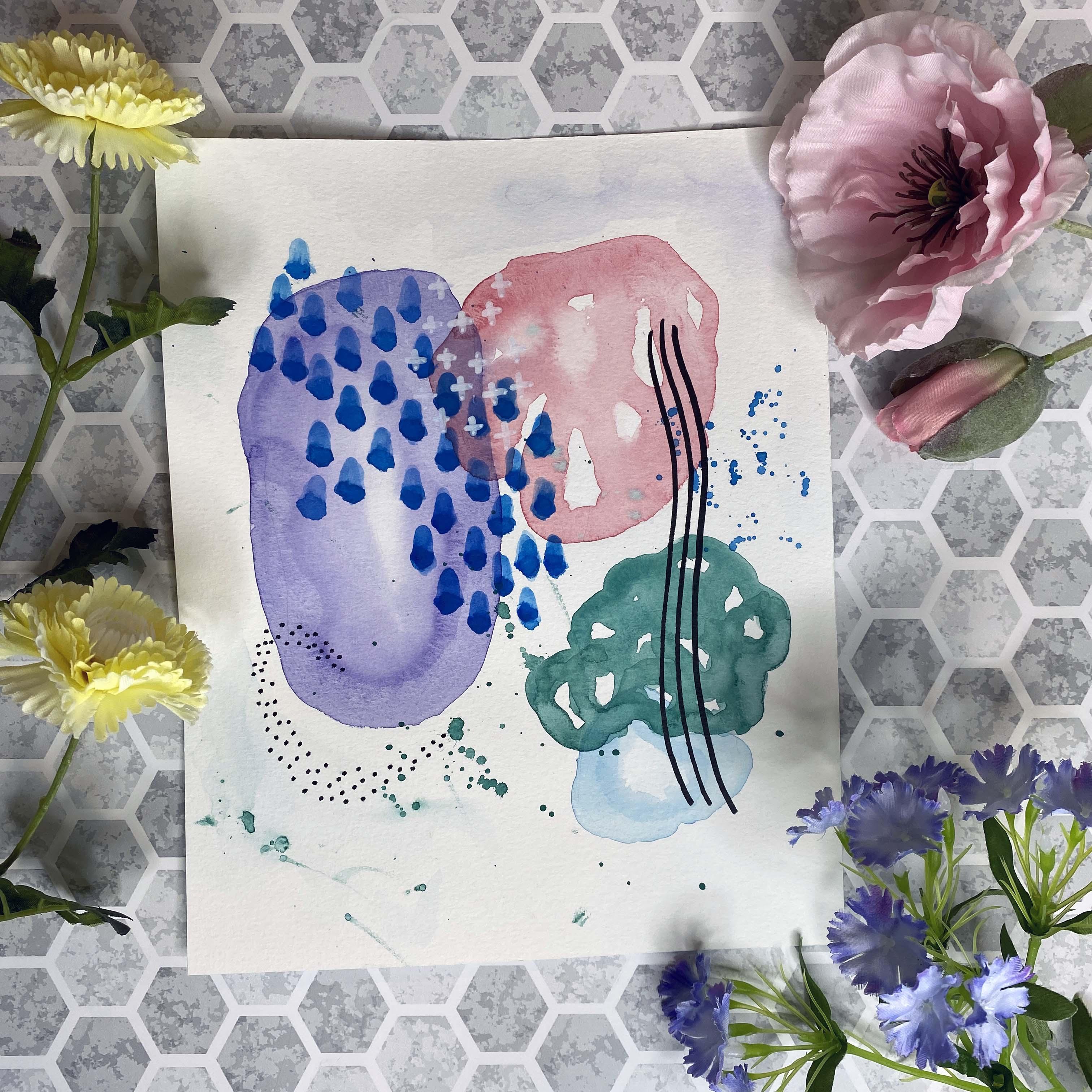
5. Arte abstrata: camada 1: Então aqui temos o nosso pedido. Vamos fazer cinco formas como um esboço como nossa primeira camada. Podemos até fazer quatro na primeira camada e depois adicionar uma segunda forma,
ou talvez três deles na primeira camada e, em seguida, adicionar como uma segunda forma. Podemos até fazer quatro na primeira camada e depois adicionar uma segunda forma, Você pode esboçar a primeira camada. Se você gosta ou não, é com você. Mas os três requisitos, ou os quatro requisitos, são usar cinco formas de tamanhos variados. Então, aqui você pode usar formas diferentes completamente, ou a mesma. Apenas tamanhos diferentes se sobrepõem ao menos três formas, modo que é fácil fará com que as formas se toquem, cruzando ou realmente se sobreponham completamente dentro, envolto dentro de outro. Pelo menos uma forma deve ser parcialmente preenchida, que é uma forma composta de vários pontos, linhas ou forma,
e, em seguida, usar camadas adicionais sobre isso. Então podemos fazer isso para que eu faça o meu esboço rápido aqui. Acho que vou reverter o esboço para ter a minha grande forma aqui. Outro aqui, fazer um pouco aqui, talvez um 2º 1 em cima e, em seguida, forma 1/3 aqui. Então isso é um esboço áspero do que eu vou didio Eu fiz levemente a lápis para que eu possa apagá-lo quando eu terminar. Então, agora vou escolher minhas cores e mais uma vez, vou escolher cores sutis, cores brilhantes ou cores ousadas, não peguei minhas cores e começarei com uma
mistura roxa muito sutil , um pouco no meu paladar, usa roxo e eu vou levar Um pouco de azul prussiano e eu vou pegar um pouco deste rosa brilhante só um rosa macio vamos torná-lo um pouco mais opaco Little Adam, outro pincel cheio de água para isso e eu vou começar minha primeira grande cor aqui minha grande forma Eu vou dar uma volta pela borda, criar a forma externa que eu quero e deixar o círculo interno seco não é realmente um círculo, mas vou tentar ecoar a forma que eu criei e pegar o pigmento meu pincel e sair por aí criando essa forma e revisando como eu vou. Adicione o pigmento. Se eu ver uma borda é muito afiada ou muito pontuda. Dois curvos. Eu vou lá e conserto. Então eu vou voltar. Basta depositar mais pigmento ao redor da borda porque para esta forma, eu quero que haja uma borda mais afiada agradável. Vou enxaguar minha escova para que eu escovar está úmido, Remover um pouco da água e eu só quero ter certeza de que o lado interno aqui tem uma borda muito sutil. Ainda tem um centro muito leve, mas o interior é bastante leve. Eu tenho que voltar um pouco mais roxo, um pouco mais de azul prussiano para o meu pigmento e então nós apenas pegamos um pouco desse super pigmento e depositamos em torno da borda ainda apenas uma cor por si. Mas ele só dá uma ligeira variação, bem como adicionar mais pigmento Eu vou enxaguar meu pincel e eu vou trabalhar em minhas formas aqui em baixo porque é a cor da água Eu vou deixar as formas secar no meio Quando eu quero criar uma sobreposição Vou levar um pouco azul cerúleo e apenas um pouco de azul prussiano Eu tenho a cor que eu gosto, uh, molhar meu pincel e eu vou fazer a mesma coisa que eu ouvi deixando o interior desta forma seco. Então eu vou pegar meu pigmento e depositá-lo em volta da borda novamente. Estou criando duas formas orgânicas cercadas. Eu vou lá com um pincel úmido, posso sempre secar meu pincel um pouco. Ou se eu quiser pegar o pigmento do centro e então eu posso ir lá e depositar mais pigmento direito na borda e eu vou deixar esta camada completamente seca.
6. Arte abstrata: camada 2: O que eu quero fazer agora é criar esta próxima forma aqui, e eu vou criar uma forma que não é tão sólida quanto esses dois. Então eu vou pegar um pouco deste rosa brilhante e apenas uma pequena quantidade de vermelho. Isto é paralelo em vermelho, molhar meu pincel e no papel seco, eu vou pegar meu pincel que está embebido em pigmento. E eu vou até aqui,
sobrepor a minha forma e dar a volta por aqui. Acho que vou mudar a forma de ser tão sólida para ter uma área de branco no centro E vou mover lentamente o meu pincel seguindo a forma. . Eu meio que criei tão bem quanto aquele que colocamos primeiro. E é uma cor muito sutil, então eu vou voltar para dentro, um
pouco mais de cor para isso, e depois depositar essa cor bem no topo. E novamente, eu não estou olhando para preencher essa imagem opaca ou solidamente. E porque estou trabalhando no papel seco, ele secará mais rápido e funcionará em Lee nas áreas onde eu coloquei esse pigmento. Então, quando eu voltar, realmente adicionar um pouco mais de pigmento direito às bordas. Eu gosto do jeito que isso parece. Eu gosto da variação que esta forma criou, e eu vou deixar essa camada secar. Eles virão aqui por causa desta forma. Eu vou pegar um pouco mais azul cerúleo como temos no nosso paladar vai misturar um pouco mais e um pouco de verde profundo com isso Dê um pouco de sensação turquesa quando eu tiver a sombra certa que eu estou procurando. E eu vou fazer uma coisa semelhante que eu fiz aqui em cima, onde eu vou criar a forma com meu pincel úmido, meu pincel molhado com pigmento no papel. Eu realmente vou fazer esta forma um pouco mais irregular do que a que ele vai ficar em cima. Eu também vou deixar muito mais branco no meu jornal e então eu vou voltar e depositar essa cor. Agora vou deixar isto secar antes de adicionar a nossa próxima camada. Mas há algumas coisas que eu quero fazer aqui. Acho que quero mudar esse tamanho para mim, é muito idêntico ao tamanho que já temos. Então eu vou pegar mais pigmento e eu realmente vou torná-lo maior, mas eu ainda quero branco
do papel entre esta forma rosa e esta forma verde. Então eu vou falar disso, mas não muito. E como a tinta ainda não secou, estou recebendo uma bela mistura onde não parece que eu adicionei à forma. Depois do fato de voltarmos lá, depositar mais pigmentos assim. Acho que vou misturar um pouco mais de pigmento para obter um pouco mais de intensidade e depositar isso em alguns lugares novamente. Isto é uma pintura mais emocional, por isso estou a ir com o que gosto, já que não tenho um resultado final. Tipo, eu não estou tentando pintar o rosto de um gato ou, ah, algo
específico ou onde você sabe, se eu estou no caminho certo, eu estou apenas indo pelo que eu sinto e o que funciona para mim enquanto eu tenho algum pigmento nisso Escova . Falando nisso, vou jogar um pouco de pigmento, privado em um spray por aqui. Gosto de fazer isso porque quebra o branco e se unifica puxando essas duas cores juntas. Eu tenho um pouco de spray no rosa e tudo bem,
e então nós vamos voltar depois que isso secar e trabalhar em mais uma forma de fundo aqui. Então esta será a camada dois do nosso projeto.
7. Arte abstrata: camada 3: Então, agora para nossa próxima camada que eu desenhei aqui, eu quero colocar a camada em uma série de formas para criar a forma maior,
minha forma preenchida por assim dizer. Então eu vou pegar um pouco rugoso e azul na minha paleta, e eu vou misturá-lo com um pouco de azul ultra marinho. Vamos dar um pouco mais de intensidade porque quero controlar este. Vou usar o meu pincel no papel seco. Então eu vou criar uma forma orgânica e vai ser composta de uma série de lágrimas e a lágrima é a forma que eu tenho para o meu pincel. Então eu quero que o fundo da lágrima seja a base aqui porque isso fará com que o eu
caia . E então eu vou começar no centro aqui da minha forma, e então eu vou construir em torno dela, criando essa forma orgânica. Eu não estou olhando para o espaço uniformemente, mas agora eu estou apenas olhando para criar uma forma que é o tamanho certo para o que eu estou indo para. E não é nada mesmo. Eu posso explicar. É só que eu quero que ele pareça coordenado e equilibrado onde ele não está repetindo a mesma forma que eu tenho, ou pelo menos necessariamente o mesmo tamanho que eu já tenho. Então eu gosto de como esse tipo de começa a fluir. Então eu vou com isso um pouco mais, e eu vou puxá-lo para cima aqui apenas um pouco mais. Então eu vou voltar e misturar essa cor o azul cerúleo e o azul ultra marinho. Você sabe, colocar outra camada para baixo direito em minhas lágrimas, com
certeza para pegar pigmento suficiente e depositar. Então este ponto, basta fazer uma recapitulação rápida e certifique-se de que eu tenho os requisitos para o meu desafio aqui para o prompt. Então eu preciso de cinco formas. 123451 tem que ser preenchido forma, que eu tenho aqui e então eu tenho que sobrepô-los. E então este se sobrepõe a estes três. Então eu já tenho três sobreposições aqui, e esses dois se sobrepõem vão colocar mais um golpe ali e ali. Então agora vou tirar um pouco deste pigmento, e vou espalhá-lo aqui. Não exatamente lá em cima, mas talvez aqui. Então, o que quer que esteja no pincel, mas estraga o meu pincel mudou para o meu pincel maior e fazer uma lavagem muito pálida de água aqui em cima, deixe-o mergulhar no papel, e então eu vou pegar um pouco disso
pigmento e escová-lo com o meu pincel. Vou misturá-lo para que ele simplesmente desapareça no papel. E é apenas um pouco sutil de cor que une o roxo. Com esse fundo, eu posso ir em depósito um pouco mais roxo, assim, e eu quero fazer a mesma coisa com um pouco disso. Explodiu bem aqui. O que? O jornal. Pegue um pouco de azul cerúleo, coloque-o no meu papel, e então eu vou misturá-lo. Este é um passo opcional, e é apenas algo para que a minha paz não pareça ser tinta diretamente em um pedaço de papel que tem um pouco de mistura pouco desvanecendo pequena névoa à distância. Eu vou deixar isso secar, e então nós vamos voltar e em nossos melhores jogadores padrões de escala muito pequena ou formas bem em cima da imagem que temos. E eu posso usar meus pigmentos de cor de água se eu quiser, ou eu posso usar um marcador ou em caneta acrílica
8. Arte abstrata: camada 4: Então agora estou pronto para adicionar meus melhores jogadores. Neste ponto, eu quero dar uma olhada no meu quadro e ver o que eu tenho acontecendo. Então eu tenho uma forma cheia aqui com nossas lágrimas azuis. Eu tenho um par de formas que têm a emplumação ou o fundo do chão branco mostrando através. Tenho um bom Grady nessas duas formas. Tenho um pouco de respingos. pequeno hey está por aqui. Então agora eu quero escolher peças para colocar em cima disso que vai adicionar interesse, chamar a atenção ou unir a peça, ou talvez até mesmo todos os três. Neste ponto, eu poderia pegar um estêncil e ver se eu queria adicionar talvez algumas dessas linhas aqui, e eu poderia traçar sobre eles com Martin Marker ou um estêncil diferente. E eu acho que eu quero ficar longe dos retângulos e quadrados só porque esta é uma forma tão arredondada. Então isso eliminaria isso. Acho que vou acrescentar algumas destas linhas aqui. Nós meio que temos o “eu “indo por aqui. Eu acho que se eu tiver algumas linhas indo por aqui, vai arrastá-lo junto, forçá-lo junto. Mas nem sei se preciso de um estêncil para isso. Então eu vou pegar meu marcador de tinta acrílica e eu vou apenas fazer algumas linhas aqui. E eu tenho que descobrir, se eu quero
que eles fiquem em linha reta? Então eu quero elas orgânicas. Eu quero uma ligeira curva para eles? Então aqui eu tenho essa linha e ela vai para baixo e combina todas as nossas três formas aqui juntas. Além disso, há muito contraste porque é uma cor tão escura em comparação com as cores que usamos. Então eu vou repetir essa forma, tentando ficar juntos e ir paralelamente a ela, e eles vão fazê-lo mais uma vez. Então lá eu tenho algumas formas que eu adicionei em Think aqui, eu vou adicionarformas adicionais,
menores, formas adicionais,
menores, e eu vou tipo de eco a forma aqui de um fundo arredondado desta forma de fundo roxo. E eu só vou usar pontinhos. Eu meio que fiz minha curva como eu gostava, e então eu vou entrar aqui e adicionar mais alguns desses pontos. E novamente eu estou incorporando outra forma, que é totalmente boa, bem
como repetir um padrão em uma escala muito Saul, e ele meio que se mistura com os respingos que já criamos, e ecoa algumas das formas que estavam tentando tirar da nossa imagem. Vou encostar isto aqui um pouco mais, assim, e gosto da forma como isso parece. Por fim, vou pegar minha caneta branca de acrílico e você pode usar tinta branca. Você pode usar caneta gel se quiser, e eu vou ver o que mais eu quero adicionar. Eu acho que iria adicionar algumas vantagens, apenas pequenas vantagens de forma aqui e ali em um aglomerado, e eu vou direto sobre as gotas que temos, bem
como as grandes formas no fundo. Vai dar um passo atrás e olhar para o meu trabalho. Eu gosto do jeito que isso parece. Há várias formas construídas uma em cima da outra. Há muita sobreposição, e então há algum contraste que aparece em você. Estou muito feliz com isso, e então lá eu tenho são imagem completa. O próximo capítulo vai encerrar a aula, e eu vou mostrar algumas variações usando diferentes mídias. Além aquarela
9. Encerra o curso: Então aqui temos nossa imagem completa da classe. Cumprimos todos os critérios do nosso desafio. Todos os quatro avisos. Usamos cinco formas de tamanhos variados. Nós sobrepusemos pelo menos três das formas que adicionamos uma forma, pelo
menos que foi parcialmente preenchida. E essa era a forma aqui com nossas lágrimas são lágrimas azuis. E então usamos camadas adicionais de linhas e pontos, que tipo de puxou a peça juntos, unificou e pegou imagens do fundo, bem como seguimos as curvas que
fizemos ao longo de nossa paz. E isso foi feito com aquarela e então usamos em caneta acrílica no final do pé. Adicione as vantagens brancas, que são muito sutis. As linhas pretas, que são muito forte país e um contraste acentuado, bem
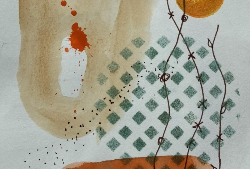
como esses pontos pretos que novamente formaram outra curva. Aqui está outro exemplo do mesmo procedimento com o mesmo prompt. E em vez de usar aquarelas, usei colagem, tinta acrílica e, em seguida, apenas um marcador preto. Este é apenas um marcador permanente, então eu colo minha imagem das minhas formas principais. Então eu adicionei uma forma aqui. Se você mal consegue ver esses quadrados cor-de-rosa. E então eu peguei um pouco daquele rosa e simplesmente desbotei para o fundo. Aqui está bem, e em cima disso, eu adicionei minha camada superior aqui desses pontos pretos, todas as formas de ar semelhante ao seu orgânico, mas eles são tipo de forma excessiva, e eu gosto do jeito que isso parece. Isto usou muita cor para criar esta imagem. Por último, peguei isso e usei materiais totalmente diferentes. Esta é tinta acrílica, tinta estritamente acrílica. Então peguei minha tela e a pintei de preto em vez de branco. E então eu criei minhas formas, e eu fiz um processo muito parecido com a aquarela onde eu coloquei um par de formas para baixo que não se sobrepunham. Quando secaram, adicionei mais formas, e depois entrei. Eu adicionei um estêncil no topo para criar esta forma. Por último, para a minha camada superior, eu entrei com alguma cor realmente contraste, este branco e este amarelo e eu coloquei alguns padrões repetidos dos pontos em cima disso, e ele tem um olhar totalmente diferente usando os mesmos prompts. Assim, com um conjunto de prompts, você pode usar muitos materiais. Qualquer um que você tem em mãos, você pode combinar o meio que você tem e você pode criar resultados totalmente diferentes cada vez que você criar este projeto. Obrigado por se juntar a mim hoje. Por favor, não se esqueça de me acompanhar aqui no compartilhamento de habilidades para ser notificado de futuras aulas. Por favor, considere deixar um comentário e obrigado por assistir.
 Daniela Mellen, Artist & Author