Transcripts
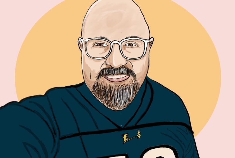
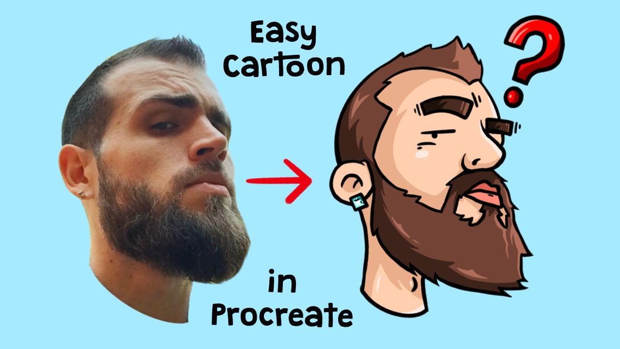
1. Introduction: Hello and welcome to another video. My name is Jay, and today I will be teaching you guys how to draw a man with a beard in Procreate. So before we start, make sure that you have downloaded all the files from the projects and resources section that you can find under this video. There are three files that you can find it over there. One is the photo that we're going to be using for this, for this class. And we're going to be downloading a brush that we're going to be using to draw it and a color palette to make things a lot easier.
2. Creating Canvas: So as always before we start with our illustration, we are first going to make our canvas. So we are going to do that by clicking on the plus in the top-right corner. So click on that one and click on the plus with the square behind it right under it. So here we're going to fill in our dimensions. We're going to be picking 2500 by 2500 pixels and the DPI is going to be 300. We're going to be needing around 15 to 20 layers. So if you do not get that because you are using an older iPad or something, I would recommend you to lower DPI to like 150 or 272. And if that does not sufficient enough, then I would recommend you to lower the width and height of the canvas to 2000 pixels by 2000 pixels. And then click on Create. That's the yellow button in the top right corner. And here we are having our canvas that we are going to work with.
3. Importing Files: Before we start drawing, we will first be importing our files. So we will start by importing the photo. We will do that by clicking on this tool next to the gallery in the top-left corner. So click on that one. Choose, Insert a File, and click on the photo you have downloaded from this project. Now it is important now we're going to resize it to the point isn't depth, we are satisfied with it. So let's make it a bit bigger so that it's centered. Like this, like kinda like that. Just follow me along on this one. That is nice in the middle. Then we're going to the layers. We're going to click on the end of the photo. And we're going to lower the opacity to around 60 percent. Some slight opacity bar from a 100 to 60 percent. Then we'll slide the photo layer little bit to the left, and we'll click on luck so that we cannot touch it anymore. It is just there. So after we have done that, we're going to be importing the brush. So by doing that, we're going to click on this brush section in the top right corner, this one over here. So click on that one. And if you scroll all the way to the bottom, you will see imported. So click on imported, click on a plus that. It's on the top right corner over here. And then this, this will show up and then we'll choose Import over here. And we will click on the crispy brush. So I'll click on it. And it'll basically be important. Now just make sure that it's selected because it will sometimes go out of it. So go to the important again and make sure that the crispy brushes selected. After that, we will be importing our color palette. We will do, we will be doing that by clicking under color palette over here and all the way at the top right corner. So click on that one. Make sure that you go to Palettes, to pellets over here and in the bottom right corner, you click on a plus section next to the pellets. Then you will say knew from file. So click on New from file. And then we're going to click on Colors, portrait man with a beard. And that'll be all the colors we're going to be using. I have imported that all these colors because it will make it a lot faster and easier for you guys to follow along so that you don't have to choose your own colors and everything like that. So it will make it a lot easier. So hope you enjoy the video. Now Let's get going with the project.
4. Outlines Face Structures: So to start off the project, we're going to first be creating a new layer by going to the layer section and the top right corner next to the color palette. So click on this two little squares over here. Click on the Plus, click on the layer itself and click Rename and call it outlines. So in this layer we're going to be drawing the outlines of the portrait itself. So now makes sure that you have selected the crispy brush that you have downloaded from the projects and resources section. And make sure that you can choose the color black. So if you've got to your palettes that you have done it as well. All the way in the top left you will find the black color that we will be using. For now. Just make sure that you pick the right size. I like probably around 4%. Maybe a little bit higher. Five, yeah, let's, let's go with 5% on the top left and not the top left in the left side, you will find this slider over here, which will define your brush size and the right size. On the bottom you will see the percentage. So choose 5%, and that's the process we will be using for this project. So now what we're going to do is we're going to trace all the features of the face, and the beard and the hair. So let's just start wherever you want. I like to start with the forehead so that everything is done. So just trace local entire phase like this, like how I'm doing. And then go to the year. Make sure to let you all also like turn it around as much as it's comfortable for you to draw. Like I like to draw like a lot with during your screen from here and there. So that makes it a lot more comfortable for me. So make sure you do whatever is comfortable for you. And just trace all the lines of the face. It's really easy. With the beard. I would recommend you not to go all the way into the outline of the bird, but to keep it a little bit in there because we're going to do something with it later on when you all understand it. But first let's just do it like this. Because we're going to make the hair severe with wilder. And if we are like doing it like this, the bird will get too big. So don't worry about it for now. Let's just create the outlines like this and the Harris and all different story. So like I will show you how to do that in a minute. So let's just first focus on the facial structures and things that are really dark. You can just color a middle like black, like I do. Well, so what I would recommend is not to put too much pressure on the, on the tablet all the time, but create lines with like a pointy end. So like practice a little bit on the screen if I wish. If I were you like I should practice a little bit. Like to create lines is more to, to let go like put pressure and let go, you know, like so don't that the lines are not always the same thickness and that creates a little bit more of an artsy effect, artistic feeling like this. And just keep going. Lips, same way. We'll just take your time. Don't feel like you have to rush into it from going too fast for you, like just pause the video until you like I've made the lines. It's all good. And what I'd like to do around the ice is I like to create a little bit of texture like this, to create a little bit more depth under wrinkles and most dislike that. You cannot really see this part of the ovary wall. So just like dude like that, not inside of the ear. And just follow all the lines. You see. No worry if it doesn't look too pretty with you yet, like you need some practice probably, but this is, in my opinion, one of the easiest ways to learn how to draw portraits. But first, just remember, remember when we were kids, we were just like drawing over pictures to, to learn how to draw better. It's kind of like that. To start a little bit over again. So we're not going to draw all the details from the blouse and everything. So like we're just going to cut off the neck like this and make it look close like that. So don't worry too much about that. You can create some lines Extra as to create a little bit more of an artistic feeling. Over here. Same thing. You can do, the same thing as overload can make this pointed things. Doesn't really matter too much, But to fill the buret out real good. All right, So first going to start with the eyebrows to teach you a little bit how to draw her in the first place. Like to draw here. You see that eyebrows are a bit wild. They don't go only like this digression. They also go a little bit like like this and like this and little bit up like that. So that's how I like to draw. And another thing is with Harris is like they're a bit thinner than the lines of the face itself. So don't put too much pressure, but makes short and sharp strokes like it. So practice a little bit on your screen like that and practice around what is sloped mouse for you. To draw hair as rule-like mostly do a very thin line, but thin but pointy, so thin what point you so you don't put too much pressure. If you put too much pressure, you get like this kinda lines. You don't want that so thin and pointy and just follow along the hair cell thick. It's very visible to draw the hearse like that. And just make it really messy and fast. Do not spend too much time on it and don't worry about it. Like it will look really good if you just do it like this, fill it in all the way. So hair by hair really quickly on appeal thing that hair will take a lot of time, but in my opinion, you can do it quite quickly because hairs quite messy. And if you'd be more messy about it, it will become a bit more realistic. While that is just basically the style of the way I do this kind of portraits. You don't have to always do it like that if you want to do it more realistically at 1, like really thin like smooth Harris, then at 1 you will be able to do that with, this is the perfect way to start learning a little bit of hers out there like that. And the other one, you don't see super world, but I'm sure you'll do fine. You can always make the opacity a bit like, like higher if you want or you cannot because I loved it, but then you can unlock it and then you can make it a bit higher to see a bit better if you want to. But because it's me, I kinda know how it looks like, but make sure you go back to the outlines layer when you've done that. If you've done that. So I'm like I'm just going to do it by by feeling and make sure that the point he goes, the pointy lines go outwards so that it looks like really real. So if I take the photo away, you see that looks a lot like eyebrows already. For zoom in a little bit. See like it doesn't look hyper-realistic, but realistic enough to make nice portraits. And let's kinda star quick and fast and easy way to, to make portraits. Alright, so that's the eyebrows. Now let's do the hair.
5. Outlines Hair: With the hair is going to be the same thing as the eyebrows. We're gonna make thin and pointy strokes. And into the scalp we're going to make the pointy things come out like that. So the pointy ends first, draw over everywhere where the hair hits the scalp, like all the way over here. The Harry goes into the scalp, you see. So everywhere on those edges, you just draw very short strokes like this and follow the hair. So like for example, if the head goes like this, you make the short stories like going in that direction as well. You see what I mean? And just do it like thick next to each other but short and thin strokes. Little point over here. I could do not look like much yet, but like later on when their hair's all there, you will see that it will look really nice. I know my hair is not black, but we will cover it later on. So first make sure that everything is just black and outline. And later on we will color it a lot better and it will make a lot more sense. I'll explain you why do black is? Because like the black will define the shadows of the hair, like the depth of the hair itself. So for example, when we, when we're later going to overcome it to black and the background is going to make it look like as if the deeper Harris or more dark, the shapes and the shadows. But you'll see it when we're there. For now, just focus on the pointy things over here like this. Very fast and simple, same way as the I wrote. Don't focus too much on details, just know Ruth accidentally something. Another thing I want to explain to you if, for example, you make a mistake and you wanted a line, how do you don't want, for example, this line with two finger tap, you can be raised that. And if you then decide you like that line anyways with three fingers, you create it. Again. Very simple. But let's get back to the hair. Fast. Make sure that this leg is released close to each other so that you don't leave too much space between them. And by doing that is just by doing really quick movements like this. That'll make it more realistic. And it seems like that the hair will actually will be faded into the scalp of the head. Here my hair is going a little bit like everywhere, so we have to make sure that the directions are as we wanted. Just like that. So then we do here, we just finish it up a little bit like we're creating a little bit more lines. Let's see, overdue black over the lines that you have clear. Let's finish to her like this over here. Alright, so now we have all these lines. Once you're satisfied with them. We're going to fill in the rest. So for this part of the hair, we're going to be doing the same thing, only the opposite direction. So we're going to be making shorter strokes, but follow the flow of the hair. So make sure it goes up. And the electrons follow the hair from the photo is simple, it will lock unlike later, like don't worry too much about like hair should be this long, so I should make strokes like this big. You can if you want to, but I like to do short strokes to create a little bit more for hair effect because not all Harris are the same length and everything. So it's very nice to make a little bit more mass out of it. You see like it will already connect anyways. So just make short strokes like that messy and fast and follow along like this. Like it's fast but it still will take a while, so don't feel discouraged. I'd like it takes too long or anything. Because this is one of the fastest ways to draw hair. And just follow along with all the hairs that you see. Okay, Here for example, there are some thin hairs you see, like if you zoom in, there's some thin hairs in the background. How to do them. It's like to really put almost no pressure at all. No pressure at all, no pressure. See you like you create really thin lines if you almost don't put any pressure. That's the way how you draw those rebel hers. But practice that, you know, like if it doesn't work out the first time because you still make it two thick lines. Just practice by flowing and flowing. You'll be fine. Just practice on your screen next to your illustration. If you want to get better and insulin and creating some certain lines. And if you're already a bit intermediate, you know how to do it already. But I'm just explaining it for the beginners. And just like that, I like to do this because it will still create the flow of air. Like if all take the photo away, see like it will create a lot of flow of the hair. You already see that it, it'll become like United. And that's exactly what we want. So just keep going and do it everywhere on top. This fast and easy. And some scenarios in the background. Don't forget those. To make it even more realistic. And lower, it starts to become really, really beautiful. Even without color, it already starts to look exactly like me. Almost. Forgot my pupil over here. So we're just also draw a pupil, just black. Don't worry too much about that. I'm going to color it at all later, so that will look a lot better. But even with dotted lines alone, it is already looking really cool. If you've, if you feel like you already get it just appeared like just continue already with the hair without looking at the video if you want to. I'm just doing it. Everybody knows exactly how to do it. But if you already have the hang of it, does go ahead. You don't have to follow me anymore. So I'd like you to hurry, goes a bit in a different direction. Desert goes like that. And here the herd goes like that. So that's also, we're going to draw it. And there is a lot shorter here than here. So like we're also going to make it shorter. Short and thin strokes. Shaking it a bit too much broadly, but hair always takes the long as the very thing. But still it's a lot faster than many other portrait drawing techniques. So I hope you appreciate that you can make things a lot faster now. And it will still be a really beautiful portrait. So don't worry about it. Now I gotta look hyper-realistic, but it's going to be looking realistic, more like an amazing kind of way and localism, comic book kind of way. So I am just draw the hair slogan that It's a bit of a hassle, especially with short hair split, nor will get their most important thing is the outside over here and like that, that has to be more precise. But over here you can color it a bit more thick and you get impatient like colored like that. If you want to login, It's all good because later on we're going to overcome it anyways. Especially in the edges were to her has to be like looking like real hair. You really have to like make it a bit more sharp and pointy. Like that. After that you can just basically colored logo if you want to. Not completely because you still want to have the texture of the hair a little bit. What we're going to also create more of that later on with the colors. And we will see slowly, well, fast. We're drawing really fast nationally, but time-wise slowly we will fill in all the gaps there. And you see if I take the photo away, the Harris already looking really good. So now what we're going to do is we're going to be drawing the beard and mustache.
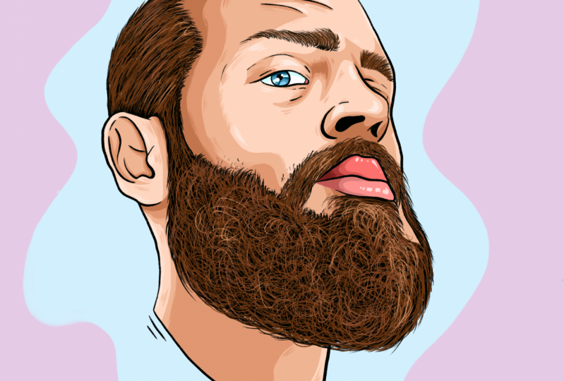
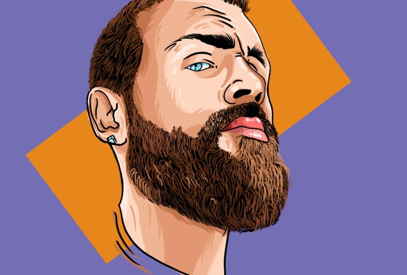
6. Outlines Beard: So for the beard and mustache, we're going to first we're going to keep going and keep him. We're going to stay in this layer. So make sure black is still selected. What we're going to do with the beard. We're going to hold on the color palette and we're going to swipe. You see this black thing appearing in flexor go into the bird and we're just calling, going to call it a beard like this. And open the photo again. Because now it's all black. It's a bit weird, but like we're going to grab a rush. And what we're going to do is we're going to draw stray hairs on the outside. We want to be doing it by creating this kind of movements like curly movements on the edges like this. See. And just follow along wherever the beard is and just make it thick. And also with the beard do not go only in one direction because beard hair is very curly and goes all directions. So also draw it like that. So draw like this direction, this direction, and without their hair a little bit out there, it's not completely going back into the bush of the hair over there. So it's just a bit out like that. So the reasoning and just fill it all in like that. And you'll see if you take the photo, the photo away that it will become already your beard. Very simple, very easy, as well as Crow movements, especially in the front over here it goes a bit more in the direction like that, but still also had them thicker, thinner. Whatever you feel like, it's beautiful. Beautiful mix is always nice. So, but yeah, that's only for the outside parts, like also over here. Because the inside part is going to be a bit more like the hair over here. And I see like a bit hair and going like this because that has more the roots. So like here are more the roots. So we're drawing more like the same way as we've done with all the things over here, like the hairs that go into the scalp and from the eyebrows. Because there are shorter and therefore have a bit more roots. Also draw a bit more festival on the outside like this. But the difference is with a beard and the hair is like that. You draw a bit more. I don't know if you see it very well over there. Back over here better like currently thinks is him. So no straight lines. Not only at least but also like a lot of curly hair. So Cocoa, Cocoa, Cocoa pool. And just do it like that. There's fill it all in, especially in the lip and this part where there's a lot of curly hairs on the site. Don't worry about it, It's all good. And some stubborn, stable and unstable. You draw very thin and sharp, very thin, almost no pressure like that. Stubble, slag that, and just keep filling it all in. Leave me like the coloring process and the other processes of once this heritage done is going to be so much faster and easier. There's always a bit more difficult part, but we have to lay our base. Still is not going to take you more than two hours full leaf me if you want. Once you get really into it, like you can make portraits in like an hour and a half. And if you want to sell portraits at 1 to people, which is always a good business, that's very handy so that you have, you can give it for cheaper or like whatever. Sure to say decision. Given the importance for your friends and family. And just follow all the hairs that are on the photo like that. So now if you take the photo away, you see I've drawn already Very nice. Sometimes it might still look a little bit fake over here, but that means just because you haven't made and overlap from the stubble to the thick beard. Very good. So you just make it a bit thicker like that, so on until it starts to become more of a hole. Hole of fact, you see. But taking photo where you can see that a little bit better. And now it starts to become like a whole. All right, so now we have done the bird, we're going to be doing the mustache. So for the mustache, it's a bit shorter than Umberto. It's basically the same effect as the hair. So we're going to make look thin point is strokes into the direction of it is already going to in the photo. Just follow the direction of the stubble of the stash like that until it becomes thick through each other. Point t and thin. And it's like be really fast. Unless you don't want to add like if you just want to take your time and do it like her hair by hair, That's all totally up to you. I just like to do it fast because then it gets more of that messier fact that I was talking about earlier, that it is a bit more realistic in my opinion. But if you want to take your time, take your time. Everybody has their own ways of doing things. That's also what art is about is to find your own own ways of working, right? Like your own style, your own your own ways, your own time. Some people like to work fast. A lot of people like to take it easy and slow. New decide to your. But for the sake of this video on wrong to do it really fast. You see that the stash already becomes a bit like that. Later on we're going to color it a bit more so it will become a bit more realistic. But for now, just keep it black. Just toggle over here. And in all directions. Make sure that the edges, It's very pointy. So that's where the roots are. And there we go. We're almost there. Then things are going to be a lot more easy. They're seated and I still have it. Bigger beard over there. So now take the far away to see a little bit how your hair. So going. You see that there's not really a one and do the same thing as what we have done there. What I had done there, like maybe yours were already perfect and that's fine. And just like that, you want to create like a wholeness of mustache to the beard. And also basically our outlines. So let's get to the coloring.
7. Refining Outlines: But before we go to the coloring, our first one to refine my outlines a little bit. So for example, in some places I see like a little bit of stock stutter because I've been drawn too fast or whatever reason it has. And I also like to create a little bit more thickness, so it creates a little bit more artistic feeling and talk a lot about that. But that's what it is about, right? To make art. And some places just make it thicker. Some places make it thinner. If you don't like, somebody can always use the urethra and the smoothing things out a little bit. I mean that if you see some mistakes like you accidentally made some black spots or anything like that, you can always erase it later. Don't worry about those things. It's all good. For example, a beautiful, thicker on it, smoother molto to low and it don't worry about it. You can always recheck everything later on when, once you're done, that's why we make layer. So things are very easy to adapt. When you want something differently, you can change it easily by just going into the layer. But yeah, like I feel like I'm good with the outlines. So let's get to the coloring.
8. Base Color: So now to color, we are first going to create a new layer. So I'll go to the layers and click on a plus. But we're going to be mechanism under the outlines. Because if we make it above the outlines, we will cover over the outlines and we want to have it under it. So click on the photo and then click on the plus. Now we have a new layer, rename it, and call it base color, base color. And here we're going to decide the base colors or we're not going to decide our decided that for you because like it will save a lot of time. Bye. Like having the colors already there makes it a lot easier. The first thing that we're going to do is we're going to click on the outlines layer, on the layer itself, click on it, and click on Reference. So if you make sure that references selected, you will notice that it's selected by that it will, it will appear under the outlines. It will say reference, you see it over here. Then we go back to the base color layer. And what we do, what we can do now is because we have our references, reference on, like if we click the skin color, it's going to be our main skin color. It's going to be under the black one. So click on that one. Now if we drag it from the corner to the face, it will color all the parts of the face you see. So do it again with the neck in the ear, but hold it for now. And you know, you see a percentage in the top right. If you hold it and you didn't let go, it didn't drop yet. You see a percentage show. What you can do now is slide to the right. But if you go all the way to like too high, it will go everywhere and that's not what we want. We only want the part like as high as possible so that it is as thick as possible though, that the colors are as thick as possible filled in. So like around this 92% is perfect. You see will have a lot of open lines here still, but we're going to color them in by hand later on. So first we're just going to fill in all the things that we want to fill in from that is the part of the skin. Then we're gonna raise our brush a little bit to make things a lot easier and just fill in all the hairs because their hearts are blocking out. Also the way that we can drop things and see that it is now not it's blocking out or drop like the paint bucket drug. So we have to fill it in ourselves a little bit. It's okay. We're illustrators. We were having fun also by, by drawing ourselves. So does do that and make sure that all the edges are filled in the hurts all doesn't matter too much because we're going to make it another color anyways. But at least the edges in between the thin, thin hairs that their skin colored. All right, Also on the eyebrow. So now we have the skin tone. Now we're going to do the lips. The lip color is this, we're tired. The bottom, the top one. So this is the top lip color. For the bottom one, we have to color it because we haven't closed it out completely. That's the one under it. It's like you have the one over here that is next to the brown color. So this oral the shadows that we're going to be using later for the skin tone. This is the upper lip shadows and as the bottom lip and in shadow. So we're going to choose the bottom lip. And now coloring that part. Make the brush to your liking. Just play around with it. I like to have a little bit of a thick brush but not too thick that it would like is too dominating. So that's goes out there all the time. That's very, very annoying. So make it like then. All right, I see that the bottom loop is a bit too much. Like what we're doing is like if you also make the mistake, click on the skin tone and make it a little bit more to your liking. Like that. So very simple. We don't have much colors to go. We just have the eyes, the eye white and a little fleshy part. I don't know what the name is where tears come out or something. So first we choose white for the filling in a form. You see that the percentage is too high of this part, therefore, it will color the entire face. But if you drop and you do that, you go a little bit more. Don't you see that it only will color the part? Now for the eye color. This one next to the white one, the blue color over here. So I'll pick that one and drag it in there. That's it. And then the fleshy part is my guess I'm not a 100 percent sure to 0 dot one and down one. Maybe they're the same. I think I put them double windows, but doesn't matter, just click this one all the way on the right and just fill it in yourself like that. And there you see it. That's all the base colors already for our portrait. So now we're going on to the shadows.
9. Shadows : So now we're going on to our shadows. And we're going to be doing that by creating a new layer on top of the base color. So click on a plus, it will create a new layer. Click on the Layer, click Rename, and call it. Shadows are simple. Now what we're going to do is first we're going to show the skin. So we're going to pick the second color next to the skin. It's for the first shadows. We want to make darker shadows later on. But first we're going to be making the first shadows over here. So that's the one under the white. So the black, white, and then there's color over here. So click on that one. Mechanized brush size, whatever you feel like it's nice for you. And what we're going to do next is we're going to decide where the sun comes from. Well, I like it that the sun comes from round here. So it comes from here to the face. So it means like all the parts over here are going to be in shadow and this is going to be highlighted so that the things that are higher into the, into the surface are like more highlighted than others. So we're going to first decide where all our shadows are going to be. So like just draw with me or wherever you want to share those, you can make your own things if you feel like it, but if you want to follow me along, that's fine as well. So I have made another video about portraits were like I made guidelines and stuff like that. But for the sake of like, I wanted to teach you guys how to do it a bit faster. We're going to skip the guidelines and just go straight to the shadows by deciding where the sun comes from. Instead of deciding where the shadows are in the photo. So just decide where the shadows are. If you want another son point, you can decide that for yourself, but if you want to follow me along, just do it like that. So we're going to just going to color all the shadows like this. Coloring in ourselves. And there were simple. If you wanted to use a thicker brush, go ahead. I like this size is quite a nice, not too dominant color all this part because the nose is also creating shadow of this parts over here. Say that undoes color and everything that you like. I'm gonna make this ALL shadow because it's very thick, bushy hair. So create a lot of shadow. Like so that you have at least a bit of cheekbone. You see like here's going to be the cheekbone. So you're going to be creating shadow under it because the cheekbone is higher. So under that you want to make a shadow. So just like that. You can also just do what I do first, make some lines like this and then you just call her in all these parts later on. So first you decide like here, we are going to want the shadow, the shadow over here, like nose bridge over there. And then color it in. Whatever's easier for you. But this requires maybe some practice to get shadows right now a little bit more about like our sun comes from and how phase structure works like that. But you'll get there, just practice a lot and if you want to do it the easy way, I would recommend you to watch my other portrait video, which then makes it a lot easier. So like if you watch my other portrait video, you will learn how to make the shadows and everything from the photo itself, which is a lot easier for beginners. This is not very difficult either. So like if you just want to follow me along on this one, totally fine. For now. We're just filling in our base shadows like that. So then after we're done with the shadows, I want to show you something else, which I like to do is I like to create a little bit more texture in our illustration. So what I'd like to do is I create a little bit more like lines like this, right? So that's crucial. Little bit more of an artistic or just sick feeling. The eyes go this way. So that creates a bit more of a life. But first let's just color and all the things that we want. And then we'll just do that. Give it a little bit more often. Extra touch. That also allowed to draw into Harris really good because sometimes they, they block out all the, all the other parts. So you want really to have the shadow in there. This is all debt because it's like inside. So unlike real courage and over here, you will see later on to look nice, edges will stay alive. And because that is in the sun, the IRS blocking this part and so does the beard. This will just fill in everything like this. And if you want to raise your brush to make things faster, Go ahead. It's really easy. I would recommend a racial brush for big areas. So that will save you a lot of time illustrating or coloring like that. So you see now we have already debate shadows of the face. Now let's create a little bit of that texture that I was talking about. Can go out of it a little bit like that. Be messy, Have fun. Thing about Bob Ross. We don't make mistakes. Just happy little accidents. I love that guy right away. I'm pretty sure most of you all do too. It has a lot of knowledge about life and art. And also he worked with really easy and fast manners in a different way. What's the very lovely legendary? Say yeah, like recurred a little bit more texture out of here you see like it's a little bit more like living right now. That's what we want. Magnet and nice shade coming from there. This is like whoop, You know. So now we're going to shade the upper lip. For the first shadow layer, we're going to discuss the upper lip color, so we're going to color next to it and just share it from the side like this. And then a little bit in the batch on the bottom like that. Because also the upper lip is a bit it's a bit overlapping. So that creates also the shadow on the bottom lip is creating a shadow on the upper lip because it's overlapping. In this case. And some people upper lip shadows overshadows the bottom lip, but in this case the other way around and work that way. Half where the bottom-left shadow, There's the color next to this one. So this one over here. So under the shadow from the upper lip, that's going to be the bottom one. And we're going to do the same thing here. Just create a shadow on the side a little bit in there too. And you already see it starts to become something really beautiful. Piece zoom in a little bit, you see that it looks really nice. Like I don't know if it's on the screen, it looks really bright, but maybe that's because of the room I'm in. Red nose might be really light, so that might be the reason. But I assure you look, if you use the colors that I picture, it's going to be looking really good. Okay, so now we're going to the shadow of the eye. So that's the second color next to the blue one left in the corner. This one over here. So just click on one and resuming in. And don't make sure that the brushes to bake reconsider coloration make too much, but like the eyelid of the top eyelid is going to create the shadow of the top of the eyeball. So we're first going to do that birdlike in and around like that. And then we're going to make stripes like this. One is thicker than the other, like that. Let's do it again over it like that. You see like it creates a little bit of a texture of the eye. So does the wood like that, but lines very simple and fast. Now we're going to create the shadow of the eyewitness. I white, I'm sorry. And that is going to be this one. So we're gonna be doing this lighter blue color over here. You see under the accrued like the eyelid shadow. All right. I see that. I totally forgot to draw my earring by the way, but it doesn't matter too much, is basically the same principle. If you really want to cd, draw the earring like we can just like take away the color layers by making them invisible. Go back to the outlines. Pick the black brush again, open the photo again, and then just draw a really quick the earring. Don't put too much effort into it, don't put too much time into it. It's very simple. Create a square with some lines like this to create depth, and that's it. And now we're just gonna go back to the colors. So for the base color, Let's use this blue one to fill in that. I see like I use some shadows on top of it, but we're going to fix that over here in the shadows layer. Sorry, has a little bit unorganized, but I hope you can make it. And the shadows for the earring is the second one next to this blue one, which also we used for the eye. So this blue, bluish green, turquoise color. And we're going to call the edges like that. And because it's like a rule, diamonds, No, it's not. It's zirconia or something. We're just doing that a fact as if it's going to be like in a square. You see? And that's it. And now just to shut off for the 2s part, which is this one on the right corner of the window corner. So click on that. And just like that. And those are already debase shadows. So now we're going on to darker shadows, and from there on another layer of shadows. And then we're going to the highlights. But first, let's go to the darker shadows.
10. Darker Shadows : So in order to create a darker shadows, we are going to first create a new layer again. So we're going to our layer section. Click on R plus, click on the layer, click Rename. Call it darker shadows. And that's it. And now we're going to first do the face. So to do the face is going to be the second one next to the debate shadow. So this is where the shadows that were used in our last layer for the main shadows. And now we're going to go over it with a darker version. So that's the one next to it, under the blue one. I'll click that one, make sure your brush is selected. Let's start with the nose. My going into the flow of it, same way that we did before, only a little bit lower. So we create a little bit of a space between like the main skin color of the shadow. And then like we're going to draw in the darker shadows like this. And we're going to just do basically the same thing as we did with the shadows. Only not everywhere. We're not going to draw the darker shadows everywhere. And like in a nose edges redraw a little bit more like that. Just there to do it. Don't, don't be afraid to make mistakes. Just go fast and enjoy what you're doing. And here, give the edges. We're going to give it the same texture later on as we're done with the other shadow layer. Same here. I'll make it a little bit like that. So a little bit more texture here. So here we're not going to cover everything but like just the edges like this. It's more the depth where the hurt cones. Little bit here. Not too much. Fill into Harris really good. And you see it doesn't take a lot of time to make portraits is just you have to practice it a little bit in order to get faster probably, but for the rest, it actually not that hard. So we're just going to follow it everywhere a bit like that. Not everywhere, everywhere, but it is logos and raised the brush a little bit to make things faster. And coloring the hearse really good as well. All right. And then for details, Lord of Russia, you and not too much, but lower it so that you can create like this affects again, make it alive. Saying we're doing the ice, not everywhere just a little bit. Maybe we should make more motions like this. So that's a little bit more realistic. Yes. So I hope it's really fun for you. Like also let me know in the comments and please give me a rating to a few like totally like it or they did whatever. I would like to know what I can improve so that I can make better videos for you guys. Because some fairly new to this. So I'm really trying my best to share my knowledge with everybody so that everybody can have like that everybody has the little bit easier in life, you know. I think that's very important to share our knowledge with each other. Also check out my Instagram if you want to. It's in my bio. There's a link to it. They will see all my art that I've made so far. And there's quite some of it. So I really love being an artist. Finding out new ways of being better, becoming a better person. That's why I ask also for your opinions and your feedback so that I can grow. I think we all should have a mindset of growth in our life so that we can get better day by day. Maybe a bit cheesy. But it is true. All right, and then keep going with the shadows. And it doesn't take too long. The moral further we get low, the easier it's going to be because it's getting less and less, less work. Because we already have done the main work is the hearable. The hairstyle is going to take some time because we're still going to color it, but you will see is not that much with the IRS. Do not cover it all the way like just the edges like this. And a deeper to hold the more shadows recreating. So like here's very deep, so creating a bit more shadows and we're going to create even more shadows in the next layer. So just like the crisp edges with pointy spiky to create spikes like you want to go from high pressure to low pressure. Kinda what we did with her only maybe a bit thicker in this case than we are going to do the same thing as we've done before. Like we gotta make some movements like to mimic the hair shadows. And then we're gonna go down to create a little bit more shadow like this and not too much rooster brush when you have like a lot of space to draw. So yeah, I was saying is please let me know what I can improve and above my artwork about my speaking. But I really hope that you are learning a lot of things from this. That you can make your own portraits for your customers or just for fun, of course, it's also possible. I've been making a lot of portraits in the past for clients. And I've done it in this way, in other ways, but I like to do it this way because it's a lot faster, a lot easier. And it gets a really beautiful results. Alright, so now that's the shadow of the darker shadow part of the skin. Now we're going to the doctor shadow of the upper lip. So let's zoom in on the upper lip. The darker shadows. One for the upper lip is the second one, x to the shadows. So that would be this one over here, the third one from the pinkish colors. So let's first forgot one. Make sure your brush is a bit smaller again. And do the same thing. To give a little bit space between pom, pom pom. Between the base color of the shadow and the darker shadow. If you want to create a little bit of that effect here as well, you can go do that. Now for the bottom lip is the same thing. It's the one under it over here and you click on that one and fill it in. Like that. I see like over here, there's still some white, so I'm going to grab my darker shadows and color it in like that. So everything is smooth. I hope. All right, so now we go to the eye and I see you're like print flip over there and then just erase it. So the eye is also the third one over here. So click on the one on the brush, make sure it's smaller because the eyes are a bit smaller and do the same thing a little bit space like this crewed space and create lines. Likely that blood thinner so that also the other shadows that were under it are still visible. And you see that is that for now, now we're doing the earring. Does this blue color over here, That's the final shadow we're going to use for the earring. We don't wanna make it too dark. Now we'll just do the edges, give it space, give it a little bit of texture like that. Not too much work. And that's it. So now we have created our darker shadows. We've gotta go create one more layer of like even darker shadows to keep it like really realistic. And after that, we're going to do the highlights.
11. Final Shadows: So now for the darker shadows, we are again going to the layer section and click on the plus sign over there. We're going to rename it again and call it final shadows. Final shadows. So final shadows. So again, we're going to pick our color. So the last one of the skin, little skin colors over this broad went under the fourth one from the middle line for the, for the middle row is going to be the one that we're going to use a bigger brush. And we're going to choose our darker shadows for now. We're not gonna go like really into it too much. We're just going to do a little bit of touches every day. Except for the lows, there's like a bit more necessary necessity for darker shadows. So like in their recreate, that could be more darkness. But in most places we're not going to create two dark shadows. We're going to keep it fairly simple for this exercise. Just so that you guys understand how easy it can be to make a portrait like that. Edge over here just a little bit too much is give it a touch. Darker brown. Over here. You can go a little bit further. See concrete, a little bit more shadow because it's like and the depth of the hair that I'm not over there, Let's keep it like that over there. And so just on the bottom lip like that bit into adults and in the ears as well. Same thing like a bit darker where, where it seems to be deeper. You can decide it for yourself or just follow along. And I'm also really curious if you're able to now make your own portraits, which are all photos. So please, if you want to look, I really am curious if you if it's possible for you are ready to do that. So please send them into me, into the project section. I would really love to look at your work and give it some feedback or anything if you need that. Some people really understand is very good and are really capable of making better work or really good work already. I just need a little bit more time. But don't worry, whatever you are like, trust the process and know that everything will get better as the more you practice with a beard, we credit just like this, shadow, like this to create a shadow of the beard and also to make it just to the edges a little bit darker that those are the shadows of the bird. Okay, So that's that. Now let's go to the final part of the upper limb, which is the all the way to dark is red color. Next to the bluish color on the middle row on the right. Pick that one and is finalized. The corners of the upper limb. I see that my brush is a bit too big. So if you notice that for yourself as well, just lower it. And that's just it. So now the eye is the final one all the way under the right of the blues in the top, top row. So click on that one. Just a little bit. Just a little, just maybe they're really thin line over here. Thin line over there. You see like when you zoom out, it looks really nice. Like I don't know if you can see it really good on camera, but I can see it really nice on my iPad itself. Like that. Alright, so that's all the darker shadows that we will be using. Logo think. Yes. So now we're going to draw the highlights of the face. And after that, we're going to start with coloring their hair.
12. Highlights: So to do the highlights now we are going to create another new layer on top of all the shadows layers. And we're going to call it highlights by renaming it highlights. So let's start with the face. The highlights for the face are this yellow one on the bottom, so that the bottom row all the way on the right, there's a sort of like next to the skin, this pinkish colors, there's this like whitish, yellow color. We're going to click on that one. Make the brush like to your liking, and just fill in some highlights wherever you think it's necessary. Like I like to do it under the highest parts of the face or like the nose bridge is very big, the high part of the face. So like that's going to be like some highlights. Same thing in the top of the island and above the eyebrows like often a bit thicker over there. So like I like to put some highlights over there as well. But just a fun way to genetic and the cheek as well. Like do some higher noise. Not too much, not too crazy. Just be free. I like to do it on the edge of the face as well as here, going out here a little bit with my coloring, but we can always fix that in the end. Don't worry about it. That's just my mistake. Over here in the ears like everything that's like higher been the edges. Britain, drift and neck like that are simple. And also I like to do it on top of the wrinkles because often that's also written, the skin is a bit higher than the others because it goes together, right? So therefore look at one-point goes higher. So you're not too much, not a crazy. That's that for the skin. So now for the highlights of delivers the one next to it, that little bit of the pinkish one color. Click on that one. And just create some highlights in the lips. Opera live like this. Not too crazy. Just like a little bit like that. Too much. Maybe. I like it, it's fine. And the bottom lip, same way. You just create a little bit of this texture. I'd like to just repeat what I'm doing. Like lines and dots like that. When you zoom out, it starts to look really good. You see, it looks really nice. Now for the earring, we're just going to choose the white color next to the black, just white, basically white. And greatest square in the middle, like that square. You don't see it very good because the blue is also very, very, very light. I don't know if you see it very well, but there's like a like a square here now and maybe like a line like this and maybe even like a line like that, create a little bit more shine and say as a sort of a shine effect. So now we're going to do the eye. For the eye, we're going to pick this color, same thing as we call it our white. And we're going to pick this greenish color on the top row and all the way on the right. And just create your highlights like that. Very simple. Because when you zoom out you see like you created like a bit more realism like in the eye itself. All right, so those were the highlights for, for the face. We're basically done with the face. We're just going to have to finish the hair. And then we have made our portrait.
13. Coloring Beard: So now for the final part, we are going to like color the hair basically. So what we're going to do is first create a new layer, but on top of the outline layer, because we are going to work on top of the outlines. We're going to be drawing over this bird. If we walk under it, it will not be visible because it will be blocked out by the total of blackness. So we're going to create a new layer on top of the outlines. So click on the plus. There are some new layer. Rename our layer and call it, let's say here. Let's call it hair. Now we're going to pick our color. So this top three, bottom three colors over here in the bottom left corner of our palette are going to be the cause we're going to be used for our hair. So let's start with this brown one in the bottom left. Let's see. We're going to have to figure out kind of what kind of size brush we're going to use. Like I'm using five right now. I think that's perfectly fine. Yeah, I think five is nice. I don't know if you can see it because of the lightning. But five is nicer like use 5%. And then what we're going to do with the beard is really different compared to the hair because the beard is very curly. So we're going to make curly lines by doing that is like recreating these kind of lunch you see. So hope you guys can see it really good. Because like reflects a bit. Maybe lower. I think now it's a lot better. I hope it's a bit blurry. So we're just going to make curly lines like this C. And we're not gonna do it all the same direction. We're going to do it in a direction like from zig zag. So like you go like this way and now you're going that way because that's how curly hover works. It doesn't go all the same duration and goes a bit like this. Basically the same way as what we have done to make the hairs beard like in the outlines layer you remember. And just do that everywhere. Some of those longer hairs are like more like crows like this. So then you create more like a curl like that. You see, sorry, it's getting a bit blurry every now and then and I do not want that to happen, but that's probably because it's very dark. Not super knowledgeable about cameras yet. I don't have a lot of knowledge about it. But basically the thing that we're doing is like making the cause of the hearse like this. Everywhere. You see bitumens better. Maybe I should just illustrate it like this so that you can see it better. And we'll zoom in every node and to show you the results are showing you the process. And just make crows like that just everywhere, really quickly, not too long. Just make it short. Because the bird is long, but still it is not as long as, for example, the hair of a female or just basically long hair. You know what I mean? So yeah. Just do that everywhere. Made the curls, assuming you see like sars to already looked like and a bit more realistic. And then Diane is not hyper-realistic. It's more often comic book style of illustrating. What's still, you can see that it's me. You can still like, no matter what kind of photo you use, you will be able to see that this is exactly the person that you're making. Maybe you will make some mistakes with lines at first, but you will get the hang of it once you practice a lot. And this also takes a little bit more time. And you see that the blacks of the beard in the background, they create a little bit of the shadow of the depth. So it creates a little bit of the depth of the hair. You don't want to create too much space because then the black is very dominant. So try to do it like really like I do like really close together. Zigzagging was still keeps some space of the blood there. And the edges again like a lot smaller than how you're doing it here. Because here the Herzl lot more messy and big and curly, but on the edges it gets a little bit more to the roots. So therefore, you make it a bit smaller. And one demo, once you get here again, you make it gets blurry again a little bit. Sorry. If you have any questions, just feel free to ask me about anything like I'm sure it can help you about it. I will try to respond as fast as possible and also go to my Instagram. Follow me there if you want to. Still growing. If you're not been sent here by my Instagram in the first place? Of course. Ledger. So I'll just keep going doing that everywhere. I'm trying to make this as interesting as possible. And let me know if you have any questions, of course, really curly. And the mode we get to this part is where like it's a bit more millimeters hair. So that's where we're going to keep going with the curl. So we're going to stop there for now. And we're just going to focus first a little bit. We're almost there. All right. And with the highlights, it will look a lot more realistic later on. So let's do the mustache, same thing as we have done with the black mustache, with the black color on the bottom of it too, is going to make very thin stripes, maybe lower the size a little bit of your brush. If you want to. If you feel like you need a little bit more control still in practicing pressure of the pen or pencil as it's called. Then make the brush a little bit smaller so that's easier for you to, to work with it, especially in the edges that might be handy to do that if you're not so good with the pressure or just if it's comfortable to you, of course. All right, So that's the head of the beard. Now we're gonna go to the hairs of the hair itself.
14. Coloring Hair 1: So for the top of the hair, we're going to do basically the same but a little bit different. So we're going to pick a nice brush size again and just do the same thing you've been doing with the black under it. You see that the direction is still visible because we left open open space. We were going to color it in MS. Second, because I do not like the white see-through parts and let's not very nice. So what we're gonna do is first decide all the directions of the hairs of the brown parts. Just like this, make the brush a bit smaller if you want to create a little bit more realistic hair texture. And just follow it. Thin hairs not to thick because this has very thin or a short I mean. So it's a lot different than the Beardy. Beardy can overlap a lot, but with this part you have to overlap of course as well Because Harris overlap, That's just the truth, but it's a bit different. It's more straight because it's very short. It doesn't curl. Now that I have curly hair anyways. But in my beard I do so. Withdraw the bit differently. I'll just do it quickly. Don't don't pay too much attention to it. As long as it's then and it goes into the same direction as the block that we have marked under it. So even if your zoom out and do all that, we start to look a bit more realistic. I don't know if you can see very warm screen with like later on we're going to go back to the outline layer to fill in all the black spots. Because indeed right now it doesn't look very nice. So we can do it already maybe for this part. So I hope to show you what I mean. If we go back to the outlines layer and we pick the black color and choose a big brush to color it is Olin. You see it now. You start to see a bit more of the brown. The reason why I didn't like to do it, because the edge is indeed here we worked with the roots and if we color it in, it becomes like a big flood. So we have to color it a bit like that. You see in the middle over here, we can just color it. Just be careful that you do not go out of it too much. Now we can see a lot better because now we have decided, for example, with the brown color also where our Heracles. So now it's lot easier to decide that. Alright, so, alright, so now we go back to the hair. We're going to pick the wrong color ago. And we're going to be doing just finishing the side part of the head of theirs. This then sharp strokes, as I told you before, she's still need some practice with that and just practice. Do not feel pressured by time or that you need to be doing it really fast like I do. Where maybe or even faster than I am. That's also possible. We're almost done with side part of the head. Over here. It's going to be like a television that's going to be a bit different because it's a bit longer, so it's basically the same, but I'm gonna do it in part so that it's easier for you to understand. All right, so that's basically the side part of the head. Now we're going to the top part. Just want to finalize it a little bit. There's like that. So now we're going to the top part of the head. And after that we'll doing the highlights of the beard and hair. And we'll be done.
15. Coloring Hair 2: All right, so now let's do the top part of the hair. And this, we're going to do the same way as we have done with the black. So just like created sharp points in the tips like and the thin back hurts a little bit with no pressure at all. So just like that it will connect altogether. So make short strokes not too long, so low. A lot of people will draw her like this. But because Harry goes a bit through each other like that, like I find it nicer to do short hair so that you get that effect already from, from the get-go. So like if you would do like long hair, so like this, it would create too much of a faker fact. Like, like what I said with the eyebrows, if you do it all in one direction, it would all look very fake and like polished or something like that. And we wanted to make it more realistic and life is a bit more on polished. So I like to create a little bit more short strokes. Have a brush size that you like. Later on we're going to fill in this all black again with refers going to decide the flow of the hair. And remember the outside parts to put no pressure at all. And when you go down like the DOM parts, I try not to go too far because here I went a bit too far in this case, because slow after erased a little bit like that. Try to keep the roots as dark as possible because there's more shade. And I'm really hoping you learning a lot from this, that you can improve your artworks, proof your talents, improve your sales even. Like I really want everybody to have the best seller on it. Just keep on doing it everywhere. Really quickly, smooth. And once you have like basically all the directions of the hair and you can see it with just a brown parts. From now. We can go to the outlines layer again and fill it in or with black with the brush just like this so that we can see a little bit better. Like our lines are going. Remember at the root to keep the roots like with just in them. So like with the skin colors in between. So you don't go too much over. It doesn't look real anymore and doesn't look nice anymore. So there's the way to do it by just keeping sharp, thin lines. And the edges. We do keep the white, you know, because like that's where like to see through to the background is going to be. So we're not going to go too deeply in with the black. Just fill in only the parts where like the wide we're showing through, like in the deadlock, our hair, so that it looks nicer. All right, so now we have colored that in. We're going back to the hair layer and we're going to go back with our brown. Make sure your brushes in the right size and you can always go back and change it if you make a mistake. That's the fun part about digital illustration is that you can make a lot of mistakes. And if you work with a lot of layers, you can easily do things over again when you do like I'm or something like that. Or if you just want to change something completely. It's very simple. And everything is digital nowadays. Designing is already digital for a while. But also illustration is getting really digital with all the new inventions of the iPads and things like that. Very lovely because it feels like it's real. You draw on a screen, but it feels like just like paper and it's better for the environment is wearing or because you're not using so much paper. And it's also more cost friendly because you don't have to buy paint all the time or ink or pencil through whatever. It's a bit of an investment, but in my experience, it has been far more than worth it. Your all you guys have already a Tablet, otherwise you cannot do this exercise anyways. Sorry, I'm talking basically about nonsense. I just saw that's the hair. So I can now how we are going to do the highlights and after that, we're just going to finish it with a background. And then we will be done before we're going to the next round. Like a wanted just to add a little bit of brown in our eyebrows. My eyebrows are quite dark, so it's not super necessary to draw in like all brown and stuff like that. But a little bit because it's not super black either. So just like create a little bit of brown in there. And if you do not like the see-through edges because now we know exactly the direction of the flow of her weekend, like just close it out like this. And there we go. Now we have basically the colors of the hair, of the eyebrows, of the skin and everything. And I were going to finish it it with two more layers of highlights of the hair.
16. Highlights Hair/ Beard: So now we're going to create another layer. We're going to rename it and call it highlights here. So highlights here. Keep it like that. We're going to pick this color, the second on the bottom, the bottom row of our color palette. Let's go into be the lighter version of a round. Make sure that our brush ice is nice. We'll figure that out and just do the edges like this where the light is hitting. So we're not gonna do it everywhere, which is going to go do it in some certain parts. So for example here is that the division between like this part of the heritage that goes like in the corner of the chin, right? So like this is all the way going luck here. And this part is a bit darker because that's more behind it so that your credit it gets more deshielded. So like retraining that division by creating highlights here. It's not super visible prolly, but it's a bit lighter, not too lightly across in our final layer will make it as light as possible. And same thing for all these edges. And every land under some blunder or scrolling through. I can maybe not this brown or light brown in real life, but it's more about the practice of how to draw a beard in this particular style. Honestly, it's pretty close to my color. I guess. The mustache, the same thing too much because it's already very thin so you don't want to create too much chaos in here either. But it will make it a lot lighter because my stash seems to be a bit lighter, dim appeared in real life as well. So all the edges are going to be really nicely highlighted. Also, my beard is a bit lighter than the top of my hair, basically in real life. So like we're also going to not draw too much highlights in on the top of our hair. The hair over here, like that. So okay, so that's it for the beard for now. Now we're going to do the top of the hair. I would just say like just some tips maybe where the sunlight is hitting like extra heart, you know, like maybe one like long-haired. It's a bit like lighter than the others because the sun is shining on it. So I'll just add a little bit of lighter like that, not too many like that. And everywhere you can just draw a little couple of hairs that are getting a little bit of extra sunlight, especially in the edges. Try it out. Whatever you like, you know, like if you wanted to make it darker or anything, it's totally up to you. Like and don't like to create too many highlights. All right, so that's highlights part one. Now we're going to do part two. So create another layer, rename it, and call it Hi lights. Number two. We're going to pick the lightest color of the three brown ones on the bottom row of our color palette. And we're going to do the same thing. Just create like a little bit of extra hairs that are hit by the sunlight. Little bit accruals, little bit out there. Like that. Not everywhere but just like a little too much. So I'm in the mustache. Let me be really, really small and tips into her really know too much. And the way she creates too much of a blonde effect. And we're going more for like brown. Brown sometimes when the sun hits, it can get very light. So that's like a nice extra effect. So yeah, like don't put too much attention to it. Like not too not too serious. Little bit in the edges, little bit every now and then here. Some popping popped up her like that. Not too much. All right, so that's it for other colors of our work. We are going to create one more layer on top of this layer. And we call it final highlights. So rename it to final highlights. Kind of pick our white color next to the black one, top, top row. We're going to our eye and we're going to give it a reflection. So what, how we do that is by creating a circle here, like in the left part, like in a real IS slide. You have so much more going on because it's the reflection of the light parts that are around you like it can be Windows or light bulbs or anything. We're going to keep it very simple to kinda like anime eyes by one little light bulb over here and a smaller one over here. So to write reflections, one big one and a small and so when you zoom out, you see it looks a lot better already. All right, so we're going to descend with the lips into highlights of the lives that we've made of the bottom loop, for example, we're going to create a little bit more weight like highlights a little bit over here, not too much. And that's basically it for all the coloring. So now we're only going to create a background for our portrait and we will be done.
17. Background: Now for the background, we are first going to create a new layer all the way on the bottom of all our colors. So if you click on the photo, for example, we're not using it anymore. So if you click on it, create plus. Call this layer back, ground to background number two, because the first background is like the color that we're going to use. Like this one is totally up to you, like whatever color you want to use. Like first, we're going to choose a background color. So like whatever you want. Like for me, Let's go for a blue one that goes really nice with my eyes. Or maybe a torque coils like this. There's a very nice like a darker turquoise to replace. What is it like? See unknowns like like a greenish blue color, turquoise, right? So okay, and that's basically the background color we're using. Now I'm background too. We're going to do something different. First of all, we have to do is turn off the reference of our outlines. Otherwise, the lines are going to block us from creating the thing that we want. So in the background to go to the selection tool, which is on the left top corner, which is this S over here. Click on that one. Just a rectangle selection. So I'll click on the rectangle over here. And then just select like a, like a, like a rectangle on the screen like this. So just like that. Go to your colors. Again, decide whatever you want. Then you can go to your disk of the colors and you can decide your own kinda color. I'm going to go for an orange color this time. Faded orange color like that. And I'll fill it in and you'll see it will create like a little rectangle. And I do this because it will create a little bit more of an artistic touch. I would recommend you to click on free form so you can form it exactly how you want to. Slightly like this. And you have made your, your portrait and your beautiful piece of art. I can hope you really learned a lot about it, like from it. And like it's not that hard to see it. It's actually very easy to create portraits this way. And, and I hope you will continue to learn and improve your skills. And that's it for now. So I would like to thank you all so much for watching.
18. Outro: So I would like to thank you all so much for watching this video. Like please give me some comments or feedback of what I can improve. Or if you have any questions, please feel free to let me know. We'll definitely answer every single one of them like as fast as I can. So thank you so much guys. And I will see you in the next video. Peace.
 Jeroen Van Wel, Let's get creative!