Transcripts
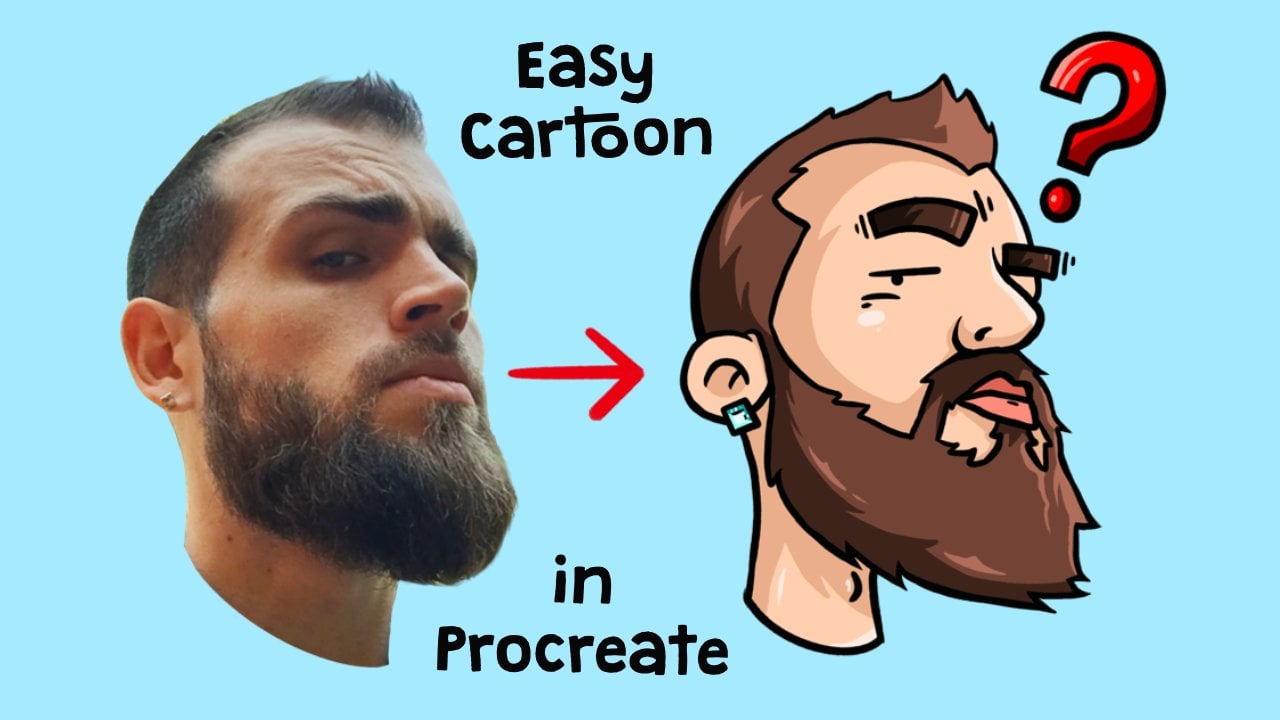
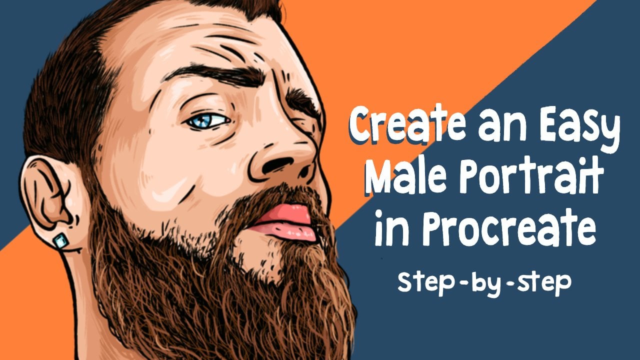
1. Introduction: Hello and welcome to another video. My name is Jay and in this class I'm going to teach you how to make an illustration in a photo. So it's going to be a little combat 40 with an illustration where they're really nice effect. In this video, you will learn how to make an illustration in photo and also how through shadow by using crisscross lines. So before we start, make sure that you have downloaded the photo, I also included the Prussian days project. If you want to use the same brushes, I do. Please also download that one.
2. Canvas + Photo: Okay, so to start, we're first going to import our photos. So we're going to be doing that by clicking on the photo. Once you have downloaded the photo, you can click on the folder link, go to where it is. And then we're going to be using this photo. And there you have it. This is the canvas that we're going to be working with. And now I'm going to do next step.
3. Lowering Opacity: All right, So now our photos imported. What we're going to do is we're going to lower our opacity. So we're going to be going to our layer. We're going to click on the end of the photo layer. And we're lowering the opacity to around 50 percent or 55. So that we can still see the detail of the photo and also are capable of drawing over it.
4. Brush: The next step we're going to create a new layer. So click on a plus in the layer section, the two little squares over in the top right corner. Click on a plus. There will be our layer, rename the layer and call it outlines. We're going to keep everything very organized. And then we're going to be choosing our brush. You can download the brush that I have included in this video. You can find that in the projects and resources section under in this video, I'm going to show a really quick how to import the brush full of people that don't know how to do that. We're going to click on a brush. We're going to be clicking on the plus and click on Import. Then go to where the brush is, where you have downloaded it. And it's going to be the crispy brush over here. So just click on that and will be important. Now just make sure that you have selected it. So if you go to your brush library and scroll all the way to the bottom, you will see the imported section is under the water. And so click on that and then you just click on the crispy brush.
5. Outlines Person: So now that we have chosen our brush, we're going to choose our size. Draw a little bit under screen to see what you like. If you're using your own brush, don't make it too thick to thin so that we can draw very nicely. And think like around 40 percent is nice, five is too much. So try if you're choosing my brush to go around three to 4%. Alright, so now what we're going to do is we're going to decide what we're going to illustrate and what, what, what are we going to leave as a photo? So I want at least a face and a little bit of the background. So we're going to be making a cut out by just creating like a line like this. Just like that too. And we're going to make another one on the bottom over here. So I'll just do that as well. Make it however you want it to, make it to wherever you want it. If you just want to do a little square in the middle and you want to just illustrate that. That is fine too. If you have your own photo and you want to do something totally different, go ahead. You're totally free to do whatever you want. I'm going to be doing this so that if I take the photo away, this is the only part I am going to be illustrating. So the middle point in between are like ragged lines. I don't know how to call it. So what we're going to do next is we're going to trace our image in-between our line. So we're going to stay on our outlines layer. While we're just going to do is we're going to trace everything. So we'll just use the brush and trace everything nicely. Dressed the sunglasses, if you're using my photo, if you use you're on, you're going to have to follow your own pattern, but just follow along the same way. Just like this. If you want to add some thicker and thinner lines, that's totally fine. I would recommend you to first light, just make the outlines and then later on you're just going to fix what you want to improve. So first you make the outlines and then later on you can just decide what you want to make it thicker. What you want to make thinner. If you want to make some point your lines or whatever it is that you want. For now, just like trace everything that you see and only stay in between the lines of the thing. Don't go out of here because that's going to be the photo. And that's going to give that nice contrast. And just have like a little bit of fun with this. And later also we are going to create some shadows. And it's going to make it look very neat. So make sure that you stay on the line of the nose. So if you go too much out of it, it will become a bit more too thick, or if you go too much in it, it will become too thin and will not really look like the person anymore that you're making. So let's try to stay in the middle lines, tried to find your lines really good. But don't worry too much about that. So when I see, follow all the lines that you see. And the lips. Same thing. Don't go too much out of it. They'll go too much in it. Because that's why we, for example, we don't want to use too much of a thick line because if we use too much of a thick line will become meddling too much. Believes very thick you see, and then it doesn't look like the person anymore. So we want to have it in a way that we can still make it a bit realistic but not too realistic of course. So what would the teeth, because we're making more of a cartoon, we're not going to make the teeth realistic. So what we're doing is just make a line like this. So if you have a folder where you also using teeth, I would just do recommend you choose to make the lines like that. And if you go out of it, you can always erase it a little bit. And there we go. Not too hard if you work like this. And it's going to be a lot of fun. And a tongue same way, not too complicated. We're not going to draw any details and make the rest just black like that. So you see here is there's still a little bit of eye roll. We can make an all-black as well. It's not too much detail in and let's just do the hair-like you could to10 way point is like this. Years hearing. Don't go too much into detail. Just make it as you see it. Because it's going to be even bid more for cartoony than a realistic illustration. And it's going to give it a very massive fact later on you will see once we're done, that you don't need to be super specific with the details. And the hair. Same thing. We're not gonna go too much out of it. We're just going to color it in, maybe just colored or black. Designer just color it black. Maybe make a one here like that. If you watched my other videos, you know how to do it. If you don't like, don't put too much pressure and just make a wavy line like that. So don't put too much pressure on the screen and just make a little wavelength, I could see it. It will create a little bit of a hair that's going out of it. All right, so now through it a little bit of joy over there as well. And then the neck. We're going to ignore that line of the sunglasses over here. We can do it a little bit like that. Very thin. I think the outlines are kinda take the most time, but after you're done with that, As long going to take too much time anymore. Now it still doesn't take a lot of time and just enjoy and have fun with your creation. It's going to be a lot of fun later on because you're not going to always do the same photo like I'm doing at the moment, but you're going to have like different people or maybe different photos that you're making. Him here, just color it in or block. Because we're only going to focus too much on the details. We're going to keep things very simple. In the neck. Just like that. Not too much detailing and bends of her top or dress. And then what is the dress? Right over here to bend over bag. And events from tourists that again, that everything just very quickly don't focus too much on detail, religious make the lines as, as quake and crispy as possible and you can always revise the lines later on. Just do it like that. Not too much. Don't put too much work into it. And there we go. Else doesn't have to be perfect. So I've liked your lines are not perfectly symmetric or anything that you you think it's not perfect. Don't worry about it. It doesn't matter. We'll see later on that it will give a nice cartoony effect by making things actually not perfect. Now, we're almost done with the outlines of the body. At least we're going to also do the background a little bit. There we go. A little bit loose fairs. So do you have it almost just a necklace. I see. Yeah. Just the legless. Also just draw it very simple. Circle in a circle. And just Lego as if you're making a cartoon. Too much detail. Not too complicated. Does like that. Mean if you would take the background away, you see that we now already have created our human being. Okay, so now created that, we're going to go to the next step which is illustrating the background.
6. Outlines Background: So for the background is basically the same thing. The only thing what we're going to do is it's going to not going to go even less in detail. So we're going to skip like things like brakes and everything that you see in the buildings. We're not going to focus on any of that. We're going to make things very simple and complicated and easy. Because what we're going to do is we're going to make sure that the person is going to be the one popping out of the screen. So we don't want the background to be looking too detailed because then our focus will be on the background and not on the person. So in this case, just draw things very quickly and just be messy. Don't worry too much about it. We go fix it later on. Like bushes, we're just going to draw the bushes like this. You see not too much complication. Just maybe it requires a little bit of practice if you don't really know how to, but just make them like this, how I'm doing. If you have a lack of background that is lesser detailed, reopening a selfie with not so much of a background, then you don't have this issue or issues. This is another part of the product, of course. And but if you see a tree or something in the background, you don't want to draw every branch in every leaf, you just want to keep it simple. So draw a tree like how you did as a kid, you know, like this and you have a tree for example. So draw it like that. So like this is the edge of the water, the reflection, flexion and same thing with the water. Just draw it like how you did as a kid, like the waves like this and like that. So now we come to the railing. The River. Very simple, same thing. Just draw it very quickly. Not too much detail. Don't worry about it. And as I told you before, the outlines are going to require some more time and some more attention. But after that, we're just going to have some messy fun. I like to be messy and my illustrations. Because I believe the more natural you make things, the more authentic it will be to who you are. And I don't believe that you have to be perfect for that. So do you have that edge? Still a little bit over here and then like that. So I'm not too much going on just like that. And you see it's very simple, but it's going to look nice later on when we're going to put some shadow in it. Even though it looks very simple, we're going to make it a bit pretending to look very complicated. So it has three same thing. Just draw what you see. Don't focus too much on it. Make mistakes. It really doesn't matter. The glands, thin lines, all good. And if you don't see very well, just improvise sometimes like didn't see the background very well because it's blurry. Just improvise something. Don't worry too much about it as long as it makes sense with, with the next part. So for example, here's a palm tree that's very long and so you just make it going on here, make it as long like this nothing more. And I don't know really what's going on over here. So therefore, like we improvise a little bit. And to make straight lines, you can just load the line. And when you hold the pencil on the screen, you can make the line like street and then you can decide where you want it. If you want to make like straight lines or anything like that, you do it, just do it like Earth. Not didn't, nothing too complicated. Okay, So over here there's another sort of war or something. I don't know. Ketones really see well on this background. That's okay. And don't focus too much on people either. Just see just some lines, improvise a little bit. Jocelyn trees. Nothing too complicated. It can also just leave things out if you want them worry too much about it. Because like it's more going to be about the contrast of the photo then about the details of the background. And you will see later on it will work out perfectly. Alright. Many people would think like this is not very nice. This is not how we illustrate or how we want to learn how to illustrate, but believe me, it's going to look nice. Same thing for the building. You think that you should have all the details correct, in order to make it nice and loud and that at all. Here we go. Just make it like straight. Color it in if you want some windows. Nothing too complicated. Said that many times already. Know Hagar smuggling the towers how you want it. It's okay. Same thing over here. And of course, if you use your own photo, it's going to be totally different than mine, but you will see that you have similarities. Okay. And poultry or rehear contrary, same thing, just focused on making it quickly and not too detailed. As long as it still looks like sort of a palm tree, you'll be fine. Don't worry too much about the beauty of it. And you can even skip some leaves if you want to because it doesn't continue in the next picture. So no problem over there. Like this. I don't see it very well, but and if you're using this picture as well, and I'm sure you won't see this very well either. Just create some images of buildings in the background if you want. Just some improvisation. Roots on windows whenever. Nothing too complicated. Again, at that, so many times this video on whatever. All right. And if you already have the hang of it by the way, and you're tired of me talking about the outlines. Go to the next step. That's totally fine if you find that this takes too long, I just want to do the entire process so that Ducasse that it doesn't have to take very long. And I don't want to skip too much about it and try to explain some things along the way. Also let me know. If you find that like I can do this faster if you want to skip forward, fast forward to my next videos or something. And what, what I, what I'm trying to do is not really what you want to see. Please let me know because I don't know, I'll try to be as helpful as possible. In this video, in this classes. Already done. Also just remain in the same layer by the way, I have it set at this, this is going to be all in the same layer and the outlines layer has separated into video because I wanted to be a separate subject because it's not the same as the person. And you see that it's going to be a little bit more, more rough, ER, rough illustrating. And that's just what it is. Do we have everything? Create some texture in it? If you want to improvise, whenever you feel like it's fun for you. What makes sense? Something doesn't have a good of really good perception and change it a little bit totally fine. There's like that. So in our next step, you will see that why it doesn't matter so much. Why we did it very messier. We skip some parts and details because we're going to make things a little bit more interesting with our shadow work. It's creating some buildings over here. Nope, I think that will do. All right, so now first take the background away. You see, even though it is very messy, It's still looks very nice because if I would put the photo in full for Guy, you cannot see it very well yet because we haven't put any color in it. But you see that it is already looking very neat. All right, so that was it for the outline step. Now we're going to do some shadow work. And after that we're going to color it. And we'll basically be done with the video.
7. Shadowing Person: Okay, So now we're gonna put in our shadows. So let's create a new layer on top of the outlines layer. So go to the layer section, click on the Plus, click, Rename and call it or not own land colored shadows. So if you've watched any of my other videos, normally I draw shadows with color, but in this case we're going to do it with lining. So what I'm going to do is we're going to zoom in on our photo real quick. And what we're going to do is we're gonna create lines in order to create shadow. So for example, you see the follow in the bottom. So do you see also where the shadows are going to be? We're not going to follow it exactly. But for example, the nose. What we're gonna do is we're going to lower our brush a little bit by 2%. And what we're doing is just making very sharp lines like this. Where a thin lines, you see a very thin lines. If I zoom in a bit more, you see that I met you in very thin and sharp line. So you can practice it a little bit on the outside. Just thin and sharp lines like that. And it goes one resume out. That's going to create the shadow of our illustration. We're going to do the same thing everywhere. You can do completely how you want to do it. You can do it this way. You can do it that way. You can crisscross it. Sometimes when there's a really dark shadow is indeed like nice for example, I'm going to give you the example in the tongue over here. To create a little bit, another line into another direction through it. You'll see it creates a little bit of shadow and light shadows. We just like to do it with one line only. Alright, so same thing under the lip. In this case, it might be nice too this direction. And just do it everywhere where you think there should be shut off even if there's no shadow. For example, if you want shed over here only you can do it like that. Just be very creative, just have a lot of fun with it. It's not going to be having to be very correct. It doesn't have to be like exactly how the photo is because it's going to be the contrast that the photo with the illustration. So it's really fun to make your own lines if you want to just follow along or do your own thing, be creative, it's totally fine and it's totally up to you, like in the sunglasses, for example, I'm just gonna do the lines very quickly and do it very messy. Don't focus too much on perfectionism. Just do it very quickly like this, like undoing some lines in there. And what I like to do with the sunglasses, same thing. Like do the lines like this completely through the sunglasses with a bit of a thicker lines. And you do that also in the other one. And just a little bit on the outside like that. Over here you see a thicker shadow. So you could do a little bit of a double line if you want. And chin, Same thing. A lot of shadow over here. Just like that. And just make it everywhere where you think there's needs to be Chateau, whatever you want. This is just for the person, for the background. We're just going to be your same messy and stuff. So we're going to be good. All right, so over here thing, there's some shadow, even though there's light, I'm going to create shadow there any ways to create some depth? For example, if you don't wear sunglasses, then I would really recommend you to look at how eyes look like because like ice have a bit of a depth. So you want to create a little bit of like lining in the ice itself or in the linings around the eyes. Just like this, just like that. I'm very simple. Just make it very quickly. If you want to create its own lining to, if you want to add some thicker, thinner lines are renowned learn every year and cannot speak at the moment. But everywhere you want, you want to create some more lining. You want to be a little bit more clean or whatever. Just do what you feel like needs to be done. And just do this everywhere. For example, this entire shoulders completely in shadow, but I'm going to just do part of it like that to create a little bit of contrast. You will see later on when recoloring everything. We're not really going to color color, but we're going to make everything grayish white and give it a nice effect. Here you see that there's a lot of lines. So what we can do is like we just make the lines very simple. Again. Try to make it go exactly how it is though. It looks like that not too much muscle lining in there. Over here. Also some learning all the way. I'm sure knows. Whatever you think is neat. Don't complicate it too much. Just do things very quickly. And just clean it up nicely wherever you feel like it's nice to feel like you want some shadow on the cheek over here. Just do it. It's totally fine. Because you see if I take the photo away now, you see that it looks very neat. Looks like very artistic. Alright, So those were the shadows of the person. Let's now go to the background. And after that, we're just going to color it and then it will be a lot faster.
8. Shadowing Background: Okay, so for the shadows of the background, we're going to do the same thing. We're just going to be a little bit more messy. So we're just doing it wherever we want. And just do it a lot more quick. In the edges into things wherever you think is necessary. Same thing as the photo, only a little bit faster and just don't let go there to there to be imperfect. Just there to be really fast. Because it will teach you a lot about illustration. When you learn how to be fast and things, then you're going to be less carrying and you have a lot more fun like it. Like children in other children make the messiest illustrations and they have the most fun. And that's what I'm trying to teach you because I believe that we are still children, children on the inside. That needs to have fun every London. Because what is live without fund, right? Speaking of like I'm Bob Ross or something, I'm totally not just believe in that kind of philosophy. And just do everything very messy. And worry too much, just there to let go. Really don't let go and just make things as quick as possible. See what I'm doing. I don't really care. I'm just letting go and leave a filling myself at the same time. So don't care what other people think of you either. Just have fun. And same thing as the other time if you are like having are tired of me talking, just go to the next step. If you know already what I'm talking about. You can see the next step already come in. Alright, so here we go. Darker things a bit darker. Just let go to their culture inner child. Don't be afraid to go out of the lines either, doesn't matter. It's all good. Quick lining. And that's how you create also the contrast of the illustration by creating a lot of messy lines like this here in there. Just do what you want to make some extra acid in there. See if I take the photo away, how cool it looks already. It's zoom in a little bit jagged, like it doesn't look like a perfect city, but it looks super cool to 22 to the, I write those messy. Alright, so, so link for the bushes to do it everywhere. Right, other side, same thing. Let's fill in everything. She wants a little darker spaces just colored in darker if you want to create some more contrast. And there we go. Now what is also cool like as to what to know is like not always going in the same direction of your lines. So sometimes go up a little bit, some kind sometimes go down and diagonally, horizontally, whatever you want. We'll try to switch it out to create a better contrast. You see what I do. Not always the same direction. It's a little bit more of an artistic feeling of not just the touch, crisscross. And also unlike I would like you to send me your own one that you have made, not this photo so that I can see if you understood completely what I mean when I talk about I would love to see your work as well. And if you want some comments on it or you want some advice on some things, you can always ask questions totally fine. Be free. If you want to see a specific video on a specific topic. Also, please let me know. Because I can only post one times a week sometimes have to make this issue. So what I want to give classes about. So that's why we'd like to know what you would like to learn. Just please let me know. When Windows is pretty wide, so don't try to show things that are very white. I may have speeded up in here and there's some videos from part of the video because I feel like you kinda understand what I mean. But for the people that don't, I want to keep on going and so that they really understand what I'm talking about. And what I'll do just fast, not carrying what's going to happen when it, if I make mistakes, snow prime would be there. I think it's very easy to do this because basically we're tracing an image embryo even not being super specific and perfect about it. So I don't think, I hope at least that you not having too much complications with it. If you do, please let me know, then I underestimated this project a little bit, but I believe you can do it. Now. The shadows and the water just created who? It's too thick. Just like this little criss-cross, not too thick. Same thing over here. Because the water is had been more wavy. We can just make some more wavy shadow lines. But do I feel all right, so now the edge of the railing of the water to the leg, this over here, just make some lines. Radar, right? I think we're almost done. Some water here. And I'll show you right now how everything looks. If I take the photo away, it looks really awesome, doesn't it? Now we're doing live super cool. You can even revise some things if you want, but basically, we have done it already. So this is the entire outline. We're now going to color it really quick, and then we're going to be done.
9. Coloring: Okay, We're going to call red right now and we're not going to really color it by using really colors. If you want to do that, go ahead. If you want to learn how to make colors, please watch it another video of this, because I want to keep this one short so I don't want to go too much into detail of coloring completely like colors color, color, color, color, color. Sorry for that one. So I'm going to do it. Black and white, grayish. That's why we already created the shadow with our cross lines so that we can just keep it black and white so that it will give a really nice contrast with the color of the photo and the white of the inside. So what we're going to do is we're going to click on the layer. And we're going to click on the plus so that the colors is going to be under the shadows and outlines. We're going to rename it to color. Not all our color. There we go. So what we're going to do next is we're just going to grab white. So white color. If you want to do that in values, make sure that all the RGB are in 255. You've got to value and you do everything into our 55, that there'll be completely white. So what you do is just to fill in by dragging the white to the screen from the top, you hold it, you swipe it, and you fill it in. That means is the entire field is now white. So what we're going to do next is when I click on the outlines. So click on the outlines so that this thing will pop up and then you click on Reference. So what we're going to be doing next is we're going to go back to our color layer. We're going to choose our selection tool. So does this one is S over here. We're going to click on automatic. That's on the top, on the left one. And then you click and hold, click and hold. Click and hold. And then you see the percentage and let you just do as much as possible without it going outside of the lines. So, so as long as much as possible. That is not in our illustration. Just like that. You see? That's also like it. Do it also on the other side, we're after our selection, we're going to click on our painting tools so that it will be selected. We're going to have our three fingers. We're going to hold our three fingers on the screen and swipe. And now it's erased. So now if you open your photo again, you'll see that everything is white. Now you have erased this two parts of color that everything is wide. So if we first sample would raise the opacity of our photo to the full 100 percent. You see that it doesn't bother us anymore. Now it's completely white in the middle, and we already have done that. So now for the next tab, we're going to create a new layer on top of this one, on top of the color. We're going to call it detail. Just call a detail. Or we're going to do next is we're going to click on that layer and we're going to choose clipping mask. What this does is now for example, we're going to pick a grayer color and not too dark but a little bit grayish. And we're gonna go select a brush like, let's see what's a good one and it's fun to use. Let me see real quick. No idea. Which tail. Yeah, that's that's used wedge tell. Watchtowers in vintage and then you choose which we all have it. It's all installed in our program. So vintage, which tail? And the inducer is a thing and like what it does now it's like it colors only the parts, as you see. That is on the bottom layer, so add more color more. But because we have put a clipping mask, it will only call it a part of that white of the layer under it. But we're not going to color it completely. What we're gonna do is we're going to hold it very slightly, so don't push it very hard on the screen. We're kind of hold it very slightly and just color it in like this, like this, like this grayish effect. And C so that you get a little bit of texture, texturize the fact I don't know if you see it very good on the screen. But it's a bit textured. So every noun, wherever you want. If you find it too dark, you choose white again and do the same thing. And just create some texture ligers. See by clicking and just having some fun with it. This will create a little bit more of an art, artistic feeling. So that when we've gone to the next tab, we're going to be like having a lot of fun. Okay? So now we have done that. Well, we're going to do is we're gonna go to our magic wand over here in the top left corner. We're going to click on that. And we're going to choose halftone. So overhears halftone. And we're going to click halftone layer. And what this does is it will create the dots. You see. It gives it a little bit more of that comic feeling. And by swiping on the screen, you can just see the, you can decide if you want really big ones, which I don't like. I like tiny wants to create a lot more contrast like this. You can also choose other effects like screen print. If you want, that will make it a little bit more white in this case, in normal case, it would create a lot of colour. Newspaper creates completely white and chooses the color from the bottom layer. But for this case we're just going to full color so that all the edges and details are really popping out. Swipe with your pencil or your finger to a size that you like into your liking depends on the photo because this photo is maybe a bit bigger or smaller than your photo. It might be different than yours. So like just play around with it until you get a right sizing that you find attractive in your illustration. All right, So I like it smaller like this. And there you have it. That's our illustration and it's really simple, it's really fast. And this technique of coloring makes things very, very quick and easy and also very interesting.
10. Thank You!: So thank you all so much for watching. I hope you learned something from it. I hope you enjoyed this video. Let me know anything that I can do better or anything that you want to learn. If you have any other questions, please feel free to ask. I'm always be there to answer it. I will not always answer right away because like, I'm not always on Skillshare, but I will definitely answer all the questions that you have. So thank you so much for watching guys and I'll see you in the next one.
 Jeroen Van Wel, Let's get creative!