Transcripts
1. Introduction: Let me tell you something, I am a professional graphic
designer and I don't draw. [MUSIC] Yes, you heard me, I don't draw, at least not
in the traditional art form. I can take a paper and draw an amazing real-life
piece of art, which is what to draw
means to most people. But what I am really
good at is vectorizing. My name is Naila. As a designer, I specialize in editorial
and surface design. Back in 2008, I took a
humorous drawing class that taught me the
skills to turn a sketch into an illustration. Now I look at it and I see so many things that
can be improved, and that is exactly
what I have been doing for the past 14 years. Since I graduated from my Graphic Design
bachelor's degree in 2009, I have worked with vectors in almost every single
project I put my hands on. Whether if I'm working
with businesses, government agencies, or non-profit organizations, I always end up working
with vectors. I can vectorize a photo to
use it in a poster design, or vectorize a simple sketch to use it in a
book cover design. I have even used these
skills to vectorize some elements of a logo and then use them to create a cohesive editorial
design for magazines. Or even this artistic nature, to use this as a short
film poster headline. The possibilities are endless. If you're someone who would
like to learn the skill to transform your photos and
drawings into digital art, but are not sure about
the right tools to use, this class is for you. For this class, you don't
need any previous knowledge, we will go step-by-step with a clear to-do list
after each lesson. I will teach you how and
when to use the Pen Tool, Pencil tool, Paintbrush tool, and the Blob Brush tool. You will also learn
about the image tracing feature inside
Adobe Illustrator, all while vectorizing
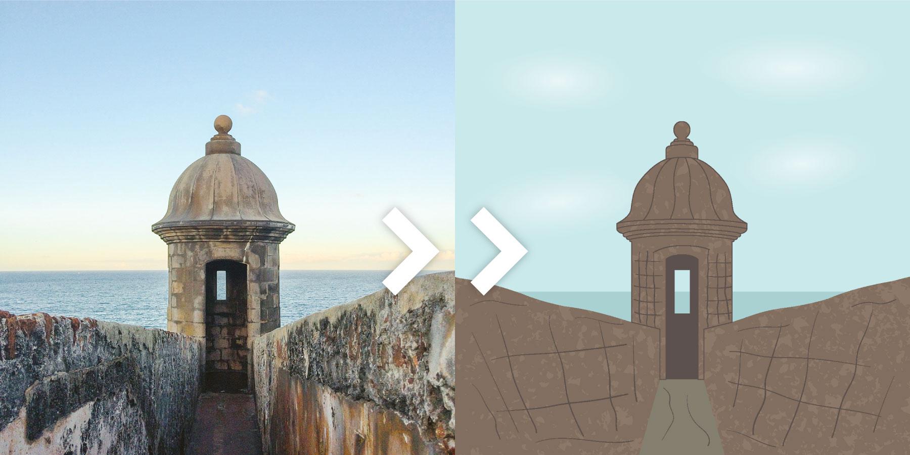
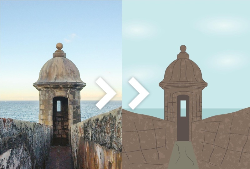
and one photo I took a while ago of
[inaudible] Garita, which is the most
iconic element of the world historic site of a
model here in Puerto Rico. You can download
the Garita photo and another photo call Textured, which is actually
the sidewalk of my neighborhood in the
resources section. Feel free to step outside
and take your own photos. Other than that, you will need the program Adobe Illustrator, for which you can find
the link to download a free trial in the class
description below this video. I will be using a Pen
tablet to teach you how it can help you in your
vectorization process. But having one is not
essential for this class. Learning to vectorize will
give you the freedom to create unique designs
in your own style. Edit them as many times
as you want and make them any size that you need
without losing its quality. Not to mention that this
skill will also make you a problem solver and consequently
a better designer. At the end of this class, you will be able to
vectorize anything you want and show your unique artistic
voice in the ego art. See you in the first lesson.
2. Class Project: For this class project, you will create your
very own digital art. Projects are a great
way to learn hands-on, and this class project is a step-by-step that you can
follow along with me. I even share with you the same images I
will be working with. First, download the free photos to vectorize in the
resources section. To find them, go to the tab
below this video where it says Projects and
Resources. Click on it. Then go to the right side of the page where it
says Resources. There will be two images, one called garita and
another one called texture. There is a third one
called practice sheet. You will also find a
PDF with the list of the most useful shortcuts that I will be using
throughout the class. I suggest that you have
it in hand while taking the class so you can
reference it as you need. Go ahead and download all the resources for
you to use later. If you prefer, you can use a photo and or hand
drawing of your own. You will then create
a new document in Adobe Illustrator and
place your image. If you have never worked with Adobe Illustrator, don't worry. I will teach you step-by-step
so you can follow along. Right after that, you
vectorize your photo using the drawing tools that you will learn in this class. You will then export your image and share
it on social media, use it as an element
in an editorial design or even upload it to an
online store to sell. The options are unlimited. Show your project in the project gallery for
all of us to enjoy. Just go to the same
Projects and Resources tab, then go to the
right and click on the green button that
says Class Project. There, you can
name your project, share your process and images
with all of the community. Let's go to the next
lesson to begin our class.
3. What Is a Vector: Let's start with the basics. What is a vector after all? It is very easy to
visually differentiate a vector from its
opposite, a raster image. A raster image is created out of small squares called pixels. The best example
is a photograph. A vector image is
an artwork that is created using
points and lines. These are called paths. Those paths are
editable for you to move to wherever you
need and create a shape. Adobe Illustrator is a
vector-based program, which means that you can
create vector images in it. When we convert raster
images such as a photo you took to a vector is
called to vectorize, which is what we will
learn in this class. If you're interested, I have
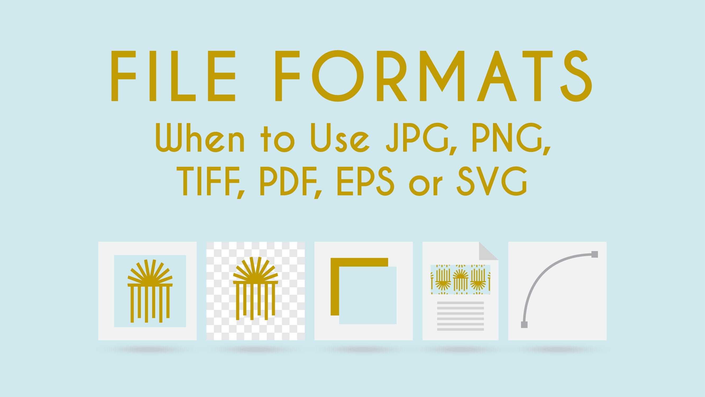
a Skillshare class that explains the differences between a vector and a raster
image in depth, and the most common file
formats and their uses, it's called file formats, want to use JPEG, PNG, TIFF, PDF, EPS, or SVG. You can find it in
the class description or my Skillshare profile. Creating vector images is very useful for
three main reasons. First, when you need a high-quality image
in a variety of sizes, for example, a logo. A logo is a design that can be placed in a small business card, but also in a big car wrap-up. But it's one of the most
important characteristic of a vector that once created, you can increase its size with
a loosened image quality. As is often the case with a
raster image, such as photos, that if the image is very small, when the large innate you
can see blur squares, that means that the
photo is pixelated. Vectors use
mathematical equations to adjust the size of a shape. This keeps its quality. The second reason
why vectors are useful is that you
may be designing something that you don't
know the final size yet and are afraid that you
will need to do it again. For example, you may
be an artist who creates artwork for
licensing or sale. Let's say that you
created an artwork in an 8 by 10 inches size, but then you get the
opportunity to use that same artwork in
a 24 by 32 inches. You can easily make the adjustment without
losing quality. The third reason
is that a vector allows you to create an
image like no other, from a simple illustration to a very detailed one with
sheets, patterns, and texture. You can create anything you
may need for your design. Now that you have a clear
idea of what a vector is, let's go to the next lesson
where I will teach you the programs and tools with which you can vectorize a photo.
4. Vectorizing Programs and Tool: In the past lesson,
you learn what is a vector and three
main benefits of it. This lesson, you will
learn the programs and tools that with which
you can factorize. If you do a quick search
on the internet by factorizing programs,
you will find a few. But in this class we
will be focusing on the industry leading
vector graphics software, Adobe Illustrator. Adobe Illustrator is a
vector-based program which makes it different
from Adobe Photoshop, which is the raster
based program. Photoshop is a powerful program in which you can create
amazing artwork, but illustrator is better
suited for illustrations. That is the reason
why it exists. If you have never used
Adobe Illustrator fear not. In the next lesson, I will open it and
set up my document so you can see how
to do it yourself. But first, let's talk
about tool I have used for years now.
My Wacom tablet. Whenever I work
from my computer, I always use it even
when I'm not designing. Using a computer desktop
mouse or track back for too long can cause
me pain in my hand. Once I started using the
Wacom tablet with a pen, that pain went away. There are many brands out there with a variety of price range. You just need to do a
research by pen tablet. My first one was a smaller one, a Wacom bamboo pen and
touch many years ago. It doesn't even have Bluetooth. You have to plug it
directly to the USB port. They don't produce
this line anymore. I updated a Wacom into spro
medium a couple of years ago. They also produce it in small and they have a
bigger one in large. But I have found
that the medium size to be very comfortable. Whenever I'm working
outside of my office, I take it with me the smaller one because
it is easier to carry. As you can see, there's
a variety of sizes, styles, and prices
to choose from. You will find that using
a Wacom tablet and a pen will help you to
take the most out of Adobe Illustrator
tools that we will be using this class
because you will have more control and
it will feel more natural as if you were
drawing on the paper. Also, a Wacom tablet
gives you access to precious sensitive tools that you can't use with
a normal mouse. These days it's
becoming more and more popular to use the iPad and the Apple pencil to create artwork and for a good reason. Apps are becoming more powerful and you
can create designs from start to finish
and send it to production all within the iPad. A great example of that
is the Procreate app or the recently launch
Illustrator for the iPad app. Still most people first by a computer and then an iPad
because let's face it, an iPad is an investment and although you can create
amazing work with it, I will still see it
as a companion tool, a great companion, but still, I still need my
computer to finalize some work and store
and manage files. If you would like the experience
of drawing by hand and buying an iPad and Apple Pencil is not an option right now, a Wacom tablet may be
an option for you. There is a link to
the Wacom website in the class description. This is not an affiliate link, it's just to make
it easier for you. Let's go into the next
lesson to select the image that we will be vectorizing
later in the class.
5. Select an Image to Vectorize: In the past lesson, you learned about Adobe
Illustrator and pen tablets. Before we create our Adobe Illustrator document
to vectorize, first, let's make
sure that you have all of your assets ready to go. In the resources section, I have uploaded two
photos that I will be using in this class in case you want to
follow along with me, but feel free to vectorize
anything you want. Personally, I have vectorized many iconic elements from different countries
for client work, but also from my own
country of Puerto Rico. For example, a
couple of years ago, I was designing the poster for a short film festival held in the near
town called Rincon. That town has one of the most iconic
lighthouses of the island. I had a picture from
the lighthouse, so I look for it, place it, trace it, and there it was, a vectorized version of
the Rincon lighthouse. You can also create
a hand drawing and use it to vectorize it. You can be a very
skilled artist in hand drawing or not. I am not. Look at this comic book project I did more than 10 years ago. It was for a humorous
drawing class. My hand drawings
are very simple, but my vector skills transform this to a completely
different outcome. Now I look at it and I see so many things that
I can do better, but this was the first
time I worked with vectors this way and I was
so amazed by it. If you choose to use a drawing, just take a photo of it and
transfer it to your computer. Once you're ready and before
diving into the next lesson, download or search
for the photo, you will vectorize and
save it in a new folder. In the next lesson, you will open Adobe
Illustrator in your computer, set up the document,
and place the image.
6. Set Up Your Document: In the past lesson, we selected and saved
in a new folder the image that we
will be vectorizing. In this lesson, you will set up your Adobe Illustrator
document in your computer. We are now inside
Adobe Illustrator, to the left you can see
the new file button. You can also open previous
illustrator documents. You can go to home
where we are at and here you can see some presets if you double-click any of them, a new Illustrator document will open with those specifications. You can also see
recent documents that you have been working with. If you go to learn, you can see tutorials to
the right of the window. In the file section, you can see any
files that you have saved in the Adobe
Creative Cloud. If you have any files share with you and any deleted file
from the Creative Cloud. Let's go to the new file
button and click on it. The new document
window will open. At the top, you can see
presets that you can choose from and there are
also more for mobile, web, print, film and video, art, and illustration. Let's go to web because
we're going to be working with an image that is only going to be
shared on digital, it's not going to
be print for now. Here you can see presets and underneath, there are templates. Again, you can double-click
and edit them. Many of them are free so you
can take advantage of that. To the right, we have the preset details and we're going to be working
with that now. The first thing that you
have to do is change the name of your document for whatever you
want to name it. I'm going to call
it vectorization. Underneath you can see the units that you
can be working with. I'm going to choose
inches because that's the measurement that
I'm most familiar with, but you can choose
whatever you like. Now I'm going to
to set the width and the height of my document. In this case, I'm going
to use 10 by 10 inches. To the right, you can see the orientation
of your document. In this case, it doesn't
affect our document because it's a square and to the right of the orientation
you can see the art boards. For now we're going to work
with only one art work. We'll leave that at one. Underneath we have
the bleed options and because we're working
with a digital document, we don't need a bleed. This is for printing only. Under the advanced options, we have the color mode, which because we're
working with a web preset, its RGB, which is the right one, because again, we are
working with digital. Underneath we have the
resolution of the document. I always like to
work with 300 PPI. We can always edit this
while exporting to JPEG, you can choose a
lower resolution. But I always like to have the highest one when I'm
working with the documents. The preview mode just
leave it to default. Now we're ready to work with
our documents click create. Now here we are. We have our
document ready to work with. But first let's go to file, save as, this
window will prompt, you can choose,
don't show again, or just leave it as that
it will always ask you, you can choose to save it in the Creative Cloud or
save it in your computer. In this case, I'm going to
save it on my computer. I'm going to look for the folder that I'll
be working with. You can rename it if you
like it and click "Save." Leave this windows as it
is, and click "Okay." It is very important
to remember to always save your
document after you do anything because things happen and the program may
crash or something, you can work around it. If for any reason your document looks different than mine, maybe the background color is lighter or things
are not in place, maybe you need to go to your
preferences in the Mac, that's Illustrator
preferences in the window that will be
on Edit Preferences. Here you can make
a lot of changes, particularly in the
interface area. Here you can choose the color, how it will look. I have mine in the medium dark because it's
the one that I'm used to, and the one that I like. But you can change that here. You can change the scale of your illustrator document
and many other things. If by any reason your document
looks different than mine, probably you need
to change something here in the preferences. I'm going to click "Okay." Now you have your document
ready to start vectorizing. If you aren't familiar
with Illustrator, I have a few words for you. Don't get overwhelmed. It may look confusing, but once you begin to use
it, everything makes sense. This class we will focus on specific tool so you can
create your digital design. Your to do for this lesson, is to create your document, choose your preferences,
and save it. In the next lesson, I will
teach you how to place your image in the documents
so we can begin to vectorize.
7. Place an Image: In the past lesson, we set up our Adobe Illustrator
document preferences and saved our document. In this lesson, we will focus on the tools which
are located at the left of the program window
that are used to create. At the right, there are panels which are used to
edit our creations. At the top, we have the
Control Panel which changes your options depending on the tools or panels
that you are using. Let's begin by
placing our photo. We're now inside
Adobe Illustrator and there are two ways that
you can place your image. First, you can go
to File, Place, or use this shortcut and it
will open this same window, and you can look for the place that you have your picture, double-click, and open it. But my favorite way is
to just drag and drop. I just open my folder, click, drag over
Illustrator, and release. Here I have my photo. I'm going to zoom out because the picture is bigger
than my artboard. That is command minus
or control minus. I'm going to click over it, drag it, and try
to centralize it. I'm going to use
these small boxes over here that you can see. I'm going to click on them, press "Option" and "Shift" on my keyboard so I can
make it smaller, but proportionally, so it
doesn't go crazy the image. We're going to do
a little bit more. I'm going to centralize it. If you need to for some reason
move around the artboard, you can click this "Spacebar" and the Hand Tool will appear. Once you release it, it will go back to the tool
that you had selected. This is a very useful tool. If you're learning any
shortcut, learn this one. The spacebar is such as helpful shortcut because
while vectorizing, moving around is one of the things that you will
do the most. Trust me. This will become such
a natural workflow for you that you won't even think
about it while using it. Now I have my picture
placed in Illustrator, I'm going to click on
it and I'm going to open my Transparency panel. If you don't see the panel
that I'm working with, you can go to window, and here you can see all of the panels that
Illustrator offers. Whenever I open a panel
and you don't see it, you can go to window
and look for it. I'm going to set the
transparency of this image to 75 because this will help us to see better
when we're tracing. If some pictures may need more
transparency than others, so you play around with whatever you feel more
comfortable with. Now, because we're
tracing an image is just like if we're
tracing with a paper, you will want to lock this
image because if I don't, and I create something on it and I don't lock
the image behind, I can move it and you don't want that because
when you're working, again with tracing, you don't want to move the
image behind it. I'm going to delete this now. There are two ways that
you can lock this image. First, you can select it
and go to "Object" "Lock" "Selection," Or you can use Command 2 or Control
2 on windows. I'm going to select
it "Command 2", and now it's locked. Now whatever I create, if I try to select the image
in the back, it won't move. But this is problematic when you want to export
your illustration. Then you have to unlock
the image behind it and move it to the
side or delete it, and I don't want that
because I want to have the control to edit my illustration if I
need to go back to it. [NOISE] That's where
my preferred way to lock an image is by creating a new layer to make
my drawings and leaving my photo in a
separate layer locked. Then I just turn the
layer visibility off without the need
to delete the photo. Let's see how that works. Now, let's unlock this image. I'm going to go to
"Object" "Unlock" or "Option" "Command 2" and
it will unlock your image. My preferred way to
lock an image is to lock it in a separate layer. Let's open our Layers panel. Here you can see they only have one called Layer Number 1. Let's double-click on
it and rename it Photo. Click "Enter" then
go to the square at the bottom with a plus sign and you are going to
create a new layer. A new layer will
always be created on top of the one that
you already have created. Now go to the photo layer and move to the left
between the eye and the photo name and click in that square and you
see that a padlock appear. That means that now
this layer is locked. If I want to create anything, you see the pencil with
a circle with a line? It means I can't
create anything here. I need to move to the
other layer that is not locked so I can
create stuff on it. From now on we will be working with the
Layer Number 2 that we're going to rename Vector. [NOISE] Now, whenever I create something on top of my photo and I need to remove the photo,
I don't have to delete it. I just go to this eye icon and turn it off and I can
see whatever I have created, and I can turn it on to
keep on working on it. I know many people don't
like to work with layers, but I love them. Layers are a great
way to organize your work especially if you're working with a lot of elements. Renaming layers is very
useful if you're sharing this file with another
designer or printer provider. It is easier for them
to find what they need. That's it, now we're ready to begin vectorizing this image. Before you go into
the next lesson, make sure to first
place your image, lower its opacity,
create a new layer, and rename the layers
Photo and Vector. Unlock the photo layer. See you in the next
lesson where I will be teaching you
about the Pen Tool.
8. The Pen Tool: Straight Lines : In the past lesson, we place the photo that
we will be working with in the new document
in Adobe Illustrator. Let's begin with our first tool of this class, the Pen Tool. In this lesson, I will teach you the technical aspect of it because the Pen Tool is one of those tools that
people love or hate. You hate it when you
don't understand it, but once you do,
you just love it. Without doubt, the Pen Tool
is the most famous tool in Illustrator because with it you can create whatever you want. The Pen Tool creates
anchor points. When you have two or
more anchor points connected by a line, it's called a path. When you create curves
with the Pen Tool, they're called Bezier curves. In this lesson, we will
focus on the straight paths. Now we're back in Adobe
Illustrator and they have created a new document and
they have placed my Pen Tool practice sheet
and I love this image. In this case, editing created a new layer because we're
only working this as a practice and
just a simple work is not a complicated
illustration. To the left, we can
see the toolbox. You can see the many tools have a small triangle to the
lower-right corner. That means that you
can click and leave the mouse there for a couple of seconds and you can
see more functions. Here, you can see,
we have the Pen Tool and its functions which is
the add anchor point tool, the delete anchor point tool, and the anchor point tool. To the right of them, you can see a parenthesis. This means that
this is a shortcut. If you press P on the keyboard, you will get that Pen Tool. The plus sign will get the
add anchor point tool. The minus, the Delete
Anchor Point tool, and Shift C, the anchor point tool. If you keep moving
to the right in this border and you
release your mouse, you will get a
floating window with all of the Pen Tool
and its functions. If by any reason you don't see the same tools that I have here, you can go to the
bottom of the toolbox, so these three horizontal dots. That's the Edit toolbar. Here you can access all of the tools inside
Adobe Illustrator. The gray ones means that you already have them
in your toolbox. The other ones you
can just click them and drag them to your toolbox. Or you can drop also
from your toolbox to your old tools windows to eliminate them
from the toolbox. When working with any drawing
tool, like the Pen Tool. The best practice is to set your fill to none and select
a color for your stroke. This way it will be easier for you to see
what you're doing. If not, the program will auto-fill your shape
towards the interior, making it difficult to
see where you're tracing. By default, you will have a white fill and a black stroke. You can click on top of any of them to bring them forward. Then you can click the
non-fill underneath, which is the white square
with a red line over. But for these, I prefer
to use the shortcuts. If you press the letter
D on your keyboard, you will get back
to your default, which is the white fill
and the black stroke. You can use the letter
X on your keyboard to bring forward
whichever you like. You can click the
forward-slash to set the one that is
in front to none. This arrow over here will
swap your fill and stroke, meaning that if I click on it, now my stroke is set to
none and my fill is black. You can change that in your
keyword with a shortcut Shift X and it will
do the same thing. The Adobe programs are
all about practice. Once you do something
many times, it will come more
natural to you. You will do it before
you can think about it. Remember that in the resources
section of this class, you can find a PDF with the most useful shortcuts that can really speed
up your process. Make sure you have selected
the Pen Tool if not, go to the Tools and
click on there, or press the letter
P on your keyboard. The course are meaning the arrow that moves
when you moves your mouse will tell you
what is ready to do. In this case, we have the icon of the Pen
Tool and an asterisk. If you will like a
different approach, you can press the Caps Lock on your keyword and
you will get an X. Some people prefer this
because it's more precise, but I will keep using
the traditional one. Now, I'm going to zoom in by using the command plus sign. I'm going to use my
space bar to access the hand tool and
centralize my image. Once I release it again, I go back to the Pen Tool. That's why the space
bar is so useful. Now I want to click and release my mouse and I'm going to
move the mouse around. You can see a small box to
the right of my cursor. That indicates the distance
between the point I just created and the
place where my cursor is. Right now that measurement
is in inches because that's the unit measure that it shows when creating
the document. If you show
centimeters or pixels, it will show you the
distance in those units. I will continue to
move my cursor to the shape of the one that I'm tracing right now
in that practice sheet. If you press Shift
on your keyboard, you will make sure that you're creating a straight
horizontal line. While you keep Shift press, if you move your mouse up, you will create a 45-degree. Or if you keep moving up, you will create a
straight vertical line. I am going to create
a horizontal one. I'm going to click. I'm going to go up and I can press Shift to make sure
that that line is straight. I'm going to click and then I'm going
to move to the left. As you can see, a magenta line just appeared. That is a smart guide
that Illustrator have. So that means that the point
that I'm going to create is perfectly aligned with
the point at the bottom. I'm going to click and release. You can see that
if I keep moving, I just created the shape
that I wanted to trace. But if I keep moving my mouse, the Pen Tool is still selected. If you want to
leave the Pen Tool, you can press Escape
key on your keyboard. Now I can create another shape separate from
the one that I just created because the Pen Tool
will be still selected. If I want to stop
using the Pen Tool, I can press the V key on my keyboard and it will
change to the Selection tool. Now I can select the path
that I just created, move it, or do whatever
I want with it. You can also press Enter
on your keyboard to change your cursor from the Pen Tool to the
selection tool. But I always press
Escape or V because they are to the left of my keyword, which is the hand that
I use for shortcuts. I want to move my
right hand away from my pen tablet as
few as possible. Little things like
this will help you to become more efficient
while working. Right now whenever I
have my path selected, you can see that the line, and if I change to the
direct selection tool, the anchor points
are color blue. You may have another color, you can change that. You can go to the
Layers panel again, you can double-click
on top of the name. Here you can see that you can choose whichever color you like. There's also a drop-down. You can select the one that
you prefer and click "Okay". Sometimes depending on the color that your line or shape are, the color of your
layer could make it difficult to see
the anchor points. So changing the
color is helpful. Now I'm going to
press the letter P on my keyboard again to
access the Pen Tool. You can go to either of the open anchor points and you can see the
asterisk change to a line. This means that you can click on that anchor point and keep creating from it,
as you can see. Now I'm going to move to the other open anchor points and you'll see that
a circle form. This means that
if I click there, I will have closed this shape. I'm going to press V on my keyboard to change
to the selection tool. Now I have a close
path. I can move it. If I change the fill
and the stroke, you can see that
I have a square. Let's go back to the
way that we had it. I'm going to press the
letter B on my keyboard. I'm going to zoom
in a little bit so you can see better
what I'm doing. If I select my Pen Tool again and I go over
any area of the path, you can see that the cursor
change again to a plus sign. That means that
if I click there, I create a new point. Anywhere I click, I keep
creating new points. If I decided that I
don't need one point, I can go over any of them, and the cursor will change
again to a minus sign, which is the delete
anchor point. At this point, I'm just only moving my mouse over the path. I'm not making any
selection on my keyboard or shortcut or even in the toolbox. If I click in this icon
with a minus sign, I will have deleted that point. Now, I have changed my shape. If I select the Direct Selection tool with
the letter A on my keyboard and I click
on any of these points, you can see that now it's
blue instead of white. I can move that point. I can change again to Pen Tool, Create another point, create another point,
and another point. Change to my direct
selection tool. I can keep editing the same
exact square that I created. I can keep editing it. What if I decide that after
I created this shape, I don't want to close anymore. You're going to choose
your scissors tool. That's the letter C
on your keyboard. You can see it here on
the keyboard is selected. You can click on
any anchor point. Then select your
direct selection tool with a letter A, click again. Now I can move and
I have an open, I don't have a closed
shape anymore. I have an open path, again. If I decide that I wanted
to join these two points, I can click on the endpoint, press Shift and click
on the other endpoint, and then you keyboard
press Command J. Now those points
will unite again. These are the basics
of the Pen Tool. Practice them and they will
become your best friends. In the next lesson,
we will be using the Pen Tool to
work with curves. But before, makes sure to
download the practice sheet and play around
with the Pen Tool and its functionalities. Create points, add
points to the path, delete points from the path. Use the direct selection tool to move points independently. Use the scissors to two separate a closed path and
joined two points by selecting them with
the direct selection tool and using the
shortcut Control J. Then go to the next
lesson to create curves.
9. The Pen Tool: Curves: Now you're getting familiar
with the pen tool. So far, we have learned a
lot about how it works by creating a square and editing it with the pen tool
functionalities. Now, we're going to create
curves with the pen tool. As we have seen so far, both the selection tool and
the direct selection tool, are very useful when
working with vectors. Remember that you
can select a move any object in Illustrator
with the selection tool. The shortcut for that is the
letter V on your keyboard. You can select
independent anchor points with the direct selection tool. The shortcut for that is the
letter A on your keyboard. Now, let's go back
to Illustrator to the Figure Number 2 to create some curves
with the pen tool. Let's start to
create this figure by creating an anchor point, and I'm going to
move to my next, the end of my shape. I'm going to click
and drag and you can see that I have now handles, which if I use the direct
selection to the letter A, I can move them. I can edit this shape until they have
this shape that I want and as you can see, this is pretty tight. I'm going to delete
this and start over. When creating curves,
what you need to do is at the moment that you
create your first point, you're going to click
without releasing and drag. These are the handles
of the pen tool. You're going to move it towards the area more or less that
you want your curve to go. Now, you can see how I can preview how my
curve is going to go. Now, I'm going to
click at the end of this tracing exercise and click again and drag
without releasing. Now, I will release. Now, you can see that my shape is more similar to the shape
that I want to create. You can go back to your
direct selection tool and move things around. You can edit again
this anchor point, and this one over here until
you get your desire shape. Now, here we have our Shape Number 1 and
the Shape Number 2. If by any reason
you want to make a straight line to a curve or
a curve to a straight line, you just need to use
your anchor point tool. Click on there, and move
towards the anchor point. Click and drag. Then they have transform that straight line
or corner to curve. The same thing here,
if I wanted to change this curve
that was triggered, I just click and click, now I have a straight line. If I have a straight line, I can go click again and drag, and I can create the handles. That's the way to use this tool. Let's go to Figure Number 3 now. I'm going to set the pen tool, I'm going to click and drag. Click and drag, and
click and drag. If I want to make any
more edits, I can click, I can press the letter
A on my keyboard and make any adjustments
that I need. We should have whenever you
move the handle at the left, you will edit the
path at the left, that you previously made. If you move the
one at the right, you will affect more
than one that you just created to the right. That's how it works. Let's
move to Figure Number 4. I want to select the
pen tool, again. I want to click and drag, click and drag, click and
drag, click and drag. But now, I don't want
to create a curve. I want to create
this straight line. I'm going to click on my last anchor point
and you'll see that as small arrow
changing the cursor, meaning that I'm going
to create a corner. I want to click
there and now we can create a straight line. You can see that
with the pen tool, everything is editable. As long as you practice, you will be better
predicting worded shape will go depending on where
your anchor points are. I know that this is a reason most people give up
using the pen tool. They just get frustrated but not getting the shape
they want to create, but give it time and practice. Before going to the next lesson, trace Figures 2, 3 and 4 of the Practice Sheet. Edit Figure Number 1 to change corners to curves
and vice versa. Once you have practiced and understand how the
pen tool works, go to the next lesson to start vectorizing your photo
with the pen tool.
10. The Pen Tool in Action Pt. 1: In the past two lessons, we learned how the
pen tool works. We trace practice shapes to get to know the tool and shortcuts. Now, we're going
to put that into action and start
tracing their photo. Let's go back to Illustrator. Now we're back in Illustrator file that we created before. The first thing that I'm going
to do is to make sure that my fill is set to none
and I have a stroke, I'm going to change it to red. If you double-click
on the stroke, you will open the color picker. I'm going to choose red because
it's a color that really make contrast with our image
and it's easier to see. Now, I'm going to
click on my "Layers." If I click on my "Layers" now, you will see that the color
palette will disappear because when you have
stack your panels, you can only have one
panel open at the time. If you want to see more, you can click on the arrows
over here and click, "Expand panels" and you
can see more things, but I like to have mine
organized this way. Let's go back to our layers
panel and make sure that I'm working with my vector
layer, not my photo. The ones that I've
highlighted is the one that I'm working with. First, I'm going to press
"Command R" on my keyword. You can see that my
ruler appear here. You can also do that
in view and rulers. In this case it says, "Hide Rulers" because
I just created it. But if not, it will say, "Show Rulers" and
what I prefer to use the shortcut because
obviously it's faster. Now, the ruler you can drag from the corner and change
where the zero starts. If you want to start for
any reason in another area, that is not the corner
of your project, you can do that. In this case, I'm going
to leave it in the area. I'm going to, "Click and Drag" to the corner
and I will have my zero or my documents
starts, my artboard starts. I'm going to Zoom out a
little bit, "Command minus". Now I can drag from the
ruler and create guidelines. In this case, I don't
want my guideline to be all over the document. I'm going to press, "Command Z" on my keyboard. I'm going to select the
"Artboard tool", click here. Now you can see that I have
selected my art board. This way is the way that
you can change the size of your artboard or any other
thing related to it. But now I'm going to drag
from my ruler to my artboard, to the middle of it, using the rulers looking up. I can see that now I
am in the center of my image I'm going to release. Now I know I can press, "V" on my keyboard. Now I know the
center of my image. Now, I'm going to go to
my photo layer and click, "Unlock it" and move
my photo to center it. I'm going to lock
it again and go back to my vector layer. You can hide or show
guidelines in view. Guides, you can hide them, you can unlock them and delete them using these shortcuts also, but also in the view guides. Now I'm going to
select the "Pen tool", make sure that I
have it selected. I'm going to Zoom
in to start tracing our biggest object with
widgets. The Garita. I'm going to start
here at the bottom. I'm going to Click, press, "Shift" because I
want a straight line. Click again, press, "Shift", go up because
I want a straight line. Click. Now I'm not pressing Shift because I don't
want a horizontal, a vertical, or a 40
degree angle line. I just want to a line
with more control. I'm going to Click. Now
I'm going to go up, press, "Shift" because I want a
vertical line and click there. Now I'm going to Zoom
in using the command plus or minus whatever
you need at the moment. I'm going to use my Spacebar
to access the hand tool. These area, you can
see that it has curves and straight
lines and I'm going to trace it now and later
and we'll go back to make some changes. But for now, I want
to make a curve, so I'm going to go to the area that I think
is the right place. Since I'm looking at it and it's the shape
that I want to do, I'm going to, "Click and
Drag" to create a curve. Now I'm going to Click, I want to create a
small horizontal, straight line. I'm
going to Click. Now I'm going to go Click, Drag. I want to create now
a straight line, so I'm going to Click
my last anchor point. Click, now I want
to create a curve. I'm going to "Click and Drag". Now again, I'm going to create a straight line so we need to click on my last anchor point. Create a straight line. Now, I'm going to
create another curve. I'm going to, "Click and Drag". Now I want to create a
straight line again, so I'm going to click on
my last anchor point, pressing Shift to help me. I'm going to create
a vertical line. I'm going to click and release. I'm using my Spacebar again
to access the handle. Now I want to create a curve, so I'm going to,
"Click and Drag". I'm going to keep
using the hand tool, I'm going to create
another curve here. "Click and Drag" using the
hand tool with the space bar. "Click and Drag"
again, the spacebar. Click and drag a little bit. Now, I'm going to go back
to my last anchor point. Click to create a straight
line. I'm going to click. Now I'm going to move to
the next point that I want. "Click and Drag"
to create a curve. I want a corner now again, so I Click my last anchor point. Move up, Shift, Click. Now I want another curve, so I, "Click and Drag". Now I want a corner, so I click my last anchor point, Shift, create a line, and now I move to the
next point that I want and I, "Click and Drag". I click again, my
last anchor point to create a straight line. Press Shift, Click. Now I'm going to create a
curve so we move along. I create Click, Drag to create a circle,
and continue on. Click, Drag to
complete that circle. I'm going to Zoom out
to see 100 percent. I'm going to press on my
keyboard, "Command zero". Now I'm going to press, "The letter B" on
my keyboard because I am done for now
with this cheap. Now, I want to continue and create this
door in the Garita. This so-called door. I'm going to Zoom in again. This is an area that
I start my tracing. I'm going to press
again, "The letter P" access, the pen tool. You can see the line. That means that I can click
there and continue creating. I'm gong to go up, use Shift to make sure that this
is a straight line. Click. I'm going to
move to the center. I'm using my guides here to make sure that I'm
in the center. I'm going to, "Click and
Drag" to create a curve. Now I'm going to Zoom
out again, press, "The letter B" to access
my direct selection tool. Now I'm going to work
with this area over here. I'm going to Zoom
in to this section. As you can see, my tracing is a little bit different
than the photo, because if I follow the photo, it won't have much sense. But now I'm looking at it and it's not exactly what I want. I'm going to select the direct selection
tool, "The letter A". I'm going to click
on this point. Actually, let me change the color of my guides
so you can see better. I want to change
it to green okay? This is exactly what I meant when I showed you how
to change the color. You see now I can see better the shapes that
I'm working with. Now I'm going to
move this around, I think that this
point is extra, so I'm going to press my
keyword, the minus sign. I'm going to delete this point. I'm going to use again
on my selection tool and keep changing it. Now I have a better
shape to my taste. You can change it
however you like. Over here, we can also make some adjustments to
make it look smoother. You can see that the
pencil gives you complete control over
your illustration. Now I have the shape
as I want it to. Maybe I want to make
some changes here, want to look from far away, make this more rounded. You can keep editing
as you like until you feel you are happy
with your creation. But now I want to
copy this area so I can have what we can
call a perfect shape. I'm going to select my path, press the "Option"
key on my keyboard. You can see how my
cursor has changed from a black arrow to a black
arrow with a white arrow. That means that now I'm making a copy of what I
just had selected. While I have the
Option key down, I'm going to press
"Shift" and keep dragging so it doesn't
move up or down, it keeps in the same level. Now, I'm going to release
my mouse and my keys. But now I need to reverse this. I'm going to press the
letter "O" in my keyboard, press "Shift" in my keyboard, and I'm going to drag to the direction that I
want this shape to look, I want to look to the left, so I drag there. If this is complicated for you, you can also do it while
having selected your shape. You can go to Object, Transform, Reflect, and there you can choose vertical
and click "Okay". Now you have changed your shape. Now, I'm going to drag it, pressing "Shift" so it
doesn't go up or down, the closest that I can
to the other shape, more or less to the center. Now, I want to remove my guide. I can go to View, Guide, hide guidelines so this
doesn't bother me anymore. Now, I'm going to zoom in. I know that even though
they look together, you can see that if I
go over with my mouse, it's not one shape, they are different shapes. I'm going to select my direct selection tool on my keyboard, the letter A. I'm going
to drag over this area. Even though I can't see it, I know that I have
selected both sides because I can see that
the path is selected. On my keyboard, I'm going
to press "Command J". Now, this is one shape. You can see it because
I am selecting it. I select it and I can see
them in both sides selected. I'm going to go down to
the area over here that I know that this area
is not closed. You have to close every
anchor point that is open. You have always two open paths, first one and the last one. This is our last one. I'm going to use the
direct selection tool, drag over it, and press on
my keyboard "Command J". Now, if I use, again, my direct selection tool, you can see this is one shape. Now, if I swap my fill, I'm going to hide my photo, here we have the
shape of [inaudible] I'm going to turn on again this, I'm going to do over my object. I'm going to lock
it, "Command 2", and then I'm going
to trace this wall. I'm going to select
again the pen tool. Going to click here. I'm going to do the same thing. I'm going to press
"Option", "Shift", drag. I'm going to press
"O" on my keyboard, press "Shift", drag to the left. As you can see, sometimes
that can happen, it can go crazy
with the shortcuts. If that's difficult for you, I'm going to delete this
and do it another way. I'm going to select this wall. I'm going to press "Command
C" on my keyboard to copy just as we do even
in Microsoft Word. I'm going to go to Object. I'm sorry, Edit, Paste in Front. Now I have the
exact copy of this. I'm going to press "Shift" and drag because that's easier. Then I'm going to go to
Object, Transform, Reflect. Choose vertical, choose Okay. Now, I'm going to place it in the right place using Shift to make sure
that it's aligned. If for any reason it moves
and it's not aligned, you can just select both walls and look for your
Align panel and choose vertical to the bottom or to the top and make sure
that they are aligned. Now, I'm going to use
the Pucker Tool to add a little bit of character
to my wall vectorization. I'm going to select
the wall here, I'm going to zoom
in a little bit, and I'm going to look
for the Pucker Tool. Again, if you don't see it, you can go to the
three horizontal dots, edit tools, and find it. It looks like an X with
arrows all around it. Now, with my shape selected, I'm going to go to
the border and click. You can see how the
path is changing. It's created a new
anchor points. I just want to add a little
bit more of character because this is an old
structure that I'm vectorizing. Got to use my selection tool, select the object, again, the Pucker Tool. We can drag. You can see that the walls are not
super straight, they have more character. I'm going to hide my photo so we can see better
what we have done so far. So far so good. Now, we can see better
what we have created. I'm going to File, Save, and save it before going
to our next lesson. Before you go into
the next lesson, trace your main object into
the photo and save it. In the next lesson, we
will continue to work with the pen tool and add some
accents to our vectorization.
11. The Pen Tool in Action Pt. 2: In the past lesson, we
used the Pen tool to create our main
shape, the garita. Now, we're going to keep using the Pen tool to
create some accents. Now I'm going to go
to my Layers panel, and I'm going to
create a new layer. I'm going to
double-click on it and rename it Accents/Brushes, because in this layer, I'm going to work with all of the lines that
I'm going to make. As you can see, it's also green as the path will be green as
with the vector layer. I'm going to double-click on
it and choose another color. I'm going to choose magenta. Now every path that I
create have that color. Then, I'm going to go
to my Vector layer. I'm going to select everything. As you can see, my
garita still works, so I'm going to go to Object, Unlock All, I'm going
to select everything. I'm going to swap my fill
color, it's a nice job. I'm going to turn on
my photo layer so I can see better what I'm doing. I'm going to make sure that the photo layer is locked and that the vector
layer is also locked. I'm going to select the
Accent/Brushes layer. I'm going to zoom in. You can also make your
panels a little bit smaller. There you need that. Just
drag when the arrows appear. Then I'm going to
create lines over here. Just to create a more
accentuated border. For that, I'm going to
use the Pen tool again. I'm going to make sure
that my stroke color is a different one than red. I'm going to choose green. Now I just zoom
in to see better. I'm going to click
in this corner. It doesn't affect the red path because it's locked
in another layer. If I would have this
in the same layer, that would be a problem
because I would be creating another point in this path
instead of creating a new one. I'm going to click and drag. Now I'm going to go to the
other side, click and drag. Now I have that line. I'm going to click
Escape in my keyboard. I'm going to click and drag
again, click and drag. If your artboard
moves like that, it's because you don't have
too much space and you're moving the mouse,
it doesn't matter, just release it and if
it doesn't look right, you can always use
the selection tool, click on the point, and manage the handles
here in this side, or in this side, however you need to. I'm going to press
Escape in my keyword, I'm going to press the P for
the Pen tool again, pen. I'm going to click, click again and drag. This one I want to fix
it a little bit more. Then I'm going to create another
one and to press Escape. Choose the P in my Pen tool, click and drag, click and drag. This will move a lot. This happens because
I'm so zoom in. If I would be a little
bit more zoom out, this won't be happening, but I just want you to be able to see better
what I'm doing. But it doesn't matter because
as you can see everything, you can fix anything. Now I'm going to create
another one from here and I don't have a corner, but I'm going to click
and drag and press Shift. I have the same level
as the one at the left. Click and drag. Now I can use the direct selection
tool and work with this. Now, it looks a
little bit better. I'm going to do the
same thing over here. But first, I'm going to select these green lines
and I'm going to select Control Command
tool to lock them. When I am using
now the Pen tool, it doesn't bother me. I'm going to click, I'm going to click and drag, click and drag. Here you can work with. If you don't see the
handle to the other side, like in this case, you can just go back to
the anchor point tool, click and drag, and you will
see the both of the handles. I'm going to select again
the direct selection tool. I want to edit the
previous paths, so I'm using this
tool, this handle. Now I keep working with it. Now I'm going to use
the curvature tool, which is similar
to the Pen tool, but you have to make two points, and after you create them, you can just click and drag, click and drag, and is another way
to create curves. I find that in this case it's not that useful, I will say. But in some instances it might. But I prefer to use the Pen tool always because I
have more control. I'm going to select
this, press Option, Shift, Copy, press the letter O, press Shift, drag to the left, press V to use my selection
tool and move these similar, but it looks like a
reflect from this one. Now I'm going to
create this over here. Click Escape. Then I'm going to
create lines here. I'm going to click
and drag, Escape, click and drag with shift to
help me here in these lines, we can drag and then I use
the direct selection tool. That's that. Now I have
these lines ready to go. We're now done
with the Pen tool. I want to celebrate yourself for learning
to work with it. Many people hate or
fear the Pen tool, but in reality is
that they don't understand how it
works. Now, you do. Use the practice sheet
from Lessons 8 and 9, as many times as you need until you get
comfortable with it. Before going into
the next lesson, trace any lines that you need to add more definitions
to your vectorization. Remember to always
save your document. In the next lessons, we will learn about pencil, paintbrush and Blob Brush tools.
12. The Pencil Tool: In the past two lessons, you learn all the ins and
outs of the Pen tool, which is one of the
most powerful tools inside Illustrator. Now I'm going to teach you about the most familiar tools in
any drawing program or app. Well, even into our daily lives since
gets the pencil tool, the paintbrush, and
the blob brush tool. At first, they look as if
they do the same thing, but the attributes
are different and you can use them to
create different results. Let's start with
the pencil tool. Now we're back in our
Illustrator document with how we finish our last lesson with a vectorization
of the data, and now I'm going to
create a new artboard. I'm going to open
my art-board panel, again, if you don't see it, go to Window and look for the art board there, artboards. Now I'm going to go
to the plus sign, on the lower area of the panel I'm going to click New Artboard. As you can see, I have, art board number one that
I can even rename and name it vectorization, and the second one
I'm going to name it test because we're going to test two different brushes here. If you select the Artboard tool, you can see that you
can click on top of any of them and move them. I'm going to move the test
one a little bit farther. It doesn't have any issues
with the artboard number one. I'm going to press the V key on the keyboard to have
the selection tool. Now I'm going to go
back to my toolbox, and I'm going to
look for the pencil, blob brush, and
paintbrush tools. Again, I have them
together because I have arranged them that way. I'm going to put
the window folding, and if you don't see
them, you can go to the edit toolbar
and look for them. As you see when you
click on top of them, on top of that tool, you can see that the paintbrush, the shortcut is P, the Blob Brush Tools is Shift B, and the pencil tool is N. For now we're going to work
with the pencil tool. Again, we're going to
change our fill to none, and we're going to leave
our stroke in black. I'm going to make sure that
I'm in my vector layer. As you can see, the
cursor half an asterisk, meaning that I can
start working. In this case, I'm going to
also use my Stroke panel. I'm going to set the
stroke of 10 points. We can see better
what we're doing. I'm going to zoom
in a little bit, and I'm going to click and drag, and create a path. There you go. This is our pencil. I can use the letter a in my keyword to use the
direct selection tool, I can click on any of
them to select them. This is the one that
I have selected. I can move this however I like. If I double-click
the pencil icon, I get the pencil tool options, and the first thing that
we see is the fidelity. If I move it to the left, which means accurate, our path will have more
points, more anchor points. If I move it to the
right, which is smooth, you will have less
anchor points and the image will look smoother. Here we have some options, and we're going to go
through them right now. Luckily, lowercase to
explain them to you. If you check the box, fill new pencil strokes. What I will do is that
it will always feel a color here as we said in the previous lesson
that we don't want that. I have it unchecked because no matter if I have a color fill, I'm going to unselect this. It doesn't matter if I have a fill color when I
select the pencil tool, it will automatically set it to none which is what I want. I have that option not checked. Then non selection
is Keep Selected, which means exactly this, that I created something,
and it's selected. If I uncheck that,
it won't happen. If I trace something,
it will be unselected. Option key toggles
to smooth tool, smooth tool is another
option that you have inside Illustrator
which do exactly that. It creates a smoother
line with less points. The selected path
means that if I have this path selected and then from this point
I move to the side, it will edit that path,
and I can do that. If I unselect that, I won't be able to do that. This is how the
pencil tool behaves. As long as you get familiar
with the pencil tool, and start working and
you got your workflow, you may want to make changes to the selection so they
work better for you. Just as with the preferences setting I mentioned at the
beginning of the class, if your brushes are not behave
in the same way as mine, probably you have different
settings than mine. Before going into
the next lesson, play around with the pencil, and make your selection
in its options. In the next lesson, we will learn about
the paintbrush tool.
13. The Paintbrush Tool: In the past lesson, you learned about
the pencil tool. Now we will dive into its
brother, the paintbrush tool. As I said, these tools
may look similar, but now we're going to dive into an interesting twist
with a paintbrush, which is the pressure
sensitive setting. We're back in Illustrator. I have the pencil tool selected. I'm going to trace a line just to show you
something later. I use the Shift to
make it straight. Now we're going to work
with a paintbrush tool. For these tool, we're going
to use the brushes panel. I'm going to open it because
I don't have it open here. This is the brushes panel. I'm going to go to this
three horizontal lines to the upper right corner. I'm going to go down
to Open Brush Library, then I'm going to go to artistic and choose artistic paintbrush. This will open another set
of brushes that I can use. I'm going to select
the first one. Whenever I select a brush
from these options, it will appear automatically
in the brushes panel. I'm going to drag
and you can see that this brush looks different. I can still use the
direct selection tool. Click on any of the
points and move it. I can even select this
line that I traced with a pencil and apply another
brush as you can see here, and you can still
make changes to this. I can use the pen tool options and select that plus sign and I can add points to this line. I can also use the minus to
eliminate anchor points. The main difference between a pencil tool and the paintbrush tool is that
you can style the appearance. As you can see, pencil just do straight lines and
the paintbrush can do different styles. You can even have
transparency with them. As I said, you can apply
it to a pencil trace. Also after you make
your selection, you can go to Object,
Expand Appearance, and it will transform your
what it used to be a stroke, like over here you have
a stroke, to a shape. Now, I can change the border. I can. But now you
see it's no longer. If I select the
one on the right, the left is a stroke. You can see here in the colors. If I select the one that I
just expanded, it's a fill. I can add a brush border as
you can see here to a fill. That's something that
you can work with. I can still use the
direct selection tool to choose points here
and edit this shape. This is useful just
to use as a base sometimes to create a shape and then you can edit over it. Now I'm going to close this
panel and I'm going to drag this one to my doc here. If I leave it, if you
see the blue line, this means that I'm going to
drop it independent there. If I move it into a group, it's going to be part of this
group and then they have access to all the panels
at the same time. That's how that behave. If you double-click on
the paintbrush icon, you access the same
similar options. The fidelity works the same way. Accurate, you will
have more points. Smooth, you will have
less anchor points. The fill new brush strokes
behave the same way. Right now, I have a fill of
black and a stroke of none. If I trace, I will ultimately have a non-fill
and a black stroke, which is what I liked. So I have that not selected. The keep selected works the
same way as the pencil, which means that I have created a path and then it keeps selected so I
can keep working on it. The edit selected paths, which I have also selected, is the same way as the pencil. I can drag from any point
and redirect that path. Now I'm going to select
all of this and delete it. Now I'm going to use
the calligraphic brush, which are these are the
top of the brushes panel. You can also go to the
three horizontal lines. Go to Open Brush Library, artistic, artistic calligraphic. Here we have similar options. But for now, I'm going
to select one of them. I'm going to select
and double-click on a calligraphic brush. Here you can see you
have different options. I'm going to change
the size to 15. In this drop-down menu, I have different options. Depending on if you have
a mouse or pen tablet, you will see more or less
options available for you. I'm going to choose pressure
and then I'm going to change the variation here and look
over here what happens. I'm going to set the
variation about endpoints. You can see that when
I'm doing less pressure, I'm going to have this size. When I'm doing more pressure, I'm going to have this size. I'm going to click "Okay". No pressure, more pressure. I'm going to do it the
other way from down to up. No pressure, more pressure. This happens whichever direction
you choose to do this. Also, you can use the
direct selection tool and make changes to this brush. If you don't have a pen tablet, I'm going to click on this brush again and I'm
going to choose random. I'm going to click "Okay" and I'm going to say
"Apply to Strokes". You have to choose
that. Now this strokes changed to random
instead of pressure sensitive. I'm going to choose
my brush again. It doesn't matter
the pressure that I'm given to my pen
in this case or, in your case, your mouse. You will get different
width or size of the brush, and it doesn't have anything
to do with a pressure that you are using
in your mouse. This is a way to
get a variation in your brush if you don't
have a pen tablet. But now you get the
idea of the benefits of a pen tablet if you
have access to one, so you can do more
controlled strokes. Before going into
the next lesson, practice with a
paintbrush and make your preferred functions
in these options. If you're using a pen tablet, change the options to pressure. If you're using a
traditional mouse, change the options to random. In the next lesson,
we will learn about the blob brush tool.
14. The Blob Brush Tool: In the previous two lessons, we have worked with the
pencil and paintbrush tools. Now let's talk about
the blob brush tool, which behaves a little bit
different than the others. We're now back inside Adobe Illustrator
and we're going to work with a blob brush tool. I'm going to select
it in the toolbox. As you can see, a circle around
the cursor of the brush, and I'm going to
use in my keyboard, the opening bracket
will make the brush smaller and the closing bracket will make the brush bigger. I'm going to trace here
something and as you can see, this is no longer a path. This is a closed object, and you can see also
because it's swatches, the stroke is non and the fill is the one
that is in black. I can again use the direct selection
tool and move points. I could use the minus key in my keyboard and
eliminate points. I can use the plus
sign and add points. I can even use the scissors, which is the letter
C in my keyboard and click on any point, then use my direct
selection tool, and now I have created a path because I can change
it and now it's an open path. I'm going to press "Command
Z" to undo all of this. As the other tools, if I
double-click on the icon, I get the blob
brush tool options. Keep selected means the same as the pencil and
the paintbrush. It means that once I create
a shape it's still selected, merge only with
selection if I shut that means that if I
trace over this shape, it will merge together, but if I create another one, and then I go over this one, it's a different
shape, is not merging. If I choose uncheck that box and then trace over
this one, it will merge. This one is not selected, I trace over and it merge, and that what it means. I always have it unselected
because that's my preference. Fidelity means the same as the pencil and the
paintbrush, to the left, more accurate you will have more corners and more
points to the right, you will have smoother
lines and less points. In this area we're going to work just as with a paintbrush. They have made some
selections here, 30 points. I'm going to be working with
a size of their points. I'm going to choose pressure and the variation of 20 points. The angle I'm going
to use 114 angle. I'm going to choose the pressure to 30 percent and the roundness, I'm going to choose 65 percent. Make sure I have pressure selected and the
variation of 30 percent. In all of the changes
you can see how it will look over
here at the top, I'm going to click, "Okay" I'm going to select everything
that I did here. Delete it just
like in the brush, and I'm doing no
pressure, more pressure. No pressure, more pressure. No pressure. Again, you can keep
working with this, and you can see how it works. If you don't have a pen tablet, which is the one that allows
you to work with pressure, you can just choose random. Here, I'm going to choose
this one fixed, fixed. I'm just tracing lines without making any
difference in the pressure. I'm working right
now as if I was working with a normal mouse, and you can see that it have as a variety of
thickness every line. You can double-click again on the Tools option window and play around with
these numbers and make changes and
just try and try again to see until you get
the result that you want. Now you can see the advantages
of using the pen tablet. Having the functionality
of pressure-sensitive can allow you to add more
character to your work. Before going into
the next lesson, open that blob brush tool
and practice with it. Change the options
to the ones that you prefer and try the
pressure options. If you're using a pen tablet, change the options to pressure. If you're using a
traditional mouse, change the options to random. In the next lesson, we will put these
brushes into action.
15. The Brushes in Action: In the past three lessons, we learned all about the technical aspects
of the brushes. Now, let's work with them. In Lesson 11, we
used the pen tool to add accents to
our vectorization. Now, we will continue to
work with the same layer. We're back where we left
our vectorization before with our accent/brushes layer. In that same layer, I'm going to add now some accents with
the Blob Brush Tool, which is the tool
that I have chosen to use because it's the one that
I have more control with. I'm going to select
the Blob Brush Tool, and I'm going to make some
changes in this area. I'm going to use a
size of two points and a variation pressure
of two points. The angle is going to be 150, reduce this pressure again
here and a variation of 30. The roundness will stay in 65 and a pressure in
the variation of 35. I'm going to click Okay. I am going to zoom in. Make sure that I am
in the right layer. I'm going to try to create
this effect of bricks. I'm going to start from the top. I'm going to click, make
some more pressure, make less, make more. Then you can see that I
have created that line. If you don't like it, you can just select it, delete it, and go again. Click. Make more pressure. You just keep going doing
this through all of the lines that you will
like to have accents. [MUSIC] You can turn off your
photos so you can see better what you're doing and
if you're happy with it. Now, I'm going to create
some lines in this walls. The photo is a reference. You going to have
to do exactly as a photo because it will
probably don't look that great. You have to just work around it and use it as a reference. [MUSIC] You can move around
lines, rotate them. You can even turn off this
one to see it better. In this case, you see this
line here that goes up. I don't want that. I'm going to zoom in
and use the minus in the keyboard to access
the delete anchor point. Then we're going to work around. Here, I'm going to use the
Direct Selection tool. With all the tools that we
have been working with, you can go around
and move things. This is slob. I'm going to unlock it. We're going to move
it more down here, so it fits the same thing here. I'm going to go perfecting my illustration to the best of my abilities or to make it the
way I want to look. Now, I am ready to color
this illustration, to put some color on it. But before, remember,
go to File, Save, or use your keyboard
with Command S or Control S. Before going
to the next lesson, choose the brush of your
preference and trace the details of your image that will
benefit of a hand-drawn style. Don't forget to
save your document. In the next lesson, we will put some colors
to our vectorization.
16. Color Your Illustration: So far in the past lesson, we have worked with
the drawing tools to vectorize inside
Adobe Illustrator. Now, we will select colors
to tune up our design. Now we're back in Illustrator, and we're going to
color our illustration. The first thing that I'm
going to do is to turn off the visibility of our
vector and accents. I'm going to unlock
my photo layer, select the photo and set
it back to 100 percent. Now, to decide, I am going to create some squares and copy them with all of the tools that we have
taught previously. You can make as many
squares as you need. Then you're going to select
one square and select the eye dropper tool
in your toolbox. You're going to go around your photo selecting,
making color selections. This can take a while, because we're very
picky our colors. But the important
thing is that you have dark colors and lighter colors. So we can have contrast
in our vectorization. Once you have made
your selections, I have made mine
already previously, so I'm going to
already copy them from this other document, and then going to paste them. These are the colors that
I'm going to work with. I'm going to go to my swatches
and because I paste them, they are already appear here. They automatically were
added to my swatches. But if you are creating them
just there in the document, you just need to
select them all. Go to the three
horizontal lines over here and go to new color group. You can name them whatever you want or you can just
leave this standard name. Make sure that convert process
to global is selected. This means that your
colors will have this small white triangle in the bottom right
corner instead of these others that don't
and then click, ''Okay''. This is important. You can delete these or not. But it is important to
create them global, because if now I double-click in this square and it's global, and let me set preview and then change this color to this, I don't even have
this square selected, but it change color
automatically. Let's say that you place a color to your vectorization and then you say, you know what? That brown is too brown, well, you can just double-click there and make a change
here in the window. Click ''Okay'', and your
vectorization will be updated. I'm going to go
back to my color. Now I'm going to go back to my photo layer and then I am going to lock it and
turn off the visibility. I'm going to turn on
the visibility of my vector and accents brushes. Now, I am going to
place the cover first in my vector layer. I'm going to select
everything in my layer and I'm going to swap the fill and have
the stroke set to none, and I'm going to
select this brown. Now, I'm going to lock this layer and then I'm going to unlock the accents layer. Remember that we created these
lines with the pen tools, meaning that as you
can see here in the swatch, these are strokes. These down here are fields because they were done
with the blob brush tool. What I'm going to
do now is to select it and go to object, expand, click ''Okay''. But I noticed that I don't have the border as an accent
and I want that. I'm going to unlock
the vector selected. I'm going to select the garita, as you can see here. I'm going to copy that garita, lock my vector layer, go to my accent's layer, and go to edit, paste in front and
as you can see, is there, I'm going to swap
the color and the fill. I'm going to select the fill
to bring it to the front. I'm going to select
the same green. So now I have my
accent as a border. I'm going to select the object, expand and now everything
in the accent's layer, it is a field. How do I know that? I know that because look at this
stroke, it has non-fair. I'm going to go
to the fill color and it has a question mark. This means that maybe
the green that I use at the top is different than the green that
I use at the bottom. That doesn't matter because
I have everything selected. I'm going to select
the darker brown. Here you go. Now I
can see my accents. Now, I am going to work with the background of
this illustration. I'm going to go to the layers, create a new layer, drag it between the photo and vector because
it's the background. If I create something
and it is at the top, it means that it's going
to cover my illustration. I'm going to select
the rectangle. This will be the sky. I'm going to choose
this light blue. Now I am going to
choose another one and create the ocean. I'm going to select
this turquoise. Now I am going to create
the interior of the garita. If you remember the
garita had a window, so I'm going to create
something here. I'm going to split
it another color and I'm going to select
that red rectangle with the background. First, I am going to go to the align panel and I am going to choose the
horizontal align center, and then I am going to go to the Pathfinder panel and
use the minus front. Now, I'm going to change this brown or a darker brown in this case because
this is the inside. There you go, you can see
that I have a window going to lower the ocean view
and this is a sky. Now I am also going to do the floor and I will
make it background. Now I have the sky and you can see it's definitely
looking much better. If you move the photo to the top of photo
layer and turn it on, you can see how your
illustration is looking. Now I'm going to create
some clouds here, I'm going to use the pencil. I am not in the right layer. That's why it creates something
but it doesn't appear and they have the circle with a line saying you
can create here. I am going to select the background layer which
I haven't named yet. I want to double-click
and rename it background. I'm going to create a cloud. I'm going to go to my swatches
panel, select ''White''. But I don't want
this cloud to be this by contrast with the sky. I'm going to zoom in, I'm going to select it. I am going to open
my gradient panel. As you can see, I'm going
to put it over here, mucositis so we can see better
where we are working with. If I click here, it's going to apply that
default gradient to my cloud. But in this case, I
want a radial gradient. I want to make cloud to
go from white to a blue, the same sky blue that I have. So it looks smoother
like a transition. In this case, I know that
this is the blue from my sky. I'm going to click ''Drag'' and leave it in
this black circle. Now that color change. Now, my cloud still looks like not that smooth and we're
going to work around that. I'm going to select
the gradient tool. As you can see, this is the area that the gradient is applied to. I want to make it a little bit smaller that the area
that I'm working with. That way, it looks better. You can keep adjusting here, where the colors are this bar
here is the same like this. If you move it further, you can see how this
square is also moving. I wanted to look
smooth like that. Now, I will continue to create
more clouds and playing with the gradient until I
get the results that I like. Before going into
the next lesson, create your own color palette and bring to life
your vectorization. At accents, use ingredients
such as the clouds. Don't forget to
save your document. In the next lesson, we
will add texture to a vectorization using
the image trace.
17. The Image Trace: In the past lessons, we have trace and
color vectorization. But now, we will work with a feature that is a
little bit different, the image trace, which allows you to
convert raster images, such as a JPEG, to a vector. The first thing that we
need to do to work with the image trace tool is
go to our Layers and make sure that we have
everything locked, except the Vector layer. I'm going to zoom out, and I'm going to bring in
my photo of the texture. I'm going to drag
it, drop it here. You can adjust it to the
size that you prefer. Now, with the picture selected, I'm going to go to
the Options menu up here and go to Image Trace. This will take a while depending on the capacity
of your computer. Now, I have the texture
picture that I had. It is vector technically. I'm going to go to this
small icon over here, which is the Image Trace panel. I'm going to click there. Here, you can see many
things in this panel. Over here, you can see different presets that
are similar to this one, but in the drop-down,
you have more options. Let's go to high fidelity
photo to take a look at this. But every time you're
working with image trace, everything that you
select takes a while, even if you have a powerful
computer, so be patient, make sure that every step
that you make something, you save your document so you don't lose information or work if the program crashes. Right now, you can
see that it looks technically the same
as our picture. But if we zoom in, you can see that
those are vectors. This is the magic
of the image trace. This will happen with any
other picture that you use. You can get the idea that
this is a very creative tool. But we're not using this
as a high-fidelity photo. We're going to use the default. But you get the idea
that you can play around with this for a long time. In the View section, you can decide which way you want to see your
tracing results. I'm going to the default. I want to work in
black and white, but you can choose
grayscale or color. If you choose Color,
you can even limit the amount of colors
because imagine, a photo can have hundreds of
colors to create something. Vectorization so complicated. You can limit the amount of
colors that you can use. The threshold is something
you can play around. If you move it to the left, you will have less
texture or color. If we move it to the
right, we will have more up onto the point that is really dark because
everything is selected. I'm going to set it to around 160 because the black sections are the textures that I'm
going to be working with. The white will be transparent. I'm going to click here to see the drop-down of the
Advanced options. I'm going to leave the
path to 50 percent, the corners to 75 percent. If you leave your mouse
on top of the words, they're explaining
what they are, but you can also move them
around and see how they work. But keep in mind that
every time you move something to one
side is going to take a while to show
you the results. Here, I will have
more pointy path. Here, we have smoother paths. I'm going to leave the
coordinates at 75, the noise is going
to be 25th pixels. I am going to select
the averaging. Think of this as the
fence between two houses. If I choose the Overlapping, this creates many houses
with fences because every black space will
be different shape. If I choose Abutting, they will be altogether
one big shape. This take less power
from your computer, and it works faster. I'm going to leave
field checked, and I'm going to
check Ignore White. This is how our vectorization
of this texture will look. I'm going to go to the Options menu over
here and click "Expand". Here, we have our texture. Now, we're going to use a texture to add it
to our vectorization. As I told you, we can now move the
panel to the dark area. We're working with
the Vector layer. If I select all of these, I'm going to select the
Garita and the walls. I'm going to make
a copy of this. I'm going to press "Option",
drag, and "Shift". I'm going to move the texture
to the side for a moment. I'm going to select everything, and it's important that I
have it all in one shape. I'm going to open the
pathfinder again, the panel, and use Unite. Now, this is one shape. Now, I am going to select
a color for my texture. That color looks fine. Now, we need to move my
vectorization to the front, so you can go to Object, Arrange, Bring to Front, or use Shift-Command-Closing
bracket. Now, I am going to
adjust the size of the vectorization to almost
the size of My Garita shape. Now, I'm going to
select everything. As you can see, I
have the Garita and the illustration
both selected. I'm going to press in
my keyword, Command 7. As you can see,
now, my texture is within the shape that
was in the front. Now, I'm going to move this
on top of my illustration. You want to make sure that
it is very perfect aligned. You select your texture,
select the wall, go to the Align panel and align to the left and
align to the bottom. Make sure that you
click outside, so you deselect the wall. Only now, select the Texture. Go to the transparency
panel and choose Multiply. Then in the Opacity, turn it down up to 10 percent, or around that, or
12, around there. There, you can see
that now we have texture in our vectorization. Now you can look how your
vectorization looks. If you will like, you can lock your layers, go to the accent layers. We can go to the
blob brush tool, make sure we still have
our last selections. If not, you can edit them again. Now, you can keep creating accents as you like. Now, we can go back to our photo layer and
turn it on and off, so you can see better
everything that you have done. Now, go to File, Save, very important. We'll go to File, Export, Export As, go to JPEG, select "Artboards",
in this case, all. It's because I just
have one artboard. If I don't choose artboard, what will happen is that it will export up everything
that is in the artboard. Even if this background
was more to the left, it will export everything. But I just want my art
board in this case. I'm going to click "Export",. We want to leave it as
a JPEG high-quality. I'm going to leave it at
150 because I'm going to share it online and it
doesn't have to reach 300ppi. I'm going to click, "Okay". Now, you'll go to your
folder, double-click. Here it is, the vectorization of your photo. Here you have it. Our final vectorized photo. Before going into
the final lesson, make sure to place an image
trace your texture photo, then use it to make
a clipping mask. Place it back on top of the
illustration to add texture, then adjust the transparency
and export it as a JPEG. A big congratulations
to you. You made it. Now, go to the last lesson of this class to share
some final thoughts.
18. Final Thoughts: Once again, congratulations, you have reached the
end of this class. You can now factorize
any photo or drawing to create amazing work. You learned to use the pen tool, which gives you
absolute control over lines, curves, and corners. This tool is great for tracing big shapes or for
vectorizing lettering. The pencil, paintbrush, and blob brush tools are more free handed
tools that gives you the similar effect
as if you were drawing by hand or painting. You can manipulate
the pressure of the paintbrush and
blob brush tools. These tools are great for
adding personalized strokes and really bring into
life your personal style. The image trace gives you a
creative freedom to transform any photo into a big
spectacle or in vectors. You can manipulate many options until you get the
look that you want. This feature is great to create interesting
artwork out of photos or as I prefer to
use it to create textures. Finally, you create a color palettes to
bring your work to life. You now have this skill to
design whatever you want, the whatever medium
you need from minimal illustration
to elaborated ones. You can vectorize an image as a gift or create
your own products. Please share your vectorization in the class project gallery, for all of us to enjoy. Just go to the projects and resources tab below this video. Then look at the
right and click on the green button that
says "Class Project." There you can name your project, share your process and images
with all of the community. Have any questions? Feel free to ask them in the discussion tab
below this video. If you enjoyed this class, please share with someone who you think it might
be helpful to. You can also visit my profile
and follow me so you can be notified when I publish my next class with
related topics. I invite you to read my
blog at naydacruz.com to find content that supports
all of my Skillshare classes. Thank you for taking this class. See you in the next one.
 Nayda Cruz, Editorial Designer