Transcripts
1. Introduction: Welcome! Do you want to create graphic design that looks professional? If you do, this class if for you. Lately we've been immersed in the online world. The solution for everything is online. That includes design tools. There are many, they are free they are great. But do you still feel that your designs doesn't look as great as they could? My name is Nayda, and in this class, you will learn three aspects of design. Typography, images, and colors. Where to find legal, free and professional fonts and images. How to download them and use them. Also how to create color combinations. I will also provide you tips and tricks of mistakes to watch out for and a simple strategy to create a design that meets its purpose. I've been a graphic designer since 2009. I've been working especially in editorial design and surface design. You can see some of my projects in naydacruz.com in naydacruz.com This class is aimed at students with beginner skill level. Someone who have access to a design or program but really needs a push for the designs to look better. If you don't know any design tool, don't worry, I will recommend some. But keep in mind that I won't be teaching you how to use them but rather giving you tips and tricks on design that you can use on any app. This class is great for bloggers, small business owners, nonprofit organizations, really anyone who needs to spread the message. You can use this skills to create social media post, class or work presentations, even your Skillshare class banner. You can create your projects step by step following along or after the class. By the end of this class, you will be able to create a design that attracts people and give them the exact information that you want to. Without distractions.
2. Class Project: For your class project, you will be creating a social media post that includes that typography, images and colors. Choose a topic for your design. It could be something you are already working on. Or if you need some ideas, you can look on the resources section for a PDF with ideas. Write down the text that is more appropriate for your topic. Choose an image and choose your color palette. In the class section "Projects and Resources" click the green button that says "Create Project", export your design and upload it. Feel free to ask for feedback from your classmates or from me. I look forward to seeing your projects.
3. Things to think before we start: Before we start designing we must think about some things. For example, design should be functional, organized and attractive. By functional, we mean that it has to serve its purpose. If you're designing an ad for a book sale, you must put where can I buy that book. If its an e book or a print book and the price of the book. By organized we mean that something has to be big. Something has to be medium and something have to be small. For example, the picture of the book could be the biggest thing in the ad, the title or its date sale could be the medium thing or the second biggest thing in the image, and the rest of the information could be the smallest thing in the image. This will create hierarchy, and it will make it more attractive design, more easy to the eye, and it will be it will look more professional. By attractive. We mean that we must attract the audience, that we want to sell the book to. If it's a book for teenagers, we want teenagers to come in and buy it. So how do we create and ad that tracks are specific audience. Well, that's called a target audience. There are two sections of a target audience, demographics and psychographics. Your target audience demographic. It's their age, their gender were they leave their education level, occupation, income and status. When we talk about psychographic. We mean their values. What they believe in? Their interests, What do they like to do? How do they spend their free time? Their lifestyle, Do they spend more money on clothes or do they spend more money on food? And their personality Are quiet? Are they outgoing? You must keep in mind those aspect of the demographic and psychographic target audience. That will help you to choose the best picture and the best fonts to better communicate with them. In the book "Advertising Campaign Planning" by Jim Avery, he presents a really simple formula that we can follow, that help us to create our strategy for a design, He says that we have to fill in this four aspects. Number 1, to convince your target audience, to buy your product or service, instead off your competition, because your brand promise. Filling in these four areas will help you to create a strategy that is clear to you. And you have a better idea of who you're speaking to. Knowing your audience and who you're speaking to, is more important than we think. There is an interesting study by Robert Loss Laws. Look at this image. What is it? Who are they? Most importantly, where are they? When this image was shown to people in the Western culture, they could perceived a room with walls, drawn by the central lines, and the window on the left side. But when this image was shown to people of Malawi in Southeast Africa, they perceived that it was a family, under a tree, drawn by the central lines, and the alleged window on the left, was a box that the woman was carrying on her head. This shows that experience does determined that perception we have when viewing an image. I want you to think about the class topic project. you choose. Who are you designing for? Think about it because it's important
4. Tools for designing: Let's talk about designing tools. There are many available. Many are free, many are paid memberships. But I'm gonna talk to you about 3 of them that I have used in different times of my life. One that you may probably have in your computer is Microsoft Office and in Microsoft Office You have Word, Power Point, and if you have a PC. You have Publisher. In those three programs or apps you can design. You just create a clean template or a white page and bringing images, you can install fonts and use them and use the tools that they have for designe to bring things back or forward And you can easily created a sign. I started on Publisher when I was like a teenager and I loved it. It pushed me to create new things and to learn more. And the good thing about those apps is that you can "google" whatever question you have, because they're so universal. Another app that you can use it's pretty famous there are many but this one is the one that I have used and I really like it's Canva. They have a mobile app and they also have a desktop. You can use it on your desktop browser. They have a free plan that is the one that I have used. And it's pretty powerful. You can create a full design there. They also have a membership. You can check it out in their website, the price and what that includes. You can also use the Adobe apps, which are the professional standard and the ones that I daily use. Those are paying apps, but they also have mobile apps, that you can just create an account and use for free, so you should check them out on the Adobe.com
5. Typography: Let's start with the typography. Typography is basically the way that you arrange your font. A font pretty known for all of us is Times New Roman and Arial. These two fonts are different in a way that they are considered "Serif" and "Sans Serif". Times New Roman is a Serif because it has these extra strokes at the end of each letter. This font is usually used for longer text because it helps to read better, because it creates like an imaginary line that helps the eye to keep reading. Arial in the other way is a San Serif which "Sans" means "no" it means that doesn't have a Serif. This letter is considered more modern, and it's usually used for headers or titles. Now, each font have what we call a family. Which you may already know but it's Times Italic, Times Bold Times Bold Italic. That is the Times New Roman family. Many fonts have variations of these kinds of letters, like Italic Bold or Extra Bold or Extended, but they are all part of the family of the name off that font. Fonts also have what we call a style, for example, of this image, the one at the top. It's a bridal font. We can call it that, because it's like calligraphy it's really stylish and elegant. The one at the bottom looks more playful and it can you be used for something related to kids or is something that is fun. So whenever you're looking for a font, you want to make sure that it transmit the message that you're aiming for. Now, let's take a look at different websites where you can download fonts. These websites you have to think about them as if they were a big store where different designers allow their fonts to be there and they allow you to download them and use them. Sometimes when you are going to download one of these fonts, it takes you to the original website where it's for sale because they only allow you to download for free one family style. For example, you can download the normal style, but the Italic version, the Bold version are available only for purchase, and they allow you to use it for personal use others are allow you to use it for commercial use, so you always must read the document that downloads within the the fonts in the folder. Let's take a look at some of these websites that have fonts available. Here we have dafont.com At the top of the page. you can see diferent topics, for example, let's clicl here, in calligraphy, and here you have different names off the fonts and you can see a preview of how that font looks. But over here at the top, it says, "Preview" and "Type your text Here" Here, you can write whatever you want to and enter submit, and now you can see that word with that font applied in that style, so you can better feel, you can better see the "look and feel" o that font and that it's a very useful tool because sometimes we look at a font, we like it, but then we use it, and it doesn't quite merge with the general idea of the design. Now, let's take a look at "Font Squirrel", that's another website that is available to download fonts and similar to Dafont. It has an area for topics that you can choose from. That's take a look at "Headings", which should be like really bold, exactly, really bold bonds. This one doesn't have the preview option. But you can see this style of the font and the letters of the alphabet of the front. Another website that you can use is "1001 Fonts". It also have the preview. As you can see here, it applies the font to the text that we put in the preview text area, and this one also have categories that you can look for. Let's take a look at "vintage", in here you can see all the fonts. Another website it's "Abstract Fonts". And it works the same way. You can write a text to preview, applying those fonts and also have categories. Now let's go back to "Fonts Squirrel" and we're gonna download a font here. So in the "Resources" area, I provided you a PFD with topic ideas. If you don't know, you don't have a topic for your project class, your class project. So my favorite topic it's dogs, so I will be creating an example of a dog training class that will be available for people. So right now, I want to look for a font, but, heading font to use in that ad that we're going to create at the end of the class. So I will take a look, I'm going to close these because, as you can see, we preview before "Headers" and its selected. Now I'm gonna go to "Casual" because I'm looking for a relaxed font, I'm going to take a look down here and I think I like this one that it's called "Bubblegum". As you can see it says "Download OTF", which is the font. The one above says OTTF. OTF of stands for "Open Type" and TTF "True Type" They're basically the same thing. They're different formats. They were created by in different moments by different companies, but they work the same. Open type it's newer and usually offers more options and variations of the font. Sometimes they have, like alternate fonts that you can see when you install them, and that's basically the only difference. You can "google" more information about this if you would like to know more about it, but you don't have to worry. I explained this because sometimes you download fonts and they have two folders: OTF and TTF. I suggest you install better the OTF, which is for "open type". Because, guess what?, Fonts take up space in your computer. So you have to be mindful. You can't go now crazy and download every fonts that you like, because it may cause you a problem. So I suggest that you download and install only the fonts that you are going to use. a savvy way to use them is to save them in a hard disk. And you have them there. If it's a font that you really, really like, you should save it somewhere because you can install them on your computer and erase the folder. But if something happens to your computer, you will lose the file as any other file on your computer that you don't have back up. So you should treat them, as documents that you have in your computer. So keep that in mind. So now we're going to hit down OTF and it went to our download folder that we are going to take a look right now. Right now, I'm working on a Mac. Later, I'm gonna show you how to install fonts in a Windows. So this is my document "Bubblegum Sans", I'm going to double click. And over here you can see a document that it's a text document. You should read that because there are there specifications for the license agreements, what the creator of this font it's allowing you to do with this font. I use this websites when it's for something for me, or for a friend, for a non profit, or something like that. If you're going to create a design, like a magazine or a book, I suggest that you use websites and sale fonts and you buy those fonts. Because you're buying the right to use them in commercial designs. But more of that later. If you want to install this font on a Mac, you just double click the document of the font, which is a open type, OTF and over here you hit the button "Install Font" This is going to install the font on the Mac's, or the iMac "Font Book". There is another way of doing this, which is my favorite way. Because I design professionally for commercial work. I like to know where my fonts comes from. Because I don't use free fonts for work that I sell. So on the left panel over here, you can see what Font Book calls "Collections" and I have collections from the places that I obtain those fonts. So when I'm doing a commercial work, I go to the folders where I have fonts that I have the commercial license, that I have paid for If I'm using something for me or for a friend to put on social media for a random thing, I can use free fonts. The way you create a collection is that you right click on the left panel and you create a "New Collection". This one I'm going to call it "Free" Hit enter, now I go to that collection and over here, at the upper side, there is plus sign. You click that, you look for your downloads "Bubblegum Sans" folder which is the folder that we download and you click the file, of the font. And now it appears over here. Now every time that I look for fonts that I download for free, I go to this folder, and I know that there is my "Bubblegum Sans". Usually, it has happened to me, that I download a font and I'm going to use in Power Point or Word, I have to restart my computer for the font to be visible in the fonts little window that goes down to drop down. If I don't do the restart, the font won't appear. On Adobe programs or apps. You don't have to do the restart process. Now, if you're going to work on something that you're going to sell, I recommend you do a research. There's a very famous website called my "fonts.com". I have never bought anything from there. I do have bought fonts from "Design Cuts" and "Creative Market". You can subscribe to both of these websites, and I suggest that you do, if you really like or are into design, they send, Creative Market specifically sends emails every Monday, with free stuff that you can use, that includes font that you can download from them. Design Cuts also do that, they don't send it in on a specific day, but they do send three free stuff on email. They also create really great fonts bundles that you can buy for a really great price. And they're really high quality. So if you're interested, I suggest that you visit those websites and subscribe to their list. So you can use those opportunities. But I have talked about download fonts if you're using an app on your computer. But if you're using Canva, you can't download fonts on your computer and use them on Canva, because they have their own fonts. They do have a website under Canva, it's canvas.com/fontcombinations and there they have a drop down and you can see all the fonts that are available on Canva, and you can click any of them, and it will suggest you, I click "Droid Serif", which is the one down, they suggest you pairings fonts that you can use. They show you examples and they combine fonts for you. Also, Canva, there is a section in there, when you're using at least the desktop option, where they have fonts and they have combinations are ready for you that you can pull into your design. So I suggest that you use that because they already have done the work for you. You just have to look for the "look and feel" that you want to. If you are working on a Windows computer, you just download the file the same way we just did. You go to your download folder and open it. So there's two ways that you can install a font here, you can right click the file and select installed. This will install the font only on your user, or you can install for all users, I'm gonna install just for my user. And as you can see there is installed. Another way that you can install a font, is that you copy it, you go to your "Control Panel", open "Fonts" and press "Control" + "V" in your keyboad to paste it. It is saying that it's already there if I want to replace it, I'm going to say no, because we just install it. And that's the other way that you can do it. If you're using Word or Power Point, or any other app, And the font does not appear on fonts drop down, I suggest that you restart computer and it'll should work fine. Now, for your class project. Think about the topic that you choose and download a font or two that look similar to the style that you're looking for. If you're using Canva, use the resources that I showed you and look for font that really blends with the topic you choose.
6. Images: Now let's go to our second topic: images. I'm gonna show you three of my favorite websites or the ones that I use the most. The first one is Unsplash and it's my favorite because it has a lot of options and beautiful images. The other one is pexels.com and it also offers free images to use for personal or commercial use. And another one is Pixabay. And it offers basically the same thing. They all have a search bar that you can look up what you're in need of. So we're gonna make a quick search in Unsplash and as I told you, my topic example is a dog training class. So I'm gonna write here, dog, and right away you see a lot of cute faces and really beautiful dogs with different personalities. And what we're looking for is something like this picture, one that has contrast, a good contrast, which means, that its has a dark color and a light color and that they provide space to write because we're going to write a title and some basic text. So you want to look for that. This one for example, it's really cute, really beautiful picture, but you don't have enough space. Unless you crop it and place a block, a rectangle in a solid color you can use it that way also you know, we have to be mindful of what you're looking the style you're doing. But mainly I'm looking for a picture of a cute dog with hi contrast and a powerful color. And I think I'm gonna go with this one over here. So you click on top of him off the picture, and over here, you see, download free, you click. You can click on top of download free, and it will download a standard size. But I like to go to this little arrow and download the original size. I prefer to do that, because that way you can use the picture in anything that I want to, because it's the highest resolution available in that website for that picture. But if you're using it, you know that you're going to use it in something for social media. You can download the image in medium, but if you're going to use it for print, I suggest you don't know the original size. So we download our picture. You go to your download folder, And here's our picture of our cute, cute, dog that we can use. Now, if you need a picture, let's say for a book cover, I suggest that you buy a picture. I like to use iStock. Because in this website I can buy the picture for the prize that I need. Many other websites you have to pay a monthly or yearly price. So this one allow me to buy what I need. That's what I use it. So, now we have our font ready. We have our picture ready. Let's go to our next topic, which is colors.
7. Colors: Now let's talk about colors. How to combine colors? Right here you can see the color wheel. The color wheel, the main triangle, if you create a triangle, these are the primary colors: red, yellow and blue. That means that the combination of these three colors create the whole spectrum of color. We have secondary colors, which are an inverse triangle, Which are orange, purple and green. If you look at the color wheel, you can see that if you combine red and yellow, you create orange. If you combine yellow and blue, you create green. And if you combine blue and red, you create purple. Those are the secondary colors. Tertiary colors are the ones in between those. Which are different hues of orange, different hues of purple, or blue, green and yellow. The first step when you combine a color is that you choose, the one that is straight against that color. For example, if I'm using a yellow, the color that is in the opposite side it's blue, or this kind of purple blue. So this means that these two colors complement each other. The same way If I used red and green, those two colors complement each other. Another way to combine colors is to create an imaginary triangle. Just as we did when we created our secondary colors and use those three colors, in this case: orange, this purple and this green. If we rotate this triangle, we can use yellow, purple and this turquoise. And that's the way that you, basically, combine colors. You can also, this is a very bright color wheel, but you can use the same steps or techniques with different hues of the color wheel. So in my case, I chose a picture, you remember, of a dog and it had an orange background. So if I draw a line, it was really intense orange, if I draw a straight line. The color that complements my orange is this turquoise. So if we take a look at this draft that I have over here, I have my image, my text, in the font that we download, this color will be the complementary color that I should use if I decide to use another color in this ad that I will create. So now, take a look at the picture that you selected for your class project or the picture of the dog that you chose, and look at the color wheel. Look for the most prominent color in that image and chose a complimentary color for that. So now you have an idea of which color combinations to use in your ad.
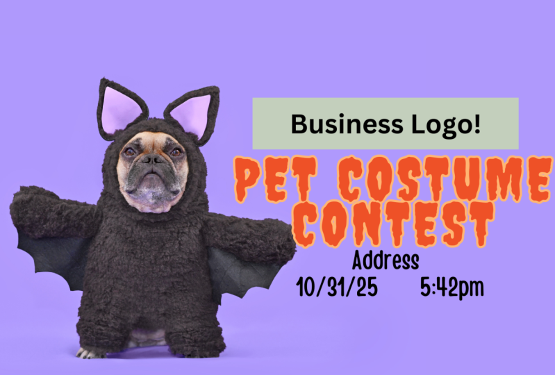
8. Let's Design: So here we have the picture that we download, the font that we chose, the complementary color for this orange that this picture have and some texts for information. You can see here that I have the same picture, but with the background extended. I just want to show you this option if you have Photoshop or a program that you can do this, and you have the ability to do this. Sometimes I chose pictures that I know I can extend the background because it's easy because it's a simple background. I am just showing this example, but I am going to use the picture as with download it, because I want to stay with you guys So now I'm going to place this picture of the cute dog over here and I'm going to choose the text, bring it to the image. And this this is going to be a simple design. But really impactful because this cute dog can speak to you, right? So I'm just arranging the text. I want to put the training word a little bit bigger. There looks good to me. All of these tools, specially this one of alignment, are available in most design programs. You just need to play with them, to know, to really understand how they work. So now I want to work with the information that says the place of the training, the date and the time. I'm going to separate this information. And I'm going to place it over here, going to make it a little bit bigger. And here I have this color. Because is the complementary color for orange. But in this case, I'm not going to use it, because I think that the orange makes quite a good statement. And I don't want to create more confusion. You know, that orange is pretty intense. But I do want to use this info number. I'm going to create a simple, another thing that you can do in any program, a simple kind of rectangle over here, I am going to change the color off my text, change the transparency a little bit for the rectangle, and place the phone number there. I am going to play with, the spacing. I am going to cut everything to see it better. This could be thinner. And here we have a simple design, but really effective. Because, tell me, who is not going to stop and look at this cute dog? and understand right away what is this about? Because anyone can look at this design and understand. What is it about. You know, it's a training class and it have the place, date and time, and a phone number for information. I'm going to show you another probable option that we can use, using the picture that I extended the background. So you can see that this works for if you need to put more information. For example, if the class is not just one day but a series of dates You can put that information and from when to when is the time of the class. And you can play with that. So this is another option that you have. So we just design our ad. So now I want I invite you to finish your ad and go to the Class Project section and upload your design.
9. Mistakes to watch out for: So that's it. You have reached the end of the class. Now you have the tools to create functional and attractive design and help you to be successful. I'm going to remind you some mistakes to watch out for. You should avoid to add too much text. Add only what is necessary. Look out for words that are extras that don't add to the information. Be aware that the image does not fight with the text. Don't put text on top of an image. It will distract people. It will be hard to read and people will just walk away. Don't use everything in the same size. Remember, hierarchy Something big, something medium and something small. Also don't use more than two fonts styles. That creates distractions and people don't pay attention to the message. Don't confuse quantity with quality. Remember that. Also, remember is not about you, it's about your target. Design for them. Speak to them.
10. Design & Share your project!: Now I'm going to finish up by designing uploaded to the project section. I hope to see yours there. Please feel free to ask any question. I will be happy to answer them. Also visit the "Resources" area so you can get all the things that I put there. Thank you for watching.
 Nayda Cruz, Editorial Designer