Transcripts
1. Introduction: Hello, and welcome to my
class. My name is Nada. Today, I will teach you about the graphic design principle
of alignment and how I use two specific
alignment tools in Adobe in design,
guidelines and columns. Through my 15 year career
as a graphic designer, I use the principle
of alignment in all my design work
from books and magazines to posters
and social media posts, both in digital
and print formats. The alignment is the
first thing that I pay attention when I
see a graphic design. In my experience, it is the most neglected
aspect in design. A good aligned layout shows experience and knowledge
as a designer. If you have been designing
for a while and want to sharpen your skills as
a graphic designer, this class is for you. For this class,
you don't need to be an expert in Adobe in design, but some basic knowledge
will help you. Nonetheless, in the
practice session, I will be teaching
you from create a document to
exporting your design. You can also apply what you learn in this class to
any design program. So join me in this
class to learn how to master with the
principle of alignment in graphic design and how to work with it inside
Adobe in design.
2. Class Project: As you may have heard me
before in my classes, Skillshare is meant
to get your results. Doing the class project is
the best way to achieve them. For this class, you
may follow me step by step in the practice lesson
to design my exact layout, or you may create your own. Then share it in the project
section of this class. Share a screenshot
of your layout with the guidelines and columns
and the exported back. You may also ask for feedback. I really enjoy seeing
all your projects. I always react to them. Now, let's continue
with our class.
3. Alignment Theory: Let's begin with basics. Graphic design is not an arbitrary selection of
typefaces, images, and color. Graphic design is made up of a structure that includes
what is known as elements. The most basic elements
of design are point, line, shape, form, space,
color, and texture. This means that
those elements are what you use to create a design. Those graphic design elements are artistically arranged by a set of guidelines that are called graphic
design principles. The most basic principles
are balance, emphasis, movement, repetition, contrast, alignment,
proportion, and unity. In this lesson, I will focus in one design
principle, alignment. Alignment is the lineup of
the elements of a design. My experience, it supports
other principles of design, like balance and unity. Good alignment can follow a physical or an imaginary line. It helps the composition
of a design to look organized,
trustworthy, and elegant. Most importantly, it makes it function and helps the reader
understand the message. Achieve good alignment,
I use two tools while designing
guidelines and columns. Most of these tools
are available in most design programs or apps. In this lesson, I will teach
you the theory of them. In the next lesson, I will show you how to use
them in a we in design. Let's talk about the first
one, the guidelines. These are lines that you can place anywhere in your design, so you can place
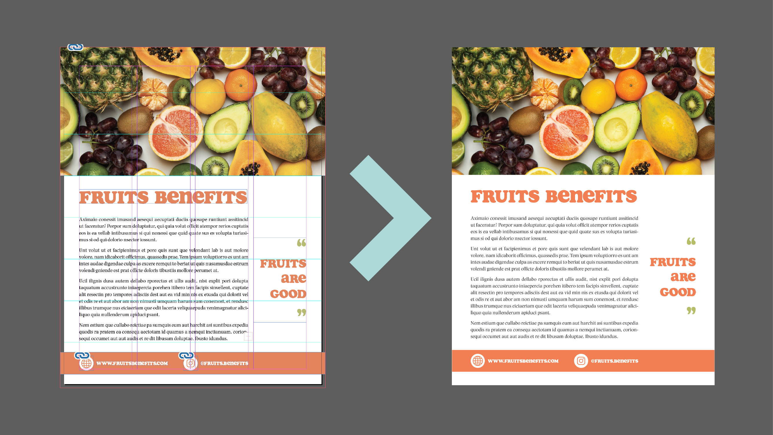
elements around it. Let's look at this
social media post. I designed a while ago with
the help of guidelines. The yellow vertical guidelines establish a margin from which nothing goes beyond and to which the biggest
elements of the design, the logo, and the
header aligns to. The red vertici
guidelines shows how the computer and the
calendar icons are centered, and the text next to them
is aligned to the left. The green horizontal guidelines show the text alignment
with the icons. The horizontal
white guidelines in the background shows the
distribution of the space. As you can see, the
space is divided in four same size
horizontal sections. One is used for the photo and logo and the rest for the text. This is what I mean when I say that alignment shows
experience as a designer. When I see a design, I can see those
imaginary guidelines. You may align
things differently, but everything must be
anchored to something. Nothing is loose
just hanging there. There is the purpose and the power of the
principle of alignment. Let's take a look at
this next example. Here, I created four
horizontal guidelines and one vertical
center at the page. Then I align the photos, logo, and text to
those guidelines. It makes the design looks
organized and elegant. The second tool that I use for
alignment are the columns. Columns are vertical spaces to which you can
place text or images. Columns are separated by
a space called gutter. Let's take a look at some
examples of two magazine pages. I use columns to design. In this first page, it looks as if there are two asymmetrical columns.
But there are five. Even though there is
only one column of text, there are five
columns that I use to place and align
every element. The top image was provided by the client and it was requested
to be the main image. So I kind of established
the layout to follow. I decided to align
the columns of text to the width of the
three photos on the top. Let's take a look to
the second example. In this design, how many
columns do you think I use? Three, six, I use
five columns again. In this case, I use four for the text and
one for the image. This gives you a
sense of how you can use columns to design
and align elements. The number of columns
does not de terminate the number of columns of the text that the
design will have, but rather supports
the distribution and alignment of the design. In the next lesson, I
will teach you how to use these design alignment
tools in adobe in design.
4. Alignment Practice: In the past lesson, you learn
what is aligning principle and how I use guidelines
and columns to achieve it. In this lesson, I will
take you with me what I design and lay out
using those tools. If you have never
used Adobe in design, I recommend that
you watch lessons three through nine of my
digital portfolio class. There, I take the time to introduce you to design
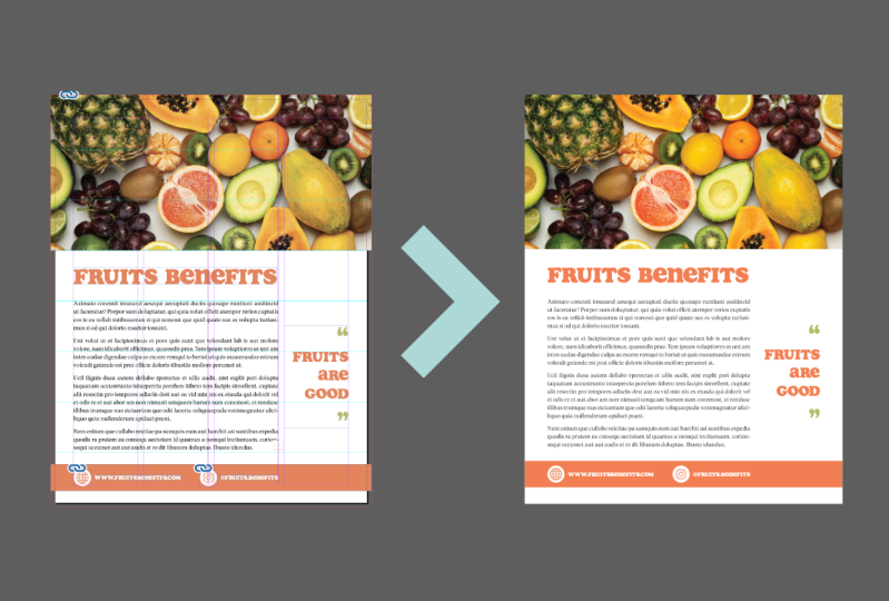
from the ground up. Now, let's go into design. So now we are inside
Adobe in design. The first thing
that we're going to do is to click on new file, in the new document window,
we're going to go to print. We're going to select letter,
which is the standard. We're going to assume that
we're going to design a magazine page
of a letter size. And we're going to leave all the preside
details as they are. But since we're working
with a magazine, which is going to be printed, I'm going to create a
leave of dot 125 ", and I'm going to click Create. The first thing
that we're going to do is to save our file. We're going to go
to file, save as, and I'm going to
look for the folder where I have the photo that
I'm going to use in my page. It is very important
that you save everything that you're
doing in the same folder. You create one folder and
then you put your images, your text, and you save the document that you're
creating in this sign. I'm going to call it
sample, you sign. And I'm going to click Save. As you can see I
have the ruler here. If you don't see your ruler, go to view, here is high
rulers, because I have them, yours will say show ruler
or you can use command R. The standard is that you click on the ruler and drag
and here you have a line. If I release my mouse,
and click outside. This CN line, it's a guide line. If I click and drag and
is now this blue color, I can move it and means
that it is selected, and I can also delete it. Now we're going to go to
lay out ruler guides. In this section, you can change
the color of your guides. You maybe don't want them
cyan, you want another color. Here you can select
the percentage from which those guidelines are going to be viewed, for example. If I choose 100 and click
and come to drag a line, you won't see it because
look below here at the left, I am less than 100%. If I choose 150, now I can see my guideline. If I choose 50%, I don't see my guidelines. And that is how that works. I'm going to go back
to Ruler guides and I'm going to leave it at 5%. And I'm going to click Okay. Now let's create
some guidelines. I'm going to go back to layout, create guides, and here I have
the create guides window. If I increase the
number of rows, you can see over here at
the left at the right, that I am creating,
in this case, three rows and below
it, I have the gutter. We learned in the
past less and that the gutter is the space
between those guides. In this case, I don't
want any gutters, I'm going to put zero there. But I am going to create
for this layout eight rows. I'm not going to create
columns because I'm going to work with
columns another way, but you can also
create columns here. For a moment, I'm going
to leave it at zero. I can choose if I
want my guides to be from the margin.
Or from the page. If I choose from the margin, the guides will begin
from the margin inside, and this margin outside is going to be not going to count. If I choose page, now my
guides start from the edge of the page instead of
the edge of the margin. And if you want to remove some previous guidelines that you have you
can check here. I don't have any, so
I'm going to click. Now, if I click and drag, you see that I can select
and move those guidelines. I don't want to move them. So I'm going to go to view. Grids and Guides. I'm
going to click Log Guides. Or you can use a shortcut
Option command and Semi Column. While we are here, make
sure that you have Snap to guide and
Smart guide selected. I'm going to show you there
later why that is important. Now I'm going to go back to
Layout, margins and columns. Here you can change your margin. I'm going to leave it
as it is standard. And in columns, I'm going
to create four columns. The gutter, I'm going
to leave it as is, and I'm going to click Okay. Now I'm going to select from my tools the
rectangle frame tool, and from the edge of the bleed, I'm going to click
and drag using three Rose from my guidelines
and release. Now, with it selected, I'm going to press on
my keyword command D. And I'm going to look
for my folder where my image and my
document is saved, and I'm going to select
my photo and it's placed. Then I'm going to click
on Content Aware Fit. And there my image. It fits better. If I want to move this image or see how
really it is please, you can see that the brown line that you can see is
the size of the image. I could click here
and the handle, press shift, and move the photo. I can also use this
circle here and move the photo inside the
frame that I created. In this case, I'm going
to leave it there. Now I'm going to place my text. In this case, I'm going to use some Doi texts from
Adobe in design, so I'm going to
select my text tool, and I'm going to click from this corner through three
columns to the right, and using three rows. I'm going to release, and then I am going to type
fill with placeholder text. Here you can see that
I have some Doi texts. If you want to learn more
about how to addit this text, I suggest that you watch one of my other classes called Learn typography
in Dobe in Design, and I will teach you
how to add this text and make it look really great. For now, I'm going to
leave it here the text. I'm going to press
escape in my key or so I can have click outside
and nothing is selected. Now I'm going to select
again my text tool. I'm going to click and drag, and I'm going to type
fruits benefits. Now I'm going to
select my text and look for the phone that
I want to use that is called so I'm going to select my text
and increase in size, two, I'm going to type here 44, enter, and there you can see it. With the text
selected, I'm going to choose the eyedropper tool. I'm going to click
in this image to choose a color from the
photo. I'm going to click. And here you can see the
color they have selected. You can click Escape to see it. If you don't like it, you
can select again the text, select the tool and go back. And you can go back
and forth doing this until you find the
color that you like. So I think I like this one. I'm going to click on
this icon at the top, which is the fit
content to frame. So my frame fits my content and it's easier to
move and align. If you don't see this icon, you can go to this
settings wheel here. And click there and there
you can make sure that your frame fitting object and text frame
options are selected, and you can play around with all these options. I'm
going to click okay. Now I'm going to
create a rectangle. So I'm going to select
the rectangle tool, click and drag and
create a rectangle here. And I'm going to choose again my eye dropper tool and
choose a color from the text. I'm going to click
the letter V in my keyboard so I can
escape my selection. I'm going to sum in a
little bit command plus, and I'm going to place two
rectangle frames squares here. I'm going to press the
letter B. I'm going to select the first one Command D, select the web icon,
click Content Awareft. And here I have my icon. I'm going to select
the next one. Command D, select
the Instagram icon, con content Wafit,
and there I have it. I'm going to move
this to the left. I'm going to move to the top, select my heather,
press command C, command B, and
copy and paste it. I'm going to move
it to the bottom. I'm going to put this
text smaller and the color I want it to be white. And I'm going to edit this
text writing a website. Benefits.com. Now I am going to
copy this copy paste, so we here the top, and I'm going to change
this to the handle that is going to
be fits benefits. I'm going to fit frame
to content again. Now I need to align all
this, as you can see, If I select this web icon, you can see that some guides
appear this green guide. These are the smart guides. And you can see how
easy it was to snap it to the left of the column. And that is why I have selected the snap two edge and
the smart guides. And again, that is in
the view grid guys, Snap two guides
and smart guides. That's how the function of that. And I can move the
website the same way. Sometimes I like to
align these two and align the text also and
then align it to the icon, and then I move it
back to the center. And I am going to align it
to the edge of the text. But as you can see
this is not centers. I'm going to click and drag
and select everything and use my align tools here and click
on align vertical centers. And now everything is aligned. I'm going to Zoom out, and then I'm going to
write something here, I'm going to copy and
paste again this text. I'm going to choose a
smaller size, maybe 30. I'm going to write fruits, enter R, enter good. I'm going to select
the selection tool. Click on the fit frame two content, and
there you have it. I can move this frame here.
I'm going to align it. Let's look over here in
the paragraph options. I'll lie to write. I'm going to click Enter and use like this stylish quotes. I'm going to step them a
little bit bigger like 48. And 48. I'm going to
change the color. I'm going to use my eye
dropper tool again and choose a green.
That looks great. I'm going to select the clo mas, select the eye dropper tool
again and click on here, and now I have both
in the same color. I'm going to click on
fit frame to content, align it to my column here, and then align it to the
center of this text. You see how the
guideline help me there? You see that green light line? It means that this text frame is aligned with this text frame. You can also select this
text frame, press shift, select the next text frame, and use your aligns in
the property panel. And live vertical centers, and they didn't move
because they are aligned. Now we're going to press the
letter W in our keyword, and this way you can see
how your design look. Maybe I want to move
this a little bit. I want to move
this a little bit. L see that green vertical arrow. That is the smart guide telling me that if
I release here, I have the exact same space
on the top at the bottom, and this is center. That is the benefit
of the smart guides. Now we're going to
go to file save. Next go to file export. And I'm going to choose in format. You can
change the name. I'm going to leave it the
same. I'm going to choose the format JP and click Save. And I'm going to
leave the range to one is only one page that's
going to stay the same. Quality maximum format
method baseline is okay. For solution 300,
space color RGB. I can change it to CMYK because this is
going to be printed. I can also select to
use the bleed settings, that means that it is going to export with the bled section. I'm going to lick export, open my folder, double click. And here I see an error. We're going to fix
that really fast. PS W, and here you can
see that my picture is not going through the
edge of the bleed area. So I'm going to double click
here and move my photo. So I make sure the photo goes till the edge
of the bled section. And then we're going to
export again, Export. Choose the same settings. Safe. I want to replace that. It's all the same, click Export, and I'm going to look
for the page again. And here you can see
that it is correct. Remember that this text is
not going to stay this way. I'm going to host it the right way in the project section,
so you can see it. You can learn how to edit
this text and make it look right in my Skillshare class called Learn
typography in design, how to design long texts. And here we have it. You
well aligned graphic design. Let's go into the last lesson to share some final thoughts.
5. Conclusion: Congress. You have reached
the end of this class. Now you can design an
infinite number of layouts with well defined
spaces and alignment. An aligned design helps
the reader to move through the document in an organized way that helps to understand, which is always our main goal as a graphic designer to
communicate clearly. If you follow along this class, I would love to see your work. Please do share it in the
project section of this class. Feel free to ask for feedback. You can also ask questions
in the discussion section. And finally, if you found
any value in this class, please do leave a review. That will help other
students to find this class. See you in the next one.
 Nayda Cruz, Editorial Designer