Transcripts
1. Introduction: Hello, welcome to my class. In this class, I will
take you through my three step typography process when designing long text in a, in design line length,
spacing and distribution. First, you will learn about the ideal length for your
lines and how to adjust it. Then I will teach you about the importance of spacing
between your letters. This includes letting
kerning and tracking. Finally, I will show
you how to work with the distribution of your
text to avoid orphans, widows, runs, and rivers. My name is Naida. For
the past 15 years, I have worked as a
freelancer employee. And now with my
own design studio. I specialize in
editorial design. I have designed commercial and educational magazines,
manuals, and books. All of this while
using Adobe in design. Editorial design is
more than just copying a pace at text from Microsoft
work to a fancy program. It requires attention to detail
and technical knowledge. That's why more than a designer, I have always consider myself
a visual communicator. My main job is to help people
understand through design. Have you ever seen
a magazine article, book chapter, or even a flyer that makes you don't
want to read it? It's because property
is visually cluttered. There is too much
in a small space. In this class, I
will teach you how to design documents
with good flow. If you are a book or
magazine designer, this class is for you. I will teach you to
polish your design skills and create designs that
people will want to read. All these design
skills can also be used when designing
with less text, such as a flyer or
social media post. For sure, your designs will
have much more impact. For this class, you should have a basic knowledge
of Adobe in design. If you don't, I
recommend you watch my Digital Portfolio class where I teach Adobe in design
from the ground up, specially lessons 38.9 At
the end of this class, you will be a better
designer and communicator. You will find clarity
in your designs so your text is easier to
read and understand. Let's begin. See you
in the first lesson.
2. Class Project: Having a safe community
to share your work, ask questions, and keep
learning is valuable. And you have that here on Skillshare for this
class project, I would love to see
a single image of a long tech design
that you apply the typography rules that you
will learn in this class. You can also share what
your design project is about or ask for feedback. Just go to the Projects and Resources tab below this video, and click on the Submit
Project button at the right. Skillshare. Classes
are meant to help you get specific
results in your goals. Completing the class project is a great way to achieve them. Also, if you have any questions, feel free to ask them in the discussions that
below this video. Let's begin our class.
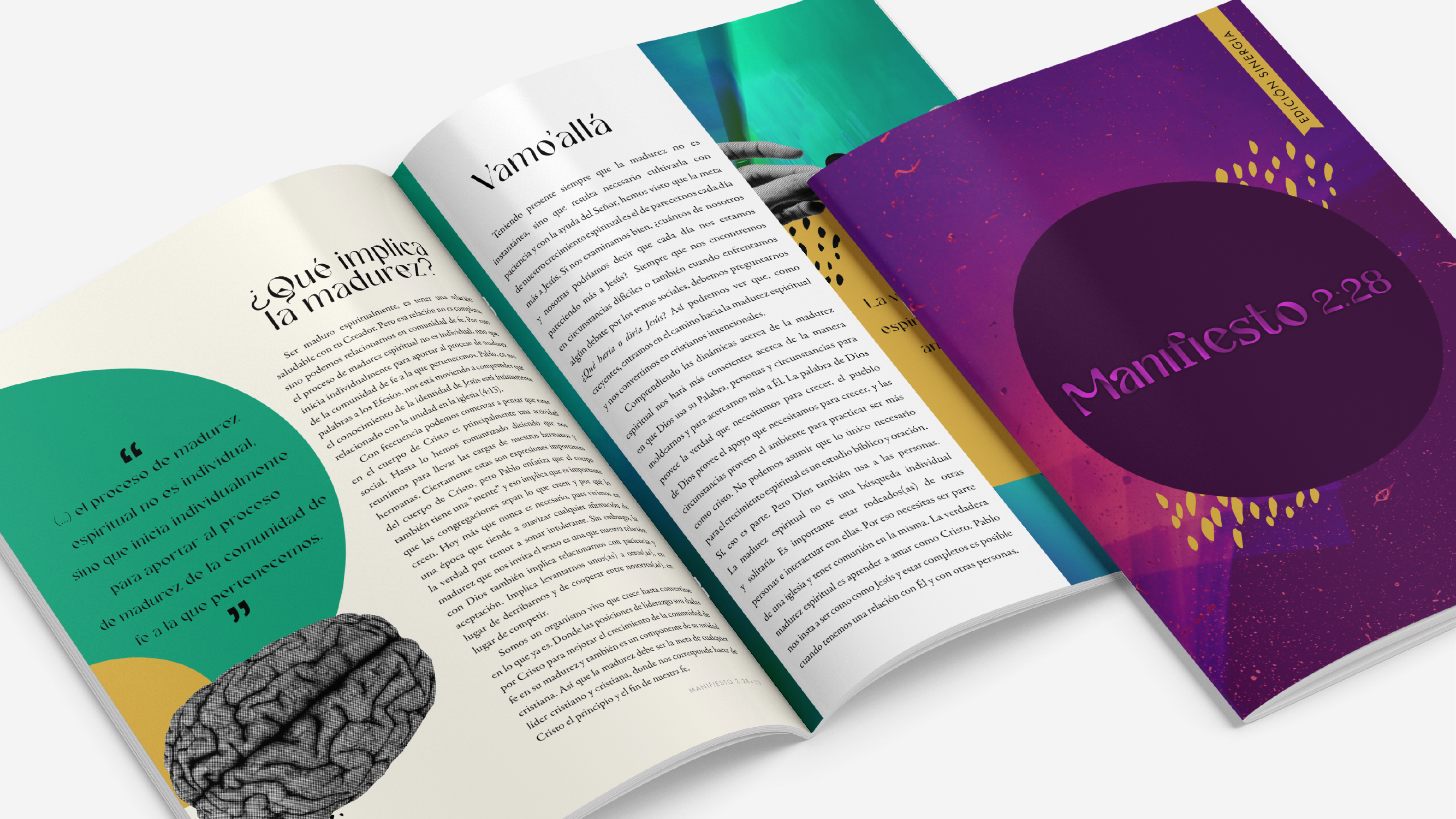
3. Line Length: A good text design begins
with good typography. Typography is the arrangement
of text to make it legible. Everything that
you will learn in this class is about typography. Many people confuse the words typography with
typeface or fonts, but they are not the same. A typeface is the
design of a character. Characters are the letters, numbers, and punctuation marks. It also includes spaces and
any other special symbol. For example, Times New Roman
is a widely used typeface. Areal, Comic Sense and Helica are other
examples of typefaces. Each one has a
particular design. Now, each type phase contains a group of features
that are called fonts. For example, the type
phase, times in Roman, contains at times in Roman bolt and times
in Roman italic. Other features of
the fonts can be semi bold and ultra
volt, among others. A type phase is the
design of characters. A font is what those
characters look like. Now that we have
those terms clear, let's dive into
the lesson topic. Line length reading is an
exercise of gratification. Once you finish a line,
you jump to the next. Advancing through the page. Long lines makes the reader feel intimidated and is more
likely not to read it. Short lines, on the other hand, makes the reader move their eyes from one side to the other too fast and their
eyes get tired faster. That's why the line
length is important. Swiss typographer
Emil Ruder said that the line should
have 50-60 letters. Other typographers
describes the idea lined by words or
even by characters, which as we said before, includes puntuation
marks and spaces. There is no exact consensus about what the right
line measurement is. I followed the average
45-80 characters per line. My experience, it produces
good line text flow. This means that a full
document should have lines shorten than 45 characters
and no longer than 80. Remember that characters are
not the same as letters. Character includes
letters, numbers, mentation marks, spaces,
and special symbols. Now how do I know my line
length and how to adjust it? Let's go into a Do in
Design to show you. Now we are inside
a Do in Design. First you must select
a line of your text. Click three times
to select a line, then open the info panel. There you can see how many
characters you have per line. I always like to show a random places to see the variety of
characters that I have. Here we can see that
we have an average of 100 characters per line and they want to have
an average of 80. There are two things
that I can do. Increase the fun size or
increase the margin size. Sometimes it's a
combination of both. It mostly depends on
what the project is. Let's suppose that
this is a book. I am going to increase the
Tex size by two points. I'm going to check again
how many characters I have. I am still in the '90s
average characters. I am also going to
increase the margins. I'm going to go to lay
out margins and columns. Make sure that you have
your little chain link. We change all the borders at the same time using my up arrow. I'm going to change
my margin up to 1 ". But you can see that my
box text stay the same. Let's click on the
adjust layout. Now you can see how my
frame matches my margins. Click Okay. And
there you have it. Let's check again and see
how many characters we have. 803-80-1804 Now we have an average of 80
characters per line. Keep in mind that
this is an estimate. You don't need to check every single line of your document, checking a few random places, and keep adjusting
as much as you need. Before going into
the next lesson, select your text size and
adjust your typeface size and margins so your lines have an average of 45
to 80 characters. Use the info panel to help you. Good space management helps make your text easier to read. Line length is only one
aspect of editorial design. In the next lesson, I will
teach you about spacing, specifically, leading,
tracking, and kerning.
4. Spacing: Leading, Kerning & Tracking: In the past lesson, you
learned about how to keep your lines and
an optimal length. In this lesson, I will teach you about spacing in your text. In typography,
spacing is a shift by working with the leading
kerning and tracking. These three can be adjusted
in the character spanel. You can identify
each one by leaving your cursor for a few seconds
on top of each section. Let's begin with the leading. The leading is the
space between lines. You may be familiar with
the double space in Microsoft Word when
designing a book, it PDF or magazine. We don't use the double
space as a standard. Instead, a good practice
is to set the leading 4-6 points more than the
size of your typeface. For example, if your
text is 28 points, your leading should
be 32-34 points. This way, we make sure that the lines are not too
close to one another. When lines are too close, the reader's eye may
get tired faster. Also, it affects reading
continuity because every time the reader goes from the end of the line
to the beginning, the eye gets confused to where
the line continues Next. Kerning. Kerning is the space
between two characters. At the same characters panel, we can find the Kerning, which is the space
between two characters. One may think that if the space between a series of
characters is the same, the word will look
perfectly balanced. Well, that is not correct because kerning is a matter
of visual aesthetic. Characters are different
shapes, some are straight, some are rounded,
some are slanted, and some have concave spaces. Those differences,
when combined, may create a visual
illusion that there is more space between the two of two letters
than the others. My suggestion is that you always set your
kerning to metric, which means that the type phase will have the kerning that the designer of that specific
type phase selected. Optical means that the Adobe in designer will analyze
the type phase and make its own selections which
may result in bad kerning. Finally, let's work with the tracking in the same panel as the leading and curving. You will next find the
tracking tracking refers to the space between
every character of a word, usually horizontally. One way that I love to use tracking is for short headings. It helps to create
emphasis and separation. This must be done with control. To apply this to long text
can affect readability. After adjusting the
right line length and selecting the spacing between
the lines and characters, your text is ready
for the final step. In the next lesson, you will
learn about how to work with the distribution of
your texts to avoid orphans, widows, runs, and rivers.
5. Distribution: Orphans, Widows, Runts & Rivers: In the past lesson, you
learned about spacing in your long text leading,
tracking, and kerning. In this lesson, I
will teach you about the last thing I work with
when designing with text. Orphans, widows,
runs, and rivers. An orphan is a
paragraph opening line that is alone at the
bottom of the column, meaning that they are separated from the rest of the paragraph. A widow is the contrary
of the orphan. A widow is alone at
the top of a column. It is the closing paragraph
line at the top of a column, leaving that line separated
from the paragraphs. A run is a single word at
the end of a paragraph. Runs are sometimes called orphans because they are
alone at the bottom. But the correct term is run. All of these, the
orphans widows and runs create interruptions
to the reader's attention. That is not what we want. There are various ways
we can solve this. We are back inside
Adobe in design. And here you can see examples
of an orphan in color blue, a round in color red, and a widow in color green. The first thing that
I'm going to do is to select all
of my text wise. Clicking inside of that text box and pressing command
or control A, I am going to go to the lines
on the right top corner of my paragraph styles panel and click New paragraph style. In style name, I am going
to write general text. I'm going to click Okay. Now with my text selected, I'm going to click on
top of the style that I just created to
apply it to this text. You know that the style is applied because when
you select your text, the general text
style is highlighted. Now I'm going to do a change
to that paragraph style. Whatever chain I make to it
is going to be applied to the texts that have this specific paragraph
style applied. I'm going to double
click on top of it. I am going to go
to Keep Options. I'm going to move my window a little bit to the
side so you can see better what's happening
in the background. And I have my preview
checkbox checked. I'm going to go to
Keep Options and click on the Keep
lines together. You can see that already
something happened in the back. I'm going to unselected
Select again. I'm going to leave it at start paragraph Start
2.2 This means that any paragraph that is
going to be split is going to have at least
two lines together. At the beginning or at the end, I'm going to click, Okay. As you can see, my orphan and my widow are
together with a line. They are no longer
orphans or widows. That issue is resolved. To fix the runs, you must create a character
style in a character style. Over here I'm going to click on the Oper right corner,
new character style. I'm going to name it Run in
the basic characters format. I'm going to choose
no break then. Okay, now I'm going back to my paragraph style and
go to general text. Remember whatever changes
I make in this style is going to be applied in my text because my text style apply. I'm going to double click
and go to grab style. I'm going to click
New Grab Style over here in applied style, I'm going to click
and select Run. I'm going to click in the
area that says two text. I'm going to erase what is
there and I am going to type in opening curly bracket, 15 closing curly bracket, and the dollar symbol. What this means is
that I want that my last line of a paragraph have at least 15 characters,
no less than that. I'm going to click okay. Now you can see that all my runs are no longer longer
runs, they are together. With other words,
this is a domin text, but they are together
with other words they are no longer alone. And they have at 15
characters with them. And there you have it, you no longer have runs in your text. Another fast and easy way to solve orphans, widows and runs. It's with the
paragraph break that place your cursor in front of the word you want to move below, Press Shift, hold it, and then press Enter. When you press only enter, you automatically
create a new paragraph creating a gap between the two. But when you press
Shift plus Enter, you keep one paragraph. This is a fast and easy way
to solve orphans and widows. Our last issue to
solve are rivers, which are vertical white spaces between lines of a paragraph. They are a coincidence because of spacing
and distribution. They may occur
more when the text is justified and the
columns are narrow. To solve this, you
must implement a mix of all the skills that you have learned
in this class. Usually, you can solve
it by adding the hyphen, but you may also need to adjust the line length and the
curning of the paragraph, or even adding paragraph breaks. Now, prepare your document to be orphans, widows Runs free. Check for Rivers and correct them with the skills
learned in this class.
6. Conclusion: Congratulations, you reached
the end of this class. You can now design long text
with the correct typography. Your text will be more
attractive for readers because it will have
the right line length, leading, tracking, and kerning. Finally, your text
will be Orphans, widows, Runs, and Rivers Free. After this class, you are a better designer
and communicator. If you learn something
valuable from this class, please leave a review. Those really help reach students who will
benefit from this class. See you in the project
section. Take care.
 Nayda Cruz, Editorial Designer