Transcripts
1. Introduction: Hi, Welcome to my class. Throughout this class, I will teach you the differences between RGB, CMYK, and Pantone, why and when to use them. This won't be a superficial class that says use RGB for digital and CMYK for print. The approach will be a very specific one. We will dive into really understanding the reason why behind the science of it all. I will also teach you to understand what hue, saturation and value are, how to create tints, tones and shades and how to create color combinations. You will then use these skills to create your own color palette and identify each one of the colors with the respective values in RGB, CMYK, and Pantone. That way, you can use the same color no matter what color, mode or system you are using. My name is Nayda. I am a graphic designer from Puerto Rico who specialize in editorial and surface design. This class is aimed at students who are just starting out in the design world, or designers who still struggle when working with color, and really want to once and for all, solve the colors consistency problems. In some instances of the class, I will be working with Adobe Illustrator. So access the program is recommended, but not indispensable. These skills and knowledge that you will learn can be used with any other program or app that allows you to work with RGB or CMYK. You will also benefit from understanding which Pantone product better fits your needs. This class is great for graphic designers who create digital art or produce any kind of print product. If you are an editorial designer, a brand designer, a surface designer, a digital illustrator... You will find valuable information to improve your work process. By the end of this class, you will be able to communicate properly when speaking about color. And you will be able to have color consistency in your work. This is the class I will have wanted to take when I started designing more than ten years ago. I know it will be a solid base to build all of your projects. See you in the first lesson.
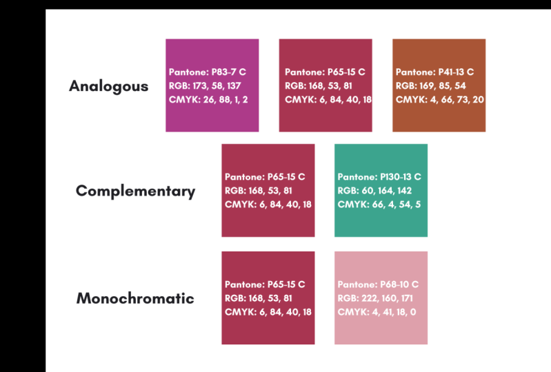
2. Class Project: For the class project, you will create a color palette using the color combination techniques that you will learn in this class. You can either create tints, tones or shades or a mix of them. You can select as many colors as you like. But I will say no less than four. After you select your colors, you will set the value for each of them in RGB, CMYK and Pantone. And don't worry, you will learn how to do it all in this class. Finally, go to the "Projects and Resources" section and create a project to share your beautiful colors and to be inspired by the community. I will see you there.
3. Color Terminology: First things first, let's discuss some color terminology that we usually encounter when we talk about color. Color is described by three properties. Hue, saturation and value. When we talked about hue. We're basically talking about color. Hue describes color. As a standard, it refers to the primary and secondary colors. The primary colors are red, blue and yellow. These colors are unique. Which means they cannot be made by mixing any other hues. The secondary colors are purple, green and orange. Which are the halfway colors between the primary. Secondary colors, appears when you mix two primary colors in equal amounts. Some say that tertiary colors, which are the mixture of primary and secondary colors, may also be called hues. But not everybody supports that theory. It is a common practice to use the words color and hue interchangeably. But technically, not all colors are hues. Black and white are not hues. They are colors. Because they are not one of the primary or secondary colors. It is not correct to say that pink is a hue, but that the hue of the color of pink is red. Because red is the color that pink comes from. A hue can be warm or it can be cold. Warmer colors are the ones that have more red, orange and yellow hues in them. Colder colors, are the ones that have more purple, blue and green hues in them. But these are not definitive. Blue by a norm is a cold color, but if you add yellow to it, it can become a warm color. Usually, when we combine colors, the starting point is to do it by the complementary color. A complementary color is the color located directly across the color wheel. A cold and a warm color. This way guarantees the best contrast possible between two colors. Red is the complementary color of green, and so on. But there are more color combinations techniques. Let's take a look at them. Monochromatic, means the use of different tints, tones, and shades from one hue of the color wheel. For example, here we would use variations from this yellow-orange. Triadic, means they use of three colors evenly spaced. Tetradic or square, and rectangular means they use a four colors that consists of two sets of complementary colors. Analogous, means the use of colors that are next to each other. In this case, these purples and blues. Complementary, as we said, is the use of two opposite colors. Analogous complementary, means the use of colors that are next to each other and one on the opposite side. For example, we use this orange, red, and purple against this green. Finally split complementary, means to start with one color, find it's complement, and then use the two colors on either side of it. Now, we don't always use this bright hues to design. We use color variations as tint, tone and shade. When we add white to a hue, it's called a "tint". When we add gray to a hue, it's called a "tone". When we add black to a hue is called a "shade". Usually hues are considered more childish colors, because they are so bright. Tints are also called pastels. Tones are more sophisticated and pleasing to the eye. A shade is basically pure you but darker. It can go to almost a 100% black. Now, let's talk about the second color property after hue. It's saturation. Saturation is the purity of a color when it is the most intense. It contains no white, no gray and no black. It is classified as chromatic. When a complementary color, or gray, or black, is added to a saturated color, it becomes less saturated. Here at the left, we have a saturated blue. As we move to the right, it becomes less saturated. It become less pure when it mixes with a complementary color, which is orange. The same happens to orange as it moves towards the blue. The same happens when we add gray to the blue. It get less saturated. The same will happen if we add black. The third and final property after hue and saturation, is value. Value determinate how close or far a color is from black or white. The darker the color, the closer it is to black. So the turquoise at the left, is a high value turquoise. The lighter the color, the closer it is to white. So the turquoise at the right is a low value turquoise. It is easier to notice the value in images with color in the same hue. For example, in this picture, the predominant hue is blue. But at the upper left, we can see a lower value. Which means it has more white. To the lower right, we can see a higher value, meaning that this blue has more black. Sometimes, when we look at a full color picture is difficult to know the value of the colors. A good technique is to change it to grayscale. That way, it's easier to see where the darker and lighter colors are. Just pay attention to the darker grays and the lighter grays. As we can see in the image at the right. Darker grays means higher value and lighter grays means lower value. That way is easier to identify the values in the full color image. This is also a good technique to know if your image have enough contrast. Let's step into Illustrator to work a little bit with all of this. Over here we have three red circles. You need to open your "Color Guide" panel. If you don't see it, you go to "Window" and select "Color Guide". And here you can see some colors that are random. You're going to select the color. I'm going to select my color. And here at the right side you see the "set based to the current color", you are going to click there. And now here you can see that you have selected, in the middle here under the arrow, we have your color selected. To the right, you can see tints and to the left you can see shades. So let's say you want to create tints from this color, which means you are adding white to this red. You select to the right. If you want to create a shade, you select to the left. But over here you can see that I only have three options. We can change that. You go to this option in the upper right corner, you go to "Color Guide Options". And here you can see that I have steps and I have the number 3, which are 1, 2, 3 both to the right and to the left. If I use my arrows, I can move and create 4, change it to 4, 5, 6. Which ever number you need or want to create. Also you have here variation. If I go to 0% you can see that I have the same color and shades intense. While I move to the right, I increase the percentage of variation. And you can see here maybe you want to create a gradient. Well then you will need less variation. But if I want more variation, I will go on increasing the percentage. If I go all the way to a 100%, you can see that the tint will have the steps that I select. In this case, I'm going to go up to 10. And the final one is going to be white and in the shades is going to be black. I'm going to click "Ok". I will make this window a little bit bigger. So now I can select, I have more options, four tints, and I have more options for shades from this red. As you can see, we have tints and shades. We don't see tones. But the tones are in-between the shades. So you can work around with that. So if you go over here, to this little window, you can see that you have different options for color combinations. If I select complementary, I will have the red color here and below it I will have the complementary color for that red. And I have many, many, options to create color combinations. The ones that we talked about and many others. This turquoise that I have down here, it's a color combination with this red. So I can go and select it, and this is a variation of the turquoise, and do the same thing, select tints and select shades. I can even select any other colors and do the same thing. Let's say I'm going to use this dark blue/purple. And I'm going to use some tints, I'm going to select in the middle first and then create some tints from it. And do the same thing for the shades. First, select the middle for the color or over here. In the left upper corner, and select different shades. And this is an interesting and nice way to create color combinations. Maybe sometimes you are like, you have no idea how to combine colors. Well, you can use this technique. Many of them looks a little bit too bright for you, or some colors they look as colors that you won't use. But that's the thing because you can use shades and tints and maybe they look better. You know, this selection of colors pretty and I will use this. But maybe I wouldn't use this green with this pink and its red, because these two dramatic for me. But because I can work with shades and tints, I can create this color combination that works and that is useful for my design. So we talked about a lot of things in this section. You learned about the three principle ways color is described: hue, saturation and value. If we add white to a hue or color, it becomes a tint. If we add gray, it becomes a tone. If we add black, it becomes a shade. Also as we create tints, tones, and shades, the hue or color become less saturated because the colors are less pure. Now, whenever you're working with color and hear, any of these terms, you know what they mean, Let's dive into color and what light has to do with it, in the next lesson.
4. Color and Light: In our last lesson, we talk about some terminology about color, hue, saturation and value. And we establish what makes a tint, a tone, and a shade. That is a good basis to know how to work with color. Now, we will dive into the topic of this class, understanding RGB, CMYK, and Pantone. Let's start by the most fundamental aspect of it. Light. We mentioned that the primary colors are red, blue, and yellow. Back when we were kids who were taught those three primary colors. Well, were told that it didn't matter if we didn't have all of the colors. Because as long or we have those, we can mix them and create any other color. So what happened? Why does the design world must choose between RGB or CMYK? Why our beautiful creations end up looking weird sometimes? Well, the straight answer is because of science. We're able to see colors because of light. And light is made of energy waves. This energy waves are group and called electromagnetic energy spectrum. There are seven spectrum of light. There is the Gamma Rays, X-Rays, Ultraviolet, Infrared, Microwave, and Radio Waves. And between the Ultraviolet Spectrum and the Infrared Spectrum is the Visible Light Spectrum, which are the energy waves that are visible to our eyes. Red light, green light and blue light are the ones our eyes are most sensitive to. So from there comes RGB. RGB color model is basically imitating the human eyes. Let's dive into our next lesson to learn more about RGB.
5. RGB: As we just said in the past lesson, we are able to see colors because of Visible Light. From that spectrum, the colors our eyes are most sensitive to, are red, green, and blue. RGB! RGB is known as the additive color because they are created by adding colored light. That's why it's intended for digital screens, such as computers, monitors, phones, displays, and TVs. Because those screens emit light. So to understand it better, when you're using RGB, instead of thinking as using paint or ink, think of it as using light to create colors. The more color light you add, the colors become lighter. And what is the lightest color of all? White. Let's take a look at these Adobe Illustrator color panels. They are both set in RGB. When we have white, it means that all of the lights are at their full potential, which is represented by the number 255. That number has a reason to be. Today we are not going to go into the reason why. But it will always be 255. When you have black, it means that a specific digital screen pixel is showing 0 light. RGB works just as our eyes. When we stare at the light source, let's say the sun, everything becomes white, pushing us to close our eyes. When we close our eyes, there is no light going in. We see everything dark or black. And that is why RGB is called additive primary color. Because you add light to create color. RGB creates the full spectrum of color by adding different amounts of light. For example, to create this turquoise, we use 128 red, 183 green and 183 blue. To create this red, we use 203, read 75 green and 87 blue. Now, if RGB can create all of the spectrum of color, Why do we need CMYK? Let's go into our next lesson to talk about this.
6. CMYK: As we discussed in our past lessons, when we use RGB, you're using light to create colors. So what do we use when we print something? In this case, we don't use light to create color. We use ink. When we print, we don't start with a black pixel and add light to color it. When we print, we start with a white surface such as a paper, and a light source such as a sun or a light bulb. Then the light bounces off the surface and into our eyes. As we said before, RGB can only be used with transmitted light, such as the computer monitor. And it adds light color. When we print an artwork, the surface, the paper, is absorbing light and reflect on it. Another word for adsorb is subtract. That's why CMYK is known as subtractive color. Red, yellow, and blue. the primary colors, is also a subtractive color system. For centuries, it was used by painters. In the 20th century, with the invention of the press, the CMYK subtractive system was popularized by printers because he was capable of producing a wide range of colors. When cyan, magenta and yellow are added together, it creates a very dark brown. So it is necessary to add a pure black in order to be able to create a solid black. This is also known as the key color. That's why is represented by the letter "K"; also so you don't confuse it with the blue color, which is already represented by the letter B. Let's go back to Adobe Illustrator color panels. In the previous lesson, we saw that in RGB, we get white when we combine all of the colors and black when there is absence of light. The opposite happens in CMYK. We get black when we combine all of the colors and white, when there are none. We can create the whole color gamut depending on the percentages of cyan, magenta, yellow and black that we add. So now we understand better the differences between RGB and CMYK. RGB is intended to use for digital screens. If you artwork exist only in social media or in a website, then you should design it and export in RGB. RGB is known as additive because colors are created by adding color light. On the other hand, CMYK is intended to be used in physical printing. If your artwork will be printed or produced in a physical material, you must create it in CMYK. CMYK is known as subtractive because colors are created by absorbing light wavelengths and reflect on it. In the next lesson, we will learn about how RGB and CMYK it relates to one another.
7. RGB and CMYK Relationship: Now we have understood why is that RGB is intended to be used on digital screens. In RGB, we experienced scholar directly. This is known as additive color because it is created by adding a light color. Meanwhile, CMYK is intended for physical printing. Because in CMYK we experienced color indirectly. This is known as subtractive color because it is created by absorbing or subtracting light wavelengths and reflecting it. There is a reason why cyan, magenta and yellow are the ones that were chosen to print. Maybe you have already noticed it. When RGB overlaps, it creates CMYK. The same happens when CMYK overlaps. It creates RGB. That's why CMYK sometimes is called the second primary colors, or Subtractive primary colors. Because CMYK comes from the interaction of the primary colors, red, green, and blue. To be able to see the full spectrum of color, we use CMYK ink that will absorb the light wavelengths and shows colors. Let's take a closer look. Green and blue creates cyan. Blue or red creates magenta. Red and green creates yellow. So when we print our designs, the ink, cyan, magenta and yellow acts as a filter that absorbs light in the visible light spectrum. In other words, the light bounced back on the paper, filters through the layers of color and create perceptive colors. When the light source bounce over the paper with cyan, it absorbs red and reflects green plus blue. So we can see the cyan, as we said before, green and blue creates cyan when the light source bounce over a paper with magenta, it absorbs green and reflects blue and red. So we can see the magenta, because blue and red creates magenta. When the light source bounce over a paper with yellow, it absorbs blue and reflects red and green. So we can see the yellow. As we said, red and green creates yellow. The same is true for RGB. Magenta and yellow creates red. Red absorbs green and blue. Yellow and cyan creates green. Green absorbs red and blue. Cyan and magenta creates blue. Blue absorbs green and red. So as you can see, science is a marvelous thing. Feel free to download the PDF in the class resources and study this slide at your own pace. It can take time to sink in, but trust me, one that does, it all makes sense. You begin to understand so many other little things that catches your eyes from time to time. So now you understand better when to use RGB or CMYK and their relationship to one another. In the next lesson, we will discuss Pantone Matching System.
8. Pantone: In the past lessons, we have learned about color terminology such as hue, saturation, value and about tint, tone and shade. We'll learned about light, RGB and CMYK. I am pretty sure if you have been working on graphic design for a while, you have heard about Pantone and I am sure that you must have said "why?". If CMYK is so amazingly, scientifically perfect, why do we need another color thing to work with? It will be nice that we can work with all of the colors there are, I can see. But every color space has its own gamut. Gamut means range, the limited space within all of the perceptive colors by human eyes. In this image, we can see that color gamut of RGB, CMYK, and Pantone. The image number one who presents all of the colors perceived by our eyes. That is known as LAB. L-A-B. We will not dive into working with LAB because it is out of the scope of this class. But if you wish to go deeper into this topic, feel free to make a research about LAB color space. Going back to color gamut, in 1930 the International Commission on Illumination, established human brains sees up to 8 million colors, but most people only see one to two million colors. So the black circle represents the LAB colors. In image number two, we can see the RGB color space, which are the colors that can be displayed in an RGB monitor. The image number three is the printable CMYK colors. And the image number four is the printable Pantone colors. If I design something in this RGB blue and send it to print in a CMYK press machine. It will print in the nearest blue available in CMYK. And this similar issue will happen whenever we work in one color space and then change to another one. Or when we work in a color space and send the design to another person, who opens it in another device with a different color space. Which is one of the most common issues when working with color. But more of that in the following lessons, going back to Pantone, the truth is that it came to solve a problem designers and printers were having for a while. When we print using CMYK, we use for color plates, one yellow, one magenta, one cyan and one black. The desired colors results depending on the angle of the ink of the dots that are printed. This is called calibration. So you can imagine that there is a high margin of error A light pink, maybe different from one printer to another. This may not be an issue for small production with a small lifespan as a flyer. But let's say that you are a fabric company. You place an order of 10,000 yards for your spring collection. You sell it successfully. A couple of year goes by and you want to reprint some of your most successful designs. The company that printed them is no longer in business. So you contact a new company. The yards arrive and you notice that the golden sun rays look brown. That is a problem because you want consistency in your project no matter when or where you print it. That's why Pantone comes into existence. The Pantone emerged in 1963. The word "Pantone" is consisting of the word "pan" and "tone" which means "all colors". They described themselves as a universal language of color. Every color has a specific name. This way you can tell it to print your provider the Pantone number you want to use. This allows for color consistency no matter where, no matter when and no matter who prints your project. That's how Pantone became the authority in color. When you're using Pantone, you are not using CMYK, but a specific Pantone color in the printing process. The color is mixed before with a specific formula, and is setup in a printing machine. So the calibration problem is not an issue. As we saw before, CMYK is referred as the process color, but Pantone is referred as a spot color or a solid color. It can be that you will print a design using CMYK plus an extra plate with a Pantone to ensure consistency in a specific color. Or you can print as many plates as you need, but all in Pantones. Not a single one in CMYK Now let’s talk about the Pantone products available. Pantone offers two color systems: The Pantone Matching System, also known as PMS, Pantones Fashion, Home + Interiors System, also known as FHI. Both system offer unique color coding and specifications. Let’s talk about them so you can learn which one you should get for your specific need. They offer these two because color changes depending on the material that is it produced, whether if it is paper or textile. The Pantone Matching System is known as PMS. It is indented for print, packages, digital, screen printing and similar uses. As of right now it offers 9,758 colors. It offers so many because, for example, in advertising, the use of intense color is common in order to attract viewers. PMS is known as the “graphic system”. Because is used in the graphic design world. They offer various products depending on your needs. But their most known products are the “Fan Guides”. For PMS, the offer a variety of them. As we spoke before, CMYK colors are known as process colors. Well, Pantone is known as “spot colors” or “solid colors”. Pantone offers products for both scenarios. In solid colors they offer the following: The Formula Guide Coated and Uncoated This one is one of the most used fan guides. This guide offers color formulations for properly mixing all Pantone Spot color inks. It offers 2,161 colors. It comes both in coated and uncoated stock. coated one is marked with the letter “C” meaning that the color is printed on coated paper for a glossy finish or on a surface that will not absorb too much ink The uncoated one is marked with the letter “U”, meaning that the color is printed on the more porous finish of a surface that will absorb more ink. Pastels and neon. This fan guide offers 154 pastel and 56 neon spot colors additional to the Formula Guide. Metallics. Offers 655 metallic colors. It includes trend colors such as rose gold. Now, Pantone also offers fan books for process colors. Color bridge. Is one of the recent additions that is becoming the most used in the market. These guides illustrate how Pantone Spot colors can reproduce in CMYK. You can see it side-by-side the Pantone Color with the closest CMYK equivalent. It also offers the HTML and RGB value equivalents for digital applications. It offers 2,139 colors. CMYK. It offers the Pantone accuracy but for Four Color printing. Contains 2,868 colors. There are many books out there similar to this one. Where they show you the amounts of CMYK that you must add to get a specific color. But this one offers the Pantone quality that ensures color accuracy. Still, you will be sending this to a 4-color press printer provider. So, color changes may occur depending on the quality of the equipment they use to print. Extended Gamut. Offers 90% better Pantone spot color matches over CMYK by adding orange, green and violet to the color gamut. So there you go. You have options for every possible need. The other Pantone color system is the Fashion, Home + Interiors System FHI It is intended for fashion designers for fabrics, apparel, soft goods and special surfaces. Such as leather, accessories and similar. This color system offers more whites, blacks and neutrals colors than PMS. As of right now, FHI color system offers 3,049 colors. FHI is known for having two coding’s: The “TCX” for textiles, such as apparel, fabrics and soft goods. And the “TPG” for coating and pigments, such as, cosmetics, paints, leather and accessories. In this image at the left you can see the color guide, the smalls ones, and also two bigger books or binders. The difference between these two is that the small ones, have the colors printed in paper and uses the TPG Coding. “P” stands for “Paper”. And the big ones, have the color in cotton and uses the TCX coding. “C” stands for “Cotton”. They both assures Pantone’s colors match. The difference between both of them is the price. If you're working with textile and very exclusive clients, the TCX, the big books, may be your best option. Still, if you work with textile, you can absolutely do it with a TPG, the small ones. What you cannot do is use the PMS graphic system to match colors for textile. Because the Graphic System guide is using ink over paper. The FHI system guide is using pigment over paper. Pantone offers many products. You can take a look at Pantone.com. Buying their products has to be seen as an investment. It all comes down to the kind of work that you do and your business needs. I always suggest doing your research and invest in the product that will have a return in investment. They do offer a Trade-In program where you can get some cash when returning a Pantone product and investing it in another one. In case you buy one and then you need changes. Pantone also offers an extension called “Pantone Connect”, that you can use in Adobe Photoshop, Illustrator, and InDesign. In our next lesson, we will learn how to use it.
9. How to Use Pantone: As we just learned, there are many Pantone products for every specific need. There is the Graphic System, mainly for traditional Graphic Design; and the TCX or TPG Systems, mainly for fashion and other physical products. They all come in different products, the best known and most accessible being the fan books. So, great, now we understand RGB, CMYK and Pantone and how it relates to the work we do. We have confirmed that we need a Pantone product. We bought it… now what? What is the workflow to use this investment we just made? Let’s jump into Illustrator to learn how to use the Pantone Fan Book. So now we are inside Illustrator and the first thing that I'm going to do is open my swatches. I'm going to select all of my design over here. And I'm going to go to this options "New Color Group". And I can name it whatever I want. I'm going to name it waves CMYK, because all of this is in CMYK. And what this is going to do is to create a group of all the colors that this design have. Because sometimes we create things that have many colors and it's really hard for us at some point to figure it out. So this is a nice way. So before, years ago, what we used to do was we will go to options to work with Pantone, go to the "Open Swatch Library", "Color Books" and over here we have different options of Pantone books. We're missing some of them. And this section over here is not updated. This section is missing around 1,500 colors. What Pantone now suggests is that we use "Pantone Connect". And that's what we are going to use right now. So let's exit all of this. and to install "Pantone Connect" You have to go to your Creative Cloud space, go to "Marketplace" over here at the top, "Marketplace", "Managed Plugins", and over here you can see "Pantone Connect". I already have it installed. So you can see that it says installed. But if not, you can install it. If you have any issue with this, you can just do a search with "Pantone Connect" and your computer or your is system. And it should help you with that. So now I'm going, to have over here "Pantone Connect", And if you can't, if you can't see this, is going to open like this. You can go to "Window" > "Extension" and select "Pantone Connect". That is where extensions go to. So now I have this window over here, and you can see that I'm logged in to my Pantone account. Don't don't be confused. You don't you don't have to get login to your Adobe account is a Pantone account. You can create this for free. As of right now, "Pantone Connect" is free. We don't know when, Pantone has not said, but at some point is going to be a monthly, a monthly thing. So you must be something within I don't know how much, but I'm just going to show you the potential that this have, so you can try it, and then you can make your decision on where to invest your money. So right now we are in this window. I'm going to move it over here, this panel. And I'm going to go to this other artboard, where I have all of the colors that I already created, a my group over here in my color group. So as you can see, I already have the CMYK color numbers, the RGB and in this case, I have this one already done, the Pantone for this color and for this one too. Now we're gonna go to this greenish color, this CMYK numbers and RGB colors. I got them from the color picker. You just double-click over here over the color. And here you can see the CMYK values and the RGB. These are other color system. And is this another color system that you may need. And this one is the HEX, this number over here, the letters and numbers is the one that you use many times for a website, use these numbers to select the colors. So if you're creating a website and you want this green, this is a number that you need to copy and paste in the website that you're creating. So that's the way that I choose those two. So now I'm gonna go to Pantone and over here, Pantone Connect, and overhere you can see a dropdown and here you have all of the books. We even have that FHI system, which is missing in the other way in the color books inside Illustrator that is no longer updated. So you can choose whichever system or, or book you're using. In this case, I'm going to use the "Pantone Formula Guide Coated" because this is the one that I own, the physical book. So I'm going to use this one. I'm going to go to this options and I'm going to go to RGB/CMYK/HEX/LAB I am going to click there. So now I have selected my green and I'm going to click "Import". As you can see, I have the green color here. I'm going to click "Search". And I have the first one is the best match. This is a little bit different the big one is the color that I have selected in my artboard and the little square here is that Pantone that is the best match for that color. You have different alternatives below. You can move your window and you can select that one that you prefer. If I want this one because I think is the best one. I can click over here and can do different things. Over here you have information about the RGB for this color. You're going to notice that is a little bit different from the one that Illustrator showed me for example, I started with the one having the illustrator starts with 167. And in this one, the Pantone Connect Window it says 162. Well, that has to do because remember this Pantone is slightly different than the one that I have selected because it's the best match. So he suggests to change this RGB, to use these RGB numbers to be closer to this green, in Pantone. So you have more information over here, and you can click here in, "Add Color to Swatch". And now I have my green here in my swatches. Over here to the right. I have my green in the Pantone version. So now I can just double-click here. And just for this example, I'm going to write down "Pantone 456 C", for coated. Because this is the system that we're using. So now I can do that with this light cream color and this blue. And then that's the way that I can work with it. I am going to close this window now. So once you have all of your colors Pantone, that you have add the to your swatches, to change your artboard to Pantone, you just use the "Direct Selection Tool" over here to the left or press the letter "A" and I'm going to select the salmon color and I'm going to go to "Select" > "Same" > "Fill Color". And now I have selected all of the colors identical to that one. I'm going to go to my swatches. And as you can see here, selected, is the salmon color or pink color that is in CMYK So now I'm going to click over the Pantone color. I'm going to click over. And now all of those colors change to the Pantone version. If I now select again this portion, you can see that is selected the Pantone version. So that's the way that you're going to change all of your design colors. Here we are going to do this light, light brown, go to "Select" > "Same" > "Fill Color". Now I have all of the same color selected and I'm going to change it to Pantone. And that's the way that you work with Pantone Connect. And that's the way that you can change your artwork to Pantone in case you need it. And that's the way that you can create a color palette and take the numbers for RGB, CMYK, and Pantone. So what you need to do next is to compare the colors that you have selected and your artwork that you have in Pantone and compare it to your physical book, for example, this greenish color is the Pantone 456 C. I'm going to use my physical book and look for that color and take a look because that is the real color that is going to be printed. Maybe you have a good monitor with calibration. But still you may see some brightness difference that you may want to tackle down. So that's what you need to do to compare them, maybe side-by-side with a monitor. Make sure that the color that you see in the book is the color that you're happy with. And that is the way your work with Pantone in Illustrator. It works in a similar way in Photoshop and InDesign. You just have to install the Pantone Connect one time.
10. Color Management: In this class we have learned about how we see colors and the relationship between RGB and CMYK. We also learned about Pantone. Now, because of all of these different ways to work with color, it is only natural that we might come into trouble when working from device to device. And when bringing into the physical world something we created digitally. We all wish there will be a way that we can reproduce digitally what our eyes are able to see. But as we saw in the past lesson, the RGB color mode is different from the CMYK color mode and Pantone. As designers, one of the most frequent problems we face is color consistency between devices and mediums. For example, that the design I created in CMYK in my Apple MacBook, looks the same, when I export it as a PNG in RGB, and email it to my client who will see it displayed in a Samsung tablet. Or when that same artwork designed in CMYK, is changed to Pantone to be send to a printing provider. That's a lot, right? How do we keep color consistency? The reality is that all devices "see" colors differently. They do not all “see” the same most saturated colors. This is because each device has its own color space. Every monitor has a different color space. This is different from color mode, RGB, or CMYK that I choose to work with in Illustrator. This doesn't have to do it with a software. It has to do with the hardware, the device. The most common devices, color spaces are sRGB and Adobe RGB. You may have noticed that those qualities are sometimes used as a selling point on monitors or computers. This image represents a set of colors visible to the human being. And what a device can reproduce. The best known is the sRGB. Almost every monitor in the market is sRGB. But you have probably heard about Adobe RGB. This means that he can show more colors, specially in the blue green area. So as you can imagine, it is a good idea to work within Adobe RGB monitor because you will be able to see more colors. Still, this doesn't solve all of our color consistency problems. How we work with the issue is known as "Color management". The purpose of color management is in short, to keep the same colors perceived by the eye from one device to another. We can have good color management with these three: calibration tools, ICC profiles and conversion engines. Let's talk about these. A monitor calibration tool is a device that you place on top of your monitor and it measures the colors on your screen and adjust it to become more accurate to what will be printed. There are many brands out there. But as simple research by "monitor calibration tool" will show you information about the most reliable brands, costs, and benefits. The second recommendation to have a good color management is to use ICC profiles. An\ ICC profile is a special file that display the true colors of a file. Even if you don't have a monitor calibration, device, your computer, your printer, your scanner, they all have an ICC profile. So whenever a program such as Illustrator offers you the option to include the ICC profiles, do it. The ICC profile is the one in charge of the translation. For example, it tells you printer how he's supposed to display the colors that you chose when designing in Illustrator. The best example to explain this, I read from Arnaud Frich. He says, you'll find a 100 something bill on the floor. It is a currency unknown to you. So you obviously can't use it in your favorite stores. Two things will therefore have to be done: First, you need to find out which country it comes from to give it a “universal” value, then you must convert it into your currency, in my case “dollars”. This sequence “give it a value” then “convert” it is called in color management “assignment” then “conversion”. That is what ICC profiles do. They assign and convert colors. The third and final recommendation to have a good color management is to use conversion engines. And that has to do with working with the preferences of your Adobe programs. Diving into adjust color profiles and making sure everything communicates the right way. This can be different from country to country and from printer provider to printer provider. I have had printer providers send me specific PDF files on how to set up my illustrator preferences for their specific need. The fact is that all the colors that your device can’t display, will be replaced by another one that can be displayed. Color management won't magically change your monitor. It will help it to make those changes in a way that makes sense and preserve the original image. Also, color management can be an expensive thing to achieve. It is also a complicated topic. Each of the things that I briefly talked are deeper topics. So how do I, as a solopreneur, small business owner, make sure that my colors are consistent. Here are some recommendations: If your design will live in the digital world, design them in RGB from the beginning, you will have a more variety of color gamut to choose from. If your design will be printed. design them in CMYK from the beginning. If working with Pantone, make sure to use the proper guide to the final product, either for the "Graphic System" or for the "Fashion, Home Interior System". At this point, it is a good practice to invest in the physical book. This way, you can make sure that no matter what your monitor shows, you are choosing the right color because you are looking at it in the book. Always, always, always, ask for a proof before placing the whole order. This is the best way to ensure that the colors are right. You can do this if you are working with our local printer or with a print on-demand site. Many print on-demand sites offer samples for a reasonable price. I have order samples from "Spoonflower", "Printfull", "Blurb" and many others. When printing, always ask your printer provider or art director, for a specifications on how to set up your document. Things such as color format, file format, or any other specific thing you should do to manage color within your computer. Believe me, providers have sent me PDF with specific instructions on how they want to document to be set up. That makes everything so much easier. Don't be scared to ask. It doesn't show as a weakness, but as a strength. It shows you as someone who knows how color can be tricky and is willing and capable of making it work. When buying a computer or monitor, select the one that displays more colors within your price range. Try to always aim to Adobe RGB. monitors. Color in general, is a sensitive thing to work with, but with the skills learned in this class and these recommendations, you can make it work.
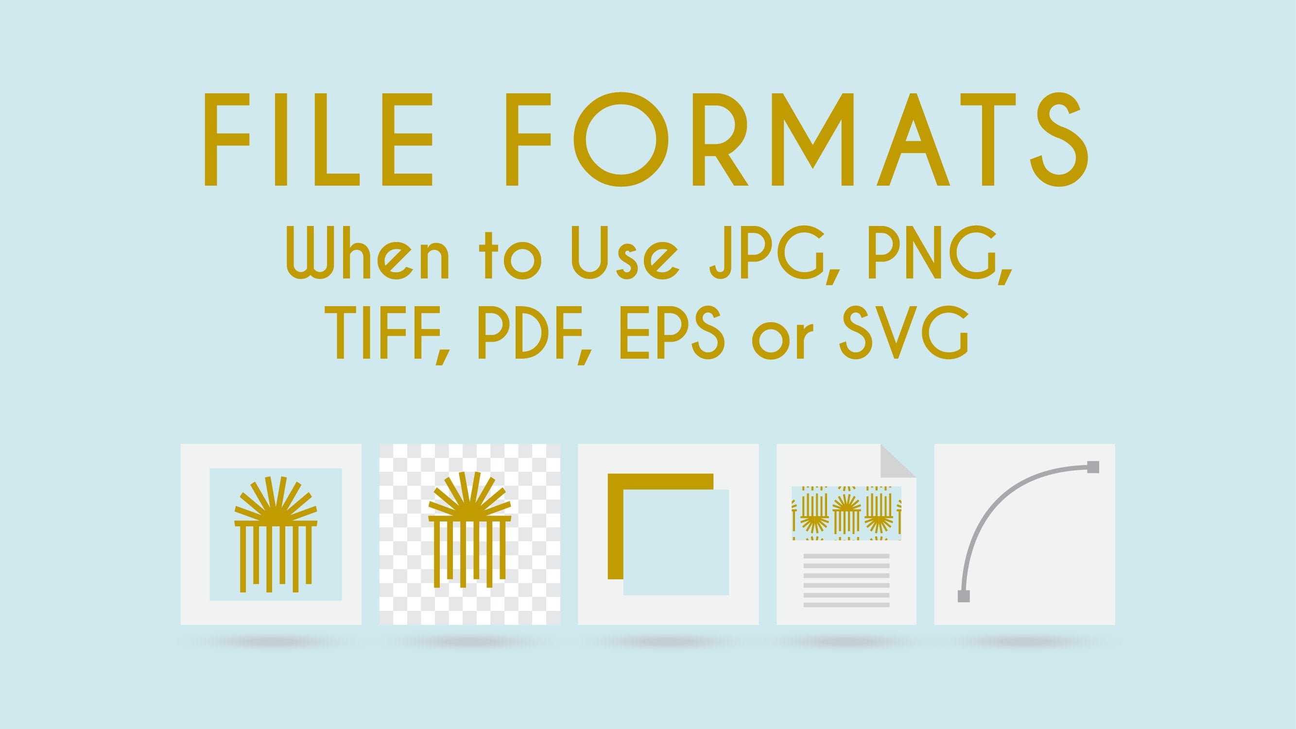
11. Final Thoughts: We have learned a lot in this class. We learned about color terminologies such as hue, saturation, value, and about tint, tone and shade; and how they relate to one another and get help us to create better color palettes. We learned about light, RGB and CMYK. We understood the relationship between RGB and CMYK. And why is that RGB is intended to use on digital screens and CMYK for print. Finally, we learned about Pantone. We understood how to use Pantone and how to find the correct values in RGB, CMYK, and Pantone to our color palette. It took me years to finally understand all of this. This class is available for you whenever you need it to go back and refresh this information. Also, remember to visit the "Projects and Resources" section to download the PDF with highlights of the class. So you can access it whenever you need. And also upload your project. I would love to see your color palette selection in the project section. I wish for it to be a source of inspiration for every student who take this class. I invite you to take a look at my other classes here Skillshare: “File Formats” where I teach when to use JPG, PNG, TIFF, PDF, EPS and SVG. A topic very related to this class when working at a professional level. And my other class “Design for Non-Designers” where I give actionable tips on how to create functional and attractive graphic design. We work specifically with color, fonts and images. I really hope I have helped you learned something new and useful. Please leave a review if you did see you in the next one.
 Nayda Cruz, Editorial Designer