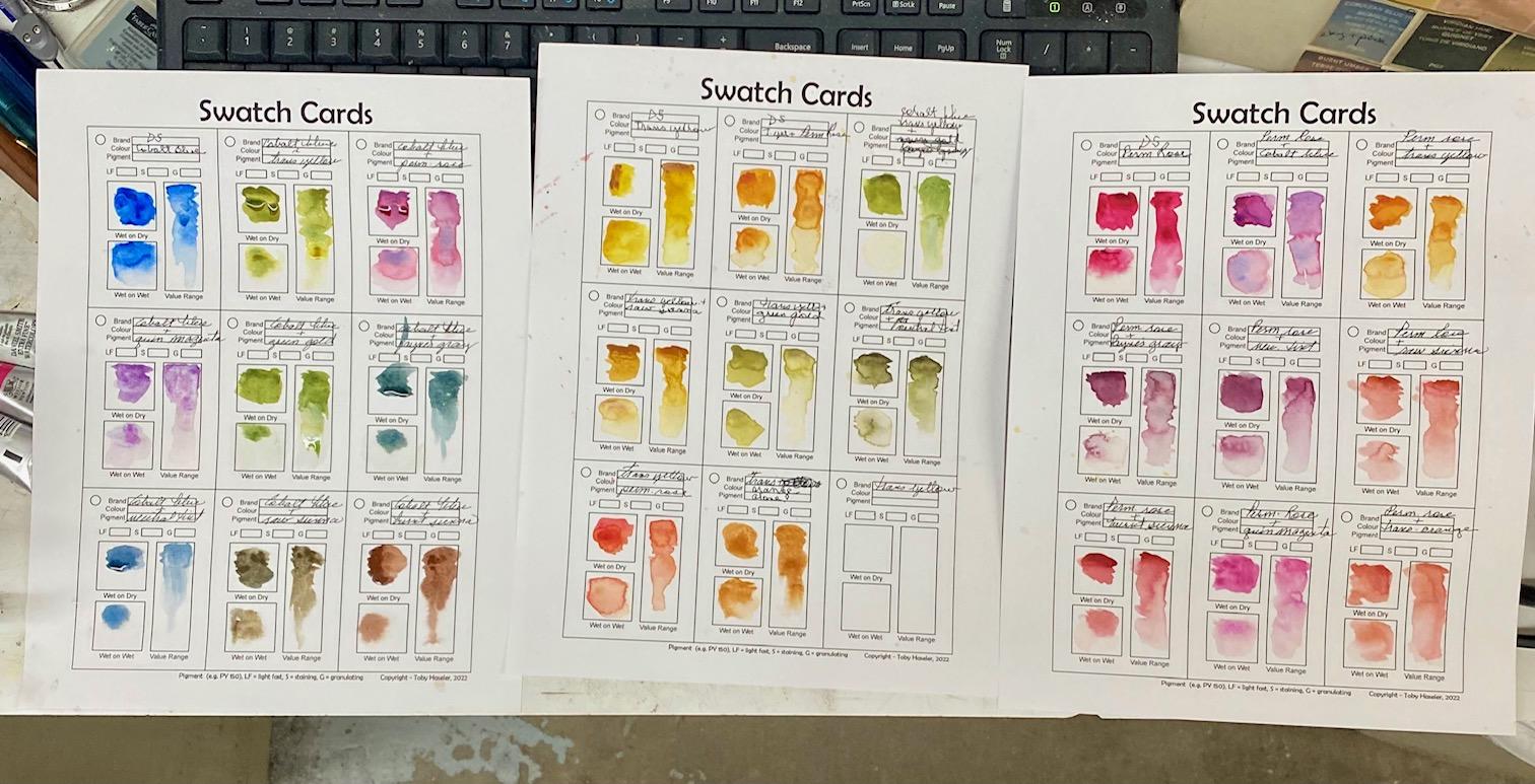
Toby's color swatching sheet - new discoveries
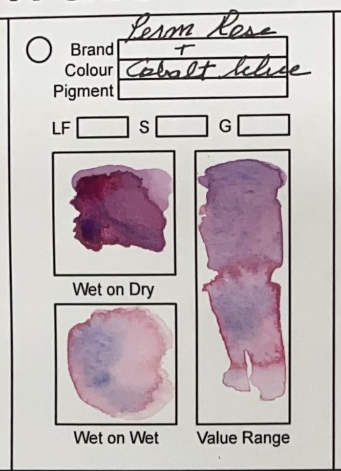 I'm still in the process of swatching colors, but was amazed by this one. Daniel Smith's cobalt blue and permanent rose. Isn't the separation beautiful! I'm working with primary colors: cobalt blue, transparent yellow and permanent rose and will post more later. I hate to admit this, but I've painted for years and never swatched my colors. I figured it Toby does it, I should too.
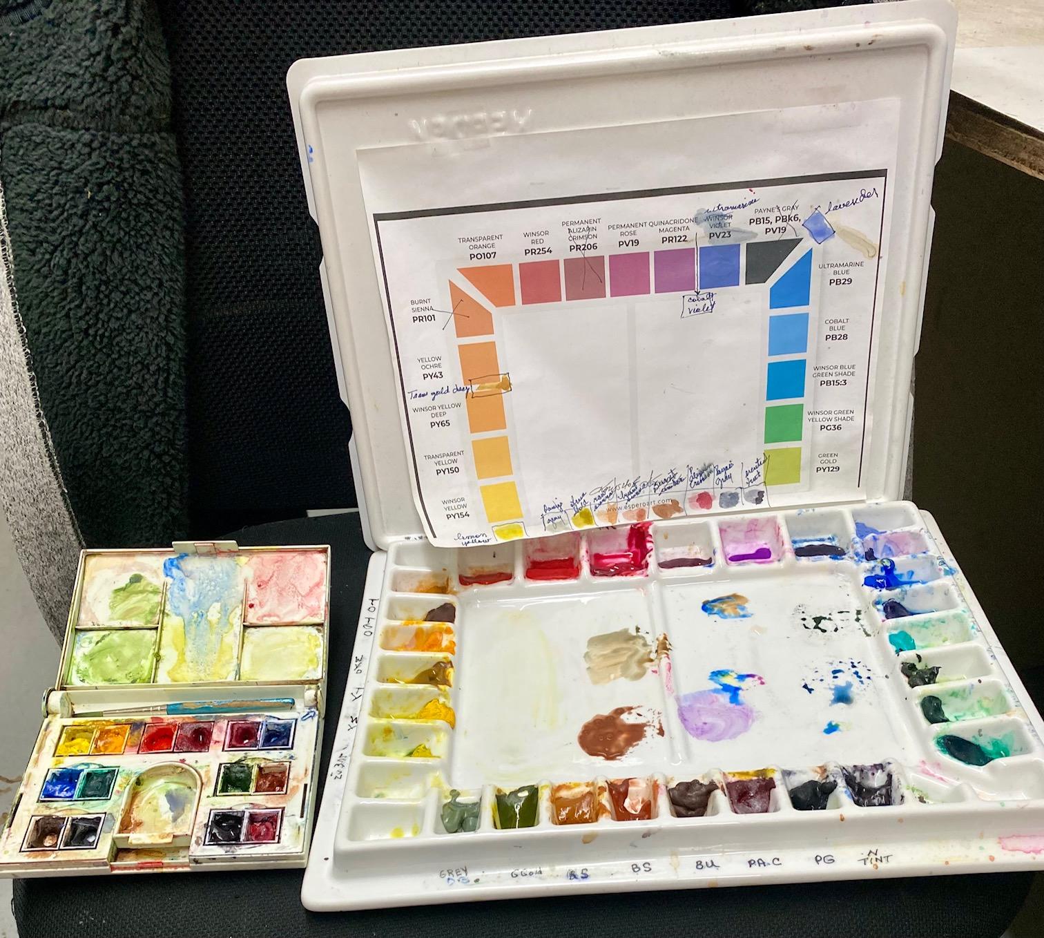
I started watercolor with a Winsor/Newton 14 color travel set. It served me for a long time and I bought Daniel Smith color in tubes to refill the set. Noticed I never used Veridian, so put neutral tint there.
Years later, I wanted to expand my pallet (knowledge of color) so I bought the large set and used tube colors according to a Skill Share class. I use it a lot, but always go back to the cobalt blue, transparent yellow and permanent rose. I just like those colors!
For the swatch sheet, I took one primary, then mixed it with the other primaries and then other colors to see what I get. Wound up with three primary sheets and I'm working on a separate sheet of miscellaneous colors and darkening colors. Just seeing the mix of cobalt blue and permanent rose alone was worth this exercise. How beautiful. I stil use my little Winsor/Newton set for simple things. I replaced the white in it with raw sienna.
I was amazed to see that I had bought color that was easily mixed by using what I already had. For instance, I bought Daniel Smith green gold and it's almost the same as mixing Daniel Smith cobalt blue and transparent yellow. I bought Transparent orange and it's almost the same as mixing transparent yellow and permanent rose. I bought quin. magenta, but it's almost the same as the mixture of permanent rose and cobalt blue ... BUT -- it quin. magenta doesn't have the beautiful color separation that my permanent rose/cobalt blue mixture has! Color separation intrigues me. Permanent rose and Payne's gray has a slight bit of separation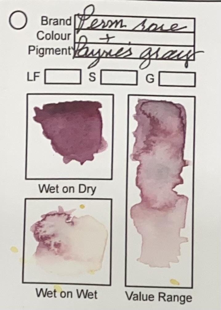 and I never knew that was such a beautiful color. Toby, know any other colors that do that? Now, for the big confession -- I don't understand warm/cool colors very well. My primaries are considered "neutral", but I do have all the cool and warm colors. Using them for a project is beyond me. I just play. Would like to have more of a plan.