My Ever Changing Color Palette
This is my story: Rather long and I understand for anyone not wanting to delve in lol….This class fell right into place for me Toby as some months back I took to the task of creating color swatches of each watercolor paint I have collected (too many really). Your suggestions and knowledge on color theory helped me dive deeper into the pigments to see more of what they have to offer.
At the beginning of my watercolor journey (1year now) I started with the Cotman watercolor palette, but soon found myself wanting to explore with different brands which led me to also realize I don’t stick to one color palette and I needed to create a solution to ease my frustrations. This is the system I created and lo and behold it works for me making it easier to create any palette with any color I desire in that moment.
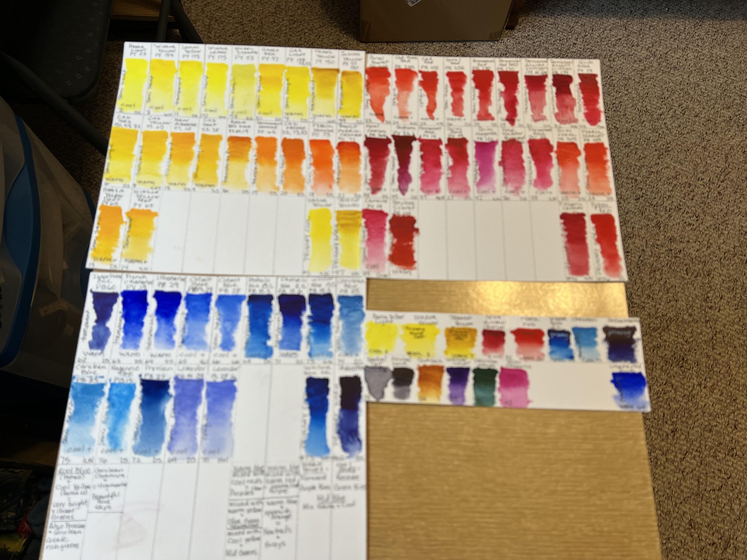
Creating my color swatches: I cut up some of my unfavored watercolor paper, created a swatch card for each color, added the paint info to the swatch and then using my loved 20 year old color wheel as inspiration, grouped the colors together and assigned them a number in chronological order.
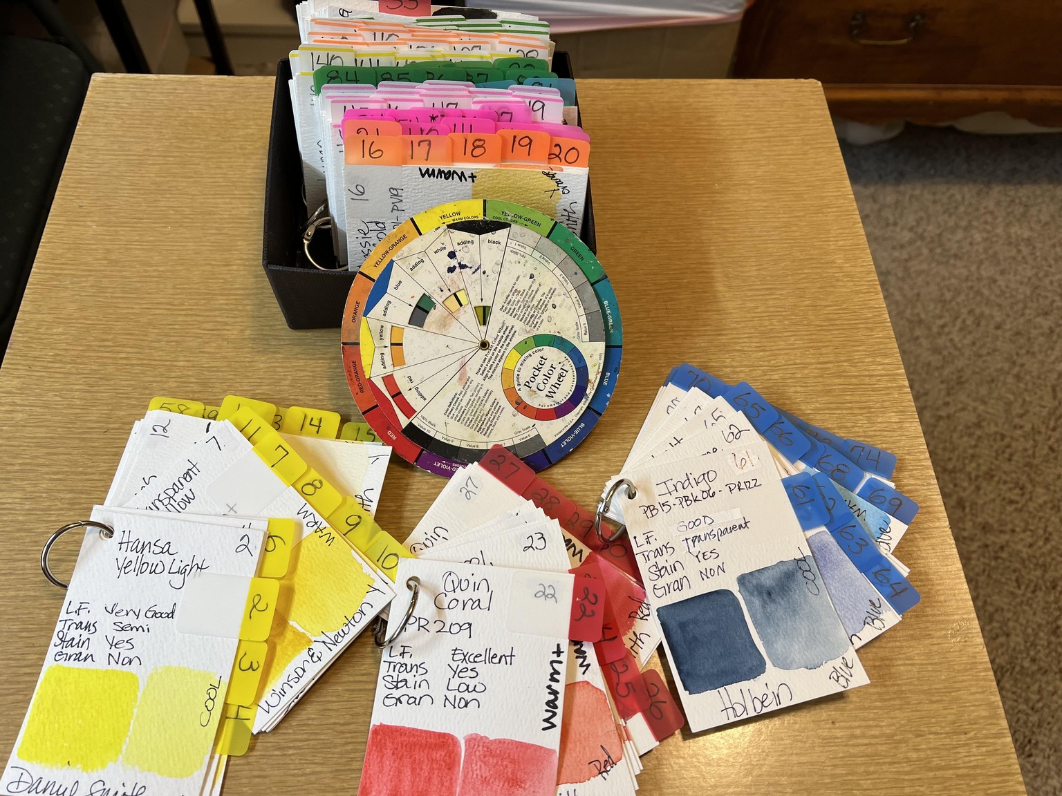
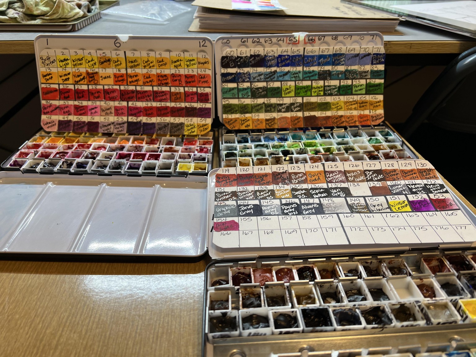
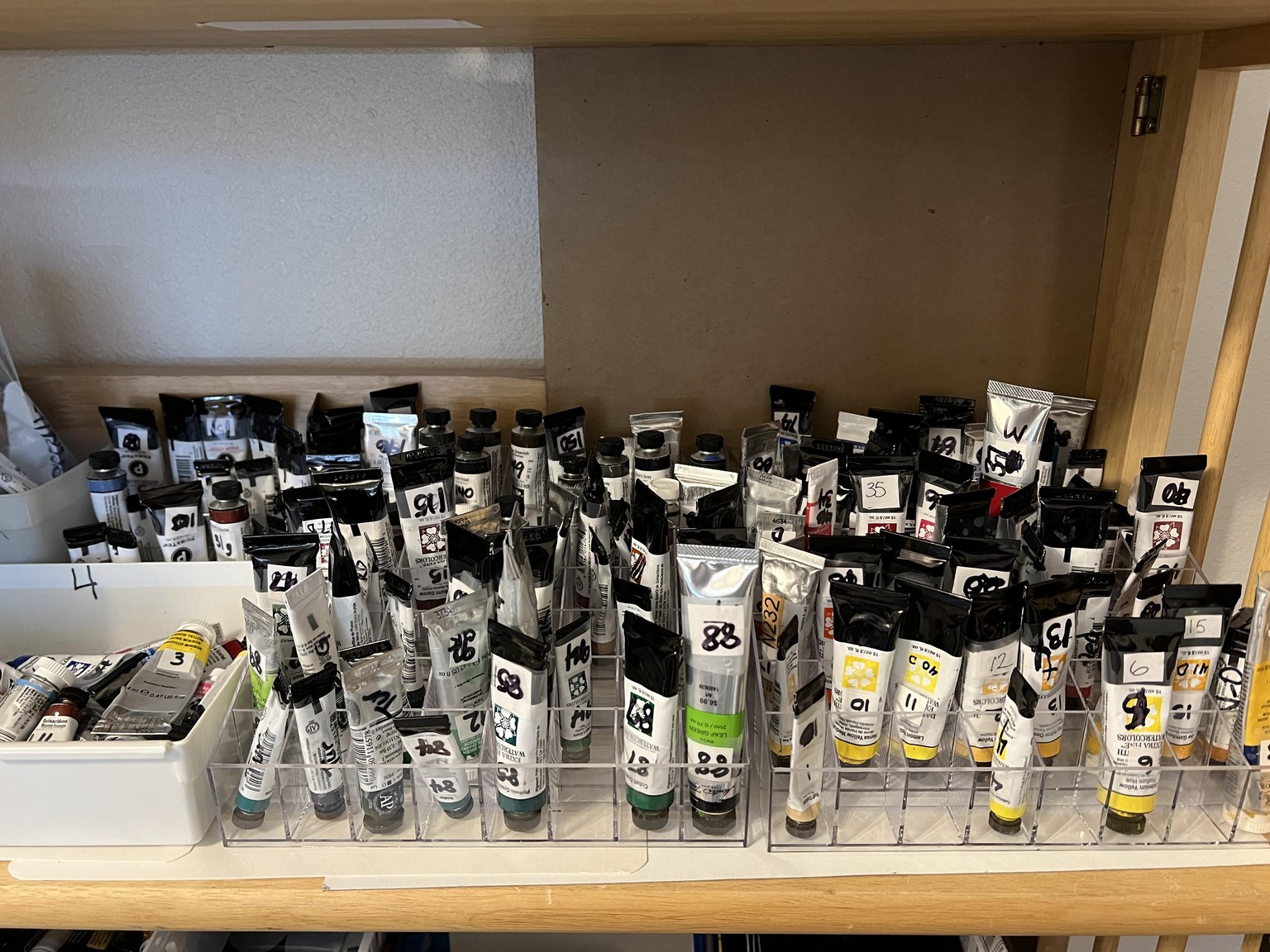
Next, I put each paint color in a 1/2 pan and organized those into three tin palettes. I wrote the corresponding number on each 1/2 pan and each tube of paint and use acrylic lipstick holders for storing the tubes.
For quick reference, I then made a palette size swatch that shows the paints in each tin.
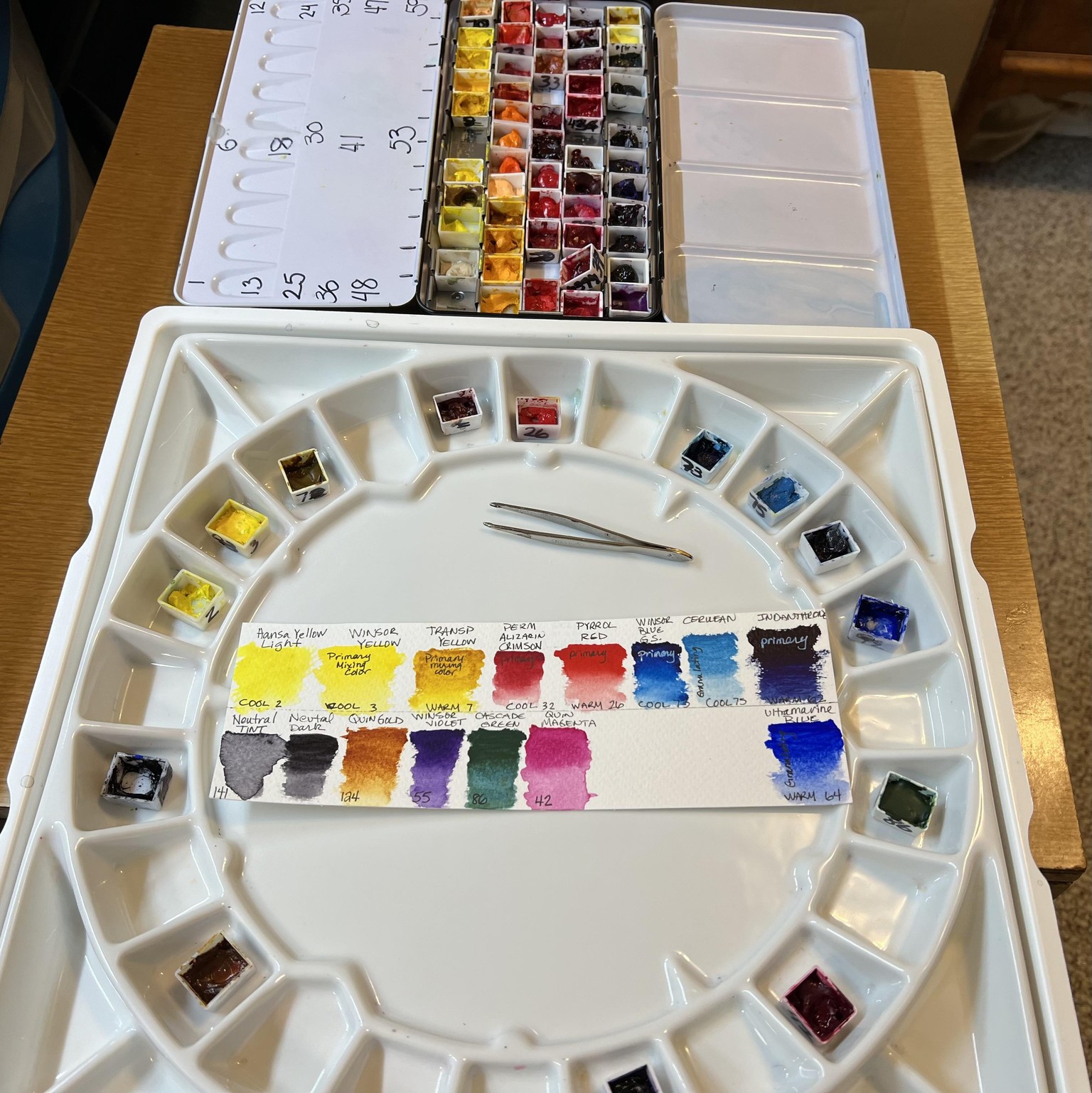
When I’m ready to paint, I use tweezers to pull the 1/2 pan from the palette and put them in my porcelain Meeden palette that I absolutely love, but I also have smaller ones I use. When I’m done painting, I let the pans dry and then plop them back into the tin palettes so there is less waste overall.
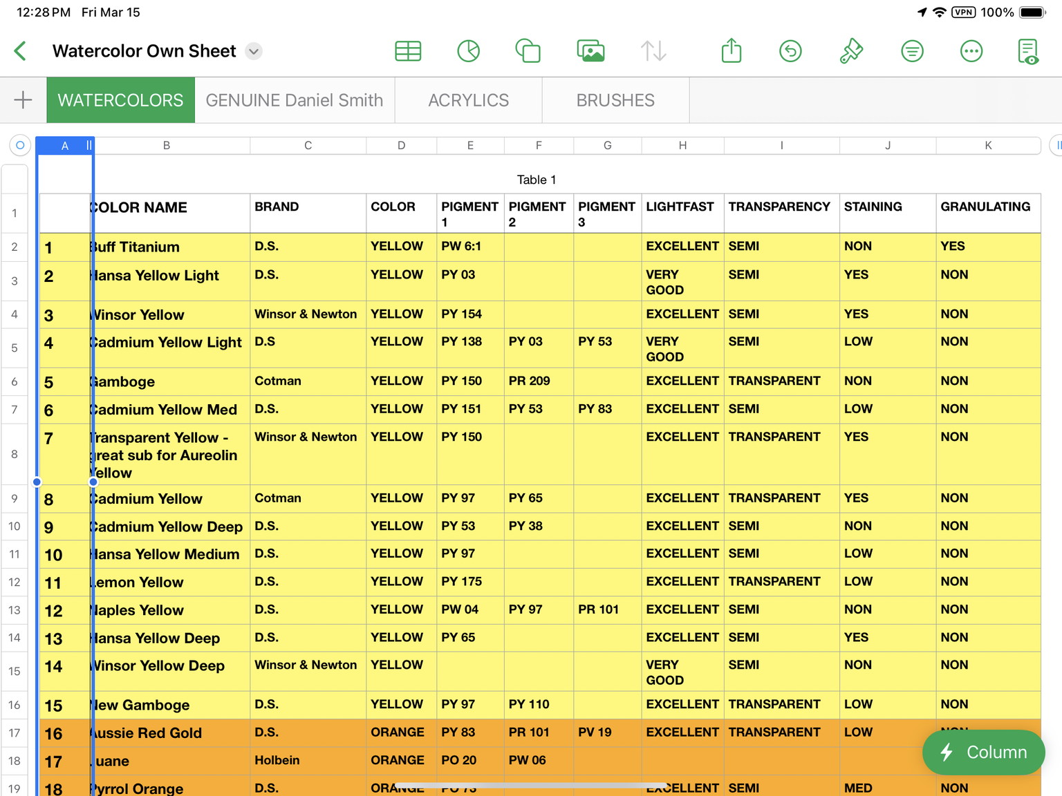
Lastly I created a cross-reference data base on my iPad that I can refer to as well. This whole system has been a game changer for me and I’m so happy I took the time to create it.
And now, at last, getting to your wonderful class. The one thing I hadn’t done yet, was work with the paints to get a better understanding of color mixing and narrowing them down to a handful of paints I could use for a limited palette. You and your class were so helpful with this Toby.
I spent the better part of a week watching your class, playing with the paints and reading about their properties.
One of my biggest challenges when I first started painting was not understanding why my colors looked so different from what the teacher used. I came to appreciate when a teacher shared not only the color, but the brand of paint they were using. This information started my journey of learning more about color theory.
There seems to be differing opinions on what some call warm or cool colors, but because of this class I realized that if I use the term ‘bias’ in place of warm or cool, I seem to understand the process better. Which way does the color lean, warm or cool (bias)? Is the color pure or mixed with several pigments? Learning more about color bias (warm and cool) helped me grasp how to select the colors I ended up picking as my primary mixing colors. This was the best part of the class for me. I feel I now have the tools to make mixing and matching colors fun instead of frustrating.
Final part of the class: Picking my three primaries.
Primary process: After swatching my yellows, reds and blues, I decided to use only transparent or semi-transp paints and stick to those paints that have only 1 pigment. (Same color, different brands can use different pigments). I then picked a cool and a warm bias from my swatch cards.
Selections:
Yellows: Cool, Winsor Yellow PY154 /or/ D.S. Hansa Light PY 03 & Warm, W&N Transp Yellow PY 150 -
Reds: Cool, W&N Permanent Alizarin Crimson PR 179 & Warm, Daniel Smith Pyrrol Red PR 254
Blues: Cool, W&N Cerulean Blue PB 35 /or/ Winsor Blue G.S. PB 15.3 & Warm, D.S. Ultramarine Blue PB 29 /or/ D.S. Indanthrone Blue PB 60.
Blues were the most difficult to choose, hence the reason for 4 choices.
To round out a 12 color palette I would also add these colors: D.S. Neutral Tint; D.S. Quinacridone Gold; Winsor Violet; D.S. Cascade Green & W& N Quinacridone Magenta
The next part of my color journey will be examining convenience and luxury colors. I’m sure I will engross myself in this process for at least a week, so it’s for another time :). I had so much fun exploring color with you Toby and can’t thank you enough for helping me out!
Excellent Class-With lots of fun color theory work to do…..:):):)