Alice's adventures
The book I choose is a classic: "Through the looking glass and what Alice found there" (1871). I love the idea of Alice going through a mirror.
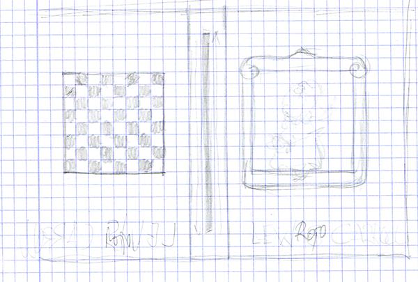
The first sketch has the basic elements.
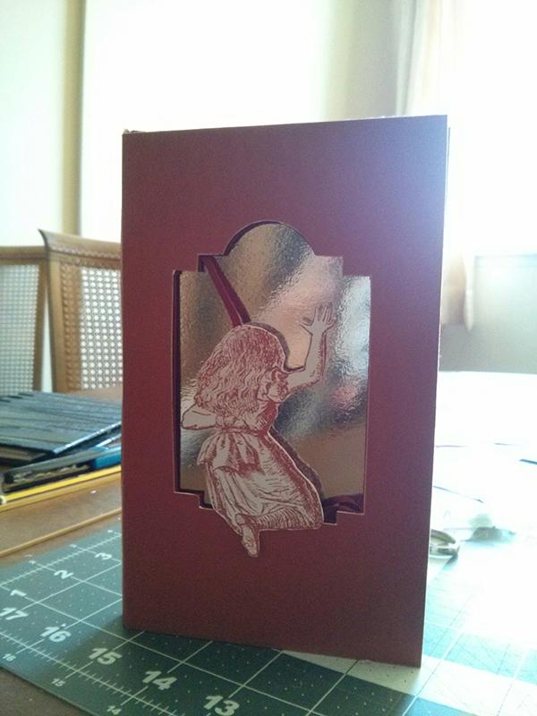
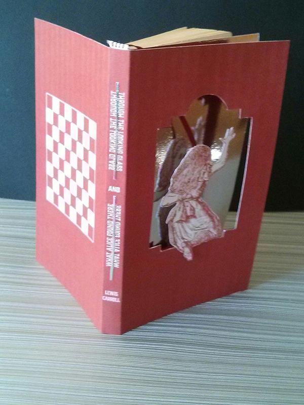
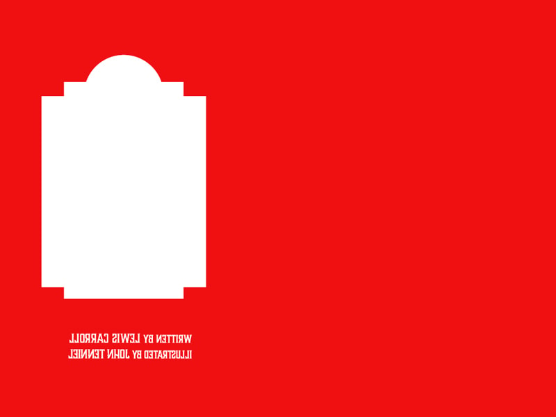
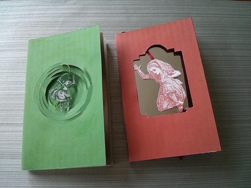
I wanted the main character go with us all along the story, that could go through the book. So, I cut the cover making the form of the mirror and used a metallic paper for the blank page, mimicking a mirror.
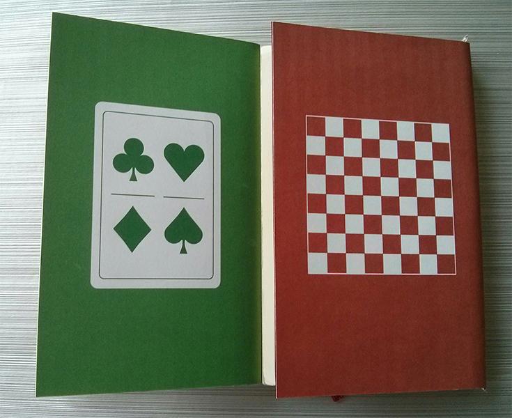
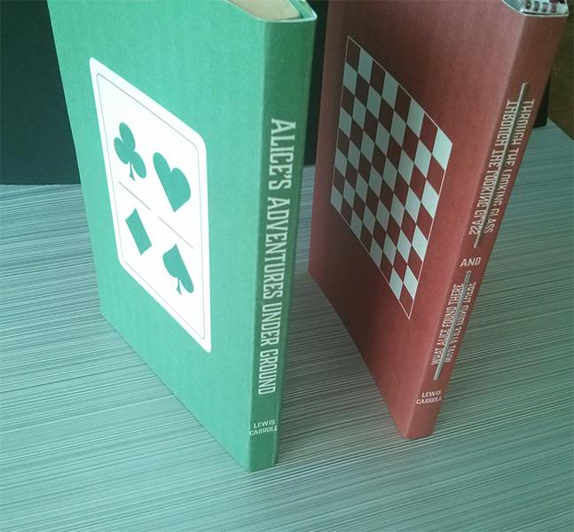
On the backcover I drew a chessboard because the book revolves around a chess game, and the colors are red and white, just like the pieces.
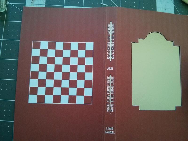
The spine is the place for the title and the author's name. The font is "Charcuterie" by Laura Worthington, is legible, and has beautiful serifs.
The cover shows our main character in her most recognizable version, from John Tenniel. The image speak for itself, telling us the title.
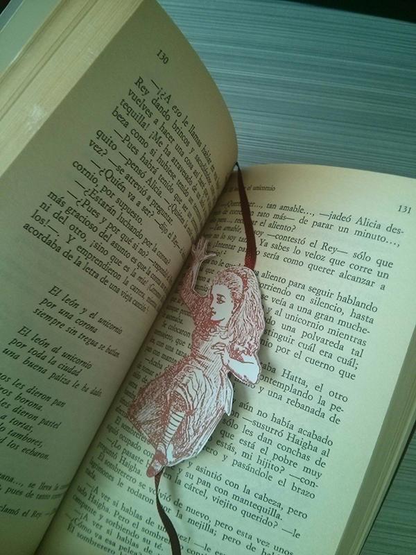
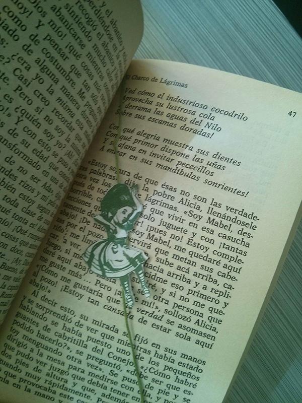
Alice is also the bookmark.
In the interior of the cover I put the specular image of the names of author and illustrator, so the reader could read them on the metallic blank paper.
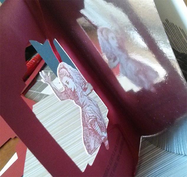
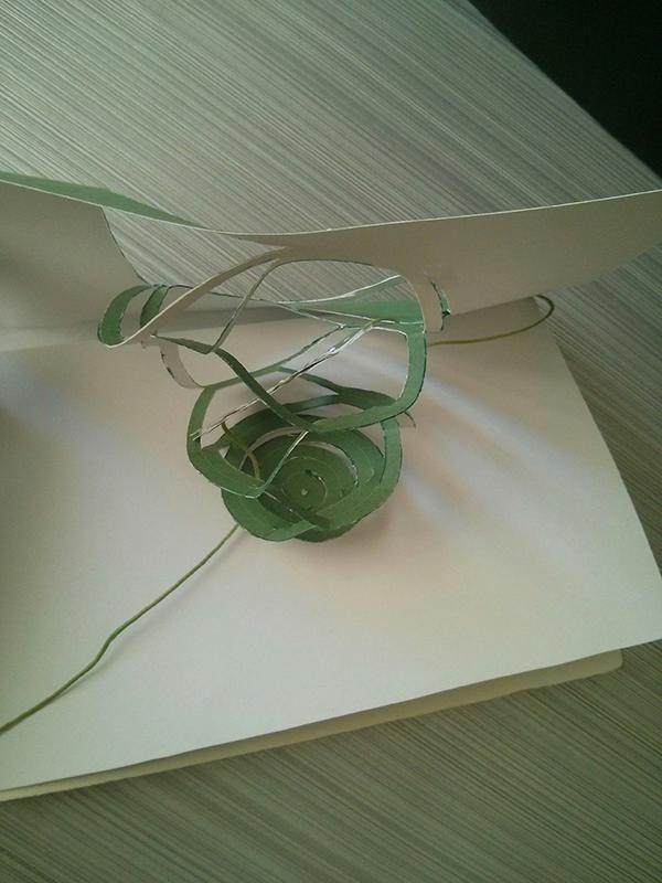
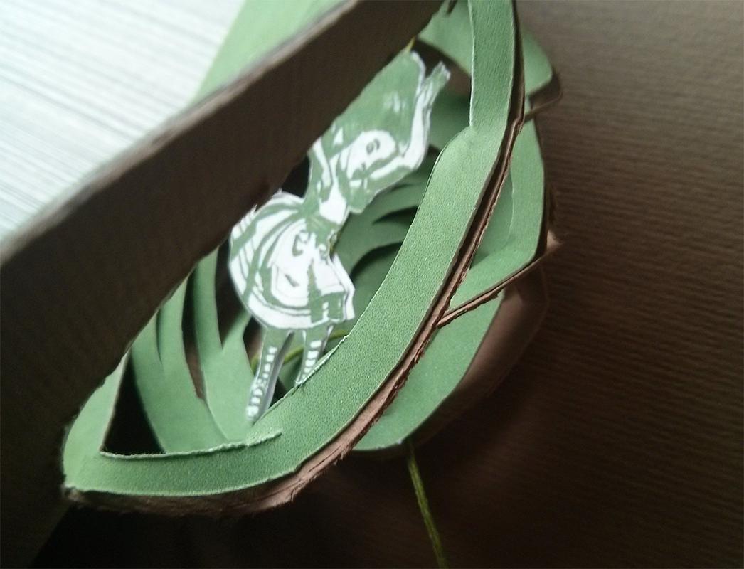
Having done this, I wanted to continue with "Alice's adventures under ground" (1864). I remembered a pop-up book I have from when I was little, with illustrations by Jenny Thorne based on the drawings from John Tenniel, so I chose the pop-up that introduces us in the story and I put it on tne cover.
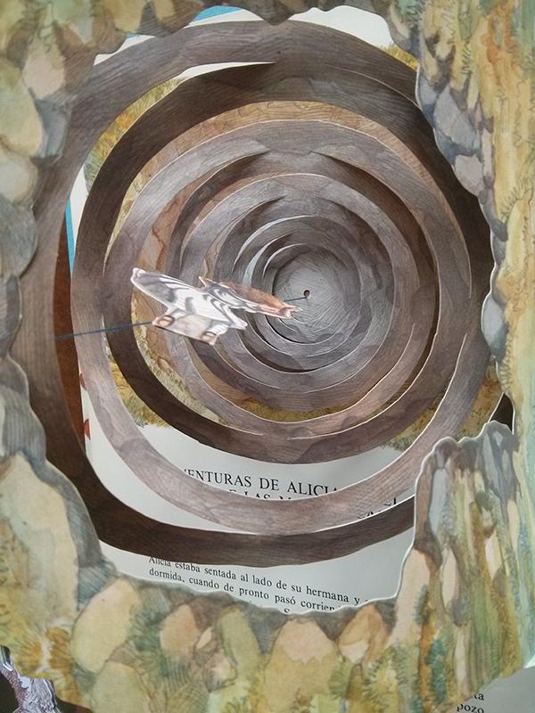
When the reader opens the book the spiral grows and Alice falls into the ground.
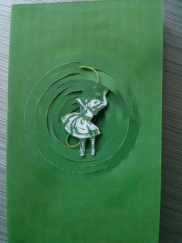
I chose the green color for this cover and brown for the blank paper.
As in the previous project, Alice is also the bookmark.
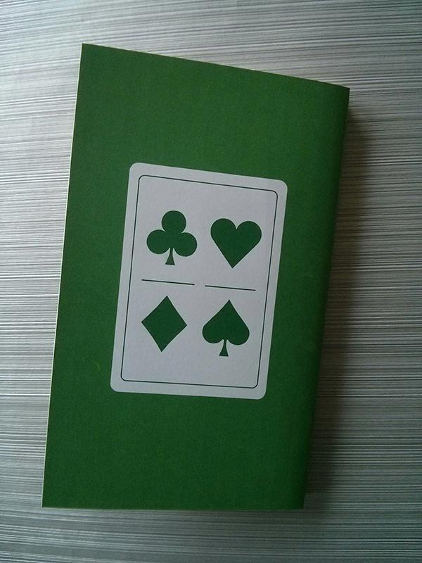
On the backcover I drew the cards. The two books work like a collection.
I wanted to de something different and fun, just like these two stories.
I used Photoshop to work with the illustrations of John Tenniel and Jenny Thorne, Illustrator for the icons of the backcovers, and InDesign to compose the final design.
I hope you like them!
Thanks Chip Kidd for your inspiration.