Transcripts
1. Welcome - YouTube Thumbnail Masterclass: Hello, and welcome
back to a brand new course on my channel. I'm a YouTuber and
I've been doing YouTube now for nine years. I've grown to 60,000 subscribers on my main
channel, and, of course, around about 8,000 on
my second channel, along with getting
millions of views. Now, today's course is focused
on one thing, thumbnails. You're seeing them right across here on my second channel, which is all about Tutorials. This is truly what draws
people into your video, and if you would like to
be a successful YouTuber, then you have to master the art of creating advertising
thumbnails. And today, in this course, I'm going to be breaking down exactly what I do to create
advertising thumbnails, and we're going to analyze one specifically in a load of detail so you can take those
principles with you when you're making
content going forward. Don't forget to check
out the class project, and without further ado,
connect with me down below, and let's jump in to class one.
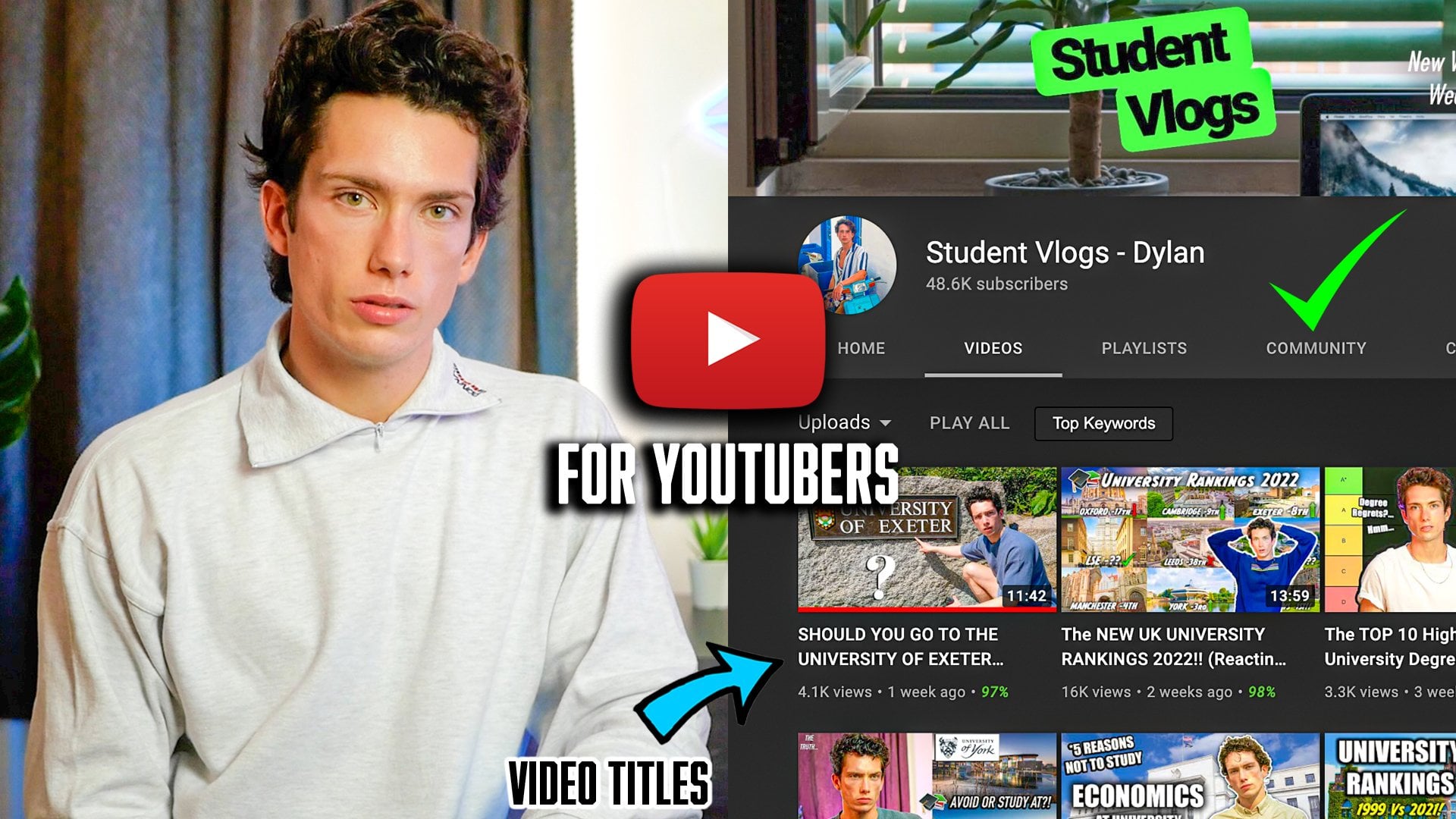
2. Success Case Study: So, welcome to Class one. This class is all
about looking at case studies of
successful thumbnails, and ultimately, why
are they successful? Now, whenever anybody
is on YouTube, often they have their
home screen available. So, for example,
the home screens going to look like
this nowadays. They're pushing short a lot, and then you obviously have
your small window thumbnails of content you watch in the top. Now, you'll notice that these rectangles are very, very small, and so to stand out, you really have to have a great thumbnail. So again, this one stands
out massively to me, a massive money sign and, of course, a white background. Mr. Beast, the king of
content in many ways. His thumbnails stand
out all of the time, mostly due to his emotional and sort of appetizing reactions in his face, all
of them have that. One or two words here or there. He does very much engaging
lifestyle content. So largely your
thumbnails depend on what style of content
you're creating. Now, this course,
I want to focus on the idea of creating
an appetizing thumb for a video that is a tutorial. So I do a lot of tutorial
work on my channel, my second channel.
It's a guide channel. And the reason why I
want to start off with tutorials is because
I feel like there's so much information
that we can get from how to build a tutorial
thumbnail that then will allow us if we're
creating tutorials to get hopefully more
clicks and more views, versus, you know, even if you're making
lifestyle content, once you understand
how thumbnails work, which this is a prime
example of how to do, you can take those
principles with you going forward, as well. So, yes, my tutorial
channel right here, largely my popular videos are all centered
around war zone. They're nice and simple, how to fix things. So what
do I have on those? Well, simply put how to fix lag. Well, I've got the Call
of Duty war zone logo. Perfect. It's right there. And then I've got, as well,
the actual simple text of This is what you're
going to be fixing, and here's you in the lobby
stuck, but this is the fix. Next up, we've got
another video. Get your music on Spotify
for free in 2023. So it's nice and simple. And we're going
to actually build another thumbnw for
this here in 2025. Now the reason why this thumbnws great is because you've got
all of the key pointers that the person who's searching for this
video is wanting to do. On the left, you've got Upload. On the right, you've
got your Spotify page, which is already
existing. Okay, mine. You've got this little box here that says you've
uploaded one song, and you've got an arrow showing you're going to be going
from one to the other. It's nice and simple, and it works in an
absolute treat. Very similar formats
for the rest of this, you know, nice, how to tap
to pick up, easy Guide, war zone, how to do this, war zone, coming down, data transfer fix, nice and simple bar at the
bottom, two phones. And you'll notice green
arrows across all of these tutorials because it signifies a change.
Just like Mr. Beast has before and after
in some of his thumbnails, signifying a change creates curiosity because you're
seeing the start and the end. One versus day 71. Very nice. Red Team versus Blue Team. There's no text, but
the title does it all. So, in essence, this is
a small case study of successful ways to
utilize thumbnails. If I scroll down even further, we're going to see some
other thumbnails that maybe weren't quite
as successful. So this is kind of quite plain. This ultimately has
no engaging text. And some of these
older content of mine didn't quite have that appealing emotional
engagement factor like this. I should have added some text or chose a more engaging frame. Um, here, fixed
missing captions. It's just a bit too busy.
It's a bit too chaotic. It's not simplifying anything. On the left, there's
too much text, and it's rather small. So, in essence, thumbnails
are very, very fine art, but it's clear to
see the pattern in all of my top thumbnails, have those arrows,
have those circles, and it's quite clear what
is going on in all of them. So yes, let's jump into
Photoshop. Next up.
3. MUST DO EDITS FOR YOUTUBE: Right. Welcome to class two. And in this quick
fire master class, I'm going to start with
the final product. I've just built this. Now, this is my
brand new thumbnail for a similar video that I made two years ago that
we just looked at. How to Get your
music on Spotify. I'm following a very,
very similar pattern, but there's so many
tricks that I've done to make this
thumbnail super engaging. Firstly, we're going to
start with the base. Now, the base is two separate thumbnails, two separate images. You've got on the
left, the white one, which runs across
the whole page, and on the right, I have
added in another image, nice and simple photoshop, dragon drop and put
it exactly halfway in between of the thumbnail
file resolution size. So the main and first
thing that I've done is I've added a nice green
spark down the middle. Here. So to do this,
you simply double tap, click onto the layer that has you want to add
that green spark too. Double click here, add the
outer glow, select the color. Nice and simple. This is less
so Photoshop tutorial and more about YouTube thumbnails and why they become successful. The reason why
this is successful as a thumbnail is because
the color scheme. Now, the color scheme right
here spotifyes green. Whenever anybody is looking to upload their music to Spotify, instantly, you associate music with kind of green
because of that, and also green is good. It means you've made progress. It means you've ticked it off.
It means you've done well. Whenever somebody is looking for a tutorial, they want success, they want to do something
well, and promoting those colors is actually
quite a nice touch. As a result, right here, you've got this green arrow, perfect, symbolizing how we're going
from the left to the right. It's green, matches up
with the outer glow, matches up with the spotify
branding and color, matches up for free, and then of course, the
Spotify logo as well. Now, if I was actually going to be pedantic or panicsy I would actually change the color of
this for free right here, because what I want to do
is to make it a little bit brighter and stand out
just a little bit more. So if I update that color
right there, perfect, and I'm going to do the
same for the Spotify logo, just to make it pop
that tiny bit extra. So first things first, the
color scheme is important. Like any good marketing
person generally does, matching up the colors to the
brand or the colors to what you're trying to signal
always acts as a treat. Now, that's not the
only thing I've done. I've done plenty of things, but the final thing I'm going to cover in class one, again, when it comes to the bulk
is making sure my text stands out so that
from a distance, you can easily read it. Now, I've obviously
done this by the colors of having white on
a black background, and then changing
the green of Spotify or changing to the green of
Spotify, which also pops out. To do this, I've simply
added a rectangle like so, clicked on the side
menu, added it across, and then once it's open,
gone to the right hand side, and typed in 80 to make those
rectangle edges rounded, having those colors
works very, very well, and it allows your text to stand out on what would be
hard to stand out, because if you've got
a thumbnail like this, two different sides, sometimes the text can get lost unless
you've got a background. So I've added that background. There are plenty more
tips and tricks that I've done to make
this thumbnail pop. We're going to cover
it in the next class.
4. Small Thumbnail Changes: So welcome to Class
three. We've gone through the bulk
of what I've done. Now let's move on to
some more subtle things. Obviously, my title right here, I blowjo Music to Spotify is
reinforcing the video idea. That should always be the case. If you're adding text, it has to be correlated to your video. Don't repeat yourself in terms of what's in
the video title. Don't repeat it inside
of the thumb now. A different variation or add an extra keyword to your thumbnail text that
isn't in your title, so you're doubling up on that
curiosity of the viewer. So that's a little cool
trick that it took me a while to learn,
but I have learned it. I've then added for free, 2025, so it's up to date.
The keyword is for free. That's what people really
want to do it for. That's another great drawing. And I've also put Easy
Guide at the top. Made sure, as well, just so the text stands
out when it's not got black background to add an
outer glow and drop shadow. So here, just a nice small drop shadow so that when I
zoom out, it comes on. And then at the bottom
on the text for free, I double click again, I've added a nice outer glow
to make that white pop. Now, as well as this. I've also done one major thing that I think adds massive value. I've clicked on my
right hand side image. I've gone to the top
filter camera raw filter, and you can see right now that there's no bars
already selected, but that's because I've
already adjusted this photo. What I do, let's say, when the photo first
came in it was nice and dark and there was all these things
wrong with it. Not wrong with it, but the
base image of Spotify, a screenshot is darker,
doesn't pop as much. I want to make these
colors pop so that it stands out on the
YouTube homepage. So first things first,
I selected Auto, and then I up the brightness
as such, the warmth. I updated the saturation and all of these things so
that when I went back on it, it was pretty clear that this
Spotify page was visible, the colors look good,
the person looks good. Yes, it's definitely
an artist, as well. Um, and you might even want
to adjust the size sometimes, but the reason why I'm not
adjusting the size right here is because I quite
like the Spotify logo at the top hand
corner right here as well to reinforce exactly what I want the
audience to realize is that I'm showing
you how to get your music on a Spotify. So subtle reinforcement
right there. If I make it bigger,
you might lose that clarity of what it is.
So there's subtle clarity. I've already boosted
the colors previously, so I don't need to
do it again, but I just showed you how to do it. And you can see
some of my tracks right there on my Spotify page. Now, there are so many
other subtle things that you can do to just subtly boost the conversion
rate of stuff like this. Now, there are three main things four main things that I've
done right here that I want you to have a moment
now to think about to see if you can
spot what I've done. It's probably pretty tough. But yeah, those are
the main things in terms of thumbnail building
before we move on. I've got nice clear text. The text is different from
my actual YouTube title. I've color coded
everything in line with the brand of the
thumbnail in the video, and I've subtly
chosen to bolster colors to make the video
stand out from a distance. Times you can add a border
as well, but to me, I can clearly see at
this small angle, this is what the video is about. This is what you're doing. It's for free, 2025,
and it's an easy guide. It's a very, very nice win. So without further ado, let us jump on to
the next class.
5. KEY: Subtle & Final Edits: So, welcome to Class four. Now we're looking at the subtle
things that I've done to, in essence, improve the
quality of this dumb now. First things first, I want to make sure that people
recognize what's going on. So in terms of symmetry
on either side, Dylan Right here is the artist, but I've added this text in
and I've made it bigger. I've also added in a
little white background before to hide the
original text. Why would I do that?
Firstly, I'm trying to match up the screenshot on the left with the screenshot
on the right. So matching up the artists names is a key thing, adding
them back in right there. It also means that I can
make the artist's name a bit bolder and I've
increased the size. By increasing the size,
I have, in essence, allowed myself to
essentially stand out more, and the audience will get
the rough gist that right, there's an artist
on the left called Dylan who's trying to
release something. But on the right, there's
an artist called Dylan, who is on Spotify already. Therefore, what this
person in the video is saying must be God damn
legit, in essence. Um, so again, subtle things like that make
a huge, huge difference. When it comes to
release details, originally, this
is nice and small. What I've done here is I've
got my nice rectangle tool. I've gone around this thing. I've gone Control Command T, and I've actually
changed the size of it. It was
originally like this. I've then made it bigger
and bigger and bigger, just so it stands out
that little bit more. And honestly, standing
more helps massively. So there's one thing
I've changed there. There's one thing
I've changed here. Also, this is super subtle, and I don't think
it'll matter too much, but what you could
do is right here, California Beach,
one of my songs. Originally, the screenshot
didn't have that. It had one of my
other clients songs. But because I've basically got a spotify screenshot
on my profile, I want to match up my
California beach thumb now to the one on
my Spotify page. So you can see right there on the right, this is connected to this now because I've
added in an extra photo. Very, very nice and subtle. Probably won't make too
much of a difference, but one thing you could do, and I'm going to do it
right now, actually, is if I highlight this, I
really want to highlight California beach being on the right hand
side and the left. So I could do
something like this. Here. Make sure that my tracks are standing
out even more. And then I'm going
to come again. I don't want to cover up this
top part of the image here. I want to keep that
nice and symmetrical. So I'm going to get
my rectangle again. Go over it again
this time smaller. I'm going to go Command, Commant once I've
selected the layer, once I've selected the right
layer, drag it even bigger. And now all of a sudden
when we're talking, we can quite clearly see the correlation between the left hand side,
California beach. And the right hand side. I'm just going to move that
spotify logo up a tiny bit. It stands out massively from the distance as well and
if it's perfectly there. Now from a distance, you're subtly drawing that connection of this to that if
you'd like to as well, which is very nice going to make that even
bigger quite possibly. I'm just going to switch
that across here. To make this side a bit bigger, increase
that white space. So highlight it,
Command T. Just getting a bit more space on the right hand side by
making this bigger. I'm then going to increase
the size of California Beach, the original photo
I've got right here. Perfect. And already,
we're now drawing those connections a little bit more seamlessly between
the right and the left. I might even just move it
across tiny bit perfect. So overall, I'm pretty happy. Stands out pretty well.
I'm a fan of that. A tiny bit smaller actually
made a tiny bit too big. So now we're drawing
up those connections between the left and the
right nice and easily, and other small things
that I've done. Once again, I talked about adding my artist's name earlier. I might actually reduce the size of that just so it looks oops, so it gets nicely sized, but the same principle applies. I've done exactly the same thing with myself and my name here, made my name even bigger. And then, of course, the
track list at the bottom. This was nice and
small at the start. However, now I essence, made it even bigger so that
people look at this and go write the track
list must be legit. That's why you
upload your songs. You normally upload songs
to your track list. And then as a
result, you've built the perfect thumbnail
in many ways because you're
showing exactly what the audience want to see. In my case, this is tutorial, and so they want to see proof, in essence, that you're going to teach them what
they want to know, what they're searching for.
That is the truth of it. Here it's pretty clear,
it's nice and clean. It's quite busy, honestly, but it's not mad, busy. Another small trick
that I might do is this excess writing on the left hand side that
is very, very busy. I might opt for a small little
blur filter at the top, and then blur just
so we can focus our attention a bit more on
some of the other factors. So you can see I'm
blowing this out right there, nice and simple. It does kind of highlight
my page a bit more, but that was a bit
too much of a blur. I want it to be subtle, so I'm going to take it
down to about 1.2. So a nice subtle
blur right there. I love the colors at the bottom, but again, don't want it
to be too distracting, so I'm going to filter gauge
blur and go 1.2 again, maybe 1.4 at the bottom because that doesn't
matter as much. And there we have it,
I've subtly, once again, reinforced the audience to look over on the
right hand side of my Spotify page and not
get caught up in too much of that mumble jumble
text there as well. So I'm going to add that
slightly as well, like that. Very, very nice, indeed. Now, I wouldn't so much do it on the left hand side
because I want them to see all of those details that
prove that it's all legit. So after I've completed
those changes, I'd say we're pretty much on the way to the thumbnail that I think is close to optimum for
a tutorial video like this, a bit different to what
you may have seen before. In terms of my war
zone thumbnails, but similarish in nature to the one that's already
proven to be successful, and those are the reasons why. So without further ado, let's jump on to the next class.
6. The Class Project: So welcome to the class project. You've just seen me
make my own thumb now. Now, I would like
to hand it over to you to create your
own thumb now, and I'll give you
personalized feedback in the description and
class project down below. So, in essence, make a video topic title and
design the thumbnw. Include all of the
subtle branding things we talked about, maybe
include an arrow, maybe adjust the base screenshot
or the base image you have to highlight
the key factors of your video. That
is the key tip. Like us to look at today.
So once you've done it, made it in Photoshop or Canva,
which can be found online. It's a bit of a tool that's very good for making thumbnails that
is more beginner, I'd say, than Photoshop, which can be quite complicated. I think it might also be
cheaper for a one off, and let me know how you get on. Like I say, I'm happy
to give advice, but I'd like you to make your
own thumbnail down below.
7. Well Done & Thank You!: So thank you very much
for taking part in today's course by the
Millennium creative team. I hope you have enjoyed
it and learned lots. If you'd like to
see further courses based around editing on YouTube, then head over to our channel. I hope you learn lots.
Leave any questions down below in the discussion. I'll check out your
channels as well. And as always, our
aim here is to foster creativity and growth, so expect plenty more courses
coming in the future. So don't forget to follow and leave a positive for you.
It really does help us out. Again, YouTube is
an absolute gem of a place to be, to work. There's so many opportunities as well when creating content. By mastering the
behind the scenes, by mastering the technical side and the SEO side of things, it allows your content
to flourish and your content created dreams to continue. So thank
you very much.
 Millennial Creatives ✅, Learn Skills from the Future