Transcripts
1. Class Introduction: Hello, everyone. Welcome to my brand new
Skillshare class where I show you my process
on doing thumbnails. If you have ever wanted
to know how to make eye catching thumbnails
for your social media, things like YouTube, and even thumbnails for your
skill share lessons, this is going to be the
short class for you. My name is Ivan
Florentino Ramirez. I am a graphic designer,
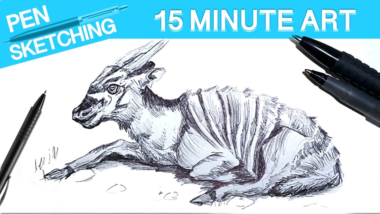
painter, sketch artist. I have a lot of experience
with life drawing, sketching, different types of
painting mediums from acrylic paint to water color, and even digital, as well. And this will be an easy to follow along course
on how I create the process for thumbnails for both my art channel and
my video game channels. Thank you. And the program that I will
be using is Affinity Photo, and that one is an
alternative to Photoshop. But any program that you have
works the exact same way. So if you are ready to begin, get your laptop ready, your computer, and
even your tablet. So let's get started. Thanks.
2. Course Summary: Hello, everyone, and welcome to my brand new Skillshare
course where I teach you how I create thumbnails
with my easy workflow. I know a few people wanted me to show them how I
do my thumbnails. There is not a right way
or wrong way to do so. There's a lot of programs that you can use like Photoshop, Adobe Illustrator, but I
am using Affinity Photo. Thank you. And the great thing
about thumbnails is that you can be as
creative as you want. You can make them as
complex and as simple, but there is a nice
middle ground in creating thumbnails that
are eye catching that you can use for both your
social media presence like YouTube and even
here on Skillshare, where you also can create thumbnails for your
courses as well, because different courses have different types of
lessons on there. You can be very creative
and eye catching for each part of your own course to have some interest
and variety. And obviously, this all
depends on the subject matter, and because I do
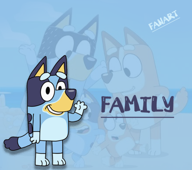
focus on tutorials, walk throughs, when it comes to pencils, painting, fan art. And on the other side, I do a lot of live streams
with video gaming, video game fan art, lets plays and reviews. There's always a great
balance of using JPAGs, text, your own photos
of your drawings, arrows and some bright
colors and even sometimes my face to kind of make it appealing and eye catching
for social media. And the best thing
of all is that a lot of these type of
apps that are free, that are paid for all work
generally the same way. All you have to do is learn
how to overlap things. Use the eraser tool,
erase backgrounds, at text, and it's super
simple. Anyone can do it. I promise you. So are
you ready to begin? Have your PC ready, your Apple, and even
your tablet. Let's go. Um, data dump
3. Making easy thumbnail covers: Before we begin this lesson, we need to know what
our subject matter is. So that all depends on your
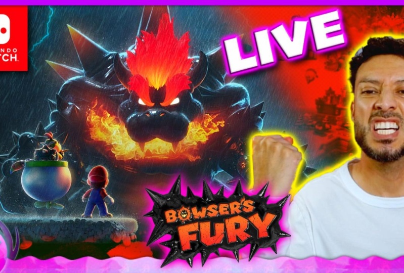
thumbnail idea that you have. And in my case, this one, I made a digital
painting fan art of Coco from the Crash
Bandygoot series that started all the way
back on the PlayStation one with Crash Bandygot two. And this was done in Procreate
with my Apple Pencil two. And the idea that I had was, why not create the
thumbnail process right after creating and
finishing this digital painting? So this just worked
hand in hand. And here is my process
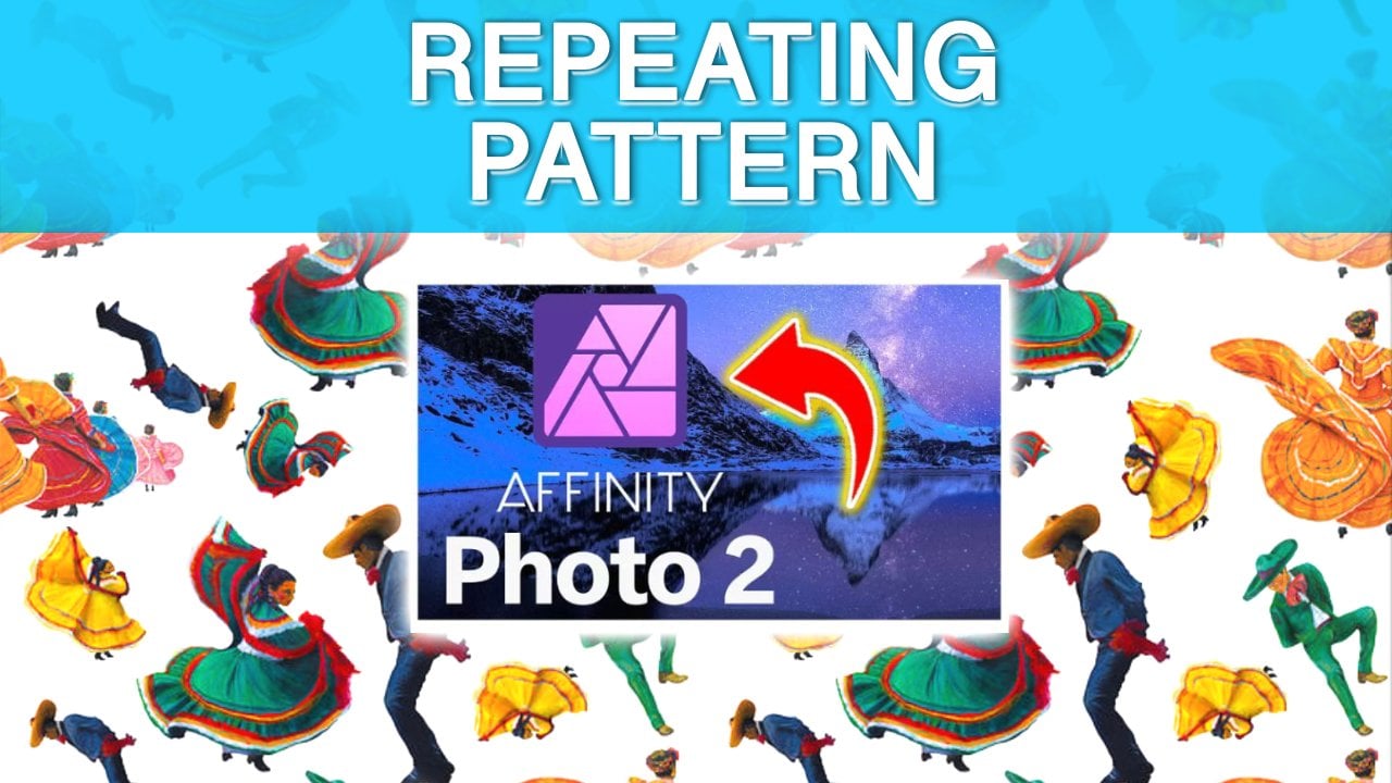
and my workflow. So if you guys have
never heard of it, this is called Affinity Photo, and it is a one time purchase
program like Photoshop. The Hole Adobe Suite
is super expensive. It's a subscription based
service, Affinity Photo. If you go onto their website, there is a download for Apple
and for Windows as well. Do have the older version, but it was a one time payment. I got a sale on it, and you
might even get a free trial. I think they do have
like a month or a week. I don't remember for
a free trial for both Affinity Photo
and Affinity Designer, which is almost like
Adobe Illustrator and Adobe Photoshop. These two are really, really
good for alternatives, so you won't be paying
those full prices for something like Photoshop. This is going to be a quick one. This is just the workflow
or the way that I like to do my thumbnails
for both my art, YouTube channel and here on
my gaming channel as well. So I like to be consistent
and my branding, I guess you would call
it, my color scheme, is this that I use
for every video. I kind of already have it here. It's already locked
that I made myself. Is this my lens of truth, border that I like to use for everything just so
it's consistent. And this one is just a very quick way that I like to do my thumbnails is I like to have a photo
of myself that I sometimes reuse for older
videos, newer videos. So this one is one
that I usually have it on left,
right, or middle. And when it comes to
background colors, I usually have a
solid background. This is what it looks
like without it. For the most part, yellow and red are really
eye catching and because I am doing
this cocoa thumbnail, I do have this one. Sometimes it is a Google image of the entire game right here. So I think I might be
using a blend of both. Kind of depends
on as I'm playing around with moving
J pigs around, how it's going to look like. So I do have my official cocoa the finished fan art that I did here from
one of my live streams. So this is going to
be the edited version of it for this video
that I'm doing. So this is Coco right
here that I did myself. It turned out really well. And yeah, I feel
like if I do this, I might have to play around
with maybe changing the way that the blend modes are at least for this JPEG right here. So I'm just going to try just
different ways to see if it looks good cause I want the main focus to be cocoa and a little bit of the
background to be, you know, that of crash. So I usually like
to play around with these blend modes and just to see which one looks the best. But this one is obviously blending with the
yellow background. So if not, I can
easily just do this. Can easily just move the opacity and play around with
this. It looks okay. No yeah, we're going to kind
of just turn it off for now, and I might even just change the color overlay by selecting this pix or this
background that I have here. This Effects button
right here or down here. You can play around
with different colors by using a color overlay. And if you're
wondering how I ended up getting this pixel, all I did was go to this
rectangle marquee tool. Show you how to easily make a solid colored
background so you can play around with whatever
thumbnail aesthetic you like. So if you go down here to the right hand corner
next to the trash can, there is a pixel
button right here, which all it does is
create a new layer. And if you go into the very
top and go to edit fill, you can fill with primary
color, secondary color. So if you go to fill, you can actually choose
any color you would like. So I'm thinking of doing some kind of a pinkish
or maybe an orange color to kind of match with the whole crash
bandicoot aesthetic. And if not, it might actually
be some kind of a blue. I'm not sure yet. This
is how I do my stuff. I kind of just play around
with it. And you know what? Because blue is a darker color, and she stands out
very well with it, I think it's going to be a
darker blue for this one. So as soon as I choose that, I apply it, and there we go. And you know what? Now that this somehow you know
what? It's working. I have this ready. I'm going to move cocoa a little bit to the
right hand side. This is actually perfect because The blend mode is going to work in
our favor this time. To have, you know, crash
in the background, even though he's not
the main focus for this, it just works. So I'm going to turn back
the opacity all the way up, and now we can try these blend modes again to see if we find
something that can work. And you know what? I feel like this average
one is working, and we're going to
turn it down even more with the opacity. So again, it's
always just you have to play around with
what you're going for. And I do like this. And next, again, you guys, I found all of these
images on Google. So, for example, this
crash Bandico logo, I literally typed in CASH
Bandicoo logo PNG on Google, and I found this one. I just dragged it on my desktop, dropped it in here, and it's ready to go. Nothing
complicated. I'm going to
actually make this a little bit smaller,
just like so. And what I like to do, if you guys want to see
how I blend things in, I'm going to remove her
just so you guys can see. So if I double click
or right click, if you go to rasterize,
this is very important. If you rasterize
any of your JPEGs, any artwork that you have, you can start editing it easily. So if I go to my eraser tool, erase brush tool right here, if I click the brackets
to make them larger, I'm just going to Blend
erase this right here. And what I mean by that, if I go to brushes
to the top right, I like choosing a blend as brush because I like
to make sure that there's a soft erasing so that my background shows
if I happen to erase. And there you go. That's
a little bit smoother, how I erased this part of
this artwork right here. I'm going to turn back
cocoa, this logo. And the last thing that I do like to do is sometimes at text. If you guys see all
of my thumbnails, that's what I like to do. I have a few saved
ones over here. So this one, I'm just
going to type in fan art. Like so. And the idea, I guess, at least for me when it comes to catchy thumbnails is at least
in the way that I do it, I like to have a
photo of myself. I'm always playing around
with different photos. This one's pretty big enough
to know that it's me. I do like to have something to kind of make it look
a little bit balanced. I don't want it to just be flat, so that's why I like to tilt it because it is a little
bit more playful. And for the most part, this here is around 25 points
for this font. I want it to be big, not small. And the main focus is cocoa, so I might actually
add a drop shadow with the effects button over here, easily add a drop shadow. And you can see it in real time. And I just want
this to stand out. And I think that
is my thumbnail. I might sometimes add an arrow. I literally have I try to
make sure everything is neat. I sometimes have
all these arrows that I have saved over here. I mean, if it makes
sense. I'm not sure. Sometimes it works. Sometimes
it just looks okay. Yeah, you know what?
An arrow works. But the main thing about
a catchy thumbnail is that things have
to look balanced. You know what I might even add? Because it is cocoa, but and see, this one might
be a little bit too big. So maybe I'll just
bring this together. I just have to play around
with it a little bit more. Sometimes I go over my
border, which is okay for me. I'm gonna play around
with if I go to adjustment actually
to character, if I go to this section right here with the A and the arrows, I can kind of bring
things together. And see this brings in the
font a little bit closer, makes things a
little bit neater. You know, so this is
actually working right here. So, yeah, you guys,
that is my thumbnail on how I create them
in Adobe Illustrator. So, yeah, let me know
what you guys think. Of this video, let
me know if you have any ideas on the way you
guys create thumbnails. I know there's a
lot of programs out there that are free
that are browser based. You can literally go on Google, type them in, and see
which ones you like. And again, I just this is
the way I create thumbnails. I like to have things that
are similar in color. So we have the yellows, reds and a dominant color
in the background. I don't like to have
too many colors so that it's all over the place. So it's all up to you guys make sure the colors
are balanced, something doesn't
dominate over the other. And again, just experiment. If you go to my older thumbnail, some of them used to
look pretty okay. I've been improving them slowly. It's all about experimenting. Make sure you go to File
Export and you go to JPEG. Don't export layers
hidden by Export persona. As long as the file size
is less than 1 gigabyte, I think at least for
YouTube thumbnail sizes, you can double check on
what the pixel sizes for thumbnails are
and around the size. So as long as it's under 1 gigabyte, I think
it should be fine. You go to Export. What I like to do,
and if there's a lot of video showing this that it does help with the
algorithm on YouTube, make sure you properly title this before you upload
any edited video, edited gameplay of anything,
even with thumbnails. But this is specifically
thumbnails. I'm going to title this
How to draw Coco Bandito. And then maybe I'll do a
slash CASH Bandicoot Fan Art. And what you guys can do is
look up for the most part, look up what popular
Veto show up on YouTube and see what type
of titles they're using. And you might be able to see which videos are most
likely to be viewed. So that's how I title my videos, but kind of make sure you title them what you are
doing in the video. And obviously, when
you upload your video, you properly title
that one as well. Use the hash tags, you have to make sure you do your research when it
comes to all that. And yeah, and when you save it, you can see what you titled
it right over here by just using the space bar
if you're using a MacBook. Or use, I think properties as an option to check
how you titled it. Yeah, as long as you title
it, something properly, you have more chances of
people finding it on YouTube. Yeah, let me know down in the comment section
below what you think, and thank you for watching. See you in the
next one. Bye bye.
 IVAN RAMIREZ, Artist, Painter & Youtuber