Transcripts
1. Class Introduction: Hello everyone. My name is
Ivan Florentino Ramirez and welcome to my skill
share class number three. With my experience,
having graduated from California State
University Fullerton, I am a portrait
artist, a painter, and have taken courses in
life studies, life drawing, life painting, and
anything from the word of pop culture and
digital artwork. I will guide you through the
steps on how to draw hair, how to blend it, And
believe it or not, we will not be drawing
every strand of hair. I'll be showing you techniques
to make it seem like there's volume in the hair
and create a realistic look. We will concentrate on drawing Freda at a front facing view. I will break down this course
in a step by step manner, where we focus on the
eyes and the eyebrows, the nose, the lips, the hair. And finally, blending
everything together and go through the necessary
materials needed to create this artwork overall. I want to challenge you to break away from that mentality. That drawing realistic is
for professionals only. And it's too hard for
just the general public. And I'm here to say
that that is not true. Anyone can take this,
whether you're a beginner, intermediate, or an
advanced artist, because we will be
learning through freehand drawing and we
won't be going by the books. I really believe that
if we draw something through the world of pop
culture, meaning Phantom, we will have a lot more fun doing that than
drawing something like an ordinary model or just basic shapes in order
for us to just dive in. Because I know that at
some point as artists, we've started drawing free hand. And we wanted to mimic and
create something that we saw. This is the perfect course for
you to jump in and sharpen our observational
skills in order for you to take that
into your own artwork. Are you ready to take on
this class? Let's get to it.
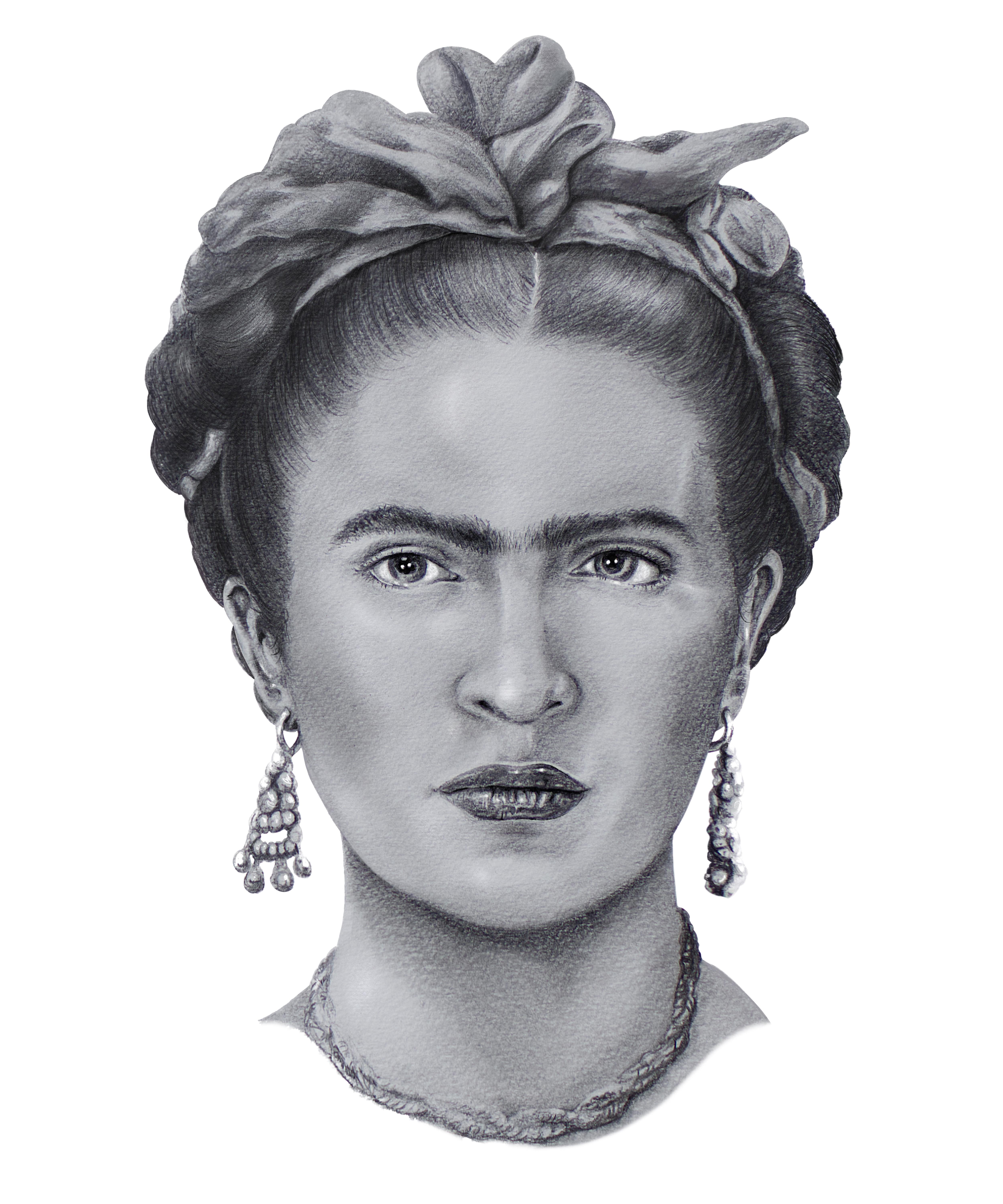
2. Class Project Summary: We're ready to start
today's class project. We are drawing Frida Carlo in a realistic way using
graphite pencil, but we're going to focus on her hair and her iconic unibrow. As I've mentioned before, if you haven't already taken
my previous two courses, they do build off
of one another. If you take the first
and second course, they do lead into this
one very well because we do cover everything
on how to use pencil, graphite blending, and all of the necessary materials that
we need for all of that. This class also follows in
the footsteps of my class, course number one, which is drawing a through
freehand drawing. We're going to try and create
likeness as much as we can. And this is the way we're going to understand perspective. This can be applied if
you're a portrait artist, because we are drawing
a human figure, drawing a colo in a
front facing view. Through all the steps
in this course, I will touch on everything
on how to draw the eyes, lips, nose, but we will focus on the hair and how
to create volume. The most important lesson
will be structure and shape. We will learn how
to create volume and not focus on the
strands of hair. I do have a high resolution
photo for you to download so we can follow
through the steps. Because the lighting
is done for us. We will learn where
the high lights are, the darks and the medium tones. As long as we
follow these steps, we go back and forth with
our reference photo, we can create anything
that we want. One of the reasons
is that a lot of artists do have trouble
drawing the eyes, the nose and mouth, and just the entire
face at this angle. Sometimes things can
be off when it comes to the symmetry of the
face and the proportions, which is the most
important thing when drawing a portrait or a face. But I will guide you
through a step by step tutorial in this video. Now that we summarize
the class project, let's go on to step number one.
3. Materials Needed for Realism: These are the following materials
needed for this lesson. A variety of erasers, eraser pencils,
graphite pencils, some blending stumps,
some blending brushes, and just a generic brush to move away some debris
from your erasers. These are the most recommended. Now these here are
called art stumps or blending sticks that
are made out of paper or also called tortulines. These are one of the most
recommended blending types of tools to have
in your arsenal. Because these you can get
into corners inside the lips, inside the ears, eyes, and for hair, and
also for wrinkles. And this one is going
to help push and pull all the type of graphite and
lead into different areas. And you'll notice
the big difference between tortulins and stumps, because tortulines are made with harder paper and therefore must be prepared by rubbing
it against a sandpaper. And stumps use soft soft paper, it easier for blending, and most brands come with the sandpaper already attached
or you can buy your own. They are used to
smooth out the ends, clean them, and prepare them. As for erasers, you must have a hard Mars plastic
eraser of any brand, but Mars is one
of the best ones, easy to erase dark marks. But a needed eraser, like
you can see right here, needs just like dough,
just like clay. And this one is easy to get into thin areas molded to
whichever shape you like. It lifts graphite very easily. And another one that
also helps reach into detailed tight areas
are pencil erasers. I have two different varieties, a squared one and a rounded thin 0.1 And these
brands are Tumbo, and throughout these
lessons you'll notice that certain
ones are perfect for certain areas
and it's always better to be prepared and
have a variety of these. So I have a collection of
Stadler pencils varying from the lightest to all the way up to eight
being our darkest. One of the main important
ones that we always need for any drawing is
the number two pencil. The reason number two
is the most important in any drawing or
sketch that we create, it's because we can create
tones from either light to dark depending
on the pressure that we apply to the paper. However, this one's optional, but if you do have a pencil
that's lighter than a two B, I recommend a drafting pencil. And this one is a two H, which is fairly, fairly light. And it doesn't matter how
much pressure we apply, it's always going to
remain fairly light. And the reason I like using a drafting pencil
just when I need to begin the initial drawing is because if we do
make any mistakes, the lines are easy to erase. Having an optional
mechanical pencil like this, any type of lead pencil comes in handy when it comes
to making hair, very thin hair, and anything
like eyelashes and eyebrows. A battery operated
eraser has come in handy so much
because you're able to go into the fine
corners of any type of crevice when it comes to the face that we're
going to be drawing. And this one is an
electronic pencil eraser. This one can remove
almost any type of dark, dark marks and just reveal the pure white paper underneath For the
pencil sharpeners, make sure they're very sharp and if you don't have any on hand, you can also use exact knife or a very sharp box cutter
to get the job done. Now for our soft blending
for our skin tones, we're going to need soft
bristle paintbrushes. Any that you have are fine. Any type of acrylic
or oil paint brushes, as long as they're
in various sizes, these are going to help us do the soft blending and the overall rendering
of the drawing. Now as for paper,
make sure you have drawing paper that's
thick enough to withstand a lot of the lead pencil that we're
going to use and also the erasing that we
might also do this one, I had a huge
Strathmore drawing pad that I just cut down into sizes. You can do this in whatever
size that you like. Finally, if you have just
regular paper or also what I recommend is tracing paper
to put underneath your hand, so when you're drawing, you're
not pushing or smudging pencil and graphite all over and making mistakes
onto your drawing. And don't worry, we will be
going into more detail as we get into the drawing with all of these materials
that we just listed.
4. Reference Photo Study: For this following step, we're going to study our
reference photo because we are using free hand
and we're trying to draw a realistic
image of Frieda Lo. It's important for us to
have a high resolution photo that we can keep looking
back and forth that because one of the most
important things to remember is that a reference photo has
everything that we need. That will not change
what I mean by that. The lighting is already set. Therefore, we know where
our highlights are, our midtones and our shadows. Because we are trying to improve our observational skills by
using the free hand method. Having something to study
from goes hand in hand. And for this entire course, please remember that I do have a high resolution photo
for you to download. What I highly recommend is to download it on something
like your phone, computer or an ipad. Any of these methods would work. You can easily have
them right next to you, so you can easily lo side by side when you're
beginning this course. This is a sure way to
know if things are looking off or if you're
going in the right direction. Because remember
when we're drawing a front facing portrait
of a human figure, we are trying to make sure that things are accurate as possible. Having a reference photo on an ipad like I do on any tablet, you can easily zoom
in and out and study specific areas and remain
on them when you're drawing within this course. Because
I separated the segments. For example, drawing the lips, the nose, the eyes,
and then the eyebrows. We can study and zoom
in as much as we like. Pause the video and
work at our own pace. Because we are
going for realism, this is such a handy way and
improve our graphite skills. Drawing with pencil, we can
really take our time and pace ourselves
because eventually when we do get to the hair, that's one of those where
I do like to break things down step by step and
going to fine fine detail. Let's take a quick look
at how lighting works. For example, you can see the
high lights in the strands of her hair to the top
right and on her bow. Notice the highlights. Some of it is pure white, meaning that's going
to have less focus when we use our pencil. As we move down to her
face underneath the nose, her lips and her
chin especially will have heavy shadows
and medium tones. You'll also notice how light affects the bone structure
around the cheeks, the chin, the tip of her nose, the bridge of her nose,
her ears and her forehead. We'll get into that in
the following steps, along with the needed
materials and how to use them. So now that we looked
at our reference photo, have your space ready,
your materials ready. Get comfortable, and let's
go on to step number one.
5. Pencil Sketching: All right, for step number one, we're going to draw
reta clos head shape, the entire face. And I'm using my drafting
pencil, which is an HB. You can also use a two
B pencil for this, but just try and apply the least amount of
pressure as possible. This way we can easily erase any lines if we
make any mistakes. Because we are drawing
this in free hand, you can start off in
any way that you like. I'd like to start
off with the eyes, particularly the right eye, and then slowly move towards
the left side of the face. And slowly adding the eyebrows, the pupils, the nose,
and then the lips. And we can slowly start
outlining the chin, the cheeks, then the ears, and then work our way
up towards the hair. Again, keeping
this fairly light. Remember to keep looking back and forth at our
reference photo. All of the information that
we need is done for us. The lighting will not change. Therefore, we can see where the highlights are and
where the shadows are. But in this initial step, it's crucial to make sure
our proportions are landing. And this is where our
observational skills come in hand. We are eyeballing this, Don't worry about making mistakes. This is the part of just jumping in and learning freehand. These type of drawings
will help us with our observational
skills in the long run. And it'll help us nail
proportions and alignment, especially with the eyes. And it helps us keep proportions in check by not having one eye, either lopsided, too
big or too small. And as a quick visual guide, I have these three head
guides from a front facing, a side view profile, and a three fourth view here You can focus
on the front facing, just so you can know
where the planes are. And if you need to divide the
head in half and in thirds, this also helps us
with alignment. And here's a great tip
to align the eyes. Grab a ruler, place it right
underneath one of the eyes, and this will help
you keep them aligned from the bottom part of
the lids and the top. And my right eye does
need some adjustments, and this is one of my
favorite techniques to fix facial proportions. Remember, you can
pause these videos at any time to catch up
and adjust as needed. If you feel comfortable
with the proportions you have in drawing
the entire face, we can start slowly moving
into some of the details before we get into using our
darker graphite pencils. Don't worry about
certain details like the eyebrows just yet. We will be getting into more
detail on how hair works. But for now, use simple strokes, starting from the bottom
and using an upward motion, doing small, thin strokes
to represent hair, and again, keeping
it fairly light. Another downloadable anatomy
chart is the eye anatomy. Now that we're moving
into the details with the way that
eyes are shaped, now we don't need to know
the exact scientific names, but at least we know
what the tear ducts are. The iris, the
pupil, the eye lid, so that we can point
them out and get a basic feel for how
an eye is formed. Again, I'm moving from
the right to the left by making sure that I have one
of the eyes and eyebrows, at least as perfect as I can. So that I know that when
I move to the left, our proportions do match. Like you see here, I
have my eraser ready. It was looking a little off, so I erased the eye and
just redid it over again. And we'll get into
the nose as well in a separate video or a separate
section of our course. But for now, here's a quick
diagram that you can also download just so you can
see how the nose is shaped, which is mainly a long triangle where we focus on the nostrils, the bridge of the nose,
where the cartilage goes, and the ball of the nose,
which is the very tip. The same will go with her lips, although that isn't a
prominent feature for Frida. Unlike her iconic unibrow, we will also touch on
how to draw the lips, but for now, think
of it as an oval. Divide it in half, some simple
lines for the wrinkles, and continue to
go back and forth through the entire drawing and making sure the
proportions are correct. Adjusting the chin, erasing anything that you
feel looks off. Drawing a few lines
for the neck. Go into the ears and start shaping out her hair
and her ribbon pattern. Because of our next step,
we're going to focus on her iconic
eyebrows and unibrow. As we look back at
a reference photo, keep in mind to do
a simple outline, one that's easily erasable. In our next step, we will land and shape some
of the shadows. And where our darkest
shadows will go, where the light is right now, think everything as shapes. This is our initial
preliminary sketch. Hopefully this first
step made you more comfortable in
approaching realism by jumping right in
and removing some of that intimidation that comes
to this style of drawing. Let's move on to
step number two.
6. How to Draw Eyebrows: Now we're getting into
Frida, los iconic Unibrow. But the principles
are the same when it comes to drawing any eyebrow. And we can break it down
to the simplest form possible is using small,
thin, curved lines. Here's a side by side comparison of what we are not going to do. Some people make the mistake
of outlining it and then adding some vertical lines and it just doesn't look right. Middle is just
vertical lines with no real variation and
it still looks off. Or lastly, everything
is blended in into a solid shape and
that also looks off. I have this diagram of
different shaped eyebrows, but she seems to have one
that a lot of us have, which are some eyebrows that are raised almost at an arch and pointed towards the ends
somewhat bushy in the middle, but they're still
not exaggerated, and they remain
fairly horizontal at its simplest form. Here's another diagram, or we
can think of it as a shape, but we won't be outlining this, because again, this
is not a cartoon. We're going for realism. Just keep this in mind when
it comes to any drawing. Specifically, when we break down certain areas of the face. Everything is a shape
at its simplest form, and we are defining it
with graphite pencil. We are basically sculpting everything out and
creating dimension. I went ahead and slowed this
video and this tiny section, a little bit more than normal, just so that we can see the way the hairs can
be created naturally. And to have more of a
natural realistic look by grouping them together, placing them in curved angles, and having a nice gradual
transitional flow. And here you can
get a better idea on how the hair should be done. For example, the very top row, everything is just too similar, while the middle grouped ones feel more natural and realistic. Here at the bottom, you
can see the arrows, how it transitions
into curves and eventually dips all the
way at the bottom tip. This is how we'll end up
with our final drawing. To begin, make sure your
pencil is sharpened, that it can to a
very sharp point. We're going to create
thin, thin strokes, starting from when
you make contact with the paper and lifting
off at the end. This creates a semi
thick starting point and a thin ending of the hair. Here I have a dotted
line just to make sure everything is aligned again. You can use a ruler for this. We just want to make sure
everything is symmetrical. Again, lifting and pushing
with our graphite pencil. You can use a two B
pencil or an HB pencil. Let's start off
with our lightest one and gradually move into
some of our darkest ones. Because just as a reminder, when we look at this
reference photo, there is a variation
with darkness. And if we press too hard, we'll create thicker lines
than what we actually want. Instead, we'll use a
darker graphite pencil, where we need less pressure but still create
thin eyebrow hair. We're actually going to
do a combination of all three so that everything
looks natural and seamless, but also subtle and delicate. Again, this is a
perfect opportunity to use a lead pencil, because those tend to be
always thin and sharp, and see how that goes for you. Having a variety when
it comes to semi thick, semi medium hair will give
this a more natural look. Now I'm going extra in
this area just so we can see how I'm
applying those strokes. I'm curving them as
I lift my pencil and towards the arch area
than imaginary dotted line, that's where the arch
starts to drop down. This is where the hairs also
curve towards the bottom. Eventually, when we do get
to our blending section, this is where we can add a
bit more of depth and shadow. But for now, let's just focus
on grouping some hairs, not making them too thick, keeping them delicate and light. And most importantly, using a sharpened pencil to
create thinner strokes. In this case, I'm still adding a few hairs to create
her iconic unibrow. Just as a reminder, we won't be blending
anything in this step. We'll be saving that
all the way towards the last few steps
in this course. This will keep the breakdowns easier to look at and easier for us to keep track of exactly which part of
the face we're drawing. Now that we have iconic
eyebrow and Uni brows, let's move on to the next step.
7. Drawing The Eyes: In this step, we're
going to draw the eye. To begin, the eye is
a basic almond shape. When it comes to the outline, try to make the
inner corner next to the nose lower than
the outer corner. Generally, this
is for most eyes. And looking at Frida's
eyes, more or less, that is her eye shape
a bit more slanted, not as round, but
more of an oval, but the medium sized inner
circle for the pupil. Again, here is a simple
anatomy chart so that we can know the basic names as we're going
through these steps. For example, here is the eyelid, the pupil, the iris, the sclera, and the tear duct. The more scientific name,
the lachrymal carnicle. But we can avoid that and just call that the tear duct area. Again, I'm starting from the right side and
moving towards the left. As I'm drawing the right eye, I'm drawing the upper
lid and I'm using a number two pencil just to darken the area and it
might look like an outline. But remember, if we look
at our reference photo, these areas that
come in contact with our actual white
part of the eyeball. These are creating
some contact shadows, meaning they are
darker than normal and therefore we're
applying it accordingly. I'm drawing the tear duct, I'm going a little easy on
the pupil and iris area, leaving two round circles for the eventual highlights that we'll get into more
detail later on. And a few simple eyelashes
with some curved lines. Again, here is a ruler just
to make sure that when I eventually move on to the left side,
everything is aligned. If we take a look
at the eye socket, it is completely white
within the iris, that one is more
of a medium tone and the people is the darkest. And the ones that are pure
white will be the highlights. Here. I'm going in
with a six pencil just for the purpose that I know the iris is a deep
black rich color and I want that to stand out. Also, I'm adding just a little bit more darkness
into the eyebrows, but still keeping a
focus on the iris. And then going in with these
contact shadows that I mentioned in the upper lid and the bottom
section of the eye. Here, I'm using my
ruler and measuring, and it looks like my left eye actually was a little bit off. I made it lower
than what it was. This is one of those
tips that I like to do, especially when
drawing free hand. This is the best guide to
keep everything in check. I like to do these
small points in the tear duct and towards
the other side of the eye. Again, these are just imaginary
lines and points just to keep us in check
when it comes to accuracy and keeping
things aligned. So as we focus on our
left side of the eye, remember that we all
have this fold and case, which basically means
that it's overlapping, which means that fold
is overlapping part of the eye and the rest
being in the eye socket. Now that I corrected
the left eye, I feel a bit more confident to start adding a bit more details when it comes to some of the
inner workings of the folds, some of the eye lashes
and those thin hairs that will curve out of those folds and notice
that tear duct as well. And remember that everything
casts some type of a shadow when pieces of the skin interact
with one another. And notice how I'm outlining the iris area because
that tends to be a bit darker and it goes a bit lighter as you go towards
the middle and again, the people being the darkest. If we zoom in on
the anatomy chart, if you notice the iris tends
to have a repeating pattern of almost pointed like lines. Although we don't need to
go into so much detail, we can still have the impression by going around the
iris and adding thin, thin ensltrokes to resemble
that type of a pattern. As I continued to draw the
iris, adding some highlights, purposefully shading
around where our highlights are going to be. Adding in a few lines
for the eyelashes, we form the eyes
at a basic level. Just make sure to look back
at your reference photos. Zoom in as much as you can to get in any details that
you might have missed. And now let's move
on to the next step.
8. Drawing The Lips: In this step, we are
drawing the lips. A few things to keep in mind to simplify things when
drawing the lips. Let's look at a realistic chart to make it easy for ourselves. We're not going to go by
the scientific names, let's just pay attention
to the filtrum, which I'm just going to
call the cupid's bow area, and the upper and lower lip. If we take a look at
our reference photo, Frida's upper lip
is not defined, meaning her cupid's bow does not have a
great indentation. It barely has a dip in the center in that
cupid's bow area. Meaning there's going
to be a small curve in upper lip area. Another great visual is
the breakdown of the lips. Think of it as an oval. We can divide it
in half and then horizontally and small
details like the cupids vo, we can adjust as we go. Although these lips
are at a 34 angle, I wanted you to visualize
this in a three D space. Then all we do is focus on
the wrinkles of the lips, which are just simple lines. That is, it, the lips
are not difficult to do. To begin, I started drawing the upper and lower
part very lightly, like we did in the
previous steps. It makes it easier to divide the lips with that
horizontal line. You can add two points from the left and right corner
of the mouth to keep things aligned with a small dip in the middle of the upper lip usually hangs with
that part of the skin. Again, another way to help align the corners of the mouth and the lips in general,
you can use a ruler. This will help the
lips from looking crooked or looking off. Looks proportionally correct. We can start penciling in some shadows
underneath the lips, in the bottom portion, and in between the
horizontal lines where the lips meet
and they're closed. This is another
great time to add some shadow in the
cupid's bow area. By curving our lines and
making that indentation clear, start blocking in areas
that you see have shadows, have midtones, and even start adding lines
for those wrinkles. Not too much to overdo it. This is an artistic choice. Leave some out, because
if you do too much, it will age her. Finally, notice how I left some of the paper purposely white. This is where the highlights
most likely will go. And it will make it
easier for us in the end to keep from
erasing so much. Notice I'm going back
into add a few lines, making them darker, making sure the contrast is striking
between light and dark. Use a three or four B pencil, just so you won't have
to put so much pressure and make it difficult
for you to erase. And now that you check
your proportions and they look correct to you, let's move on to
drawing Frida's nose.
9. Drawing The Hair: Hello, everyone. We
are drawing the hair. I feel like the hair is one of the most difficult things to do if you approach
it the wrong way, Thankfully, because
you followed my steps. We drew the volume of the hair, meaning we drew its shape
and the volume that it contains before we started drawing any of the
strands of hair. Because in the end, we do
not want spaghetti hair, we want this to have
volume structure. And in between, we wanted
to have and look like it has individual pieces of
hair with some highlights, shadows, and a nice contrast
between light and dark. And one of the most
important reasons that I did not approach
it in a way to just draw strands of hair in the beginning because this can
lead to an unnatural look. If you take a look
at this example where the hair is
lined out in red, think of it as a shape. If we think about
it in these terms, it will simplify it for us. The same way we draw a head, the ears, the nose,
lips and eyes. We separated those into shape. Now we did the same
way with Frida's hair. Frida's hair is slicked back, done in more of a
intricate pattern where it looks like a bun, or several buns wrapped
around her ribbon. Notice how these are individual
groups of hair as well. Think of it on what it sits on. Think of it like a
mannequin's head. They wrap around
in groups of hair, it's slicked back in this case. And I'm following the form. Here's a quick tip. Start from the root and let the
strand taper out. This will give you
an organic strand of hair and make
sure they overlap. And once again, if we take a
look at our reference photo, you can see that
the light is coming from the very top
end to the right. Notice the highlights on
the right side of her hair, making the left side
for the most part dark and right underneath
her ribbon as well. Now I debated whether
I wanted to combine the blocking in the skin tone
and the hair all at once, but I think it'll make sense
if we do these together. Grab your two pencil and start blocking in
all of her shadows. What I'm doing now is putting
in all of the shadows. And cast shadows where
the light isn't shining. For example,
underneath the ears, the ear canals,
underneath the neck, right in between the
sides of her eyes, the eyelids and
anywhere that you see a middle tone in the reference photo on
her skin and her hair. And make sure you add variations along the side of the hair where the hair is growing and moving backwards into the scalp. This will add some variation to keep it from
looking like a wig. Again, the connection to the
skin should not be outlined. Show some gradation
within pieces of hair, then strands a bit
more of thicker ones, and this will keep it from looking like it's
pasted on her skin. This will keep it interesting
and more believable. What I'm doing now is
following the shape. For example, underneath in
between her nose and her lips. The cupid's bow. I'm following the
form and curving it in a light direction
from left to right. Again, you can
section these off in patterns to make it
easier on yourself, so that you can know where
the middle tones are. Right underneath the
mouth, the chin, and in the neck area, there's a prominent shadow. And even where her
cheek bones are, again, we're blocking
in everything. Eventually, when we get
into the blending section, it will make it
easy for us to have a smooth transition from a textured pencil
marks into a soft, gradual graphite
pencil rendering. Now notice the difference
where I'm not putting any graphite pencil on the
paper, it's pure white. You can leave those for
the highlight areas. Depending on the
paper that you use, you'll notice the
paper texture as well. Now This is our
time to start using our 4b5b and even six pencils. We want to make a
nice transition into a dark graphite and really make sure the
darks are standing out. And there's a
striking difference between our tube pencil. Now notice the nice
striking transition from a medium tone to a dark black by the application that I
did on her eyebrows, her eyes, her pupils and irises. That's exactly what we want. We want things to jump
out of the paper when necessary and things
to be gradual. And also notice the application that I'm doing on her hair. I'm using a five B pencil
and a four B pencil. You decide the same way we want a transition from dark to light. This is what we're
doing with the hair. We're blocking in the tones. And again, think
of these as shapes and clumps of hair
and follow the form. Again, notice how
I'm leaving some of the hair paper white and these are going to be our
highlight areas. Pay attention to your reference
photo and start darkening the areas that are the
darkest curve into the hair. You don't have to drop
every single strand. As long as you make
curved pencil marks, it will resemble hair. And that will give us
that three D realism. Look. Again, notice that I'm using tracing paper or just paper underneath
my palms and my hands. I tend to smudge things to prevent that. Make
sure you're doing this. You will not ruin the blending and the graphite you
applied to her face. This is a very important step to keep you from ruining
all of your hard work. Now, in order to make hair, and these hair clumps and sections look
three dimensional, we need to have
different elements. Again, we need to have
shadows, half tones, highlights, and finally
detailed texture. In order for it to
look life like, we want a clear separation
between strands of hair, small groups of hair. When we're looking
at something like a realistic drawing
from far away, we want this idea that
it looks like we have hundreds and hundreds
of strands of hair without actually
drawing all of them. And that's why the
blocking in portion of this video is important. Now in this step,
I'm blocking in the entire ribbon that
she has on her head. And this is what's tying
all of her hair together. Adding the texture part, it's all about design. Don't get too repetitive
with the same strokes. Try to create organic
and interesting shapes with overlaps and
groupings of the hair. There needs to be a
great balance between simple areas and complex
areas with a lot of detail. For example, notice that
some of the hair I left out with simple strands and some
a bit darker and a lot more. This will leave it organic and three dimensional,
which is what we want. We are trying to
create the illusion of strands and make sure you draw
confident strands of hair. It's better to draw quick, confident strands
slightly out of shape, then drawing very slowly
and end up looking wonky.
10. Blending and Shading Techniques: Hello everyone. We made it welcome to the final
lesson, the blending. To begin, we're going to use either the art
stumps or tortulins. They are almost the same. Art stumps tend to be harder because they use a harder paper, while tortulins tend to be
smoother with a softer paper. And these are rolled into
a stick pencil form, making it easy to use
it just like a pencil. When we're blending,
what you want to do is grab one of your
stumps or tortulins and start to push and pull
the graphite back and forth. The same way like we were
adding our graphite, we're going to follow the form. We're basically pushing it into the paper and we are blending
everything together. This is the term where
shading comes from. This is going to
give us a base layer of a smooth graphite transition. Here's an example
of some shapes. Notice a strong
contrast of light and dark because we know where the light is from
a reference photo. And now that we're blending, we want to have both
middle tones, light tones, dark tones like the shadows, so that we can create a smooth look and a three
D rendering of her face. What I'm doing with
these stumps is that I'm blending
everything together. And that's why our
blocking in portion of our last lesson was
very important. We know which sections
we have to blend in, and now we just
keep on layering. Now what you want
to do, as you can tell from how I'm blending, there isn't enough contrast. You can only see a striking
difference on her eyebrows, her pupils, and a
little bit on her lips. I'm going to take
out my 3b4b and five B pencil and start
adding those deep shadows. Here's a zoomed in
section of her lips. Look at the big
difference when I'm adding my five B
pencil graphite, right in between the lips, there's a cast shadow. This deep, rich black really does make everything stand out. And I'm taking my tiniest, my smallest stump and
blending that in. The lips do have
these vertical lines for wrinkles play around
with how much you want to add so we don't age her And use the stump to do vertical lines
and some horizontal lines. Again, we're also going to be
using our needed eraser to erase and remove graphite where those high
light areas are. These stumps are
very pointed and can go into small crevices
for those highly, highly detailed
areas like the lips. And if you do need to
make them sharper, use your sandpaper to shave it down and get that clean
point that you need. Continue adding some of
those dark shadows into her bow area to bring
everything together. That bow tends to
be very soft and it looks almost like a silk ribbon. But notice where
the deep shadows are, because as a whole, not only are we bringing
together her hair, her facial features, her
accessories like her earrings. But anything that resembles realism has some kind
of three D dimension. And we're giving it structure. And remember to turn your
artwork as often as you need to in order to have a comfortable drawing placement of your hands. And this also helps notice mistakes when looking at
it from a different angle. And light tends to bounce
around everywhere. So pay attention to
your reference photo and have a nice transition
of light to dark. Because the blending is the
final step of this course, we're going to be moving between our pencils and every
material that we've used. We're using our stumps, our erasers, and next we're
using our blending brushes. Now, when it comes to erasers, remember that we
have a variety of pencil erasers and
our needed eraser, I like to use the striking
highlights in her pupils, in the iris area, using my pencil erasers, because they are narrow enough
to lift up any graphite. And again, remember
when we left some of those paper white that made it easy for us to layer the
graphite around that. Notice those reflections in
the eyes stand out against the black graphite and
these are the type of details that help with human eyes and
drawing portraits. Notice the same thing
with the erasers and the highlights
on the lips as well. Remove any part of the
graphite to reveal that paper underneath the same thing around the nose and the tip
of the nose area, and even on the
top of her cheeks. While areas like her forehead,
the bridge of the nose, and areas of her
hair will be the lightest where that light
source is coming from. And as for accessories, which we didn't really touch on. But if you do zoom into
your reference photo, they tend to have more
reflections than normal. Because these are
metallic surfaces like pearls, gold or silver. So pay attention to that
and add the same way we do a contrast of light to dark. We're going to
continue and repeat all the steps that we've
done in this lesson. Continue using your pencil
to add more details. Add in more graphite
where it's needed. And then continue to push
and pull your stumps. And now let's try our brushes. Now, these are simple acrylic
or oil paint brushes. I tend to have them very small, or actually they're
more of a medium sized, but they are very soft
and they are stiff enough to smoothly push all
the graphite in a light way. This is going to give us
a soft airbrushed look. This is something
that we can't get too much with just stumps alone, and you'll notice
the difference. Continue to add more graphite
where it's needed and try out those paint brushes just like you would do a pencil. Push it back and forth,
almost like a makeup brush. The more and more
layers you add, the more you'll
notice the softness that's being pushed
into the paper surface. Again, we need a
combination of textures, meaning if you leave
in some pencil marks along with a soft, blended look. When we use our observational
skills in the way that we created likeness by adding
even more stray hairs, adding a little bit
more eyelashes, some skin imperfections
like pores, and stray hairs in her eyebrows. We are drawing realistically, and this is the art of an artist that we
all wanted to draw, and you guys have done it. If this is your first
time experimenting with seven and even
an eight B pencil, which has more of a
charcoal feeling, go ahead and try it out
gradually and see if that makes a difference in the darker areas, like the hair. I know I used the
seven B sparingly, but what a difference
that it makes. I used it in the ear canals, in some part of the lips
and right in the middle of her pupils as well.
And in the irises, experiment with
how dark you want it to be and continue to blend. And now hopefully you enjoy
this course and hopefully that intimidation of drawing realistically has
decipitated a bit more. And now you can take this into your own artwork with
a bit more confidence.
11. Final Thoughts: So what did you guys think of class project number three
on drawing realistic hair, using Fda clo as our subject? And remember not to rush
and go at your own pace. You're in control of
everything that you do. I hope you guys have fun
learning how to draw strands of hair and the basic
shape and structure. And the fact that we
do not need to draw every single strand of
hair is very important, because we do not
have time for that. That takes way too
long and we learned many tricks In order for
us to create volume, We focused on the
locks of hair and how the head structure
defines how the hair flows. I really do believe that
this approach using Phantom, which means pop culture, and someone as iconic as Frida Lo is a bit more
instative of drawing something that's
a little bit more familiar and someone
that we know instead of just going by what a textbook says and
drawing boring models. And this was really fun on learning intricate hair designs. Hair patterns, especially
the kind that she has where it was tied
back very slick. And we even learned about
her unibrow as well. How did your final Frida
Colo drawing turn out? And remember, don't forget to upload this into the project
section of this course. Please leave your
honest review and I will be interacting with every
comment that I do receive. Thank you guys so much for
joining me in this course. There's more to come and see you guys next
time. Bye, bye.
 IVAN RAMIREZ, Artist, Painter & Youtuber