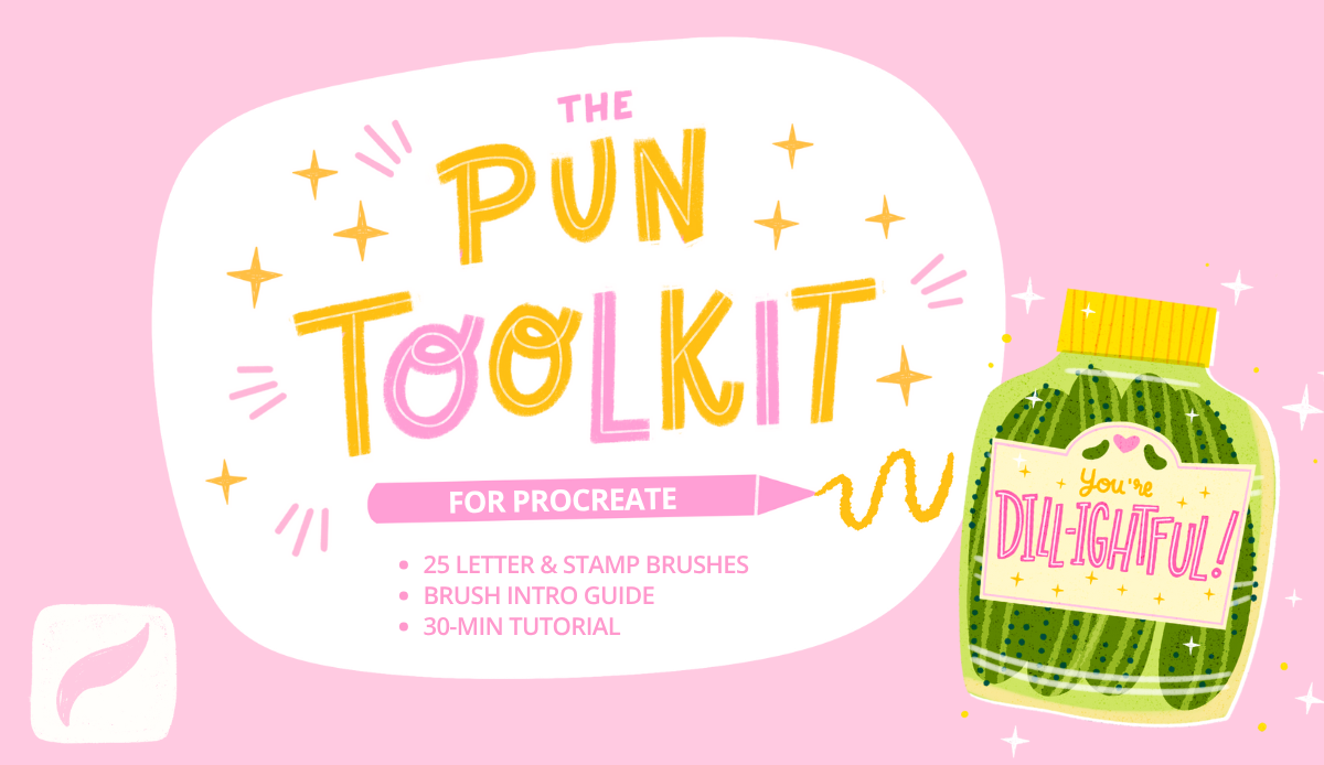
Transcripts
1. Intro: If you like pickles,
this project is for you! In this class, we're
going to design a cheerful pickle
jar and Procreate. This is a relaxed and easy
project that combines illustration and lettering in
a way that feels creative, fun, and low pressure. We'll build our
illustration step by step using simple
shapes first. Then we'll add
lettering and lastly, we'll add some texture and details to make the final
piece really stand out. Along the way, I'll also show you some easy
techniques that help add personality and
depth to your illustration. Your final piece could work
as a greeting card, sticker, a print, or simply a fun project that you can share
here on Skillshare. And while we'll be creating a pickle theme design together, you can absolutely customize this idea to fit your own
style or favorite theme. So you could replace
this by a jam jar, some peppers, sardines in a jar, or any other food pun you love. This class also includes
a color palette and a sample version of my Pun
Toolkit brushes for Procreate. I'll be using a mix of these brushes from the toolkit,
but these are optional. They're here to help inspire you and make the process easier. This class is beginner
friendly and easy to follow, though it would help
to already have a bit of understanding
of the Procreate basics. So we're going to use
stuff like Alpha lock, clipping masks, and
the selection tool. However, you don't need to
draw perfectly or follow every exact step to create
a fun project like this. Procreate makes
experimenting really easy. Grab your iPad, open Procreate, and let's create something
delightful together.
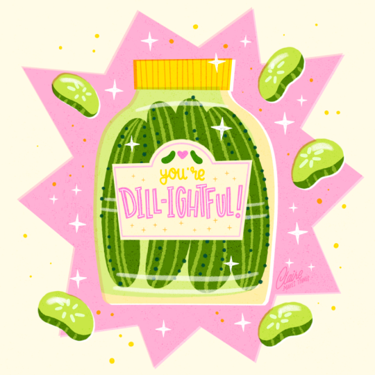
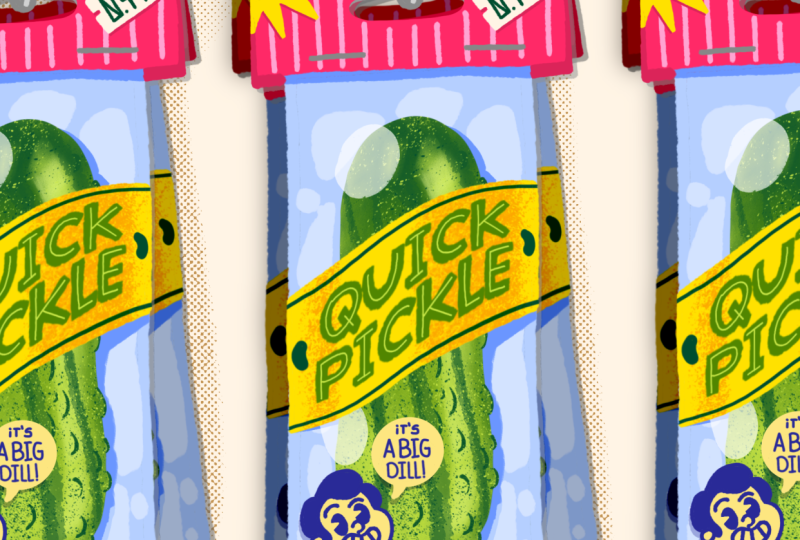
2. Project & Resources: We're going to create this playful pickle jar that includes a cute pickle pun that could
become a greeting card, sticker, wallpaper,
and much more. I actually sell this
greeting card design in my collection on Thought fall, which is a greeting
card website, and it's by far my
most popular design, especially around
Valentine's Day. Pickles, gherkins, and olives are some of
my favorite things. They've become really popular the last couple of years and sparked a whole wave of
really interesting products, and they've also become big subjects in surface
design and illustration. They have such recognizable
shapes and there's a lot of opportunity for fun,
labels and wordplay. One of the most
useful things you're going to learn in
this class is how to combine lettering
and illustration in one cohesive design. Even though we're making
a pickle jar today, topics like jam jars,
peppers, canned fish, or sauces or any fun theme
you can imagine that includes bottles or jars
is suited to this process. So you can follow
along with me or use this process
as inspiration to create your own
variation of this with different colors,
puns or objects. We're going to start building the illustration
right away using simple shapes so there's
no sketching phase needed. First, we're going to start
with all of the basic shapes. We're going to add
lettering and then lastly, some details and
texture as well. For the brushes, you can use Procreate default brushes or the ones that I've
included in this class. You can find those brushes and the color palette in
the resources tab. You can also scan this QR code with your iPad to
download them directly. That way you can open
them quickly and Procreate and get
started right away. The brushes are part of my Pun Toolkit that I like to
use for designs like this. It's all completely optional. It's simply there to help inspire you and
make the process of creating these greeting cards and lettering a
little bit easier. In the next lesson, we're
going to start with our canvas and our basic shapes.
3. Build Basic Shapes: Let's start by
creating a new canvas. Mine is 2000 by 2000 pixels. You can make this a bit
bigger if you like, because that's kind of a
small size, to be honest. If you've downloaded
the color palette, you'll see that in your palette, either at the top
or at the bottom. And the brushes will show
up in your brush library. If you can't find them, just make sure to open
the full library and they might be either in the Procreate library
or the classic. To make things a bit easier, I'm going to add a
guide right away. I go to the wrench icon Canvas and then toggle
on drawing guide. We're making this quite big, but we just want to
make sure that we have this square
in the middle that we can use as a
guideline for our jar. Let's add a background color, which is actually this yellow, but then I'm going to
just make it very light, it's an off white. Et's start with our jar. For this, I'm just going
to use this shape pen and this is just a
really basic brush. Any smooth brush works for this. Start with the bottom. To make a straight line, just hold your Apple pencil and your line will turn
into a straight line. The same for the top,
Now for the sides, this might take a few
tries to get it right. But the goal isn't to make
a perfect symmetric jar, it's okay if the edges
are slightly different. This makes the end result
just more fun, I think. If you do want to adjust
the shape slightly, you can use the
selection tool and then you can use warp
to change your shape. And I'm just
polishing these edges slightly with the eraser. Let's continue. This
jar needs a lid. Make sure you're doing
this on a new layer. Let's use yellow. This time, because this
is just a rectangle, we don't even need a brush. We can just use the selection tool with the selection tool, just tap four times. Then at the bottom in your menu, you have the option to use color fill and that fills it with the color
you have selected. Let's see how that
looks if we bring down the opacity of our
jar just a bit. Next up, we're going to add
a second color to this jar. We want to just add that inside
of the shape of this jar. We're going to turn this
layer to Alpha lock. You can tap on the layer
and the menu will pop up. You'll find Alpha lock there, or this is even easier. Swipe right on your layer with two fingers and that will turn your layer
to Alpha lock as well. Then with our light green, let's fill this jar as well. I'm not filling it
completely just to have this illusion of there's a glass and then the
pickle juice inside of it. Then we also need a
label on top of our jar. I'm going to make this page and do the same
thing as the lid, use the selection tool and then we don't want
to make it perfect. You can just make it slightly diagonal and this makes
it look more fun as well. And to make this
label a bit more fun, just giving this a
nice traditional shape with the oval on top looks
quite nice, I think. We're also going to add some
pickles outside of the jar. Let's use our light green. Then we're going to
add these slices all around the jar as well. We're not going to finish any
of these shapes just yet, but we do want to lay down our basic shapes
because this will help us make our
final composition. And you can move these slightly with the selection
tool if you want to. When you're finished, we can
turn off the drawing guide. I think it would be nice to add a pop of color behind the jar, for me, it definitely
has to be pink. I think that's a nice contrast
with the green as well. To make a star shape, we're going to use the
selection tool again and just tap to make your shape. Then at the bottom, you have the color fill again. If you already
have the selected, when you close your shape, it automatically
fills in that color. If you don't have that
on, just tap after and you can use the color fill. This is already
looking a lot more dynamic and very colorful. What we need now is to fill
this jar with our pickles. Let's use our darker green and then on a new
layer on top of our jar, we're going to add our pickles. Before you move on
to the next lesson, make sure that you have
all of your basic shapes ready and keep everything as much as possible
on separate layers. This will make it easier for
us to make changes later. So if you're not sure yet
about color, for example, don't worry, that's
something that we can easily adjust later
on if you need to. In the next lesson, we're
going to work on our letters.
4. Add Lettering: Firstly, let's add a bit of detail
to our pickles in the jar, and we can do that directly
on our pickle layer. Let's turn that layer to alpha lock swipe right
with two fingers. We're going to add
some light green to sort of show the
ridges of our pickles. And we're going to add some
more details to this later, but for now, this is a
good start, I think. Et's move on to the lettering, which is our main focus here. Let's first think about the
placement of our letters. For this, we're going to use this letter guidelines brush. This is useful to
determine the baseline, the X height of your letters. To use this, just use
your Apple pencil, draw a line, and then hold it so that you can draw
a straight line. We're going to put delightful
bigger in the center, and then you are at
the top, much smaller. Now these guidelines
will help us to make sure that all our letters
are on the same baseline. We have a bit of
space at the top, so it would be nice to
add some flourishes or maybe some really small pickles
as the logo of the jar. By the way, you can decide to choose another Pun
ear, for example. The light fall is
quite a long word. It's a lot of letters. If you're not feeling very confident about your lettering, pick something shorter or
take it out altogether. You can simply put
some mini pickles on this label and skip the
lettering if you want to. Because there are
a lot of letters, I'm making them very thin and then placing them at an angle
and making them playful. This helps us actually with making sure that all the
letters are able to fit. Even though all of the letters
are at a different angle, I'm still sticking
to that X height so that it's still organized
and intentional. This will make it much
easier to read as well. Lastly, your that can go at the top maybe in a script,
just something different. I'm thinking it would be nice
to make these letters pink, which is a nice contrast
with the green. Normally for letters,
I would actually suggest to use the
double monoline brush. This is a brush
that I use to make letters so that they
have a consistent width, which I think is a
really nice look and it really helps
to make the base of those letters and
this actually process that we follow in my short
and sweet lettering class. But in this case, the
letters are so small and it's not as important to have the perfect
width of letters. Just a regular shape
pen is fine too. Here are the letters, it
might take a few tries and make sure that your
letters don't overlap and that they have an
equal amount of space. Because the letters
are quite small, they really don't
need to be perfect. In this case, it's much more important that they are legible, try it out and then zoom out and see if your letters
are actually legible. With this, the
bigger your letters, the more experimental
you can get, the more you can add to it. But in this case,
it's really small. As I said, the focus
really is on legibility. Then we can do three things to clean up these letters a bit more to make it look
more intentional. Firstly, erase the round edges. Now you have these sharp edges and it just looks a
little bit more clean. Secondly, if some of your
letters just feel a bit wonky, you can with a
smaller brush size, just clean up those
edges a bit as well. Thirdly, also making
those corners in the letters a bit sharper. They really feel like
intentional block letters. I think that looks good,
and then we can move on to our last piece
of lettering, your. Maybe it will look good
in a different color. I tried this first in yellow, but there really wasn't
enough contrast. It's really hard to read. Instead, I would say pick
something between our yellow and orange
that would look quite nice and it's a
bit easier to read. I'm just doing the
same thing, just erasing those edges slightly, and I think that looks better. And of course, our small pickles as well with the
little heart in the middle. And then we can turn
off our sketch layer. To make this label feel a
little bit more complete, we can add a boder maybe in
pink, that would look nice. And you can use the
selection tool here to just make slight
changes if you need to. And we're almost done
with our letters. One thing that we
can add here to our letters is maybe an inline. That's really subtle,
but I think it will just make these
letters pop a bit more. We use the same technique
in my lettering Made Easy class and
there we explained that basically using an inline is the easiest way to make your lettering stand out
without doing too much to it. When your letters are quite thin and there's not a
lot you can add to this, an inline like this really
makes a difference. I think white is
the best option, but feel free to try
another color as well. And that's our letters done.
5. Details & Texture: Now comes the fun part.
We're going to add a bit of magic to this
to really make a pop. So first of all, we're going to create some more
contrast in this jar. Then we're going to add
some more detail to the lid and to the pickles and, of course, these big pickles
on the side as well. And we're going to saturate this pink in the
background a bit. Next, we're going to add some
more filler elements like little stars and dots and
some texture on top as well. So to start with, this jar at the moment is a very similar
tone to the background, the pink in the background, and it would help to
set apart the jar from the background a little
bit to make it more visible. So the way that we can
do that is something I do a lot in my illustrations, which is an offset technique
or a cutout technique. We're going to add a white layer underneath and then move
our layer slightly. So what we're going
to do for this is, first of all, duplicate our jar. And then also duplicate the lid and then merge
those two together. Make sure that that merged layer is behind your jar and your lid, and it's turned to Alpha lock. Then select white and fill
that layer with white. Next up, go to the
selection tool, and then we want to move that
white layer just slightly. You can do this by simply tapping and then you can
just move it a tiny bit. You'll see that white
layer appear underneath. Then lastly, turn your lid to the multiply blending mode
and your jar layer as well. Tap on the blending
mode and to multiply. I'm just changing the opacity of the jar slightly to make
it a little bit more subtle. And now you can see the result. What we have is a
slight white edge on one side and a saturated
overlapping edge on the other. This technique is
used a lot when you have a limited color palette or your tones are
really similar, this is a great way to separate
your colors a little bit. I think this is
such a nice effect. I use this in my illustrations all the time because I think it just adds a nice imperfect
touch and as a side effect, you get this nice contrast
between your layers as well. Let's move on to adding some
more detail to our lid. Let's turn that layer to
Alpha lock and then we can with a slightly
darker color, let's use that orange. Then with this double
monoline brush or any other line brush, just add some lines to
show the ridges of a lid. To our pickles, lastly, let's add a bit more detail with the darkest green in the color palette and then
go to the dotted line brush. We can just add this
on the same layer, so you can turn off
Alpha ok to swipe right with two fingers and then
we can add some dots. I know this isn't exactly
what pickles look like, but I think this is as close
as we can get and adding a bit more of that darker green makes it just a bit
more fun to look at. The dots look like some more
texture on the pickles too. For just the last detail
on this jar itself, you don't really see that
is glass at the moment, we're just going to add some
a glossy reflection on top. Any soft brush will do. You can just use
white and then lower the opacity slightly and
add a couple of lines. Next up, let's finish those
pickle slices on the side. Make sure that this layer
is on Alpha lock again, and then we can simply add
the outside layer to this. For some detail
inside these slices, we can add this seed. Let's use almsbt for this. Make it a bit more like green. Then lastly, like we did with pickles in the jar that
have these ridges on them with the light green and
then the rough edge brush. We can just add that
detail as well. And also for just a little
bit of a glossy effect, we can do the same thing
as with the jar and just add a bit of a reflection
on top as well. We can do the same thing with these pickle slices
as with our jar and add a white layer underneath to create
some more contrast. Let's duplicate that layer. Fill that layer with white. Again, with the selection tool, let's move it slightly to the same direction to the
bottom right, just tap. And our green pickle layer, let's set that blending mode
to multiply. There you go. That's finished. Now they have a bit more depth and they set apart from the
background as well. We already have our
pink background shape, but to just make it a
bit more saturated, let's duplicate that layer and set the top one to multiply. Now you've obviously
multiplied those colors and just for that same
cut out technique, we can just adjust
that layer slightly, and now it matches what we did with the
jar and the pickles. If you want it less intense, you can simply lower the
opacity of those pink layers. At this point, I wasn't super
happy with my placement, so I'm moving things
around just a little bit. We're almost done. We're going to add just a few more details. At the moment, there is a bit of leftover space in our
label and around the jar. We're going to fill that
up with some shapes. I'm going to use some stamps that I have saved
in the Pun Toolkit, but use whatever you like. Use the simple shape pen
to maybe make some stars, some dots, or any small details you can think of that
will look nice in this. This is optional,
but I think there's just a little bit of space in this label that we could use. You can leave this as
is or fill it up with some flourishes or
some little stars and dots like this, for example. And then I'm using
that same shape with white around the jar and
on top of the jar as well, just to make it a
bit more fun and to break up the pink from
the background a bit. I'm also adding
some more dots to this on a new layer and I'm setting that
layer to multiply. Then I'm going to use some yellow simply because
we haven't used yellow that much yet and that will balance
everything out a bit. I'm setting this to
multiply because this way, when you add those dots, as you can see on
top of that pink, they'll turn it into a
slightly darker orange. It's just a bit more intense. Next up for some texture,
this is optional. I like a bit more
of a rougher look, I like to add a speckle
texture on top. To do this, find the speckles texture and then select black
on a new layer, just cover your entire
canvas in the texture. Then go to the blending modes of that layer and set
it to overlay. This way, those black
speckles were turned into saturated speckles on
top of your colors. You can change the opacity slightly to make it a
little bit less intense. When you zoom in, you'll
see that now you have all these subtle colored
speckles in your design. This is our design finished. But before you leave,
don't forget to add your signature,
very important. I'm adding this to the bottom
right next to the jar. I actually covered this in my custom signature brushes
class and I talk a bit about why signatures are important and just some general tips on how to place them in
your design as well. If you don't know how to do
this, this might be helpful, especially the first lesson
in the class. That's it. Now we're done.
6. Share your Project: And that's our
finished illustration, your very own
delightful pickle jar. This design is actually part of a small collection I created, and you'll find the
other three designs in that collection in my other
course, lettering Made Easy. This comes with a demo
file for Procreate, so you don't need to
start from scratch, and I break down
different ways to add lettering to your designs. If you want to learn more about how to make your
illustrations shine, in Make it Pop, I talk about things like
the offset technique that we used here, adding texture to your
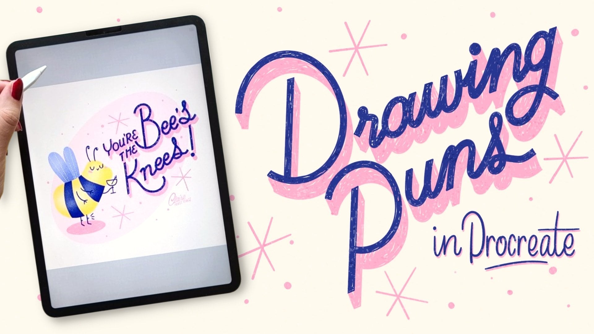
work and much more. And for Pun and
lettering inspiration, drawing puns in Procreate
would be helpful as well. I would love to
see your project, whether you followed the class exactly or created
your own variation, feel free to upload your work to the project gallery and
share any process shots too. It doesn't have to be finished. And if you need more
help or you want to brainstorm your
next project together, I'm also available for
one on one sessions. I would also love to hear what
you want to work on next. So feel free to give
me any suggestions in your project or in
a discussion step. If you enjoyed working
with the sample brushes, you can check out
the full Pun Toolkit for even more lettering stamps, textures and techniques
for future projects. Most importantly, this
toolkit isn't just brushes. It comes with a
mini class so you can follow along and
use them right away. Before you leave, please leave this class a review
in the reviews tab. And if you have any questions, you can leave those in
the discussions tab. I would love to see a process. You can share that
with me on Instagram. For more updates, make
sure to follow me here on Skillshare or
subscribe to my newsletter. I try to make regular classes, tutorials, and give you
Procreate freebies. Thank you so much for
drawing along with me, and I hope this class
inspires you to keep experimenting with
playful illustration ideas. See you in the next class.
 Claire Makes Things, Illustrator | Lettering Artist