Transcripts
1. Welcome!: Welcome to yellow
blanket flowers, designed for
confident beginners. This is class two in
a series of classes, focused on three outcomes. Firstly, to mix our effortlessly beautiful
neutral background. Secondly, we're going to do a fun thing and name
our chosen palettes. And thirdly, in each class, we're going to choose
our favorite background to paint or study on. Hi, I'm Holly. And I
teach from my studio in a very drafty 18th century
house in Southeast Scotland. As well as teaching
on Skillshare, my designs have been chosen for greetings cards,
wallpaper and bedding. My inspiration comes primarily
from my surroundings. I adore trees, and
wildflowers are my passion. In Eslothean we have the
Heather strewn Lamamu Hills. And a 40 mile coastline
including the iconic bass Rock, which is home to 150,000
Northern gannets, and it's the largest colony
of gannets in the world. I was brought up in a
very land locked area of Northwest England. So when I was a
child, I promised myself that I would
live by the sea. And although I don't
paint seascapes, I feel I can breathe more
easily next to the sea. So back to our class. And have you ever wondered how artists allow their
paintings to pop? It's very often to do
with the background. I'm going to share with you
the secret of how to mix luscious backgrounds which don't compete with your paintings. We'll be using gouache, but you could also mix your favorite watercolor
with white gouache, using only the three primary
colors plus white and black. In this class, we're going to paint yellow blanket
flowers together. And I chose this
rich, warm green. We're going to stipple in
with the makeup brush, easy flower centers
before taking up our flat brush to create
expressive flowing petals. We're going to reach a place of confidence where we'll feel able to replicate
our neutral recipes time and time again. You may have named your palettes so that they're easy
to remember and added new brush strokes and floral elements
to your glossary. And just a quick reminder, you can always
upload your project in our projects and
resources area. It's a lovely way of seeing
other students work, as well as sharing tips
and getting feedback. For my deaf, hard of hearing, or
neurodivergent followers, you can access subtitles to the class as well as
a full transcript. So, shall we get
started? Let's go.
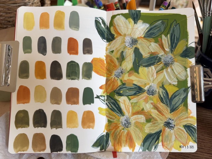
2. Materials: Because we're
creating backgrounds, there's quite a few
papers that we can use. I'm using Fabriano
Studio hot press paper, 11 " by 14 ", 28 by 35.6 centimeters. But you could use your
favorite watercolor paper or mixed media paper. And you can see here
I just folded it in half and creased
just one tiny edge. I then cut that in half. And then I did the same again, creating a little crease. I couldn't see that one, so I'm just making a pencil mark. And there we have
our study papers. Now, as the class went along, I did actually cut those in half again to create some
smaller backgrounds. For our background,
we're going to use handsy yellow
light, Ultramarine. Quinacridone Gold
and Prussian Blue. And I used my half
inch flat brush. But any brush you like, really, that will give you
a good coverage. For our practice run, I just used an off cut of some hot pressed
wood colour paper. As for colors, I'm
using moss green, which is Shen han, primary black, which is Holbein. Hansa Yellow Light,
and I'm using a Daniel Smith and
Quinacridone Gold, which is also Daniel Smith. And finally some white. And I'm just placing two
little areas of white there, and I just want to
mention that you can use watercolor and just buy
one tube of white gouache. And then if you mix
those together, the gouache kind of lends the watercolor that opaque feeling. And then today I'm
using a stippler brush, which is actually
a makeup brush. Always a really
inexpensive alternative to artists brushes. And then finally
a colored pencil, and I used caradash
luminance in dark sap green.
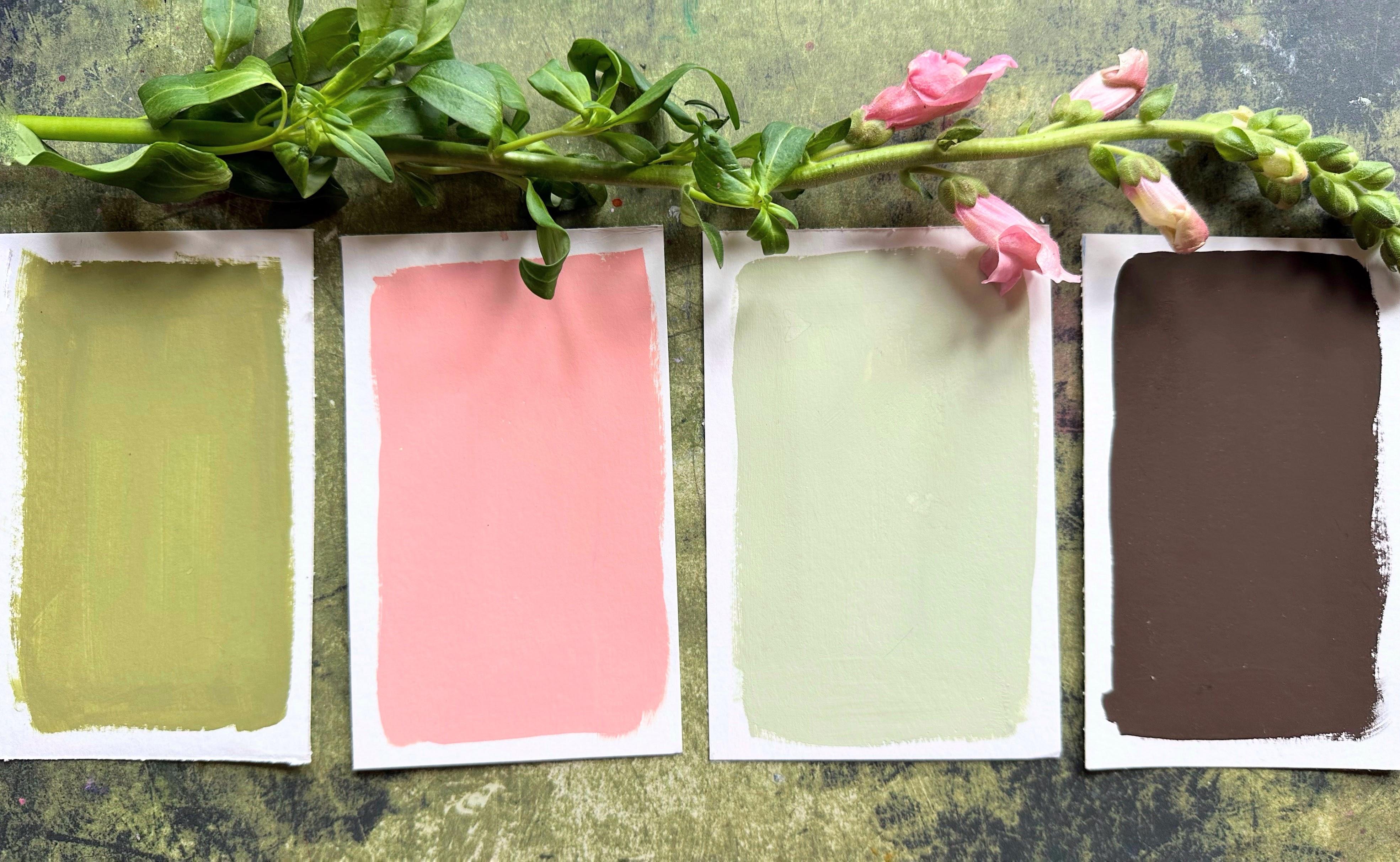
3. Class Project | Mixing Neutrals: I thought I'd cut
down a couple of the larger sizes into
small study size. So let's start with
handsome yellow light, Ultramarine, and
Quinacridone Gold. I'm using my half
inch flat brush. It's great for mixing as well as laying down
the backgrounds. So I'm going to mix
this lovely green first with the blue and yellow. And because we're using
handsy yellow light, that's a nice bright,
cooler green. And as soon as we
add the quin gold, it starts to warm it up. And then let's put
some white down. So I'm adding a
fair bit of white. And that makes this lovely, what I feel is like
a 1950s green. Then let's put that down. Actually, this is the
color of our front door. I tried to make this
paint go a long way. Let's get those
last remnants onto the brush and get full coverage. Just going over that with a
damp brush, and I love that. It'll be interesting
to see how that dries. And I want to also, while we've got them, do one
of these little studies. They would make really
good practice sheets if you wanted to do one
of the larger pages. Okay, so let's move on to what I called
Presmennan and Woods, one of my favorite
forests nearby. And we've got lots of Quinld
and some Ultramarine. I really want to mix a
lovely warm lush deep green. And one of my favorite
enduring mixes is just this quin gold, Ultramarine, and Emma can
add a little white to it. But let's get this
moving first of all. Adding a little water. That's well mixed now. And then we don't want
to lose the richness, so I'm not going to
add loads of white. And let's put this down. Oh, that is lovely. It's such a beautiful
and reliable way to mix a quick green and adding the white brings us that
lovely gouache feel, very matt, slightly chalky
feel. Really gorgeous. I can't wait to do
a study on this. Absolutely blissful. Beautiful. So we've got a couple of greens
going on there. This one I called fen. And I'm starting off with Pyl red and adding
handsy yellow light. So that's going to give us
a kind of an orangy feel, although the Pyl red is so overpowering that it's
staying pretty red. And then we're adding
Prussian Blue. And adding some white there, and I'm using the Windsor
and Newton zinc white. That mixes this earthy green, which we may use
in another class. I called it loam. Such an easy brown
to mix, as well. And then let's add some
more handsy yellow light. And I'm kind of mixing into it. I know that this is going to create a lovely earthy green. And I love green so much. I just want this on a
larger piece of paper. I should have mixed
a little bit more, but I'm hoping to cover this. Oh, I love that. Just added
a little bit of water there, just so I can finish the edges. This next one I called Viana. That's Scots Gaelic, and you meant to roll
your R a little bit. And although I have spent
more of my life in Scotland, I still have an English accent and find it hard to roll my Rs. But it's a beautiful name, and it means older
as in the tree. So while I've been
talking there, I added some handsy
yellow light, and I'm just adding more there, and then adding zinc white. So adding some white
to that really makes it a near to color. So this is where we have kind of paler versions of all colors
and all mixes of colors. Adding a lot of white brings these beautiful lighter
tints to the fore. Well, that's delightful as well. And it just shows
you how easy these are to go back to whenever
you want a background. I love that. So that's
Fiana and Fenn.
4. Practise For Our Study: So this is an off cut
of Hanamula harmony, and then let's put
some colors down. So I have moss green,
some primary black, handsy yellow light, quin gold, and I'm going to put two
little areas of white, and I'm using zinc white. So let's start off by stippling. And I'm picking up the makeup
brush that I mentioned in materials really inexpensive
and super handy. I will leave a link to
these in the about section. So let's start by getting
off all of the moisture. We want the brush
to be almost dry. And then let's dip into
all of the colors. Just go with what
feels right for you. You don't need to
do the same as me. But I went in with the black, green, and the hands yellow
light and quin gold. And we want them to just stay fairly unmixed
on the brush. And I'm just bobbing up
and down a few times. And each one is individual, and I absolutely love that. I'm mixing there's some
quin gold with white. I have my half inch
flat brush here, and I'm going to be using
this for the petals, as well as using it for our background, as
we've just done. And let's just practice
some brush drecks. So that's the full brush there. And then let me show you a
kind of a twisty movement. So we're putting the full
brush down, twisting, and then lifting up
now let's do the side. These make particularly
beautiful petals. And this brush is really
going to come into its own when we do our
final layer of petals. Isn't that a beautiful
petal shape? If you don't have a flat brush, the next best thing
would be a filbert. A little bit more
cuing gold there. So let's try getting a little
movement in these petals. And then placing these over
top of our blunter petals. In this way, we can start
to build up layers, a little bit of white
there and some quin gold. We're going to be
mixing on the brush like this. It's so beautiful. And again, gives us varied and surprising
and delightful outcomes. Really get to know your
brush, take your time. And then let me show you here adding water to our gouache. So it's almost like a
watercolor consistency. We're going to add over
these translucent petals. This, I feel is one of my
favorite things to do. It's so beautiful. So we have the thicker
gouache underneath and then the watered down watercolor style
gouache over the top. And the translucency
is gorgeous. So I have my little
white area there, and I've added some
hands yellow light. Because what we're
going to do now is create a second layer on
our stippled centers. Now, we want a very dry
brush for this layer, and we're not pushing into the page as we did
with the first layer. It's very light touch. But this lovely light, handsome yellow and white really starts to create some
depth in those centers. We've done these brush strokes
before in other classes, and I love them.
They're very textural. So just keep varying the
direction of young leaves. But those lovely textured kind of pushing into the page leaves, I think a few of those
would be really lovely. And we can do that upwards
on the side of the brush. Now I have my luminans
dark sap green, and whilst the
paint's still wet, we can go in and
carve leaf shapes. And we can also take
that beyond the leaves. I'm holding the pencil
right at the top, so it allows me just to
paint more intuitively. And then I thought it
might be nice to add some little seeds to the
center of the flowers. I'm doing them quickly. I
don't want them all to be very uniform or
perfectly shaped. I love this pencil. I think it's my favorite color, and these arndase pencils
are just gorgeous. I'm now building a
collection of them. And just so you can see
here on the white paper, let's do some seeds.
5. Class Project: Study | First Layer Stippled Centres & Petals: Let's start on our flowers. And we're going to do
some stippled centers and put our first
layer of petals down. Got my quin gold again and our moss green or a warm
green of your choice. A little bit of black. That's primary black by Holbein. And handsome yellow light. Two. Let's start on our stippling. And we're going to be using the same technique that we used in another class in this
series or Daisy study. The stippler I'm using today
is actually a makeup brush. In other classes, I
use a Jackson's art, Deer foot and an inexpensive
crafts for all stippler. What we're aiming for here is a mix of all sorts of
colors on the brush. So a little bit of
black, yellow and green. And then in we go, and I'm just going to place
them fairly randomly. And that looks good. Yep. It is a bit hit and
miss with stippling, so that's why I
always have a piece of paper to the side of me. And then some of that gorgeous
quin gold into some white. And then a cooler
yellow in the top left there with the
handsome yellow light. A little bit of green. I'm not cleaning my
brush in between mixing. This is all about mixing color on the brush
and on the page. So just a quick practice. That's the side,
and you can also use the full brush
as we practiced. So I'm doing the twisty
move to start with. And then that's on the
side of the brush. So you can just vary
your brush strokes. So again, a full
brush and side brush. And the reason why this is
so beautiful is that we can start to see the background coming through the
brush strokes. I really love this technique. So I'm mixing my colors and also doing full stroke and side stroke on my flat brush. It is about relinquishing control and just allowing
lots of color on your brush, not thinking about
what color they have to be or which is
the predominant color, going between all of these
colors that we have laid out and mixing on the brush. I do like using this
brush on its side. It creates such
beautiful little petals. So I'm still running between
the handsome yellow light, the quin gold, a little bit of black, and a
little bit of white. Every brush stroke is different. This is what I love about
hopping between colors. Stepping back in terms of
feeling like I have to control things and just see
what my brush puts down.
6. Class Project: Study | Second & Top Layer Petals: So I've got white ping gold and handsome yellow
light there all in one well because I now want to go
on top with another layer. So I'm just allowing
those all to mix. Have a quick look, see
what it looks like. And then let's add a
top layer of petals. And I do love green gold mixed. It's just so vibrant. It's also transparent, so it
lends itself to this class because we can continue to see the background coming through
or the layers underneath. That was the whole
brush round to a twist. That was the whole brush,
and that's a side. So you can just keep varying all of the brush works
that we practiced. There will be small moments that you like in
this in particular because it's very intuitive and we're not trying to
control the process. Once you've finished,
you'll be able to really take in what you've done, and it will be wonderful. You'll be able to see
these little moments that bring everything together. I'm also not really worried about which flower is
over, which flower. It's all about texture
and translucency. So just have a little
practice on the side there. I love these little petals. A flat brush is wonderful. It's not everybody's first
choice, but I love it, and I think I'll be using
this brush a lot more. I've really got
familiar with it. So a little bit more white. And now let's do some
translucent petals. So what I've done there is
watered down the paint, and you can have a
practice on the side. If you're finding you don't have control over these petals, you may just have
too much water. You can see that by
watering down the paint, we can really work
with the green base. It's an incredible process. And once you've mastered it, it will always, always
be one of your things. Isn't it gorgeous? So I take my time over these I
really enjoy the whole process. But also, I just want to
make sure that they're well formed because these are the ones that we're
going to see on top. B
7. Class Project Study | Stippling, Leaves & Pencil : I'm now thinking I want to add a little bit more
to the flower heads. So that's my moss green and handsy yellow light
and a bit of white. This is a very earthy palette, and I'm really
enjoying it because I often choose cooler
colors for my paintings, so this is a really
wonderful voyage into that gorgeous kind of earthy textural moss
greens and warm yellows. So again, I'm allowing these
to mix on the stipple brush. And I'm just bobbing up once
or twice on these centers. I'm not pushing down a lot. And then what we get is each bristle kind of a little bit separate
from each other, and it creates this
multitude of dots, which, if you tried
to do one by one, would not look the same. There's something quite random, unexpected and surprising
about using a stippled brush. I'm adding just a
tiny touch of shadow there with a little bit
more of the primary black, minute little touches, not pressing down very hard at
all on the stipple brush. I would say the flower heads
are a two pronged process. So the first layer, you can push down and get lots of texture out of
your stippled brush, and the top layers
are much more gentle. We're not pushing
down on the brush. We're just wanting to use all of the tips of that with
all that gorgeous color. So a little bit more moss green, and let's add some leaves. And this is a very similar
movement to the petals. We're not doing
anything different. I'm either using my
full brush or the side, just as we did with the petals. Going over the petals
a little bit there, practicing those two
movements again, that full brush on and
twist and using a side. Minimal leaves,
really? Oh, like that. This is what I mean about
just mixing on the brush. You get these lovely surprises. Beautiful. I love that. And then if you want
it, you don't have to. We could do a slightly
lighter layer on top. So at this stage, everything
is mixed together. I've got a little bit of black, little bit of the moss green, some white, and a gold. And using the side of my brush, as we did for our top
petals. Gorgeous. Yeah, I'm liking that. I also wanted to aim for
something in this class, and that was not too much of a dynamic in terms of value
or brightness of color. I wanted them all to be very harmonious and close together. This is a luminous pencil by Carendash and
it's dark sap green. I'm holding a pencil at the top. And what that does is just
make the marks slightly more random and less
perfect and defined. I do love this pencil
in particular. This color is lovely. So just picking out
some of the leaves, and some of these marks
can go over the petals. I'm gonna do one down here. It's not gonna
show up very much, but I just wanted something
there at the bottom, right. And now, why not add some little details
to the flower heads? We don't need too many. It just adds to the texture, and it's like a little
step beyond the stippling. Again, very random, very loose, not worried about trying to make them perfect
little circles, just marks really to
enhance the stippling. Now, that bottom
left flower just looks a little darker
than the others. I just want to add some white and maybe some
yellow on top there. So tiny bit of white. And I might as well bob
some in the others as well. And there we go, our
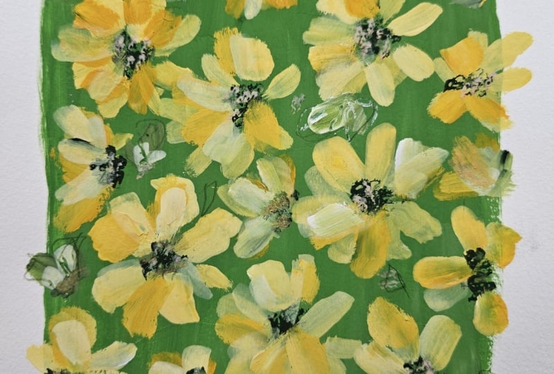
yellow blanket flowers.
8. Thank You!: I hope you're going away feeling so much more
confident about mixing neutrals and using
them for your own studies. Today, we've concentrated
on yellow blanket flowers, and in other classes
in this series, we'll be creating a
woodland walk daisies and a rose leaf study. So keep a lookout
for these classes. You can build up your array of studies on your
beautiful backgrounds. If you hit the follow button, you'll get updated as and
when I release a new class. Any questions? Fire away. You can contact me
through discussions when you upload your project
or over on Instagram. Thanks again. Take care
of yourself. Bye for now.
 Holly Tomas Art, Watercolour | Gouache | Mixed Media