Transcripts
1. Welcome!: Welcome to this low stress, restful, confident beginner
to intermediate level class. We're going to be exploring William Morris inspired
florals and foliage. Now, although he
was my inspiration, I would say that this class is a very contemporary
interpretation. William Morris, of course, was a 19th century
English textile designer, artist, poet, writer,
and social activist. But his influence has
enjoyed various resurgences, notably in the 1950s, and in more recent years, New York based
artist Ken De Wiley. Moving over to our class, we're going to prepare
with lots of practice, all the brushstrokes
that we're going to be using as well as the
finishing touches. We'll then prepare
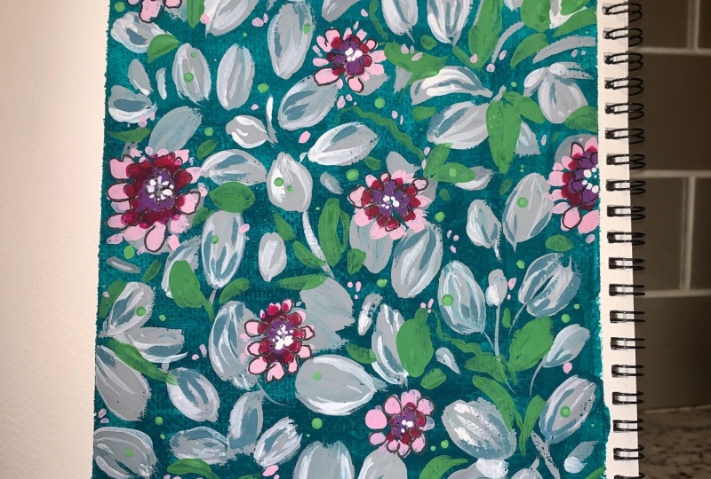
our background by mixing this lovely teal blue green before starting on
our first layer of leaves. We're then going to start on
our contemporary florals. I wanted us to paint free
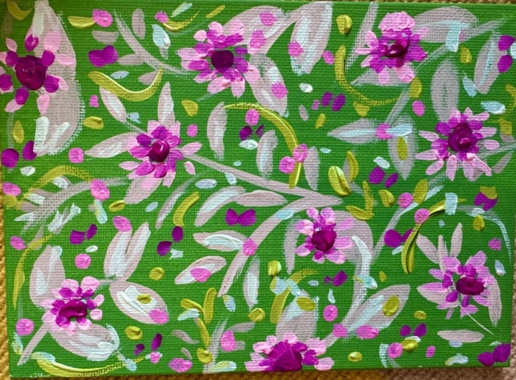
hand to try to capture the energy and the essence of the Arts and Crafts Movement. I was inspired by one
particular painting, which was part of a calendar
that my daughter bought me. I was particularly drawn to the background and also
the first layer of leaves. We'll be adding details
with some lovely spring green and tiny dotty florets. Adding details with pen and
with a small detail brush. I'm just going to take
you through quickly all the different sections
underneath the class. So the A section is full of class details and also
a materials list. There's a project and resources
area where you'll be able to upload your project and access any resources
that I've shared. Next, we have reviews and
a huge thank you to all of you who have taken the time to leave reviews.
It means the world. Discussions is our lovely
community area where you could ask me questions and
share tips and feedback. And in our final section, you can access a full
transcript of the class. So when you're ready,
let's get started.
2. Materials: So over two materials. And let me start with brushes. This is a size five pointed
round brush by memory point. And I have my Escoda Versatile
size ten round brush. Then I've got a size zero, which is like a detailed brush. It came in a set
with watercolour. Size zero, size two
would be great. And a Pigma Micron 005 in Sepia. Now, we're going to be
doing some dotting, and I like to use
clay modeling tools. They have these little
bobbles on the end. But if you don't
have one of those, you can always use the bottom of a paper brush,
something like this. Over to paint, and I'm
using all gouache, but you can use watercolour
for this class. I first off have a green. It's a moss green by Shin Han. But if you don't have gouache, you could always
choose something like a green gold in watercolour. So you can choose any
of these colors in watercolour and then mix
it with a white gouache, and it will keep some of the
properties of the gouache. It's a much cheaper way and an easier way to transition
from watercolour to gouache. So here's our moss green. It's a lovely, warm,
yellowy green. And then a cool green, and I've chosen Windsor green. So that leans towards the blue. I'm using Bengal Rose but
any pink of your choice. And we're going to use
these two to mix together. It's going to be
really harmonious. And finally, I just used
a ready mixed gray, and this is Shin Han. But you can also
just create a very simple gray mixing
black with white. So those are our paints. I used washy tape, and this is a cheaper variety. I was using MT, but I'm finding
this really good, and it's a lot cheaper, so I'll leave a link to that. Now, for paper, I
like hot press, and I'm using As here. The reason why I
like hot press so much is it's a
sensory thing for me. I like my brush to
glide over the surface. It's also really good when
you want to photograph your artwork or if
you're creating designs, it scans so much more easily. So this is a really
good quality paper. But as we're creating
a background, you don't necessarily
need an expensive paper. So if you have something
like Hanamul harmony, which is also hot press, then that would be great, too. It's a really affordable
paper and very good quality. Another alternative is fabriano, and this is a
studio watercolour, and it's also hot press. You can use cold
press for this class. And as I just said earlier, you can use any
quality of paper, really, because we're going to be creating a lovely background. And that's us, so let's move on.
3. Practise | Grey Leaves: I'll be taking you through
how to mix the color and lay down the background
in our main class. So for this practice run, we're just going to focus on
practicing brush strokes. I've chosen to use a gray, and I'm using the shin han. And I'm using my size
five round brush. So I've just added a little
water enough for it to move, but we still want
it quite thick. So probably 70
pigment, 30 water. So it can use various strokes. What I'm demoing there
is a two stroke leaf. It can use various shapes. So I've started off small there, and there's a
slightly larger one. I'm lifting up just a little
bit at the end quickly, so we get a ni a lovely, slightly dry brush effect
at the base of the leaf. Now's one with a wiggle. Varying the size and shape of our leaves is gonna
look really lovely, especially on top of
our teal background. I so lifting up again at
the base of the leaf there. I like this pointed round
brush because it's really good for very thin lines that we might need for
the stems as well. So just test out all
of the brushes that you have until you find one, which will allow you to
create this variation. A side swoop there.
We've done quite a few of those in other classes, and then a tip belly tip. And I'm just using the
tip of the brush there. And then you can try different
speeds of creating leaves. Trying different angles there from the left and the
middle, from down to up. I have noticed that a good practice is really good for me before I
start on a painting. I kind of convinced myself
that I don't need a practice, but in truth, it
really does help. Just relaxes you, gets you
used to the paint thickness, and also the brush
that you're using.
4. Practise | 1st & 2nd Circle Of Our Flowers: Let's move on to our flowers, and I think you're
gonna love these. We're going to use a pink, and I'm using this Bengal rose, which kind of leans
towards the red, I think. Lovely rich color. A little bit of white. I'm
using up some Shinhan there, and continuing to
use our size five, or you could use a
size four or six. Then bring over some of
your pink to the white. We will be going through color mixing in lots of
details in the class. So I'm taking the excess paint
off so I don't waste it. Going to imagine a circle, and we're going to lay
down some outer petals. This is the simplest flower, I think, to paint. And I'm using a
mixture of movements. So at the moment,
I'm working out, and then I start to
work from out to in. But you can move your
paper if that's easier. When I first did these, I did them really kind of
quickly and quite expressive. I would just show you how
quickly you can do these. I quite like that look as well. It's very kind of expressive. And a little one there. So, what we're going
to do is just leave enough space in the middle
for our other layers. Let me do a larger
one here for you. They're so pretty
just as they are. And I love this pink with gray. I've always liked pink
and gray together. Now, of course, you're
going to be painting this on that lovely
teal background. So this is really just to
show you the brushstrokes. Going in for the next layer, and I've got the neat
Bengal rose there. And I'm taking over
some of the pink mix. Once the Bengal rose is
mixed with a little white, you can start to see
its pinky value. When it's neat, to me, it looks very like a red. So it's very adaptable. We're going to do exactly
the same brushstroke and create this second layer. I do love this slightly
stylized version of flowers. It's kind of cute. As soon as we add
the Bengal rose, you can start to see the flowers coming towards us off the page. You can take your
time with these, or you could practice
doing them really quickly. Such a gorgeous, rich color. So there's me doing my
very quick movements. Back to nice and
slow and steady. So that movement out from the center and then
pulling into the center. I've done this larger one here so you can see
a little better.
5. Practise | Leaf Details: So I started off with a white. And this is the Shinhan. I'm actually going
to fast forward because it just wasn't
working for me. I realized that I was missing
the Windsor and Newton. So, you know, it's a
very personal thing. Many people like
Shinhan as I make, and I do love the moss
green, which will be easy. But for the white, it
just didn't feel right. So I started over and opened up a Windsor
and Newton white. So here I am trying to eke
out the rest of my white. Must order some more. It's very rich, and I like it for little details like this. So I'll see how I get on with
this quick practice run. And it's just much
better coverage. So what we're going
to do is pull down these very quick,
swift movements. At the base and at
the top of our leaves or indeed the whole length of
the leaf and some veining. So we're going to alternate here what we do with each leaf, so that has a slightly
individual feel. So each leaf has its
own little character. I found it best to
approach it more quickly. It feels much more in the flow than if I took
time over these details. I This is something that I found I really
needed to practice and get in the groove of before
I started on the project. The more you do
it, the more loose it becomes and the more
confident your strokes. So it is well worth having
a good practice with this, getting to know which
brush works for you. This tiny little brush has such a lovely point
on it as well, so that's why I've chosen this, and I'm holding it
quite low down as well. I'm using a lot more
white than I might use in the project just to show you more clearly what
we're going for here. Just these lovely
gouache details. Answer me going slowly. I'm going to try
upside down as well because sometimes I like
doing leaves that way, and that is actually easier. In our project, we could choose to be a little
bit more delicate. But for this, I just really want to get used to this brush, which I haven't
used a lot before. Alternating the brush strokes and deciding what I like best. So I'm already feeling a lot
freer than when I started. Just one stroke is good enough. I just watching out for
if you start to lose control because it
begins to get tacky, just add a tiny touch of water and get your
brush moving again. Tiny little details there. It's actually really enjoyable because we're doing
a second layer and the leaves are
laid down for us. Just seeing what it
looks like going in with some thicker paint towards the base of some of the leaves. I don't know why I had a
pair of scissors there. So totally overdoing
these with the white, but this is the
idea of practice. Going in a little heavier than you would, I always do that, just because I want to get used to all the different elements that we need to be aware of, the paper, the paint, the paint brush, and what
we want to bring to it.
6. Practise | Inner Petals: So in our background, which I'll be taking you through step by step
in our main project, we actually take
over a little bit of Bengal rose into
the Windsor Green. This time we're taking a
little of the Windsor green to the Bengal rose to
create a deeper pink. Both these colors
are really vibrant. Let's just see what
that looks like. It's a delicious color. Maybe take over some of
this pink mix that we had. And a tiny touch of white. That's slightly lighter. I like that. It's not
an exact science, and it's just about
mixing until you find a color that
you really like with the paints that you have. So back to my size five And in with
quite a thick mix, 80 pigment, 20 water. We want the paint
to do our bidding, so if it's too thin, we won't get that
lovely lush color, and we lose control. If it's too thick, we don't have any control
over the shape. I do love borrowing colours
and blending them together. So we get that kind
of gorgeous harmony. So we get a really
lovely balanced painting because all the colors are
speaking to each other. Just leaving a little
space in the middle. I'm not sure what flowers these are. You'll have to let me know. I quite like going out
of reality every now and then and doing a very
stylized flower. So yeah, let me know
what you think they are. They're looking really cute. So back into our white. Now, this isn't going to show up too well on
the white paper. Of course, when we have that
lovely teal background, you'll be able to
see this better. This is our center. And depending on how
much room you have, tiny little daubs or
even little dots. Just adding some pink to
that so you can see it. Quick little movements. On a teal background. These suddenly then
have a sparkle about them once the white
is in the center. Sweet little flowers.
7. Practise | Warm Green Leaves: Now to our green, and this
is a lovely warm green. I'm using the Shin
Han moss green. But if you don't
have that, something like a yellowy
green, green gold. And, of course, as
we've covered before, you can use wood colour. It just tends to have
a little shine on it and not be quite as
matte as gouache. Let's add a wee
bit of the Windsor green to your choice
of warm green. So, cool, darker green, like a Winsor Green,
and a yellowy, bright green, like a green gold. And why not a touch of white? So we're making a fairly
kind of mid tint here, and back to using my size zero. And the reason why I
wanted to bring in this warm green is it's a lovely contrast to
that cooler gray. And we can get a lot of movement
in knees, some wiggles. I tend to use a
very swift movement while I'm doing stems. And what I think we'll
do is weave these in around the elements
in our class project. So just kind of getting used
to them being quite fluid against the stiller elements of the flowers and
the gray leaves. So we can feed that one
behind that gray leaf. And on some, we could go over. I think the main thing to imbue in these
leaves is movement. Having a play around with
the brushes that you have. So this one I'm starting and then a very swift movement up before the end
of the movement. So kind of an interrupted end, and they can cross
over each other. Practicing moving between
the very thin stems and the ribony leaves. What's the movement,
different sizes of leaves. You've got a whole page, so just feel like you can fill that and just get really
comfortable with the shape. So I'm using my size
five here just to demo the brushstroke and you can
see it a little bit more. I often go in and add little tips to the
leaves afterwards. So this is going out
and lifting at the end. I really love that movement. It's very freeing. And then in from the edge
of the leaf to the stem, then having a practice around the flowers. I
8. Practise | Sugar Pink 'Confetti' Petals & Green Dots: So, unfortunately, this
part wasn't recorded, so I'm just going to carry on and show you what
I've been doing here with these
small pink details. So basically, I just mixed the Bengal Rose with some white. And I'm just seeing
what they look like around the
motifs or over them. Just using the tip of my
size five round brush. I always find it easier just
to think about these as shapes rather than
petals or confetti. And I'm trying various
directions with my brush. Just want to see what it looks like over that darker color. Gorgeous. These are very addictive. And the next thing
that I'm going to show you is even more addictive. So we're going to
really, I hope, enjoy adding these
finishing touches. So now we're going to
go over to our green. This is the warmer
green of your choice. And we want to keep
it very thick. So I'm just making sure
that it's nice and smooth. I know this is one of my
favorite things to do. I've picked up my
clay modeling tool. It's one of those with
the bobble on the end. And let me show you
with this first. If you haven't got one of these, you could always use
the bottom of a brush. But let me show you with the
clay modeling tool first. I'm just making sure there that I've got enough paint down, and it's nice and thick. So very, very
little water added. And then I'm just going to.in
these little green dots. I I love doing this. And the more you do it, the
more you'll get used to whatever it is that you're
using to make the dots. I'm going to add a little bit of white just to make it
a little brighter. So you'll probably
find that you have to keep going back into the paint. Maybe you'll get
two dots out of it, and then you'll need to
dip back into your paint. And actually, I am finding that the paint in a well is
quite hard to work from. So I've put it on the flat
surface in between the wells. And that feels much better. I love adding these little
dots as finishing touch. So these two little
finishing touches are really going to add a really pretty and
sophisticated painting because we're adding all sorts
of sizes, colors, shapes. Aren't they cute? So now let me show you
with a paint brush. So I've got a fairly
small paint brush here, and I'm just dipping the base of the brush into that green again. And you can see, there's not
much difference, really, so So don't feel you have to buy in any
clay modeling tools. You might already have
something you can use. I'm actually preferring
these with the brush.
9. Practise | Darker Details on Our Grey leaves: So we're going to go back to our gray and mix a darker color. So I'm adding the Winsor Green. I've already got some of that, and we've got the
gray from our leaves. So let's add just a little
of the windsor green or your dark cool green
to our gray mix. I was going to add
a little bit more. I want it a little deeper. Much better to go in slowly. So I've decided because we use the Winsor Green to
deepen our pink, we can use the pink in the Winsor Green to make that a slightly
deeper color, too. So I thought I would do that. Again, as a vehicle to kind of bring all of
the colors together. So borrowing from each color
always enhances your work. So back to my little size zero, making sure that I have
enough paint on it, but not too much that
it clogs the brush. And then we're just going to go around the white highlights. There's no hard and
fast rule on this. I think just follow your heart and add details where you like. I was going to add
a touch more gray. I felt that was a
little too dark. Now, my brushes got clogged
because I used it for mixing, so I like to give
it a little bit of a wash before I go
back into the paint. And again, just checking. I've got the right consistency. Good opportunity also, just to have a quick warm
up before we go in. And that color's
just right, I feel. I'm kind of working it
around the highlights. And mainly towards the bottom
and the top of a leaf, but also the full
length like a vein. Again, a very low pressure
part of our practice. I'm just going to now
create a bit of movement. So rather than just
very straight marks, I'm going to try and
move my brush a bit. Maybe a couple of
wiggles here and there. And I'm also making
very swift movements. So just trying to get
a little movement, a little curve, and a
few thicker lines there. Just have a play around
and see what you prefer. I feel I'm already warming up, which is a nice feeling
because it will feel so much easier going
into the class project. So I'm just trying out
a few different moves. So trying to get a
little movement in these tiny little leaves and
then in this larger one. I really like that, actually. Just slowing down a little bit, so I can show you that move. So nice. I like that. And some tiny little stems
and dashes and dots. Yeah, I'm glad I had
that warm up because I've kind of discovered
a new little move there. So now we can go into
creating deeper shadows. So if we have two leaves that are kind of
clumped together, we can add shadow to one and allow the top one
to come forward. So I'm just going to
replenish the gray. Just waking that up a little bit and trying out the color. Maybe I'll mix a little bit
of white and pink in there. I just want to get
the right tone. So this might be something
that we want to do, just to add some dimension. So we're adding a
lighter gray over those. So we're effectively creating new leaves over the very
detailed shadowy leaves. I'm going to add some of
that mix that we've just used to the gray and
back to my size zero. And then what we can do is create a shadow
around that top leaf. It just gives you an option
if you have some leaves that are clumped together and
you want to separate them. So just bringing
our brush around the top lighter leaf and adding more shadows
to the ones that we did. I don't expect we'll have
to do this on every leaf, but it's good to know
that you can do this just to highlight some
of these leaves by creating that rich shadow. A
10. Practise | Pen details: Okay, so I've got
a 005 in Sepia. And what I thought would
be really sweet is just to do a little bit of line
work around the flowers. So I'm just going to pick
out some of them, not all. Oh, wa pen's not
working very well. And I'm really just taking my time and enjoying
this process. Picking out little petals
on any of the layers. Always super restful to have
a little bit of a doodle. So just making lines around some of the
outer layer there, and the inner little
white petals. To me, this adds to that feel
of both the William Morris, but also the mid
century 1950s kind of contemporary florals. Slight fantasy flowers,
slightly naive. I think they're really cute. You don't need to do this stage. You can just leave
them as they are, but I think on the background
that I'm planning, I think these are going to look really lovely with
the pen details. And I don't feel I have to
follow the petals exactly. You can kind of make
them slightly larger or create little pen
petals of their own.
11. Practise | Neat Pink Details: So back to our Bengal Rose
and size five round brush. And I thought it would
be nice just to add some little petal shapes in
just this neat Bengal Rose. I do like adding neat paint
towards the end of painting, especially if we've been
mixing colors so far. So we've been creating a
lot of tints and using a very bright and neat color
like this in small doses, I find really elevates
your painting. Just adds a little bit of huge. Watching out for drips. Just seeing what it looks
like over the motifs around. It's such a gorgeous color. It's nice to use without
adding any white. And I'm adding some just
close to the paler pink. It's, I guess, a very
gentle impressionism, where we're just adding
colors next to each other and allowing the
brain just to blend those. So I just slowing down there and showing you how
simple these are. You can see the
difference really when you add these
little details. And although this is
a practice sheet, it's actually started to come
together like a painting, all the little elements
working together. So I'm really looking
forward now to adding all of these together
in our class project. I love it around that
green leaf there. Lovely. Really happy
with that. Gorgeous.
12. Class Project | Background: So let's create our background, and we're going to just put out the colours that we're
going to be using. That's the Bengal Rose. This is Winsor Green, both Winsor and Newton. I'm using my half
inch flat brush, but you could use a small
wash brush as well. This is a Jackson's
one. I really love it. So I'm giving it a thorough wash and taking the excess water off. Because this is a
gouache background, so you want it to be
applied quite thickly. I've just picked up
a larger round brush there for mixing. So Winsor Green taking over
some of the Bengal Rose. Borrowing from each color and mixing can bring a
sense of cohesion. So I use it quite a lot. And then just some
permanent white. Or you could use titanium
or Chinese white. And I'm trying to
achieve a kind of lovely bright turquoise,
but slightly muted. So I'm just adding a little
bit more of the Winsor Green. I think that was a
little too light, so I'm just going
to bring that over. And I also want to be really sure that I have enough
for the whole page. So just that mix
of Winsor Green, Bengal Rose and white. So this is what I'm
trying to achieve. It's one of those things
where I wasn't filming. I was just trying out something. I wish I had filmed it, but we can recreate
it here together. And I'm just going
to continue to mix until I get that
color or close to it. So I'm just really
experimenting with slightly different mixes and seeing which way I want to go. Now, the consistency we want here is enough for it to move, but thick enough to give
us really solid coverage. I can already tell
I'm not mixed enough. But I'm just gonna plow
on and see how far I get. I really enjoy laying down
a background like this. I think I wasn't so annoyed in myself that
I hadn't done enough. I'd be really relaxed right now. So I'm just paying attention to the corners and
the edges, as well. Just getting as much paint
as I can off my round brush. All is not lost because
we have done this mix, so we know how to recreate it. And it actually doesn't matter if it's slightly off
because I'm going to show you a way
that we can create a fairly smooth surface. So I'm not giving
myself a hard time. So yeah, definitely mix more
than you think you'll need. So I'm making sure as
much as possible that all the little white pieces
of paper are covered. So this is how we're going
to blend it all together. I'm putting a little bit
of water on my brush. Not a lot because we
don't want it to start to bloom and cut
through the paint. But just enough that we
can move the paint around. It's a really lovely technique, and it means that if you've had to mix extra paint and it's
not quite matching up, you can do this and
it will all even out. I also don't want a
really perfect finish. I don't mind some texture and some brush strokes
showing through. But if you want it, you could just continue to do this until you've got the
surface that you want. So you see everything
turned out in the end, and that application of
a little bit of water to smooth it out is a really
good technique to remember. It's very warm in Scotland, so everything's drying
really quickly. I'm so messy. I'm just going
to tidy up a little bit. Sometimes I wear gloves just 'cause I've got paint
all over my hands. Oh, my gosh, Holly. So messy. I'm just gonna cut
that sploge off, or it's gonna haunt me for
the rest of the class. Right. Happy with
that background. Excited now to carry on
with the first layer.
13. Class Project | Grey Leaves: So the background has
dried really well, and I'm using an actual gray. Normally, I mix a gray, but I'm going to keep
things really simple, and this is Shinhan. It's really important
to keep our colors as vibrant and as clean as
possible as we go along. So I've got one pop for dark colors and another
for the lighter colors. So I'm just checking
the consistency there, and it's slightly too thick. So I'm adding a tiny
touch of water. Now, it is important to get
the right thickness here. What happens if we put down
something that's too wet? It starts to disrupt
the background color. And it's not what we're
going for in this class. It is something that's quite beautiful if that's
what your intention is. But for this class, we want
to keep it nice and thick, so it's laying on top of that. Gorgeous background. So I'm using my size five round brush. You might have a favorite brush, which is a four or six or
even larger, actually, if you've got a pointed
round brush and doing these two stroke petals and trying to keep it as
fluid as possible. I'm just getting enough
paint down there. Nice mix around. You can tell the
thickness, as well, because there's a
slight dry brushing as I pull up my brush. I want to vary the
direction of these leaves. This is our foundational
sprig of leaves. And obviously, we do
loosen up as we go along. So the practice is fairly important because it just
gets us in the mood, gets us looking at our brushstrokes and knowing what we want to aim
for in the project. I didn't like that
stem too much, so that's okay because we can always do
leaves over the top. I absolutely adore
gray with this color. The inspiration was
just so strong, and I saw this green paintings, and that was it. I just knew I had to do
something like that. So it's a very contemporary
take on William Morris. I honestly could
paint leaves all day. You can, of course,
do your stem first, as I did with the
main one up there, or lay down your leaves and
then pull through a stem. I'm really trying hard
here just to keep it nice and fluid and just a
little bit expressive. So with William Morris, what I love about his
designs are that they do often have a fairly
formal view of florals, but there's movement
in them, as well. And I'm not quite
sure how he did that, but there was so much movement, and yet you would say that
they were quite still. So I'm trying to bring that
quality over to this as well. You can follow along
with me in terms of placement of your
leaves or go your own way. But I'm basically just
filling up some of the space. We want this to be a firm, definite start on
which we can build. Mm hmm. So just keeping in mind that I want this
to be fairly balanced, but with a little bit of
wildness to it, as well. I have no idea what
leaves these are. I often just paint, and then afterwards, I
decide what they look like. As I've got some spaces there, three that I can identify, just want to go in gently
with that extra leaf there. Maybe one here, poking
in from the edge. Just wanting to fill that area, but for it not to take
over 'cause we've got those larger elements
they're doing their job. I've decided just to
add some tiny leaves. You know how much I love to add small leaves to the
larger leaf motifs. It's one of the techniques
that I use quite a lot. I love little details. And just keep going
round until you feel you've got enough
coverage with the leaves, but it also leaves space, obviously, for the flowers. So just pausing and having a look, and I'm
gonna stop there. And
14. Class Project | Outer Circle Of Flowers: Adding more white. And we're going to mix
that with the Bengal rose. I am getting on really well with the Windsor
and Newton guash. It's very dependable. It's slightly thicker, and I feel more luxuriant than
other major brands, even more than a Daniel Smith, which I've used for years. I am a convert to it. And I'm taking my time just to mix the color
that I really want. And this is a tint, of course. So adding white to a color. Gray is tone and black shade. So I'm going in with this paler
pink, just to start with. Again, just making sure
I've got enough there. I think I have.
And these flowers are so delightful
and easy to do. I don't know where
they came from, but just something in my
head clicked one day, and I just thought,
What a simple way to create little
layers and petals. And they're so sweet. So we can start with
the outside first. It's gonna add a
little bit more pink, any pink of your choice, and we're going to go in and just create our outer petals. So just be mindful that you leave enough room in the center
for all the other layers. Working with the
tip of the brush. So I'm not needing to
complete the movement. Tiny little dabs
and daubs of paint. And also very quick, you know, try not to get
too tight with these. I feel they look the best
when we just do them intuitively and approach
it in a joyful manner, really, without getting too tight and feeling it
has to be perfect. So I'm dotting them around
and going over some leaves, of course, in places. I'm not really
aiming just to put them in the spaces left
in between the leaves. I'm also not too worried
that it looks uniform. You know, I don't want
them all spaced apart in one particular measurement. They're actually just
so cute on their own. You don't even need to do
anything further, you know, if you wanted to use this
in another painting, they're just so cute. I'm varying the
size a little bit. So there's some smaller ones, some larger, paying attention
to the edges, as well. So I'm just looking at the
one that I did originally, and let's now mix that
second layer of petals. So going for a much
deeper pink here, so I'm just adding water to the nglerose and taking over the mix that
we've just used. I'm really, really in love with Bengal
Rose at the moment. Just makes my eyes sing
I eyes could sing. And we're going to do
exactly the same movements inside that pink
layer of petals. Honestly, my favorite flowers
to paint to the moment. So pretty. Look at that
pink, isn't it glorious? Just love it. So I would say this is probably 90%
pink with 10% white. It's even easier doing these inner petals because we're just following
what we've done. So it's deeply restful. I can't get over this pink. So beautiful. And actually, I think I'm just in love
with the name of it. Ben Gal Rose. Gorgeous. So speeding
up a little bit there. Not forgetting the ones that we have in the outer margins. Pink makes me so happy. When I was a young girl, I absolutely hated pink
because I was brought up with three brothers
and three male cousins. And so they used to see pink
as a very gendered color. And I wanted to be
like one of the boys. So, you know, I rejected pink. It's a shame, isn't it, that we gender colors like that. So I'm reclaiming it and
absolutely reveling in pink now. I'm thinking I might just
want to add something here, and I just want to
add a smaller one, I think. In this space. And then the inner petals. So so pretty.
15. Class Project | Leaf Details: So I'm switching brushes and
going down to a size zero. Now, this tiny little brush, I got in a Cotman set, and it's very light to hold. But I also have one here
that's a normal size. And but that's a size two. And let's do some details
on the gray leaves. The reason why I like
this little Cotman brush is it has a really
fine point on it. So if you have a round
brush with a fine point, that's going to be
perfect for this. So let's put some
more white down. Mixing a very light gray. That's mostly white. Adding water. When
we get to details, we need a little
bit more control. So if the paint is too thick or we have too much
paint on our brush, we're not going to get
those finer details. So I find that I do add
slightly more water. You'll know if you
have too much water because it will be
absorbed by the page, and we want to have
it sit on top. So I'm just going
to try this out. And that looks good. So let's use that technique where we're moving the
brush really quickly. And these brush strokes
are so much more organic and have so
much more movement than if we were
trying really hard. So sometimes just trusting a brush and swift movements
creates just what we need. Sometimes trying less is
actually the best way. I know that sounds a
little counterintuitive, but that's what I found
for my style, anyway. I don't feel it's
showing up too much, so I'm just going to put
down some neat white. And we're going to build
up these little details, so these are gonna look so cute. It's really important to find
the right brush for you. These are quite fine details. If you don't have a
small detail brush, you could always
use a dip pen for these marks or even
a white gel pen. And we can vary the
stroke on each leaf. On some of them, you can
just do the details from the tip to halfway down or go right down
through the leaf. Isn't this effective. And again, I really feel like it does nod in the direction
of William Morris. There's an incredible amount of detail in the
florals and foliage. I'm holding my brush
quite close down. I do that because it gives me
a little bit more control, and it's almost
like using a pen. And that's a good
approach in general. If you're wanting loose florals, you could hold your
brush further to the top end when you're wanting more controlled
movements further down towards the ferral
and the brush itself. Adding tiny little
stems as well. And I'm actually loosening up
quite a bit as I go along. So, again, a good warm up, I think, is a good idea. This is another restful process. We're not having
to think too much, and we're working
with existing motifs. So very swift movements, keeping that flowing quality. Putting some veins on some. It's time consuming, but
also really lovely to do. So you'll find you
won't want to, uh, rush through it. And down to our last view.
16. Class Project | Inner Third Circle of Petals: And so we've done our
first two rings of petals. And now we're going to
mix a darker color. But we're using a very
limited palette here, and we're going to
use the Windsor green to mix a darker pink. I love when we do this together because it's how we can make a painting sing because all the colors are
blending together, borrowing from each other, and it makes for a really
happy, harmonious painting. So I'm going in steady at first. Don't want to add
too much green. I really enjoy mixing a dark pink with the
addition of green. And that looks really nice. Yeah, I like that.
Might be a touch dark. I don't know. Let's have a look. Just mixing a little bit
more of that pink and white. And then, here we are on
our third ring of petals. Just following again what
we've already laid down. Couldn't be easier.
Brightening it a little bit. It's a bit too dull, I think, so I've just
added some white. The other thing which makes this cohesive is the addition of white and this use of
tint. I love that color. I really hope that you
can take this flower forward and let it become
part of your floral glossary. Certain flowers now just seem to feel like my
signature flowers. Tiny little dots almost
on these smaller flowers. I fancy doing a small
flower in this space here. So now going back into
that pale pink mix. And we don't need a lot of it, but I'm just going to
create some tiny buds. I just felt like there was
another motif needed there. So I'm quickly
kind of just going back to the mixes
that we've just used. White and Bengal rose, mixing a deeper pink for
that inner petal layer. I really love this little one. It's quite sweet. Not much
room for the darker color, but I'm just gonna
dab some in there. And pausing and looking
over the painting. Pausing is really useful just to take stock as
you're going along, especially for more detailed
paintings like this.
17. Class Project | Warm Green Leaves: On the original, I did these swirly movements
with a warm green. I love using cool and
warm colors together. So, the closest I
have at the moment in Gouache is this Shin
Han moss green. I do like it, but I
don't find Shin Han as thick as Winsor
Newton or Daniel Smith. A little bit more green. If you don't have a warm green, you can always add a yellow to any green that you
have in your stocks. So again, these are
going to be quite flowy, so we want enough water added to give us
lots of movement. And you notice there
that I'm doing that borrowing
from other colors. So I'm adding a touch of the winter green with
some more white and some more water and just
mixing and testing it out. I think I'll go for a tiny touch more off
the Winsor Green, and I'm going to use my size zero pointed round brush again. So nice small detail brush. And I'm just trying out the little curly
cues and ribbons. Because, although it's a
fairly static painting, I want to remember
the movement that William Morris brought
in to his designs. So there's a little movement
in the gray leaves. But with these warm green ones, I really want to kind of have some bendy ribbony
elements going on. And, of course, we can go over
the first layer of leaves. We're starting to weave
our elements together now, and you can start to think
about whether you want these leaves to go over or
under your previous layers. I felt I was getting a
little too static there, so I'm just going
to switch it up, get that movement back in. And this one I'm taking my time. They don't all need to be
quick, swift movements. I just love threading them in between all of our elements. It brings all the
layers together. A very conscious
decision on my part was to also mix cool
and warm colors. That's something that
top designers use a lot, and we can do it very
simply here with this warm, yellowy green gold colour
over that cool teal. And suddenly, it's almost like this garden has just
burst into life. Like, you know, you've closed
your eyes for a moment, and you open them up, and all
this growth is happening. It's kind of magical. I'm thinking about my edges and making sure that the motifs
are going over the tape. Just poking in from the edge of the page and then taking
these behind and around. Keeping an eye on our paint as well that it's not
getting too tacky, and we're able to move
it across the page. When you're working on
top of a layer like this, it's slightly more
gravelly feel. Gravely is not the right word, but it doesn't run
as smoothly as if it was just on a hot press
surface, for example. So we need just that
tiny touch more water when we get to
details like this. So it runs smoothly. We're going over various
thicknesses of paint. So I'm adding little
curly cues in places and extending
some of the leaves. I love the decision making with this because
we can just slowly go around and decide if we're
going to go under over. Just fleshing out
some of the leaves there because I noticed that
the middle motif there, where I slightly kind
of tightened up a bit, has slightly broader leaves. So what I'm gonna
do there is just to balance it out and go around and just pick out some leaves and make them slightly broader. There's always something that
we can do to keep balance. That's why I also
do stop and take photographs at different
stages and just look at it with a different perspective where there are holes or
where there is an imbalance. And I think I'm really
happy with that. I don't want to overdo it. So loving this. I'm going to stop there and let's move
on to our next lesson.
18. Class Project | White Dotty Centres & Wee Pink Petals: So let's go back into
some white and just do some little dotty
centers to these flowers. I quite like the pure
bright white for this, as it really kind of
makes them more three D and move out of the
page again towards us. Tiny little dotty features. And just a continuation
of that shape of petal. And on the smaller
ones just a few dots. Again, very simple because we're just following the shape that
we've already laid down. That's really woken these up. I thought they were
quite vibrant, but wow, adding this whites just
really transformed them. It's amazing. Lovely. And not forgetting our
motifs at the edge. Have I done them
all? I think so. Yep. Now, what I want to do
is some small accent flowers. You know me in my tiny details. It's a feature that I use
a lot. I really love it. Finishing touches are
really important to me. And I'm just really
thinking what I want. I kind of vaguely
know what I want, but just firming up the idea in my head and picking up my
Bengal rose because why not? When sure, pick a pink. So your choice of pink
here and a touch more white and mixing
a nice pale pink, adding just a touch of water. These are the tiniest movements. Almost dots, really, using
the very tip of the brush. And I want some poking
out from behind leaves and some over. The reason why I
like accents like this so much is
they're very pretty. I mean, you know, that's it. I love that kind of fairy dell almost magical feel
like confetti. We've done these as well
in previous classes, either little Vs, little
dots, little dashes. You can't really go
wrong with these. I think the only thing
that we need to be aware of is not to do too many. That's so easy to do. I love them so much. This also is a
conscious decision of mine to bring everything
together, as well. That's why I feel finishing touches like
this are so important. We've got those
larger elements in pink flowers and gray leaves. We've got the medium
sized elements in the warm green leaves. And we have these tiny little
petals in a breeze maybe. And I love working with different sizes of
motifs in one painting. And I'm not thinking too much about where
I'm putting them. It's a very free
flowing experience. I just allow my
intuition to take over.
19. Class Project | Pen Details: So you know me, and I've got to get a pen
out at some point, so I think it would be really nice to add some pen details. So I'm getting my
Trustee 01 Pigma Micron, and this is in Sepia. And I'm just practicing there, just making a little
squiggly center. So 01, it's not the finest pen. So I'm just gonna try and
find maybe a smaller one. So I'm going to go down in size and use a smaller Pigma Micron. So what I want to do is just go around some
of the white petals. Maybe some of the pink ones too. I did this on the original one, and I really liked it,
so I'm gonna go for it. Obviously, this is
an easier process if the paint is
thoroughly dried. And I don't want to pick
out all of the petals. So I'm just doing random
ones on any of the layers. I did like them in the
center on the original, so I'm definitely gonna do that. And we can really slow
down now that we've got these little
details this end stage. Using a pen with these makes them
a little bit more graphic, slightly
fantasy flowers. And although William Morris used fairly
recognizable flowers, strawberry flowers
and honeysuckle, they do have that slightly
other worldly feel.
20. Class Project | Green Dotty Details: I've got something
exciting to show you, and it's just a very,
very simple thing. We're going to use either
a clay modeling tool with those little
bubbles on the end, or you can use the
bottom of a paint brush. We're going to create
some little dots. I realized that subliminally, I was taking in all of
these little elements from the William Morris calendar that my daughter had bought me. And I noticed on
the lily pattern, although there are
variations of it, on this particular one, the dots in the background. So those work their way
through to this class. We need a nice blob of paint because we're
going to make these slightly three D. So just lightened it a little
bit with some white. And then, let me just show
you how wonderful this is. Again, it's another
magical quality that I often use
in my paintings. If this was my job, I would be so happy, dotting paint, a
professional dot painter. It's the simplest
little movement. They remind me of little pearls. That's it. Pearls. So pretty. So my camera is gonna
play up a little bit because I'm using this
fairly perpendicular, just so that we get
a lovely round dot. And I'm dotting them around
and over the motifs. But I do love these over
that teal background. So that's where I'm
heading for first. Oh, my days. I love dotting. I think maybe I should just fill a sketchbook full of paintings like this
so I can just dot. And, again, I think
our only danger here is doing too many. So doing some over
those gray leaves. Yeah, I'm just thinking.
Thinking of pearls. They remind me of those
tiny little cabochon. And for any of you
who are scrapbookers, and use those little
stick on pearls, that's what they remind me of. You can't really go
wrong with this dotting. And the only thing that could happen is that it's too watery, and then you risk it
becoming a bit of a sloge. And so we want just enough
paint, quite tacky almost. And that creates these lovely
clear three D perfect dots.
21. Class Project | Darker Blue-Grey Leaves & Reveal!: So this is our final lesson. And again, referring back
to the original idea, I think it might be nice to
do some more leaf details. So I'm putting more gray down. And that's the Shinhan. Oops. I've got to claim a brush. A little bit of green in
there, but never mind. And enough water again
to get it moving. And I'm going to add some
winter green to that. I like to use the in between bits there
to put paint down so that I don't put it directly in the paint and then realize
I've made it too dark. So mixing a kind of a
turquoise blue there. And again, using that technique where we borrow
from other paints. You get some beautiful
results that way. Some lovely neutrals. So moving back down
to my size zero, I just want to kind of go
over those gray leaves. And again, this is a
technique you see a lot of surface pattern designers using the old style of
gouache painting, where there's quite a
lot of details going on. Different tints,
tones and shades. And I think this will really allow that white to
come forward a bit. Effectively, just adding
a little bit of shadow. And I do like that because it's really pushing
that white forward and bringing those leaves towards us in a more
three D manner. You can always opt out of this last section and just
leave it the way that it is. So very much the same approach,
very swift movements, taking my brush off the
page and not completing the full movement and creating these little
shadowy areas. Again, this takes time, but it's hugely restful and
almost like a meditation. I'm not going in with
anything particular in mind. Some of the strokes
are going outward, some are drawing in. I'm doing lines mid leaf, top of the leaves, the
base of the leaves. So just really
switching it up and not feeling I have to do the very
same thing on every leaf. But I'm amazed how well
that's worked, actually. Next to the white. And, again, a very different kind of
take on William Morris. And I can shadow there. You see how that is
underneath that leaf. Delightful. I do love this gray with the pink added. I must remember that
for future paintings. Just kind of got that
slight blush in it. It makes me happy to
think of you painting this and just having
some time to yourself. Again, just shadowing that leaf there because there was quite
a clump of leaves there, so I wanted to just separate them out a little bit
with some shadowing. I grew up in the design world, so my dad took me around to see a lot of the designers visit
them at their homes. A lot of freelance designers. So I met some of the
fabulous kind of old school gouache surface
pattern designers. I felt very privileged
to have met them and to have grown up
with that access. So here I'm just dotting in some really bright Bengal pink, and I love that
vehicle, you know, where we use brightness again to really create
that three D effect. So bright colors come forward, duller, more muted
colors move backwards. And so it's the same with color. So warm colors come towards
us cooler in the background. So I've got those two
techniques working in harmony together to create suddenly
this real feel of depth. I do like the feel of this snow because it just
feels kind of magical, maybe almost like
a night garden. So on to my favorite
part and the reveal. I used to use EMT washer tape, but it's quite expensive. I use this now, and I get it off Amazon,
and it's perfect. It's worked with all of
my papers that I use. So And the final piece of tape. Oh, I do love a reveal.
So happy with that.
22. Thank You!: So we've reached the
end of our class, and we've explored
the timeless quality of the Arts and Crafts movement. I'm hoping there are some motifs there that you feel he could
recreate in the future, especially the little flowers. So thanks again so much. If you have any questions, don't hesitate to get in touch via discussions or
over on Instagram. Poly Thomas Art. Take good care of
yourself. Bye for now.
 Holly Tomas Art, Watercolour | Gouache | Mixed Media