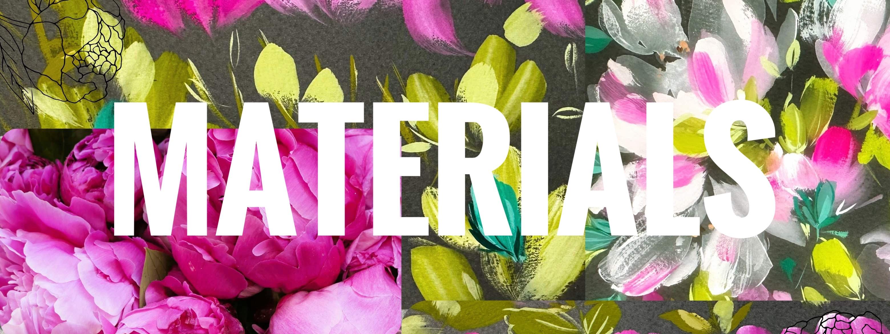
Transcripts
1. Welcome!: What if I told you, you
could paint peonies with a very limited palette and just two or three brushes. The peony flowering
season is so short, which makes them all
the more special. There's a reason why we're drawn to capturing their beauty, but they can also feel
quite complicated to paint, and it's taken me maybe a couple of years to develop a style that
I'm really happy with. Keywords for this
confident beginner to intermediate class are
translucency and layering. We're going to have a
really good warm up together, going
through brushstrokes, mixing peaches and pinks, working on value, texture, and then final detailing. Hi, I'm Holly, and I teach from my studio in a very old house in the Lowlands of Scotland. As well as teaching
on Skillshare, my designs have
been selected for greetings cards,
wallpaper, and bedding. My inspiration comes primarily
from my surroundings. I love trees. Wildflowers
are my passion, and living on the
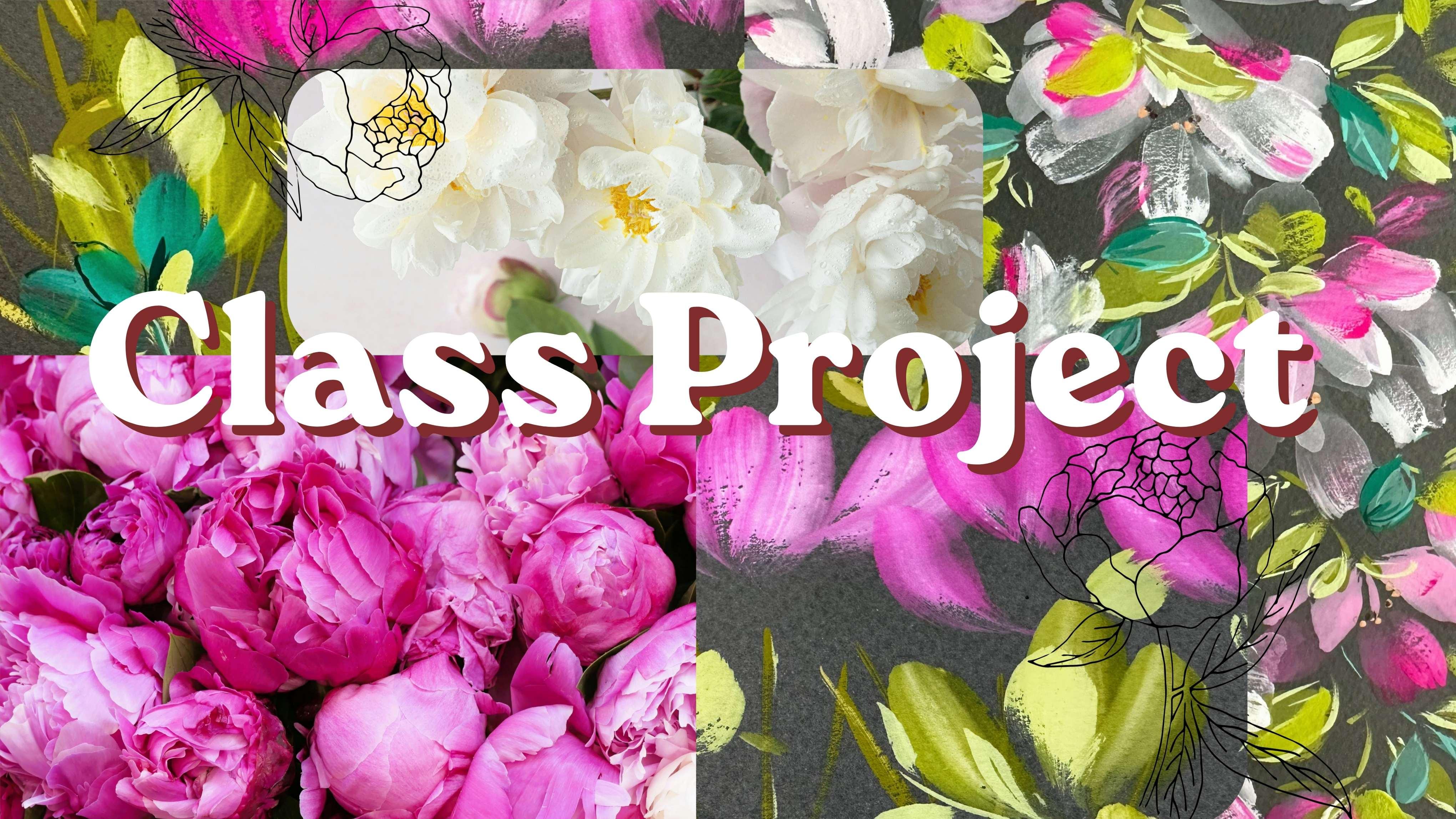
coast is a real gift. So let's take a look
at our class project. We're going to take all
that we've practiced into creating a joyful
bundle of peonies, bursting with soft pinks
through to a really hot pink. If you don't have gouache, you can do this class
with watercolor. And as I've mentioned before, an easy way in really
is to just buy one tube of white gouache and mix that to
your watercolors. At the end of this class, I'm hoping you'll
feel more confident in balancing intuition
and thought, developing trust in
your brushstrokes. And moving towards your own
unique, authentic style. Before we start, I just
want to mention you can access subtitles
underneath each lesson. And there's also a
full transcript. I enjoy every aspect of
creating classes for you, but by far, my favorite
is seeing your projects. So if you fancy
sharing your work, you can find where
to do this under our class in projects
and resources. And then over on the right, you'll see submit project. Super excited to get
started, so let's go.
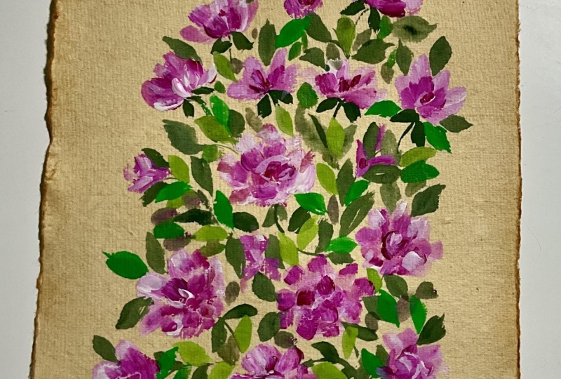
2. Practise | Initial Translucent Layers: So let's put some white down. And a choice of pink, and I'm using the Windsor
and Newton Bengal Rose, a warm green, and I'm using
the Shin Han moss green. And then let's bring some
water over into a well here. So I've kind of done three
drops there. Added some water. So this is very watery. And let's just practice the shape that we're
going to be using. And I'm using my flat brush, but you could use a Filbert. So very translucent. And I'm putting the brush down, fan it out there, and
then turning round, twisting to a tip. And here on the
side of the brush. Let's do a few of those
with a bit of movement. Curving the brush round. Just getting used to your brush. Pick up a little bit
of your pink and let's mix a very pale pink
still with lots of water, and we can just drop in or create new petals
with this pink, using the side of
the brush there, and then back to
the full belly of the brush and twisting towards
the end there to a point. This is your practice page, so there's no right or wrong. Not that there's any right
or wrong for your project, either. It's all learning. So you can see that we have the gray page showing through, and that's what we want
for this first layer. And I'm just continuing with
the brush that I've chosen, warming up, familiarizing myself with the shape of the brush. And we're going to come back to this once this layer has dried. So let's go a little larger, and we're using two
strokes of the brush. Nice fluid movements, and we'll let those dry
and come back to them. In our class project, we'll be varying the size. So let's just practice doing some smaller
ones again here, a mix of the full brush
and a side of the brush. And you can always
go round and drop in little bits of
white or pale pink. Let's add a little
bit more pink. Touch of white, a
touch of the pink. Still quite watery. And let's do another
pink flower. Such a pretty color. So these could be half open
flowers, smaller peony heads. The main technique in this
class is to build up layers. So we've got a basic
translucent layer. We've got a slightly thicker
layer with the pink, and we're now going to go
in with a lot more pigment. And what I like to do
is pull down a petal. So it's slightly lower than
the background petals. And I'm going in between here. So I'm just keeping
going until I am below the point of
the previous layer. Just gives us a sense of depth. And here we've got a
little bit of the paint bleeding into the watery
layer underneath, which is a really
pleasing effect. Or you can go over
fully dried layers. Let's try here with this one. So again, going in
between those petals, pulling it down, so it's underneath the previous
layer at the bottom. And then just adding
lovely soft petals. A little bit of pink again. Slightly thicker, a
bit more pigment. Then let's do the same with
our half opened flowers. So these are very
pigmented layers now. So getting some neat white
with the Bengal Rose. These are fully dry now. And then we can create
these foreground petals. I love this technique
where you can actually mix two
colors on your brush. Using more pigmented
petals as well over these semi translucent
ones brings them forward. It kind of creates a depth
for the whole flower.
3. Practise | Dry Brushing & Easy Flower Centres: So I'm switching
to a Filbert size 12 and picking up
quite a lot of pink. Fairly neat and just flaring
out the brush a little bit, because what we're going to
create is some texture now. So it's a swift movement. I don't have a lot of paint
on my brush or water. Let's flare it out again. And then just drag
it along the paper. Now, this also depends on what type of
paper you're using. So for this, it's got
some tooth to it. This is the Fabriano Tiziano. So it's showing quite
a bit of texture. If you're using hot press, you'll get a slightly
different result. But still that beautiful
texture that we're looking for. And you can also, of course, use the side of the brush. Once you've got the consistency
that you're looking for, we can try this over
one of our flowers. So flaring out the brush again and let's choose
the top of this petal and just create that very swift textural
dry brush effect. Neat pink again, just working it through the brush
a little, flaring out. And let's try again
with this flower. It's such a pretty detail, and all of these details
are kind of what brings this whole
painting together. Oops. I got a lob
on my brush there. Just go to try and get rid
of that. Flare out again. Let's try over this very
translucent flower here. That's slightly dry. Let's just see again. Yeah, so that's wing
on the very dry side. It is a little bit of a
thing that you have to practice until you
get the brush into the right consistency and
dryness that you want. So back to my half
inch flat brush, and I'm just going to finish off these flowers by creating
much more pigmented petals. Quite confident strokes. This is your practice page. Nothing can go wrong. And let's just go over these
tiny little petals up here. So we've got the
very translucent, the mid range, and then
very thick at the front. And this is how we're going to create that beautiful depth. A little bit more white. Back to my Filbert, a size 12. Very pigmented white now. I'm just going to allow the
excess water to soak up. And then let's do some dry
brushing with the white. So you can see I'm also just starting the movement
before I hit the page. And I find that
helps a little bit with these free flowing,
expressive brush strokes. So flaring out the brush again, it's a very swift
and up movement. And just keep going
until you get a real feel for the
brush that you're using and the consistency
that you want. I think just the way that
my brush flared there, it looks like there's a
line down the middle. I think that's just accidental.
That's quite sweet. So it's got very dry there, so I'm dipping my brush
back into the water, taking the excess off, and then just going back in. I didn't even need to put
more paint on my brush. Just the water has
carried me through. So let's try on one of
these large petals now, starting from the top,
very swift movement down. We're not looking
for perfection here. We're looking for getting
used to the brush, allowing your intuition
to take over. And we've got lovely hard
line there on that petal, so we can kind of accentuate
that by adding this texture. It is a bit of a skill
just trying to get the right amount of water and paint all your
brush for dry brushing. But once you've got it and you're really
familiar with the brush, it becomes second nature. So why not try some
little centers now? And I'm using Raw Sienna. You could use quin gold or
any kind of orangy brown, and I've mixed that with the white and adding a
little bit of the pink. This makes it into a slightly peachy tone leaning
towards the orangy gold. And I've gone down to a very
small brush, slide zero. Any small brush or a brush with a really good point on it
doesn't need to be tiny. All I do for the centers are these very tiny
little dots, really. Or you could put your brush down and then just
pull down slightly. Extremely simple and
almost throw away. I struggled with
centers for so long, and I was overcomplicating it. I realized that when I looked
at other artists' work, their centers were very simple, especially with
this kind of style. So don't put yourself
under pressure to create, you know, really
elaborate centers. We're just going along
with the theme of the painting, which
is very loose. So if we started to do
really complicated centers, it would look a
little bit so this is a very gentle approach
to the centers. And here I'm just
picking out the centers. Might add another
layer to those. Another thing you can do
is put the centers down over the translucent
layer and then start to build up so you start
to lay down petals around So let me show you here. So we got our center, and then you can just start to curve your petals around those. That could be a slightly
easier approach. And now I'm just using
up the white paint, really, just adding
another layer. To stroke petals there, and then on the side, and
doing that kind of movement, which is allowing the sway of the direction that
you want to go in. I've put some burnt tumber down because I think it'd be
quite nice just to have a darker color next
to those centers. Like a little bit of shadowing.
4. Practise | Mixing Peach, Painting Stems & Leaves: Let's get another
sheet to practice on. So we've got the Bengal Rose, a little bit of the
Raw Sienna mix. I'm going to add a little
more. That's watercolor. And the Bengal Rose
is the gouache, of course, and so is the white. And then let's mix just a slightly different color to the neat Bengal rose that
we're going to be using. So the Raw Sienna, the pink of choice. A
little bit of white. And we start to get
kind of a dusky pink. Another quick way of
mixing a dusky pink, as you'll probably know, is just to add a little
bit of green. Just want to push it a little
bit more to the peach. So adding more Raw
Sienna and more white. Gorgeous color. Look at that. Beautiful. So we can start to bring in slightly different petal colours as well. Adding a little bit
more white to that. Let's see what that looks like. Very, very pretty
color. Love it. So really, basically any gold or orange mixed with a pink
and a little bit of white. And we get these gorgeous,
dusky pinky peaches. So we could always add some of these petals in
amongst our flowers. I really love creating colors
with very limited palette. So what we're doing
is borrowing from each color to mix some
luscious supporting colors. I love that pink. So some more Bengal
Rose now fairly neat. And I just want to
try that two tone again so we get that lovely
pink next to a paler pink. This is another effect, which is going to add to
that multi kind of texture, shape, size, hue, falo that
we're going to be bringing. Quickly running out of paint. So more Bengal rose, a
little bit of white. And let's kind of go in with some deeper colors
with this technique. I really love mixing
on the brush. And some dry brushing there. A little bit of everything. It's slightly unpredictable
as well, which I love. You never quite know how
it's gonna come out. But it's one of my
favorite techniques to bring into a painting. Then let's go over
to our moss green. So this is gouache. If you want to use watercolor, you could use a green gold or any warm green and add a little bit of
your white gouache. Because, as you know, I use both watercolor and
gouache side by side, and I feel like it gets really expensive if we have
to buy in new paints. So let's just use what we have. So here is how to mix
a kind of a deeper, pinky, brownie peach, and that is to take some
green over to the pink. And the reverse works as well, bringing a small amount of
pink over to your green. Bring a little bit of
depth and turn it slightly towards a more sage
or olive green. So let's practice some stems. And maybe a few little
sepals around the flowers. So the sepals is just the
usual tip belly tip movement. Slightly slower movement
than the stems. Mixing some white with the green because what we
can do there is just add some really cute
little highlights because we've got quite a lot
of detail in our flowers, so it's quite nice to have
some on the leaves, too. So, washing, drying my
Filbert brush again, picking up a little
bit of white, mixing that with my moss green. Let's try some larger leaves very similar to
the petal shapes. I didn't want to
overcomplicate the leaves as they're there really just
to showcase the flowers. So full brush there. And I would say that this is mostly how I would
paint the consistency, which is slightly in between what you'd call a watery
layer and a dry brush. It's just the way that I work, but you find what's
good for you. Let's just practice the shapes of the
leaves that we want. And we can just add smaller
leaves around our flowers. So we'll definitely be doing
this in our class project. I love green and pink together. I think it's my favorite Combi, and adding this luscious, bright but deep green is just a beautiful embellishment
and supporting act, if you like, to our flowers. And we can add some
highlights over these larger leaves as
well by adding more white. And like a dual
tone there again, mixing on the brush. Down to the last vestiges
of my Winsor Green. So, again, if you don't
have Winsor Green, fallow blue or any cool
blue green would be great. And just adding a little
bit of white to that. Adding them white just
transforms this color. It's one of my favorites
at the moment. And yes, I am breaking
rules here because normally you would put the cooler color
in the background, and then you would use warmer colors to bring
the painting towards you. But I like breaking rules, so here we are. So pretty. Let's just keep
practicing full brush, side of the brush, a little
bit of dry brushing.
5. Practise | Finishing Touches: So moving to our
finishing touches now, and I'm using a
small brush again. And let's outline some of
the petals with pure white. Very thick paint. The trick here I found and you've probably
found your own way in with this is to have the brush not too
sticky with paint. So I want it fairly wet with the excess taken off
and quite thick pigment, just so it does move, but it's also very defining. And I'm just choosing
certain petals to highlight. It's quite nice
to do them around the initial very
translucent layer. And with our thicker
value petals, as well. A and why not around the pink? You can see that I'm holding
my brush fairly low down, and that's because to me, it feels more like I'm
using a pencil or a pen, and it just gives me a
little bit more control. Just pulling down some
little lines on this one. And then let's move back to our other page and mix a
very pale bluey green. This is the winter green. And I've mixed it
quite light just so that we can start
to see the details. And just adding little
embellishments around the leaves, sometimes just
outlining the leaf, others just adding some
little veining details. Trying to bring a little bit
of variety with each leaf, so I'm not doing the same thing. This stage of the painting is really restful because we have all the elements down and I
just kind of doodling now, which is one of my
favorite pastimes. So let's do the same with
the moss green leaves now, adding white to our moss green or warm green
of your choice. And again, I'm doing it fairly light so that
you'll be able to see it and doing the
same thing here, outlining some of the
leaves, adding veining, little curvy lines around
the outside. Super restful. This will really get our muscles warmed up
for our class project. It's quite a thorough practice, and the reason why I made
it so is because I found I needed quite a lot of warm up to paint like
this in this style. I just could not go into this without taking
some time just to warm up my
muscles and get back to the brushstrokes
that I want to use. So I hope you feel
that it's been good having this really
thorough warm up. So they just slowed
down a little bit and did some more
detailed veining. I can't get enough of
this. It's so restful. This is definitely one of my favorite doodles to
do with a small brush. It's just picking
up some light green and then two curved
lines, basically. It's such a cute addition. And one I go back to
time and time again. Let me show you over
here on the right. So it's just two very
swift curved lines. Oh, it's so sweet. I love these. I'm going to be doing
some mini painting soon. I can see that I'm going to
be using this one for sure. Oh, so cute. Don't they
look really effective, especially on this dark gray
background. I love those. On the home stretch now, and I'm just going to mix a little bit more of
that Winsor Green. Let's add a little
bit of shadowing now around our
blue green leaves. This is handy when we might
want to separate the leaves. So there I'm making sure that the blue green leaf is dominant over that one
in the background. And the same here. Very subtle throwaway lines. And maybe some more defined
lines just pushing down on the brush a little
bit more. So pretty. Adding a little bit more white
and back to the filbert, let's just put in some
final little brush strokes. So we're defining the
warmer green leaves with the lighter green. It brings together that moss
green and the windsor green. So these final leaves I
tend to when I'm painting, make them very free, very expressive, and
slightly textural. You can see how it
all comes towards you and brings all of
the elements together. And then a little
bit of dry brushing. Very satisfying. And
I think that's it. So let's move on to
our class project.
6. Class Project | First Translucent Layers: I'm going to start with a
very translucent white, so I've added three drops of
water there off my brush, and then let's take over
some other white guash. Using the full brush, we're just going to
pull through a petal. With that one, we're going
to twist the brush round, so starting off
with the broadside and twisting to a point. So let's continue to lay down these lovely translucent petals using that twist movement. So we get full bodied petals, but we all come in to a point. Let's try another one over here. So again, a good
wiggle on the brush. Using the side of
the brush there. Flat brushes make the best
petal shapes, I think. You can get quite a
variety of shapes. We're also starting to
think about composition, so I feel another flower
here would be really lovely. And let's drop in some water. That will add another
texture to our painting. A very watery one there. Gonna drop in some
paint to that one. And I love this little
trick where you put down a very watery petal next
to a more pigmented one, and it flows into it. All of these little
tactics are going to work in our favor to create a
really detailed painting. So a mix of the side
and full brush. You can see there's a flow here. It's almost like a figure eight. We want to go out into these
spaces above and below. And now let's add a
little splash of color. So I've picked up
my Bengal Rose, adding some worth of
water and white to it. And then I'm just starting
off nice and slowly. Let's just drop in a little
bit of white and rose. So it can start very
gently to introduce color. And then we can go
around and just drop in little bits
of water or paint. So varying the size for these flowers that are
going to be coming out. We're going to make them
slightly smaller, maybe. And dropping in a little
bit of that pale pink. A little bit more Bengal Rose. Let's just take up a tiny touch. Maybe even a little bit more now and create some
smaller flowers, maybe half open flowers. So this is a very
delicate start, and we can err on the side of very watery flowers because we're going to be building
up so many layers. And these may not look
anything now, but believe me, once we've got some texture
and layers on top of this, they're going to
really do their job, which is to add depth. This painting is a
mix of intuition, but also a little
bit of forethought, because it's such a
large undertaking. We need to balance
thinking and feeling. So the thinking bit starts
now where we're just coming up with a composition
that we're happy with, and then we can start to
free up a little bit once we've mapped out these
initial flowers. So now you can see that we
can start add extra petals. And I'm using that initial layer as the base for creating
a flower around this and curling around petals using the
side of the brush. Let's do the same here. So you can start to see
the shape of the flower. And the same here. So creating petals in the foreground and our lovely translucent
petals fall behind. It's a lovely way to
start a peony head. So we're just mindful here that we're using slightly
more pigment for these layers and varying the shape and size of our
petals and also the direction. You can see what I mean about a flat brush and how beautiful it is for
petals like this. Touch of pink in there. And you can see that
our first layer is already falling back. Some translucent pale
pink on that one. So we're really using gouache
in a watercolor manner, really for these
first two layers. Running out of white. So we can loosen up
a little bit now, add a little bit more color. The Spengleose is such
a rich bright color. It's absolutely gorgeous
for this project. Now let's do a little
bit of a dryer approach. So we haven't got as
much water on the brush, dabbing off the excess. And then just drawing that
down over the petals we've already laid down a
slight dry brush effect. Let's go back to
our Filbert now. And really start to bring
in this bright pink. So dabbing off the excess. Flaring out the
brush a little bit. And then a very quick movement. So we're not dragging the
brush along the page. We put it down, and then we just very swiftly move
it and lift up, so we don't really want it
covering the whole petal. It's an accent on top. This is another glorious
way of bringing in texture. Almost a flicky movement. So again, making sure
the brush is very dry. And then we can start to follow the shapes that
we've already laid down. I've got a big plot of
water there in the page, so I'm just going to dab that. I'm not worried about
it because it will dry, but also, I'm pretty sure
that will get painted over. Back into some white. Flaring out the brush. Very dry brush, and then
the same movement here, and this is all part of
building the whole picture. And the same using the side of the brush and then
just a flick through. You get unpredictable results, which I think is a
really lovely addition because we don't want this
to be too thought out. Nice dry brush. Lovely texture. And because of the
paper that we're using, in my case, it's the
Tiziano pastel paper. It does pick up the
tooth of the paper, so we get a little
bit more texture. I'm used to using a very
silky hot press surface, but it's quite nice to be able to work with
a paper like this. So I think I'm going to do a little bit of dry
brushing on here. So if you have any petals that
look a little bit lonely, we can start to go back in.
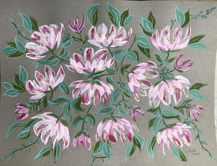
7. Class Project | Easy Centres & Building Up Layers: So before we move any further, it might be nice if
we add some centers, so I have some Raw Sienna here. And let's pick up a
small round brush. If we add a little bit of
that pink to our Raw Sienna, it kind of keeps the cohesion going in the whole painting. I often do this, just
borrow color from the palette that we have
and mix them to each other. And then we're just
going to tap in little dots where
the centers will be. So on these, we're laying them down before we
add the foreground. We don't need to overdo this. I think I always
overthought centers. Just a few dabs of color
sometimes is enough. We don't want them to distract from the petals and the flow. Fairly abstract and quick. I love how those really
work nicely with the pink. Let's add a little
bit of burnt tumba. I love burnt tumba. Adding a little bit of water and a little bit of
the previous mix, again, allowing all the
colors to blend together, and we're just leaning towards
the color that we want, which is predominantly
a brown and then dotting that
around the Raw Sienna. Keeping it very light. Sometimes the simplest
centers are the best. That's brought them
to life a little bit. Bringing over a fresh palette and adding a little
bit more white. So now we're going to go in with some swifter movements
and with thicker paint. And we can add a
little bit of the pink and also the rosy ande Mix. And that will just lean it
towards a peachy color. And let's mix up a
few different hues. We could have, like,
a peachy on the left there and more pink
in the center, and then a very pale
pink on the right. Just dip into those
three different mixes. And again, just building
up those layers. And it doesn't matter
if we start to paint over petals that
we've already done. It's all part of the process. So a variety of the full brush, the side of the brush, and then almost just the
tip for smaller details. In some places, going over entirely the petals
that we've already done, and in others, just
to the side so we can start to get lots
of different hue value. And we're starting to
loosen up here with our brush strokes and
engaging more intuition. No. Adding little extra petals. It's starting to take form now. So here I'm working
round the dots that we've just done in the center. W to keep those.
Remembering that kind of overall bowl shape. So we are curling the
petals at the side. Here going in with
some nice pale pink. The good thing about gouache is if you're not entirely
happy with something, you can go over it, especially as we're getting to a
much thicker paint now. Curling round to that
one center point. Leaning towards the pink again. And adding some petals to our
smaller, half open flowers. And why not introduce some of
that to our white flowers? Yeah, I love that. So a bit
more of the Bengal Rose, and that first stroke, I was using a very dry brush, and it had flared naturally. So I really liked that. And I think that would
be lovely to bring into this painting
a little bit more. Varying my brush strokes. We can do slower movements or very quick
expressive movements. Trying all the
different techniques that we have going for us. So that was quite
a watery petal, then I dropped in paint, keeps all of that texture going. So I just need to
figure out here we've got three main flowers here, one coming down,
one to the left. So I'm just going
to move that around so I can see what I'm
doing a little bit better. And then I'm going
to really start to shape these three flowers now. Pushing down on the brush, a little bit more water, which gives us more control, and the brush can travel
further on the page. And already that looks a lot better. I'm really
happy with that. So I just want to do a similar thing to
this second flower here. And then the third one. A little twisty movement
on the brush there. So I feel now that they are
a little bit more defined. So why not go back a little deeper here with
the Bengal Rose. Do adore this color. And getting both
white and pink on the brush yet another technique that brings in lots of detail. So almost neat pink now. And it might be
nice just to work on the petals that
we have going on. Didn't want to completely go over that lovely brush
stroke underneath. And I am mixing the white
and the pink on the brush. Brings about a lovely,
lovely effect. Again, slightly unpredictable. I think moments like that
are really important. So we're loosening up now a lot. Again, mixing my brush, white and pink. A
gorgeous effect.
8. Class Project | Leaves: Let's start to add some leaves. And I'm using the
Shin Han moss green. But any warm green of your choice
replenishing the pink and a little more white. I'm also putting down
some Windsor green. That's a very cool green, and I'm using a fresh pot of water just so I keep my
pinks and greens separate. So back to our size zero and adding a bit of
pink to the moss green. I'm a big believer in that just borrowing colors and
mixing them together. And then we're going to lay down some stems and some
sepals on the buds. Just to get us
going. Just mapping out those areas where
we want leaves. Adding a little stroke
of white over the green. We're going to add
larger leaves, so no pressure here. Just a way of knowing where we want to
work with the green. In places, the
paint is still wet, and I don't mind that really. Can all mix together
a little bit. I often do my stems quite quickly in an expressive way because I have
quite shaky hands. So the more I try, the
more shaky they are. So I tend to just use quite
an expressive stroke. Just a paler bit of green now. Adding a few leaves. I'm amazed, actually, given
that this is a size zero, how beautiful and how big the leaves are
with the size zero. So a little bit of
attention now to our buds and half open flowers. Working a lot more quickly
and more intuitively now. We can start to relax
a little bit because our painting is quite
formed in its composition. And I always find
leaves relaxing because we're really just working on complementing
the flowers. So mixing between
the green and white, just to get a little bit
of variety in our petals. I like little details
on my leaves. And now I'm doing really swift movements because it's easy to get a little bit tight as
we're going through. And so I like to just do some throwaway swift movements just to keep that
looseness going. Not too much water on my brush, so we're getting a
slightly dry brush effect. So I'm looking at the cluster
of flowers on the right, and they're getting quite
tight, which is fine. But I just want to balance
out the painting on a whole. So I'm going to mix
white with Bengal rose, a little bit of water, and
I'm going to add a flower. Yeah, I think I'm going
to add a flower here. So we've got petals
going in all sorts of directions and half
opened flowers. There's an eye bit
of movement going. I just felt I wanted
to add another flower here just so the two
groupings look similar. So I'm going back to
this grouping here, and this flower has gone a little bit wayward,
I would say. So I'm going to just bring in a few leaves there to give
it a little bit more shape. So some of the moss green
and a little bit of white. And I'm choosing
where the center is, and I see it as there, so So drawing in those leaves with that
center point in mind. And that looks better. And so let's carry on and
dot some leaves around. I really want to bring the painting out to the
edges of the page now. It seems to almost
have its own life, and it's telling me
where it wants to go. So mixing white and
green on the brush again and being quite bold, using the side of the
filbert for those leaves. And then slightly more
expressive with those two, pressing the brush into
the page a lot more. Same with that. A slight
twisting on the page. I am thinking of placement, but I'm not deliberating
over it for too long because this is where we need to trust our
gut a little bit and be more led by our
heart than our head. So the leaves,
adding those leaves is actually really giving it shape and form
and also dimension. And I now want to add a
different green altogether. So I'm mixing the Windsor
green with that pale pink, a little bit of
everything, really. Mixing those other colors in just makes it
more of a neutral. We don't want it to
completely take over, but I did want this painting to be really bright and joyful. So our warm green leaves have mapped the areas
that we want leaves. And now all we need
to do is place these cooler leaves
around those. We don't want to obscure them, but adding them around or slightly over would be fabulous. I do love Winsor
Green and Bengal Rose together. Really, really bright. So again, another dimension to our painting where we're
using warm and cool colours. And I've got slightly against convention here because
normally you would put down your cool leaves
first and then your warmer leaves
because obviously, cool colours recede and
warm moves forward. But I kind of just went
with intuition on this. I didn't plan out my colors too much and who wants
to be conventional. It is quite a challenge at this stage of
the painting just keeping the whole in mind. U
9. Class Project | Petal Highlights: Before we start, I have chosen to use a very
small detail brush, but you could also
use a dip pen if that felt easier or
more familiar to you. Let's pick up our detail brush, and I'm using a size one. Mixing up a little bit of white. We need enough water in
this to give us a lot of control because we're going to now highlight some
of the petals. I'm actually going to go down
to a size zero, I think. And also, because this
is like a mini brush, it's really easy to hold. So I think this is the one. And that feels a lot better. It's a very light touch and just following the
edges of the petals. It helps to define them as well. It's such pretty detail. On some, you can do a slightly
thicker movement, as I did there, and on
others, very delicate. And we can also define the very first layers
of translucent petals. And also on our subsequent
layers of the pale pink. Oh very restful activity going round these petals
already formed for us, so it's a little
bit like doodling. I'm trying not to put
them on every petal, although that's very
hard not to do. I'm just going to pick up this little very
delicate flower here. So because it's such
a translucent petal, I don't want to go too heavy. It makes such a difference, and these are very
delicate details, but it helps define the
petals a little bit. I also really brings
them to life. And it looks so pretty
against that dark gray. A I just want to pick up this
little petal here. Just felt a little bit
too far back in the page. Lovely. Super restful. So just pausing, having a look at
the whole painting. That looks good. I'm
happy to stop there.
10. Class Project | Leaf Details: So let's continue to
use a find tail brush. And this is that little size zero that I got with
a set of paints. Very gestural lines and curves. I want each leaf to be
slightly different. So on some just a line
through like a vein, others outlining the
shape of the leaf. I find turning my
painting really helpful in just keeping an overall
view of what's happening. Et's keep it really sweet and simple and move fairly swiftly, adding little leaves
over the top in places. Isn't this color gorgeous? Adding extra little leaves and working around
the moss green. And thinking about
the overall blow, so adding little
stems here and there. I think minimal is best, and then you can always go back in and add further
lines if you want to. I love how this pale turquoise works with that dark
gray background. So now let's mix up a
little bit of paint, and we're mixing an ice
bright and neutral green. Just adding white
to our moss green. It makes the most
delightful color. And then we can go in and
start creating details. Adding white to both that
turquoise and moss green kind of keeps that cohesion
going as well. Again, working fairly swiftly, and it's such an
enjoyable process because everything
is laid down for us, and now we're just adding
our little details. What you can notice
at this stage as well in the painting is the
more details there are, the more depth we create, bringing forward some of the leaves and some of the
flowers are falling back. So I've noticed that some of the pale green isn't showing up quite as
well as I'd like. It's just sinking into
the page a little bit. So I've added a little
bit more white. Curves lines and extra little
leaves here and there. You can see I'm holding this
brush quite close down. And in that way,
I can use it like a pen and have a similar
amount of control. Just breaking up this cluster of leaves here so they have
a little bit more shape. Adding finer details,
little extra leaves. And enjoying defining
these little areas of leaves where they're
clumped together. You can also decide on the
direction of your leaf and if you want it to be curled
a little bit at the edge. Going round the sepals now, defining those a little bit. And keeping movement
in our brushstrokes allows us to keep that flow that we originally
started out with. We don't want to get too static. Moving more swiftly now and just working my
way around again. Adding extra details to
leaves I've already worked on and also just working on areas that are a
little bit undefined. It's very swift, very
gestural, very expressive. Just adding some
little extra leaves here on the dark
gray background. Love those. Very sweet. I think I'll do a few more. Yeah, I'm really loving that. I'll love these colors together.
11. Class Project | Finishing Touches: So let's start work
on our final details. We've worked together
from translucent to really pigmented layers and created a great deal of
depth by doing that. So now I'm mixing
up some Windsor green with some water and
a little scrap of white, I think that was still in there. I want to define these bluey
leaves a little bit more. We have the highlight, and now why not add a little bit more depth
and add some shadowing. So I have a little
spot of white there, and I just want to I
don't want it too dark, but I do want it
darker than the white. So let's see what
that looks like. That feels better,
not so dominant. So I'm going back to my
little size zero brush. It would be really
easy to overdo things, and I probably am
doing too much, but I really love this process. I love detail. Winsor Green
is such a rich color, very, very cool, bluey green. Using these darker
leaves and just placing details on existing leaves or
just little bits of shadow. And what we're doing there is knocking back the Winsor
Green leaves in places. So that Moss Green moves
forward a few broader strokes, turning round my painting again. Just so I can keep
an overall view. I find it really useful. I hope you do, too, because it gives us different
perspectives. And you can start to
see things differently, see areas which may be
clumping together or a little bit tighter that just one view would not give us. Quite thoughtful
here, not wanting to unbalance the whole painting
a little more white. And back to our filbert, giving it a good
wash and good blot, as well, because
we're going to be working on some dry brushing. So making sure there's
good coverage on our brush and then fanning
out the brush like we did previously and just adding some lovely white
highlights now to our petals. So all the moisture
is pretty much off the brush and using neat white, tiny touch of pink, maybe. And then slowly working
around our petals. I would say this
stage is thinking, intuitive balanced,
taking my time, casting my eye around, picking up some of the very translucent petals from our first layer as well
as subsequent layers, and also trying to keep a
little bit of flow going. So on some petals, I am just using that very
quick flick movement, and on others a kind of
wiggly flowing movement. Adding these highlights as
well defines the petals. We've been defining our leaves, and now we need to pull the flowers up to
the fore, as well. Deciding that petals
gonna go over that leaf. And speeding up just
a little bit now. I do really love. Oh, I think I'm
overworking that area now, but a bit unhappy with that. It's very easily done, but yeah, what I was saying was, I
love the dry brushing. I think it brings about
a really delicate, almost whimsy kind of
feel, which I love. Very kind of fairy dell. So in with our Bengal Rose now, one of my favorite
pinks at the moment. And let's just do
the same thing and dry brush on some of these
gorgeous pink flowers. M and just define them now. And let's not be
afraid of color. Let's go in with that neat
pink, quite bold moves. And you can start to
see how we're pulling layers towards us
as we add detail. Oh, I love that pink. Just makes my eyes dance. That's kind of quite
a white area there, so I just want to bring
in a little bit of pink and just to define those
three peony heads there. Oh. And you can see we're
getting even more depth now. We have the translucent
layers in the background. Mid layers which are
more muted pink, and then our top layers are
this vibrant Bengal Rose. Filberts are beautiful for
adding details to petals. And I love this combi of
the flat brush and filbert. Some soft pink on that flower. And just making sure that we have a nice distribution of this pink across
the painting. So you can see, I
just want to work on that flower to bring that
a little bit more forward. So don't be afraid now
to be really bold, going back to some white
and some more Bengal Rose. I'm loving this deep pink color. And I think it might be nice just to add
some more kind of petals or half opened
flowers around the edges. I'm kind of now working
on a rectangle shape. So although we started out
with our figure eight, you can see now that we're
filling up the motifs. Gentle dry brushing. Soft and quicker movements. Balancing out the
pink across the page. I want to add some more leaves, maybe just some softer
leaves with less detail. So going back to the moss green, and I want to add some
hands yellow light to that. You know that I love very balancing leaves towards
the end of a painting, and I often use
either a very bright green or a kind of
a balancing blue, more like a French ultramarine. But because we've
chosen a palette here, which is more turquoise, I want to use a bright green, just tie everything together. So adding some white to that. So it's a very bright moss green now with the addition of
the handsome yellow light. Just making sure I have enough
of this to do what I want. Take the excess
paint off our brush. And then let's keep this
really gestural and loose. And it didn't feel like there was enough of a difference
between the moss green leaves, so I'm adding more
handsy yellow light. Handsy yellow light is one
of the best mixing colors. I would strongly
recommend having it in your collection of paints. Yeah, this is lovely. Kind of more limey green leaves. And let's work
quite quickly now. Trust that your eye
is going to pick up spaces that may need just a little bit of
definition or texture. Expressive movements. Very little water on the brush. And this finishing touch is
very much about intuition. I would recommend not
thinking too much and just working
around your painting, adding tiny details to the
leaves we already have, or just little gestural
movements on their own. What we're doing by adding
this layer of leaves is just making sure that all the flowers are
separated from each other. So any clumping
can be sorted out. Small details, adding texture. And developing the spread of the flowers now
across the page. And I like that. I don't
want to have it too tight, and I don't want to do anymore for fear of losing the flow.
12. Thank You!: Thank you so much for coming along on this
journey with me. We've done a little
bit of color mixing. We've used vibrant colors. We've experimented with
transparency and layering. I hope it's left
you feeling really confident about finding your
own style going forward. If you have any questions, you can start a discussion
under our class. Or you could always get
me over on Instagram. I am Holly Tomas Art. Take good care of yourself. See you soon. Bye for now.
 Holly Tomas Art, Watercolour | Gouache | Mixed Media