Transcripts
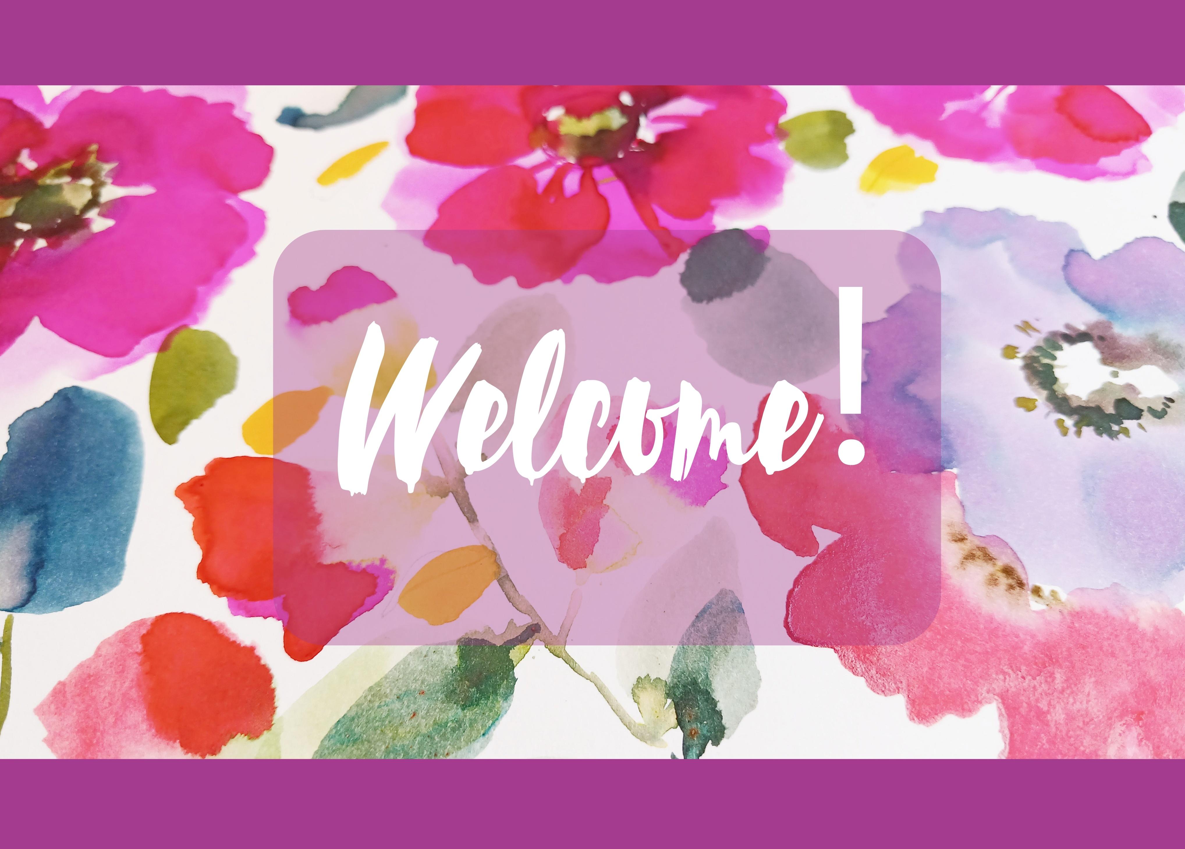
1. Welcome!: Welcome to Joyful Florals. We'll be breaking out our
brightest colors using pink, apricots, rose reds, and violet, with soft, warm
and cool voliage. Before we jump in, for
those who don't know me, as well as a skill
share teacher, I'm also a surface
pattern designer, specializing in bedding. I grew up in the design world, as the family business
was Tom Lewis Studios. Although I went down a
different career route and have been a musician and
a therapist all my life. In 2017, I experienced a major relapse in
my health condition. But the beautiful
thing that came out of that was that I
reconnected with my art, became a designer, and started teaching on skill
share four years ago. I enjoy every aspect of creating classes for you from
class development, through to finishing a class and seeing your project work. I think that's my favorite bit. So moving back to our class now, we'll be using lots of
water and aiming to achieve just the right amount to pigment to create
lush colorful petals. Using a round brush
or a mop brush, will help form the loose
shapes that we're looking for. I'll be using watercolor, watercolor inks, and
a little gouache. So you can choose one of those mediums or interchange
between the three. I'll be sharing two of my
favorite brush strokes. I've used the first
one for years when it comes to
painting loose florals, and we've also covered
it in my class, rose Watercolor
Sketchbook Practice. It's a really versatile
brush stroke. I'll be guiding you
through various methods, which will allow you to adopt these techniques
to take forward. Second brush stroke is one
we covered in Brier Rose. It's a very expressive
textural gesture, which creates gorgeous
intuitive marks, and is great for flower buds. And as always, it's a real
joy to see your projects. If you're new to school share, let me acquaint you with the area where you cannot
load your project. This is just
underneath the class, under projects and resources, and on the right is my project. A lot of my followers also
post their work on Instagram. If you do this, please tag
me. I'd love to see it. So let's get on with
our class together. A
2. Materials: Let me take you
through materials. Before I start, I just
want to say you don't have to have the same
materials that I have. Any watercolor paper
of your choice, and I will be offering
alternatives where I can to the inks,
gas, or watercolor. So if we start with paper, I actually use Hanam harmony
paper for the practice runs. It's more affordable
than the fabriano. But I do love this for projects. So this is the
fabriano artistico. It's hot pressed, very
kind of silky surface. It's really lovely
paper. It's my favorite. But you can use any watercolor
paper for this project. Cold Pressed, is
absolutely fine as well. So if we look at brushes, I'm using a mot brush, and this is Jackson's brand 3/0, and I believe it came
in a set of three. We'll need a smaller brush. A round brush size
four would be great. And I did use a pencil right at the end
for a little bit of doodling or you could use
your pigma micron or dip pen. If we move on to color, let me show you the
greens that I used. So I used brusho, which is a pigment
powder and can be watered down to an
inky consistency. And I'm going to use moss
green and olive green. A lot of you will
know that I love the brusho moss green for
the center of flowers. If I was to advise you on which brusho to go for
first, it would be that. And they make them in
smaller pots, too. Then I have green gold. And if we move to oranges, I'm using Calligraphy Inc. For no purpose
really apart from, I was just intrigued to
see what it looked like. And this is Tom
Studio Sunflower. And then I have Hans
yellow deep in gouache. So if you move over to
pinks, I have a rose, and I've got the Moss rose, which is the doctor PH Martin's concentrated
watercolor seven A. And I'll be using Perlln violet. If you don't have this, you could use a purple and add your yellow or orange to it. And that will create this
lovely, earthy purple. And I'm also using in Tom's
Studio the English rose. The Calgraphy ink I
find dries quite flat, but I liked that, so I just carried on using it
for this project. You choose any red
that you have. For example, you could use
Perine red in watercolor, and I've got a Pyle
red there in Gach. A red that you prefer. Finally, we have the slate blue in the doctor PH
Martin's watercoloring. And it's a gorgeous color, and when it's mixed
with the moss rose, it creates a lovely
violet color. So we'll be mixing
those in class, but you can mix any blue
or any pink together. I chose to tape off my project. You don't need to do that, but I'm using here
empty washi tape. And as far as I know, they
come in these two sizes, very, very dependable,
really love them. So let's get on with our class.
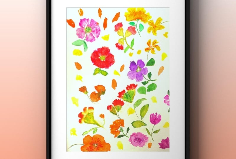
3. Practise: Rose Madder Buds & Leaves : So I've put the green gold on the right there and the
rose udder on the left. I'm going to practice
our rose buds. Fresh water. Just take the excess of the water
off just to avoid drips. We still want it quite wet. And then we're going to
just bounce up and down in the green gold with
the base of the brush. And then with the tip,
just pick up some of the rose madder or any pink that you'd
like to start with. And then we're
going to just push the brush into the page. It's a very gestural movement. And then you can drop in a little bit of color
to the top if you want. So keep washing a brush
between rose buds. Let's just pull a stem down. And I'm using my mot brush, but you could bring in your smaller round brush
at this point. So that's just water. You can see here
that once we've used our mop brush, it gets squashed, and that's actually a
handy thing because we can use that thinner side
of the brush for the stems. So I'm just adding
some slate blue and a little bit
of the moss rose. So I'm getting a tiny bit
of that moss rose, very, very saturated, adding
a bit of water to it, and I'm just dropping
a little bit in. Rinse my brush again. And I'm now using my
brush olive green. So at this point, just
any green that you like, you could use undersea green or any dark green
of your choice. Then just drop a
tiny little touch of that into the
water of the stem. And let's pull a nice leaf down. Little tip there, full body of the brush and
up to the tip again. We're just allowing
that flow from the stem to run into the leaves. Just mixing a little bit
of the slate blue with the olive green and dropping
that the top of the leaf. So let's do another bud. Each one is going
to be different, which I think is wonderful, and you could always adapt it afterwards by adding
another texture on top. So whilst that's still wet, let's bring out the stem and
drop the olive green in. A little bit of the
lighter green there. And a nice water relief they're allowing that flow from
the stem into the leaf. If you have ever
wondered how artists get that effect in water color, this is one of the ways. And you can vary the color, do leaves that are more leaning towards the green and some
leaning towards the blue. And let me show you now
with a smaller round brush. This is the size. And
this is already dried. So I'm going to just pull out
the stem with some water. Add any green you like, a little bit of lighter green, a little bit of
your darker choice. And you can see it flowing
up the stem there. Then I'm going to just
wet the base of this bud. So this is another
technique which is really handy should your work dry
before you would like it to. And then you can just
bring it alive with a little touch of the
olive green at the base. So you can always layer up
here and I'm going back in just to make that
a bit more cha. And then let's just do loads of these and really get
comfortable with the movement. Tip down, full
belly of the brush, and then up to a tip again. So we can also do a leaf with the same kind of movement
that we've used for the bud. So just filling up the page now. They make lovely buds and
also half open flowers. Finally, just adding some
little touches to the leaves. And let's move on to lesson two.
4. Practise: Orange Flowers: So I've got some
water on my brush, and I'm just mixing some of the sunflower with the
hands yellow deep. And we're going to
start by putting the heel of the
brush on the inside, and we're going to
move the tip around. So the outside of the petal is moving more than the inside. It creates this lovely shape. So let's try another one. Keeping the heel to the inside and allowing
the tip to move around. Makes a lovely,
lovely petal shape. So, I would invite
you to try this as many times as
you need to feel confident because we're
going to be using this movement a lot
in our class project. So, there's another method
here and we can go in with just water on the brush and then pick up the ink
on the tip of the brush. Now, what this does
is it gives you a paler center to your flower. It's really lovely
for wild roses. And then we're going to pick up a little bit of
the Perine violet. We want this to be
quite pigmented because we don't want
it to travel too far. So not a lot of water
on your brush and just a little bit of the violet and dabbing that in to
the center of the petal. This is such a lovely, earthy, and yet
colorful color to use. And because it's
opposite on color wheel, it's complimentary, and it
just looks lovely together. I've always loved
these colors together. So this time, let's
join three of these petals So we're just leaving a center
there that we can either add another layer to or
we can add a center to. And we could try for a
different color this time. So why don't we try dropping
in some green gold? Now, green gold travels a lot. It's very extrovert. So even a touch and it will just completely expand and flow, and we can use that
to our advantage. It is a beautiful effect, and this might be
something you want to try. So I'm just adding a
couple of petals here, and let's do another
center here. I'm just going to form a
circle with a little bit of water and just enough for
the petals to flow into it. We don't want it to
take over the petals. We've got a few choices, really. If you don't want it
to flow too much, just go in with a drier
brush with more pigment, and that's the moss green, which is very, very granulating. You can try your
lighter green first. So you can at this stage, wait for the petals to
dry a little bit more, or you could add a
little bit more pigment, and just take up a little bit of the water with
a blotted brush. So you can see what I'm doing
there is just lifting the, lifting the water as well, just to give us a
bit more control. Now, remember, you
can always do that if your pigment has gone
into the petals too far, just go in and lift the
color with a damp brush. So what I like to
do then is just to add the darker
green to one side, and it just adds a
little bit of a shadow, and you can see that that's moving gently into the petals. This is practice time, so there's no right
or wrong when you're doing a class
project, really. There are no mistakes. So let's do a full
flower this time. You can move your page around. I always find that easier. And you've got time to
reshape your petals as well. And then let's pick up some
more of the Perine violet, and just going to
dab that in like just little dots
around the center. So I just wanted to demo how to rescue your petal if
a color has taken over. So if we pull in a leaf
here with the olive green, and it doesn't look brilliant. You can go in and just almost
roll your brush outwards. This is a damp brush. There's hardly any water on it. Just dried it off
re, really well. And then you can just
uplift that color and add some more pigmented
orange to correct it. Now, it depends on
what you're going for. You might actually
want that look, so it's entirely your
decision, really. So if we just lay down a
three petal flower here, I'm going to show you
an alternative center. So we're just going to
pull down the color. I've just got a little
bit of water on my brush, and you can use your
small round brush for this move, if you like. Just bringing down spokes again, then dropping in some
of the olive green. And again, you can go in gently and see how
far it travels. So pulling a stem further out, dropping in some water. And let's pull down a lovely
lush, olive green leaf. And there I just added some of the slate blue to the green. So let me just show you how
it all runs into the stem. It makes the leaves
so connected, and I really love that about it. And I just want to pull some little spokes
into the center. And you can do that with
your small round brush. And we're going to
let that one dry. Whilst that's drying, I'm just going to do
another one here. I'm just going to use up the
page to carry on practicing. So I'm just going to add
some of the brusco moss green in its very
granulated form. And a little bit there
well watered down.
5. Practise: Second Layer Of Orange Flowers: So it needs to be
more pigmented than the first layer just
so it sits above it. And I like to go in between
the petals to form new ones, and also just to bring it just below the
petals underneath. So let's move back to
our paler flowers, and I'm using the same
orange, the dark orange, and creating new
petals in between the petals layered
underneath and just below, so you can see the first layer just on the outer edge there. So let's just use up
the paint that we have by practicing these layers. And I'm going to go in with the dark orange now on
this three petaled flower. And actually trying a
third layer here just on the inside of the
two outer layers. And then pulling down spokes
with some olive green. Half little spokes
and half little dots. So just putting down
some more English rose. I'm mixing that up with
the hands yellow deep. Any of your red and yellow, I do love this movement. We're going to pull down
a little spokes and then add some petals at
the top of that. Whilst it's still
wet at the bottom, adding some darker olive green. And you don't need to work all
the way around the flower. So this area has
just two layers. And then just pulling
down a few spokes in that deep orange and then dropping in the olive
green again at the base. And as the finishing touch, he can always go in
and just dot some of the dark orange further
out from the center. And let's move on now to
our pink flowers and buds.
6. Practise: Pink Flowers & Buds: So let's paint some
pink flowers now. And I'm going in with
a very wet brush and just picking up the moss rose
on the tip of the brush. And what's really nice is
putting down just a water petal next to a pigmented one and just allowing
it to flow in, it's a really beautiful effect. So I'm just completing
this flower. And then I'm going to add soy
olive green in the center. So similar effect here, just water on the brush
and pigment on the tip. And you might find it helpful to draw a circle in the
middle in pencil. And then place your
petals around that. And drop in a wee bit of water. Now I'm going to draw
a stem down here, but I don't want it to touch the flower because
I know that it will run too far into the petals. And I'm just mixing up the olive green and
the slate blue. And then just a smaller leaf and allowing the color from the stem and the neighboring
leaf to flow in, adding a touch of the blue
to the tip of the leaf. So now I'm just going
back into the center, putting some water
in, but not too much. I don't want it to take over. So I'm adding a mix of the moss and olive
green in the brush o. And then pulling in a
couple of leaves there. Now this is good because
I can demonstrate when the color takes
over a petal like this, and you're not happy with it. Take all of the moisture out of your brush
as much as you can, and then you can just roll your brush and it
will lift the color. So let's go on to a
few little buds now. And I've got the green gold
on the base of the brush. The tip in the moss rose. And as before, I've created
the stems with just water, and then I'm dropping in green. And I'm just going
to add a couple of leaves here in the olive green. And a bit of a
warmer green there, adding orange to your
choice of green. So let me show you now
with a round brush. I'm using my size ten here. So, I'm having to work a little
bit harder than the bruh. You could always go up
a size if you wanted. I'm just using exactly
the same as the mot bruh. And I'm just wiggling it
a bit more just to get some nice kind of folds and
textures in it and layers. And then we're going
to drop some water in the center and then
some moss green brush. And then in with
some perine violet.
7. Practise: Violet Flowers: So let's mix up a violet,
and that's so easy. We're just going to mix up the moss rose with
the slate blue. And you don't need to
mix up this color. You can just use
a purple that you have like a dioxazine
or a carbozol. Or you could decide to
use any color you wish. I don't want you to
feel that you have to follow exactly
what I'm doing. This time, I'm just
going to.in some olive green and then
some parallne violet. So we have a few choices
now for the centers. So I'm now pressing the base of the brush back into the
green gold and then just using the rest
of the violet that we have mixed up to create
a few little buds. Go back to those very
gestural movements. And pulling down
some little stems. So I am adding some
more rose madder. Some of the English
rose Tom's Studio Inc. But your choice of
reds here and Pyl red, or you could use peralin or
crimson. The list goes on. And I'm just going to add another little layer to
these half opened flowers. I like the bud at the top as it was, so I've
just left that. And just before we move on, let me demonstrate
the side sweep again. I love this shape of
leaf. It's so organic. So just the side, not all
the way down the brush. And let me show you again here. So just sweeping to the side and slowly bringing
it up to the tip. And again, in from the side, slowly start to rise up
until you get to the tip. And it's a blunter
shape of leaf, but you can always just add on stems and a little
bit of detail. And you can also use this brushstroke
moving away from you. So, let's move on now and add some layers to our flowers and fill the page with a few more
buds, roses, and leaves.
8. Practise: Layering Pink Flowers & Buds: So let's add a layer just like we did with
our orange flower, while we start with a
small petal and then pull down spokes to the
center of the flower. It's a really
pretty thing to do, and you don't have to do it all the way around the flower, just nicely placed areas. Mixed a bit of red in
there with the pink. So let's do that with
this flower here as well. Mix of the rose and the pink. Pulling down those
little spokes. And you can do it the
opposite way to pull out the spokes and then
add a little petal. Let's move on to
the centers here. And I am diluting some
of the moss green bruh. It's very textural still, and just a little bit
of the olive green. And then dropping little dots a, so it moves slightly and
gently into the petals. And let me just demonstrate that with a small round brush. The same movement,
just dabbing in color. And then adding some of your lighter green
into the center. And let's add another
layer to our buds. So we're doing exactly
the same thing that we've done
all along, except. I'm going to just push
it into the moss green this time with a little bit of the violet mix on the brush. So let's move on
to the next lesson and try some
finishing touches. I.
9. Practise: Half Open Flowers & Finishing Touches: So just to show you
that any green works, I'm just going to put down
some permanent green gouache. Using the same method, and I'm actually just picking
up some dark green there and using the Tom's
ink sunflower. And the great thing
about these buds is if you're not happy with one, you can always go over
and put on another layer. So a lovely orangey red one. And this is just to show
you that everything works. That was watercolor. What's nice about this stage in proceedings is that
all the colors start to get mixed together. Then why not use the
rest of our greens and blues to create some
luscious leaves. This is the side sweep again
and the Another side sweep. I think that's my favorite leaf. There's always one leaf. So let's add some of
our yellowy orange. This is Hans yellow deep. It's the gouache. And let's add some
final finishing touches with some small yellow petals. Now, having just done this side sweet movement
with the leaves, this should come easy now
because we're starting to get used to not
only the movement, but how each brush
that we own behaves. So these can be just one
stroke or two strokes, just tiny little
bud like flowers. And we can utilize the stems
we've already got down. Can pull them in behind the
petals around the leaves. Again, there's no
right or wrong. Just go and put them without thinking too much where you
would like them to land. If you want it at this stage, you could get out your pencil, your pigma micron,
or your dip pen, and we could just do
a bit of doodling. I think it's important
not to go overboard here because the whole piece
is quite flowy and free. But if you hold your pencil either halfway up or at the top, this will loosen
up your movements. We don't want them
to be too neat. On some of them,
I'm just going out beyond the petal and on others, just putting a line through. Very simple movements. And when you're ready, let's move on to
our class project.
10. Class Project: Taping off & Roses: So let's start off
by taping our page. I'm using the empty
washi tape here, as I mentioned in materials. I think it would be nice to do some flowers which are going
just beyond the boundaries. So that's the doctor
PH Martin's Moss rose, and the rose Mader watercolor. And I'm also
replenishing my orange, which is the Tom
Studio sunflower and the English rose red. A little bit of Perine
red there as well. So handsome yellow deep, slate blue, and perine
violet water color. Remember if you don't
have a paraene violet, if you just add a little
bit of yellow to a purple, that will mix you up,
something pretty close. So let's bounce up
and down the base of our brush on the green gold. And then dipping our tip
into the rose udder. Pull down a little stem. And I'm dropping in just a
little bit more rose madder and a tiny touch
of the moss rose. So this time, I'm going
to mix a little bit of the moss rose with
the Tom's sunflower. I've got the green gold
on the base of the brush. I'm going to press
our brush into the page and allow the brush
to create the texture. So I'm doing the same movement and picking up some green gold every time and dipping it this time into the English rose. And you can move between
your pink and your red. So, a little bit of
rose madder again, and that's a lovely
textural one. Then we're going to start
pulling out the stems. Dropping in pigment. And I'm dropping in a tiny
touch of olive green. If you don't have olive green, a good alternative
is undersea green. Adding a few leaves now, and what I'm doing there is mapping them out
almost with water and then dropping in a mixture of the teal and the olive green. And you can add that to the
base and the tip of leaves. At this stage, you can add
any color that you like. I'm adding a little bit
of the orange as well. And hilt you have one
color on your brush, you can always go round and
just drop in that color, either in your petals
or in your leaves.
11. Class Project: Orange Flowers: So moving on to our
orange flowers, and I'm mixing a little
bit of the handsy yellow deep with the Tom
Studio sunflower. So we're placing our brush with the heel on the inside and the tip of the brush
to the outside. And we're leaving
quite a space in the middle so that we
can add a lovely center. I do like a flower that's
coming into the page. Feels kind of freeing that these petals can have a
life beyond the tape. Just taking my time
to shape the petals. And before that dries too much, let's add in a little bit
of our paraline violet, less water, more pigment
for the centers. I'm going to do a different
center here and just make an nice circle in the middle
with a little bit of water. We don't want it
to be too flowy. And I'm mixing some of the moss green with a little
bit of green gold. And then adding a darker green, in this case, the olive
green, just to one side. I'm going to do a three
petaled flower here, I think. Can take your time shaping it. And then pulling down those little spokes from
the bottom of the petals, just with water, and then adding in whichever pigment
you would like. I'm just adding a mix
of the greens there. Pulling through a lovely
leaf in olive green. Another one here, you can allow them to mix slightly
with the flowers. That aways looks lovely. All the colors are
mixing together now, which I think is lovely, so we've got a very
warm green there, which is a mix of the
handsy yellow deep, the sunflower, and
a bit of green. Whilst you've got color
again on your brush, you can go round and just
drop in color in the leaves. So I'm mixing a bit of the red and the orange
there together. Pulling down those
spokes with water, adding a touch of
water into the stem. And this time, why don't we
go for the Perlin violet? Dropping it into the
base of the flower, and also on the stem. Pulling in the leaves and allowing the stem
color to flow back. One more little
orange flower here. I don't want the orange to
take over the whole design, so I'm just doing one more. A little bit of the brusco
moss green this time, mixed with a little
of the green gold. Pulling out the stem
with some water, and just dropping in
a little bit of red. And pulling down
two little leaves. I'm just dropping in a little
bit of the teal blue there. So let's move on
to Lesson three.
12. Class Project: Pink & Violet Flowers: So we're using the method
where we go in with a very wet brush and pick up
the pigment just on the tip. So this is the moss rose. And I do like these ones which are just coming
into the page. I'm just going to pull
that over that leaf. Then I'm going to drop in a
mix of moss and olive green. And just allow that to
spill into the flower. Little bit of a
darker color there. And let's do another one here. Water on the brush and
the pink just on the tip. And you can decide
whether you want to go behind this orange
flower or go over it. So now we're going to
mix up that violet. So I'm mixing a blue and a pink. And in this case,
I'm using the doctor Ph Martin's slate
blue and moss rose. I'm just going to drop
some of that into the pink flowers and and
create a violet flower here. At this point, you could
use your favorite purple. I'm just putting down
a little bit more of the green gold or the light
green of your choice. Bobbing up and down
in the green gold. And picking up some of the violet and add some
half opened flowers. I want them to be slightly
in the background here. And then the same
double dip method here. Just dropping in a little
bit of a mix of everything, a little bit of red, a
little bit of violet. Doing that can make a
piece more cohesive. Just mixing up a little
bit more of that violet. So I think I'm going to
add a little flower here, poking out behind
the orange flower. And I've got pigment
throughout my brush this time. Just maybe a couple
of petals here. Pull down a couple of spokes. And you can see that I've gone slightly over the red flower. And I think it's really
nice at this stage, just to have some of them kind
of blending very slightly. I'm doing the same
there with that leaf, placing down a pink flower. So, let's move on now to our second layer
of the red buds.
13. Class Project: Second Layer; Red Buds: So let's bring some red in now. And I'm going back
to the English rose. This is the Tom Studio Ink. But also still have some pyrol and perllin
red on my palette. So use your choice of red, whether that's a gouache,
watercolor or ink. So what we can do is go back to the red buds and just flesh
them outt a little bit, so they're more like
half open flowers. I think I'll start
with these two here, and I'm just going to pick
up some English rose. I'm going to allow
the layer underneath to stay visible and just add some lovely
petals over the top. Just bring those little
spokes down to the stem. And I'm going to do the same with these little
buds over here. Just gently laying down some red and just pulling the
petals down a little bit. Dropping in a little
bit more red. And I think I'm going to use the green here at the
base of this flower. I'm just going to bring
down some darker green, the olive green to creates. I think I'll do one more now, and I'm going to work with
this lovely textural bud here. It looks a little lonely there. And I'm hoping that that
texture will still pep through. So let's move on.
14. Class Project: Second layer; Pink Flowers: And now for a second layer
on our pink flowers. So as before, quite a lot
of water on the brush, dip into the pink. And number doing smaller
petals within the first layer. And you can go beyond
or just underneath, bring down those little spokes. You can do this with
either water or pink. And we're going to drop in a little bit of the
green gold this time. So as we drop in the green gold, we're not using a lot
of water so that it doesn't flow in and take
over the petals altogether. So viewing this from
different angles, I think is really helpful. So I'm just going to do
this one here as well. And you can decide here
whether you want to go in with a lot of pigment or still have it watered
down a little bit so that you're working with a
little bit of translucency. Just pulling the paint down
to the base of the flower. Adding ale bit of the
olive green there. And then pulling
down into a stem. Just a wee leaf, I think. So I'm just going
to pause again, and have a look at how
balanced it's looking, where I want to do
a bit more work. So I'm just going
to mix ale bit of the English rose with
the sunflower this time. And gently pulling down
the color to the stem. And I'm adding just a
little drop of red. Some olive green into the base. And another leaf.
15. Class Project: Second Layer; Orange Flowers: So for the second layer
of our orange flowers, I'm just going to mix
everything together. So I've got my English rose, which is a nice red. I've got the sunflower,
which is orange, and a little bit of
that handsy yellow mix as well in the larger well. And I've also got some pyrol
red there on the right. So we wanted really to mix a deeper orange and the
easiest way is to add red. And let's go in underneath
the original petals. And I'm adding a little bit of the red water color as well. Everything mixed up now, making this gorgeous
deep orange. A little bit of pink in there as well from the moss rose well, and just dropping in some pigment at the
base of the petals. And then from there, pulling
the little spokes down. We'll go in with a brush, which is not full of
water, so quite pigmented, remembering that if we add
a lot of water to this, that it would just pour into
the petals and take over. So I'm just tapping in
some of the olive green. I'm just going to add
some more hans yellow deep and another yellow ink, which is handsy yellow light. It doesn't matter if
you don't have this. I'm just going to
mix those together. Another way to create layers is to go in with
a very similar color, but just more pigmented, which is what I'm doing here. We don't need to
fundamentally change the hue, but just the value. So I'm just tapping in some of that dark orange that we
used on the previous flower. And then I'm mixing down
some of the Perlin violet, not a lot of water on the brush. I'm tapping some of that into. We don't want it
to travel too far. Oh. So let's do the same with this
three petaled flower. Just going back to that
mix that we've just used, and gently adding some
additional layers. And adding some
orange to the base. Just allowing that to
flow a w into the petals. Another way to add
layers is to actually paint with some water on
top of the layers beneath. I'm just creating some very
small tear drop shapes. And just bringing it
down to one point. Dropping in a little
bit more water. And then I'm going to
drop in a bit of orange. Finally, just a touch of the green gold to make that
color travel outwards. To be honest, I don't
think I'm quite keen on this flower.
But there's always one. I'm just going to drop in some more color and
hope for the best. A little bit of green
at the bottom there. I'm tempted to bring
in a little bit more of that handsome
yellow light ink. Any cooler yellow that you have, and just adding in again that
kind of darker orange base. Uh And I'm just going to
bring out the red again. And I'm picking up some of
that purple that we mixed earlier and adding a
little bit of red to it. I really love that color. Just creating a few little
details at the base. Touch of olive green,
and it's finished.
16. Class Project: Soft Blue-Green Leaves: For these soft leaves, we're going to mix the slate
blue with an olive green. So we get a nice tally green. You can move down to a
smaller brush at this phase. You can go down to a
small round brush. I'm going to stay
with my mot brush and do the side sweep leaves
that we practiced. Very gentle. We're using less value in the whole leaf
and then we're going to drop in a deeper value at the
base or at the side. It's always best to
start if you were doing soft leaves with water, and then just to
drop the pigment in. So I'm just outlining
one there with the water and dropping in
that lovely teal green. I do think this color
brings pieces together. I often use a little bit
of blue in my designs. And you can move around and add finishing touches to leaves that you already have laid down, or you could add
new little ones. So what we're adding
here is a different hue and also different
shape and size of leaf. And I'm just seeing
where there's some white space and putting
in these gentle leaves, putting down a lot of water, and then just dropping in
that lovely blue green. I'm differentiating
the value again, and putting some pale leaves
in and dropping more color at the base, and at the tip. We're at the respal phase, things slow down and we
can start to look around and see where we
need more petals, more leaves, or maybe
just to leave well alone. I'm just finding
out where there are some little storks and adding
small leaves to those, and also some that are poking
out from behind the petals. It's nice here to
overlap the leaves, too, like we did
with the flowers. Dropping in a little bit of all of the
colors that I have. Understuding tips to the leaves. I'm just going to
pause and have a look. I think I'm really
happy with it. So let's move on to
our finishing touches.
17. Class Project: Small Orange Flowers, Flower Centres & Reveal: So for our finishing touches, it might be nice to have
some small yellow petals. We've picked up our
small round brush, and we're using that side
sweep movement that we practiced and is
a smaller version of the one that we did
with our mock brush. You could always
tap in a little bit of a darker green at the base. And we've reached
the relaxing part of this whole process, just adding these little
finishing touches. Our movements have slowed down, and we can look and
be very considered about where we want to drop in these little
yellow petals. And another thing
that we could do is I'm just going to
drop some little dots here just above where the centers and a seals
of the flowers are. It's a very pretty
little detail to add. I'm using my Perelin red there. And we can now pick
up our pencil or your pigma micron
or even a dip pen. And just add some tiny little
details to these leaves. The very throwaway movements, because we want to stay with the flowy nature of
this whole piece. So we don't want to get too
hung up on finer details. I'm going out and beyond
some of them with the pencil and on some just
pulling through a line. And why not pull down some
details on the petals as well? It's very subtle with a pencil. So if you wanted
to see those more, then a very fine pigma micron, probably in the would be lovely. I'm just knocking
back those dots, they felt a little too bright. So a nice pause again. Look over your painting. Is there anything
that sticks out? Are there any glaring
white spaces? Is something not quite balanced with the rest of the painting? And when you're ready,
if you have used tape, we can start just to pull that back and to do the full
reveal of our painting. If you're unsure about your
washer tape or masking tape, wait until your
painting is fully dry. I find that the
fabriano artistico is really good at
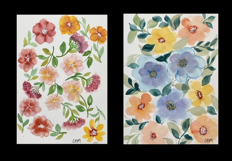
taking masking tape. Very rarely rips. And final strip of tape. And there we have it, our
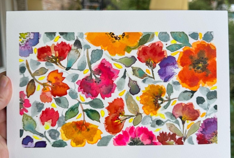
joyful florals, oranges, pinks, reds, lilacs, with soft, warm and cool leaves.
18. Thank You!: Thanks so much for
joining me in this class. I hope you're going away
with more confidence in the use of bright
colors, glazing, using water and
learning about timing, and how different colors
flow into each other. I've shared with you two of
my favorite brush strokes. The first one to create the
petal shapes of our flowers. And the second is a
gestural brushstroke, which creates a lot of texture. Most of all, I hope that
you've been able to carve out time and really engage
with the process, as well as the finished project, and that you've been
able to silence your inner critic
and paint joyfully. I can't wait to
see your projects and to hear about how you
experience the class. If you have any questions, you know where to find me. I'm here or I'm over
on Instagram two. Thanks so much again
for joining me, and I'll see you
again very soon. Take care bye bye for now.
19. BONUS Lesson: "Harriet's Garden" : Then I'm going to
start by dipping into any red that you like. I'm using English rose ink. It's actually calligraphy ink, and I'm really liking it. Dries very flat, which
is kind of nice. Whilst that's still wet, I'm going to go in
with some green. I just want a little
touch of that, really. You don't want to
travel too far. Drop a little bit
of ink in there. It's gonna keep
this very simple. A little bit of blue
with the green. And then we could do
a bright pink one. And actually, we could
do the double dip here. So it's harder with
water down green. That's quite nice. You
can go in and reshape, so don't worry about any
reshaping that needs to happen. I'm just bringing some spokes down and dropping some
of the olive greening. I'm going to keep
moving my coach, keep it nice and flowy. I want to do some very
pale ones as well. So I'm picking up some rose
madder, which is just here. I've mixed that down
quite a bit and I'm just going to put in a nice pale rose here. And you can drop in
some green gold. Then some of the olive green. Keeping it nice and simple. Might do a little
flower coming off here. I could blend with
that, can't it? And you can swap
from your mop brush to a small brush if you
want for this little bit, but you can actually shape
your brush if you've got a mop brush so that
it's flat like this. Then you've got a side that
you can just go in with. That's just something that
changes a little bit and add some of the ads yellow. And now we're going to
turn it round again. Let's add another yellow
flower coming this way. Very loose. We can mix the yellow with
a little bit of your toms or whichever
red ink you're using. We can do a little
base to it here. I'm going to use a
little bit of green gold and a little bit of the olive
green and just tap it in. Let's try another pink one. We can have this flowing into
this one because why not? This is the moss rose. It's very bright, very vibrant. Then you can move it
to wherever you like. I'm just pulling it out. It moves around. I'm
going to add some of the perlon violet to the center. It's tiny touches. And then mix some
of the green with the pink to make it
a little darker. Just drop in. If
you've got some, then I'm just going to
water down some more green. It's going to let that flow
into that flower there. A blue tinge to this one. Roughly. Loss that's wet, let's pick that up a
little bit and use it. Then I can just add a little
bit of orange to that. A pink and yellow that you have. I can just let
that do its thing. I'm going to do a double dip. So I'm dipping base
into green gold, and I'm picking up
this color here. Let's add some more
yellow to this one. Don't want to spoil
this too much. And what we could
do at this stage is just do a little
bit of scratching. We could strap scratch here and we can shape
some of the petals here. And then drop in some periviolet
a little bit of yellow. Timing is probably crucial for this bit because if
it's too wet here, it will just glow
out and you want to just have it at
the right point where you can drop it in and it's not going
to travel too far. Then very pigmented green
gold will still travel, but just very thick. Okay, got to get another leaf here and bit of blue and green. I think it's time
for another red. I can all flow together. It's come to me for f trout. Yellow will just barge you into any party, without an invite. So then I wait for that to dry and we'll go in
with a double layer. No. Then we want another pinky one over here. Just going to do like
a half opened flower. I'm going to drop
it into the tip, and see how that flows. If I put some green gold, which we know travels here to see what happens there,
that would be quite nice. I'm just going to add a bit
of blue and yellow into that. Need encouragement because
it's just stayed where it is, and that's okay because
we can swish it down. I think a nice soft
pink one now again. Back to our rose, and this is rose madder. Again, it's most extraordinarily
pretty color, I think. Anyway, love it. I can bring some spokes down and we can
scratch a little bit, we want on this one,
what's wrong end? And we can drop. Quite pigmented live green. But I've taken the excess off, so there's not a lot on my bush because otherwise it would
just take over that area. I might just add a little bit of hands yellow deep
again, tiny touch. I want the piece to breathe. And then we're going to pick up some quite pigmented,
pink of your choice. I'm going for rose madder. I'm just going to do that
twisting movement up here. I needed a little bit
more water on my brush. H just do some little petals up there that very textured. I think another one down here. Again, just going to bounce
up and down on the green. I've got it in the heel and I'm going to just go into
the rose madder again, quite pigmented and I'm just
going to squash that in. I might leave that like that. It looks quite nice.
Maybe another one here. It's going up this way. I'm just going to get
a smaller brush size four round brush. I'm just going to pull
some little stalks out. That can have its
own little stem ct. Drop some olive green. If you don't like an area when it's bleeding too much, go in, leave the dry brush
and just keep scooping away until you get to the
effect that you want. Just adding a little
bit more pink to those. And it might be nice to
have some lavender leaves. So I got some dance around blue. And some moss rose. Then we want these
two quite delicate, so I'm covering all of my bush, but I've got quite a lot
of water on there as well. Just want some little
hints of lavender. But it's more of a lilac. These can gang
over these leaves. I think they look really pretty. And some slate blue. In the bottom of this one, just to kind of
bring the changes. I don't like the way
it's flowing in. You can scoop back. Let's turn it round. I'm going to go in and add
another petal to this. Take most of the
pigment out when I went in there because
it's so bright, but I can add a tiny
touch hue as well. And it just creates
these lovely layers. Bouncing a little bit. There's always one plow that you have to work
a bit harder with, and I think it's this
flower here. And I think I'm going to have to go in with a very bright color, turn it round again, actually, I'm going to try and correct the shape of
it and I'm going to double dip into the
pink and the red. I love how that looks
over the green ink. That's lovely. That's very nice. Remember that. Is
that a better shape? Yeah, that looks better.
How nice is that? In danger of being too much, but I'm just going to double
dip into the red and pink. I'm just going to pick
this up here because it feels like it should be a
little brighter than it is. I'm going to bring down a few little lines
and just drop in some ink mix of slate blue ink
and brush and olive green. I'm just going to mix down a
little bit more olive green. Needs to be mixed quite well. I just going to do a little
bit of few extra leaves, you can definitely do this with the small round brush as well. Just to add over the
ones underneath. I'll do a confident one there. I think this could be darker. There's a nice one here. Where is it? Put it over here. I will look nice. I'm actually just not really doing
much of my brush, just placing it almost
printing with it. Okay. Les like I need
to reclaim this here. Is the red gone into it, flowed into it a lot. I'm going to pick up some neat I can see why
it's still very wet, it's where the page is spockled. But that's okay. I
do love this effect. If you have brusco, you could try this over your olive green leaves and
just pick some of that up. There's quite a lot
of water there. Okay, I'm going to add a
tiny bit more detail here, so I'm just going to add
another layer of the Tom's ink. I can drop a little bit of
water in there as well. So I'm just going to add a little bit of
layering to them. A little bit more
scratching maybe. The scratching doesn't
always show straightaway. It's when it dries, you start
to see it coming through. That's quite nice might
just bring that out and do the same here. A
 Holly Tomas Art, Watercolour | Gouache | Mixed Media