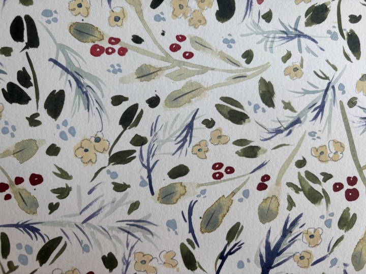
Transcripts
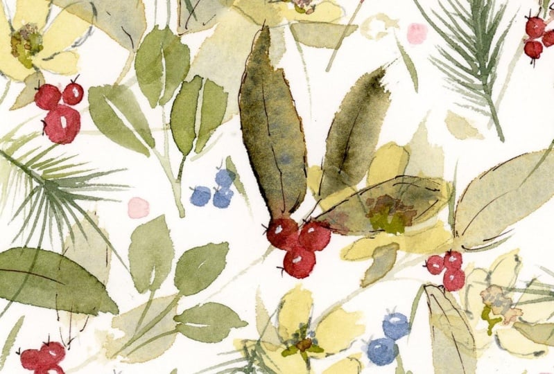
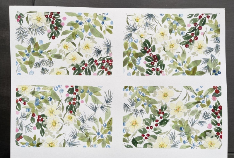
1. Welcome!: Welcome to this doodle
session of winter wonderland, glossy leaves and
beautiful bright berries. We're going to
start by taping off the page into four sections. I was thinking that
they would make lovely card toppers
or gift tags. We'll be starting off with the
rowing leaves and berries. And then I wanted
to contrast those, so we're going to
be using a blue to create some
Scots pine needles, and then some rich
glossy leaves. We're going to call in lots of techniques to create depth
in our little paintings. In our choice of color, how thickly we use the paint, how we overlap motifs
to create layers, and also use texture to
create visible brushstrokes, especially when it
comes to painting our Christmas roses with simple sea curves and
ginger colored centers. We're going to do some
subtle doodling with pencil, and then we've got to get
our pigma micron out. We're going to go
round the leaves and also really bring out
the red rowan berries. I do like blue berries, too, so we're going to paint some snowy black
thorn slow berries. Bringing all of these techniques together allows our
eye to travel right down from the bright red berries to the soft green rowan leaves. And we can spend some
quality flow time just doing our
little doodles and finishing touches to
our wintry foliage and bright berry project. You'll find a full list of materials in our
class about section. There's no pressure to share your work, but
if you'd like to, you'll find it under the video
in projects and resources. And then on the right,
you'll see submit project. I know some of you also share
your projects on Instagram. So do tag me as I don't
want to miss anything. Okay, so let's stroll, wheel or scoot our way into
this winter wonderland.
2. Taping Off & Colour Prep.: So I'm using my sh, hot pressed square block and
just taping off the sides. And then I'm going to eyeball it 'cause I don't
like measuring. I'm going to put
some tape across the middle to form
four little squares. I just wanted to add here, one of our fellow skill sharers, Natalie Nichol used a tape which was double the width
of the outer margins, and she made two tent cards. So that's always
another option rather than cutting right
up to the design. Doesn't have to be perfect. I think that's okay. So let's prepare our colors, and I'm using a mix of
gouache and watercolor. So the first was
ultramarine blue. This is undersea green. And then we have a lovely
bright red in the pyrol red. Some white, this
is titanium white, and hands yellow light. And some lamp black. We're going to just
mix up a green, which is one of my
favorite greens using black and yellow. I'm just getting another
palette out so that I can water some of
these colors down. So I'm gonna mix up this lovely natural green
from the black and yellow. Isn't that gorgeous? And some of the undersea green. So I'm adding water to these because it
would be nice to put some more watercolor shapes down and then start
to add layers.
3. Rowan Leaves & Berries: So I'm going to use my size ten scoo versatile because
I want some nice, larger leaves really
for the background. So I'm going into
our undersea green. This is just undersea
green and water. And laying down some
lovely, larger leaves. The reason why I'm using undersea green is it's
a very natural green. It's a lovely foundation
when you're creating layers. I should have mixed
up a little bit more. So what we're doing is going over the central
reservations, if you like, and try not to think about
these as four squares, but more like one flowy
painting from which we will take our little card
toppers or gift tags. So I'm constantly thinking about how they can all cross over
each other into each square. So what we need to be mindful of here is not doing too many. We need to leave space for all the little details
we're going to add. I'm just adding some
tiny little tips to some of the leaves. So that looks random,
and I like that. That's what I was going for. I wasn't really thinking about any particular tree or plant. I mean, I guess these very, very loosely could
be rowan leaves. But of course, they would have more leaves and
clusters of berries, but I don't want to have
them take over the page. So I'm just going to add a few red berries
using our pyrol red, a little bit of water. And then just to make it a
little bit more natural, I'm adding a tiny
touch of green. It just knocks back the
brightness a little, and that's what we want here. So I'm taking the excess off, making sure there are no drips. And just creating
these little circles they're so fun to do. We can leave a
little white space where you could just
fill in the whole berry. And I'm just painting a couple over the
edges of the tape. Very simple. Tiny clusters, maybe some a little
smaller than others. It's almost mesmeic
doing these so restful. I love doing berries. So you can see, I've only added a tiny bit of green cause
these are still very, very bright, and that's
what we're wanting. I'm not worried too much about placement,
where I like, really. So you just go for it. You could do more berries
than I'm doing here. I'm going over the
leaf there, as well. Oh, little tiny one. These could be tags
just as they are, so you don't need
to go any further. You could just make these
into tags for your presents.
4. Painting Our Scots Pine Needles: So I thought it might be nice to bring in some
contrasting leaves, and these are going to
be very different to the flowy rowing leaves
that we've just put down. So these could be Scott's pine, and I'm just mixing up the handsome yellow light
and the lamp black, and then a tiny bit
of the ultramarine. So what I'm looking
for really is kind of a deep greeny blue. I think I'm going the
other way round now. I think I'm going
to do predominantly blue and just taking over a
little bit of that green mix. So I'm using now my
size two escudda. So any size two round brush that you have or that
you're familiar with, it could be a larger brush. So again, just taking
the excess off, and this is what I would say is a watery mix as you would
use for any watercolor. And we're just creating these
little spike to leaves. Nothing to them, really,
a few little lines. And we can afford to not go
in with too much of a paint. You know, we're thinking
about value of paint here. We've got a light
value with the roans, and we want just a slightly
darker value for these. No rules, though,
and no mistakes. It is about the
journey, as well. I know everyone says that, and sometimes I get a
bit goal orientated, but just enjoy the process. Once you've done a few of these, you really get into
the flow as well, and it gets easier,
becomes more fun. So I'm just trying to
keep these fairly loose. They have a spiky shape, but we can still bring
movement into them with a curly stem or just changing direction
of the fur needles. So we can overlap the
rowing leaves if you like. At the moment, I'm
kind of threading them through and just again, keeping an awareness that
we want to be crossing over and barging into
the neighboring square. So now I'm going to mix a green that will
go with this blue nicely just to add some
shading and a different color. That's quite pigmented. So I'm just going to dab
off the excess again. And thread in some of these green leaves
with the ultramarine. I could do a little scribbles. It doesn't take much, really. This is a lesson I'm
learning a lot lately. And, you know, I always
overworked things. I think I still do sometimes. Now I realize that a slow and steady wins
the race sometimes, just taking your time, having those moments
of consideration. I do hope you've got a nice
hot drink next to you, and you can just stop
every now and then. Maybe a hot toddy or a cup
of coffee, hot chocolate. So not a lot added, really, these little tiny marks
in amongst the blue. It's just enough to stop
them from looking too flat. I really like the spikiness contrasting with those leaves. I'm really glad I've
done these now. I have to say here, I
had absolutely no plan. I often just launch into things and just
see what happens, and sometimes that
doesn't work at all, but on this occasion, I'm very pleased that it seems
to be going well so far. So I'm in danger of doing
too many things here because we want to be careful
about leaving lots of space for
the other motifs. So I'm going to stop.
5. Glossy Holly Leaves: So, again, I want to
vary the leaves here. We've got the spiky
pine needles. We've got the flowy
kind of rowing leaves. So I thought it might be nice
to have some glossy leaves. And what's glossier
than a holly leaf? So I'm going back into that black and handsome
yellow light mix. So I am adding water, but I still want it to be quite pigmented
because what we're doing here is we're going
from that very watery layer, and we're increasing the value of the paint as we layer up. So as I lay these down, you might be wondering
where the spikes are. So, fun fact. Holy, when it's been
nibbled by deer, actually has the
ability to switch genes and make
their leaves spiky. So, apparently, that's called
epigenetic modification. So, isn't that fascinating? I've always seen
holly leaves that are smooth and never understood why. Suppose I've always
thought that it's similar to the female
and male ivy leaves. So it is predominantly
because of animals eating the lower leaves and
trying to defend themselves, so they start to
produce prickly leaves. Absolutely fascinating.
And these, of course, are
stylized holly leaves. So these leaves are just
two strokes of our brush. I've always liked
these leaves that have a little white
space in the middle. And we are at that stage
now where we can start to go over some of the
motifs underneath. I'm just going to add in
a little bit of a stem. I want a bit of movement
in it because the leaves themselves are these kind
of solid glossy leaves. So I just wanted to make them
a little bit more fluid. I mean, they don't have
to be holly leaves. They could be buckthorn or bay. So, again, I am incorporating the tape because I don't want these just to
end at the edges. I thought it might
be nice just to add the odd little leaf
along the stem, as well. Isn't that glossy green
gorgeous next to the red? Such lovely wintry colors. Just two little strokes
there like a V. And I am loving these
because they're bringing a totally
different quality to the pine needles or the
rowing. Much richer. And I also like the
dark against the light. That was something I really
wanted to achieve in this. So putting down a
very watery leaf in the background just
really helps this sink. As soon as we start to add
the greater value leaves, it just looks so nice
and suddenly you've got that dimension and you've
got the feeling of depth So, just looking around, adding a few finishing touches. And I'm happy with that so far. So let's move on to
our next lesson.
6. Christmas Roses: Bringing In a Little Texture: So let's mix up a white. I'm using titanium white guash, and I'm wanting to mix a cream. And I usually use
handsy yellow deep, but I have this lovely
quinacridone gold here. So let's see what that
looks like with the white. We're quite like that,
and that's lovely. Bit more white. I want
it to be able to be seen but still be
close to a white. So a little bit more white. I want to take my time
because it's quite hard to mix a white to
paint on a white page. So I want it to be creamy
enough to show up, but not to have too
much color in it. And I also want it
to be of high value, so a lot of pigment to water, so probably 80%
pigment 20 water. There are ways to bring
this out even more. So I'm really just
doing sea curves. And you can stick with
your size two round brush. But I'm going to use
my pointed filbert, and I'm really not
bothered what these are. They could be Christmas roses, which are actually
helleboros niger, which flower in the
depths of winter. But I do like that comb
of white, red and green. I just love it. Let me show
you the brush strokes. So I'm starting off with
a small stroke and just getting a little larger
as we curl around. Very simple shapes. Don't worry about the center because we're going
to add those later. And that's it. Let's just
keep it really simple. And I think that's going
to work really nicely. I know I'm going to
get frustrated with myself because I haven't
mixed enough color, so I'm going to do that now, so I'm just going to add
a little bit more white. Maybe I touch more of
the quinacridone gold. I'm just taking my time to
mix enough to keep me going. Okay, so I had a
drip on the brush, and that's kind of come
out with a daub of water, which I'm not very
pleased about. I'm just gonna try and forget
about it and go over it. I'm not happy with that
color because I think I got some green from
my brush in it, so I'm just going to start
again in a clean well, put lots of white down. Clean my brush really well. And then bring over
some of the quin gold. And that's much brighter. I think I just got a little bit of green in the mix before. It was just a little dirty. So, likes just said, don't worry too much about it
not showing up fully because I'm just gonna lift that bit of
water there because we can add some pencil
around it and some centers. So they're going to have a
lot more life about them. For now, let's just create
some very simple sea curves. And with these flowers, we can start to actually embrace a bit of
texture as well. So let's just put a little bit more paint still than the glossy
leaves on our brush. Don't be afraid to go
really thick here. Just checking that that's dry. 'cause I want to go over that. It'll be quite nice just to bring some of these petals
over the darker leaves. It all adds to the
layering effect. And I'm going to do another one over this darker leaf here. And one just coming into the
page from behind the tape.
7. Christmas Roses: Centres: So I want to mix a color for the centers of
the flowers now. So I've got the quin gold. I'm mixed with the creamy
color that we've just done. A little bit of green. I'm just really playing around with the colors that we have down until I get something
that I would like. I'm gonna see what that looks like with a little
bit more quin gold. Oh, I'm quite liking that. That's like a mustardy colour. So I'm going to use my pointed filbert just because I
really love this for the centers of flowers
because you can get these tiny petal shapes just by using the tip of
it and also dots. So it's a really
lovely brush for that. So I'm literally just
tapping in some color. You could also.in color using the base of a brush or as
I've done in other classes, actually, with a
clay modeling tool. Yeah, I really loving
this mustard color. And I do like a few colors
in the middle of flowers. So I might come back to
these. If you'd like to. We can always add a little
bit more color there. Not sure where the
center is for that one, but little dots and dashes. I think I have them all
just checking over. So now I'm thinking it would
be nice to have a few stems. So I'm going to go down
to my liner brush. Again, you don't need
to swap brushes here. You can use your size
two round brush. It's just that I kind of get on very well with
my liner brush, and I use it a lot for
the finer details. So I'm now mixing some of the mustard in with
the green mixture, which was the lamp black and handsome
yellow light mixture. So we've got a nice warm
green here, a green gold. These are hardly
anything at all, but they just add a
little bit of movement. And I'm just adding some leaves. I'm not really sure
what flowers these are, and I don't think those
leaves are anything near a helibut or a rose, but I really don't mind. I just love doing
these little stems. And just threading them
behind other motifs. I mean, they're hardly
anything, really, but you'd be amazed
how much movement it can bring to a little
painting like this. I'm just doing some leaves at the top of the flowers
now going beyond. And I think that's
it. So let's move on.
8. Doodling With Our Pigma Micron: So it's time for some doodling, and I have a pigma micron 003, and this is in black. I do often use
this pen in sepia. This is where you can bring your own individual
style of doodling. I tend to just go round
the outside of leaves, but not all the way round. Just some little embellishments. Maybe a few lines. I'm trying to
restrain myself and not do absolutely every leaf. This is the beauty of using a very light color
in the background, 'cause we can also then go in and doodle and it will
show up really nicely. It gives us lots of scope. So at the moment, just sticking
to the row and leaves. And then I think I'm going to do these little Vs on
top of the berries. This is one of my absolute
favorite doodles. They just seem to pop
alive. I love it. It also seems to serve a purpose in bringing the berries
to the fore, as well. I suppose, 'cause it just has more detail than the
motifs underneath. Super, super restful to do. And it is that simple. I try not to do too much. We might add some
shading to them. So if I were to
mix a darker red, I think the quickest
way is with some green. And this is an example of mixing colors which are opposite and complimentary to each other. So mixing a greening with red creates this lovely
rich darker red. Such a simple thing to do, as you would with yellow and
purple and blue and orange. And I'm just doing these tiny little curves just
on one side of the berries. And this too seems
to give them life. I might have to just do a berry class for
you at some point, because I would happily
paint berries all day long. We've also reached that stage in the doodle where we've got
all our main motifs down, and it's now a very
peaceful process as we can slow down as we
add our embellishments. M. It's tempting to edit this. But I'm not going
to heavily edit because I feel it's
really important that we just have time to sink into a kind of reverie
and relaxation. I aspire to be given
the name Doodle Queen. I think I have a
little way to go yet, but wouldn't that be great? So, while I have
this red mixed up, and in the interest of
tying all of this together, I'm going to use a little
bit of it in the center of the hellebor dotting it in
amongst the mustard color. Just creating a little
circular center in places. Everyone can look
slightly different. And again, I think it's about
using your favorite brush, really, for this in one that
you trust and know well. And we might even add a
third color to the centers. I'm really liking the idea of a little variety of
colors going on. Lovely Robin red dots. Gorgeous. So I'm just spinning a page, making sure that I have
all of the flowers done. And I think I do. Yes. Yes.
9. Blue Sloe Berries: So we have that red echoed, and I think it would be
nice to do the same with the blue just to bring in
a little bit more blue. So step by step, we're just thinking
about all these elements which start to bring together
a cohesive painting. We've got all these layers and this use of color,
the use of value. So I'm going to mix up one of my favorite blues and using the colors that
we already have. I'm putting down the
French ultramarine. Some titanium white. Both of those are gouache, but you could do this in
watercolor. No problem. And our friend
quinacridone gold. I may not use it because I actually just like the
blue and white together. And talking about the
opposite on a color wheel, of course, orange is
the opposite of blue. I have a tiny touch of the
quin gold on my brush. So it's actually turning it into the color that I was meaning
to do from the start. Some gold has got in there, and it makes this lovely,
rich powder blue. It's one of my favorite mixes. And it's that simple. It is
just ultramarine blue and white and a very tiny
touch of gold or yellow. So let's do some more berries. So I'm back to my
size two round brush. And I want to add a bit
of texture with these. So we're using a
high value of paint, and it's almost too
dry to go on the page. I've started to do this lately, and I really like
it as a technique, so just wanted to
share it with you. So you kind of just
going around in circles until there's
enough paint on the page. It's very, very
tacky in the well, and then just slight
dry brushing effect when we put it onto the page. So you can see here
how dry my brush is. Of course, you will
run out of paint, so it's about a balance between having enough
paint on your brush, but not too much,
just so you get those lovely scrunchy
rough edges on them. This is another element that we're using to create
this painting, and that is texture. So we've got a little bit of texture in the white flowers, and now we're bringing
more into the project by having these lovely
little textural berries. They could be Well, they're not dark
enough for crowbrries. They could be bilbery or slow. It'll be really interesting to see how you interpret this. You may have different
local plants to me. I'm in the Lowlands of Scotland. I know we have quite a lot
of you across the water, across the pond, and
also over into Asia. So I would love to know
what your local plants are, whether you have
wild blue berries and what they are called? What's the plant called? Same with the white
flowers. What do you see? And what do you have locally? So throughout, I am keeping
mindful of those edges. I really want to create
a feeling of these being off cuts of a design once
we've actually finished. So some are coming
into the page, some are going over
motifs underneath.
10. Rose Centres in Blue & Snow for Our Sloe Berries: So while we have the
blue on our brush, why don't we add a tiny touch of blue into the centers
of the roses? So I'm just sticking with
my size two round brush. Very swift movements. And that's then done. What I would like
to do now is add some snow to our slowberries
snowy slowberries. Because, you know, why not? I do love snow, but it
doesn't stay here very much. We do have the odd winter where we have snow for a
couple of weeks, but, um, we're on sea level. So it doesn't stick, sadly. So I'm just cleaning
off my brush and sticking with my
small round brush. And I'm mixing this
very, very neat. It's just enough water
for the paint to move. So you're probably 90%
pavement ten water. And taking the excess water and paint off my brush, as well. We want lots of control, just for these tiny, tiny touches on our lowberries. Oh, that looks so nice over
that green leaf. I love that. Kind of serves to bring
them forward a tiny touch, but not further forward
than the red berries. And that's what we're
looking for, really, to keep them in the
middle distance. Is this not one of the happiest little pastimes
adding snow to berries? Just see curves cradling
one side of the berry. I'm so glad I did this now
because they look so gorgeous. And it especially highlights them when they are painted
over those leaves underneath. Just double checking. I don't want to miss one off, and that's it. So sweet.
11. Doodling With Our Pencil; Adding Outlines To Our Christmas Roses: We're nearing the end now, but I want to add
a little bit of definition around
the cream flowers. So I'm using a
mechanical pencil, and I like just to break
off the nab as it were, and then I've got a nice
sharp pencil to work with. And I'm just going to very
gently outline the petals. It doesn't have to
be on everyone, but I'm going to
see how it goes. And the reason why I
like to use pencil, especially when I've
got pen elsewhere, again, it is bringing
a different texture. And it's far gentler than using a black pen when
you've got these delicate, white, creamy flowers. So it's a nice, gentle way
of nudging them forward. Again, super restful to do. You can see them moving
forward already. It's very easy when you're doing a painting of lots
of foliage and flowers to overdo
things a little bit. So what we're trying
to do here is maintain a balance
and a harmony. And it's quite a skill to
practice trying to allow each motif to have its day to shine without outhining
any of the others. These flowers are so cute. So whilst we're here,
I'm going to do those little Vs on top
of the blueberries. I don't want them to come forward as much as
the redberries. I want them to recede cause blue recedes, red comes forward. So we're using that vehicle
here to create depth. So for that reason,
I'm not going to use the pen for
these but the pencil. So the berries would
be at the top, and the blue would be somewhere in the mid
background, I would say. Very cute little detail. So easy. So I'm just double checking now that I have cared for every Bilbrey. And, yes, I am really happy. Everything seems to be
working fairly well together. I'm just going to have a bit of a break and then
come back to it.
12. Extra Holly Leaves & Shadows for Sloe Berries: So I've taken some time
just to look at it. Use my handy tip of
taking a photo of it, and I've noticed that I would like some more dark
leaves in places. There's a couple of
corners maybe that I think it would be nice just to balance out those
darker leaves. So I'm going back to this green gold that
we mixed earlier, and I'm going to try
and color match it. So I'm adding some
undersea green because I know that's quite a
deep, earthy green. And that if we mix that in, we should be fairly close. And that's not too bad, but
it's actually a bit too deep. So I'm going to just
take over some of that green gold and add
a tiny touch of white. And nearly there,
just a tiny touch more of the undersea green. And, yeah, that's good. So it's just in these
corners, really, and I don't want
them to be too big. So I'm literally just adding
a couple of leaves there, and I think I'll do the
same over in this corner. I'll have one just
coming into the page. So you can see that that's
just balanced it a little bit, and now I only see one little
area maybe in this corner. Maybe just a couple more. Yeah, being careful
here not to overdo it. It's that merry dance
all the time between all of these little elements. So, what I'd like to
do now is just mix a darker version of the blue that we had
for the Bilberys. So I'm adding more
French ultramarine to the original mix and taking over some of the
Undersea green mix. I don't want it too exaggerated, so just a wee bit darker
would be excellent. Can we just try that.
Yeah, that looks good. I'm just going to
go round creating these little sea
curves just as we did with the roan berries and just add these
tiny little shadows. And that coupled with
the white highlights, we'll again, just bring
these forward a little bit, but not further forward
than the roan berries. So we're kind of still playing
in the middle distance. Just checking over my work, making sure I have not
missed steady berries, don't want them to feel lonely.
13. Adding Filler Leaves: So I've added some
undersea green to the cream mix from earlier. And it's a trick I
often use at the end of a painting to bring a cohesion, and it's usually a
green of this color, or if it's predominantly
another color, I would use a soft blue. So this is like a pale
chantreuse at the moment. Is that what I want? I'm just trying it out on a scrap
piece of paper there. Let's just practice the
brush stroke very quickly. So you can do tip belly, tip, or you could do the side stroke that we use quite
a lot in classes, and it gives you this
slightly blunter leaf. But I like using both together.
I think they're lovely. So we might do some side sweet leaves
here around the flowers, just to define the
cream a little bit more and to allow those
flowers to shine. So I'm just trying to find spaces that are
blank where I'm not going over too many motifs and also places where we've
got some dark leaves down, and we can start to glance
over those in places as well, adding to the feel
of layers and depth. Again, just around
the cream flowers there to accentuate them. And just adding some tiny leaves where there's a black space. I should have a term
for this by now, because it's a technique
I use quite a lot, one color that seems to be the final color to go down that brings
everything together. It also means that we've got a few greens going on,
which adds variety. This is a very considered
process at this stage. Just stopping every
now and then and then adding the smallest of details. I like that there's a
lot of foliage now. Just another one glancing over the glossy leaf underneath. So going off the edge again. And I'm happy there.
14. Adding Extra Rowan berries: So one final adjustment, talking about that kind of dance between the
different elements again. And now that we've added
some more foliage, I just want to be sure that the red is not completely
overshadowed now. So I've added quite a lot
of water to the pyrol red because I don't want
these berries to compete with the ones that
we've already got down. So I'm thinking of just going
in very softly, really, and adding a little
sphere of water, and then a drop of
the watered down red. So it's more of a
diffused color. Very simple and easy to do little pools of water
and a drop of red. And we won't embellish these. We're not going to add
any detail to them. I just wanted a few
more splashes of red, and this is another way
of creating a highlight. So as we did with the other
berries using a white squash, what we can do here is
take the excess water off our brush and then just do a sea curve around and
lift some of the color. Making sure that tape
is securely down. And we can vary the size. I'm just lifting again
with a tiny sea curve. I'm just trying to
keep them random. And remembering to go right up to the edges
and beyond tape. Lifting that that's
quite a bright one. And this blotting my brush and a little sea
curve and lifting. Such an easy and cool
method to add highlights. And it feels like we
have that balance again. And we are using predominantly opposites of complimentary colors
on the color wheel, red and green, which are just ultimate kind of
wintry colors, I think.
15. The Reveal!: I think it's now reveal time. And this time, I'm going to try and take them off in order, so they go over each other. Like, you see, because
I eyeballed it, it's not perfect, by any means, but, um, because we're
cutting these down, of course, they don't all
need to be the same size. Almost there. And then the very final veal. And taking the tape off just
allows these to breathe. And also, you find
that although they look very busy when
they're taped off, and they're actually not so
once you've removed the tape, they've all got their
own little character. So these would
make lovely cards, extra special gift
tags or frame them. They're gorgeous as
little pictures. I just can't wait to see what kind of life they
have beyond the class. I'm going to use mine
as card toppers. Can't wait to get
started on those, and I'll share them in projects.
16. Thank You!: Together, we've explored quite a few things
in this class, color, value, layering, texture. And also, we've worked with a difficult balance and
dance, if you like, between all of the motifs, allowing elements to shine but not to outshine
its neighbor. And that's a merry dance. But above all, I hope I've given you the
opportunity to take care of yourself and have some time just
relaxing and doodling. Whatever you celebrate
over the winter, I hope you have a
wonderful time, and I look forward very much
to seeing your projects. So I'll see you over in discussions or on
Instagram. Take care. Okay. Mm hmm.
 Holly Tomas Art, Watercolour | Gouache | Mixed Media