Transcripts
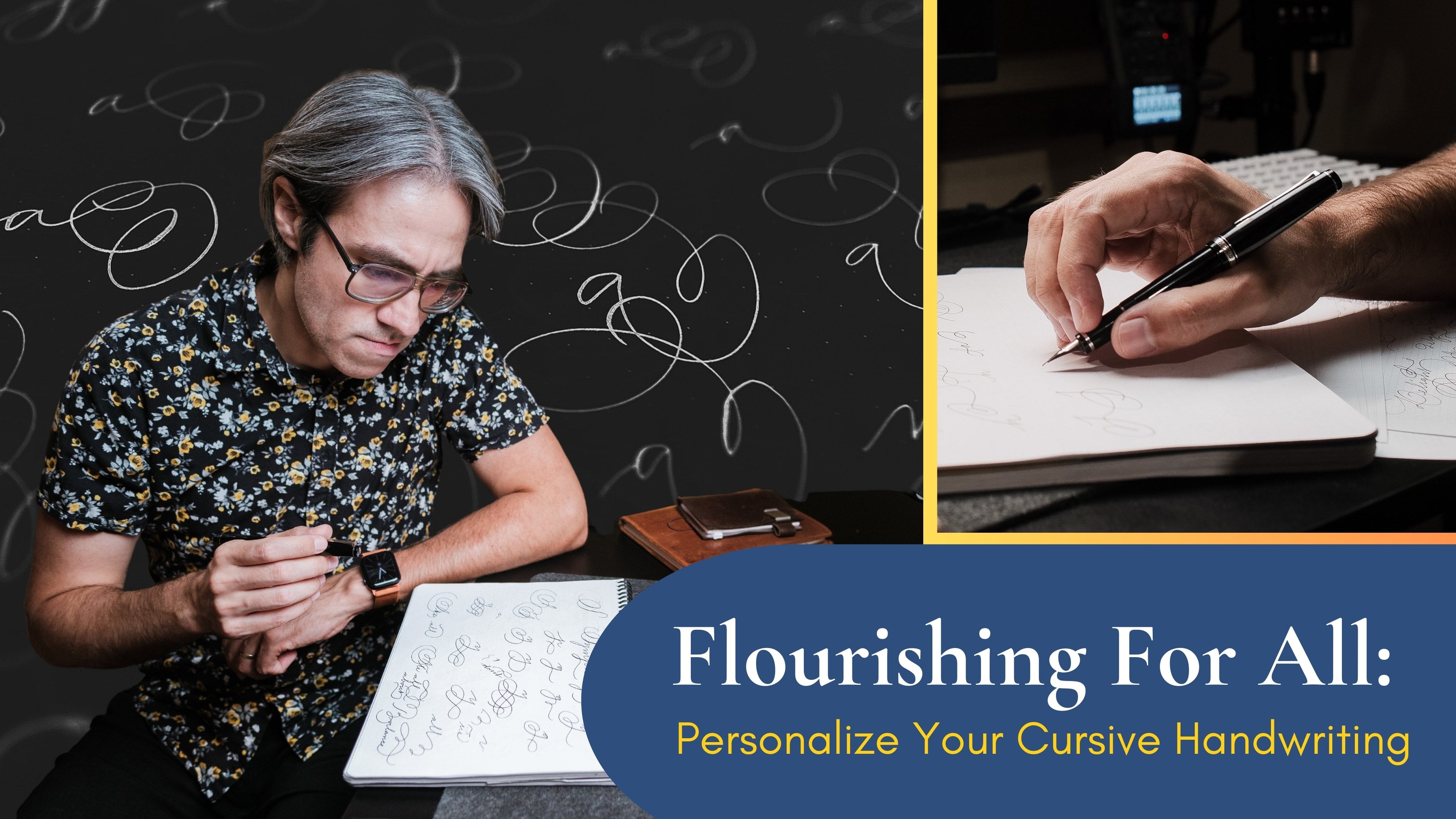
1. Introduction: I want to teach you a
powerful technique that has the potential to change
the way you write. This will not only improve
your cursive but it will also allow you to write
with much more confidence, without hesitation,
at faster speeds, and for longer periods of time. I am talking about
muscular movement, a way of writing that has
been around since the 1840s. This is incredibly useful for anyone interested in
cursive or calligraphy. Hi, my name is Robert. I'm a filmmaker, a photographer, and a creative person, always looking for ways to
learn or improve myself. Not so long ago while looking at my own handwriting I realized that it was extremely
difficult to read it. I decided to get
better at cursive. The first step of course was
to learn and familiarize myself with everything
that has to do with the details
of the alphabet. If you are just getting
started in this, I actually have a class
called beautiful easy to read cursive where I
explain all of the basics. Do check that one out first if you want to learn all
about letter forms, shapes, and proportions
in cursive. But my own learning
did not stop there. This class is for
you if you want to take your cursive handwriting
to the next level. The thing is that even
if you write legibly, it can still be a struggle to
make your cursive look like its naturally flowing and
without so much effort. Let me show you the difference. This is a clip from my
first-class where I am demonstrating the
lower-case alphabet. Now at the bottom let
me show you how I write the alphabet with a technique that I'll
be teaching you here. Yes, the bottom one
may be less precise but there's an element of freedom and flow that
was missing before. The benefits go beyond the
speed alone and everything is even more obvious when seen in a paragraph or a
fully written page. This is without and now this
is with muscular writing. This way of writing will
help you with consistency. It will remove shakiness
and it would make your cursive look so
much smoother and fluid. If you're ready to
improve your cursive then you are in the right place. This class will also be
great for anyone who wants to transition from
cursive into calligraphy. This is because the
way we will practice muscular movement is both
with the Palmer method, also called business penmanship and with some Spencerian
letter forms. I believe that handwriting
is something very personal. As we do some exercises, my goal is to give you some tips that will allow you
not only to practice muscular movement but they will also inspire you or give you ideas on how to write in a
way that is unique to you. I will teach you some
new letter variations. We will look at some
simple flourishes that you can incorporate
in your everyday. We will do some drills and
you will learn how to apply those to any new letter
that you intend to learn. I hope you are
excited about this. I know for a fact that after
learning muscular movement myself my handwriting
has never been the same. Get ready because if you are diligent and consistent
with your practice, I am sure it will be
the same for you.
2. Overview, Tools, and Concepts: Welcome. Before getting started, there are a couple of
things I want to mention. Generally speaking, I believe there's two areas
that we need to pay attention when we're working on improving or modifying
our handwriting. One of them is memory. Here I am referring
to knowing the forms, shapes, proportions, and the
specifics of each layer. The second one is technique and here I am talking
about the actual way in which we write and how we work on our muscle
memory through practice. In this class, I am focusing
mostly on technique. More techniques alone
without the memory side may only end up in confusion
or frustration. That is why I have mentioned
my other classroom cursive, which will take you through all the basics if you
feel that you need them. If you decide to go ahead
only with the purpose of learning movement techniques,
that's totally fine. I have to tell you
that Spencerian, which is the inspiration
behind my cursive, already has a slanted
and an angular look. This will be somewhat accentuated with
what I am teaching. What I mean is don't worry if your cursive looks
different than mine. The best that you can do is try to understand all
the principles, go along with the exercises, and then you will be able to apply them to whatever you
are trying to achieve. Now, let's talk about
what you will need. In this class, I will be
writing with a fountain pen. I will be using a Pilot Prera
with an extra fine nib. You can go through the class with any writing tool
that makes you feel comfortable but there's
two very important things that I hope you consider. The first one is for you to try using something that will
give you thin lines. For fountain pens,
I suggest you go for a fine or an extra fine nib. This will allow you to
see all the details on the strokes as you
practice and it will be easier for you to notice
the areas in the forms and the shapes where you will
need to work on improving. Number 2, and this is
the most important, is that you need something that allows you to write with
no pressure at all. This is what's great about
fountain pens in general, and that is why I
highly recommend them. But if you choose a different
kind of pen or pencil, just know that we
want to get rid of the habit of
holding the pen very tightly and we also want to stop pressing hard against
the paper as we write. Only if we can do that is
that we will be able to develop techniques that involve
using different muscles. If you want to know if
you got the right tool, just let it rest
on your hand like this and by moving it around, you should still be able
to produce some lines. On paper, I will be using
HP premium 32 paper. Not every paper takes
fountain pen ink well, but this one is great
for practicing. Another option for practicing
could be a Rhodia pad. I particularly love
running on dots because of the feeling of
freedom that they can give you. In this class, as I go
through the exercises, I will actually be using some printed guides that I am sharing with
you as a resource. That is why I am using
the bigger HP paper. Using guides is
not a requirement, but I will talk specifically about that in a later lesson. There's one more important thing that I have to mention here. I suggest that you stay away from practicing
in notebooks that are higher than one centimeter or about half an
inch at this point. The reason for that is
that we will be studying all the principles of
movement and as you will see, it's extremely important
to limit the points of contact with the surface
where you are writing on. You will eventually
be able to bring this knowledge and your practice or exercises to notebooks and I will actually
encourage you to do so, but not at this beginning stage. This only adds a layer of complexity that you do
not need right now. On the other hand, it's important that you
do not write directly only on one sheet of paper
on top of your desk. If you want your fountain pen or nibs to have a
long-lasting life, it's always good to have
some amount of cushion. I find that having between
10 or 20 pages under the one that you will
be using is just great. With that being said, let's
go to the next lesson where I'll briefly talk about the
project for this class.
3. Project and Improvement Tips: In this lesson, I
want to talk to you about the project
for this class. When you start to
develop a new skill, you will normally
want to go from bad or not so good to better. But in this particular case, what you will experience
will probably be different. Before seeing any progress, you will find that
your handwriting will become a bit worse at the very beginning when you start incorporating
what you learn. I want to tell
you, do not worry. You are trying to introduce
a way of doing things that is different than
the habits that you have carried for
a very long time. It will be uncomfortable, maybe it will be a bit messy, but if you are consistent with your practice and
have discipline, you will get better, I promise. I can tell you this from
my very own experience. For the actual project, I want you to document the three stages
that you will go through. Let me tell
you what I mean. First, make a record
of your handwriting, your cursive or
calligraphy right now. Don't try to do it any differently than what
you will normally do. It can just be a
sentence, a phrase, it can be a paragraph, a passage from a book,
anything is okay. The second step
would be to record your handwriting once you start to introduce the
concepts of movement. You don't have to write
exactly the same text. Actually, you may have
trouble writing more than just a few words,
but that's okay. You'll be able to do
this step right after the following lesson when I
talk about grip and position. I suggest you do this
before going through the entire alphabet because
that's how you will see the biggest difference between
this and the next step. For the third step
of your assignment, after going through
all the class and practicing for some time, I want you to write
something once again, but this time incorporating
everything that you learned. Right now it's like
your handwriting is somewhat stable,
going like this. But after incorporating
different movement techniques, it's totally normal
to go like this, only to experience some
rebirth after practice. Documenting the process that your handwriting goes through is meant to give you motivation
to continue practicing, and I encourage you to
share your project here on Skillshare because that will truly inspire other students. I'm excited to see how you apply everything
that you learn. By the way, I'm okay if you only want to
show off your progress, but if you specifically
are looking for feedback,
critique, or advice, you can also mention
that at the time of submitting and I'll be glad
to jump in with some of that. I hope you're ready because
in the next lesson I will share with you the
principles of position, pen grip, and how all of this
translates into movement. Basically what we will
talk is a foundation of everything that
you will learn in this class. I will
see you there.
4. Pen Grip, Position, and Movement: In this lesson, I want
to talk about pen grip, position and how all of this comes together to
create movement that will allow us to grab more
fluidly and without so much shakiness or hesitation. What I want to share
with you here is the foundation of
the entire class. I want to give you all
the theory and principles at once before we put
it all into practice, you always have this
lesson to refer back if you need to
refresh your memory. I suggest that you pay extra attention and feel free
to rewatch if necessary. In handwriting,
generally speaking, there's three types of movement. One of them is arm movement. Another one is
muscular movement, which has to do
with our forearm. Finally, there's
finger movement. The most common out of this
is the one of the fingers. This is probably what
you learn in school. For most people, this is done with what is
called the tripod grip. Grabbing the pen with three fingers or a
variation of that. For this writing, you do need some support
of here in the hand, which means that you will most likely need to rest on the side. When I started working
on improving my cursive, I wanted to have a
bit more freedom, so I started trying to rest
on the last two fingers, but the fact is that I was still using my fingers to write. The writing that
comes out of this can be very precise and
very controlled, but at the same time, you are limited in
movement and you also have to be applying some
pressure to keep balance, which often results in fatigue and some
degree of shakiness. Arm movement is the total
opposite to finger movement. Instead of focusing
on trying to have control in a small space, this movement is great
for big strokes. This is something that
you would use when you're standing up and writing
on a board, for example. It's also extremely
useful whenever you are either
writing big or doing flourishes and you
need your hand to travel around
without difficulty. I personally haven't spent a lot of time practicing arm movement, but it isn't that hard
because the strokes are meant to be large and
without a lot of precision. But then there's something
called muscular movement. This is much more control
than arm movement, and is meant to give you speed, smooth strokes at the same
time that they allows for a very relaxed writing
experience that can lead to go on for long periods of
time without getting tired. This is where we're focusing
most in this class. There's some important
things that you have to consider here before we
get into how it looks. First, let's look at how
tall your table should be. Shouldn't be too
short or too tall. Roughly, you should
be able to form about a 90-degree angle here. If the table is
taller than that, then you will not
be able to properly find support in your forearm. If the table is too short, then you will actually
be running more with your arm and you will not
have enough precise control. We want to be able to rest this part of our
forearm on the desk. Second, with another
one to anchor our hand, or more specifically the wrist
on the table or surface. That is why it's not such
a good idea to start practicing this technique on a notebook because
without noticing, your hand will be
higher than usual. This will make it easier
for your wrist to lay down and you will start using your fingers without
even noticing. Third thing to consider. Something that we want to
limit is the wrist movement. The most natural way to
do this is by modifying the entire way in which we
hold the pen. Try this. For a little bit forget
about the tripod grip. Just raise your hand
on the desk like this. Now, let's bring in the pen. Let's make room for it
with our index finger. Just put it there without pressure, without
holding it tight. Now, remember that I told you
not to put your wrist down. For that to happen, we will bring your hand
slightly up and we will be barely touching the surface
with these last two fingers. It can be either with your fingernails or the
fleshy part under that. We're just barely touching
the desk with those fingers, but no other part of
the hand is down. My suggestion is for you
to do all the drills and exercises that will
follow with this position. The points of contact
are the forearm, the last two fingers, and of course, the
nib of your pen. This is the most
traditional position for muscular movement and it has a side effect of limiting
wrist movement by itself. Because as you can see, the wrist can go nowhere. Let me make something clear. It's totally normal
for you to feel a bit strange writing like this, and in the following
lessons as we exercise using this position, it may also be a
bit frustrating. My hope is that as we go through the exercises together
and with some practice, you will slowly
start to feel more comfortable and confident
we are writing like this. But if for some
reason you feel like this position is
absolutely not for you, you can still apply
muscular movement by having your hand on an angle
and with a tripod grip. Try to understand the principles and adapt them to your
case if necessary. If you are left-handed, this also applies
to you by the way. I actually believe that
learning muscular movement is great for left-handed
people because one of the challenges that you
may have is trying not to get ink all over your hand
or the page as you write. Less points of contact means less chances for
accidents to happen. Now, all of you, I
suggest that you position the page as
you write on an angle. You will basically be making all the ascenders and descenders
straight towards you. In that way, you will end
up with a consistent slant. If you do not have
enough space in front of you because of
the size of your desk, you can always rotate your
chair and be on the side. Always remember to rest your forearm and follow everything that I have
already mentioned. It could be something like this. Those are the basics about
movement and position. But let me tell you two more things that will
be very helpful to you. Number 1, combined movement. There's a couple
of different lines of thought about this, but depending on what
you're trying to achieve, I believe it's
totally okay to allow yourself to introduce
something or movement aside from
muscular movement if you need it on
certain letters, loops, flourishes,
or small details. I will explain some more about this when we start going
over the alphabet. Just noticed that I am talking finger movement here,
not wrist movement. Using your wrist at the time of writing will only
make you get tired easily and can lead to
injuries or cramps. Number 2. Another thing that I have
to mention here and that is very important is the concept
of your writing zone. These once again has to
do with your position. Let's say that you have
the paper in front of you and it's already
on an angle, our arms should also
be in this shape. Now, let's say that
this is our baseline. We're using muscular movements. We're down in this
place with our forearm, which means that we're
also limited about how far around the page can we travel
at the time of writing. As you can see, I can only
go so far towards me or in the opposite direction before I start to have to twist my wrist. This is not good. We want to be able to write
with a relaxed wrist. Let's do this curve here. Following the natural
movement of our hand, keeping everything
in line and relaxed, and this reveals the
area of the page which allows us to write in
the most comfortable way. What we need to do as
much as possible is stay around this
area when we write. We do that by moving
the page as necessary, not by moving yourself,
with your pen, which can result in getting hurt with your wrist or having a different
perspective which will result in inconsistent slants. If you are looking
at it from here, it will look
different from here. That was a lot to
cover. Believe me. Everything will become much more clear in the
following lessons. For now, you can go ahead
and try to write something. This is the perfect
moment to document the point in time
you're at because I'm about to take you through
some practice and a series of exercises after
which your handwriting, at least when using
this technique, will probably never be the same. Before we get there though, in the next lesson, let me give you some advice on drills, the use of guides,
and tips on how to make the best of
your practice time.
5. Drills, Guides, and Practice Tips: In this lesson, I
wanted to talk to you about drills, guide sheets, and give you a couple of tips
that will be useful as you become more familiar with
muscular and combine movement. I have to tell you
that for a long time I resisted the idea
of doing drills. In my mind, there seemed to be very little advantage in practicing the tracing
of random shapes. Well instead of that, I could spend some time practicing letters
and actually writing. It was until I started to get
real serious about learning muscular movement
that I started doing some drills and understood
more of their benefit. From what I've experienced
I can tell you there's three main
reasons why you should do some drills
if you are starting to introduce different types of movement in your handwriting,
or calligraphic. The first one, and what I think is the most
important is for you to get used to your
new pen grip and position. Since we are trying to modify, or improve the way you write, you will already need to
put a lot of attention on the specific details
of the letter shapes, the forms, and all the rules
that are involved in this. This is already difficult and requires a lot of
practice and focus. You want to get past that
initial stage of fighting your muscles so they don't go back and right, as
you will always win. For me, this is where it really shine because they're simple enough you don't need
to think so much when you're doing
them and in that way, you can spend some time
only trying to get used to the mechanics of
how everything works. The second reason
that I recommend doing drills is for you to start recognizing their forms that build all of your letters. Whether you are interested
in copper plate, Spencerian, business penmanship, or any other script it is very important that
you start learning the basic strokes that conform what you are trying to
learn and to some degree, practice drills around that. That way you will
always know whether your letters look as they
are supposed to look. In this specific
case of this class, I am showing you Spencerian
and Palmer method letters and a lot of them are built
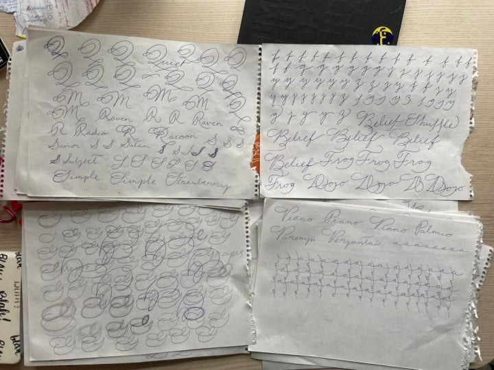
around the shape of the oval. For example here is
one variation of the Spencerian S. If you start
to analyze the letter, you will find an oval
here and one oval here. They are horizontal, not on an angle so if you're practicing the letters and you find your S is starting to look a bit weird, or out of balance you can always try to picture these ovals
that I'm showing you. Maybe you are making
them more like a circle, or maybe you are making them on a slant and not
totally horizontal. You'll see, I believe in having a personal touch
and I think it's totally okay to break rules, but just as important
is to know them first. The third reason that I can
give you for doing drills is for warming up before
integrating session. I don't really know
why this happens, but we need some warm-up
to get into a rhythm, or flow where we can write without tension,
or stiffness. This is specifically true
whenever we're using our muscles to grow it
and not only our fingers. Here are the most basic
drills that I suggest. First are the slanted ovals. We want to trace about
10 ovals at ones. First to the right
and then to the left. As you do this, pay
attention to your position, pen grip and trying to do
it all with a light touch. You don't have to
go extremely fast, but some amount of
speed is necessary. If you want to remove
shakiness from your strokes. Then we want to do straight lines on a slant
crossing our ovals. Right now, I suggest that
you do these drills about the same size that you plan
for your uppercase letters. Later, when you are more
comfortable with them and want to start practicing
with lowercase letters, you can do them smaller. Another drill that we can do is horizontal ovals, the same. We want to do them clockwise and then the opposite direction and the horizontal lines
movement will also be useful so let's
cross those ovals. Now, we want to introduce
some traveling. For these, we can do the same slanted ovals trying to keep a consistent
separation between them. They naturally
follow this diagonal on the page and I'm
okay with that. Again, I'm doing them
in this movement to the right and then in
the opposite direction. I have seen a lot of
variations of this. Some do it in horizontal, or from big to small. It's all good. Just tried to keep it all as
consistent as you can. Do keep in mind that from
all the reasons to do this, none of them is to
become a drill master. Really have seen
people do drills so perfectly and if
that's your goal, then there's nothing
wrong with that. But I personally want
to get what I need from drills and move on to
the actual grinding. One more that is also
useful is this one. This will be helpful for when
you start doing flourishes. When I got started with
muscular movement, I would fill up one page of drills before any
practice session. This point where I'm
right now, however, I feel comfortable enough
with a pen grip and position. I do not do drills as
often as I used to. I may do some whenever I'm trying to learn
a new variation, or sometimes before doing
an uppercase letter, I may trace some ovals in the air just in
preparation to grinding. Also, I have to tell you
that I'm generally okay with my first couple of
lines to look a little bit messy at the beginning
of a grinding session. But I know that if
I will be doing something important is
good for me to warm up beforehand instead of
going straight into it. What I mean is drills
may be helpful, but only you can judge how
much you will need them, or when you can go ahead
without doing them. I actually feel pretty much
the same about guide sheets. I don't think guide sheets are necessary for
learning cursive, especially if you are
planning to only use it for your everyday
casual handwriting. If you are here to learn
muscular movement. However, my guess is that you are pretty
serious about this. Muscular movement is
already stepping into calligraphy territory
where there's more rules and many more
details to consider. It's not such a bad idea to have some reference for
more precision on the angle of the
slant and size, or proportions of our letters. There's also the fact
that once you start practicing and exercising
with this new muzzles, you may struggle
not to go all over the place so it's okay to
have some help with that. I made these guide
sheets that I'll be giving you in the
resources of this class. It's not your typical guide. I would say it's more like a
grid with 52 degree angle. Everything I'm teaching you it's totally up to
you if you use them. It's not a requirement. If you do end up
printing some of these, I also suggest that you practice without guides whenever
you have a chance, just so you do not become
too dependent on them. Guys, I'm excited to show
you how everything that I've been talking
to you will help us at the time of
creating letters. In the next lesson, I want to briefly explain to
you some things to keep in mind as we go
through the uppercase alphabet.
6. Uppercase Alphabet Overview: By now we have
already talked about all the principles that are the foundation of
muscular movement. We have talked about
drills that will help you get used to this new
method of writing, but I want to take
everything one step further. I want to show you
how to translate all of that knowledge and
drills into actual letters. For that and specifically
for the uppercase letters, I will be focusing on the
Palmer method alphabet. The Palmer method is
a simplified form of Spencerian that was used in
the US around the 1840s. I have to tell you
that this is not the most fancy
alphabet there is, but it has the
advantage of being creative around muscular
movement itself. I think it's a great transition into using this new
technique that I'm teaching you even if you later decide to take the style in a totally
different direction. The reason that I'm starting
with the uppercase letters and not the lowercase
which are the ones that you will probably be using
the most is because I first want you to understand the connection
between ovals, drills, and the
actual letter shapes. Once all of this
starts to make sense, you can later apply the
same principles and practice methods to the
rest of the letters, variations, and
any other type of coercive or calligraphy
that you intend to develop. People say that it takes
between a month to six months of consistent practice to see progress with
muscular movement, but I think that
everybody is different. I started noticing improvement after a couple of days already, and since then it has
just been a matter of fixing or changing
whatever little details that I continue to notice. The best that you
can do is enjoy the process and practice as
consistently as possible, and as you practice you'll first notice that your drills
start to get better. Those ovals will not
be all over the place. Then you will see
some progress in doing the Palmer
uppercase alphabet, it won't be so
difficult anymore. Then finally, you will see progress in your
lowercase letters. You have to know that the smaller you go the
harder that it gets, but do not give up and
you will get there. Just to give you some more
motivation aside from the basic Palmer
uppercase alphabet, I will also be giving you one or two Spencerian
variations for each letter. Two Spencerian script involves shading and line variation, which is the topic for an
entirely different class, but the letter forms I
will give you incorporate ovals and can also help you
practice muscular movement. Some of these will be
flourished and may or may not work for
your everyday cursive. Flourishes can affect
legibility to a certain extent, so you always have to
watch out for that. But I still think that it's good to learn how to start creating some forms that are more complex while still using
this same technique. If the Spencerian
variations are too much for you at this
point, don't worry. Feel free to skip those
for now and revisit them later when you feel more confident with your writing. Guys, I hope you are excited. Get your pen and your
paper ready because in the next lesson we
will start writing.
7. A, B, C, D, E: Let's start with the first
group of uppercase letters. Letter a may be one of the most basic letters,
and at the same time, it has this almond shape, which is super-important even as we'll later get into the
lower-case alphabet. Just to add, we can get used to the movements in both here, let's do some tracing
without lifting our pen. Remember, it doesn't
have to be perfect. You just want to find the
balance with the correct amount of control while grinding
with a very relaxed grip. I will be showing you
each exercise once, but you can keep doing it until you feel
comfortable with it. There's also this other exercise that I find a little bit harder, especially with the jumping or linking from
letter to letter. This will not only help you get that exit stroke with a
right amount of curve, but it also will make you
feel more comfortable with putting words together and
moving around the page. Once you are comfortable with
a simple form of letter a, you can try to practice
this spencerian variations. All the ovals or almond
shapes are very clear here. Now for you to see this
as part of a word, let me write about. First with a simple shape, and now I will write alive
with a spencerian variations. I want to be writing words
because that will allow you to see how uppercase letters
make a bit more sense. You can start to practice a bit doing the lower-case alphabet, but remember that's not
our focus right now. Let's do uppercase B. We can immediately see that this letter is more
complex than letter A, but in reality is all
about curves and ovals. Let's break the letter
apart to practice it. First, we do that entry stroke and we jump into
an oval from here. See, this is why I told you
that reels do have a purpose. They help you see
those basic shapes. When you feel okay
doing the entry stroke with a big oval a
couple of times, we can break it into
two ovals like this. There's this little connection
between the top and the bottom loop that may
give you a bit of trouble. Here's something
that you will see me do in a couple of letters. Whenever we're after
that small loop, we can stay there and
practices by itself. Now, let's jump
to the last part. I'll do the letter
one more time. Now let's look at a spencerian more
complicated variation. There are several loops
here that you can practice in a similar
way, but honestly, one of the hardest
things for me are straight lines and small
loops like this one here, is one of those instances when I think it's okay to use
some finger movement. Let's write bird with
a simple version. Now, I will write believe with
the spencerian uppercase. Letter C should feel very easy
after the previous letter. Is all about the oval. Let's go back and practice that. I'll do it one more time, and now a spencerian variation, it's also made up of ovals. Let me write cute. Now, I will write cake
with a simple palmer C. The uppercase D for palmer's alphabet
looks like this. Honestly, it's not my
favorite looking letter, but it's a great
introduction to a new type of curve or loop we
will be encountering. Let's start to
practice like this. Is like if we were doing
a slanted number 8. Now we will start the same, but very soon we will
switch to horizontal. Practice this too
several times and then you can take it
one step forward. Do the entrance stroke, the horizontal loop practice, and from there let's
jump to a big oval. Do you see it now?
Let's try to go to that closing oval without
stopping along the way. Now, let's practice
that last exit stroke with an oval alone. Now we will put it all
together and you got your D. I will write door. Now, let me show you a spencerian D while
I write Denmark. This D belongs to that same family of the B
that I showed you before. Let's do letter E. This is a tricky one because it looks so simple but actually, getting it right does
take some practice. Let's break it apart for that. Let's do that entrance
stroke up until here. We will practice
this small loop, just like I was telling you. After that, we will take
it one step further and practice the bottom part like
if it was a connected oval. The tricky part is
actually joined to the top together
with the bottom with enough impulse or speed so that we don't stop in the middle and end up shaking a little bit. To practice that connection, let's just trace the entire
letter several times. Now I'll do it by itself again. Let me show you a
spencerian variation. Whenever you see the
last stroke like this, almost closing a novel, you can also do it like this
and actually close the loop. Let me write easy with a
simple palmer uppercase, and now I'll write earth
with the other variation. Continue to practice all of these letters and I'll see you in the next lesson
for some more.
8. F, G, H, I, J: Guys, welcome back. Let's
start this lesson with Palmer's uppercase F.
I like this letter. You will not find ovals here, but there's this familiar curve
that we practiced before. Then there's this trade
out closing stroke. After some practice, you can do the bottom
part like this. Let's practice the
top in a similar way. Now, let's put it all together
and I will write flag. This Spencerian
variation that I'm giving you is a bit
more flourished, and you start to see
some ovals there. Let me write forever. This is letter G. I feel this one is easier than
it looks because it all depends on that oval shape that we're all familiar with
by now. Let's practice it. It's like if you do the oval, then take a quick break and
turnaround back down to exit. Let's do the oval one more time, and that last stroke. You may have some
trouble doing that exit, so we can practice it by
tracing it over and over again. We're just trying to get used
to the movement like this. Let's see it all together
as I write guitar. This Spencerian variation
is full of ovals again, watch out for these two
being horizontal and roughly there should be
parallel to one another. I will write grapes. Here is letter H. The entrance stroke is different than the ones that we
have done until now. But you guessed it. It also comes from the oval. Let's practice
this. There we go. It can be done in
a quick movement. Now the next stroke,
it's a straight line. I always find this challenging, but let's practice
the movement alone. Now, I will write house, and I'll show you as Spencerian variation that I really like. This one is flourished, but I think it's still
very clean and elegant. I use it all the time.
I will write habit. Let me show you later
I, I'll be honest here. I think this is my least
favorite uppercase letter. For your muscles to get
used to the basic shape, we can start with an oval, done clockwise and retracing it while making it a bit
more narrow each time. After that, we can just do the narrow shape alone and
retrace it a few times. Remember to do as many of
these as you find necessary. Now the tricky part of
this letter is that the stroke that goes to
the bottom is supposed to be closer to a straight line while still having a tiny
bit of a curve down here. That small loop at the
top is also challenging. You don't want to
make it super sharp, so it may be useful to
practice it alone a few times. Also pay attention how
I'm trying to follow the slant on that stroke
I keep retracing. Is one of those
times that having a guide sheet is super helpful. I like this one. I
think I got it right. Let me write India. This Spencerian
variation that I will show you is challenging. But I feel that if you
can get these overwrite, there's less pressure
on trying to perfectly write the
basic original shape. I'll write idea. If you're like me and
you struggle with the I, there's this other variation
that is a bit easier. Let's look at letter J. The top part starts
from the oval. Let's trace it a few times. Now as you can see, there's this straight
line which is similar to the uppercase
we just practice. Let's trace the shape a few
times following this slant. The main difference
between this and the I is that this stroke extends
all the way to the bottom, still on a straight line, so let's practice that movement. Now I'll write the
letter by itself. Always keep in mind that the top is bigger
than the bottom. I will write jazz. Now remember that
exercise that I showed you before
for flourishes. We can incorporate
it into a Spencerian J. I will write jacket. This is a fun J and
it looks fancy, but it's not so difficult
once your muscles loosen up. At least I find it easier
than they uppercase I. Let's move on to
the next lesson.
9. K, L, M, N, O: Guys, let's start this
lesson with uppercase K. If that for stroke
looks familiar is because it is the same as R H. Since it comes from the oval
let's do a few of those. Now that we got the first
stroke down let's practice that small loop
like I previously showed you with a
horizontal eight. Let's try to do it all. Down here it's okay to
slow down a tiny bit. Then you can go back up or you don't even
have to go back up, you can also extend it
to the bottom line, I will write king. Now let me do the Spencerian variation I want to show you. I'll write kitchen. There's a variation that is very similar to this K and then use requires a bit more control
to extend those strokes. The idea is to keep all of these curves as
symmetric as possible. Our grade kilogram. Let's do uppercase L. Aside
from that first stroke, this is somewhat similar to our uppercase D that
we practiced already. Let's go over that
exercise one more time. First is like a slanted eight. From there we do
it in horizontal. We can retrace
everything a couple of times until we feel
comfortable with the shapes. There you have it. An uppercase
L. I will write letters. This presenting variation that I will show you has a couple of ovals that should
also be symmetrical. I will write labyrinth. If you got this
variation right you can also close the last loop. It doesn't matter
if it's crossing the actual baseline but if
you want to keep it cleaner, you can also bring a loop lower. Let's do uppercase
M together with letter N because
they're so similar. Let's do some ovals for that first stroke that you should be
familiar with by now. There we go. It's pretty much
the same for both letters. I find that a good exercise
to get this movement right is to practice doing a lot
of loops from big to small. As you can see when
using muscular movement. The smaller you go it's easier
to start making the shapes sharper but that shouldn't happen. Let me try
one more time. It doesn't have to be perfect. We're just trying to get
used to the movement. Tried to keep the
second part of letter M a little bit thinner. I would write menu. Now I will write nine. Do you remember that flourished exercise that I showed you
before with capital J. We can also apply it on these letters I'll
write magazine. Random variation for N that
I'm showing you is simpler. I'll write nature. Letter O may be the most pure oval shape
that we have done until now. Some extra practice
is never a bad thing. We trace it up and just
practice that exit stroke. Let me write off. Being such a simple letter, you'll be surprised to see all the different variations
that can be done with the O but let's look at a simple sponsoring one
that is very versatile. I would write object. I find this one easier to read
and not very complicated. You can always extend that
loop and cross it like this. I would write order. Let's continue in the next one.
10. P, Q, R, S, T: Hi, welcome back. Let's start
this lesson with letter P. This one is like a
review of uppercase B, which we did a couple
of lessons back. We can do the entry stroke, and trace some ovals. From there, we can focus on the actual top part
with another oval, and we got letter P. Now let me show you a special
P. I will write package. I'm telling you Spencerian
uppercase letters are so good for practicing complex shapes that still come from the oval. Let's do uppercase
Q in Palmer method. It looks very much
like a number 2. We start practicing
with the oval. Then we can practice
that exit stroke, which is very similar to our uppercase L. Let's try
to practice one more time, retracing first the oval, and then that last stroke. We got it. I will write queen. Let me show you a
Spencerian variation. Now I'll write quiet
with this one. That interest flourish once again comes from the
exercise that I showed you. I can give you one more
option for several letters. For example, let me do it on the M that we already learned. Now, let's look at uppercase
R. You can add it like this, or you can bring the last stroke to the top; it's up to you. This letter belongs
to the same family as the uppercase B and P. We get there with
the same exercises. The big oval; a couple of times, then we do only the top part, and finally the
last exit stroke. I will write radio. For the Spencerian variation, let me switch it
up a little bit by lifting up my pen at the
end of that first shape. Then we'll pick it
up back here again. Let's write raccoon. Uppercase letter S; that entry stroke may be the
one different thing here. Well, we can practice
that slanted line just as we did before
a couple of times, and we do the closing like this. I find it useful to practice
that last stroke by itself, so we can do it like this. We can even retrace it to try to make it part of
our muscle memory. We can even mix up both of
the exercises like this. Let me write subject. You may have seen
the Spencerian S which is a bit simple looking. But as always, the
tricky part is getting some symmetry
here with the ovals. I will write simple. Let's do letter T. Do you
recognize that first stroke? It's exactly what we did
on the previous letter. Let's practice it one more time. Once we got that, we can go to the
top part which is very similar to
what we previously did on letter F.
Let me write tent. This is one of those cases where the Spencerian variation
is so similar. We just simplify the bottom
part of the first stroke. Let me write travel. If you want something a
tiny bit more flourished, you can also do it like this. I will write test. See
you in the next lesson.
11. U, V, W, X, Y, Z: In this lesson, let's
look at the last group. We will start with letter U. We can start practicing
the entry stroke, like we've done
before with an oval. But then there's
something tricky here, the loop has to be done on
the opposite direction. So we'll practice it this way. I find it useful to do several
U's from big to smaller. If you're the one, you don't
even need to separate them. The point here is just
trying to get used to the movement and
travel of the hand. I'll write umbrella. Here is our
Spencerian variation. I'll write unity. Letter V is somewhat
similar to letter U. The difference, of course, is the last stroke. You can do it like this or
you can extend it a bit more. The entrance stroke is the same. We can practice with the oval. But then the shape
itself is thinner, so we have to keep that in mind as we practice the central loop. Let's do the shape alone
from big to small. Now, I'll write verb. For the Spencerian variation,
I'll write vacation. Let's do letter W. The
entry stroke is the oval, which is always a good practice. Then there's that stroke
which has a slight curve. Let's practice it by itself. Did you see the last strokes? Let me do that shape. It almost looks like an N,
seems like this. We put it together
and we got our W. I'll write Wednesday. For the Spencerian variation, I'll do this one in a similar
way as the previous letter V. I'll write water. Let me show you letter X. We can start by practicing some ovals from
that first stroke. Here, we will do some ovals in exactly
the opposite direction. The strokes of uppercase
X are simple and I suggest you practice them
separately. Let's do that now. There's two things
that you have to consider at the time of
putting the letter together. The first one is the
symmetry between both sides and the second one and this is the hardest one, is that you have to
have both strokes barely touching each other. Let me write X-ray. Now, let me show you a
Spencerian variation. This one is actually a bit more forgiving because you don't
need perfect symmetry. I'll write Xbox. This is uppercase letter Y, it's kind of like a
U with a descender. Let's practice the first oval. Then, we practice the oval
in the opposite direction. Then, let's do that
straight stroke that goes all the
way to the bottom. Let's look at something here. Let's imagine this
is our baseline. We want our descender
to cross exactly there. Let's practice a
couple of times. Remember to try to
keep this stroke going down straight and not
so much in an angle. We can retrace it a few times. Let me write year. For the Spencerian variation, let's look at this flourish
that we already saw before, and there's an extra loop
at the exit, yesterday. We're finally on letter Z, guys. The top part is our oval shape, so we retrace a few times. Then there's a small
loop which we can practice as if we were
doing uppercase Q. Here, the descender is
different, but in my opinion, it's easier because
it comes from the shape of the oval
without any straight lines. Now let's try to do all the previous exercises
on the same letter, first the oval, then
the small loop, and finally the bottom part. I'll write zoo. Let me show you a
Spencerian variation that looks impressive, but it's just the same
flourish that we saw before on uppercase J, zebra. If you want a more simple one, you can always do it like this. I'm so happy you've
made it this far, guys. Before we jump to the
lowercase letters, let me explain to you in the next lesson how
we'll be going forward.
12. Lowercase Alphabet Overview: In this lesson, I want
to explain to you how we will be going through
the lower-case alphabet. If you have made it this far, I am making two assumptions. The first one is that
you are already familiar with the overall principles of the cursive lowercase alphabet. I am not talking
about movement here. You have the shapes and form. It's even better if this is
Spencerian or Palmer method. Again, that`s a style that you can learn in my other class, beautiful, easy to read cursive. Number 2, I am assuming that you have already
gone through all of the previous lessons doing all those exercises and that you are more comfortable
with muscular movement. Using muscular movement in the lower-case alphabet can be quite a challenge.
I'm not going to lie. But you'll get there
practicing consistently, tracing and retracing, or trying to find
the basic form each time so that you can
build on top of that. This is exactly what
I showed you with all the uppercase
alphabet and you can continue just like that with each of the lowercase letters. I suggest you start by writing a little bit
bigger than usual. Once you start getting
the shapes right, bring them back down
to your desired size. I do not want to make the following lessons
feel repetitive. With this in mind, I
want to move forward to the lower-case
alphabet in a way that will be less about loosening up, less about teaching you every single detail
of each letter, and more about giving you
tips or advice that will make your writing
flow and look better. Honestly, the reason
that I started getting into muscular movement
in the first place was because of the beautiful
results that I will always see associated
with this technique. I already knew how to
write the letters, but my own cursive was still
very rigid or stiff looking. I wanted my cursive to be
much more natural and smooth. Muscular movement
helps a lot with shaky or hesitant strokes, but there are still more
things that you can do to make your cursive look
like actual handwriting, and not so much like you`re trying to draw the
shape of each letter. Here's what we will
do. I'll be using the Spencerian lowercase
letters as a foundation. But on top of that,
I'll be giving you some specific tips that you can choose to incorporate for your handwriting to
look more personalized, more yours, and not something that just came out of a book. We will be putting
together words, we will be checking
some new variations, and I will also teach
you some elements like flourishes that you can incorporate in your
everyday writing. As we go forward, I have to
tell you a couple of things. Number 1, remember to try to be consistent with the size, consistent with the
distance between letters, and consistent with your slant. This is key in keeping
your handwriting legible. Number 2, when writing
with muscular movement, keeping a certain
rhythm is important. After some practice, you
should be able to write faster than before when you
were only using your fingers. But the fact that
you can go faster doesn't mean that you have
to go crazy with speed. Just try to find a
comfortable pace to enter this rhythm in which a letter just flows naturally
into the next one. I have to mention here that muscular movement will
allow you to connect all the letters
more easily since your movement will
not be so restricted. This is totally up to you, but I have no problem lifting my pen whenever
I find it necessary. Number 3, this is
an important one. Don't expect your letters to look exactly the same as before. Embrace the freedom that
muscular movement gives you. Let go of perfectionism
or extreme precision. Only then you will be able to write more confidently and have a much more rewarding feeling as you see how your handwriting grows into something new that
reflects your personality. Now get your pen ready again and let's go
back into writing. This time we will
not be going in alphabetical order because I've decided to group letters that have similar elements
just to make the following lessons
more cohesive and easier to practice.
I'll see you there.
13. a, c, e, o: In this lesson, let's
look at letters a, c, e, and o. The reason I'm
putting them together here is because most of them, with the exception of the o, have these angular oval look, which is foundational for later practicing the rest
of the alphabet. A very good starting
point to using muscular movement with any
of the lowercase letters, you just to practice them like this with a consistent
space between them. I am not being very strict here. Otherwise, I will
probably be lifting my pen to avoid retracing, like you see in a
couple of these. More important for me when doing letter a is to remember that the bottom part looks like
a lowercase letter i. This helps me to keep my lines clean and the
letter is easy to read. If you start lifting
your pen and try to avoid doing retraces like
the ones that I showed you, watch out that your letters don't feel too disconnected from their own strokes or they will start looking weird
and hard to read. You want to do it all clean
and connected like this. Now, let's practice
with letter c. Again, let me try without lifting. This one here starts
to look like a letter e. Always try to keep that
last little point separate. This is a common mistake, and it can actually
be accentuated when you start lifting
your pen. Let me show you. Now for sure you cannot
tell if that's an e or a c. You don't want to have any
empty spaces in that area, whether you lift or not. Let me do it one more time. One area that I still
need to work on is avoiding these
sharper angles. It really is challenging
with small letters. Let me show you letter e, but I will make it
double the size. Letter e is so similar to letter l when we
look at it this way. Pay attention to always
leave this space there. With letter o, I
want to give you a little tip that will
make it more stylized. The letter itself is
just an oval in a slant. When you are joining
it with other letters, it's easy just to do the
connection at the top. I will say try to avoid that. Instead, try to connect
it a little bit to the right and to the
bottom and give you a connection stroke,
a bit of a curve. This is a small detail, but it will influence the
way that your writing looks. Let me do another line of this. It just feels much more like small waves and not so
much like straight lines. It is always good
idea to practice ovals together with lowercase
letters just like this. This exercise will
help your letters flow from one to another one. Actually, this may be just the simplest
of the flourishes. But if you extend the stroke
at the end of each letter, it really makes it all
look very smooth or fluid. Let me show you what I
mean with some words. Let's write Ariana. See the exit stroke
of that last a. Now, let me use letter c
while writing fantastic. I know I am listening
letters here that we haven't
analyzed but what I hope you can see is
specific letters that I talked about in the
context of a word. I will write experience. Letter c and letter
e are so similar. As you can see, the
main difference is that small space that I
was telling you about. Let's do piano. Now, just so you can
understand what I mean about that exit stroke being
a very simple flourish, let me write the same word
in the most normal way. The extended stroke gives the word personality
and character. There's one more thing I
wanted to show you here. If you struggle with spacing
between the letters, and have the tendency to
make them all very tight, this is something you can do. Make lines of each letter imagining that you have to
fit another one in-between. Then rotate the page
and do the same. We are exaggerating a bit with the spacing here but with
this writing technique, the distance between letters is an important
element that will facilitate the use of
[inaudible] At the same time, it will also affect the overall look. I'll see
you in the next lesson.
14. i, m, n, u, v, w, x: We got a big group of
letters for this lesson. But they all share
similar strokes. We can look at them all at
once and in a quicker fashion. It's i, m, n, u, v, w, and the x. Now look at this. Like I tell you, they come
from exactly the same strokes. If you need some exercises with letter a in the previous lesson, then letter i will
not be so hard. Like I was telling you it's just like the
bottom of letter a. We can still practice repeating the letter one after the other. Letter m and n are a bit hard because of
that angle at the top. You can practice the shape
by itself like this. Pay attention not to
retrace this part too much. A bit of it is not a problem. We just want to keep our
strokes as clean as possible. You can practice going really wide and later when
you're comfortable, try to make the letter
a little bit tighter. Do pay attention how
this angle here in the exit stroke is not as sharp as the others in
the middle of the letter. We can also practice m, n, m, just so we get used to that space, that
helps legibility. Now letter u can easily be
mistaken as letter v. But watch out for the
angle right after the entry stroke for that exit. A good stylistic touch is to
do it right below the top. Also, pay attention
that our u is not as thin as our v. This
is something that you can also consider
when writing lowercase w. Our first loop should
be the same fat as our u. The other one follows
our v. Sorry. Let me do it again because they should be about
the same tone. Notice that same exit stroke
that I'm telling you. Not exactly at the top, but a tiny bit below. Now in this lesson,
I want to show you another simple flourish that you can use at the end of words. Instead of going upwards, which is the most natural. We try to finish it in a downwards curve.
It's super simple. Don't worry too much about getting the perfect
loop every time. I think the most important for
these ferocious is for you not to hesitate and just do it with confidence
all at once. Let's practice with some words. I'll write Shanghai. Now I'll write bathroom. Let's write corn. I'm using this as a chance to also practice uppercase letters. I will write you. Now all of these have their last stroke coming
out from the baseline. But this disclosing flourish also works for everything else. Let me write improv. I think that was too sharp
up there. Let me try again. Improv. See, the v here has a bit
of a different ending, but it works just as well. Let me write worldview. With x I will write fox. Good. Now let's
check our letters with ascenders in
the next lesson.
15. b, h, k, l, d: In this lesson, I
want to go over those lowercase letters
with ascenders. I'm talking about
the b, h, k, l, and d. All of these
seem to be one of the biggest struggles for anyone trying to learn
muscular movement. Actually, I think they are also hard doing finger
movement alone. There's just no way around that. For all of these with
the exception of this last d variation, you should always try to keep that area inside the
loops with some space. This will keep all the letters
legible and well-defined. By the way, also keep in mind the proportions that d is shorter than the
rest as you can see. Now, the one that you
may want to start with all the time
is by practicing with letter l. This is the most basic of this group and does
not require any lifting up. Once you get this one right, you can move on to practice
all the other letters. As you do the ascenders
always keep in mind that you want this stroke
to go straight down. Watch out that you don't
make this angle super sharp. Use something or movement
up there if necessary. You want to make sure that
you go straight down. This will help you with that angular look at the baseline. Here, I want to show you another small flourish that you can use for closing words. In that last stroke you go up, but it's like you are almost following the
shape of the oval. To get this right, once again, I suggest you practice tracing ovals around each letter
like we did before. By the way, here we have two
different kinds of endings. The b doesn't end in the
baseline like our h, and in the letters that are like this we have two options. We can start with the
small flourish right up from there or we can
go below the baseline. You have just one
more alternative. I use both all the time. Let me do the l and I will do letter d. Let me try to stay above
the baseline here. Don't forget that you
can still apply any of the small flourishes
I have shown you until now in any of the letters. Let's do k for example with
this one pointing downwards. Let's practice closing
some words with these letters and the little flourish that I just showed you. I will write Lambda. Now. I will write Broth. Now, I will do Bank. I will write Conventional. Pay attention to how
I connect the o here. like I was telling you
in a previous lesson. I will write Complicated. Awesome. Let's
continue practicing in the following lesson guys.
16. f, g, j, y, z: Hi, welcome. In this lesson, let's focus on those letters
that have descenders. It's pretty much
the same principles as the previous lesson. All of them, with the
exception of letter Z, go down in a straight line, and then all of them
come back up in a curve. I try not to make this
bottom angle very sharp. Another thing is that
most of them, again, with the exception of letter Z, I try to cross them exactly
here in the baseline. This may change when each of these letters is used
at the end of the word. But before showing you that, I want to give you some variations that could
make your life easier. Here, you don't
have to worry about the sharp loops anymore or
about the space in-between. You can just keep them
all simple like this. I will suggest
that you decide to do one style and stick to that, or at least for whenever you
are inside the same page. I sometimes still use this F or this Z mixed up with
all of the others, but this three with
a curve down here, they do stand out more. In this lesson, we will not be learning any new
closing flourishes. But that is because I
want you to practice those that we have talked
before putting these letters. They have a somewhat
different feel. For this one that ends
in a downwards curve, you have the option
of doing it below the baseline or
above the baseline. This is one of those cases
where I was telling you that I don't mind if it
doesn't cross exactly there. Now, let's do the Z with the simplified curve
that goes upwards. Of course, if you want to
use any of these closings, you will not be able to use
any of these variations. You have to choose
one or the other. Let's practice with some words. I will write belief with that simplified variation of the F and I will
show you something. I generally like this one
more in the middle of words. For closings, it
looks a little bit strange unless you have
one more stroke here. Let me write shuffle. I think it looks
better in the middle. Let me write belief again, but with the other variation. Yes. In my opinion,
it looks better here. It allow us to do a more
elegant exit stroke. Now, let me write frog
with a simple variation. I will write dojo. Let's just do the
normal Y in Emily. Let me do dozen so that you can see how to connect
the simplified Z. Now I will write gas with
the other variation. Great. One more lesson
to go and we'll be done with our lowercase letters. I'll see you in the next one.
17. p, q, r, s, t: Guys, in this lesson, let's look at the remaining
lowercase letters. We will spend a
bit more time with the s and the t.
But for the others, I want to show you a couple of variations that you
may find useful. Now, this is the p that
I use most of the time. But if you want something that
can be more easy to read, you can of course,
close that loop. If you want to make
the entire letter without lifting your pen, you can always try
this variation. For letter q this may
be the most common one. There's this other one. But my favorite is this one. The exit stroke already
has a feeling of movement. Let me write equal, so you can see how I connect it. Now, letter r has
this other variation. I like to use both,
even in the same page. Remember that with
the first variation, you can always use that more flourished that
go below the baseline. Let's look at
letter s by itself. I think later s looks
especially good with this small flourish and
looks almost like an oval. But then, there's
another variation that I recently
enjoy using a lot. It's almost like a number 8, but it's so easy to
recognize as an s, especially when you use it
at the beginning of a word. Let me write simple,
for example. Now, I will write friendship. When you use this variation
in the middle of the word, I find that it becomes
a tiny bit confusing. Context here is what
makes it easier to read. I will write cash with
a traditional s. Now, I will do it with the other
one that I'm showing you. I think what makes this variation easy
to read is this curve that already looks or feels like an s. So if you can
make that clear, you should be fine
using it anywhere. And by the way, consider
this as a bonus. But if you make this
same s a bit bigger, you can even use it, if it was an uppercase S
at the beginning of words. Let me write salmon. All you have to do is
extend that first stroke. Now I will write survey. I don't think that this
variation is Spencerian, but I still think it fits
very well with the style. Letter t could be
a lesson in itself because there's so
many ways to do it. This is the most basic one, and this one is
the one that I use mostly when there's a t
at the end of a word. Most of the time, I will not be using the first variation
that I showed you. This is my favorite. With that wave at the top. I used to do it very small, but I figured out that by
extending it like this, it really influences the
look or a page full of text. You could even make it
bigger if you wanted. Like this. I feel like this one already has
attracted too much attention. There's this other option
where you can start the wave even from under
the letter itself. It looks cool, but I don't
know it a lot because I feel like it interrupts my flow or the reason
as I am writing. If you want something that feels more stiff or more rigid, you can use this variation. It's a straight line
instead of a wave. Finally, there's this
palmar variation that has a very
minimalistic look. There you go. Choose
any you want. I really use all of them here and there without
too much of a thought. Let me tell you a couple of things about these
wave at the top, I will write cathartic. When there's an h or another
letter with an ascender, I really do not mind to cross
it over with that wave. It somehow makes
the word feel more connected and I do not think
it affects legibility. I will write cotton. When there's double ts,
one after the other one. You can always use the
wave to join them. Or you can do exactly the
same with a straight line. I will write totally. Now, when there's some
space between two ts, you have the option of using this flourish as if it
was the wave on the top. Here. Let me do it by itself. You could do it several
times to practice. I will write totally once more. If you do not want to use
what I just showed you, you could still use
the normal version and just extend it. It
works pretty well. Let me write things. Here I'll use the one that
starts from below. See, I'm almost crossing
the H. Of course, you can always keep it simple. There's nothing wrong with that. Let me write Robert, my name just to show you
the variation for closing. This one is a bit different, but you can always
do the closing flourishes that I
already taught you. You would do it like this if you want to go upwards at the end. Another thing you can do is
just to extend it downwards. Is the opposite of that
over which goes up. Let me write carrot. You can always have that wave
in this variation as well. Great. Awesome guys. We're done with the
lowercase alphabet. Now, let's look at the numbers and add a few more things
in the next lesson.
18. Numbers, Flourishes, and Sample Text: Okay guys, I hope you have been enjoying practicing all the
letters of the alphabet. Honestly, I think that if you have made it
all the way here, you will not have any
trouble with the numbers. I do not make them any more special than in my
normal cursive. I don't have any
extra flourishes, and I don't follow any specific rules on
the size or proportions, but here they are in
their most simple form. Now, I told you some exit
stroke flourishes as we were going through the
lowercase letters and I want to review them
here, all at ones. Let's do them on letter A. Here's the most common one, just extending the
last stroke upwards. Then extending it downwards. These two are the most
simple ones and can be used without issues in the
middle of any sentence. Then there's this one, which is almost like an oval. I like to use these words
specifically with the D, N, and R. You can make any of these flourishes bigger or more elaborate like this for example. you can make a small loop following downwards
or to the side, extending it and
bringing it back down. You can start going
on like if you were planning to do the oval
and then turning around. For now, that's it. There's a lot to be said
about flourishing alone, but we will leave that
for another time. I think all of these that
I showed you can work in your everyday
cursive and they are great to give your
handwriting a personal touch. Just keep in mind that the bigger and more complicated
your flourishes are, the more attention they will
demand from the viewer. I'm talking here specifically in the case of granting
a wall of text, like a letter or even
just a paragraph. You want to keep those
bigger flourishes, very sporadic or
only for the end, is just like cooking. A little bit of salt brings
out the taste on the food, but too much can ruin it. Now, I just want to take
a couple of minutes to write a paragraph using
muscular movement. This is just for you to
see everything in action. I know that it won't be
perfect and that's okay. It's just a matter of trying to improve a bit more
than the last time, one step at a time. One of the most important
things for me is to be present in the
moment of writing. If there's something you can do to improve your handwriting, your cursive or
your calligraphy, truly this is it. Write mindfully,
consider a stroke. Notice your mistakes. Think about the layer
that is coming up. Try to make it better than the
last time and if you fail, don't worry, you'll
have another chance. Think about how you will close this word or if you will
be using any flourish. You are always
looking a little bit ahead preparing for
the next letter, the next word, or for
the upcoming line break. Enjoy the process and you will naturally
become better at it. I'll be quiet from
now until the end of the texts and I'll
be seeing you in the next lesson to give
you some thoughts on what you can do next to continue
learning and improving.m
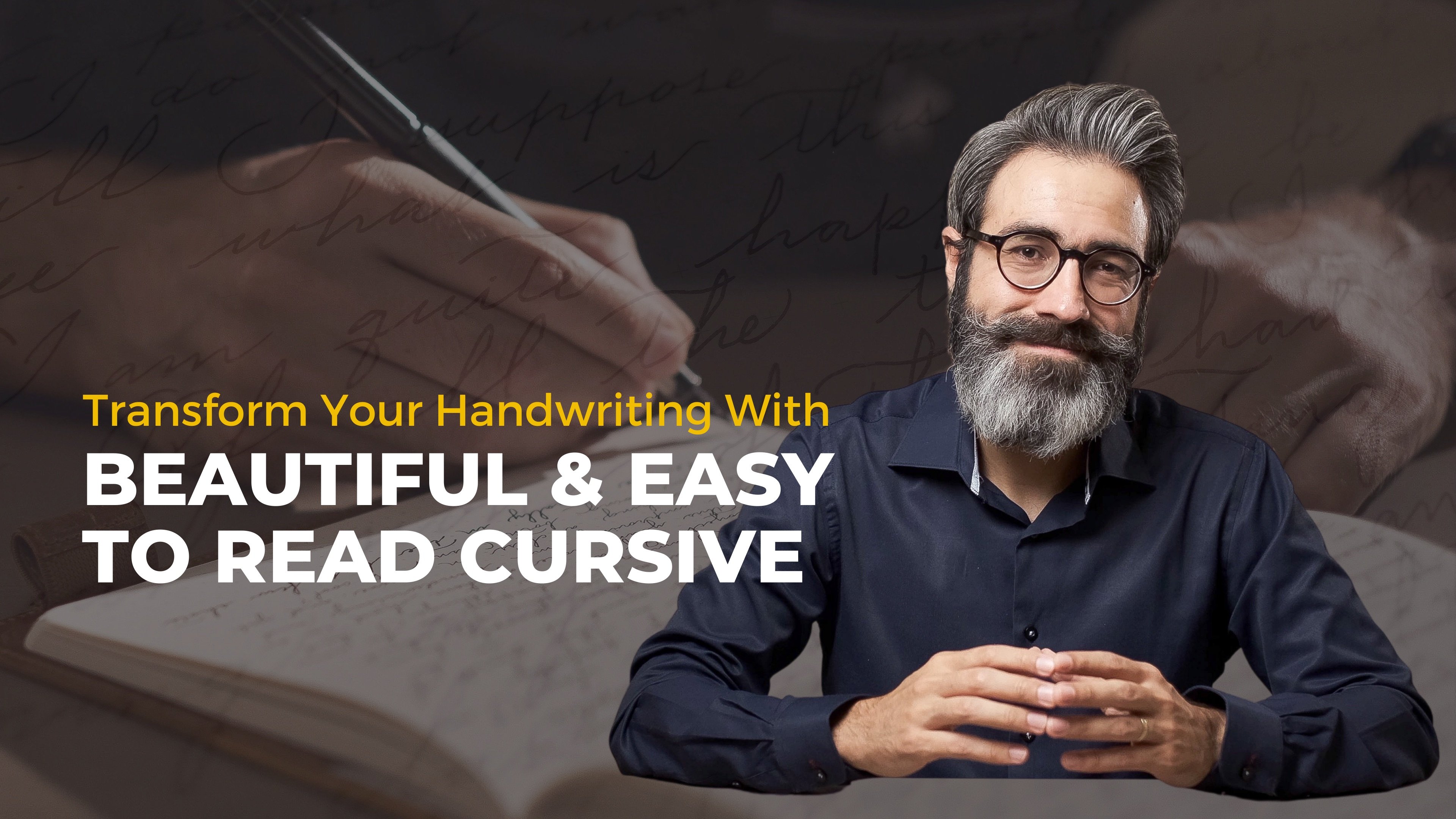
19. Closing Thoughts and Next Steps: You made it all the way to
the end, congratulations. I'm so happy for you. I think that learning
muscular movement or combined movement is not
for the faint of heart. It really is difficult, and requires a lot of time,
and consistent practice. But honestly, once you start to see some progress
and notice how your handwriting starts to transform into something closer
to what you really want, it is truly rewarding. If you didn't get there
yet, do not worry. Don't give up and
continue practicing. Remember that every lesson
you watched is packed with tips and advice that
you can revisit anytime. You could also go a step back, as a form of review, and take my other class. Beautiful and easy
to read cursive. That class is less about
movement technique, where it can teach
you more about the specific details that
conform each letter. Now that we are in the closing, let me tell you a
couple of things. The first one is
that you can always reach out for any
questions that you have about anything that
was not clear or maybe you want to share some thoughts,
ideas, or resources. We have a discussion
section here in Skillshare, where everyone is free to
connect with one another, and I'll be glad to help out
with anything that I can. Second, do not forget about
sharing your project. I can assure you that many
people, including myself, can be inspired by any progress that you
have done in this class. If you are specifically
looking for critique or help in a specific
aspect of your cursive, let me know, and
I'll make sure to give you a thoughtful response. Third, I truly hope
you do not stop here. Continue practicing, continue
trying to get better, trying to be more consistent, always trying to be present
in the process as you write, and I'm sure you'll continue
to improve as you do this. If you start to feel confident
with movement technique, then feel free to start
practicing writing on notebooks. For me, journaling has
been a way in which I have quickly improved my cursive
and overall handwriting. I feel like both things are a perfect match for one another. It has given a bigger purpose
to all my practice time. If you think this is something that you
would like to try out, by the way, I also have
another class on that. If you went through all
the lessons and exercises, another obvious direction for
improvement at this point would be to make the jump
into true Spencerian. This involves getting
a pen holder, ink, and some nibs. There's a lot of online
courses on modern calligraphy, but actually, there's not
so much about Spencerian. I think that is because it's not a very easy style to teach, and you need a very
specific skill set. But I have great news for you, if you've got all the way here, you are pretty much ready for Spencerian. Yes, it's true. You already got the
alphabet, the movement, now it's just a matter of incorporating specific
shading rules, being more strict
on letter forms, and learning more
about flourishing. That's the direction
that I suggest going. If you enjoyed this class
and found it useful, please make sure to leave me a review so that it can
reach many more students. If you would like for me to prepare a class in Spencerian, flourishing, or
anything else, also, make sure to mention
it in the review, in the discussion section or
when you submit a project. Honestly, I'm still in a
journey of learning myself, but I would love to
continue creating content that is helpful to
others, so just let me know. You can always follow me here in Skillshare for updates
or sign up for my weekly newsletter if you
want to keep up with any of my other personal projects
or creative inspiration. Thank you so much for your time. Thank you for watching, and I'll see you
in the next one.
 Robert J. P. Oberg, Creative - Filmmaker - Photographer