Transcripts
1. Introduction: For as long as I can remember, I've been interested in cursive, perhaps because of its elegant, classic, and artistic qualities. Or I may have grown
up watching a lot of period films and reading
classic literature. To think that somehow I always
associated with cursive. One thing is for sure,
I became fascinated by the idea of using this as a form of expression for myself. For several years, I used this handwriting style in
my own personal journals. Well, I thought I
was writing cursive. Some months ago, I started looking through previous texts and I was surprised that I
couldn't read half of them. Hi, my name is Robert. I'm a photographer, filmmaker, and I've also composed several
instrumental music albums. Anything that has
to do with art, creativity and productivity
resonates with me. I'm also a very visual person. So when I realized that
my cursive handwriting was extremely hard to read, I decided to do
something about it. I did a lot of research. I've practiced. And
in just a few days, the change was already noticeable. It's now been about half a year. And while there's still a
lot of room for improvement, I feel like my handwriting
has changed so much. I've gathered so
much knowledge and practice that I wanted
to share with you everything that took
me from something completely illegible to this, something beautiful and clear. The style I've adopted
is loosely based on Spencerian, an old American
script using the 1800s. I want to share with you my handwriting style
in a way that you can learn not only what
makes cursive good-looking, but also easy to read. Once you have this knowledge, you will be able to apply
it to anything you write, whether you already
know some cursive, and would like to learn more. Or if you do not know,
And would love to know, then this class is for you. Together we will look at
pen grip, position. We will talk about proportions. I will analyze all the elements that conform every single letter. And I'll give you
very practical things that you can start
applying right away. If you spend time practicing
what I teach you, you will see improvement. I promise. This is no ordinary class. I do not want to give
the impression that I'm an expert that knows everything about cursive there is to know. I'm in this same
journey with you. I just want to be your guide
in helping you to discover this new way of expressing yourself through
your handwriting. Let's do this.
2. Tools, Materials, & Guides: Welcome. In this section, I want
to talk to you about the tools and materials that you will be using
during this class. I also want to give
you some thoughts on the use of guide sheets. Actually, you can use
any pen or any pencil, any kind of paper for practicing your cursive handwriting. However, since we're at the
very beginning of the class, I want to tell you two things that will be very important. Number one, I think that you should try to make
it about the process. Learning cursive is not something that will happen
from one day to another. It's actually quite a journey
and not always an easy one. So it will require effort. The best that you can do is
enjoy every step of the way. Number two, I suggest that you make all of this about yourself. I think that cursive handwriting is something so personal. It really should reflect who you are and the decision
on the tools, the pen on the paper. It's just an excellent
opportunity to decide on something that you will
love and that you will enjoy, and that will motivate
you to write every day. For me, this is fountain pens, the one that I will be
using during this class. You do something that I got off from Amazon with good reviews. There's just something
about the flow of the ink and the way that fountain pens allow you to
feel the paper as you write, that I find so poetic, so beautiful, so
inspiring really. If you start to get
into fountain pens, you will find out that not every kind of paper
works well with them. You honestly cannot
go wrong with Roger. And that's why we're using
small Rodia dot pad. You can try lines or greets. I'll be using dots
because I believe they give good
amount of freedom. And freedom is
something that I am trying to incorporate
in this class a lot because I believe that
cursive in itself is a style that has so
many rules and so many, you know, it's so specific
about some many things. But I want you to
feel freedom at the time of learning and
at the time of practicing. So that again, it becomes something that is
closer to yourself. So for me, dots are
perfect for that. Now, let me show you something. If you can avoid
using guide sheets. Yes, you are reading correctly. Actually, guide sheets are a very popular tool for whenever you are
learning cursive. However, I feel like if you only practice all the time on guide sheets and guide
sheets and guide sheets, once you are in an
everyday situation on, you'll have a normal
piece of paper and you want to practice
or write something, you will feel a little bit lost. And then you will
have to go through the entire process of adapting your handwriting
or re-learning. So I'm not saying
do not use them. I'm saying use them as
little as possible. There are some important
things that we can learn from guide sheets, which has to do with
proportion and size. Once we learn all of that, we can incorporate that into our own handwriting in
any piece of paper. And I will be covering all of
these in the next section.
3. Size & Proportions: Let's talk about the importance of the size of your handwriting. I also want to share with you some principles of proportions that are very
important for you to know before you
start practicing. Actually, I think
that the size of a handwriting is
something so important. And yet it's not mentioned a lot in courses of
penmanship or cursive. I personally like
to write small. And if you're like me, I have
two suggestions for you. The first one is that
it's okay to write small. No problem with that. As long as you can see the shape or the form
of each letter clearly. If it's too small and you cannot see the letters very well, then you may be learning
with some bad habits. And then if you ever need
to go a little bit bigger, you will have some trouble
or the letters will suffer. It's always easier to go from bigger to smaller than
the other way around. So if you'd like to write
extra, extra, extra small, I suggest that you go
a little bit bigger and then adjust it
as you go along. A number two, again, if you'd like to write small, a highly suggest that you use a pen with a fine
or extra fine nib. This will allow you to see every shape and every line
with much more definition. And by the way, in
this style of cursive, usually the thinner the line, the more elegant the
overall look is considered. Of course, this is
something subjective, but it makes me feel better about using an extra fine pen. Now let's look at something. This is the size in which I
write most of my cursive. The paper is notepaper, which means there's five
millimeter space between dots. And my lower-case letters are about half the space
between those two dots, which means 2.5 millimeters. That's pretty small. You will
have to read it right now. I know that he's too small, but I just want
you to have a feel for how the text looks. I am skipping half a line
between each line of text. If I didn't escape
that half a line, then my size of my text will have to
become a tiny bit smaller. And it will look like this. So in this text, I just made a very
small adjustment to the size of my handwriting
is just very small. But as you can see, the difference in the look, It's pretty big I think. And also here I
didn't skip any line. So everything looks
a little bit more crowded, a little
bit more tight. Some people prefer this, and some people prefer this. Is okay. I know it's just a
matter of preference. I just wanted to show you
how big of a difference, something as a tiny
bit of a change in the size of your
handwriting can be. Now, how did I decide
on my handwriting size? How can I adapt it
to different spaces? Depending on the situation? This is not something random. This is not something
that I'm just guessing a psycho
or just by feeling the cursive handwriting style
that I will be teaching you is actually
based on Spencerian. And Spencerian is style. That is, pretty old school, has a lot of rules about the angle and the space
and the proportions. And while I do not follow
every rule perfectly, I still think that knowing about the principles of
proportion is something extremely helpful for you
to decide the size of your handwriting depending on the space that you
have available. So let's look at the
guide sheet that I showed you in the
previous section. Before. Anything else? Let me tell you that this
is called the baseline. This is the waistline which the limits the size of a
lowercase letters. These are called descenders, and these are called ascenders. These guide sheets specifically is for Spencerian cursive. This means that
there are two spaces for the ascenders to go
all the way to the top, or the descenders to go
all the way to the bottom. There are exceptions, of course. Like here we can see
in the letter D, but we will cover all of them
as we go over our alphabet. For now, I just wanted you
to see how the size of the letters comes from dividing the space into
thirds, basically. So there's 123 parts to the top, then there's 123
parts to the bottom. If we know this, we
can use it to give sized or handwriting accordingly wherever
we are granting. Okay. This is a text that I showed you when I
didn't skip any line. To write like this, I
had to mentally divide the space between two
dots into thirds. Let's see the letter
L, for example. The letter next to it is just
about a third of its size. This is too small for me and
I feel a little bit more comfortable by grinding
just a tiny bit bigger, closer to half the
space between the dots, not a third of that space. If I tried to do my
letters that size, then I didn't skip a line, integral BMS because
for example, this descender will have to go all the way to
the bottom dot. And we can see that in
the other sample text. Here is a page where
I skipped half a line and I am following
the same principles that I showed you
on the guide sheet. Here we have a y and
it gets all the way down because of this size. So we're seeing the same
rule of thirds here. When I'm reading on lines, I have a little bit more space
and I don't skip any line. Decides is just great. So it will vary depending on the medium where
you are guiding us, find the size that
makes you comfortable. And then you can adjust all the proportions
by knowing this. And by the way, when I say
that I skipped half a line, I mean that I started
one line and the dots, the next one is
between the dots. The next one is on
dots and so on. I think it's very
important to talk about size and proportions. It's something that will highly influence the look of
your cursive handwriting. And let's be honest,
maybe one of the main reasons that we
are learning cursive, if not, the main reason, is because your
looks so beautiful. On the other hand, by knowing all of these rules
of proportions, you can also tweak
them or change them a little bit to make
them more your own. I totally believe that it's
okay to break the rules, but just as important
it is to know them. In the next section,
let's talk about another very important element, which is the pen
grip and position.
4. Pen Grip & Position: In this section I
want to talk to you about pen grip and position. These topics may not
sound so exciting because you don't see that real connection with
the actual handwriting. But let me tell you, knowing some tips on how to hold the pain and how to position
yourself at the time of grinding can either help you to make everything easier or if you
do it incorrectly, it can make everything more complicated than it already is. So just to start off, let me tell you that my cursive handwriting
is based on Spencerian. Spencerian. These are very old
style of coercive that later evolution
into Palmer method, business permanent shape,
and so many other branches. But one thing that a lot of these older styles
of course have, have in common is that
they were written with our movement and not
with finger movement. By our movement. I mean that the letters
were formed like this, but this muscle and not
so much with the fingers, I personally do not
master our movement yet. And I don't think it's as
necessary as it used to be in other times because they are movement is extremely
useful if you want speed. Or it's also extremely useful
if you are running for very long periods of time and you don't
want to get injured. I'm okay to take a break whenever I'm writing with
my cursive handwriting. And I don't need speed
because when I grade, I like to enjoy myself. So I do not call my
cursive handwriting Spencerian because this is such a foundational part
of these other scripts. And I know that I'm
breaking the rule with that being said. I still think that knowing some elements that come into play with our
movement is important. So let's start with
how I hold the pen. I use something called
the tripod grip, which is I lead my pen
rests on the middle finger, put my index on top
or my thumb here. I try not to let the pen
go totally to the bottom, but actually try to keep it in line with this last knuckle. And when I put my
hand on the paper, I only use the last two
fingers traditionally again, this could be for gliding
around the page when you write why you do it like this. And in an angle, what I tried to be very careful of
is not a restaurant. My greased or my palm on
the paper as I'm grading. This way, I have no trouble when I get to the border with page and then I have
nowhere to rest. So I think he's a very good idea that you tried to get used to those not to rest on the side of your hand
when you regret, because without you
knowing you will start to hold it harder or
put more pressure as you tried to get
the shapes right by putting your last two
fingers on the page. It's kind of hard to press too
hard. We are getting hurt. So you will know
when you are putting too much pressure
does what I mean. It kind of forces you to
write in a relaxed way, which is extremely important. The same, we're not
putting the pen all the way inside
here because this will also put too much pressure
on the fingers as you know, you want it like
this. More relaxed. You can ride and
not feel any pain. Another tip that I
can give you for wearing in a more relaxed
fashion is to use your left hand to hold down the paper as you ride
or put it on the table. The thing is that
you can press with a left hand down and
take some strings away. You would otherwise be using on your right hand as you write. These kinda helps you
balance our strength. Another way that you
can use your left hand, of course, is by moving
the paper as you write. We will have a comfortable area where we are making
the shapes and the forms without having to figure out how to
move your arm around. What if I was reading on
a bigger piece of paper? I will probably use my left
hand to move this around instead of trying to move my body or my arm
around to fit this. So the left hand is also
very useful for that. So just relax your
arms, relax your body. Do not be totally on top
of the page like this. Put your hands like this, and try to figure out what's the position in
which you are more relaxed? I put my arm a little bit
above the elbow on the table. I'm not exactly on the above
or a little bit above. And I make sure that I put
this page on an angle. I don't want it totally
straight to me. I want it on an angle. And when I do all this
lands and all the shapes, I make, all the lines
pointing towards me. Because if all the lines
are pointing towards me, when the moment that I
straighten up the page, there will be these
consistent inclination in all my letters. Okay. So just as a quick summary, the tripod grip, the last two fingers when you put
your hand on the paper, the left hand to
bring some balance, holding the pen with the last knuckle and
relax as you go, right? That's it, guys. I mean, all of this of
course is optional. I'm just giving you some suggestions that
have worked for me. With that being said
in the next section, I will give you an
introduction on how well will be teaching you all the
letters of the alphabet. Now also give you some advice for making the best out
of your practice time.
5. Practice, Overview, & Project: I know that you are so
excited to start writing. Before we go any further
in this section, I want to give you some
tips that will help you make better space
for your practice time. I also want to give you an
overview of how we'll be teaching you the letters
in the following lessons. This will allow you to make
the most out of this class. So in your practice time, I highly suggest that number
one, you write mindfully. Be in the moment. There's so many
distractions around us. There's so many things to do. Make use of your practice
time to disconnect yourself from everything
else and just focus on what you are
doing. Adult present time. Practicing your handwriting
requires you to be noticing bad habits and
trying to get rid of them. Or noticing how it is
that you have carried for years and also
trying to change them. For this to happen,
you have to be paying total attention
as you write. If you feel rushed or you feel like you need to write
something really quickly. I suggest you do not practice at that time your
cursive handwriting until you're already comfortable with all the forms and the
shapes of all the letters, number to make practicing
a daily habit. Give it a place, give it a time, and make it happen. Or maybe you already
have another habits like drinking coffee every morning or reading
a book in the afternoon. Tried to put your practice
time right after that. That way it will be easy for
you to remember to do it. So much of this has
to do with being motivated and seeing progress
in your handwriting. And you only have this
if you do it every day. In the following lessons, we will start going over
the entire alphabet. So I wanted to give
you an overview of how we will be doing that. I will be going
letter by letter, giving you some tips or advice
on how to get their form. And they're shaped correctly. In some cases, some
letters have variations. If that's the case, you do not have to know all the variations. You can just choose one
and try to practice that until you feel
confident with it. Little by little, we will start joining the letters
between themselves, then we will start
building words. And I highly suggest that you do not only
practice the letters by themselves because the whole
cursive look appears when you put them together into words and the words
into sentences. And here's something extremely important. As you practice. Try to be consistent with a
space between the letters. Try to be consistent with
the angle of your slant, and also try to be consistent with the
size of your letters. If you do this, your handwriting
will look beautiful. No doubt. Oh, and by the way, the
product of this class is to write a
paragraph or a poem, some texts in your
current handwriting. And after you have
practiced for some time, you can come back and grade the same text with
what you have learned. I am excited to
see your progress. Now. Let's start practicing. So get a pen and
a piece of paper. And let's do this.
6. abcde: Okay, let's start with the first five letters.
This is letter a. Very important letter because
it has a shape that we will see come up again and again as we progress in the alphabet. This is what I'm talking about. It's not a circle. It's not an oval. It kind of looks
like a water drop. Pay attention that the top side has more of a curve
than the bottom. If you do not watch
out for that, then you will end up with a
much more rounded letter. We are not looking
for so many curves or rounded angles in
these type of cursive. Actually we want sharper
angles and clean lines. My, that I also mean. Now we want to be able to see separation like this one here, which can easily go away if
we do our letter to rounded. And by the way, in this exit
stroke of the letter a, there may be a slight curve
upwards or downwards, depending on the letter
that will follow. Let's run our letter
a on the guide sheet. Now, let's practice
joining several A's, one after the other one. You can keep doing as
many A's as you need. Just try to keep in mind those little details that
I've been telling you. Okay, now let's take a
look at our letter B. The ascender is a
curve upwards and then it goes straight
to the bottom. There is another variation where you can actually close this be. Most of the time I will
use the first one. Well, this is also an option. Yours whatever you choose, tried to avoid doing your
ascenders like this one. Watch out for that space
between the lines. Now let's do or be
on the guide sheet. So you can come in a
the, of the proportions. Let's try to write some bees, one after the other one. It's actually a tricky later, both because of that
initial curve in the ascender underweight
and the last row goes out. Now let's try Baa, Baa. As you can see, I do not mind lifting my pen
between letters, but you can also do it without. And now let's do our C. This angle here at the bottom is a key element of this letter. This how it would look
if we break it apart. Notice how there's
no strong curves we're trying to avoid. Once again, making this letter rounded as we were
probably taught in school. Oh, and here's the way
in which the letter C is traditionally written in
sprint, Syria and cursive. I personally do not like it. It kind of looks
like the letter E, but it's an option if you want to write everything
in one stroke. Now, let's do it on our gadget. Let's write CAB, CAB. Here we are joining our C to our a in a very
simple fashion. But for me personally, the joining between the a and the b is a bit more challenging. To do it with a letter C, bike riding, CBA, CBA. And by now you can probably
start seeing how each letter has a very similar
angle in their sheep, especially where they
rest on the baseline. Okay, Let's do our letter D. Remember the basic
shape inside the letter a? Well, our D, It's basically
that bought with an ascender. I sometimes use these
other variation, which is also done
in one stroke. If you use this one, remember to keep data center clean and good separation
between the lines. Letter D is one of
those letters that have an ascender that is a bit
shorter than the rest. I'll do it on the
guide sheet so you can see how it compares with RB. Actually, how about
we write Db, Db, Db, that stroke that links with the b is
always a challenge. So let's get it over with. The more we practice, the more our muscle
memory will develop. Now let's do D, C, a, B. Don't beat yourself up if you struggle to get
your letters right. I actually still
see lots of room for improvement in
my own cursive. As long as you see
where you're making mistakes and you continue
working on that, then you are in the right path and the improvement
will come with time. Okay, let me show you later, ie. If we break it apart, we see that the first
stroke is kind of like a mini version
of R be ascender. Then there's the exit stroke. Again. There's a bit
of a curve when we go up and then it goes
straight down, then there's the exit stroke
with only a slight curve. This one depends on the
letter that follows. Of course, let's do
our E one more time. Just as with our c, What we want is avoid
doing a rounded letter. We're looking for
that sharper angle and the bottom of our array. Remember to also keep
the separation between those lines because
we do not want it to look like a C
or something else. Now, let's look at it
on our guide sheet. Let's put together a, E, B, a. Practicing that
connection with a, B and C. Is there some similarity
between letters C and E? I also find it useful to practice them together.
So let's do that. And with that, we got to
the end of our lesson. How about we write the
first five letters we use learned one
after the other one. Since there are
only a few letters, Let's do them all
at least twice. Alright guys, I hope
that you had some fun. Remember to continue
practicing and let's learn the following five
letters in the next lesson.
7. fghij: Okay guys, Welcome back. Let's go through the
next five letters. This is our F. If
you pay attention, it starts just as
if you were doing an ascender for the letter
B, which we already learned. But this time it goes all
the way to the bottom. Then the bottom side is kinda like an inverted
version of the top. This stroke joins our slant exactly at the same
level as our baseline. Pay attention to the other
point where the lines cross one another
is our waistline. We should be the same tool as our other letters
without ascenders. You may have the tendency
of doing this in a curve, but avoid doing it, or it will mess with a look of all your angles in your page. I think that letter
f is really fun. I actually wanted to show
you two more variations. This one here is a
very minimal one. And this other one
looks pretty elegant. I think it looks extra cool, especially when
there's words that have two F's, one
after the other one. Let me write it on the
guide sheet for you. I'll be doing the most
traditional brush on here. Now, let's write C, F, E. Goofy, or first
word is a small word, so do it at least twice. Now let's do F FA. Here you can see
how the a and the E require a different stroke
to connect with them. And that's where the exit
line of our previous letter needs a tiny bit of a curve
upwards or downwards. Okay, let's look at our letter G. You remember that shape
from our a and the U. Remember that variation from letter f that I just showed you? Well, it's exactly
that same descender. Do remember that the point where our lines cross is
at the baseline, this small triangle shape here, gifts are G, a very sharp look. Try to keep the
separation there. Now, let's look at it on
the guide sheet. Again. Now let's grad g. G. Again. Here we're practicing
that connection which is different when
dawn for letter a, then for letter e. Now let's do g, b, f, g b, f. This is great to practice all those ascenders
and descenders. Alright, now let's do our age. Letter H is that same ascender
that we've done before. But now there's a new shape. It can look like an N p of data and how it
links to the right. These are the letter follows
the angle of our slammed. Because if we didn't do it, then it will look like this. It will give us trouble when we tried to put the
letter together. Remember we want clean
lines and separation. You may also find it useful to practice that shaped by itself. And you can do it like this. Let's see how it
looks. Negotiate. Now, let's grade age AD, AD. The way that the h connects with a previous letter reminds me
a little bit of letter B. But I also find
the exit stroke of the age easier to connect
with other letters. Now let's do H, H, H, H, H I, J. I have an idea. How
about we do if HB, those three letters
have a similar ascender and how it 3D connection. Now, let me show you a letter. I nuts it. Super simple. Actually composed by strokes that we have
already done in other letters. The first is a slight
curve to the top, and the other is a
sharper and tried to make these lines straight to the bottom and not in a curve. It's a very easy mistake to do. And one that I
constantly have to stop myself from doing it. But if you do that, your letter, I starts to look like a C and
it can affect legibility. You can practice those strokes one after the other
one like this. Here's our eye on
the guide sheet. And now let's write
eyes, ICE, ICE. This one is great to
practice consistent spacing. I normally leave the dots
on top of the eye until I finished a word just so that I don't interrupt the
flow or rhythm. Again. Now let's great idea. I D, E will get little r j. The last letter for this lesson. You sit a little bit familiar. Yes. That's like the first
part of our letter I, but this time with a
decentralized goals in a straight line all the way
to the bottom and then goes up and crosses at the baseline is just like
the descender of our G. We have already practice all these strokes
in previous letters, so these ones shouldn't
be that hard. Now let's look at our
J on the guide sheet. Let's grad J, J, D, E. And let's practice a connection with all the vowels we
have learned so far. J, a, j, e, j. From all these letters, you can see that the
one where I feel that I need to lift my pen,
Islam letter a. Not just a personal choice. Now, let's practice
all the letters that we have learned until now. From letter a all
the way to the j. How about we do this as a challenge at the
end of each lesson. We're not looking
for perfection. We're looking for consistency. I mean, you can look
for perfection of U1, but what I mean is that the goal should be to grade
in a way that you will enjoy. Alright, I'll see
you in the next one.
8. klmnop: Hi, welcome back. Let's start this
lesson with letter K. It goes like this. We have this ascender that we've
done before is a curve up, then straight down,
crossing at the waistline. And then we have this new shape, which looks like an R. Let me
show you a common mistake. Try to stop yourself
from doing this. If you're not careful.
That last stroke of r k starts to have some
overlapping lines. So as we make the shape,
we'll get to this point and then we will straight
out and downwards. That way, our K will continue to have clean and
well-defined lines. Let's read it on the gadget. Now, let's grind key. Kid, KID, Leningrad, Kabbalah,
K E BAB, BAB. Let's take a look at our L. You can see we have
already been doing this all along with
our ascenders. The one thing that
you want to be careful not to do it like this. Bold lines curved. We want to curve upwards and then a straight
line to the bottom. Now, let's do it on
our guide sheet. Let's write labelled
twice L a b e l. Now let's grab life
a couple of times. You also how we can get used
to all those assemblers. Let me show you a letter M. It just like this.
Remember this shape? Yes. You are correct. It's exactly that
same one from letter. Each one is to avoid making all the lines
one above the other. Space between each of
these shapes is important. Remember that they are all
leaning towards the right. If you have trouble with the M, You can practice that
shape by itself like this. After that, you can do some m's by adding some
separation between them. Now let's look at it on the
gadget known as great magic, MAG, IC, M a GIC, great meal, M, E a L. Again, now for letter N, you shouldn't have any
problem by now because it's just exactly the
same shape as our m. A very good
exercise actually, to loosen up your
hand is grabbing n m, n m. This is also great for practicing
conditioning space. Okay, Let's do our n
on the guide sheet. And let's write nine. I'll do this three times. Whatever you want to
have some extra form your steroid nine times. Okay. Let's find
again three times. Find if I in the how are you doing with
all your practicing and all of his letters? I hope you're all doing well.
There's no need to rush. Remember. Okay, let's
learn our later. Oh, that's it. Maybe when we were starting
with the alphabet, you had to stop yourself from making the letter a to round it. But now we actually don't
want that shape anymore. Nope. Here It's okay to have
more of a rounded shape. I guess this is closer to
an oval after a closet, you use have to add
that little exit stroke to connect with
the other levers. This exit stroke, by the way, will also make our goals more legible and will avoid
confusion with letter a. Let's write it on
the guide sheet. And now let's ride
long L o a n, a n. Let's do model M O D E L M O D E L. Let me show you a letter p. The first row is like if
you were making a letter j. And remember that
shape for more age, we just pull it
together and that's it. There's two things
to consider here. That sharp angle from
the first row should be a little bit
above our wasteland, which means is a
little taller than our other letters
without ascenders. There's different opinions
on how tall this should be. What I personally,
I'm okay with it. You're standing on a little
bit and the descender of our p is also shorter than the descenders
that we have seen until now. We will see that
with more detail when we do it on
the guide sheet. For now, I want to show
you two more variations. This one works if you want to do the main shape without lifting, or you can just throw the
descender in the simple way just with that line
and close this loop. Maybe these two are easier
to read than the first one. But I personally don't like the overlapping of lines
that happens on here. I think that the first p,
someone looks more stylish. Okay, let's do it on the guides. See how it stands out a
little bit on the top and it doesn't go all
the way to the bottom. You just a couple of rules that maybe doesn't make
a lot of sense, but I can tell you it does
affect the overall look. So I just tried to follow it. Okay, let's grab people. P, O, P, E and lazurite, pink PIN key. Now are you ready for granting all the letters so we
have seen until now. Okay. Let's do this. I'm actually not sure if I can feed them more without falling
out of the beach. And I did it. Okay, man, that was stressful. Alright, I'll see
you the next one.
9. uqrst: Hey guys, This
time we will start with letter U because this will allow us to practice more words as we learned
the following letters. So here's our u. As you can see, it has the exact same
strokes as our letter I. You can practice
letter U by itself. And I find that it's a great way to loosen up those
muscles in the hand. And if you want more
of a challenge, you can write u i, u. As you can see, the space
between the letters is a very important element to make your cursive
easy to read. Let me do the letter
U on the guide sheet. Now, let's grab minimum. D is a fun word because of
all those curves and turns. And let's do it again. From now on, we will continue to repeat each word as we practice, but we do not have to join them. I still want to write them twice so that you can try
to follow along. Alright, now and
his great ukulele. And let's do it again. Every time you do a
word for a second time, try to improve in detail
that you can notice. Okay. Let me show you letter. Do you recognize that
for a shape? Yes. It's the one in our
letter a and a. You remember our F? Well, our Q has a very
similar descender. But notice how is a
tiny bit shorter? Just like our p. Q has a couple of
variations like this one, which is a very simple version. Or there's another
one like this, which is how he was
traditionally written with all the variations of different letters that
we have seen so far. You can see that there's
groups or families. Like for example, there's
the minimum family. Or there's this one, which is a little
bit more common. I just wanted to give you
different options so you can mix and match according to whatever is your
personal taste. Now let's do our queue
on the guide sheet. Let's drag queen. And a saturated. Again, I'll be using the most
traditional variation. So you can see how different it is when we put it together
with other letters. Now, let's ride qualified. When I use this d at
the end of a word, sometimes I extend the last
stroke like this is like a simple flourish or more
like a floor is when I'll be. Okay. Now let's do the same work, but this time I will use
the minimal variations. Let's look at letter R. This one for me is a bit of
a challenge. I won't lie. You may be tempted
to do it like this, but I personally think it should be avoided because
it can look like a calligraphy S. And then
that will affect legibility. If you read fast or
not paying attention, you may also start writing
your arms like this, almost like a square. Again, try to avoid that and let me do it a little
bit bigger here we do our curve up
and then carefully do a turn here and pick
it up from the bottom. And that point where the
lines meet at the top, that's supposed to be a little
bit above our waistline, just like when we were doing our p in the previous lesson. You also have to be
careful not to do it super thin or it can be
confused by illness. Notice how I try not to
do very sharp corners in this last stroke is
a difficult letter, so just take your time
to practice it well. There's another
variation which I also use a lot when there's an
r at the end of the word. It can be done like this in separate strokes or all at once. This variation is also easier to connect
with some letters. Let's look at letter
O, for example. That's a tricky one. See how that R stands out a
little bit taller. If we do our other variation,
it's a bit easier. Now let's do our letter
r on the gauge it. Now there's great friend. Even though I'm taking my
time and I'm going slow, feel free to pause the video
if you need one more time. Less great break. Here you can see
that the b also has that special way to
connect with the r. And Liz are the same, but with the other variation. Harbor we grind unicorn. And less worried with
the other variation. See how this one also
has a tricky connection. These are with the n. That's something that you can also spend some time practicing. Okay, Let's look at letter S. This lesson seems to
be full of new shapes, but I think that this one
is actually very forgiving. You can even jump
over this line. There is no problem with that. Sometimes I even do
this as I'm writing. I don't know if I'm
breaking any rule, but what I'm trying to avoid, the overlapping of
lines that could happen if I repeat the
bottom stroke on the way up. Whatever you do, don't
make your S to fat. Do the first stroke. And when you get to this point, take a mental note of
where is your slant and then just follow that
as you go downwards. Let's do it on our guide sheet. And by the way, as you can see, that top sharp angle also goes out a little bit
above our waistline. Let's write singular. And know that we're trying
to practice all these curves and lines and angles
that create this style. But it's important
to keep in mind that more than
something I look fancy, we're trying to make
something that can be read. I mean, that's the point of handwriting after all, isn't it? And do it one more time. Now let's write closer. Here you can see how r
is connect with it all. And it doesn't totally close. As far as I know, there's
no way around that. And it also happens when
you connected with a B. So just be aware. Now let me show you
how I do letter T. I like this letter. And you can also
do it like this. The ascender in one stroke
is totally up to you. And then there's
this other variation that looks very modern. And I think it goes
especially well when there's a T at
the end of a word. You can even add
the other stroke to make it easier to read. When you're doing your tea. Tried to be careful not to
cross that line too low. You will break the
balance of the letter. It looks a little bit better when it's kind of
like in the middle. There's also this other
way that I also use a lot. Instead of crossing the
main ascender is kinda like a small curve floating above. Or you can cross your ascender
also with this curve, there's so many possibilities. When I say words that
have double tees, I like to do
something like this. Or you can even cross
them both at once. I mean, it truly is a fun later on I have to
mention that t, just like our d, is one of those letters with an ascender
shorter than the rest, as you can see here
on the guide sheet. Okay, Now let's write total. And let's do it again using the different way to
cross our ascenders. Liz, great, subtle. Okay guys, are you ready to write all the
letters that we have learned until now?
Let's do this. This was a tough lesson. I know we're almost there guys. I hope that you are doing well
with all your practicing. Just one more to go and you will know all the lowercase letters. I'll see you in the
following lesson, guys.
10. vwxyz: Hi, This is the last lesson
on our lowercase letters. This time we will be
looking at the last five. So let's start with the letter
V. I did lift my pen here, but you can also do
it all in one stroke. Give you one. The thing that you need
to pay attention to is not to do it like later. You here you can see
them side-by-side. There's a few times where this becomes a little bit confusing. Like when our U or V
comes after letter B. Letter U has these sharp
angle that the videos I have. Let's look at the
connection with all. I'd say that the most
important difference is that exit stroke. Let's put our u and v
before the other letter. Okay, Alexander V
on the guide sheet. And now let's grade obvious. Just to practice our connection
that we were looking at. And let's write versatile as we grade each letter
and we're paying attention on getting all
those details right? We're already thinking
of the letter that will follow where mental
age using a variation. And we are going
over the type of connection that will
probably be using. This is what I mean when I say that we need
to run mindfully, you have to be totally
focused on this. We can now let's do our w and w use those like a W. He has that same
exit stroke from our V, But other than that, it's
the same form as our u. I'll do it on a
gotcha one more time. How will we read? Awkward? And I'll do it again, and this time I'll switch the R and D for a
different variation. Okay, let's write metal. Okay, let me show
you a letter X. This is the most
traditional way to grab it. And if you have trouble with it, you can also do it
this other way. I personally like
the first one more. Let's write it on
the guide sheet. Now let's ranked boxer. The thing with these X's that you have to leave some space. So then you can come back
and add that last stroke. Let's try with the other one. Yeah, I mean it also works. Just choose whatever you like. Let's do big cell. And now let's learn letter Y. Here it is. It is like a v. And then
there's the descender, which is just like our G or J. Remember that it crosses at the baseline and remember
to leave this space here so that our lines
look clean and sharp. Something that I constantly
have to watch out myself for, e is not stretching
it out like this. This is sometimes hard to see until you add the descender, but then you will realize
this all are imbalanced. Let me do Y on the
guide sheet for you. Now let's bright yellow. Let's write giga byte. That is sometimes a
bit of a troublemaker, but we'll let her why it
behaves quite well actually. Now, let me show you
letter Z and lag. The leukotrienes letter
is very elegant, but at the same time, it's also full of new shapes. So let's break it
apart. This is the top. And the descender is different than all the other ones that we
have done until now. It doesn't go straight
to the bottom. It goes in a bit of a curve. And also notice that
this one doesn't cross Exactly and the
baseline. But below. A very common mistake is to
open the descender like this. So be careful with that because they will mess with
the spacing of your words. Now, I'll do it on
the guide sheet and less right? Zebra. Let's grant. Amazing. And amazing. You did it. Are you ready
for that last challenge? Let's rank all the
lowercase letters. I'm so glad that you
made it this far. In the next section, I'll
share with you how we'll be learning are uppercase letters. And I will also give you
some thoughts on that.
11. Introduction to Uppercase Letters: You made it through all of
the lower-case alphabet. Congratulations. Now before we jump into
the uppercase letters, I want to mention a
couple of things. I will not be writing this on a guide sheet as I did
with the previous letters. Here. I'm not so concerned
about proportions. I'm much more concerned
about finding the right balance with
the forms and the shapes. I am still riding
him my uppercase on a guide sheet to give you as a reference in the
resources of this class. But just to save a
little bit time, we will not be doing that
as I teach them to you. Another thing that I
have to mention is that part of this balance
that I'm seeking in my uppercase letters comes
by seeing the letters together with other
lowercase letters in a word. So I highly suggest that every time that you practice
your uppercase letters, do not do it just by themselves. Always try to form words. And by the way, usually, we will see uppercase
letters in two situations. One is at the start
of a sentence where I normally try to make them stand out
a little bit more. Maybe I will make them
a little bit bigger and I will not connected
with the following letter. And the second situation
where we will normally use uppercase letters is in
the middle of a sentence. In that case, I usually do not want it to
stand out so much, so I will not go
extra on the size, and I will try to
find the variation that I can connect with
the following letters. This is not always possible. Of course, some letters are totally disconnected
all the time, but it's just something
to keep in mind. And also this is just a
matter of personal taste. If there's a
suggestion, not a rule, I actually think of
uppercase letters as little accents here and
there around the page. But the overall look of your
cursive handwriting will come not from the uppercase
but the lowercase letters. So do not stop practicing those. I will be teaching you the letter as I use
it most of the time. And if I know of
some variations, I will also be
explaining that to you. I'm actually not doing a lot of calligraphic uppercase letters
with tons of flourishing. I use one something nice, simple and clean that I can use for my everyday
cursive handwriting. But totally feel free to go ahead and look on calligraphy, uppercase letters,
or other kinds of cursive and try to incorporate
it to all of this. It's all a matter of
personal taste and finding the way that you
can express who you are in the best way possible
for your handwriting. Without being said, let's jump into our
uppercase alphabet.
12. ABCDE: Hi, Let's get started with
our uppercase letters. Here's the a that I
use most frequently. As you can see, aside
from that last stroke, is pretty similar
to my lowercase a. I pretty much start and finish the shape of my letter in the same
way as a lowercase. I just extend the exit
stroke below the baseline. Here's a tip of
advice that will help you in several of the
uppercase letters. Try to imagine that
there is an oval hinder. This will help you with balance. Let's ride Amber, notice how I extend the
first stroke in that m. I do not mind to have some lines crossing one on top of the other
one like that. And you can even use this to connect with the
following letters like this. I'll probably use it like this in the middle of a sentence. I want to show you
another variation. I believe this one
is more traditional. Let me ride Apple. Following the same variation, you can make that
loop even bigger. And he gives you a
very different look. You can use it as a separate a, or you can also connect it. Have you been seeing people use a more simple version
of this one like this. Let me write Australia. Okay, Let's check out later be. So this is the main
form that I use. I normally extend
the last stroke a bit more and let it go. Kinda like underlining the word. Let's grind bingo. I can even make
that last loop even bigger and it will
look more impressive. Let me write beautiful. What if you don't want
it to stand out so much? You can easily connected
with your word like this. There's another
variation which you can use in pretty much the same way. Use a different entrance stroke. Let's ride broke. Let me show you literacy. Here. Again, you can
picture an invisible oval so that it can helps
you to give it balance our grade Chloe. You can also connected with the following letter.
Lending, right? Canada. When you do this connection, you'll have to watch out not to mess up the shape
of the letter. There's also this other
variation that sometimes I use. Lend me write cinema. There's one more variation
that I wanted to show you. This one I think is the
most traditional one. You see it looks cool and I
like to use it sometimes. Let's look at uppercase D. The shape of this
letter is not an easy 13 with imagining a novel
doesn't really work here because there
are so many loops and there's so many
different directions that the letter Google. One thing that helps me
to keep the balance look, is that I like to pay attention
to this area down here is kind of like
letting the belly of my D rest on the baseline. You can also try
simplified variation, which goes like this. You just leave it open.
Let's write Diana. And if you'd like
loops or you prefer something that will
look more fancy, you can try this
one. Our destiny. Okay, now let me show you
the uppercase letter E. It goes like this. Notice how this top part is slightly smaller
than the bottom. Let me grind analyzer. I normally leave a disconnected
even inside a sentence. But you can also try to join it with other
letters this way. Or if you like something
a bit more flourished, you can play with
that last loop. How bride, Emily. And that's our first five
uppercase letters, guys.
13. FGHIJ: Hi, Let's continue learning
are uppercase letters. First, let's look at letter F. I normally start this
letter with this land. There's a small curve at the top and then there's
one on the bottom. And this true cross in here, once I have this, is just a matter of adding that top part and I
tried to stay inside the invisible limit
that the bottom line gives me outright friends. There's also this
other variation. And this one is
easier for me because those small loops are
easier to do them. The big one from our first
variation are grind Frida. Oh, and I wanted to show
you one more variation. This one is similar
to the first one. I'll grade family. I guess there's
potential here to join the F to the
rest of the world. But I like to live
with disconnected. Let's look at letter G. Letter G is a good
one if you're trying to impress this exit stroke
here is similar to or B and the same way it can go
under the following letters. You can do it
straight like here, or in more of a curve. Let me write grace. Remember what I was
telling you about using an imaginary oval. Here is good to keep that in mind for bringing
balance to our form. And another thing that
I have to mention is that you have to
pay attention that this point where our lines meet is lower than the
top of our letter. There's one more variation
that works pretty well. If you don't want your
letters to stand out so much. It's kind of like a small
version of the previous one. More here you are staying
on top of the baseline. Lemming write G cell. And what this one is also possible to connect it
with other letters. Are great genius. I start my uppercase H
with a short curved line. There's a loop here.
And then this point, it is like I'm doing
an uppercase C. Notice the invisible over here, helping me keep the balance. Let me write harmony. You don't even have to do
that for a stroke in a curve. It also works fine like this. Hour ride home. Now there's also
this other variation that I currently
been on user load. Well, it belongs to the
same family as one, a variation that I showed you. I'll grade Hannah. Later. I has a shape that for a while I found
very challenging. It's like a rocket or like
a square, I'm not sure. I normally start the
later below the baseline. Body doesn't have to be the
same with this angle here. It doesn't have to be sharp
by using Nike like that, let me grab industry. You can also use this to
connect with other letters like this are grind Iceland. And if you're having
trouble with this one, I want to show you another eye, which is totally
different, but also works. Great. Imagine. I think
this is easiest to do. But most of the time I was
still trying to go for one of the others just because
I like some challenge. Okay, let's look at
our uppercase J. This one is very simple. It reminds me a
little over lowercase f. This one is facing
the other way. You can easily join it with
other letters like this. If you prefer, you can also use it without that connection. Our grade, Jessica. Let me great joy. And again, I'll try to
connect it with a word, juice. And wind down. We are at the end
of this lesson.
14. KLMNOP: Hi, Let's look at some
more uppercase letters. This time, I will
start with letter k. The k that I use
most of the time. It's actually very, very simple. I start with my slant and
when I get to this point, I'm making sure to go straight out and lower
than my baseline. This way I can accommodate some more letters on top of it. And it just makes
my k stand out. And at the same time it
makes it all very cohesive. Ion. Of course, this layer is very easy to connect
with other letters, in that case, and just avoid
extending the last stroke. There's one more variation
that I wanted to show you. Look at this shape. Does it
remind you of something? Well, we saw a
variation of letter h, which belongs to the same
family, so to speak. We'll see it again in
a few more letters. But for now, let me
complete this one for you. I am connecting in here. Well, you can do
the same without the connection just by
extending the last stroke. Are gray. Kangaroo. Now let's look at letter L. The
main shape is like this. I think it's different than all the others that we
have seen until now. Pay attention how this
small loop here is resting on the baseline
while the last stroke is on. The reason I do it
like this e so that I can start my
word on top of it. Just like we were doing
with our k. If you want, you can start a letter
from the baseline itself. This is something that I've seen a couple of times
from other people. Or you can start it in the
middle of the year like this. Adding one more term. L is a fun word and it
actually allows for a lot of playing with curves and
lines and flourishes. But I won't be getting
into that in this class. Let me show you a letter
M. Uppercase M is actually very similar
to my lowercase m. Just like with our
lowercase version, we have to be careful not to
make it totally straight up. That's an easy mistake to, we want it at an angle
leaning to the right. Nice. Send this last stroke here a little bit
below the baseline. Swat the letter stands out more. I am not thinking of
the oval shapes here. I'm just doing a short extension with a tiny bit of a curve. And I also like to have a little bit of space
in this loop here. You don't have to why
you think it looks good. You can easily connect
this M with other letters. Let's write mindful. And there's another variation. If you like, sharp angles, you may like this M
are great melody. This m follows exactly
the same principles as our previous variation on
regards to the last stroke. We can also connect
it like this. Right? Medicine. Uppercase N should not be a problem
if you already got your m. It follows the
exact same shape. Let me grab Nicole. And you can also connect it. Our gray needle. If you want to do a
sharper variation, you can relate this. I personally really like to extend that last
stroke in a big curve. It just makes our
letter stand out more and at the same time, it doesn't break any balance. It just makes it
all come together, which is especially
useful because in this variation there's
no way to connect our n with other letters. Let's look at letter or this letter is almost as
if you were doing an oval. You follow a shape. Bodies are not close
it completely. Instead, you go in there
like that, outright oasis. Before we were imagining a novel to give balanced
with some letters. But now you actually
get to draw it. If you want to make it
send out some more, you can do it like this. We just extend the last stroke
and add one extra term. Ride. Olivia. I'll say that this o belongs more
to the calligraphy world, but I still like to use
it once in a while. There's this other
variation that is also used in learning cursor. Again, just like an oval body. The ones more loop over there in the top
and xy like that. I haven't used this one so much. But you just one
other option to have. Okay, Let's learn uppercase P. Let's look at this
variation first. I liked this little
boy at the same time, is challenging to get
the right balance here, the imaginary oval may be useful once again to
get the shape right. Lend me gripe brings us. I personally like
this first variation because picture in the Oval really helps me to get it right. But if you want something
that looks more simple, you can also try this
out ride Parker. And a very similar variation
can also be done like this. Are great. Phoenix. As you can imagine, there's no way to connect this letter with
others inside of word. At least not that I know of. I let me show you
one more variation. I start with this land and I add a small curve at
the top and the bottom, then I'll do the top part. I pay attention
that this big loop doesn't go past the
first line that I wrote. Our grade, Panama. There you go. Four different variations
for P. You can actually use a similar form of
these to make it be like this one that
we didn't see before. Or these two that
we had to re-learn. With all of these, you can already start
building your own alphabet in a way that works well together
and in a similar style. Alright, I'll see you in the next lesson for
some more letters.
15. QRSTU: Hi, welcome back. Let's look at our following five
uppercase letters. This time we'll start with Q. And it goes like this. British array, you just
looks like a number two, let me write queen. Why don't you pull
it together with other letters and make
a word out of it. It doesn't look like
a number anymore. You can also, of course, do we without that initial loop. You can even join it with
letters that follow. If you want something different. You can also try this variation. You just do the letter O, like we learned before, and you cross it with a
curved line like this. This one has no relation
with number two, so it may be less confusing. If you have a hard time choosing between
one or the other, then there's this variation, which is like the first one, but it almost closes the loop. Again. This May 1 be a good option if you want to avoid confusion with a number on men away. You can also do this other
variation for letter O. It will look like this. All right, quiz. Let's learn later. Are this one is very similar to our p.sit. But here we're just adding
one extra stroke like this. I think this is the R
that I use the most and I like how it looks with our
connection, just like this. I'll grade Robert again, but this time I will connect it. I liked the first one more. But you always have the option. You can always play with
these other variation if you like something
more rounded or that it looks a little bit
fancier outright, Rachel. And there's this
other variation. Do remember what I mentioned
before about keeping this loop within the
limits of our line. This will help us keep
everything in balance. And last but not least, There's this other variation, which is also very simple shape. The first one remains my
favorite variation novel. I'd really like to
do is like this. Almost closing that
circle. Our grades. Sarah. This is a new shape, so you may need to practice it a few times to get it right. Just remember to keep
an eye on your slant. So are these remains consistent with the rest of
the letters on your page? Here it is again, I
mean, just look at it. The curve makes
it such a class C and elegant letter are great. Sacrifice. If you want to connect it with the letters, you
can also do that. You follow the same strokes, but you interrupt the
circle and exit like this. Algebraic spin. Now allegorize serenity.
Pay attention. Hi, I'm leaving D
sharp angle out here. I've seen some people
trying to make it rounded and I think
it works either way. Letter T, I will normally do a very similar interest
stroke as I do with my age. And that's it. Super simple lemming
ride together. I've seen cases where this
same shape is used as a J. But my J installed a difference, so I haven't created
any confusion. You can also add a small
loop at the beginning. You still continues
to be the same shape. Our grade, Trinity. If you like that small loop, you may want to add
another one like this. It also works our grade teacher. Now, if you want
something different, you can also try these
other variation. I actually like to have these strokes one on
top of the other. And now great tomato. Maybe this t is the most
recognizable award. Now let's look at later you
start with the small loop. And when I go back up
and make sure that I stay below that interest stroke. Here. Once again,
it may be useful for you to imagine
that over like before. Just so you can have the
right balance in the letter. If you prefer something simpler. And without that
small intron loop, you can be curved like this
one to start a letter. This is how you will connect
it with other letters. These two variations were well, either with a connection or
without let me ride Uber. Now, our grade upset
with a disconnected you. Okay guys. Well, almost there. Just one more lesson
and then we'll be done with our uppercase letters.
16. VWXYZ & Numbers: Hi. In this lesson, we will look at our last five uppercase letters. And since we will probably go over the numbers really quickly, I will also include those here. Now, let's start with letter V. There's a few things that you need to be aware
with this letter. This is not a straight line. There's a slight curve and also the other side has a small curve that's closer to the exit. And here the bottom makes sure that it's
not a sharp angle. And this last exit stroke, I like to live with a tiny bit taller than the other side. Traditionally, it
should be shorter, but by making it a bit taller, I feel that it just helps me accentuate the angle or
the inclination or later. Once you get the basic shape
right, you can try this. It's basically the same, but we are extending that
last line all the way out. You need like a small
flourish that brings the world together in
a very stylish way. Our grade, Vanessa. And let me show you one
more variation here. What I'm changing
is use that first loop are grind value C, hide in and do the last
stroke taller this time, like I did with my first week. Works okay, especially
with this variation. Let's do our w. W,
as you can see, is quite different than our v, because this one has more straight lines and
sharper angles. Just like with our first
variation of letter V. I like to keep this exit stroke a bit
higher than my initial loop. Alright, let me ride waffle. You can also do that big
loop at the beginning, as we've done with
other letters. And W is also great for
extending that last stroke. Are gripe with me. You can play with
these two variations and make some of
their elements like you can do this more
and through loop will externalize stroke
or the opposite. And B entry loop with
a shorter exit stroke. For letter x, I start with this loop and
then do this shape. After that, I use in verdict
kind of looks like a 96. A little bit. It's simple and it works. It's a bit of a shame
that this is not a very common letter because
I really enjoyed doing it. You can also do a variation with a big initial loop
like we did before. And in this case, let's try
to connect it outright. Xylophone one. There's one more variation
that I want to show you. Remember our age? Well, this is very,
very similar. We use pull it all
closer together. Outright. X-men, CMU, me having a hard
time looking for words that I can use
with this letter. For letter Y. I just do it as if I were doing
later you well, here I go all the way to the
bottom, below the baseline. And I like to use
that last stroke to Wonderland part of the
word outright yellow. If you already know
they uppercase you, you just need to
add that listener. That's it. Yourself with are you, you can also start this
letter with a big loop. And let's try to connect to this time and
grinding yesterday. Sometimes I also do this shape with a
descender of my way. If you're into calligraphy
or flourishes, this letter with a descender may give you lots
of possibilities. I personally just like
to keep it simple. And ladies and gentlemen, we've arrived to the letter Z. Do you remember a lowercase? Well, you just have to do that top part bigger
and that's it. I'd like to make sure that these small loop is visible here. Again, this is not a very common uppercase
letter, but it's a fun one. And by the way, I normally
use it connected. Even though you could do similar things with the
descender as we deal with our y. Okay, and we'll
close this lesson. Let me show you my numbers. I think the numbers are
used are very standard. The one thing that
makes them cursive is that inclination and that's
more curves here under. Traditionally, dish will also be some size variation
with number 679. Why they're not
follow that rule. I just threw them all the
same size. Pretty much. Look at this eight. This
one is a bit different. Now nine, and we are done. You already got all the
letters and numbers. In the next section. I just wanted to
show you how I grind the sample paragraph
where it will all come together.
I'll see you there.
17. Sample Paragraph: In this section, I want to write a paragraph for you. This way. Everything that I have
been talking about, uppercase letters and
lowercase letters in size and proportion in space
and slant and all that, how everything can
come together. Hopefully, this will also make some of your
own questions clear. And actually, do you remember that
paragraph that I showed you when we were talking about size and proportion
of your handwriting? Yes. This is exactly that
same text you can find. These are the ones
where I do not skip any line in the
resources of this class. Feel free to download
it so that you can practice doing
your own version of these texts is a
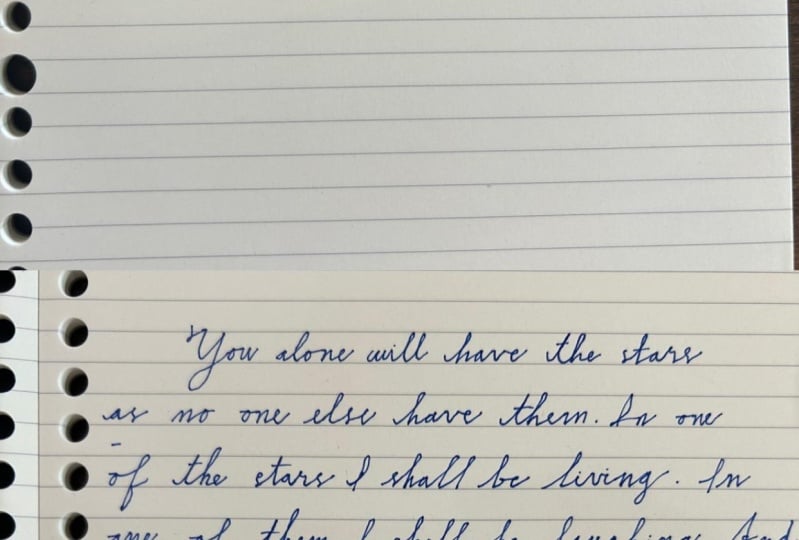
passage from one of my favorite books,
the little prince. So just stay with me
for about ten minutes. Feel free to play some
background music. I will be grading
in total silence.
18. Closing: You made it through all the
sections of this class. Congratulations. I really hope that you learn something new. I can tell you even myself, I have learned so much by going and analyzing
all the letters, forms, and all the shapes. I made so many mistakes
in front of the camera. Like you'd have no
idea. I'm not lying. I even see my oncology better now than it
was at the beginning of the class because the class forced me
so much to practice. In this section, I
just wanted to give you some closing thoughts and some suggestions to continue to improve as you go
forward in this journey. By now, you may already know all the shapes and
forms of the letters, but I still suggest
continue riding mindfully. Pay attention to all
those habits that you already have or the ones
that you want to change. Really, success in all of
these is only in your hands. I'm not there by you
telling you these, correct? Correct. You have to set
yourself goals and try your best to get there as
you continue to practice. I also suggest that you make
an alphabet for yourself. Choose one of the variations of different letters that I gave you and put it all together. And always, you can come
back to that as a reference. Another thing that I
have to mention is that as you practice
more and more, all of these letters will be comparable your muscle memory. And that's where you can
start introducing speed. Now, speed is important
because until now, you may just be
drawing the letters. Like What I didn't know
that class basically was using my fingers to draw
the letters slowly. That's why there's
some shakiness because I was doing
very, very clear. Now when you start to introduce, you may not be perfectly clear, but you have to always
keep in mind that you want your handwriting
to be legible. That's why I think
that knowing the forms first and knowing all
of the elements of them that I have been
telling you in all of this class is super-important
before introducing speed. Because you maybe breaking
more rules as you read faster and
that's totally okay. You will know which
rules you are breaking. You will know what next
time I will try to do these are or these other
letter in a better way. But speed will truly make
your handwriting look like actual handwriting and
not just drawings. So grade letters,
Great, thank you. Cards, nodes, grocery lists, passage from the book that
you just read, poems. For me, journaling is just the perfect practice for
this kind of handwriting. And every time that
you write something, I highly suggest that
you have a piece of paper or a small notepad where you can write any word that you encounter that is giving
you some difficulty. That way, you can
always come back and practice those
by themselves. And if you feel like
you're getting stock, if you feel like
there's no improvement, you can always come back and
try a different variation. You can always try to improve
your speed and even more, there's so many resources online when some of
these older scripts, like Spencerian Palmer
method, business penmanship. And you can start to
incorporate more of the elements in all of these
in your own handwriting. In the end, it all
comes down to practice, practice and more practice. I am so happy that I had the opportunity to prepare
all of these for you, and I hope that you
find it valuable. Thank you so much for your time, guys, and I'll see
you in the next one.
 Robert J. P. Oberg, Creative - Filmmaker - Photographer