Transcripts
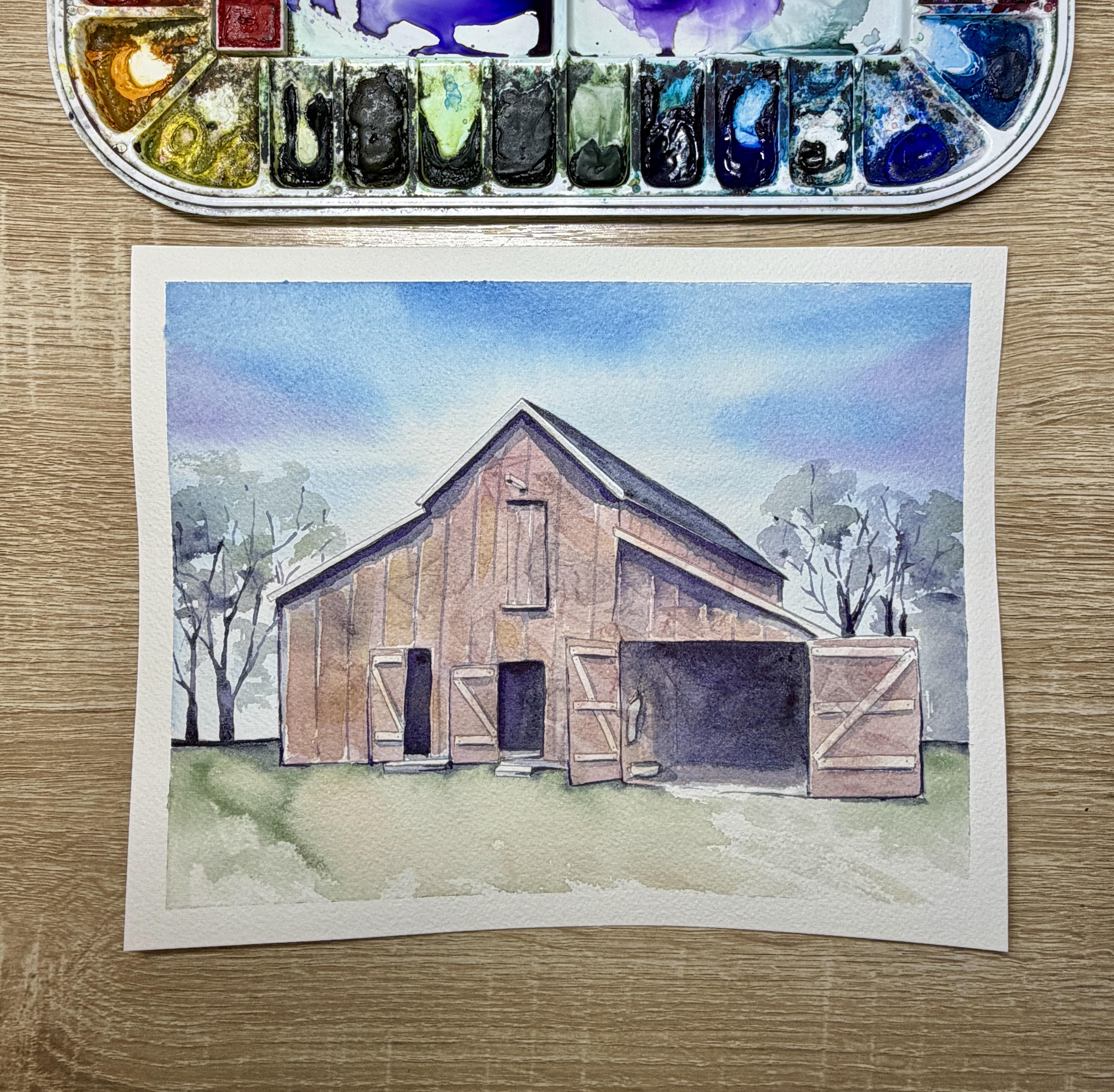
1. Intro: Wooden Barn: Hello, and welcome.
My name is Emily, and I'm an artist and instructor based in Madison, Wisconsin. In this Skillshare tutorial, you'll learn how to paint an easy wooden barn
using watercolors. We'll learn some
specific techniques for creating a wooden texture
using plastic wrap, and we'll also take
a peek at adding wet-on-dry layers
to create shadows, as well as glaze color and paint some really easy
trees in the background. You'll have access to a tracing template
included in this tutorial, as well as some color
reference photos and printout instructions that will teach this
tutorial step by step. So grab your supplies, and let's get ready to paint.
2. Supplies: Alright, before we get started, let's talk some supplies for
this wooden barn tutorial. So for the paper
that you choose, I'm using a cold pressed
100% cotton paper. This is arches, 140 pound paper. I am taping it onto
a plastic board, using painter's tape or
using a watercolor tape, such as Qie hub, on all four edges, making sure that I
have an even amount of tape on the paper
and on the board. And then I'm also
using my watercolors, which are Daniel Smith, you are going to need a
few different colors. You're going to need a red, and you can use a magenta,
if you would like. You're going to need a brown, like a Piamantt genuine. This is a warm brown. You're also going to need a carbazol violet and an indigo. We're going to use those two
colors to create a shadow. Or you can use any other
colors that you would like to create a shadow color
such as shadow violet, or you can mix your own grays
for that color as well. You can use some blues
and purples for your sky, some greens like a sap green for your foreground and also for your trees in
the background. You can find a full list
of the watercolors, the specific Daniel Smith watercolors that I use
in the supplies guide. For our brushes, we're going to use a variety of
round size brushes. For the majority
of our painting, we'll use a round size four. You'll also need a
slightly larger brush. I'm using a silver limited
golden quill brush for painting the sky, as well as for wetting our barn. And then you might like a size zero or one detail brush for some of the trim and for some of the small shadow
work in the background. Lastly, you also need some plastic wrap for
creating the wooden texture. I'm using just
regular plastic wrap, and we'll need to cut it down to roughly the size of our barn. Once you have all
of these materials together, let's get started.
3. Wet on Wet Sky: Alright, so for this tutorial, I have started by printing off my eight by ten inch template of the wooden barn onto
Arches cold pressed paper. It's important that you're using a high quality 100% cotton, cold pressed paper for
this itorial since we are going to be doing
a lot of wet on wet. So I have it taped down onto a plastic board for painting. And now you can see
that I'm wetting the sky using clean water. So I want my sky behind the background to be lighter
than my wooden barn. The reason why is
because if I have my sky darker than
my barn color, I know my barn is
gonna be quite dark. And so if it's darker
than my barn color, it's my barn is gonna kind
of fade away into the sky. So I'm wanting the
color to be light. I know that already. I'm wetting completely up to my barn, and I'm making sure
that I have it wet, but it's not dripping. Um, next, I'm going to
take some palo blue. You can really use
any blue here. I'll take some on my
large quill brush, and then I'm mixing it out
onto my palette first, so I don't get any
really dark blue blobs. And I'll start at the
tip top of my painting. I'm lifting up the painting slightly just so that I
can have gravity help. And I'm coming in from the edges with these little
swoops coming into the edge, from the edge, and I'm not allowing that blue to come
completely to the barn. So this is going to create the illusion that there's
clouds behind the barn. And since I have
the wet background, that blue is going
to just nicely blend and merge into
the water background. Now, I don't want to
overly mix my blue out, so you can see there's
still quite a lot of almost shapes here
in the background. So I wet my brush, cleaned it off,
dried it slightly. And now I'm just coming back in, and I'm fixing some
of those shapes. But I'm not overly blending
because I do still want the dark blues to stick out and the light blues to stick
out and the white space. After I mix that out
and I blend that out, then I can go in
with any sort of accent colors that
I'd like to add. The only accent
color I would not add while the blue is still wet is any sort of yellow that's
going to mix to a green. But anything like a
purple or a magenta or a pink is going to work really well for a little
accent in the sky. Now, I'm coming in in just
two spots in the sky, one small spot on the right, and one small spot on the
left with that purple. I don't want to overcomplicate
the background. I'm just adding a little
extra color here. And now, this step
is often overlooked, but I think it's really
quite important. I'm taking a smaller brush. I'm done with
laying on my color. And I'm taking a
damp, small brush, and I'm coming and I'm dragging that blue immediately
up to the barn line. So sometimes when we do
wet on wet backgrounds, we omit this stage. And then there's a
slight little ring of water where the color does
not touch after it dries. And that's because the water
will often repel the color. And so we have to come in
with a brush and just make sure that that color is touching
the edge of our object. And then that way,
we're going to have really nice clean edges. Just make sure that you do not introduce more water
at this stage, so you notice I'm constantly drying off my brush
with my paper towel. If I do introduce
water at this stage, I am going to get blooms.
4. Wood Texture with Plastic Wrap, grass, and roof: Alright, so I gave this guy
a little bit of time to dry. And now that it's mostly
dry to the touch, I am going to prep
my plastic wrap. Now, we're gonna be
using plastic wrap here for the barn wood texture. And so I want to cut a piece of plastic wrap so that it's
roughly the size of my barn. If I use plastic wrap for a
large too large of a space, I run the risk of pulling the color from the plastic
wrap into the background. And so, although it doesn't
have to be perfect, you'll notice that I'm
cutting my plastic wrap into two different shapes so that I can just cover
the front of the barn. When I'm using plastic
wrap for creating texture, I'm remembering that
the plastic wrap is going to create lines of texture where these
lines are dark and wherever the plastic does not touch and lifts
up from the paper, it makes it quite light. So when I'm adding my
colors onto the barn, I'm trying to get a
medium transparency. I don't want very dark colors, or otherwise, that texture is going to be
really, really dark. I am going to start by wetting the whole
facade of my barn. I'm not going to add this
texture into the roof. So you notice the
little sections, the little tiny section
of that overhang there. I'm not going to paint. But I will paint over the windows and the
doors where it's really, really dark and also
up to the floor line. So I'm using just
clean water for this. My waters slightly tainted
from the sky, and that's okay. Alright, now I'm going to
choose some colors for my barn. I'm choosing all woody colors. So the first one is a
rinocrodon burnt orange. Any type of burnt orange that's not too bright and
vibrant will work for this. So I'm just dropping in some
water down orange here. And then I'm going
to come in with a few different
other woody colors. The goal here is to not
have just one color. I want to mix multiple colors to give it that texture of wood. So now I'm coming in
with a piainite genuine. This is a very warm brown that has lots of red
undertones to it. And then I'll also drop in a
little quinacridone magenta. Um, so sometimes I like to add these little accent colors
to wood and to rocks, kind of earthy mineral colors, because I think it makes for
a really good underlayer. I know that I'm
going to be adding some red on top of my wood. And so adding in kind of some
of these earthy oranges, magentas This color I just
laid down is an indigo. And so those colors kind
of act as this natural, very natural blend of colors. I'm not going to overly
mix these colors together. You notice that they
are quite transparent. Now, before I allow
any of this to dry, I'm going to lay my
plastic wrap on top. I'm going to lay
both sections down. And then after I
lay it down nicely, I'm going to make sure not to pull the plastic wrap at all, but scrunch it inwards. I don't want to push
and scrunch out, or I might end up scrunching and pushing the color
out onto the sky. So I'm going to kind
of just scrunch it as much as I want, and then I'm going to leave
the plastic wrap there so that it can dry slightly
for around 10 minutes or so. So after I leave it
drying slightly, you can see it's not completely
dry, and that's okay. I can lift off my plastic wrap, so I'm noticing you can even see the little bubbling
of the water there. And now I can leave the rest of that facade to
dry completely. But you can notice all
the really nice texture that that plastic wrap has left. So now I want to paint a
section of my painting that is not going to
immediately touch this barn. So I'm going to start with
the grass and down below, so I can give that barn facade just a little bit
more time to dry. I'm just going to
be careful to not touch or try not to touch an overlap the
front of the barn here. So I'm using my quill brush with some sap green and a very, very light touch here. I'm kind of using a
diagonal brush stroke. I am touching the um the area where the barn meets the grass. And then I'm pulling my brush out diagonally
so that there's a little bit of dry brush effect where you can see the
grain underneath. And now I can drop in some
colors into this wet section. I'm dropping in some
deep sap green. I might drop in a little bit of that quinocradone burnt orange, and then I'm going
to come back with a smaller brush along the
base edge of the barn, and I'm going to drop in
some even darker tones to really help give the illusion that the barn
is sitting on the ground. Alright, so I've got my colors
on the ground. I'll mix. I'm going to grab some
indigo, like I said, and I'll start at
that horizon line, and I'll add a little
bit of indigo on the horizon line while
my foreground is still wet so that I can
allow a little bit of that indigo to seep
into that foreground. And then I'll just outline
the base of my barn, and I'll allow some
of that indigo to just spread nicely
into the grass. Alright, so now I've given that barn facade
some time to dry. It's still not completely dry. So I don't want to paint
any of the dark shadows, but the sky is dry now, and so I'm going to
paint the roof first. I'm using an indigo
to paint the roof. I'll paint wet on dry paper. And then the same thing, I'll drop in some darker
indigo for my pan along where the roof meets the barn to give it a
little bit more of shape.
5. First layer of Shadows and Tree trunks: Alright, so I made sure to touch the facade of my barn to
see how wet it still is. And it is still slightly damp. I wouldn't say that it's wet, but I do think that
it's going to be dry enough to start
some of the shadows. Now, if there's any sort of wetness that you feel
on your fingers, it's probably going to be too wet for you to paint on top of. If you start to paint your shadows in the
doorways, using indigo, and you can see the
indigo starting to spread into the background, stop immediately and
use your paper towel, dab it off, and give it a
few more minutes to dry. So since mine is dry enough, I mixed some indigo, with water. And now I am painting
these shadows. Now, I don't need
these shadows to be the darkest that I
want for my painting. I am going to go over
this for a second layer. So at this point, I'm just wanting to
get down my colors so that I can map out my
painting a little bit better. Alright, so after I paint
the shadows in the doorway, I'm going to paint the
cast shadow from the roof. So I'm using my round
size four brush, and I'm using the
edge of my brush. Now, it's a very thick shadow. The shadow line does
not have to be even, so you can see that at the
bottom of this shadow, there are certain sections where it just kind of bubbles
out a little bit more. That's perfect. I do not want my shadow line
to be perfect, or otherwise, it's going to
look off in my painting. So I can vary my pressure
just slightly as I'm painting this cast shadow so that I don't have that perfect
line underneath the roof. Alright, from here, I'm going to take some of that
water down indigo, and I'm going to make
some slat lines that will represent my wooden panels
from vertical lines, starting from the roof
down to the bottom. Now, I'm still using my
round size four for this. If you do have a rigor brush and you'd rather use a rigor brush for this,
that's okay, too. The main idea here, though, is we want to keep
a really light touch. If any of those lines break as you're doing
your light touch here and you've got a
little space that's left where it's not
connected, that's okay. We're not going to
worry about that. We're also not gonna
worry if some of the lines are more
opaque than others, and we're also not
gonna worry about going over like that top window there at the very
top of the barn, we're not going to
worry about going over. I'm also making some closer
vertical hash marks lines down that section
of the roof there, where it's just a
smaller section of roof. If your little
lines got too dark, you can definitely soak them up with a little bit
of a dry brush. Know that we are
going to be doing a layer on top of this. So it's not we are going
to darken things up. Now I'm taking that same indigo, and I'm adding some
cast shadows under the wooden bar wooden
beams that you're finding. So in the upper window there, as well as the two by four
that's kind of sticking out and all of these
Zs on the doors, I'm adding these drop shadows underneath the Z shape
and on the right side. So I'm keeping it all
on the same side. I'm also adding some drop
shadows to the stairs below. Um, and once again, I'm using the same indigo. I know I can always darken up any spots that
need to be darkened. But like I said, I'm
just kind of wanting to place the shadows where
I know they would go. All right. So as we give that shadow layer a little
bit of time to dry, I'm going to start working on
the background of my barn. So in my original
reference photo, there are a few trees
in the background, and so I'm going to
add a few trees, but I don't want to make
these trees very detailed. I want to keep the
focus on my barn. So I'm mixing right now an indigo with some
carbazol violet, and I do still need it
fairly watered down. It's I would say it's like
a medium transparency, medium to dark transparency. And I'm going to
start with my base, my trunk of my trees. Now, I want to keep a very light touch as I'm
making these tree branches. And so I'm starting
with the base, and then I'm pulling
using my size four brush, and pulling some of the
smaller branches on the top. Now, I'm working upside down because I think
that it's a lot easier to be pulling lines down than it is to
be pushing lines up. You'll also notice that
on these branches, when I get towards the
tip top of my trees, I am using the slightest touch, and I'm even lifting my brush up from my
paper quite often. So I'm leaving space on purpose. The reason I'm doing
this is because I want my eye to connect the dots instead of
connecting the dots for you. And it's going to make it
look a lot more realistic when you don't have these
lines completely filled in. I'm also looking more at
the top shape of my tree. So I still want to have kind of this rounded
shape at the tip top. And once I have that shape, I can go back and you noticed
I was dropping in more of that pigment along
the base of my trees. I'm going to come over
on the other side and add a tree or two
to this other side. The hardest part about
adding trees and foliage to your paintings
is not adding too much. Um, it's very easy to
add too many trees, and then to bring the focus of your painting from your subject matter
to your background. And so, sometimes it's
helpful for artists to, um, sketch it out ahead of time
on a separate sheet of paper and sketch out how many
trees you want to add. Other artists like to set timers for them for the
background and say, Okay, I've got 5 minutes
to do my background. And so with the time restraint, sometimes they do
less than more. With this, I, um, literally just trying to
do these trees quickly, and I'm also trying to not overcomplicate it by
adding too many details.
6. Darkening your shadows, Glazing your barn color, and adding Foliage to your trees: Alright, will I let those trees dry before I add
the foliage on top, I'm going to go back to my barn painting now that
I have this really nice, deep indigo and carbazol violet already mixed
from my trees. I'm going to use that to
darken some of the shadows. So I'm starting with my
drop shadow on the roof, and I'm adding a second layer. You're going to notice that your indigo is going
to dry very light. It's much lighter
than actually I even expect it to dry
when I lay it down. And so I do always like to mix a shadow color for
my second shadow. Instead of using just indigo
for this second shadow, I'm adding that carbazol violet so that I can have a
more intense shadow. I'm also going to intensify
my shadows by dropping in some carbazol violet
while my shadows still wet. So in the sections of these doors where you would
imagine it to be the darkest, which would be that
upper right corner, that's where I'm dropping
in the carbazolviolet. And then I'm using
a damp brush to blend out that edge where the shadow meets the
highlight of the door. I'm using that deep
shadow to just outline some imaginary objects that are hanging
on the wall there. And then I'm also going to use that shadow for the
rest of my doors. My goal here is I do want quite a large contrast between my doors that are in shadow
and the rest of my barn. But I also want
to make sure that that shadow color is that deep dark shadow is brought into other sections of the barn, not just the doors. And so you'll see how I do
that in just a little bit. Alright, so I finished
with my doors, and now I'm bringing that
deep dark indigo and violet, and I'm adding some
accent darkness on some of the windows. So I'm going underneath some of these some of these
sections of the barn. And I'm going to highlight some of those beams and
bars that are in my barn. And this is going to
just help them to pop. Alright, so now
we're ready to add a colorful glaze on top
of our wooden barn. So I want to deepen and
darken this color of my barn, and I want to add
some red hue to it. So I'm going to do that by
glazing over everything. So my glaze needs
to be quite watery. So I'm adding anthraquinoid red and just a little bit
of pyomintite genuine. That's my brown to tone
down the red just slightly. And I'm creating this glaze, a watery glaze that then I'm going to paint on
top of my barn. Now, I'm not going to
paint over everything. I'm going to leave
these little Zs open so that the undertone
colors can shine through. And I'm also going to paint
along the vertical slats. So remember how I painted those vertical lines to create almost these
wooden boards. So I'm going to actually
just glaze on top of that, and I can leave a little
bit of paper to shine through so that it kind of gives this illusion that there
really are these boards. Now, this glaze can be
done multiple times. So if you wanted to start out
slightly lighter in color, you're nervous about
it going to red, you can definitely glaze with a more water
down red to start, let it dry completely, and then add a
second glaze on top if you want to deepen and darken that color
a little bit more. So it's a great way to keep
some of these texture, some of the texture from the
plastic wrap that we created with the first layer
by glazing on top, we're changing, we're
altering that color, but we're still
keeping that texture. So you can do this as
many times as you need to know that the layers do
need to dry in between. Alright. And the last thing
that we can't forget about is adding some little foliage to our trees in the background. Now, you don't need to add
foliage if you don't want to, but we're going to use a
watered down shadow color. I did add just a little
bit of green to this, but it's really
leaning more violet. And I'm using a dry
brush technique. So I'm holding my brush as
parallel as I can to my paper, I'm using the edge of my brush, and I'm creating these
large kind of blobs on the topmost
section of my trees. Now, I'm making sure that it's
really quite watered down. And before it dries, I can always drop in
some darker pigment. Now, this is going to
create trees that are kind of this illusion of
trees without having to paint individual um,
individual leaves. So like I said, it's quick. I'm trying not to
overthink this step. This may be something that
you practice ahead of time on a scratch sheet of paper so that you can gain a
little bit of confidence. And then while it's still wet, I'm dropping in some
darker purple and some darker greens just to accent those trees
a little bit more.
 Emily Marie Watercolors, Watercolor Artist and Dog Lover