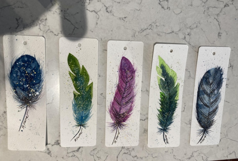
Transcripts
1. Intro: Hello everyone. I'm Natalie
and in today's lesson, we will be drawing
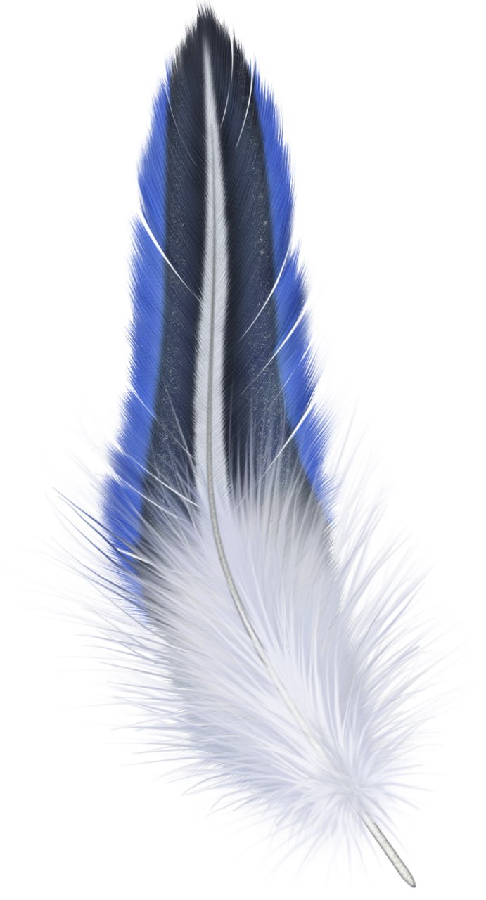
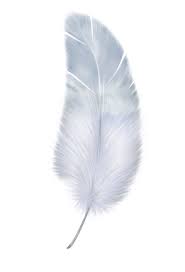
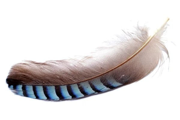
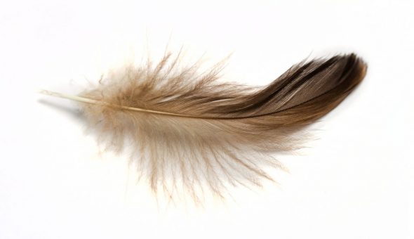
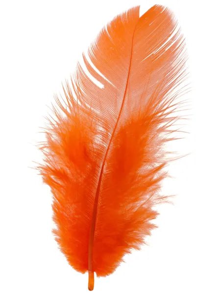
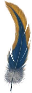
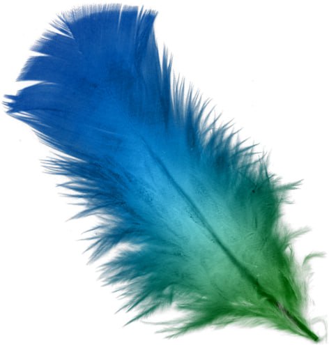
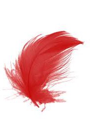
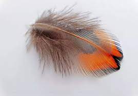
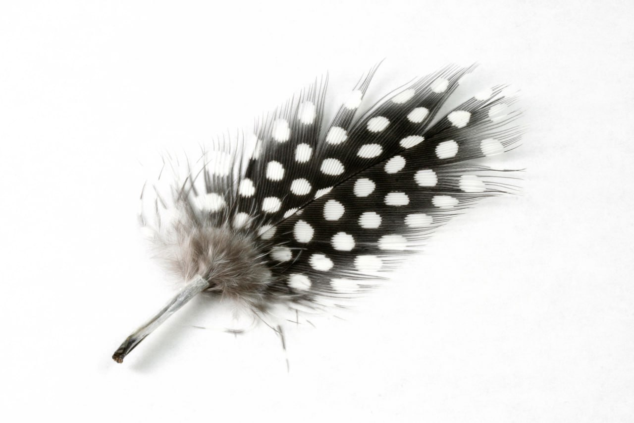
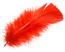
watercolor feathers. I have some photo references. I will attach them,
but honestly, they are only needed for clarity and general
understanding. You can imagine the colors
and shape yourself. I will show you how you can
beautifully modify them. After that, you can let
your imagination run wild. Well, shall we begin?
3. Pencil drawing: Let's start by securing the
sheets of paper at the edges. This will make it
easier for us to draw. The paper won't
curl up if needed. We can also use pin
to step as a stand, but I don't need it for now. If you don't have tape, you can use clips. They also hold the sheet in, please preventing
it from bending. Now I suggest placing the
silhouettes of feathers on the paper so we can confidently
walk with water colors. Here I want to place
a curved feather. I'm just making
light sketch now. There's no need to
detail the drawing. The pencil sketch is
just to understand where and what will be placed and what shape
the feather will be. Over here, I want to place a feather with a
slanted sharp edge. On top of the page, there will be a
feather of this shape. I want to draw it
with white spots. I've marked them schematically
to avoid confusion here, I'll place feathers of a more
standard and clear shape. If you really want, you can draw a tiny
little feather over here. All right, the pencil
sketch is ready. I like the composition, so I'm keeping it this way. In the next step, I'll move on to the watercolors. Note that the drawing turned out light and barely noticeable. It doesn't overpower
the watercolor. Don't press too hard on the pencil to maintain
the lightness.
4. Watercolor washing: Let's get started. I want to make this
feather to toned. I want to take a bright
green and feel it in, occasionally leaving small
stripes on the feather. You can even flow
the brush after removing the excess
moisture from it. This way you can achieve very characteristic
feather like strokes. And immediately we introduce
blue into the drawing while the green filing has not yet dried, obtaining
smooth transitions. If the paint has
already managed to dry, you can help mix. In some places, you can
add brighter spots. Again, I love the
mimicking such feathers. You can also take a clean
brush and add some water to get NE and characteristic
watercolor transitions. There is a light area formed at the bottom and that's
to our advantage. With a caligraphic brush, we make more present
light crystals at the end. It is necessary to finish the dark
brace of the feather. If you wish, you can add a few
dark strokes for contrast. Don't overdo the details to retain the lightness
of the water color. We move on to the next feather. I wanted to make it
really dark so we take very saturated paint and color the feather almost
up to the outline. Then I fluffed the brush and made several three hand
strokes along the counter, making the feather
more realistic. I blur the lower
part of the feather and a few bristles
and that sharp tip, if the feeling hasn't
dried completely, it will be very easy to
make dot by spraying water. My paint has already said saw a clean brush with
water will help me. I will be wiping the spots
first with the wet brush. I traces on the feather, then squeezing the brush, I remove the moisture
along with the pigment. Such facts work very well on cellulose paper and it's
a bit harder on cotton. I like this method, the spots look very natural. That's why in such situations
you can do without white. In the same way, you
can draw a line in the middle indicating
the base of the feather. I add a bit of texture here
to animate the feather. The next feather I want
to make very bright. I suggest mixing yellow,
orange, and red. First I take yellow, You can slightly the brush so that the counter is
immediately interesting. After you paint the
upper part with yellow, immediately proceed to orange
so that the paint mix is better if you didn't
make it in time. Then with the help of water help the colors create
a smooth transition. You can also add a few splashes, leave the lower eight of the orange wet so that it
mixes easier with red. If you wish. Ad dress
splashes or just clean water. Immediately you get
texture and light streaks for the next father, I want to add some
small stripes. First, I'll mix a
dense blue paint and apply it as a wash. I then immediately create
stripes with a dark color. In my case, paints
gray in some places. At this color along the edge, traditionally fill up the brush and make a few brush strokes. I want to add a little water
for more smoothness and an you can let the
pint flow down, blue, age, or remove
excess pint to add an element of
understatement later. You can easily add details
with a liner in this spot. Now I take a fine brush, load it densely with
pin so it doesn't spread out and
detail the center. After fluffing the brush, I add the final details to the feather and move
on to the next one. In this pot, I want to draw
a pink purple feather. I'll make the tip of
the feather bright, then mix in more water and add fluffiness and
casualness to the bottom. I also want to go along the entire feather
adding some detail. You can make several
brush strokes, slightly changing the color. Take dancer paint and linger in some places
detailing the father. But remember to stop in time. Well, there's only little left. Let's make the next feather
blue, yellow first. With the blue color, I want to outline a feather. You can even brush in prints to create an
unusual texture, leaving gaps add
yellow to the center. Then again with blue mark the fluffed base of the feather. By the way, it's easiest to make such fluffy strokes with
a calygraphic brush. I strongly recommend
getting one if you don't have it in
your arsenal yet. I really love this
brush and use it often as you might have noticed. All right, there
is space left here for a small feather.
Let's fill it in. You can make a
quick pencil sketch or immediately draw
it with watercolor. I'll take a common color and lightly outline the
top of the feather. Then I pick up lilac and smoothly blend the colors
directly on paper. I add a few standard strokes, the feather is done. That's definitely it. I'll draw the sheet now and
then add some liner details.
5. Details with liner: Let's start on the first father. I want to show the feature from the top where there is minimal detailing
with water color. From there, I'm drawing a
dashed line down the middle. There is no need to make
uniform strokes everywhere. Choose a couple of
places for this and diversify a
sketch in this way. To indicate a smooth edge, it's best to make
strokes from the edge towards the center here. I want to add a
bit of chaos here. I've added a few lines
along the strokes and distinctly mark the center. Done. Moving on to
the next feather. I'm emphasizing the center. Then on light background, I led several parallel lines. Relax your hand and with such light movements display the character of the feather. There are beautiful
smartest here. I won't touch or
overlap this part, preserving the watercolor
gradient on this side. I'll draw a couple
of lines next, I'm adding a few
dots in the center of spots to make
them move vivid. A few lines along the
father's counter that said I stop in time and move on to
the next one on this feather, I'll add just a few details
to emphasize its essence. I want to add anything where
the beautiful gradients are, but in this area, I'll detail the feathers out line
with these lines. I also draw a few casual
lines at the bottom for more fluffiness
on the left side. I'm leaving a bit, but I try
not to overload the sketch done such a mysterious
father turned out on the tiniest feeder, I suggest making several
neat parallel lines, creating a pattern. Let this fizer stand out from the others. You can also add a few dots, making it expressive and unique. That's all the feather
turned out very. I want to emphasize the smooth
dark edge on this side. Next I continue the lines
from the other side, mark the central
axis and detail it. I will make the left side dancer leaving more lightness
on the right. Let the feather
be heterogeneous, making it more
interesting to examine the patterns on the
top. Little feather. Turned out very interesting. Let's highlight them. I'm adding a few lines
from the bottom left, then detail their
upper right part. I denote the center of the feather with two lines leaving the middle untouched,
showcasing volume. I feel like adding a few
ovals and dots to this, creating a pattern. And that's I move on to the last
feather which I missed. I really like how the
water color settled so there will be a minimum
of pan details here. I'll just detail the center
and add a few lines in the form of strokes showing
the leaves structure done. That's how our set
of feathers turned out. Which one do you like the
most and can't we replicate? I'm attaching the
references I relied on, but I strongly urge
you not to copy that you see 100% Instead, add your own details and colors, parts of yourself
into your sketches. I won't hold you up any longer. Get started.
6. Outro: This concludes the lesson. I hope you enjoyed the process. Such uncomplicated sketches
allow you to immerse yourself in the creative process and practice from
a state of ease, draw, and most importantly,
do it with joy. I'm looking forward for your
colorful feathers. Bye bye.
 Natalia Nikitiuk, Capturing Life's Beauty