Transcripts
1. Welcome To The Class!: Hello, everyone. My
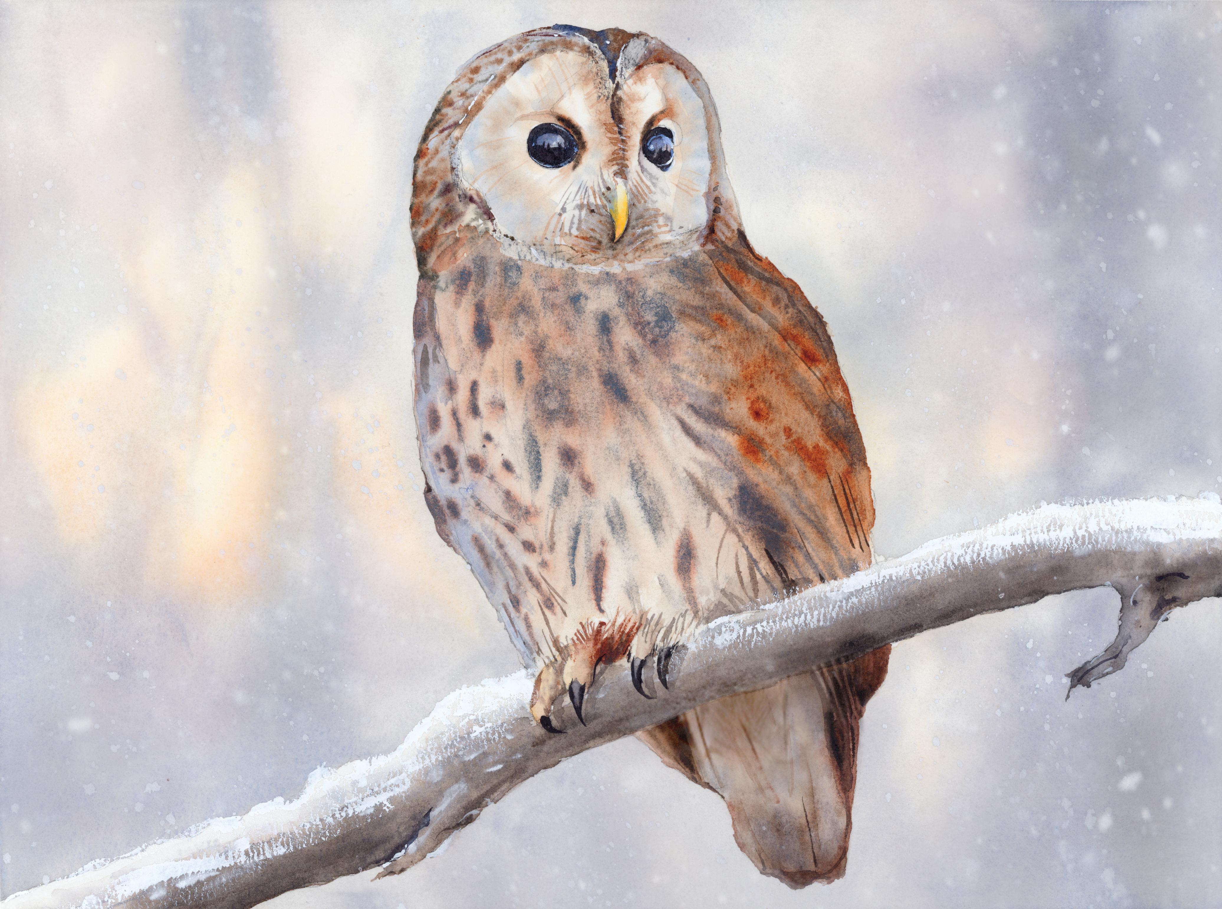
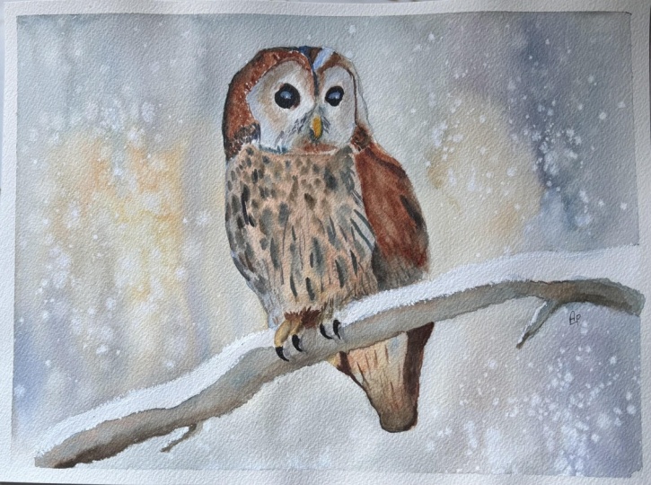
name is Will Elliston, and today we're painting a calm winter owl
in watercolour. This subject is all
about quiet light, soft edges, and the
beauty of simple shapes. We will explore how a gentle background can
make the bird glow, how saved paper and drops of water suggest
snow and breath, and how small accents
in the eyes and beak bring character
without heavy detail. Expect a limited wintry palette, subtle temperature shifts, and a restful composition that
leaves room for atmosphere. I've been a professional
artist for many years, exploring lots of different
subjects from wildlife and portraits to cityscapes
and countryside scenes. I've always been entranced by the possibilities
of watercolor. But when I started,
I had no idea where to begin or
how to improve. I didn't know what
supplies I needed, how to create the
effects I wanted, or which colors to mix. Now I've taken part in many
worldwide exhibitions, been featured in magazines, and been lucky enough
to win awards from well respected
organizations such as the International
Watercolor Society, the Masters of
Watercolor Alliance, Windsor and Newton, and the SAA. Watercolor can be overwhelming
for those starting out, which is why my goal
is to help you feel relaxed and enjoy this medium
in a step by step manner. Today, I'll be guiding you
through a complete painting, demonstrating a
variety of techniques, and explaining how I use all
my supplies and materials. Whether you're just starting out or already have some experience, you'll be able to
follow along at your own pace and improve
your watercolour skills. If this class is too challenging
or too easy for you, I have a variety of classes available at different
skill levels. I like to start off with a free expressive
approach with no fear of making mistakes as we create exciting textures
for the underlayer. As the painting progresses, we'll add more details to bring it to life and
make it stand out. I strive to simplify
complex subjects into easier shapes that
encourage playfulness. Throughout this class, I'll be sharing plenty
of tips and tricks. I'll show you how to turn
mistakes into opportunities, taking the stress out of
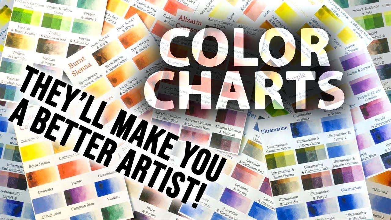
painting in order to have fun. I'll also provide you with
my watercolor mixing charts, which are an invaluable tool when it comes to choosing
and mixing colors. If you have any questions, you can post them in the
discussion thread down below. I'll be sure to read and
respond to everything you post. Don't forget to follow me on Skillshare by clicking the
follow button at the top. This means you'll be the
first to know when I launch a new class
or post giveaways. You can also follow me on Instagram at Will Elliston
to see my latest works. So, let's get started
and bring this silent, snowy moment to life with
fresh, confident washes.
2. Your Project: Thank you so much for
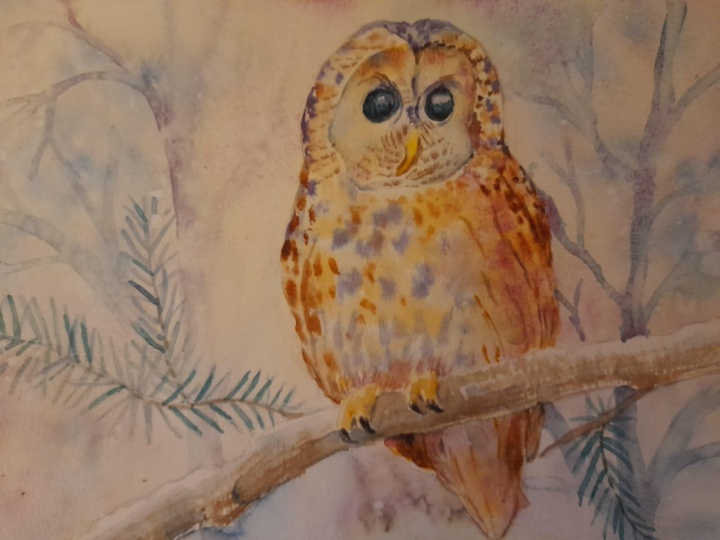
doing this class. Our aim is to capture
the essence of an owl at rest perched
in the falling snow. Think in clear silhouettes
and linked value masses, letting soft washes
drift to suggest plumage while the background
stays hushed and airy. Allow granulation and blooms
to read as feather texture. Then place a few crisp notes
where it matters most, the facial disc, the beak, and those dark reflective eyes. A touch or splatter can suggest snow while saved paper keeps
the scene bright and cold. Favor suggestion
over description and let the paint choose
some of their poetry. In the resource section, I've added a high
resolution image of my finished painting
to help guide you. You're welcome to
follow my painting exactly or experiment with
your own composition. As we're going to be focusing on the painting aspect
of watercolor, I've provided templates
you can use to help transfer or trace the
sketch before you paint. It's fine to trace when using it as a guide for
learning how to paint. It's important to
have the underdrawing correct so that you can relax and have fun learning the
watercolor medium itself. Whichever direction
you take this class, it would be great
to see your results and the paintings you
create through it. I love giving my
students feedback, so please take a photo
afterwards and share it in the student project gallery under the project
and resource tab. I'm always intrigued to
see how many students have different approaches and how they progress with each class. I'd love to hear
about your process and what you learned
along the way, or if you had any difficulties. I strongly recommend
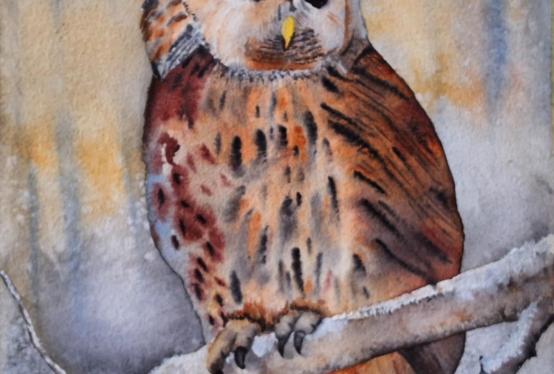
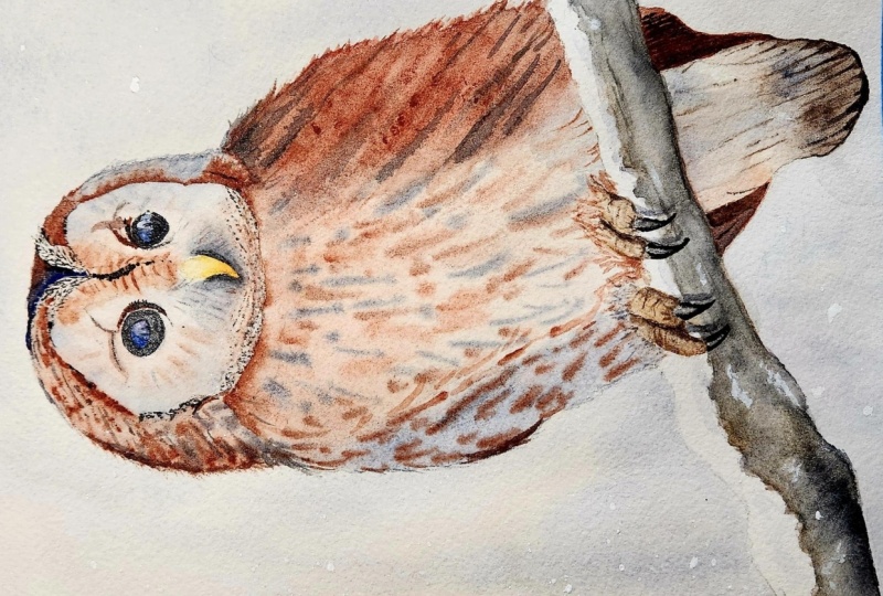
that you take a look at each other's work in the
student project gallery. It's so inspiring to see
each other's work and extremely comforting to get the support of your
fellow students. So don't forget to like and
comment on each other's work.
3. Materials & Supplies: Before we get started
with the painting, let's go over all the materials and supplies you'll
need to paint along. Having the right materials can greatly impact the
outcome of your artwork. So I'll go over all the supplies I use for
this class and beyond. They're very useful to have at your disposal and we'll make it easier for you
to follow along. Let's start with the
paints themselves. And like most of the materials
we'll be using today, it's a lot to do
with preference. I have 12 stable colours in my palette that I
fill up from tubes. They are Cadmium
Yellow, Yellow Ochre, burnt sienna, Cadmium
red, Alizarin Crimson, Opramarne blue, cobalt blue,
serlean blue, lavender, purple, Viridian, black, and
at the end of the painting, I often use white gouache
for tiny highlights. I don't use any
particular brand. These colors you can
get from any brand, although I personally
use Daniel Smith, Winsor and Newton
for Holbein paints. So let's move on to brushes. The brush I use the most is
a synthetic round brush like this Escoda Purl brush
or this Van Gogh brush. They're very versatile because
not only can you use them for detailed work
with their fine tip, but as they can hold
a lot of water, they are good for
washers as well. They're also quite affordable, so I have quite a few
in different sizes. Next are the mop brushes. Mop brushes are good for
broad brush strokes, filling in large areas and creating smooth
transitions or washes. They also have a nice tip that can be used for smaller details. But for really small details, highlights or anything
that needs more precision, I use a synthetic
size zero brush. All brands have them,
and they're super cheap. Another useful brush to have is a Chinese calligraphy brush. They tend to have long bristles
and a very pointy tip. They're perfect
for adding texture or creating dynamic
lines in your paintings. You can even fan them
out like this to achieve fur or feather
textures as well. And that's it for
brushes. Onto paper. The better quality
of your paper, the easier it will be to paint. Cheap paper cuinkles easily
and is very unforgiving, not allowing you to
rework mistakes. It's harder to create
appealing effects and apply useful techniques
like rubbing away pigment. Good quality paper, however, such as cotton based paper, not only allows you to rework
mistakes multiple times, but because the pigment
reacts much better on it, the chances of
mistakes are a lot lower and you'll be more likely to create
better paintings. I use Arches paper because that's what's available
in my local art shop. A water spray is
absolutely essential. By using this, it
gives you more time to paint the areas you
want before it dries. It also allows you to
reactivate the paint if you want to add a smooth
line or remove some paint. I also have an old rag or t shirt which I use
to clean my brush. Cleaning off the paint
before dipping it in the water will make the
water last a lot longer. It's always useful to
have a tissue at hand whilst painting to
lift off excess paint. Also, you never know when an unwanted splash or drip might occur that needs
wiping away quickly. I also have a water dropper
to keep the paints wet. When you paint, it's
important to have them a similar consistency to what
they're like in the tubes. This way, it's easier to
pick up sufficient pigment. A hair dryer is useful
to have for speeding up the drying time and controlling the
dampness of the paper. And lastly, masking tape. And this, of course, is just to hold the paper down still onto the surface to stop it sliding
around whilst painting. Also, if you plan on
painting to the edge, it'll allow you to create a
very crisp, clean border. And that's everything you'll need to follow along
with this class. Now let's get on and
start the drawing.
4. Preparing The Composition: So let's start off the
drawing using nice soft, loose gesture marks to s
map out where the owl is, starting off with
circles, blocking it out. Then marking roughly
where the branches. And now we can switch over to a finer lead pencil to
add a few more details. Trying to get that
outline the silhouette of the owl because the strength of this composition is the
clarity of the silhouette. Then we can start
working inwards. The little curves at
the top of the head. We don't want to
add these details until we've done those
gesture marks correctly. Luckily, I got it
right first attempt. But if you see any inaccuracies in
yours, just use a rubber. That's why we start off with
a soft pencil to begin with. And then bit by bit, we add more details. From top to bottom,
using my mind's eye with various
different references and practice sketches that
I've done beforehand, marking out where the claws
wrap around the branch. Then we can use a rubber to rub out those soft
markings we've done underneath because we don't want those appearing
on the painting. Just carry on like this
until you're happy to begin.
5. Warm Colours: So the first thing
we want to do with this painting is to completely wet the
background with pure water. So I'm using a large brush
to do this to speed up. But basically, we want
to wet every single area except the branch and the owl because we're going to paint the
background all in one, so it helps pre wetting
it to begin with, starting with a warm yellow
ochre glow, in a few spots. To create the illusion of
warmth because this is quite a cool painting actually
being winter in the snow. Having this contrast of
warmth coming through is a nice feeling to achieve and we do it using
wet on wet techniques. So it really helps, it's only possible if we pre
wet the paper to begin with. Now I'm adding a bit
of red and mixed in with this yellow ocho that we've already applied,
it looks orange. A bit more orange. And notice when I
go in this time, I'm not painting the middle. I'm going around the outskirts
of these yellow marks. Because if you think
about it when you look at the sun light source in general, it's brighter in the
middle and then it glows around the edges
as it changes color. So we've got this yellow
in the center and then adding this orange
around the outside. And because it's wet on wet, we can take our time with it. We can always add a
bit more water at this stage because
it's light pigment. We're building up
pigment bit by bit. We're not going too
bold to begin with. We are making the most of the water and
allowing it to move the pigment around with
soft brush strokes. Adding a bit more water there because I can see
that the shimmer, the reflective surface
had started to dry up. So I'm adding a bit more
water to give myself time. It's the inconsistency
that creates those ugly sharp
shapes that we don't want in this
particular scenario. Sometimes we want to create that unevenness when we want
to create rough texture. We'll do that on
the feathers later. But when we want a nice
smooth background, we want to keep the water
quite consistently, so it dries evenly. You can see because
it's wet and wet, it's already smoothed
out some of those edges. So I'm going back now to
re emphasize that glow. All warm colors at the moment. Think yellows, reds, oranges.
6. Cool Colours: And now we have those nice warm colors
placed on the paper. We can start cooling
it down just a bit, starting off with
neutral tint or black, just to kind of start things off in a kind of neutral tone. Now I'm adding ultra
marine blue into that to create that coldness. But I want to have a nice
range of grays here. So at the top, we've got a kind of blue, and at the bottom, you've got burnt sienna and
a bit of a lizarin crimson. So we're creating our own
kind of indigo color here. And using the tip of my
brush to make sure we don't paint over that
branch because I want to have a bit
of snow placed on that branch and also notice how I'm using this brush and applying the paint
around that glow. I'm not going straight over it. I'm following the curve of these warm brush
marks we did before. And you can see the light
reflecting on my paper, which shows how
wet the paper is. So we know if it's
wet like this, we're going to
achieve soft edges, and that's what we
want soft blendings. And because we pre
wet the paper, we don't have to be too
concerned about painting right up to the edge of the al
because it's already wet. The pigments will naturally spread we might have to encourage them a bit in some
areas to get extra even, and we can redistribute some of the pigments where
it pulls together because you can see the weight of my paper isn't
particularly thick. It's like mid range weight. So it is crinkling. It's natural for paper
to crinkle quite a bit. So where it does crinkle, there's going to be a little
pool of water on pigments. So if it comes too much, I'm going to have
to redistribute it. Now on the right hand side, I'm really going cool
using this cobot blue. And the mix between this lovely orange
and blue is lovely. So I'm keeping everything
soft at this stage, but not necessarily even. You can see some areas are
darker, some areas are cooler. And gray is the kind of middle
tone we've got going now. Now that all the blues have
mixed with the oranges, the majority of the tones in this painting in the background are gray, and that
was always the goal. But we've kind of
got a warm side and a cool side to
help create this kind of balance that's not
symmetrical, but it's balanced. It's got this kind
of harmony going on because orange and blue
are complimentary colors. And now as the paper is
starting to dry a bit more, these strokes that I'm applying now will hold their shape. So I'm implying some branches, some distant trees
that are still soft, but they'll hold their
shape a bit more. So it's like the sun is
creeping through these trees. The reason I want
them to be soft is because I want the focus
on the owl, of course. And when you think
of good photography, you have some areas, the subject that's
in focus and then the background is out
of focus. It's blurry. And when light shines
through, it's still blurry. So that's why I've tried to achieve on the left
the sun coming across. And there's still influences of that on the right hand side, too, adding a bit
of purple as well.
7. Falling Snow: Let's start adding
some darker tones now. It's all fairly mid
tone at the moment. This isn't going to be
a big dark painting. You can paint in
many different keys. You can have high key, which is very light
painting like this. Not many darks used, and
then you've got low key, which is very bold
and heavy pigments. And you can look around my
classes and see some are very bold and dark like my street
scenes or the candle. But this one is high key. And then you can
have mid key too. The owl will definitely be the darkest part
of this painting. But for the time being,
we're making the most of the whole stage of the water drying and
the pigment drying. So we've had fun with the very wet paper to begin
with, with those warms. And as it's starting to dry off, I'm thinking about
getting it nice and even. So I'm using my
brush to soak up, reabsorb where the water has fallen into the pools
and then putting on my sponge and then
going back and forth to really draw
out the unevenness, because at the moment, I want
it to dry nice and even. You can see there's a few hairs that have
fallen off my brush. I'm going to leave those until the paper is completely dry. If I try to get those
little hairs out now, it'll mess up the painting. And although it
looks distracting, seeing those hairs
on there, actually, when it dries, it doesn't
make any difference. You can just brush them off and it doesn't
affect the painting. So as comfortable as it seems
seeing those hairs there, just leave them on
until you're done. So it's been quite an even drying process,
which I'm happy about. There's no big pools
of liquid and pigment. And now it's about 60% dry. I'm using pure water and
splatting it on there and what these water splats
will do as it's drying. Is disperse the pigment
where the drop lands. If it was still very wet,
this wouldn't do anything. The water would just
mix with the pigment and just spread out evenly. But because it's already
close to drying, the water changes
the consistency, and you can see how it just pushes that pigment
away, makes it lighter, and creates that illusion of snow falling,
but in a soft way. Now the painting
is about 90% dry, and I'm using white
guash and tapping it. Obviously onto the paper. Again, to create the
feeling of snow. Now, because the paper
is a lot drier now, some areas are completely dry, this snow is going to
have a harder edge to it. And if you find the
white is too diluted, it'll dry paler,
and that's okay. We can create a bit of depth. Some are going to
be whiter, some are going to be not as white.
8. Painting The Beak: Okay. So now we finish
the background, and if you are going to
add snow white splats, do that before we
start painting the owl because we don't want to
paint on top of the owl. So starting off with the beak, using just pure cadmium
yellow to begin with, and then softening
it at the top, so that it gradually fades out rather than a
hard edge at the top. Clean the brush, and
it's a bit too strong. So I just dabbed
out on the sponge and sucking a bit more pigment
out so it's less strong. And just scrubbing it so that
it fades out at the top. It doesn't have to
be perfect because we'll paint over
certain seclins anyway. I want the beak, the tip of
it to stand out a bit more, so just a little drop of red. And as we mix it and
blend it around, that red with the yellow will
turn to orange, at the tip. So now that's done, we
can clean our brush, change to a larger
one, actually, use pure water and just wet
the paper around the eye. For the time being, I want
to keep the eye pure white. So again, pre wetting
the paper to begin with helps make life easier for us because when we start
dropping in the pigment, it'll spread out naturally, and it'll save us from
unwanted hard edges. The kind of feeling that
I want to convey in this painting is a feeling of calm and soft edges whisper. They're calm kind of edges. But hard edges shout. They've got more
texture. They're louder. So I'm only going to use hard edges where I want there to be accents
like the beak, the eyes, the little areas
that grab the attention. So I mix a kind
of neutral brown, burnt sienna, basically, but because I already had purple on my palette,
I'm not scared to it. I mix around on there and
create its own unique color. I don't want it to be
a big vibrant orange, but I'm okay experimenting. Wet on wet, just
filling out the area. Even though I want
the area to be soft, I don't want it to
be even, actually. So I'm just squinting
my eyes when I look at my photo references or even my test paintings that I did in my
sketchbook beforehand. And I'm kind of thinking
in terms of value, like how dark do
I want it to be? And then what's the
temperature of that tone? Do I want it to be cool or warm? So, of course, I want
that warmth of the brown, but I don't want it to be flat. I want to add a bit of variety. So now I'm dropping
in ultramarin on top of that around the edges to
make it more interesting. So I've just cleaned my brush, and I'm using these
brush strokes to just influence the pigment
with directional lines. It creates a subtle kind of draw a circular kind
of draw to the center. Then as it's wet, dropping in some deeper pigment,
burnt sienna.
9. Darker Tones: So now I've looked at
everywhere where I want there to be wet on
wet and happy with it. So I'm going to dry it
out completely and go on top of it with a second layer with some hard edges this time. So I've taken a little bit
of black, just a little bit, but mainly it's blue, but because it's
so concentrated, it looks like pure black, especially on top of that brown. The blue makes it
look like a gray, and just a few touches
to begin with, just to map out the area
that I want to paint. Cleaning my brush. Going back
in with some pure water. It's quite difficult to see
and spot all the details. So I'm trying to simplify it with just easy readable shapes. I use tones to do that. So looking at the
general shape above the eye, it's basically shadow. And that's pure burnt
sienna at the moment. I wraps around the eye, goes a bit above it, actually. I can soften that
edge up, pure water. Again, I'm trying to only have the hard edges
where they're essential, so it needs to be a bit bolder going back
over with some black. I'm not trying to
overdo it with detail. I paint a section, take a second just to step back
and see if that's enough. I don't want to overdescribe it. Now move to the top so that we don't stay in one
section for too long. Using a mid toned
to fill it out, starting off with a kind
of blue cool gray and then adding some
warmth in there. So even in a tiny little
section like this, tiny little shape, there's
some dynamics going on. It's going cool to warm and now dropping some dark
ultramarine in there. And the same again with brown. So rather than actually
brushing it all in, I'm dabbing it in because I know the paper is quite
hungry and my brush is full. So when I dab it, it's just going to fall out
and disperse by itself.
10. Wet on Wet Feathers: Now we've added those
darks in there. We've helped set up the tonal range so that when we come to
paint the rest of it, as we continue on now, we can use that as
a kind of guide. It's not the full tonal
range, I may add. There is not a full
dark black yet. But in terms of the body, I think that's the
darkest we're going to go and then we're going to
leave the eyes for pure black. So for the time being, I think we finished
with this section. We'll come back to
it again later. Let's paint the outside area. So we pre wetted it before. So when we add these
little strokes in now, we can see that the
water spreads out a bit. And I'm just following the curve of the head
here as we go up. And I'm purposely not
filling it all in. I'm allowing the water to move where it wants
and the pigments, to create the gaps, and that achieves a kind
of illusion of detail. With just a few brushstrokes, we're creating the illusion of hundreds of hairs,
thousands of hairs. And the particles
and the grain of the paper will help that
illusion as it dries, too. This burnt sienna that I'm using looks much more
vibrant when it's wet than when it's dry and becoming familiar with your
pigments is something that you just learn over time. It's not something
as a beginner, you're expected to know. And it's not a
major issue either. But as time goes on, you'll notice these things. So if I didn't want
it this vibrant, I might want to tone
it down with black, but because I know it's gonna dry a bit more muted than this, I'm going to leave it as it is. So that's the left
side, pretty much done. And on the right hand side, we're going to do it
a bit differently. Rather than have
all that texture, we're going to do
a more even wash. So starting off with this light gray just to see
where I'm going with the wash. And then we can dabble with it once
it's all filled out. I don't want it to be super wet. Just enough so that
it's moisture. When I add a bit of
brown in the top, we can control it a bit better. If it's too wet, it's
hard to control. So starting with some warmth
at the top of the bottom, and then we can add some
blue in the middle. And we're using the
brush to manipulate it rather than control it directly. Using a tiny tip of the brush to connect the right hand
side with the top. Then there's a little white bit that I've left on purpose. You can see it at the top
in between in the middle. I've purposely left that
because I want to use a dryer brush technique
using the tuff of the paper, the grain of the paper to
create the illusion of hair. So as that dries, I can start implying some directional
strokes for where the hairs might be, the feathers, rather.
11. Dry Brush Feathers: So I'm just going to apply a dry brush mark
up the top here. And of course, a dry brush doesn't mean
it's completely dry. It just means that it's not
soaking wet like before. So to achieve a dry brush mark, you want to make
sure the pigment is actually stronger than
it usually is, it is. And then use a tissue
to draw out most of the water in your brush so that when you apply
strokes like this, just brushes on top of the grain of the paper
and not into the valleys. It's almost
impossible to achieve dry brush if it's smooth paper. If it's hot press paper, which is smooth, it's
pretty much impossible. You need cold press or rough paper in order
to achieve dry brush. So a few more slight
subtle details using the tip of the brush. Now, I really want this beak to pop and it's a nice vibrant
yellow at the moment. But the white isn't
correct next to it. I'm going to apply some gray, some muted colors next to this orange to make
it pop even more. Being very careful not
to paint over the beak, going just around
the outside of it. Notice how this
gray is quite cool compared to the browns
that we've applied so far. Filling out the general area, and then I just clean my brush. And like I always do, I'm
smoothing out the edge. Cleaning my brush
again. Every time I want to go back to smooth out
the edge, I clean my brush. Mixing another gray. Instead of taking the black I've got, I know that brown and
blue makes a gray, and they're often more
interesting grays than the black itself, because that's
quite a flat color. So we've got a nice smooth, wet on wet blending
around the beak. And then as we go up here, connect it to the
top in the center. And then I want to create
a few detailed feathers. So using the tip of my brush, I'm just I kind of
use these feathers as directional marks so
there's a nice little flow. It's quite an aesthetically
pleasing thing because it's almost
symmetrical on each side. So your eye can just travel
around the painting.
12. Facial Details: Let's darken up that area around the beak because it's
got a nice gray to it, but we need to increase that contrast to make
it pop even more. The face, of course, is usually the center of
attention, the focal point. So that's the area that we need to spend more
time on to get right. Because naturally, that's
where our eyes are drawn to. So I'm okay with adding a bit
more detail in this area. Adding a bit of brown
to contrast with that coolness So it's quite a simple color
palette we're using. We're basically
using muted blues, which look like gray,
basically, and browns. And they're complimentary
colors anyway. So in between blue
and brown is gray. So the paper here
is about 70% dry, still moist and
damp to the touch. Not that I'm touching
it, but I can feel that wetness when I apply the brush strokes because the
pigment is not falling off as easily as it does when it's very wet or completely dry. So it always feels greasy because I'm applying brush strokes and
it's not falling off, so I have to kind
of twirl my brush to let that pigment
fall onto the paper. But it's actually a
nice time to play with pigments because you can apply these strokes with
a bit more control. But it's not going
to be hard lines. The strokes are still going
to melt into the paper. I feel like having concentrating
on the details here is worthwhile because I
don't want to just add flat tone in the face
area because on the body, we're going to imply lots of detail rather than
actually paint the detail. The body will be a lot faster
to paint than this face. But we need this detail here to help suggest what the detail we're not painting on
the body will be like. Again, it's like a
camera focusing on the face and leaving
the body blurred. We can imagine that that blurred detail would look like this if
it was on focus. So adding a few
lines that rotate around like a clock
around head. It
13. Starting The Body: Now we can start painting
the body, and again, as you can see, we're filling in the area
with pure water. Been careful not to paint over
the area we've just done. Go right to the edge and
filling it out with water. I'm also not painting the feet or claws
for the time being, so I'm careful not to
paint that area as well. The good thing about
filling this area with water is that if you do
actually paint over, you can just wait for it to
dry or if it's in an area, you can just dab it
off with a tissue. Of course, if you've painted over the background or the head, you don't want to use a tissue, otherwise it will
pick up the pigment. But if you paint over the bottom here onto the branch
or the claws, you can just use a
tissue to dab it dry. So I'm using the
same brown that I already have on my palette
to keep it all in harmony. But I'm adding a
bit of yellow ochre to add a bit of warmth and just dropping the
pigment in dabbing it. I'm not being specific to
where I'm applying it. I'm barely thinking about it. I'm just thinking
about the general tone where it needs to be darker and lighter and then swirling it around to make
it a bit more even. And of course, because it's wet, it's going to spread
out by itself anyway. So I don't have to be
too particular about it. Using ultra marine blue on top of this golden
kind of brown color, making sure the edge is dark enough so that it has that contrast
with the background. We want there to be a
strong silhouette of this owl so I'm adding enough pigment to
make sure that it's darker. Luckily, I've got that
warm light background on the awl on the left so that it doesn't
have to be too dark. Then on the right hand side, I might use brown so that we've got a blue edge on the left, and we're going to have a
slight brown edge on the right, just to keep things interesting, so it's not all the same.
14. Chest Feathers: And we can use the brown
that's already on our palate. It's basically a
pure burnt sienna. I'll just mention that this
area that I'm painting now, I actually repaint in a bit because the camera wasn't
recording as I went forward, so I kind of blended it all
out to go over it again, making sure it was all recorded. But it doesn't matter because it's all wet
on wet at this stage. So as long as it's wet on wet, we can take away and add on until we feel that it's
right. That's the good thing. We don't want it to
be pure white anyway, so I'm going to blend it out so that it's a
kind of neutral gray. But even at this stage, you can see that we're using
wet on wet to try and achieve or imply the shape
of feathers around the body. So dropping in that brown
on the right hand side, said that the
silhouette is clear, the outline of the
bird is clear. And you can see there
how the footage changed. I kind of scrubbed it, made
it a bit more neutral, and I'm adding pure
water on there now. I'm basically going to
do exactly what I did before this time I'm recording. So this is just an underlayer. It's not important for
it to look like this. It's just a kind of mid tone, and then I'm going in
with Burnt Sienna, again, Kind of blocking out the shape a bit
more with some warmth, so I'm connecting it to
the top of the head. And it's coming down.
So these shapes help the flow of the
painting, the composition. Your eye can just travel
down them and connect them, and then on top of them, we'll
add the father textures. But we need to wait until
the paper is right. We can't just add details
now because the papers too wet and it'll
all just melt out. So I'm taking advantage
of this wet stage by dropping dots kind
of evenly spaced. I don't want them so close
together that they're going to blend into one big mass. I'm personally spacing them out. Then we can go
thicker. I'm actually using iridescent blue
silver from Daniel Smith, but it doesn't matter. As you can see from my palette, it's like a muted blue, a muted blue gray color, and it's a lot thicker. Well, the consistency is thick so that when we place
it on like this, it holds its shape
but softens out. If it softens out too much, we just wait a bit
longer and we go back with a thicker consistency.
15. Left Feathers: Now I'm going to
paint the sides, the wings on the sides,
starting on the left. So I used that blue
gray as a base, and then I just added
lazarin crimson in there. So it looks kind of
reddy brown now, a red kind of brown. And again, it's wet on wet, so you can see how I'm scooping up that
pigment with my brush. So it's super thick. And then when I'm
dropping it on there, it looks dark, but it's not
runny because it's thick. It's holding its shape. But over time, over about
a space of 2 minutes, the little thin particles will kind of break away into
the water and smoothen it. But there'll still be a thick
consistency in the middle. And to me, that's the favorite
part of watercolor to me, being able to find a
painting where I can use that technique because you can't really achieve that in any
other medium like oil, a medium where the water
interacts to create an effect that would either be impossible or painstakingly
time consuming to achieve. Whereas in watercolor,
you can do it in the space of 5 seconds. Before we move to
the right side, I'm just going to
agitate it a bit. I like the bit on
the left there. So I'm going to use
my hand to just quickly protect that space, and then I'm going to use pure water from a brush
and just splat it on the middle there to just make
it a bit more distorted. I just want to make it a
little bit more exciting, again, making the most out
of the watercolor medium. And now we can paint
the right hand side using burnt sienna. Again, it looks very orange
and vibrant when it's wet, but when it dries, it'll mutant down a bit and fit a bit better
into the composition.
16. Right Feathers: When looking at references
online through Google Image or Pinterest and you look at the textures and
feathers on an owl, you can see that
really you're not looking at thousands
of feathers, even though you
are looking at it, it looks like spots, looks like camouflage, which it's intended to look
like, obviously. So we're kind of just squinting our eyes and
focusing on what we actually see as a kind of generalization
rather than letting our minds know that it's thousands of feathers
and painting each one, we're kind of generalizing it. Simplifying it in the most
convincing way we can, which I guess that sums up the key to watercolors so
much easier said than done. Simplifying it in the most convincing
way that's possible. It's almost like a paradox because there'll be a point
where it looks too simple, and it won't be conveying
what you want to convey. And then maybe you've created
something very convincing, but it lacks the spirit
because it's been overworked and the simplicity of it has been stripped from it. So finding that balance, sometimes it works,
sometimes it doesn't. And I think even if you're painting in a different
medium like oil or acrylic, even though you have much
more control over the medium, you have to kind of create
the kind of expression and ethereal feeling even if you have to do it by yourself
rather than in watercolor, where you're allowing
the watercolor to do it. So we're doing this right side, kind of the opposite way of
how we did the left side. On the left side, of course, we added the dark pigment
onto a light wet base. But on this right hand side, we added the dark
base to begin with, and then we kind of
scrubbed in pure water. And by scrub in, I mean, we had a nice flat base with pigment that had
settled, basically, and then using clean
water on our brush, we go back in and just scrub that particle the particles that have landed on the paper, agitate them and push them out to bring that
transparency of the paper back through so we've achieved
texture that again, can be interpreted as hairs. I'm using a few
dark pigments now just to connect it with the body and add gesture like lines to
give that feeling of flow. So hopefully, there's
a feeling that your eye looks at the
head to begin with, and then there's a kind of draw to take your eyes
downward towards the feet and the branch. No.
17. Starting The Tail: So using a hair dryer to
completely dry it now, it can paint the tail. Using kind of a neutral brown. It's almost like yellow ochre. It's interesting to kind of work out the colors that
I'm using because it's not a specific color
that I'm thinking of. This color could be made in many different
ways, actually. You can use yellow
ochre or you could use a muted burnt sienna. So I'm painting as a base, basically the middle section, the large middle section. But I'm leaving at the moment, the two sides white. And then I'm dropping in
that same burnt siena color. And then that muted blue, which again is the theme
basically in this painting, muted blues and burnt sienna. Because we painted that
yellow ochre base. It kind of gives it a
warmth around all of it. So the areas that are in between the pigments
have that glow to it. This brown that I'm using now, it can be seen as
a darker brown, but actually value wise, it's not that much darker
as the body above. It's definitely a more muted
brown. It's not so vibrant. And all it is is burnt sienna mixed with
any of your blues, cobalt blue, ultramarine blue. Because they neutralize
it, it looks more muted. Now, of course, down at the
bottom here at the edge, I'm going a lot darker tonally. And I want it dark and
I'm just dropping it. I'm letting the paper and the water draw the
pigment from my brush. We can follow it
up here as well. Taking some cobalt blue. Soiling around so
it's more neutral. And then when I add this
to the brown, again, you can see how it
basically turns to a gray. In fact, apart from the beak, it would be an interesting
exercise to paint this whole thing using
just brown and blue. And if you wanted to
be even more specific, it could be burnt
sienna and ultra Marne. If you're willing to
experiment, you could try that. Of course, the background, you can use other colors like
the orange and the purple.
18. Finishing The Tail: Now on the left part, we've given it a
bit of time to dry, so we can paint that area in now without it blending out into
the rest of it. And I'm going to use the
same colors as before. Starting off with a
mid tone gold color. So you can achieve that with yellow ochre or burnt sienna. But really, I'm using
colors that are already on my palette so that
they're all harmonides. So you don't have to
follow me exactly. You can look at your palette and see what color you can take. This is just a mid tone
to start off with just to get that paper wet
in that section, and I'm taking some bold burnt sienna with
a bit of black, actually, and then applying it on the edge where it's wet. That's nice and thick pigment. And now we can go in with a bit more watery consistency and just agitate it just a tad, just so that it blends out slightly from dark to mid tone. And we could leave it like that. Now that's perfectly fine. If you want to save a bit of
time, you can move on now. But just for a bit
of excitement, if you want to go
the next stage, you can add a few
dry brush marks to help with that flow as I
was talking about before, the direction of the eye. So I'm adding these
thin little lines trying to achieve a bit
of a dry brush texture, just to keep that downward flow. And maybe further
emphasize the silhouette. So we now pretty much finished the bird's
body and the feathers, and you can see the
strength of the silhouette. There's no part of
it that's ambiguous. And that's the point
in this painting. We want it to stand out
against that backdrop. And then this branch that
we're going to paint next connects it
from side to side. Adding a bit more tone to
give it a bit more depth. Again, not completely necessary. It depends how much detail
you want to the painting. If you just want to
do a quick study, and you don't want to
spend a long time, these extra couple of minutes doing a few details
can be skipped, and collectively, you'll
make the painting shorter. And it doesn't necessarily
add much more. It's just your
personal taste. Okay.
19. Correcting Tones: So you can see, actually
the tail on the bottom beneath the branch is
slightly darker than the top. So so now that the top is dry, I'm just going to go
back in there with a very light wash. And without agitating
the pigment on the paper, very quickly, fill in a bit of depth, one stroke, not going
over it again and again, just to bring it a tone darker. If you keep on agitating it, if you go over it once you've already gone over it once and
it reactivates the pigment, then you're going to
blur out the edges. I'm just trying to
darken it, not blend it. So you have to think before you apply the
pigment in this section, also adding a bit of
shading in that head area. Very subtle. Again,
it's quite diluted mix. So it's not going to dry uneven. It's just a subtle bit of tone, just to kind of describe
the form a bit better. I actually do agitate some
areas just to soften them out, but only tiny little
areas like this. Barely perceivable. But
20. Painting The Eyes: Now it's time to do the eyes, and I've made sure that the face in particular is
completely dry at this stage. I don't want to be
touching it with my fingers and agitating it. So it's best if you're unsure to dry out
the paper completely. Now, I'm starting
off with a kind of vibrant blue and then
dropped in some purple. And again, this is just a
preference. It's not important. If you don't have purple or you don't have a vibrant blue, that doesn't matter, actually, because we'll be going
over this with black, and it'll be graying
out and neutralize it. It's just something to
get the bowl rolling. It's not that important. So I'm drying that
out completely now, and now we can go
on with the black. We just wanted something
mid tone there. No way is this eye
going to be vibrant. So that's not an
important thing. Just get a mid tone, and then now we're going to
go in with some solid black. Start off with a
strong consistency, and then once you've
applied a few strokes, then you can work with
the pigment on the paper. You don't have to keep
on going back and forth to the pan on your palate. You can use that strong pigment. It's already on the paper,
and that's what I'm doing. So I keep on going back to
that black that I've got on my paper as if
it's my palette. I just saves a bit
of time because it's going to be a solid
black most of this area, except for the tiny
little highlights that I'm being
careful to preserve. I don't want it to dry
out and be a dark gray. I definitely want
it to be a black. I'm painting the inner
outline of the eye. I'm not of course, painting the outside of it. I'm working inwards, but I'm painting the outline of the eye, the circumference, and then
slightly making it thicker. But I'm leaving a kind of
semicircle in the middle. And then it's kind of
curved the bottom of that semicircle with the
severe sphere of the eye, and that's what gives the
illusion of the form. And, of course, the white
bit is the reflection of snow around it,
the landscape. And inside that semicircle, you can see I've added a few tiny little brush
strokes hair lines basically, just to imply the
reflection of trees. It doesn't matter what they are, some squiggly lines
that are very thin. So it's not a pure semicircle. And then we're going
to do the same thing on this side, the right side. And I kind of look
across to the eye we've already done to try
and match the depth of it, how far it goes down, and how high it goes up. Of course, this eye
is more at the angle. It's less straight on, so
it's not really a semicircle. But if we think about the
form, it's a similar thing. We just have to skew it a bit. Then I'm going to darken
that semicircle with a light wash of blue
on one side of it, on the left hand side of it.
21. Starting The Feet: Now those eyes look like
they're shimmering a bit and going to start painting the feet with this vibrant yellow. It's a orangey yellow though. It's not as lemon
yellow as the beak. Just to even wash just
to fill out this area. I'm not painting the
claws quite yet because I haven't decided what color
the claws are going to be. I know they're most
probably going to be black, but I'm not sure of the tone yet because we haven't
painted the branch yet, and I want to make sure there's
a strong enough contrast. Painting the toes at the moment, the feet, rather.
They're not toes. I know the branch is going
to be a different color, so that will be a
strong enough contrast. But the claws themselves, most probably they
will be black. But I'm still not going
to paint them yet. I could leave them white,
but I think that'll be a bit too fiddly when it comes
to painting the branch. But maybe I'll do an
underlayer first. For the time being,
I'm just painting the feet and connecting them to the body and
leaving out the claws. Softening out some edges there. Now I can start building
up the tone a bit more, adding almost black, but it is very
concentrated burnt sienna. Think about where those shadows
are where the light isn't reaching and making those areas dark to give it a feeling of depth so that these feet
don't look stuck on. They're actually
like a dynamic part of the owl and connects
it to the branch. Likewise, with each
of these toes, I don't know what the
anatomical name or the claws, adding a bit more form. So it starts light on the left, and then as it curves around, it goes over midte and
then eventually dark. These areas like
this, they're easy to overwork because they're a
bit detailed and specific. But actually, once you
finish the painting, you shouldn't be drawn
to this section. It's just about painting
it in a way that doesn't distract from the main
focus of the face.
22. Branch Underlayer: So now you can dry
that area completely, and we can start
painting the branch. And like we did with the body, we're going to pre
wet all of this area. With pure water. And you can see we can bit
by bit drop in a gray. I think I have gray because I don't want it to
be a bright green branch or a bright brown branch because the brown will look too
similar to the owl, and the green the color green isn't connected with anything
else in the painting, so it won't have harmony. It won't work with
it. So keeping it a neutral gray like there's frost on it
works well, anyway. You can actually
see that there's snow on top of this branch. So I didn't wet that area. I only wet the area of the branch where there's
no snow so that I can use my brush to kind of describe the snow falling on
the branch there. Using the tip of my
brush to convey that. And I will admit
when painting this, I probably spent too much
time that is necessary on it. This branch is just a secondary
element of the painting. It's not meant to take
too much attention. It just needs a simple
wash and filling it in. But I was going back and forth between playing with the snow, adding parts, taking it away. I'm mixing my own grades, just using the blue
and the brown. While it looks pure
blue at the moment, I know I'm going to mix
brown into the air, and because it's wet on wet, it'll all get incorporated. Even a touch of purple there. I got a tissue in hand because I was painting
a bit too high. Now, taking some muted brown and connecting it with
those pigments we've already placed wet on wet. It's okay for this
area to be a bit browner because it's
not next to the owl, so it won't blend in so
much, and that's fine. It's only as we get
closer to the owl that we can start experimenting with different colors or tones so that it's a bit more
distinguishable from the owl. So working from bottom to top, left to right,
filling up the area. Although I said, I don't
want the branch to be green, that doesn't mean we can't influence a little bit
of green in there. It won't end up being green, but just a subtle touch of it will make a little
bit of a difference. It's still technically a brown, just a slight greeny brown.
23. Neutral Tones: But even that little experiment there with
the hue of green, it didn't really feel right. So I've gone and brought
that brown back, and I think a way to deal with it is actually
to make it a bit darker. So I just mix some pure black right
now and going back over it so that instead
of there being a color difference between
the owl and the branch, there's going to be
a tonal difference. And also, this black makes it a bit more
gray rather than brown. Not that I want this
area to be eye catching. I just don't want it to be exactly the same color
as the owl, obviously. And it's these kind of
things that we've got to experiment and work out when
we paint because as artists, we don't have all the answers before we start the painting, a lot of it is problem solving
whilst we're painting. I mean, of course, like
I do with these classes, I do a lot of practice
paintings beforehand, rehearsals to make sure I
roughly know what I'm doing. But even then, it
doesn't turn out exactly the same,
especially with watercolor, where it can be unpredictable and you don't want to actually force that
unpredictability. It's nice to learn
how to work with the unpredictability because it's no longer unpredictable. If it is predictable, then it becomes boring
because you're forcing it, and the soul of watercolor kind of gets
lost in that forcing of it, the predictability of it. Of course, after a while, through practice and experience, it can become predictably unpredictable if you want
to get to that level. So I'm just finishing
off this watch. And actually, this
would have been a good time to stop painting this branch
and call it a day, really. But this is a good
example of how even me as an artist who's been
painting for years can still get into that trap without realizing
of over painting. When you're stuck in a painting, you kind of get into
the flow of it, and it can be difficult
to stop yourself. It's not that we paint perfect
paintings all the time. So there's nothing too
wrong about this branch.
24. Wet on Wet Branch: But for some reason,
at the moment, I'm feeling that it's
not dark enough, so I mess with it a bit more. Which actually isn't necessary. It was fine before. And you can see that by
overworking with it now, I get myself in a bit of a
pickle because it's becoming a bit too detail orientated, a bit too textured and
distracting from the owl itself. It's not necessarily
that it looks too bad, actually, it's just unnecessary. We could have stopped
then and called it a day. But I guess the important thing is that I was having fun
experimenting with it. Whatever the result
was, the main reason for painting is to have fun. Of course, if the painting
turns out well at the end, it's a nice memory
of the moment, and you can feel proud of it. But the real joy of
painting is the act itself. Most of well, all
of my paintings, I put away into a drawer, and I don't really look
at them after I've done them because I'm more concentrated on what
I'm painting next, and more excited for
what the future can hold rather than looking back
at my old paintings. Of course, that also
means it's nice that in a few months time I
can go back to my drawer, take out all these paintings, and see paintings that
I've completely forgotten about and see
something in them that I didn't see before
with a fresh eye. And then I can use that
again with future paintings because sometimes you
go through cycles as artists and you're
aware of something. But then over time, you concentrate on other things
and you forget about it. So you can look back at your past work as if it's done by a completely
different artist, and then over time, gradually, all these
different aspects that you'd be practicing,
color, tone, texture, and for me, maybe it's a cityscape or
an animal or a portrait. It all comes
together in the end, and you can take elements
from any subject, and it can help with
any other subject. Funnily enough,
my favorite thing about this painting is
actually the background. There's something
about that soft glow coming through the trees, which I think is very
unique to watercolor because although you can
paint it with oil or acrylic, the fact that we achieved that through just a few
brushstrokes and then allowing watercolour to do the
blending for us to let it melt eeeal way is what
I think is magic. And it feels so satisfying because you
literally don't know how it'll turn out until it's done because you're allowing the watercolor to do it for you. So it's just a relief
when it happens to work. Because many times it
hasn't worked for me, and gradually over time, it becomes hit or miss, and then it becomes more frequent and you
understand it intuitively. And then after that, you could
understand it consciously.
25. Painting The Talons: So I went back with the
white gouache paint just to refine some white areas where the snow can
be on the branch. But again, that's not
totally necessary. If you are happy with the
way your branch looks, you don't have to
add white to it. Maybe you don't want snow
on the top of there. So now that areas dried, I can paint these claws. And I'm just using pure black. It doesn't matter if it's
not a super dark black, as long as there's
enough contrast between the claws
and the branch. Notice how I'm not actually completely filling in the claws. I'm leaving a little bit of
a white area in the middle. Just because I'm imagining them being very shiny and
reflecting some of the light. I will dull down those highlights
just in a bit, though. But for the time being, just defining that shadow
area on the claws. Using the tip of my brush.
Clean my brush a bit. And those highlights
are a bit too strong, so I'm just going
to soften them, not by adding more pigment, but just smudging what's
already on the paper there so that they're
barely noticeable. Next with a mid tone gray, lighter than the black of the claws and darker
than the branch, I'm going to paint in some shadows from where the
claws are onto the branch. So claw shadows. So a nice,sent translucent wash. You can start off light and then dab in more pigment
until it feels right for you. Just adds to that
allusion of three D. Then a few fine lines here where the feathers on the
owl are a bit more obvious. There's a bit more sharp shadows going on in this section. Okay, little details that aren't completely
necessary if you are running out of
time and don't want to add extra details, you don't have to,
little touches that might improve it if you
feel it's right for you. I don't want to
force any details if it's going away from
your own personal vision. A few fine lines
here. And that's it.
26. Final Thoughts: Welcome back, and
congratulations on completing this watercolor
class on painting Ow. Today, we focused
on value design, soft and firm edges, and the power of restrained
color to build mood. We explored how saved whites and gentle lifting
create winter light, how selective accents
carry expression, and how suggestion can
say more than detail. Remember, watercolour
painting is not just about technical skills, but also about expressing your creativity and
personal style. I encourage you to continue
exploring, experimenting, and pushing your
boundaries to create your own unique
watercolour masterpieces. As we come to the
end of this class, I hope you feel
more confident and comfortable with your
watercolor painting abilities. Practice is key when it comes
to improving your skills, so keep on painting
and experimenting. I want to express my gratitude for each and every one of you. Your passion for watercolour
painting is so inspiring, and I'm honored to
be your teacher. If you would like feedback on your painting, I'd
love to give it. So please share your painting in the student projects
gallery down below, and I'll be sure to respond. If you prefer, you can
share it on Instagram, tagging me at Will Elliston, as I would love to see it. Skillshare also loves
seeing my students work, so tag them as well
at Skillshare. After putting so
much effort into it, why not share your creation? If you have any questions
or comments about today's class or want any specific advice
related to watercolor, please reach out to me in
the discussion section. You can also let me know about any subject wildlife or scene you'd like me
to do a class on. If you found this class useful, I'd really appreciate
getting your feedback on it. Reading your reviews
fills my heart with joy and helps me create the best
experience for my students. Lastly, please click
the Follow button Utop so you can follow
me on Skillshare. This means that you'll be
the first to know when I launch a new class
or post giveaways. I hope this class encourages you to let atmosphere
carry your motion. I look forward to seeing you in future classes until then happy
painting and bye for now.
 Will Elliston, Award-Winning Watercolour Artist