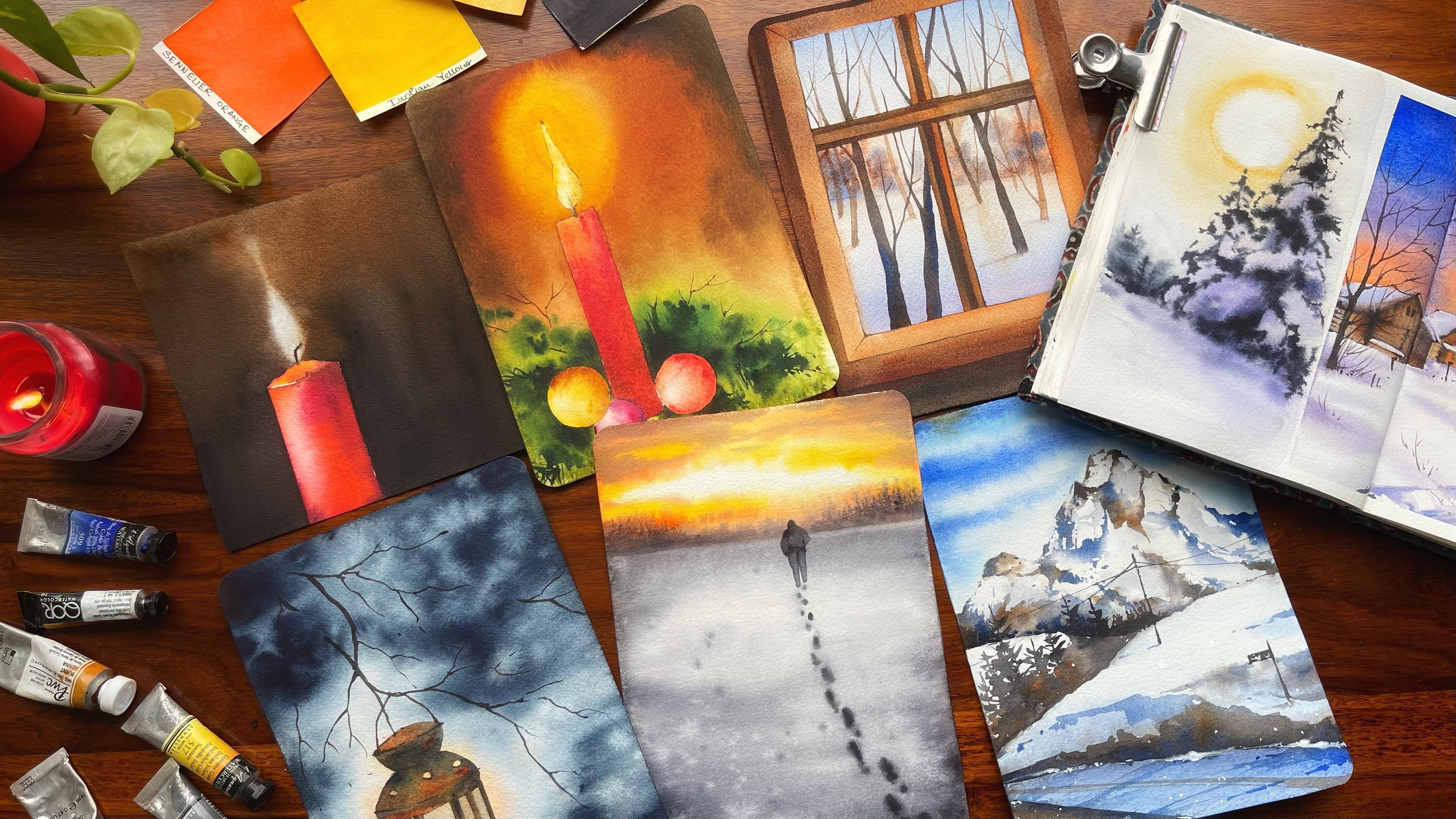
Transcripts
1. Introduction: Winter days are usually
lazy days where I love to wrap around a cozy corner
and sip my cup of coffee. But how about painting
five beautiful paintings, sipping that cup of coffee, which is after your taste? I a an artist instructor,
mother skillshare, teacher, and grand owner
of Pirin parcels, where we manufacture handmade
sketchbook artist W paints, brush roll, and Mucho. You can also find me on Youtube bargaining watercolor
illustration letter. I give up videos every week. Today's class is
all about painting five beautiful magical
winter scapes. Now each of these winter
scapes are exclusive of each to you can start with any
painting of your choice, though I always like to add it in an increasing
order of difficulty. Each of these lesson has
an initial part where I have walked you through the entire process of how we would be approaching
the painting, as well as what are
the colors that are required to
complete that painting. Before we start out
with any painting, it's important to always know what are your
basic materials, like the kind of paper brushes, as well as water
tissues, et cetera. Whatsoever I will be using for all these painting,
water is the key. You have to go ahead and partner with this
beautiful medium. Water in water colors, winters, should not
wait any further. Let's start out with
our first painting.
2. The Flow Stepwise Approach: This class is going
to be pretty simple, easy and interesting
flow of colors. We are mostly going to
deal up with the basics, like all the materials required. Then each of the lessons
is going to come up with an initial part where there are a set of colors which I'm
going to use for my painting. Then we walk through the entire techniques part
where I continue to discuss about the basic techniques
of water colors and how I'm going to use it in my T use are your time with
English voice over so you can just fall
along and paint with me. Do not, do not forget to
just stop at any place wherever it is required
or go ahead and reduce or increase the speed
as for your need. Let's move on to our lesson now.
3. Materials All you need: Before we start out with any of these five
beautiful paintings, it's important to note what
are the materials that I usually prefer when I walk
along with watercolors. For all these painting, water is the key. You have to go ahead and partner with this
beautiful medium. Water, water colors, the
exact materials are, one is your arches. 300 GSM, 100% cotton paper. And this is 7.97 0.9 inch. But I did cut out this
paper from interior sheets. Each of the sites, like this particular site, is 18 centimeter, and this particular site is
around 15 centimeter. That's the size which I'm going to use for doing
all my paintings. We can see that's the size
for all the paintings. Let's discuss about
brushes, brushes. I'm going to discuss
a few of them which you need for mainly
completing the painting, though you might see a few more, but those are
really not required for the entire painting. One is a wash brush that
you will really need. One is a blending brush, or you can say the
Casaneo brush. It has been one of my
favorite still date. Another one is my
Escoda Optim brush. I'm not sure if you can
really see anything over here as it is not very clear. It's a very old brush of mine and that's one of the
reasons you can't see it. It has got a very nice tip. Then I have a silver ruby
satin monogram liner brush. This is a very beautiful
and nice brush. I have been using it for many of my recent paintings and it's really amazing
to go ahead with it. Okay. The Vinci Casino
Route brush size three. These are the brushes. I will have two jars of
water as always. One for washing my
brushes and another for my clear water that I really
need for my paintings. This is the ceramic palette
that I'm going to use now. This ceramic palette in particular has got a
lot of wells in it. You can go ahead with any
palette of your choice. But in ceramic palette, your paint doesn't stay for
a longer period of time. Now, usually paints come in
various nature shapes sizes. Either it can be cubes like this or you can store it
in belts like this. They also come in
various half pans, full pants, et cetera. For me, I always
prefer full pants. Now there is a reason for it. Now what happens is if I
have to dip my brush in it, you can see that my brush
goes completely inside it, and the top part of the
brush remains the same way. Whereas if you have half pans, your brush will
always go over here. And what happens in the process is that you might
end up spoiling the. That's one of the
reasons I always prefer going for full pants
rather than half pans. I will keep a scale, a pencil and eraser, very handy, because a few of these paintings do require some
amount of sketching. And all you can have a
tape handy by your site. Now this is a washi tape. Why I need it though. All these paintings are done on an acrylic board like this. As you see, this is the acrylic board where I
would be using all the sheets. Like one of the sheet will
stick to it and I will apply water on the back side of this as well as on
the front side of this. That's why I'm going to use it. But for particular painting, I'm going to mask out
these areas using my take. You will see as we progress
through all the PTs, okay? Now, I guess this is it
that I wanted to explain. Every painting comes up
with its own set of colors. I will tell you what are the colors that
I'm going to use. Let's pocket for now and go
ahead with our next lesson.
4. The Loner Colors & Techniques: The first painting is
also known as the Lunar. You can go ahead and create this beautiful painting with
minimal amount of drawing, then we are going to work
around with limited part. Let me walk you through the basics of all the colors
that we are going to use followed by the
techniques that we are going to go ahead and walk
around with for this painting. Says, you all know that this is a limited palette painting
that we are doing. I really wanted to
keep it simple, guys. We'll go ahead with
very few shapes. The first shape that is from the lightest value is
my nickels yellow. Nickels yellow is
a shade which I would be using for these areas. You can see it very well for some of the more
illuminated spaces, or the spaces which
look more vibrant. I would go ahead
with Indian yellow. Many of you already
know that I have been using Indian yellow
for quite some time and it's one of my
favorite coat of colors, selling your orange. Now this is mainly for this wall space where we
need a bit of orange. If you have red and yellow, you can also create your orange. I usually mix a bit of
my maple yellow into the orange to get a bit lighter value
compared to what I have. The darkest value that I'm
going to use is Neutritent. You can also keep burn Siena
in case you are not very, very confident about the colors
or the shades, etcetera. For the brown, you can also use some amount of brown
for the toppy. Let us understand a
few basic techniques for our water colors. One is when you apply
your brush to your color, then you directly
apply on the paper. This is a wet on dry method
where we have wet paints, we are touching it to the
dry surface of the paper, and therefore, there is a wet on dry method that we're doing. Let's go ahead and apply
some water on the surface. I have applied some water. There is no particular way that I'm thinking about
applying water. I would go ahead with rush smaller brush and then
start applying some colors. Now the colors will
move because we have water already
on the surface. This is our wet on wet method. Then comes one of the most
interesting techniques, that is you apply
some water on paper. This is more about controlled
approach of water colors. This is really
important for our sky. You will see that I have optimum amount of
water on paper. There are no no places
where my water is moving. To a great extent, I would go ahead and start with my blue to create simple clouds. Let's go ahead and create
some simple clouds where water will not allow
the colors to move a lot. You see, my colors are not
moving to a great extent. This is more of a controlled approach that you are going to
work around with. I love to work with this kind of intensity
in terms of water that you have on paper as well as it allows me to
really work well. You have already
applied some color. We are going ahead and applying one more
layer on top of it. I did go ahead with
some lightest value. Now if I really want to work around with
more darker values, I can cover up the space
that I've already applied. With watercolor, I can
create a gradient. Then I can again, go over it with my darkest
or lightest value to create more shades or even the clouds that you are planning to see. Okay, let's understand
this in a bit better way. I'm going ahead with some
more darkest value over here. And then creating my clouds. You can see how the clouds
are getting formed. As you go towards the bottom, they would become
smaller and smaller. And that's okay. We are working
through the same process. This is very imaginary. And I don't have anything
in my mind while I'm creating this
part of my sky. It's just to help you
understand how we create our watercolor skies and how you can do your
watercolor studies. Okay. If I go ahead and paint a small land
formation over here, you can get it that more
like a complete painting. Go ahead and apply
someone brown. You see how easily I have
gone ahead and created a very simple painting
using a very few colors. And we don't need to
really think much. Now, I will just show you
another simple technique. Now, when the colors flow a lot and you really want
them more controlled, you can go ahead with
a brush like this and just pick up the colors from a few areas wherever
it is moted, like the one you see right now, or else even add
the darkest value. The similar way I'm
showing it over here, you can go ahead with some of your darkest value
and now approach the painting when your paper is almost dry and it's
more on the damp side. You can play around
very well that way. Okay, I guess this looks great. Now let's understand another
flattering technique, which is very important when we are working with watercolors. Going ahead and
applying a light wash. This particular part, he
would be working around the similar way it
did allow the space to become a bit more dry then when it is
semi wet condition, you can see the shining. I'm going ahead and
splattering some water. You see how I get
these textures. They are so nice
and beautiful and you can use it for any of
your future paintings to, it is easy to create
an interesting one. That's it that we are going to learn for our first painting. We will go ahead and start
with this painting here.
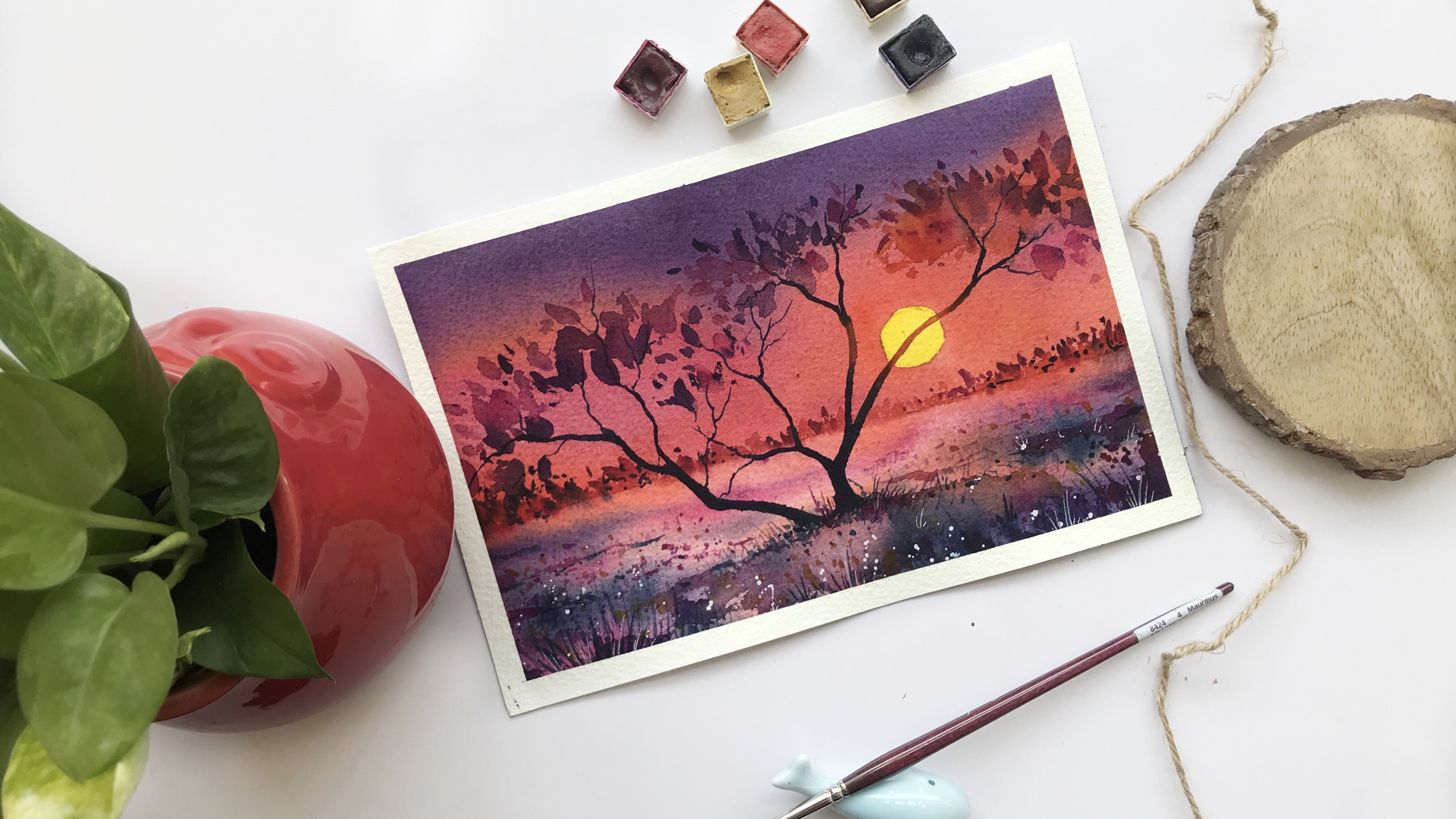
5. The Loner Painting: We only know the colors. Then the major techniques
that we are going to use for this part
of the painting, which is the lower, the sunrise, the snow, et cetera. Everything is very beautiful. Let's jump on to our listen now. This is one of my
favorite paintings from the Marathon series
as it has so much of simplicity in it and there is so much less that we need
to do in a winter painting, but still it is one of the complete and most
beautiful paintings that is there in
this whole series. I'm going ahead with the three centimeter
mark and you can see I have aldy marked
it on my paper. I would go till about
the middle part, which is around 1.5 centimeter, and start adding the head as well as the bottom
part of the human being. I am not a person who adds figures to a lot of
my paintings, hence, I'm a bit careful whenever I am adding any kind of figure, it has to match up
with the perspective. This man is going away from us. He is appearing at
a pretty far off of a place because of
which the size is smaller to what it
would have been if we are observing from
more closer place. Hence, I guess you can also make this in a very
quick and easy manner. The whole painting will
come together very quickly. That's the best part about
this painting, though. It has human being, it has sunrise as well
as the bottom area. You can see that there
is snow, et cetera. The painting takes
really less amount of time if you see, okay, once you are done with
the sketching part, which is majorly just
adding the legs. And one of the legs, of course, would be a bit longer
compared to the other one as the person is moving
towards the horizon line. Hence, there are step by
step the person is moving. We will of course
paint those steps too. But first you need to just
understand the concept, how it goes I together
with the theme, as well as how it works for you. For me, you already know that there is a rule
of thuds that I've taught in my previous class where you did watch
the seven days of in seven different
kind of landscape and it was all about
the soft washes. We are going to
apply a similar kind of concept even
in this painting, it's going to be very easy. We will apply some water on the back side of
the paper Once we are done with the
sketching and we will stick it to
the acrylic board. I will apply water even on the top area as well
as on the bottom area. Place a small tape underneath
so that the gravity doesn't work and you can see the water flowing from the top towards
the bottom area. One important aspect,
while you do watercolors, have your tissue by your side. If you have your tissue, I can say that that's one
of your best friends, so that you can
avoid any kind of cauliflower effect
or backgrounds. Those are the things you
have to take care of. There are many paintings
that I did fail before I had this particular
successful painting. Yes, having said all of it
that watercolors is easy, you can go about
it, but a previous, a bit of knowledge
about watercolors is always always an add on whenever you are
taking my classes. This is not a very,
very basic class. As I would say, having a
bit of knowledge is great. But each of the section
is coming up with an initial understanding
of what we have to practice and how we go about that particular painting. If you have day one or
you have project one, you are getting a practice
session along with it, which makes it really
easy to float. I'm going ahead with
now my yellow color. You can see that some amount
of white space I have left. You can go ahead with size three or a size four
brush while you add the colors towards the
top part of the painting. The yellow is, of
course, Indian yellow. It's one of my
most lovely colors that I have always used. Mixing it with some amount of my orange and then adding
it towards the bottom. As well as this orange I need to even add towards the top. You guys can always nail, I think sunrise,
sunset painting. We have done quite a lot of them in all my previous classes. But why this
particular painting is special because not only that, we have this sunrise, but also we have some of the darker
clocks that I'm going to add as you progress through your watercolor journey or any of the other mediums. Some of the mediums, of course, give you opportunity
to go back. We. Whether it be acrylics, you can go light over dark. But watercolor gives or has a less space in terms of
moving back to lighter values. One of the reasons
we always apply lighter value compared to
the darker value first, is we love to have
the darkest value later on so that it's very easy to navigate to
the lighter value. You exactly know where you want to place your
darker value once you have placed
already or darker value and then you try
the lighter value. Sometimes it's possible that the darker value get mixed
with the lighter value. It just moves all around and you are
unable to control it. That's why going with a
conservative approach is always better
for watercolors. I'm adding some amount of my senalar orange
in various places. You can see that I have
mixed a bit of Naples yellow also into it While I am adding this and
some of the areas, of course are more darker, do remember that we do not want the colors to go beyond
the horizon line. That's one of the reasons
whenever I, my darkest value, I would like to keep it till that particular place going with some amount of
my neutral tint. You already know
about the colors and the shades that I'm
using in this painting. All I need to tell you
is control of water. You have to wait for
one or 2 minutes, or 3 minutes once you
have applied the water, so that the paper
is not so much wet, that the hole of the
puddles are moving here, and they're taking the
colors everywhere, which we really don't want. There is a difference
between having a puddle and having
a moist paper. Or you can say an even
coat of wash on the paper. I would love to have
that even coat of wash on the paper compared
to the puddles of water, which actually makes
your colors move a lot. Okay, the darkest value
is a neutral tint. I'm going ahead with it. I've mixed it with
a bit of orange and I'm applying it in
few of these pieces. Wherever I want to add the
darkest value of the cloud. You will understand
that I haven't tried to add the horizon line in the
middle of the painting. One important aspect of any kind of a
sketching, Of course, sketching is
practically the base or the framework of the
whole of the painting. Having said that,
it's not always a possibility to
have a bad sketch, or it's not always a possibility
to have a good sketch. But to an extent,
if you can have a framework ready for yourself, I think the final
painting will, of course, be in your favor itself. So that's the only
thing which I would ask you to keep in mind while
you do watercolors. As always, have a basic
framework by your side. I'm not saying that you
have to draw the steps of the man who is walking, but you need to, of course, take care of the man and the human figure
that we want to add. I did apply the darker
value on top of this man, because after we apply or
one wash or two washes, you will see that automatically the graphite marks will
go lighter in value. I always use a drafting
pencil, which is anyways, quite light on paper, using my Escoda optimal brush
to add the darkest values. Now for making the trees, now these trees are
basically far away from the place where
you are watching it. It is near the horizon line and that's one of
the reasons why you make sure that they
are absolutely small. We do not want any dark
values or we do not want lots and lots of trees which are
ranging really high. That's what I want to
avoid in this painting. I know that you guys already have some amount of knowledge
and if you don't have, I would highly recommend you to follow last two of my classes, meditate with watercolors, a
14 day watercolor challenge. The next one, which
is all about painting mist and fog over seven
different landscapes, I think that can really
set the tone for this or the whole
of marathon series. We already have done
two marathon series, but they were a
lot more lesser in terms of the difficulty level. I would say having said that, it's not that this particular
painting is difficult, but yes, there are
more elements into it. And we have also progressed
in our watercolor journey. Hence, there is two or
three important aspects that I would ask you to also
follow for watercolors. Okay, going with my
darkest value now for the trees and I'm using this
needle shaped pointed brush, which is majuly my
escoda optimo brush, I have been using
these brush for. A lot, many years. And I know this is, has been one of my
favorite as well as comfort brushes
over these years. Though you get these kind
of brushes now very often in other brands like
the Vince, et cetera. So you might have to just check what's
available in your country. And then if you want to even purchase something like
this, please go ahead. It can last really, really long. You can see that
past three years, or four years that
I've been teaching almost on skill share, this brush has been pretty much constant through
all the paintings. Okay. Just blending the
bottom parts so that the colors don't move
towards the bottom area. I did allow my paper to dry completely before I'm going
ahead with the bottom area. The color, of course, has to be the neutral tint. Neutral tint is one of
my favorite shades. Believe me, for winters though, I would love to paint all my winter season
with this neutral shade. Having said that, that's
never a possibility. Yes, going ahead with
other shades too. But most of this is
limited palette. You can see we are using maximum two to three
shades in these paintings, and that is only defining the
whole of the winter season, winter season, fall season. You can see that the colors are pretty less
compared to what we usually use during the
summer than beach trees, et cetera, where we literally create so many
colors on our own. Just mixing a bit of blue for the darker greens and all of it. Yes, not getting into a lot. I would say just go with the flow and add
the darkest value. And few of the areas
near the horizon line, I have added some darker value, but I'm not very happy with it removing some bits
and parts of it, as well as adding the darkest
value towards the bottom. I would even splatter
my water on top of it. Do not worry, there
is a lot coming up. Splattering is pretty common in most of my winter landscapes. I do this technique in
other landscapes too, because that really gives
me the texture that I need. Water is more handy compared
to adding any other thing, whether it be a salt, whether it be other chemicals, et cetera, that
you want to really add to the watercolor painting. I guess this comes really,
really handy that way. Okay, darkest value
looks so nice and I'm so happy with how the whole
blend has come up me. This is one of my
favorite paintings, as I've told you earlier also. And it would remain as one of my favorite painting though
there is a lonely man there. A warm sunset. Sunrise. Of course
it's a sunset, but you can also make a sunset. It's poetic and you can
actually name it as you want. For me, it's a sunrise. I see the brightest
side of the day. And this really helps me to brighten up my
mood to a great extent. I start with the
darkest value from the site and take it
towards the middle. Now the main reason
of this is that the cauliflower effect
usually comes on the site. Once your paper is dried off, it's important to really
prevent that part. And you have to also take away all the water from the site so that there
are no backruns. Backgrounds do happen. I'm not, I mean, surprised if many of you
come back to me and say, okay, background did happen. Yeah, it really happens. And there's cauliflower
effect also. Whether you say background
cauliflower effect, the water that's there on your
board will come back into your paper because your
paper is still wet and there is a lot more water
on the board which can se, pen to your paper giving a very different kind of a texture that you
would of course see. Even when we splatter water
that particular place, the colors move and we just get some white small areas exactly
what you watch over here. These things do create
a lot more textures, but what exactly you
want in terms of even texture is something that you need to know
for your painting. Okay, I mean these marks of the shoes that the
person left on the snow. The most important thing
that you should observe while you paint
these shoe mark is that when it is closer
to us that you can say when the whole of these shoe marks are towards
the bottom of the painting. They would be bigger,
and when they go away from the painting or
towards the horizon line, they could become more and
more smaller. That's all. If you are happy, satisfied, there are no backgrounds, everything is fine,
let the paper dry off, and then just go with the final painting of the human body in
the middle and rest. I think the whole
painting will come together and you would
already fall in love with it. There is nothing much
that you have to do. To be frank, as I always say, the more simple you keep a
painting, the better is. You're always the outcome, okay? Adding a few trees towards the right as well as
even on the left. I want to define the
whole of this place a bit more compared
to what usually it is in terms of the
trees or in terms of the bushes that you want
to add in the far away place, just exactly the way you have added the
trees on the right. You have to also go ahead
and add it on the left part of the painting and that
is near the horizon line. We will just add a few lines, straight lines and just criss cross it towards the bottom. Just blend it with
another blending brush. That's it and that's the max we are going
to practically define, it is far away and we
do not want to just go into a lot of details
over there at this stage. Now, when I actually observed the painting that is just
below the horizon line, you can see that, of course, there are lots and lots
of backgrounds though. I did clean up the space. But yes, these kind of things can happen and you might have to go ahead with one more
round of your watercolor. It's absolutely okay. These kind of things
to keep happening and never ever think
about the fact that, oh my God, the whole
painting is ruined. Now, are these backgrounds, the cauliflower effect, this, the whole of the water
colors has gone for a toss. I might have to go
ahead and again, I don't know, you do
not need to do that. You can just go
over the space with some darker values and then
just get it done. That's it. You will see how I am also
taking it forward and just adding the colors on top of the values that
I've already added. Dome. My paper is still
not completely dry. I would suggest you to only do it once your paper
is completely dry. This whole process can be a bit more tedious and
more time taking. I guess you are fine
with the sides. If you haven't got the
cauliflower effect, no back runs, just
leave it, let it, and then add the human being
towards the middle part exactly the way I am doing in case you want to go
ahead with another layer. Because your bottom part
is lighter, of course, you can go ahead
with this process once your paper is
completely dry. Finally, I need to now clear out the
spaces because this is a major important step because we don't
want at this stage. Again, we get some
more backgrounds. I need to splatter some water. You can see that paper
is not very wet. It is semi moist, a situation which means
that if I splatter water, it will give me the same textures that
I did get last time, going ahead with the deeper
values for the marks of. Shoes on the snow, then we will just add
or splatter the water. There's very less that
is left right now. You have to let your paper
dry off and then have the layer of the colors go into the human being that we
are planning to add. That's one of the
most important steps, I think in Pole of the painting that brings
the painting together. This particular step would
have been absolutely avoided. If I wouldn't have
got the back Drs, maybe the whole of the
painting would have ended within the
21 minutes period. Except the drying
time that it takes, I do not like to use a dryer, and that's always been the case. I would leave all of
it to dry off on it soon and then only get
back to the next layer, then the bottom part
of the horizon line. And once that part is done, we will just allow
the paper to dry off. As I did tell you earlier, we want the concrete
painting to be very organic and that's
one of the reasons I have given so much amount of
time when we are going in layers or when we are working through various aspects
of this painting, whether it be the sky, whether it be the snow,
everything takes time. And water colors, I would say is we work quicker
compared to any of the other mediums because
it dries off very quickly. It is a lot, much less messy compared to
other mediums that I've seen. Even washes more messy. You have to clean
up your brushes, you have to clean
up the water char, everything takes so
much amount of time. That way, I'm more happier
with my watercolors and it's such a beautiful
medium where you can have so many combinations. And the final painting
would really make it the best that you can
ever, ever think of. Okay, the paper is
completely dry and it's time to go ahead with
the human being. I will start very simple. Go with a bit of
the lighter value, which is my neutral tint
as I did tell you earlier. You can also go
ahead with black. I'm not against black, but I usually don't like to use black in any
of my paintings. I usually use paints gray. Now the paints gray that I had, there is some bit of blue
into it and I do not want the colors to react and give me a green anywhere
in this painting. That's one of the
reasons I did not use that particular color rest. Otherwise, I guess the
whole of the painting, I'm pretty happy with how
the colors are moving, how this whole human
being is coming together. Everything is so amazing. The whole process, I think I
just enjoy the process more. That's one of the
reasons I feel that whole of the watercolor
painting is so beautiful. The final outcome
is so beautiful. I'm enjoying every step and every bit of any
painting that I do. I think that's the
most important aspect. Whenever you are working
with any medium, just fall in love
with that medium. If you are in love with
that medium, automatically, I think you will nail
your paintings in it. This part is just
somewhat detailing and we are going ahead with some of our lighter darker
values here to add more detail to the human being
that we did paint earlier. This particular human
being, of course, needs to be darker
than the background of the sky or the bottom
area that hug 40 painted. Let's have a final look at the painting once it is
completely dried off and just go ahead and
make round corners. I think the round
corners look better. That's one of the reasons
I always love to get those round corners for all
these kind of paintings, which are more wet on wet, and hence having a
final look at it. I am finally done
with this painting. There are a few
key takeaways from every painting that
we are doing today. So we'll list that down and you can have it
at your disposal. Okay, Final look.
6. The Christmas Decor Colors & techniques: Here goes our second painting. This painting is all about creating a beautiful Christmas
decoration with a candy. It's a must in all my classes, whether it be a lantern or
whether it be a simple candy. This is the quickest and
the easiest painting. Along with the beautiful negative background that
you are going to do, I will teach you
everything about creating this negative
painting background, as well as walk you through all the colors that I have
used in this painting. Started out with a
very rough sketch of my tangle and it is a simple red angle
that is illuminated. I would go ahead with my acrodon corn for
painting this part. The speed of the video is to x, though you can follow along or adjust the speed as you wish. This is more to do with how I work around with
the negative values. But first, let's just
understand a bit about try and wet on wet when
we work with it together. Wet on wet is a very simple technique that you will see how I work
around in the next, when I create the
negative painting. But first, let's
work around it on. This is the easiest.
When you touch your bed, brush with the dry
paper, it is wet on dry. I'm going ahead with a
gradient wash where I have a particular area which
is more lighter in value and the other area that
is more darker in value, while I go towards the right, I would add more darker value, That is my pink and
some of my purple. This pink and purple basically
creates the depth in the painting which
you really need for this part of your cattle. The light is on the left, as you see, the darker
value is on the right. I usually keep a lighter
and darker value for all my paintings. That really helps me
to understand how exactly I should go ahead and
work around with my values. Values is a very
important concept. You can create various values with one single painting too. If you are someone who is
absolutely new to values, I would request you
to go ahead and check out one of my classes
that is a power painting. And monochrome as well
as you can work around, meditate with watercolors, it has a painting that is
starting monochrome. And there we have discussed
values in much more detail in case you are someone who really wants to
learn wet on wet. I guess again, the classes Tate with watercolors
as well as there was the last class that I have released in which you
learn about painting. Seven days of painting, mist, it's a high on wet, on wet kind of a class. By the way, right now
I'm working around with my darkest value of pilet
though it can't be seen very, very clearly, But you can understand now that it is
more of a violet color. I did allow the
piece to dry off, and now I had started applying
my water in and around it. I'm not going to go
completely into it. Next is my neutral tint. This is one of the
most beautiful colors that I've worked
around with till date. And I am completely in
love with this color. I have not applied the
color genuinely in and around my candle
because there are chances that you get
into the subject. Now, what are we doing right now when we are painting in
and around the subject, that is the candle flame? Then it is known as
negative painting. Now this negative
painting is something that many of us might not have done earlier
and this is more of wet on wet that you
observe me doing. But many to use
just going around the subject in a particular line or way with a Ton Frye method. On Frye method is
way more easier. You can just leave
out the space status for the flame and not
apply any water in it. You will automatically
get the flame in a particular shape and
size status required. It would practically show
off the illuminated part of the candle in a
better way rather than going ahead and
painting inside it. Now, this particular piece is
amazing for this painting, but when we go ahead
with the next painting, there is some amount of
work that we need to do. Even inside the flame. Though I want to teach
you both ways how you go without touching the
flame and only use water. Whereas the other
way is to also touch inside the flame and create various color
shades, et cetera. That is a bit advanced and
we are going to do it as we progress and go ahead
with our painting. Okay. I apply two major colors. That is my burn Siena. The second one is my Neutritent. As you have seen,
I'm going ahead and using simple water to
clear out a few spaces, as well as allowing me to apply some amount of
the darkest value. Though this is really,
really tricky. I just want you guys to try it, but don't get too much into it. If you get an
absolute painting the way you see over here,
that's absolutely fine. You see how I've
left the pace off my particular area of the flame and just
left it like that. This is more advanced where
you are applying clean water, just taking off any extra paints that gets into the flame, and creating a wet
on wet effect. I have told you that
this is advanced, so you may try this out
for your satisfaction. Go ahead. Right. But
do not get into it. Much as I've told
you even earlier, don't get stuck at
any point in time. Watercolors is not being
stuck at any place. Going ahead with the flow and just enjoying the
painting in total. Okay? Using my flat brush
just to remove a few areas where I think the color has gone and you can also use
a bit of white quash, but it becomes really
tricky at this stage. That's one of the reasons
I have not used it. And I like to use the white
space of my angle flake. To be frank, you can
even mask out the area, has dots or whatever it
is and then create it. I would leave that
decision up to you. It is a bit tricky as
always and advance too, so it's quite an option that you can exercise
and try it for yourself. Okay, let the fling
area dry off. Once it dries off, we will go ahead and
just paint the stick or the small thread that really illuminates the hole of the candle and
provides the light. I think that's one of the most amazing parts and
I would love to do that. Continuing with my
cleaning up of the space, it will continue.
It takes a while. You have to do it in multiple
times to clean it up and eat it exactly
the way you want, or really get the
exact illumination wet on wet space that
you have wanted. Always, It's a task, it's not very easy. It will come with
time. Do not worry. Try it once, twice, or thrice, if possible, or else leave
it. Come back to it. Maybe after all the
five paintings, I'm pretty sure about it. You will nail it at that point. Okay, going ahead and
creating the black piece. Now, this is one of the
most dangerous parts, to be frank, because
the whole part is white and we do
not want to spoil it. Just understand that
this particular part needs to be absolutely dry when you make this black
part of the candle, which practically candle thread that illuminates the whole of the candle part and apply a bit of yellow
on the tip of it. You can see it, usually when a candle is lit,
go with the flow, Enjoy the process,
enjoy the painting, and just pave the way
for the next one. Let it dry, and let us discuss all the colors which we need for completing
this painting. Now the Ps are yellow,
as you can see. It has to be lemon
yellow or Indian yellow. Whatever yellow is available
with you, some burden, dark brown you can create mixing some blue in your brown
that you have orals. You can also use When Brown
CPR the colors like this. For the lighter values of green, I would go ahead
with yellow green. Then I would sap
green or dark green, whatever is available for
the color of the cattle. It's red, but I usually
mix some amount of micincrodone coral and
red into it to create this along with it I have three ball spot decoration
which is purple, pink. Then this is more of red. Here I have more of
brown and yellow that I have added overall. Yes, there are a lot of colors that we required
for this painting, but I'm pretty sure about it. Once you get a hang of how
I am using the colors, you would be easily able to faker out the painting in total.
7. The Christmas Decor Painting: I am super excited and super
pumped up to teach you this beautiful lesson about creating
Christmas decorations. So let's jump on
to our lesson now. Our winter marathon cannot be completed without a
Christmas candle. And I just thought that this is one of the
easiest paintings, though it might look really tough because of the
wet on wet technique, et cetera, but you have
to really give it very, very less amount of time amongst all the other paintings
that you have done today. So let's just start out
with marking our candle. And I am just marking two lines. I usually place my
subject either on the left or on the right
or on the top part, not exactly in the middle. That's something
which I have been following for a while, though. When I started out, I did have some different
experimentation or the ways I would like to
change it to a great extent. But having progressed
in my journey of watercolors as
well as sketching, I do understand that if I place my subject either on the
left or on the right, it has much better impact on the spectator compared to what you usually
see in other cases. Okay. Going ahead and marking our line for the
top part of the flame. And once we are done with
the top part of the flame, I would go ahead and make some smaller circles
towards the bottom. These are basically
the decorating small, small balls which
are really shiny. We will create the shine
with the help of just water. Yeah, I know that it is
not so easy to work with watercolors and we'd
like to preserve a lot of white spaces that
you usually see. I will be using any simple stuff that is
available in and around. Like right now I have used a, my masking gave interior
site to make two circles. Then I have used one of
the small coins and made another smaller circle
masking out the area of this hole of the candle
as well as these circles. It is important because we do not want the colors
to move into these. And we are going ahead with
the backgrounds first. Then we will go ahead with the middle part or the main
subject that you have chosen. Go ahead and apply the
masking fluid in these areas. You have to dip your
brush in the soap and then apply it
over the entire area. Let your paper dry
off completely and then go ahead
with the water. Water would be applied
on the back side of the paper as well as on the
front side of the paper. Back side of the
paper really helps your paper to be in place all it would also help your paper to stay wet for
a longer period of time. Another basic water colors is starting out with
the lightest value. Lightest value would
be some amount of yellow and orange
in and around the flame where my
candle is lighted. Then we will start out
with more dark value, starts your burn sienna, as well as CPR, or when I came round. Now I would leave that
decision up to you. If you want to mix your
ultramarine with the burn Sienna, that is also a good option to go ahead with the darkest
value which you want. Now these are the options that I would always like you
guys to explore and always to go ahead and add less of these colors or have less of these
individual colors, and go with mixing of the shades to get the
final darker values. Having said that, I
know many of you might be just starting out on
your water color journey. And it's always good
to exactly know the names of the
color that I'm using. And hence, you can go ahead with the indique, brown or CPA, as I did tell you in
and around the flame. Just try to add the lightest value as
we have done earlier. And now I'm trying to
blend the brown with the lighter shade of the yellow
that has been aly added. To be frank, this is a
of your gradient wash as well as blending gradient
wash as I do say that we are going from the lighter
to the darker values and blending comes
in between or else all the colors that
you see will not move into each other and they will look very weird when it actually dries
out completely. I'm going ahead with my olive or sap green in and around this
bottom part of the candle. Now, bottom part of the
candle needs to be in the greener shade because I have these pine tree
leaves over there. I want to keep it really soft. And subtle. That's one of the reasons I have just
added it this way. The darkest value
that I'm going to add into this part would be
my darker value of green. Lastly, you will see
that the browns will mix up with these greens
to create beautiful value, which you will see that has automatically
blended with each other. And frankly, we
do not need to do much because water
will do its own job. They will move into each other, the colors will get mixed, but not like puddles
moving here and there. It's optimum amount of
water that we needed. Only thing that we
need to add right now is the darkest
value of the green. Having said that, once your
paper is completely dry, either you can leave it at
this stage like I have done, or once your paper
is dried enough, you can go ahead
and apply a bit of your clean water in and around these balls and then get the texture of the
ferns in a better way. I will show it to you as well. As that's discussed in
the techniques part, you can follow the same just going ahead with some
splatters of water. Once this part is done, I will just add some more
amount of brown as I see that the water has done
so much amount of work. That my colors are moving a
lot and they are flowing. I'm not getting
the darkest value that I really want
for this painting. So those kind of things
we need to really take care of when you are
working with watercolors. Last thing that you need to do for this painting
is to prevent your backgruns back
runs can only be avoided when you clean up
the spaces on the corners. Which majorly means that
in and around this sheet, you need to keep
cleaning up orals. The water that's in and
around it will move into this paper and it will create
some qualflower effect. Though it looks code, it's not that it doesn't look code or you have some
problem with it. But cleaning is
always a good idea. Just the way I am
doing right now. You have to keep a tissue very handy for this
particular process. Okay, time, go ahead and
add some more yellow. I am just so obsessed
with the blending part. Let's blend, blend, blend. And it's really
important to blend. Having said that, we need to go ahead and add some greens. You have to wait
two or 3 minutes before doing this process. The paper needs to be in
a semi dry condition. If we go ahead and add it when the water is too much on the paper or when there
is puddle like effect, the colors will move a lot and
then you will we don't get any particular arrangement or we do not see much
of an arrangement in terms of the
greener values of the ferns or the leaves
that we want to show. That's something which
you need to keep in mind as the background
should not move into the four grounds or
the second layer that we are adding right now should not get blended with
the background. The layer one, layer two
is right now done on the same wet surface that
we did add in the first go. You will observe there
are only few drops of paints here and
there and that's it, We are not going to
touch it anymore. Just some parts on the top area where I want to add
some more grounds. That's it. And then let
your paper dry off. You can do the same process of simple addition of some
ferns to give a bit of, I would say, lines, et cetera. It could look better
when there are pins, But this particular arrangement
is absolutely good. You may not go ahead
and touch it anymore, you can leave it
at this stage to winter, days are
usually cold and during those days where you
have the festive season, it's great to light up
candle and just feel the warmth of the small candles that you see here and there. I really love this
whole process and I usually have a red candle
for the winter days. Then go ahead and keep adding some of the darker
values towards the corner. As you see me doing it, I'm using my paints
gray to do the process. You can go ahead
with even black. I do not have any
black on my palette. As I always say, paints gray is the best
case option that I had, letting my paper dry off and then remove
the masking fluid. Your paper needs to
be absolutely dry before you go ahead and
remove the masking fluid. Or else it would be
very tough for you to remove any kind of masking
fluid from the paper. And paper might also tear. I have fast forwarded the entire process of
removing the masking fluid, but you have to really go
slow in this whole thing. Okay, go ahead and start applying the Quinacrodon
Coral color. This is one of my
favorite colors. You can also go ahead with red. Mix up some amount of compose operan it aspolas add a bit of purple
here and there. Or brown veriple, it is
needed to add shadows. Okay. I guess I would continue to
add the colors a bit slowly. You can see that my process
of painting is quite slow. It's not like a really
fast forward process. You can always, always follow
along as it is real time and you can paint with me
once your structure is ready. The structure is
the basic framework and it is pretty simple
most of the time. In each of the paintings
that we have done till now, only the basics of a
lantern, the human figure. We have simple, simple subjects that have been chosen for
each of these paintings. But still, I do understand
that many of you are not very well versed with the
wet on wet technique. And for that, I would
always suggest you to go ahead and check out
my old 02 classes. One is all about mist and fog, where you can practically
master these landscapes. Another one would be
meditate with watercolors, 14 day watercolor
exercise that can really help you to ace through each of your paintings very quickly. Okay, continue with the brown
and then add some yellow towards the top area just to make it a bit more
orange in shade. Make it lighter. Once we have added the yellow
towards the top area, I would blend it more with the bottom color that is majorly my quin actodon coral
or the red that I've added. I would leave it more lighter As that particular place
is being illuminated with the help of the top
area which I did lighted up. That's one of the reasons whenever you are
painting the top area, it is just under the light. Under the light,
it will be a bit more lighter in value
and it would be a bit more transparent
compared to what you usually observe the other
parts of the scandal. That's all you can keep in mind and just continue
working with it. This is not at all difficult
as I did tell you earlier. Also, most of our
backgrounds are set, Our foregrounds are very simple. There is nothing much that
you need to do over here. Just go ahead and keep
adding some more of your reds in your bits and
parts of the painting, wherever it is needed. Do remember this basic
aspect of watercolors. Whenever you are working with
watercolors, less is more. Less really helps you to actually ace through
each of your paintings. If you add less in
your foregrounds, as well as you do not add a
lot of detailed background, you can focus the whole of the painting only on
this particular candle, which needs to be the
focus area as it is the winter season and there is Christmas lights celebration. And we want to show all of
it through this painting, starting with my
decoration ball. I would say that the left side, you will see some
light because of which in that particular area, we need to work more with
water and less with colors. In watercolors, mostly you work more with water
and less with color. And that's why the
name is watercolors. Water comes first, and
colors come second. Keep this in mind.
Always, always. And I can tell you that you will nail all of your paintings and continue working if you
actually practice regularly. I can tell you that
you will love to work with watercolors as well as not only you will
fall in love with water, watercolors, you would
just feel so amazed. Surprised with
beauty, that this. Holds for each one of you. And this medium is frankly
going to help you learn, learn, re, learn, whatever
you can think about. It gives us so much in
terms of opportunities. I have seen, how much I
have grown with this medium and how this medium has
literally supported me. But what one thing
that I've done, that I've tried to
partner with this medium, there have been many
failures in the process, and I have never been actually taken aback with
all the failures that I had. I was always up for
more new challenges, and that's how this medium has literally given me
more and more rewards, rather than it being
more of a challenge. The more I learn, the more
I work with this medium, the better outcome
I get from it. I am to add some loose lines
which look more like stem. I'm using the tip of my brush. You can go ahead with any
of your other brushes, size one, size zero,
to paint these. I'm going ahead with my
optimal brush size six. It has got a very
nice tip on the top, which I have been using
for many long years. And you have seen
me using these in many of my other classes too? Yes. I'm going back
to the same rush. This is my comfort brush and it has always been one of that. Adding two or more lines, 23 lines here and
there. That's all. I'm not going to get
overboard with adding more and more lines or adding more details
into the background. That's what I'm not going to do because I want to keep this
painting really simple. Even for the four rounds,
you will not see me. Go ahead and add a lot of details because the whole of the painting needs
to be really simple. In winters, you do not see
that there is a lot of complexity except the one mountain painting
that we are going to do, where there is a good amount
of work that we have done, even in the Lego two other, all the other paintings
that we have done, It's just a lot of work that we have done for the backgrounds. Maybe adding more colors, lines here and there, et cetera. Once that background is done, we are set with our foe grounds. There is only one single subject that we might have done
for our foe grounds. And that's it, that's how the beauty of the
winter season is. Let's continue and add more and more colors
towards the bottom, as well as some color
towards the top area. I'm going ahead
with my paint spray for the bottom area again, or you can also go ahead with a mix of your brown
and paint scray. If there is any blue
also in your brush, it is usually some
kind of black, dirty blacks that we get. And I will work with that for this illuminating part of the top of the
kettle. Okay, great. I think this whole painting
is coming together very well. Let's have a look
from another angle. And I'm using some
orange to create another decorating ball that
we have towards the right, I am adding some of
my darkest value. And as we progress, I'm blending it with
more and more water. Water is going to help us, and it is our best friend, as I always say,
blending the colors. Maybe I will add a
bit of red while I go towards the right side
of this decorating ball. Let's continue with the
last decorating ball, and I'm just adding a bit
more red here and there. In the second last ball that
we did add, the last one, I would like to do it in most of the colors
that I've used for my are warm in shade as the
background is not so warm. And it is with the
darker values, even the greens that we
have used are darker towards the background of the candle because then
our candle can stand out. Having said that, we
want to give that warm, beautiful feeling of the Christmas season
through this painting, and hence, I need
to add some pk, a bit of purple, a touch
of it here and there. And that's all we will be
done with this painting. And once this painting is done, there is somewhat detailed
touches that you need to add to the top part of
the illuminated candle. I will show you as we progress In the bottom part, you can
see there is some backgrouns. Those backgrounds are
actually nice as I do tell you that every time
whenever you have back runs, they are not bad this time
they really act well. You will see once the
painting is done completely. Now it's time to add
the last few details to our part of the painting. Once it is done, I would go ahead and add
a bit more detail in the other places where
I have thought I would do and let
the paper dry off. That's the first thing that you should always think
about before you take off your paper from
this acrylic board. Let it dry off completely before you just start shaping
the sites of this paper. I always love to cut out
the sites because this gives a very nice and rich
look and feel to the painting. I hope you are enjoying
this marathon with me and we will go ahead with our next painting where there is a lot more to
learn about winters. I've been enjoying
the winter season and every year I usually
come up with a class. You have a Winter
holiday greetings card and other classes too, that you can go
ahead and watch from my last few classes
that I have given, there are over 45 classes that
you have at your disposal. So please go ahead,
check it out. They all have something new
and they are all done in a particular way
which can help you to progress with your
watercolor painting. I do even teach quash for anyone who's interested in Kash
can also learn Kash. Okay. Ad in the final
details, have a look.
8. Through the Window Colors & Techniques: Day three is all about creating what you see
through your window. It's all covered with snow, and you have tried trees. So I could not stop
myself from this simple, yet interesting landscape
out of my window, which we are going to paint
with very few sheets. Let's go ahead and
check them out. There is lots of
techniques as you have already learned a lot of them
in the first two paintings. Let us understand all the
colors which we have. One is ultra, meaning for short, then is some burns enough
or brown oxide color. Whichever you have available with yourself, you can use that, use some ultra meaning blue for some of the parts of the
trees as well as you can go ahead with any of the other darker value
like nutritent to create the darker value of brown is something that
I need to tell you. This painting is all
the techniques that we have learned earlier will
be used in this painting. No need to go ahead and
any new techniques. It's mostly wet
on wet and wet on dry that we're
going to use only. There will be a specific
use of masking tape. Keep a masking tape
handy. That's it. Now let's go ahead
and start out.
9. Through the Window Painting: Finally, we are on
our third painting. This third painting is
simple, interesting, but do not go by the
length of the video as the video might look a bit more overwhelming once you start, you are going to get
into it and end it like a pro. Let's go ahead. This is one of the
easiest painting from the current series, but it took some
good amount of time. Do not get over with the length of the painting that
you see over here, but tab on how you progress. Each and everything is very
easy in this painting. Just that there are a little
more steps as we progress. We would be actually
drawing a window. You can go ahead
follow the steps. As you see I am taking
right over here. And then we are going to actually individually
paint parts of it. First we will be painting the
scene outside the window, and then we will get back
to the window and paint it. That's the reason for all the, so much of time that we
have taken in this project. Okay, go ahead and start adding lines on both sides
of the paper. As you observe me,
I'm actually leaving some margin on all the sides. Towards the bottom,
I would be leaving a bigger margin so that everything doesn't
look more symmetric. But symmetry is something
that you have to take care of as it is a
window which is made by us. Hence, it would be way more
symmetric than the other. Randomness which you see in nature framework of a painting is something that I always
love to take care of. Hence, I am going ahead with this particular part
of the sketching. It's all done by scale. Many of you might not be having the idea
of using a scale, or you may not like
using a scale. Please go ahead, go
freehand Absolutely. With your drawing. In case you feel there is
a need for scale, then only use the scale Now, because I know that so
many of you do have this constraint or are new to water colors or even
to the sketching. Hence, I do give
out only simple, simple ideas that can be used for doing any kind of
sketching or painting. I am doing the same,
even over here. That's what you guys
do need to keep in your mind when you do any part of your
sketching or painting. Okay, Don't go with the flow. I would say at this
moment, right now, it's important to at least lay a background for your
future painting. Background is all about
having a basic place. And what's the basics? The basics are our
building blocks. Building blocks is
basic of sketching. Sketching is something that
I've always stressed on as we have progressed with
our watercolors or painting. Though this whole
of the series have literally some amount of
limited sketching and most of them are done with the help
of scale or different kind of hacks that I have also used initially during my
watercolor painting journey. Yes, you are going to use all of it even for your
painting journey. Let's continue and let's add
more panels to the window. Now there has to be
some more panels. Right outside is a
beautiful winter day. In that winter day, you can literally
have a look through your window and see that the
trees don't have any leaves. They are standing there. It's mostly gloomy, though. There are other
paintings which are more warm and this one
is a bit gloomy. Be with me and let's keep
enjoying this marathon. There is nothing much that you need to keep in
your mind when you are working through this
particular sketching. Because there is nothing
like a lot of perspective or sketch or vanishing point, then your horizon
line, et cetera, how it becomes more linear and how the two point
perspective works, or three point
perspective works. All of those complexities are not there in any
of the paintings. What you need to keep
in mind is that we are not going to
place our subject. The subject is majorly the
outside, gloomy weather. Just concentrating on either just in the middle of the paper. That's something I
never do either. I place it towards the top side or towards
the bottom side. You can see that this window is also shifted a bit
towards the top. That's it. You need to
keep in your mind and then continue with the
process of painting in Kolkata. I usually don't
get such strong winters, and that's one of the
reasons I have this urge to practically look through as well as enjoy these snowy landscapes. I usually satisfy myself with these paintings and feel that
the winters are very close. Though this time
I really want to visit a few of the
places which are there, like Jelling or Kong Kong. So these are the places
that I really want to visit and see how the winter is with the snow capped mountain
and snow in and around. But that's going to
happen really late. Maybe late of
January or February. But it's what my soul really, really wants right now. We can always paint that out on our paper and
feel the season. So let's go ahead and enjoy the season with
our watercolors. Watercolors has been one of the most rewarding
mediums for me, and all I can say is that it would be very rewarding for you. This painting is not
about a lot of water, so you can just relax, not think much, have
any board by your side. We are going to go
ahead and just, um, some tape put in and around these places as
it is more structural. Yes, Putting the
tape would be great. Many of you might think I get everything at the
first, believe me. No. Even while I
was sketching this, I was struggling with one
more sketch before this. And I did it on the back
side of the same paper. What a color paper can handle, paints on both sides. And that's one of
the reasons I love to experiment and
not waste any of my. If you are someone
who is also in love with using both
sides of the paper, then go ahead and
use a sketchbook. Sketchbooks are one of the
best ways in which you can not only help yourself paint both sides as well as save some good amount of
watercolor paper. You can always finalize the drawing or painting on
a final paper later on. If you would like something that you have painted on
your sketchbook, that's how I always go about it. I have an entire
sketchbook series. I have been using sketchbooks for last I don't
know how many years, maybe four to five years. And there are a
lot of sketchbooks that in these many years. I continue to paint
and I continue to explore on my sketch books. There are a few
rough ones and there are a few more prettier cells. Yes, I do. Just go ahead and paint my
heart out on my sketch books. That's the way I keep myself. I would say that's a
safe place for me. It's something that
I have loved to do. I love to experiment
on those sheets, let my fears go away, and not think much about how the whole
painting is turning up. It really doesn't
matter at that stage. Yes. You should also
figure out those areas. What's your save? So because the individual
sheets can go around, whereas a sketch book will
not allow you to do that. Having said that, these
paintings can also be used on holiday cards or you can give them to your
near and dear ones. Something that anyone
and everyone can do. This is the best way to
celebrate the season. After all, it's one of the
most beautiful season. We always watch out
for every year. We paid for this time. Towards the end of
the year, celebrate, I guess this is a great time to even celebrate with
your water colors, what you have not been doing. Just pick your brushes, pates, et cetera,
and start paint. Okay. Adding some trees
outside the window. As I've told you,
that's the same. Few of the trees would be more nearer and few of the
trees would be far away. The far away trees would
be lighter in values and the nearer one trees
would be darker in values. That's how we are going to
progress in our painting. It's time to apply my tape. And you can see how I
have applied my tape. I have practically covered each and every
part of my window. You can now start applying water on the entire
space and we will be working a lot with the
colors like ultramarine, then your brown oxide, or you can also go
ahead with Burn Siena. There are these
options that you can exercise in terms of the brown
that you're going to use. I would be making
the darker value of brown with the help
of my ultramarine. That's one of my favorite
colors whenever I work with season of winter. Yes, this is one of
the colors that I love to use for my snow, for my sky. So go ahead and start using it a bit of purple here
and there is good. You can also go ahead
with pink and mix it with your ultramarine to get
a light shade of purple, which you apply on the snow you can observe while I add the water as well as the paints, it's with my huge
Mapra's, absolutely fine. You are looking out of the window and you
want lighter shades? It is at a distance, yes. All using your brush
is absolutely good. Go ahead with some
brown oxide orals. You can also go ahead
with burn Siena, then apply some amount
of your tra maine. As I did tell you older, adding some ultramarine to make the darker values and show that there is some
pushes foliage in the background and
it is at a distance. Now, this is pretty optional. I would say that
you can keep it, you may not keep
it, it's up to you. I love to just show a bit
of a horizon line and so that it gives more
perspective and it gives more understanding about the
land that I'm looking in, about the place that I'm looking into it. It's more scenic. That's how I like to
balance out my landscapes, but this decision is up to you. Absolutely. As I
say, it's foggy, it's not so good visibility, and hence you can just have lighter trees in the
background and let it go. That's also a great
way to look into it. Okay, you can see
that I have got some darker values with
the help of the mix that we have created ultramarine and ultramarine and brown oxide. Whatever is available with you, do not be interested into
the colors that I have. What I'm using, of course
you have a list of it. But just go with the flow. Use all the colors
that's available on your palette.
Do not think much. Half the ultramarine. It's one of the best
colors that you can use as well as
it's granulating. So you can see a lot of
effects coming in from one single color,
starting with my trees. Now the ones that
are at a distance, I'm using my brown. Now, this brown is
frankly my P sena. Let your paper dry off
first, completely, and then only you can do
this particular exercise. Go ahead and start making
more and more branches. You have already
added those branches. Just go over it With the help of your brush and
paint the smaller, smaller branches
that you've seen, you can go ahead with
something like a very, very thin brush For
doing this exercise. I would leave that
decision up to you how you want to do it on your own. Then going to add
more and more trees, even in the foe grounds as
well as in the backgrounds. I really like to go with the lighter values for the
backgrounds as I've told you. And brown is a good color or bercienas a good
color for that, you can mix ultramarine
in your bncena, as I've told you earlier. To get a darker shade of brown. If you have an K brown or CPO, which you're more
comfortable with, please go ahead and use it
in the foe ground trees. The whole of the painting, as I've told you, is very simple. I think this is one of
the very simple paintings that we can do in any win, I think, occasion or any
winter themed classes. It's just that it takes a while. Firstly, for the sketch, it takes about ten
to 12 minutes. Then once the sketch is done, we have to move on
quickly to our painting. Painting is also done in parts rather than what
we have done earlier, just painting the background. Grounds and Vietnam,
those kind of things. Of course we haven't
been in a position too. That's one of the reasons you will also take some good amount
of time to finish it off. Okay, continue branching out your trees at each
and every place. I'm mixing some amount of tra
marine into my burn Siena, or you can say any of the other brown
shades that you have. And then start applying it for the four ground
one along with it. You can keep in mind that this mixing can even
happen on the paper, but you might get
patches of blue and brown which is one
of the reasons I just thought to
avoided at this stage. You can of course, try it
out if you are interested. Do mix your colors on
the paper directly. Which means that you are painting inside the
tree, not outside it. Of course, you are not
mixing it anywhere else. It has two weak colors that you're going
ahead and mixing. You can apply a
light thin wash of water on top of the tree area where you want to
add the colors, just add some ultramarine
and burn Siena. They will mix into each
other and you can of course, use your brush to do
the rest of the mixing. This is a good way to try out new combinations and see
how it works for you. Really want to stick to
how I have worked out? I have told you exactly the way what I did follow
for my painting. Painting trees has been really
meditative process for me. It takes a while and I really
love to enjoy that time, pour my a heart
and soul into it. Keep adding the branches
and just branching it out. 1.2 is enough. We are not going to
branch out a lot, as it is not the green summer as well as the spring season that
we want to show over here, new leaves are coming out. There are more
branches. It's more to do with the winters. And winters are dry, They are not so nice, I would say, some of you
might feel that way. And then the trees are also
pretty dry when you see them. Always, always
keep this in mind, we have to go with the nature, how it exactly looks. Do not get overboard
with the fact that you have to add more branches or
you have to add more trees. It's absolutely fine add two or three branches
and let it go. We will keep painting more
trees, more branches. As you progress in any of the other
watercolor paintings too, do not add lots and lots of it, or else the whole painting
will lose its charm. It's the winter delight, you can say, and I want to
keep it in the similar way. Okay, some shadows
are really important or the place exactly where
the trees are originated. We should just add
some amount of darker values in and around
it and leave it pull. I guess I'm pretty
happy with how it has turned out
one or two here. And there is better. More is of course better, but what length you
can go and keep adding trees or something that you need to always
watch out for. It also depends on the size of the paper that
you have chosen. My size of the paper
is almost five. I love to add more
and more trees. Five is a great size to go ahead with always
for your paintings, rather than going
with smaller paper. Smaller paper might not give
you the exact experimenting. I would say tying that you want for any of your paintings, it leaves us with less
space to experiment. Though, sized paper
is always great, but sized paper takes
more amount of time. Effort colors everything. I mean, it's just something
that takes a lot of time. For me, I usually don't suggest when you are
just practicing, I just pick up my size
sketchbook and practice on a regular basis of if you are someone who wants to practice
on a bigger size, please go ahead and do the same. Going with the middle
part where I have this brown burn Siena I am
adding for the window panes. Once I have painted
the window panes, I would go ahead and add
some ultramarine into it. You will see how they
bleed into each other. That's one of the ways
I did even suggest for your P. Now, once you have
applied the colors, these are going to bleed. That bed looks so
beautiful and amazing. Keep adding the colors into the window panes area
once you have done. Just observe how the
colors just make those beautiful shades from where it moves from
darker to lighter, they go and blend
into each other. We do not need to do much. Watercolors have to
do their own job. Let water work for you rather than you
working with watercolors. I always say that partner with this medium because
this medium is really a medium
which is going to reward you more when you
allow it to work for you. Rather than you always picking up your brushes and
continue working with it. Like wash, wash, you
need to work a lot more. Whether it be blending, whether it be
adding any foliage, adding trees, et cetera. Everything needs to
be done from your end and there's a lot of way to come back to
the whites, et cetera. Having said that, I
feel that wash takes some bit more amount of time
as well as it is forgiving. Hence, you have a lot of
space to make mistakes, whereas in watercolors there's less space to make mistakes. I think it is different
for every medium, and you frankly need to fall
in love with this medium, or any of the other mediums to stick by it for a
longer period of time. For me, watercolors have been one of the lovely mediums
that I've followed, and I still love to work
a lot with this medium. Continue working with it, and let's go ahead and
even remove the tape from the other sides once this part is
completely dried off. Once I have started
removing the masking game, you can very well see that
I did keep my white Synta. I do not want the colors to
move a lot here and there. It's also good if you just want to go ahead and paint inside
without masking these areas. But masking really helps you to have a free
flow, not think, go as you want, it would just help you
to preserve these areas. Now one is masking
floor that you can use for your candle like
we used earlier. This is one of the
paintings where not going ahead and masking
it with a masking fluid, because these are more
symmetric squares, et cetera, and hence masking out
becomes more easier for me. I'm going ahead with my just simple masking
tape for masking it out. You can also cut
shapes and sizes from your masking tape
if you are someone who likes to only go
ahead with masking tape. I have done it previously for a lot of my paintings
and I still do. I love to do that as it helps to keep some of the
spaces absolutely intact and not any much about how we keep
progressing with water. Okay, great, let's just
add some more brown. Now this brown is very simple. Go ahead, add the browns, and then we are going to
mix more darker values. First is always go ahead
and add the lighter values. Then we are going to work
with the darkest values. It's time now to add darkest
value towards the bottom. Weaver go slowly towards the
sides and towards the top. Once I've added the darker
and lighter values, I would start adding
some ultramarine, darker and lighter value of the same color or shape
that we are using. Ultramarine is to
add more depth and darkness to some of the areas
so that the middle portion, which is majorly
my scenic beauty that I'm watching outside
the window, stands out. That's it. I keep in my mind while I paint any of the sides, ultramarine does even have
a granuating effect which gives some texture to the
wooden panel that you observe. Yes, it's a good color that
you can go ahead and use in your wooden panel
or wooden paintings. You can see automatically, it getting darker, lighter, grandating, FX textures,
et cetera. And it's soon. The color into a bit of this
area and I'm going ahead with my tissue to just take off or lift
off that extra color. It's always important to
keep your tissue handy. Adding the colors is the
most important thing. Having said that, it's
important for you to work with a tissue that any place
where you might have, go ahead and add more color
or you want to lift it out, those things can be
done pretty easily. Okay, cool. I guess it's time to keep adding more
shades here and there. I would like to even add a bit more foliage
to the background. It's a very light
shade that I'm using. You may not even feel
the difference much. You can even lead the
step, to be frank, it's just that I wanted to
add somewhat darker shade. I'm using this
particular darker value of crowd for adding
the foliage part. Once your paper is dry, go ahead with one more layer
towards the bottom area. I'm going ahead with brown. And then I would blend it
with the darker value. Majorly, your blue, you
can see how I am using my blue in a pretty
not so thoughtful way. I would say yes, just go with the flow added anywhere you want it needs to. Just wherever you add it, you would see the
darker value coming up. I'm using my flat brush
for doing this process. As you can see, most of the
places where I have worked for the wooden panel is the
flat brush from the Vinci. I have used it in the past too, and this works really
well when you have to work on any kind
of a wooden texture. Okay, continue with
this and I will again meet you soon
when I do need to actually tell you a lot more or I can say that
at this point it's very less than I have to
teach you just to go with the floor and paint along with me. That's
it you need to do. As I say, I keep my paintings to your time so that you can
follow along and paint with me, continue thing along with me. And once you are done, do not forget to
upload the projects. I would love to see all of them. I am always very excited
about your projects. Keep adding more of
these darker values. You can see some of the portion of the windows standing out. Once we have added the darkest
value towards the sites though, we did not
do a flat wash. And this was more
of a varicated wash shock situation where we did mix two to three shades and we caught the color
of the window panes. Having said that,
it's important to add depth into the painting, which means that we have to
add areas which are more in the shadows or are darker in values and some of the areas
which are lighter in values. We are just going to add that
in our painting right now. Once you have added that, you would be in a
position to see how much difference
it really makes to the painting compared to what you already
had till now. Okay, I guess I would like to blend the colors first
and then we'll go ahead with the exact shadows that I have been
talking about till now. The shadows part
is not something that I do expect from
each one of you to know, or maybe it just comes with
a bit more experience. Just try to get along and just try to
paint along with me. Having said that, I know it
will not come automatically. Believe me, I was there at
your stage a few years back and it takes a while
for each one of us to get hold of water colors and really partner
with this medium. I always say, do partner
with this medium, do partner with this medium. And it has been pretty
iterating in all of my classes. Having said that, I know if you can partner with
this autiform medium, it's going to reward
you like anything. Continue with some of
the darker values. As I did tell you
we are going to add once this part is done, I think there is nothing much that you
have to go ahead with. Your background is done
in terms of what you are having a look at
outside the window. And or the priests that are really in the
foregrounds are darker in values and in the background are
lighter in values. We are done with all of it. There is less in terms of work
that we are left out with. Okay, continue. We'll paint. Paint and paint. We'll add a very
thin line towards the side of the right
as well as the left. We'll also add it.
This is majorly to show the darker values of the shadows on the window panes. Frankly, I don't have
much to explain at this stage as you
already are doing. Well, I'm pretty proud of
how you guys are painting. The whole of this
part continue slowly. This is the final
detailing part. That would be my only
suggestion to each one of you. Do not fast forward this process and do not
lose your patience. This painting is really simple, just needs, I would say, some amount of patience. If you have the patience, you are going to
nail this painting. You have done more tougher
paintings when we started out with our marathon, though, They might look
way more simpler, but they are more tougher when it comes to the kind of
paintings that you are doing. Yes, keep this in
mind when you go ahead and paint this
particular window. There is not much that I have to go ahead and tell you about
in terms of even detailing. Just go with a small thin brush. I have a very thin tip on the top of the and
hence I am using that. That's it I think would
be another suggestion from what I do experience or what you should be working
around with at this stage. Somewhat broken lines in few
of the areas of my window. Now, you can also have a pretty illuminated window
if case you are adding some yellows in this
window pane and there's a light or a candle that's
placed near this windowpane, then you can, of course,
make it a bit more yellow in texture
color, et cetera. Those are the things that can be added at any point in time. You don't need to
just think about it and then go ahead and
add it. Okay, great. Less to work around with. You should be happy
and proud of yourself. You have already
needed a painting. There is a lot in terms of perspective in this
particular painting, though the painting has
very less to explain, but the trees that are there in the background and far away
from us are lighter value, closer to us are darker. And value itself is one of the major
rules of perspective. The horizon line
we did talk about, that's another major
rule of perspective, and I'd love to do that for
this particular painting. There is less in terms of the window that you
have to explore. That's it, and let's just go ahead and wait to
finish this painting, dry it off completely, and then have a
final look at it. I think you would be very, very happy when you are thoroughly done with
each and every part of it, finally, see you in
the next lesson.
10. Christmas Lantern Colors & Techniques: I have always painted lanterns throughout any Christmas
class that I have given. Now, there is another
Christmas class about painting holiday cards which
is also available on can go ahead
and check it out. I think you will always fall in love with any holiday
paintings that you do. This again is a
Christmas lantern. We are going to do basic
backgrounds and how to create snow with using
splattering of water. We are going to use almost
a similar techniques that we have already learned in case there is anything
extra in and around how to create the
illumination of the light, which I'm going to
teach you very soon. Let's discuss a bit
about our techniques. I have this square people, I'm dividing it
into equal parts. I have one more line here, I have one more line here. Then I have these
as my focus points. Now, most of the
subjects that you have is usually placed
somewhere here, here. Or they are placed here. Even if it be horizon line where you are just
making a landscape, we place it somewhere here
or somewhere on the top. It is usually not at the
middle and the subject is usually never placed in the
middle of the square paper. These are the basic
points where we have to, let's understand a bit more when we see this on the
real scenario. If I divide my paper, you will see that my
focus point is here. Which means I have added
my lantern just in the rule of thirds basis
where I have my focus point. I usually go by this even for my other paintings
I can show you that. You see that whenever I am dividing my paper into
three equal halves, I have placed my horizon line on the top, basically divide. I have placed my human
being somewhere point. That's how the whole
painting gets more balanced. In total, I guess you are great. Let's go ahead with
the lesson now. Understand all the colors
which we need now. The first color is co and a bit of neutrotent
that you can add into it. Along with it we will
keep something after Don, Coral or red, whatever
is available. Yellow you can mix
or neutro tent to get the other
shapes of brown for this particular part of
your Christmas lantern.
11. Christmas Lantern Painting: Our fourth painting
is very interesting. I am truly in love with
my fourth painting. As you already know now, this painting has got a good
amount of sketching in it as well are going to create
some beautiful backgrounds, branches of trees, et cetera, coming together as
a full composition. Every composition has a few
roots in this painting, I'm going to teach you
those rules offered. A Christmas lantern can never be missed out when you
are working through your winter holiday cards or even you are doing a winter
marathon. What do you say? For me, it's a must. This particular painting
is going to help you understand how to create
backgrounds with beautiful, spluttering effect that
looks more like snow, as well as how the
glowing effect of candle works through this
gloomy and heavy nights. So let's go ahead and start out. I would start out by
sketching a single line, and then I would make an
equal amount of distance. I will actually draw
an equal amount of distance on the left as
well as on the right. And then I will start adding another line
towards the bottom. Now both of these
line, of course, will be connected and we are
going to draw a lantern. Nothing much that you
should be worried about. Only that the main line
that you have drawn, 789 and whatever centimeters
you're going to take, just divided it into
two equal halves. Once you divide it
into two equal halves, the lower half is going to work through your lantern part. And the upper half will not only have the top
area of the lantern, but also the holder which is basically hung on a tree branch. Of course, it has to
be a tree branch or else you can't practically
hang any kind of a lantern. You can also hang it
on a fence, et cetera. But I did choose a tree branch for this particular anything. The bottom area of
the Christmas lantern needs to be a bit more sperfle, but you cannot see
the whole of the spare when you are going
ahead and drawing it. I practically use a
lot of scale while sketching because
many of you are big N. I don't want you guys
to get confused with free freehand drawing
is as great to do if you are good with your freehand
drawing free and use it. Just that many of you are intermediate in terms of sketching or big
nurse and sketching. And I don't want you to get bogged down with
the sketching part. To a great extent, whole
of the sketching painting, everything is done real time, so you can follow along
and paint along with me. There are no real
measurements per se, it's just a simple identification
of how we go about it. The final painting, of course, might differ a bit from
the whole sketching, because sometimes
what happens is we go a bit aboard or we are not completely in lined
with the framework that we did add to our draw. I mean, add to a paper
basically as a drawing, all of it put together. Let's continue and let's
add more and more lines to show that there is a
beautiful lantern. I have placed a red
candle inside it for showing it that it
is the Christmas season. Who can get away with this? And drawing the
lantern is a must. I had a holiday
Christmas holiday card about 22.5 years back. You can go ahead and
check that out too. That's a beautiful class. It has four holiday cards in it. Just winter holiday cards, you will find it absolutely
amazing when you painted on any of your cards and send over to your
near and dear ones. This is something
that many of you do follow as a tradition to send hand painted holiday cards
or even give this kind of paintings or give
it as a gift to your near and dear ones
as they're highly valued. I would say something
that you have drawn, you have taken so much
amount of effort, you've invested so
much amount of time. That is something
seriously amazing. As well as it actually
shows the kind of emotion that you do communicate with your
near and dear ones. Okay, I think I've
just become so emotional about this
holiday season altogether. Let's continue with
our sketching. When I do sketch, it might be a bit boring
to many of you. In fact, it is pretty
boring to me also. But I know that this
is the basics which we have to follow in case we are working
with watercolors. Or any other medium. Slowly, as I have progressed in
my watercolor journey, I have realized that
sketching really helps to build our foundation
in a bit of way. If you have a good foundation, you can automatically
build upon it. Even watercolors, et cetera, will look absolutely stunning. Because the effects or the techniques of watercolor are not going to change much. Only thing that you are working on in this particular painting or any of the future paintings, is how to create those effects. Along with the sketch that
you have added to your paper. If you can gel both of them, I can tell you you
are going to nail any or all your paintings. Okay. Now, back side of the lantern also needs to be
sketched to a great extent, and on the left side, there is an opening that
you usually have. If you have to place any kind of a light or you have to place
any kind of a candle inside, this kind of side
is always there. I'm right now drawing it. Once this part is done, I have to also add some more basic lines as you observe me
adding it right now, a few of the parts for
the lantern I do shade a bit because after
our first layer, which is majorly adding
your background, what happens is with water, the graphite marks go away. And I really don't want that. When I'm going to add
colors to my lantern, it would become
difficult for me. And secondly, the lantern, the outside of it
is pretty dark. So it is a black lantern, but because of the
illumination of the candle, it will become a
bit brown in shade. Let's continue
with that and keep adding the beauty to
this sketching for now. It is a bit tedious, but still all I can say is the sketching
might take some time, but the painting is going
to take you really, really less amount of time. The background is all
you need to do and rest. Everything will come in
place pretty quickly. I usually divide any structure that I have to paint into
basic shapes and sizes. You would see a
lot of rectangles, then a lot of lines. When I go ahead and add any of my curved lines
even into the slander, that's what I see
is most important, breaking your subject
into shapes and sizes that you are more
familiar with or that you can easily adjust to, if you can frankly see the basic shapes and sizes
through any of your subject, whether it be a lad done, whether it be a candle, whether it be human being, Anything that you are doing. I mean, even some kind of
different kind of doors, windows, more distant houses, houses which are closer temples. Anything that you want to add? I think everything can come in line if you exactly know how you can go about with simple lines and simple
shapes and sizes. Shapes and sizes is all you have to do when you are
breaking up your subject. If you have done that, going
to nail your painting. Okay, let's go ahead and
draw a few branches. Branches is one of my favorite. As you all know, I have been drawing branches for
many, many years now. Every time I draw some or
the other branch, I feel, oh, I did not actually
paint it this way. I should have done it earlier. It would have come
out more better. It would have looked much
better in my other painting. The more you practice,
the more you get better at
anything that you do. You should take it for granted. Keep practicing. Get it in the routine of doing
watercolor sketching. Watercolor painting,
I can tell you each and every
sketch that you do, each and every paints
that you apply on paper is going to help you. Either you have taken
it as a side hustle or either you are doing to
just release your stress. You are taking it
up as some other, in particular, hobby
that you want to follow. Whatever you are looking
forward to with watercolors, you are going to just
nail each and everything. I'm going ahead with the indigo or the paints. Gray color. I have applied water on
both sides of the paper and now it's time to
just add some colors. I'm going ahead with my zero size casino, The Vinci brush. This is one of my
favorite brushes. It has got such an amazing tip as well as it can hold a lot of water and paints that allows me to work through this
painting very quickly. Okay, You can see these are random brush strokes
right now that I'm applying. And then just Lighter and darker in
few of the places. What I'm trying to
do is going in and around this Christmas lantern
and adding some colors. I am pretty much not thinking about where where to add even. I am adding one or two
dots here on there. Make sure that you are not
going inside the lantern. That's all I guess is important. Work with water. Yes, we are
adding even water droplets. That's something which I usually don't do in most
of my paintings. But this was my
happy space and I did anything and
everything possible for the background study. One important rule that I
have followed in many of my paintings is keeping the
corners very dull and boring. Yeah, I do not like to
add a lot of grounds, backgrounds, et cetera,
for my corners. I like to leave it as such. That really helps my
spectator to focus on the most important
aspect of water colors, which is majorly
concentrating either on the lantern or on any
subject that you are doing. You will even see
that I have not placed the lantern in the
middle of the painting. I'd like to place it
either on the bottom part, mostly on the right top part, als on the right bottom part, urals on the left top part. As per the rule of thirds,
which you guys card, know that it is important
for our focus point J, this lantern to practically lie somewhere not in the
middle of the building. Yeah, it should basically lie on the focus points
which are majorly, once you intersect about
two lines from the top, two lines from the
left to right, you will get four
intersecting points. That's where you should go ahead and get your all the subjects, et cetera, focused on rather than doing it in the
middle of the painting. I really don't like
it though I have done it for a few of
my audio paintings, but as I'm maturing more
and more in water colors, I nowadays don't like
to do that at all. Okay, splattering some water,
splattering some paints. Lots and lots of
happiness over here. I think I have myself got
a bit overwhelmed with the situation right
now and carried away with how this
painting looks. It's okay to do that as you are happy and you
are in a good space, you want to experiment. This is something
that I have realized, the paintings where
I've experimented more. They have come out really well. I keep on just clearing out the edges on the right
as well as on the left. That's very important so that there is no
cauliflower effect. I have told it even earlier in many of my wet
on wet classes. You can try out my wet on wet classes which is
a 14 day challenge. As well as there is one mode that I have
given pretty recently. It's all about
painting list and fog, it's a master class. There are about seven paintings. You can do it on seven days or even go ahead with
only few of them. That choice, I would
leave it up to you, but once you complete the class, you can frankly, actually need any kind of foggy paintings
that you want to do. Okay, adding some in
few of the areas. I do not like to keep my
paintings pretty flat. This is something
that I have realized, even for my background. I'd like to add lots
and lots of color. Color variation I would
say that is changing the values to a great extent is something that
I have followed. And again, splatter of clean
water on the top side. I will be doing it even
for my bottom area. You can do it on other parts. To having said that, it's important to add the yellow as well as
the orange shade. I have taken
pineapples yellow and mixed it with some amount
of seneliar orange. To get a shade like this, I'm adding it in and around
the candle on my lantern. I will just add a few drops of this particular paint
on the background too. That's absolutely fine. You can always do it. It helps to mood intact and let this
glow of candle prevail. I would say that's something which I have learned over
time and over the years. You can use the same color that you are using
in your subject, even for your backgrounds. That helps you to actually create background
which looks very, very pleasing to the eyes of the person who
is watching it, adding three small circles. One thing that you
have to understand, let this paper dry
off completely, and then only get back to
the painting of the lantern. Drying time, of course, is not included within the
spat that you see over here, or else this would have
taken eternity to complete. This is a 300 GSM, 100% cotton arches paper, and it really takes
a lot of time. It's winter season though, in this part of the country, I would not say that I experienced winters
to a great extent. Having said that, I do experience some colder
mornings and colder evenings. That's it, rest. Everything is pretty much tropical that we have over here. You can use black. You can also go ahead with any of your darker
values of brown. I would leave that
decision up to you. I am painting with
my paints gray. I have mixed it with
a bit of brown to get some of the shades
that you see over here. I like to mix my
shapes on the paper. And touching the colors
over here really helps me to create values and shades
that you cannot see. When you directly mix it on the palette and
bring it to the paper. I would like to continue
with my lantern. It's a slow process
at this stage. I would really want you guys to keep your patients
to a great extent, have some browns and have some good amount of
beautiful blacks. Or you can say mix
the colors over here and create the
values over here. That's something which we
do learn with experience. Initially, when I started off, I always wanted to
create the colors on the palette and then
get back to my painting. Whereas as I have progressed, I love to mix it on
the paper rather than mixing it on the palette
different colors. I'm not saying that I don't
mix any color at all. We did mix the orange
and the yellow. You see that the
backgrounds have gone, as well as your illumination
part has also gone light. Now, this is majorly
going to happen to you when you are working
with wet on wet technique. If you are working a lot
with your wet on wet, once the paper dries off, the colors will be
one or two shade lighter than what you
have usually observed. That particular time has
arrived when you have to start blending even smaller
spaces on this lantern. And it starts with
the left side. As you can see, I have body
applied the dark colors and now I'm trying to blend it with my lighter value of brown. The interior part
is more illuminated as there is a candle
which is placed inside. Whereas the outer part, I have tried to make
it more darker. Let's go ahead and apply the similar rule as we work
towards the middle part. I am working with our size
three casino, the Vince Brush. As you always see that there are minute materials that we
have to cover at this stage. It's one of the
reasons for moving to our simple and easy thin brush. But if you have something
like an optimal brush, you can also consider,
continue and continue. Keep blending your colors. Keep adding the darker
and the lighter values. Try to blend your
colors on the paper itself rather than doing
it on the palette. And then bringing it to paper, it will really show the
majority of any color artist, the whole of the
painting comes together. Once you have painted
this lantern, I guess you actually know now
exactly what's my feeling. We are coming to the last leg of this painting where it is
majorly going through smaller, smaller details of the lantern, making this whole
painting come to life. Once the lantern is done, we will work around
the tree branches. The tree branches are
pretty simple and easy. You can go absolutely random. In making that, I
always tell you that nature is
absolutely random. When nature is random, you have all the rights to
create that randomness. Hence, go ahead with
anywhere you want to add your branches or small, small parts if you want. Only thing that
you should keep in mind is the season is dry, therefore there will not be. Only have those try
branches and the whole of this lantern is actually hung by that try
branch of the tree. You can now see that
I've switched to my optimal brush as it has a better tip and I have to
add more thinner lines. I am going ahead with
the holder portion of my lantern right
now towards the top. Everything I did draw initially, that's one of the
reasons we have spent about eight to 9 minutes, which is about one third of the whole of the process
time in our sketching. It is actually way higher. Usually, I spend about
five to 7 minutes out of a 30 minute painting. But as I did tell you, that the sketching is
a basic foundation, and once your foundation
is correct, of course, your final painting is
going to be super amazing. Going to the bottom part
of the candle area. This is majorly the space on top of which this
candle is kept. I am not going to
differentiate a lot, just adding it pretty simply, then adding some of the
darker even on the left. Once this part is done, we have to start out
with the candle. Candle is of course, red. Red is the season, and hence, I could not actually think about creating the candle with
any other color than red. As I did tell you even earlier, a few lines interior
and the exterior part, just to show a bit more
detail. That's it. Once this part is done, we will go ahead and add everything else that is
needed in this painting. Wherever you have a
lot of darker value, let the background do its job. We are not going to touch
those areas in and around the illuminated area where you want your
branches to be seen. Just go ahead and start
adding the thinner asphalaus, thicker branches over there. I am adding in a
pretty random way. I don't have anything much
in mind while I create this. Only one thing going ahead with a thinner
brush might help you to practically see that how this whole framework
turns up for me. I like to go ahead
with my optimum brush, and this is from Escota. As you already know, you can go ahead with
even size three, size two size one brush. Whichever you are
more comfortable, go with your comfort brush. This is something that I
have not iterated much. Yes, I always, always
say all of us over these years have been
painting and there is one single comfort brush
that we always get back to. For me, it is practically this beautiful
optimothinizeip brush which I have been working with. And it looks absolutely super amusing going ahead and
adding some balloons, branches here and there. Once these branches are done, we will just let this
painting dry off, along with this
bottom candle part, which we have to paint, of course, and rest. Everything just looks
so picture perfect. I think this whole
painting gives me that particular pipe of
the Christmas night where it is super chilly and you have hole of the area
covered with snow. There is a candle
that you have put on, on a dry tree branch
that's there in your porch or in your backyard, wherever you can say. I usually start
imagining things, whether it be that chilly night, whether it be that snow. Because we do not get to
experience all of it. As I did tell you earlier, over here in the eastern
part of the country, I mean, where I am living
practically in Kolkata, you don't get to see so
much of snow, et cetera. We have to really go to higher hills stations to
experience all of it, and usually it doesn't happen. We leave our houses during
this time of the year, and hence, imagining is
always a great power. What do you guys say? It helps me to live the moment. It allows me to bring that
warmth and happiness, even give back that
happiness when you are already living
that part on your own, through your imagination,
through your paintings, through each and everything
that you are doing. I guess you can also give
it back or convey it back to all the spectators or the people who are
watching your painting. Finally, the red, it is a mix
of a bit of brown and red. I have applied a bit
of coral initially, and then I'm just
mixing a bit of brown and adding the darker value
towards the left part. Yellow part is important
for the candle. I am adding it
towards the top and blending it while I
go in the bottom. The bottom part, I'm adding a bit of brown and
making it darker. Once this is done, I guess most of our work is complete and I'm not
going to retouch anymore. Something that I have
learned over time is not to go ahead and keep touching each and every
part of a painting. If you keep touching a
lot in your painting, what happens is that
the whole glue, love, et cetera, that you
have created through that painting looks so
much more overworked. We are not going to
overwork any part of it. And I am now just trying
to add that glass case, which we usually see
once it is done, it doesn't look
transparent for sure. Earlier it was looking
so transparent and it was like the whole
candle can be seen. Now that should not be also
the case while you create, but it's fine if you are
unable to do the step, leave it and let everything dry off and
then see your painting. I'm pretty sure about it. You are going to tap
your back and say you have done a great job today. Finally, I'm going to
size the corners a bit. I want it more oval or
semicircle, kind of a situation. Of course, it cannot
be semicircle, I just want it a bit more
curved on the sides. I'm using this cutter
for the same reason.
12. Snowy Mountains Colors and Techniques: Finally, we are
going to go ahead and paint this
beautiful mountain. All of you can relate to it, I'm pretty sure about it. Winter is incomplete without
doing a mountain painting. Let's go ahead and start
out with our mountains. The sketching is very simple. Easy. We are just going to go
ahead and lend our colors. We need one lending brush and you need another brush
for adding the details. I am not going to teach in terms of techniques,
anything over here, but we are going to go ahead and all the
colors for this one. Again, I have really less to
explain over here because I have created this nine boxes that you have already learned. And you can see most of the subject that I have
lies on the top part, except the pathway, which
is mostly my foreground. And I am going to individually
work on each one of them. Everything, to be frank, is important except
the sky because it is in the background and I'm not going to detail it much. Rest. You need to keep
two brushes really handy. One is your blending
brush and another, your brush where you
will apply your colors. Colors that I'm going to
use for this painting. One is ultra meeting, the second is some
amount of talor blue. Or you can also go ahead with
bright blue, eralium blue. Any blue that's
available with you, some amount of indigo
or dontrin blue, brown. Burn N for some of the
parts that you just need to have any neutral tint or any of the darker
shades of brown, that is CP, et cetera, to create the darkest value that we have added
to the painting.
13. Snowy Mountains: We are ready to dive
into our last painting. I am going to go with the flow, so let's join in and
understand the flow. This is our final painting, where we are going to draw
a beautiful mountain, a small pathway that is
cutting through the snow, something that is
completely spontaneous. This particular painting was not supposed to be like this, but it just happened that
I started painting it. And there were
different steps that I followed to arrive at
the final outcome. And I really loved how
the final outcome was. Hopefully, you
will also like it, and let's start out
with our sketching. The sketching is
also pretty basic. You do not need a lot of skills while you
sketch this one. Just draw a few lines
as I'm suggesting, and some polls that
we really need. This is a small
pathway that you also, which I am adding right now, towards the bottom area, there will be some parts
which are absolutely snow clad and there would be few of the areas which are
darker internal values. We are not going to work a lot with various
different colors, but yes, some different
shades of blue and brown. That's all I'm going to take. You can walk around with Siena, I guess, and you can work
around with ultramarine. These are two of the most
used colors in this painting. While I draw the sky, I would be using more of my yellow blue and
mix it with bit of ultramarine to
get the fine colors. I would say do not get stuck
with the colors to be frank, because we are just going to add some darker values and blend
it with a blending brush. Keep two brushes pretty handy, One for adding the colors and the second one for
just blending it. It's a good idea
to do this on an, A five size paper and
not smaller than that for sure as it has a
lot of components, whether it be trees,
whether it be mountains, whether it be pathways.
I don't want that. If you squeeze it in a
smaller paper like six, it might not turn out
exactly the way you want it. Okay, let's continue
with our sketching now, I do keep my eraser, K a pencil pretty handy. Any of the areas
where I'm not very confident about, I do use scale. Do I am a true believer? The better you can sketch, the better would be
your final outcome. Having said that, it's important
to understand that you can't sketch each and everything that you
can think about. And hence, as a beer, it is always good to take help from whatever resources
that is available with you. I'm adding a few ridges
into my mountains. These are basically the places where you might find
darker and lighter values. Everything is usually
never covered with snow. Some of the areas which are more towards the
peak a with brown, some of the areas
that are more to do with the places which
can hold the snow, they would be in
your white sheet. Hence, we will be working
around with the white sheet. Even with the blue,
we are not going to work around with
white and white. I am not a true believer that we should work with a
lot of white wash, or you can say
white, opaque color. And hence, I like to explore it with more of the blue
shades that we have. Apply water on both sides
of the paper thoroughly. This really helps your paper to be bounded with your
eclestic sheet, as well as it gives
you more opportunity in terms of the time to work
around with wet on wet, I'm going ahead with the
top part of the sky and this is majorly a
mix of my yellow, blue and ultra many. I do my initial wash. I try to always
cover a larger area, which means that go ahead with your larger brush and
slowly as you progress, you can always change your
brushes and add more depth and values into your sky or
into your mountains, whatever area you want to plate. You can right now
see in my mix of color that I have
on the palette. And I have shifted
to a smaller brush. I have loaded my brush
with the same colors, more of my low blue and
less of ultramarine. Next. Art is to add smaller
strokes to this card. Everywhere. I'm not going to add the colors in a similar way. Some of the areas
would be way more darker and some of the areas
would be more lighter. Clean up the area of
the mountain as we want it to be absolutely
white, most of the parts. And then we will add
the other colors of blue and brown as we
progress with this painting. You, my shade of blue
has changed and it has tilted towards a bit
more of Taylor Blue. Now, this combination,
you can always alter, as I say that as I would say, it would bring in
more of depth as well as maturity
to your painting. Okay, continue with some more
of the clouds as you add and then you can go ahead and start adding the
colors to your mountains. I do not want to
add lots and lots. That's something which I try to avoid having said that the
first layer was really light. So we can always go over with one more or two
more shade darker as you progress with
your other layers. Though, this layer or
various layers that I'm doing is on weight
weight process itself. I'm not going ahead
with one layer drying off and then moving
on to the second layer. It's just one layer
that I've applied. And then over it I am going
ahead with the wet paints, the wet paper for adding the various intensity of
colors and values, et cetera. Okay, continue and
add more and more darker towards the
top area as you observe me also doing it fine. I guess I am really happy
with how it has worked out, but as I see that there are a lot more darker values towards the top area
of the mountain. It is wet, wet, and hence, the colors will move. We don't want a lot of
movement in the colors. Hence, cleaning up some of
the areas is very important. That's what I would do. For the same process. I keep my tissue pretty
handy so that I can pick up the colors and take it off on my tissue
again and again. Going ahead with my lighter
value for the snow. As you observe me, I have started from the bottom
and going towards the top. The colors are
more of the blight to as well as some amount
of ultramarine into it, wetting the top area, which is majorly my mountain. And then I am adding some more darker
values in the pathway. The snow, as I did tell you, would be more in the blues
which you are observing. Blue is one of my
favorite colors for painting mountains and
the winter season. I have already fallen in
love with this color. There are various shades
of blue that I am using always in
the winter scapes. If you have taken my other
classes on winter scape, you get to realize that I use a lot of blues
for all my winters. There is a holiday card that I have given
about two years back. You can always go ahead
and check that out. That also has lots
of usage of blue. Some amount of my neutral tint for the darkest of the values. And adding the neutral tint even on the top part
of the mountain area. The value which I for the neutral tint is very
light as you can observe, as well as the area
is already wet, and hence my colors
are moving on its own. Adding some burn
Siena now towards the bottom area and mixing it with some
of my neutral tint. Or else you can
also go ahead with blue and X to burn sienna with the indigo or blue color,
this darker value. Now since this particular space has some amount of ultramarine, you will see that there is some values which
are breaking up. Or that is majorly
known as granulation. Now, granulation is a process
which you will see in few of the major, I
would say pigments. That happens for all the
granulation happens, but in some of the pigments,
yes, granulation happens. And it's usually very common
when it is ultramarine. I majorly use the
French Ultra Marine from the brand
Winsor and Newton, Professional grade, usually,
I have seen that granulates. I really love that effect. And that's one of the reasons I have been using ultramarine for many of my
paintings where I can see good amount of granulation. First I've added the colors, and now I'm going ahead and
just blending it again. I have added some of
the darker values, dipping my brush
and blending it. This is the common process
which we will continue to work around with for
the other parts of u, the top area of the mountains. I've placed my palette
on the left side so that you can really see how I work around with my
values and colors. It's not always possible to practically place the
palette here and there. And that's why I always like to mention what colors
I'm picking up, what values I'm choosing, or how I am blending my
colors, mixing my colors. Those things I do keep
saying very often. Having said that, yes, there are a lot of things that still remains and you
can always go ahead and understand it better
as you progress through your watercolor
journey by Frank. In this particular painting, I have less to explain. As I've told you,
the more work you would be doing would be
one brush where you would be adding the colors and the
second brush would be all about adding your
blending technique. The blending technique is maturely done with
the bigger brush. I'd love to have some good
amount of water in it or have it really damp so that the
colors can spread a bit. It looks more like a wet as
well as dry a technique. It is basically a blend
of both and really gives such a beautiful outcome that I am thoroughly
in love with it. Okay, continue with this
part of the painting and we are working on the left side
of the part of the mountain. Once this part is done, we will also go ahead with
the top part of the mountain, as well as there will be some trees and some
beautiful posts, some wires, et cetera, which we will keep adding. Now, every painting does always
shape up as we progress. It will not shape up
with one single layer as well as it doesn't just progress with one
kind of watercolor. Like either it be on wet on wet or either it
be on wet on dry. We have to always use a mix of your wet on
wet and wet on dry. Now, all of you know what is
wet on wet and wet on dry. But what we do not understand is what exactly
or how exactly we should use both of these
techniques to achieve the final outcome that we are
really looking forward to. I'm huge Princeton brush, It is size six. It is just like my mop brush And I use
it for my blending. It's very damp as well as I usually use it as
a wash brush too, for adding the colors towards
the top area or any of the places to cover most
of the areas very quickly. In watercolors, what I have understood is time is the key. Most of the painting
happens within the first 20 to 25 minutes and that 20 to 25 minutes
is absolutely crucial. And rest, I think whatever
time is left is usually the detailing part
where we exactly know we have to go ahead
with only a few details. But this part which
is shaping up of our painting is something
that happens quick, yet there is a lot of work
that needs to be done in it though. I do talk about being really fast
with watercolors. One thing that you
should always keep in mind when you work with
watercolors is being fearless. Yes. Working fast as
well as being fearless. Something that is very
important in watercolors. If you really fear watercolors, you cannot be partner
with this medium. Something that I have
realized over these years of painting is partnership with the medium is very important. The quicker you partner
with this medium, the better would be
your final outcome. You should not fear if there are some dots
that I should apply. If there is some lines
that I should apply. Should my brush sub be smaller? Should my brush shoe be bigger? Which brush I should use? The confusion is
always in the head. You just should
let your heart out and you should let the
watercolors take over, rather than just thinking a lot. You can always pause this video too and just paint
along with me. Because everything
that you paint is real time going along with
me with the painting. And you do not need to
follow all the steps. It's just that I am trying to build up a mountain
like structure. Some of the areas are
darker in values, some of the areas are
lighter in values. You can only keep that much
in mind and just shape up the whole of this area
in a similar way. I don't think that
there's a need of always painting in blue or always painting in
one particular color. You can always go
ahead with mixing up your colors like neutral
tint, blue brown. These are majorly
my go to colors for winter scape and this
particular water scape, I'm going ahead with this shades some of the detailing that is important and I would
go ahead with that. For my top part of the mountain, there are some lines that
I will add smaller dots. And here and there, once I have painted this
part of the dots, et cetera, I would continue my
final, final painting. Final, final painting
is something that has to do with more
of the foregrounds. There is less of the background
that's involved in it. We will work on the road, we will work a bit on the ice. The trees yet trees are
still in the background though I have not tried to paint with a lot of
water these trees. But yes, you can also try with some good amount of water
for painting these trees. Adding some more ridges in some of the areas and
then blending it. I am blending it with
the same brush that I've used for painting
or adding the colors. Adding more and more dots and
lines in few of the places. Now we are almost in the process of ending this particular part. Or you can say we have majorly covered the bigger areas
for our mountain area. It's on the, I would say
details that are only left. We have to be very careful at this stage how we
continue to add these smaller dots and not get over with the process of adding these dots and some
of the spaces. If I don't like, I just
go ahead and blend it. This is something that I
have learned over time. Blending is always
a good exercise and blending really helps to keep things more simple
and yet very interesting. I have always found painting
mountains very difficult. And it really doesn't
come naturally to me. Though. I have given
various classes where we have painted mountains exactly the way you observe in a
photograph, et cetera. Yet, painting mountains has been pretty difficult
for me and I have been very conservative with the approach of
whole of the painting. I don't do it very often or I am not someone who
is very good at it. You can say that I'm
somewhere in between a big nor and
intermediate artist when it comes to
painting mountains. Whereas you can say that,
of course, I'm very, very advanced when
it is a landscape or any kind of other painting. Yet if you can follow along with me and paint a few steps
exactly the way I am doing, I'm pretty sure about it. You will nail this
painting altogether. Since this is not
my comfort zone, I wanted myself to step
out of the comfort zone. And similarly, I would
ask you all to step out of your comfort zone if
it is about watercolors. Watercolors is not
an absolute comfort when you started out, but as you progress, you can see that it is a easy and very
comfortable medium. But all the outcomes that you get with this medium
will not be excellent, and it will take you a
while to get a hang off it. If you are patient enough, you're going to nail
everything that you do. I'm pretty much done with
my mountains at this stage. And I'm going ahead with some of my lines and dark light
of values towards the bottom as well
as I will go ahead with my other areas of the snow. That's all we are
going to paint. And once those areas are done, we will go ahead
with the top part of our place where there
is more of trees, et cetera, that you add heavy space that I paint, even wet on dry. You will see, I love to
actually add more colors, mix the colors on the paper. Only now, this is something that I have learned
over the years. It doesn't come naturally to me, and I still experiment a lot. The more you give yourself
a chance to experiment, I think the better outcome
you get in watercolors, the more you can start mixing
your colors on the paper. I think finally, that outcome will come very,
very easily. Okay? Blend the colors. Blend the
colors as you progress. Blend it with the help
of my flat brush. And then add a few
dots here and there. As you see this part, I will go ahead and start adding a few trees for my
background too. That is also coming up
the trees, of course, I have been saying a lot, but even on my trees you will see that there
are two major colors. One is Burn, Siena
and Neutrotentt that is going to rule my trees. Rather than going
ahead with blue, I'm not going to actually take a lot
of blue for my trees, for surely you can see
the neutritentI'm. Just dropping a line
and adding some of the lines on the left as well as some of the lines on the right. I'm not thinking much
while adding these lines. Drops of paints here and
there, and that's it, making your brush dance. That's all many of the artists have been
saying for the trees. But all I understand for my trees in particular
is you have to go ahead and just make them more broader
towards the bottom. While at the top you can really make them
way more smaller. If you follow this
basic technique, I think you are going to nail
all the rest of your pas. Okay, continue with
some more trees. Continue with some more lines. As you see, I have to alter
the sizes of the trees, which I'm going to
do, it is nature. And you will not find all the trees in
similar shape and size. Hence, it's important to
keep on altering the color, not only the color and values, but also the size of the trees that you
add to your painting. The paints towards the top is majorly the neutral
tint and while I towards the
bottom is basically the brown or the burn
Siena that I keep panning. Now this neutritentt will
blend up with this burn Siena. Make sure that your
paints are not concentrated in a
particular space, which means that your
neutritentt is not only towards the top and you have only the burn siena towards the bottom. You have to actually apply
the colors in a way that they blend into each other
and yet look very organic. Making some smaller
lines for the trees. As you progress towards
the right hand side, we will go ahead with smaller and bigger lines for a few of the smaller poles as well as a few of the areas
which shows that. Okay, this particular place, you can go towards the right
or go towards the left. You can put these
kind of signs as it usually happens on any
kind of hill station, et cetera, inspiration
from whatever you see. If you have ever
visited a new place, see around, watch around. If you have seen
any hill station, go ahead, check it out. What inspires you, bring that to life with your
watercolor paintings? That's what I have been doing till date and
I'm really in love with how I work through
these particular shapes, sizes, et cetera, of
the trees, roads, anything that I see, I keep just adding
it to my painting. You know, I get inspired
through photographs. But none of the
photographs that I see is exactly how I paint. Because I always feel that the painter themselves
or an artist can get inspired from a photo and
change it according to their own style and vision
of that particular painting. Taking an inspiration
is something that I take and then
converted completely. So if I actually show you exactly how the photograph
of this painting is, it has no match to
what we have painted. Finally, that's mostly how
my paintings turn out. Nowadays, there have
been times where earlier I was just exactly painting what I used
to see in a photograph, and over the years it has changed to a huge extent.
I will not deny that. I do still take a lot
of inspiration from the photograph stand paint
quite similar to it, but changed the background or
change the pho grounds and change a lot of stuff in
that particular photo. And you practically cannot
recognize that it has been inspired from
one single photo. It is usually an amalgamation of many things that
goes on in my mind. I mean it can be even
any other artists mind, like over here I'm adding some of the shadows of these rocks, et cetera, that we have
painted on the roads. And that usually doesn't happen
always with every artist, or we usually don't
do it pretty often. And hence, I do change a lot of things in my
painting the way I want it, that is absolutely
normal and you will also get a hang of it as you progress with your
watercolor journey. It is absolutely not natural
or it doesn't come very, very soon as you start
out with your journey. But yes, don't try hard. That's something I have realized I initially wanted to
try very, very hard, and over the years I
have realized that there is no point trying
so hard. It's okay. It will take some time, but it will get to
you, just that. Keep painting. Keep yourself alive through your watercolors. Um, understand you're sometimes stuck in a total
watercolor journey. That's also absolutely okay. I have been there,
I have seen that. And as we continue to paint, you see that there is a lot
of change which has happened. And finally, the final paintings
are very, very amazing. Do not stop. That's all it
will be, my advice, continue. Do not get demotivated.
Just work around. I'm pretty sure about it. You are going to get a very
dutiful final outcome. Okay. Continue with
some more lines as you observe over here. And then even add more
lines with a cross. Exactly the way I do. Now it's time to
splatter some snow. But before we go ahead
and splatter some snow, make sure that
you're using color, which is either gosh, or you can also go ahead
with an opaque white color. For me, I am right now splattering with the
help of my brush. And once the splatter is done, I will add some drops or some loose lines
here and there on the mountain as well as
towards the bottom area. Finally, let the paper dry off
and have a fun look at it. I hope you have enjoyed
all these lessons. I'm waiting for your projects in the project so that I can have a look at all the
beautiful ones.
14. Conclusion: I hope you have enjoyed all the five beautiful paintings
of Winter along with me. In case you have loved
anything about this class, please go ahead and
leave me a feedback. It's a great source
of motivation as well as it helps me to understand what you like
about this particular class. As always, do upload your projects in the
project so that I can go ahead and have a
look at each one of them and give you my
valuable feedback. Usually there are a few tips, a tricks that I give
out in my feedback. So it's always a great thing to go ahead and
upload your projects. I am eagerly waiting
for each one of them. Finally, a very happy Christmas and New Year to each one of you who is
watching the class. I hope you enjoy this season completely and
I will meet you again. Next month we are going to
paint a bunch of, again, beautiful paintings, a goodbye and happy painting to each one of you during
this holiday season.
 Dhritikana Nath, Watercolor Artist and Instructor