Transcripts
1. Introduction: When we think about creativity, one of the easy accessible medium stack comes in our mind as water column. As you need only a few brushes, paints, and people. But when we tried to create something, we're usually not happy with the outcome as beginners. So if you do have gone through this, then this is the class for you. Hey guys, Siam, rhetoric on or not. Then artist and structural model under Skillshare teacher from Delhi, India, many of you might already know me, but for the people who are joining me for the first time, I go by the name, what the dark illustration got later on Instagram, most of my artwork said displayed over there for everyone who have started with watercolors and leave it because this medium is not asking warning as others. Then this CDs of dwell classes is going to help you to discover 12 different subject which we will be painting what, 12 months, starting with birds and so who? Tim Meadows mountain speeches and much more. There will be six mini paintings on every subject and each mini painting has an average runtime of 10 minutes. The class is simple and easy, as well as fits into a position you will of yours. Lastly, everything is designed in a way that because stepwise going from materials required to painting called six mini paintings. Along with that, learning new techniques which can be used in any other project of yours. So without any further ado, let's move on to our first lesson.
2. Materials Required: Let us discuss all the colors which we need for completing the painting. I'm mostly using my Winsor and Newton professional grade watercolors. You can go for any colors that is available on your palette. Try to use mostly any artist grade paints that is available with you. I'm going ahead with one of my yellow that has gambled yellow. You can go for any other yellow that is available on your palette, or Windsor, permanent deep, you can go for any permanent yellow deep that has a bit of an orange and cadmium orange. And then as your carmine, burnt sienna, sepia, red, violet, ultra marine hand, your violet column. These are the basic shapes that we would be using for completing all these paintings. We are not going to use any other shape. If you mix your carmine and your wallet, you will get a color that is close to red-violet. Hence, you can also go ahead and prepare your red-violet rather than buying the shade altogether. Let us discuss the brushes as well as the papal, which we need for completing the painting. I'm using an Arches 300 GSM asset pre cold press paper. It is 26 centimeter into 36 centimeter. I would divide the 36 centimeters side into 12. 12 and 12 equals halves, as well as I will divide that 26 centimeter into two equal halves. Status 13 centimeter into 13 centimeter. Hence, it would be a bit of a rectangle, kind of four people that I would get. I'm using a size six brush which has a nice tip. If you do not have this brush, you can go for any size two brush as part of size eight brush, kind of 67 plaque brush sold mainly you can go for any three kinds of brushes that Seville book at you for completing this painting. There is a monograph pencil, which I'm using along with it. I'm using on kneadable eraser, kneadable eraser for taking off any graphite monks. And the next is my tape. It is again 67 or you can say half of half an inch tape that you can use for taping it down. I'm using a $0.01 coin. We were new, meet this for marking of few circles. In our last painting, there's a white quash and a ceramic palette of my choice. You can have any palette for yourself to take out all the colors on top of it. To Joseph, water is really important. Two jars of water gives me 1 fresh supply of water and another can be used for washing my brushes. That's a P which we need from the materials perspective, let's move one to the next lesson where we would work a bit about how we deep down on paper and move ahead.
3. Tape Down your paper: I would just like to highlight a few points before we go about starting this class. The first finders that tried to watch this class on a bigger screen because these are mini paintings and details might get lost if you're absorbing it on a small screen like your mobile. And then next is try to use a 100 percent cotton acid free 300 GSM people are more. For people. You have different options available before finalizing any painting to check the color on the paper on which you want to do the final painting. And then only you can start with the painting. Remember, all the colors will be one shade lighter once the layer dries off. So apply the shades accordingly. If you are using student grade paints, you might need more layers to achieve the same vibrancy which you observe. Right now when I start painting, all the paintings are done real types so that you can paint along with me. This is a focused class on beginners. Hence, anyone can join in and give watercolors or try, as well as long as many techniques which can be used in their final projects. Later on, I'm using a six MM tape to tape down my paper. You can use whatever is available with you for taping down your people. According to me, he needed Good to go since this is a small sized paper hands, I'm using this six MM one. The next is which kind of deep removes from his office easily. Always check the tape that you are using. If you are not in a position to actually take a look at your tape, what you can do when you are done with the painting, blow some hot air and just on the corners and you would be in a position to remove the tape easily. That's the easiest process, which you can do next is removing their tape at an angle. You need to remove the tip at an angle that would really help you do not report the people. The thought is that your painting should be completely dry. If you're painting is not dry enough, then your people might get above. These are my top three tips. If you want to tape down your paper and in case you want to remove your tip, is it? That's all we will be doing. And this is basically 12 into 13 centimeter, kind of rectangular square. You can see on which we will be painting.
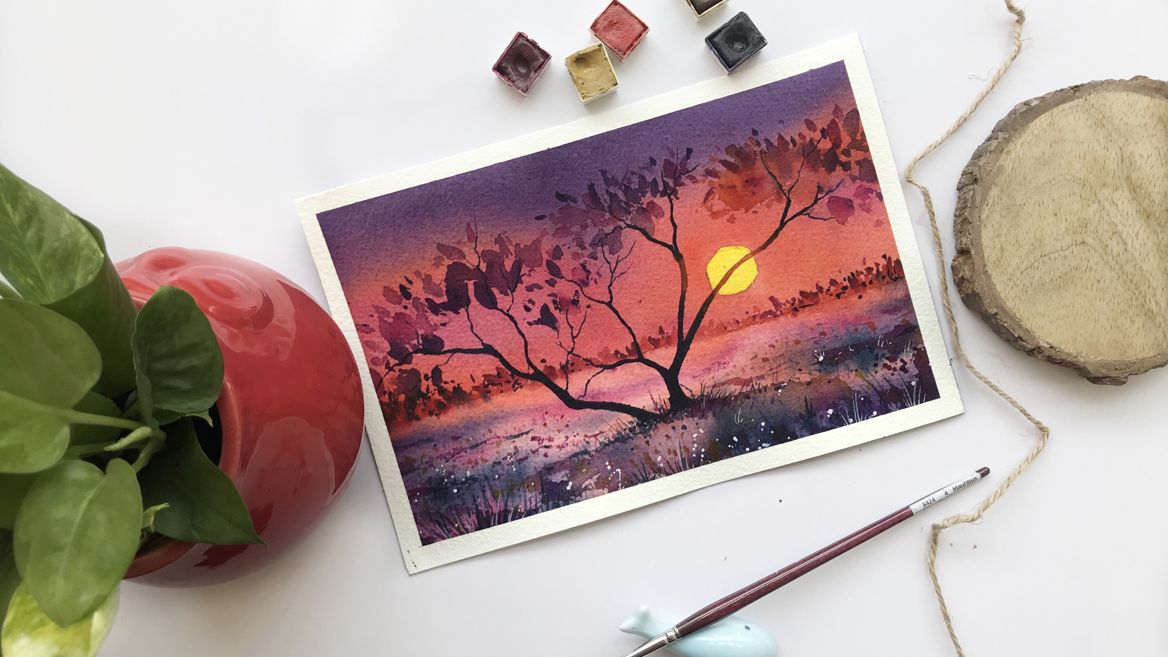
4. Project 1 Sunset: This is the first project that we would be doing for this mini painting CDS. This may be painting CD, so we'll be over 12 months as you know. And this is going to be the first project out of this mini painting series. We are going ahead with permanent yellow deep. Along with permanent yellow deep, I would be using some vet and crimson. You can also use any other object which is available on your palette. And for me on if you do not have it. So these are the options that you can keep it yourself. They would really help you through this class in terms of the color palette which you need. The colors that I'm using are absolutely free flowing. I am not thinking much wildlife, these colors. It's just to free-flow. I'm going with the lightest value first off, with the top of the cavea where I want to paint with the yellow color. And then I'm going slowly towards the bottom. Medial beta would go ahead with the darker values, darker values in a way I would say I would gradually move from yellow, then move to the Valmy Leon or read whatever you have. And the next would be my carmine. So these are basic colors that I'm going to use along with it, keep some burnt sienna and CPO with yourself. Once you are done with this area, then just add some buoyancy and not do your brush. And just on top of the paper, go slowly while you mix it with the yellow and then keep moving to woodstock middle part. If you see there would be a seamless flow from the Dakpo value that is the bone CNR to do a yellow pea are not going to complicate the subject much. Hence, keeping it simple and easy is the idea. I would go ahead with some of my burnt sienna more and accurate towards the middle of the painting you've seen how I'm flapping my sky. There is simple and easy strokes. At some point in time, I go a bit darker in terms of the values of the burnt sienna which I'm using for that top part of the painting, whereas firelight come towards the middle area. I use it as a lighter value. I'm going ahead with our flat brush. It is a 67 flat brush which I have. I want to blend this white into the red and the car mine, which I have fathered and it has to be really seamless. If you want any of your paintings to look seamless, you have to go ahead with the soft approach. I would say you can also keep up harder edge. I prefer more of soft edge that gives me that idea of the sun setting and that beautiful sky. Just they're simply, you can just add the colors and get the outcome. There is nothing difficult that we are going to achieve through this painting. It might look a bit longer as it is real time and you have to go stepwise with me. You can paint along with me. There are only four to five colors which I am using. So it's simple, easy, interesting, and you can quickly done with this, go ahead and remove some of the parts with the help of your brush. Once you have removed these spots with the help of your brush, just make sure that you add some darker values of the CPR towards the top, towards the bottom area. One interesting aspect of watercolor is using the correct paper. I always use an Arches 300 GSM cold pressed acid free paper. It is a more and made people. You can also go head with any kind of paper of your choice. Only important aspect is 100 percent cotton. There are many handmade papers which are available in the market. One can be the caudate people, one can be the chip depart paper. These are the peoples which can be always used. But do make sure that you are using at least fool for VGS him of this people because they are handmade and not more and made hand. So you might need to use a bit thicker version compared to what you usually use for a more made people did have other options like Fabriano as well as many other brands like pow Hong than others row papers of your choice like Molinsky or any, any particular Paypal fan, Emilia, etc, whichever you are using. It can be even Winsor and Newton paper, whatever you want to use, just make sure that the tongue person garden, as I always say, make sure that you aren't as kind of a darker value of brown even to watch The importantly via helping you hack this dark brown towards the bottom area, make sure that you are adding some amount of your black to your burnt sienna and then applying it towards the bottom and towards the top area. Or with a blending park over if your plays a major role while you keep painting the sky cavea. There is nothing else that in specific I'm doing. Hence, if you keep adding these colors, you will observe how beautifully you are painting. Turns out, I will just keep blending and keep adding some more colors to this part of the small mini painting because I wanted to look more attractive and interesting. So go ahead and add more colors to it just to make sure that you are blending it Well, as I have told you earlier. One thing that I must tell you for all these watercolor paintings, quarter will do its job. Hands, your colors will move around. I don't think that you would be in a position to control the colors. Hence, what you need to make sure that you are just applying the colors and blending it. There will be places where you will not be very happy with the outcome and there will be places where you will be fairly happy with how the painting is turning out. We're not going to get disheartened Tech any point. Hence, searches to make sure that for watercolors you have to be a bit more strong hearted. The kid, the asset is coming and keep painting all the paths. Do make sure that you are not going to leave it at any point in time. I always say this, that's one of the aspects of mini paintings are that we're not leaving at any point. We do not face this challenge of wasting papers. We are not going to even make it they hit so that it takes a lot of time. It's not at all time consuming as analyze, these kinds of paintings can be gifted to any person so that they feel special about it. You can make it on your cards, you campaign there, you can put it on your walls, whatever you want to go ahead and do with it, that's the greatest way of using your mini painting. So make sure you are using it to your fullest orals. You can even make bookmarks out of it. Make two paintings one after another, and then you get a bookmark out of it. That's how you can use these paintings to your advantage. I'm still actually taking out some of the colors from the white. Yeah, I'm not really happy with how this white is turning out. You have seen me a Brit moving around with the white, picking it up and then again adding some colors, then making it more software. So all these things keep happening. And once it is done, make sure that your paper is completely dry before you start adding the, these grasses. Right now that I'm going ahead and adding They are kind off small, small lines that I'm going to paint. Make sure that you also keep adding these small, small lines below the sun. It would be smaller that I'm adding and above. It would be a bit more broader towards the right, in, towards the left. Again, the sun is pretty much in the background and it is not so dark, or you can say it is not absolutely white and glowing. That's one of the reason we can go ahead using the darker values. I always say while you are near the Sun, you have to use lighter values. But here the sun is not at all very, very shining or it is not producing so much amount of light. It is not bright enough, It's pretty light in the background. Hence, you can use these stucco values, make sure you keep these kind of observation and mind while you do any kind of paintings, even in your future projects, all the learnings that you are having in this particular painting, it can be always used in any of the other projects of your choice. So here I'm starting off with the middle of the area where we, I am going ahead and drawing a plant. It's absolutely free flow of my brush that I'm using. Again, there are times where I want to go without any drawing and it's just a flow which I want to go head width. I can join these mini paintings because of that, one single reason. You can go as you want. You do not need to follow any order. I'm just starting a few branches urine there. If you see, I just go absolutely random with my plants are branches. Plants are, again happening in nature, and they occur in nature. It's completely natural. Hence you can paint it as you want. There is no single way on no particular way of painting tree or painting, or branch or painting a plant you can go ahead with, with any way that suits you. There is no one single way of painting it. Oris, there is no one best way of painting it. Go with the brush that you have. Random strokes. Absolutely use the tip of your brush if you see the top-down. I'm using the brush absolutely at a 90 degree angle so that I can get those thinner lines. That's what we need for our painting and that's how we go about it. There is no best way to do it as I have told you. Hence, I would go ahead and painted in the similar way. Now as their time to just paint some of my bots. Now the birds, I will just do a very, very rough sketch now since has a beginner, I want you guys to first do a very rough outline of the part and we are going ahead with a simple pencil sketching. You can go over it and paint over it. If you see there is no with that we are going directly and then we will make mistakes. I don't want us to make any kind of mistakes because our background has turned out so pretty our trees, plants, anything that we have done till date has turned out so pretty so I want to go ahead with in a way that it looks better. And from here That's one of the reasons of adding this kind of a bird right now, you can see a very, very light sketch. I want to keep it light as you know that watercolors are transparent and nature, and I don't want at any point and time you will observe for any kind of graphite max, I'm now making some of the legs of the birds. And it is very, very simple way. We keep moving around it. I have taken their darkest value right now to paint a bird, which is majorly my CPR color. You go ahead and add first the left side, which is majorly one of the bird's wings data mining. Then I will add the body as well as the legs. I go very, very slowly adding all these basic parts for a bird. I do not want to go wrong as you all know, and I want to make it come to life as we progress. This is the only thing that we are left with. Hence, we would not take more than two to three minutes to just paying this and finish it off. I would go ahead. And now me. The other part, which is majorly the neck area and then though the leg area, these are the two aspects that I would think I would make a longer beak. That's what I like about these migratory birds. Hence, you will see more of longer beaks even coming up in the next few lessons. So hopefully you will enjoy it. Even those there are bright, vibrant, beautiful. It's going to be simple, easy yet interesting kindof or topic. As we are going to change these topics every month. You know, there will be 12 months of this mini paintings that we are going to do. And every month we will are going to add somewhat the other new topic too, our daily routine or practice, or we will discover a creative self in that way. At all. These particular classes will be focused only on bigness. That's fun of the idea which I really wanted to explore because that's big nose. I was always so confused about how to go about a particular painting. And that's when I learned that we have to go really step-by-step with any painting or any watercolor that we do over your, I'm trying to make a long, long wings of the birds. The first wing is really long because this bird is flying and it is really matured, one that you see. So it's sold enough as a bird. And you will see now I am making the head of the bird as well as the neckline that I would add. Then I would add the beak of the bird slowly, steadily I build up on this board area. I never say that you have to go together about painting anything. You should always go slowly about painting with watercolors. In watercolors, there's no way you can get back. That's one of the reasons. The most, most important aspect of watercolors is to go slow. Take your time, think about it and then only move around it. You are not going slow with any of your paintings. It's always okay to even come back, watch it, and then go about it. Because we do not want to make any kind of mistakes even far as smaller paintings, I want you all guys to just try get with the one go and then give it a shot. It would be really beautiful once you finish off this painting, I can tell you that I was so happy once I finished off this whole of the painting and had a final look at it. Once this is done, we will move on to one more easier side of this painting process and enjoy it, guys, enjoy watercolors. If you started giant watercolors, it will reward you like anything. Once this is done, have a final look at it and we are not going to remove the tape. That's the best part. We will move on to the next one that we will add some more birds to our skies and sell Hotez.
5. Project 2 The Vibrant Sky: This is the second project for today. And I can tell you I enjoyed most out of all the six paintings, painting the second project, it is simple, easy, interesting as I always say, we are going ahead with the wet on dry method. That is, our paints are wet and we are going ahead on a dry paper to paint more with a really light wash of your yellow while you are going to watch the bottom. Whereas when you walk towards the middle of the painting, you will have to go with a darker value or fewer yellow color. You can use any color of yellow of your choice. Just do not try to use lemon yellow. Lemon yellow has a bit of capacity in it, which I really tried to ignore while I go ahead and paint, I'm adding some of my permanent yellow deep now onto my painting. You can also use chromium orange or cadmium orange, anything that is available on your ballot. Go ahead and add some more gamelan towards the top. Since Valmy Leon is one of the colors that I really like go while I paint these vibrant skies. Hence, I'm using it to my advantage. Go ahead and add some more red towards the bottom. And you'll see that the colors that I'm adding is very simple. And the middle part time teaching a bit in white. Why I love to keep this part of Britain white. I want to show some amount of water over there and keeping white collar would help me to show the fork. You will see how I double up the form. We're going to do so much within the same painting. And you can go step-by-step along with me. It's a real-time video, hence, it's very easy to paint along. Go ahead and let your paper dry. Once your people has dried up, just had some small, small lines in and exactly the long, long strokes as I go ahead and painted, I'm mixing two colors over here. One is my red and one is my vermilion. You can also go ahead and use your dominant yellow deep has you want to add I'm okay with whatever color do we are going ahead and adding. If you'll see, I'm now using my round brush that a size eight to make it absolutely blend it with the background. This is, again, one of the paintings where you can do agreed blending and you will see the form automatically happening though messed For looks fantastic during this kind of form monsoon season which is happening in India. I love to see it always and I love to paint it. So this is one of the small tries that I'm going ahead and doing for this painting where we are good to paint the birds. Whereas the painting were done on really vibrant and pretty. Okay. Just paint along with me and stay along with me and blend the colors with the background as I'm doing. These are the small, small trees which appear in the background. And you observe that these trees are really far off. Hands cannot see them a lot from closer view. Whereas the look that they are dead in the background with different colors marching. I'm going ahead and adding some of my red as well as you can use carmine, whatever colors you want to go ahead and use, you start to paint these two long crease and just blend it with the background that you already have. These are the longer trees that APR, whereas the other trees are in the bushes and they appear smaller. They can be plants, whatever. It's absolutely fine how you want to depict it. Go ahead and paint some small, small plants now which are dead in the water. They arise in the water and keep adding the branches to it. What I usually do is that I make one of the branch and then again branch it out. That's how I keep hiding small, small branches to one of the stamp that I already have. This is actually like a plant or a tree which is broken and the Watteau and a bird is sitting on top of it. That's how we are going to show it. Hi, I'm seriously happy. Till now, the way the painting has turned out, it's simple, easy, yet it is so interesting and it is so captivating till now. Go ahead and add a body of the bird. If you see it's a very, very simple body that I go ahead and pack once I'm done with that, but then I will start painting. I go with a lighter value as you always see. So I'm using my burnt sienna right now. Once I have added the burnt sienna, I can mix it with CPR, Arles. I can even mix it with some of my red, violet or Carmine. Again. The colors you do not meet whatever is available on your ballot. Go ahead and use it. I go with a very, very simple stroke on top of the pencil marks that we have done. I go with a very light hand and I'm using the brush just perpendicular. That's one of the reasons you absorb that. My brush is just on top and you might not be in a position to see the paper. Once I am painting the branches, I keep slowly adding all these branches. If you see that, I go really slow at this point in time because this is the second layer that we are adding to our painting. I do not want that being gone wrong at this point in time and spoiler Pollock's painting. Hence, make sure that you go really slow and you can actually meal the painting very well. Go ahead and add some more sepia. I'm using my advantage. You can use any other color of your choice. It can be black, it can be the Nike brown, it can't be indigo. It can be any color of your choice. Do make sure only that your background is absolutely dry when you go with the second layer. We are building up in layers. And that's the beauty of this whole painting. Go ahead and make the neck of the bird. The neck is a bit broader. Hence, what we need to do is change the body accordingly. You have to make a bit broader in terms of the body. And once that is done, then I think our board would be really balanced out that way. Balance in terms of the board that we are painting. Whether it be its neck, whether it be its body, whatever you are going to paint, make sure that you get that balance hand nicely. I can see that the bird is building up. I would just add some more branches to this particular plant or the tree, which is they're just add. Now the reflections onto the water area. It's simple, easy hand, so good to paint all these things. I really loved this mini paintings. That's one of the reasons. Okay. Just make the reflection Absolutely In a very, very simple way. Go ahead and painted that your water is moving a bit hands your reflections and not absolutely the way use absorbed on top of the water. That is basically your birds are not absolutely same. We see it in a different color of the sky that you observe onto the water. And that's how I'm going to paint all these reflections. One stamp, like your people try and have a final look at this painting.
6. Project 3 Silhouette: We are going ahead with some yellow color right now. And I am very, very random way on dome of the sky. The sky is, again, simple, easy. Hi, I'm going with my mommy on a bit. It is very, very light touch of a million or you can also use your permanent yellow deep, some of your carmine on to the top area. And you see how beautifully it's blending with the brown that I did add. It is wet or dry when I start up, whereas now when I keep adding the colors, it becomes more wet on wet as there is. Or D, one layer of color that is there on top of the paper. Go ahead with our darker value of sepia on the top area of the sky. And once that is done and go with a darker value even towards the bottom of this guy. Do make sure that you blend it well with the orange or with the bombing Leon hospital as once you have done that at some amount of red onto it, I really loved learning this red and warmly onto my painting. And I am now going ahead and adding some of my darker value, Titus, my SPM CPU is one of the way beautiful colors which I am currently using and many of my other paintings too. It looks nice and beautiful, interesting. And once you are done, go with your brush, and that is my size six brush. They've landed me. I'm adding some clouds. These clouds I am adding just saw that our sky look more interesting as well as the appeal to any kind of a spectator who sort of solving my painting go absolutely random in terms of painting our tree. Again, three occurs in nature. Whatever occurs in nature is always random. Do make sure that you add some branches and we will have some loose leaves onto the street. Makes sure that your painting is absolutely dry before you go ahead with the second layer, I always say this that you need to work in layers. If it is a watercolor painting, watercolor painting has got its transparency. And watercolor painting looks so, so interesting. As well as that is 100 advantage of doing watercolor painting. It dries off very quickly. You need really less colors and brushes while you do these kinds of paintings, nothing much is needed while you add the colors. Or you can have a very, very basic palette and still start off your journey in watercolors. I started off in a similar way, and now I am so much into watercolors and a lot doing all the paintings to the core, add some more branches, smaller while you go towards the top, on top of the tree and towards the bottom of the tree trunk needs to be proud of. Broader tree trunk really helps to support a tree. You all know that while we are towards the bottom of a tree, new half or product tree trunk, while you go towards the top, there will be more branches, hence they won't become smaller. I'm going ahead with absolutely loose style of painting the leaves. They are on top of the tree. I'm using my brush, absolutely lose at someplace. I am adding more pressure and I am releasing the pressure in the other places. That's how I go about it. It's interesting the way I continue painting these leaves because they look so simple yet you might face a bit of a challenge. You start off, you can always try it on a rough paper and then added or to your final painting. Keep adding one or two branches more to this painting. I'm so happy. I mean, almost a painting is done before. We are even five minutes into the creativity date. That's what makes it really interesting and dumps off when you do these mini paintings. And absolutely real-time. So you can paint along with me. I'm making the body of the bird. I make a slanting line. And then me wings. That is towards the right and towards the left. That's all I'm going to paint. Either make the feathers that move towards the bottom area. Go ahead with your brush, which has a nice tip. As we need to paint the wings of the birds and things will be on the left than on the right. As I did draw it. It's an absolute propaganda way, the way I keep painting these so small, small feathers. And once you see these feathers are done just to extend the body or pick two words though. Bought a paleo, we need to show the body fully part, makes sure that it is 10 or while you go towards the bottom and extended a bit to show that it has two legs. Yeah, that would really help to assure it. And whenever you see that the wings look a bit smaller, just to extend them then that the stem, I think I'm pretty happy with the outcome. I'm Mike make the body of big article that said, and let the painting dry off and then have a final look at the painting. I'm pretty sure you would be happy with the final outcome. I didn't make two legs as well as a bit of the feathers status towards the bottom of the birds.
7. Project 4 The Family: Okay, So we're starting with our fourth painting for today. It's going to be again, a simple small sun that we're going to add to this painting. If you see, I'm going ahead with the same tape which I did use to tape down my paper. I'm using it as a so-called former painting and then erasing it a bit so that I get the lighter values. Once I have the lighter value, I would start and go ahead with my red violet. You can also use carmine kind of bit of violet in it and you will get a color which is similar to the one that I'm using right now on the people. You can also go ahead with any other color of your choice. It's just that the red, violet and vermilion, or red, if you add to the particular painting, looks more aesthetic and they go together really well, That's one of the reasons I have added it over here. I'm adding very randomly, although colors, it is just going in and around it. Again, it is a wet on dry method that we are using. Hardly we have used wet on wet method completely for a painting except the first one where we did go ahead and add a lot of clouds, start hiding some of your colors and make it absolutely seen in terms of the values that you use on the left side as well as on the right side. I'm pleasing once more tissue so that in case I even pick up some colors from this painting, I do not spoil the other parts of the paper. That's how I go about in case I'm doing six paintings together for mini-series. It's always good to have tissue close by you. Okay, that's how we go about this. And then I start adding some of my other sheets, which is more of red and vermillion. You can go ahead with even warmly on if you do not have the red, I have added more of red into this. And you see how beautifully the scholar has blended with each other. It looks so organic and that's one of the reasons I like to go ahead with red violet and red together. Once this is done, we will let the paper dry and then start adding the sun. The sun would be more in the yellow as well as in the orange. I would go ahead with Sennelier yellow or any other yellow data's available on your ballot. That is no hard and fast rule to go head with a particular yellow that you see. I'm using some amount of my other yellow that is lighter in value. Or you can say that doesn't have capacity in it. It looks more transparent and nice. Hence, I'm using this yellow in most of my paintings. I would go head and had some of my orange. Or you can even go ahead and add. Some of you are afraid to get that orange in the sun. Once that is done, then lego people try over it. We would go head with the second layer. It is not a tough one, just that you need to go ahead with two layers. Hence, your first layer should be absolutely dry once you start adding on drawing your second part, I'm going ahead with a straight line, and this is just like a nest we will have on top of a small bowl. That's it. Oh, we need to do start adding some colors. Now. It is a small pool that we have padded and I'm going ahead with my sepia color. You can use any color that is available with you, either a beep and IK prompt, either be sepia, I'm good with anything. If you do not have any of this color, go ahead with the dark brown shade that is available on your palate. If you do not have even their dark brown shade, you can make some amount of black into your burnt sienna, which you have already added and then start painting with it. Go-to words Third Reich, as well as two words, the left, I have told you we are going to paint a nest that is placed on top of a small ball to check always that your painting is dry enough as I did check with my fingers rank now, once that is done, then start adding small, small leaves and small small plants as if the nest looks completely natural. Hi, more darker values in the middle. And while you go to what's the side or to western part of the small, small lines which look like plants and dry pushes, et cetera, that usually bought users to make their mess. Let's go ahead and keep painting. Stand out those small, small lines, which I did tell you would look more like the plants, dry leaves, etc. Matt usually uses for building their nest. And once this is done, I would go ahead and paint the small, the people who is waiting for them model to feed her or his waiting for her mother. Anything you can imagine and put it together. Whenever I see your board, It makes me so excited. They have this freedom lie in the sky. They have this freedom to move around. They have so much to see the hap this together. Please to Koran move around the move from one city to another city. They move across countries. Everything that they can do makes me feel so excited at each point in time. I'm going ahead and adding one more board now, which is basically the mama bird. And this is a small and beautiful painting where we will have her baby and mother bird that is together living and taking care along with it. We believe in have a father to add on so that the family looks more complete. Yeah, I think that's just time in solving tough imagination going on in my mind whenever I think about painting birds are any subject. It's my own thought process. You can think it absolutely in a different way. There is no hard and fast rule of thinking this. Absolutely the way I'm going ahead and thinking it just extended a bit so that you get in, get the beak. Well, the board is stunning. Hence, you can see there are two legs that are battered. Once you have added the legs, we will start with another bird and that is flying in the sky. Again. I am going ahead and painting the wings first. On the left as well as on the right. The right one will be or cannot compare to the left one and 10, I would extend the board. That's how I go about it. The focus is right on my hands so you cannot see it properly, but believe me, you would be in a position to see you the way you are observing right now. I'm going ahead and adding the feathers to the weekend stack. You can see, and I told you the left one would be a bit thicker compared to the right wing that I'm going to add. Once. That is done, just extend the bottom part of the body and make two smaller legs of the boats. That's how we go about it. And I guess that said I am pretty happy with how it has turned out. Let's just leave it here. I'm not going to go head and the heart. Anything more. I will see you in the next painting.
8. Project 5 The Reflection: Let's go ahead with the second last painting for the day. It's going to be, again, small one. As you know, this is the money payment series. I am going ahead with some red towards the top area and then I'm adding some of my permanent yellow deep. You can use any color of your choice. But this palette especially attracts me a lot. Hence, I'm adding these scholars right now. Once it is done, I'm going ahead with some red and adding on the red. You will see that I would be mixing and matching it with some red violet. So wait for that time and you will see how the colors change the scheme and how beautifully it turns out. It's just that right now I am blending it, trying to get one single color of the yellow or the permanent yellow deep whatever you are adding. Once that is done, start adding your red pilot. I am so much impressed with the scholar. I just loved the scholar. I have been using it quite often in many of my other paintings 2. This gives such a beautiful outcome once to finish the painting that I am truly, truly happy with it. I would love to add colors to the white spaces that is already there on the paper. And I can see for spoke once that is done, I would go ahead and add some more darker values of the red violet. And you see how the colors are blending into each other. See it is watercolor painting. In watercolor painting, what you will do its job. You just need to plan the colors. And that's it. You will go ahead and just see that complaining this perfect rest, everything will be done on its own. We do not need to do a lot in this painting. It's going to be a simple painting where we see a reflection of the sun onto the watery. And I'm just trying to make some of the waves. If you do not have this kind of color palette, you can go head, but whatever is available with you with Carmine, you can make some amount off your purple and then get something closer. Go ahead and start adding some of your burnt sienna onto the paper. I'm using a flat brush for adding it. This is a six MM flat brush that I use throughout the paintings. You can observe how I am just adding some small, small lines towards the left hand, towards the right. And that's it I'm going to use for my painting. And then I would go ahead and just let the paper dry off before I start painting my boat. It is going to be a very, very small birds sitting on top of a rock. That's all is my idea of painting this particular small mini version of the book. It is a single good and it is a migratory bird which is sitting on the small Brock. And this is done, I guess I'm not very confident. Water directly going with the color hi, might go head and move it and first brought aboard and then normally go or word for the painting because the head looks really out of proportion as well as though peak. Hence, I do not want to commit any mistake at this point in time. I use my tissue to the advantage and then go ahead and start adding the head of the bird. Then I would go to words, the neck of the board. I draw it with my pencil. Always, always make a sketch. If you want. Not very confident, though it is great to go head without sketches. But it's important to have a sketch BioCyc that really helps you do actually get that confidence as a beginner. And this mini painting series is focused on bigness. Hence, I would like you to just add this board first ten on the co-head with the painting part, because I had really committed a mistake and I do not want you guys to commit the same mistake. Go with the head part first, slowly. And this is the sepia color which I am using. As you know, I have been using those CPR color and I have given you so many alternatives for the CPR color. This is a dark shade that I am using for completing the neck as well as the body of the bird. Once that is done, We will go head and the heart, the legs. Or you can see it would go head and the long, long legs that usually see in the migratory birds. After I have added that, I would like to show that it is sitting on top of a rock. And the rock will be also in their darker values that I've worked are gone. Again, the whole painting is not about making it complex, but it is more about making it simple, easy, interesting, and keeping it in a way that you can at any point in time, wherever you find, even ten minutes in a day. I will go ahead. And now being the ROC area, once I have those, you can also go ahead and add a bit of your reflection on the water area. I think that would make it more interesting as I am doing it right now and leave it there for it to dry. Let's move one to the next lesson.
9. Project 6 The Light: Okay, So this is the last painting for today and we are going to use a very nice method to work this out. I have taken a small coin hand. I'm just marking a few so-called in and around it. You do need to do the same. Go ahead and mark a few circles here. And then the middle one that I did draw first is the one where I will mark my son and I will paint a bird. Go ahead and make a few more circles here and there. It's just absolute random. It is again, a possibility that once you finish this off and go with the first skill, you will not be in a position to see it very well. Again, you might need to draw it once more, which sometimes happens to me. So I'm just giving you a heads up. Go ahead and make a few half circles because every time it's not full, hence, marking it over here would make a lot of organic flow. And once that is done, you have to start by going in and around the sun. Again, it is a wet on dry method. I will take my wet paints and go further sides of the sun where I would start painting my background. So once so the background is ready can be a cool word with a second layer. Second layer this time is going to be really interesting. I can guarantee on it right now. Start with your permanent yellow deep morals, any orange that is available on your palette. Go with it with a very, very light value right now we can always go ahead, had, had more colors to it. That's absolutely fine. Going with a darker value at the first four will not be the kids. You know that I always love to go with a lighter value first and then make it more darker as we move ahead. I am now adding some red to my painting. This is a beautiful red color that the hi-hat, you can also move it scholar trade or any other very cadmium red, anything that is available on your palate. Then I add some of your car mine, and your red-violet. Red-violet is a very, very beautiful color which you can use to your advantage. As I always say. Once that is done, then we will use some of our chromatin. Blue. Ultramarine is again a very, very nice color, but do remember that it's a bit granulating, hence, you can go ahead with any other shade of your choice, like your dark blue or Prussian blue or anything that is closer to this IEP dad even be whole. Cobalt blue. Cobalt blue is also very nice. So if you want to replace your ultramarine cobalt blue, now, only I would go head with the blending part because I just don't like the way colors are flowing on top of the paper. It's important to have a good planning when you are counting your colors. Then only I think you would be in a position to kneel all your paintings if you're blending as well. So these are mini paintings and many paintings will not require a lot of technique. Only technique would be more wet on wet, wet on dry. And the next would be your planning. Those are the usual techniques that you can go ahead with. I am using my flat brush to blend the middle part of this whole of the mini painting behavior. Once this is done, go ahead and start adding some of your orange in the bottom area. Why I did add this orange? Yeah, because I just dropped 10 drop of water or you can say one, the big drop of water because of which the colors got displaced heads. I am adding this yellow color again on top of it. Once this is done at some of your orange or red color, and once you have that orange and red, go head and heart, some of your blue in your second layer. So lading, I am doing in the background. Also. Why? Because it was not as vibrant as I wanted, hence two layers, so was kind of mandatory for me. You can also go ahead with one layer if you were pretty happy with the colors that you have applied to your bank account. Pretty happy with the background and let it drive, take some whitewash and make her very, very light or lighter in value in terms of the color that we're going to use. You can also use titanium white, which is more opaque and nature that can also work in this case, go over the area which we did mark as circle. With the help of the coin that we place on top of the paper, go over it three to four places we're going to mark has really didn't mark to ring the initial part of our drawing. They would look like MOOC effect in the background tab is soft. To focus. Background you get when you shoot a subject hand over your subject was the simple book. And along with it, you have some of the grasses harmed branches from the plants that we don't. That's it, I guess Sando, once this is done, you will go ahead with the few more bouquet effect. That's it than some of the places I would be drawing in their DACA values of white and some will be more lighter value of y. I keep bought tissue handy. That really helps me to seal to any kind of painting pretty easily. Why is a key part tissue handy? Because you can always remove your paint from the paper pretty easily if you have a tissue by a site. That's how we go about painting these smaller of the coin which we did MLK has, I have told you all you keep on adding more of whitewash and variable. You feel that you have made it more darker than what you should or what you would like to have on your paper. Go ahead and just remove the white collar. I would just add one more row of these bouquet effect. And I don't want to overdo these painting because that's not the focus which we have onto this painting, whereas this is just creating a background. One more thing you should always keep in mind is once this painting dries off, you will see this column we more lighter. So if you see it more white right now, do not worry. It would become way more light oh, when it dries off completely. Every time I have a look at these mini paintings, I've become more and more excited. You know that how many paintings are easy to work on the heart. So simple, interesting, and you can do so much even within this time span of 10 to 15 minutes, or even being more or less so you have seen there are paintings which car, even around six minutes to seven minutes. So practically we are not going to complicate anything over in this whole cities and hope that you will continue working on this last part. Again, now we are adding some plants. It is simple, easy. I'm going with my CPR color. As you already know that I have used a scholar very often in the UDL spite painting stack we have done till now. Once this part is done, you have to make sure that you paint a bird, which is pretty, pretty noway it would be a small bird, but goal with the pencil sketch first as a beginner, I always say this make your framework in case you are even finding some difficulty in painting these kind of leaves and branches or plants do make sure that you go slow and steady. There is no rush in watercolor paintings. So I have not had the amount of time you would mean for drying off your paintings, leaving that you would not need more than the time which I'm using for painting along with me. Go ahead and start adding these small, small branches. I'm going very, very random using the tip of my brush to add them one or two branches in the middle, I have tried making it a bit more longer and thicker compared to the other branches which Harvey more tenor. If you'll see, I did not place the sun in the middle of the painting. Most of the parts that we are painting till now, you might have observed that I have not placed anything to woodstock middle of the painting. That's one of the rule that I always love to go about. It. Even placing a subject in the middle, I would like to place the boat towards the left or towards the right. Something I would do so that I keep the whole of the painting more interesting. You should always learn to not place your subject exactly in the middle. That really doesn't attract the spectator to a large extent compared to if you actually go ahead and make this object a bit towards the left or towards the right, make this model. But if you see isis make a small body, tail and a small beak with the head. That's all I'm going to do with my pencil and then go over it with some lighter value of brown hand-on down prompt. Do make sure that the bird is towards the middle 80, which is near the sun. It has to be more lighter in value and more upon c. And I would be applied in that case compared to if you go ahead with the colors that are towards the right and the bird is a bit towards the right, then it would be more with the DACA value. So Laika would be around the sun and DACA once you are moving away from the Sun. Since the sun is pretty bright and that's one of the reasons I have asked you to make it lighter while it is towards the sun. I think I'm pretty happy and satisfied with the whole of these paintings. I hope you might have also enjoyed all these six paintings. It can be done on a single piece of paper and you can give it to anyone. That's it. I guess just go ahead and let this paper trauma and I will meet you in the conclusion, but
10. Bonus Lesson: So this is the bonus lesson. I'm yes, there are a few changes. Basically the paper size and the paper sizes right now, 12 into 15 centimeter. So you can also take the same paper sizes co-head with the paper size that you have been using. This is a sketchbook that I have from Hong and it's also a 100 percent cotton, 300 GSM people. I have four always like this paper, and this is practically the student grade paper that is there with them. And this whole sketchbook is made out of that. Okay, let me go ahead and start making the so-called that is needed for the sun. And then I'm going ahead and making a rough sketch of the board is the board that we will be painting. And this bird is flapping their wings towards the upper side. Once you are done with this bird, we will go ahead and start painting. I would just take off all the extra graphite marks and then start with my orange color. Whatever oranges available on your palette. Go ahead with that rest. I think you can go with any cadmium orange or any other kind of orange if you do not have oranges to mix some amount of your rate with your yellow and get a color which is similar to what you observe right now. I'm going with my size, a term, Titus is caught up brush and I am adding the colors. Again. It is wet on dry method. Why I do go ahead with wet on dry method for these paintings high wanted to be more vibrant and this vibrancy only happens when I have the color that is done wet on dry or else you might need two layers if you are going ahead with wet on wet, hi, I'm good. If you want to try wet on wet, wet on dry walks on a smaller paper and you do not need to struggle much while you are adding the background colors. Let's go ahead and start adding the red along with the orange. I'm pretty happy how the painting is right now turning up because the colors look really vibrant, beautiful, but don't know whatever color you are right now, applying on the people will try off one sheet, lighter ones. Paper is completely dry. So do make sure that you are going ahead and applying the colors in a similar way. That helps you to keep it exactly the shade which you want. And hence, do make sure that you add the colors accordingly. For me, right now I feel the oranges less along the sides of the sun. Hence, I would go ahead and add more orange part. I see that the color is not adding up perfectly hence and going ahead with some yellow. Now, I would ask you to go ahead with any yellow except lemon yellow wire usually see that on top of the lemon yellow, you get some amount of opacity. I mean, with lemon yellow, you will get some amount of opacity. And that's what I love to just not have on these kinds of paintings. I hope that you just know. That's how the whole of this series works. I love the transparency of watercolor and hardly we have used much of opacity and all of these paintings. Let's start adding some more yellow and few of the areas where we need. And then just move around your paper a bit so that your colors can move freely. As there is water on the paper and the colors will move. You see such a beautiful sheen on the paper. You can see right now. Go ahead and let this paper drive once you are happy and satisfied with the sky area and see how flawless the sky has turned out. After it is done, I would go head with some amount of my CPR and start painting for now, which is majorly the trees in the background. And I am going absolutely lose this. I am using my size six is caught up. Brush. If you are not having this kind of a brush go head with a smaller brush that has size two. I would even show you how I am using size two brush as we progress in this painting. Stop adding some amount of your leaves on the trees as well as go absolutely random. There is no great way or there is no perfect way in which you should add. Leaves, or you should add your bushes in the background. So go with any way, use majorly the tip of your brush to make an uneven. Because again, if you see its nature and nature will be random, there will be no perfect way in which you would be observing it. Hence, trying to get that perfection will not be correct. Go ahead with whatever way you want. I am just adding a few goals here and there so that it looks more natural in shape. And in some of the places I'm just adding some water because I want to change the value a bit of play with the value, but you might do this, you might not even do this. There is no fixed or random way in which we should go ahead and work this out. It's only you continue to build on it. And finally, you will see that the whole painting has come together. I am now going ahead and using my size two brush. If you observe I wrote again you start tip of the size two brush to go ahead and paint this area. And this is absolutely random, as I have told you, I would be leaving one or two dots here and there, so dark, it looks more natural and more loose. Never tried to attain perfection in your painting. That's what is not at all important in a water column. Because watercolor itself is random. If your watercolors are random, why do you want to control it? Why do you want to get to perfection and watercolor? Let it move as it is there. Let it Dan, so on and so on rhythm. There is no perfect way to handle it. I would say start partnering with this medium. Once you start partnering with this medium, you will find all the happiness that is there. In this kind of watercolor. I have found my freedom with watercolors only when I started accepting that everything will not be perfect. There would be a lot of imperfections and watercolor. Hands. Just go with the flow, let it walk on its own. And even a simple painting like this where we are working with only a few shades. So like yellow, orange, red, and sepia still you might feel okay, This has not turned out exactly the way we wanted, but we should not bind ourselves with that. You will see that I would be also struggling a bit while I make the wings on the right-hand side. I just wanted a bit thinner but it became albert ticker. And I was like, okay, this is not exactly how I wanted it, but it happened. And I accepted it after 1 in time. Because if you try to not accept the difficulties that comes with the watercolor or the randomness that comes with the watercolor. You would never be happy with this medium. You will always be striving for more and more and more perfection. Start adding some amount of your flying or flight the bird is taking. It will have its wings. Hence, you need to show those feathers. Wings. I would say that when I started off adding the feathers, there was not practically so, so happy with it back then I start to make it a bit longer towards the right as well as towards the left-hand? Yes, that was a magic thing that happened. Do make your wings a bit longer and larger. That is where the magic lies. You will see how beautifully the whole piece comes together. And it looks so much organic and domes of a bird which is flying in the air. And you see a sunset with such beautiful colors put together. I don't know. I mean, this is one piece where I'm still in love with each and everything that I did paint it flawlessly, put together like it was meant to be like this. And hence, I went ahead and let the area just exactly the way you see I'm struggling of it. But yes, you can take a damp brush and take off the extra pins whenever you feel it as necessary. And then I go ahead and add some deeper values. So that's it, I guess so we need to do in this painting, once you are fine with this, Go head, let your the painting dry off and then take off your tape. Now painting of your tape is very important, as I say, once your paper is dry, then only peel off your table. I'm not here to rip off our paper, write heads. Let's just paint the sun a bit with the bright yellow color. Oh my God, I'm just falling in love with this color. This has the beauty and add, add. I would love to leave the white which is already there in the sun, atria and then just add on some amount of the yellow. Once you see the yellow, you would be like this is really, really organic and this looks absolutely In terms of the sun that is there and eight is setting and the brightness is completely there. As such, I hope you to just paint this particular one and fall in love. Put the colors as well as the painting are together. Once done, do not forget to upload it in the project gallery as I would love to have a look at it and give my valuable feedback.
11. Conclusion: I hope you're good finish all these six paintings. So within an R, that's usually the timeline that I love to keep for all these mini painting CDS. Yes, few of them are above 10 minutes. I'm few of them very available or 10 minutes? That's how I did keep it. Of course, you can't have everything according to the same timings and fuel would be complex and feel would be easier. Mixing and matching is really important. I hope you have learned Our lot about blending wet on wet and wet on dry method. Always know that whenever you are doing a watercolor painting, it would be one shade lighter than what you have applied on the people. Hence, you might have to go ahead with, why not do layers of your watercolor if you are not happy with the vibrancy of the paintings. I think that this holds of these six paintings really made me fall in love with watercolors again. And the next one would be everything about painting beaches and summer. So I would go ahead and make six. How many paintings and invite you all to join me this series, this is just the month one. There are 11 more months, which is left-hand. We would be painting so many different subjects. And I can tell you once you take the series, you would be in a position to become a master in watercolors. We are going to slowly level up and hope that you can also join me in this whole 12 months and let us keep each other motivated and start creating hands well as join this beautiful journey of discovering new techniques and being creative with watercolors.
 Dhritikana Nath, Watercolor Artist and Instructor